« If you’re having a bad day, catch a wave. » — Frosty Hesson
How do you cool down in a heatwave? In this household, when the temperature soars and drags the humidity along, we reach for a soothing surfing movie, preferably one by peerless surf auteurBruce Brown* (1937-2017). Last week, it was his 1959 opus, Surf Crazy, in which a group of SoCal surfers venture down to unsurfed Mexico, which in turn called to mind “Mexico“, an early ’70s underground two-pager recounting a similar sojourn.
Which, this nominally being a comics blog, leads us to the one and only artiste embodying and straddling both the underground cartoonist’s and surfer’s ethos, Rick Griffin!
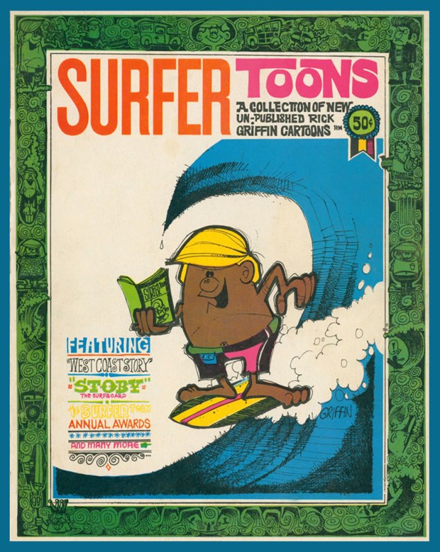
An early Griffin collection, Surfer Toons (1964, John Severson), featuring his early creation, Murphy, likely inspiration for notorious jewel thief Murph the Surf‘s sobriquet.A bio of the young surfer-cartoonist from The Surfer vol. 3 no.3 (Aug.-Sept. 1962). The photo confirms that his Murphy strip was autobiographical.« In 1964, a serious car accident left Rick unable to work for several months. Later that year, Surfer started a new series titled The Adventures of Griffin and Stoner. They were make-believe surf trips that Ron Stoner, a famous surf photographer, and Griffin were supposed to have taken around the world. » Stoner’s real-life adventures, however, were not so happy.In this mid-to-late-60s illustration, we witness early signs of Griffin’s mature, more assured line. A simplified version of this piece would appear in The Surfer‘s March, 1972 issue.
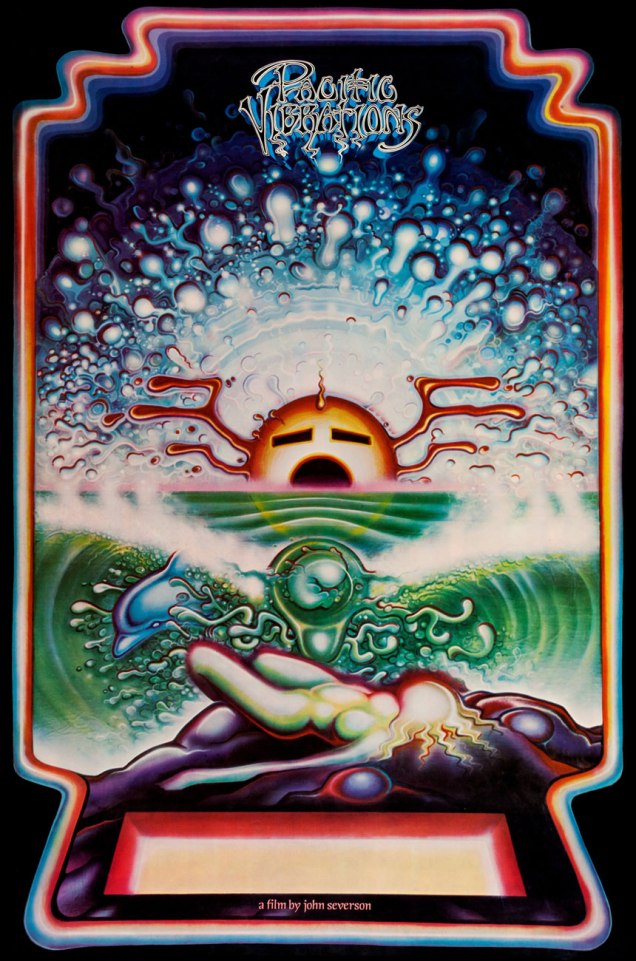
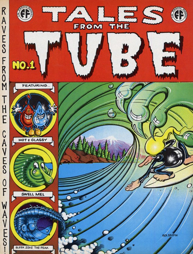
Griffin’s tour-de-force adaptation of Them’s Mystic Eyes appeared in an issue of The Surfer in 1970. Witness how Griffin’s depiction of Murphy has evolved over the decade. The fancy helmet is a Hopi Indian ceremonial mask, a frequent artifact and motif in the artist’s subsequent œuvre. Weedy song, imho — and yet, meaning is where you find it.Also from 1970: Griffin created this piece for his patron John Severson‘s surf documentary Pacific Vibrations, (in which he also appeared!) and it provides a fine example of Griffin’s matchless lettering**. And there’s that Hopi mask again. Though it was quite a popular poster in the 1970s, If you ask me, though, accomplished as it is, it utterly fails to evoke surfing.Tales From the Tube, as it originally appeared in 1972, inserted into an issue of Surfer Magazine (Vol. 12 no. 6); some copies exist separately, however. Also to be found within its pages: Roberts Crumb and Williams, Steve Clay Wilson, Bill Odgen, Glen Chase and Jim Evans.TFTT was later reissued (now with a price) in the regular comix format by The Print Mint. As you can see, Griffin reimagined and re-separated his colours. Which version do *you* prefer?
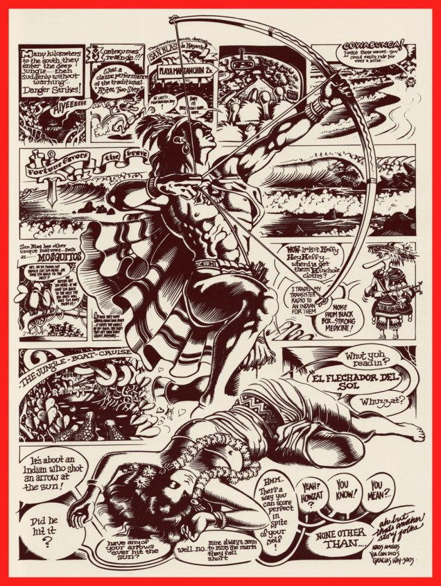
Visual splendour, not coherence, was always Griffin’s stock-in-trade. And why not? This travelogue premiered in Tales From the Tube.More poster (and soundtrack) artwork for surfing documentaries, this time 1972’s Five Summer Stories and its 1976 sequel, Five Summer Stories Plus Four, directed by Greg MacGillivray, a prolific, award-winning director and cinematographer to this day.… another Tales From the Tube, another Surf doc affiche from ’76. « This film and the other surf films for which Griffin has done posters are not usually shown on the regular movie circuits. Their soundtracks are usually composed of rock music of various forms – soft to hard – with a few breaks for narration. The surfing scene throughout the world has grown large enough to support the production of many films each year. »As you can see, Murphy abides. A 1993 sticker, with instructions.
-RG
*I’ll go even further: for me, it pretty much has to be Bruce Brown. His easy charm and wit, not to mention his untrained-yet-superb set of filmmaking skills leave other surfing cinéastes floundering in his wake. From what I’ve seen over the years, their work either seems too dry (ha!) or overdone and overeager. I’m still keeping an eye on the horizon, nevertheless. The relative unavailability of quality prints for most of these films is a hefty obstacle, while their soundtracks are far, far easier to find (e.g. Gone With the Wave, The Fantastic Plastic Machine…)
**“At this stage [1969], Griffin’s lettering almost ceased to be functional as legible typography. In fact, in even earlier work, he jokingly incorporated meaningless calligraphy into his posters. Rick pioneered and carried to an extreme in the 1960’s this disregard for the legibility of lettering, creating totally abstract forms the resemble letters. His particular style influenced and encouraged artists locally and throughout the world to reconsider all previous limitations that they were placing on stylized lettering and the ways that it could be used with other graphic forms.” From Gordon McLelland‘s monograph, Rick Griffin (1980, Perigee).
« Octopuses have a lot in common with other species that are known to thrive in cities—not only can they use human-made structures for shelter, but they’re highly adaptable and good at problem solving. So maybe we’re justified in adding to our list of neighbours, next to the raccoon at the sliding glass patio door and the coyote in the halo of the street lamp, the octopus casting its appraising eye from under the sunken hull of a rowboat. » |source|
Octopuses in a mundane, urban setting? Address yourself to Gary Larson!
As promised a couple of weeks ago, we’re back with another Larson-copia of tentacles! Pt. 1 can be found here. Again, thanks to co-admin RG for all the scanning and colouring work.
If you think we’re somewhat stretching the definition of “tentacle”, I think the husband’s, err, feet definitely qualify.
Incidentally, one the world’s largest sea creatures is the lion’s mane jellyfish, whose tentacles are the longest of them all (they can attain lengths up to 37 metres or 120 feet).
Letting us know what we’re in for straight away, even the cover of the fourth Far Side collection features a tentacle.
∼ ds
Some content on this page was disabled on June 3, 2022 as a result of a DMCA takedown notice from Gary Larson. You can learn more about the DMCA here:
When I was in college, most of my professors could easily be divided into two categories: those who had good taste in comics, and those who did not. I don’t know who launched this tradition (is this something that’s universal to all post-highschool educators?), but somehow the majority of teachers were fond of clipping particularly pleasing items from newspapers and (usually messily) scotch-taping them to their office door. This usually included some brief newspaper articles, and definitely a cartoon or two.
I have to admit that I had a soft spot for panels that clearly had spent the last decade (or three) in that spot, and were little more than yellowed, warped, sometimes downright indecipherable relics of yesteryear. However, of greater interest were office doors tended as carefully as an prize-winning garden, proudly displaying a frequently renewed wall of cartoons, meticulously positioned and impeccably pasted onto the door’s surface.
I was lucky enough to know one professor who was passionate about Bizarro, and another one who harboured a similar fire for Gary Larson‘s The Far Side. At the time, I didn’t know that Larson had retired in 1995, and that new work of his was no longer published in newspapers. I was in college in 2004. Did the professor in question hoard large archives of cut-out The Far Side strips (these weren’t photocopies), and just cycle through them? Was there, in her office, some portal to an alternate reality? That mystery shall only deepen over time. I can only state that I would make sure to swing by first thing in the morning to enjoy that day’s offering.
Today we present you with a fairly complete collection* of Gary Larson tentacles. I give my gratitude to co-admin RG for his “eagle eye” – he spent an hour or two going through his paperback collections of the strip (and giggling maniacally) to spot anything cephalopodian. He then scanned ’em (and added colour frames, because that’s the kind of man he is), so this post has honestly been more work for him than for me.
*It turns out there’s quite a lot of them, so this shall be a two-part post.
Larson has been notoriously opposed to having his strips posted online by fans, but in December 2019, he has decided to start a The Far Side website, featuring a random selection of cartoons, some weekly selections organized by theme, and the occasional doodle or sketch. I have absolutely no wish to disrespect the opinion of the author, but I hope that now it’s okay to share our excitement about so much tentacle goodness with our readers. Besides, tentacles or not, most of these are hilarious and surreal, a combination that’s dear to my heart.
Without further ado…
« Controversy never seemed too far away from me, especially during my first year of syndication. I truly thought my career may have ended a number of times. I remember one I did of a couple dogs that were playing this game, where they were smacking around a cat hanging from a long rope attached to a pole. I called it “Tethercat.” To me, and I assume my editor, it didn’t cross any line because this was just a game dogs might play. But that one got people stirred up. Especially cat people. I’ll forever be grateful to fans, who in those early days often rescued “The Far Side” from cancellation, or campaigned to get it reinstated. » 〈source〉
« Among the massive fan base that The Far Side would eventually develop, interestingly scientists and academics were among the first to take to the comic, despite Larson’s frequent jabs at this very same group. The strip also had a tangible impact on the world of paleontology. In an 1982 comic, a group of cavemen are in lecture hall being shown a slide of a dinosaur. The caveman instructor is pointing to the spiky tail of a Stegosaurus while saying, “Now this end is called the thagomizer…after the late Thag Simmons.” As it turned out, in real life, no one had actually given that part of the Stegosaurus’ tail a name. Despite Larson’s fudging of the facts (in actuality, dinosaurs and humans missed each other by more than 140 million years), paleontologists adopted “thagomizer” as the official name of the spikes on a Stegosaurus. » 〈source〉
And, in glorious colour…
While there are cheap and abundant paperback collections of The Far Side in every self-respecting bookstore, in 2014, Andrews McMeel Publishing released a beautifully designed 3-volume The Complete Far Side. Oh, and it weights 20 pounds. For bonus value, some letters written to the newspapers by befuddled or angry readers are included. Few of us may feel the need to possess such a grand coffee table book (I’ve been pondering that myself ever since it got published), but its very existence is a lovely testament to the enduring nature of Gary Larson’s world.
±≠ ds
P.S. Those teachers with bad taste in comics I mentioned? They had Garfield and Cathy on their doors…
Some content on this page was disabled on June 3, 2022 as a result of a DMCA takedown notice from Gary Larson. You can learn more about the DMCA here:
« The observer, when he seems to himself to be observing a stone, is really, if physics is to be believed, observing the effects of the stone upon himself. » — Bertrand Russell
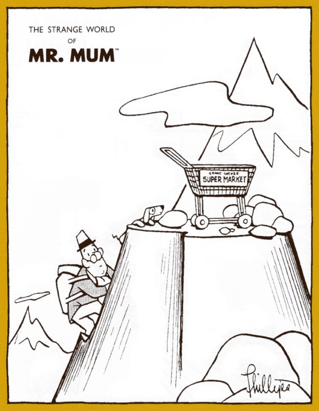
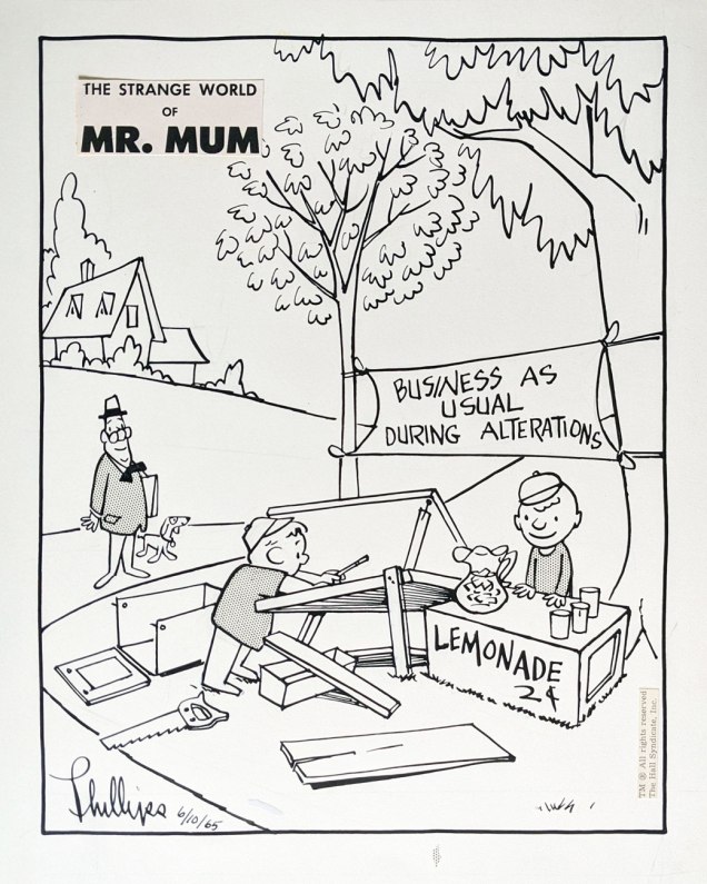
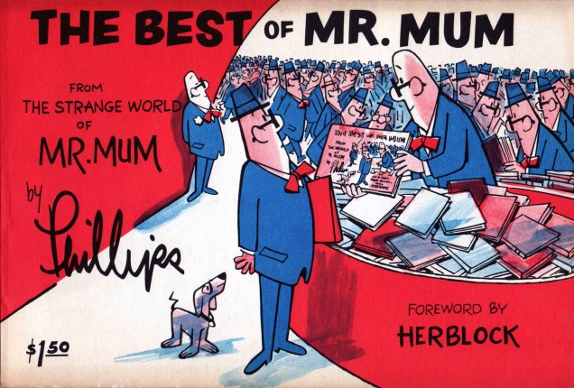
Irv Phillips‘ (1904-2000) Mr. Mum was a comic strip that ran between 1958 and 1974 (at which point both author and alter ego took their well-earned retirement), attaining a quite considerable level of popularity, thanks its appearance in over 180 newspapers in 22 countries or so. The pantomime approach certainly helped sell it abroad. The titular character is a bystander, an eternal witness to… everything and especially anything.
In an interview published in Cartoonist Profiles no. 4 (Fall, 1969; Jud Hurd, editor), we learn that Phillips « ... has been an actor, a violinist, a Hollywood script writer, the Humor Editor of ‘Esquire’ magazine, a playwright, as well as a very successful syndicated cartoonist. » He goes on to reveal that « I didn’t draw until I became Humor Editor of Esquire Magazine in my thirties. I used to make little rough sketches to try to illustrate gags that I had written for the various Esquire cartoonists. I would take these sketches in to Dave Smart, the founder and publisher of Esquire, and together we would make the choices as to which cartoonist would handle one idea best, which man would be best suited to another idea, etc. It seems that these little sketches sort of intrigued Dave for a while and finally he said, ‘Why don’t you try to draw?’ »
While Phillips’ style is deceptively rudimentary (but still distinctive), it’s evident that his years as a gag man taught him the fundamentals: economy, clarity and substance. Here are a few samples drawn from a variety of sources:
Sunday strip from March 2, 1969.I’ve often wondered myself just how certain stray shopping carts arrived at their unlikely destination.The Valentine’s Day Sunday of 1971, as it appeared in print. There’s always something to fret about, isn’t there?The lone Mr. Mum original piece in my collection, it’s the June 10, 1965 daily. It was a Thursday. The artwork is surprisingly large, at 22 x 28,5 cm (8,75″ x 11″). Note the little bit of halftone film stranded outside the frame.During the strip’s run, three collections appeared: this is the first, published in 1960 by Pocket Books.Issued in 1965 by G. P. Putnam’s Sons, this is the second and finest of the collections, its format comfortably allowing the presentation of dailies (two to a page) and Sunday strips. Hell to scan from, though.Finally, The Popular Library brought us the third collection, 1971’s No Comment by Mr. Mum. A slim, unprepossessing volume, it’s nonetheless filled to the brim with great picks.A sample of a card he has given people who have sent him ideas. Phillips said: « Most of the fan mail seems to come from intellectuals and children. When people send in ideas, I send them the card, write them a letter, and if I use the idea, I send them a signed original. »
The Mum aficionado will seek sustenance wherever he can find it, but it helps that in this century, a pair of easy-to-find, affordable print-on-demand collections have seen the light of day. They are Classic Mr. Mum Volume 1 (2010, iUniverse) and The Strange World of Mr. Mum (2011, Empty-Grave Publishing).
One unexpected hurdle that stands in the way of a Mr. Mum revival is that an overwhelming number of Phillips’ originals repose in one man’s private collection. Not to put too fine a point on it, painter Andrew Massullo, though evidently a man of discernment, is hogging all the Mr. Mum original art. In a profile that appears in the San Francisco Chronicle’s website, SFGate, he reveals the appeal and the breadth of his collection:
Mr. Mum Cartoon Collection by Irving Phillips How many: 1,385 –
« It’s like potato chips, you can’t just have one. » Why? The deadpan humor and the beautiful drawing.
« They remind me of my childhood. » From? From his estate and eBay. Any more? « No, I have all I want. »
Ah, that’s probably why I managed to snag one for myself. Let’s hope Andrew, if someone should make the request, will be open to the idea of a definitive Mr. Mum collection. I heartily concur with Mr. Massullo’s verdict on the addictive power of the strip. It vividly brings to mind the québécois adage « Le plaisir croît avec l’usage. » The deeper one delves into Mr. Mum’s oddly comforting universe, the more one appreciates the depth of his brilliance. For a start, scope out this fine selection of strips on Ger Apeldoorn’s ever-excellent blog The Fabulous Fifties. And while you’re at it, sneak a peek at my Christmas-themed ode to this loveable bystander.
« There’s nothing like eavesdropping to show you that the world outside your head is different from the world inside your head. » — Thornton Wilder
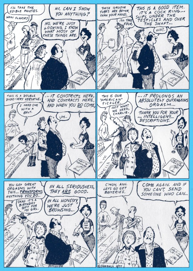
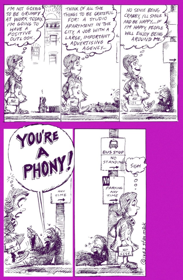
I’ve always been drawn to the more observational areas of cartooning, and Stan Mack (b. May 13, 1936) surely counts among the preeminent practitioners of the form, thanks to his long-running strip (in the pages of The Village Voice for a couple of decades!), Stan Mack’s Real Life Funnies.
Therein was to be found the cartoonist’s bold pledge: « Guarantee: All Dialogue Reported Verbatim ». Oh, it might seem easy, but I’m quite convinced it was anything but.
In point of fact, here’s some insight on Mr. Mack’s modus operandi, from the horse’s mouth:
« Carry a little pad and pencil. Dress to blend in quietly. Get to the destination with enough time to case the joint. It helps to be not too tall, not too short, not too dark, not too handsome, not too ugly, not too old and not too young.
When I arrive, if I find that everybody knows each other, I make a quick exit and forget it. Otherwise, the system continues: smile and keep your ears open. Find the men’s room (always good for a line), find coffee and food, which is very helpful unless you are trying to take notes. Look for a few convenient corners in which to hide. Learn to walk backwards in order to get closer to groups. Learn to stand in the middle of a mob and like it. And, finally, learn to change direction suddenly in order to follow a good line floating by.
Appear preoccupied. If you are engaged in conversation, pay no attention to what you are saying. Say anything. Fake it. You can’t listen and think at the same time. Float through the event. Each has its own particular current. Professional wrestlers and East Side gallery-hoppers move at different speeds.
When I start to draw a strip, I sit with my deadline approaching and a pad full of quotes and doodles. I try to draw the kind of people who actually said the lines.
I don’t know why some comments seem important and others dull, but I know that it isn’t until I begin to edit that material that the story emerges. It’s often a surprise.
It’s the unexpected that makes it work. Therefore it helps to approach everything with an open mind and no preconceptions, whether it involves policemen or transsexuals or frisbee addicts. »
« I hear words I couldn’t make up. I think, ”that’s something I would never have thought of. I’ll just write it down.” I work out of other people’s heads. »
Stan Mack’s Real Life Funnies, The Divorce (March, 1977, The Village Voice).Stan Mack’s Real Life Funnies, An Art Sale in Suburbia (April, 1977, The Village Voice).Stan Mack’s Real Life Funnies, Sex Accessories (October, 1977, The Village Voice).Stan Mack’s Outtakes, The Sting (Adweek, 1983)Stan Mack’s Outtakes, What a Bummer (Adweek, 1983)
Stan Mack’s Chronicles, Up His Alley (The American Bystander no. 7, Winter 2017).
Astute Mack-o-philes (and I’ve every reason to believe that they are astute) might point out that I neglected to bring up the artist’s splendidly surreal early ’70s National Lampoon feature, Mule’s Diner; fear not, its time in the limelight will soon(ish) be at hand, so stay tuned.
« Some men are like flies… without a plan – without direction… they flit restlessly about the world… escaping one danger… and another… only to fall into the spider’s web… » — Bleak’s prospects are grim (Jan. 4, 1948)
Here we are, making our way through Kitchen Sink’s valiant chronological reprinting of Eisner’s post-WWII The Spirit, namely strips from December 1947 to December 1948; still at the peak, with a bit of fatigue on the horizon. At any rate, this particular vintage inspired a score of the master cartoonist’s most sublime new covers… as you’ll witness.
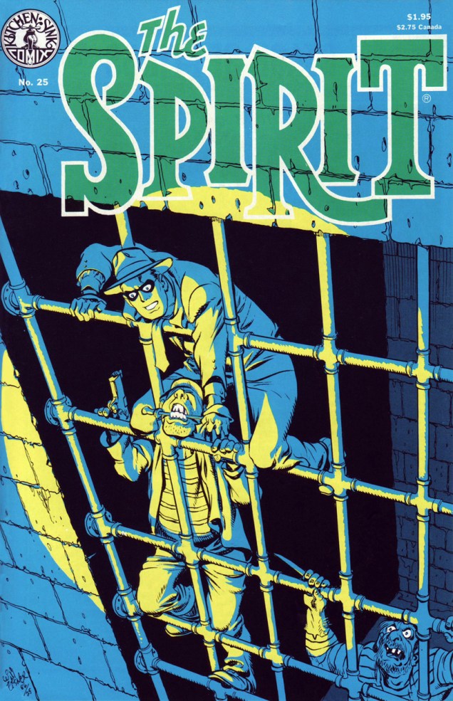
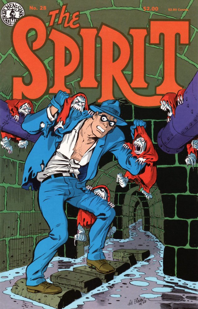
Kitchen Sink Press’ The Spirit no. 25 (Nov. 1986) cover-features Eisner’s famous and much-reprinted jailbreak saga, Slippery Eall (aka ARiver of Crime), originally published on November 30, 1947. The story features inmates bearing the mugs of Eisner studio contributors: letterer Abe Kanegson is Bellows; penciller-inker Jerry Grandenetti is Dapperish; and Eisner himself is Slippery Eall. Also in this issue: Death of Hugo (Dec. 7, 1947), Snow (Dec. 14) and Christmas Spirit of 1947: Joy (Dec. 21). Cover by Will Eisner. Cover colouring by Pete Poplaski.
Speaking of the slammer, Eisner muses sardonically on the cartooning life: « Working in this field is a very, not lonely, but solitary life. All of us come to realize how many hours we’ve been chained to the drawing board. We used to talk in the studio about how if we were sent to jail, it wouldn’t make any difference. We could still turn out comics and our lives would not be a hell of a lot different. »
Here’s that celebrated opening splash, from its appearance in Will Eisner’s 3-D Classics featuring The Spirit no. 1 (Dec. 1985, Kitchen Sink); get those glasses out!
From Dave Shreiner’s ongoing talk with Eisner, published in The Spirit no. 26‘s Stage Settings column: “Eisner has always been a functionalist, rarely a decorative artist producing something for its beauty alone. He is a powerful artist in that nearly every device he uses serves more than one purpose. With a bit of prodding, he took issue with the seemingly prevalent attitude among comic book artists that splash pages serve as a second cover to a story: there for decoration and enticement, but redundant to the story.”
Eisner: « A lot of the artwork done in this field is for a kind of personal satisfaction. It’s used to display artistic muscle, rather than confining itself to an artistic purpose. I believe a lot of artists fear addressing themselves to a purpose because they’re afraid that the showiness, or dazzle dazzle of their artwork, will probably be diminished.
Consequently, they feel the approval level, the applause meter, will fall off somewhat. We’ve talked before about one of the problems facing artists in the comic book field being that their work is judged essentially on the physical appearance of it. It’s the artwork, rather than the content. That fact contributes to comic books being looked down upon. »
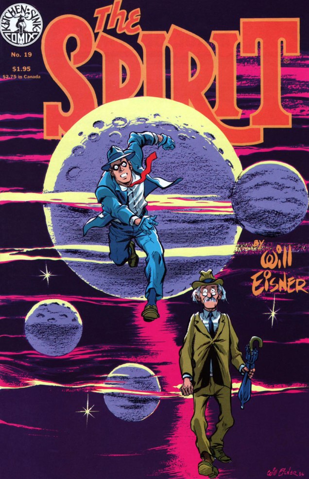
This is The Spirit no. 26 (Dec. 1986), and it brings us ‘Umbrella Handles’ (Dec. 28, 1947); The Name Is ‘Powder’ (Jan. 4, 1948); The Fallen Sparrow (Jan. 11, 1948); and Just One Word Made Me a Man (Jan. 18, 1948). Colours by Pete Poplaski, grey toning by Ray Fehrenbach.This is The Spirit no. 28 (Feb. 1987), and it features Life Below (Feb. 22, 1948); The Return of Roger (Feb. 29, 1948, evidently, like 2020, a leap year); The Strange Case of Mrs. Paraffin (Mar. 7, 1948); and War Brides (Mar. 14, 1948). Colours by Pete Poplaski, grey toning by Ray Fehrenbach.
On the subject of the inspiration behind cover-featured Life Below, Eisner explains: « I was trying to find a unique, or exciting and startling setting within a normal situation. It always intrigued me that cities, particularly New York City, had miles and miles of catacombs under the streets. People doing city stories frequently overlook the potential of them. Underneath the city are layer after layer of story material. »
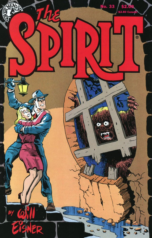
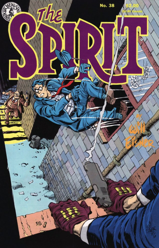
This is The Spirit no. 31 (May 1987), featuring The Last Hand (May 16, 1948); Assignment: Paris (May 23, 1948); The Emerald of Rajahpur (May 30, 1948); and The Guilty Gun (June 6, 1948). Colours by Pete Poplaski, grey toning by Ray Fehrenbach.This is The Spirit no. 33 (July 1987), featuring The Springtime of Dolan (July 11, 1948); Barkarolle (July 18 1948); cover-featured The Thing (July 25th, 1948), an adaptation of Ambrose Bierce‘s short story The Damned Thing and quite the Jerry Grandenetti showcase; and The Eisner Travel Agency (Aug. 1st, 1948). Cover colours by Dave Schreiner.This is The Spirit no. 35 (Sept. 1987), comprising cover-featured The Story of Gerhard Shnobble (Sept. 5, 1948); Cache McStash (Sept. 12, 1948); Lorelei Rox (Sept. 19, 1948); and Ace McCase (Sept. 26, 1948). Cover colours by Ray Fehrenbach. That poor Mr. Schnobble (the little flying guy with the grin and the bowler hat)… his is among the most tragic fates in comics.This is The Spirit no. 36 (Oct. 1987), and it brings cover-featured Tooty Compote (Oct. 3, 1948); Gold (Oct. 10, 1948); Nazel B. Twitch (Oct. 17, 1948); and Pancho de Bool (Oct. 23, 1948). Cover colours by Ray Fehrenbach. Striking shadow effects: the KS production team sure knew how to make the most of the relatively primitive mechanical means at its disposal.This is The Spirit no. 37 (Nov. 1987), and it hits us with Halloween (Oct. 31, 1948); cover-featured Plaster of Paris (Nov. 7, 1948); The Chapparell Lode (Nov. 14, 1948); and Quirte (Nov. 21, 1948). Cover colours by Ray Fehrenbach. Note the witty symmetry of the matching KS logo, top left.This is The Spirit no. 38 (Dec. 1987), which lands expertly and rolls with The Amulet of Osiris(Nov. 28, 1948); cover-featured The Coin (aka Stop the Plot!, Dec. 5, 1948), an action-packed humdinger featuring the return of The Octopus; Two Lives (Dec. 12, 1948); and Christmas Spirit of 1948 (Dec. 19, 1948). Cover colours by Ray Fehrenbach. A dizzying honey of a cover.
Past this juncture, the strip’s slow, inexorable decline commences, and the covers reflect that fact. But not to worry: Eisner was a consummate pro, and the rest of the run is not without its gems. Besides, I’ll be cherry-picking ’em for you.
If you’ve just arrived at the intermission, fret not: take your seat and relax, here’s what you missed so far :
… or point your clicker on our general category, That’s THE SPIRIT!, and summon the lot at once… but in reverse chronological order; that’s the minute toll this dab of convenience exacts.
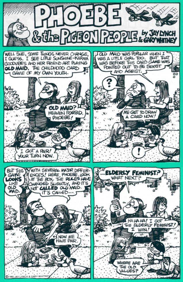
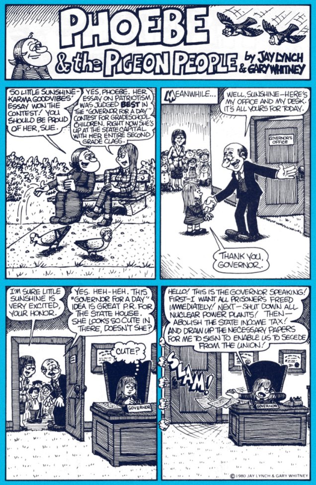
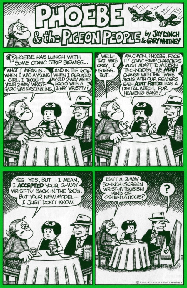
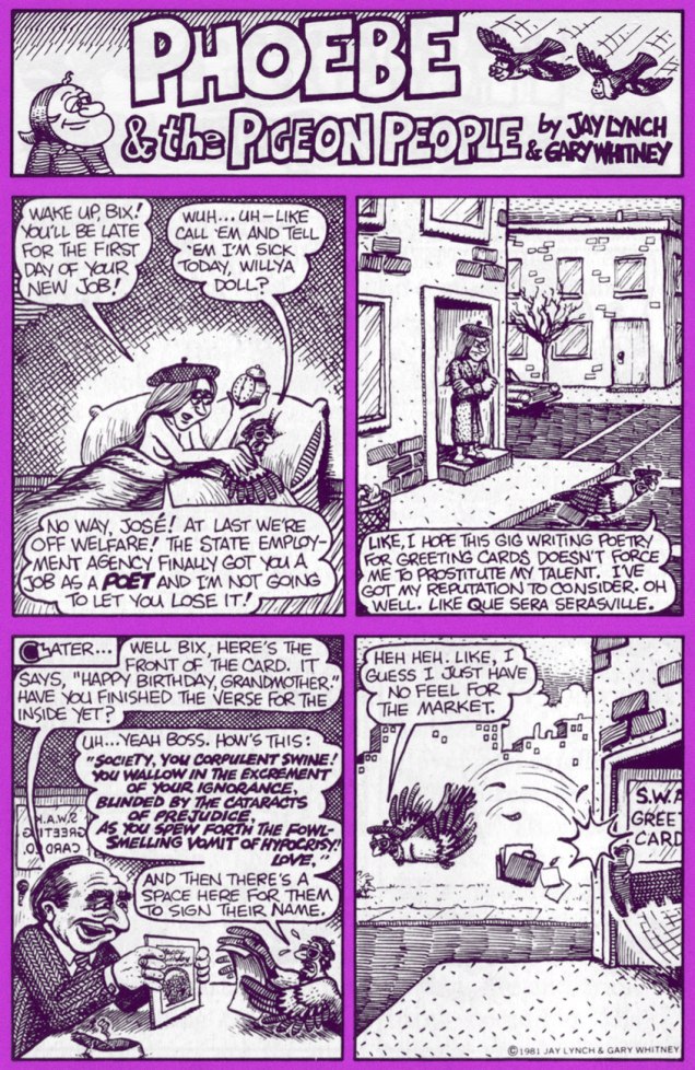
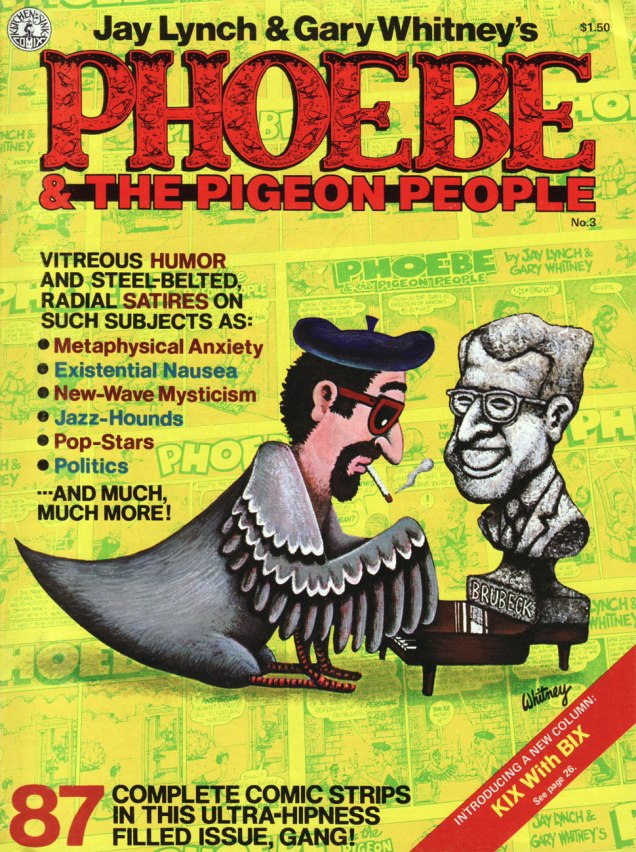
Today, we’ll shine a light upon his epochal comic strip Phoebe and the Pigeon People. Here’s how it was hatched:
« In April 1978, Lynch teamed up with cartoonist Gary Whitney to produce weekly Phoebe and the Pigeon People strips. Lynch wrote them and Whitney drew them. “It was very easy and it got us invited to cocktail parties”, said Lynch. “We wanted to do a strip that would appeal to secretaries, rather than a strip that would appeal to the comic fan type person.”
« Lynch and Whitney launched a stage show based on the characters, called When Cultures Collide, with an improvisational theater troupe, The Practical Theater. The performance included a battle of the bands between rock and new wave musicians. » (quoted from Ink & Anguish, a Jay Lynch Anthology, 2018, Fantagraphics)
P&TPP was another one of those captivatingly freewheeling features that popped up during the heady heyday of alternative weeklies. A while back, we devoted a post to Tom Hachtman‘s Gertrude’s Follies, which bloomed in a similarly unlikely fertile milieu. In Phoebe’s case, The Chicago Reader was the publication it called home during its impressive 1978-1996 run.
A 1982 poster for the event in question. Art by Gary Whitney.
For a few years now, they’ve (in this case, a shadowy outfit vaguely named “Alternative Comics“) been promising us a Phoebe collected edition. We’re still waiting. Hey, if the publisher needs more time to do the job right, so be it… but expectations are accordingly high.
Amazon’s blurb is an ominous portent: « The under-achieving Phoebe and friends hang out with beatnik people-headed jazz-loving beat-philosophy cooing pigeons in a park in Chicago. »
Uh, not even close. Here are a few highlight from the strip’s first four years, pulled from the pages of Kitchen Sink’s valiant three-issue run (1979-81); read these selections and you’ll know more about the strip than whoever wrote that blurb. You’re welcome!
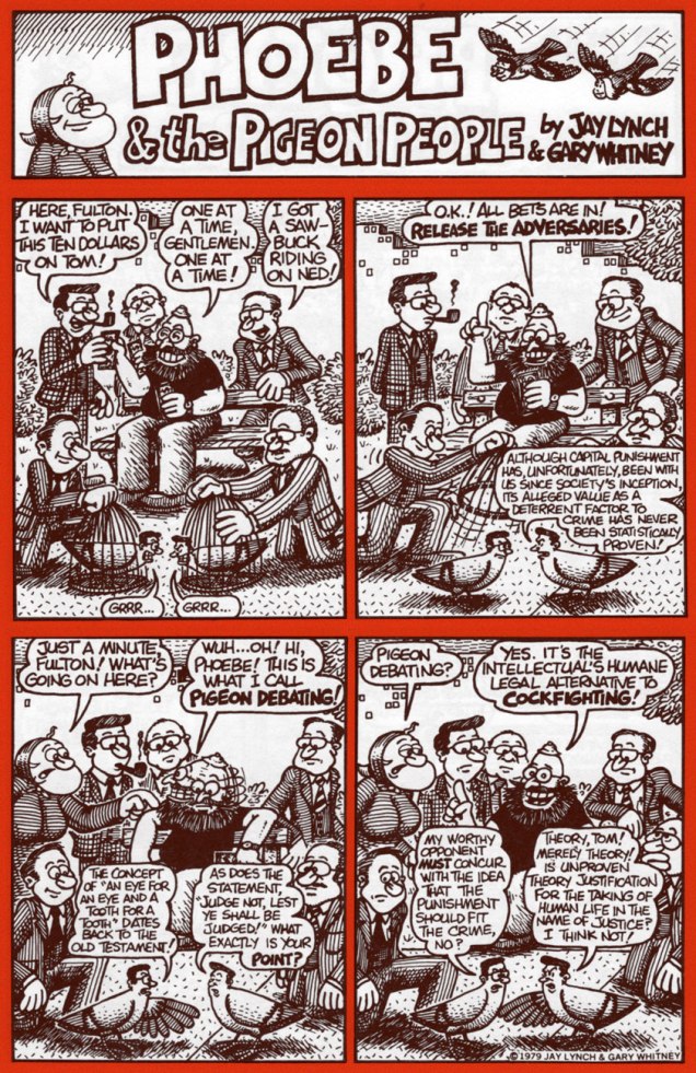
Phoebe & The Pigeon People no. 2 (May 1980, Kitchen Sink).
Clearly, these strips are so rooted in their time period that they retain no relevance whatsoever to today’s world and its social and political mores.
Ah, politicians: Plus ça change, plus c’est la même chose. I’d love to see some of our finer young minds take a crack at such an opportunity. One can still dream, right?In Phoebe’s world, there was always plenty of room for the meta-contextual.
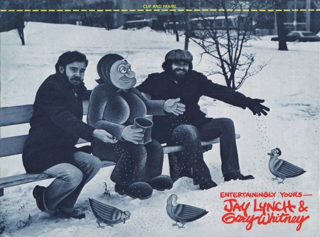
This is the magazine-size Phoebe & The Pigeon People no. 3 (July 1981, Kitchen Sink). Until the omnibus arrives, this is your best bet. Read the run right here, friends!Our loveable auteurs and some of their cast, enjoying the Chicago winter. That’s Mr. Lynch on the left, Whitney on the right.
I particularly love the strip’s anything-for-a-joke ethos: as was Lynch’s wont, he ran the gamut from lowbrow to highbrow, from squeaky-clean to salacious, from sunny side up to scrambled. Let’s face it, that bizarre premise would have challenged and defeated most would-be humourists within a few weeks, let alone a decade-and-a-half.
Jay Lynch, dapper elder, as he appears in the short film There’s Something Weird About Jay Lynch (2014, filmed and edited by John Kinhart). Watch it here!
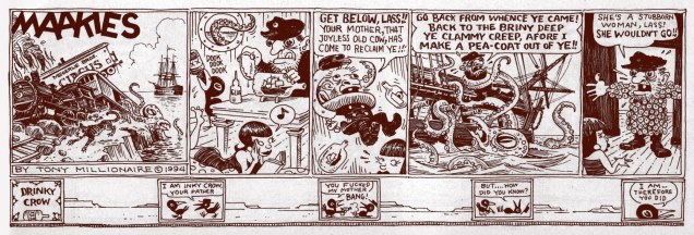
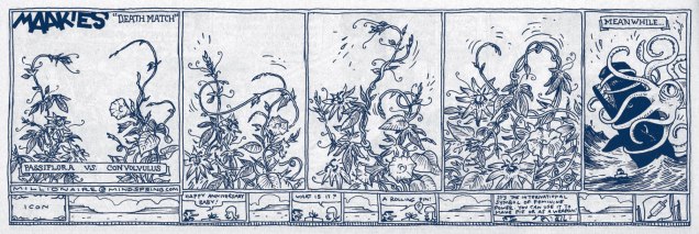
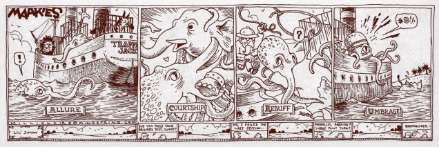
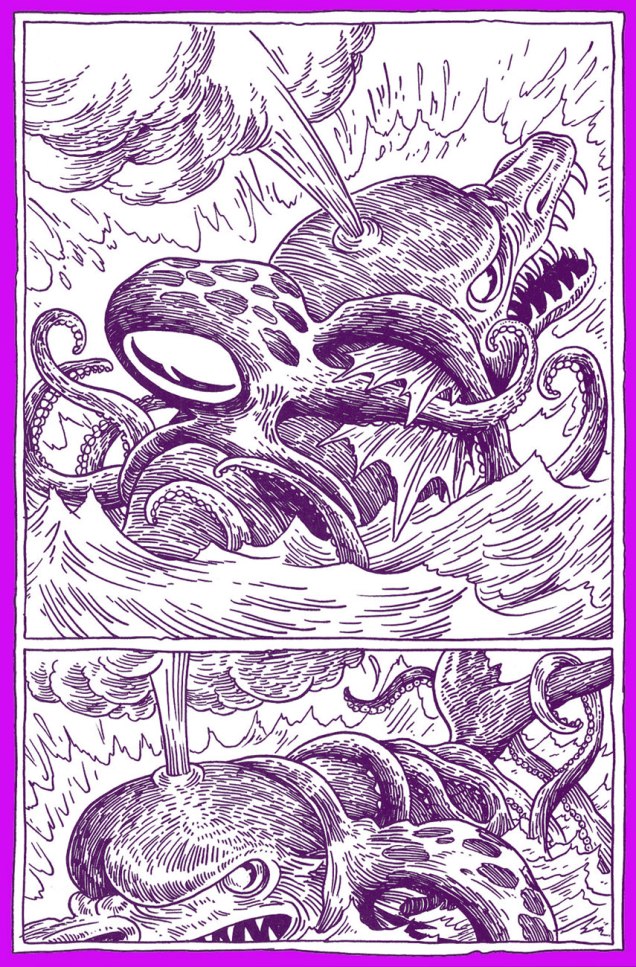
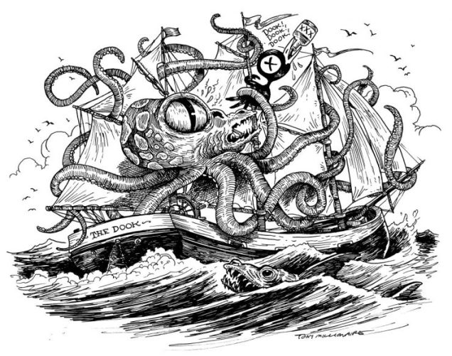
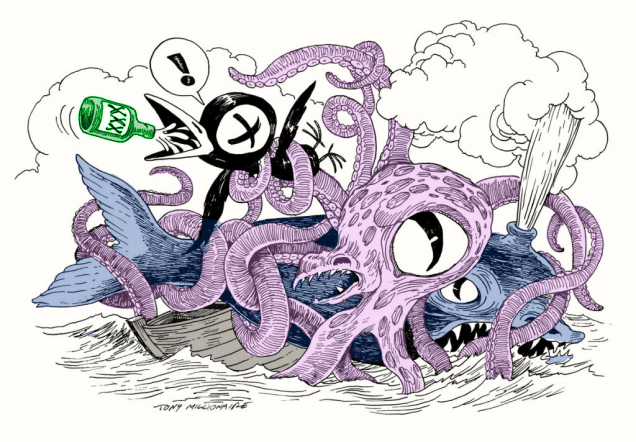
Once upon a time, in a kingdom beyond the seven seas, a little boy lived under the name of Scott Richardson in a seaside town (let’s call it Gloucester and pretend it’s in Massachusetts). His whole family were artists, and he would watch his grandparents paint the sea, the ships that sailed it and the people who commanded the ships. It must have come as no surprise at all when the boy, too, started to draw. Eventually, he grew up, moved around a lot, almost started a major war and somewhere along the way, acquired the nom de plume of Tony Millionaire (which, according to him, « comes from Old French. It means a person who owns a thousand slaves. Serfs, not slaves. »
How’s that for a little fairytale? You will forgive me for the jejune introduction, but something about Millionaire’s art is magic. It is easy to underestimate how good an artist he is because his art is so cartoony, and his characters so outlandish: his award-winning, syndicated strip Maakies, for instance, concerns itself with a perpetually blotto stuffed crow (Drinky Crow) and his best pal, a sock monkey (Uncle Gabby). Both were TM’s childhood toys. All children make up stories about their playthings. What’s magic isn’t that he was able to create a world for his toys to inhabit, it’s that he was able to pull us, the audience, in with him.
His art is also stunning on a purely technical level: the impeccable geometry of his Victorian houses, the zest of his epic battle scenes (often between a whale and a kraken, it should be noted), the lushness of the gardens inhabited by fairies, gossiping insects having tea, and mice with puritanical sensibilities.
A couple of other things about Tony Millionaire: he’s really funny (or “drunkenly charming”, if you prefer; read his interview with John F. Kelly from 1999), and he clearly loves drawing tentacles, gleefully sticking them hither and tither. He’s clearly long overdue for an inauguration into the elite hall of Tentacle Tuesday Masters. I’m not here to provide you with hard facts about when and how, either about the newspaper strip Maakies or about the comic series Sock Monkey. You can get that from elsewhere. But I do believe that this is the only website where you can get your tentacle fix *and* your TM fix all at once (courtesy of co-admin RG who did all the scanning work!)
Anyway, enough of this chit-chat, and let the tentacles abound!
« Maakies is me spilling my guts… Writing and drawing about all the things that make me want to jump in the river, laughing at the horror of being alive. »
As fun as Maakies are, I find that one gets weary of them quickly – they’re like chips that burst with flavour to the point of causing desensitization. I believe that Sock Monkey is where Millionaire really gets to shine; I fondly remember being bowled over by Sock Monkey: the Inches Incident, in which TM really put his nautical sensibilities to use. The other books from this series only reinforced this impression – the art was so much lusher, and the moral complexity of these stories made each tale bittersweet. The artiste himself summarized it well, stating that « Sock Monkey is me trying to rise above all that bullshit, to be more poetic, looking at the bright side, remembering the things that used to delight me as a child. At the same time, the main theme to all the Sock Monkey books is the crashing of innocent fantasy into bone-crushing reality. »
Fantagraphics published a full collection of Sock Monkey strips, but you can also read three of them right here online. I would of course strongly suggest supporting the publishing house and the author by purchasing the book, but what kind of high moral ground can it be if one is not offered a choice?
« See? Brute force triumphs after all!!! » — Mr. Fly (Jan. 11, 1942)
While Kitchen Sink’s ambitious chronological gathering of Eisner’s post-WWII The Spirit was intended to clean up and organize the series after decades of random, piecemeal reprinting, it was still a bit of a mess, at least early on. The methods of reproduction varied from issue to issue, and even within issues: three of four of issue one’s stories carry the original newspaper shadings, while one (« Hildie ») is newly-coloured and grey-toned. However, the folks at KSP can’t be faulted for this chaos: it all hinged upon which stories’ original line art remained in existence. Through it all, the publisher remained commendably hopeful but realistic and honest about the prevailing realities and conditions.
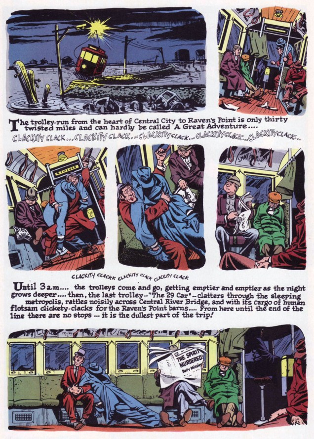
This is The Spirit no. 1 (Oct. 1983, Kitchen Sink). Colours by Pete Poplaski, grey toning by Ray Fehrenbach. Four tales are featured: The Christmas Spirit (Dec. 23, 1945), by Eisner and John Spranger; Dead End (Dec. 30, 1945), by Eisner, Spranger and Bob Palmer; Hildie (Jan. 6, 1946), by Eisner and Alex Kotzky; and Dolan’s Origin of the Spirit (Jan. 13, 1946), by Eisner, Spranger and Palmer.This is The Spirit no. 4 (March 1984, Kitchen Sink). Colours by Poplaski, grey toning by Fehrenbach. Four stories within, all by by Eisner, Spranger and Palmer: Nylon Rose (Mar. 17, 1946); The Last Trolley (Mar. 24, 1946); Yafodder’s Mustache (Mar. 31, 1946); and The Kissing Caper (Apr. 7, 1946).Here’s a fine example of the careful colour work executed by grey tinter Poplaski and colourists Fehrenbach (in this case) and Mike Newhall, taking evident pains to avoid overwhelming Eisner’s detailed line work. In terms of old-fashioned colouring, this was a notch (or seven) about what was being done in mainstream comics in the 1980s, a period of technological changes, of magnificent highs and painful lows. This is page two of noir classic The Last Trolley (Mar. 24, 1946), from The Spirit no. 4.
The colour question elicited ever-churning controversy and budgetary woes in the face of steadily diminishing sales. By issue 9, the custom colouring was abandoned to make way for the rather more economical, but muddy laser-scanning of original Spirit sections, and an extra story was added to issues 10 and 11; then inside colour was jettisoned for good, with gray toning retained. But issue size was reduced to 6 1/4” x 9 3/4″ (as opposed to the traditional comic book format, which is, as we all know, 6 5/8″ x 10 1/4″) for issues 12-16.
Denis Kitchen sums up the situation very aptly, circa issue 4, late in ’83:
« … the current color comic market demands a more sophisticated reprinting of these stories. There is nothing sacred about the original color. Though Eisner experimented boldly with color, he generally left coloring to assistants, and much of it was handled in a pedestrian manner.
We shoot these stories, where possible, from original art in Will Eisner’s archives. Where stats, negatives silverprints or other proofs are the only source, we use the best existing copies. Our colorists, where possible, use the original sections as color guides and are concerned with authenticity and precedent. Color changes, gray tones and other ‘augmentations’ are made with the approval of Will Eisner. »
This is The Spirit no. 11 (Aug. 1985, Kitchen Sink). For this final colour issue, five stories, all by by Eisner, Spranger and Palmer: The Haunt (Oct. 27, 1946); Beagle’s Second Chance (Nov. 3, 1946); Caramba (Nov. 10, 1946); Return to Caramba (Nov. 17, 1946) and Coot Gallus (Nov. 24, 1946)This is The Spirit no. 17 (Mar. 1986, Kitchen Sink). Colours by Poplaski, grey toning by Fehrenbach. Four stories within, all by Eisner and Jerry Grandenetti: Be Bop (Apr. 20, 1947); Ev’ry Little Bug (Apr. 27, 1947); The Fix (May 4, 1947), and The Fortune (May 11, 1947).This is The Spirit no. 19 (May 1986, Kitchen Sink). Colours by Poplaski, grey toning by Fehrenbach. Four stories await within, each by Eisner, Grandenetti and letterer Abe Kanegson: Black Gold (June 15, 1947); Hangly Hollyer Mansion (June 22, 1947); Whiffenpoof!! (June 29, 1947), and Wanted (July 6, 1947).This is The Spirit no. 22 (Aug. 1986, Kitchen Sink). Colours by Poplaski, grey toning by Fehrenbach. Presenting a quartet of tales by Eisner, Grandenetti and Kanegson: A Killer at Large (Sept. 7, 1947); Into the Light (Sept. 14, 1947); End of the SS Raven (Sept. 21, 1947), and Orson Welles lampoon UFO (Sept. 28, 1947).
If you’ve just caught us mid-swing, nothing to worry about: earlier entries are at your beck and call as follows :
… or point and click on our general category, That’s THE SPIRIT!, and beckon everything at once… but in reverse chronological order; that’s the price you pay for convenience.
Greetings! Today we take another foray (I started with Tentacle Tuesday: the Many-Armed Tentacle Strip) into (modern) newspaper strips. It’s easy to assume that everything published in your paper’s comics page is drivel, but there’s some reassuring exceptions to this rule.
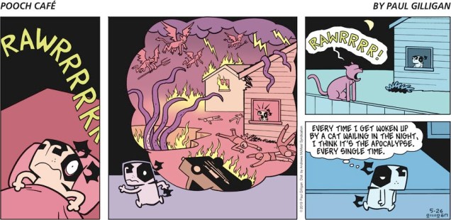
First, we have Canadian Pooch Café, around since 2000. One wouldn’t think that a strip about a dog (Poncho, the terror of the neighbourhood) and its owners and friends would have tentacles in it, but it does, much to my delight.
The fish in the bowl (named Fish) is a recurring character, cohabiting (and occasionally having his life and safety threatened by) Poncho.All cats in this strip are purple and are indistinguishable one from another.
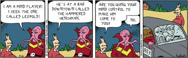
Scary Gary, by Mark Buford, follows the everyday tribulations of a 700-hundred year old vampire who’s gone quite soft and suburban. The most excitement he can hope for is purchasing a new bag of chips… on the other hand, his henchman Leopold’s life is a whirl of nefarious, villainous schemes and ploys.
In case you didn’t know what a mind flayer is, it’s the same thing as an illithid 😉
My colleague has talked in detail about a certain crotchety witch in Growing Old Gracelessly With Broom-Hilda, so I’ll just leave this one strip here (and politely inquire why Broomie thinks that the octopus isn’t good enough to cuddle with, huh, HUH??)
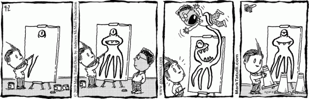
Mark Tatulli’s Lio is a riot of tentacles, given that Lio’s best friend is a giant squid. All of it is pretty fun, but once in a while I’m so charmed that I save the strip to my computer. Here are some of those saved, favourite strips:
No doubt Dr. Zoidberg would rush towards the seafood buffet offer with similar speed. Or is Ishmael just angry for friends of his that have been fried?
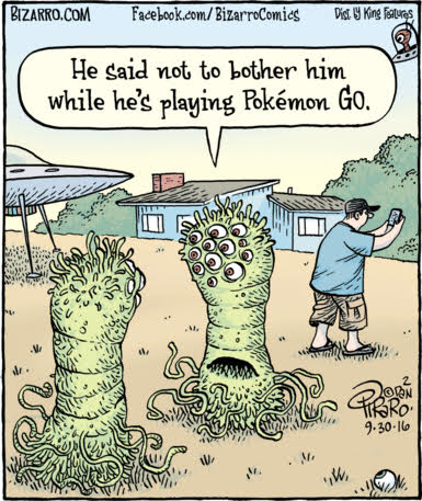
Bizarro – ah, to be able to rely on something that’s still good some thirty-plus years later -, has already had a Tentacle Tuesday of its own (see Let’s Get Bizarro), but since then I’ve accumulated a few extra strips.