« That’s the conditions that prevail! » — Jimmy Durante
Today, we salute noted vaudevillian, piano player, comedian, singer, film and radio star, raconteur and unlikely comics legend James Francis “Jimmy” Durante, born on this day, February 10, in 1893 (as it was a Friday, the family presumably fasted or had fish for dinner). He truly was a master of all media, as you’ll witness.
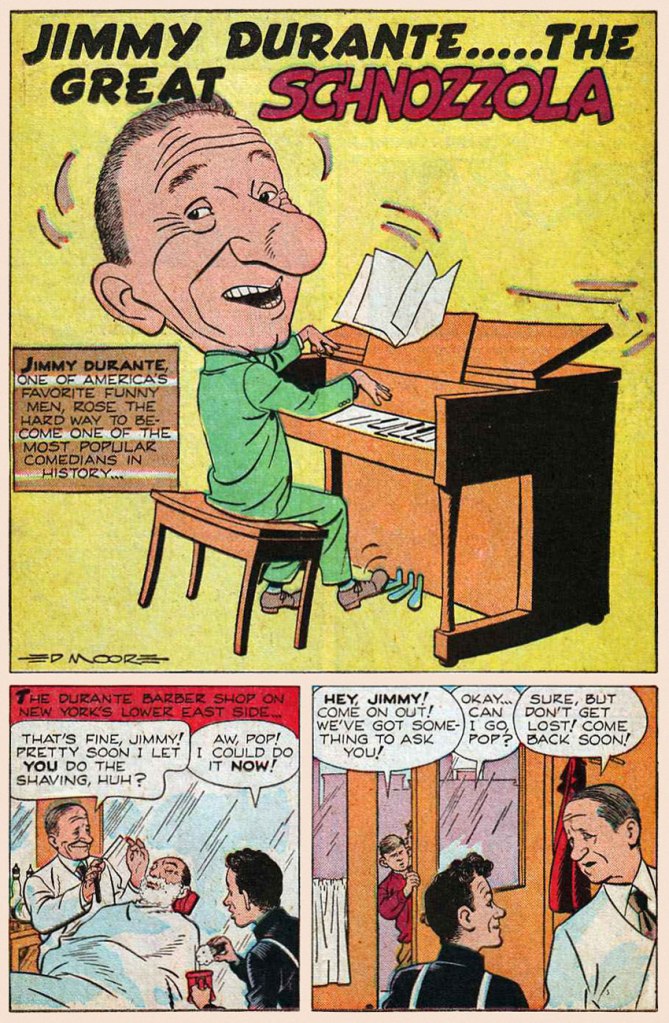
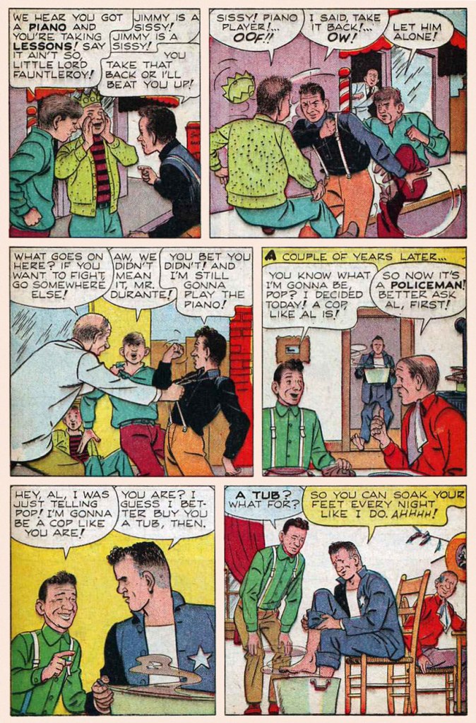
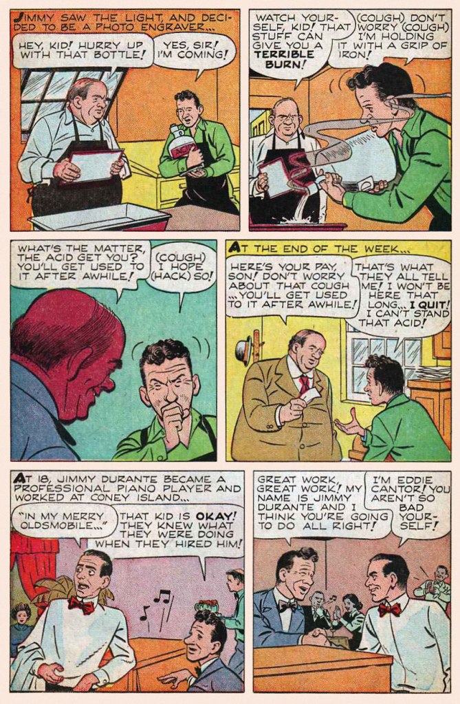
This early bit of biography appeared in Juke Box Comics no. 4 (Sept. 1948, Eastern Color); it was illustrated by Ed Moore. Hear Cantor and Durante reminisce about their early days on this 1947 episode of The Jimmy Durante Show.
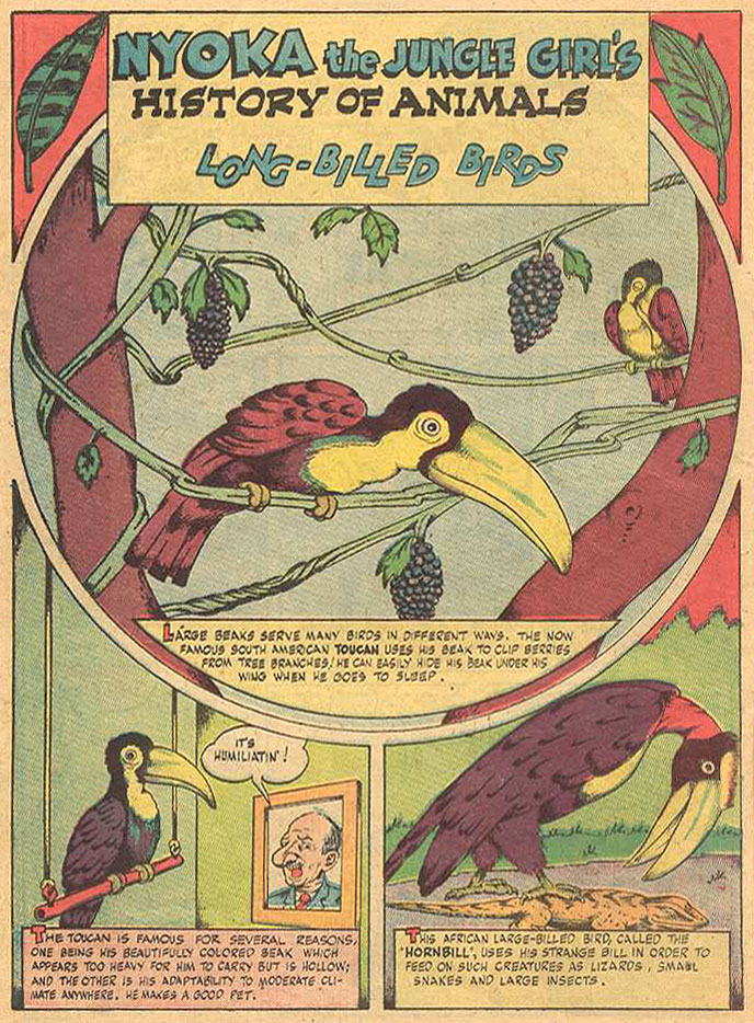
A passing mention of old Jimmy, from Nyoka the Jungle Girl no. 24 (Oct. 1948, Fawcett). Writer and artist unknown.
An early cover by Dick Ayers (1924-2014), this is Jimmy Durante Comics no. 1 (Oct. 1948, Magazine Enterprises).
The second and final issue of Jimmy Durante Comics (Winter 1948-49, Magazine Enterprises).
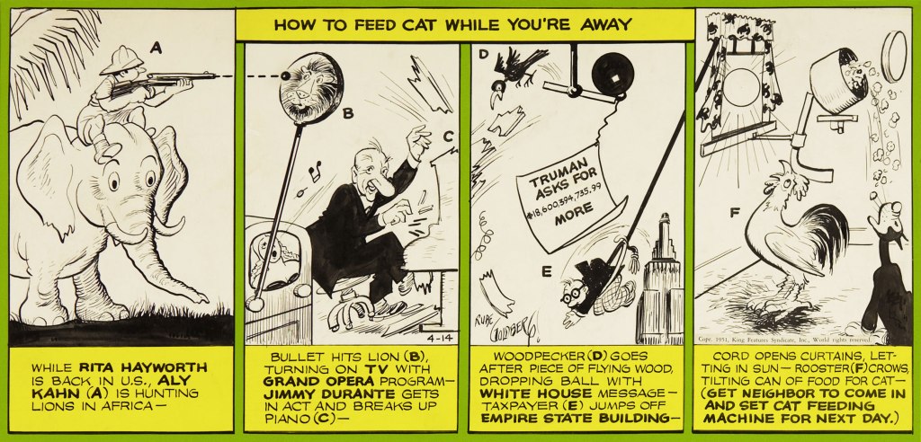
Mr. Durante rates a smashing musical appearance in this Rube Goldberg Device daily strip (Apr. 14, 1951, King Features Syndicate)… by Rube Goldberg, naturally.
And here’s the Shnozzola in the midst of a carnal melée of his fellow Old Hollywood legends (can you name them all, cinephiles?) This is Bill Griffith‘s cover for The Tiajuana Bible Revival Volume Two: Under the Stars in Hollywood (1977, Hooker, California: Paramounds Prod.). This was « An anthology reprinting 1930’s Tijuana Bibles, some of which were obscene parodies of popular newspaper comic strips of the day. Others made use of characters based on popular movie stars and sports stars of the day, such as Mae West and Joe Louis, sometimes with names thinly changed. Before the war, almost all the stories were humorous and frequently were cartoon versions of well-known dirty jokes that had been making the rounds for decades. » [ source ]
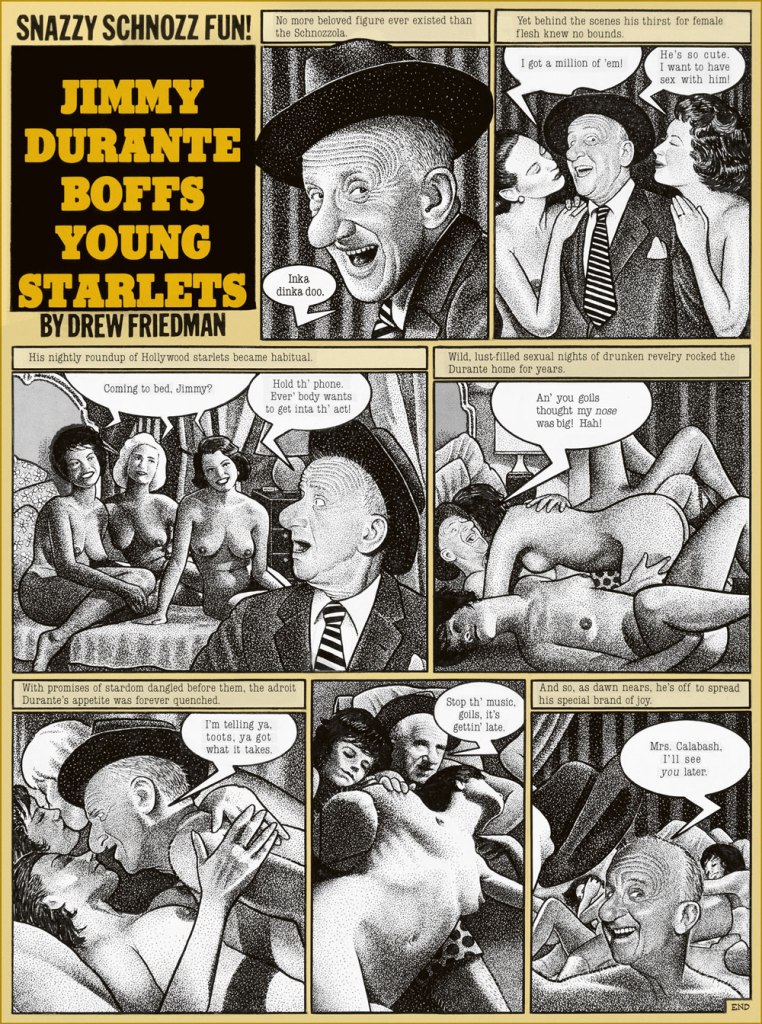
Pointillist-satirist Drew Friedman‘s immortal Jimmy Durante Boffs Young Starlets first saw print in National Lampoon vol. 2 no. 78 (Jan. 1985).
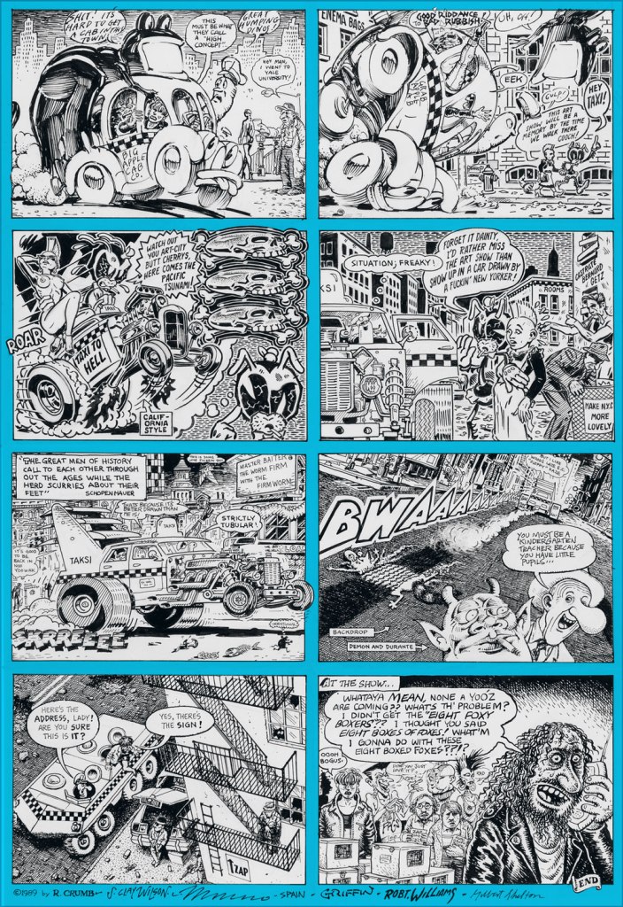
Durante briefly pops up (with the Checkered Demon!) in the second half of a truly all-star underground comix jam involving R. Crumb, Steve Clay Wilson (1941-2021… he left us just three days ago, aged 79… RIP), Victor Moscoso, Spain Rodriguez, Rick Griffin, Robert Williams and Gilbert Shelton. It appeared in Zap Comix no. 12 (1989, Last Gasp). Cartoonists are generally fond of the Schnozzola, but Underground cartoonists are just mad about him.
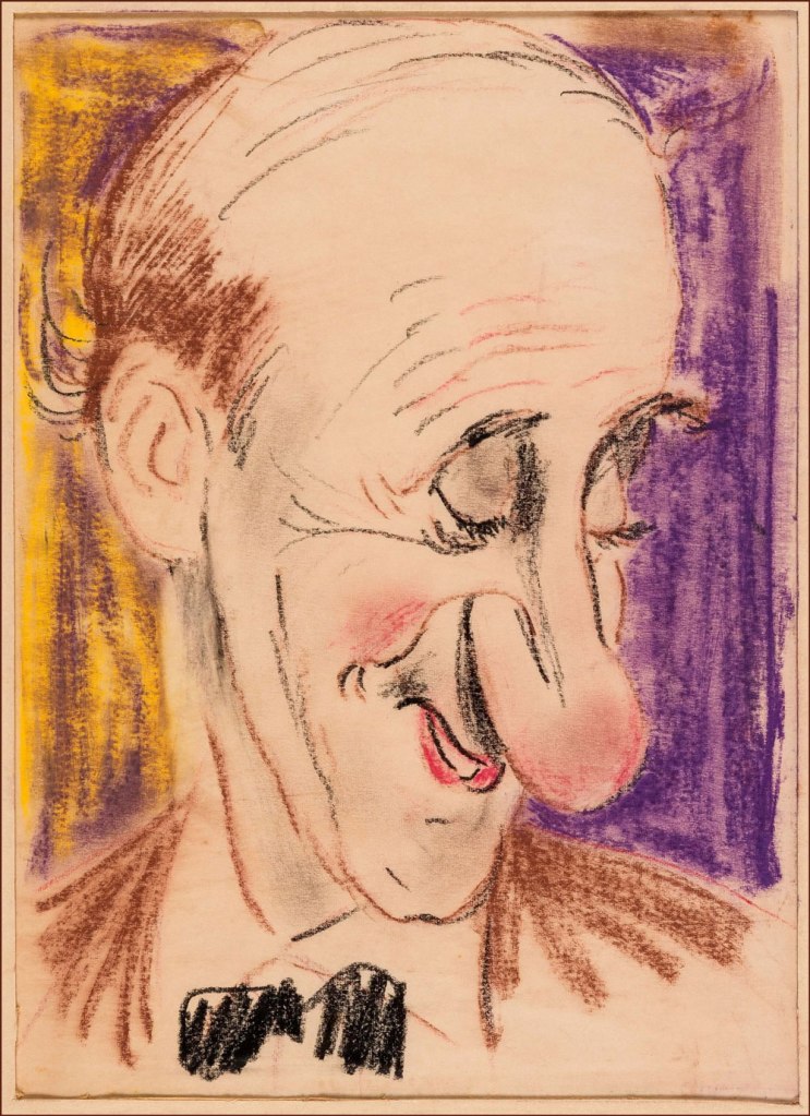
And finally, on a gentler note… here’s a clearly affectionate caricature (a preliminary sketch) of the esteemed Signor Durante (aw, he’s blushing!) by the amazing Sam Berman (crayon on onionskin paper, 1947). Berman (1907-1995) was, deservedly, quite a big deal in his day; as the erudite Drew Friedman told Print Magazine in his quality of co-curator of the 12 Legendary Caricaturists You’ve (probably) Never Heard Of exhibition at NYC’s Society of Illustrators, Berman « was indeed famous and celebrated in his day. Beginning his career in the late 1930s, he created iconic sculpted caricature covers for Esquire featuring their new mascot “Esky” (created by Berman) for an entire year. He created the sculpted caricatures of the leading actors (Fredric March, Carole Lombard, etc.) for the opening titles of the 1937 classic screwball comedy Nothing Sacred, did huge amounts of work for all the top magazines and newspapers of the day, including for Mark Hellinger’s popular column, created close to 60 amazing full-color portraits for the 1947 booklet The NBC Parade of Stars, drew children’s books, and arguably his most famous creation, the opening caricature of Jackie Gleason rising over Brooklyn for “The Honeymooners,” although he was never credited on the show for drawing that image, nor in any books. He then inexplicably went into map-making and faded quietly into obscurity. »
« If you’re having a bad day, catch a wave. » — Frosty Hesson
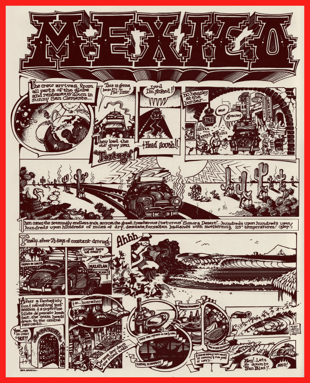
How do you cool down in a heatwave? In this household, when the temperature soars and drags the humidity along, we reach for a soothing surfing movie, preferably one by peerless surf auteurBruce Brown* (1937-2017). Last week, it was his 1959 opus, Surf Crazy, in which a group of SoCal surfers venture down to unsurfed Mexico, which in turn called to mind “Mexico“, an early ’70s underground two-pager recounting a similar sojourn.
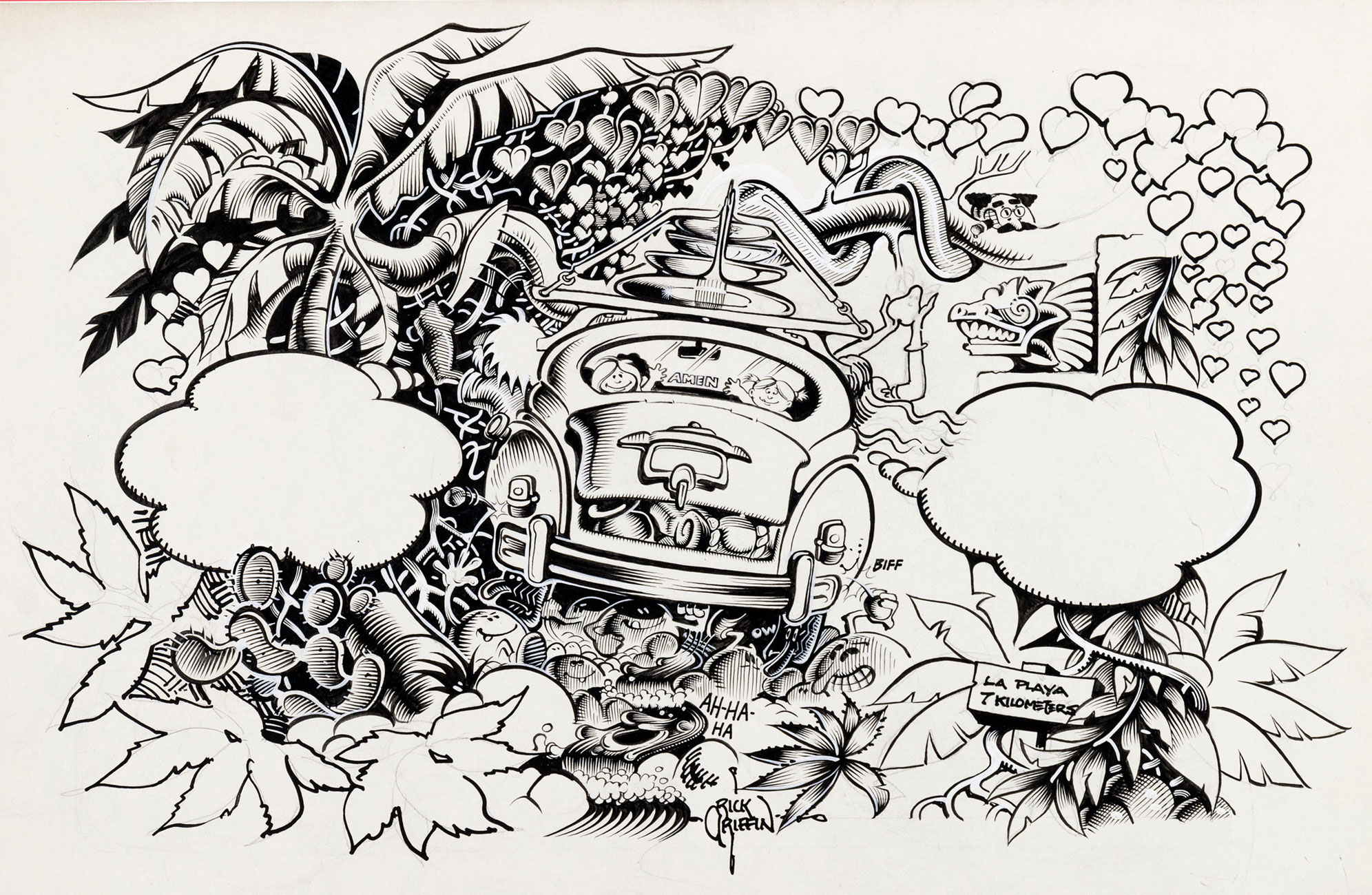
Which, this nominally being a comics blog, leads us to the one and only artiste embodying and straddling both the underground cartoonist’s and surfer’s ethos, Rick Griffin!
An early Griffin collection, Surfer Toons (1964, John Severson), featuring his early creation, Murphy, likely inspiration for notorious jewel thief Murph the Surf‘s sobriquet.
A bio of the young surfer-cartoonist from The Surfer vol. 3 no.3 (Aug.-Sept. 1962). The photo confirms that his Murphy strip was autobiographical.
« In 1964, a serious car accident left Rick unable to work for several months. Later that year, Surfer started a new series titled The Adventures of Griffin and Stoner. They were make-believe surf trips that Ron Stoner, a famous surf photographer, and Griffin were supposed to have taken around the world. » Stoner’s real-life adventures, however, were not so happy.
In this mid-to-late-60s illustration, we witness early signs of Griffin’s mature, more assured line. A simplified version of this piece would appear in The Surfer‘s March, 1972 issue.
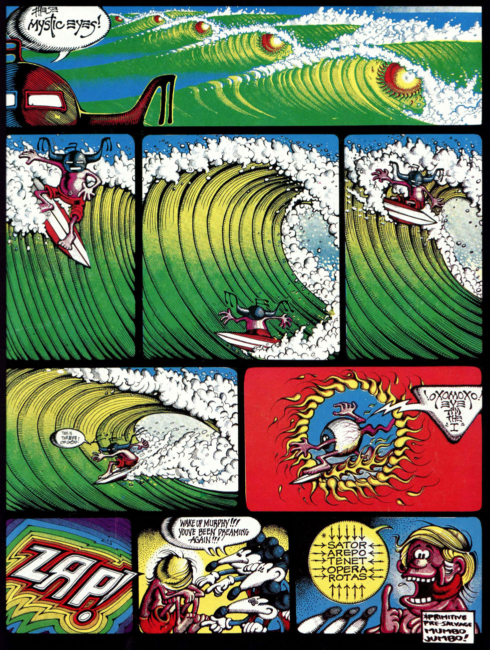
Griffin’s tour-de-force adaptation of Them’s Mystic Eyes appeared in an issue of The Surfer in 1970. Witness how Griffin’s depiction of Murphy has evolved over the decade. The fancy helmet is a Hopi Indian ceremonial mask, a frequent artifact and motif in the artist’s subsequent œuvre. Weedy song, imho — and yet, meaning is where you find it.
Also from 1970: Griffin created this piece for his patron John Severson‘s surf documentary Pacific Vibrations, (in which he also appeared!) and it provides a fine example of Griffin’s matchless lettering**. And there’s that Hopi mask again. Though it was quite a popular poster in the 1970s, If you ask me, though, accomplished as it is, it utterly fails to evoke surfing.
Tales From the Tube, as it originally appeared in 1972, inserted into an issue of Surfer Magazine (Vol. 12 no. 6); some copies exist separately, however. Also to be found within its pages: Roberts Crumb and Williams, Steve Clay Wilson, Bill Odgen, Glen Chase and Jim Evans.
TFTT was later reissued (now with a price) in the regular comix format by The Print Mint. As you can see, Griffin reimagined and re-separated his colours. Which version do *you* prefer?
Visual splendour, not coherence, was always Griffin’s stock-in-trade. And why not? This travelogue premiered in Tales From the Tube.
More poster (and soundtrack) artwork for surfing documentaries, this time 1972’s Five Summer Stories and its 1976 sequel, Five Summer Stories Plus Four, directed by Greg MacGillivray, a prolific, award-winning director and cinematographer to this day.
… another Tales From the Tube, another Surf doc affiche from ’76. « This film and the other surf films for which Griffin has done posters are not usually shown on the regular movie circuits. Their soundtracks are usually composed of rock music of various forms – soft to hard – with a few breaks for narration. The surfing scene throughout the world has grown large enough to support the production of many films each year. »
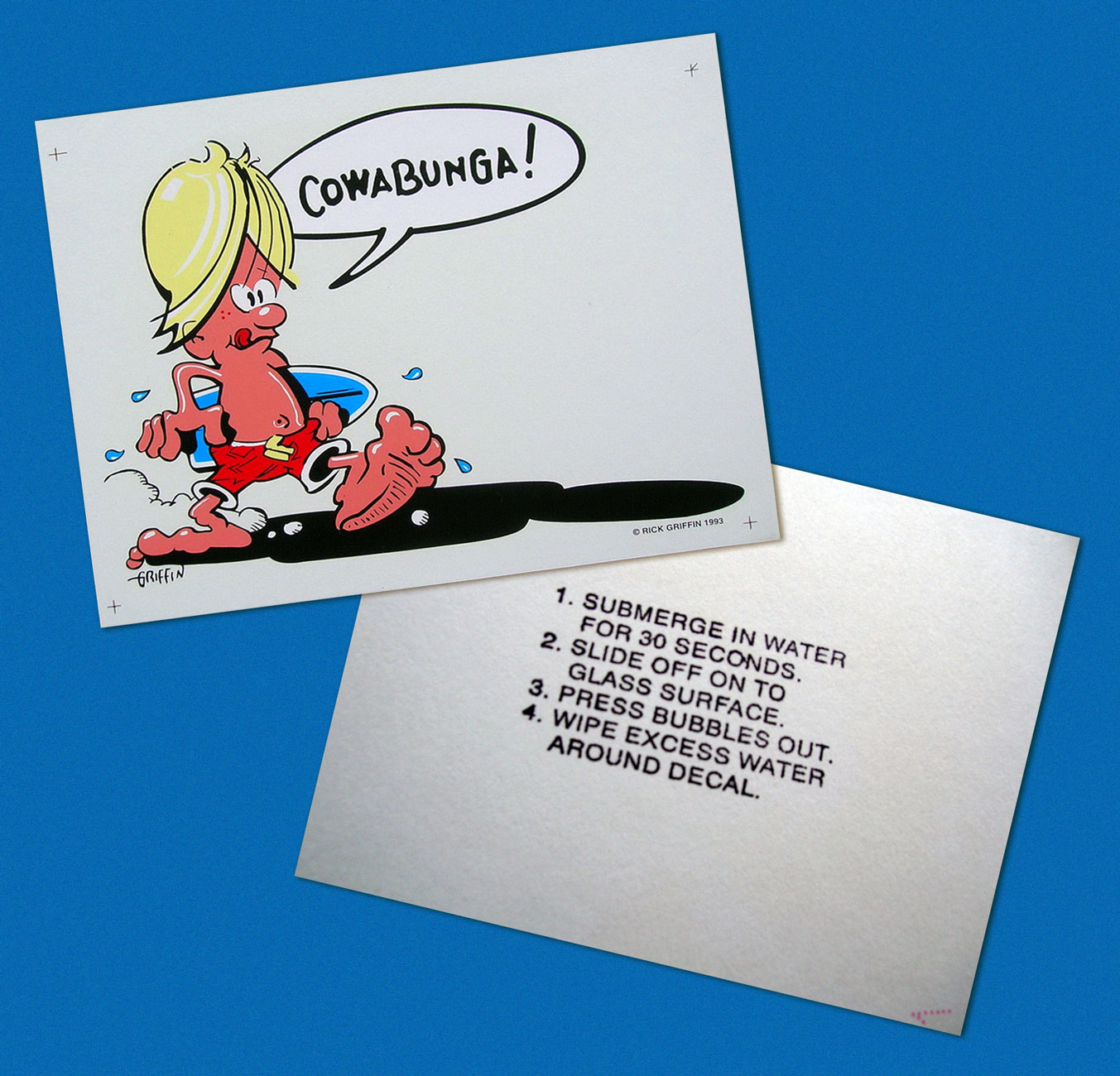
As you can see, Murphy abides. A 1993 sticker, with instructions.
-RG
*I’ll go even further: for me, it pretty much has to be Bruce Brown. His easy charm and wit, not to mention his untrained-yet-superb set of filmmaking skills leave other surfing cinéastes floundering in his wake. From what I’ve seen over the years, their work either seems too dry (ha!) or overdone and overeager. I’m still keeping an eye on the horizon, nevertheless. The relative unavailability of quality prints for most of these films is a hefty obstacle, while their soundtracks are far, far easier to find (e.g. Gone With the Wave, The Fantastic Plastic Machine…)
**“At this stage [1969], Griffin’s lettering almost ceased to be functional as legible typography. In fact, in even earlier work, he jokingly incorporated meaningless calligraphy into his posters. Rick pioneered and carried to an extreme in the 1960’s this disregard for the legibility of lettering, creating totally abstract forms the resemble letters. His particular style influenced and encouraged artists locally and throughout the world to reconsider all previous limitations that they were placing on stylized lettering and the ways that it could be used with other graphic forms.” From Gordon McLelland‘s monograph, Rick Griffin (1980, Perigee).
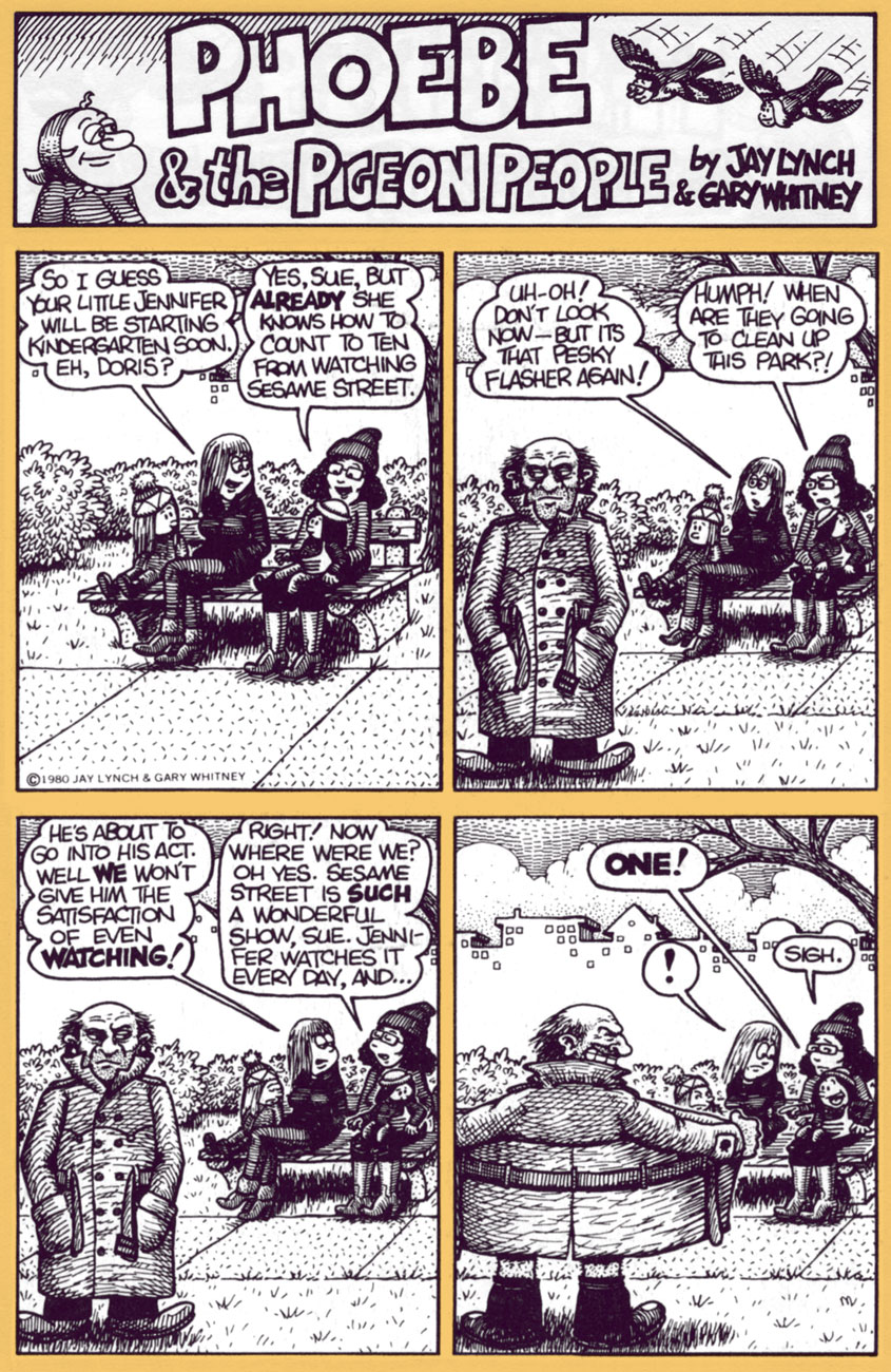
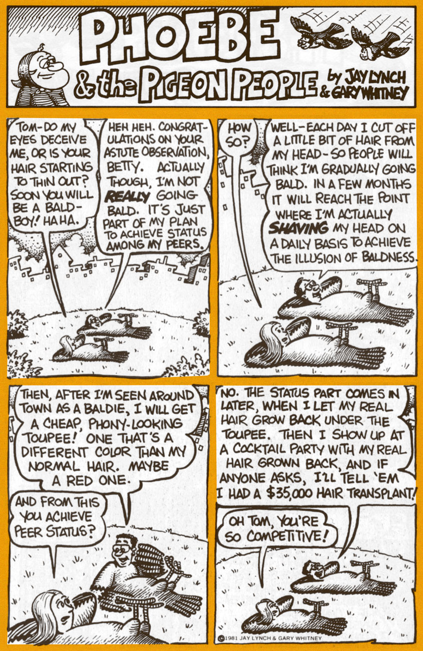
Today, we’ll shine a light upon his epochal comic strip Phoebe and the Pigeon People. Here’s how it was hatched:
« In April 1978, Lynch teamed up with cartoonist Gary Whitney to produce weekly Phoebe and the Pigeon People strips. Lynch wrote them and Whitney drew them. “It was very easy and it got us invited to cocktail parties”, said Lynch. “We wanted to do a strip that would appeal to secretaries, rather than a strip that would appeal to the comic fan type person.”
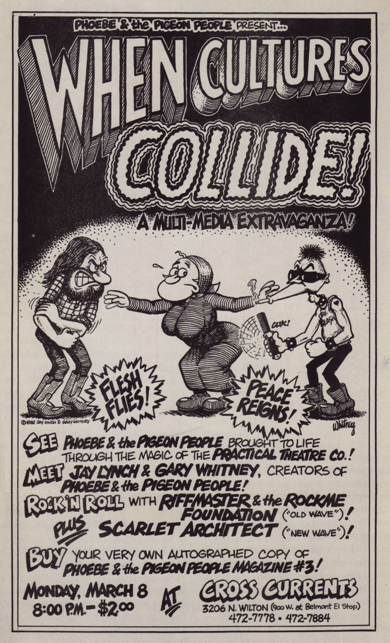
« Lynch and Whitney launched a stage show based on the characters, called When Cultures Collide, with an improvisational theater troupe, The Practical Theater. The performance included a battle of the bands between rock and new wave musicians. » (quoted from Ink & Anguish, a Jay Lynch Anthology, 2018, Fantagraphics)
P&TPP was another one of those captivatingly freewheeling features that popped up during the heady heyday of alternative weeklies. A while back, we devoted a post to Tom Hachtman‘s Gertrude’s Follies, which bloomed in a similarly unlikely fertile milieu. In Phoebe’s case, The Chicago Reader was the publication it called home during its impressive 1978-1996 run.
A 1982 poster for the event in question. Art by Gary Whitney.
For a few years now, they’ve (in this case, a shadowy outfit vaguely named “Alternative Comics“) been promising us a Phoebe collected edition. We’re still waiting. Hey, if the publisher needs more time to do the job right, so be it… but expectations are accordingly high.
Amazon’s blurb is an ominous portent: « The under-achieving Phoebe and friends hang out with beatnik people-headed jazz-loving beat-philosophy cooing pigeons in a park in Chicago. »
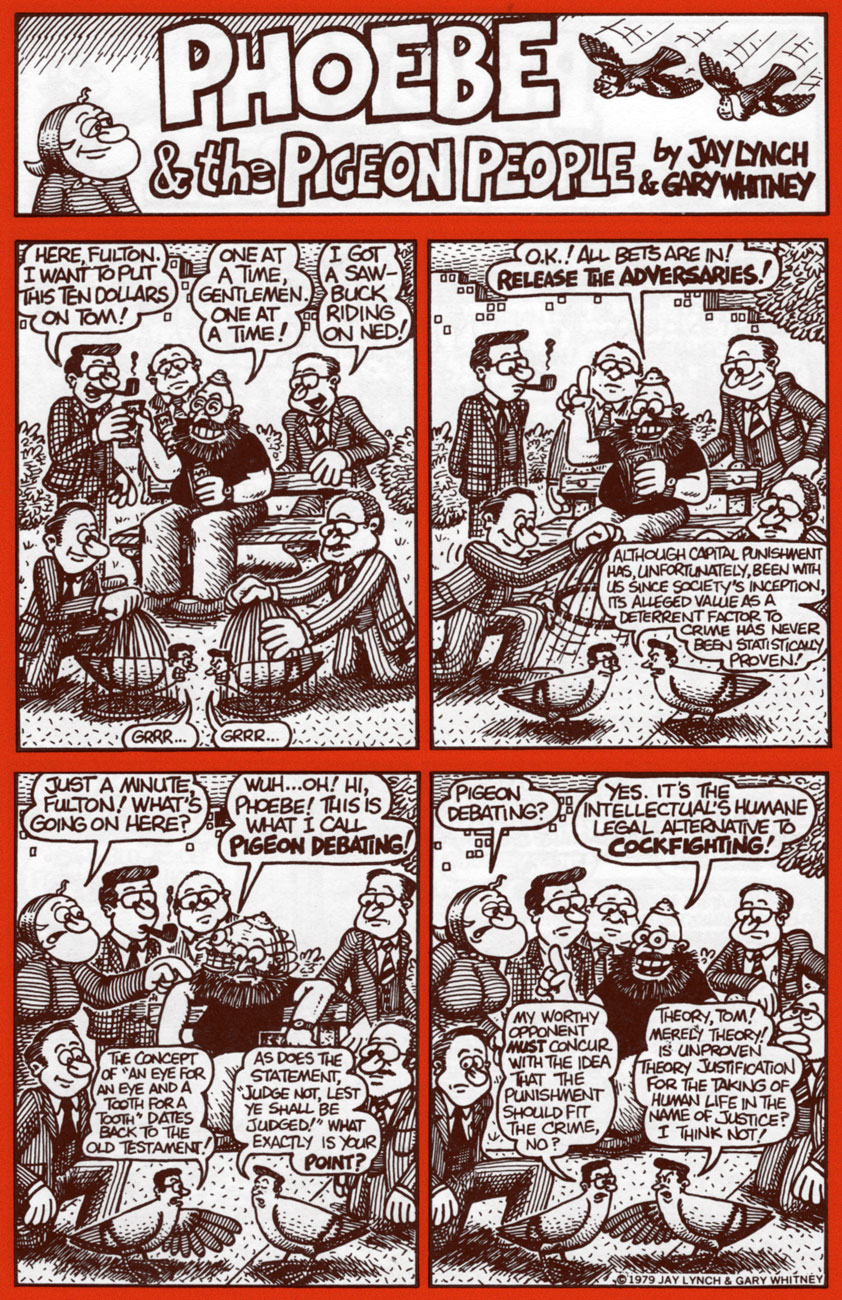
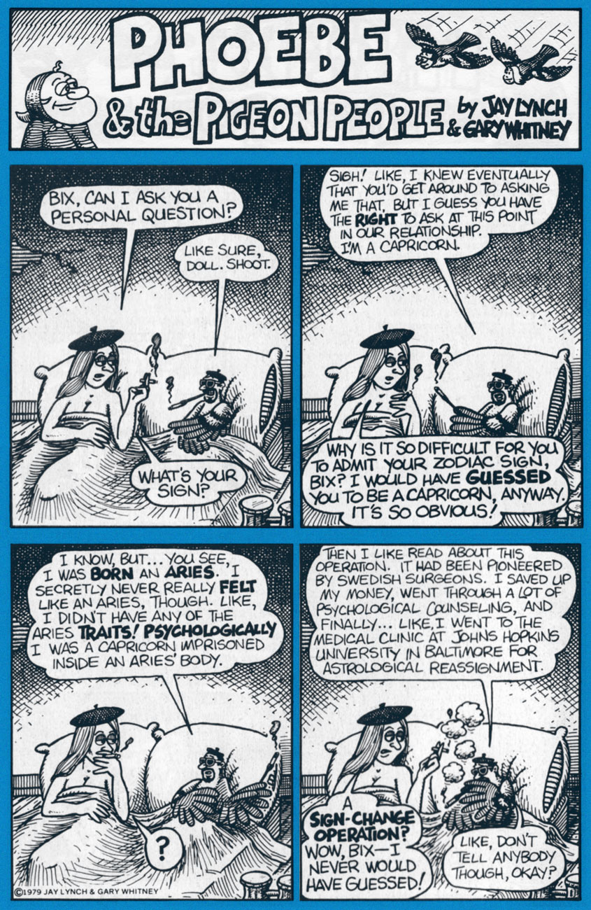
Uh, not even close. Here are a few highlight from the strip’s first four years, pulled from the pages of Kitchen Sink’s valiant three-issue run (1979-81); read these selections and you’ll know more about the strip than whoever wrote that blurb. You’re welcome!
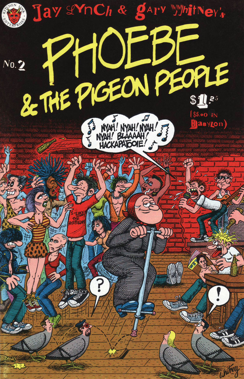
Phoebe & The Pigeon People no. 2 (May 1980, Kitchen Sink).
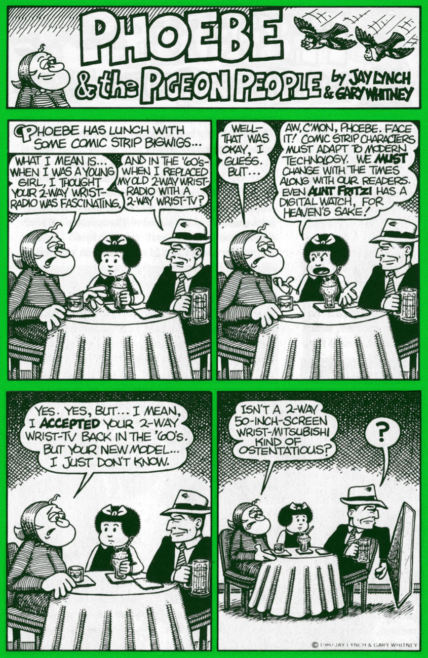
Clearly, these strips are so rooted in their time period that they retain no relevance whatsoever to today’s world and its social and political mores.
Ah, politicians: Plus ça change, plus c’est la même chose. I’d love to see some of our finer young minds take a crack at such an opportunity. One can still dream, right?
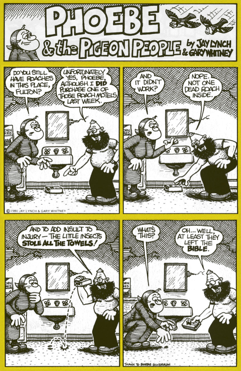
In Phoebe’s world, there was always plenty of room for the meta-contextual.
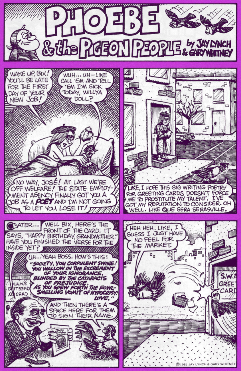
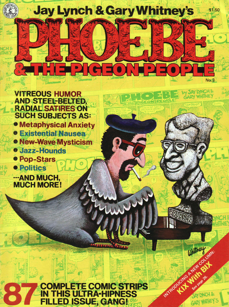
This is the magazine-size Phoebe & The Pigeon People no. 3 (July 1981, Kitchen Sink). Until the omnibus arrives, this is your best bet. Read the run right here, friends!
Our loveable auteurs and some of their cast, enjoying the Chicago winter. That’s Mr. Lynch on the left, Whitney on the right.
I particularly love the strip’s anything-for-a-joke ethos: as was Lynch’s wont, he ran the gamut from lowbrow to highbrow, from squeaky-clean to salacious, from sunny side up to scrambled. Let’s face it, that bizarre premise would have challenged and defeated most would-be humourists within a few weeks, let alone a decade-and-a-half.
Jay Lynch, dapper elder, as he appears in the short film There’s Something Weird About Jay Lynch (2014, filmed and edited by John Kinhart). Watch it here!
« So to this my life has come: there’s meaning in a piece of gum » — Parthenon Huxley, Bazooka Joe
We recently lost another fine cartoonist in Howard Cruse (May 2, 1944 – Nov. 26, 2019), and while he’s most frequently celebrated for his pioneering work in Queer comix and his graphic novel Stuck Rubber Baby, I’m much fonder of his comparatively ‘lightweight’ humorous work. In other words, I’ll take the wacky short stories over the Ponderous Magnum Opus, thank you.
And things don’t get any lighter than Bazooka Joe, now do they?
In 1983, Howard Cruse was engaged by Topps to redesign Bazooka Joe and illustrate a new set of strips, the series’ first true update since co-creator* Wesley Morse‘s passing in 1963. Topps, figuring on more-or-less total turnover of its kiddie audience, had been rotating batches of strips every seven years, drawing on the vast hoard of unpublished strips left by Morse, and now and then hiring freelancers to pad out the lot.
An unpublished Howard Cruse instructional comic, mid-1980s. Cruse recalled: « I always liked this strip because it’s practically the only time I was invited to draw the character at a size large enough to allow some stylistic personality. » I added the colouring, just because.
Howard Cruse Bazooka Joe model sheet, prepared for 1983 revamp.
Cruse’s model sheet for the rest of the 1983-vintage cast.
Chameleonic cartoonist R. Sikoryak, who contributed gags to the second Cruise series, posits that « One of the pleasures of the traditional comic strip is the conciseness of words and pictures, and the Bazooka format takes this compression about as far as humanly possible. As with haiku, there is a great power in the constraints that must be respected in obeying a format. »
Samples of the 1983-84 vintage.
Jay Lynch explains: « Despite the brand managers and marketing companies responsible for the various revamps of Bazooka Joe over the years, and their valiant attempts to make the characters and the gags more ‘hip‘, I’ve always thought that the primary appeal of these tiny comics was their overall lameness. Back when I wrote Bazooka Joe, I’d usually start by going through turn-of-the-century joke books and rewriting the ancient quips to turn the 1908 ragtime aficionados into 1990’s heavy-metal enthusiasts… »
Some thoughtful suggestions from Cruse for the 1988 crop.
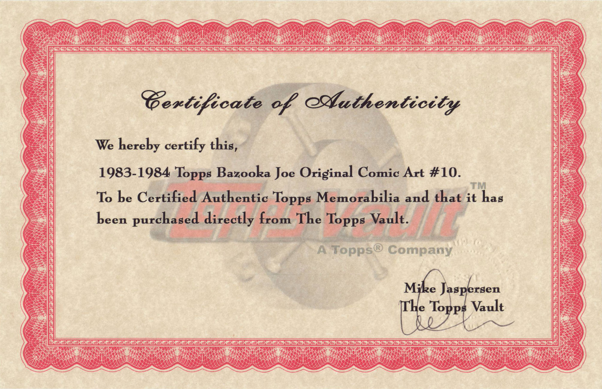
From my personal collection, original artwork supposedly from the 1983-84 batch… but something doesn’t add up. Incidentally, actual size is 3 x 3 5/8 inches.
The accompanying certificate of authenticity raises more questions than it answers. To wit, as Mr. Cruse elucidates: « When I was asked… to reconceive Bazooka Joe as a teenager and provide him with a new ‘gang‘, the only holdover from the earlier tykes… was Mort, the weird sidekick who wore a turtleneck pulled up to his eyes. Len [Brown] and Art Spiegelman… thought the ultra-lengthy turtleneck was a bit – in fact, was literally – over the top, though. So for my first series of strips the sweater’s collar was brought down below Mort’s chin… Apparently this change disturbed some nameless traditionalists at Topps, so when I was hired to draw a second batch of strips in 1988, the turtleneck was restored to its original position… » In that case, if my original is from the ’83-’84 series, why is Mort’s turtleneck in its traditional, and proper place?
Another certificate, this one appearing on the back of Bazooka Jerk (Garbage Pail Kids Giant Series Stickers no. 1, from 1986). Illustrated by Howard Cruse.
Then, in 1990, when the time came for another series, Topps opted to subcontract the work to a marketing company that dismissed Cruise’s work as « too goofy », according to Jay Lynch. Then Lynch, Pete Poplaski and Grass Green took up the gauntlet, which is a fascinating tale in itself… but one for another day.
If such lowly cartoon ephemera hold even the slightest sway over you, you’ll likely be very interested in Topps’ Bazooka Joe and His Gang (2013, Abrams ComicArts, edited by Charles Kochman), which proved an invaluable resource in cobbling together this post.
« Bazooka Joe has become the personification of the lowest form of humor. And this is why he’s one of the most widely known comics characters on the planet. Sure, the jokes were cornball. But that’s their appeal. » — Jay Lynch
-RG
*with Topps executive (and Golden Age comic book artist) Woody Gelman.
« Here’s to the thugs and maniacs who fill each book with concepts so damnable, so putrescent, that they make the EC horror magazines of yore seem like mere cocktail napkin doggerel. I salute you. Now I’m going to take a bath in quicklime. » — Harlan Ellison toasts Death Rattle (1986)
In the 1980s, with the Comics Code Authority in its death throes, you’d think horror comics would have made a massive comeback. Well, they did… and they didn’t. Since there had been plenty of black and white magazines to operate outside of the Code’s restrictions, bringing bloodshed and mayhem to colour comics made the much-anticipated liberation a bit of a non-event. For my money, the truly interesting horror material opted for different approaches, now more experimental, then rather whimsical, at times clinical, sometimes abstract. Underground comix publisher Kitchen Sink, surviving thanks to its eclectic spirit, revived its early 70s horror anthology in 1985, an adventure that this go-round lasted eighteen issues and unleashed cutting-edge, nostalgic, shiver-inducing, thought-provoking and gut-busting efforts by such talents as Richard Corben, Rand Holmes, P.S. Mueller, Jack Jackson, Stephen Bissette, Mark Schultz (his Xenozoic Tales were introduced in Death Rattle 8, in 1986), and, on this unsettling cover, Charles Burns.
This is Death Rattle no. 10 (April 1987, Kitchen Sink). Cover by Charles Burns, coloured by Pete Poplaski.
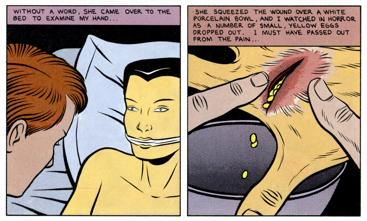
Before this cover, and speaking of clinical horror, Burns had earlier provided one of Death Rattle’s most harrowing gut-punches in issue one’s Ill Bred: a Horror Romance. I wouldn’t want to give away too much, but here are a few samples from this queasy masterpiece of gender fluidity, body horror and (justified) insect fear, seemingly inspired in equal parts by David Cronenberg films, Japanese art prints and Burns’ personal demons. Not for the queasy, but peruse it here if that ticks any of your happy boxes.
« You know, the dog food that Billy Jack loves! » — The Firesign Theatre
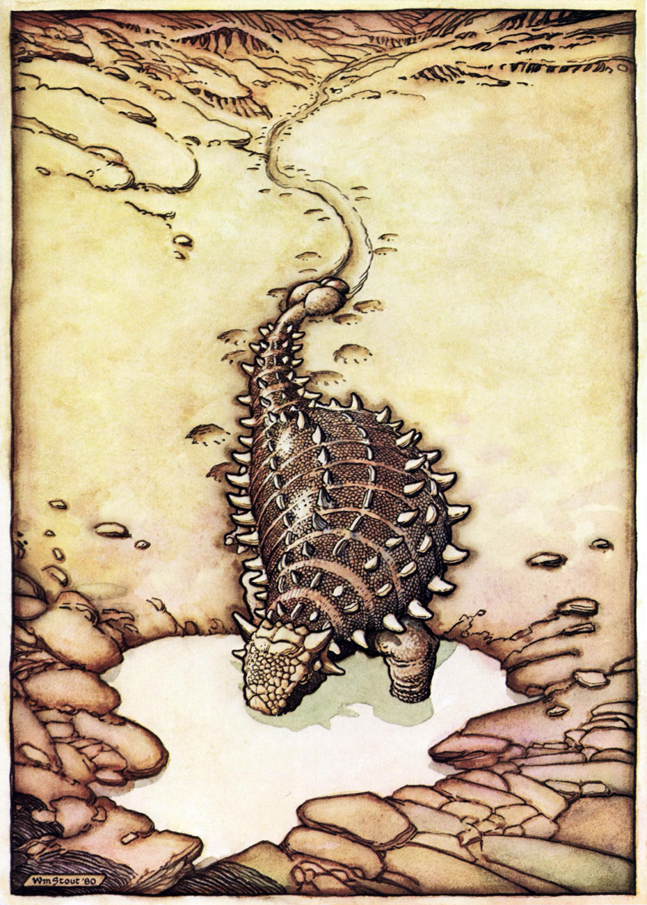
Ah, September the 18th. Today’s the birthday of the staggeringly accomplished William Stout (born in 1949), master of ancient reptiles, bootleg record covers, friend of The Firesign Theatre, former Russ Manning assistant (none but the best would do!), and I’ll spare you the illustrious details of his career in cinema. Still, let’s look around a bit, shall we?
Here’s an unforgettable cover from Alien Worlds no. 3 (July, 1983, Pacific Comics). This scene gave me nightmares, and still raises a shudder. These critters look like a hybrid of a platypus and a piranha. Happy landings!
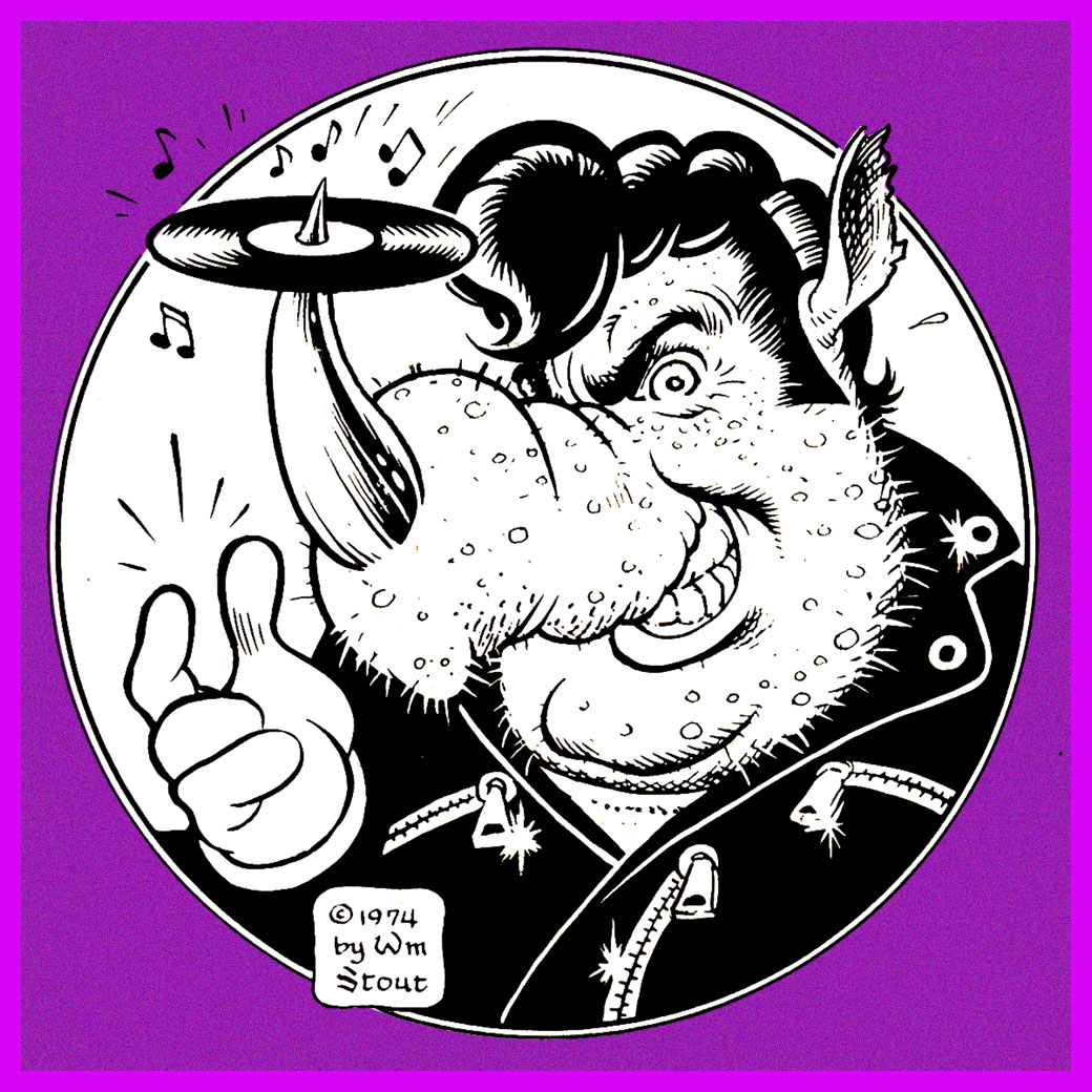
Stout’s wonderful original logo for Rhino Records, circa 1974.
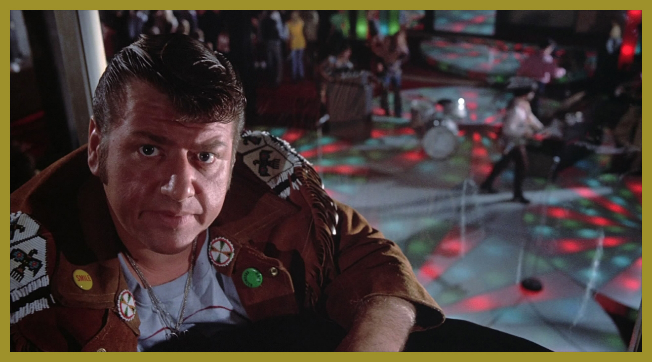
Speaking of ’74, isn’t that rhino a dead ringer for Swan’s oleaginous right-hand man, Philbin, from Phantom of the Paradise?
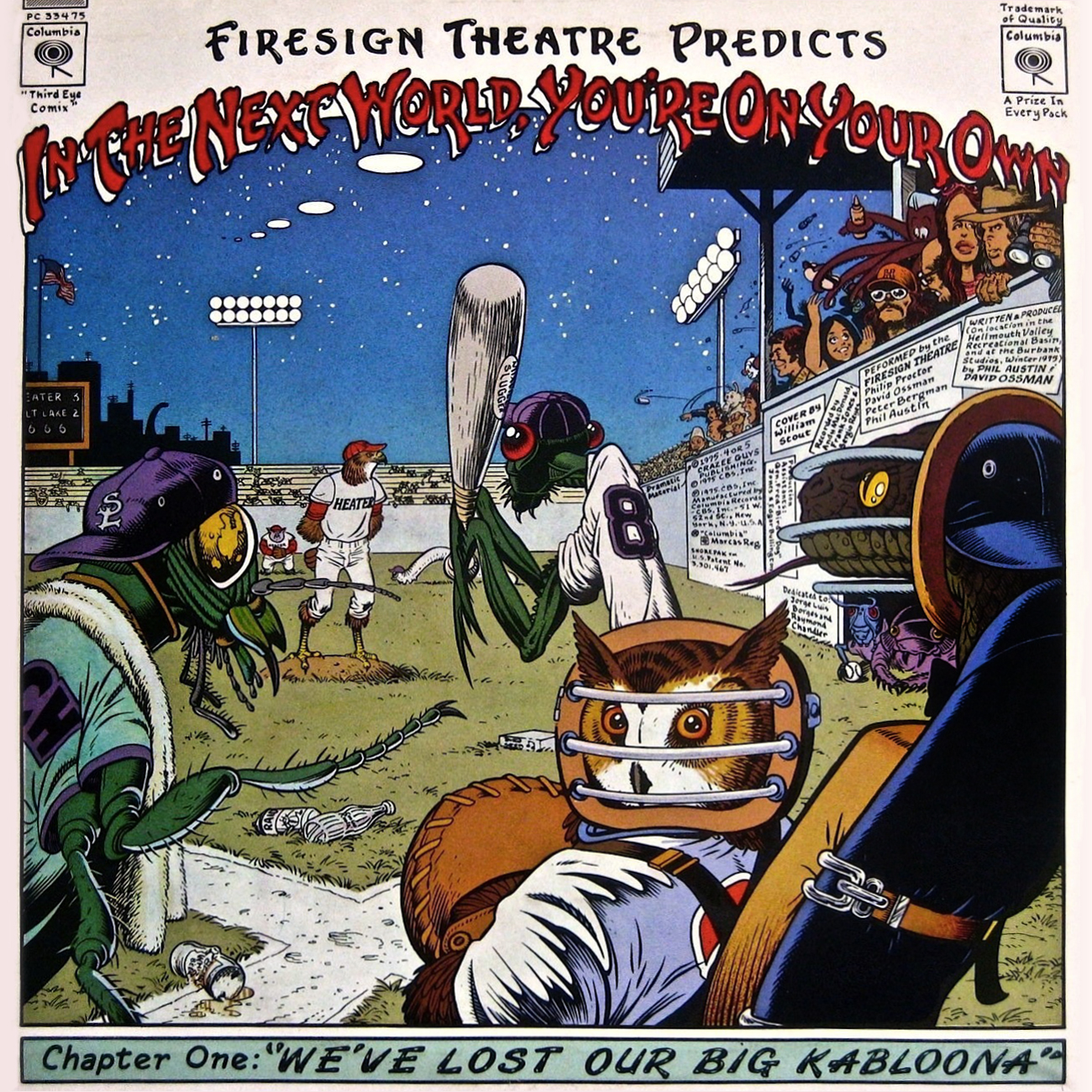
This is the back cover (the recto is equally sumptuous) for The Firesign Theatre‘s 1975 opus, In the Next World, You’re On Your Own, featuring a pair of classic sidelong suites, Police StreetandWe’ve Lost Our Big Kabloona.
A clutch of underground classics? Sure. Here’s Cocaine Comix no. 1 (Feb. 1976, Last Gasp).
Another number one (with a bullet, of course): 50’s Funnies no. 1 (1980, Kitchen Sink). More lies inside!
A favourite page from Stout’s masterpiece (or certainly his great labour of love, at the very least): The Dinosaurs: A Fantastic New View of a Lost Era (1981, edited by Byron Preiss). This piece (the first he drew for the book) is entitled Hot Weather. « After lifting his head for air, he drank more and then wallowed his whole length and breadth into the ooze, vocalizing for the first time that day, and loudly. »
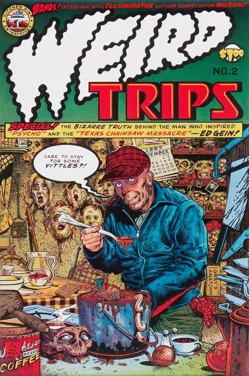
Say hello to friendly Ed Gein. Weird Trips no. 2 (1978, Kitchen Sink). Please note the sinisterly customized Kitchen Sink Enterprises logo, Wrightson–brand coffee, and EC Comics narrator The Old Witch impishly peeking from a lower-right shelf. And yes, can’t go disemboweling your fellow man and woman without a copy of Gray’s Anatomy. Preparation is everything!
Well, there never was any doubt that Mr. Stout was an EC Comics überfan. The Comics Journal no. 81 (May, 1983, Fantagraphics).
« If you don’t want to be idolized by the masses, you don’t become an author, you become a plumber-welder! » — Entretien avec Mandryka, Les cahiers de la bande dessinées no. 28 (1975), conducted by Numa Sadoul
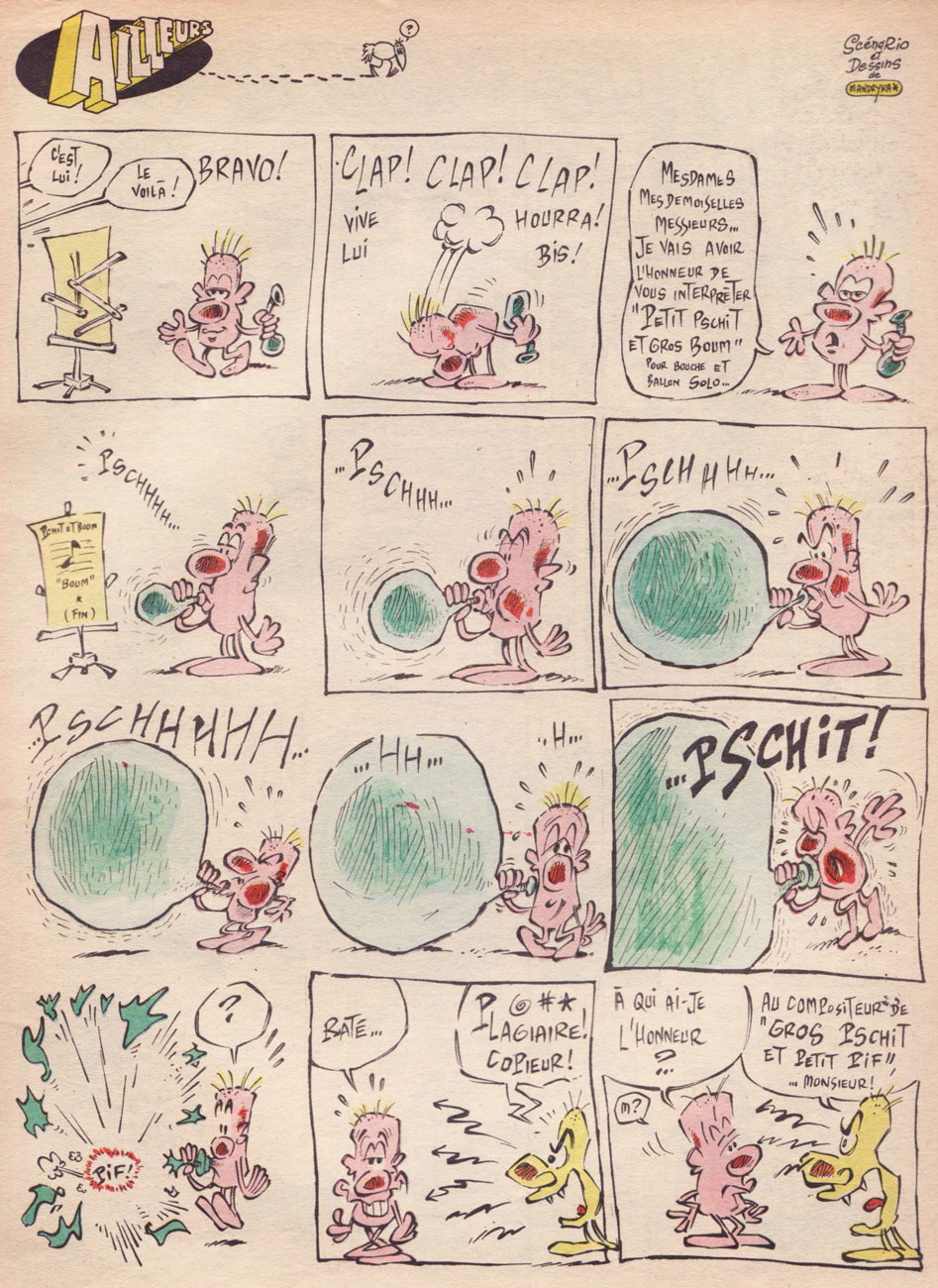
Nikita Mandryka was born October 1940 in Bizerte, Tunisia, to Russian émigré parents. His grandfather had fled the Russian Revolution in 1921 aboard a warship he was commanding. Nikita’s first professional strip appeared late in 1964 in Vaillant (Boff, in Vaillant no. 1024, Dec. 27, 1964), soon renamed Vaillant, le journal de Pif , then Pif Gadget in 1969. While he’s best known for his loquacious, dominoed cucurbit, Le Concombre Masqué, today we’re going to harvest the riches of his somewhat less familiar, but equally absurdist creation, the free-form strip Ailleurs (“Elsewhere”). The feature debuted with the inaugural issue of Pif Gadget and made its bow with issue 35, a few months down the line.
Mandryka left Pif Gadget on good terms (and returned over the years), and with a solid reason: while Pif’s editorial team rightly adored his work, its left-field humour left the majority of Pif’s young readership quite baffled, and sometimes infuriated. Mandryka’s place in the magazine may have been secure, but he yearned for an audience that actually understood him. This he would find at Pilote, with its teenage readership, and all the more so with L’Écho des Savanes (which he cofounded, in 1972, with Claire Bretécher and Marcel Gotlib).
Pif’s was an unusual case: its most singular, daring, arguably most valuable strips were those least appreciated by the kids. And that slice of the readership, you’ll have guessed it, tends to express its opinions more freely and vehemently than their elders, who did love (but more quietly) the somewhat abstract, second degré (offbeat, ironic) features, such as Marcel Gotlib and Henri Dufranne‘s Gai-Luron*, the recently-departed Massimo Mattioli‘s M. Le Magicien or Henri Crespi‘s Nestor. Still, the savvy editorial team, who after all had made the magazine a massive hit, keenly grasped the import of editorial balance and trusted its collective taste and instinct over the “wisdom” of the accountants and marketers… who, at the height of the magazine’s popularity, pulled a mutiny and… sank the ship. So, in hindsight, Mandryka was right to leave.
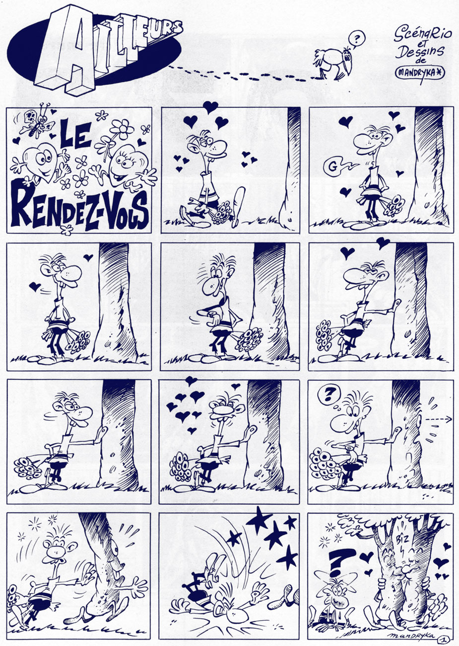
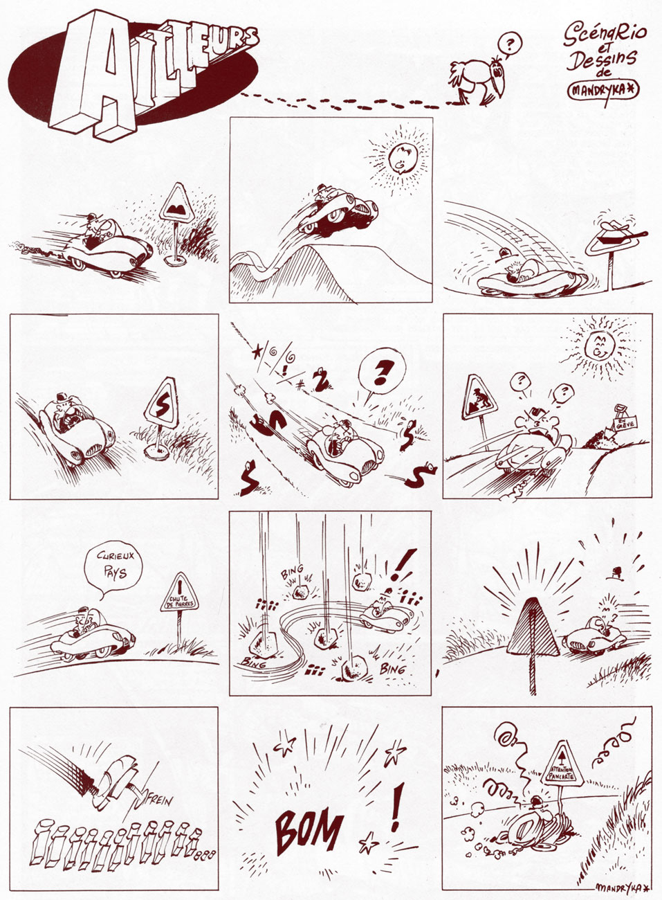
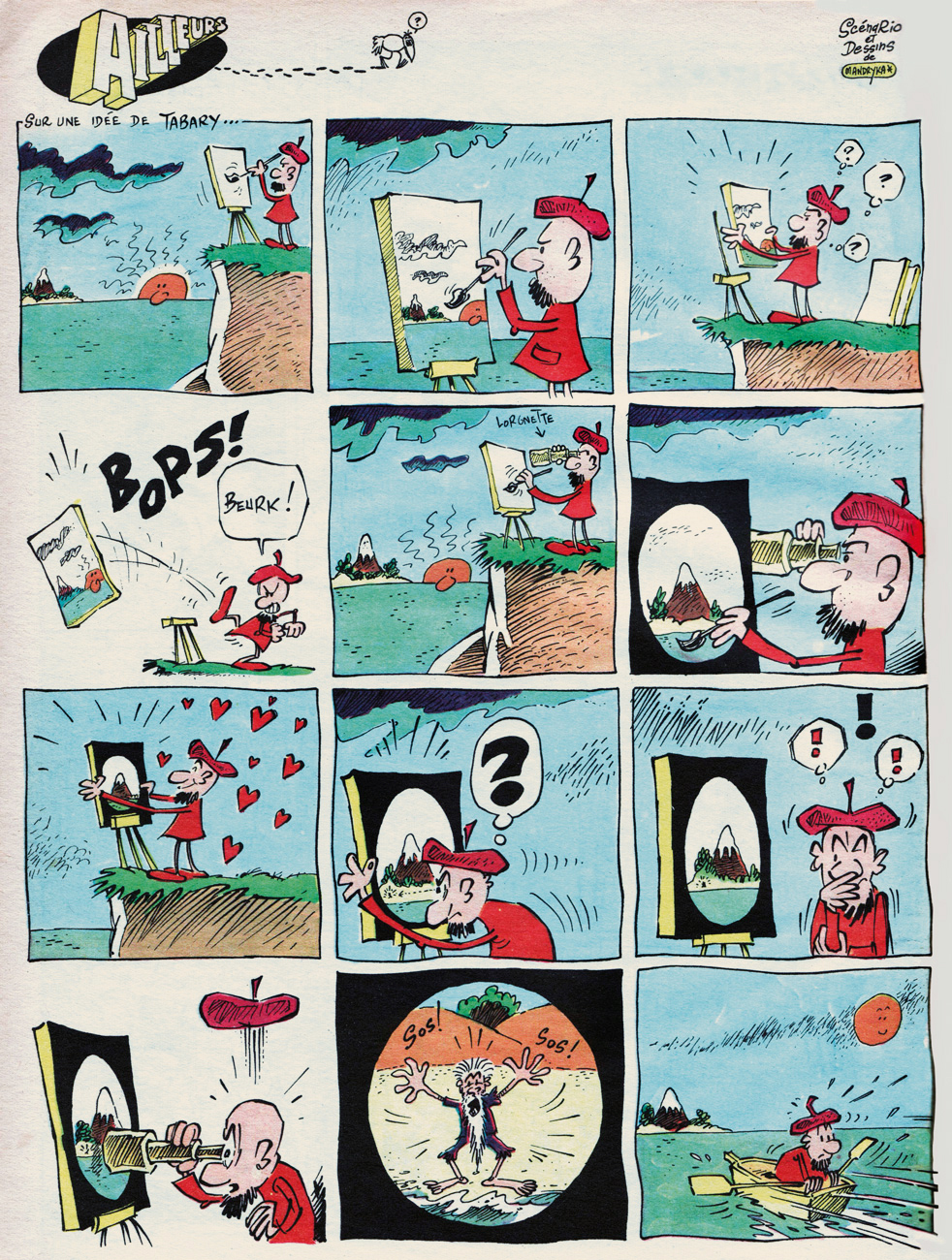
Ailleurs‘ début, from the inaugural issue of Pif gadget / Vaillant no. 1239 (March 1st, 1969); If it goes “zgunk”, it’s not a zgonk, it’s a zgunk.
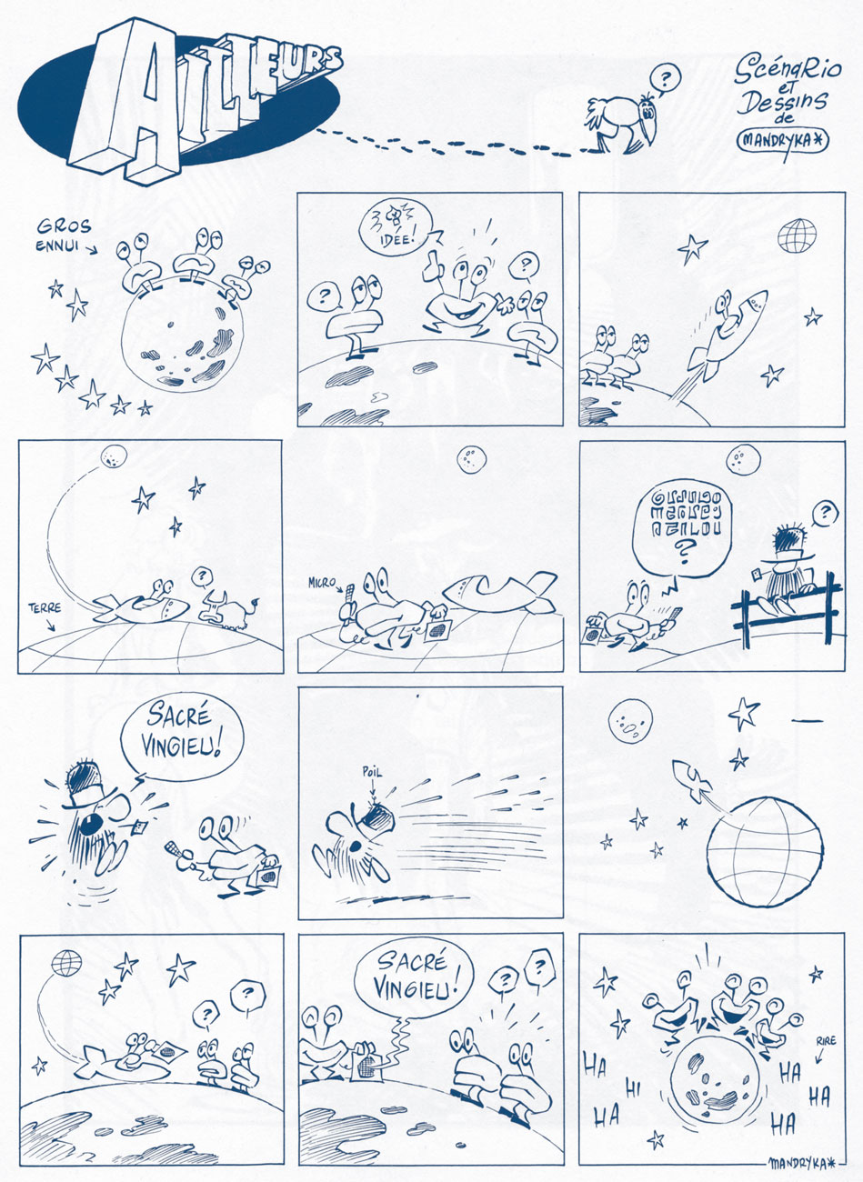
As an english equivalent to « Sacré vingieu! », I propose « Dagnabit! »
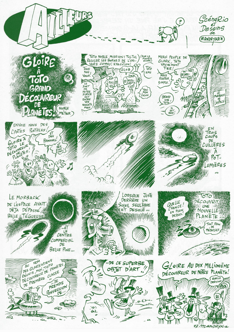
Ends with a sarcastic « Glory to the ten millionth discoverer of our planet! »
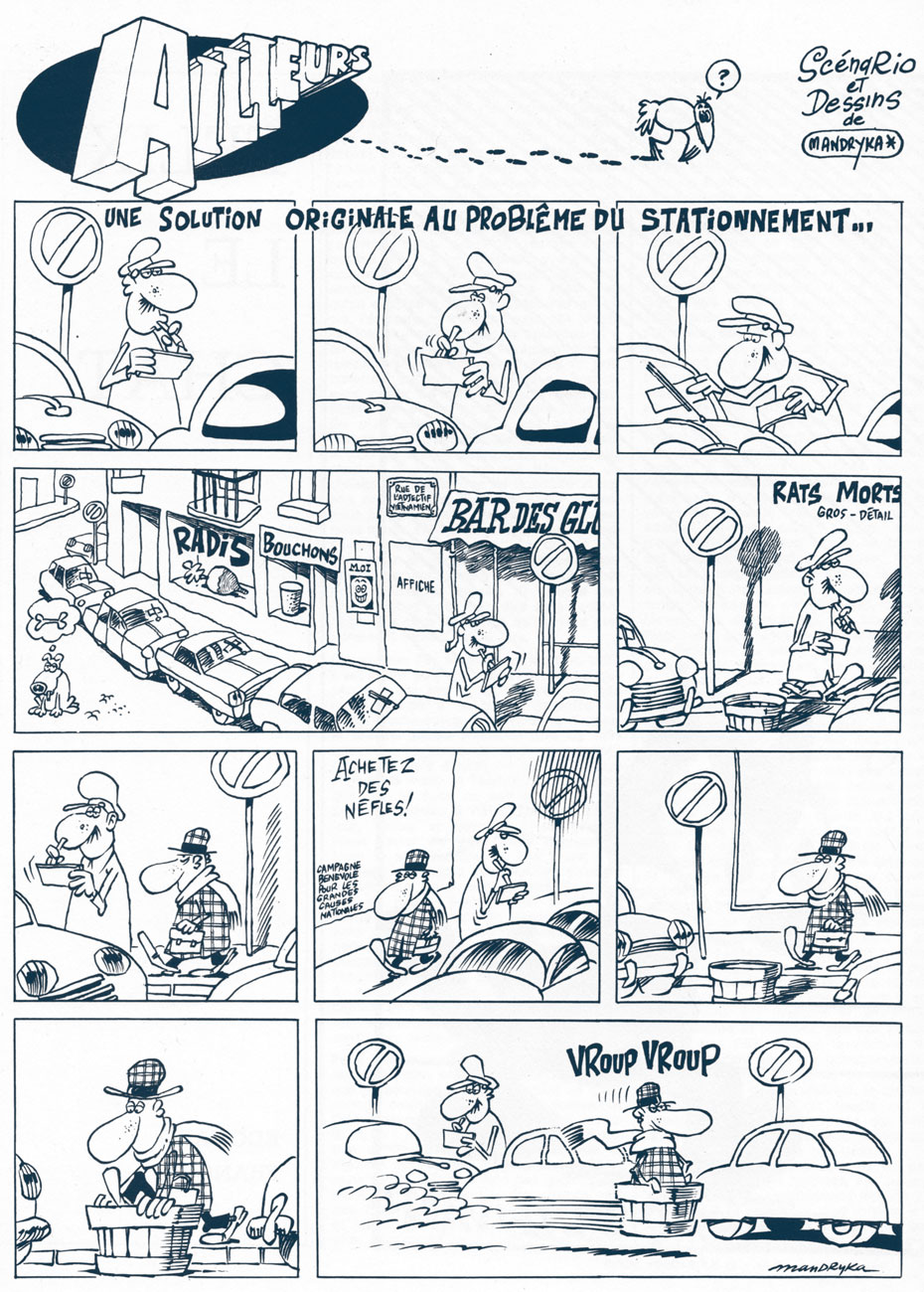
« An original solution to the parking problem. »
From Pif gadget no. 23 / Vaillant no. 1261 (July 1969); now you know what the legendarily stoic members of The Queen’s Guard do whilst at leisure.
From Pif gadget no. 33 / Vaillant no. 1271 (Oct. 1969); idea provided by Tabary (Jean or his brother/ghost Jacques? We may never know).
The final Ailleurs strip, from Pif gadget no. 35 / Vaillant no. 1273 (Oct. 1969). This would have made a great skit for Jacques Tati‘s peerless Mr. Hulot.
Nikita’s just heard a really good one during this photoshoot for a L’Écho des Savanes advert.
I’ve always been fond of this oddball little ad, which appeared in mid-70s comic books (in this case, a late 1974 DC 100-pager). It certainly demonstrates the considerable influence that pioneers such as Thimble Theatre creator Elzie Segar had on many an underground cartoonist.
If the advertised products had been iron-ons (à laRoach Studios*) instead of finished t-shirts, they’d be easier to find today. The Mickey Rat shirt is still being produced these days, though likely a grey market item… same as it ever was. On the other hand, I can find neither hide nor hair of the Hebrew Shazam shirt. Anyone? (2025 update: it’s available again here! A grateful tip of the hat to eagle-eyed reader Michael C. Rookard,)
A bountiful spread from The Natural Trading Company’s Mail-Order Catalog, which proposed T-Shirts – Posters – Art Prints – Buttons – Records – Comics… count me in!« Pinball Wizzard, you say? »
Here’s a bit of background on the Crazy World shirt, designed by (or swiped from) John Van Hamersveld, the genius behind the unforgettable The Endless Summermovie poster: « The face emblazoned across the chest of Mick Jagger in a 1972 New Musical Express feature on the Rolling Stones had a rich history according to its creator. The iconic image was the product of a mescaline and marijuana jag, after which Van Hamersveld was left with the enduring image of a man’s face with a big, toothy, wide smile. From a portrait of Jimi Hendrix he had made in 1968, Van Hamersveld came up with the Johnny Face logo the following year, which he used for promoting his own work. »
And there’s Mick, just like the man said.One of the current offerings. Oh, definitely a bootleg.
For me at least, it’s hard to look at Johnny Face without seeing in it echoes of The Face of Steeplechase, Coney Island’s widely-grinning mascot.
Trivia time: can you name the infamous individual behind the 1966 demolition of the beloved Steeplechase amusement park? Find the answer here.
As for the artist who crafted the Natural Trading Company ad, I was drawing a blank until a few years ago, when the wonderful Jay Lynch (1945-2017) kindly lifted the veil on that particular mystery: Jerry Kay was the stylish culprit. Much appreciated, Mr. Lynch!
– RG
*not to be confused with the originalRoach Studios, of course…
Death rat·tle (/ˈdeTH ˈˌradl/), noun: a gurgling sound heard in a dying person’s throat.
Greetings! Today we explore Kitchen Sink‘s mostly-black-and-white horror anthology (drum roll, please) Death Rattle, which ran between 1972 and 1996 in three distinct “volumes” (please don’t forget your professional spelunking gear, things might get messy). For the pedants in the audience (and let’s be honest, that’s probably the majority of us comic-loving freaks), the break-down goes like this:
Volume 1, 3 issues published between June 1972 until June 1973 under the Krupp Comic Words imprint; volume 2, 18 issues published between October 1985 and October 1988 under Kitchen Sink Comix; finally, volume 3, five issues published between December 1995 and June 1996, also under Kitchen Sink Comix. I must admit that that my favourite period is Volume 2, and it’s from these issues that most material presented below has been drawn.
There is already a Tentacle Tuesday devoted to Kitchen Sink (see Tentacle Tuesday: The Kitchen Sink Touch) featuring, among other things, two splendid Death Rattle covers. We have also previously ogled some DR inside art in Tentacle Tuesday Masters: Rand Holmes. Today we take a longer peek into the stories promulgated by this fantabulous anthology. Get ready for some nasty fun!
(Man, I’ve got to tone down my build-ups…)
Panel from Mind Siege! by Steve Stiles, published in Death Rattle no. 3 (February 1986). The “my god!! so BIG!!” alien has the power to telepathically send mind-shattering hallucinations, eventually driving (nearly) everyone on earth insane. This issue also provides the first installment of Jaxon’s epic series Bulto… the Cosmic Slug (collected as Secret of San Saba: A Tale of Phantoms and Greed in the Spanish Southwest in 1989, for those interested).
The last soldier on earth killed it! …Or did he? Panel from Mind Siege! by Steve Stiles, published in Death Rattle no. 3 (February 1986).
The first 5 issues of Death Rattlevolume 2 appeared in glorious colour, after which the series reverted to its standard black-and-white (financial hurdles). Issue 7 came out proudly bearing the slogan “too gruesome for color!” Issue 5 gave more details of the change to come:
« It will still be printed on quality paper, so you archivists out there won’t have trouble preserving disintegrating, rotting, putrid copies that look like they’ve just risen zombified from a Graham Ingels story. We’ll still be printing atmospheric stories of the unusual, the eerie, the — dare we say it — ghastly. So let’s rejoice, not mourn. »
I remember being vaguely disappointed for just a little while (it was nice to have colour), but the high quality of (most) stories made it easy to get used to the switch, and I really liked the unapologetic way Kitchen Sink confronted their audience, making a good thing out of a bad thing.
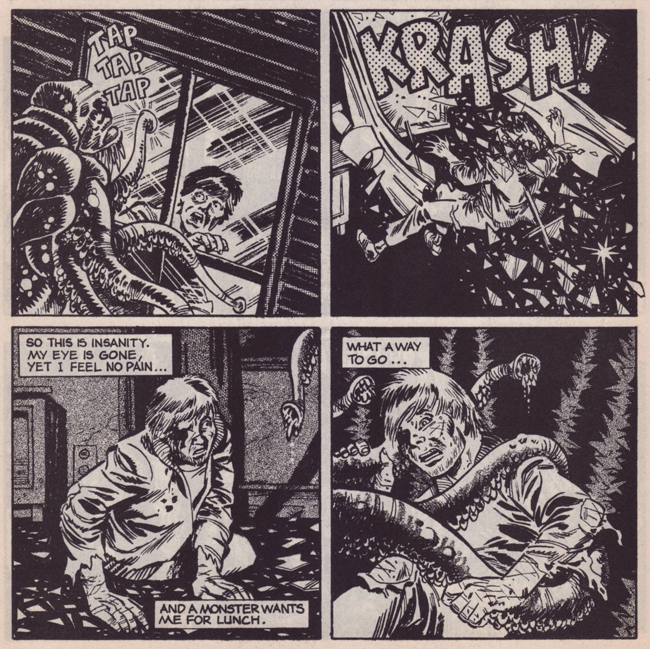
Polite monsters knock before smashing noisily through the window. Page from Old House, scripted by Kenneth Whitfield and drawn by Steve Stiles, published in Death Rattle no. 7 (October 1986).
Page from Old House, scripted by Kenneth Whitfield and drawn by Steve Stiles, published in Death Rattle no. 7 (October 1986).
I didn’t realize it immediately, but this post ends up being some sort of cephalopod love song to Steve Stiles. Speaking of the latter, I’d like to mention that he doesn’t get enough credit for his work on Mark Schultz’s Xenozoic Tales, even though he drew Schultz-scripted back-up stories for no fewer than 13 issues of XT – and, frankly, did an excellent job. Instead of getting interrupted smack in the middle of an intoxicating story, Xenozoic Tales could have continued to thrill us if Schultz scripted and Stiles illustrated. ‘Nuff said. Visit Stiles’ website – it has tons and tons of stuff.
If I may be allowed a slight digression, here are two examples of Stiles’ recent (and computer-coloured, I’m afraid) work taken from his Tumblr blog – I think tentacles still prey heavily upon his mind! 😉
Okay, no more distractions. Back to our regularly scheduled program:
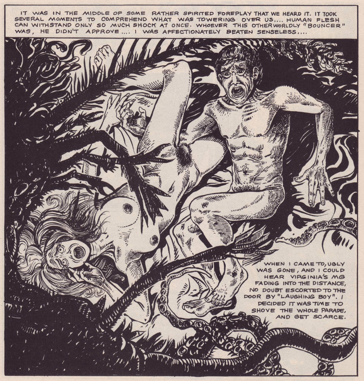
Last Exit by Steve Stiles, published in Death Rattle no. 8 (December 1986). Comics *definitely* teach us that guns are useless against tentacles.
« Savoring my growing fear and horror… the crawl and prickle of my flesh.. waiting to feel the rapid feather-flutter or antennae… the clammy weight of tentacles… the jolt of pain as mandibles grip with steady pressure…» Panel from Mirrors by Eric Vincent, published in Death Rattle no. 11 (June 1987).
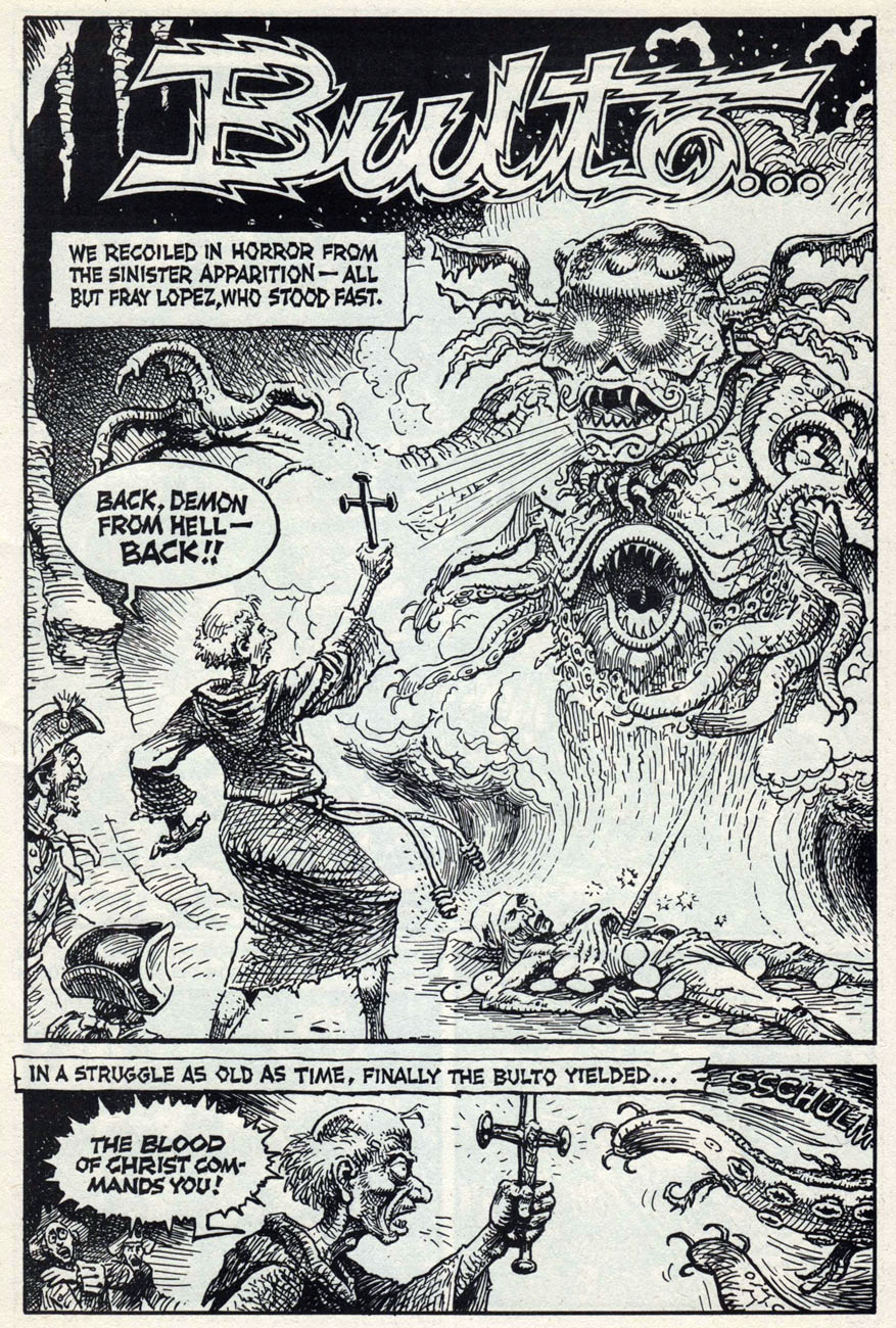
Page from Bulto – The Cosmic Slug (part 5) by Jaxon, published in Death Rattle no. 12 (September 1987). There simply isn’t anything Jaxon can’t ace: a lot of artists have no trouble depicting curvy vixens, few artists can draw an anatomically correct horse, and even fewer would be able to create a blood-curdling scene with a manic priest and a convincing Elder God.
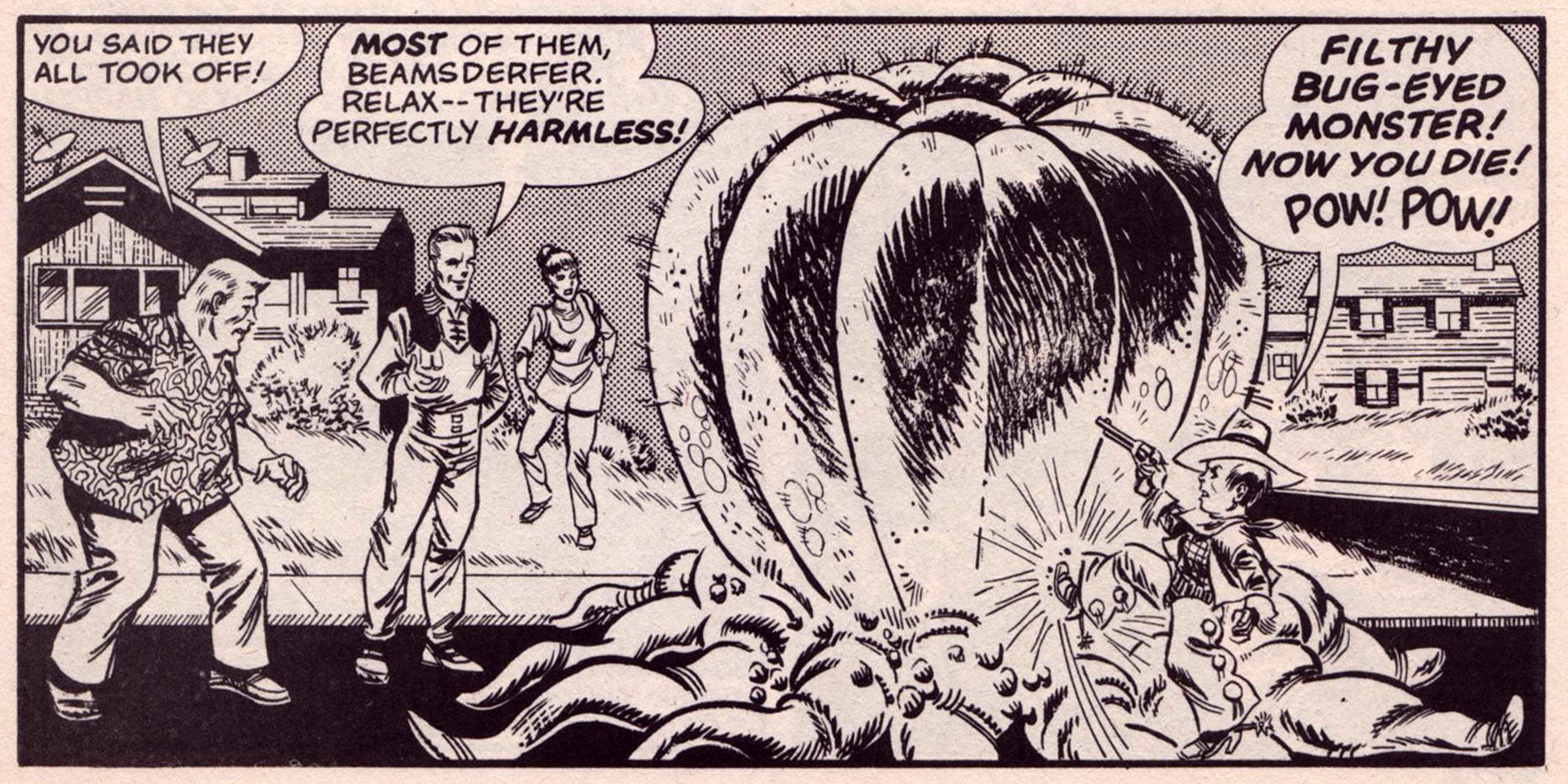
Panel from The Arrivals by Steve Stiles, published in Death Rattle no. 12 (September 1987). Watch who you’re calling filthy, kid – soon you’ll be one of them.
A bit of comic relief: panel from Dr. Stodge Rimperton, Otologist by Tony Millionaire, published in Death Rattle no. 2 (volume 3), December 1995.
« Yes, you may find yourself raving in the aisles when you read Death Rattle, although we sincerely hope not. We hope it will thrill, chill, slice, dice and possibly even amuse you. » (introduction from Death Rattle no. 4)
« You really saw that things were not at all what was portrayed in the mass media… at least not in our neighborhood. It was just a conclusion that most of the kids of that age came to, that things were extremely corrupt. » — Spain Rodriguez
While plenty of cartoonists trod the path of autobiography before him, it took Manuel ‘Spain’ Rodriguez (1940-2012) to truly show how it should be done: here at last was a genuine full-blooded practitioner, hardly content to merely observe from the sidelines, blending with the wallpaper. Lover, brawler, consummate graphic storyteller: a scarce combination indeed.
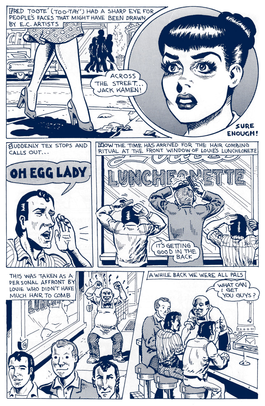
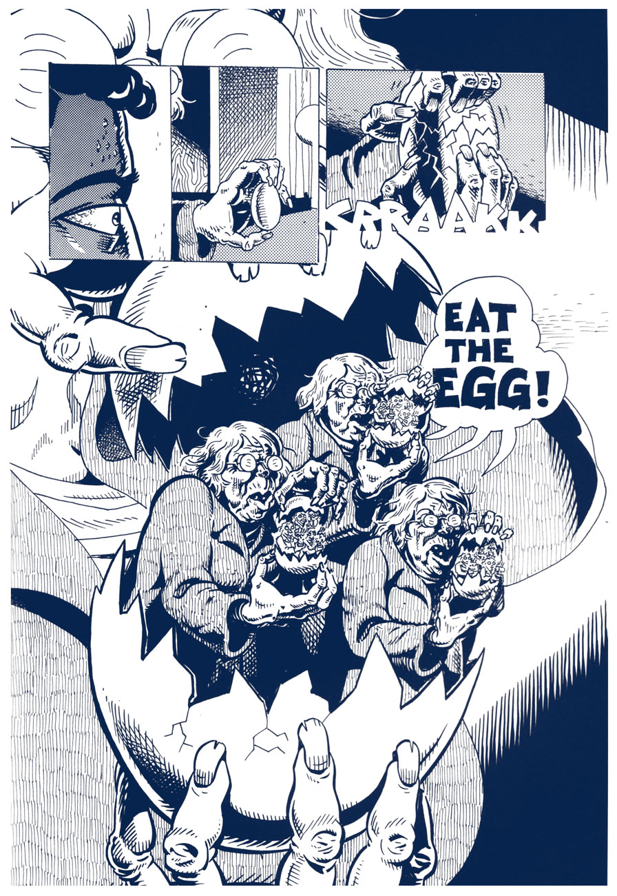
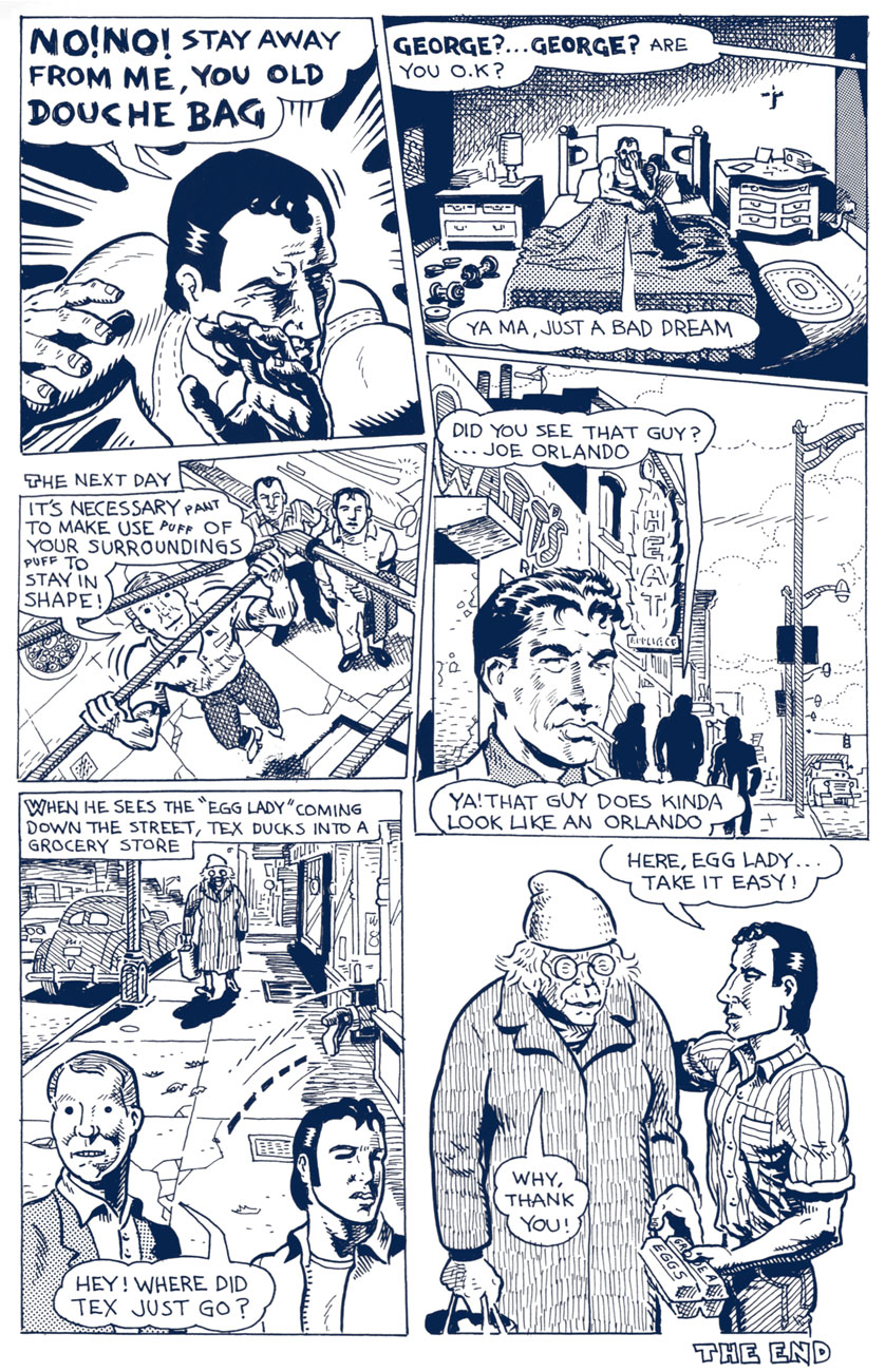
The following tale belongs to a cycle recounting the exploits and insights of The North Fillmore Intelligentsia, Spain’s closest compadres in Buffalo of the 1950s. Tex’s Bad Dream… originally appeared in Blab! No. 3 (Sept. 1988, Kitchen Sink Press); indeed, Spain’s recollections became, over time, the sole reason to purchase the once-excellent Blab! Mercifully, most of these were collected, in their usual exemplary fashion, by Fantagraphics, as Cruisin’ With the Hound (2012). You’ll still be lacking the mysteriously-omitted, quite essential « How I Almost Got Stomped to the “Still of the Night” by the “Five Satins » (Prime Cuts No. 2, Mar. 1987, Fantagraphics), which you can find in another Spain anthology, My True Story (1994, Fanta again).
In the meantime, enjoy, with my compliments, this true-life tale of original EC Fan-Addicts, facial restructuring, cautionary dreams, isometrics and pork sandwiches.