Tentacle Tuesday: Flash Gordon, Space Opera Saviour

« When I was a young writer if you went to a party and told somebody you were a science-fiction writer you would be insulted. They would call you Flash Gordon all evening, or Buck Rogers. » Ray Bradbury

We’ve talked about newspaper strip Flash Gordon in Tentacle Tuesday: Lurkers in the Newsprint, and now it’s time for its comic book version! Although I normally have very little interest in FG, this is no second-rate Tentacle Tuesday: there is some prime tentacular material to be enjoyed.

We first concern ourselves with the Flash Gordon Charlton Comics run, which picked up the count where King Comics had left it in 1967. From 1969 until 1970, Charlton published issues 12 to 18, all of which but the first had glorious covers and cover stories by Pat Boyette, an absolute WOT favourite ( you can visit co-admin RG’s Pat Boyette — Hillbilly Makes Good* for a deeper exploration of his career).

The cover of issue 14 has an octopus shortage (a serious flaw affecting many, many comic book covers!), but the monster o’nine-tentacled-tails the ’emotionless killers’ encounter is a beauty. The following page is also a good example of Boyette’s imaginative page layouts, in which things are kept dynamic, but never engender confusion about who is doing what and to whom.

Page from Rancor and the Seven Shadows of Flash Gordon, scripted by Bill Pearson and illustrated by Pat Boyette, was published in Flash Gordon no. 14 (June 1969).

Then we come to a real bevy of Boyette tentacles a few issues later –

Flash Gordon no. 17 (Charlton, November 1969). Cover by Pat Boyette.

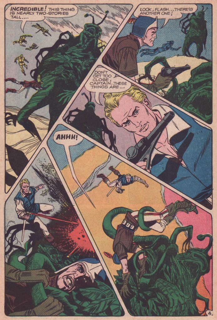
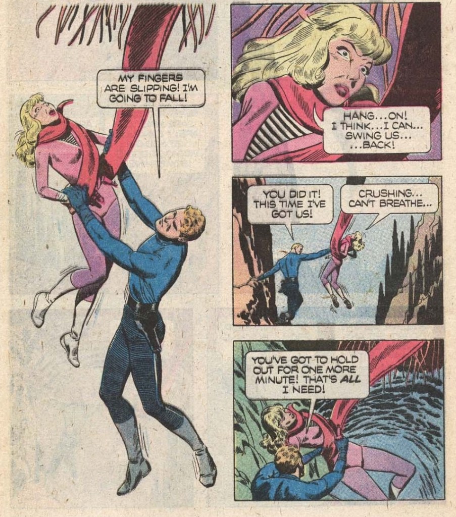
The Creeping Menace, the cover story, is scripted by Joe Gill and illustrated by Pat Boyette. I am including two pages (and a panel) because it’s too difficult to choose between them – all boast the aforementioned dynamic layouts and striking tentacles.

Isn’t this a lovely, stylish panel? I want it on a t-shirt.

The publishing history of comic-book Flash Gordon was an interesting relay race: Gold Key Comics resumed the run with issue 19 (1978), and kept it up until issue 27 (1979); finally, issues 28 to 37 were published under its Whitman imprint between 1980 and 1982. The latter category offers two tentacled covers, and some inside goodies.

Original art (sadly by an unknown artist) for the cover of Flash Gordon no. 29 (Whitman, May 1980).

The cover story The Deadly Depths is scripted by John Warner and illustrated by Carlos Garzón. Oh, this thing is not hostile… just hungry.

The last Whitman issue also is of some interest, though on the cover Flash looks like he’s fighting caterpillars with an martini olive for a head.

Flash Gordon no. 37 (Whitman, March 1982). Cover by Gene Fawcette.

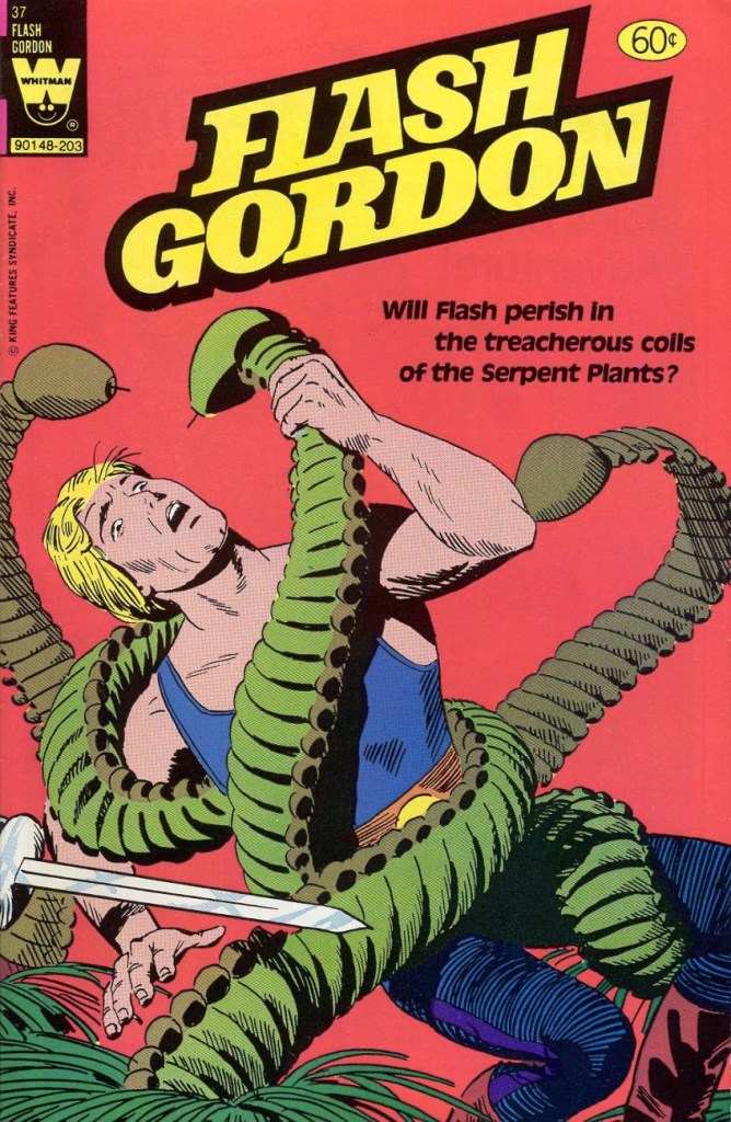
Cover story My Friend, My Killer! is scripted by George Kashdan and illustrated by Gene Fawcette and features cute serpent plants that look like they’re wearing little hula skirts.

And that concludes our tour of Flash Gordon tentacles in the Silver Age (and with some forays into Bronze).

🌱 ds

Tentacle Tuesday: Wonder Woman in the Silver Age

Wonder Woman is probably my most recurring area of focus when it comes to TT posts – although this is just the third, as it turns out, despite feeling like the fifteenth. The first two were devoted to the Golden Age Wonder Woman (Tentacle Tuesday: H.G. Peter and Wonder Woman lend a hand and Tentacle Tuesday: More Golden Age Wonder Woman Wonders!), and having more-or-less exhausted the GA’s tentacles, we move on the Silver Age (which, in my assessment, is considerably less interesting, but sometimes has quite nice art).

All pages are scripted by Robert Kanigher, pencilled by Ross Andru and inked by Mike Esposito, except for the first page from Stamps Of Doom!, which was scripted by Bill Finger.

Page from The Stamps of Doom!, scripted by Bill Finger (credited as Charles Moulton). printed in Wonder Woman no. 108 (August 1959).

I bitched about Kanigher WW in Tentacle Tuesday: Wonder Girl in the Silver Age, Part I and Don’t Let a Mysogynist Plan Your Wedding: Robert Kanigher and Wonder Woman’s Utterly Unsuitable Suitors. I’m starting to feel like my needle is stuck in the groove, but I will however note one more thing: in my righteous anger about Kanigher’s preposterous depiction of women, I’ve been ignoring that he’s not great at writing men, either. That is… he can write wonderful male characters (see Enemy Ace, for instance), as long as romance is totally off the menu. It’s as if he is saying that romance transforms intelligent, capable men into utter, snivelling dolts (a point of view that one could defend, but within limits). Take a look at what kind of suitors poor Wonder Woman gets saddled with (perhaps their stupidity is one more way of spiting her?) in these panels from Wonder Woman’s Impossible Decision, published in Wonder Woman no. 118 (November 1960):

To reiterate: man is sitting on a rock. One wouldn’t think that this is a particularly dangerous activity. And yet one minute he’s contemplating the injustices of life (sitting!), and the next he’s sinking (at the speed of a locomotive) into sea, right into the welcome arms of an octopus. I think the octopus planned it.
The guy’s suffocating, but he’s still fretting about Merman as a rival for WW’s affections.
This is Wonder Woman no. 128 (February 1962). Cover by Andru and Esposito.

Allow me to drive one more nail into that coffin, and after this I shall forever hold my peace. I stumbled upon this rather entertaining quote, taken from an interview with Kanigher conducted by Tim Bateman and Steve Whitaker in 1989 (read the full thing here). Here it is, with no further comments from me:

« So Ditko […] tried to force meanings where meanings did not exist. But he tried to tell me that I knew nothing about romance, because his idea of romance was professorial, pedantic. I know what romance is, I’ve written more romance probably than anyone alive. Romance is an excess of passion, and I don’t care if there’re a thousand books that says romance is not that, romance is a time period. Tchaikovsky is a romantic. Excessive, that’s what romance is. So to say that my idea of excessive emotion is not romantic…» 

And now, I shall remain mum, and let you savour these tentacles in peace!

Two pages from The Academy of Arch-Villains!, published in Wonder Woman no. 141 (October 1963).
In comics, swordfish are often pitted against octopuses (one doesn’t have to go far for examples – just look at the previous story), but I wonder how often that happens in real life…
Page from War of the Underwater Giants, published in Wonder Woman no. 146 (May 1964).
Page from The Olympics of the Doomed, published in Wonder Woman no. 148 (August 1964).
Page from I Married a Monster, published in Wonder Woman no. 155 (July 1965).
The Sinister Scheme of Egg Fu, the Fifth!, published in Wonder Woman no. 166 (November 1966).

~ ds

Tentacle Tuesday: Justice League of America

JLA’s roster has rotated throughout the years, but for the sake of this post, only the seven original members will get cephalopod tussling privileges! Here they are, with the conspicuous absence of Batman and Superman who are no doubt rushing behind the scenes to rescue everybody (but don’t worry, we’ll get to them as well):

The Brave and Bold no. 28 (February-March 1960, DC). Cover pencilled by Mike Sekowsky and inked by Murphy Anderson.

I’ll start with Superman, otherwise he’ll get offended – you know how susceptible he can be. Rather, a double whammy of Superman and Flash, who stumble upon some rather adorable (aside from their propensity to eating people) tentacled aliens. Of course our superheroes decide to make a race out of it, because concentrating on saving some planet or other is clearly not exciting enough – and Batman just happened to be hanging around to give the starting signal. Some afternoons are just that quiet. Race to Save the Universe!, scripted by Denny O’Neil, pencilled by Dick Dillin and inked by Joe Giella, was published in World’s Finest Comics no. 198 (November 1970, DC).

Nevertheless, this dynamic duo does allow itself to get distracted from its marathon, just long enough to defeat this green cutie:

Don’t underestimate kittens.

Incidentally, Superman already has a Tentacle Tuesday all to himself (Tentacle Tuesday: It’s a Bird! It’s a Plane! It’s a Tentacle!) Still, here he is collaborating (more like ‘rescuing’) Jimmy Olsen from an intriguing green (why must they always be green?) monstrosity with worm-like tentacles. Ugh, not the most appealing. These pages are from The Voyage of the Mary Celeste II!, scripted by Jerry Siegel, pencilled by Curt Swan and inked by George Klein and published in Superman’s Pal, Jimmy Olsen no. 75 (March 1964, DC).

DC’s “Big Three” – its most iconic and popular – are of course Superman, Batman and Wonder-Woman. As far as the latter is concerned, as much as I love this character, seeing as we already have two Tentacle Tuesdays posts in her honour – Tentacle Tuesday: H.G. Peter and Wonder Woman lend a hand and Tentacle Tuesday: More Golden Age Wonder Woman Wonders! – I think I’ve said everything I had to say on the subject. Thus, we move on to Batman, albeit briefly because there is also Tentacle Tuesday: All Aboard the Batmarine! to peruse. He’ll have to share the stage with Superman, but I’m sure he’ll be a good sport about it.

World’s Finest Comics no. 110 (June 1960, DC). Pencilled by Curt Swan and inked by Sheldon Moldoff.

The cover story is The Alien Who Doomed Robin, scripted by Jerry Coleman and inked by Sheldon Moldoff.

Our next JLA member is the Martian Manhunter, whom I have a strange soft spot for. It’s well known that girls just can’t resist green skin! In honour of this bias, here are not one, but two excerpts from stories featuring tentacles front and centre.

First, two pages from The Beings in the Color Rings, scripted by Dave Wood and illustrated by Joe Certa, published in House of Mystery no. 148 (January 1965, DC).

And for dessert, a page from The Supernatural Masterpieces!, scripted by Dave Wood and illustrated by Joe Certa, published in House of Mystery no. 150 (April 1965, DC).

Naturally, Aquaman has encountered more than a handful of octopuses in his long undersea career – I went on about that in some length in Tentacle Tuesday: Aquaman and his Octopus Sidekicks. I have plenty more where that came from, so there surely be a part II to that particular tale… in the meantime, here is a rather striking cover that didn’t make it into that post.

The Brave and the Bold no. 73 (August-September 1967, DC). Cover pencilled by Carmine Infantino and inked by Charles Cuidera.

The cover story is Glag the Destroyer, scripted by Bob Haney, pencilled by Howard Purcell and inked by Sal Trapani.

Last… and maybe least, because I could never warm up to him… is Green Lantern. The following pages are from a story pencilled by Gil Kane, who doesn’t generally get glowing reviews from WOT. Nevertheless co-admin RG wrote an ingenious post combining our common dubiousness about Kane and percolated it through specifically Green Lantern covers – the result is Hot Streak: Gil Kane’s Green Lantern, which impressed, if not quite convinced, me.

Funny Thing Happened on the Way to Earth!, scripted by John Broome, pencilled by Gil Kane and inked by Vince Colletta, was published in Green Lantern no. 70 (July 1969, DC).

I hope you enjoyed this overview of the Justice League of America as filtered through the rather eccentric lens of tentacles.

~ ds

Joe Maneely, Atlas of Versatility

« The cemeteries are full of irreplaceable people who were all replaced. » — Georges Clemenceau

Commercially and creatively, the 1950s held some of the best and the worst years for the American comic book industry. Basically, the first half was a glut and the second, a massacre. This is all well-trod ground. Today, we’ll stick to one artist and his main employer.

In his one intensely-prolific decade as a professional cartoonist, Joe Maneely (1926 – 1958) produced the overwhelming bulk of his work for publisher Abe ‘Martin’ Goodman’s Timely/Atlas, which would become Marvel Comics by the decade’s end.

The artist at his table. Herb Trimpe lets us in on the secret of Maneely’s prodigious speed (said to produce up to six pages a day, pencils and inks): « his pencils [were] almost nonexistent; they were like rough, lightly done layouts with no features on the faces … It was just like ovals and sticks and stuff, and he inked from that. He drew when he inked. That’s when he did the work, in the inking! ». Talk about unerring confidence!

Atlas historian Dr. Michael J. Vassallo sums up the Tao of Goodman (and, by and large, Marvel’s):

« As one genre faded, another would add titles to compensate. It didn’t matter if the new titles were basically redundant titles with new names. Goodman followed all trends in the comic book industry and the publishing industry in general.

A savvy businessman, he rarely led, mostly followed, but had the resources to follow with gusto, overwhelming competitors with product. »

As Ger Apeldoorn tells it, Maneely was a mere thirty-two years of age and at his frenetic artistic peak when tragedy struck:

« … on June 7, 1958, after going out for the night (with old-time friends John Severin and Walt Kelly assistant George Ward) he stepped out on the balcony of the train to get some air, fell between two trains and died. For a long time the story was that he had been drunk, but according to Dan Goldberg* he had lost his glasses earlier that week and that may have been a contributing factor. »

If the inspiring story of Joe Maneely, and its heartbreaking and sudden end is at all remembered these days, it has chiefly been through the diligent efforts of aficionado-historians such as Jim Vadeboncœur Jr. and the aforementioned Dr. Vassallo. Now why would an artist of such calibre fade so swiftly from memory? Since that happens all of the time (what one might term ‘invisible evidence‘), let’s move past the realm of the rhetorical and be more… specific. But first, some samples of the late Mr. Maneely’s goodies.

This is Outlaw Fighters no. 2 (Oct. 1954, Atlas).
This is Jungle Action no. 1 (Oct. 1954, Atlas). With spandex yet to hit the market (and even then), Leopard Girl’s costume must have been quite… stifling.
This is Mystery Tales no. 23 (Nov. 1954, Atlas).
This is Two-Gun Kid no. 18 (Nov. 1954, Atlas). I doubt anyone’s going to land comfortably. Particularly those poor horses.
This is Journey Into Mystery no. 22 (Feb. 1955, Atlas).
Oh, Stan — you’re so butch!” This is Rugged Action no. 2 (Feb. 1955, Atlas). To my eye, the bottom panel evokes Harvey Kurtzman‘s early style (think Two-Fisted Tales at EC); ironic, given that Maneely was as confident and speedy in his drawing as Kurtzman was painstaking and slow.
This is Apache Kid no. 15 (Aug. 1955, Atlas). The publisher also had in its roster Arizona Kid, Kid Colt, The Kid from Dodge City, The Kid from Texas, Kid Slade, The Outlaw Kid, Rawhide Kid, Ringo Kid, Texas Kid, Two-Gun Kid, The Gun-Barrel Kid… did someone say ‘redundant’? Why, yes, someone did.
This is Police Badge #479 no. 5 — the sole issue, really; its numbering picked up from Spy Thrillers… and went no further (Sept. 1955, Atlas). Maneely was another of that rare breed who could draw anything… because they enjoyed drawing everything. Dig all that well-observed detail!
Atlas published, in quick succession, no less that four short-lived Mad clones: Crazy, Riot, Snafu and Wild, each lasting from three to seven issues. None were particularly funny either, even if they did look quite good. This is Riot no.4 (Feb. 1956, Atlas) featuring what is termed, in comic book circles, an ‘infinity’ cover.
This is Melvin the Monster no. 4 (Feb. 1957, Atlas); Dr. Vassallo writes, in his in-depth Maneely overview for Alter Ego magazine (no. 28, Sept. 2003): « Stan Lee and Joe Maneely’s Melvin the Monster… duplicated everything they could about Hank Ketcham’s Dennis the Menace — art style, comic strip format, even upper-&-lower-case lettering style — everything except the warmth and innocence.»
This is Kid Colt Outlaw no. 69 (Feb. 1957, Atlas). Along with everything else, I love his way with flora and fauna. Incidentally, most of these covers were coloured by Stan Goldberg.

And so… why have Maneely’s star and memory dimmed so? It has been proposed, and I agree, that it’s because he just didn’t draw superheroes (a couple of Sub-Mariner covers being the lone exceptions), and Marvel itself hardly lifted a finger, over the years, to preserve the reputation of one of its principal architects.

The artist’s promotional letterhead illustration, circa 1948.

There’s been much idle speculation as to what course comics history would have taken had Maneely lived. Stan Lee wrote, in his usual disingenuous way, that:

« How I wish the world (and I) could have seen what he’d have done with the F.F., Spidey, Thor and all the other Marvel super-heroes! It’s a true tragedy that we’ll never have the chance. »

Let’s be honest here: Maneely was an incredible artist, and he made Stan look good, but Joe wasn’t a writer, and certainly not a world-builder in the fashion and class of Jack Kirby, Steve Ditko, Walt Kelly, Carl Barks, John Stanley, Basil Wolverton… and precious few others. Without Kirby, the so-called Marvel Age never would have come to pass. Not to mention that Maneely, with a wife and three daughters to feed and support, had just begun to work for one of DC’s friendliest editors, Murray Boltinoff**. He would have been unlikely to drop a better-paying, likely secure gig to drop everything and return to Marvel’s uncertain prospects. Ah, and I see Mark Evanier views it along the same lines.

Oh, and I’ve mentioned in the past Maneely’s likely influence (mostly in the inks) on his contemporary Rocco Mastroserio. Take a look at this gallery of his covers and see if you agree.

-RG

*Stan Goldberg, actually.

**as a matter of fact my first encounter — as a child — with Maneely’s work was through a reprint of one of his DC stories: The Doomsday Drum (House of Secrets no. 9, March-April 1958).

All Men Are Brothers: Henri Dunant’s Croix-Rouge and the Geneva Convention

« When a naked man is chasing a woman through an alley with a butcher knife and a hard-on, I figure he isn’t out collecting for the Red Cross. » — Clint Eastwood in Dirty Harry (1971)

As is often the case, I had something else in the pipeline for this week… but then I came across a beautiful biography of a wise man whose birthday was just around the corner. Now if the other guy (he’s 88) can just hold on and stay alive another week, things’ll be just fine.

In these riotous days when acts and thoughts of kindness and compassion are being denounced as political and partisan, we would do well to remember the life and example of International Red Cross founder, Henri Dunant ( Jean-Henri Dunant, May 8, 1828 in Geneva, Switzerland). Read on…

To Treasure Chest’s credit, they’re not being tribal or sectarian at all: Dunant wasn’t even Catholic, but rather Calvinist.

As you can bear witness, Reed Crandall (1917-1982) was not the type of artist to cut corners. Unlike some of his peers who could not be bothered to properly draw, say, details of background, period or costume, Crandall lavished attention and care to each and every element, yet without overpowering the narrative. His pages aren’t mere sequences of panels: they’re smartly composed for smoothness of flow and tonal balance.

Though nowadays his fame rests largely upon his brief but fruitful association with EC Comics (1953-56) and its echo at Warren Magazines (1964-1973), the greater bulk of his work was produced for Quality Comics (1941-1956) and for the catholic comics anthology Treasure Chest of Fun & Fact (1960-1972). All Men Are Brothers was, as it happens, his first work to be published in Treasure Chest.

Here’s a tongue-in-cheek but revealing snippet from a profile of Crandall that appeared in Creepy no. 10 (Aug. 1966, Warren):

« Combined with Reed’s fantastic drawing ability and mastery of rendering technique, is the rare ability to take any subject or setting and impart to it a complete sense of realism and authenticity. This, along with the fact that he is one of the most genial and unassuming men in the comics field, has earned him the high regard of his fellow artists, in addition to a growing circle of reader-admirers.

Asked about his ambitions, Reed replied: “To live in an ivory tower and to try to learn to draw and paint, also to pursue unendurable pleasure indefinitely prolonged.” It looks to us as though the drawing and painting are pretty far along already, so surely the ivory tower and prolonged pleasure can’t be too far behind… and in our opinion, it couldn’t happen to a nicer guy! »

As for writer John Randolph, who knows? He scripted twenty or so non-fiction pieces for TC between 1955 and 1962, then appears to have moved on. It must be noted that he understood the comics medium, as his work (often with Crandall) was well-paced and not overwritten, the words and visual in steady harmony. Many a writer, lacking the restraint and finesse required for the collaborative pas de deux of comics, tends to crowd out the illustrator, box him in (j’accuse, Al Feldstein!) or pointlessly restate what’s right there in the visuals (Et tu, True Believer?). Add to that the difficulty of elegantly condensing a life or career in six pages… as in this case. Take a bow, Mr. Randolph, whoever you are.

All Men Are Brothers originally appeared in Treasure Chest of Fun & Fact vol. 16 no. 7 (Dec. 8, 1960, Geo. A. Pflaum); cover by Crandall.
Crandall is most closely associated with the long-running Quality (and DC thereafter) character of Blackhawk (a Will Eisner co-creation). This is Modern Comics no. 78 (Oct. 1948, Quality). Between the operas, musicals, and films, John Luther Long’s Madame Butterfly sure gets around! Read the issue here!
More orientalism, but what a cover! This is Police Comics no. 105 (Apr. 1951, Quality). This title was the former and first home of longtime headliner Plastic Man, who bowed out with issue 102. Superheroes, you’ll recall, suffered fading popularity by the early 1950s. Read the issue here!
While Crandall arrived a bit late to the EC party, he made his lasting mark. Versatile as he was, I’d argue he was most in his element on this swashbuckling title, one of EC’s last-ditch, doomed attempts to placate the censors. Wally Wood drew the ship on the left, a recurring element of the cover layout. EC colourist Marie Severin (1929-2018) truly deserves a long round of applause for the sublime job she performed here. This is Piracy no. 3 (Feb.-Mar. 1955, EC).

-RG

Tentacle Tuesday: Don’t Miss the Boat!

« Don’t change your tack when the timbers crack
On the dark and the rolling sea…
» *

I am relatively indifferent to tales of adventure, but the siren song of the ocean sometimes prompts me to venture into reading tales about ruthless pirates or valorous seafarers and the perilous voyages they undertake on ships big and small, magnificent or modest. Who hasn’t felt a thrill at spotting a handsome vessel on the water, even if that water is but a canal running through the city? The other point of interest of this discussion is that where there’s an ocean and a ship upon it, there is a (preferably) giant octopus somewhere nearby, only waiting to shred the ship’s hull to smithereens and voraciously gobble up its shipmates.

I’ve talked about consumed shipmates before (see Tentacle Tuesday: Seafaring octopuses and the men they have shamelessly devoured), so today let’s focus on some nautical vessels!

Here is a modestly-sized yet utilitarian boat with a handsome octopus in tow. Maybe he just wanted to climb on deck to rest a while, like this otter?

More Fun Comics no. 44 (June 1939). Cover by Creig Flessel.

A similar boat (I don’t know whether it’s my profound lack of knowledge of boats that makes it seem that way) was attacked by a bigger, scarier – downright malevolent! – octopus some twenty years later. See Kyle “Ace” Morgan, Matthew “Red” Ryan, Leslie “Rocky” Davis and Walter Mark “Prof” Haley scramble for safety while an enraged octopus seeks to devour them! Oh, sorry, I’m being melodramatic.

Challengers of the Unknown no. 77 (Dec. 1970 – Jan. 1971, DC). Pencilled by Jack Kirby, inked by Jack and Rosalind (Roz) Kirby.

This cover has actually been recycled from Showcase no. 12 (Jan.-Feb. 1958, DC), where the background was yellow and the water a more normal shade of blue-white. I do like how the octopus stands out against a black background, however (and the multi-coloured water really sets off his beady, evilly-glowing green eyes!)

Of course these encounters also take place within the stories, as opposed to on the cover.

Page from The Outcasts of the Seven Seas, scripted by Bob Haney, pencilled by Howard Purcell, and inked by Sheldon Moldoff, was published in Sea Devils no. 23 (May-June 1965).

Time to move underwater, a very natural setting for an octopus attack. Here we have a submarine tenderly wrapped in tentacles:

Page from The Human Torch in the Clutches of the Puppet Master!, (over)scripted by Stan Lee, pencilled by Dick Ayers and inked by George Roussos. This story was published in Strange Tales no. 116 (Jan. 1964, Marvel).

Last but not least, I’ve kept this neat little submarine until the end:

Voyage to the Deep (IDW Publishing, 2019), a collection of Dell Comics’ short-lived, four-issue series published from 1962 to 1964 and illustrated by Sam Glanzman. Note the introduction by WOT favourite Stephen Bissette!

Glanzman is also a favourite of ours, though we haven’t talked about him much (yet). In case you’re wondering what the insides of one of those issues looked like – good, they looked really good! Note the octopus proudly perched in the middle of the page.

Page from Voyage to the Deep no. 1 (September-November 1962, Dell). Art by Sam Glanzman.

~ ds

Hot Streak: Nick Cardy’s Aquaman, Previously

« Suffering sea snakes! Can this really be happening, Aquaman? » — Aqualad has a query.

I just realised, a few days ago, that I’d left something hanging for too long: nearly two years ago, I turned the spotlight on a series of Aquaman covers, casually (in my debonair way) letting it be known that there existed another, earlier, and even longer (well, by one) run of exemplary Aquaman covers. The time has come to see whether I was talking through my hat… or not.

Now, at the risk of repeating myself, it must be stated that, since we’re dealing with DC’s late Silver Age, there’s more to any given cover than a signature. DC’s recently-ascended art director, Carmine Infantino, had a hand in designing virtually every DC cover between late 1966 and early 1976. How strong a hand varied from cover to cover, of course. A good designer sometimes knows when to hold back and be invisible, or just about.

Infantino always strove to improve himself and update and hone his skills. Well into his career (he’d started in 1940 at Timely), he pulled an unexpected (and very smart) move. As he recalled it in The Amazing World of Carmine Infantino (2000, Vanguard Productions):

« Around 1960, I went back to school again, this time to study under a gentleman named Jack Potter at the School of Visual Arts. What Jack taught me about design was monumental, and I went through a metamorphosis working with him. I’d sit there confused and he’d tear the work apart. But then it was a light bulb going off – bam! – and I’d understand everything he was getting at.

After studying with Potter at the SVA, my work started to grow by leaps and bounds. I was achieving individuality in my work that wasn’t there before.

I threw all the basics of cartooning out the window and focused on pure design. Everything I did was design-oriented. That was quite the challenging task. But that’s where Potter’s teaching took me.

… I started putting hands in captions, that was decorative. He taught us to do everything decoratively. I’d always found captions very dull. So I thought I’d break the captions into smaller paragraphs and use hands to get people to read them. I regularly pushed design and perspective to the extreme. »

And speaking of reinvention, I must also salute Nick Cardy’s own mid-career creative burst. Prior to the mid-60s, Cardy had always been one of those genteel, tasteful but entirely unexciting journeymen, the way most DC editors liked ’em. I can think of precious few long-timers that managed to convincingly reinvent themselves and greatly raise their game, well into their career, without utterly misplacing their original identity (that disqualifies you, Keith Giffen) in the process. Alex Toth, Jerry Grandenetti and perhaps Sheldon Mayer come to mind…

At any rate, when Infantino got together with Cardy on those covers, all hell broke loose, in the best possible way.

This is Aquaman no. 37 (Jan.-Feb. 1968, DC). The despondent walrus, bottom left, is family pet ‘Tusky’. Oh, and my apologies for ever-so-slightly poaching some potential Tentacle Tuesday material.
This is Aquaman no. 38 (Mar.-Apr. 1968, DC). I wonder what’s up with the redundant vertical logo, top left.
In case you’re wondering about Aquaman’s expanded regal duties (“and TV!“), they were showing repackaged reruns of his half of the previous year’s Superman / Aquaman Hour of Adventure. A Filmation production, so don’t expect too much if you haven’t seen it.
But back to the comic book: this dazzling scene announces the saga of “How to Kill a Sea King!”, as our amphibious hero seeks to thwart a hostile Venusian takeover of Earth and sea. Script by Bob Haney, art by Cardy. This is Aquaman no. 39 (May-June 1968, DC). Oh, and the hottie? That’s “Aliena”. A real bolt of ‘inspiration’ there, Mister Haney.
This is Aquaman 41, (July.-Aug. 1968, DC). Such dynamically-designed fun! This is where the new creative team of Stephen Skeates and Jim Aparo joins new editor Dick Giordano (his second issue), but Cardy remains on covers… because Aparo, who resided a couple of states over, couldn’t attend the cover conferences.
This is Aquaman 41, (Sept.-Oct. 1968, DC), a highlight among highlights from the redoubtable team of Infantino (publisher-designer), Cardy (penciller-inker), Giordano (editor), Jack Adler (production manager and colourist), and, inside, Skeates (writer) and Aparo (penciller-inker-letterer). There’s a texture to the colour work (most evident on the foreground piraña… a freshwater fish, incidentally) that’s unusual for comics of that period. I wonder how it was achieved…
This is Aquaman no. 42 (Nov.-Dec. 1968, DC).
This is Aquaman no. 43 (Jan.-Feb. 1969, DC). Face-first in a bed of mussels, with several tons of pressure? Yikes.
This is Aquaman no. 44 (March-April 1969, DC). I love how, despite the gravity of the situation, the mobsters are kind of cartoony. Cardy would most fruitfully mine this tragicomic vein in the brilliant but short-lived western Bat Lash (1968-69).
This is Aquaman no. 45 (May-June 1969, DC), concluding Skeates and Aparo’s two-parter, the self-explanatory “Underworld Reward”. An undeniably epochal cover by Mr. Cardy. To wit, so compelling and mysterious is this scene that it’s merited an astute blogger’s impressively in-depth analysis… well worth a peek.

-RG

Into the Inky Shadows With Jerry Grandenetti

« Jerry Grandenetti started out ghosting The Spirit, and nobody… NOBODY… captured the spirit of The Spirit better. Not content to stay in Will Eisner’s shadow forever, he forged his own unique style leading to a highly successful comics career lasting decades. » — Michael T. Gilbert

Since my very first encounter with his work, Jerry Grandenetti (1926-2010; born ninety-five years ago today, another Thursday April 15th) has endured as one of my true artistic heroes. But he’s not celebrated much at all.

Though he’s worked extensively on The Spirit, he’s treated as a bit of a footnote in the Eisner hagiography. His DC war work is well-regarded, but he’s inevitably overshadowed by the Joe KubertRuss HeathJohn Severin trinity. Besides, by and large, the war comics audience doesn’t overlap much with the spandex long johns crowd. Grandenetti has only very occasionally and timidly dipped a toe into the super-heroics fray, and he was far too unusual for overwhelming mainstream acclaim.

In fact, aside from the couple of converts I’ve made over the years, I can only think of three fellow torch-bearing aficionados: Michael T. Gilbert (who digs best the early, Eisner-employed Jerry); Stephen R. Bissette (who favours the spooky 60s and 70s work); and Don Mangus, who’s most into the DC war stuff. I daresay I enjoy it all, but my taste is most closely aligned with Mr. Bissette’s on this particular point. Let’s sample a bit of everything, insofar as it’s feasible to sum up a career spread out over five decades… in a dozen-or-so images.

Opening splash from The Secret Files of Dr. Drew: Sabina the Sorceress, written by Marilyn Mercer and lettered by Abe Kanegson, from Rangers Comics no. 56 (Dec. 1950, Fiction House); this version hails from a reprint (Mr. Monster’s Super Duper Special no. 2, Aug. 1986, Eclipse) using the surviving original art; it was recoloured by Steve Oliff.
Page 3 from The Secret Files of Dr. Drew: Curse of the Mandibles!, written by Marilyn Mercer and lettered by Abe Kanegson, from Rangers Comics no. 55 (Oct. 1950, Fiction House); this version hails from a reprint (Doc Stearn… Mr. Monster no. 4, Dec. 1985, Eclipse) using the surviving original art; it was most tastefully recoloured by Steve Oliff.

In 1954, the powers-that-be at National Periodical Publications (you know, DC) gave Grandenetti some latitude to experiment with their War covers. Grandenetti produced an arresting hybrid of painted and line art. The process involved a grey wash painting that was photostatted, with flat colour laid over the resulting image. The first few attempts yielded striking, but nearly monochromatic results. A bit farther down the pike, the production department got more assured in its technical exploration.

This is G.I. Combat no. 77 (Oct. 1959, DC); wash tones and colouring by Jack Adler, who recalled, in a 1970s interview: « It was suggested that we start doing washes for covers, and we were talking about doing it for so damned long, but nobody attempted it. I think Grandenetti did the first one, an army cover with someone floating in the water. I think that was the first wash cover that was done. That one ended up looking like a full color painting. »
This is G.I. Combat no. 83 (Aug.- Sept. 1960, DC); wash tones and colouring by Jack Adler. In 1995, Robert Kanigher, Grandenetti’s editor on the DC war books and a frequent collaborator, recalled: « Jerry liked to experiment and I had to sit on him to get him to stop it. Especially in his covers, which were outstanding, when I forced him to draw as realistically as possible. »
Original art from The Wrath of Warlord Krang!, smothered in dialogue and exposition by Stan Lee, from Tales to Astonish no. 86 (Dec. 1966, Marvel); inks by Bill Everett. Namor‘s constant random shouts of ‘Imperius Rex!‘ make him sound like a sitcom character with Tourette’s. As far as I’m concerned, it’s possibly been the most annoyingly asinine slogan in comics since Stan stole ‘Excelsior!‘ from Jean Shepherd.
The opening splash from Cry Fear, Cry Phantom, written by Archie Goodwin, from Eerie no. 7 (Jan. 1967, Warren). In the mid-60s, presumably tiring of being pigeonholed as a war artist at DC, Grandenetti made the publishers’ rounds, doing a bit of work for Tower, Gold Key, Charlton, Marvel, Cracked (check it out here) and most memorably Warren where, after ghosting a few stories for Joe Orlando, he unleashed his innovative expressionistic style.

DC was generally hesitant to entrust its more established properties to the more “out there” artists. In the cases of Grandenetti and Carmine Infantino, the solution was to match them with the weirdness-dampening inks of straight-arrow artist Murphy Anderson. And you know what? It did wonders for both pencillers and inker.

This is The Spectre no. 6, October, 1968. A tale told by Gardner Fox (and likely heavily revised by hands-on editor Julius Schwartz, a man who loved alliterative titling) and superbly illustrated by the Grandenetti-Anderson team. Steve Ditko aside, Jerry Grandenetti had no peer in the obscure art of depicting eldritch dimensions (you’ll see!)

Page 13 from Pilgrims of Peril! written by Gardner Fox, from The Spectre no. 6 (Sept.- Oct. 1968, DC); inked by Murphy Anderson. Dig the salute to a trio of real-life spooky writers, all of whom editor Julius Schwartz knew well, having even served as Lovecraft’s literary agent late in the man’s life. By the tail end of the 1960s, Lovecraft’s work was finally making some commercial inroads, thanks largely to Arkham House co-publisher Derleth‘s unflagging diligence.
Page 22 from Pilgrims of Peril! written by Gardner Fox, from The Spectre no. 6 (Sept.- Oct. 1968, DC); inked by Murphy Anderson.
Page 2 from Men Call Me the Phantom Stranger, written by Mike Friedrich, from Showcase no. 80 (Feb. 1969, DC); inks by Bill Draut. This story reintroduced an obscure character from the early 50s, which Grandenetti had drawn a couple of times during his six-issue run. The Phantom Stranger has remained active ever since, but most writers (save Alan Moore, wouldn’t you know it?) don’t really know what to do with him. This, however, is my very favourite PS appearance. Draut, a slightly old-fashioned penciller by this time was, as a slick inker, a wonderful fit for Grandenetti’s confidently loopy layouts.
Page 3 from The Haunting!, written by Jack Oleck, from House of Mystery no. 183 ((Nov.-Dec. 1969, DC). Grandenetti pencils and inks: undiluted!
Page 2 from Eyes of the Cat, written by Robert Kanigher, from House of Mystery no. 189 (Nov.-Dec. 1970, DC); inks by Jerry’s fellow Will Eisner ghost Wallace Wood. The inspired combination of Grandenetti’s adventurous layouts and the velvety unctuousness of Wood’s finishes are a match made in heaven, but one Woody wasn’t fond of. Oh well.

So there you are. Just the tiniest tip of the iceberg. Happy birthday, Mr. Grandenetti!

-RG

Tentacle Tuesday: Octopus Cameo*

*No, I am not referring to the popular company that lets customers hire favourite ‘stars’ to record personalized videos; a month ago, I didn’t even know this existed, and my life has not been improved by this knowledge.

Sometimes an octopus stays politely in the background, waving hello shyly from behind a rock, or waiting for a dance invitation like a bashful kid at a high-school dance (do they still have these?) I never know where to use these covers; their tentacled nature is undeniable, but their octopuses are so peripheral to the main story that they tend to be overlooked when I am in search of a unifying theme for a post.

cam·e·o/ˈkamēˌō/

a small character part in a play or movie, played by a distinguished actor or a celebrity.

a piece of jewellery, typically oval in shape, consisting of a portrait in profile carved in relief on a background of a different colour.

I’m not sure this counts as a “portrait in profile”, but I will happily accept it as a cameo.

All right, on to the comics…

Mutt & Jeff no. 18 (Summer 1945, All-American). Cover is by Sheldon Mayer. So the octopus has only four tentacles, but he’s a cutie!

Mutt & Jeff have already been part of a Tentacle Tuesday line-up, but the main interest here is Sheldon Mayer, a big favourite at WOT. Don’t believe me? Set your orbs on Yesterday’s Tomorrow’s Teenagers: Sheldon Mayer’s Sugar and Spike.

Life with Archie. no 41 (September 1965, Archie). Cover by Bob White.

Co-admin RG rounded up quite a few of his favourite Bob White covers in Bob White, Forgotten Archie Artist and More Bob White, Lost Archie Artist – I highly recommend to have a look at both posts!

Treasure Chest vol. 22 no. 9 (December 1966, George A. Pflaum). Cover by Reed Crandall. This cover is of course dedicated to Jules Verne.

Treasure Chest, a long-running catholic publication we mention routinely though not too often (for details, see co-admin RG’s Hallowe’en Countdown IV, Day 24), runs the gamut from informative to fun, sometimes both at the same time. There are occasional clunkers (like the admittedly rather entertaining multi-part story I am currently reading about Godless Communism), but overall it’s well worth picking up, should some issue catch your eye.

Can you spot the octopus, right there in the window? He’s all set to escape, I think. Bonus: bats! As the top says, this is a strip from June 1970, scripted by Brant Parker and Johnny Hart, with art by Parker. These two have created The Wizard of Id in 1964, so this strip has been around for quite a while…

I originally had in mind happy, frolicking octopuses for this post, so here is one instance of just that. As a matter of fact, his smile is somewhat unnatural and more of a rictus, but I don’t want to be picky…

Bunny no. 14 (March 1970, Harvey). Cover by Hy Eisman. More (dubious) puns than one can shake a stick at… it’s almost like reading a Piers Anthony novel.

I’ll quote from Don Markstein’s excellent summary of this hare-brained comic series: « Bunny was aggressively, even obsessively trendy. Even at the time, it seemed to lay on the love beads and “psychedelic” display lettering a bit thick. […] But she owed her painfully discordant Sixties-ness to nobody. […] It’s as if her entire raison d’être was to parody the decade of student activism and radical youth fashions, even while living it. To make matters worse, this teenage girl comic was edited, written and drawn by middle-aged men who were probably, like most middle-aged men, unable to communicate with their own daughters. To vary the dialogue, in which everything that wasn’t “groovy” was “outasight”, they made up their own slang. Things could also be “zoovy” or “zoovers” or even, in extreme cases, “yvoorg” — which was obviously “groovy” spelled backward, but no hint was ever given as to how it might be pronounced. »

~ ds

Hot Streak: Gil Kane’s Green Lantern

« It was exactly an assembly line. You could look into infinity down these rows of drawing tables. » — Gil Kane

Some of our more sensitive readers may have noticed that we’ve been none too gentle with Gil Kane (1926-2000) in the past, dealing him some rather rough lumps at times. But that’s not the whole story: in taking stock of such a protracted and prolific (dare I say profligate?) career as his, much of it inevitably spent on autopilot, one must be discerning. In other words, I like some of Kane’s work, but there’s plenty of it I don’t care for. Still, WOT’s rule of thumb is that if we altogether loathe an artist and/or his work, we’ll just turn a blind eye.

And speaking of the sense of sight, what makes a great comic book cover? Must be my art school training and subsequent work in advertising tipping the scales, but to me, design and layout reign primordial as ingredients… as values. I’m often dismayed at many a would-be critic’s apparent method of assessing an image’s artistic worth, namely: how many popular characters does it feature? Is it action-packed? Is the issue sought-after and expensive? Does it feature a famous character’s début? Is it drawn by a fan-favourite artist who unquestionably can do no wrong… because he’s a fan-favourite artist who unquestionably can do no wrong? (and how dare you claim otherwise!)

Gil Kane reportedly generated around eight hundred covers for Marvel in the 1970s… of all levels of craft and quality. With that kind of frenzied output, it’s impressive that most were perfectly serviceable, given that there certainly was no time for meticulous, sober planning. They were generally over-captioned (not Kane’s fault!) and crassly sensationalistic, but that’s what Marvel sought and settled for.

It’s a shame that Kane and his former classmate at the School of Industrial Art (back in the early 40s!), DC lynchpin Carmine Infantino didn’t get on too well, because their Silver Age collaborations had a special spark… must have been the animosity. It had been noted by the DC brass, as early as the late 50s, that Carmine’s covers reliably caught prospective buyers’ attention and dimes. And so, by 1967, he was unofficially designing most of the publisher’s covers, and certainly the covers of all titles edited by Julius Schwartz. Green Lantern was among these.

So we turn today’s spotlight on a hot streak of seven. Kane gets his name in the title, but it would be more accurate to say they were Infantino-designed, Gaspar Saladino-lettered, Jack Adler-coloured, Gil Kane-pencilled and Murphy Anderson and Sid Greene-inked covers. The streak begins after Green Lantern no. 54’s downright poor cover, and ends with the interruption of Kane’s impressively long run of consecutive issues.

We begin with Green Lantern no. 55 (Sept. 1967, DC). Harmonious, easy-to-parse arrangement of numerous elements and exemplary integration of text. Design by Infantino, pencils by Kane, inks by Murphy Anderson, lettering by Gaspar Saladino, colours by Jack Adler. Oh, and lest we forget: logo designed by Ira Shnapp (circa 1964), classic Green Lantern uniform designed by Kane (circa 1959).
This is Green Lantern no. 56 (Oct. 1967, DC). Kane was never much for varying his monsters (see below). Pencils by Kane, inks by Anderson.
For a bit of comparison on how things were done from company to company, this is Tales to Astonish no. 91 (May, 1967, Marvel). This is what happens when there’s no planning or attention to detail: in an already-crowded cover, did we really need that ugly box advising us of the presence of The Abomination? He’s right there! (maybe the abomination refers to the cover itself). And the foreshortening nightmare that is the baddie’s left arm was so dire that, when a fan commissioned Arthur Adams to produce a recreation of this cover (which, things being as they are, many surely consider ‘iconic’)… he wisely corrected the anatomy and tweaked the poor composition. Interesting how Marvel’s heavy-fingered yes-man, art director John Romita Sr., was always game to “fix” Ditko and Kirby art, but saw nothing wrong with this one.
This is Green Lantern no. 57 (Dec. 1967, DC), featuring Catastrophic Weapons of Major Disaster!, written by Gardner Fox, pencilled and inked by Kane. Cover by Kane and Greene… love the placement of the signatures!
This is Green Lantern no. 58 (Jan. 1968, DC), featuring Peril of the Powerless Green Lantern! (a Julius Schwartz title if there ever was one), written by Gardner Fox, pencilled by Kane and inked by Greene. I’m not overly fond of the Kane-Greene mix, but Sid Greene, as a penciller-inker did some splendid work on the Star Rovers series (1961-64), co-created and scripted by Gardner Fox.
An issue whose price few can afford unless they bought it off the racks, this is Green Lantern no. 59 (March 1968, DC); pencils by Gil Kane, inks by Murphy Anderson. Featuring the introduction of GL alternate Guy Gardner, who was to be dubiously re(jack)-booted in the 1980s, by Steve Englehart and Joe Staton, as a jackass with an ugly uniform and a worse haircut. Notwithstanding the fact that the Green Lantern Corps would never bestow power and stewardship on such an immature and pompous loose cannon.
This is Green Lantern no. 60 (April 1968, DC); an evident Infantino design, with pencils by Kane and inks by Anderson… which interestingly ends up producing a prototype of Brian Bolland‘s distinctive style… a decade early.
This is Green Lantern no. 61 (June 1968, DC); pencils by Kane, inks by Greene, and featuring (groan) Thoroughly Modern Mayhem!, scripted by Mike Friedrich, pencilled by Kane and inked by Greene. Co-starring Alan Scott, the Golden Age Green Lantern.

-RG