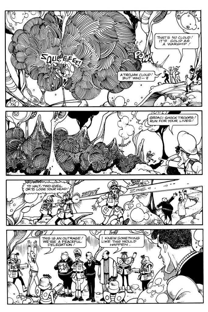
« “Obey the government“, said one croak. “We are the government“, said another. » — Ray Faraday Nelson
I’ve been juggling several ideas for posts, most of them leaning more or less to the light-hearted and poetic, save one… and since that outlier is more suited to the current state of affairs, here goes.
.

.
.
.

.

.
.

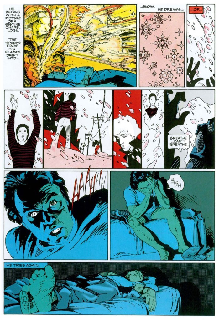
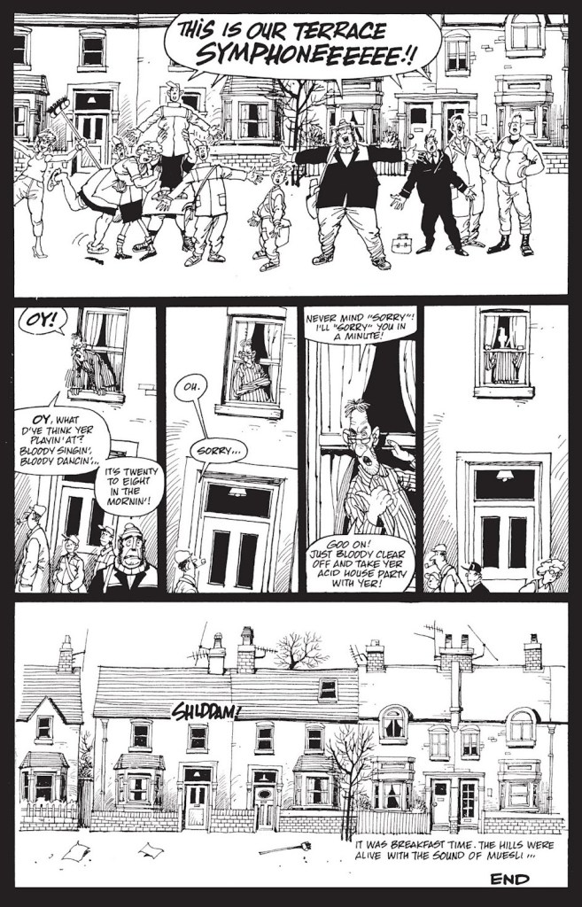
You guessed it, the story was adapted by John Carpenter for his 1988 film They Live, one of the great science-fiction films of that decade that bombed at the box office and were later reconsidered… more lucidly. Think Carpenter’s The Thing** (among others… poor guy!), Ridley Scott’s Blade Runner, and this one. At least it didn’t suffer a pointless remake or a Denis Villeneuve sequel. Yet.
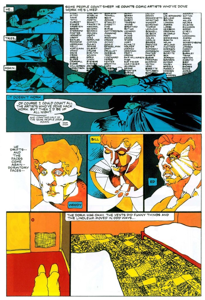
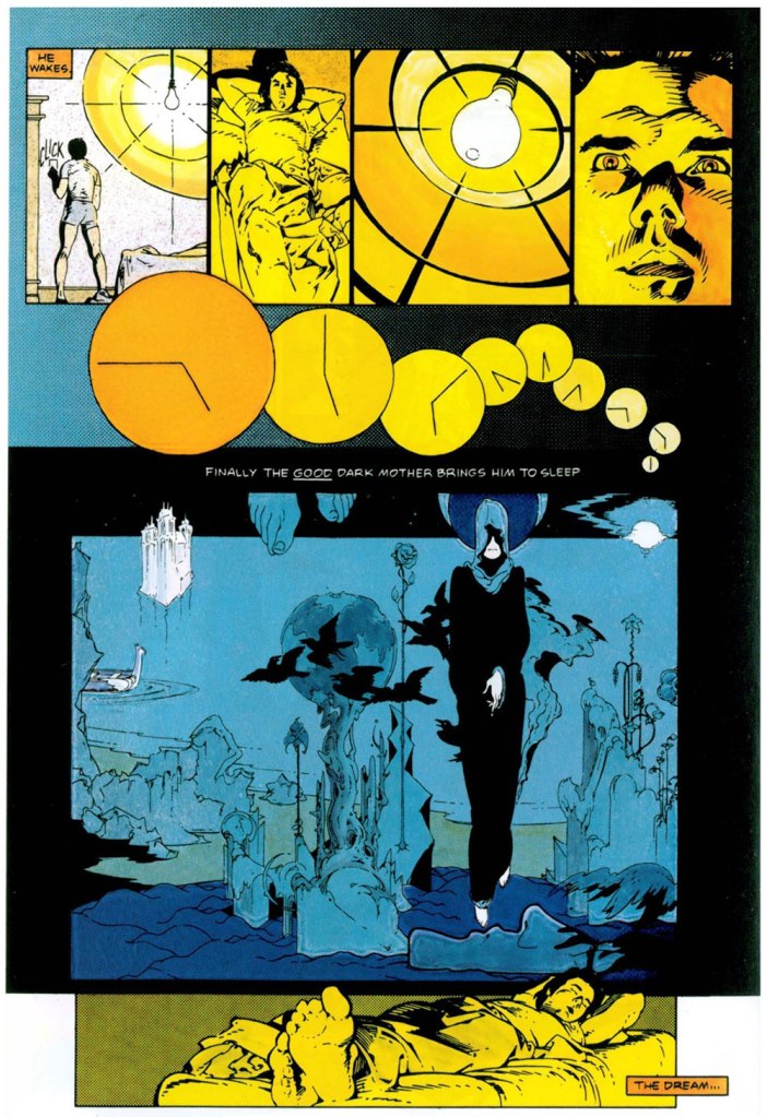
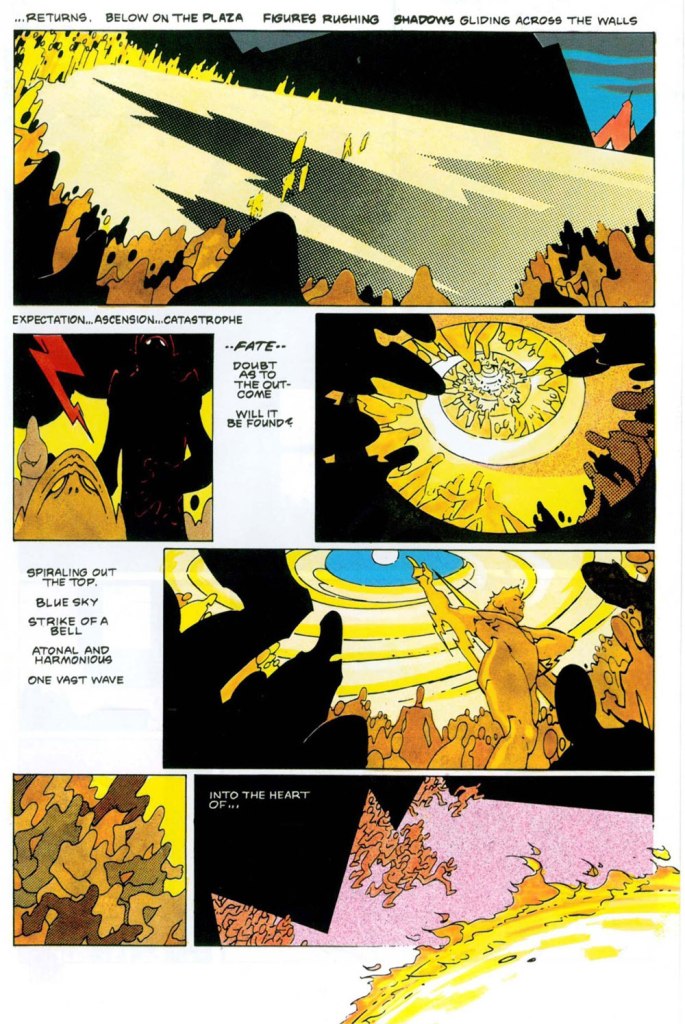
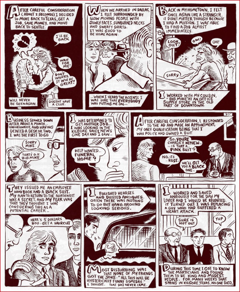
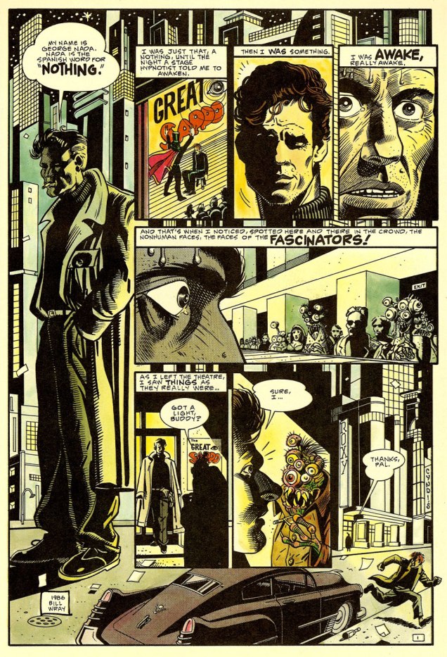
Anyway, Carpenter recounted, in an interview published in the venerable American Cinematographer (Sept. 1988), soon after the film’s release: « They Live began three years ago with a comic book I bought called ‘Nada’. It was published by Eclipse Comics, a company which puts out very beautifully rendered science-fiction stories. This particular strip was taken from a short story called ‘Eight O’Clock in the Morning’ by Ray Nelson. » [ source ]
How refreshing it is to hear a filmmaker directly credit his source of inspiration, even if said source might be viewed as ‘low-brow’ by the holy arbiters of intellectual standing. Compare that to, say, avid comic book collector George Lucas, who brazenly pilfered elements from Jack Kirby’s Fourth World and Pierre Christin and Jean-Claude Mézières’ Valérian for his space opera, then pretended he’d been instead inspired by the scholarly comparative mythology theories of Joseph Campbell‘s Hero With a Thousand Faces. Riiight, George. And don’t get me started on Spielberg.
Related aside: on They Live‘s imdb.com page, some lout quite misunderstood the purpose of a FAQ — objectivity, for one thing — and took it upon himself to malign Ray Nelson’s essential contribution. To the question « What are the differences between the short story and the film? », he frothed forth:
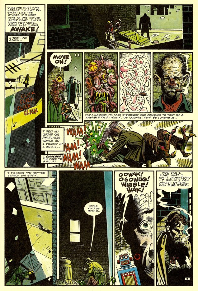
The short story, titled Eight O’Clock In The Morning, is an exercise in awful writing. The protagonist goes around murdering “Fascinators” without any discussion of what changes him from a compliant citizen to this state.
What John Carpenter’s story does, in essence, is add fat, muscle, a brain, and pretty much everything else a living organism needs, to a skeleton in the most literal sense. Everything that fills out John Nada’s back story and makes him seem like an actual person who thinks and feels is all John Carpenter’s idea.
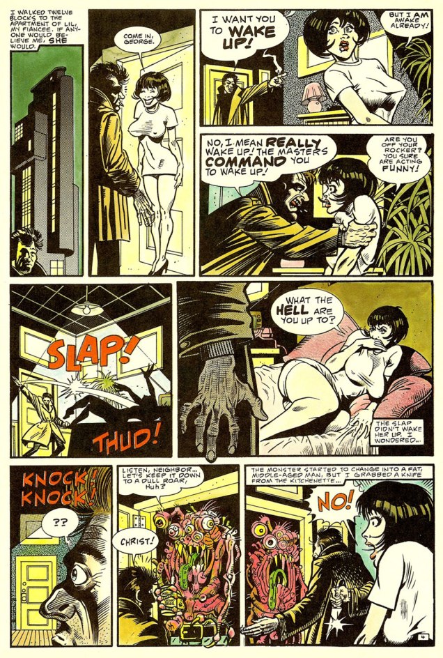
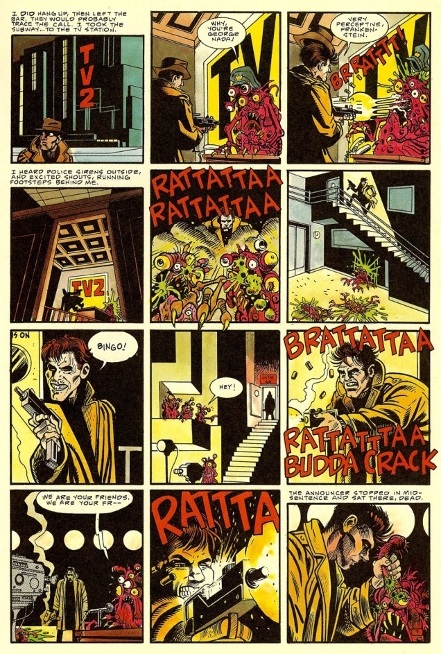
Ahem. It seems to me that there just *might* be a slight difference, in terms of expansiveness, between a 94 minute motion picture… and a five page short story. Well, you be the judge: read it here, in its original context and everything!
-RG
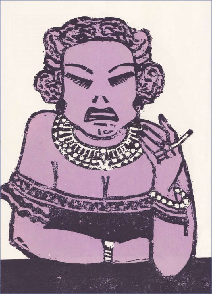
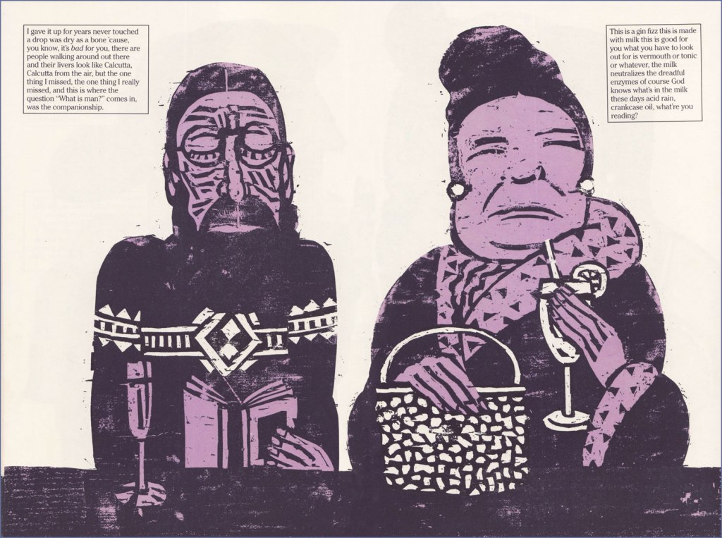
*I simply must point out that, though I like Mr. Wray’s work as a cartoonist, I am in absolute awe of his paintings. Here’s how he helpfully puts it: « Making his living as a cartoonist who specialized in painted subjects, he spent many years coalescing a eclectic array of art styles, ultimately finding his voice in a contemporized reflection of traditional California regional painting that focus on humble subject matter rarely considered as fine art. » His paintings are so very *soulful*, demonstrating a glorious grasp of colour and composition, to say nothing of subject and technique. Take a leisurely look here.
**Farewell to The Thing actor T. K. Carter, who passed away just today. What a cast that was!