Georges Pichard’s Distressing Damsels

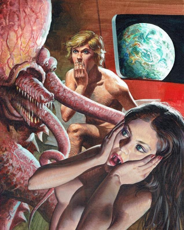
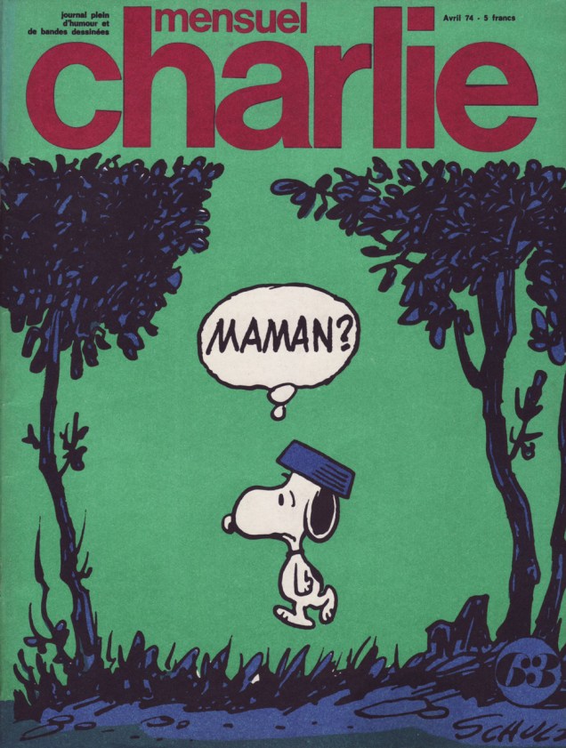
French comics artist Georges Pichard (1920-2003) specialized in erotic comics, and his work ranged from “just controversial” to “outright banned”. I have a soft spot for his excellently-endowed women with almond-shaped eyes – what they lack in sensuality (to my opinion, at least), they compensate with cantankerous personalities and odd liaisons with deities. Pichard also displays a preoccupation with labour and industrial themes, kind of a communist thing to my mind – his women are called upon (mostly unwillingly) to work with heavy hardware, build railroads, excavate mines, and undertake other menial tasks involving much metal and machinery. This, of course, is accomplished while naked, or nearly naked (shackles are frequently involved.) It doesn’t come off as sadistic or even sexist, however – it’s more like a grotesque comedy or satire. Anyway, I’ll get to all that in just a second.

First I’d like to show a few examples of his earlier work, which wasn’t “pushing moral boundaries” (as an anonymous admirer once put it). His two early series – Ténébrax and Submerman – were collaborations with comics artist Jacques Lob. Although Pichard’s eye for pretty women was already in evidence, his style was much cartoonier, which is lovely.

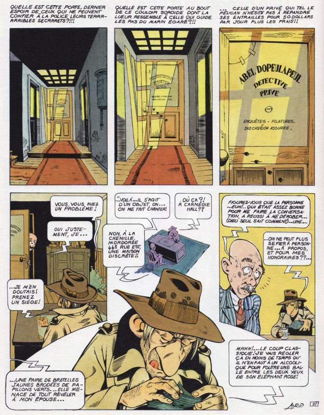
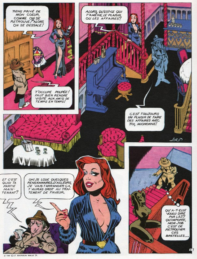
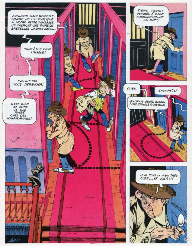
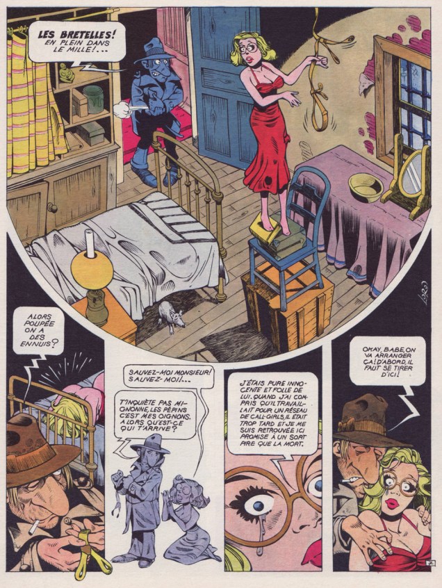
Ténébrax is an homage of sorts to the roman policier (the French genre of detective stories): a villain uses the Paris subway for his base while he whips his rat army into tip-top shape for world domination, but his heinous plans are foiled by a whodunit writer and his assistant, who manage to throw a spanner into his nefarious schemes.

GeorgePichard-tenebrax
Ténébrax, the first collaboration between scénariste Jacques Lob and Georges Pichard, was published in episodes in the short-lived weekly Chouchou (1964.)
Tenebrax01A
The opening page of Ténébrax. The bottom panel says (or, rather, our human protagonist says), « Who are you? Help! »

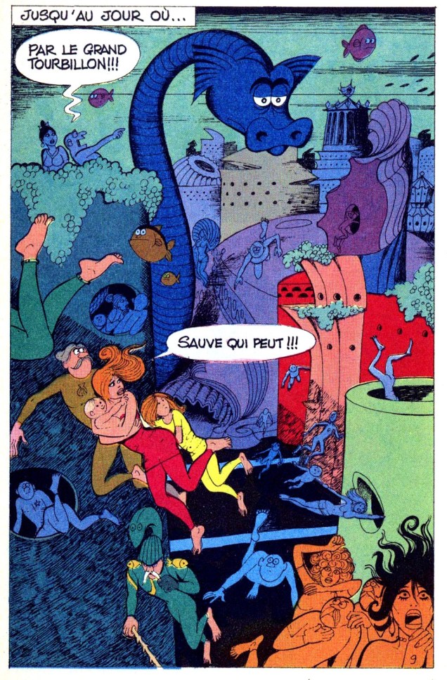
Submerman, on the other hand, is a superhero parody:

Submerman-Pilote1969-Lob-Pichard
A page from Submerman from Pilote n°527 (1969). See all Pilote covers featuring Submerman here. The series was published between 1967 and 1970. People looking for a really obscure Halloween costume, take note of Submerman’s get-up: it wouldn’t be so hard to draw a yellow fish on a red onesie.
GeorgePichard-Lob-Submerman-no4
Submerman: La faune des profondeurs, published in Super Pocket Pilote n°4 (1969). « Sauve qui peut! » translates to « Run for your life! » Interestingly, English doesn’t have a « Save yourselves, those who can », but French and Russian do. I can’t vouch for other languages.

Now, I promised you some of Pichard’s women. An obvious place to start is the series Paulette, scripted by Georges Wolinksi (who, by the way, was killed in the terrorist attack on Charlie Hebdo in 2015) and illustrated by Pichard.

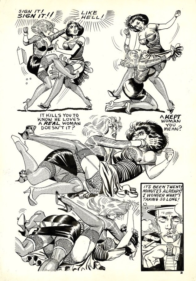
Paulette began in 1970 and chronicled the wild (and ever so slightly improbable) adventures of (who else?) Paulette. She gets kidnapped (more than once, by different parties), wooed, attacked, betrayed, saved, pregnant, communist-icated, converted to capitalism, harem-ed, and so on, not necessarily in that order. The only thing she doesn’t get is left alone. Poor girl. I wouldn’t say the series is entirely light-hearted, however – the authors used their pretty héroïne to ventilate all sorts of issues.

Paulette-en-amazonie-4-Wolinksi-Pichard
Paulette en Amazonie (Éditions du Square, 1975). Is it wrong that I love the drawing of evil Nazis and dumb soldiers a lot more than the damsel in distress? Pichard’s women all looked the same, but his villains had a lot more variety – which is not untypical of artists who are obsessed with the female form, actually. Silly, really; one would think that an obsession would lead one to exploring different shapes and forms, but somehow it rarely works out that way.

« Here she is, ready to climb aboard airplanes that are inevitably hijacked, to wind up in jungles, in wasp nests, in ambushes, to crash through panels, through traps, into the arms of men unworthy of her, and to come through all this with a smile, without blaming anyone, not even Pichard and Wolinski, whose main preoccupation it is to never leave her alone.» (Introduction to Paulette 4, 1975)

An illustration to the political-gone-absurd content of Paulette:

Paulette-Wolinski-Pichard-Communiste
The colours make me think of a black light poster. Here Paulette wakes up her bearded beau (who figures that her « Something terrible has happened to me! » refers to a pregnancy, and responds with « Don’t worry, if you have money that’s nothing, In Switzerland or Morocco… ») to inform him that « I think I am a communist! »

Speaking of bearded beaus: one of my favourite Paulette plots – although I haven’t read the whole series – involves Joseph, the old perv we just saw in bed, whose job is to protect Paulette from… err, himself, I guess?  When Paulette rescues a magical mole, it offers her one wish, and because she is terminally naïve (bordering on the cretinous, if with a heart of gold), she wishes for Joseph to become young again. The mole, however, is myopic like all others of its kin, and mistakes Joseph for a woman, so he gets transformed into a sultry brunette.

Moving on to other oeuvres

GeorgePichard-Borneo Joe
Original art from Bornéo Jo (Dargaud, 1983), with script by Danie Dubos and art by Pichard.
George-Pichard-MarleneetJupiter
Marlène et Jupiter (Yes Company, 1988).
PichardL'UsineA
A panel from L’usine (Glénat, 1979).

And I saved the funniest as a digestif: in the last panel, the man is saying « But what am I supposed to do now? », to which she responds with « Replace your windshield, of course! I’ll give you an address, they’ll give you a ten percent discount if you mention that you were sent by Fairy Motricine – I’m the sister-in-law of Fairy Electricity. » (Note: Motricine was a brand of gas.)

George-Pichard-Surlaroute

~ ds

Tentacle Tuesday: Euro Tentacles Unto Horror

Tentacles have no anglophonic bias.  A tasty human morsel is every bit as appetizing when it’s babbling in Italian or German. Join me on a visit to the European side of things, where tentacles are truly horrifying and there’s none of this politely-hold-a-girl’s-leg stuff. It’s gore and revulsion through and through!

HorrorTalesV3#2A
Horror Tales vol. 3 no. 2 (1971, Eerie Publications). Let’s have a moment of silence for what the poor guy is going through, being swallowed alive by a pulsating pink monstrosity which appears to have the same hole for eating and waste evacuation like some sea anemone (that has that has a single orifice for eating, excreting, and shedding eggs and sperm) and is about as appetizing. No, scratch that, sea anemones are much better.

The cover, painted by German artist Johnny Bruck, is a reprint from the German sci-fi series Perry Rhodan, published by Moewig-Verlag starting in 1961. Here is the original:

PerryRhodan136
Perry Rhodan no. 136. « Beasts of the Underworld », if you were wondering.

If the last cover made me vaguely think of an arsehole, this next one clenches, er, *clinches* this unfortunate association.

WitchesTalesVol3#5A
Witches’ Tales vol. 3 no. 5 (1971, Eerie Publications). Tentacles that look like furry slugs, a face like a puckered, blood-stained anus… this creature even his mother couldn’t love. And the victim? Why the fuck is a vampire in an astronaut’s helmet? And why a vampire at all – isn’t a tentacled monstrosity scary enough without bringing a blood-sucker into it? This witch is having nightmares.

The cover is by Franz Fernández, a Spanish artist born in Barcelona. He worked for Selecciones Illustrades, a Spanish art agency mostly known for its deal with Warren Publishing, which led to many Spanish artists submitting stories to Warren between 1971 and 1983.

On a somewhat less revolting, yet no less puzzling, note, we have these gorilla dinosaurs with tentacles. Why the hell not? I dedicate this cover to my friend Barney, a fan of silverback gorillas.

Gespenster Geschichten1399
Gespenster Geschichten no. 1399 (1974, Bastei Verlag). Gespenster Geschichten, “Ghost Stories” in German, was a weekly comic book series that ran between March 1974 and March 2006, which certainly gives us a clue as to how successful it was. In the early years, most stories in Gespenster Geschichten were reprints of American horror comics, pretty much what one would expect: lots of appearances from Frank Frazetta, Jack Kirby and Wally Wood, for instance. When the magazine stopped relying on reprints and started featuring new content, Argentine, Spanish, Peruvian and Italian artists provided most of the artwork, together with Yugoslav artists (such as Goran Sudzuka) and a couple of German ones, most noticeably Hans Wäscher, a revered German comics artist (whom Google comically translated as “hans scrubber”). This cover points out that the contents are “neauflage”d (i.e. reprinted).

I appear to be utterly incapable of doing a Tentacle Tuesday post without some sort of scantily clad, beautiful maiden joining the fray. Why resist? Here are a couple of precursors of The Possession.

Orror14A
Orror no. 14 (1978, Edifumetto). For once, the monster is kind of cute, as opposed to completely nauseating. Art by Alessandro Biffignandi.
Sukia52-cover
Sukia no. 52 (1980, Edifumetto). Sukia was a joint effort of Renzo Barbieri, founder of Italian publishing house Edifumetto, and Fulvio Bosttoli. Ornella Muti fans, take note.

The original painting allows us to see more detail in the alien’s, err, anatomy. After seeing this, I don’t think anybody needs abstinence speeches.Sukia No. 52 L'alieno 1980

~ ds

Let’s All Go Down to the Catfights!

Catfight (noun): A vicious fight between two women that features biting & scratching and often involves clothes being ripped off.

To which I’ll add that if you put two women with different hair colours in one room, it’s like there’s a chemical reaction that makes them instantly aggressive. In comics, at least – and we all know that comics reflect real life accurately, right? The resulting combativeness is especially obvious when the encounter is between a blonde and a brunette. The women involved must also be beauties – presumably, plainer girls resort to verbal assaults when provoked, eschewing physical violence, unlike their flashier counterparts.

Or it could have something to do with the mostly-male audience who actively likes watching belles brawl. (Perhaps “ogle” would be a better description.) Let’s move on to the ogling bit, then!

Undercovergirl-catfight
Err, agreed on the “talking too much” bit. Manhunt no. 9 (Magazine Enterprises, June 1948). That art’s by Ogden Whitney.

“Jeepers! Baldy’s been skewered through the ticker! He’s defunct!” This charming scene with boob grabbery and skirt rippery (I know, don’t I have a way with words?) is from “Off Stage Kill”, a Dan Turner Hollywood Detective story from Crime Smashers no. 7 (Trojan Magazines, 1951).

CrimeSmashers7-DanTurnerHollywoodDetective
Script by Robert Leslie Bellem, pencils and inks by Adolphe Barreaux (who was also the editor). Read the issue here. In case you were wondering, Fifi and Brenda are just acting out a fight scene for a movie, although they do get a little carried away (and accidentally skewer Baldy in the process). How many women have a knife tucked away in their garter belt?

Skipping ahead ten years or so…

EricStanton-Steve Ditko-DivorceAgreement
Ditko shared a studio in NYC with artist Eric Stanton between 1958 and 1968, and they collaborated on some bondage comics (or at least it’s commonly assumed that they have – for more information on that, dive into a discussion on the Four Realities blog, or read this excerpt from Fantagraphics’ Dripping with Fear: the Steve Ditko Archives Vol. 5.) This page is from a story published in 1966 and entitled “Divorce Agreement”.

The clothes-shredding and breast-mauling (ouch) continues…

Teena-dailystrip-Dec4th-1966
Newspaper comics do it, too! This is Teena A Go Go from December 4th, 1966, written by Bessie Little and illustrated by Bob Powell.

Sometimes Betty and Veronica associations are hard to avoid. These girls also made sure to wear contrasting costumes while fighting, for maximum visual appeal, proving it’s possible to be fashion-conscious even in prehistoric times.

Anthro6A
Anthro (the happy teenager watching this scene, and normally a redhead) will marry the victorious maiden… but the fight is a draw, and so he has to marry both in this “The Marriage of Anthro” story. This is Anthro no. 6 (July-Aug. 1969). Pencils by Howard (Howie) Post (who created Anthro, the “first boy”, a Cro-Magnon born to Neanderthal parents) and inks by Wally Wood. Let it be mentioned that Anthro is an immensely fun series, and that I love Howie Post’s art with or without Wood’s beautifying influence.

Women of other cultures aren’t immune from this phenomenon, by the way. Witness Italian chicks fighting:

Maghella13-Averardo Ciriello.
Maghella no. 13 (Elvifrance, 1975), cover by Averardo Ciriello. ” The title is something like “a scalded pussy doesn’t fear cold water”, a play on “chat échaudé craint l’eau froide“, an idiom that means roughly “twice bitten, once shy” or “a burnt child dreads the fire” and translates literally to “a scalded cat fears cold water”.

Italian erotica can be so entertaining! Maghella means a “young witch” in Italian. “The girl is identified by two braids of black hair and giant breasts with unspecified powers“, reads Wikipedia… Odd, I would have thought that her breasts have very specified powers, indeed. 😉

Moving on to French damsels…

LeTreizièmeApôtre-NatachaHôtessedel_Air
Natacha (hôtesse de l’air) is a Franco-Belgian comics series, created by François Walthéry and Gos.  This page is from an adventure (one of the final stories scripted by the great Maurice Tillieux) called Le treizième apôtre (The Thirteenth Apostle), published in 1978. The blonde is Natacha, our heroïne.

If you want to emphasize the catfight aspect, dress your girls in feline-motif outfits. Oh, I’m sorry – this is no quotidian quarrel, it’s professional wrestling!

Bunty352-WomenWrestlingComic
Bunty no. 352 (1992) – unfortunately, I don’t know who did the cover. British Picture Story Library was a 62 page a comic digest, published weekly. If you’d like to know how Leopard Lily overcame Tiger Tina, visit Assorted Thoughts from an Unsorted Mind.

I think we need one even more literal interpretation of “cat fight”:

BettyandVeronica-TigerGirl-DandeCarlo
A snippet from “Meow Row”, published in Betty and Veronica no. 59 (January 1993). Script by George Gladir, pencils by Dan DeCarlo, inks by Alison Ford. Now guess who is who. (It’s obvious: Tiger Girl is Betty, and Veronica gets Meow Girl’s sexier costume.)

This is a fairly inexhaustible topic, but one must quit sometime. Cold shower, anyone?

~ ds

Update from January 2023 – now we also have Let’s All Go Down to the Catfights — Again!

Harvey Kurtzman, selon Marcel Gotlib

« Tous les merdeux ricanaient en se disant qu’une revue sans merdeux à la tête, ça ne marcherait jamais.* »

In issue 63 (April, 1974) of the recently rechristened « Charlie Mensuel » (to avoid confusion with its sister publication, Charlie Hebdo, yes, *that* Charlie Hebdo), insightful bandes dessinées critic and French national treasure Yves Frémion-Danet (b. 1947, Lyon), writing under his « Théophraste Épistolier » nom de plume, provided a classic essay accompanying a reprint of Harvey Kurtzman and Will Elder‘s « Goodman Gets a Gun », originally published in Help no. 16 (Nov. 1962, Warren). In his piece, Frémion posits that, with his 28 issues of Mad / Mad Magazine, Kurtzman’s brand of satire completely changed the rules of the game, and that despite an utter lack of commercial success and name recognition for himself and his work (reportedly, a French edition of Mad was published in 1965-66, for six or seven issues) on the continent, his influence on a significant swathe of the subsequent generation of French and Belgian cartoonists easily validates his vital importance.

PetitsMiquetsA
Théophraste Épistolier’s column’s logo, which translates as “Little Mickeys give you big ears”. A “Petit Miquet” is, in french, a generic name for cartoon characters from a dismissive and/or ignorant perspective. Someone to whom Mickey Mouse is the sole precursor of all Little Mickeys. Artwork by Gotlib.

Frémion spares no praise for Kurtzman’s acolytes Elder, Jack Davis, Basil Wolverton, Wally Wood and John Severin, and publisher Bill Gaines, but has nothing but contempt for editorial successor Al Feldstein (“vile copier”, “lumbering”, “regular”…). Frémion charts Kurtzman’s subsequent projects and associations, and his rôle in the rise of Underground Comix. Recommended reading… if you can read french.

Ah, but that brings us to an apt illustration of that creaky adage, « A picture is worth a thousand words »: as it happens, the legendary Marcel Gotlib (b. 1934, d. 2016), speaking of influential, provided a quartet of original illustrations to put across what comics were like Before and After Kurtzman, commenting at once on American comics and on Franco-Belgian bande dessinée, with a snappy Gallic twist. Like Goofus and Gallant, but with far more tongue.

It took me a long time to come to terms with Gotlib. In my formative years, in Québec, his was such an outsize, smothering influence that one got quite sick of him. To be fair, not of him so much as his multitudinous, third-and-fourth-rate would-be clones. His style was easy to imitate, yet difficult to master. You see how that could easily careen off the rails?

GotlibKurtzman01AGotlibKurtzman02A

GotlibKurtzman03A
In the left panel, the pistol is missing, having been whited-out « in accordance with the law on publications intended for young people », a quite repressive set of regulations adopted in 1949.
GotlibKurtzman04A
More of the same: « Certain body parts have been whited-out. » Gotlib’s point is well made: when something relatively innocuous gets erased, the mind often fills the blanks with more perverse possibilities. Serves you right, censors.
Charlie63A
The issue in question. Charlie / Charlie Hebdo was published from Feb. 1969 to Feb. 1986, lasting, in fits and starts, 198 issues. It then merged with Pilote… and disappeared. Cover, of course, by Charles Schulz.

-RG

All the shitheads giggled, telling themselves that a magazine without an shithead in charge never would stand a chance. » – Théophraste Épistolier


Spotlight on Florent Chavouet

Once in a while, I come across an artist I’ve never heard of before but whose work I really like. It’s always a delight to stumble upon an elegant boat afloat daintily on a sea of crap. (Life is full of new things to love that we just haven’t discovered yet, but the trick is to discover them amidst all the noise.)

FlorentChavouet-PetitesCoupuresAShioguni-Chef
The chief of police dreams of food… but will he be able to find a tasty bowl of udon before all the noodle stalls close for the night? Panels from Petites coupures à Shioguni (Éditions Philippe Picquier, 2015).

Florent Chavouet is an accomplished artist who prefers bright colours, which predisposed me to liking his art before I even considered the potency of his storytelling. He mostly draws in a cute, cartoony style that’s perfect for all the travelling-around-Japan chronicling he has done. However, architecture doesn’t stump him at all – a lot of his drawings are successful, detailed sketches of streets and apartments – and he’s amply capable of realism when the situation calls for it. And he’s an excellent storyteller, to boot.

My favourite book of his (so far) is my most recent acquisition: Petites coupures à Shioguni (Éditions Philippe Picquier, 2015), a complex story involving many characters and the ways their lives intersect and influence one another during a typical night in Japan. (Well, maybe not typical.) As the story unfolds after sunset, we get treated to a lot of pop-right-out-of-the-book, light-on-dark-background scenes, something Chavouet excels at. The art is his most accomplished yet; his latest book came out in 2016 (L’île Louvre), but I haven’t read it so far. I think we can say with certainty that he’s still developing his talents!

FlorentChavouet-PetitesCoupuresAShioguni-TaxiDriver
The cab driver has distinctly bad luck on that night. Petites coupures à Shioguni (Éditions Philippe Picquier, 2015).
FlorentChavouet-PetitesCoupuresAShioguni-Knife
Another lovely feature of Petites coupures à Shioguni (Éditions Philippe Picquier, 2015) is the hand-lettered dialogue – it’s an integral part of the artwork.
FlorentChavouet-PetitesCoupuresaShioguni-Cover
A promotional presentation of Petites coupures à Shioguni (Éditions Philippe Picquier, 2015).

This graphic novel hasn’t been translated to English yet, so non-French speakers will have to wait for a bit until it is.

Going back in time, but remaining in Japan, here are a few samples from Tokyo on Foot: Travels in the City’s Most Colorful Neighborhoods (Tuttle Publishing, 2011).

FlorenceChavouet-CharacterSketch
A page from Tokyo on Foot: Travels in the City’s Most Colorful Neighborhoods (Tuttle Publishing, 2011); it came out in the original French in 2009. You’ll be encountering scores of intriguing characters if you take Chavouet along as your guide.
FlorentChavouet-Map
Tokyo on Foot is full of such isometric-projection layouts of people’s apartments.
FlorentChavouetFireworks
Tokyo on Foot also has plenty of beautifully rendered night scenes.
FlorentChavouet-TokyoSanpo
Page from Tokyo Sanpo (Éditions Philippe Picquier, 2009).

Visit Chavouet’s blog here – if you don’t speak French, you can admire the art (though you’ll be missing the stories he likes to make up for each of his drawings/paintings).

FlorentChavouet-yokai7
An example of the critters you’ll encounter – which Chavouet calls Yokai, the Japanese word for demons or monsters – on his blog.

~ ds

Loro’s Abel Dopeulapeul, privé

« The French have a phrase for it. The bastards have a phrase for everything and they are always right. To say goodbye is to die a little. »

― Raymond Chandler, The Long Goodbye

Dopey private detective parodies are a dime-a-dozen, and they seldom raise more than a lazy, jaded chuckle. With that out of the way, just how does Jean-Marc « Loro » Laureau (1943 – 1998)’s Les enquêtes d’Abel Dopeulapeul pull ahead of the pack? Let’s see: while it’s hardly side-splitting, it nevertheless scores precious points on the hilarity front by maintaining a mostly deadpan tone. But… one quick peek at the strip and the jig is up: it’s a glorious, unabashedly visual feast. Loro was blessed with that rather uncommon gift, the ability to seamlessly mix the cartoonish and the realistic. Even Wally Wood couldn’t pull that off. Frank Cho is a perfect contemporary example of someone who’s utterly incapable of it.

LoroPortraitA
Monsieur Laureau himself, in the late 1970s.

M.A. Guillaume, who penned the back cover copy for the second Abel collection, Sale temps pour mourir (1979, Dargaud), clearly gets the picture. I’ll translate:

« Dopeulapeul, a parodic and cretinized response to [Philip] Marlowe, views himself as that marvellous guy who stalks vice and corruption on fifty dollars a day plus expenses. Within the haze of his dream fed by adulterated bourbon, he doubtless imagines he’ll croak on some moonless night, alone like a dog behind the last trashcan of some filthy dead end. The reader will cackle maliciously, knowing no-one gives a toss about the death of a caricature. But he’ll be wrong. Dopeulapeul conducts himself like some village idiot in the throes of some clandestine passion for Lauren Bacall. His blasé detachment, dragging a language school aftertaste, is as seductive as an unkempt stinkbug. It matters little how offhandedly Loro may treat the tentative meanderings of this poor beggar. Within him slumbers a fascinated vision that survives all clichés: in the debauched night, a man moves along, and his shadow is weary of knowing too well the callousness of the blacktop and of men’s hearts. He is free and solitary and Death is at his heels.

Parody can’t put a dent to that, and Loro knows it full well. He may laugh, parody, demystify, “Sale temps pour mourir” is nonetheless an homage to an untouchable legend. »

Loro is all-but-forgotten nowadays, but his ability to channel vintage Will Eisner (particularly The Spirit) without aping him, while displaying plenty of his own pyrotechnics, by itself deserves a more prominent place in history.

LoroRequiem01ALoroRequiem02ALoroRequiem03ALoroRequiem04ALoroRequiem05ALoroRequiem06ALoroRequiem07ALoroRequiem08ALoroRequiem09ALoroRequiem10A

« Réquiem pour un privé », an early entry in the series, first saw print in Pilote Hors série aventure (No 17 bis, October 1975, Dargaud)

-RG

A MAD dash… inside

Okay, now that you’ve seen some Mad covers (see a MAD dash… outside)  let’s have a peek at some inside art by the habitués.

One of my favourite MAD artists is Antonio Prohías (1921-1998). Hailing from Cuba (but being forced to emigrate thanks to an repressive government that wasn’t too fond of the concept of “free press”), he moved to New York in 1960. Apparently Prohias was in no hurry to learn English (and, in fact, his cartoons are silent). Here’s a cute anecdote involving Sergio Aragonés, courtesy of Wikipedia:

« Two years after Prohias’ debut in the magazine, cartoonist Sergio Aragonés made the trek from Mexico to New York in search of work. Because Aragonés’ command of English was then shaky, he asked that Prohias be present to serve as an interpreter. According to Aragonés, this proved to be a mistake, since Prohías knew even less English than he did. When Prohías introduced the young artist to the Mad editors as “Sergio, my brother from Mexico,” the Mad editors thought they were meeting “Sergio Prohías. Twelve years later, Mad writer Frank Jacobs reported that Prohias’ conversational English was limited to “Hello” and “How are you, brother?” Said Aragonés, who speaks six languages, “Even I could not understand him that well. »

Clearly, art was Prohias’ language, and we’re not at all complaining.

Mad66October1961-Vengeance-AntonioProhias
It pays to play the *long* game! “Vengeance” was published in Mad no. 66 (October 1961). Art by Antonio Prohías.
Mad11September1973-TheOldBallGame-AntonioProhias
This it the original art for a gag called “The Old Ball Game”, created for Mad’s Fortune Kookie Dept. It was published in Mad no. 161, September 1973. Art by Antonio Prohías.

In case you’re wracking your brain, trying to remember where you’ve seen his style before, Prohías is mostly known for Spy vs Spy, a series inspired by his clash with Fidel Castro. The series debuted in Mad #60 (January 1961).

AntonioProhias-Mad253
Original art for a strip published in Mad no. 253, March 1985. Ironically, I don’t particularly like Prohías’ Spy vs Spy, despite the lovely art and violent dismemberment scenes, much preferring Peter Kuper’s (much later, starting in 1997 up until today) version of this strip.

Next on our list is Al Jaffee, the “world’s oldest cartoonist” (Guinness World Records certified and everything!), Mad’s longest-running contributor, creator of the Mad Fold-In, mastermind of Snappy Answers to Stupid Questions.

Mad297-September1990-AlJaffee
This fold-in comes from Mad no. 297, September 1990. Drawn by Al Jaffee, it answers (maybe) the paramount question of “What is the most sickening trend in movies today?”( Since I can’t very well ask you to fold your computer screen, the answer is “Commercials in theaters.”)

Incidentally, Mad introduced fold-ins in 1964 – they were a most prominent feature of MAD Magazine, conceived, drawn and written by the aforementioned Jaffee. I’ll quote the man himself:

Playboy had a foldout of a beautiful woman in each issue, and Life Magazine had these large, striking foldouts in which they’d show how the earth began or the solar system or something on that order — some massive panorama. Many magazines were hopping on the bandwagon, offering similar full-color spreads to their readers. I noticed this and thought, what’s a good satirical comment on the trend? Then I figured, why not reverse it? If other magazines are doing these big, full-color foldouts, well, cheap old Mad should go completely the opposite way and do an ultra-modest black-and-white Fold-In!”
I guess they folded (ahem) on the “black-and-white” part later on. Here’s another nice Al Jaffee production:

Mad214April1980-Al-Jaffee
This cartoon dwelled on the back cover of Mad no. 214 (April 1980), and was written by Dave Manak & drawn by Al Jaffee.

In a 2010 interview, Jaffee said, “Serious people my age are dead.” That may just be the recipe for eternal life.

Moving on to another mainstay of MAD: Sergio Aragonés, an artist about whom Mad director Al Feldstein said “he could have drawn the whole magazine if we’d let him.” Prolific, delightfully funny, and (by all accounts) a really friendly guy, Aragonés (born in 1937) is still with us today.

Mad139-December1970-SergioAragones
A little gruesome hippy humour from Sergio Aragonés, published in Mad no. 139, December 1970.

My favourite recurring feature by Aragonés is “Who knows what evils lurk in the hearts of men? The shadow knows. Many years ago, I picked up a copy of “Mad’s Sergio Aragonés on Parade” at a second hand store. I didn’t know who he was, then, but I loved the sometimes tiny, always funny squiggly drawings immediately. (I also didn’t know who the Shadow was, so that reference was sailing right over my head.) Even though I have since then upgraded to the considerably heftier “Sergio Aragones: Five Decades of His Finest Works“, there’s no way I’m getting rid of my dog-eared, stained and shopworn copy – that’s the one I reach for when I need a chuckle.

SergioAragones-Shadow02A
Published in From Mad no. 131, December 1969, scanned from “Mad’s Sergio Aragonés on Parade“, and artistically coloured by co-admin RG.
SergioAragones-ShadowKnows
Published in From Mad no. 129, September 1969, scanned from “Mad’s Sergio Aragonés on Parade“, and artistically coloured by co-admin RG.

Hurray for Aragonés, the weird hours he keeps (by his own admission), and the thousands of ideas bubbling in his head at any given time. “Sergio has, quite literally, drawn more cartoons on napkins in restaurants than most cartoonists draw in their entire careers“, said Al Jaffee, and glancing at the tiny drawings decorating the margins and in-between-panels of Mad magazine, one can easily believe it.

The other guy who just has to be mentioned is Don Martin (1931-2000), promoted as Mad’s Maddest Artist. Where else would we get our fix for goofy characters with comically large, hinged feet? I can just imagine the squeaking noises they make.

DonMartinHaveYouLaughedToday
Well, *have* you?
This Don Martin cartoon was used as one of the eight “Vital Message” mini posters offered with Mad Super Special no. 17 (1970). It makes me think of my mom’s parting admonition every time I would leave the house – “and don’t hit old ladies with an umbrella”. I am proud to say that I’ve followed her advice… so far.

Here’s a fun description of standard Don Martin characters (source):

« His people are big-nosed schmoes with sleepy eyes, puffs of wiry hair, and what appear to be life preservers under the waistline of their clothes. Their hands make delicate little mincing gestures and their strangely thin, elongated feet take a 90-degree turn at the toes as they step forward. Whether they’re average Joes or headhunters, Martin’s people share the same physique: a tottering tower of obloids. Martin puts the bodies of these characters through every kind of permutation, treating them as much like gadgets as the squirting flowers and joy buzzers that populate his gags: glass eyes pop out from a pat on the back; heads are steamrollered into manhole-cover shapes. All of this accompanied by a Dadaist panoply of sound effects found nowhere else: shtoink! shklorp! fwoba-dap! It’s unlikely Samuel Beckett was aware of Don Martin, but had he been he might have recognized a kindred spirit. »


DonMartin-The-Suicide-MAD
From Mad no. 78, April 1963. Art by Don Martin.

~ ds

Philippe Caza’s Surreal Suburbia

C’est un fou qui repeint son plafond et un autre fou arrive et lui dit: « Accroche-toi au pinceau, j’enlève l’échelle!

CazaDetritusA
Marcel (and the hapless Yvonne) meet the Homo-Detritus. From Pilote no. 47-bis (April, 1978)

Poor Marcel Miquelon: a simple suburban nobody, he merely wants to get a good night’s sleep, but it’s never in the cards. When he and his Yvonne go to bed, each night at 10, some din from above invariably keeps him awake and frustrated. So what can he do but seize his faithful broom by the handle and bang on the ceiling to manifest his discontent? And dreadful things happen, in increasingly byzantine shades of dreadfulness.

These loosely-connected vignettes appeared sporadically from 1975 to 1979, under the portmanteau heading of Scènes de la vie de banlieue in the French monthly Pilote (1974-1989). They were the brainchild of Philippe Cazaumayou, alias Caza (b. November 14, 1941, Paris), also a renowned science-fiction illustrator, which should certainly surprise no-one.

CazaPlafond01ACazaPlafond02ACazaPlafond03ACazaPlafond04A
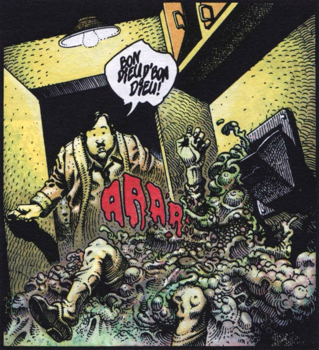
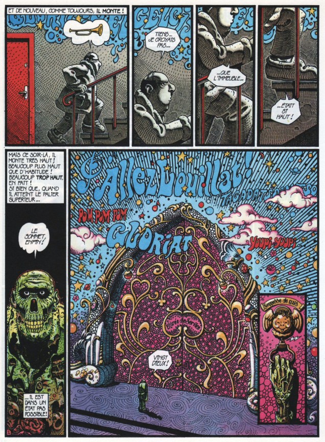
This episode is titled Toujours du bruit au plafond (« Still some noise on the ceiling »); it originally saw print in Pilote Mensuel no. 34 (March, 1977). It’s the rare (possibly the only) one that ends peacefully for Marcel, perhaps because he didn’t bother with the broom. Better St. Peter than… well, everything else.

*One of the hoariest French jokes, everyone’s heard it, and its appeal has whirled countless times around the bend, deep into irony and meta-subtext. Thankfully, though, it’s actually translatable, at least verbally: A lunatic is painting the ceiling. Another madman comes along and says: « Hold on to the brush, I’m borrowing the ladder! »

BalaiDargaud1982A
A ‘Scènes de la vie de banlieue’ collection (Dargaud, 1982). I agree: for all he’s gone through, Marcel Miquelon does deserve his own statue.
ScenesBanlieue_CouvA
The collected works (Les Humanoïdes associés, 2017)

-RG

Building a Simpler Tintin: Meet Martin le Malin

Cards on the table time: I never did much like Tintin. While there’s no denying the technical virtuosity and high imagination on display in Hergé’s work*, as a child, his overly-meticulous line and storytelling struck me as flat, sterile and remote. I thought I was just about alone in this view.

There was a Tintin-esque series I did delight in, and that was Martin le Malin, a translation of the Dutch « De Avonturen van Pinkie Pienter ». While much derided and nearly forgotten today, Pinkie remains, in my view, a misunderstood and under-appreciated work.

I was to learn, decades later, that the series was in fact created in response to the very aspects of Tintin that left me cold. In 1951, Dutch painter J.H. Koeleman (born October 30, 1926), while visiting his brother, learned from his young nephews that they were somewhat frustrated with and repelled by Tintin, finding the stories too complicated and the artwork too fastidious. From this incident, Uncle J.H. hit upon the idea of creating a series using a deliberately naïve and relatively primitive style, something closer in tone and essence to what a talented and imaginative child would craft for himself.

Koeleman produced and self-published a pair of albums, which were met with critical praise but disappointing sales. However, in early 1953, established publisher Mulder & Zoon came knocking and offered the man a deal: they would, using the greater resources at their disposal, republish and distribute his early efforts. The joint venture worked splendidly… at least for a time. In total, Koeleman wrote and drew twelve Pinkie Pienter albums between 1953 and 1958. These were also published in softcover 16-page colour instalments, which is the format I encountered them in. In my youth, they were everywhere: (long gone) supermarkets, department stores… and at 39 cents apiece, they offered a fine deal.

However, during Expo 58 (aka the Brussels World’s Fair), long-simmering tensions came to a head between the author and his publisher. Koeleman walked out, and the less said about his successors, the better. For it is in the later Martin le Malin albums that we can plainly witness the difference between intentional simplicity and economy… and sheer incompetence.

Today, I’ll focus on my favourite saga, « Les Martiens atterrissent » (Number 6 in the series, and serialized in « La soucoupe volante », « D’étranges visiteurs de l’espace » and « L’attaque des Martiens »).

MartinVisiteursA

MartinMartiensA
In the actual story, Martin’s bumbling sidekick, Floris Fidel (Floris Fiedel in the original) has been shrunk by Martian leader Plasticos (isn’t he just adorable?), but on the cover, while their size ratio remains constant, it’s Plastico who’s grown gigantic.


MartinVisiteNocturneA
You go to bed quietly, and the next thing you know, Martians are trampling your hedgerows and peeking in your window. Next time, draw the curtains. Love the way the cat runs for it in panel 5.


MartinRoueA
Martin finds that piloting unfamiliar spacecraft is not something you pick up on the fly.


MartinRendez-vousA
Having captured Martian Aluminicus’ spacesuit, Martin tries, and fails, to infiltrate the invaders’ ranks.


MartinDémasquéA
Oops. Another one of Floris’ screwups lands Martin in hot water.

I only learned today, while researching this post, that Pinkie/Martin was also published in English! Is anyone familiar with this edition?

RonnyRoberts
The copies I’ve seen for sale are listed in far-flung Australia. Curiouser and curiouser…


MartinCaméeA
The Martin cameo, as it appeared on the back of the first edition albums.
And here’s a custom-made Plastico (with Florisse in tow) needle-felted by WOT’s own multitalented ds.

*I am, however, quite fond of Hergé’s early series (that he considered minor works) « Les exploits de Quick et Flupke » (1930-40) and « Les aventures de Jo, Zette et Jocko » (1936-40).

-RG

Krokodil Smiles: Cartoons in the USSR

« Krokodil » («Крокодил» in Russian, a crocodile) was a Soviet satirical magazine founded in 1922 and that outlasted the Soviet Union by a number of years. In 2000, it was driven to its deathbed by a general lack of interest and failing finances – no longer being relevant to the modern age, alas! – and though weak attempts were made to breathe life into it in the 2000s, it finally croaked altogether, wheezing its very last in 2008.

Right from the beginning, The Crocodile (personified by a pipe-chomping red crocodile, holding a pitchfork) featured quite a lot of satirical drawings, which were basically panel cartoons, and sometimes even actual comics. The magazine’s modus operandi was to viciously skewer various enemies of the State and the People, such as bureaucrats, alcoholics, bribe-takers, church-goers, various delinquents, ne’er-do-wells and anti-Soviet villains. Institutions were also attacked, sometimes gleefully and sometimes sternly, and that list was long, too: American imperialism and capitalism, German Nazism, colonialism, and more other -isms that you could shake a stick at.

vyistavka-jurnal-krokodil-2-1
“There were pickpockets, dope peddlers, murderers and thieves
Card shark gamblers with aces up their sleeves
Bank robbers, burglars, boosters and pimps
Prostitutes and call girls and all kinds of nymphs
Loan sharks, swindlers, counterfeiters and fences
Crooked politicians spending campaign expenses
Hijackers, arsonists, bookies and the mob
And anybody else who ever killed, cheated or robbed”
Hustler Groove, Apollo 440

I would not like to leave you with the impression that Mr. Crocodile was an unsympathetic fellow, however; in its gentler moments, Krokodil’s tongue-in-cheek humour could be a delight, and its savage attacks sometimes masked a subversive anti-Soviet streak. Many prominent writers and artists worked for the magazine, and some of them started their careers within its pages. Aside from a plethora of cartoons, the magazine also featured news, stories, aphorisms, epigrams, and reviews of books, films and theatrical plays, etc.

Krodil1927
June 1927, cover by Hrapkovskoy.

Mr. Crocodile came with an extensive family. He had a wife, the Big Krokodila, who lost her marbles in the 1930s, and two twin children, who acquired hilariously caricatural careers in 1990 – Totosha went into management and Kokosha moved to the U.S. to design men’s magazines. These (and other recurring) characters marked several generations of Soviet citizens, and many of their catchphrases have become an everyday part of the Russian language.

Without further ado, here’s a few Krokodil cartoons on very Slavic topics, like drunkenness, and general debauchery and bureaucracy, including the disappointing lack of goods (and poor quality control of actually available goods). In no particular order…

KrokodilFritz1942
“Fritz in Hell”, 1942. Illustration by Y. Ganf. “Fritz” is used as a moniker for any of your average, humdrum Nazi.

KrokodilVacation1956
“Tribe of wild ones at the seashore”, 1956. Illustration by I. Rotov.

Krokodil051978
“We made a big mistake when we brought them to the puppet show!” 1978.

KrokodilProstitues1929
“THE MAN WITH THE SUITCASE IS INDIGNANT: What the hell is happening!… There’s so many prostitutes… One doesn’t know… which one to pick!” Illustration by I. Yang, 1929.

KrokodilProstitutesNasirov
1987. Illustration by L. Nasirov. Nearly 50 years later, prostitutes are still around, but their goods are a little more on show. You couldn’t really be an above-board pin-up artist in the USSR, but some people clearly had, shall we say, proclivities for depicting the female form.

KrokodilGazelle1956
The lion says in the first panel: “It’s disgusting! An elephantess in the role of a gazelle! I’ll go to the theatre manager and find out who gave her this role!” 1956, illustration by Y. Ganf.

KrokodilGranny
A charming case of bribery: “And here, dearie, is some evidence for your examination!” Perhaps this requires some context: this charming granny makes moonshine at home, and she hopes to soothe off the irate-looking policeman with an offering of a glass of vodka and a pickle (traditional accompaniment to vodka – highly recommended, perhaps with some mushrooms. I’m getting distracted, sorry.) Illustration by G. Ogorodnikov.

Крокодил1975
“It’s a good omen: first let a cat walk into a new apartment!” 1975, cover by G. Andrianov.

Krokodil1979Bouillon
“And where are the potatoes, the pepper, the salt?” Illustration by V. Shkarban, 1979.

Krokodil251989
1989, illustration by E. Bender. I think somebody wanted an excuse to draw voluptuous women!

Krokodil281989
“Dressed like that? To the cinema?’ “– I’m going over there to be filmed…” Illustration by V. Mochalov, idea by M. Vaisbord, 1989.

KrokodilPigs1963
“Now just watch it: oink the way I taught you to!” Illustration by S. Kuzmin, 1963. What happened to the missing pigs? They were most likely sold off to finance the kolhoz foreman’s drinking and gluttony. A kolhoz was basically a sort of collective farm or production cooperative, but corruption and negligence ran rampant.

KrokodilHorseradish1945
“Same thing as in the vegetable patch: old horseradish next to a young potato.” Illustration by I. Semenov, 1945.

KrodokilYasinkiyWolves
“Where are all the Red Riding Hoods going?” “–To grandma’s. She decided to write a will for her country house.” Illustration by G. Yasinkiy, 1984.

Krokodil1975
“In honour of the International Women’s Day, the dance of the Little Swans will be performed by the stage crew workers!” The 8th of March was a big deal in the U.S.S.R., and not only for one’s mothers and grandmothers; if I recall correctly, even students were supposed to bring in flowers for their female teachers. Illustration by I. Sichev, 1975.

~ ds