« Feminism encourages women to leave their husbands, kill their children, practice witchcraft, destroy capitalism and become lesbians. » — Pat Robertson
Truly one of the crown jewels of Franco-Belgian comics, Isabelle (1969-1995) has quite a pedigree: it was conceived by scripters Yvan Delporte, Raymond Macherot and illustrator Willy Maltaite, alias Will. When Macherot took ill, the legendary André Franquin stepped in, and the series took on a slightly more sombre shade, and its characterisations gained further depth. The best of all possible worlds, truly.
Brimming with magic, poetic grace, wit and atmosphere, Isabelle gave us, for a change, a level-headed and resourceful little girl in a world of infinite possibilities. I can’t stress this point enough: unlike every other little girl character in supernatural fantasy tales I’ve ever encountered, Isabelle doesn’t trip over roots, gasp loudly or drop a glass at the wrong time; she doesn’t disobey solemn, life-or-death instructions against all common sense. And yet she’s just an ordinary little girl, not a secret ninja or a princess in hiding. Truly refreshing. After reading Isabelle, most of what passes for fantasy is shown for the formulaic, stock dreck that it is. This is the genuine article.
In the mid-90s, publisher Les Éditions Dupuis brought the series to an unceremonious end, judging its sales numbers insufficient. Ah, but Isabelle has its fans, and a tenacious lot they are. Dupuis’ rival, Les éditions du Lombard (home of Tintin, and now merged with Dargaud, home of Astérix et Obélix) collected the entire series in 2007, in three stunning volumes rife with priceless documentary extras. Absolute bande dessinée nirvana. Good luck getting copies these days, sadly.
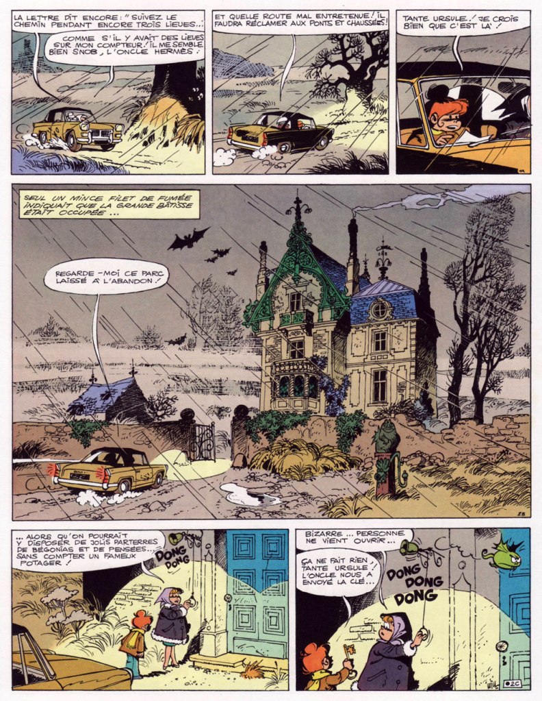
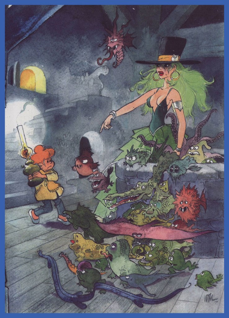
The cover of weekly Spirou no. 1929 (Apr. 3, 1975, Dupuis), beginning the serialization of the seventh Isabelle story (and her third album), Les maléfices de l’oncle Hermès (collected in book form in 1978). This is where two of the series’ pivotal characters, the titular Oncle Hermès and his eventual paramour, sexy witch Calendula, were introduced, not to mention her evil ancestress (the original) Calendula, the series’ archfiend.
The album in question, in its original edition (1978).
Page 2 of Les maléfices de l’oncle Hermès. During a long career shackled to characters he didn’t own (i.e. Tif et Tondu), Will was thrilled to work on a series of his own, one closer to his own interests and preoccupations. Dig that mood!
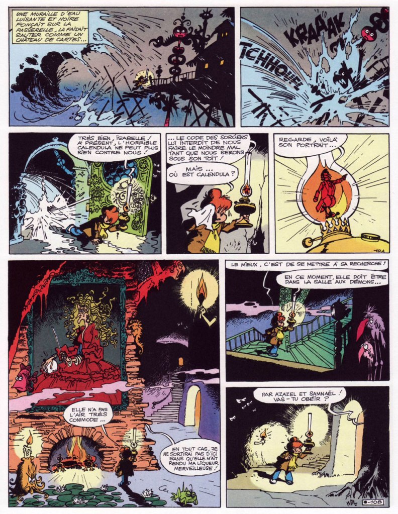
Page 10 of Les maléfices de l’oncle Hermès. Cloven-hoofed Oncle Hermès, the victim of a centuries-old curse, is trapped in a flame, and his great-great-great-great (etc.) niece Isabelle is endeavouring to set him free.
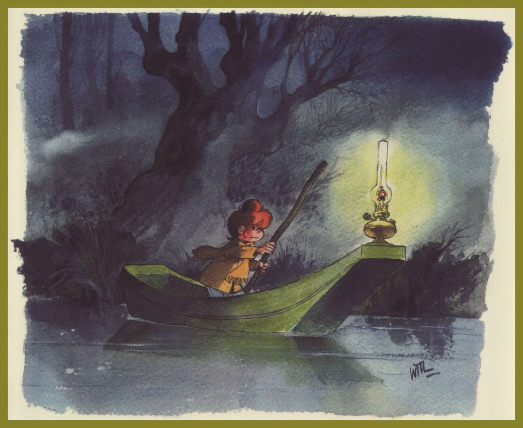
The journey is, of course, quite perilous… and the visuals gorgeous.
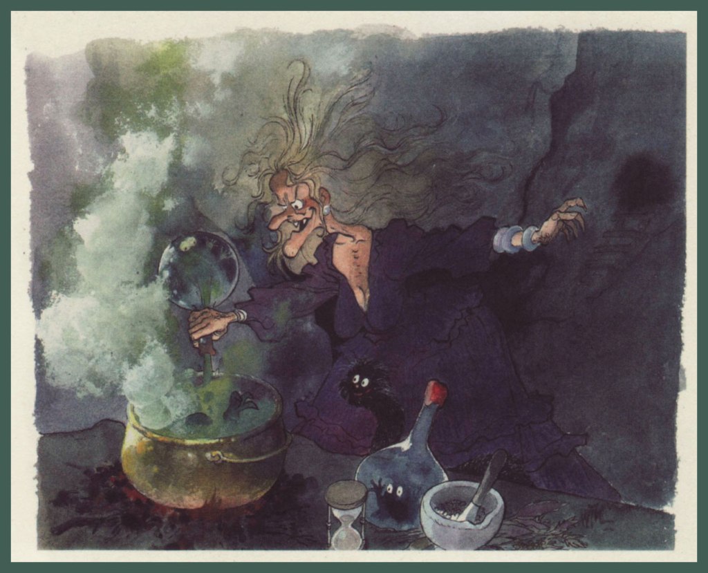
This is the original spell-caster, malevolent Calendula.
And this is her descendant of the same name, on the side of good, though she does have a temper.
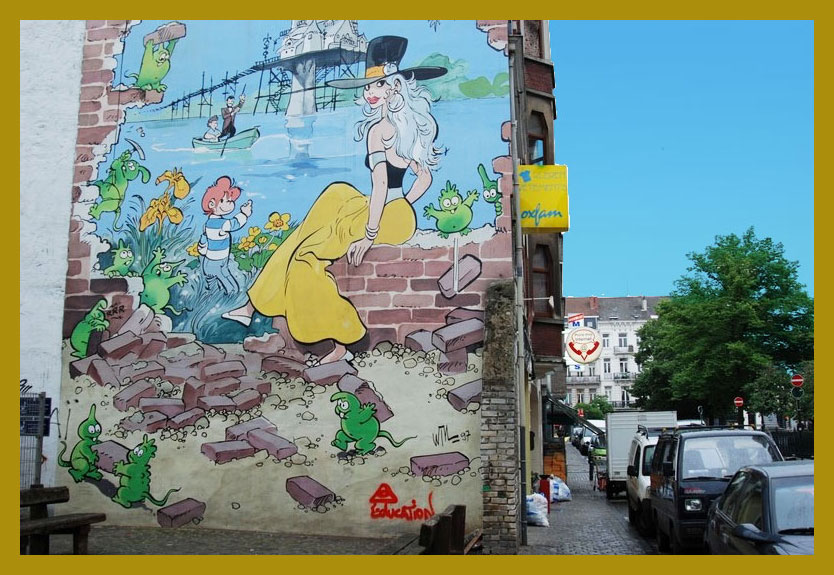
Isabelle and Calendula (and friends) feature as part of Brussel’s delirious Parcours BD. Does your hometown appreciate its comics this effusively and concretely? (update: The Isabelle mural was painted over in 2016, I regret to say.)
« Flattery is like chewing gum. Enjoy it but don’t swallow it. » — Hank Ketcham
Going way back: When I was a wee lad (still in the single digits), my mother would accompany me to our area’s oldest and finest bookstore (Chicoutimi’s long-gone Librairie régionale). At the time, I had been purchasing bound collections of Belgian bédé publisher’s Spirou, the earlier the better. Even at that tender age, I held the conviction that things had already peaked.
A friendly employee ushered us into the restricted area of the bookstore’s top floor, a vast warehouse I never got a tour of… but it was immense! I was led to an aisle where, high above, dozens of older Spirou collections were kept, dating all the way back to 1962. I can afford to be specific, because I bought the oldest issue they had on hand (Album Spirou no. 84). At ten dollars a pop, they were reasonably-priced, but still costly for a child with a 1970s-scale allowance. For my parents, a reliable source of ideal birthday and Christmas gifts, however!
It was in their pages (no. 90, see below!) that, along with the established Spirou magazine series (Spirou et Fantasio, Boule et Bill, Buck Danny, Benoît Brisefer, Tif et Tondu, Gil Jourdan…), I encountered scads of unfamiliar entries. Of these, an early album caught mid-tale one that truly stuck with me through decades and therefore is the object of today’s post.
This is Album Spirou no. 90 (Sept. 1963, Dupuis), collecting the bédé weekly’s issues n° 1316 to 1328. Cover by André Franquin, depicting a scene from a Spirou adventure, the troubled production that was QRN sur Bretzelburg (under its original title, QRM sur Bretzelburg).
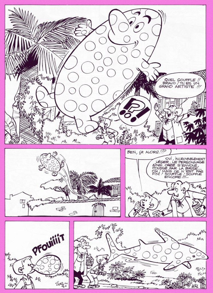
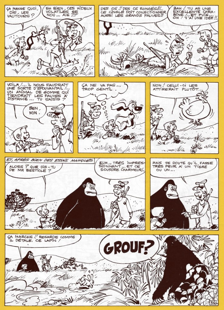
In short, though, here’s what’s relevant in this case: from 1949 to 1987 (with a pause between ’59 and ’63), Will illustrated the adventures of Tif et Tondu, characters owned by Éditions Dupuis, its publisher. Still, he longed to draw characters of his own, which wasn’t an idle whim, given that most of his colleagues and collaborators did just that, enjoying more latitude and far greater financial rewards. In 1962, he got the chance to try his hand at an original series, Éric et Artimon, conceived with versatile scripter-cartoonist Raymond Antoine, alias Vicq. And the result was outstandingly charming, light-hearted and hilarious.
The 1976 (and only, so far) edition of Toute la gomme. Still, I’m grateful for its existence: I was finally able to read the whole story, though without colour.
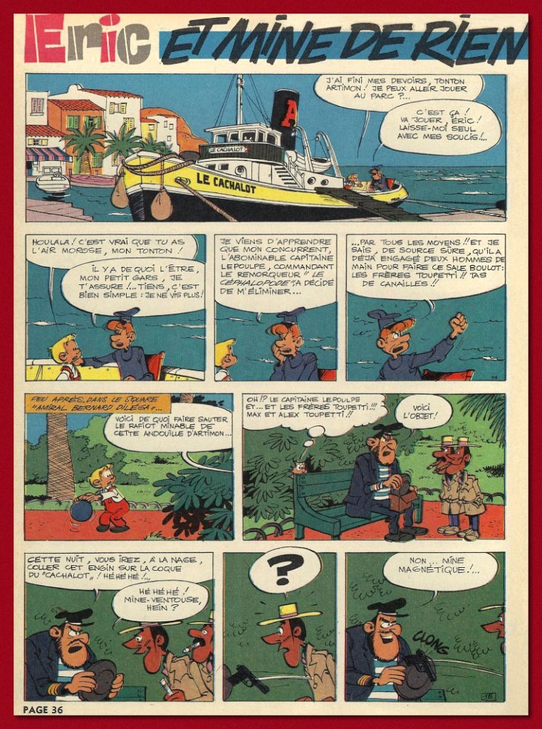
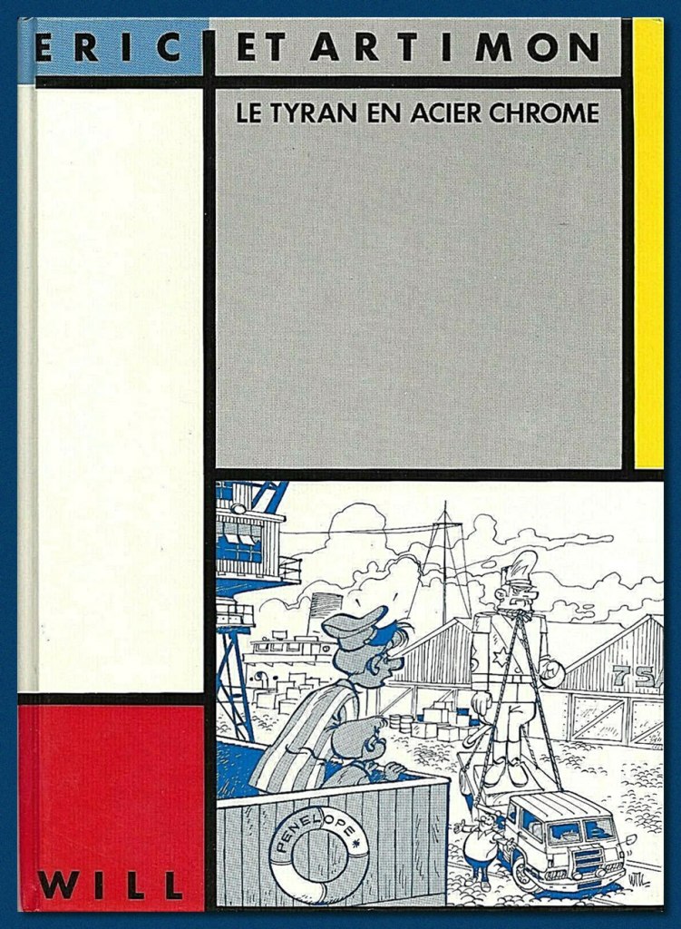
A mere two long adventures (44 pages each) were produced (Le tyran en acier chromé, 1962, and Toute la gomme, 1963, plus a six-pager, Et mine de rien, in 1967), and Dupuis never bothered to collect or reprint them. Instead, well down the pike, two separate, smaller publishers licensed the rights and issued small black and white runs of, respectively, Toute la gomme (Espace Édition, 1976) and Le tyran… (Magic Strip, 1983).
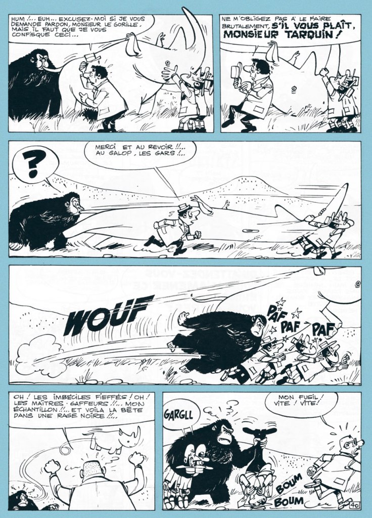
Candy aficionado Éric visits his main supplier, loveable eccentric Monsieur Grosoison, at his confiserie ‘Au bambin vorace’ (‘The Voracious Toddler’). The old man, also a brilliant inventor, shows off his new creation to his best and most loyal customer. The stuff’s not only downright magical, it’s also exquisitely delicious.
« Such lungs! Bravo! You are a great artist! »
After an unscrupulous candy magnate has the inventor kidnapped by his henchmen (an uprarious pyromaniac and a pair of tiny twins afflicted with stiff necks from gaping at Éric’s balloon creations drifting overhead), and taken to his private island, he threatens to leave him in the hands of fearsome gorilla Tarquin the Superb. Meanwhile, Éric and Artimon encounter the ape, who turns out to be blessed with tremendous intelligence, a fine sense of humour, and a powerful set of lungs.
However, Tarquin doesn’t like his good-natured fun interrupted.The back cover of Espace’s Toute la gomme, wherein Éric employs ingenious means to escape a rooftop.
The opening page to the short concluding episode of the boy and the captain’s adventures, Et mine de rien (Spirou n° 1506, 1967).
And here’s the fancy 1983 edition of Le tyran en acier chromé, scarce and fairly pricey nowadays, unlike Toute la gomme.
Thankfully, Éric et Artimon haven’t been entirely forgotten, despite the shabby treatment they received at the hands of their original publisher. Here’s a signed lithograph produced in the early 1990s by Belgian bookstore Chic-Bull. Note the fancy silver ink on the statue. Mine’s number 48!
I’ll be spotlighting Will’s other creator-owned series, Isabelle, at some point during this year’s Hallowe’en Countdown!
« Well, she sneaks around the world from Kiev to Carolina She’s a sticky-fingered filcher from Berlin down to Belize She’ll take you for a ride on a slow boat to China Tell me, where in the world is Carmen Sandiego? »*
Today’s Tentacle Tuesday is for globe-trotters only – but don’t let this post give you an itch for actual travelling: that’s verboten right now.
This Teutonic tentacled cutie appeared on the cover of Moga Mobo no. 3 (1995). The wraparound cover is the work ofJonas Greulich, one of the co-founders of this German comics magazine that began publication in 1994 (the other two artists involved are Titus Ackermann and Thomas Gronle).
Speaking of German comics, does anybody know where this page and its German Captain Nemo come from?
20.000 Leguas de viaje submarino was adapted by Héctor Oesterheld and illustrated by Roberto Regalado. This 23-page story was published in Argentine Billiken Magazine (Editorial Atlantida) in 1974. For those who can read Spanish or would just like to see more images, head over to this article.
One would be remiss in not paying at least a brief visit to Asia:
The cover of a comics anthology from Hong Kong, probably from the 1960s.
And back to Germany at a staggering speed (watch out for whiplash)!
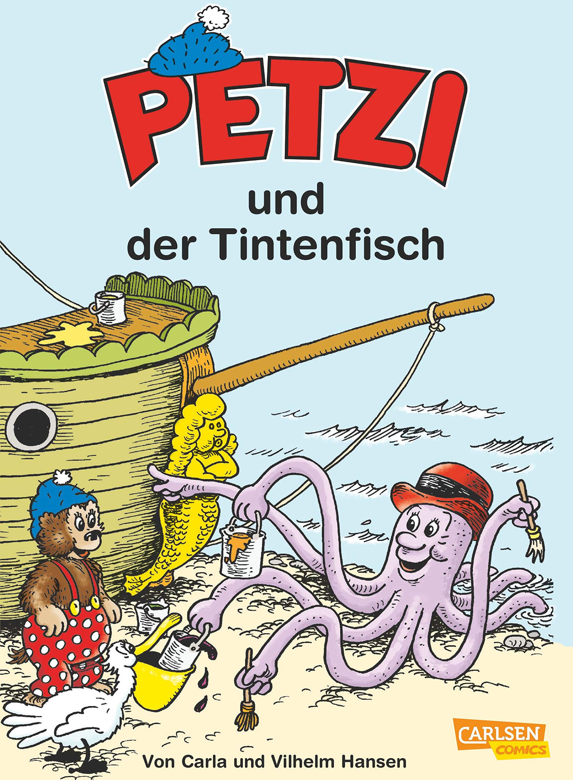
Petzi is actually a translated version of a Danish character named Rasmus Klump, created by a husband-and-wife team Carla and Vilhelm Hansen in 1951. The adventures of the lovable bear cub were popular enough to be translated into many languages, but a hefty price had to be paid – namely, a name change. Rasmus became Petzi in French, German, Italian, Portuguese and Vietnamese, and I’m slightly amazed that such different countries could agree on one name. In English, you will no doubt be familiar with Barnaby Bear. This is Petzi no. 40 (July 2008), a reprint of older material published by Carlsen Comics.
∼ ds
* She’ll go from Nashville to Norway, Bonaire to Zimbabwe
Chicago to Czechoslovakia.. and back!
« The man who cannot visualize a horse galloping on a tomato is an idiot. » ― André Breton
What is one to do, in a mere blog post, with a polymorphous artist such as Maurice Henry (1907-1984)?
Here’s a handy bit of compressed biography, from his Lambiek page:
Henry was a French painter, poet, filmmaker, as well as a cartoonist. Between 1930 until his death, he published over 25,000 cartoons in 150 newspapers and a dozen books. His cartoons were generally surrealistic and satirical.
In 1926, he co-founded the magazine Le Grand Jeu with René Daumal, Roger Gilbert-Lecomte and Roger Vaillard, with whom he formed the “Phrères simplistes” collective. Henry provided poems, texts and drawings, while also making his debut as a journalist in Le Petit Journal.
He left Le Grand Jeu in 1933 to join André Breton’s group of Surrealists and their magazine Surréalisme au service de la Révolution. He also worked with the artist and photographer Artür Harfaux on the screenplay of twenty films, including ones starring the comic characters ‘Les Pieds Nickelés’ and ‘Bibi Fricotin’. Maurice Henry spent the final years of his life making paintings, sculptures and collages. He passed away in Milan, Lombardy, in 1984.
The answer? My default solution, which is to focus on some small parcel of the much greater whole. A number of Henry’s works bear revisiting (for instance, Les métamorphoses du vide [1955], a truly groundbreaking picture book about the world of dreams; À bout portant [1958], a collection of literary portraits; or Les 32 positions de l’androgyne [1961, also issued in the US in 1963], a chapbook of… gender recombinations) and deserve a turn in the spotlight.
To quote co-anthologists Jacques Sternberg and/or Michael Caen in their indispensable Les chefs-d’oeuvre du dessin d’humour (1968, Éditions Planète, Louis Pauwels, director):
Surrealism — he was part of the group before 1930 — left its mark on him and it’s because he was already well-cultured as he launched his career that he was among the first, in the desert that was the publishing world of the 1930s, to attempt unusual drawings calling upon often startling ingredients, such as poetry, black humour, the fantastic and the absurd. He caused no less of a surprise by doing away with captions, at a time when bawdy jabbering was the fashion all over. In short, Maurice Henry was indisputably a pioneer of that grey and stinging brand of humour that would explode like an H-bomb some fifteen years later.
A lovely bit of conceptual humour from 1938. A rare one bearing a caption, but the joke called for it. At this early stage, you won’t be wrong to point out a certain stylistic debt (it’s the roundness and simplicity of line!) to his contemporary and compatriot Jean Effel. Henry was indeed a fan. Do check out my co-admin ds’ fine post spotlighting the good Monsieur Effel.
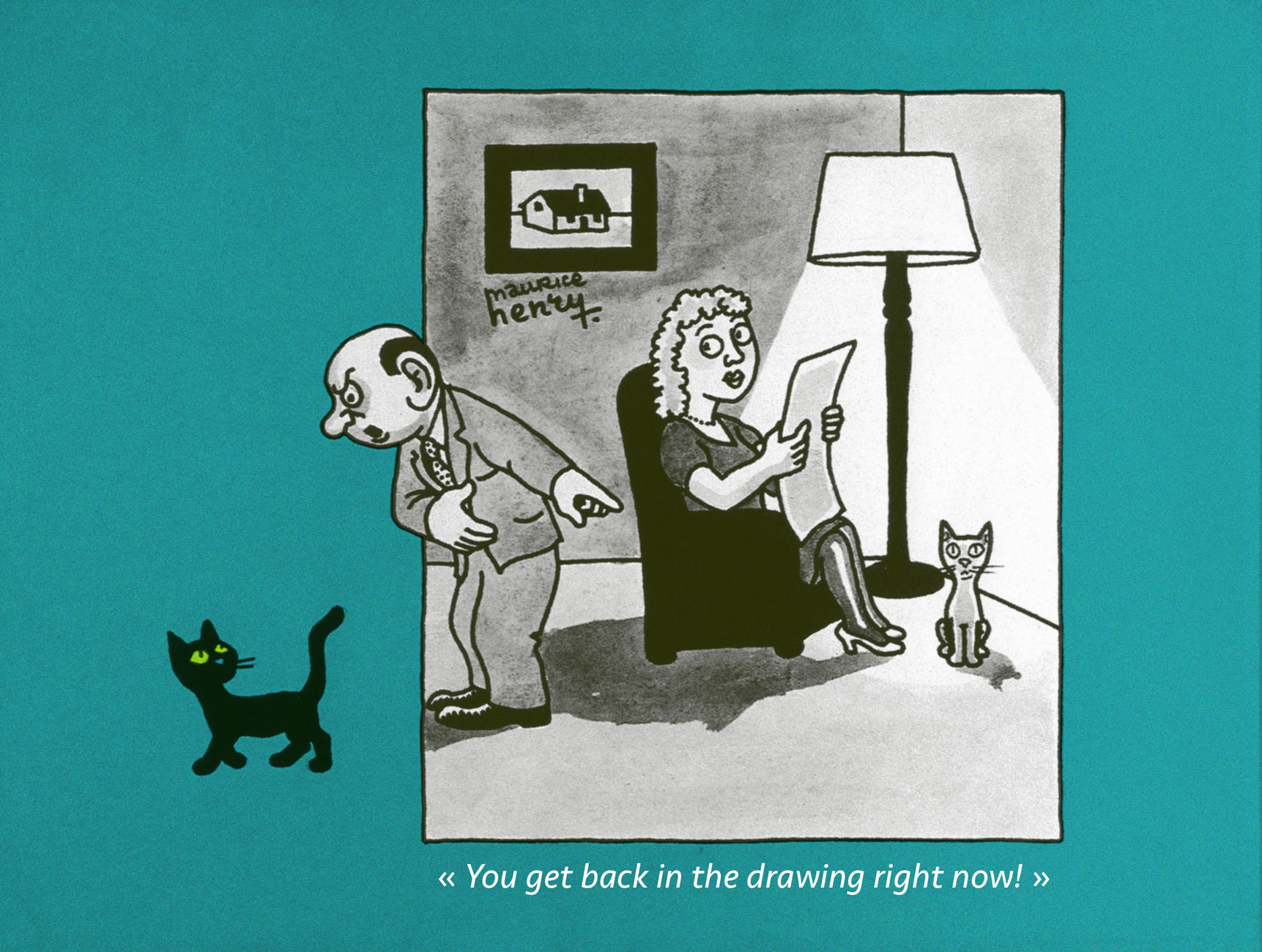
An example of what enlightened creators such as Henry were fighting for: making room for cartoons that weren’t just about the cheap chuckles. Consider, for instance, the existential plight of the Minotoreador . Published in K. Revue de la poésie no. 3 (“De l’humour à la terreur”, May 1949).
The Military, Government, Constabulary and Clergy were favourite targets, naturally. When it was (barely) tolerated. It helped to be ambiguous, even if one wasn’t ambivalent (1951).
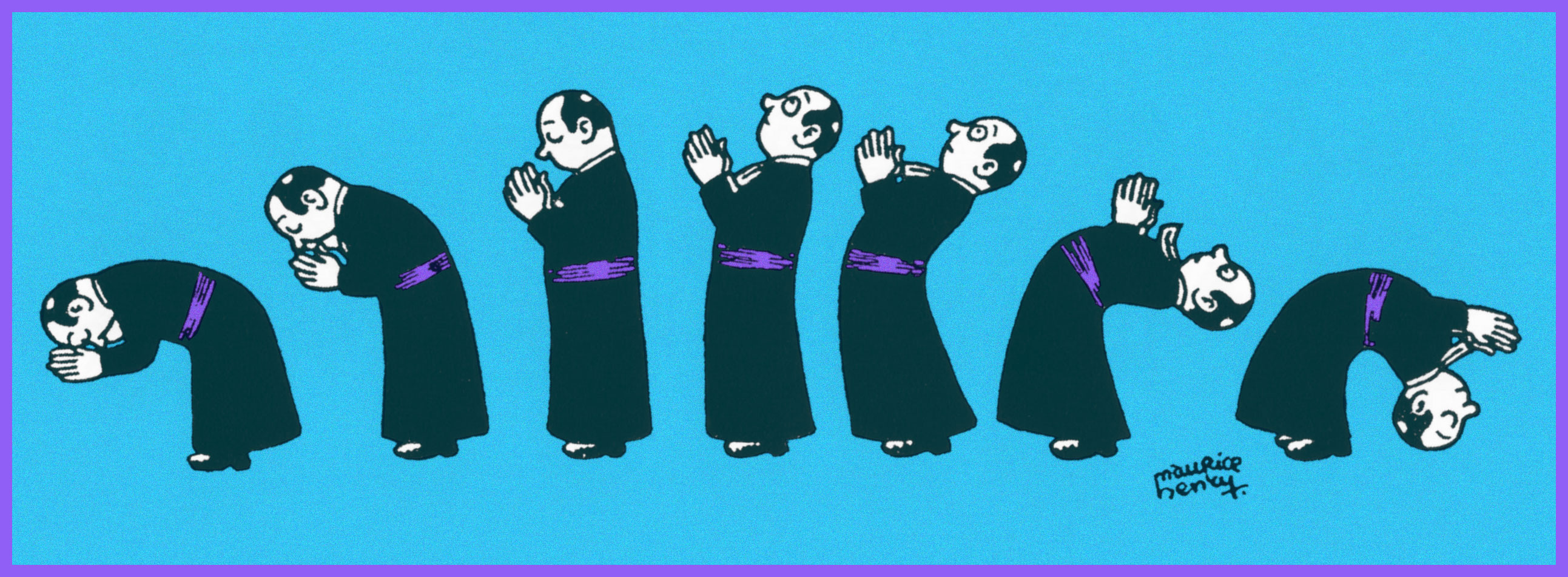
Here’s one for the clergy; though mocking, it’s hardly what you’d call hostile. From the first issue of epochal surrealist magazine Bizarre (1955-1968).
Yes, it’s Card Sharp Jesus entertaining, confounding (and possibly fleecing) his disciples. Note the ace up his right sleeve (1941).
Walking on water was clearly just the beginning (1948).
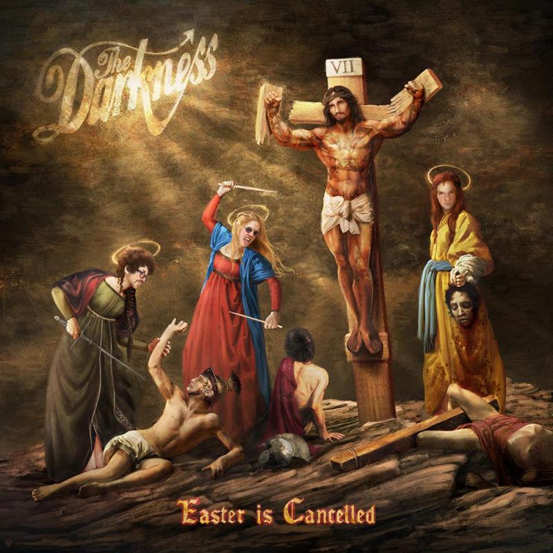
Henry’s Jesus seems like a swell fellow, really. A bit on the roguish side, which is fine by me (1958).
See? A case of a joke’s that’s more than a half-century old still finding echoes in the present day. Cover from The Darkness‘ prophetic 2019 album, Easter Is Cancelled.
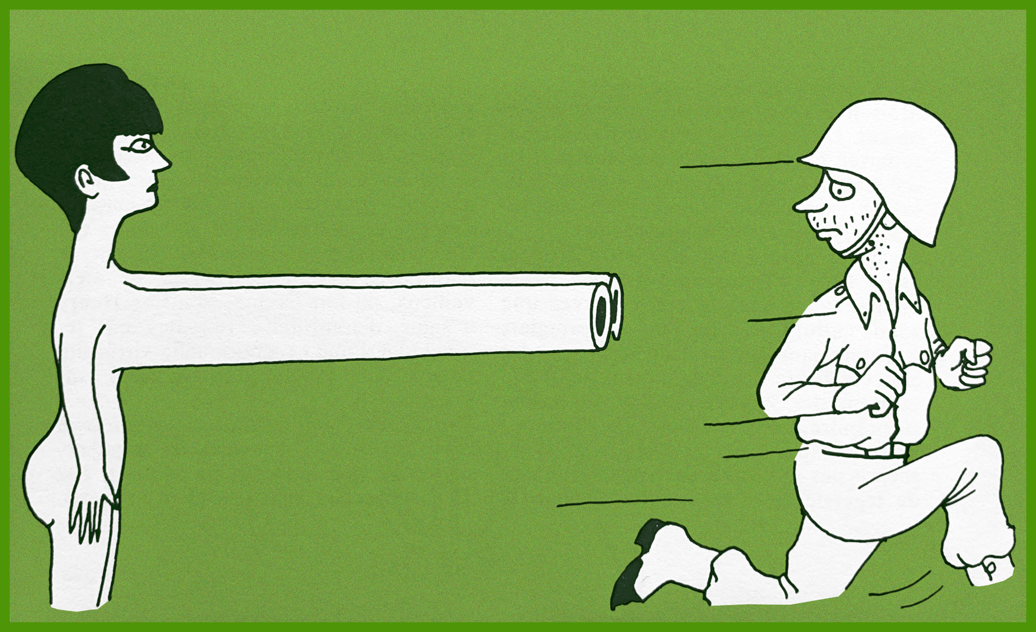
That soldier’s scared yet dismayed expression brings to mind Futurama’s hapless Philip J. Fry.
That’s one relaxed elephant.
Another illusion shattered.
The little hand wave at the end really makes this one.
The artist in 1935, photographed by his friend and frequent co-conspirator Arthur Harfaux.
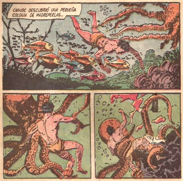
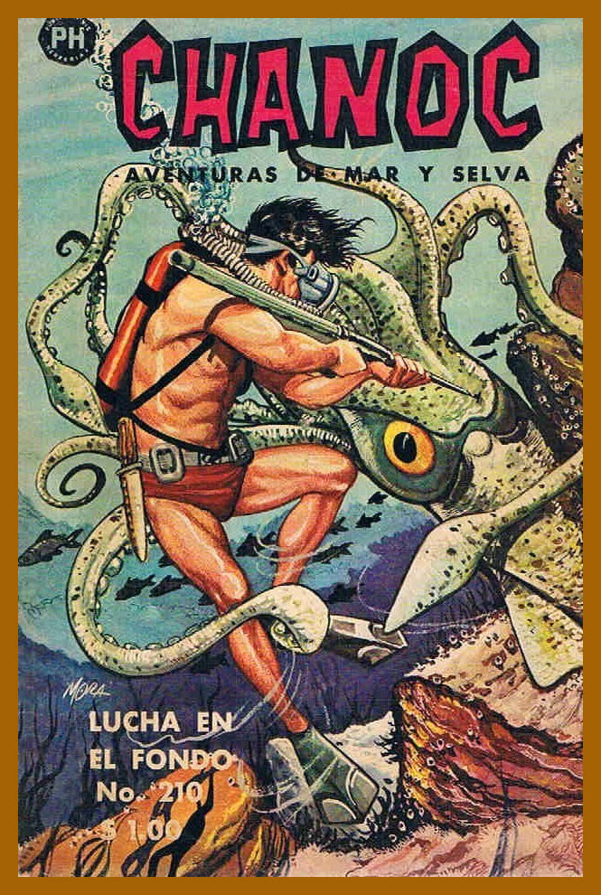
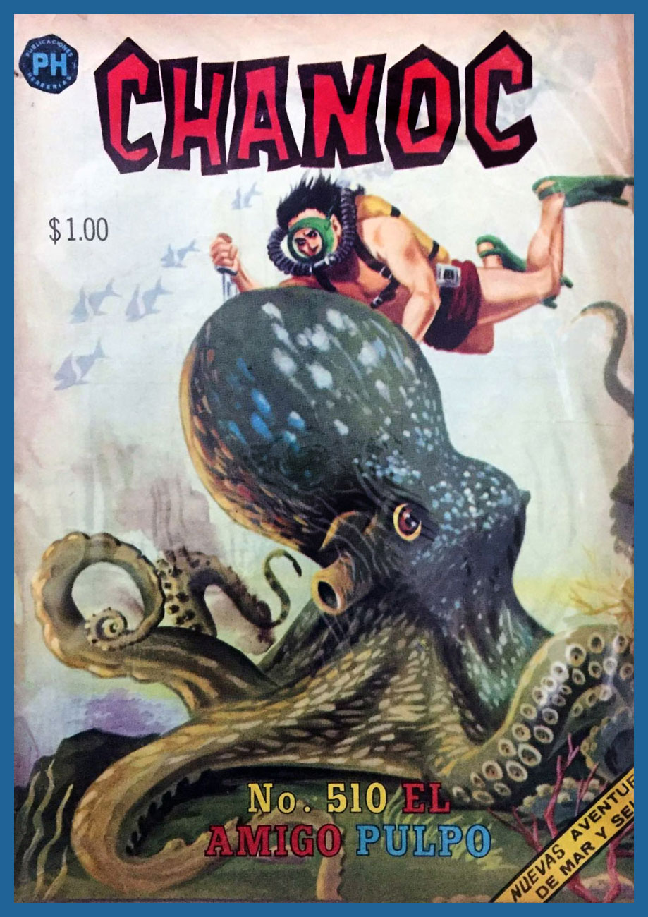
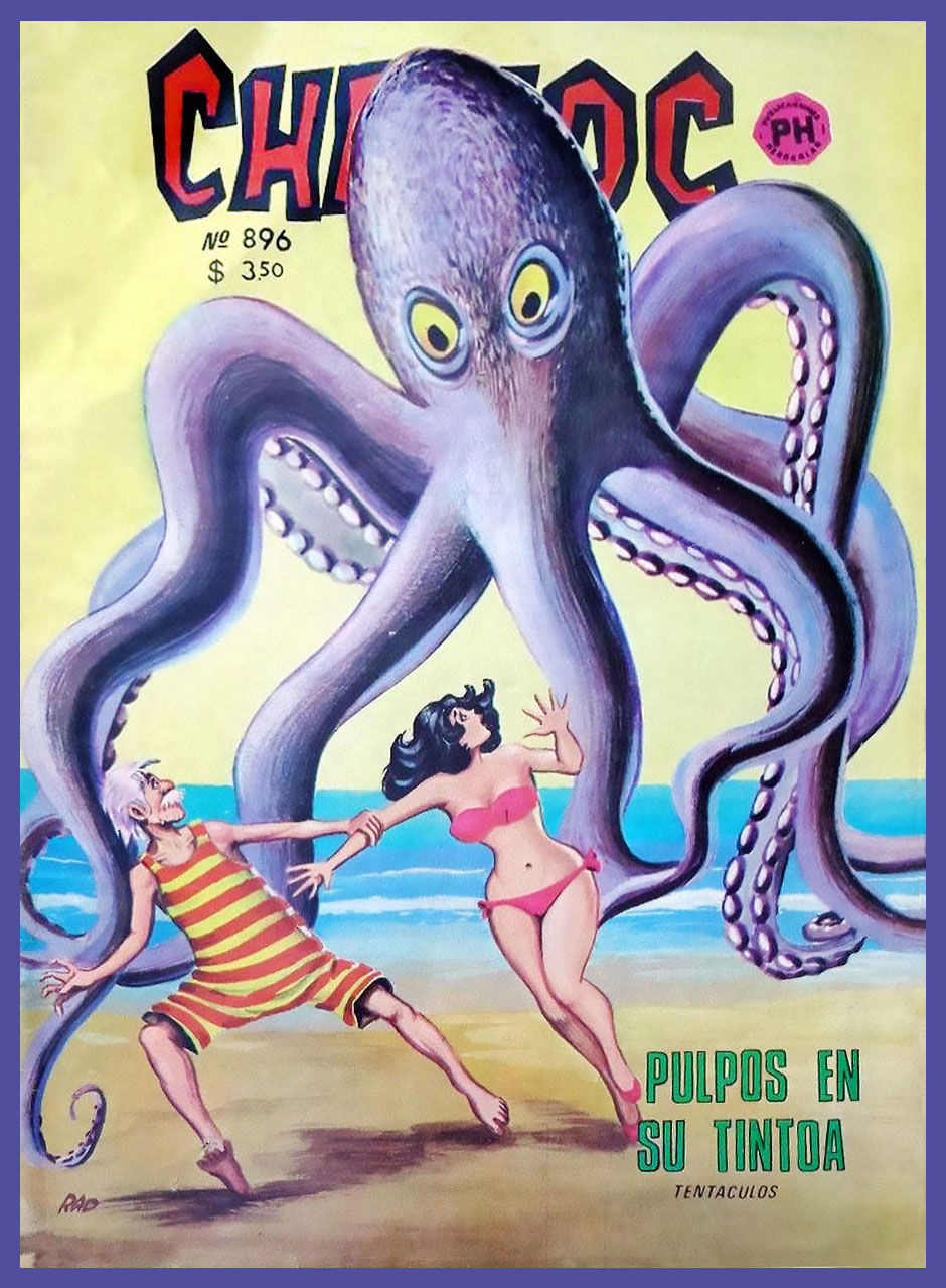
« Chanoc was set in the fictional Mayan fishing village of Ixtac somewhere near Veracruz. The heroes struggled against corrupt foreigner and larger-than-life sea and jungle animals, especially sharks and octopi. An important feature of the comic book was its use of local colour and coastal lore… »
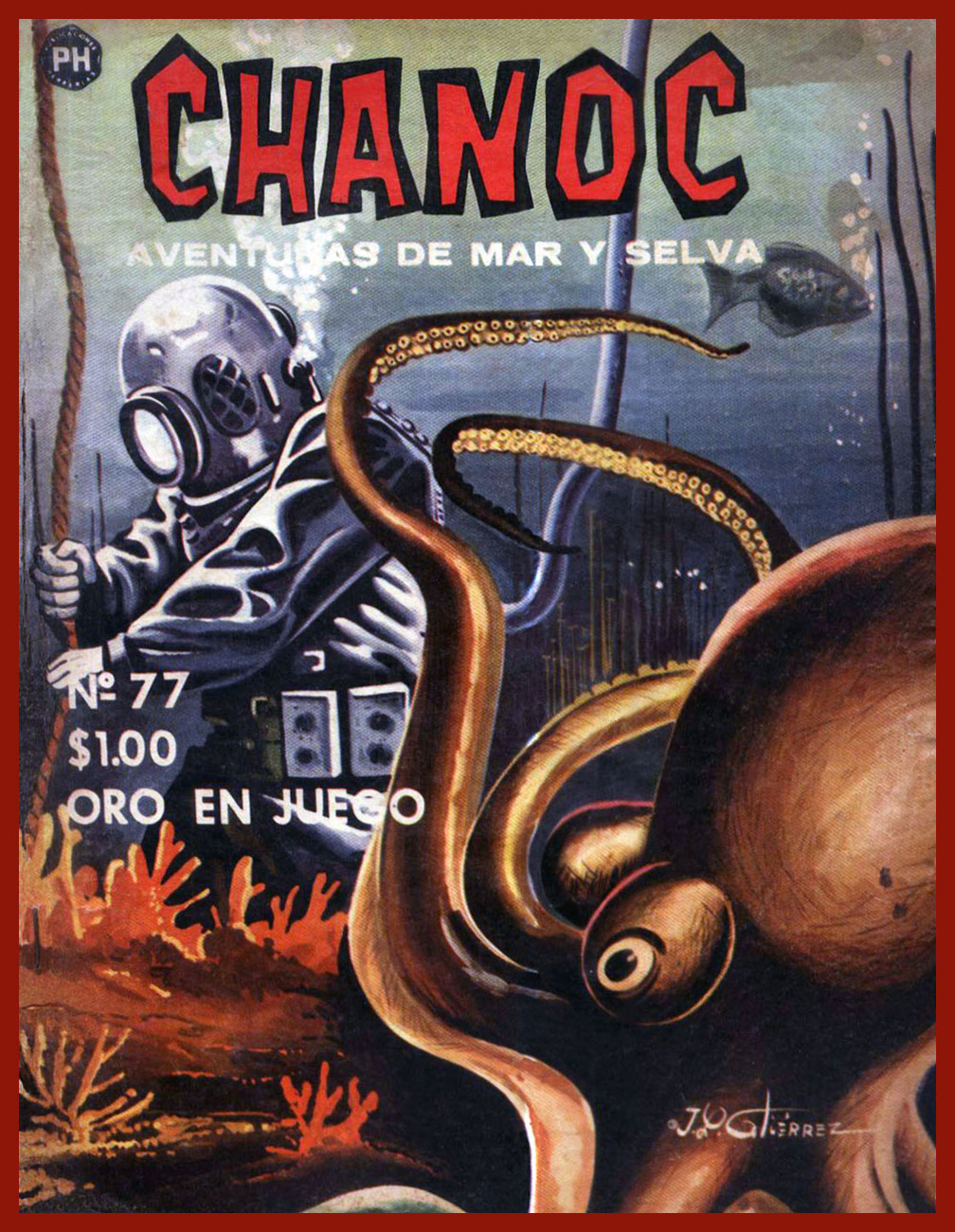
I’m always unpleasantly amazed when I stumble upon a comic series that ran over a thousand issues… and that I’ve never heard of until now. The sting of it is only slightly alleviated by the fact that it was published in a language I don’t speak. I have already written about long-running (and abounding with tentacles) German series Spuk Geschichten; today it’s the turn of Mexican Chanoc. We may be unable to travel right now, but at least we can accompany pearl diver and fisherman Chanoc and his goofily-mustachioed grandfather Tsekub Baloyán in Aventuras de Mar y Selva (adventures on land and sea – in the context of this post, mostly the sea).
Chanoc actually started out as a rejected screenplay by Dr. Ángel Martín de Lucenay, who, undeterred by this failure, cobbled the story into a proposal for a comic strip and brought it to publishing house Publicaciones Herrerías (taken over at a later junction by Novedades Editores). Ángel Mora was recruited to provide the art, and the first issue (32 pages in full colour!) came out in October 1959. Martín died after having written only 20 episodes, and young writer Pedro Zapiain Fernández was hired. He plotted Chanoc for the next eleven years until 1971, at which point his services were dismissed for a variety of reasons.
In Not Just for Children: The Mexican Comic Book in the Late 1960s and 1970s, author Harold E. Hinds argues that it’s Fernández’s involvement that made Chanoc a best-seller.
« In order to continue to improve the characterization of Veracruz culture, Zapiain immersed himself in the coastal environment. He fished, sailed, deep-sea dived, hunted sharks, and was even shipwrecked in a hurricane.
Many of the scenes and characters in the comic book are modeled on real Veracruz vistas and people. Zapiain slowly transformed Chanoc. Adventure faded in importance, although many issues still contained at least one adventure subplot. Comedy became Chanoc’s trademark, the humour ranging from wit and repartee to parody and slapstick comedy. Mild polictal satire and social ciriticism were intoducted and sports themes became a staple. » /source/
Conrado de la Torre took over the writing when Zapiain (who, incidentally, died in 1979, at 48) was fired, but by most accounts Chanoc’s heyday was over, though I’ve seen mentions of the strip still being published as late as mid-90s. Many artists have contributed to Chanoc during the golden years: «painters Landa and José Luis Gutiérrez (both as cover artists ); Guillermo Vigil , who later created the comic El Payo; Antonio Morales, the screenwriter for Viruta y Capulina , and Antonio Salazar Berber, the first sports cartoonist and creator of mascots for Mexican soccer teams. » /source/
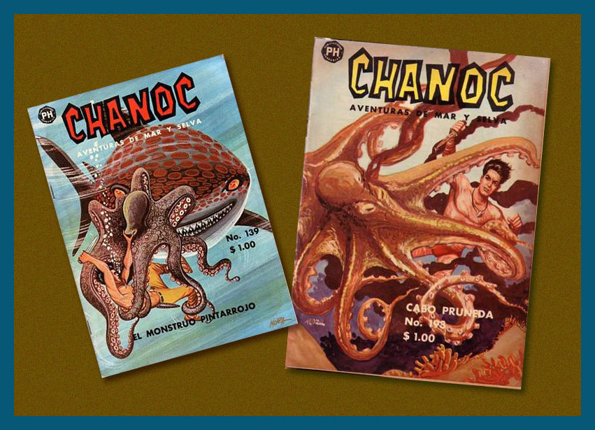
Some covers are, sadly, only available online in extremely poor resolution, so here are two more:
Chanoc no. 139 and Chanoc no. 193 (1963).
« The comic book may be more popular in Mexico than in any other Latin American country. In this essay, Harold Hinds speculates that its decline was due to a number of factors, including the degeneration of one of its main characters, Tsekub, into a mere clown, the inaccessibility of its increasingly “slangy” language, and its tendency towards cuteness rather than meaningful satire. He then examines the main characters. Chanoc is a kind of highly moral Tarzan‐figure who protects the defenseless against villainous exploiters. Tsekub, Chanoc’s sidekick and antithesis, is an old man with a young spirit whose zest for life provides much comedy. Hinds points out that in addition to adventure and humour, Chanoc’s main components, the comic book also deals with foreign, particularly U.S., interference, in Mexico and elsewhere. He also considers a variety of ways in which Chanoc reflects, at times quite subtly, Mexican culture and society; e.g., aspects of regionalism, nationalism, mestizo character, machismo, and modernisation are briefly explored. » (excerpt from Harold E. Hinds’ Chanoc : Adventure and Slapstick on Mexico’s Southeast Coast)
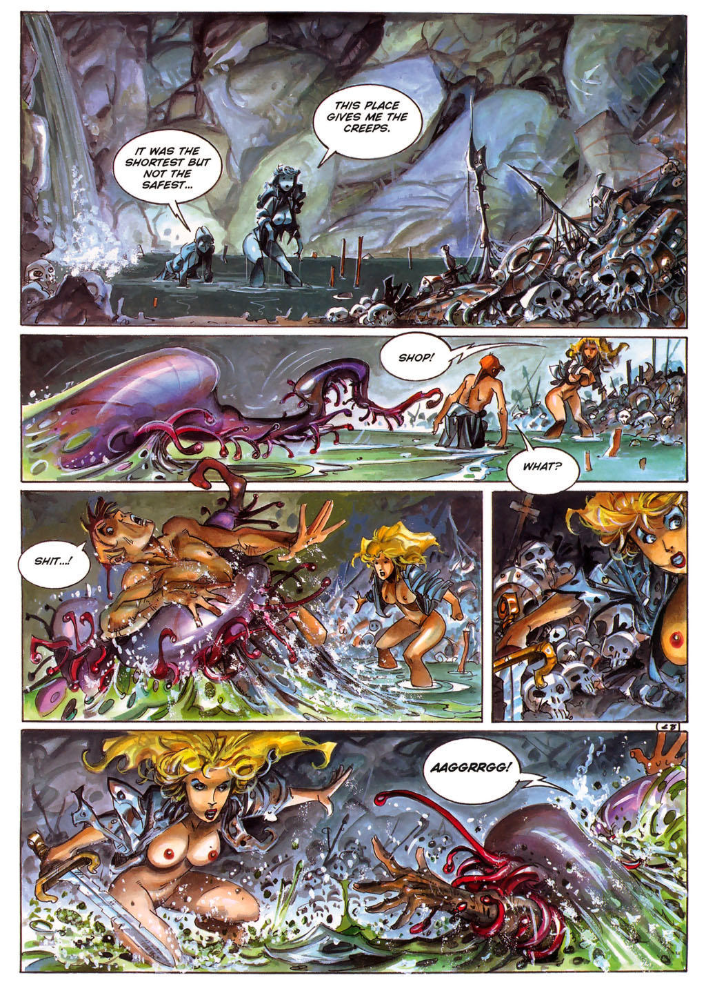
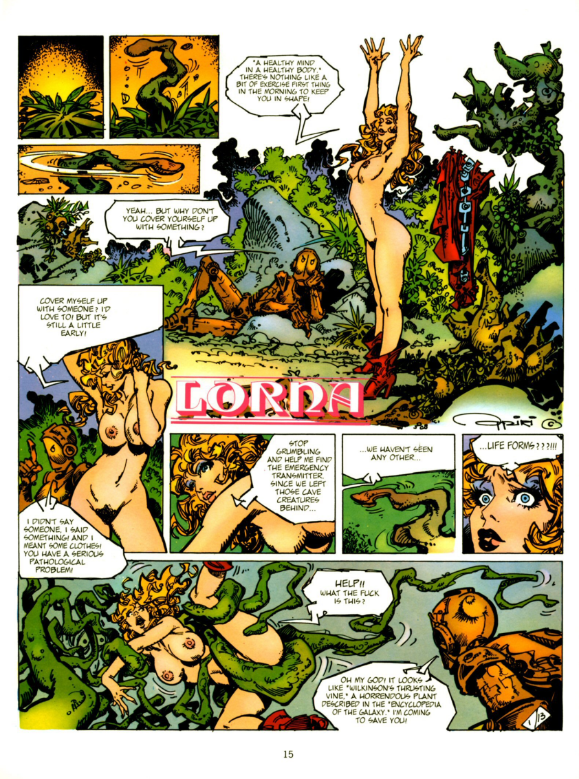
I recently stumbled upon a comic story that I really liked, posted on one of those websites of dubious legality bestrewed with ads. Oh, the plot didn’t make all that much sense, nor was it original… but I liked the art, bright and stylish. Lorna, the heroine, was drawn a bit like a fashion sketch from the 80s: big hair, blue eyeshadow, lots of leather and studs wrapped haphazardly over her sumptuous form.
I’m late to the party, for Spanish artist Alfonso Azpiri (1947-2017) has been around for a while. He was a frequent contributor to Heavy Metal Magazine – which explains why I haven’t come across his art before. I’ve never read it; I also haven’t seen the magazine-inspired movie Heavy Metal (from 1981), nor its follow-up, Heavy Metal 2000 (2000). My first glimpse of an exposure, oddly enough, to “the world’s greatest illustrated magazine” came by way of the video-game Heavy Metal: F.A.K.K. 2 (also from 2000), which I adored at the time, and have played several times. I’ve of course seen second-hand copies of the magazine lying around comic book stores, but they never seem interesting enough to pick up.
Heavy Metal: F.A.K.K. 2 also had tentacles!
To get back to the topic at hand, Lorna is Azpiri’s most enduring character. She’s been compared to Barbarella, though I believe Jean-Claude Forest’s heroïne was a much more original and fresh creation. Still, Lorna has redeeming features, aside from the fact that it’s fun to follow the adventures of an almost-always naked buxom blonde with an attitude.
What I like about Lorna is her resilience – her enjoyment of trysts with animal, mineral and vegetal never stop her from looking for a way out and turning the tables on her various captors at the first opportunity. And speaking of doing squat thrusts in the cucumber patch, Lorna gets it on with everybody, independently of their species, origin, or chemical composition, organic or inorganic. I fail to see why a sack-like creature from another planet, a giant crustacean or a beetle-sized lizard would want to get it on with a human female, but oh, they do. A lot of stories from other authors balk at such unholy pairings*, setting them up only to have the damsel rescued at the last second, but Lorna is usually her own guardian angel, managing to escape…. after properly enjoying herself.
*Although Italian artist Paolo Serpieri‘s Druuna (also from Heavy Metal Magazine) comes to mind – she also gets assaulted by all manner of yucky things, but where Lorna has colourful fun, Druuna is getting painfully raped, so I by far prefer Lorna’s adventures.
So here are the adventures Lorna had with tentacles. If you want more Azpiri, this art portfolio is a good place to start; and if you want to sample Lorna’s adventures, you can read pretty much all of this stuff online here.
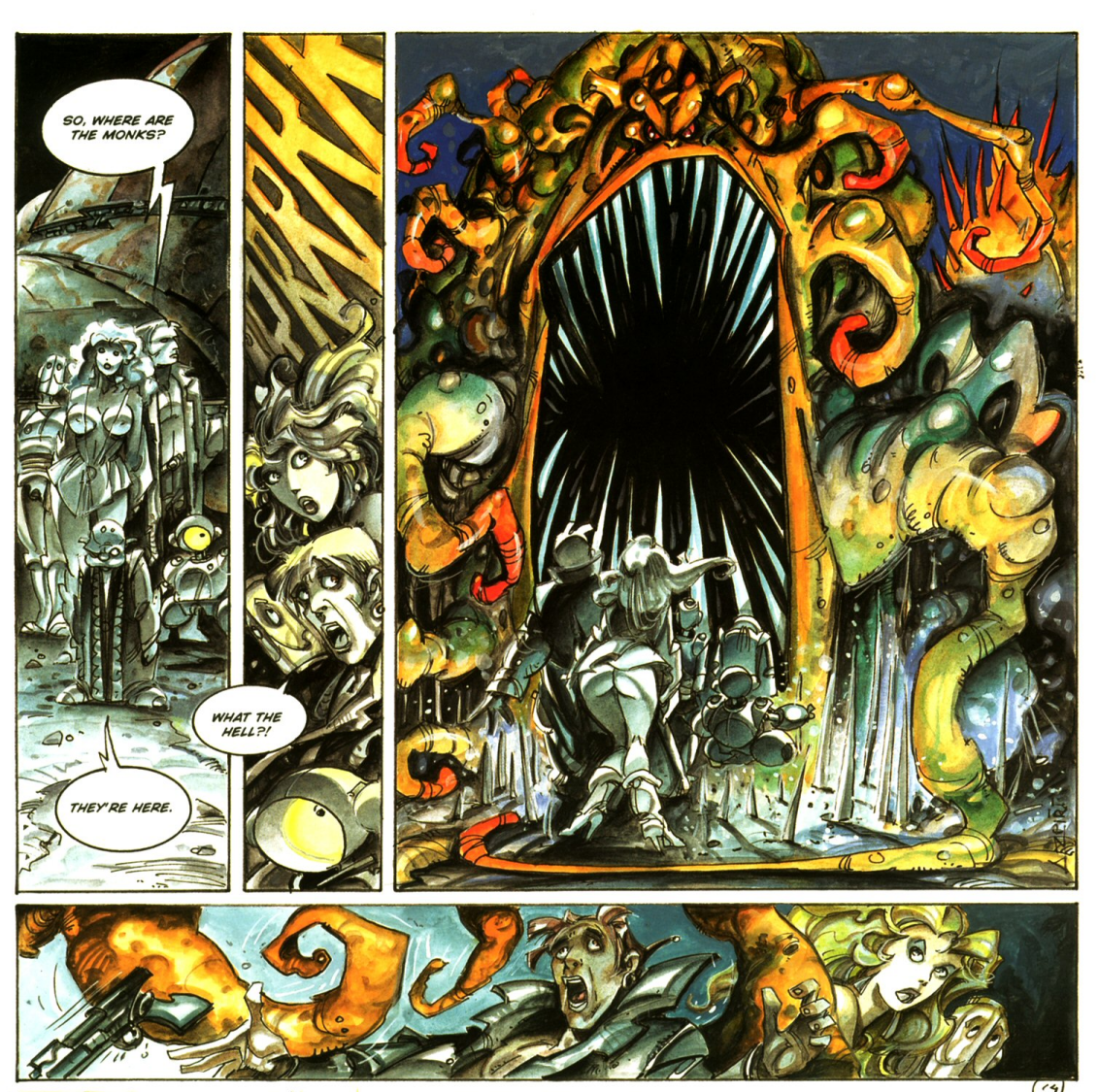
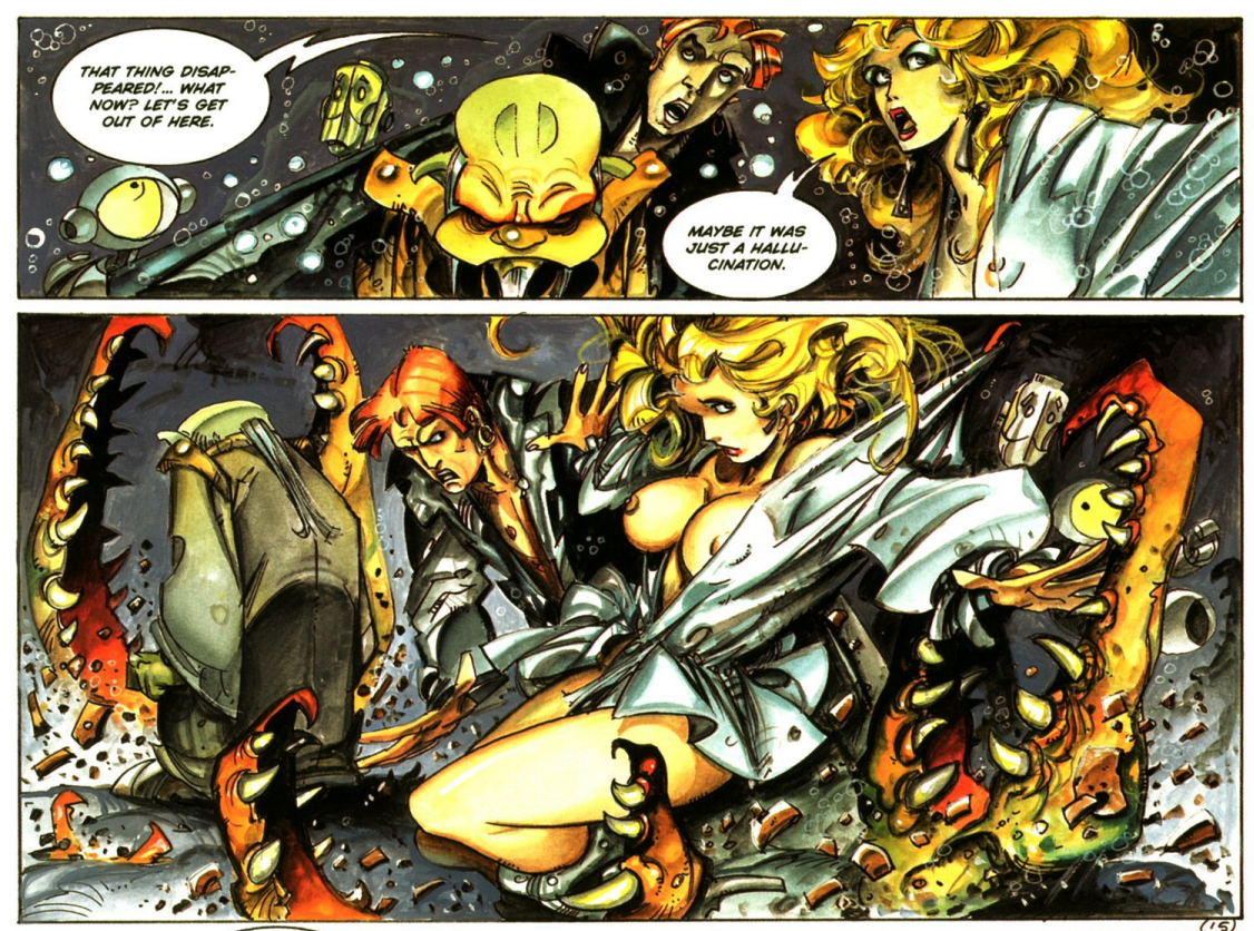
The following pages are fromLorna: Lost Shadows(2006). The original title is Sombras perdidas (2005). Both were published in Heavy Metal Magazine.
« Azpiri’s earliest published work was done for Italian horror titles in the ’70s, but he expanded into fantasy and science fiction, with erotic themes a constant across all his work. He made his Heavy Metal debut in the July 1984 issue with a story called “Daymares/Nightdreams.” In all, his work appeared in over 30 issues of Heavy Metal; on three occasions, major chunks of issues were given over to Lorna stories (September 1998, March 2002, and March 2006). Heavy Metal also published hardcover English-language versions of his Lorna stories, as well as sketchbooks and portfolios. » |source|
The following is from The Eye of Dart-An-Gor (2005). In Spanish, this came out as Ojo de Dart-An-Gor in 2003. Both were published by Heavy Metal.
Two following page-and-a-half is from Lorna and Her Robot(2000). The original title was Lorna y su robot(1999). Both were published by Heavy Metal. I prefer Azpiri’s later style.
Speaking of making it with a robot, I recommend taking a gander at Nuts And Bolts: 15 Times A Robot Got Lucky. Lorna is #10 of that list, and I highly recommend the comic at #2.
« Television is like the invention of indoor plumbing. It didn’t change people’s habits. It just kept them inside the house. » — Alfred Hitchcock
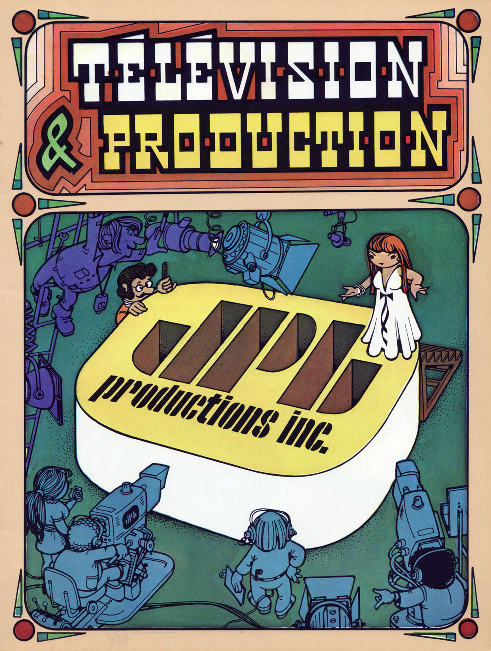
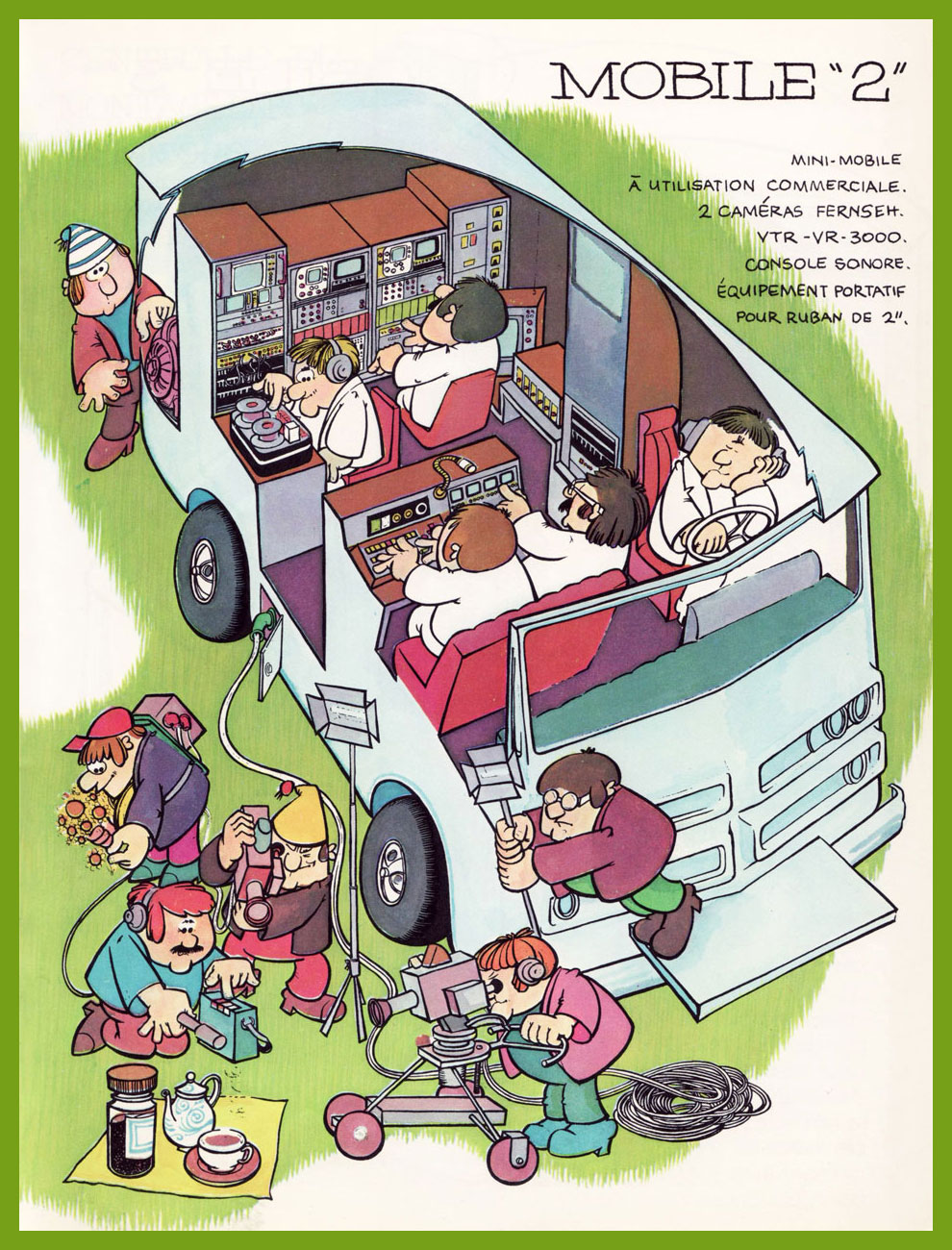
A little while back, I chanced upon a handsome, lavishly-illustrated brochure (undated, but from 1976 or so) promoting the services of a Montréal television production company, which leads into this little history lesson.
JPL Productions Inc. was a subsidiary of Télé-Métropole*, Canada’s first private French-language television network. In 1965, France-Film president and Télé-Métropole founder Joseph-Alexandre DeSève sagely ensconced political cartoonist, illustrator, art director, television director, watercolourist… and even co-star of a timeless, Oscar-winning Norman McLaren short film, Jean-Paul Ladouceur (1921-1992) at the head of the newly-constituted ad production arm of his television operation. This was an era in which you might actually find bonafide creatives in positions of influence, before the age of financial ‘diversification’ and conglomerates** unleashed its full toxic bloom and creatives were henceforth sidelined and supplanted by bean counters.
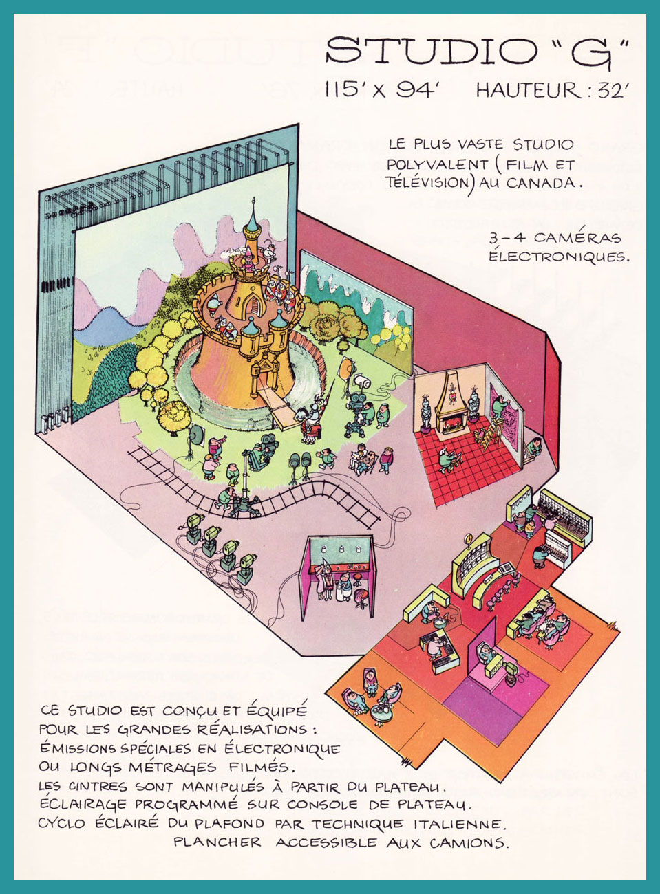
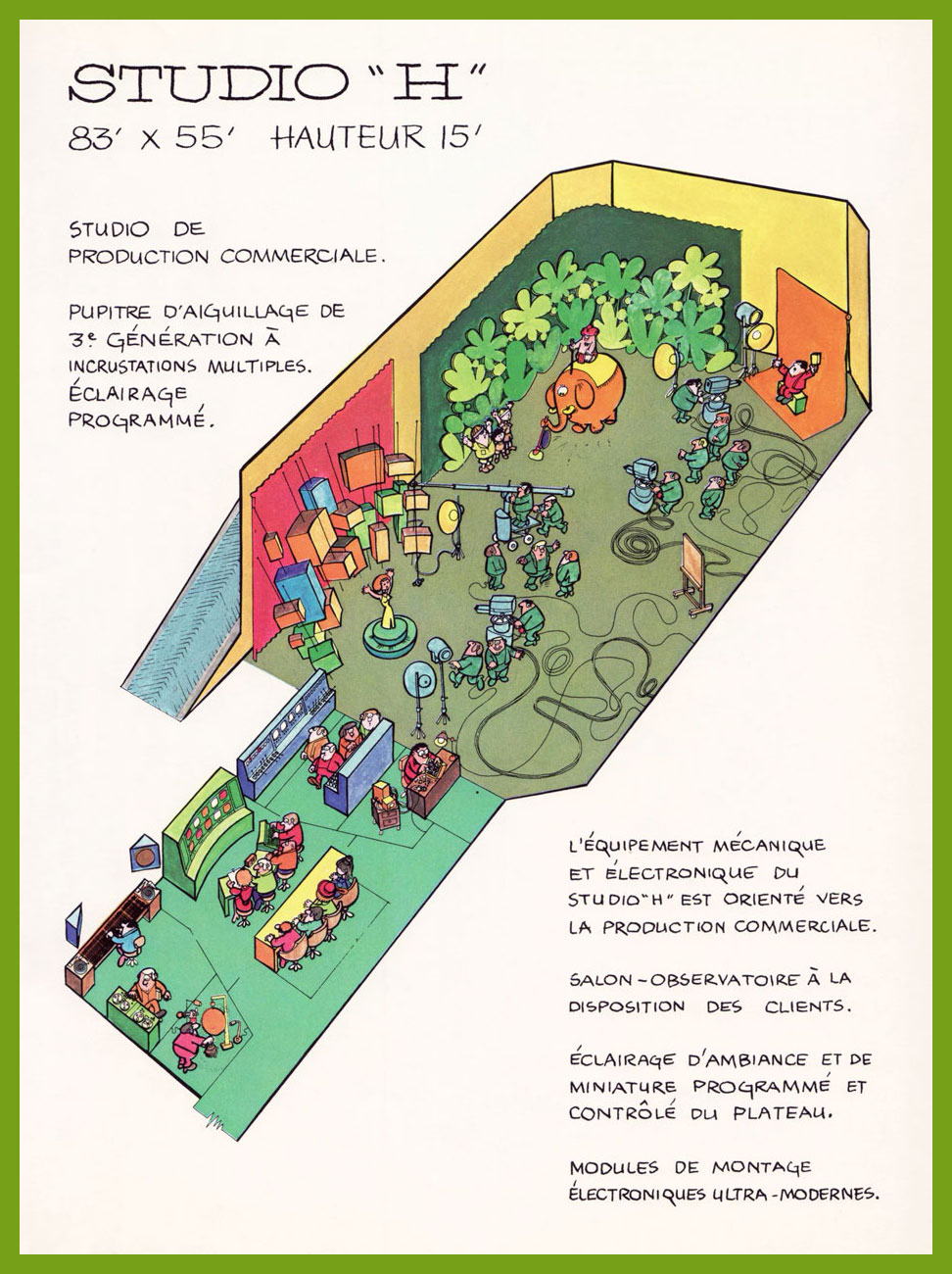
Over time, JPL expanded the scope and range of its activities. I hardly need to go into details: that is precisely this publication’s purpose.
The front cover. All artwork (uncredited… for shame!) by Bernard Groz.
JPL himself provides the introduction: « To tell you about us, to speak of our people, our accomplishments, our equipment, we told ourselves: “it can’t be done without images”. And so, this illustrated brochure. JPL Productions Inc. is a subsidiary of Télé-Métropole Inc., the largest private enterprise television station in America. We produce advertisements, documentaries, industrial films, feature films, slideshows, soundtracks, printed matter, soundtracks, etc.. We hope that the following pages will give you a sense of the scope of our business. Our illustrator could not include each member of our personnel in his drawings. He had to leave out 250 of them. When we speak of ourselves, we say that we are producers, designers, publicists, advertisers, creators, communicators, propagandists, persuaders, as well as a whole range of ‘-lists’ and ‘-ers’. Without doubt and without false pride we are right. But we… prefer to think of ourselves, first and foremost as makers of amazement. » Phew!
An elephant running a vacuum cleaner? I’d like to see that commercial.
Four Sound Studios. Here and there, Groz threw in recognizable figures. In this one, the pianist (and the bandleader) are the talented Georges Tremblay, who composed and performed many a memorable (and often surprisingly elaborate) theme for Télé-Métropole’s émissions. To wit, the network released an LP’s worth of them, Les thèmes du 10. Here’s one, La couleur du temps, written for… the weather bulletin.
Stage Services: workshops, studios, salons.
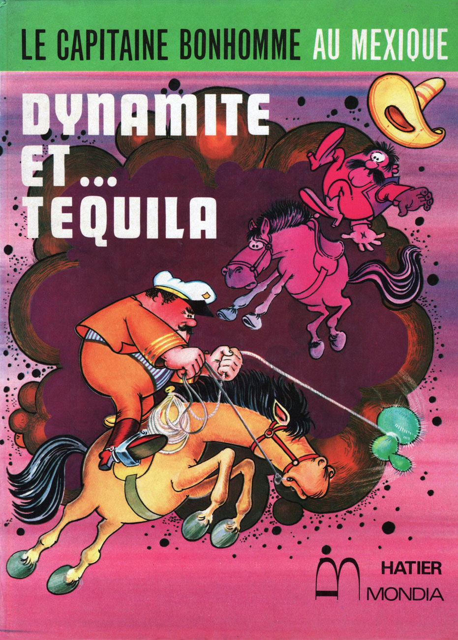
Front cover of Le Capitaine Bonhomme au Mexique: Dynamite et… Tequila (1973, Hatier/Mondia); scripted by the Capitaine himself, ace raconteurMichel Noël (1922-1993) and illustrated by Bernard Groz. How much of Renaissance man was the Capitaine? Here’s his astounding biography (in French).
Dynamite et Tequila‘s opening page. The beloved Capitaine Bonhomme, a Télé-Métropole fixture introduced in 1962, would follow his creator throughout his life. He was yarn-spinner in the grand old Münchausen / McBragg tradition, and his wide-ranging popularity in Québec has endured largely because he never patronized his audience and, as with much of the richest grade of humour, his wooly accounts were sprinkled with witticisms and allusions whose meaning(s) suited both juvenile and adult sensibilities. Here he is during a 1988 talk show appearance.
-RG
*« Present at the February 19, 1961 inauguration were Montréal’s Archbishop, Paul-Émile Léger, the city’s mayor, Jean Drapeau, and the Prime Minister of Québec, Jean Lesage, who declared that television has « great power, and therefore great responsibility. » Chew on that, Stan Lee fans!
**After mobster and parking lot maven Emmanuel “Manny” Kimmel inherited the assets of his partner Abner “Longie” Zwillman (“the Al Capone of New Jersey“) upon the latter’s death, he continued his plans for legitimization and diversification. After The Kinney Parking Corporation acquired a chain of funeral homes, Kimmel soon entrusted the business dealings to a canny young undertaker named Steve Ross. « Ross diversified into businesses that had no visible connection to the already odd marriage of caskets and parking spaces. He bought office cleaning services, DC Comics (publishers of Superman), MAD Magazine, and a talent agency. In 1969 Ross made a daring bid for Warner Brothers, the film studio and record company. » « Kinney acquired Warner for $400 million. » Quotes from William Poundstone‘s captivating Fortune’s Formula (2005).
And that, children, is how The Mob bought DC Comics. I always chuckle when fanboys claim, without a shred of evidence, that Charlton Comics (owned by the Santangelo family) were ‘mobbed up’. I guess to some people, it’s only the Mob if it’s eye-talian.
« Outside of a dog, a book is a man’s best friend. Inside of a dog, it’s too dark to read. » – Groucho Marx
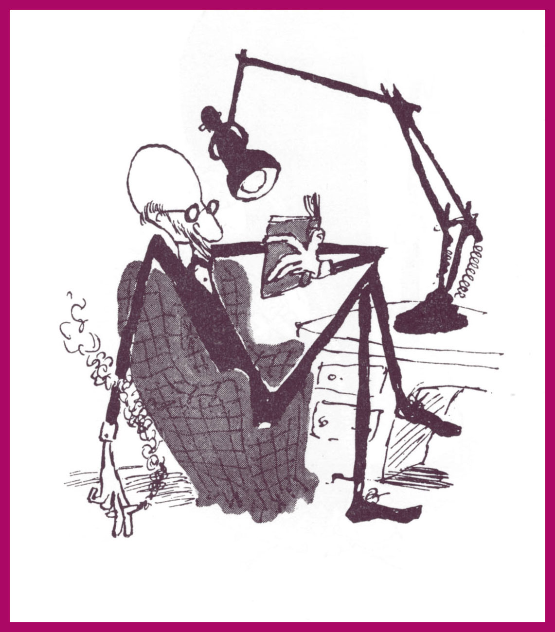
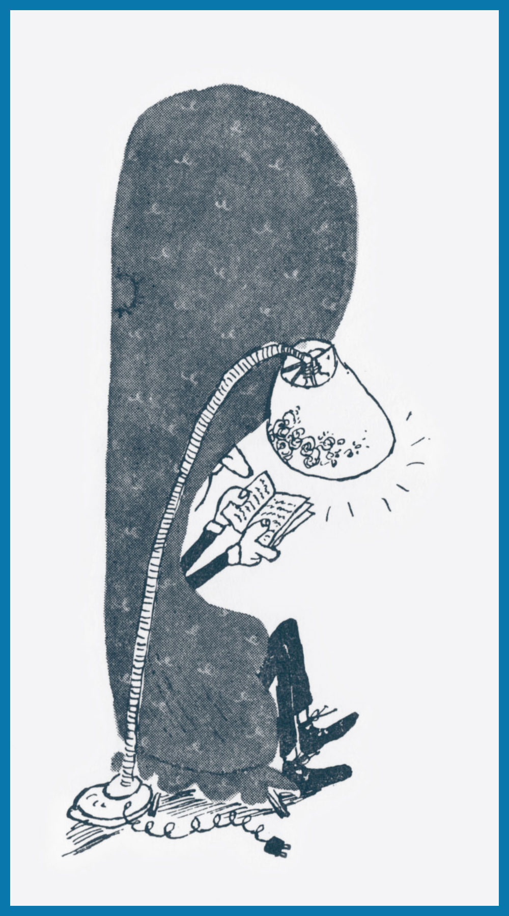
Today, we salute the remarkably versatile and woefully short-lived Gerard Hoffnung (born in 1925, died in 1959 of a brain haemorrhage, aged 34): cartoonist, illustrator, educator, musician, raconteur… and voracious reader, ça va de soit.
While he’s perhaps most fondly recalled for his music and his music-related cartooning, I hold in special regard a slender volume of his gentle celebration of the act and art of reading, Hoffnung’s Constant Readers, from which I offer you the following samples.
This piece evokes echoes of another cozy favourite, this one, by two-headed cartoonist Anton.
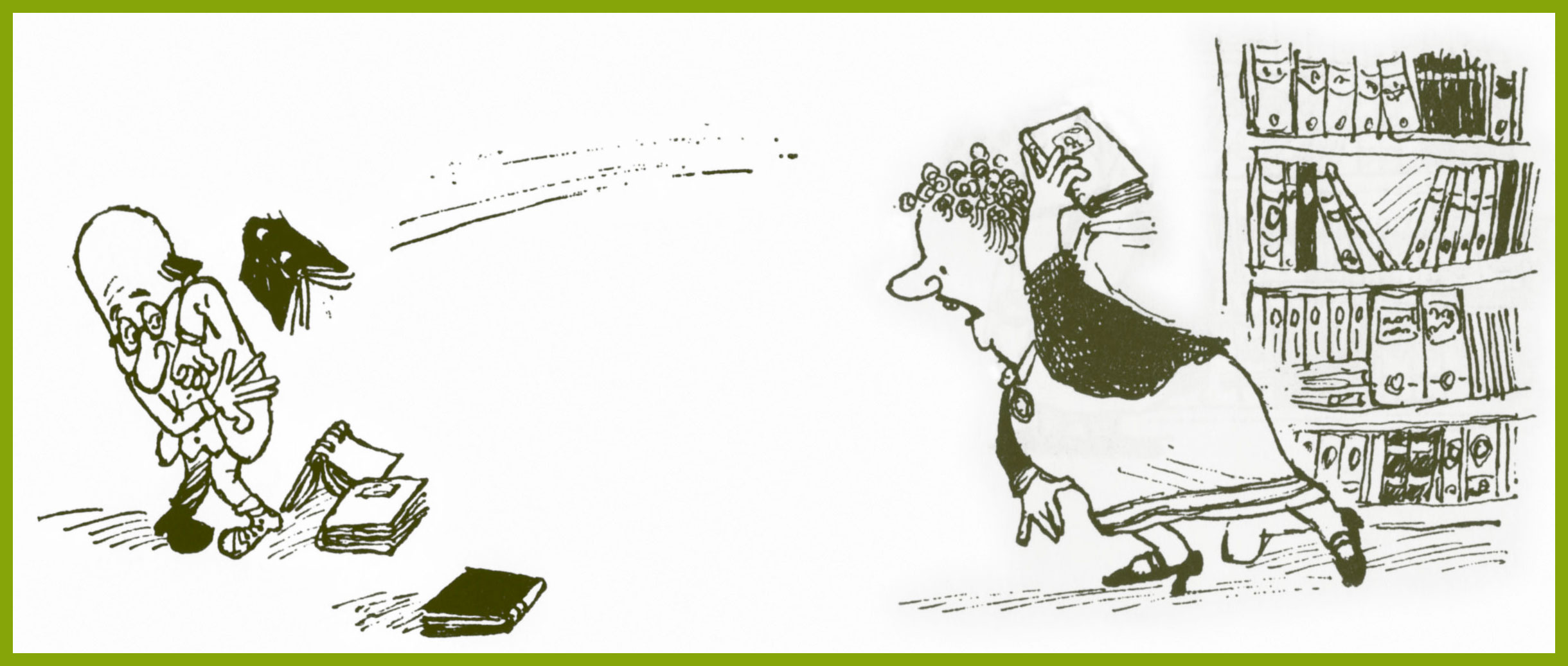
Ah, the familiar struggle, this time with the unlikelier outcome… for a change.
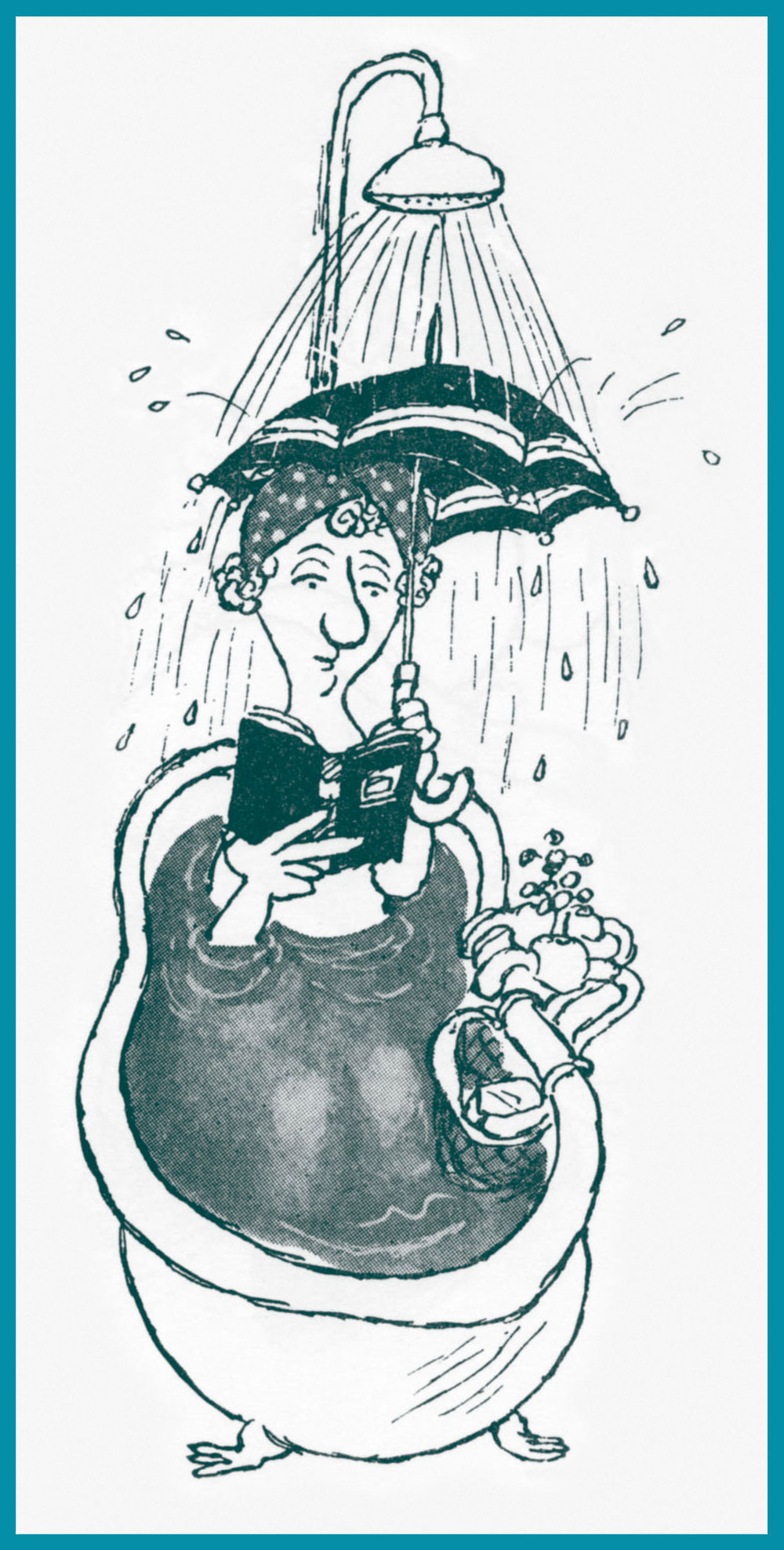
The dread of every true bibliophile.
Not a scene you’re likely to witness these days, nor should you!
I’m told that flour and yeast have lately been vanishing with dizzying speed from grocery shelves. It appears that home-confined bread lovers have, in tremendous numbers, taken up the noble art of making their own.
« Children are made readers on the laps of their parents. » – Emilie Buchwald
Front and back covers; like much of the man’s œuvre, Hoffnung’s Constant Readers (1962, Dennis Dobson, London) was published posthumously. For some dad-blamed reason, the book was at some point reissued under the rather disparaging title Hoffnung’s Bookworms. Bleh.
The debonair (what else?) Mr. Hoffnung.
Born and raised in Berlin, teenage Gerard was sent to England in 1938 to flee the encroaching tide of Nazism. He was a lifelong (however brief the life) doodler, and most of his thousand-plus drawings (in a style bearing a touch of his noted compatriot Wilhelm Busch‘s influence) were carefully preserved. For such a short life and career, this irrepressible fellow left behind an outstanding discography and bibliography.
His devoted widow, Annetta Hoffnung, née Perceval (they wed in 1952), attended unflaggingly to his memory during the nearly sixty years that she outlived him by (she passed away in 2018); the website she created to celebrate and promote his work remains active, and there you’ll find a fuller biography. Thank you, madam.
«... it was invariably his work that was given pride of place. His was emulated and imitated. By the end of the 1930s, he was the most respected and sought-after artist working for comics…»
And now guess who these lines were written about. My title was a dead giveaway, I admit! But if you’ve heard of Roy Wilson, you are, as it turns out, distinctly in the minority. He doesn’t have a Wikipedia page (surely that is a sign of success and fame in the modern world) in English, and a quick search for his name yields a lot of unrelated nonsense. But just add the word “comics” to your Google quest, and we’re in business!
Royston Warner Wilson was born in Northamptonshire, England just at the turn of the century, in 1900. He died young, at 65, but those years were enough for him to leave more than a lifetime’s worth of cartoons, humorous drawings and comic strips. For someone who has been widely credited as the most influential artist of British humour comics in what roughly corresponds to the Golden Age, which is to say the 1930s to the 1950s, his relative obscurity is downright criminal. While not particularly well-remembered by the world at large (even by the British public, it seems), at least he is beloved by legions of fans who were children during these decades and were irrevocably, and delightfully, marked by the antics of his characters.
In the 1930s, he was the leading artist for Amalgamated Press, which unleashed a variety of humour/comic titles, mostly weeklies, upon a delighted audience of pre- and post- pubescent children. Oh, a lot of these publications were around before he stepped in – but he revitalized them. As for the publisher, it had a long history with comics: as a matter of fact, it entered that particular market in 1890 with something called Illustrated Chips.
Because Roy Wilson was so talented and prolific and his artwork so lively, his style quickly became the house style and remained so for decades, which is why Wilson can be easily credited with having created what we can roughly call the “British humour style”, easily recognizable to this day.
He not only created and drew (and, often, redrew: like some super prolific artists who seem to have too many ideas to put down on paper, he was a perfectionist) the stories, he also lettered them himself. He had a great eye for colour, too! Which leads me to my next point – I’ve often seen him referred to as the « British Walt Kelly », but I’m not entirely on board with that comparison. Oh, there’s similarities – for instance, their common love of playful language and the ease with which both depict frisky, charismatic animals – but I think this monicker does both of them a grave disservice. Let’s appreciate artists on their own merit, shall we?
Only one Wilson monograph appears to have seen print: The Comic Art of Roy Wilson (1983), and it’s quite scarce nowadays. I recently purchased a copy. All images in this post have been scanned from it, courtesy of co-admin RG.
Roy Wilson was actually allowed to sign his paintings – I don’t know if that was a first, but it was certainly highly unusual in British comics. He was paid about eight guineas per painting.
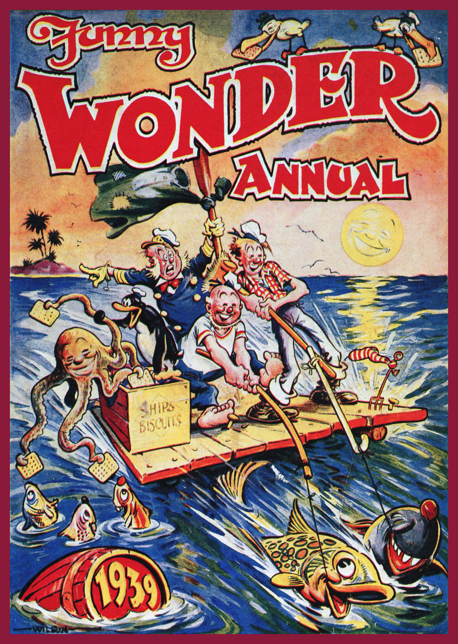
The reason for the re-occurring octopus, as you may be wondering – other than it being clearly fun to draw – is that he was a character in the stories of Pitch and Toss, published in Funny Wonder. To wit, Pitch and Toss Put On a Good Show and Show How to Make Good Money!:
Published in Funny Wonder, August 21st, 1937.
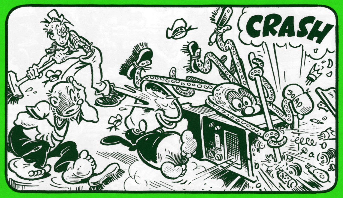
The above was the first appearance of Occy the Octopussie, who became a mainstay of the strip. Here are two (rejected) panels from another chapter in the saga of Pitch and Toss, this time for Pitch and Toss and Their Pets Get a Sub and Spend a Happy Whitsun, from March 30th, 1942.
« Roy Wilson’s art is still very much alive and, even in the comics of today, his influence can be seen. Britain’s foremost comic artist created a host of cheery and boundlessly zestful characters who still exist in the minds of the millions they entertained His art will not be forgotten. » (quote by Alan Clark and David Ashford from The Comic Art of Roy Wilson)
« Rahan n’a plus peur de la nuit, ni du feu, ni du tonnerre du ciel, ni des fleuves sans fin… »
(Rahan no longer fears the night, nor fire, nor the sky’s thunder, nor endless rivers…)
Even non-European readers will probably have some familiarity with handsome troglodyte Rahan, one of the heroes of the Franco-Belgian bande dessinée.
In 1969, Rahan made, to general acclaim, his début in the inaugural issue of Pif Gadget: apparently his escapades appealed to both male and female audiences. The series was created by writer Roger Lécureux and artist André Chéret, both seasoned comic pros by then. His adventures spanned years upon years of publication and spawned legions of rabid fans. To give you an idea of what “many years” implies, the last album – with new material! – came out in 2012; the collected series, which gathers material between 1969 and 1999 (30 years of the Lécureux – Chéret team), took up 26 handsomely-printed hard-cover volumes.
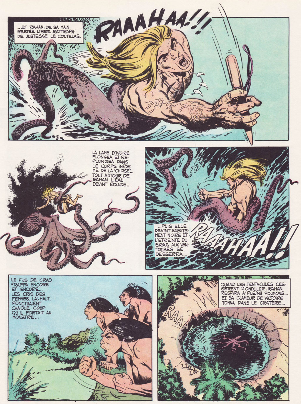
The following sequence is from La flèche blanche, originally published in Pif Gadget no. 90 (Nov. 1970), and reprinted in colour in Rahan no. 7 (Oct. 1973).
I first encountered Rahan on his home turf, which is to say in some old issues of Pif Gadget. I am not a big fan of the prehistoric genre, as it demands a more momentous suspension of disbelief on my part than I can provide. (The endless parade of clean-shaven blonde hunks accompanied by female nubile savages is a little too much for me.) Besides, Pif Gadget offered far more fascinating strips to focus on, so I happily skipped over the adventures of Rahan, just as I would gleefully ignore Les pionniers de l’espérance (same writer as Rahan) or the boringly handsome Docteur Justice (not the Marvel one).
However, I have to (grudgingly) avow that Rahan doubtlessly had great things going for it. Its strengths are also what seems to provoke some modern readers into dismissing Rahan with a patronizing hand-wave: aligning itself with the communist nature of Pif Gadget, Rahan espoused such values as justice and equality. He was also an immensely curious young man with a scientific mindset, which led him to discovering/creating useful tools, helped him to solve problems and shielded him from the superstitious nonsense others believed. One doesn’t often run into a caveman whose leitmotif is Humanism.
I did not grow up with Rahan, having only come to Pif Gadget in the last ten years or so (through the influence of co-admin RG), but these values are well known to me from growing up on Soviet science-fiction (Russian has a nicer word, fantastika, which is much more encompassing and also includes any forays into fantasy, prehistoric or otherwise). That, too, often gets thrown under the train of « childish, naive and simplistic », the holy trinity of a jaded cynic that’s currently en vogue as a role-model.
This seems especially unfair given that the series did not shield its mostly young readers from some harsh truths about life. Death and violence accompanied our hero wherever he went, and a lot of characters he encountered were, frankly, colossal assholes, as disinterested in fairness or egalitarianism as some modern poo-pooing readers. Not to mention Rahan’s curse of solitude – orphaned twice, he is never really accepted by the tribes he bumps into during his travels. He’s either rejected as an intruder… or venerated as a sort of a god, once he creatively extricates himself (and frequently the tribe) from some predicament. Oh, and this being a French comic, there are also bare-breasted women like it’s no big deal (and even some breast-feeding).
Original cover art from Rahan – L’intégrale Tome 16 (2019, Soleil).
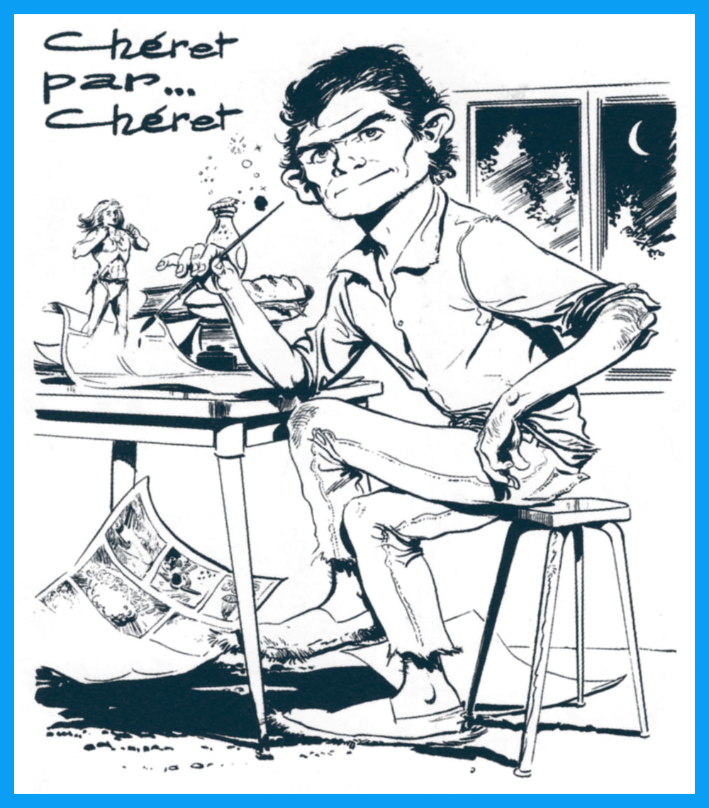
Today’s post is dedicated to André Chéret, who died less than a month ago, on March 5th. He was 82.
A self-portrait of the artist, which originally saw print in Pif Gadget no. 81 (Sept. 1970).