« Kate’s death scream gags stillborn in her throat as the tentacles dart toward her, slithering hungrily across her body. »
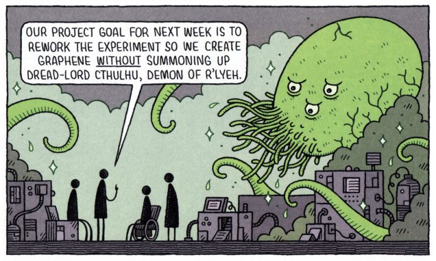
Here’s a quick association exercise: as fast as you can, name words that come to mind when somebody says “Dracula”. Um, fangs! Stake! Blood, cape, biting! … Tentacles? Say what?
It would have never occurred to me to look for tentacles in Dracula, giant-size or otherwise, so thanks to admin RG for this splendid suggestion.
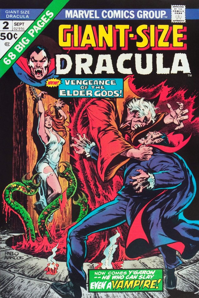
Giant-Size Dracula no. 2 (September 1974). Cover by Pablo Marcos.
You’re not sure those green things were tentacles? If it quacks like a duck, it may well be an aquatic bird – and if it slithers towards female “human flesh”, count it as tentacles! Call Them Triad… Call Them Death! is scripted by Chris Claremont, pencilled by Don Heck and inked by Frank McLaughlin. I have to say that the art is distinctly subpar, as far as I’m concerned.
The writing isn’t brilliant, either.
“Words are inadequate”.
Perhaps it’s the drab colours that weigh this down, and the original art would be a considerable improvement? Nope, sorry.
As further example of the ineptitude of this art team, a quick question: does this look like he’s slapping her?
She was lying face down, but she somehow manages to flip over instantly.
However, I have no wish to engage in Don Heck bashing – he had his moments, it’s just that this story wasn’t one of them. Instead, I will direct you to this article explaining how Harlan Ellison mocked Heck once upon a time, several lifetimes ago. Also, ouch.
Harlan Ellison: There are guys who’ve got very minimal talents and it doesn’t matter whether they corrupt it or not. I could name them and would happily name them, but why bother? There’s no sense kicking cripples. I mean, all you have to do is open up comic books from Marvel and DC and take a look at them. You see these guys have a very minor-league talent and, to say, “Well, these people are wasting their talent” is ridiculous. I mean, they’re never going to be any better. What’s the name of the guy who used to do… over at Marvel… he use to do… [Pause]… the worst artist in the field.
Continuing our foray into Draculas of colossal proportions tangling with tentacles…
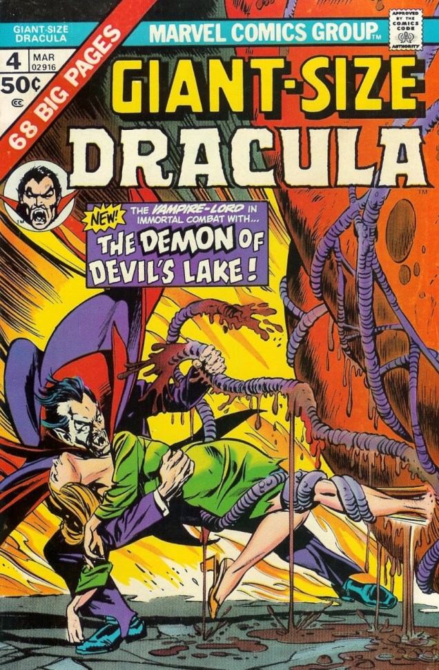
Giant Size Dracula no. 4 (March 1975). Cover pencilled by Gil Kane and inked by Tom Palmer.
Sadly, the tentacles promised on the cover don’t really appear in the cover story. Time to move to another series —
Tomb of Dracula no. 62 (January 1978), pencilled by Gene Colan and inked by Tom Palmer.
What Lurks Beneath Satan’s Hill? (tentacles, obviously) is scripted by Marv Wolfman, pencilled by Gene Colan and inked by Tom Palmer.
This has been scanned from the reprint, which in my opinion looks worse, not better.
The story continues in number 63 –
Tomb of Dracula no. 63 (March 1978). Cover pencilled by Gene Colan and inked by Tom Palmer.
The Road to Hell!is scripted by Marv Wolfman, pencilled by Gene Colan and inked by Tom Palmer:
« All-you-can-eat-calamari — dive in! »
Next up (eventually), an equally random concept: Werewolf VS tentacles!
Random fact of the day: in Mandarin Chinese, secret is “mimi”, whereas in French “mimi” means something like “cute”. Today’s post is not cute, but it is very much about secrets – DC secrets, to be more precise.
Secrets of Haunted House no. 14 (Oct-Nov 1978). Cover by Mike Kaluta.
The original art for this cover feels a little less cluttered:
Taking a peek at the insides, we will find that they have little to do with the cover, but tentacles are still present. The Discovery is scripted by Jay L. Zilber, pencilled by Juan Ortiz, and inked by Vince Colletta:
Tentacles also rudely intrude in Selina, a story scripted by Nicola Cuti and elegantly illustrated by Ramona Fradon and Bob Smith —
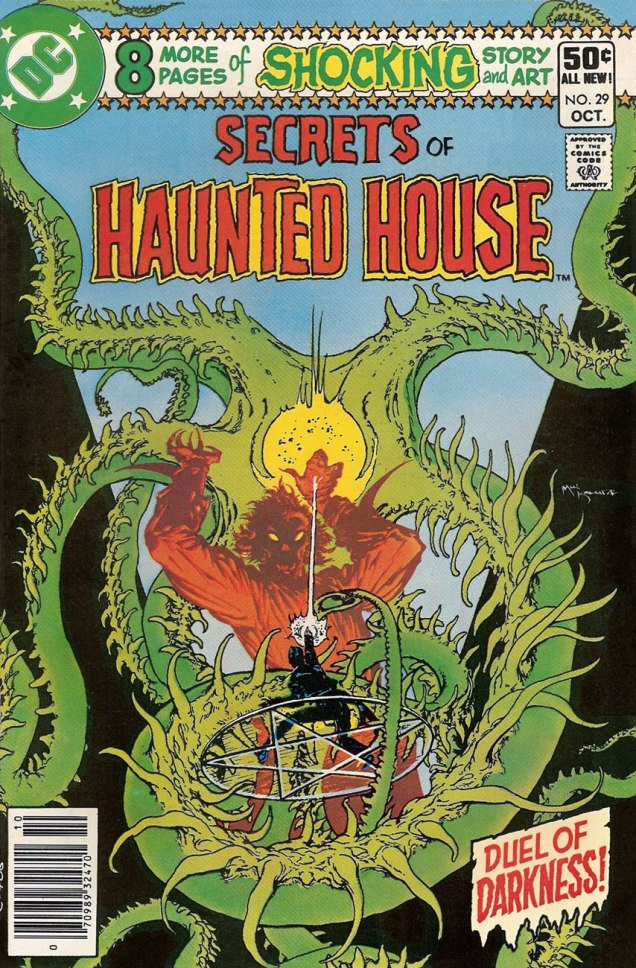
The thing about masks was too topical to not include.Secrets of Haunted House no. 29 (October 1980), cover by Mike Kaluta.Secrets of Haunted House no. 36 (May 1981), cover pencilled by Rich Buckler and inked by Dick Giordano.
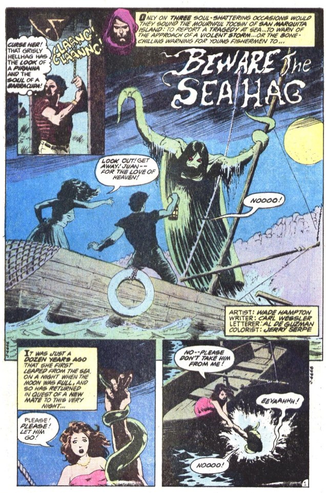
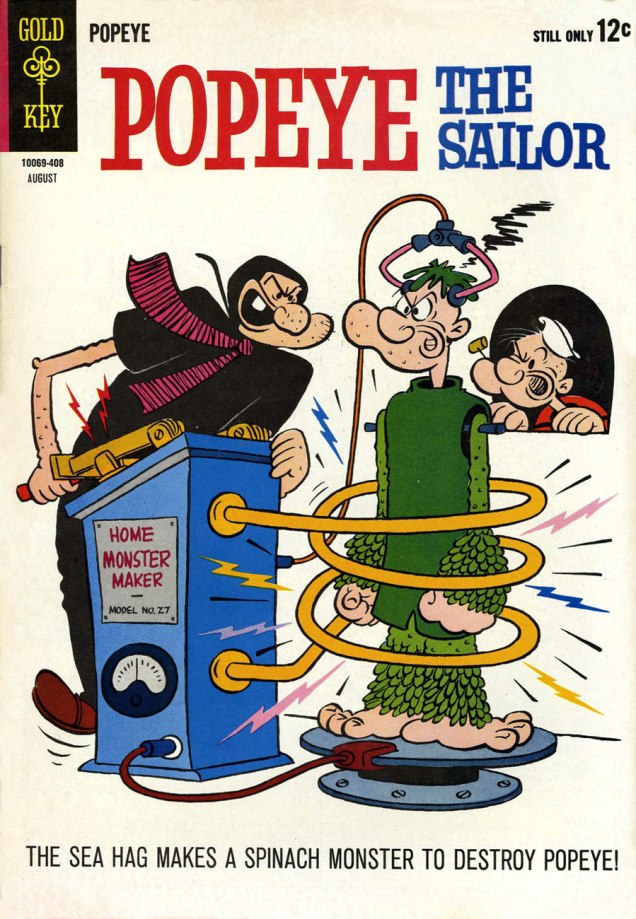
Beware the Sea Hag, the cover story, is scripted by Carl Wessler and drawn by Wade Hampton:
But, wait, this is not what the Sea Hag normally looks like! This is more like it:
Popeye the Sailor no. 73 (August 1964), cover by Bud Sagendorf. I wonder if the Sea Hag realises how much spinach reduces under heat.
Shifting to another sort of secrets (these are sinister rather than haunted), we have another tentacle apparition —
The Monster of Death Island is scripted by Maxene Fabe and drawn by Ruben Yandoc (i.e. Rubeny). It was published in Secrets of Sinister House no. 11 (April 1973).
This story, a sort of take on Bluebeard, is well worth reading, for the plot as well as the stunning art. I don’t want to reveal spoilers – you can read it here.
Since we’re discussing secrets, I might as well throw in TheHouse of Secrets… I will willingly admit that I have the hardest time keeping track of which is which.
House of Secrets no. 101 (October 1972), cover by Mike Kaluta. This could have been a Mike Kaluta Tentacle Tuesday!From House of Secrets no. 100 (September 1972). This page of Abel’s Fables is by Lore Shoberg.Cain & Abelby Sergio Aragonés, printed in House of Secrets no. 103 (December 1972).
It’s lovely to enthusiastically anticipate new oeuvres from a present-day cartoonist, or to have the opportunity to praise his work knowing that, perhaps, some of this praise will eventually reach him. I spend much time reading books written and drawn by people long gone, so it’s truly a pleasure to endorse cartoons by a contemporary artist.
In this case, this post was prompted by getting my hands on Department of Mind-Blowing Theories, which came out in April 2020. It took me a few months to get my hands on it, yes, but get to it I did.
Tom Gauld, hailing from a Scottish county with the romantic name of Aberdeenshire, is a self-declared SF/F nerd with a scientific bent, the latter proclivity acquired thanks to his grandfather, who was a marine biologist. To quote Gault, « he was a quiet and thoughtful man and I think because of him, the whole family had a respect for science and scientists. He subscribed to New Scientist and would give them to my Dad after he’d read them, so there were always copies around our house as I was growing up. » The first time I encountered Gauld’s strips, I thought he was a scientist, so accurate were his depictions of the struggles of the scientific community. As it turns out, this is a somewhat new and recent direction for him – he’s only been contributing to the New Scientist since 2014. His more literary-minded work has been published by The Guardian since 2005, and he has also created some lovely covers for The New Yorker (eight, to be more precise).
All material (except the first image) in this post has been scanned from You’re All Just Jealous of My Jetpack (2013, Drawn & Quarterly), a collection of selected strips published in The Guardian, and the aforementioned Department of Mind-Blowing Theories (2020, Drawn & Quarterly), his fifth book with this Montreal publishing company.
A print from a series of twenty four commissioned by Bart’s Hospital. These prints are installed throughout its Cystic Fibrosis Unit. « As part of Tom’s commission, he met with patients to gain insight into the particular circumstances of their condition, the hurdles they encounter, their hopes and fears in order to create a project that is relevant to their reality. The outcome is an urban park featuring humorous vignettes and unexpected elements. Each isolation room in the Unit displays a selection of prints from Tom’s Imaginary London Park series. Embedded within each image are an array of symbols that relate to an explanatory key, included in the rooms. Patients can imagine the variations in their own, as well as adjacent rooms. Due to frequent re-admission, patients can explore more of the work, and discover new vistas, when they return to the Unit and occupy a different room. »
Gauld’s tentacles aren’t always front-and-centre, occasionally occupying a humble corner. I got Richard Dawkins, by the way.
« There sometimes seems to be an idea that in order to be a scientist you have to put aside your humanity and become an emotionless logic-machine. I think that’s wrong, but some people (even some scientists) seem to believe it. There’s a thread running through the book of cartoons that depict scientists being human: Being unsure, bickering, misunderstanding, and messing things up. It’s much more fun (and realistic, I think) to depict flawed, klutzy humans than idealised successes. » |source|
« I spent seven years at art school and tried all sorts of drawing styles, but when I got into drawing comics I found that a simple style worked best. I gave up trying to be “artistic” and just used the type of drawing I’d naturally revert to when I wasn’t thinking too much: the style I’d use for a silly cartoon to amuse a friend, or to draw a map or an idle telephone doodle. I’ve tried to improve as I’ve gone along, and I hope I’ll never be stuck with a fixed, unchanging style. I want the images to be simple and clear, but with a bit of human warmth, a bit of handmade wobble in the lines, to stop it seeming completely diagrammatic and cold. » |source|
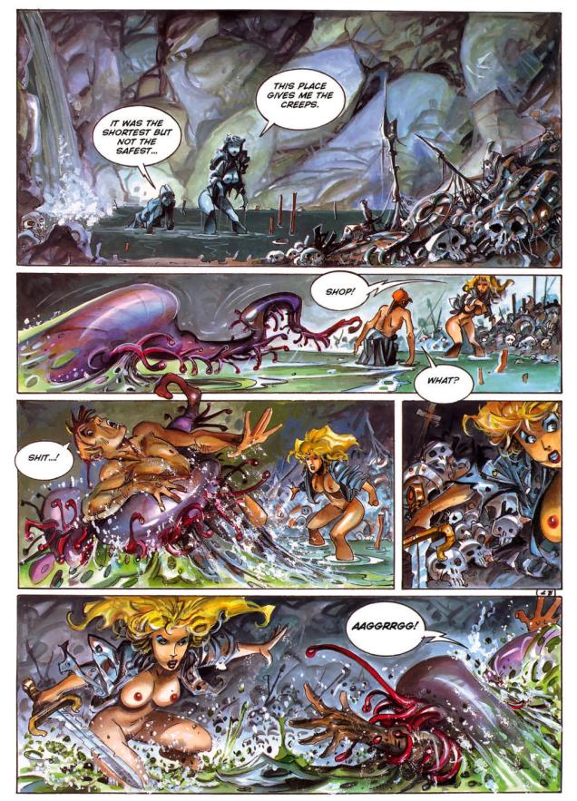
I recently stumbled upon a comic story that I really liked, posted on one of those websites of dubious legality bestrewed with ads. Oh, the plot didn’t make all that much sense, nor was it original… but I liked the art, bright and stylish. Lorna, the heroine, was drawn a bit like a fashion sketch from the 80s: big hair, blue eyeshadow, lots of leather and studs wrapped haphazardly over her sumptuous form.
I’m late to the party, for Spanish artist Alfonso Azpiri (1947-2017) has been around for a while. He was a frequent contributor to Heavy Metal Magazine – which explains why I haven’t come across his art before. I’ve never read it; I also haven’t seen the magazine-inspired movie Heavy Metal (from 1981), nor its follow-up, Heavy Metal 2000 (2000). My first glimpse of an exposure, oddly enough, to “the world’s greatest illustrated magazine” came by way of the video-game Heavy Metal: F.A.K.K. 2 (also from 2000), which I adored at the time, and have played several times. I’ve of course seen second-hand copies of the magazine lying around comic book stores, but they never seem interesting enough to pick up.
Heavy Metal: F.A.K.K. 2 also had tentacles!
To get back to the topic at hand, Lorna is Azpiri’s most enduring character. She’s been compared to Barbarella, though I believe Jean-Claude Forest’s heroïne was a much more original and fresh creation. Still, Lorna has redeeming features, aside from the fact that it’s fun to follow the adventures of an almost-always naked buxom blonde with an attitude.
What I like about Lorna is her resilience – her enjoyment of trysts with animal, mineral and vegetal never stop her from looking for a way out and turning the tables on her various captors at the first opportunity. And speaking of doing squat thrusts in the cucumber patch, Lorna gets it on with everybody, independently of their species, origin, or chemical composition, organic or inorganic. I fail to see why a sack-like creature from another planet, a giant crustacean or a beetle-sized lizard would want to get it on with a human female, but oh, they do. A lot of stories from other authors balk at such unholy pairings*, setting them up only to have the damsel rescued at the last second, but Lorna is usually her own guardian angel, managing to escape…. after properly enjoying herself.
*Although Italian artist Paolo Serpieri‘s Druuna (also from Heavy Metal Magazine) comes to mind – she also gets assaulted by all manner of yucky things, but where Lorna has colourful fun, Druuna is getting painfully raped, so I by far prefer Lorna’s adventures.
So here are the adventures Lorna had with tentacles. If you want more Azpiri, this art portfolio is a good place to start; and if you want to sample Lorna’s adventures, you can read pretty much all of this stuff online here.
The following pages are fromLorna: Lost Shadows(2006). The original title is Sombras perdidas (2005). Both were published in Heavy Metal Magazine.
« Azpiri’s earliest published work was done for Italian horror titles in the ’70s, but he expanded into fantasy and science fiction, with erotic themes a constant across all his work. He made his Heavy Metal debut in the July 1984 issue with a story called “Daymares/Nightdreams.” In all, his work appeared in over 30 issues of Heavy Metal; on three occasions, major chunks of issues were given over to Lorna stories (September 1998, March 2002, and March 2006). Heavy Metal also published hardcover English-language versions of his Lorna stories, as well as sketchbooks and portfolios. » |source|
The following is from The Eye of Dart-An-Gor (2005). In Spanish, this came out as Ojo de Dart-An-Gor in 2003. Both were published by Heavy Metal.
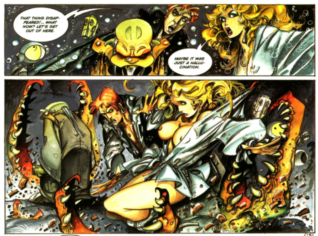
Two following page-and-a-half is from Lorna and Her Robot(2000). The original title was Lorna y su robot(1999). Both were published by Heavy Metal. I prefer Azpiri’s later style.
Speaking of making it with a robot, I recommend taking a gander at Nuts And Bolts: 15 Times A Robot Got Lucky. Lorna is #10 of that list, and I highly recommend the comic at #2.
« Octopuses have a lot in common with other species that are known to thrive in cities—not only can they use human-made structures for shelter, but they’re highly adaptable and good at problem solving. So maybe we’re justified in adding to our list of neighbours, next to the raccoon at the sliding glass patio door and the coyote in the halo of the street lamp, the octopus casting its appraising eye from under the sunken hull of a rowboat. » |source|
Octopuses in a mundane, urban setting? Address yourself to Gary Larson!
As promised a couple of weeks ago, we’re back with another Larson-copia of tentacles! Pt. 1 can be found here. Again, thanks to co-admin RG for all the scanning and colouring work.
If you think we’re somewhat stretching the definition of “tentacle”, I think the husband’s, err, feet definitely qualify.
Incidentally, one the world’s largest sea creatures is the lion’s mane jellyfish, whose tentacles are the longest of them all (they can attain lengths up to 37 metres or 120 feet).
Letting us know what we’re in for straight away, even the cover of the fourth Far Side collection features a tentacle.
∼ ds
Some content on this page was disabled on June 3, 2022 as a result of a DMCA takedown notice from Gary Larson. You can learn more about the DMCA here:
Many years after the fact, political caricatures are hard to appreciate properly, generally speaking – politicians’ names get forgotten, events become blurry in the collective memory, and what was surely witty and acerbic just seems incomprehensible. They’re of great historical interest, and often of considerable artistic merit, too, but it’s not something I’m particularly interested in. That being said, nothing rekindles my enthusiasm like an octopus, especially if he’s sprawled all over the map of Europe, or, heck, the whole world. Power is an aphrodisiac!
People far more erudite than myself have written about political cartooning and its historical usage of octopuses. For a good overview of the subject, head over to an article published in Never Was Magazine. If you just like looking at pretty pictures, for a more comprehensive gallery of images I recommend The image of the OCTOPUS: six cartoons, 1882-1909, which breaks down components of six historical political caricatures of the tentacled kind, and Cartography’s Favourite Map Monster: the Land Octopus, superbly informative and thoroughly illustrated. There’s a also this fascinating article, but alas, in French, so only our French-speaking readers (of which we have quite a few) will be able to partake.
I have no system – I tried including images that aren’t seen too often in articles of this kind, or ones that are stylistically striking.
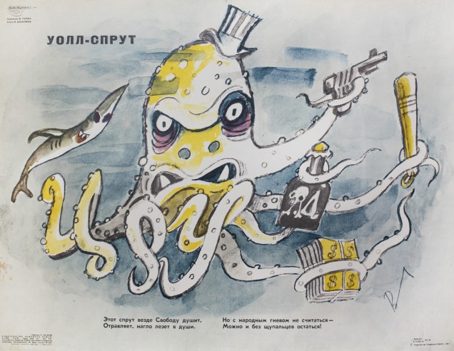
Does this look like an American tycoon to you? Nah, I didn’t think so. His name is Wall-Squid (some pun on Wall Street, I think), and he was published in a Russian magazine in the 80’s. The quatrain underneath doesn’t really rhyme, so it won’t lose much in translation: « Everywhere he goes, this squid strangles Freedom, poisons and recklessly pokes into people’s lives. But those who do not heed the People’s anger risk losing their tentacles! » Subtle.
But let’s go back to the 19th century, seemingly the golden age of tentacled propaganda. The line between propaganda and social criticism is blurry, of course – with my environmentalist tendencies, I think of the following trio, all condemning stabs at Standard Oil, attacked for being an unlawful monopoly, as perfectly justified attacks drawing attention to a serious problem.
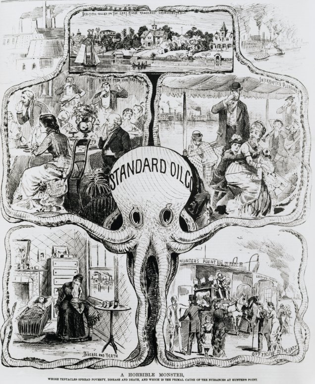
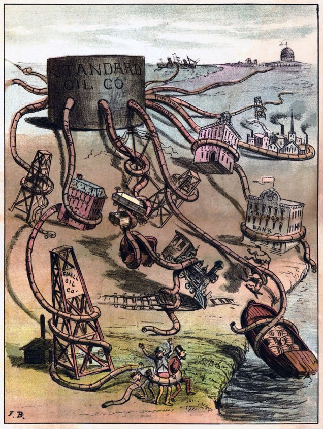
This one is from 1880, published in Daily Graphic. Standard Oil, “whose tentacles spread poverty, disease and death, and which is the primal cause of the nuisances at Hunter’s point“, is portrayed as an octopus with a somewhat vacant stare, as if it had no awareness of the havoc it’s wreaking.The Monster Monopoly by Frank Beard, a cartoonist who helped usher in the American Prohibition. This was published in Judge in 1884.And again in 1904. Next! was published in Puck Magazine. This octopus is considerably meaner – its intent is to destroy.
Another monopoly that was detrimental enough to warrant an octopus caricature was the Railroad Monopoly:
The Curse of California (I believe it has many more, now) by George Frederick Keller, “its many tentacles controlling such financial interests as the elite of Nob Hill, farmers, lumber interests, shipping, fruit growers, stage lines, mining, and the wine industry“.
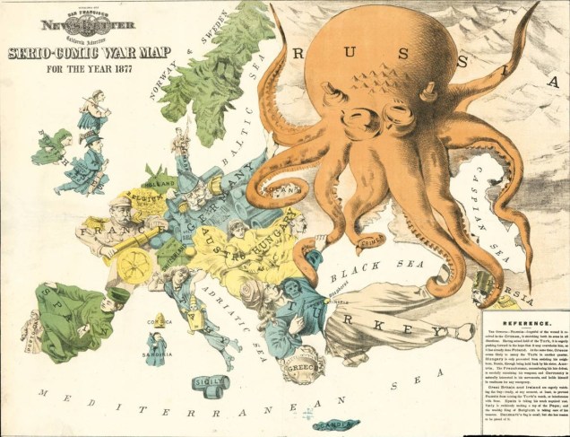
The following trio take on the same map, making for interesting compare-and-contrast material. The years may go by, but Russia continues to be grabby… Incidentally, as I am Russian, apparently these Tentacle Tuesdays of mine were pre-ordained by Fate.
The Japanese answer to the serio-comic octopus map of some decades past. created during the Russo-Japanese conflict of 1905.
Speaking of Russia…
Entertainingly, these days, one can purchase this image as a poster on Amazon or at Walmart.
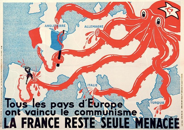
And speaking of communism…
« All European countries have vanquished communism – only France remains under threat. »
Lest I be accused of all this having no relevance whatsoever to today’s political climate… well, fortunately some traditions die hard, and tentacles as a representation of an all-encroaching evil are here to stay!
Illustration byMark Bryan. Painted in 2016, this is the artist’s vision of what a Trump presidency would be like.
I wasn’t going to let the other party off the hook… Or is it one and the same?
« Il vente — C’est le vent de la mer qui nous tourmente… »
Yesterday, I finished reading an excellent book by French author Pierre Mac Orlan, best known for Quai des brumes (Port of Shadows), written in 1927 and transformed into a movie in 1938. In other words, a while ago! The title of the novel I joyously devoured is Le chant de l’équipage (1918), and it’s a grand tale of swashbuckling adventure on the high seas. Well, actually it’s a lot more complex than that, and it’s beautifully written. As it’s in the public domain, you can read it online here (but in French only, I’m afraid). As I’m still digesting scenes from the novel, so to speak (no, the équipage did not encounter an octopus on its journey), my mind’s eye is focused on the far-away sea… so today’s Tentacle Tuesday has been rerouted from its original concept into everything nautical. Let’s spend a little time inhaling the healthy sea-breeze, in a world of handsome ships and the people who make them sail.
Perhaps the following story does not depict your standard encounter with an octopus… but it’s indubitably a seafaring tale. The Eyes, illustrated by Pete Tumlinson, was published in Astonishing no. 30 (February 1954, Atlas):
In the next page, the octopus-balls steal a lot of sunglasses (their discovery that ears are needed to wear glasses is off-panel, though).
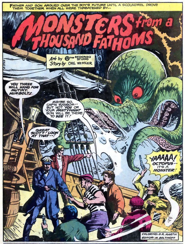
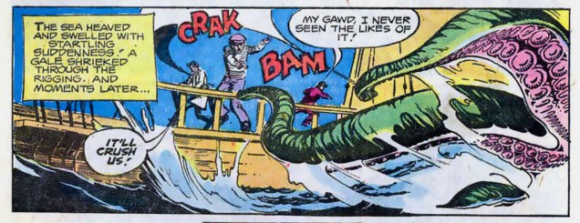
Monsters from a Thousand Fathoms, scripted by Carl Wessler and illustrated by the Redondo Studio (RG: with a heavy dose of E.R. Cruz), was published in The Unexpected no. 185 (May-June 1978, DC):
Ads endeavouring to put the viewer into the shoes of an action-type he-man to sell some nonsense is nothing new. And yet, through this hackneyed jungle, sometimes a glimmer of real excitement comes through:
An ad published in The Marvel Family no. 60 (June 1951, Fawcett). Never mind the Cola (it’s still around, incidentally), but that fight scene was pretty well orchestrated, if you ask me!
Those of us who like to dream of adventure, but preferably from the comfort of our own homes, I have this strip:
Since the aforementioned The Tracy Twins got its wings in a colour supplement of monthly scouting magazine Boys’ Life in 1952, I will now smoothly segue into a related topic, or a bit of warning, if you like.
If you start out as a wide-eyed kid in search of sea-faring thrills, and meet an octopus, just like this:
An issue of Adventures for Boys (December 1954, Bailey Enterprises).
You might end up, many years down the road, growing up to be, well… a little peculiar, shall we say.
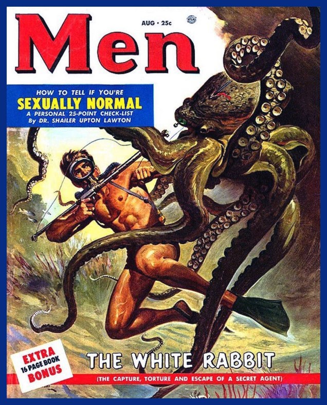
I’m sure several parts of that 25-point check-list for sexual normalcy involves cephalopods. This is Menvol. 2 no. 8 (Aug. 1953, Atlas). Cover by Robert Emil Schulz.
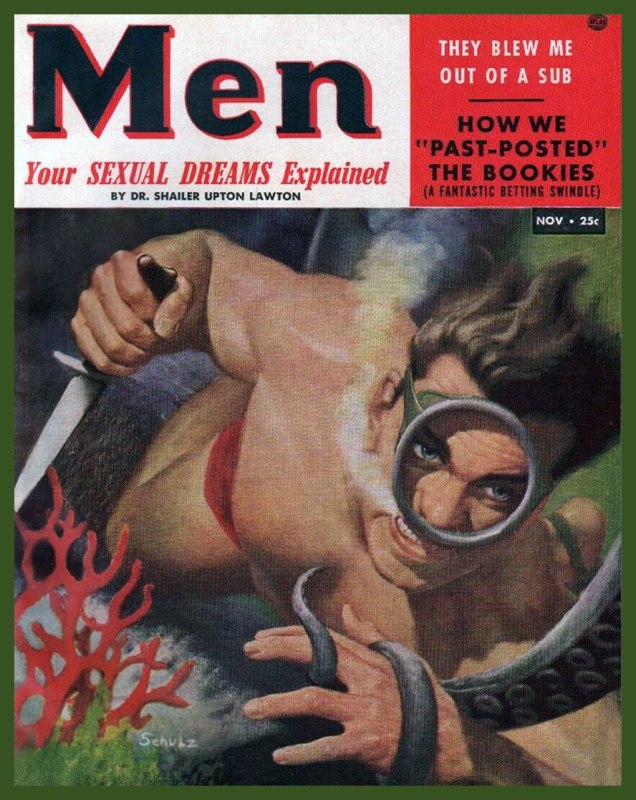
And if that wasn’t sufficient, the same doctor has further advice for his readers in this slightly subsequent issue:
Menvol. 2 no. 11 (Nov. 1953, Atlas). Cover by Robert Emil Schulz.
When I was in college, most of my professors could easily be divided into two categories: those who had good taste in comics, and those who did not. I don’t know who launched this tradition (is this something that’s universal to all post-highschool educators?), but somehow the majority of teachers were fond of clipping particularly pleasing items from newspapers and (usually messily) scotch-taping them to their office door. This usually included some brief newspaper articles, and definitely a cartoon or two.
I have to admit that I had a soft spot for panels that clearly had spent the last decade (or three) in that spot, and were little more than yellowed, warped, sometimes downright indecipherable relics of yesteryear. However, of greater interest were office doors tended as carefully as an prize-winning garden, proudly displaying a frequently renewed wall of cartoons, meticulously positioned and impeccably pasted onto the door’s surface.
I was lucky enough to know one professor who was passionate about Bizarro, and another one who harboured a similar fire for Gary Larson‘s The Far Side. At the time, I didn’t know that Larson had retired in 1995, and that new work of his was no longer published in newspapers. I was in college in 2004. Did the professor in question hoard large archives of cut-out The Far Side strips (these weren’t photocopies), and just cycle through them? Was there, in her office, some portal to an alternate reality? That mystery shall only deepen over time. I can only state that I would make sure to swing by first thing in the morning to enjoy that day’s offering.
Today we present you with a fairly complete collection* of Gary Larson tentacles. I give my gratitude to co-admin RG for his “eagle eye” – he spent an hour or two going through his paperback collections of the strip (and giggling maniacally) to spot anything cephalopodian. He then scanned ’em (and added colour frames, because that’s the kind of man he is), so this post has honestly been more work for him than for me.
*It turns out there’s quite a lot of them, so this shall be a two-part post.
Larson has been notoriously opposed to having his strips posted online by fans, but in December 2019, he has decided to start a The Far Side website, featuring a random selection of cartoons, some weekly selections organized by theme, and the occasional doodle or sketch. I have absolutely no wish to disrespect the opinion of the author, but I hope that now it’s okay to share our excitement about so much tentacle goodness with our readers. Besides, tentacles or not, most of these are hilarious and surreal, a combination that’s dear to my heart.
Without further ado…
« Controversy never seemed too far away from me, especially during my first year of syndication. I truly thought my career may have ended a number of times. I remember one I did of a couple dogs that were playing this game, where they were smacking around a cat hanging from a long rope attached to a pole. I called it “Tethercat.” To me, and I assume my editor, it didn’t cross any line because this was just a game dogs might play. But that one got people stirred up. Especially cat people. I’ll forever be grateful to fans, who in those early days often rescued “The Far Side” from cancellation, or campaigned to get it reinstated. » 〈source〉
« Among the massive fan base that The Far Side would eventually develop, interestingly scientists and academics were among the first to take to the comic, despite Larson’s frequent jabs at this very same group. The strip also had a tangible impact on the world of paleontology. In an 1982 comic, a group of cavemen are in lecture hall being shown a slide of a dinosaur. The caveman instructor is pointing to the spiky tail of a Stegosaurus while saying, “Now this end is called the thagomizer…after the late Thag Simmons.” As it turned out, in real life, no one had actually given that part of the Stegosaurus’ tail a name. Despite Larson’s fudging of the facts (in actuality, dinosaurs and humans missed each other by more than 140 million years), paleontologists adopted “thagomizer” as the official name of the spikes on a Stegosaurus. » 〈source〉
And, in glorious colour…
While there are cheap and abundant paperback collections of The Far Side in every self-respecting bookstore, in 2014, Andrews McMeel Publishing released a beautifully designed 3-volume The Complete Far Side. Oh, and it weights 20 pounds. For bonus value, some letters written to the newspapers by befuddled or angry readers are included. Few of us may feel the need to possess such a grand coffee table book (I’ve been pondering that myself ever since it got published), but its very existence is a lovely testament to the enduring nature of Gary Larson’s world.
±≠ ds
P.S. Those teachers with bad taste in comics I mentioned? They had Garfield and Cathy on their doors…
Some content on this page was disabled on June 3, 2022 as a result of a DMCA takedown notice from Gary Larson. You can learn more about the DMCA here:
My grandfather, born around 1920, used to tell me tales of what life used to be like in the 40s for a young man. He skipped the salacious adventures, of course, as that would have been inappropriate fodder for a child, but another thing he seems to have omitted is the presence of all manner of tentacles in everyday life… I cannot ask him about it, as he passed away many years ago, but I nevertheless dedicate this post to his memory.
Famous Funnies no. 83 (June 1941, Eastern Color), artist unknown. To be attacked by a sock puppet trying to pull you into the sea is tragic, not funny!Planet Comics no. 22 (January 1943, Fiction House), cover by Dan Zolnerowich. I somehow completely overlooked this cover when doing Tentacle Tuesday: Planet of Tentacles, courtesy of Fiction House.Air Fighters Comics no. 5 (February 1943, Hillman). Cover by Charles Biro.The United States Marines no. 3 (1944, Magazine Enterprises). Cover by Creig Flessel. I don’t know if fighting a Japanese head caricature attached to seven tentacles qualifies as an “authentic marine corps story”.Famous Funnies no. 157 (August 1947, Eastern Color). Cover by Stephen Douglas.
« In the spring, at the end of the day, you should smell like dirt. » – Margaret Atwood
Our neighbours are certainly following this sage piece of advice, crawling out with shovels and rakes, clad in rubber boots and – a new development this year – face masks. As far as I’m concerned, the flu virus can’t be transmitted by plants, so one is quite safe in the garden or backyard, as far as that goes… but how about proper protection against plant-tentacles? ♪♪ Whether on land or under the sea, tentacles are coming for you and me… ♫♫ I promise to stay away from song-writing in the future. But now, for the comics!
Sea Devils no. 18 (July-August 1964). Cover by Howard Purcell. The Sea Devils grapple with tentacles quite a lot, so they had a whole Tentacle Tuesday: Ahoy, Sea Devils! to themselves.
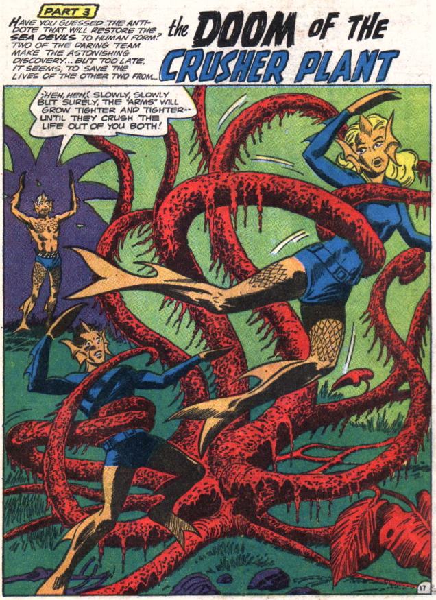
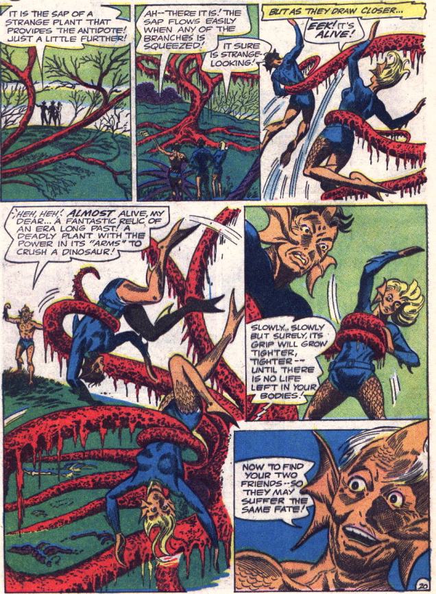
The art inside is quite nice, with pencils by Howard Purcell and inks by Sheldon Moldoff (read the whole issue here):
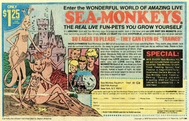
Incidentally, co-admin RG pointed out that the Sea Devils were basically turned into Sea-Monkeys – and minus the tail, he’s perfectly right!
Many people are highly wary of seaweed – and this story proves them right. Remember, eat seaweed, but don’t let seaweed eat you!
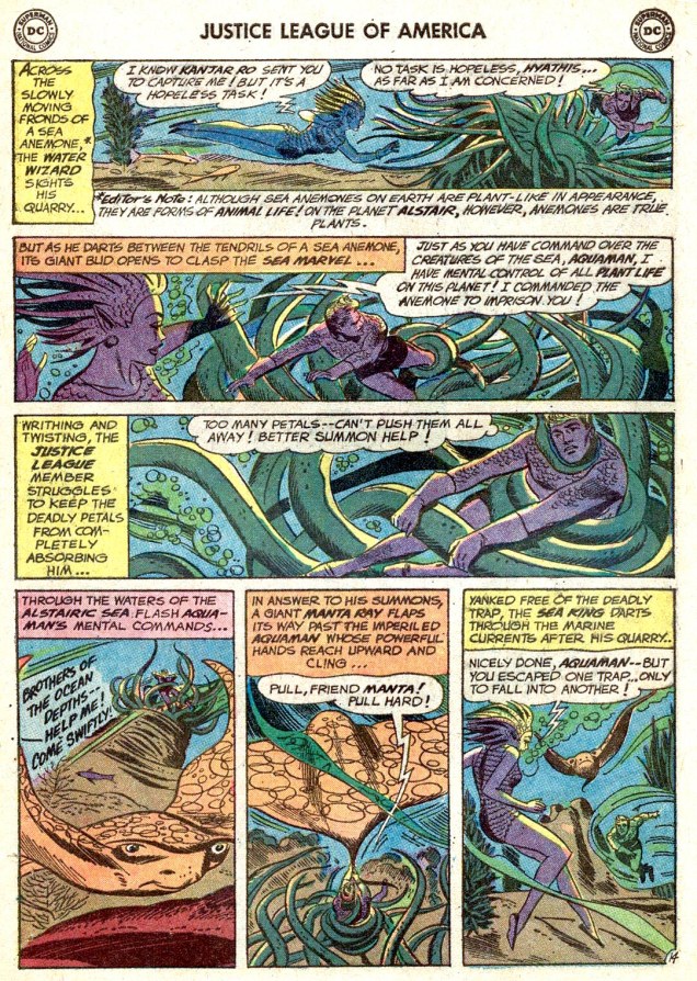
Page from The Slave Ship of Space!, scripted by Gardner Fox, pencilled by Mike Sekowsky and inked by Bernard Sachs. This story was published in Justice League of America no. 3 (Feb-March 1961). I wonder why the author decided to make anemones into “true” plants, when he could have simply incorporated actual seaweed into this story.
Back on land, and not even on a different planet, we have a story featuring hungry, hungry vines *and* the novel sport of “princess-tossing”:
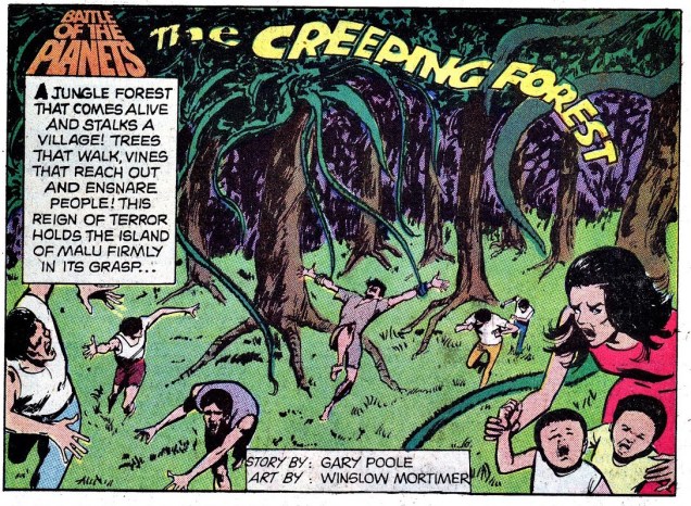
Battle of the Planets no. 4 (December 1979), cover by Win Mortimer.
The Creeping Forest is scripted by Gary Poole and illustrated by Win Mortimer:
Of (relatively) recent vintage, a philosophical young man pondering the mysteries of life while held in the tender embrace of this, err, plant:
Fenrir no. 4 (Norvert Hethke Verlag, 1988).
Previous botanical Tentacle Tuesdays can be perused here.