Stan Mack and the Delicate Art of Eavesdropping

« There’s nothing like eavesdropping to show you that the world outside your head is different from the world inside your head. » — Thornton Wilder

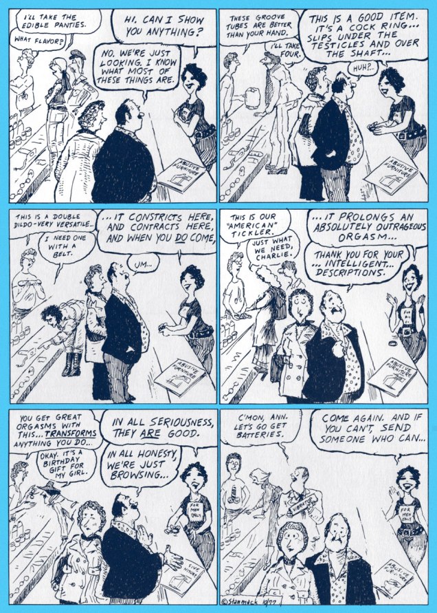
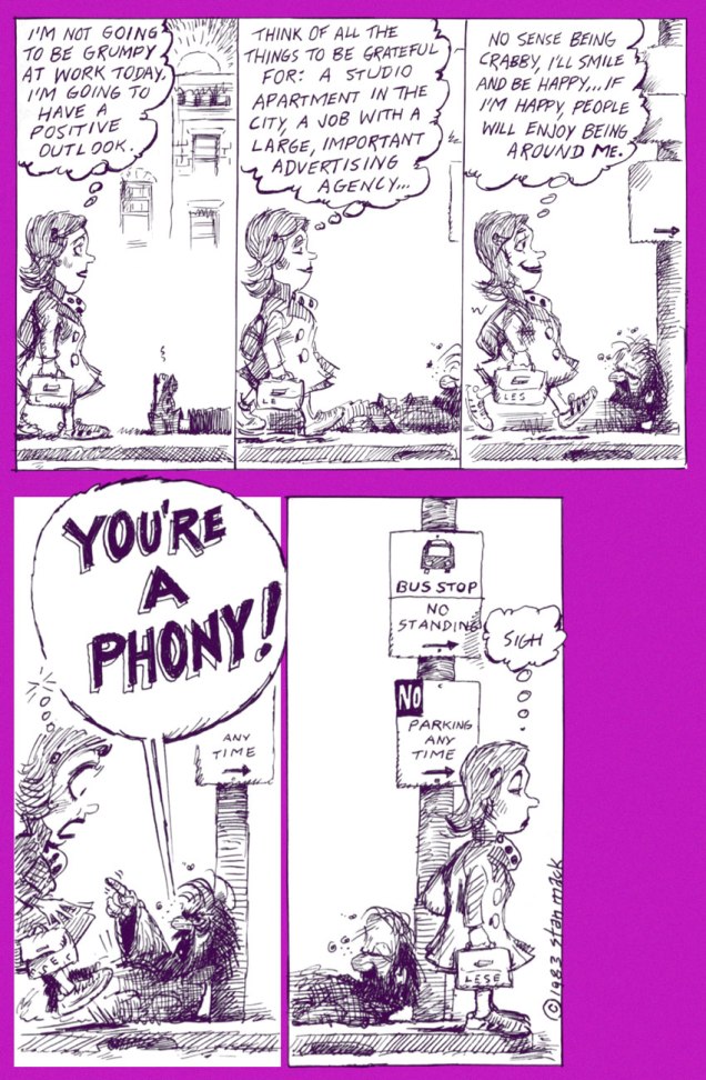
I’ve always been drawn to the more observational areas of cartooning, and Stan Mack (b. May 13, 1936) surely counts among the preeminent practitioners of the form, thanks to his long-running strip (in the pages of The Village Voice for a couple of decades!), Stan Mack’s Real Life Funnies.

Therein was to be found the cartoonist’s bold pledge: « Guarantee: All Dialogue Reported Verbatim ». Oh, it might seem easy, but I’m quite convinced it was anything but.

In point of fact, here’s some insight on Mr. Mack’s modus operandi, from the horse’s mouth:

« Carry a little pad and pencil. Dress to blend in quietly. Get to the destination with enough time to case the joint. It helps to be not too tall, not too short, not too dark, not too handsome, not too ugly, not too old and not too young.

When I arrive, if I find that everybody knows each other, I make a quick exit and forget it. Otherwise, the system continues: smile and keep your ears open. Find the men’s room (always good for a line), find coffee and food, which is very helpful unless you are trying to take notes. Look for a few convenient corners in which to hide. Learn to walk backwards in order to get closer to groups. Learn to stand in the middle of a mob and like it. And, finally, learn to change direction suddenly in order to follow a good line floating by.

Appear preoccupied. If you are engaged in conversation, pay no attention to what you are saying. Say anything. Fake it. You can’t listen and think at the same time. Float through the event. Each has its own particular current. Professional wrestlers and East Side gallery-hoppers move at different speeds.

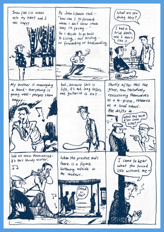
When I start to draw a strip, I sit with my deadline approaching and a pad full of quotes and doodles. I try to draw the kind of people who actually said the lines.

I don’t know why some comments seem important and others dull, but I know that it isn’t until I begin to edit that material that the story emerges. It’s often a surprise.

It’s the unexpected that makes it work. Therefore it helps to approach everything with an open mind and no preconceptions, whether it involves policemen or transsexuals or frisbee addicts. »

« I hear words I couldn’t make up. I think, ”that’s something I would never have thought of. I’ll just write it down.” I work out of other people’s heads. »

StanMackDivorceA
Stan Mack’s Real Life Funnies, The Divorce (March, 1977, The Village Voice).
StanMackSuburbiaA
Stan Mack’s Real Life Funnies, An Art Sale in Suburbia (April, 1977, The Village Voice).
StanMackAccessoriesA
Stan Mack’s Real Life Funnies, Sex Accessories (October, 1977, The Village Voice).
StanMackAlbanianA
Stan Mack’s Outtakes, The Sting (Adweek, 1983)
StanMackPhonyA
Stan Mack’s Outtakes, What a Bummer (Adweek, 1983)

« So, what’s he done lately? », you may ask. Well, you will nowadays find him in the pages of The American Bystander, where the cream of America’s extant cartooning geniuses gather to keep warm. Rick Geary, R.O. Blechman, Sam Gross, Drew Friedman, P.S. Mueller, Tom Hachtman, M.K. Brown… and these are just some of *my* favourites. Do them (and yourself) a favour, check it out!

StanMackAlleyA
Stan Mack’s Chronicles, Up His Alley (The American Bystander no. 7, Winter 2017).

Astute Mack-o-philes (and I’ve every reason to believe that they are astute) might point out that I neglected to bring up the artist’s splendidly surreal early ’70s National Lampoon feature, Mule’s Diner; fear not, its time in the limelight will soon(ish) be at hand, so stay tuned.

-RG

Treasured Stories: “Spawns of Satan” (1973)

« Hugs can do great amounts of good, especially for children. » — Diana, Princess of Wales

Today’s entry is a tale of vampirism from the typewriter of Jack Oleck (1914-1981). In the late 1940’s Mr. Oleck’s career in comics began promisingly with his brother-in-law Joe Simon and his partner Jack Kirby‘s Prize (Young Romance, Strange Worlds of Your Dreams, Black Magic and other anthologies), followed by a stint with EC late in the publisher’s classic, pre-Mad Magazine-only run (Crime SuspenStories, Shock SuspenStories, Vault of Horror, Incredible Science-Fiction, et al), along with assignments with Hillman, Atlas, Charlton and Harvey… among others.

Finding the décor of the Code-regimented funnybook industry a bit austere to his taste, he devoted the years of 1957 to 1969 to publishing and editing the magazine Decorator News and authoring the odd novel.

In 1969, he sauntered over to DC, where he cranked out quite a caboodle of scripts over the following decade-or-so, mostly in the horror (as it couldn’t be and shouldn’t be called under The Code) genre (“Mystery”, they called it), but also the occasional bit of romance, science-fiction and adventure. I’d like to say he was great, but frankly, he was pretty much a page-filling hack.

This is probably his finest script from this most prolific period, and it’s still full of plot holes and other inconsistencies. But that’s market reality for you: Oleck was consistently readable, he was fairly competent, he turned in his work on time, and he got along with the editors. Sometimes that’s all you need.

So why am I featuring Spawns of Satan if I seem to think so little of it? Well, obviously, there’s the luxurious grace of Nestor Redondo‘s art, granted here a specially generous setting to display its virtues. The middle act of the story is virtually mute, and all the more effective for it.

Read it first, then I’ll tell you more.

RedondoSpawns01A
Okay, if the town’s taken care of them, how come no-one’s found it unusual that the kids aren’t around during the daytime? Doesn’t anyone go to school?
RedondoSpawns02A
It certainly tips the scale in the miscreants’ favour that the sheriff just shrugs and admits he hasn’t a clue. I guess it just wasn’t an election year.
RedondoSpawns03A
Wait… kids (with one or two tackling most of the grunt work) burying five coffins on grassy ground, and “not a sign that the ground’s been disturbed“? Mighty vampire powers, I say! And can you imagine the torment and frustration of the little ones, knowing they’ll never grow up, never get to take charge or be taken seriously? This story is just honeycombed with potential avenues of exploration.
RedondoSpawns04A
One slight problem: hypothermia should not affect undead creatures without a beating heart nor, necessarily, blood circulation. A little too convenient, Mr. Oleck. But fine, you’ve got them to the bottom of the lake.

RedondoSpawns05ARedondoSpawns06ARedondoSpawns07ARedondoSpawns08A

RedondoSpawns09A
For me, one of the tale’s chief assets had been Aaron’s characterization. Now how is it that suddenly, this cool-headed and calculating leader just loses his shit and gives up*? As depicted earlier, Aaron would have ordered a retreat to the lake and formulated another plan. But no, there had to be a ‘sting in the tail’. Also, if the town knew full well they were dealing with vampires, why do bodies turned to dust suddenly seem “impossible”? Finally, did you get the impression that the Baker kids killed out of hate (well, except for Holly; that girl had a bad attitude), as stated in the final panel? I think not: the clan was portrayed as a predator pack, who merely killed to survive, no sentiment allowed.

SOS is otherwise mainly notable in its introduction of themes and ideas that would be brought to full miasmic flowering by (of course) Alan Moore in issues 38 and 39 of Swamp Thing (July and August, 1985), namely the family unit of underwater vampires. Moore’s set of toothsome nasties was more-or-less introduced, but not fully-fleshed out, by his predecessor, Martin Pasko, in July, 1982’s Saga of the Swamp Thing no. 3‘s A Town Has Turned to BloodMoore’s keen eye caught the spark of potential and set the hills ablaze. However, it seems unlikely that Moore’s research hadn’t trailed back a few years to the lacustrine lair of the parasitical Baker brood.

While slaughterous children were all the rage from the late 50s (John Wyndham’s The Midwich Cuckoos, its filmic adaptation Village of the Damned and its sequel, Children of the Damned) and into the 70s, Oleck’s Spawns still preceded Stephen King’s ‘Salem’s Lot (1975), The Omen (1976) and the 1976 Spanish shocker ¿Quién puede matar a un niño? / Les révoltés de l’an 2000 (boy, did that one scar me as a kid), and given the comics field’s penchant for cribbing ideas *after* they had run their course, that’s another feather in Oleck’s fedora.

Speaking of editors, I’ve long suspected that this particular issue of House of Secrets was the dumping ground of an aborted experiment by its editor, Joe Orlando. Orlando had clearly been trying to shake things up a bit, running two longer, less compressed stories per issue instead of the usual three… as DC’s available story page count had dropped from 24 to 20 (and would reach a woeful 17 by 1976!); the two-story practice lasted but a few issues. After no. 117, it was jettisoned. It would appear that at least one of House of Secrets 113’s stories had been scheduled and delayed: eight months earlier, Jack Sparling’s grey-tone lovely cover for House of Secrets no. 105 (Feb. 1973) was a perfect illustration for Doug Moench‘s, Mike Sekowsky and Nick Cardy‘s fascinating ‘Not So Loud– I’m Blind’… which finally turned up in this issue as the lead story. Sombre and rambling, Moench’s likely first sale to DC lacks the usual forced twist ending, opting instead to trail off into darkness. In fact, when I first read it, I thought my copy was missing a page.

Moench went off to be arguably (well, he’s my pick) Marvel’s most consistent writer of the 1970s, and only returned to DC in the ensuing decade.

-RG

*short answer: The Comics Code Authority.

Glenn Dakin’s Alter Ego, Abraham Rat

« What’s the point in eternity… if nothing ever changes? » — White Ant gets in the final bon mot (Captain Oblivion no. 1)

In the mid-1980s, the surprise success of Kevin Eastman and Peter Laird‘s Teenage Mutant Ninja Turtles touched off a veritable avalanche of ever crappier, hastily-assembled and cheaply-produced knockoffs — at least Eastman and Laird initially meant their creation as a joke. Oh, there were some real gems amidst the rubbish, but as Sturgeon’s Law tells us, the bad greatly outweighed the good, let alone the great. This is now known as the Great 1980s Black and White Comics Glut.

Among the good-to-great (well, to my taste) were a score of short-lived onomatopoeic humour anthologies such as !Gag! (Harrier), Honk! (Fantagraphics), Splat! (Mad Dog Graphics), Bop, Buzz, Twist (along with the venerable Snarf, all from Kitchen Sink)… the mutant progeny of Zap Comix, I suppose.

It was within the pages of Honk! that I was greeted by such across-the-pond talent as Eddie Campbell, Glenn Dakin, Phil Elliott and Paul Grist. Their work provided a sorely-needed gust of English country air to the superhero-fatigued reader, though one had to keep both eyes open, as alternative comics publishing in the ’80s was a maddening mixture of whack-a-mole and ‘throw stuff at the wall and see what sticks‘.

Now that the stage is set, I’ll share some of my favourite Dakin strips. He’s been a busy chap, creating several solo series: Temptation, Captain Oblivion/Abe Rat, Robot Crusoe; collaborations: Paris: the Man of Plaster (with Steve Way), Mr. Day and Mr. Night, The Man From Cancer and Greenhouse Warriors (all with Phil Elliott), as well as YA novels (the spooky Candle Man) and animation (the astonishing Shaun the Sheep).

Today, I’ll focus of my very favourite Dakin creation (his most understated and personal), the fancifully autobiographical Abe Rat.

DakinMeetAbe01A

DakinMeetAbe02A
The author introduces his creature, and who better to do it? From the sterling compendium Abe – Wrong for All the Right Reasons (2001, Top Shelf).

DakinSpring01A

DakinSpring02A
A Song of Spring was originally published in Fast Fiction no. 14 (April 1985, Fast Fiction).
DakinCapOblivionA
As this Captain Oblivion one-shot was left out of the Abe collection (the original artwork was lost!), the completist will want this one as well… and will not be disappointed nor go broke in the process. This is Captain Oblivion no. 1 (Aug. 1987, Harrier). Cover colours by Mr. Phil Elliott.

DakinAbeTrialDeath01ADakinAbeTrialDeath02ADakinAbeTrialDeath03A

Dakin’s comrade-in-ink Eddie Campbell (Abe’s his fave Dakin strip too) provides the introduction to the collection, and therein shares these thoughts: « Back when we were doing our little photocopied comics (what I term ‘small press’) in the ’80s, we constantly challenged each other to take the comics form in new directions. Dakin evolved in exciting ways in his Abe stories. The were autobiographical, but more concerned with the inner life than the physical one. He arrived at an approach which I termed ‘discourse’. He would devise characters and symbols, and borrow others, combining them in argumentative juxtapositions. There would be passages where he’d use a character from history or a novel to push his contemplation towards a resolution. Once he even called a halt to proceedings and ran a variant ending. »

Thanks for reading, hope you enjoyed making Abe’s acquaintance.

-RG

What! You Call This Cold Weather?

« Polar exploration is at once the cleanest and most isolated way of having a bad time which has been devised. » ― Apsley Cherry-Garrard, The Worst Journey in the World (1922)

Here’s what happened: I was leafing through Paul C. Tumey‘s splendid comics anthology Screwball! The Cartoonists Who Made the Funnies Funny (2019, The Library of American Comics/IDW) when I came across a wonderful sample of Gene Ahern‘s Room and Board (1936-58) wherein the strip’s central figure, Judge Homer Puffle, feeds another boarder a steady line of bull in that grand, booming Baron Munchausen — Captain Geoffrey Spicer-SimsonColonel Heeza Liar Commander McBragg tradition.

Room-And-Board1937A
Gene Ahern‘s Room and Board (March 17, 1937, King Features).

Of course, it’s all piffle and bunk, but it brought to mind a passage from a favourite article on weather peculiarities in Siberia, Marcel Theroux‘s The Very, Very, Very Big Chill (published in Travel & Leisure in 2000):

« Local people told me that at minus 60 and below, a dense fog settles in the streets, and pedestrians leave recognizable outlines bored into the mist behind them. A drunkard’s tunnel will meander and then end abruptly over a prone body. At minus 72, the vapor in your breath freezes instantly and makes a tinkling sound called ‘the whisper of angels.’ »

Then I thought: « all very nice, but that makes for a rather meagre post »… so I decided to toss in a few bonus images featuring that venerable recurring motif… and got carried away.

Astonishing36A
This is Astonishing no. 36 (Dec. 1954, Atlas), the title’s penultimate pre-Code issue… not that Atlas ever crossed the line into gruesome. The cover-featured yarn is The Man Who Melted!, an amusing load of utter rubbish you can read here. Cover art by Carl Burgos.
ChamberChills10MarvelA
This is Chamber of Chills no. 10 (May, 1974, Marvel), and most everything’s the same, save for the colour palette and the now-hostile expression on the caveman’s mug.
ChamberChills10HarveyA
And this is also Chamber of Chills no. 10 (July, 1952, Harvey)… the original, whose title Harvey Comics left curbside for Marvel to recycle when they went all kid-friendly in the Comics-code-ruled Silver Age. Cover designed and art-directed by Warren Kremer and illustrated by Lee Elias. For some insight into these collaborators’ working methods on the horror titles, here’s our post on that very topic. Incidentally, what’s up with the hifalutin Lord Byron quote, Harvey folks? This wacky fare is quite plainly fiction… what’s your point? [Read it here.]
Unexpected101A
This is Tales of The Unexpected no. 101 (June-July 1968, DC). Layout and pencils by Carmine Infantino, inks by George Roussos. Infantino, promoted the previous year to editorial director (he would soon rise to the rank of publisher), brought in the versatile Nick Cardy to serve as his right-hand man on the artistic front; together, they designed all of DC’s covers until both men stepped down in 1975.
HOM199A
This is House of Mystery no. 199 (February, 1972, DC), illustrating Sno’ Fun! a rare (possibly unique, really) collaboration between Sergio Aragonés (script) and Wally Wood (pencils and inks). Cover designed by Infantino and Nick Cardy, pencilled and inked by Neal Adams and coloured by Jack Adler.
Unexpected142A
This is Unexpected no. 142 (Dec. 1972, DC); cover art by Nick Cardy.
Unexpected147A
This is Unexpected no. 147 (June, 1973, DC); cover art by Nick Cardy.
Unexpected150A
This is Unexpected no. 150 (Sept., 1973, DC); cover art by Nick Cardy.
SuttonHaunts36A
« Hey, look! The critter is frozen whole… it’s in pretty good shape! » Tom Sutton vibrantly sells Joe Gill and Steve Ditko‘s cautionary tale of arctic drilling gone awry, The Ancient Mine. Also in this issue: Steve and Pete Morisi‘s Surprise!, and Gill and Fred Himes’ touching Pipe Dream. This is Haunted no. 37, (Jan., 1974, Charlton), presented by the publisher’s blue-skinned, green-haired answer to Nana Mouskouri, Winnie the Witch.
HulkHaunted37A
« … that face haunts me… was it a man or a beast? » Ah, the Seventies. Left dazed and frazzled by his whirlwind life of slow-mo violence, glamorous excess and substance abuse, not to mention radiation poisoning, the inevitable occurs: The Hulk wanders onto the wrong set, as well as the wrong publisher’s! Against all odds, he handles the rôle with aplomb and commendable gravitas. A page from Gill and Ditko’s The Ancient Mine. Read it here!
Ghosts37A
This is Ghosts no. 37 (April, 1975, DC), featuring Luis Dominguez‘s first (or many) cover for the title, a passing of the torch from Nick Cardy, who’d handled nearly every one of the preceding three dozen…. minus two: number 7’s cover was the work of Michael Kaluta and number 16‘s that of Jack Sparling.

Oh, and since I wouldn’t want any of you superhero aficionados to think I’m freezing you out, here’s another demonstration of Mr. Infantino‘s “encased in ice” idée fixe.

Detective373A
Mr. Freeze, who first popped up in Batman no. 121 in 1959, initially known as, er… Mr. Zero (Celsius, Fahrenheit or Kelvin?) before being revamped and renamed for the mid-60s Batman TV show, a makeover that carried over to the comics, but tragically didn’t include his outfit. This is Detective Comics no. 373 (March, 1968, DC); layout by Infantino, finishes by Irv Novick. [ read it here!]
… and I can just about hear the « but what about Cap? » troops tromping down the hall, so…

KirbyCap112A
Namor goes all First Commandment on some poor Inuits (surely they’ve seen frozen bodies before?), displaying an unseemly level of insecurity for someone of his standing. This recap hails from King Kirby’s sensational feat of deadline rescue on the behalf of a tardy Jim Steranko (to be fair, it was worth the wait). George Tuska‘s inks are a surprisingly good fit! This is Captain America no. 112, Lest We Forget! (April 1969, Marvel). [ read it here!]
My co-admin ds was just telling me yesterday about a client who, upon remarking to a succession of winter-kvetchers that actually, we’d had a pretty mild January, was invariably met with goggling bafflement, as if he’d just then grown a second head. In related news, it was just announced that said month of January was, indeed, the planet’s warmest on record. There is, naturally, an xkcd strip about this sort of circular denialism.

-RG

Will Eisner’s The Spirit at Kitchen Sink (pt. 4)

« Some men are like flies… without a plan – without direction… they flit restlessly about the world… escaping one danger… and another… only to fall into the spider’s web… » — Bleak’s prospects are grim (Jan. 4, 1948)

Here we are, making our way through Kitchen Sink’s valiant chronological reprinting of Eisner’s post-WWII The Spirit, namely strips from December 1947 to December 1948; still at the peak, with a bit of fatigue on the horizon. At any rate, this particular vintage inspired a score of the master cartoonist’s most sublime new covers… as you’ll witness.

EisnerKS_Spirit25A
Kitchen Sink Press’ The Spirit no. 25 (Nov. 1986) cover-features Eisner’s famous and much-reprinted jailbreak saga, Slippery Eall (aka A River of Crime), originally published on November 30, 1947. The story features inmates bearing the mugs of Eisner studio contributors: letterer Abe Kanegson is Bellows; penciller-inker Jerry Grandenetti is Dapperish; and Eisner himself is Slippery Eall. Also in this issue: Death of Hugo (Dec. 7, 1947), Snow (Dec. 14) and Christmas Spirit of 1947: Joy (Dec. 21). Cover by Will Eisner. Cover colouring by Pete Poplaski.

Speaking of the slammer, Eisner muses sardonically on the cartooning life: « Working in this field is a very, not lonely, but solitary life. All of us come to realize how many hours we’ve been chained to the drawing board. We used to talk in the studio about how if we were sent to jail, it wouldn’t make any difference. We could still turn out comics and our lives would not be a hell of a lot different. »

3DSpiritRiverSplashA
Here’s that celebrated opening splash, from its appearance in Will Eisner’s 3-D Classics featuring The Spirit no. 1 (Dec. 1985, Kitchen Sink); get those glasses out!

From Dave Shreiner’s ongoing talk with Eisner, published in The Spirit no. 26‘s Stage Settings column: “Eisner has always been a functionalist, rarely a decorative artist producing something for its beauty alone. He is a powerful artist in that nearly every device he uses serves more than one purpose. With a bit of prodding, he took issue with the seemingly prevalent attitude among comic book artists that splash pages serve as a second cover to a story: there for decoration and enticement, but redundant to the story.”

Eisner: « A lot of the artwork done in this field is for a kind of personal satisfaction. It’s used to display artistic muscle, rather than confining itself to an artistic purpose. I believe a lot of artists fear addressing themselves to a purpose because they’re afraid that the showiness, or dazzle dazzle of their artwork, will probably be diminished. 

Consequently, they feel the approval level, the applause meter, will fall off somewhat. We’ve talked before about one of the problems facing artists in the comic book field being that their work is judged essentially on the physical appearance of it. It’s the artwork, rather than the content. That fact contributes to comic books being looked down upon. »

EisnerKS_Spirit26A
This is The Spirit no. 26 (Dec. 1986), and it brings us ‘Umbrella Handles’ (Dec. 28, 1947); The Name Is ‘Powder’ (Jan. 4, 1948); The Fallen Sparrow (Jan. 11, 1948); and Just One Word Made Me a Man (Jan. 18, 1948). Colours by Pete Poplaski, grey toning by Ray Fehrenbach.
EisnerKS_Spirit28A
This is The Spirit no. 28 (Feb. 1987), and it features Life Below (Feb. 22, 1948); The Return of Roger (Feb. 29, 1948, evidently, like 2020, a leap year); The Strange Case of Mrs. Paraffin (Mar. 7, 1948); and War Brides (Mar. 14, 1948). Colours by Pete Poplaski, grey toning by Ray Fehrenbach.

On the subject of the inspiration behind cover-featured Life Below, Eisner explains: « I was trying to find a unique, or exciting and startling setting within a normal situation. It always intrigued me that cities, particularly New York City, had miles and miles of catacombs under the streets. People doing city stories frequently overlook the potential of them. Underneath the city are layer after layer of story material. »

EisnerKS_Spirit31A
This is The Spirit no. 31 (May 1987), featuring The Last Hand (May 16, 1948); Assignment: Paris (May 23, 1948); The Emerald of Rajahpur (May 30, 1948); and The Guilty Gun (June 6, 1948). Colours by Pete Poplaski, grey toning by Ray Fehrenbach.
EisnerKS_Spirit33A
This is The Spirit no. 33 (July 1987), featuring The Springtime of Dolan (July 11, 1948); Barkarolle (July 18 1948); cover-featured The Thing (July 25th, 1948), an adaptation of Ambrose Bierce‘s short story The Damned Thing and quite the Jerry Grandenetti showcase; and The Eisner Travel Agency (Aug. 1st, 1948). Cover colours by Dave Schreiner.
EisnerKS_Spirit35A
This is The Spirit no. 35 (Sept. 1987), comprising cover-featured The Story of Gerhard Shnobble (Sept. 5, 1948); Cache McStash (Sept. 12, 1948); Lorelei Rox (Sept. 19, 1948); and Ace McCase (Sept. 26, 1948). Cover colours by Ray Fehrenbach. That poor Mr. Schnobble (the little flying guy with the grin and the bowler hat)… his is among the most tragic fates in comics.
EisnerKS_Spirit36A
This is The Spirit no. 36 (Oct. 1987), and it brings cover-featured Tooty Compote (Oct. 3, 1948); Gold (Oct. 10, 1948); Nazel B. Twitch (Oct. 17, 1948); and Pancho de Bool (Oct. 23, 1948). Cover colours by Ray Fehrenbach. Striking shadow effects: the KS production team sure knew how to make the most of the relatively primitive mechanical means at its disposal.
EisnerKS_Spirit37A
This is The Spirit no. 37 (Nov. 1987), and it hits us with Halloween (Oct. 31, 1948); cover-featured Plaster of Paris (Nov. 7, 1948); The Chapparell Lode (Nov. 14, 1948); and Quirte (Nov. 21, 1948). Cover colours by Ray Fehrenbach. Note the witty symmetry of the matching KS logo, top left.
EisnerKS_Spirit38A
This is The Spirit no. 38 (Dec. 1987), which lands expertly and rolls with The Amulet of Osiris (Nov. 28, 1948); cover-featured The Coin (aka Stop the Plot!, Dec. 5, 1948), an action-packed humdinger featuring the return of The Octopus; Two Lives (Dec. 12, 1948); and Christmas Spirit of 1948 (Dec. 19, 1948). Cover colours by Ray Fehrenbach. A dizzying honey of a cover.

Past this juncture, the strip’s slow, inexorable decline commences, and the covers reflect that fact. But not to worry: Eisner was a consummate pro, and the rest of the run is not without its gems. Besides, I’ll be cherry-picking ’em for you.

WhoThereLogotype

If you’ve just arrived at the intermission, fret not: take your seat and relax, here’s what you missed so far :

… or point your clicker on our general category, That’s THE SPIRIT!, and summon the lot at once… but in reverse chronological order; that’s the minute toll this dab of convenience exacts.

-RG

« You’re going out wearing THAT? »

« It’s wisest always to be so clad that our friends need not ask us for our names. » — James Fenimore Cooper

(Being a compendium of fashion faux-pas and various sartorial eccentricities.)

Now here’s a figure shrouded in mystery (and little else): Captain Wizard, whose sole appearance was on the cover (and not enough of it) of Atomic Bomb no. 1 (Gerona/Jay Curtis, 1946), a scarce one-shot. Artist unknown, regrettably.

AtomicBomb1A

What are this intriguing man of (relative) mystery’s abilities, aside from autonomous flight, quasi-nudity, bountiful love handles and a snazzy roué moustache? Did he “scare straight” hapless criminals with his sweaty, virile bear hugs? Sigh… I fear we shall never truly know. He’s in the public domain, the gent’s overdue for a revival!

Inside this issue: the exploits of Mandrake lookalike Beau Brummel, Special Agent No.1, Airmale and Stampy, Teeny McSweeny and Captain Milksop. Bracing stuff!

Read it here: http://comicbookplus.com/?dlid=25457

WhoThereLogotype

I suppose there are many ways to compete for the prized title of « Most outré criminal Batman and Robin have ever encountered » (awarded every other year in October at Gotham City Hall; call 608-555-1313 for reservations): powers, weapons, motivations, henchmen, moniker, targets, modus operandi

Batman63A
The Killer Moth made his play for the brass ring by donning the most garish and unsightly garb imaginable. Here he is making his début in Batman no. 63 (Feb. 1951), The Origin of Killer Moth! This sorry buffoon’s inception is credited to Bill Finger, Dick Sprang and Lew Schwartz, presumably to dilute the blame.

Of course, it’s unfair of me to pick on Killer Moth’s costume. I’m sure he took full opportunity to hone and refine his look over the next couple of decades. Plenty of down time to mull things over at his leisure in the clink, right?

Batman-Family10A

To precious little avail, apparently. Here he is a quarter century on, in Batman Family no. 10 (April, 1977); his wings have arguably been upgraded to a cape, but he’s still evidently daltonic. Cover by Bob Brown and John Calnan. Sadly, this was some of veteran Brown’s last published work; he passed away from leukaemia in January, 1977.

WhoThereLogotype

Another entry from the closet of shame. His Very Name Invokes Terror… among the dandies of the Serengeti, who blanch and quake at the notion of being seen in public with him. However, that headgear of his reportedly drove Sir Elton mad with envy.

Showcase66A
Showcase no. 66 (Jan.-Feb. 1967), The Birth of B’wana Beast, pencilled (and possibly scripted, but who’d admit it?) by Mike Sekowsky and inked by George Roussos. Edited by George Kashdan… who was unceremoniously relieved of his editorial duties after a mere two Showcase issues, both featuring B’wana Beast.

WhoThereLogotype

With Jack Kirby and Steve Ditko having decamped (not to mention Stan futilely slouching towards Hollywood), Marvel in the early 70s had not only lost its visionary plotters, but also its ace character designers.

Also, after 30 years or so of men in suits and hats, it was deigned that the younger and hipper generation should have characters whose wardrobe bore at least a tangential relationship to its own.

Created for the 100th issue of Daredevil by scripter Steve Gerber and penciller Gene Colan (who ended his initial long run on the title with that issue; was Angar the final straw, or was it the even more wince-inducing toadying to Jann Wenner?), Angar the Screamer was, to quote the amaranthine words of Wikipedia, « … born in San Francisco, California. He became a hippie and a radical social activist. He volunteered for an experiment that endowed him with sonic powers that caused people to hallucinate. » Groovy. Perfect for… 1973?

ColanDD100AngarA
If anything, we can be grateful that Angar’s colour scheme is relatively restrained. I suppose it makes sense for a flower child to opt for earth tones. This is the concluding, cliff-hanging panel from Mind Storm! (Daredevil no. 100, June, 1973). Pencils by Gene Colan, inks… nay, “embellishments” by John Tartaglione. Read that, er… masterwork right here.
Daredevil101A
Poor DD’s saddled with calves thicker than his thighs. Cover art by Rich Buckler and Frank Giacoia, with the usual fussing and turd polishing by John Romita Sr..

This is Angar’s first cover appearance, Daredevil no. 101 (July 1973), in a tale that could only be called… Vengeance in the Sky With Diamonds!

There *are* indeed tentacles within, so you’ll likely encounter these, some enchanted Tentacle Tuesday…

– RG

Tire la chevillette: Jean Ache’s Little Red Riding Hood Variations

« … Out behind a tree
there jumped a great big hungry wolf
‘Pardon me’, he said, real cool

‘Why make the scene alone?
A crazy chick like you should have
a handsome chaperone’ » — Ridin’ Hood (The Coasters, 1962)

It could be quite convincingly claimed that Jean Ache (1923-1985,  Jean-Baptiste Huet in Le Havre, France) was the most versatile, chameleonic artist of his generation. Not only was he able to accurately adopt any style he chose, “high” or “low”, but he also wielded a panoply of styles of his own devising. To support my claim, take a peek at noted historian Henri Filippini‘s comprehensive survey of Ache’s career (in French), which includes a generous gallery of his multifaceted art. [ Part One ] and [ Part Two ]

From 1971 to 1973, near the end of René Goscinny‘s enlightened regime (his Astérix compère Albert Uderzo ably serving as art director), French bédé periodical Pilote featured a high-calibre series of “high art” pastiches. It was entitled Le Musée Pilote.

The pages of 1973’s Pilote Annuel revealed an Ache tour de force, wherein he retold the classic tale of Little Red Riding Hood in comics format *and* in the style of a number (seven, to be exact… but not *the* Group of Seven) of famous painters. The set bore the following cheeky introduction: « Within the scope of the Musée Pilote, we came to realise that numerous artists had never tried their hand at comics. Thanks to our friend Jean Ache, it is now a done deal, and we are pleased to present the tryout pages crafted by these illustrious beginners. It is for you to decide whether these attempts are conclusive, and if these young people’s efforts should be encouraged. »

Here we go!

AcheRousseauA
After Henri Rousseau (French, 1944-1910). Incidentally, « Tire la chevillette, la bobinette cherra » means « Pull the bobbin, and the latch will go up. »
AcheLégerA
After Fernand Léger (French, 1881-1955).
AcheBuffetA
After Bernard Buffet (French, 1928-1999).
AchePicassoA
After Pablo Picasso (Spanish, 1881-1973).
AcheDeChiricoA
After Giorgio de Chirico (Italian, 1888-1978).
AcheMiróA
After Joan Miró (Spanish, 1893-1983). My first encounter with Miró came through this item; if I’d been hipper, it might have been this instead… but I was only six years old at the time.
AcheMondrianA
After Piet Mondrian (Dutch, 1872-1944).
PiloteAnnuelA
And here’s the cover. This is Pilote Annuel 74 (no. 731 bis, Nov. 1973). It comprised, in roughly equal measure, a selection of the past year’s best work and new material.

My initial brush with Ache came in the early 1970s and his short-lived Pastec (1968-70, 9 issues, plus one album). I only ever got my hands the album (« L’Agent secret chante à minuit », 1971), but I never forgot. Like many a childhood fascination, it came out of nowhere, then vanished.

AchePastecA
A sample from Pastec no. 4 (January 1969, Société française de presse illustrée). The birdie is Psitti, Pastec’s loyal Ara; the Llama is Camélo; and Pastec himself is the displeased fellow with the green hat in the middle tier.

I honestly hadn’t planned to write two consecutive posts about nearly-forgotten French artists named Jean, but something else fell through… and here we are. Sorry!

-RG

Jean Mad’s Enigmas and Anomalies

« A good puzzle, it’s a fair thing. Nobody is lying. It’s very clear, and the problem depends just on you. » — Erno Rubik

Jean Mad… now who’s he? A once-popular and prolific French cartoonist and illustrator, largely forgotten today, in part because his body of work appeared, frequently unsigned, in ephemeral periodicals… and hardly any of it was ever collected or reprinted. So he isn’t a household name, if he ever was, but his distinctive style will ring a bell among francophone readers of a certain age.

Now for a little context: in 1959, Belgian publisher Marabout launched a wildly popular series (nearly 500 titles between 1959 and 1984!) of pocket books called Marabout Flash, and the little tomes’ handy format (11,5 x 11,5 cm) and low cost “inspired” French publisher Vaillant, in 1962, to borrow the idea (at a size of 11,5 x 12 cm… to sidestep legal repercussions) for cheap reprint collections of José Cabrero Arnal‘s Pif le chien strips, which had been running in communist newspaper L’humanité since 1948. The format decided upon was 100 gags – 100 jeux (« 100 gags – 100 games »). It was an instant hit (quickly reaching 150 000 copies sold per issue), and soon generated numerous spinoffs. But the games half of the equation was, for a long time, rather shoddily-illustrated. By the turn of the decade, though, thanks to several judicious additions (Jean-Claude Poirier, Jean Marcellin and Henri Crespi, to name but a few) to the production staff, the product looked pretty spiffy. Which brings us to Mr. Mad, who first turned up in 1969… and came and went throughout the 1970s.

JeanMadAnimauxVF_A
True or False? 1) The beaver only fells small trees 2) A newborn bear cup weighs a mere 200 g; its mother weighs 200 kg; An antelope can approach a lion without fear; A giraffe can reach foliage beyond the reach of an elephant. (1)-False: beavers have to known to drop trees up to 30 m high and 2 m in diameter; (2)-True; (3) True, when he’s full; (4) False: an elephant can just lean against a tree, bending it to reach the foliage it seeks.) From Pif Poche no. 71 (July, 1971, Vaillant).
JeanMadCostumeRobotA
Mad was a master of historical detail. A1-D2-R6 (Middle Ages); B1-I5-A3 (Louis XV); C1-J5-E3 (Prehistory); D1-H5-L6 (Ancient Egypt); E1-C2-F3 (Lady of the manor); F1-G5-J6 (1900); G4-E2-C3 (Musketeer); H4-R5-G6 (Cosmonaut); I4-B2-D3 (Roman); J4-L5-B3 (Knight); S4-A2-I6 (Renaissance); L4-F2-H6 (Gaul). From Pif Poche no. 71 (July, 1971, Vaillant).
JeanMadArbrePerchéA
Mad’s economical, chiaroscuro style came to mind when I later encountered Joseph Mugnaini‘s classic illustrations for Ray Bradbury’s The October Country. In this one, you have to find the hidden crow from Aesop’s timeless fable. From Pif Poche no. 70 (June, 1971, Vaillant).
JeanMadÀTableA
« While observing these odd guests, try to find the six idioms that each one evokes and that all have to do with the table. » (1) Manger son pain blanc le premier; (2) Mettre de l’eau dans son vin; (3) Mettre les pieds dans le plat; (4) Mettre les bouchées doubles; (5) Tourner la cuillère autour du pot (“beat around the bush”); (6) Couper la poire en deux; From Pif Poche no. 70 (June, 1971, Vaillant).
JeanMadDiableA
« These four drawings illustrate idioms featuring the word ‘devil’. Do you know them? » (1) Tirer le diable par la queue; (2) Loger le diable dans sa bourse; (3) Envoyer quelqu’un au diable; (4) Avoir le diable au corps. From Pif Poche no. 68 (April, 1971, Vaillant).
JeanMadBandesA
A cute demonstration of Mr. Mad’s versatility, from Ludo, le journal des amateurs d’énigmes no. 3 (Oct. 1973, Vaillant). « These four drawings are excerpted from different strips, but all have one detail in common. Which one? » The solution was to be provided in the following issue, which I only acquired decades later… but I’m sure you can suss out the answer to this one.
JeanMadMauvaiseChuteA
Prior to encountering this piece in Ludo, le journal des amateurs d’énigmes no. 1 (Feb. 1973, Vaillant), I had no clue as to the identity of the mystery artiste. I guess this piece was large and elaborate enough to warrant a signature.
JeanMadEnfinVoitureA
« A car at last! » « Where? » A bit of a cheat, that one. How was I to know, at age six, that a “DS” was a French car, even one as lovely and classic as the Citroën DS? We didn’t have those around where I grew up, and that’s a shame. From Pif Poche no. 70 (June, 1971, Vaillant).
JeanMadGaffeA
A surprisingly adult situation, given the audience. Catch the gaffe!: The man of the house, having queried his spouse: « At what time are those two drips due to drop in? », what should be her reply, to salvage the situation? « They had to cancel. But our friends, X… have just arrived. » From Pif Poche no. 71 (July, 1971, Vaillant).
JeanMadMonturesA
An artist who can not only draw steeds, but depict various equine types and personalities… now, that’s skill. From Totoche Poche no. 20 (March, 1971, Vaillant). Name Their Cavalier: (1) Don Quixote; « I am called Rossinante » (2) Alexander the Great; « Bucephalus is my name » (3) Attila the Hun; « The grass never grew back where I trod » (4) Henri IV (Henri de Navarre); « I am white, as is his panache ».
JeanMadProdigesA
Child Prodigies: (1) « My word, he’s rediscovered geometry! » (Little Blaise Pascal) (2) « Later on, with my machine, I’ll be making the pot boil. » (Little Denis Papin) (3) « The harpsichord? Child’s play! » (Little Wolfgang Amadeus Mozart). From Pif Poche no. 68 (April, 1971, Vaillant).

I suppose I didn’t think twice about it when I was a kid, but it seems to me, in hindsight, that kids in those days were expected to possess quite a baggage of eclectic knowledge pertaining to history, geography, language, architecture, logic, observation… As an omnivorous, voracious reader, that state of affairs suited me to a T, and so these dense little volumes nourished me considerably at a time when I was most receptive to such gleanings. Inevitably, both the comics and the puzzles were soon dumbed down, but I had moved on by then.

-RG

Lynch and Whitney’s Phoebe and the Pigeon People

« How do I despise thee? Let me count the ways. Society, you corpulent swine! » – Bix

Today, January 7, marks the seventy-fifth birthday of storied undergrounder Jay Lynch (1945-2017), creator of Nard n’ Pat, Wacky Packages, Garbage Pail Kids and MAD Magazine contributor… to name but a very few.

Today, we’ll shine a light upon his epochal comic strip Phoebe and the Pigeon People. Here’s how it was hatched:

« In April 1978, Lynch teamed up with cartoonist Gary Whitney to produce weekly Phoebe and the Pigeon People strips. Lynch wrote them and Whitney drew them. “It was very easy and it got us invited to cocktail parties”, said Lynch. “We wanted to do a strip that would appeal to secretaries, rather than a strip that would appeal to the comic fan type person.”

« Lynch and Whitney launched a stage show based on the characters, called When Cultures Collide, with an improvisational theater troupe, The Practical Theater. The performance included a battle of the bands between rock and new wave musicians. » (quoted from Ink & Anguish, a Jay Lynch Anthology, 2018, Fantagraphics)

P&TPP was another one of those captivatingly freewheeling features that popped up during the heady heyday of alternative weeklies. A while back, we devoted a post to Tom Hachtman‘s Gertrude’s Follies, which bloomed in a similarly unlikely fertile milieu. In Phoebe’s case, The Chicago Reader was the publication it called home during its impressive 1978-1996 run.

PhoebePosterA
A 1982 poster for the event in question. Art by Gary Whitney.

For a few years now, they’ve (in this case, a shadowy outfit vaguely named “Alternative Comics“) been promising us a Phoebe collected edition. We’re still waiting. Hey, if the publisher needs more time to do the job right, so be it… but expectations are accordingly high.

Amazon’s blurb is an ominous portent: « The under-achieving Phoebe and friends hang out with beatnik people-headed jazz-loving beat-philosophy cooing pigeons in a park in Chicago. »

Uh, not even close. Here are a few highlight from the strip’s first four years, pulled from the pages of Kitchen Sink’s valiant three-issue run (1979-81); read these selections and you’ll know more about the strip than whoever wrote that blurb. You’re welcome!

KSPhoebe02FrontA
Phoebe & The Pigeon People no. 2 (May 1980, Kitchen Sink).

PhoebeFrenchLessonsAPhoebeDebatingAPhoebeSignChangeA

PhoebeElderlyFeministA
Clearly, these strips are so rooted in their time period that they retain no relevance whatsoever to today’s world and its social and political mores.

PhoebeFlasherA

PhoebeGovernorA
Ah, politicians: Plus ça change, plus c’est la même chose. I’d love to see some of our finer young minds take a crack at such an opportunity. One can still dream, right?
PhoebeNancyDickA
In Phoebe’s world, there was always plenty of room for the meta-contextual.

PhoebeRoachMotelA

PhoebeGreetingCardsA
Bix gets to trot out his pet poetic phrase. Catchy!

PhoebeToupeeStatusA

KSPhoebe03FrontA
This is the magazine-size Phoebe & The Pigeon People no. 3 (July 1981, Kitchen Sink). Until the omnibus arrives, this is your best bet. Read the run right here, friends!
KSPhoebe03BackA
Our loveable auteurs and some of their cast, enjoying the Chicago winter. That’s Mr. Lynch on the left, Whitney on the right.

I particularly love the strip’s anything-for-a-joke ethos: as was Lynch’s wont, he ran the gamut from lowbrow to highbrow, from squeaky-clean to salacious, from sunny side up to scrambled. Let’s face it, that bizarre premise would have challenged and defeated most would-be humourists within a few weeks, let alone a decade-and-a-half.

JayLynch2014A
Jay Lynch, dapper elder, as he appears in the short film There’s Something Weird About Jay Lynch (2014, filmed and edited by John Kinhart). Watch it here!

-RG

Hot Streak: Bill Everett’s Menace

« I have learned to live each day as it comes, and not to borrow trouble by dreading tomorrow. It is the dark menace of the future that makes cowards of us. » — Dorothy Dix

Menace was a short-lived (11 issues, 1953-54, Atlas) horror anthology title that’s mostly remembered*, if at all, for its one-shot introduction of a zombi by the name of Simon Garth. Because Atlas never really played the gore card, its successor Marvel was able to mine most of its Pre-code material as cheap filler in their 1970s bid to flood the market. Don’t get me wrong, though; these titles were still a lot of primitive fun, and in most cases, I’d pick an issue of Weird Wonder Tales, Where Monsters Dwell or Uncanny Tales From the Grave over the latest Fantastic Four or Spider-Man.

The writing was by no means daring or even coherent, but the artwork was frequently rather fine, with none quite finer than Bill Everett‘s, particularly his covers, which elegantly straddled the line between fearsome and goofy.

I’d be tempted to say that Everett (1917-1973) was at his peak when he created these, but the bittersweet fact of it is that Everett was still at the height of his artistic powers, even as he was slowly dying in the early 1970s.

This particular hot streak ends not because Everett turned in a lesser job, but because other hands provided covers for the rest of the run. Talented hands, at that (Carl Burgos, Gene Colan, Russ Heath, Harry Anderson), but none of the other Menace covers are a patch on Everett’s mighty half-dozen.

Menace01A
These monsters look kind of playful and kooky, don’t they? This is Menace no. 1 (March 1953, Atlas). Inside we find Everett, George Tuska, Russ Heath and Werner Roth art. Oh, and Stan Lee stories. Colours by Stan Goldberg.
Menace02A
This is Menace no. 2 (April 1953, Atlas). Colours by Stan Goldberg.
Menace03A
This is Menace no. 3 (May 1953, Atlas). Colours by Stan Goldberg. Was the title’s monthly schedule truly supposed to be a selling point?
Menace04A
This is Menace no. 4 (June 1953, Atlas). Colours by Stan Goldberg.
Menace05A
If you think that’s impressive, you should see what mushrooms can do to asphalt!** This is Menace no. 5 (July 1953, Atlas). Simon Garth was dug up (sorry) in 1973, likely at the behest of continuity addict Roy Thomas, to star (if you can call it that) in his own black & white magazine, Tales of the Zombie (10 issues, 1973-75). Like The Man-Thing, he was essentially mindless and shambling, and so mostly a pawn or an uncomprehending witness to others’ tragedies. The best of the mangy lot is, imho, The Blood-Testament of Brian Collier (TotZ no.7… read it here.) It’s not great, but it sure looks pretty, thanks to the sublime Alfredo Alcala, who’s quite in his element here.
BugEyedPair
Don and Warren also met Simon. Read Lee and Everett’s 1953 Zombie!
Menace06A
This is Menace no. 6 (August 1953, Atlas). Colours by Stan Goldberg.

That strange compulsion that’s creeping over you, that ungodly craving for more Bill Everett, cannot quite be slaked without incurring a terrible cost, be it in human lives, the forfeiting of your immortal soul, or both. But do check out my co-admin ds’ earlier tribute to Mr. Everett’s nightmares, Bill Everett’s Restless Nights of Dread, it might tide you over until dawn.

-RG

*these babies are rare, in any condition.

**Here’s an example:

« A bump in the garage floor turned into a half meter of mushrooms in little more than three days. It crushed its way through five centimetres of asphalt in Åge Reppes garage in Stord, western Norway. It is the water pressure in the cells of the fungus that makes it able to crack the asphalt, says a biologist at the local university. » [ source ]. These are inky caps. Edible, but some species are toxic when consumed with alcohol. These are commonly known as ‘tippler’s bane‘.