« The observer, when he seems to himself to be observing a stone, is really, if physics is to be believed, observing the effects of the stone upon himself. » — Bertrand Russell
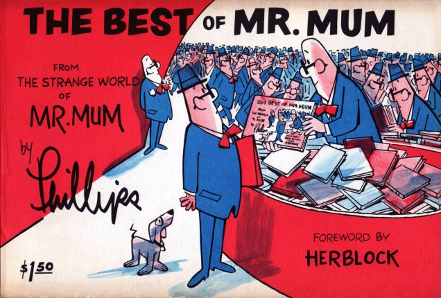
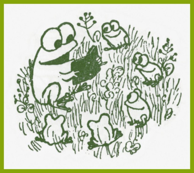
Irv Phillips‘ (1904-2000) Mr. Mum was a comic strip that ran between 1958 and 1974 (at which point both author and alter ego took their well-earned retirement), attaining a quite considerable level of popularity, thanks its appearance in over 180 newspapers in 22 countries or so. The pantomime approach certainly helped sell it abroad. The titular character is a bystander, an eternal witness to… everything and especially anything.
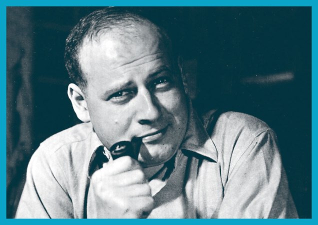
In an interview published in Cartoonist Profiles no. 4 (Fall, 1969; Jud Hurd, editor), we learn that Phillips « ... has been an actor, a violinist, a Hollywood script writer, the Humor Editor of ‘Esquire’ magazine, a playwright, as well as a very successful syndicated cartoonist. » He goes on to reveal that « I didn’t draw until I became Humor Editor of Esquire Magazine in my thirties. I used to make little rough sketches to try to illustrate gags that I had written for the various Esquire cartoonists. I would take these sketches in to Dave Smart, the founder and publisher of Esquire, and together we would make the choices as to which cartoonist would handle one idea best, which man would be best suited to another idea, etc. It seems that these little sketches sort of intrigued Dave for a while and finally he said, ‘Why don’t you try to draw?’ »
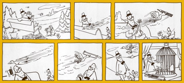
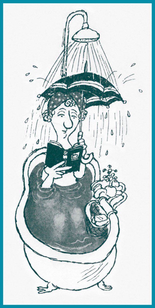
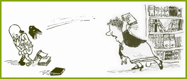
While Phillips’ style is deceptively rudimentary (but still distinctive), it’s evident that his years as a gag man taught him the fundamentals: economy, clarity and substance. Here are a few samples drawn from a variety of sources:
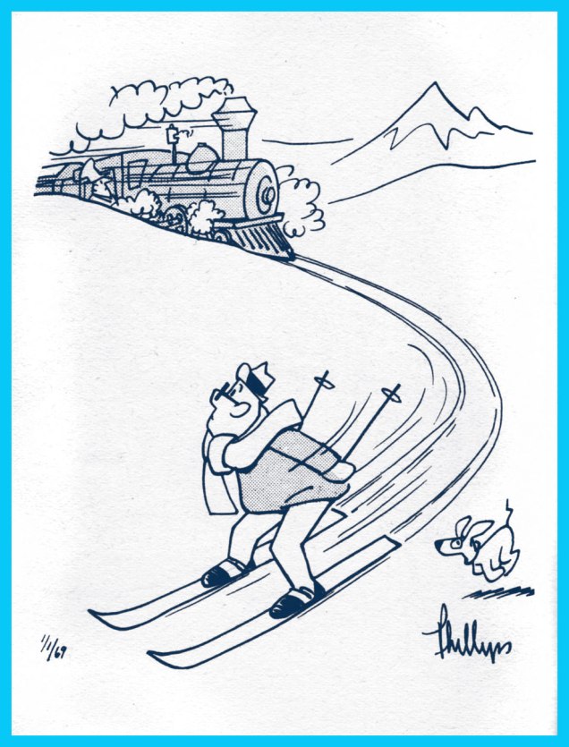
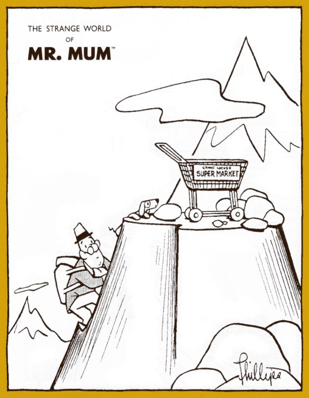
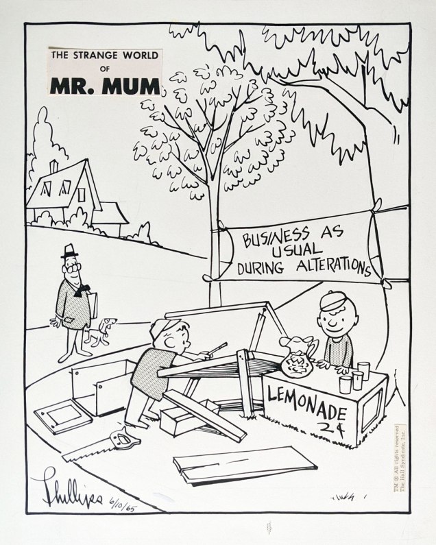
Sunday strip from March 2, 1969.I’ve often wondered myself just how certain stray shopping carts arrived at their unlikely destination.The Valentine’s Day Sunday of 1971, as it appeared in print. There’s always something to fret about, isn’t there?The lone Mr. Mum original piece in my collection, it’s the June 10, 1965 daily. It was a Thursday. The artwork is surprisingly large, at 22 x 28,5 cm (8,75″ x 11″). Note the little bit of halftone film stranded outside the frame.During the strip’s run, three collections appeared: this is the first, published in 1960 by Pocket Books.Issued in 1965 by G. P. Putnam’s Sons, this is the second and finest of the collections, its format comfortably allowing the presentation of dailies (two to a page) and Sunday strips. Hell to scan from, though.Finally, The Popular Library brought us the third collection, 1971’s No Comment by Mr. Mum. A slim, unprepossessing volume, it’s nonetheless filled to the brim with great picks.A sample of a card he has given people who have sent him ideas. Phillips said: « Most of the fan mail seems to come from intellectuals and children. When people send in ideas, I send them the card, write them a letter, and if I use the idea, I send them a signed original. »
The Mum aficionado will seek sustenance wherever he can find it, but it helps that in this century, a pair of easy-to-find, affordable print-on-demand collections have seen the light of day. They are Classic Mr. Mum Volume 1 (2010, iUniverse) and The Strange World of Mr. Mum (2011, Empty-Grave Publishing).
One unexpected hurdle that stands in the way of a Mr. Mum revival is that an overwhelming number of Phillips’ originals repose in one man’s private collection. Not to put too fine a point on it, painter Andrew Massullo, though evidently a man of discernment, is hogging all the Mr. Mum original art. In a profile that appears in the San Francisco Chronicle’s website, SFGate, he reveals the appeal and the breadth of his collection:
Mr. Mum Cartoon Collection by Irving Phillips How many: 1,385 –
« It’s like potato chips, you can’t just have one. » Why? The deadpan humor and the beautiful drawing.
« They remind me of my childhood. » From? From his estate and eBay. Any more? « No, I have all I want. »
Ah, that’s probably why I managed to snag one for myself. Let’s hope Andrew, if someone should make the request, will be open to the idea of a definitive Mr. Mum collection. I heartily concur with Mr. Massullo’s verdict on the addictive power of the strip. It vividly brings to mind the québécois adage « Le plaisir croît avec l’usage. » The deeper one delves into Mr. Mum’s oddly comforting universe, the more one appreciates the depth of his brilliance. For a start, scope out this fine selection of strips on Ger Apeldoorn’s ever-excellent blog The Fabulous Fifties. And while you’re at it, sneak a peek at my Christmas-themed ode to this loveable bystander.
« Maybe one day I’ll feel her cold embrace and kiss her interface; ’til then, I’ll leave her alone. » — Jeff Lynne, Yours Truly, 2095
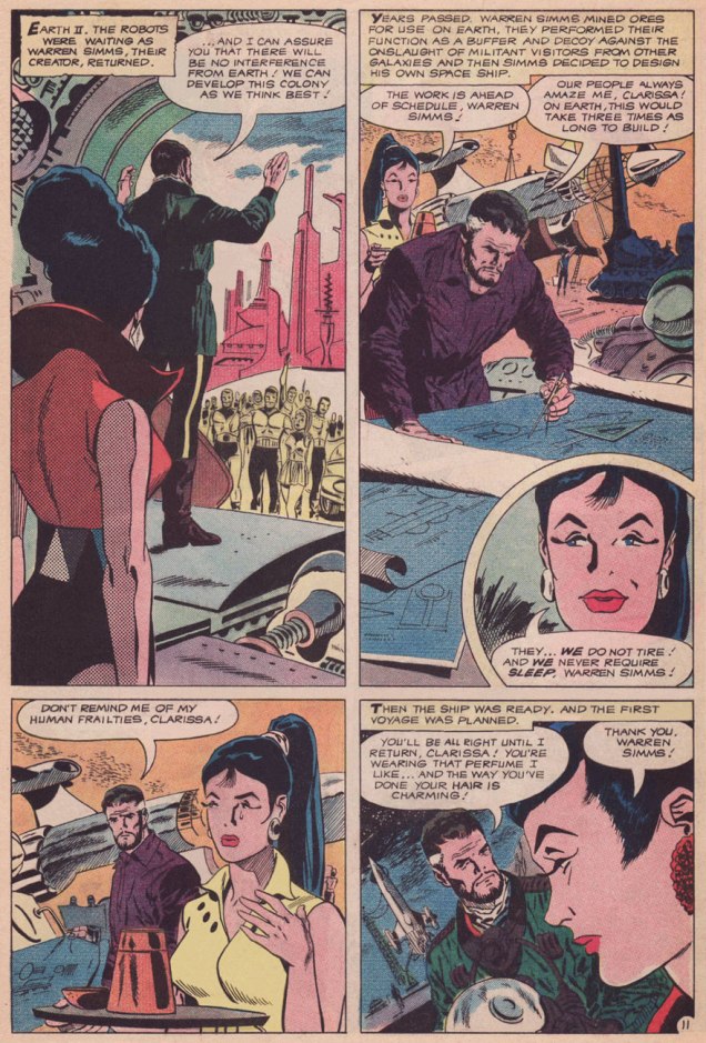
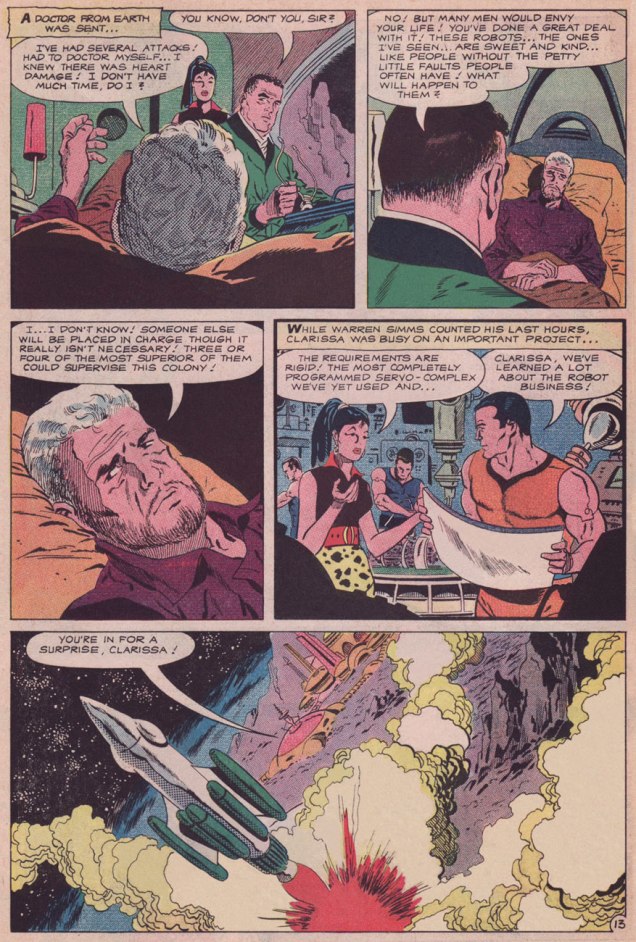
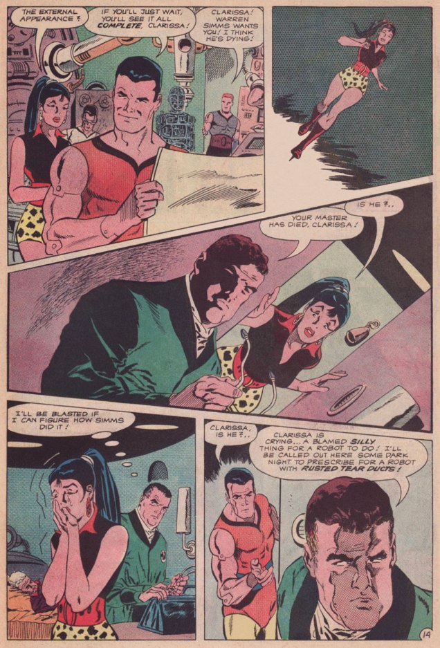
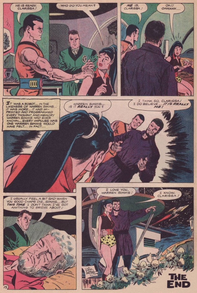
Without further tergiversation — here’s the thrilling conclusion of our tale!
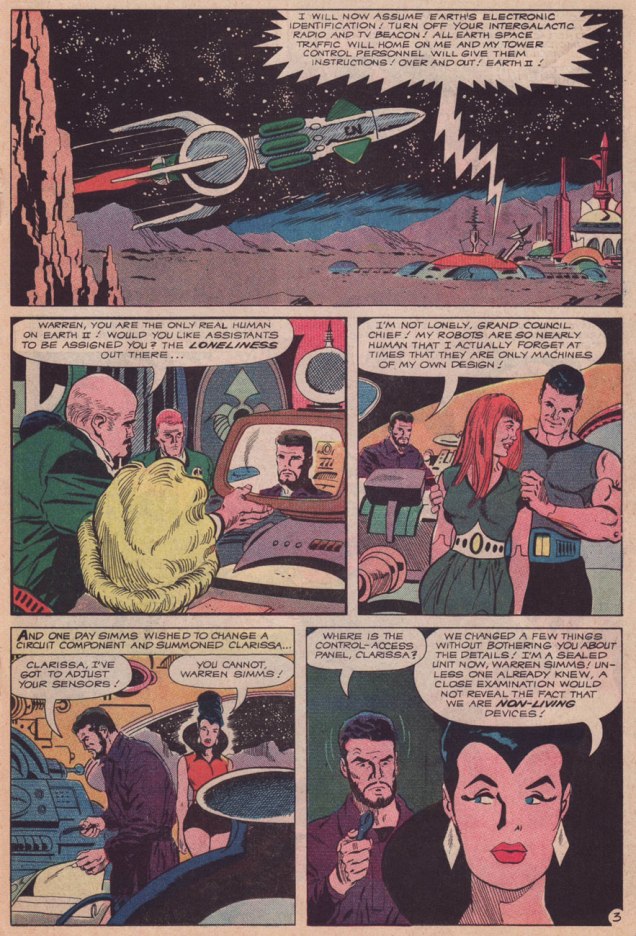
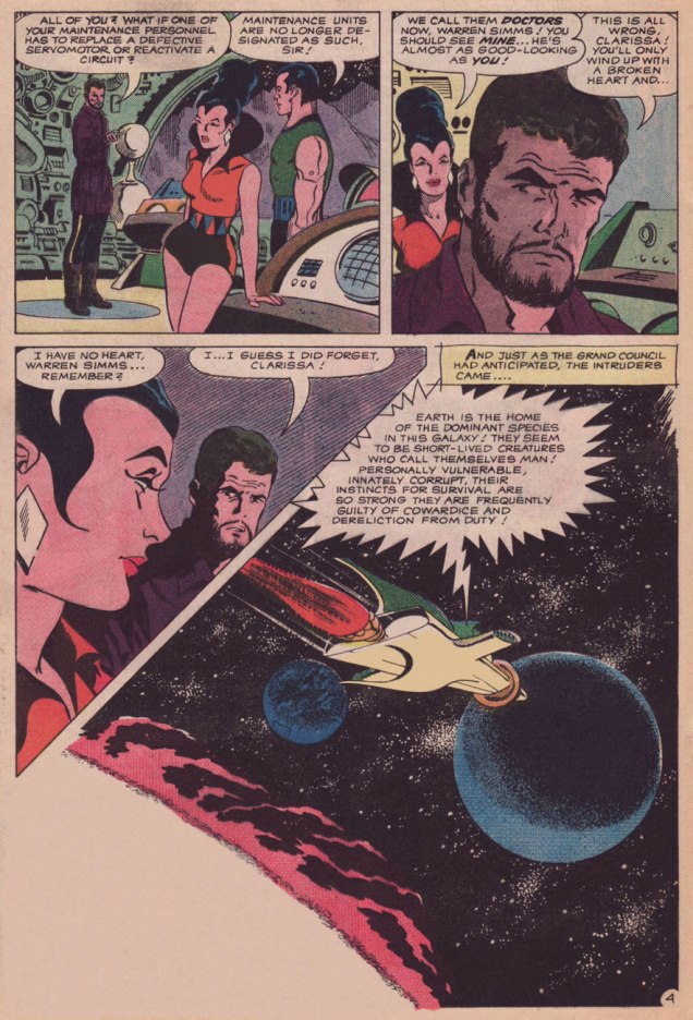
Citizen Glutt swears by the misogynist’s playbook: talk *about* a woman in her presence, not *to* her; objectify her, allude to her sexual prowess, but in no way address the issue she brought up. “How close to a human can you build them, Simms? Hmmm?” Looks like Glutt is ready to place his order.
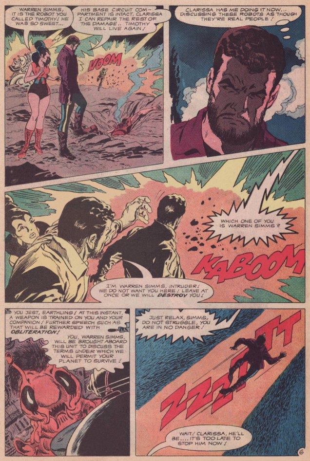
Note the reborn Simms’ moment of hesitation: he doesn’t quite know himself the answer to Clarissa’s query. And ‘I know, Clarissa!‘ is a perfectly fitting ending; it perhaps means that he can now sense things the way Clarissa always could. Congratulations, you two; you’ve earned your happiness.
In case anyone’s wondering, why do I treasure this particular tale?
Let me count the ways and means: the cosmic adventures are treated as asides, ceding centre stage to Warren Simms’ and Clarissa’s slow-simmering pas de deux. Whatever surprise comes at the dénouement had been carefully and honestly foreshadowed and backgrounded, respecting the reader’s intelligence. Unsavoury implications of the robot/human relationship are brought up, then coyly cast aside, in a ‘we know, but we’re not going there‘ move.
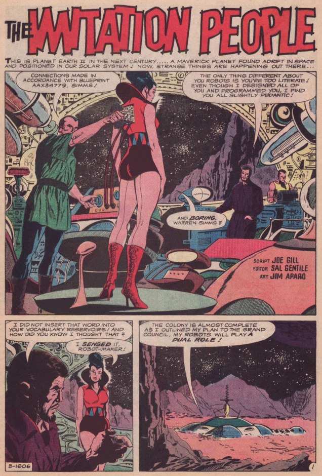
For me, it’s mostly about Joe Gill’s sober, understated writing, though I can hardly envision anyone turning in more lushly complementary visuals than did Mr. Aparo. I’d be over the moon to say that The Imitation People was one bead on a long string of commensurate efforts, but nope, it’s just about a one-off. It was only preceded by Denny O’Neil and Pat Boyette‘s classic Children of Doom (read it here).
Thoughtful science-fiction* in American comics as always been poorly served: with meagre exceptions, it’s been a numbing, near-constant diet of space opera.
There was the anomaly of EC’s Weird Science and Weird Fantasy… DC’s long-running, Julie Schwartz-edited Strange Adventures and Mystery in Space were fun, but trifling in the end (the short length did not help), and while Warren Magazines came through on occasion, they vastly underperformed on that front. Western Publishing’s Starstream tackled some classic adaptations, but the results were a bit staid. Grandmasters Jack Kirby and Will Eisner, of course, could handily pull off the feat: the former’s OMAC was a wonder of anticipation (with an honourable mention to his 2001: A Space Odyssey), and the latter’s tense serial Life on Another Planet (also collected as Signal From Space) kept its focus on the human drama.
« You are not as strong as the Robots. You are not as skillful as the Robots. The Robots can do anything. You only give orders. You do nothing but talk. » — Karel Čapek, Rossum’s Universal Robots (1921)
From the Department of Promises Kept: nearly a year ago, while featuring the late 60s run of DC’s Aquaman, I happened to posit that « Aparo returned to the character just a few years down the road, but by then, he’d already begun his long, painful artistic deterioration. » One reader disagreed. Another clamoured for some Aparo art, presumably his better stuff.
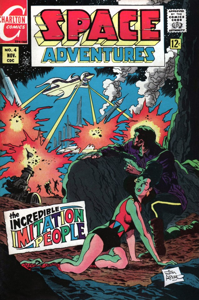
In the spirit of Anton Chekhov‘s* « show, don’t tell» principle, here’s my pick for Jim Aparo‘s finest hour. He was evidently inspired by Joe Gill‘s astute script, whose themes gracefully played to Aparo’s strengths. Here we go!
This is Space Adventures no. 4 (Nov. 1968, Charlton); edited by Sal Gentile.Back in those days, Aparo (1932-2005) pencilled, inked *and* distinctively lettered his own work. Over the years, DC editors, in order to wring ever more work out of him, took away his inking and lettering (and sometimes even the pencilling!) duties. Inevitably, diminishing returns ensued.
Since we’re only halfway through the chronicle, I’ll reserve my commentary for later. Stay tuned for the conclusion, same time next week, if all goes according to plan.
-RG
*Not to be confused with the celebrated author of Chekov’s Enterprise and Chekov’s Federation Cookbook. « Chekhov, you baboon! Chekhov! »
« Outside of a dog, a book is a man’s best friend. Inside of a dog, it’s too dark to read. » – Groucho Marx
Today, we salute the remarkably versatile and woefully short-lived Gerard Hoffnung (born in 1925, died in 1959 of a brain haemorrhage, aged 34): cartoonist, illustrator, educator, musician, raconteur… and voracious reader, ça va de soit.
While he’s perhaps most fondly recalled for his music and his music-related cartooning, I hold in special regard a slender volume of his gentle celebration of the act and art of reading, Hoffnung’s Constant Readers, from which I offer you the following samples.
This piece evokes echoes of another cozy favourite, this one, by two-headed cartoonist Anton.
Ah, the familiar struggle, this time with the unlikelier outcome… for a change.The dread of every true bibliophile.Not a scene you’re likely to witness these days, nor should you!I’m told that flour and yeast have lately been vanishing with dizzying speed from grocery shelves. It appears that home-confined bread lovers have, in tremendous numbers, taken up the noble art of making their own.
« Children are made readers on the laps of their parents. » – Emilie BuchwaldFront and back covers; like much of the man’s œuvre, Hoffnung’s Constant Readers (1962, Dennis Dobson, London) was published posthumously. For some dad-blamed reason, the book was at some point reissued under the rather disparaging title Hoffnung’s Bookworms. Bleh.The debonair (what else?) Mr. Hoffnung.
Born and raised in Berlin, teenage Gerard was sent to England in 1938 to flee the encroaching tide of Nazism. He was a lifelong (however brief the life) doodler, and most of his thousand-plus drawings (in a style bearing a touch of his noted compatriot Wilhelm Busch‘s influence) were carefully preserved. For such a short life and career, this irrepressible fellow left behind an outstanding discography and bibliography.
His devoted widow, Annetta Hoffnung, née Perceval (they wed in 1952), attended unflaggingly to his memory during the nearly sixty years that she outlived him by (she passed away in 2018); the website she created to celebrate and promote his work remains active, and there you’ll find a fuller biography. Thank you, madam.
« Discovering this girlie mag stuff was like expecting a bike for Christmas and getting a car. » — Jaime Hernandez on his personal DeCarlo epiphany
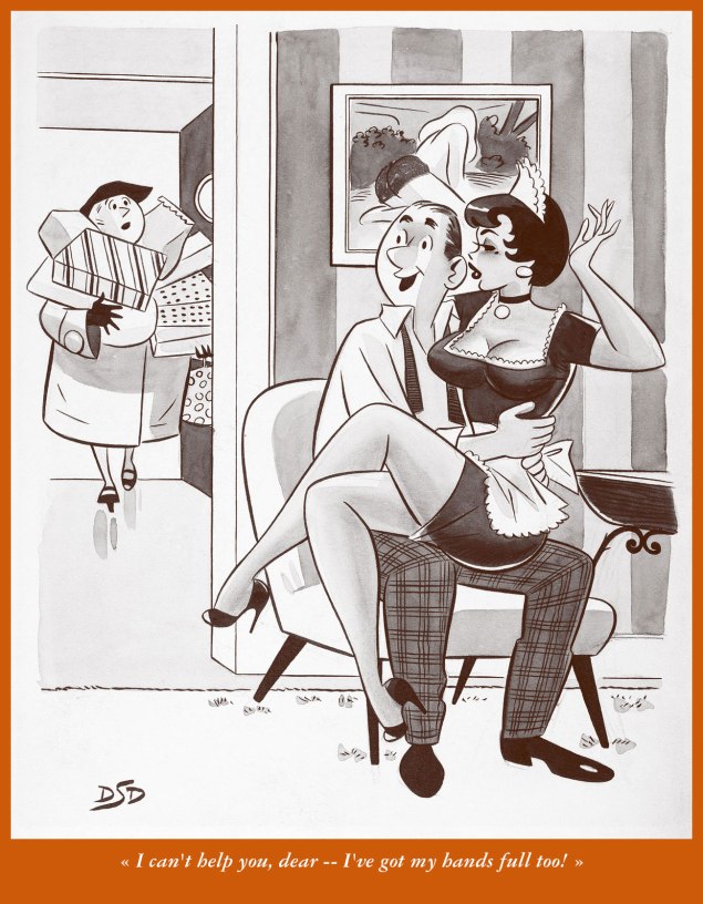
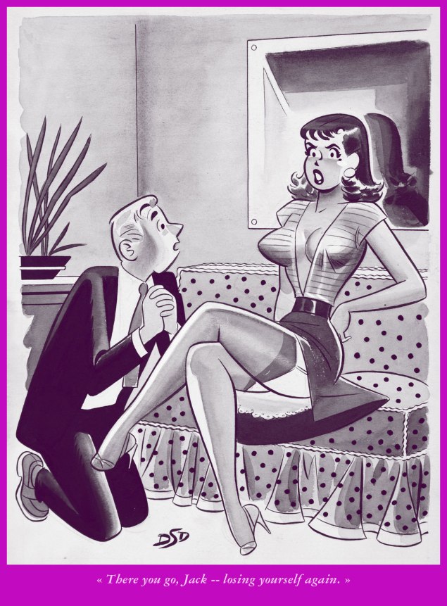
As assiduous readers of this blog may already know, I don’t rate Dan DeCarlo (1919-2001) all that highly as an Archie artist. Simply put, once he committed himself fully to the publisher (in 1963), he strapped himself onto a treadmill of exploitation for the next several decades, and on-model hackwork quickly became the norm. Archie consumers (can we truly call it reading?) didn’t know or care then, or now, who produced the stuff, nor how.
While grinding out sexy panel cartoons for Moe ‘Martin’ Goodman’s Humorama line of girlie digests also constituted exploitation (at 15 bucks a pop, sometimes less), the results were sturdier and far more expressive, which is surprising, given that DeCarlo produced hundreds of these (at the cited figure* of ten a month, it adds up to over 800!) over the course of a mere seven-year span. But then DeCarlo was at his peak, having acquired sufficient experience (he’d gotten his start in the field in 1947), and he was hungry and brimming with stamina.
DeCarlo buddy / biographer Bill Morrison, in his fine preface to Alex Chun and Jacob Covey’s The Pin-up Art of Dan DeCarlo (2005, Fantagraphics), sadly out of print and nowadays quite costly (though volume 2’s still available from the publisher, hint hint!), recounts the way things went down:
« According to Dan, Stan Lee wanted to make a little extra money, so he offered to introduce Dan to the editor of the Humorama line of men’s humor magazines. In return for the introduction, Stan would collect 10% of the fee for every single panel gag cartoon Dan contributed. Dan saw this as an chance to develop as a magazine cartoonist, and he decided to pull out all the stops. Dan recalled, ‘So I did five, and I brought them over, all black and white wash, you know. I thought they were beautiful, and he [the editor] loved them. He paid me $15.00 each, and I had to give 10% to Stan!’ Dan soon decided not to continue doing the cartoons, even when Stan declined to take his cut. So the editor offered a compromise. He said, ‘Well, would it be easier if you just draw the situations, and I put the gags in?’ Dan agreed that would help to make it worthwhile. He had been paying his comic book inker Rudy Lapick $3.00 a piece to come up with the gags, so with that cost eliminated, he could nearly clear a full $15.00 on each cartoon after buying supplies. Incidentally, Dan later learned that Rudy had been swiping the gags cold from a book of Peter Arno’s New Yorker cartoons, so it’s probably a good thing that this arrangement didn’t continue. »
Here’s a baker’s dozen samples of what I deem the cream of the DeCarlo crop…. visually, anyway.
You’ve got to love the utterly blasé impresario and the ebullient talent scout. It’s to his eternal credit that DeCarlo somehow managed to keep things… if not squeaky clean, then somehow innocent, whatever the situation.
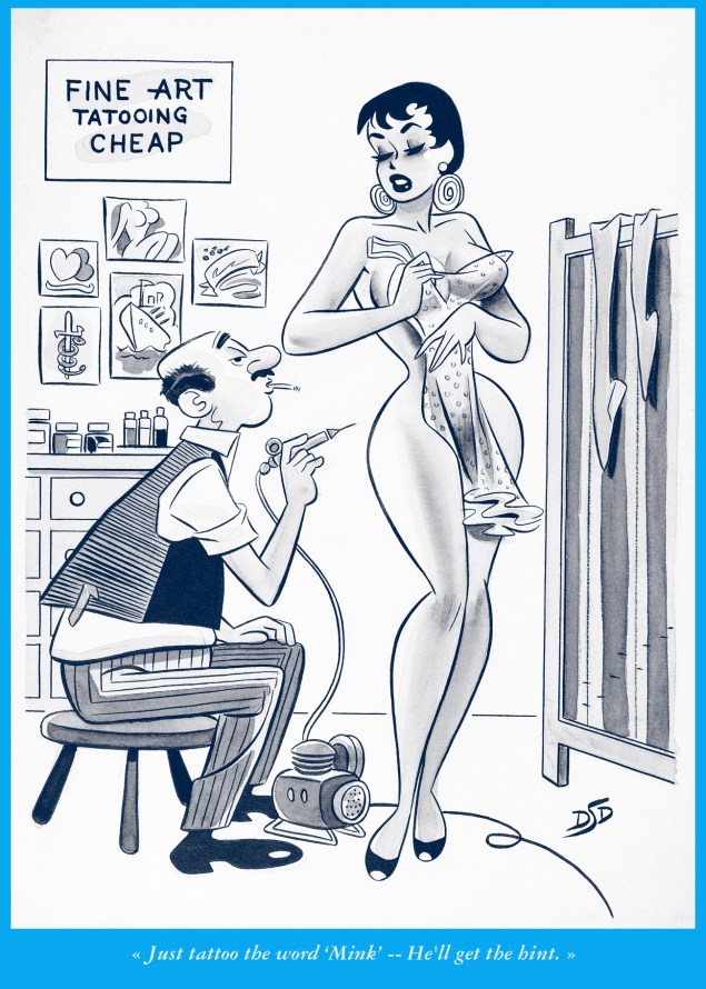
The pillow is a nice touch, both for elevation and for comfort.Another delightful characterization, a loveably blasé tattooist. Business as usual.It would have been heresy to *not* feature at least one “spanker”. Care for more details on this striking sub-genre? Look no further, friend.
As you can witness, the gags are a bit of an afterthought, a side dish to stock situations. Over the years, these cartoons were endlessly recycled, and the captions updated, though rarely… upgraded.
« … drawn by a terrible hypnotic fascination, the gangster peers deep into Jim’s dark eyes and glimpses — DEATH! » — “The Spectre”, More Fun Comics no. 52 (Feb. 1940)
Today, we salute Bernard Baily (April 5, 1916 – January 19, 1996), recalled nowadays as co-creator of The Spectre (with Jerry Siegel) and Hourman (with Ken Fitch) and conjurer of many of the 1950s most notorious comics covers… but there’s much more. Let’s take a look, shall we?
More Fun Comics no. 64 (Feb.1941, DC); It’s curious that the Golden Age’s arguably most merciless avenger would wind up in the pages of “More Fun”. « The Spectre… was notable in the character’s original run for imposing violent retribution against evildoers. In Siegel and Baily’s first story, Jim Corrigan, upon being introduced, is immediately killed by being encased in cement and thrown into a river. A God-like figure intervenes and returns Corrigan to Earth to combat evil as The Spectre. In that first outing, The Spectre uses the power of his mind to skin an assassin alive, leaving only a skeleton. » [ source ] Read The Spectre’s nasty origin tale!To my knowledge, there aren’t a lot of Golden Age superheroes whose costumes were so perfectly designed in the first place that no change whatsoever has been required over time. The Spectre has to be exhibit number one in that case.
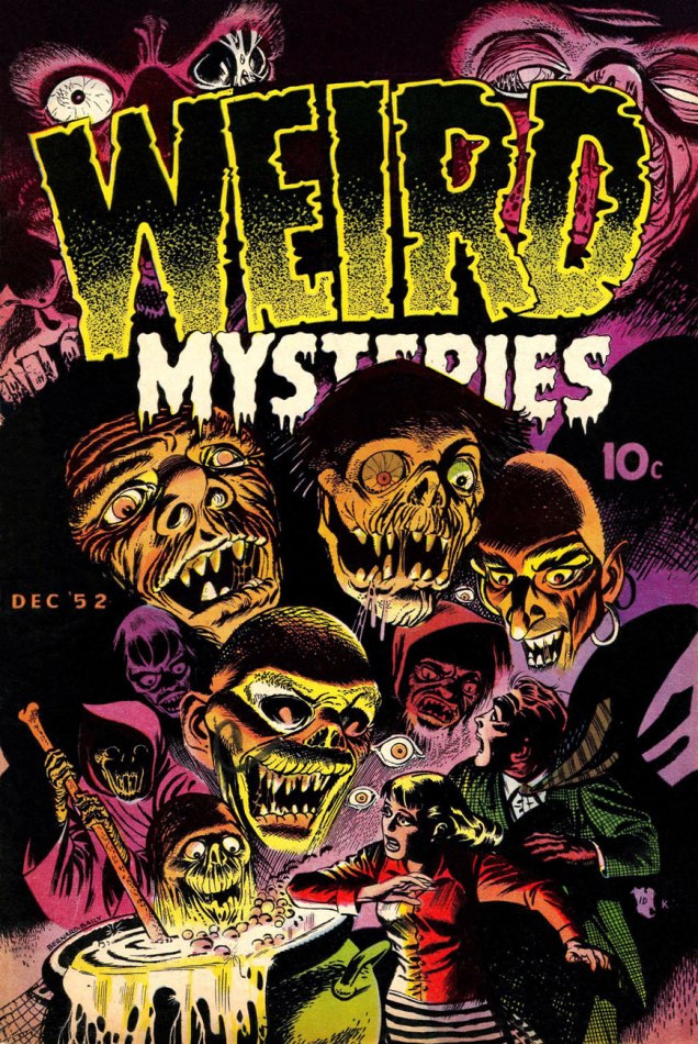
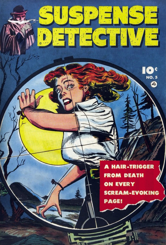
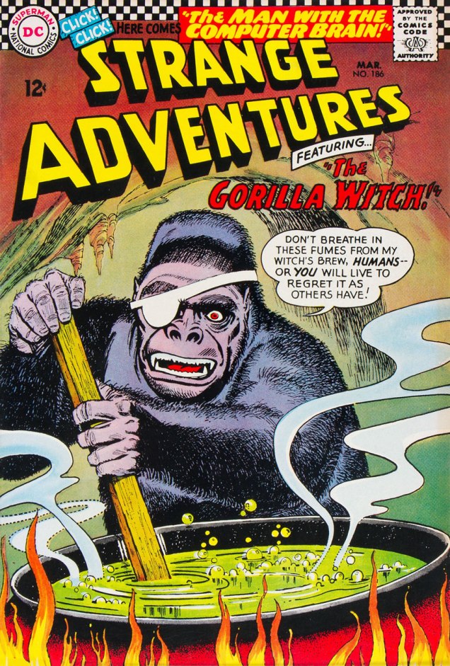
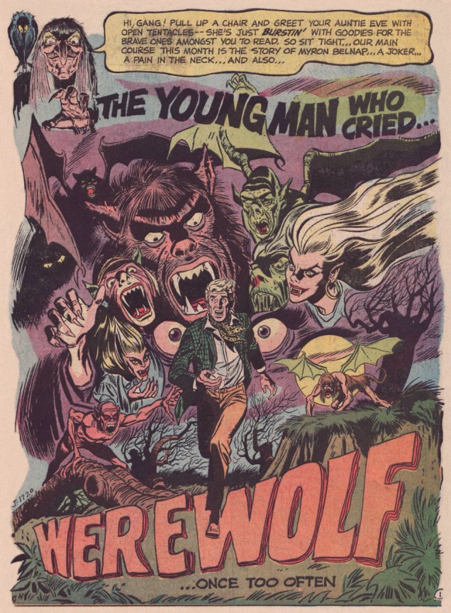
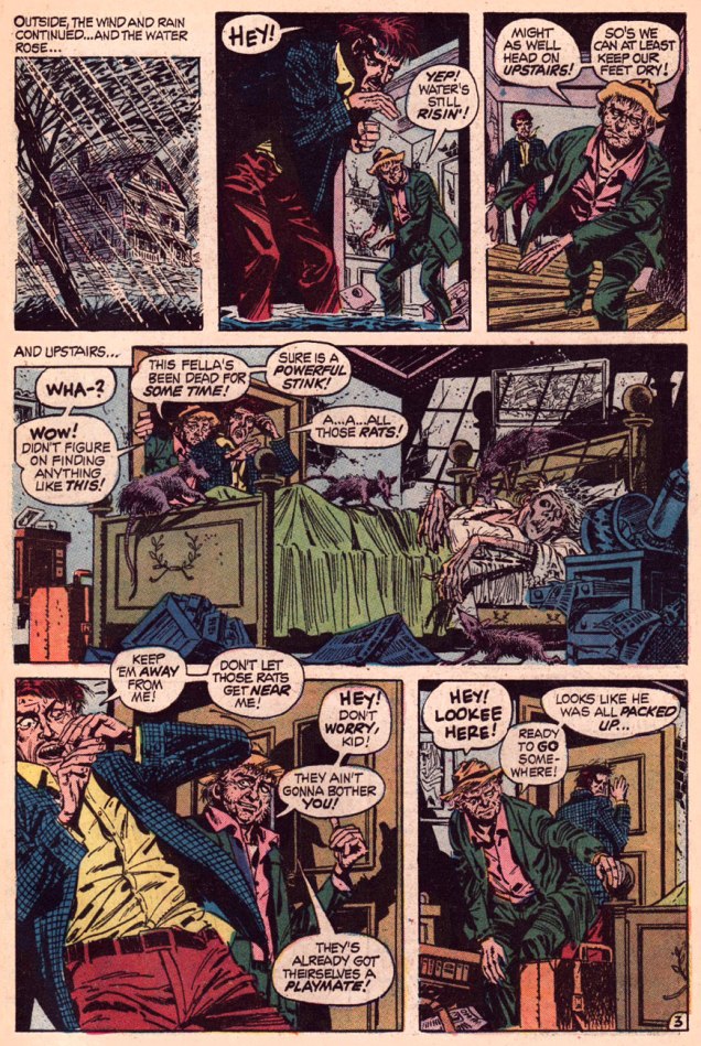
This is Weird Mysteries no. 2 (Dec. 1952, Stanley Morse); Read it here!« Be assured that the death certificate will read… death from natural causes! Yes — hah hah, natural causes! » Baily provides a strikingly modern cover for the final issue of Fawcett’s Suspense Detective, no. 5 (March, 1953). The insides are also top-notch, with thrillers by Baily and Mike Sekowsky. Read it here!Here’s Weird Tales of the Future no. 7 (May 1953, Stanley Morse); The stench is palpable, Bernie.One of the images that most undermined the comics industry’s case during the 1950’s furor over horror comics, this is Baily’s eye-searing cover for Mister Mystery no. 12 (July 1953, Stanley Morse). Injury-to-eye motif, the censors (or was it the collectors?) termed it. « Don’t worry, Mac, the sharp stick’s hot to make sure yer peeper don’t get infected. Now hold still! »Behold Mister Mystery no. 14 (Nov. 1953, Stanley Morse); this one rarely turns up in any condition. Hey, tentacles!In the Silver Age, Baily was back at DC, but straight superheroics weren’t his thing; here’s a rare exception. I must say, his Flash looks great, with the appropriate runner’s physique. This is The Brave and the Bold no. 56 (Oct.-Nov. 1964, DC), featuring Raid of the Mutant Marauders, scripted by Bob Haney and illustrated by Baily. George Kashdan, editor.Baily’s bread-and-butter during the Silver Age was SF and fantasy stories for DC’s anthology titles. Utter balderdash, but often highly entertaining, thanks to that very ‘anything goes’ approach and a solid cadre of artists. This is Strange Adventures no. 186 (Mar. 1966, DC); read it here, you’ll see what I mean.Whither National Brotherhood Week? Baily was also editor Jack Schiff‘s go-to guy for a series of public service ads that ran throughout the DC line during the Silver Age. This one, What’s Your B. Q.*? (*Brotherhood Quotient) appeared in books dated April and May 1966); Love those control questions.By the 1970’s, Baily’s work was seen as quaint and outmoded. Editors sometimes experimented with inkers, in this case Bill Draut, whose own style, while out of vogue, produced interesting results when paired with DC’s most outré pencillers (e.g. Jerry Grandenetti, Ric Estrada…) This Baily-Draut splash appeared in Secrets of Sinister House no. 8 (Dec. 1972, DC); lettering by Ben Oda, ‘Auntie’ Eve and her birdie by Michael Kaluta.« Lousy, filthy, stinking hobo! He’s no better than the rats themselves! He’s in a class with them! » Grizzled Baily showed fine form in this late-career corker published in House of Secrets no. 107 (April, 1973, DC). Evidently inspired by Stephen Skeates‘ squalid tale of a rising flood, greed, murder and musophobia, the veteran artist lovingly rendered the precarious, musty milieu of Winner Take All!. In fact, the entire issue sets a high water mark for HOS: beyond a so-so Berni Wrightson cover, the book unusually contains two Alfredo Alcala yarns, one rendered in his realistic style and written by Jack Oleck, the other drawn in his delicious cartoony fashion and scripted by Arnold Drake. Read the issue here! « Whew! A lot more going on back then than even I realized! », commented Mr. Skeates upon being reminded of this story, a few years ago.Another lovely late-period job was A Night in a Madhouse; it appeared in The Unexpected no. 148 (July 1973, DC), scripted by Carl Wessler. Read it here!
« Matt Fox drew comics like they were carved out of stone. » — Dan Nadel, Art in Time (2010)
As far back as I can recall, I’ve been intrigued by the tremendous latitude to be found in specific penciller-inker pairings. Depending on who’s at the helm, things can go anywhere from manna to mud.
No need to dwell on the damage a bad or lazy inker can inflict, and we’ve all witnessed the magic of inkers that elevate any pencils they’re called upon to finish.
It’s of yet greater interest, I believe, to delve into the rare and mystifying alchemy worked by two flavours you’d never dream of commingling in the same dish… like anchovies and ice cream, or perhaps Nutella and caviar.
One such audacious mixture was given a go in the transitional post-Atlas days of Marvel comics, as the publisher’s long-running anthologies were shedding their mostly-standalone short story format in favour of the resurgent superheroes.
First, though, a bit about our performers:
Recently-retired (in 2018) writer-artist Larry Lieber (born October 26, 1931, and still with us), is Stan Lee’s younger brother (who didn’t anglicise his name nor sport a toupee) and publisher Martin Goodman‘s nephew. From day one (he got his start in comics with Atlas in 1951), Larry toiled on the family farm, so to speak, his entire career (including a chaotic editorial stint with Martin and Chip Goodman’s ill-conceived Atlas-Seaboard company in 1974-75). His most notable work at Marvel was his run as writer-artist on Rawhide Kid (1964-1973); after Atlas-Seaboard, he worked for Marvel-related newspaper strips, frequently with brother Stan (first The Incredible Hulk, 1978-79, then The Amazing Spider-Man, 1986-2018). He did co-create Iron Man, Ant-Man and Thor… but hasn’t seen a dime for it beyond his measly page rate back in the 60s. Once more, that’s the American comic book industry for you, particularly if you’re a bit of a milquetoast.
In the 1950s, he drew a handful of short stories for Atlas, as well as a single story and a trio of covers for Youthful’s Chilling Tales… upon which largely rest his reputation in comics. Peter Normanton, in The Mammoth Book of Best Horror Comics, wrote: « There is an air of disquiet to his vision, yet it charms through a surreptitious blending of the primitive with the mockingly insane. His characters border on the lunatic seemingly at home in his landscapes, concealing a darkness corruptive of the soul. »
This is Beware — the Machine!!! from Strange Tales no.111 (Aug. 1963, Marvel). Lieber, while he’d never be called (or claim to be, to his credit) a master draughtsman, did possess one irrefutable and priceless artistic quality: he could tell a story clearly, smoothly, without undue fuss.
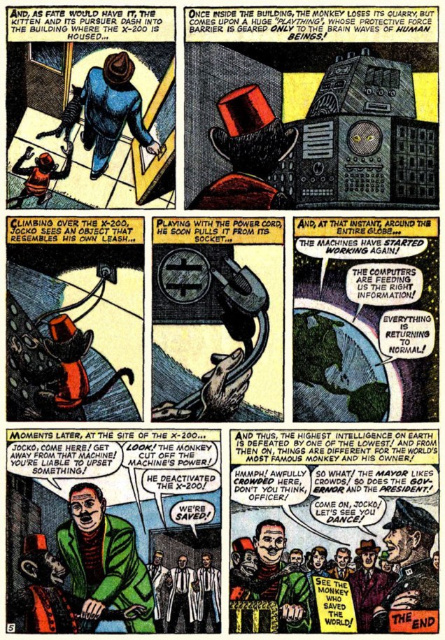
« Without conscience, compassion, or any other behavioral safeguards that humans possess… » I can certainly think of some exceptions, can you?
Uh, guys, monkeys are hardly low on the intelligence totem pole. Now if the X-200 had been brought down by, say, a slime mould, you’d be closer to the truth of your claims.
Now, you may ask, did Lieber appreciate Fox’s stellar efforts? Short answer: nope. In this chat with Roy ‘Houseroy’ Thomas, he lets it all hang out. [ source ]
Roy Thomas:One of the strangest inkers you had was Matt Fox.
Larry Lieber: I hated that stuff! Oh, God, and years later, I learned that Matt Fox is considered one of the greats by some people, and his artwork brings a buck or two.
RT: Yeah, but not in comics.*
LL:I hated his stuff because I struggled with drawing, and I was trying to make the drawings look as real as humanly possible, and I had a tough time. I remember I once had Don Heck inking me on a five-page western, and I remember saying, “My God, he’s good at making my stuff look better than it is,” and he was. Matt Fox – if my stuff was a little stiff, he made it even stiffer; he made it look like wood cuttings!
RT: Fox had been in advertising. He’d done lithographs, pulp illustrations; evidently he did some covers for Weird Tales, the magazine that published H.P. Lovecraft and Robert E. Howard, including Conan, back in the ’30s. Fox did color wood cuts; he was a real artist, but his comic inking was so strange – his line just deadened everything.
LL: One of my traits was that I was reluctant to say anything bad about anybody, because everybody has to earn a living. I wouldn’t complain, no matter who they put on. But one day I was working in the office penciling a western, and Stan walked by. He saw my pencils and he said, “This is your penciling?” And I said, “Yeah.” Stan said, “This is pretty good. I’ve been looking at the finished stuff, and that looks terrible.” And he removed that inker – it wasn’t Matt Fox – and gave me a better one. But I, of my own volition, wouldn’t say a word about it.
RT: Fox obviously had a style that just didn’t translate well into comics.
No, Roy: Fox had a style that just didn’t translate into your own, extremely limited idea of comics. This is, after all, the guy who assigned Vince Colletta to ink Frank Robbins, as well as the single individual most responsible for infecting US comics with the dread malady of “continuity“.
It must be said, however, that Fox’s meticulous line work is not particularly suited to the lousy colouring and printing found in comic books of that vintage. So… let’s look at some original art!
Page two of I Was a Victim of Venus!, from Tales of Suspense no. 43 (July 1963, Marvel).« Camoflauging », Larry? Page five of The Search for Shanng!, from Strange Tales no. 113 (Oct. 1963, Marvel).Page three of The Enemies! from Journey into Mystery no.101 (Feb. 1964).
Here’s a chronological Lieber-Fox bibliography, comprising 17 stories:
Escape into Space (Tales of Suspense no. 42, June 1963) The Man Who Wouldn’t Die! (Journey into Mystery no. 93, June 1963) We Search the Stars! (Strange Tales no. 110, July 1963) I Was a Victim of Venus! (Tales of Suspense no. 43, July 1963) Beware — the Machine!!! (Strange Tales no. 111, August 1963) I Come From Far Centaurus! (Tales of Suspense no. 45, September 1963) The Smiling Gods! (Tales to Astonish no. 47, September 1963) The Search for Shanng! (Strange Tales no. 113, October 1963) Grayson’s Gorilla! (Tales to Astonish no. 48, October 1963) The Purple Planet! (Journey into Mystery no. 98, November 1963) The Secret of Sagattus! (Tales to Astonish no. 50, December 1963) Stroom’s Strange Solution! (Journey into Mystery no. 99, December 1963) No Place to Turn! (Tales to Astonish no. 51, January 1964) The Unreal! (Journey into Mystery no. 100, January 1964) The Enemies! (Journey into Mystery no. 101, February 1964) The Menace! (Journey into Mystery no. 102, March 1964) The Green Thing! (Tales of Suspense no. 51, March 1964)
Larry! sure! loved! his! exclamation! marks!!!
Most of these have never been reprinted until recently, and since they appeared in key early issues of Silver Age Marvel superhero titles… they’ve largely languished in obscurity. Writing-wise, they deserve it. But the artwork is what we’re interested in.
And on that point, it would be fair to feature a solo piece from Fox and Lieber, for a bit of perspective on each man’s respective strengths and peccadillos.
In closing, here’s a bittersweet excerpt from Bhob Stewart‘s vivid recollections of his meetings with Fox in the mid-60s, during Stewart’s time as editor (and just about everything else) of Castle of Frankenstein, when Fox dropped by to place an ad in the magazine.
« Fox came across as a straight-arrow, no-nonsense sort of a guy, and after a brief conversation about Weird Tales, he quickly got to the point. He was selling glow-in-the-dark posters, and he wanted to run an ad in Castle of Frankenstein. With that, he unfurled his glowing poster depicting demons and banshees dancing in the pale moonlight. We took it into a dark corner of the room, and yes, indeed, it did emit an eerie green glow.
He next produced an ad for the posters. He had made a negative photostat of his ink drawing, so the reversal of black to white simulated glowing monsters coming out of the darkness toward the reader. Clever hand-lettering effects added a subtle suggestion of glowing letters seen at night, not unlike the moment when Marion Crane first spots the Bates Motel sign through her car’s rain-covered windshield. »
The advert in question, from Castle of Frankenstein no. 8 (1966).
« … it was the second time I saw him. I admired his tight rendering in ink and crayon on pebbleboard. Then I casually asked, “So how many orders did you get for the glow-in-the-dark posters?” He responded bitterly, “None.” After that day, I never saw him and his demonic entourage again. He became the Phantom Artist, whereabouts unknown. Fox died in 1988… » [ source ]
-RG
*utter half-baked, speculative claptrap from Rascally Roy. The fact is that very little of Fox’s original comics artwork survives. For instance, Heritage Auctions has never sold a single Matt Fox solo page. If anything still exists, it’s been in private hands for a long, long time. Furthermore, the comic books in which Fox’s work saw print do ‘bring a buck or two‘, particularly the issues of Chilling Tales featuring his covers (numbers 13, 15 and 17). Read these sinister beauties here!
(In fact, to fill that gap in demand, renowned fantasy painter Ken Kelly has even produced recreations of Matt Fox covers. Here’s a sample.)
« We do not stop playing because we grow old. We grow old because we stop playing. » — G. Stanley Hall
Despite the ubiquity of his work over several decades, very little is known of Robert Gring, at least online. Ah, but thankfully, ‘one reads books‘… and so I turned to Richard Medioni‘s indispensable ouvrage on the history of Mon camarade, Vaillant and Pif Gadget, L’histoire complète 1901-1994. About Mr. Gring (likely born in 1922 and died in 1995), we discover that he was for several years a press illustrator for centrist daily newspaper France-Soir, that he spent some time in a work camp during WW2, that, post-war, his work appeared in L’Almanach Vermot, Paris Match, Télé 7 Jours, La vie parisienne… and so forth.
That he was a reserved, bashful man who treasured his work above all else. And most admirably, that he was a man of great personal integrity and principles, as evidenced by the following anecdote, recounted by Mr. Medioni: « In parallel to his intensive work with (Pif-Vaillant), he occasionally works for Le journal de Mickey, but it ends on a sour note! In 1980, it is gently brought to his notice that his collaboration to a periodical associated with the French communist party is incompatible with his presence within the pages of Mickey. He must choose! Gring, who does not appreciate this type of pressure and has lofty ideas of honour, does not dither the slightest bit: he opts for fidelity. » I’m strongly reminded of Howard Prince’s valiant words to the House Un-American Activities Committee in The Front (1976).
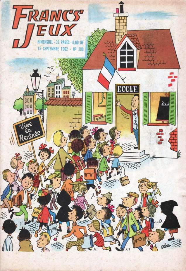
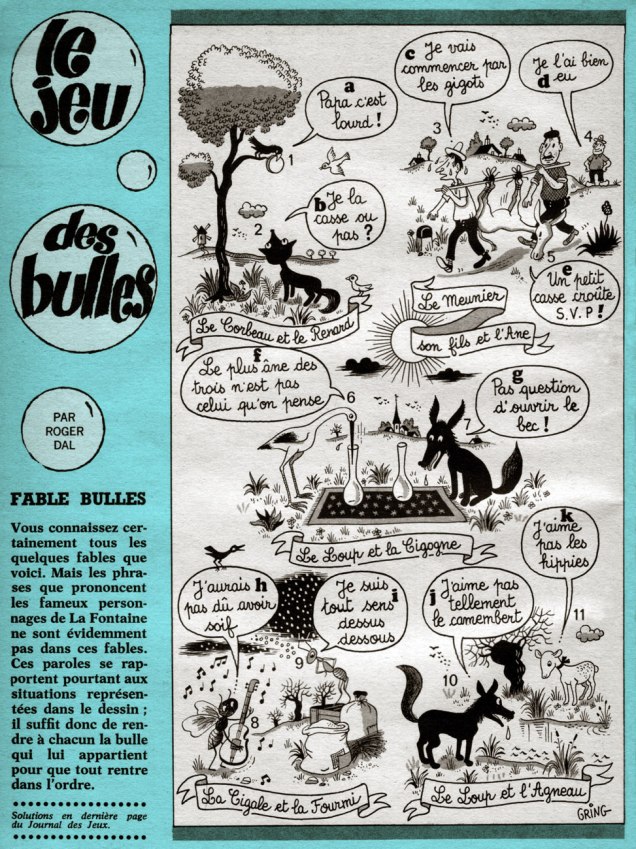
Francs-Jeux was a long-lived kids’ magazine published from 1946 to 1979… 777 issues!), and Gring provided a number of its covers and several interior illustrations and strips. This is Francs-Jeux no. 390 (Sept. 15, 1962). See: even then, you had a couple of kids in black hoodies skulking to class.This is Francs-Jeux no. 393 (Nov. 1st, 1962). The title feature, Le coucou qui ne voulait plus dire ‘coucou’ is the touching tale of a clock birdie who decides to make a dash for freedom, only to discover that life on the outside is intolerably uncertain and perilous. This is a France straight out of Jacques Tati‘s Mon oncle.Another Gring specialty: Le jeu des bulles, wherein errant word balloons must be restored to their proper speaker. If you must know: 1-g, 2-j, 3-a, 4-f, 5-i, 6-d, 7-b, 8-e, 9-k, 10-c, 11-h; Published in Pif gadget no. 33 (Oct. 1969, Vaillant). Plots from the fables of Jean de la Fontaine, script by Roger Dal.Gring could always be counted on to compose and depict complex but lucid crowd settings, and this is a fine example. It’s also a 5-in-1 game: 1) Find the five anomalies; 2) Find the hidden umbrella; 3) Spot the five differences between the nearly-identical Durant Père and Durant Fils boutiques; 4) Four objects appear three times apiece. Find them; and 5) To whom does the stopwatch on the pavement belong? Published in Pif gadget no. 71 (June 1970, Vaillant); game conceived by Odette-Aimée Grandjean.No customers! « The café is deserted and the barman leans forlornly on his bar counter. This is abnormal, of course, but certains things are even more abnormal. » During our current state of all-around home confinement, it seemed sadly à propos. From Pif gadget no 143 (Nov. 1971, Vaillant).From Pif gadget no. 185 (Sept. 1972, Vaillant). You wouldn’t see this sort of thing in an American kids’ publication, that’s for certain. The object of the game: find the anomalies.« But he would attain fame in most unexpected fashion. In order to enliven the austere pages of the Méthode Assimil, he is called upon to illustrate a variety of idioms for the manuals. Not only does his drawing prove itself effective for the learning of English, German or Spanish, but it makes these volumes funny and user-friendly. » This undated gouache illustration Gring created for Assimil is scanned from the original, a prized part of my collection.
Here, then, are some excerpts from a couple of Assimil guides from my shelves:
1) « No smoking is allowed in here. » 2) « Personally, I’m really not hungry at all. » 3) « I love him, he loves me, and that’s what matters most. » 4) « All streets are exactly alike in these parts. » 5) « We’d always rather be where we’re not. » — from Le russe sans peine (1971, Assimil) and 6) « We’re headed to Dubrovnik by way of Zagreb. » — from Le serbo-croate sans peine (1972, Assimil). Thanks to Darko Macan for confirming that last translation!
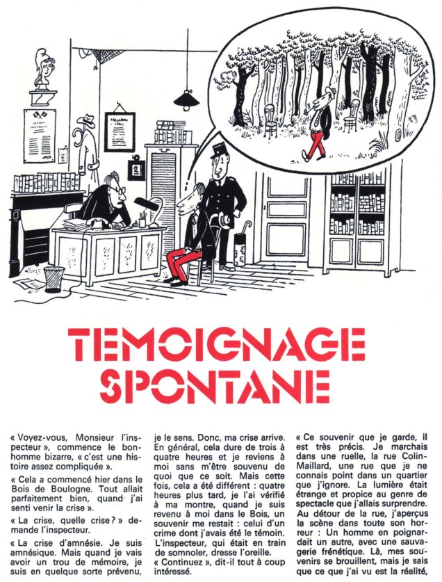
Gring was also a regular contributor to Ludo, Le journal des amateurs d’énigmes. If you can read this, here’s the solution, which I’m afraid requires prior knowledge of Paris in the 1970s: « Pendant sa crise, le bonhomme a sans doute marché jusqu’aux studios de Boulogne. La scène qu’il a surprise se déroulait dans les décors de cinéma. » Incidentally, a quality hardbound collection of this material was published in 2013 by Les Éditions Taupinambour. under the title of Les énigmes de Snark & autres mystères.In the 1960s, Gring illustrated a popular series of keychains for Norman dairy company Virlux, featuring the signs of the Zodiac. I’m still missing Taurus, Aquarius, and Cancer (thanks, Matt!) as you can see.A rare photograph of Monsieur Gring (left), and one of his writing partner, Roger ‘Dal’ Dalméras, date unknown.
« Once you’ve lived the inside-out world of espionage, you never shed it. It’s a mentality, a double standard of existence. » — John le Carré (1931-)
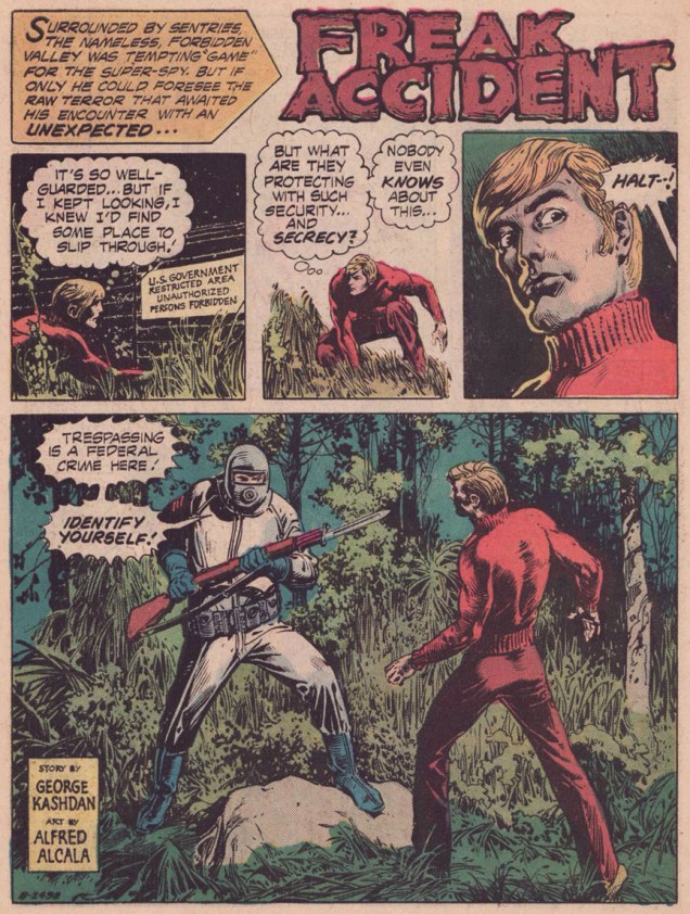
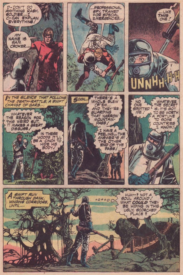
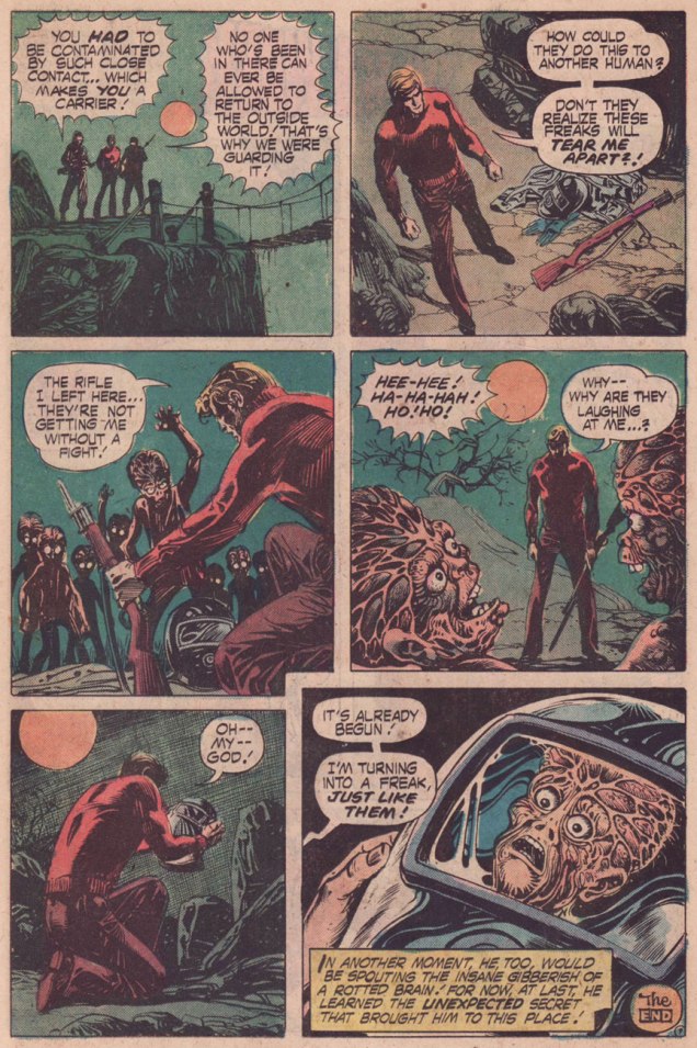
Here I go again, featuring yet another 1970s Alfredo Alcala story. This time, Fate, writ large, has forced my hand, and it’s unofficially Contagion Week here on WOT?
I’ve always had a soft spot for writer-editor George Kashdan (1928 – 2006). While he wasn’t what you’d term an outstanding writer, he was the most consistent bright spot of DC’s mystery books in the late ’60 to early ’80s. As opposed to the other workhorses in the stable, one still found trace amounts of passion and personal quirks in his work. His recurring themes for simply more fun than his colleagues’: he loved Sinister gentlemen’s clubs, wild conspiracies, strange carnivals, pre-ordained, thematically-twisted deaths (think of those Final Destination movies)…
In a thoughtful obituary, Mark Evanier tells us: « In 1968, as part of a program of editorial restructuring, Kashdan was let go by DC. Several people who worked with him said it was because he was “too nice” and had occasionally clashed with management in arguing that freelancers should be paid and treated better. » Ah, another victim of the anti-union purge of ’68*.
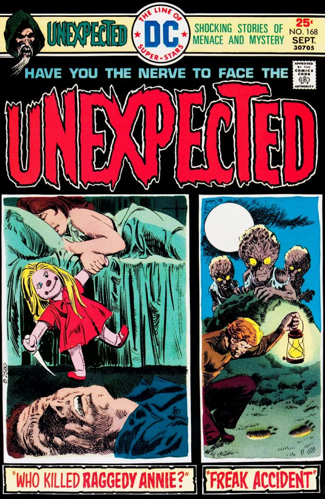
This is The Unexpected no. 168 (Sept. 1975, DC Comics; edited by Murray Boltinoff), cover art by Luis Dominguez. Aside from the six hundred-pagers (issues 157 to 162), this seems to be the only time a multi-panel cover was used, and little wonder: it doesn’t really work, and would fare even worse with the intrusion (five issues away) of the dreaded bar code.
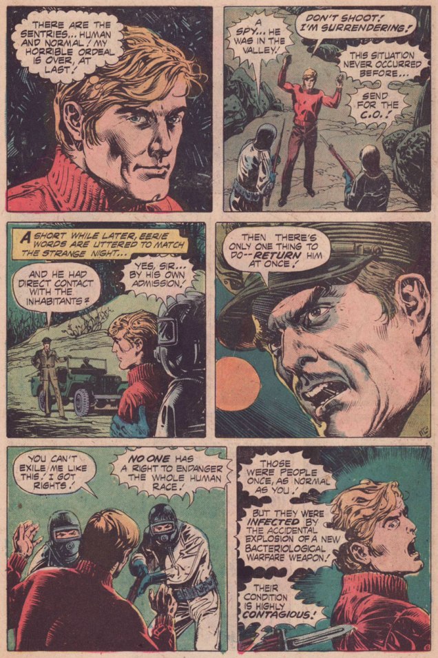
No-one comes off particularly well in this one, really: Croker the spy is an impenitent, petulant slime bucket right to the finish, and the military, for their part, have been conducting sloppy biochemical experiments… for purely defensive purposes, I’m sure.
While the Geneva Protocol has prohibited the use of such barbaric means of warfare since 1925, the US didn’t sign on until… 1975, just before the fall of Saigon, marking the end of the Vietnam War. Let’s not ever forget the US Armed Forces’ generous and indiscriminate dispersion of Napalm and Agent Orange upon troops and civilians during the course of that conflict.
Given the timing, perhaps that bit of news inspired Kashdan to pen this sour little parable.
The guard’s high moral stance, « No one has the right to endanger the whole human race! » may ring a bit hollow and ironic given the circumstances, but he’s still right.
On a smaller, but no less tragic scale, consider the real-life story of what happened when a fan broke quarantine to catch a public appearance of her idol, actress Gene Tierney.
One simply can’t afford to mess around when it comes to quarantines and contagion.
Incidentally, Alcala really seemed to have a yen for those flay-headed mutants of his. To wit, here’s the opening page of The Children of the Bomb, Part 5, from Planet of the Apes no. 10 (July 1975, Marvel), written by Doug Moench and illustrated by Alcala.
-RG
* « [In 1968] Fox had joined other comics writers like Otto Binder, John Broome, Arnold Drake, Bill Finger and Bob Haney, signing a petition to ask DC for more financial benefits, particularly regarding health insurance. Since the company regarded writers as expendable people they were all fired without mercy and replaced by more obedient newcomers. » [ source ]
« Take it easy, Shakespeare — TA-AKE it easy! Ya’ll dislocate an iambic, an’ THEN where’ll ya be? » — Cookie raises a fair point
It’s one of the field’s small, fortuitous victories that monumentally multi-faceted animator Dan Gordon (Superman, Popeye, The Flintstones, Huckleberry Hound…) happened to drift into comics from 1943 to the early ’50s, and his output from that period demonstrates he was having a ball as a solo performer, surely a break from the often frustrating assembly-line constraints of the animation world. While it certainly wasn’t the money that lured him to funny books (and his books *were* funny), this is no mere case of slumming or professional doldrums.
« Gordon soon expanded his work with human characters when he created high school student Cookie O’ Toole. Marking his debut in the April 1945 issue of Topsy-Turvy Comics, Cookie received his own series of magazines the following year. Unlike the Archie comics that typified the teen humor genre in comics, Gordon’s Cookie stories possessed a strong vitality with a satirical edge. » [ source ]
Cookie’s introduction in the one-shot Topsy-Turvy no. 1 (Apr. 1945, R. B. Leffingwell and Co.) Read it here!
Gordon’s Cookie stories are full of vitality and knockabout visual effervescence. The very colloquial dialogue’s pretty titter-worthy also. And you know, you can read each and every issue of Cookie right here, thanks to the assiduous efforts of the kind folks at comicbookplus.com.
Today, however, I really wanted to salute Gordon’s Cookie cover art, which first drew my attention to his comics work. Here, then, is a gallery of my picks.
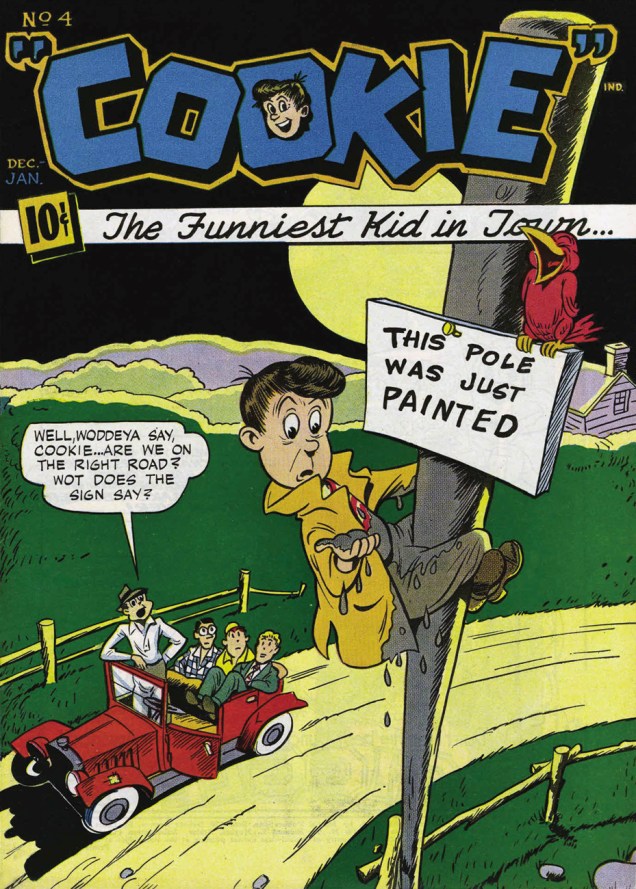
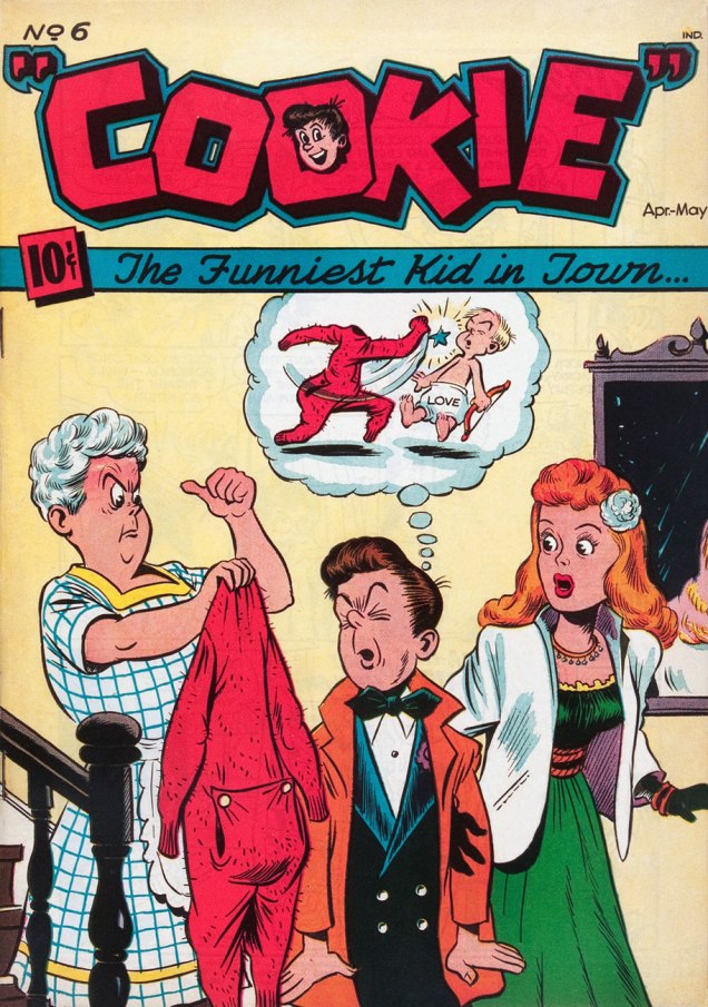
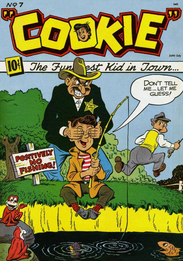
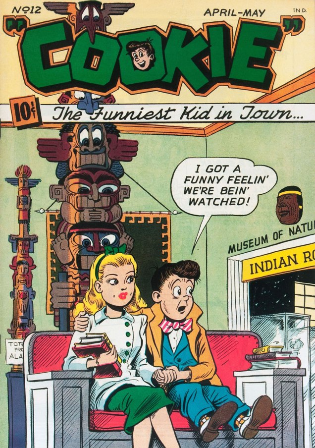
This is Cookie no. 4 (Dec. 1946-Jan. 1947, American Comics Group). Cover by Dan Gordon. The entertained birdie is a lovely touch.I’ve always loved that joke, even if it makes very little sense. Here’s where I first encountered it, through Wesley Morse‘s 1962 version.This is Cookie no. 5 (Feb.-Mar. 1947, American Comics Group). Cover by Dan Gordon. Incidentally, Cookie’s sweetheart is Angelpuss. With a name like that…« Aw, ma! » This is Cookie no. 6 (Apr.-May 1947, American Comics Group). Cover by Dan Gordon.This is Cookie no. 7 (June-July 1947, American Comics Group). Cover by Dan Gordon. « Well, I looked for support from the rest of my friends / For their vanishing trick they get ten out of ten. »This is Cookie no. 8 (Aug.-Sept. 1947, American Comics Group). Cover by Dan Gordon.This is Cookie no. 9 (Oct.-Nov. 1947, American Comics Group). Cover by Dan Gordon. Angelpuss is a singularly understanding lass, bless her heart.This is Cookie no. 12 (Apr.-May 1948, American Comics Group). Cover by Dan Gordon. Design-wise, this one’s a particular standout. The totem gets a real workout!This is Cookie no. 20 (Aug.-Sept. 1949, American Comics Group). Cover by Dan Gordon.
… and before you go, check out Gordon’s action-packed cover for Ha Ha Comics no. 66, which my partner ds featured one bright Tentacle Tuesday last year. « They say he can cook too! »