Hot Streak: Joe Kubert’s Son of Tomahawk

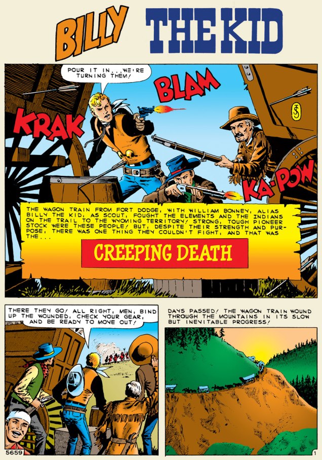
« Who are these men, Tomahawk? » « My Rangers! We fought against renegades… from Pennsylvania to Kentucky! When the country got too crowded, Moon Fawn and I moved out West… where a man has room to breathe! » — Tom Hawk sums up his change of station.

Tomahawk was created in 1947 by writer Joe Samachson (later co-creator, with Joe Certa, of J’onn J’onzz, Manhunter from Mars) and artist Edmund Good. The series was distinguished by its setting, the American Revolutionary War (1775-1783), and it appeared both as a back-up in Star Spangled Comics (until it switched to an all-bellicose format and became Star Spangled War Stories in 1952) and in World’s Finest (at first intermittently, from 1949, then steadily from 1953 to 1959). And Tomahawk had been spun off into his own book in 1950.

Inevitably, with the Silver Age and its superhero reascendancy, to the eventual detriment of all other genres, the historical adventure strip’s slow decline set in.

As Don Markstein put it:

« Toward the latter part of the ’50s, practically all DC comics ran aliens, monsters and other goofy sci-fi stuff on the covers, no matter how badly it clashed with the title’s subject matter — even war comics often sported dinosaurs in that position. And so, all through the late 1950s and early to mid ’60s, Tomahawk fought gigantic tree men, miraculously-surviving dinosaurs, mutated salamanders, and other menaces that seem somehow to have escaped the history books. There was even a giant gorilla among them, and putting a gorilla on the cover was also a contemporary trend at DC. »

It all comes down to the editor, and Tomahawk was long edited by Jack Schiff, who just adored that sort of (admittedly fun) claptrap, then by his associate Murray Boltinoff, who at least was more flexible.

To wit, with issue 116 (May-June 1968) came a change and a relative return to the feature’s roots. First, Neal Adams was brought in to provide covers, and the more outré aspects were phased out. With issue 119 (Nov.-Dec. 1968), the book’s final creative team was brought aboard: writer Robert Kanigher and illustrator Frank Thorne (1930-2021), eventual creator of Moonshine McJugs. Thorne replaced Fred Ray (1920-2001) who, while he wasn’t a Tomahawk originator, had been chronicling the mountain lion’s share of his exploits since 1947. He would draw a handful of short pieces for DC’s war books before leaving the comics field in the early 1970s, writing historical non-fiction and art directing and illustrating for publications Civil War Times Illustrated, American History Illustrated, True Frontier, The West and Yank (despite the title, not a porno mag).

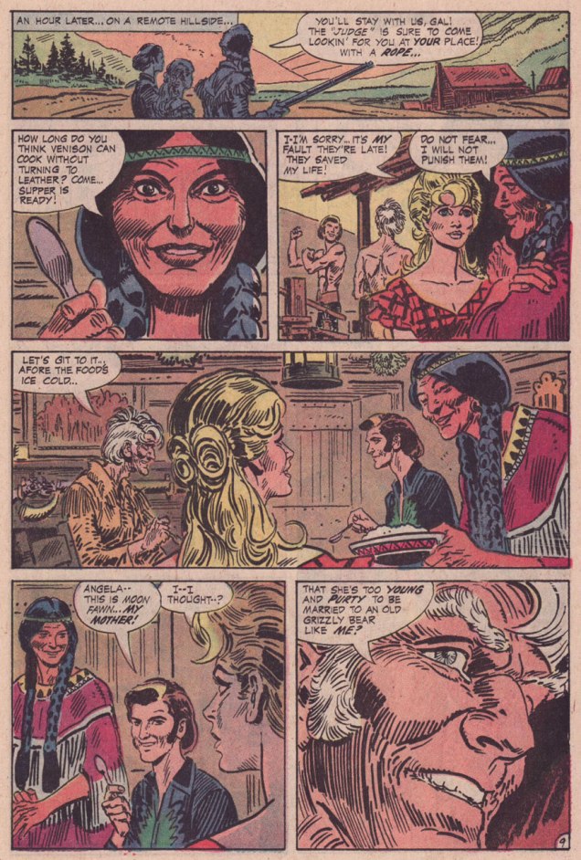
With the heart of the creative team in place, it was a change of editors that prompted Tomahawk’s final mutation, and arguably its most interesting: Joe Kubert took over the editorial reins, and the action was moved four decades or so forward in time. Tom ‘Tomahawk’ Hawk had settled down with a Native woman, Moon Fawn, sired a pair of sons, and was by then a lanky, crotchety old coot, but not quite helpless. His elder son Hawk was the protagonist, and they encountered frontier-style prejudice, greed, corruption, tribalism, paranoia… you guessed it: it was a ‘socially-relevant‘ comic, but hardly the cringe-fest that was the concurrent Green Lantern/Green Arrow. I daresay that Kubert and Kanigher’s respective politics were rather too complex for that.

Tomahawk131A
This is Tomahawk no. 131 (Nov.-Dec. 1970, DC). Inside: Hang Him High!, written by Robert Kanigher and illustrated by Frank Thorne. I like how nonplussed Hawk is at the prospect of doing the Brand New Tennessee Waltz..
Tomahawk132A
This is Tomahawk no. 132 (Jan.-Feb. 1971, DC). Inside: Small Eagle… Brother Hawk!, written by Robert Kanigher and illustrated by Frank Thorne.
Tomahawk133A
This is Tomahawk no. 133 (Mar.-Apr. 1971, DC). Inside: Scalp Hunter, written by Robert Kanigher and illustrated by Frank Thorne.
Tomahawk134A
This is Tomahawk no. 134 (May-June 1971, DC). Inside: The Rusty Ranger, written by Robert Kanigher and illustrated by Frank Thorne.
Tomahawk135A
This is Tomahawk no. 135 (July-Aug. 1971, DC). Inside: Death on Ghost Mountain!, written by Robert Kanigher and illustrated by Frank Thorne, and the powerful Spoilers, written by Jerry DeFuccio and illustrated by John Severin. This was my admittedly random introduction to the series.
Tomahawk136A
This is Tomahawk no. 136 (Sept.-Oct. 1971, DC). Inside: A Piece of Sky!, written by Robert Kanigher and illustrated by Frank Thorne, plus an extraordinary Firehair tale by Kubert… but then they all are.
Tomahawk137A
This is Tomahawk no. 137 (Nov.-Dec. 1971, DC). Inside: Night of the Knife!, written by Robert Kanigher and illustrated by Frank Thorne, plus a selection of fine reprints.
Tomahawk138A
This is Tomahawk no. 138 (Jan.-Feb. 1972, DC). Inside: Christmas, written by Robert Kanigher and illustrated by Frank Thorne, as well as an assortment of worthy reprints boasting artwork by Nick Cardy, Sam Glanzman, Norman Maurer and Mort Drucker.
Tomahawk139A
This is Tomahawk no. 138 (Mar.-Apr. 1972, DC). Inside: Death Council, written by Robert Kanigher and illustrated by Frank Thorne, plus a clutch of reprints illustrated by Fred Ray, Gil Kane, and none other than Frank Frazetta.
Tomahawk140A
This is Tomahawk no. 140 (May-June 1972). Inside: The Rescue!, written by Robert Kanigher and illustrated by Frank Thorne. Gaspar Saladino‘s brand new logo, a rare misfire, was unveiled just in time for the book’s cancellation.

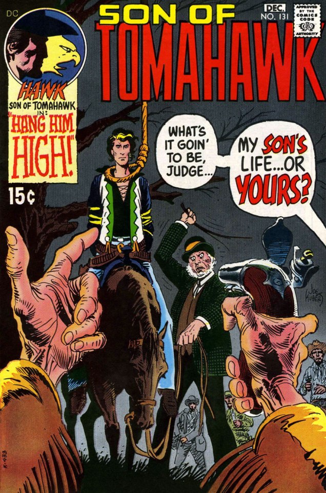
As for the interior art, I’d say it’s Frank Thorne’s finest work. The notorious Alexander Toth would of course disagreed, far preferring Thorne’s work when Thorne’s style bore a heavy… Toth influence (here’s an example from 1957.) For comparison, here’s a pair of interior pages from Tomahawk no. 131‘s Hang Him High!

ThorneTomahawk131_09

ThorneTomahawk131_12A
Thanks to their production manager, Jack Adler, DC had the finest, most nuanced colouring in the field in the late 60s and early 70s.

Toth would, in (final) conversation with The Comics Journal publisher Gary Groth, in 1996, froth forth:

« I repeatedly warned Frank: “For Christ’s sake, get the hell away from Kubert. He’s not doing you any good. His influence on you is negative, not positive, so get the hell away from him and stop aping his style and stop putting on all that shit that you lived without for years. You did nice, clean, hard-lined stuff, and it’s been detrimental to your work.” He confessed: “Yes, Joe Kubert and his style are hard to resist.” So, yes he had the influence, and he liked it. Well, good luck. »

DC attempted an update of the character back in 1998. It wasn’t *atrocious*, but basically a rehash of Jeremiah Johnson with a sheen of ‘Magical Native American‘ sprinkles.

-RG

Just Visiting: Daniel Pinkwater & Tony Auth’s ‘Norb’

« You know, I once took a ride in a Volkswagen convertible driven by Harvey Kurtzman, with fellow passengers Terry Gilliam and Robert Crumb. Had we been smacked by a garbage truck the history of humor and popular culture would have been slightly changed. Interestingly not one of us had the slightest interest in any of the other three. Except, I am pretty sure we all hated Kurtzman, but who didn’t? » — Daniel Pinkwater

This post was originally going to be an interview. Having belatedly discovered Norb (1989-1990), I got in touch with Daniel Pinkwater (who better to ask?), intending to pepper him with questions, but he was so very helpful, providing me with all the background material I could have desired, that his prediction that « … since I have nothing to add, you may not need to formulate any questions for me » … came to pass. And so I gladly yield the floor to the sterling Mr. Pinkwater.

Tony Auth was a brilliant artist. He had an important day job as editorial cartoonist for the Philadelphia Inquirer. I think it was his first job, which he held for decades, and he was a Pulitzer Prize winner. We talked about doing ‘something’ together for a couple of years. Tony wanted to do a daily/Sunday newspaper strip, so we did that. Every day we’d remind one another, ‘keep it stupid.’ The fact was, we had no idea how stupid a commercial strip needed to be.

Stroke of luck, Denny Allen, who was temporarily in a position of influence at King Features had approached me years before about doing a strip. We met the power elite at King Features. I won’t characterize them except to say that the concept of stupid did not elude them, nor would it have been likely to. We negotiated for, and received a substantial advance from King, covering two years. I understand this was unheard of in the highly competitive rat race with a great many submissions coming in every day from marginally talented cartoonists.

So we went to work. My part was utterly easy. I would write the dailies and the separately plotted Sunday strip every Saturday while watching Dr. Who. Tony was putting in long hours in addition to his job at the newspaper. The strip launched in something like 70 papers, and I was told this was a big launch and unusual for the times.

We started in the vacancy created when Bloom County ceased production. The response from readers consisted entirely of actual hate-mail, letters saying it was hoped we would die, crude drawings of tombstones and daggers dripping blood. The only piece of positive fan mail I remember came from Jules Feiffer. A few papers dropped the strip, some in response to outrage from readers for whom the comics page was their literature. The typical letter read, ‘I hate NORB, it makes me feel stupid.’ Fair enough, I thought.

I understood that as few as 10 negative letters were enough to spook a paper into dropping a feature. My wife did a bit of research and discovered that all new strips have it rough initially, but if one survives two years it becomes un-droppable, and it is the editorial staff who get the threatening letters. Interestingly, Tony, who was a fair-minded political cartoonist, and got abuse all the time, (he’d had his office trashed by the right and the left at different times over the same issue, for example), and didn’t mind it, regarded the comic strip as the product of his heart, and was hurt by the unfair criticism.

So, at the end of the first year, Tony, exhausted by working two full-time jobs, depressed by the evidence that nobody seemed to like the strip, unwilling, as I was, to follow the advice from the comics/humor expert at King Features, let me know that he was not having any fun. ‘So, shall we quit?’ I asked. Since he was carrying 90% of the weight, I didn’t feel it should be my call. King was delighted to kill the strip because that meant they wouldn’t have to pay us the second year’s advance, and apparently they thought that saving money was the same as making money.

Exactly a year after the strip stopped appearing the fan mail started to come in, ‘Where’s NORB?’ ‘NORB was my favorite comic.’

NorbDailies01A
A pair of dailies from the first week, whereupon we meet our protagonists and our protagonists meet.
NorbDailies02A
From week two. It’s lovely that Mr. Pinkwater opted to bring along a character from his Snarkout Boys novels (The Snarkout Boys and the Avocado of Death and The Snarkout Boys and the Baconburg Horror), Bentley Saunders Harrison Matthews, aka Rat Face aka Rat. She fits right in. That kind of freedom is among the foremost perks of owning your work.

NorbDailies03A

NorbDailies04A
A four-day sequence, to give you a better sense of the strip’s flow. I love how the alien armada is basically pixelated. Spoiler: They won’t get very far with their plan of conquest.
NorbCollectionRectoA
Front cover of Mu Press‘ collection of the Nord dailies, published in 1992. To quote the late SF luminary Vonda McIntyre in her INTROdadaDUCTION: « When [Mu Press] decided to reprint NORB, I jumped at the chance to write this essay. Only then did I discover that writing it didn’t mean I got to reacquaint myself with the Sunday strips… it meant I got to see the daily strips, which I didn’t even know about, for the first time. »
NorbDailies05A
Now and then, Pinkwater would drop out of the narrative, go into meta-textual mode and engage the critics in an entertainingly passive-aggressive fashion. I do prefer the plot-driven strips, however… as does Rat. « Problem, Norb-Baby. Humorous adventure with a touch of satire is out this year. I don’t know where to put you. » (07/13/1990)
NorbDailies06A
« You’ll pay for treating my employer like a baked ham, you evil person! ». Don’t worry, Norb’ll be okay: « Explain. Were you sliced like a radish or not? » « Oh, I was! But it was in the future. »
NorbDailies07A
Anything goes, in the most winning sense. The noble Norse warriors were soon to realize that at Trump’s, you simply can’t out-chump the boss.
NorbDailies08A
Norb is an exemplar of the narrative strip that doesn’t take itself seriously: while the story proper is intriguing, any individual fragment is quite entertaining on its own.
NorbSunday01A
Never having been reprinted, the Sunday strips are rare as hen’s teeth, and those who possess them presumably clipped them out of their local paper back in the day. Foresight! As is often the case with King Features continuity strips, Sundays and dailies feature separate storylines.
NorbSunday02A
Several years ago, Norb was featured as the Obscurity of the Day on the excellent Stripper’s Guide blog. There you’ll find a handful more of these gorgeously-coloured (aside from all their other evident virtues) Sundays, and more dirt about Norb.
NorbCollectionVersoA
Et pour conclure, Auth’s back cover illustration from the Norb collection.

« It’s pretty clear that you take the whole subject of comics and cartooning a lot more seriously than I do. » Guilty as charged. Thanks for your most kind coöperation, Mr. Pinkwater!

This post is dedicated to the memory of Mr. Tony Auth (1942 – 2014).

-RG

Will Eisner’s The Spirit at Kitchen Sink (pt. 5)

« … And so Hooten Landing remained unchanged through the years… a landmark and a memorial… a colonial world that had made only one or two concessions to the march of progress. » — From Ye Olde Spirit of ’76 (July 3, 1949)

Having reached the last half of Kitchen Sink’s chronological reprinting of the Post-WWII Spirit, we come at last to the end of our own chronicle. As stated earlier, facing an inexorable dwindling of Eisner’s involvement and investment in his creation due to other commitments and an understandable sagging of his stamina, the strip slowly entered its decline. Then as now, good help was hard to find, to the point where Eisner opted to wrap up the strip rather than let it peter out completely. This sober and courageous decision most certainly contributed in preserving the feature’s solid reputation to this day.

As we embark on the inarguably lesser half of the run, we encounter fewer standout covers, which is to be expected, given the creator’s diminished affection for the contents. Nevertheless, forty-four Will Eisner covers are bound to yield some genuine sparklers. Here, then, are my picks.

EisnerKS_Spirit45A
Kitchen Sink Press’ The Spirit no. 46 (July 1988) cover-features Satin, originally published on June 12, 1949. Also in this issue: the clever and entertaining The Prediction (June 19, 1949); The Elevator (June 26, 1949); and Ye Olde Spirit of ’76 (July 3, 1949). Cover by Eisner, with colours by Ray Fehrenbach. Obviously, we’re still in classic territory.
EisnerKS_Spirit46A
This is The Spirit no. 46 (Aug. 1988), which, over six instalments, « takes The Spirit to the Peligros, a fictional group of South Pacific islands, where he interacts with an entirely new set of characters, cultures and adventures. » The issue opens with Lilly Lotus (July 10, 1949); then follows with Sally of the Islands (July 17, 1949); The Masked Man (July 24, 1949); and The Ball Game (July 31, 1949), introducing latter-day sidekick and comic foil Sammy. Cover colours by Ray Fehrenbach.
EisnerKS_Spirit47A
This is The Spirit no. 47 (Sept. 1988), which wraps up the masked man’s Pacific Island with the cover-featured Matua (Aug. 7, 1949), followed naturally by The Return (Aug. 14, 1949); then it’s back to Central City business with The Candidate (Aug. 21, 1949) and White Cloud (Aug. 28, 1949). Cover colours by Ray Fehrenbach.
EisnerKS_Spirit49A
This is The Spirit no. 49 (Nov. 1988), presenting Crime (Oct. 2, 1949); Death of Autumn Mews (Oct. 9, 1949) partly a retelling of the former Denny Colt’s origin, and boasting a true-blue classic splash pageThe Curse (Oct. 16, 1949); and Fox at Bay (Oct. 23, 1949). Cover colours by Ray Fehrenbach. Incidentally, The Spirit was the 1988 Harvey Awards laureate in the category of “Best Reprint Project”.
EisnerKS_Spirit50A
This is The Spirit no. 50 (Dec. 1988). Gathered therein are the Hallowe’en tale of Elect Miss Rhinemaiden of 1950 (Oct. 30, 1949), featuring the return of the sorcerous Hazel P. Macbeth; The eerie The Inner Voice (Nov. 6, 1949); Surgery… (Nov. 13, 1949); and The Thanksgiving Spirit (Nov. 20, 1949). And yes, The Spirit spends the entire issue on crutches. Eisner was ever the innovator! Cover colours by Ray Fehrenbach.
EisnerKS_Spirit52A
This is The Spirit no. 52 (Feb. 1989), and it cover-features the classic Bring in Sand Saref  (Jan. 15, 1950); also in this issue: The Christmas Spirit (Dec. 25, 1949); Fan Mail (Jan. 1, 1950); and part one of the cover story, Sand Saref (Jan. 8, 1950); this cover bears some outstanding colour work by Mr. Fehrenbach, if I may say so.

Some background about the classic Sand Saref two-parter, from Tom HeintjesStage Settings column:

« The final two stories form one longer tale, and they’ve earned a place in comics history. Eisner’s work and film noir have been mentioned in the same breath for decades, and you hold in your hands one of the best reasons why. »

« The story’s history is unorthodox. Sand Saref and Bring in Sand Saref had their origins in Eisner’s shop, which had been producing various comic books and pieces of commercial art with growing frequency. The two stories were originally done as a single 11-page feature, but it didn’t star The Spirit. The lead character was John Law, a character Eisner intended to launch independently of The Spirit feature.

When the John Law project was shelved due to the often poor newsstand distribution of many comic books, Eisner later saw an opportunity, and seized it by breaking the 11-page John Law feature into a two-part Spirit story. Astute readers are now saying: ‘But Spirit stories are seven pages long, requiring fourteen pages of art.‘ Well, there are no flies on Will Eisner. He created the first three pages of ‘Sand Saref’ to bring up the page count.

Eisner said breaking the John Law story into two halves, eliminating all traces of the intended hero, and inking in the faces of The Spirit’s cast of characters wasn’t simple. “The characters were different people, so considerable dialogue had to be rewritten,” he said. “John Law was a policeman and The Spirit wasn’t. Merely because they both fought on the side of law and order didn’t make them the same character.” In fact, Eisner has Sand Saref tell The Spirit ‘you’re a cop’ in the climax of the 14-page story. »

EisnerKS_Spirit66A
This is The Spirit no. 66 (Apr. 1990), and the issue reprints Future Death (Jan. 21, 1951); The Meanest Man in the World (Jan. 28, 1951); the shadowy, ultra-violent Showdown (Feb. 4, 1951); and its cover-featured conclusion, The Octopus Is Back (Feb. 11, 1951). Cover hues by none other than Joe Matt!
EisnerKS_Spirit69A
The Spirit no. 69 (July 1990) reprints Time Bomb (Apr. 15, 1951); Hobart (April 22, 1951); Help Wanted (April 29, 1951); and cover-featured The Facts (May 6, 1951); Ray Fehrenbach is back on colours.
EisnerKS_Spirit70A
The Spirit no. 70 (Aug. 1990) reprints The Hero (May 13, 1951); The 7th Husband (May 20, 1951); King Wang (May 27, 1951); and The Thing in the Jungle (June 3, 1951); Eisner’s cover illustration mixes elements of the second and fourth stories, and it is ably coloured by Ray Fehrenbach, comme d’habitude.
EisnerKS_Spirit86A
This is The Spirit no. 85 (Nov. 1991), featuring The Ballad of Greenly Sleeve (July 6, 1952); Matt Slugg (July 13, 1952); Marry the Spirit (July 20, 1952) and of course, the sadly tantalizing cul-de-sac that was Jules Feiffer and Wally Wood‘s Outer Space (July 27, 1952). Cover by Eisner and colours by Fehrenbach.

A word or two about The Outer Space Spirit, as it’s come to be called: Eisner, looking for a worthy successor to bequeath the strip to, found young Wally Wood. Talented as he was, Wood’s tragic character flaws were already well established: unlike Eisner, he couldn’t pace himself and he couldn’t stay the course, two qualities essential to the steady production of a comic strip. But for the couple of weeks before Wood started missing deadlines, such lush, interstellar beauty! Feast your peepers here.

CatchUpEisnerAdA
Finally, as a bonus: detail from a Kitchen Sink house ad devoted to the publisher’s more-than-fine assortment of Eisnerania; it first appeared on the back cover of The Spirit no. 45 (July, 1988).

Well, that’s it! Thanks for tagging along on Will Eisner and his most famous creation’s tireless peregrinations.

If you’ve missed the earlier entries in the series (punctuality is not one of your strong suits, is it?), all is not lost. In fact, it’s all handily archived within easy reach :

… or if single-clicking is more your speed (takes all kinds!), there’s always our general category, That’s THE SPIRIT!, which will bring up everything at once… but in chronologically inverse order.

-RG

Deep in the Soup With Rick Griffin

« If you’re having a bad day, catch a wave. » — Frosty Hesson

How do you cool down in a heatwave? In this household, when the temperature soars and drags the humidity along, we reach for a soothing surfing movie, preferably one by peerless surf auteur Bruce Brown* (1937-2017). Last week, it was his 1959 opus, Surf Crazy, in which a group of SoCal surfers venture down to unsurfed Mexico, which in turn called to mind “Mexico“, an early ’70s underground two-pager recounting a similar sojourn.

Which, this nominally being a comics blog, leads us to the one and only artiste embodying and straddling both the underground cartoonist’s and surfer’s ethos, Rick Griffin!

SurferToonsA
An early Griffin collection, Surfer Toons (1964, John Severson), featuring his early creation, Murphy, likely inspiration for notorious jewel thief Murph the Surf‘s sobriquet.
GriffinBioA
A bio of  the young surfer-cartoonist from The Surfer vol. 3 no.3 (Aug.-Sept. 1962). The photo confirms that his Murphy strip was autobiographical.
GriffinFilmTruckA
« In 1964, a serious car accident left Rick unable to work for several months. Later that year, Surfer started a new series titled The Adventures of Griffin and Stoner. They were make-believe surf trips that Ron Stoner, a famous surf photographer, and Griffin were supposed to have taken around the world. » Stoner’s real-life adventures, however, were not so happy.
GriffinLaPlayaA
In this mid-to-late-60s illustration, we witness early signs of Griffin’s mature, more assured line. A simplified version of this piece would appear in The Surfer‘s March, 1972 issue.

MysticEyes01A

MysticEyes02A
Griffin’s tour-de-force adaptation of Them’s Mystic Eyes appeared in an issue of The Surfer in 1970. Witness how Griffin’s depiction of Murphy has evolved over the decade. The fancy helmet is a Hopi Indian ceremonial mask, a frequent artifact and motif in the artist’s subsequent œuvre. Weedy song, imho — and yet, meaning is where you find it.
PacificVibrationsA
Also from 1970: Griffin created this piece for his patron John Severson‘s surf documentary Pacific Vibrations, (in which he also appeared!) and it provides a fine example of Griffin’s matchless lettering**. And there’s that Hopi mask again. Though it was quite a popular poster in the 1970s, If you ask me, though, accomplished as it is, it utterly fails to evoke surfing.
TalesTubeWhiteBorderA
Tales From the Tube, as it originally appeared in 1972, inserted into an issue of Surfer Magazine (Vol. 12 no. 6); some copies exist separately, however. Also to be found within its pages: Roberts Crumb and Williams, Steve Clay Wilson, Bill Odgen, Glen Chase and Jim Evans.
GriffinTFTT_A
TFTT was later reissued (now with a price) in the regular comix format by The Print Mint. As you can see, Griffin reimagined and re-separated his colours. Which version do *you* prefer?

Mexico01A

Mexico02A
Visual splendour, not coherence, was always Griffin’s stock-in-trade. And why not? This travelogue premiered in Tales From the Tube.
5SummerStoriesA
More poster (and soundtrack) artwork for surfing documentaries, this time 1972’s Five Summer Stories and its 1976 sequel, Five Summer Stories Plus Four, directed by Greg MacGillivray, a prolific, award-winning director and cinematographer to this day.
TFTTPosterA
… another Tales From the Tube, another Surf doc affiche from ’76. « This film and the other surf films for which Griffin has done posters are not usually shown on the regular movie circuits. Their soundtracks are usually composed of rock music of various forms – soft to hard – with a few breaks for narration. The surfing scene throughout the world has grown large enough to support the production of many films each year. »
CowabungaStickerA
As you can see, Murphy abides. A 1993 sticker, with instructions.

-RG

*I’ll go even further: for me, it pretty much has to be Bruce Brown. His easy charm and wit, not to mention his untrained-yet-superb set of filmmaking skills leave other surfing cinéastes floundering in his wake. From what I’ve seen over the years, their work either seems too dry (ha!) or overdone and overeager. I’m still keeping an eye on the horizon, nevertheless. The relative unavailability of quality prints for most of these films is a hefty obstacle, while their soundtracks are far, far easier to find (e.g. Gone With the Wave, The Fantastic Plastic Machine…) 

**At this stage [1969], Griffin’s lettering almost ceased to be functional as legible typography. In fact, in even earlier work, he jokingly incorporated meaningless calligraphy into his posters. Rick pioneered and carried to an extreme in the 1960’s this disregard for the legibility of lettering, creating totally abstract forms the resemble letters. His particular style influenced and encouraged artists locally and throughout the world to reconsider all previous limitations that they were placing on stylized lettering and the ways that it could be used with other graphic forms.” From Gordon McLelland‘s monograph, Rick Griffin (1980, Perigee).

Treasured Stories: “Creeping Death” (1960)

« You can’t wake a person who is pretending to be asleep. » — Navajo saying (attributed)

I’ve written before of my appreciation of Joe Gill‘s long-running yet consistent ‘good guy with an edge‘ characterization of Billy Bonney, but I had stuck to the book’s exteriors, namely Warren Sattler’s watercolour covers from the final stage of the series’ original run. I’ve also — twice! (first here, then there) drawn attention to John Severin (1921-2012) and his colossal powers as a cover artist. Today, at long last, we dare to peer inside.

Some may wonder at the up-to-date slickness of our current selection. Bear with me. Sure, it’s old, sure, it’s obscure, and the original comic book it saw print in is on the pricey side… but it’s work that’s found some resolute champions in the intervening sixty years.

After the Charlton comics line made the switch to a mostly-reprints mode (circa 1977-78), executive editor (and cartoonist) George Wildman, possibly nudged along by his colleague Bill Pearson, endeavoured to harvest some dusty gems from the vast archives at his disposal. In this case, six consecutive issues (nos. 124-129) of the long-running Billy the Kid were aimed squarely at the discerning fans with a bold ‘All Severin Art‘ label.

Fast forward to just a couple of years ago. As the nefarious, multifarious Mort Todd* tells it: « I had the extreme honor of working with John for many years as a writer, penciller and editor. When comics creator Bill Black told me he had a complete run of John’s work on Billy the Kid in the form of Charlton’s original photostats, we decided to recolor the work and release it in two volumes. Since the original artwork is lost to history, these photostats are the closest things to the originals to reproduce from. »

When I approached him, Mr. Todd most graciously granted me permission to showcase an excerpt from his restoration of Messrs Gill and Severin’s efforts. If you enjoy this one, do check out morttodd.com for more goodies!

CreepingDeath01ACreepingDeath02ACreepingDeath03ACreepingDeath04A

CreepingDeath05A
Why this particular story? Doesn’t it strike you as ever-so-slightly timely? We all could use a happy ending, though, in these times of contagion and racial strife.
BillytheKid20A
And here’s the original comic book in which Creeping Death appeared, namely Billy the Kid no. 20 (Jan. 1960, Charlton). Your basic “collage of interior panels” cover. Then again, with John Severin, you’re spoiled for choice… and you do get your dime’s worth.
PAMBillyOrigin01A
Not to be confused with the historical William Bonney, Charlton’s Billy was the legendary bad boy’s first cousin, and he aimed to redress the damage done to the family name by its all-too-infamous black sheep. Read it here! Written by Joe Gill, with art by Pete ‘PAM’ Morisi, this tale appeared in Billy the Kid no. 15 (Feb. 1959, Charlton).

You may have noticed that this Billy the Kid fella displays some awfully progressive attitudes for 1959… and, some might say, even for today. And if you surmised that the story’s writer, Joe Gill, was a card-carrying liberal, you’d be way off the mark. He was, after all, Steve Ditko‘s favourite collaborator**. Gill was, instead, a bonafide conservative, fair-minded, intellectually honest, prudent, sagacious. It would appear that with time and shifting meanings and mores, this once-thriving breed has been overwhelmed by today’s  reactionaries, who arguably went so far as to usurp and absorb its very name.

CamelsMarionAdA
An R.J. Reynolds ad from the back cover of Coronet no. 177 (July, 1951). Put that in your T-Zone and smoke it!

By way of contrast, and speaking of cowboys… Marion Morrison*** (1907-79), better known as “Popular, handsome Hollywood Star John Wayne“, despite his renown as a so-called Conservative Icon, was no conservative… he was just another reactionary. I mean, just consider *his* stance towards African-Americans (« I believe in white supremacy until the blacks are educated to a point of responsibility. I don’t believe in giving authority and  positions of leadership and judgment to irresponsible people. ») or Native Americans

Meanwhile, Gill’s Billy the Kid, though thoroughly adept at quick marksmanship and fisticuffs, always sought to defuse conflict and avoid bloodshed through wits and compassion. His idea of paradise (just like his real-life cousin, come to think of it) was to head South of the border into México and hang loose among his amigos, who good-naturedly called him El Chivito.

-RG

*whose name basically means “Death Death” in French and German (albeit with an extra D); how cool is that?

**The comic book story/script writer? It doesn’t matter who follows the first. That first choice is Joe Gill.” — Mr. Ditko, from his preface to Steve Ditko’s 160-page Package no.3 (1999).

***And the likely inspiration for Shel Silverstein‘s story-song A Boy Named Sue, (popularized by Johnny Cash)…. or was it rather Jean Shepherd?

More Bob White, Lost Archie Artist

« That’s the last number, Lollipop! Time for me to go! » — Archie has to go mop the floor with Reggie

Well, I’ve already stated my case for neglected Archie artist Bob White (1928-2005), but persistent reader interest has (ever so gently) forced my hand in the matter. You crave more, and who am I to deny such a reasonable request? Besides, these suckers are rather thin on the ground.

Comics scholar Bart Beaty‘s experience appears to match mine in this regard. He notes, in Twelve-Cent Archie, his compelling study of the period, that « … high-grade copies of most Archie comics from this period do not seem to exist on the market. » And I heartily agree with his assessment that « much more available are copies that have been treated in the ways they were intended – copies that show the well-worn tattering of having been read and reread repeatedly by children. » The selfsame quandary arises with other loved-to-rags series such as DC’s Sugar and Spike, whose issues all-too-frequently turn up sans their paper dolls feature… and a story page or two on the reverse side.

Here, then, is my second batch of Bob White covers from his prime period, which, not so coincidentally, arguably matches the prime of Archie comics.

Archie124A
This is Archie no. 124 ((Dec. 1961, Archie); ah, that blessed period when the Archie line featured some truly bizarre situations. I’m afraid my picks will reflect this little bias of mine.
BettyVeronicaSummer8A
This is Archie Giant Series Magazine no. 8 (Sept. 1960, Archie)… only a few days until the summer solstice!
PalsNGals19A
This is Archie Giant Series Magazine no. 19 (Winter 1961-62, Archie).
Pep152A
This is Pep no. 152 (Jan. 1962, Archie), an absurdist upgrade of the corny old ‘multitasking teenager’ joke. I love the three-way visual match between Archie’s bowtie, Ronnie’s dress and the Martian’s peepers. Also, nicely-detailed TV shootout.
Pep155A
This is Pep no. 155 (June 1962, Archie), notably risqué in its implications. This Cat Person seems far more… assertive than her kin Simone Simon had been a couple of decades prior. Among the distinguishing  hallmarks of White’s artwork is his evident enjoyment and finesse when it came to drawing hands. Digit delineation dexterity is a rare gift, as any artist will attest.
Laugh143A
This is Laugh no. 143 (Feb. 1963, Archie). Aw, Reggie. It’s actually a rather flattering effigy… Betty would be delighted to take it off your hands!
Pep161A
This is Pep no. 161 (Mar. 1963, Archie), an exemplary use of the best-ever Archie line’s cover grid: it allowed for nicely-open vertical scenes, and the visuals had ample room to breathe. Bob White and Samm Schwartz took fullest advantage of the format.
Pep170A
This is Pep no. 170 (May 1964, Archie); an excellent composition, with just the right amount of detail.
B&VSummerFun28A
This is Archie Giant Series Magazine no. 28 (Sept. 1964, Archie); I’d keep my eyes on Betty instead, Archie: aside from being the more athletic of your girls, she’s also the one with the bat.
Pep173A
This is Pep no. 173 (Sept. 1964, Archie); given that Ronnie’s wearing a mouthpiece, is it off-base to assume that the telltale scarlet traces on Archie’s cheek were left by the fish on his right? The lip colours even match! 😉

-RG

Behind the Scenes, Back in the Day

« Television is like the invention of indoor plumbing. It didn’t change people’s habits. It just kept them inside the house. » — Alfred Hitchcock

A little while back, I chanced upon a handsome, lavishly-illustrated brochure (undated, but from 1976 or so) promoting the services of a Montréal television production company, which leads into this little history lesson.

JPL Productions Inc. was a subsidiary of Télé-Métropole*, Canada’s first private French-language television network. In 1965, France-Film president and Télé-Métropole founder Joseph-Alexandre DeSève sagely ensconced political cartoonist, illustrator, art director, television director, watercolourist… and even co-star of a timeless, Oscar-winning Norman McLaren short film, Jean-Paul Ladouceur (1921-1992) at the head of the newly-constituted ad production arm of his television operation. This was an era in which you might actually find bonafide creatives in positions of influence, before the age of financial ‘diversification’ and conglomerates** unleashed its full toxic bloom and creatives were henceforth sidelined and supplanted by bean counters.

Over time, JPL expanded the scope and range of its activities. I hardly need to go into details: that is precisely this publication’s purpose.

JPLFrontispiceA
The front cover. All artwork (uncredited… for shame!) by Bernard Groz.
JPLPrésenteA
JPL himself provides the introduction: « To tell you about us, to speak of our people, our accomplishments, our equipment, we told ourselves: “it can’t be done without images”. And so, this illustrated brochure. JPL Productions Inc. is a subsidiary of Télé-Métropole Inc., the largest private enterprise television station in America. We produce advertisements, documentaries, industrial films, feature films, slideshows, soundtracks, printed matter, soundtracks, etc.. We hope that the following pages will give you a sense of the scope of our business. Our illustrator could not include each member of our personnel in his drawings. He had to leave out 250 of them. When we speak of ourselves, we say that we are producers, designers, publicists, advertisers, creators, communicators, propagandists, persuaders, as well as a whole range of ‘-lists’ and ‘-ers’. Without doubt and without false pride we are right. But we… prefer to think of ourselves, first and foremost as makers of amazement. » Phew!

JPLStudioG_A

JPLStudioHA
An elephant running a vacuum cleaner? I’d like to see that commercial.

JPLMobile1AJPLMobile2A

JPLStudiosSonA
Four Sound Studios. Here and there, Groz threw in recognizable figures. In this one, the pianist (and the bandleader) are the talented Georges Tremblay, who composed and performed many a memorable (and often surprisingly elaborate) theme for Télé-Métropole’s émissions. To wit, the network released an LP’s worth of them, Les thèmes du 10. Here’s one, La couleur du temps, written for… the weather bulletin.
JPLScéniqueA
Stage Services: workshops, studios, salons.
CapitaineBonhommeA
Front cover of Le Capitaine Bonhomme au Mexique: Dynamite et… Tequila (1973, Hatier/Mondia); scripted by the Capitaine himself, ace raconteur Michel Noël (1922-1993) and illustrated by Bernard Groz. How much of Renaissance man was the Capitaine? Here’s his astounding biography (in French).
CapitaineMexique01A
Dynamite et Tequila‘s opening page. The beloved Capitaine Bonhomme, a Télé-Métropole fixture introduced in 1962, would follow his creator throughout his life. He was yarn-spinner in the grand old Münchausen / McBragg tradition, and his wide-ranging popularity in Québec has endured largely because he never patronized his audience and, as with much of the richest grade of humour, his wooly accounts were sprinkled with witticisms and allusions whose meaning(s) suited both juvenile and adult sensibilities. Here he is during a 1988 talk show appearance.

-RG

*« Present at the February 19, 1961 inauguration were Montréal’s Archbishop, Paul-Émile Léger, the city’s mayor, Jean Drapeau, and the Prime Minister of Québec, Jean Lesage, who declared that television has « great power, and therefore great responsibility. » Chew on that, Stan Lee fans!

**After mobster and parking lot maven Emmanuel “Manny” Kimmel inherited the assets of his partner Abner “Longie” Zwillman (“the Al Capone of New Jersey“) upon the latter’s death, he continued his plans for legitimization and diversification. After The Kinney Parking Corporation acquired a chain of funeral homes, Kimmel soon entrusted the business dealings to a canny young undertaker named Steve Ross. « Ross diversified into businesses that had no visible connection to the already odd marriage of caskets and parking spaces. He bought office cleaning services, DC Comics (publishers of Superman), MAD Magazine, and a talent agency. In 1969 Ross made a daring bid for Warner Brothers, the film studio and record company. » « Kinney acquired Warner for $400 million. » Quotes from William Poundstone‘s captivating Fortune’s Formula (2005).

And that, children, is how The Mob bought DC Comics. I always chuckle when fanboys claim, without a shred of evidence, that Charlton Comics (owned by the Santangelo family) were ‘mobbed up’. I guess to some people, it’s only the Mob if it’s eye-talian.

Strange Sports, Weird Kids and More: Don Maitz at Warren

« Naturally there was quite a ruckus when everyone found out who… and what Rah was. But there wasn’t any rules concernin’ the eligibility of a mummy to play ball, so the Jets’ victory stood… » — from Roger McKenzie’s The Return of Rah

Carrying on with our irregular survey of significant Warren cover artists whose names and reputations are somewhat less inextricably linked with the publisher than the usual suspects, and thereby sometimes overlooked. Fresh out of art school, and on his way to a truly remarkable, award-peppered career, Don Maitz (born 1953, Plainville, CT) graced a brace of Warren Mags with some of his earliest professional imaginings, which I’ve gathered here.

MaitzCreepy93A
A lot of people apparently don’t much care for Warren’s late 70s sports-themed issues, but I like ’em, given that they feature a trove of gorgeous Carmine Infantino artwork, when he was experimentally-paired with a dizzying assortment of inkers (in this issue, John Severin, Alfredo Alcala, Alex Niño… and, well, Dick Giordano). At their best, the sports issues allowed him to revisit with more latitude (though less ingenuity, I’d argue) the Strange Sports Stories format he’d initiated in 1962 with writer Gardner Fox and editor Julius Schwartz. This is Creepy no. 93 (Nov. 1977, Warren). Senior editor Louise Simonson* (née Mary Louise Alexander) was commendably trying to spice up what had become a stale formula, but it turned out that there just wasn’t sufficient overlap between Warren readers and sports fans. A more staggered release programme might have cushioned the blow: as it was, Warren readers got two sports-centric issues in November 1976, then another pair in November 1977.
MaitzEerie88A
I hope that headline was meant ironically, because (spoiler alert), the humans are the monsters and the aliens… aren’t, in Bill Mohalley and Nicola Cuti’s Deathball 2100 A.D., a sordid, derivative (Rollerball + Death Race 2000, geez) and heavy-handed tale made uglier by Dick Giordano’s usual stiff, graceless visuals. Nice cover, though. This is Eerie no. 88 (Nov. 1977, Warren).
MaitzCreepy94A
Well, now! This marvellous vision, marking quite a tonal break from the usual Warren diet, corresponds to no particular tale within this ‘bad seed’ issue, yet teems and brims with story, with nary malice… but so much wonder. A bold move on the part of editors Simonson and Nick Cuti. This is Creepy no. 94 (Jan. 1978, Warren).
MaitzCreepy95A
This handsome simian trio deserves better than their association with Cary Bates and Esteban Maroto‘s rather juvenile, Lord Greystoke-slandering Murder on the Vine. You’ve done better, boys. This is Creepy no. 95 (Feb. 1978, Warren), a cover bearing more than a mere whiff of Frazetta.
MaitzEerie91A
The probability of violent demise aside, isn’t this just the most unctuously idyllic autumnal scene? This is Eerie no. 91 (March 1978, Warren).
MaitzEerie93A
Though this one is to my mind the lesser entry in the parade, I must concede that it’s presented in exemplary fashion: the colour choices, the placement of the type, even the integration of that unholy blight, the bar code. This is Eerie no. 93 (June 1978, Warren).
MaitzEerie94A
Young master Maitz’s final Warren cover (chronologically speaking): this is Eerie no. 94 (Aug. 1978, Warren), illustrating Nicola Cuti and Leo Durañona‘s Honor and Blood. « Can the child born out of an unholy union between man and vampire grow up to lead a ‘normal’ life? You can’t escape the sins of your parents. Their errors ripple faintly down the generations! » “Er, what’s with the deer head?”, you may ask. The answer, from the story: « The bride was never to see the weak, corrupted face of her human husband. She wedded the Elk, symbol of the Beast. »
BlackGoatA
« A lowly elk, “symbol of the Beast”? Maaa, you’re just making shit up, Nick. » The feeling on that point seems, in fact, quite unanimous.
MaitzUnsafeFootingORIG_A
And here’s a privileged peek at Mr. Maitz’s Creepy 94 cover painting original (Mixed media on Masonite, 24” x 18”), which, as it turns out, is entitled Unsafe Footing, which makes me love it even more.
CapnMorgA
As a rum enthusiast, I am naturally aware of the Captain Morgan brand… whose mascot (circa 1982) is, as it happens, Maitz’s most familiar creation… to date. Prost!

-RG

*Yes, that Louise Simonson (Jones à l’époque)

Phew, That Was Close!

« Death smiles at us all, all a man can do is smile back. » — Marcus Aurelius

The other day, I chanced upon a Rick Geary piece about tangos with the Angel of death, which returned my mind to a time, when I was but six years of age, and that my parents had gone holidaying, leaving me in the care of some old friends. At their home, I recall perusing some back issues of that evergreen Reader’s Digest (the French-Canadian edition, called Sélection du Reader’s Digest), wherein I encountered some memorable articles, including one about the miraculous survival of people who tumbled from great heights*, unencumbered with parachutes, and another that grimly recounted the calamitous landslide that one night engulfed a village, Saint-Jean-Vianney, just a few kilometres from my hometown.

Ah, but human memory is notoriously fallible and self-deceiving. So I deemed it prudent to inquire whether the events were truly as recollected. A quick call to my folks confirmed that yes, they did toddle off to Europe for three weeks in November of that year (I think my parents are delighted when I quiz them about such matters). The landslide took place in May, so that fits too.

As the close shave lends itself well to comics, I’ve gathered a potpourri of short pieces on the topic. Tighten your seatbelts, we’re in for a rough ride!

Salt01A

Salt02A
A presumably factual two-pager from New Heroic Comics no. 70 (Jan. 1952, Famous Funnies), featuring artwork by no less an eminence than the great Harry Peter (according to Ger Apeldoorn, which is good enough for me). The whole ‘salt of the earth’ thing rings pretty hokey, but one has to appreciate that this account of selfless heroism wasn’t whitewashed.

GearyNearDeath01AGearyNearDeath02AGearyNearDeath03A

GearyNearDeath04A
This post’s springboard, originally published in Dark Horse Presents no. 82 (Feb. 1994, Dark Horse). From Heavy Metal to National Lampoon, with High Times and The American Bystander in between,  I’ve yet to encounter a publication wherein Mr. Geary’s work failed to rise to the very top with its patented palette of fanciful perspective, sunny understatement and psychological verisimilitude. 
GirlFlewA
An airborne entry from Gordon Johnston‘s Ripley’s Believe It or Not-style syndicated strip ‘It Happened in Canada‘ (1967-81). However, the Wikipedia listing of historical tornadoes in Canada fails to turn up one such whirlwind in 1823. Perhaps it happened in Kansas instead.

Icebox01A

Icebox02A
Pesty baby brother saves the day! Another entry from New Heroic Comics no. 70 (Jan. 1952, Famous Funnies), artist unknown. Astoundingly, a little research (I wouldn’t want to pry further) indicates that a Donald P. Kiselyk, now 73, still resides in New Jersey. Doing the math, he would have been born in 1947, which fits perfectly). I wonder whether he recollects his hour of four-colour glory…
BuriedAliveA
Another It Happened in Canada entry. Looks legit, too, though it seems Johnston didn’t nail the spelling: the resilient gent’s moniker is Myllyla. According to Wikipedia, « At 9:57 in the morning, an avalanche of snow buried the Leduc Camp in British Columbia, killing 27 copper miners working for the Newmont Mining Corporation workers and destroying several buildings. Another 42 of the 68 people buried were rescued on the same day, while a carpenter, Einar Myllyla, was saved three days later from the ruins of a collapsed building. “To their everlasting credit”, author Jay Robert Nash would write later, “rescuers refused to abandon their search until every man in the camp had been accounted for. »
FarSideBrushA
Obviously, I couldn’t leave out this Gary Larson classic.

Keep your arms and legs in the vehicle, don’t tease the wild animals, wear your life jacket, look to both sides before crossing the road, and don’t forget to floss. Oh, and call your mother more often; she misses you.

-RG

*the fellow whose tale stayed with me was most likely Lt. I.M. Chisov, « … a Russian airman whose Ilyushin IL-4 bomber was attacked by German fighters in January of 1942. Falling nearly 22,000 feet, he hit the edge of a snow-covered ravine and rolled to the bottom. He was badly hurt but survived. »

Some content on this page was disabled on June 30, 2022 as a result of a DMCA takedown notice from Gary Larson. You can learn more about the DMCA here:

https://wordpress.com/support/copyright-and-the-dmca/

Recalling Tomorrow With Dean Motter

« Mister X has always puzzled me. I’ve never been exactly certain where he came from. It seems like he has always been present — maybe not skulking through the perplexing shadows of the city so much as through some kind of collective unconsciousness. » — Dean Motter (1986)

On this day, back in 1953, the celebrated art director, graphic designer, writer-illustrator and cartoonist Dean Motter was born in Berea, Ohio, not far from Cleveland.

Over the course of his illustrious career, Motter has flitted in and out of comics, often in tandem with a rather remarkable array of collaborators, among them Jaime Hernandez, Paul Rivoche, Seth, Ty Templeton and Michael Lark… but just as frequently on his own.

As you’ll see, though he is quite adept in a vast range of media and techniques, nearly all of his mature work is lovingly filtered through his abiding interest in Will Eisner’s The Spirit, film noir, Art Deco, German Expressionism, with, I’d say, a soupçon of Soviet Propaganda art… resulting in a surprisingly cogent and coherent retro-futurist vision. The future as seen from the past, in short. And that’s just the visuals.

Andromeda01A
Ah, youthful indiscretions! Motter’s cover for the inaugural issue of the tabloid version of Andromeda (1974, Media Five; Bill Paul, editor). Herein, Motter wears some rather less highfalutin’ influences on his sleeve, notably those of Mssrs. Brunner, Kane and Steranko. « Focus Fire ~ white Eclipse The Aurora Anti-Cosmos Splitting Heavens Apocalypse. »… concluded Young Master Motter’s epic poem, Celestial Circuit Cirkus.
MotterMegatronLP_A
An early appearance from (a yet-unnamed?) Mister X, snuck its way onto a Canadian reissue of Patrick Cowley‘s Megatron Man (1982, Attic Records). And here is a later, rather dodgy recycling of his artwork that must give Dean some choice nightmares.
MisterX06A
A nice change of pace to showcase his range, this is Motter’s cover for Mister X no. 6 (Dec. 1985, Vortex). This splendid logo, débuting here, would thankfully return from time to time.
MotterMrX08A
This is Mister X no. 8 (Oct. 1986, Vortex); In its subtlety, this cover stretched the limits of what was technically possible in comics printing at the time, in terms of saturation and contrast.
ShatteredVisageA
In the late 1980s, Motter jumped at the chance to write and illustrate Shattered Visage (oh dear me, a Shelley quote!) a sequel to 60s British television classic The Prisoner (4 issues, prestige format). This is the (much improved) cover to a 2019 reprint (Titan Books) of the original 1990 DC Comics collected edition.
Electropolis02A
This is Electropolis no. 2 (Sept. 2001, Image), a spin-off of his Terminal City limited series (1996-97, DC Comics).
MotterXEpilogueA
Page two of Epilogue Prologue from A1 no. 1 (Atomeka Press, 1989), story and art by Motter.
MisterXEviction02A
Cover from Mister X: Eviction no. 2 (June 2013, Dark Horse).
MisterXEvictionA
The cover of Dean Motter’s Mister X: Eviction & Other Stories (Nov. 2013. Dark Horse).
MotterRazed04A
Front and back cover spread of Mister X: Razed no. 4 (May 2015, Dark Horse). Unusually done in gouache, if I’m not mistaken.
MotterTheShadow025A
One of the current comics field’s crasser, most mercenary outfits, Dynamite Entertainment specializes in the frivolous mangling and mingling of established franchise properties, with the wankbait titillation ramped way the hell up and variant covers out the wazoo. Sample titles: Red Sonja & Vampirella Meet Betty & Veronica (twelve issues so far, as it’s so very high-concept), Barbarella / Dejah Thoris, or Army of Darkness / Xena… I mean, check out this train wreck of a lineup. Such is the power of their brain-dead crappitude that they even managed to produce an abysmal mini-series from a Roger Langridge script, a career first for the great man. Their not-so-secret weapon: in the hallowed publisher’s tradition of the old bait-and-switch, they don’t scrimp on the slick-as-spit cover artwork. This is The Shadow no. 25 (May 2014); a variant cover, need you even ask?

Aside from his comics work, Motter spent a considerable part of the 1980s working for the Canadian arm of what was then the biggest (and possibly stingiest) record label in the world, CBS/Sony, shepherding or designing beautiful and clever covers for albums that were often neither… but that’s an art director’s job, cynical as it may seem. Anyway, you know you’ve made it when your work rates a pastiche decades on; to wit:

MotterCoversA
This reminds me of how a single-minded, contrarian generation of Chuck Klostermans has taken over music criticism in order to wipe away the work of the Obama Administration Robert Christgaus and Dave Marshes of this world, aiming to vindicate and impose their beloved childhood bands, which once were the reigning critics’ whipping boys. Nowadays, you’ll find 4 and 5 star ratings (out of five, there’s no room here for moderation!) of Van Halen, Kiss, Loverboy and Journey albums, which was unthinkable at the time of their release. Plus ça change…

What is there left to do but to warmly wish Mr. Motter the finest of birthdays… at a safe distance? Alles Gute zum Geburtstag!

– RG