Not long ago, I chanced upon this passage from an interview with the lovely Ramona Fradon, wherein she touches upon her mid-70s work for Joe Orlando‘s ‘mystery’ comics at DC.
« Those were all Joe’s productions, and there was nothing he liked better than to get around the Comics Code. The fact that my drawing was comic helped him get away with more than he could with other artists. He was always pushing the envelope. »
To understand what she means, I refer you to this particular story, which I showcased last fall.
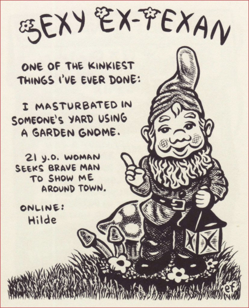
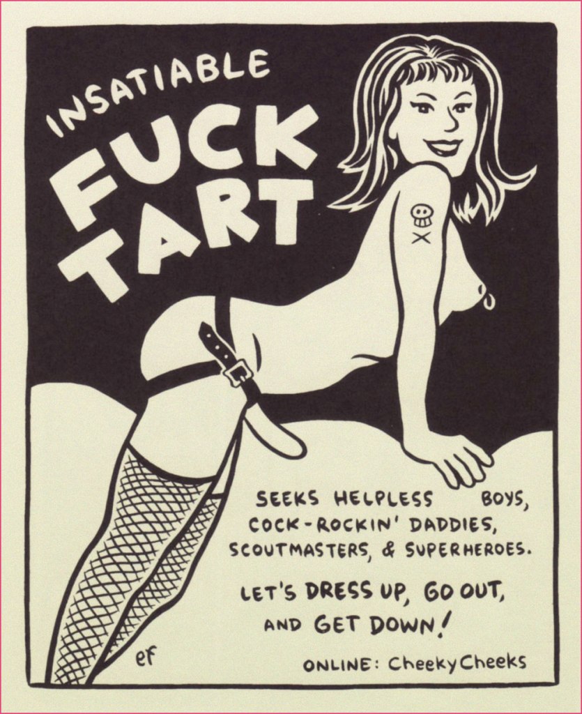
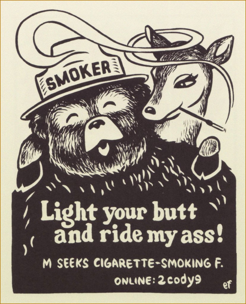
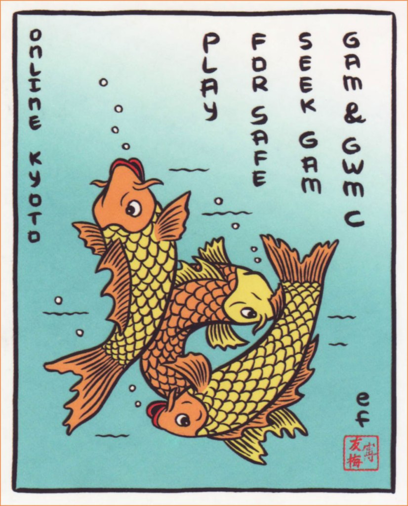
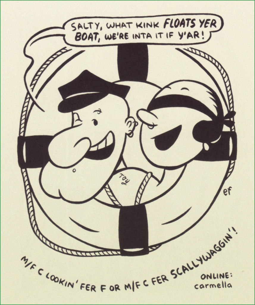
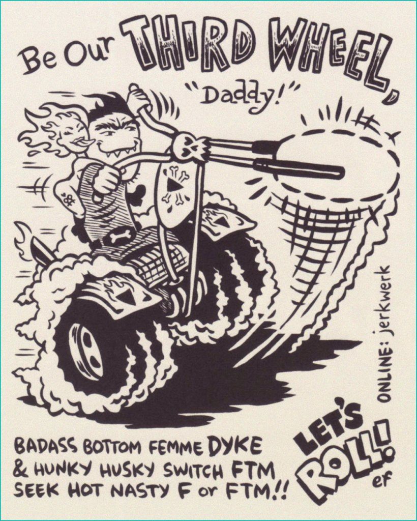
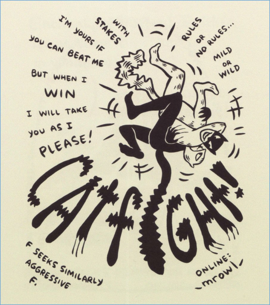
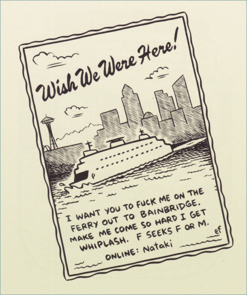
« So when we decided to start running a weekly illustrated personal ad — ‘Lustlab Ad of the Week’ — we knew right away what we didn’t want. We didn’t want to sensationalize what was already pretty sensational, thanks. And we didn’t want to hyper-sexualize what was already plenty sexual. We wanted an artist who could take short, pithy personal ads — short, pithy, filthy personal ads — and infuse them with the kind of playfulness that true kinksters bring to their sex lives. We wanted someone that could make someone into whips and chains and hoods look like someone you could take home to meet your parents.
We wanted Ellen Forney. »
Just like Ramona Fradon, Ms. Forney wields a friendly, extremely engaging and accessible style (as you’ll witness). Here, then, is a modest sampling from the four-year frolic of the ‘Lustlab Ad of the Week’, circa 2004-2007. Feel free to browse.
The feature’s highlights have been collected, in fine fashion, in a snazzy little hardcover entitled ‘Lust‘. (Feb. 2008, Fantagraphics). While it’s out of print by now, affordable copies appear to still be available. If it floats your boat at all, do not hesitate!
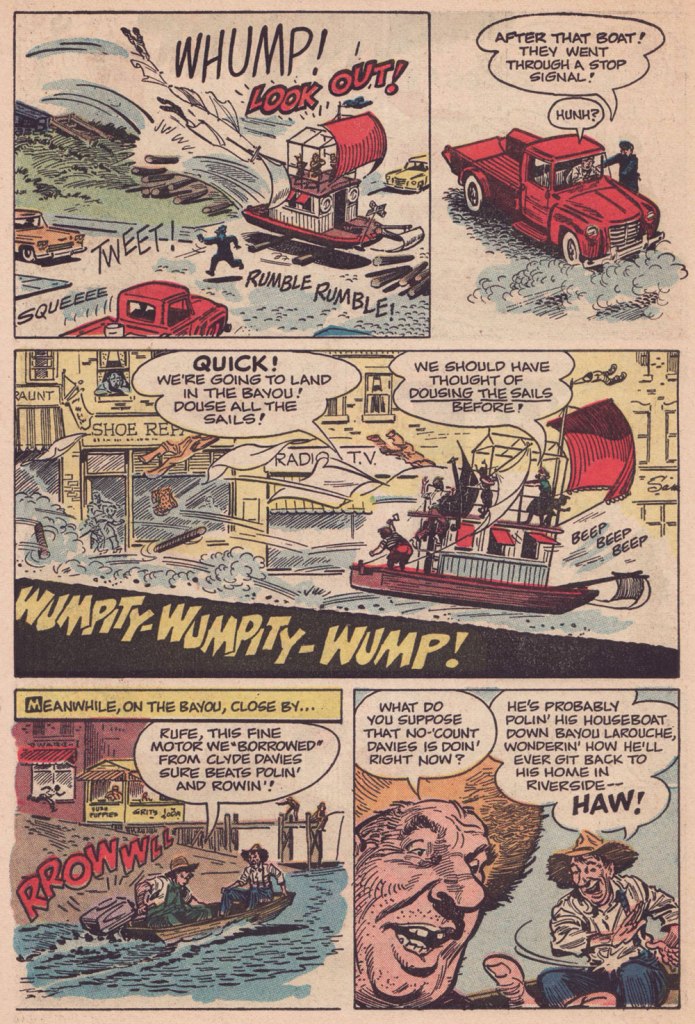
« Carefully, the old man utters a cacophonous incantation… then lets his mind go blank. » — Stephen Skeates
We recently (last March 30) lost a fine fellow and writer in Steve Skeates (1943-2023). I’ve long appreciated his work, as I felt he was among the very few ‘mainstream’ comic book writers who could actually be funny, not to mention gripping or thought-provoking*, whatever the situation demanded.
At its peak, his writing also stood out by virtue of its containing actual creative ideas rather than the usual mishmash of bromides and creativity-stifling continuity that the fanboys clamoured for.
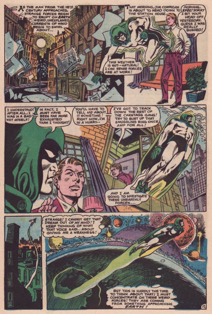
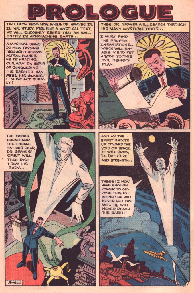
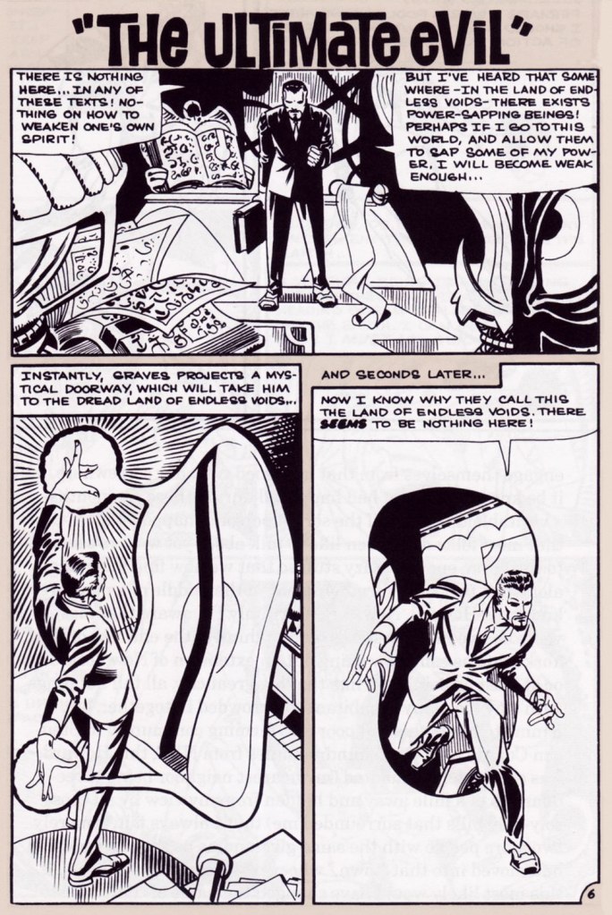
Today, I’ll showcase a bicephalous favourite, The Spectre in « The Parchment of Power Perilous » and Dr. Graves in « The Ultimate Evil », both springing from the same author… and the same plot.
How did this come to pass? Skeates told the story in an article entitled « Graves Acting Strangely: The Ultimate Evil Reconsidered », published in Charlton Spotlight no. 5 (Fall 2006, Argo Press, Michael Ambrose, editor).
« … at that particular point in time, I was totally unaware of the unique manner in which Julie [Schwartz ] approached his profession, typically in the dark when it came to the fact that this longtime comic book icon was far more actively involved in the plotting process than any other editor up at DC. […] I ambled into Julie’s well-kempt office armed with an intricate plot… something I had stayed up half the night before constructing, working, reworking, polishing and repolishing, only to have Julie read it over, extract a couple of ideas he liked, and unceremoniously toss the rest of it away. […] the two of us set about constructing what basically amounted to a brand-new plot based on those couple of ideas of mine that Julie liked, ideas that had somehow gotten his creative juices flowing. »
Charles J. “Jerry” Grandenetti (1926-2010) shows to breathtaking advantage his mad compositional virtuosity, anchored by Murphy Anderson’s rational inks. Skeates again: « … inker Murphy Anderson was the perfect stabilizing force, his meticulously detailed inks reining in Grandenetti’s insanity just enough so that even the latter’s wildest notions — colliding planes (no, not aircraft — planes of existence), his frequent disdain for panel borders, the same character shot from two or three separate angles within seemingly the same panel, etc. — became perfectly understandable, making the story so much utter fun to follow (even for someone like me who obviously knew exactly where it was going. ) »Grandenetti’s two previous issues on the title, illustrating Gardner Fox’s Pilgrims of Peril (check out a stunning excerpt here) and The Ghost That Haunted Money!, had demonstrated that he likely was the only match for Ditko when it came to depicting hallucinatory other-dimensional vistas. Let’s face it, just about all who followed Ditko on Doctor Strange either half-heartedly aped Ditko’s designs or drew other dimensions as if they were Wally Wood’s outer space (or Dali’s The Persistence of Memory). Well, save for Tom Sutton, I guess. Grandenetti could have done a great job, but honestly, I like his career as it is. The day Steve Ditko walked away from Doc Strange is the day the character ceased to exist, as far as I’m concerned.Five pages from The Spectre n. 8 (Jan.-Feb. 1969), edited by the… mighty hand of Schwartz. Special kudos to the uncredited colourist (though DC’s assistant production manager Jack Adler surely supervised), who did a superlative job, making discerning use of bold contrasts and close harmonies. It would have been so easy to end up with a garish mess!
Unlike (with one notable exception, initials SD) his colleagues who scampered from Charlton to DC along with editor Dick Giordano (Denny O’Neil and Jim Aparo, for instance) in the late 1960s, Skeates maintained his Charlton work for a time. He explained: « I simply possessed too much affection for what I was producing for that Derby, Connecticut company to do anything along those lines. » Skeates enjoyed « … contributing to Charlton’s take on the “mystery” anthology, ghostly compilations somehow edgier, funkier, and far more fun than those produced by DC and Marvel. »
« Furthermore, unlike DC, Charlton didn’t require that I first submit a plot outline, get it approved, and then write my story. Instead, I could just suddenly turn in a finished product, on spec, a way of working I very much preferred — diving right in with the plot idea only sketchily there, not boxed in even by myself but allowing the story to work itself out, to go where it wanted to go. » Amen.
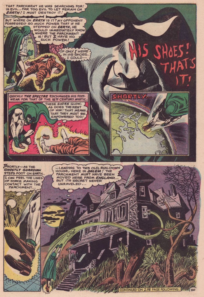
The one time we saw the Doctor M. T. Graves truly get his mystical groove on was in this tale of two Steves, Skeates and Ditko, a splendid bit of recycling-but-not-quite.
And he’s how the whole ball of wax coalesced: « I suddenly remembered that fairly intricate Spectre plot that Julie had long ago summarily tossed aside. Hey, y’know, I might just be able (especially if I placed most of my emphasis on those portions that Julie hadn’t extracted, working on the bulk of my original plot while rather downplaying those couple of ideas that Julie and I had built our new plot on) to transform that baby into a workable Dr. Graves adventure! »
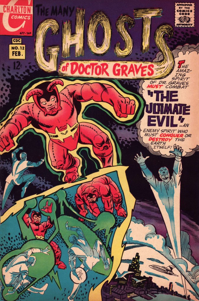
This is The Many Ghosts of Doctor Graves no. 12 (Jan.-Feb. 1969, Charlton). Edited by Sal Gentile.
« Boom! I was into it, writing this story nearly as fast as I could type. Of course, to in effect have Graves play the role of the Spectre, I could see no way around making certain alterations to my protagonist’s makeup, making him far more mystically powerful than he had ever before seemed, more like Marvel’s Doctor Strange than anyone else…
Yet I could see no real problem in any of that, unless of course someone up at Charlton wound up doing something supremely silly like assigning the art for this story to none other than Ditko himself — which, as it turned out, is exactly what happened! »
Some — perhaps all, who knows? — of this tale’s original art (or at least production photostats) has survived, and gives us the opportunity to gaze upon Ditko’s artwork in its raw state, so to speak.
Hail and farewell, Mr. Skeates. You will be missed.
When you move house, as I did a few months ago, some items inevitably get buried while others get kicked loose. For instance, several decades ago, I had picked up (at a dollar fifty apiece, apparently) a tidy little pile of Punch issues from 1946 and 1955. Punch (1841-2022) of course, boasted at the time what was likely the world’s finest roster of cartoonists. Not only were the cartoons splendid — and now I’m old enough to actually get most of the jokes — but even the ads, often produced in-house, were exquisitely illustrated. And so, instead of the cartoons (you can still scratch that itch with our recent Rowland Emett’s Ramshackle Poesy in Motion, for instance), I’m proposing a sampling of adverts from my pile o’ Punches.
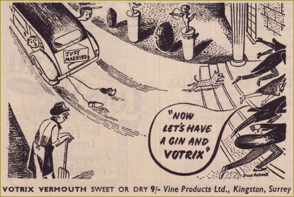
Remember the days before built-in obsolescence? Me neither. I note with pleasure that the grand old Scottish firm of Saxone still stands. For more Anton, check out Anton’s Spivs and Scoundrels, Baronesses and Beezers.From the June 3, 1946 edition of Punch, the Summer Number. This Votrix stuff wasn’t very good, it would appear. « As the second world war started to take hold, the export of vermouth from Italy and France become non-existent. Given the devastation left behind, it was slow to start back up again once the conflict was over. In England Vine Products based in Kingston, Surrey (whom had been making British copies of Sherry and Port for some years) launched Votrix Vermouth advertising it as “Indistinguishable” from pre-war Vermouths from Europe. They claimed it was made with the finest grape juice blended with genuine vermouth herbs. There was a lot of controversy and even several court cases as to how this grape juice was made (and if it was actually wine made from raisins rather than grapes). It was never any real challenge to the vermouths from Italy and France. » [ source ]
While Rothman still exists in name, the company’s true lifespan was 1890-1999. Mergers and acquisitions, that same old story…
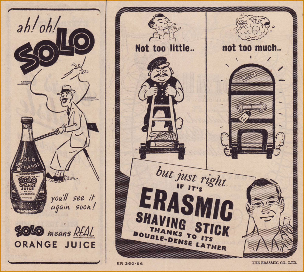
Solo is gone. « Pablo Utrera owned Solo Orchards, an orange juice business. In 1960 Idris Ltd., the soft drinks firm, acquired the whole of the issued share capital of Solo Orchards (“A small but well-known company making quality products“) for a consideration of 143,500 ord. 5s. shares in the company, worth £130,000. By April 1962 Idris had disposed of the Totteridge (Barnet, north London) premises of Solo Orchards, moving production to other factories. » [ source ]
Erasmic (founded in 1869), on the other hand, still operates, its products widely available.
An interesting soft sell approach to selling brakes! Established in 1926, Lockheed merged with Martin Marietta in 1995 to constitute Lockheed Martin.
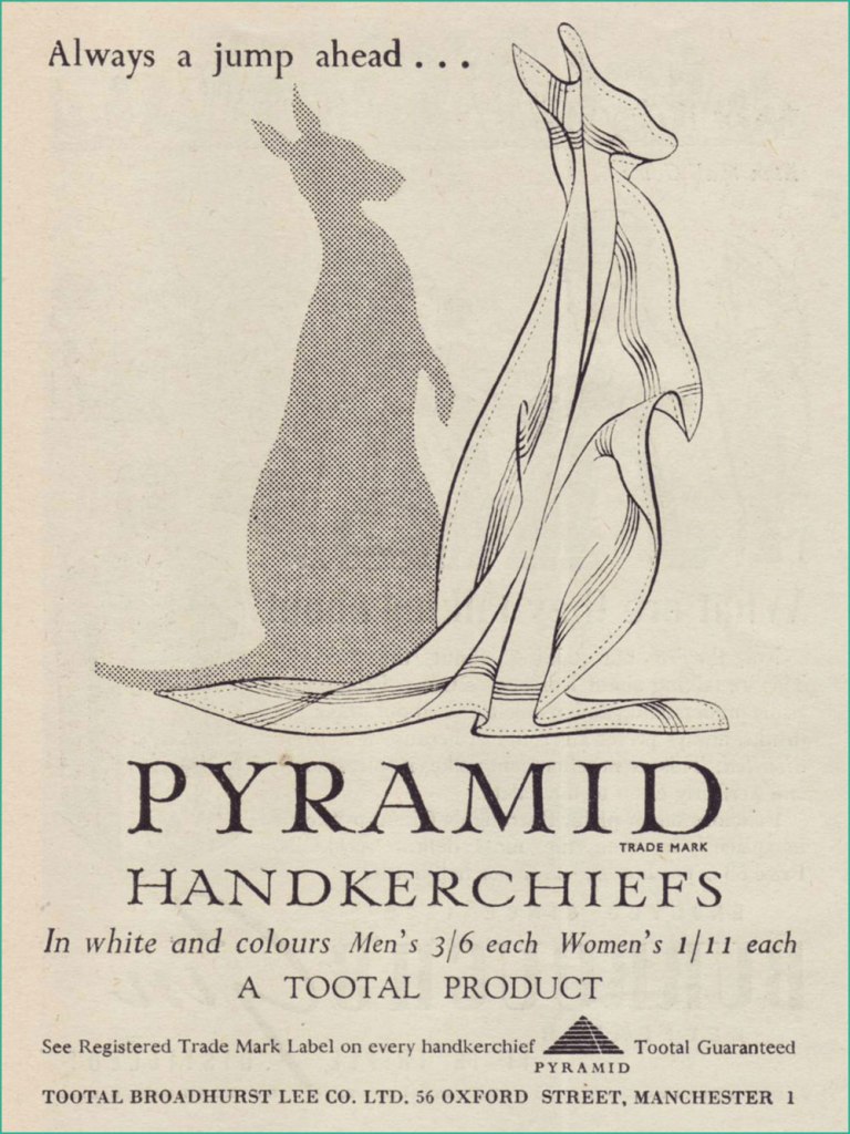
Despite the advent of disposable tissues, Pyramid handkerchiefs appear to have survived. I believe they were named so because they were made from Egyptian cotton. That said, what a clever ad… as a product, hankies hardly strike me as a boundless fount of exciting visual ideas. Get yours here!Having toiled in advertising illustration for some years, I can tell you that the privilege of signing one’s name in an advert is a rarely-accorded one. Unless, of course, your famous name was part of the pitch. This one’s from the pen of Bruce Angrave (1912 – 1983). From the Nov. 28, 1951 issue. Read about the history of the International Wool Secretariat.
Guinness for Strength, went the famous slogan. But was there anything to the Irish brewer’s bold claim? CNN looked into the question. Here, the artwork was provided by John Lobban, who went on to be “one of Britain’s foremost numismatic artists”…. and Paddington Bear illustrators.
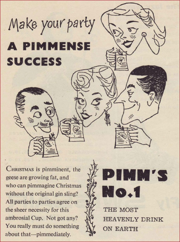
« Every day we left the house in his Phantom V, always with a big pitcher of Pimm’s close at hand. Then we went into this little studio and Richard took his place at the mic with a tall stool to his left and the Pimm’s on the stool. Then we started recording, for maybe three or four hours or until the Pimm’s was gone. He did like to lubricate his voice chords but that was as far as it went – he could have never got through that music in a drunken state. » A decade or so ago, upon reading this quote from songsmith Jimmy Webb about his work with Irish rapscallion Richard Harris, I wondered just what this Pimm’s might be. It was a bit hard to find at the time, and kind of costly for a matter of idle curiosity, but I’m happy to report that it’s delicious.
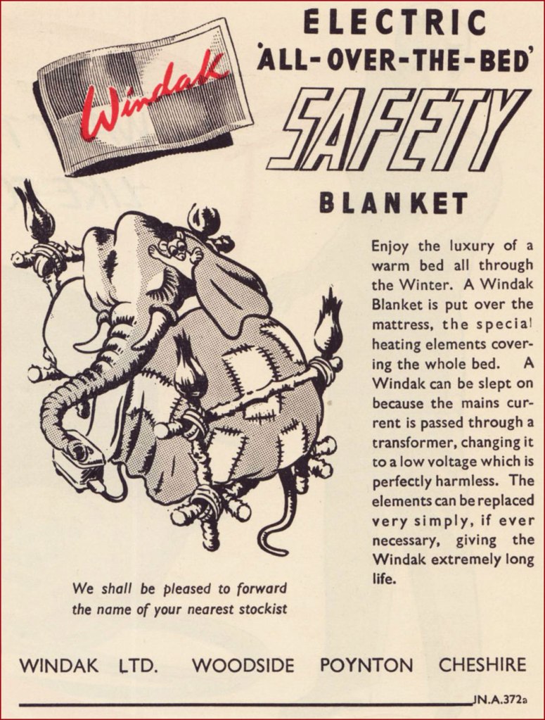
Windak was an offshoot of Baxter Woodhouse Taylor (still around!). Here’s an intriguing bit of trivia: « The Cold-War era of High Altitude flying led there to be an array of different flying suits and helmets trialled for this purpose. At the time, nobody really knew the effects of flying at high altitudes, or what the adverse affects of a sudden cabin depressurisation could be (such as the fear of canopy blowing off). To protect the aircrew against this perceived danger, initial efforts were placed on developing fully enclosed pressure suits. The life span of the development full pressure suits was short lived, as it was soon realised that partial pressure helmets and a pressure jerkin, and eventually just a demand oxygen mask and pressure jerkin was sufficient to “get you down” safely after a cabin depressurisation event. Of the array of full pressure suits tried, this series, known collectively as the “Windak” suit and helmet has become the most well known, due to many television and film appearances in science-fiction works, as space suits. “Windak” was a trade name used by Baxter Woodhouse Taylor, and had been in use since the second world war on items of heated flying clothing. However, people seem to solely refer to this series of full pressure suits as “The Windak Suit“, even though the series contains a few variants. » [ source ]
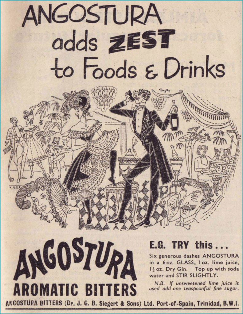
Angostura Bitters remain an essential tool in the mixologist’s attirail.
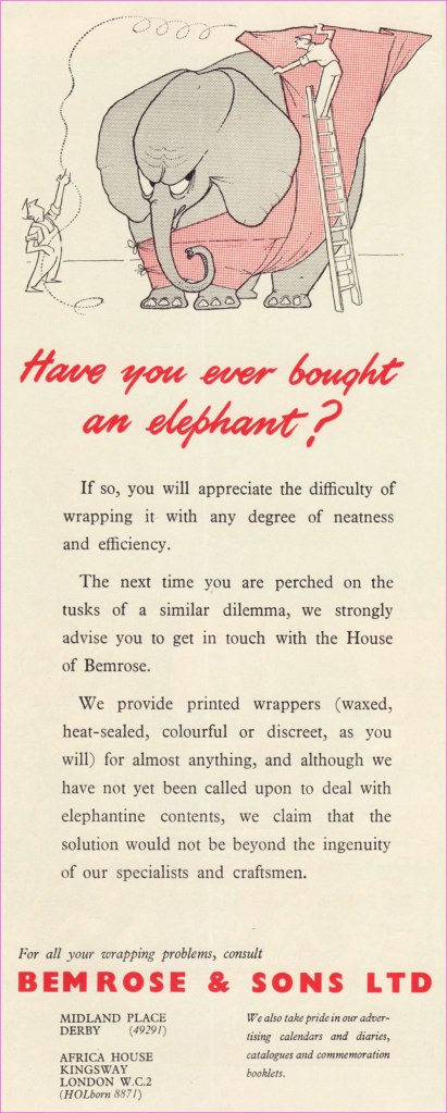
Despite several changes in name and vocation over the years, the firm of Bemrose & Sons abides in some fashion to this day. A perfect example of adapting to survive.
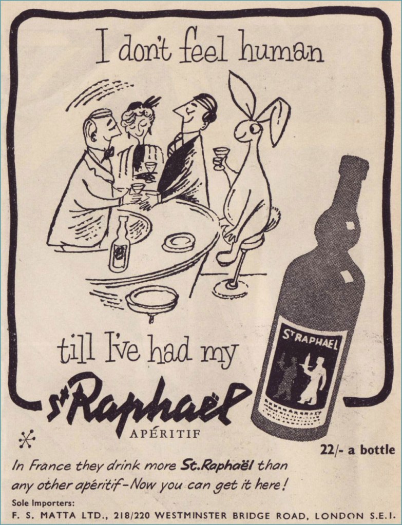
A pair of examples from a series of themed ads. The first saw print in the Aug. 10, 1955 issue, the second in the Sept. 14 one. They didn’t go much for repetition, did they? First concocted in 1830, St Raphaël remains a highly popular apéro. Read its history here. I’m getting a sense that in the liquor business, if you’re hawking a decent quality product, you’re in for the long haul, barring Edgar Bronfman Jr.-level greed and incompetence. But in the business world, that’s as rare as rocking-horse poo, right?
« This is how you disappear… » — Scott Walker, Rawhide
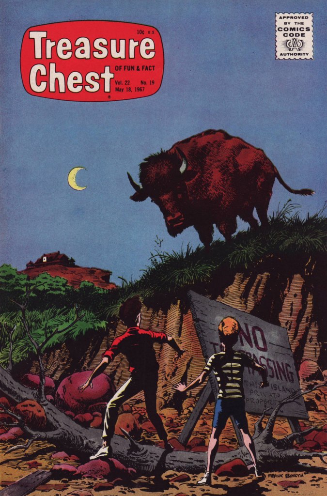
No foolin’, honest: today is the birthday of cartoonist Frank M. Borth III (April 1, 1918 – August 9, 2009), who worked on such Golden Age features as Phantom Lady, Captain America, Skypilot, Spider Widow, colleagues Captain Daring, Captain Battle and Captain Fleet… he kept busy.
Borth’s first Phantom Lady page — premiering her classic outfit, at that — from Police Comics no. 17 (March 1943, Quality). Unusually for such an assembly-line industry, Borth did his own lettering, and it’s easy to see why: he was terrific at it. Read the whole issue here!
Then, at the close of the 1940s, he began a long association with Catholic publisher George A. Pflaum, chronicling (among others) the rollicking adventures of one Frumson Wooters, aka The Champ, a stereotype-bucking chubby kid who’s at times scatterbrained and clumsy, but also wise, determined, resourceful, and humble to boot. Written by Captain Frank Moss and radiantly illustrated (and later, also scripted) by Borth, the feature ran for two decades in Treasure Chest of Fun and Fact, a publication distributed to parochial school students between 1946 and 1972 and generally avoided like any of the Ten Plagues of Egypt by your average comic book fan, but — wouldn’t you know it? — chock full of excellent work by the likes of Bernard Baily, Fran Matera, Bob Powell, Reed Crandall, Joe Sinnott, Graham Ingels, Joe Orlando, Murphy Anderson, Jim Mooney, Marvin Townsend, Paul Eismann… I’ll stop now.
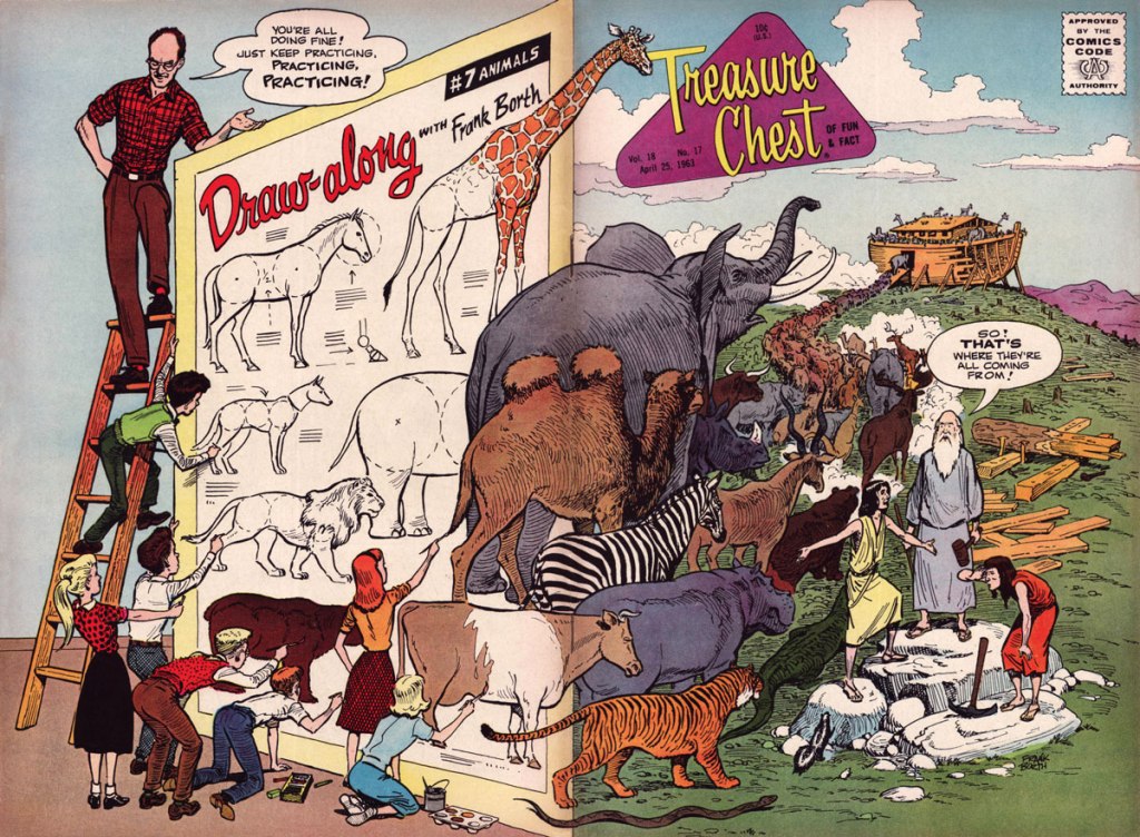
Being ad-free, Treasure Chest had the luxury of full cover spreads, and Borth would, with his, delight in the element of surprise. This is Treasure Chest of Fun and Fact Vol. 18 no. 17 (Apr. 18, 1963, George A. Pflaum). Issues 11 to 20 this volume of TCOF&F presented a 5-page chapter of his engaging tutorial Draw-Along with Frank Borth, which was collected in 1965.
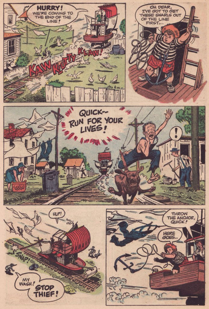
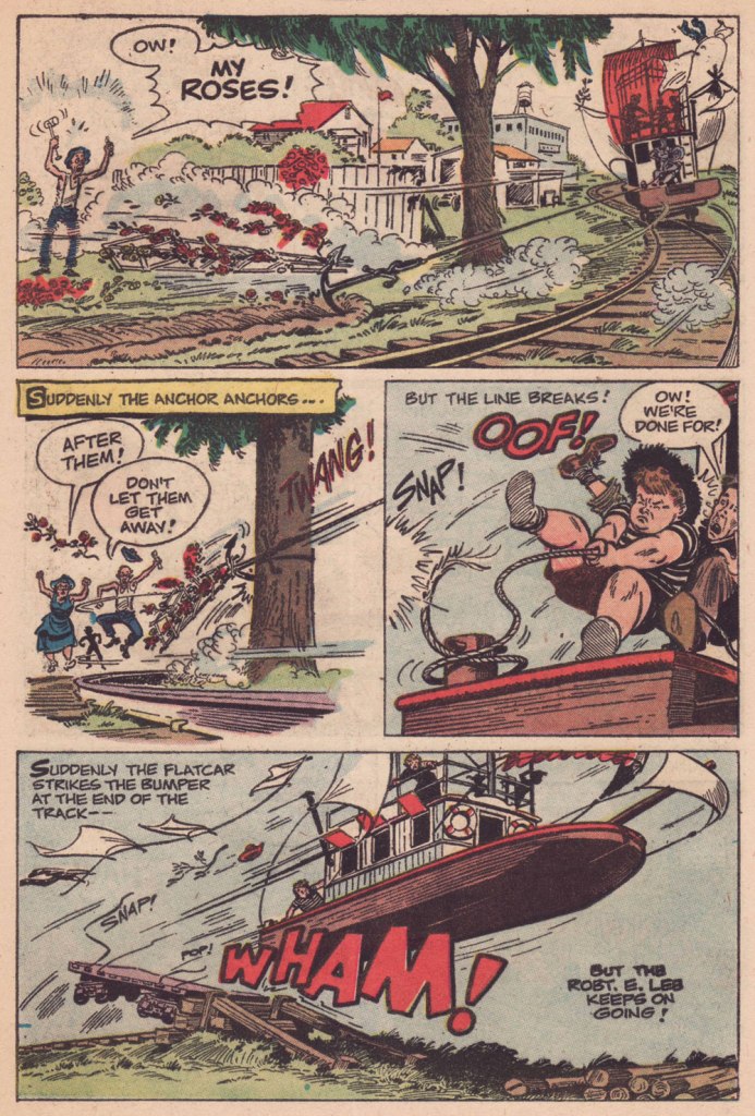
I was going to feature a gallery of favourite Borth pages from all over the place, but instead decided it might be more interesting to highlight his ability to break down an action sequence, since that’s the palpitating heart of an adventure yarn. Therefore, here’s chapter 4 of “The Champ’s Treasure Hunt“, published in TCOF&F volume 15, No. 4 (Oct. 22, 1959).
You can read the entire saga, from the start, right here!Another splashy (quite literally) Borth cover, this time featuring The Champ! This is Treasure Chest of Fun and Fact Vol. 21 no. 10 (Jan. 13, 1966, George A. Pflaum). I allow myself a Frumson exception for Treasure Chest of Fun and Fact Vol. 22 no. 19 (May 18, 1967, George A. Pflaum), my favourite Borth cover — and one of my very favourites, period. It’s a scene from the penultimate chapter of The Mystery of Forbidden Island, written and drawn by Borth.
I intended to direct interested readers to an autobiographical essay Borth penned late in life, but it’s gone — well, retrievable if you try hard enough, but to avoid losing it altogether, I’m going to quote it in full:
FRANK BORTH, syndicated cartoonist was born in Cleveland, Ohio and graduated from Cleveland School of Art in 1940. Frank had earned his tuition by painting price signs in tempera paint for butcher shops, grocery stores, Green Grocers, etc. from 11th grade on until he left Cleveland to get employment as an illustrator in New York City. Where he worked as a free-lance illustrator and writer for comic book publications.
Frank was drafted into army and assigned to the Transportation Corp training Center at Indiantown Gap Military reservation to produce training aids where he rose to the rank of T/Sgt. In 1944 Frank painted a 52-foot mural for the Service Club that is still there today. Frank married Barbara Stroh of Harrisburg, Pa in 1944 and was discharged in 1946.
Frank came back to New York to find work and an apartment; he found neither, but his landlady offered him the summer use of some unheated rooms over garage of a large house she planned to rent to roomers out in Montauk. Frank and Barbara moved in May 1st for the summer as Montauk was by then once more a summer resort, and he found employment by painting murals in bars and sign work at the Yacht Club. Frank entertained members every Friday night at a dinner with chalk talk and other inspiring skits. Finally Frank decided to create a new comic-adventure strip about a two-masted schooner available for hire and an agent in the audience offered to try to sell it in New York.
Frank’s little family really lived on the money he had saved up in the three years in the army. He went back to Cleveland however due to the death of his father and worked for a small ad agency. The following spring the agent told him that he had sold the yachting script and Frank went back to Montauk to work on the strip “Ken Stuart” for three years; but couldn’t get it syndicated inland. Frank was not saved by the bell but by a Catholic publication called “Treasure Chest” who mailed him a script to illustrate in ten chapters of six pages each, a fiction story about the Priest of Shark Island. This led to steady interesting assignments for 25 years. The magazine was in comic book form, and was published every two weeks during the school year, twenty in all. Since they didn’t print in the summer, Frank would use that time to write scripts on his own. In those days they corresponded by letter and the editor and Frank soon became pen pals. Frank made sure that he delivered always on time and produced exactly what they were looking for.
The Borth family, they had produced two children a son and a daughter, they bought property in Montauk and built a house. Frank had joined the volunteer fire department and also volunteered to be one of the crew on our new ambulance as well. You can imagine that he did a lot of artwork for the fire department and other civic organizations. He taught Sunday school and was elected an Elder of the Montauk Community Church. Barbara, Frank calls her lovingly Bobbie, became a Girl Scout leader and also sang in the choir, they no longer were “summer people” but full time residents of Montauk. Bobbie became a schoolteacher and also attended Southampton College and earned a Masters degree.
Frank was asked to become a republican committeeman, which led to Frank being elected a Town trustee, and to the office of Councilman on the East Hampton Town Board in 1968. At the conclusion of the four-year term Frank choose to give up the part time position that had by then turned into a full time commitment. Shortly after retiring from politics, Warren Whipple, a long time friend (The artist who drew the syndicated cartoon feature “There Oughta Be a Law”) called to asked Frank if I would take the job of writing the plot and dialogue of each cartoon as the original creator of the strip wanted to retire. Frank said OK, as he had done almost as much writing as drawing with his own labors. The syndicate approved Frank taking over and for the next ten years, Whipple and Frank Borth were a team.
Frank took over the entire production of writing and drawing the strip until February of ’83 when he turned 65 and terminated the production. The Treasure Chest Publisher also went out of business due to the rapid closing of a lot of parochial schools. Another publisher tried to sell it on the newsstand but failed. Frank turned out about 50 when another acquaintance talked him into getting back into production doing crazy assignments for Cracked Magazine which he had done for a period of time until they switched editors and all they were interested in was using famous people’s names.
Frank concluded his second career and retired to doing art and posters for local organizations like the Fire Department, Lighthouse, and the Town. Since he had created the Town seal of east Hampton as well as the Bicentennial seal, he also drew up the tricentquinquagenary seal as well. He still does things for the Library, church, and other local organizations until I lost the vision in his left eye which has deprived him of depth perception. Frank still writes but cannot draw as I used to. Oh, well. 84 is a reasonable time to retire, he chuckles. Frank’s retirement is spent in painting Montauk land and seascapes.
Circling the drain: this is TCOF&F vol. 27, No. 2 (Jan. 1972, George A. Pflaum), the final volume; at this point, the magazine had adopted a monthly schedule and relied heavily on reprints. But heck, an issue with a 37-page Frumson Wooters epic, The Champ Goes Down!, is pretty easy to take. It had been serialised over the six issues of 1967’s Treasure Chest Summer Edition.
Having long followed the man’s career, briefly met him and heard him speak, I’m convinced that he deserves every accolade he receives, and I know all this attention won’t even go to his head for, in addition to his staggering talent, the man just radiates patience and kindness.
In 2006, he was concluding a talk in Montréal by taking some questions from the audience, and an old lady asked an incredibly basic one… that most would have dismissed or shrugged off with a « how can you not know that already? ». But no, he gently responsed to her query in the most illuminating way, elevating the moment to the delight of everyone in the audience, including, of course, the lady with the question.
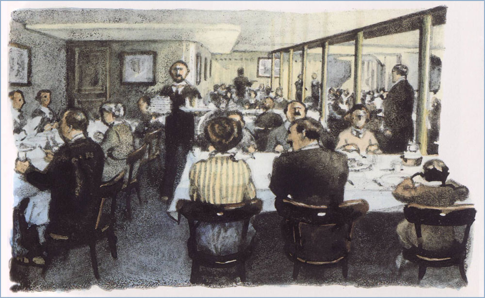
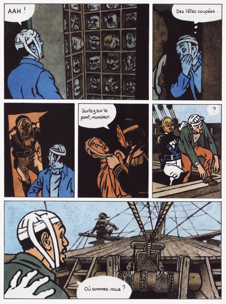
A 1997 illustration created for an issue of long-running (1971-) bright kids’ magazine Okapi on the theme of The Titanic. This shows the doomed ship’s third class restaurant.A sequence from the album that first brought Guibert to prominence, La fille du professeur, a collaboration with Joann Sfar, whose script won the 1997 René Goscinny award at the Angoulème festival. Note the remarkable fluidity and animation of the choreography. A sequence from his wild collaboration with WOT? favourite David B., 1999’s Le capitaine écarlate (The Scarlet Captain), which fancifully thrusts real-life author Marcel Schwob (1867-1905) amidst the lunatic fray.The pirate ship, travelling through the sky on its own wave, is trapped betwixt an airship and the grappling hooks of the Parisian police posted on the Eiffel tower. Of course.Here’s a glimpse into Guibert’s working method, two panels from Le capitaine écarlate: « Inking the pencils is always a problem: it’s even nonsensical to have to draw the same thing twice! Generally, the inking stiffens the drawing, since the pencilling stage is allusive and the inking stage is descriptive. So I try to do the opposite: I settle all the drawing problems in pencil and then, I put my page over a light table in order to reinvent the drawing in pen, leaving out a lot of the details. But that’s just a last resort. It’s hard to be quick and spontaneous while trying to convey subtle things. Ideally, I’d love to do without pencilling, but I need it to nuance my drawing. » (from a talk with Hugues Dayez published in La nouvelle bande dessinée, 2000, Éditions Niffle)A page from his probable magnum opus, La guerre d’Alan, in which he recounts visually the real-life recollections of an American exile he met by chance in 1994 on the Île de Ré. This part of the saga is available in English as Alan’s War. Here, a bunch of malnourished GIs hike for an hour for a steak meal provided by a lumberjack. For Alan, coming from a family of modest means, it was his first time eating steak. « Observe, improve yourself, fill up your noggin! » is the crux of his advice to young cartoonists. Leading by example, he’s constantly observing and rarely stops drawing. Thankfully, some collections of Guibert’s sketches have seen print, and they’re delightful. Here are some samples from Le pavé de Paris (Oct. 2004, Futuropolis), which is the exact size of a Parisian cobblestone, just like those lobbed at the police by demonstrating students during the tumultuous events of May 1968.I’m in awe at his ability to discern and render infinitely delicate shifts and nuances of colour and tone, especially in low light.« Drawing allows you to tear off pieces of reality and to take them home. In my notebooks, I know that the most beautiful drawings, the most vibrant ones, are those I did in places or before people that I want to keep near me. »« This is why my notebooks are so precious to me: they are riddled with accidents and unrepeatable little things. And while I practically can’t bear to open one of my published books, I often find myself checking out my notebooks. »A page, drawn in 1999 and intended for L’enfance d’Alan. Guibert initially planned to cover his friend’s life in order, but postponed the childhood part, since he possessed fuller documentation of Alan’s war years. In the end, this page didn’t make the cut, which gives you some idea of the very high standards Guibert sets for himself.L’enfance d’Alan appeared in 2012, and was followed in 2016 by Martha & Alan; like the rest of the Alan Cope memoirs, they were published by L’Association. The lion’s share of what’s kept me this long from showcasing one of my very favourite cartoonists: most of it is virtually impossible to scan, unless I’m willing to destroy the spine of some often rare, precious — and treasured! — volumes.
« We all have a thirst for wonder. It’s a deeply human quality. Science and religion are both bound up with it. What I’m saying is, you don’t have to make stories up, you don’t have to exaggerate. There’s wonder and awe enough in the real world. Nature’s a lot better at inventing wonders than we are. » ― Carl Sagan, Contact
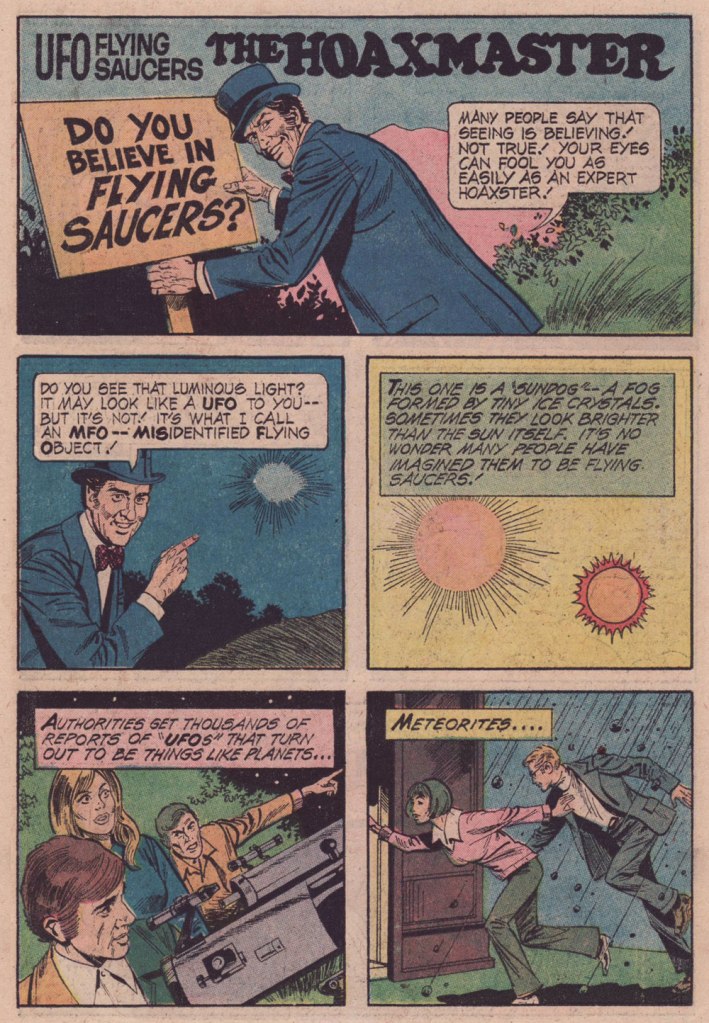
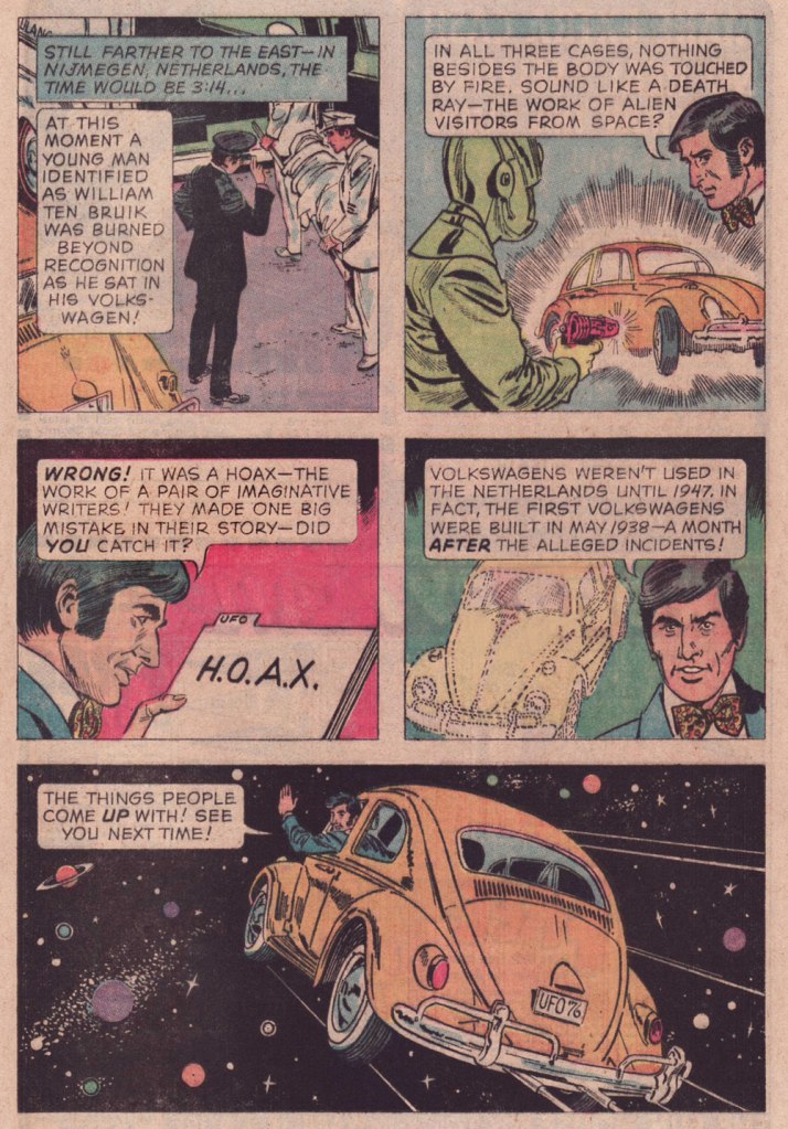
Time to keep a promise — a promise to myself, but just as worthy of being kept. A couple of years ago, I posted the first half of a favourite comics feature of mine, ‘The Hoaxmaster’, which ran in most issues of Gold Key’s UFO Flying Saucers in the 1970s. At the time, I declared that I might get around to posting the second half of the set some World Contact Day, which is today.
The bracing brand of skepticism demonstrated here by the Hoaxmaster, much needed as it was then — smack in the middle of the UFO-Spiritualism-Occultism mania of its era — is yet more urgently needed these days, as the merry-go-round of surreal disinformation spins faster and faster, further out of control with each passing day, it would seem. You may have noticed.
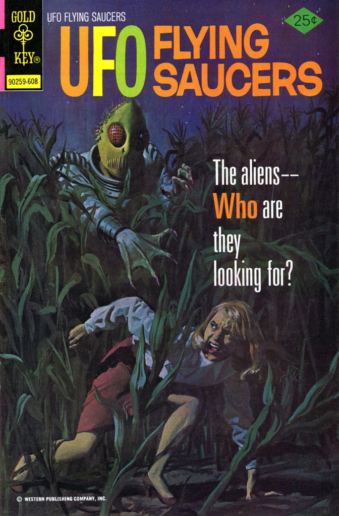
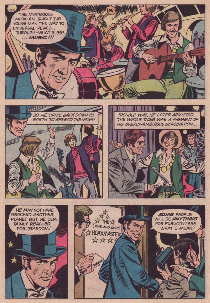
From UFO Flying Saucers no. 9 (Jan. 1976, Gold Key); as with all the Hoaxmaster vignettes, script by Pat Fortunato and artwork by Frank Bolle. From UFO Flying Saucers no. 10 (May 1976, Gold Key).From UFO Flying Saucers no. 11 (Aug. 1976, Gold Key).This was the issue in question, my introduction to the title; it bore this terrific — downright terrifying — painted cover by George Wilson.From UFO Flying Saucers no. 12 (Nov. 1976, Gold Key). Adamski!From UFO Flying Saucers no. 13 (Jan. 1977, Gold Key). Bolle was always a solid artist — which is certainly why he enjoyed such a long and busy career — but I can’t think of any, among the myriad of features he worked on, where he seemed to enjoy himself this much. His work always had a deadpan grace, but here, the wit deployed in the scripts allows him to reveal a seldom-seen facet of his talent.
« This is the very center of everything there is. A huge black hole eating up the galaxy. The end of everything. » — Clifford D. Simak
Early in the Fall of 1979, I was pleasantly surprised to discover some new work by Jack Kirby in our weekend paper’s comics section. Things had been awfully quiet on the Kirby front since late 1978, the ‘King’ having unhappily — and quite understandably — left Marvel for the second time that decade.
This new work was part of the long-running anthology strip Walt Disney’s Treasury of Classic Tales (1952-1987). I dutifully collected the shabbily-printed comics sections and patiently hoped for an improved presentation.
The October 28, 1979 Sunday strip, as it appeared in newsprint. Incidentally (and unoffically) here’s the whole story.The surviving original art page from the same date, for comparison.
Western Publishing, usual licensee of Disney product since its acrimonious split from Dell in 1962, then issued a Black Hole adaptation, in both a slick magazine and comic book format. But — holy bait-and-switch! — it wasn’t the Kirby version!
A typical page from the Western Publishing adaptation. Written by Mary Carey and illustrated by Dan Spiegle (1920-2017), a perennial favourite of the publisher’s. Another mystery: since Spiegle had earlier proven himself well-capable of capturing likenesses, one must assume that the decision to dispense with likenesses of Anthony Perkins and Ernest Borgnine and replace them with those of, I dunno, ‘Weird’ Al Yankovic and Ontario prime minister Doug Ford must have come down from on high. But… why?
I’ve been musing over these riddles ever since (in my spare time). Recently, I decided to act by putting the question to one who was there… namely Mr. Michael Royer, who’s been most gracious to us with his time and recollections (check out our three-part interview with MR!) — and continues to be!
RG: Mr. Royer, I’ve long been baffled as to why Disney (or Western Publishing, at any rate), thought it necessary to commission two separate comics adaptations of The Black Hole. I’ve always surmised that Kirby was considered too wild for them, but that’s just speculation on my part.
Since you were working for Disney at the time, and you inked the Kirby adaptation, I presume that you played some kind of role behind the scenes as well. Could you share some of the facts with me (and my readers)?
MR: Jack Kirby was selected to draw THE BLACK HOLE Sunday comic strip on MY recommendation. Gold Key editors always selected their OWN artist for similar licensed material… plus they were in no position to pay their artist the fee I got Jack. I inked and lettered HOLE and made necessary changes to the robots to protect the image for toy, etc. sales trademarks. Jack was an impressionist and I made the robots “on model.”
Jack became so bored with the scripts, that were done “storyboard” like by someone who had NO understanding of how to make comic art interesting and exciting, that he asked me to layout the FINAL Sunday page, which I did. I had told the powers that be at Disney that Jack must get his originals back but, of course, being Disney, they did not return them as they had promised. Jack only got the remaining pages not yet sold by the Circle Galleries after threatening Disney with a lawsuit. Disney gave me one of the Sunday originals because someone had spilled a cup of coffee on it.
The head of our Creative Services dept. at Disney was not a big fan of Kirby* and after I had inked the first Sunday he had another staff artist “fix” the faces, which stood out like what they became: inept changes. I yelled “DON’T CHANGE THE FACES!” They gave in to my warning.
It was an interesting time back then. Bob Foster and I were the ONLY artists in Creative Services who had worked in comic books and strips. They would never take our word about things until our department head, Bob and I, were on a conference call with Sylvan Beck (King Features Strip Editor in New York) and then they believed what we had to say about the ways a Sunday strip could be drawn to fit many formats. It was very frustrating at times knowing more than your “bosses.”. But… it is the same old story. Middle management was loaded with MBAs who didn’t know shit from shinola! We used to joke that if one had an MBA anyone could get hired at Disney… You didn’t have to know a damn thing about anything else except how to get the MBA.
RG:I’ve read somewhere that the Black Hole scripts were the work of Carl Fallberg. I mean, if that’s true, surely he wasn’t the one who storyboarded the script, as it’s a bit hard to reconcile ‘NO understanding of how to make comic art interesting and exciting’ with a visual artist of Fallberg’s calibre… might he have delegated the task to some flunky?
MR:It was Fallberg… storyboard layouts for each panel/page. I liked Carl and he was a nice man, but he had no idea how to “jazz” up the film visually and Jack wasn’t about to rock the boat, by being his usual inventive self. The script layouts were just like the film… boring. Just a blow by blow of what was going on in the film. The comic strip could have been exciting if Carl hadn’t just “stuck” to the movie. But, perhaps I am being too critical. Carl was probably “following orders” from our department head. When I tried out to do strip art for Disney in the late 60s or early 70s that same department head told me NOT to worry about “likenesses” of the actors. So when I told in my samples they were turned down because “no one looked like the actors.” Gawrsh…as Goofy would say. As I said… Bob Foster and I were the only guys in Creative Services who had ever been intimately involved in comic book or strip art production in our department. Things did change a bit eventually.**
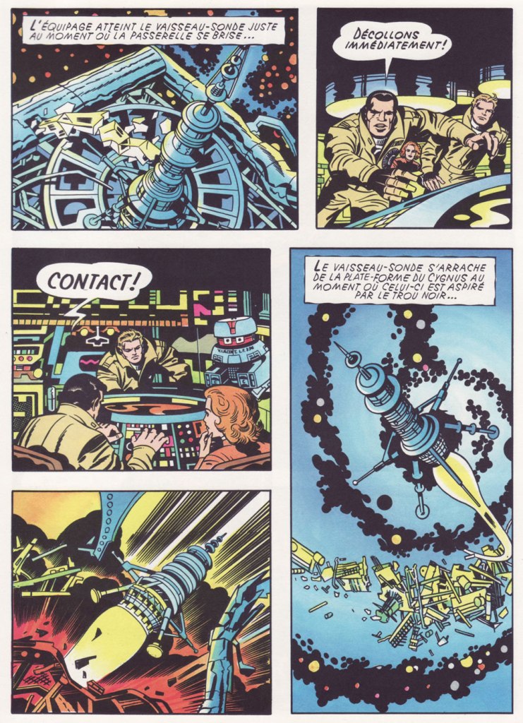
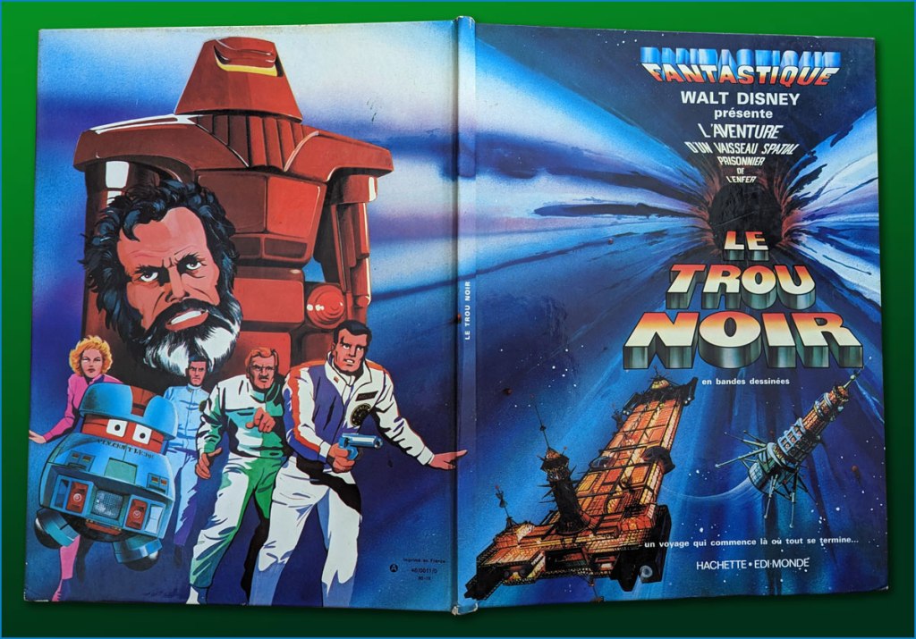
I’ve heard it said that the Kirby Black Hole material has never been reprinted or collected in full… which is only true if you only count English-language editions. I happen to have on hand the well-produced French collected edition (Fall 1980, Edi-Monde/Hachette). It was serialised earlier in the weekly Le Journal de Mickey (published continuously since 1934!).I’ve mostly gone with the action sequences. In an episode of Sneak Previews, film critics Gene Siskel and Roger Ebert perceptively assessed The Black Hole‘s shortcomings.Here’s a look at the hardcover collection in question, with its amusing cod-Kirby painted back cover.
I leave the final words to Mr. Royer, along with my earnest appreciation of his gregarious generosity!
MR:As a point of interest (or none at all), I designed and drew the Sunday page BLACK HOLE title panel as well as lettering, correcting robots and inking. I have a full set of B&W proofs if any one is interested in putting them into print. Offered to loan them to IDW but I guess they weren’t interested. My price must have been too high. Two comp copies of whatever they printed. LOL sigh.
*this was decades before Disney became perfectly fine with reaping billions upon billions from Kirby’s creations.
« I can resist anything except temptation. » — Oscar Wilde
A master from the Golden Age of comics, Matt Baker (1921-1959) is surprisingly well-remembered today. Part of it stems from his singular biography — he was a successful African-American cartoonist, an especial rarity in that era — but his posterity chiefly rests on the quality of his comic book covers.
Looking around, I see that much has been written about him in recent years. But I don’t see any mention of what strikes me about his work: in essence, it creeps me out. But I understand: Baker, as a black man, must have observed and experienced affairs of the heart from a different perspective.
Don’t get me wrong: it’s technically superb, of course. But it’s the tone that I find jarring. Baker’s covers stand out by virtue of their darkly cynical realism. A lot of these situations could only end in tragedy, from unwanted pregnancy to Black Dahlia scenarios. These comic books bore generic tag lines about ‘exciting romances’, ‘love stories’ and ‘romantic adventures’, but Baker’s covers instead feature entrapment and extortion, blackmail, rape and other forms of illicit sex, procuring and corruption…
Perhaps I’m reading too much into these yellowing bits of old paper. But there stands the fact that inside these comic books, the tone changes: we receive the usual tidy moral homilies at the conclusion of every story. Yet the covers, with their unresolved scenarios, retain their haunting power.
Here’s my evidence. See what you think!
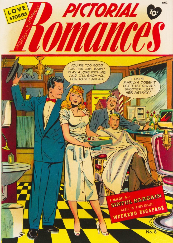
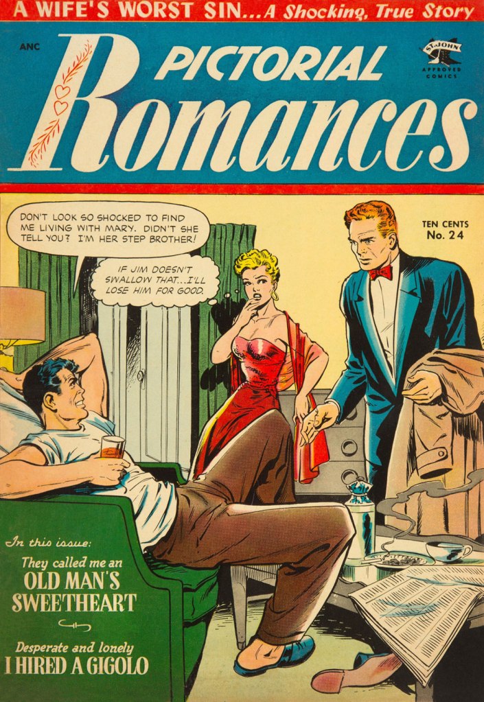
This is Pictorial Romances no. 8 (July 1951, St. John). Read the issue here.This is Wartime Romances no. 2 (Sept. 1951, St. John). Hilda seems to basically behave like Baker’s Canteen Kate, a character that makes me cringe in much the same way as Katharine Hepburn’s character in Bringing Up Baby, even without the mannered accent. This is Teen-Age Temptations no. 2 (June 1953, St. John). I sense a case of Section 2423 about to transpire. Read the issue here.This is Diary Secrets no. 18 (June 1953, St. John). Soliciting is evidently far less demeaning than going on welfare. Read the issue here.This is Teen-Age Romances no. 32 (July 1953, St. John). Oh, that Pat’s a keeper.This is Diary Secrets no. 19 (Aug. 1953, St. John). In 1953, a twenty dollar bill could buy you two hundred comic books, not to mention a jailbait date or twelve. Read the issue here.This is Wartime Romances no. 17 (Sept. 1953, St. John). No respect for the wingman. A rare case of two creeps who deserve one another. Read the issue here.This is Pictorial Romances no. 24 (Mar. 1954, St. John). Read the issue here.This is Teen-Age Temptations no. 8 (June 1954, St. John). For once, the cover matches the inside story. Read the issue here.This is Cinderella Love no. 25 (Dec. 1954, St. John). Drunk gringos slumming it over the border, down México way… what could go wrong? At least we can rest assured that the whole ‘waking up in a tub full of ice cubes, short one kidney‘ is an urban legend. But the plot of Elton John and Bernie Taupin’s 1975 classic, Grow Some Funk of Your Own, remains a distinct possibility.This is Teen-Age Romances no. 40 (Dec. 1954, St. John). With the Comics Code looming, the scenes depicted on St. John’s covers got sanitised into looking like any other romance comic book of the era. But I daresay Baker’s work was better than ever — I mean, look at that delicate, yet confident and expressive line. Read the issue here.A portrait of the dapper artist. Regrettably, work became scarce during the post-Code years, and Baker was reduced to hacking out page fillers for Vince Colletta’s studio. It’s an honest living, sure, but a waste, since nothing looks more like a dashed-out Colletta-inked romance than another dashed-out Colletta-inked romance.
Baker, cursed with a heart ailment, died tragically young at age 38 in 1959.
« The whistle of the old steam trains … could conjure up visions of bleak distances with one solitary wail. » — M.C. Beaton
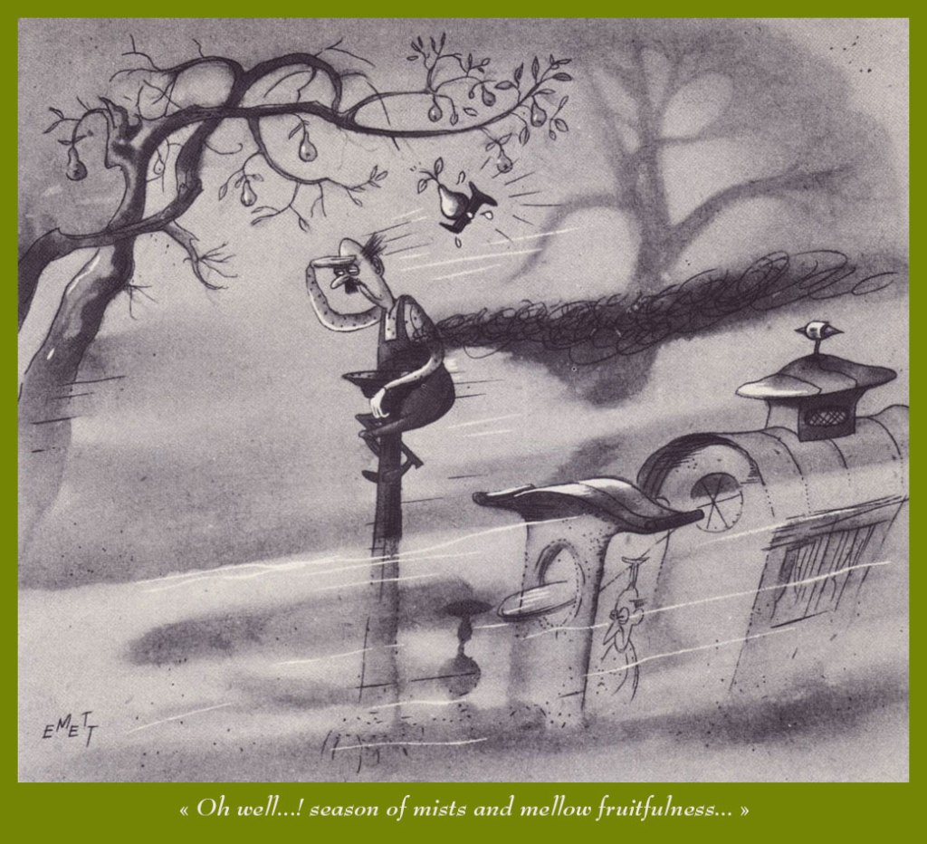
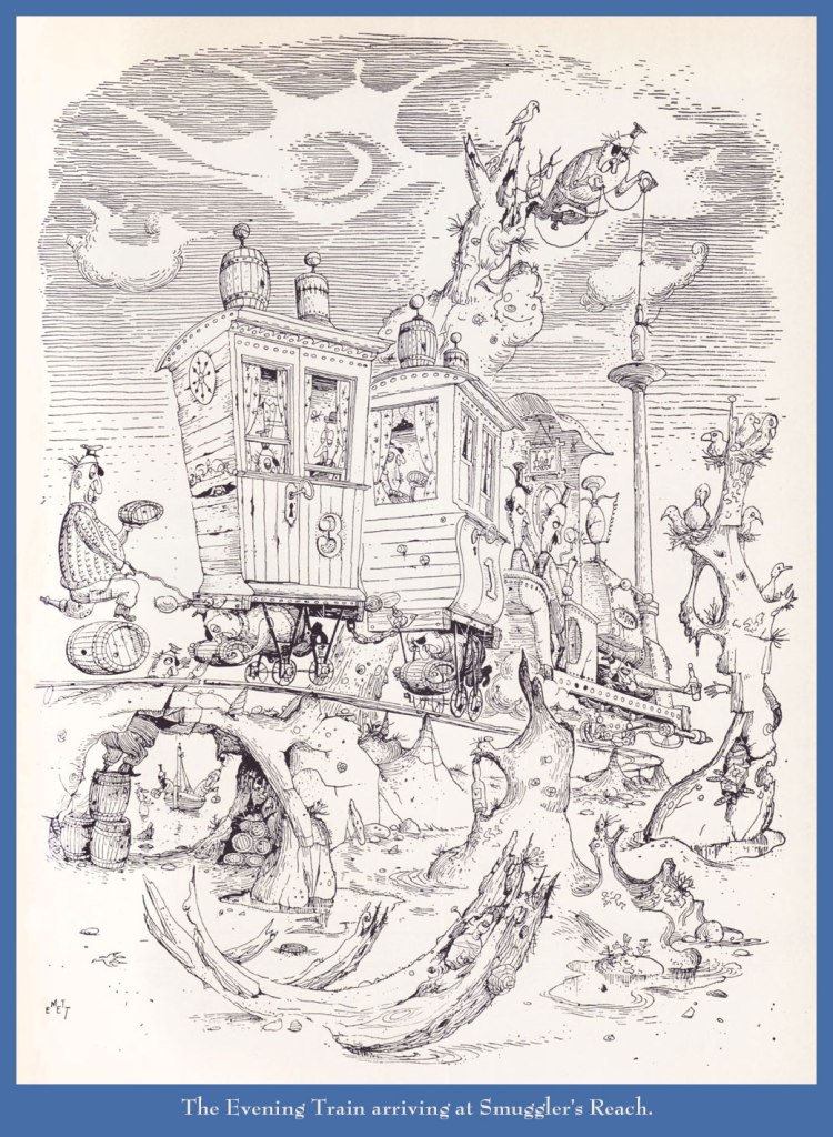
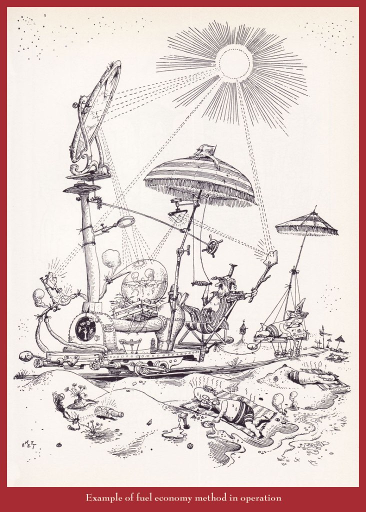
A couple of years back, I gave our readers an introductory sample of the genius (hardly too strong a word in his case) of Rowland Emett (1906-1990), and vowed I would return with a fuller, more lingering look.
Since I got the biographical trimmings out of the way that time, today, I’ll merely offer you an even dozen of my favourites.
Can’t tell a trébuchet from a catapult from a ballista? This handy guide will steer you right!Prof. Lightning’s moniker is evidently well-earned.Another inventive step in the harnessing of solar power.While this particular train route sadly does not exist (as an editor once wrote, “the great Emett, whose crazy world seems so much saner than our own…”), there are some lovely birding tours available throughout that green and pleasant land, from Land’s End to John o’Groats. Said nationalisation took place in 1948. Here’s a bit of background on that historic endeavour.
Ah, the nineteen seventies… and their Satanic panic, in which we can recognize so closely the roots (or at least relatives) of today’s disinformation maelstrom, before the politicisation and weaponisation of septic paranoia and lies had become honed to such an anti-science. In a lot of sordid ways, Lawrence Pazder was an Andrew Wakefield of his day.
Here’s a story that I first encountered around the time of its release, remembered, but didn’t revisit until a couple of weeks ago, when a good friend (merci, Keith!) helpfully snapped up a copy for me. This deceptively dark tale was created by writer Arnold Drake (I surmise), penciller John Celardo and mysterious inker Wanda Ippolito, who may have a been a spouse or relative of Celardo’s. It’s odd to find someone else inking Celardo, as this was his chief, most enduring and distinctive strength. For comparison’s sake — and presumably, reading enjoyment — here’s another Drake-Celardo outing, The Anti-13!
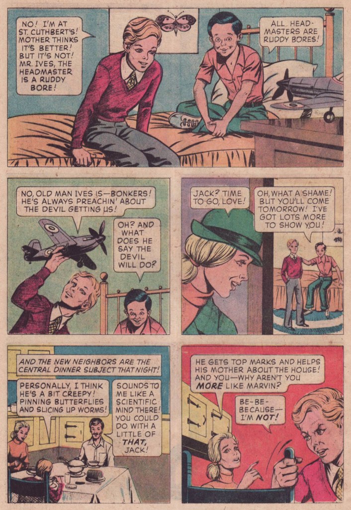
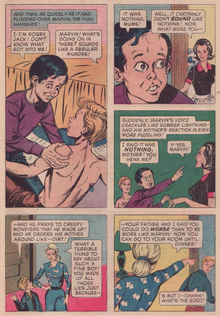
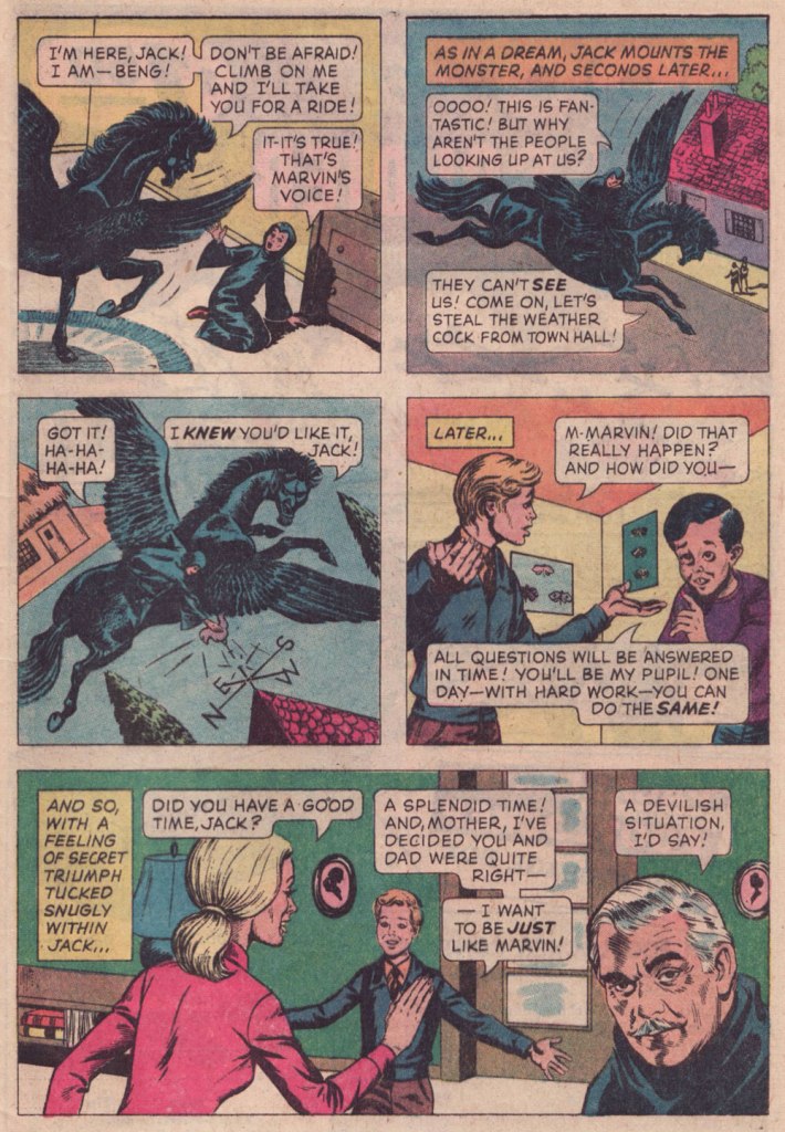
I won’t make any claims that this is great art: by this time, Gold Key’s printing was shoddy, they barely bothered with the colouring (straight Magenta and Cyan and Yellow everywhere — how lazy can you get?)… but I treasure this one because of the story. Given its moral — what moral? — it’s hard to imagine The Comics Code Authority giving this one a pass, as it merrily violates several of its key precepts. I’ve got another such blasphemous entry in the pipeline… this one duly Code-Approved! Just you wait…
I had a childhood friend who was a lot like Marvin (minus the devil worship — for all I know)… he was incredibly talented, but also scarily unpredictable, and not in a good way. One day, he just disappeared.
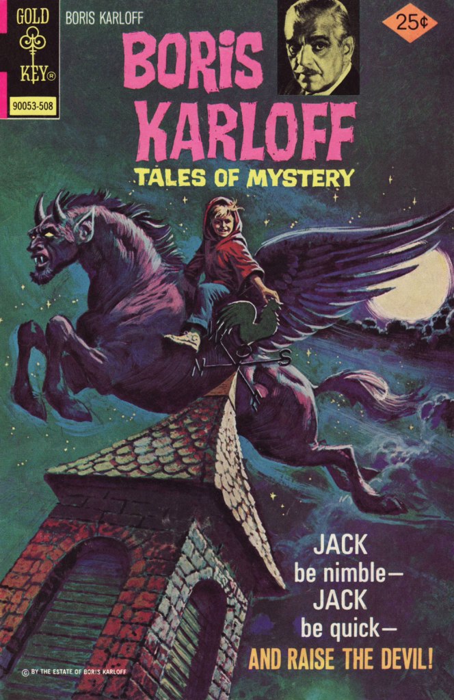
On the other hand, the accompanying cover is spectacular.
« Why Can’t You Be More Like Marvin? » originally appeared in Boris Karloff Tales of Mystery no. 63 (Aug. 1975, Gold Key), which bore this masterfully disquieting cover by Luis Domínguez. It would have made it into my Domínguez retrospective, Luis Domínguez (1923-2020): A Farewell in Twelve Covers but for the fact that I didn’t own a decent copy of the issue.
And as (nearly) always, a bonus for context: Celardo had a long and fruitful career, and I’m sure one of its highlights was to number among Fiction House’s elite cadre of cover artists. I’ve said it before, but despite their mind-numbing repetitiveness, FH covers were tops in the Golden Age in terms of draftsmanship and production values.
Aw, poor Ka’a’nga — always left at home to feed the jackals while Ann Mason goes off on escapades with her other boyfriends. And who insisted on adopting them in the first place? Ann, that’s who! This is Jungle Comics no. 98 (Feb. 1948, Fiction House). Judging from his ability in the jungle antics genre, it’s no wonder that Celardo was picked to illustrate the real thing (at least comics-wise): the Tarzan comic strip, from 1954 to 1968, between Bob Lubbers (another FH cover artiste!) and Russ Manning. And here’s one of Celardo’s Tarzan Sundays (March 27, 1954, United Feature Syndicate).