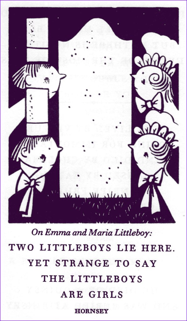
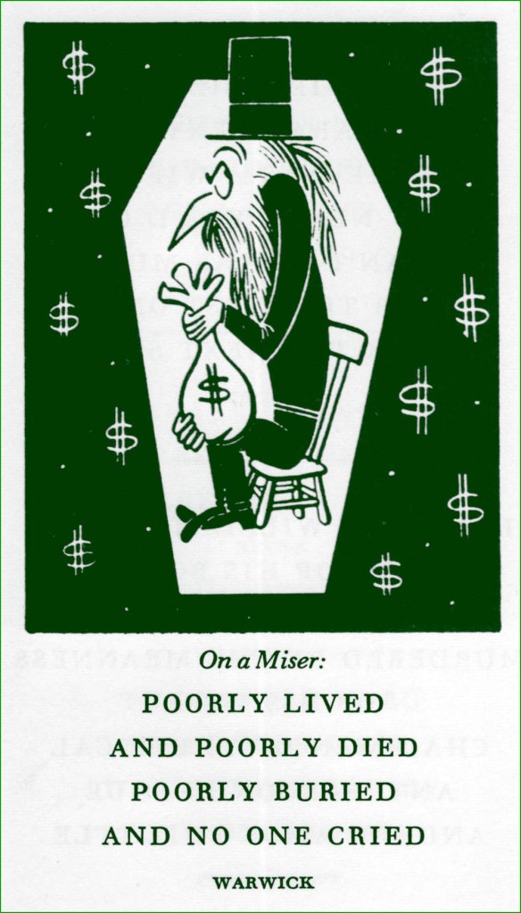
« Epitaph: a memorial that usually lies about the one below. » — Unknown
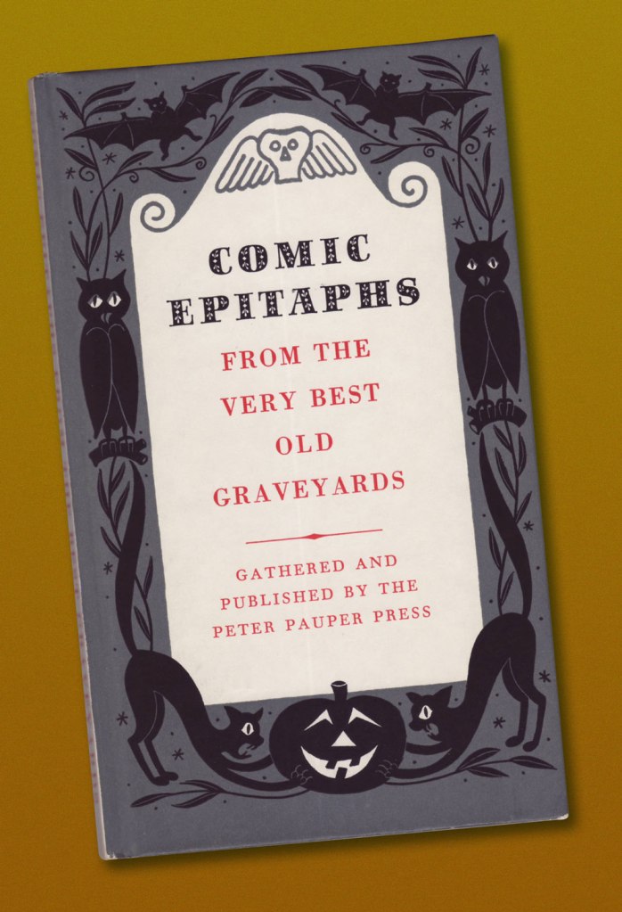
Ah, those lovely Peter Pauper Press books! They once were far easier to find*, but time marches on. This one’s a lightly macabre old favourite from 1957, wryly illustrated by long-time New Yorker cartoonist Henry R. Martin.
It is prefaced with this caveat: « The following collection of gravestone inscriptions is hardly a serious historical one. Most of the items are genuine, but many are suspect, and a few are frankly contrived. In some cases genuine inscriptions have been somewhat altered, and the place names are not reliable. Scholars are therefore warned not to find fault; but all men — and also any women who choose — are invited to read further for a little ghoulish amusement. »
-RG
*confirmed — anecdotally, I’ll grant you — by a visit, yesterday, to Maine’s spectacular Big Chicken Barn, where I didn’t stumble onto a single solitary PPP title.
« Then hear this, and never forget it. Any fool with fast hands can take a tiger by the balls, but it takes a hero to keep on squeezing. » ― Stephen King, The Dark Half
A couple of years back, I was reading, through idle curiosity, a ranking of Stephen King’s books*. I came upon the article author’s précis for King’s 1993 novel The Dark Half:
« The premise is simple and ingenious: a literary author “kills” off the pseudonym whose popular fiction has been paying the bills, only for that alter ego to take murderous, corporeal form. Within the killing spree that ensues, King offers some profound observations about the schism between high art and popular culture, while also exposing his own worries about legacy. » I like King’s perhaps a bit too cute allusion to Donald Westlake’s troubles with his better-selling, pulpier pseudonym Richard Stark — The Dark Half’s antagonist is named George Stark.
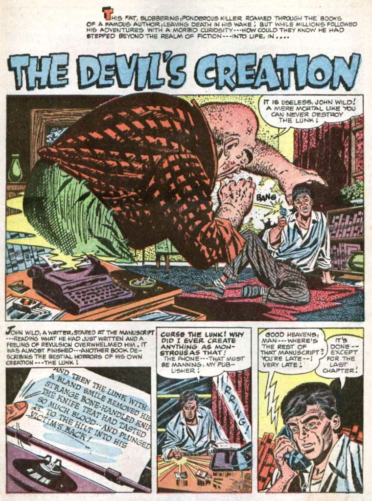
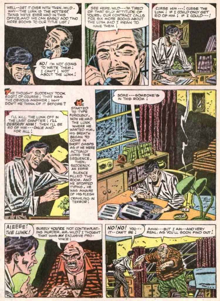
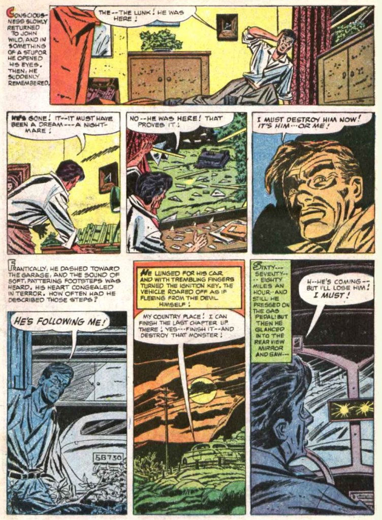
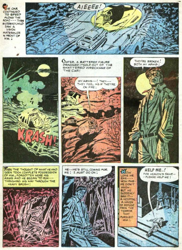
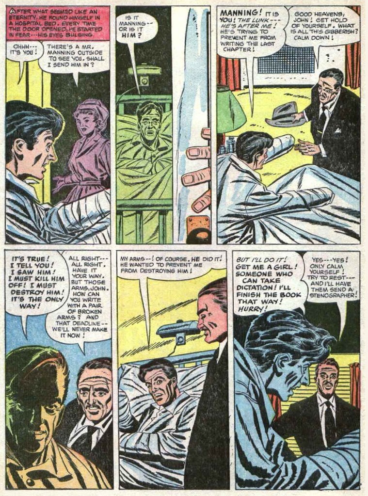
Anyway, that essential premise reminded me vividly of a harrowing comic book story I’d encountered as a child. Here it is — poorly reproduced, I’m afraid — and I’ll provide a bit of context afterwards.
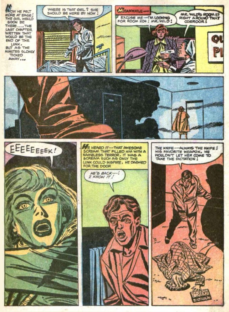
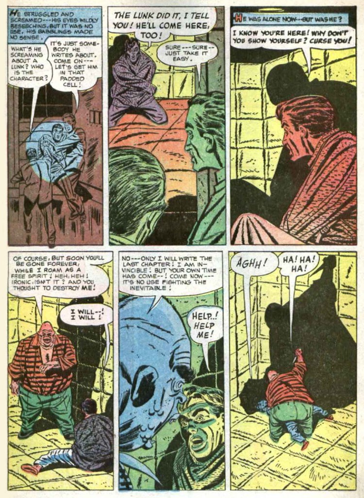
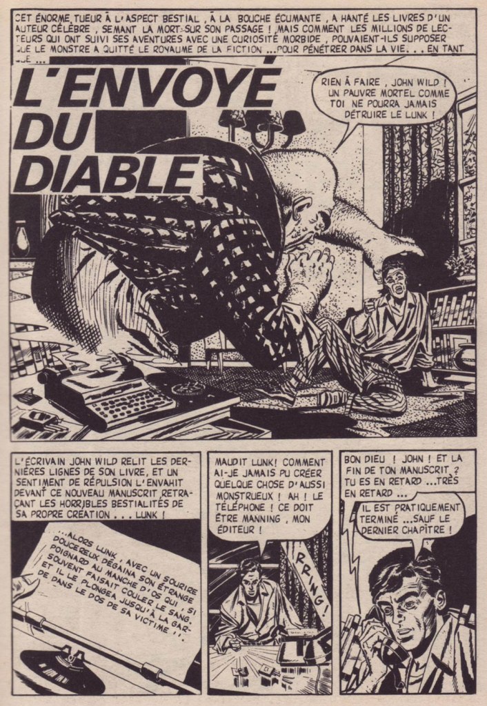
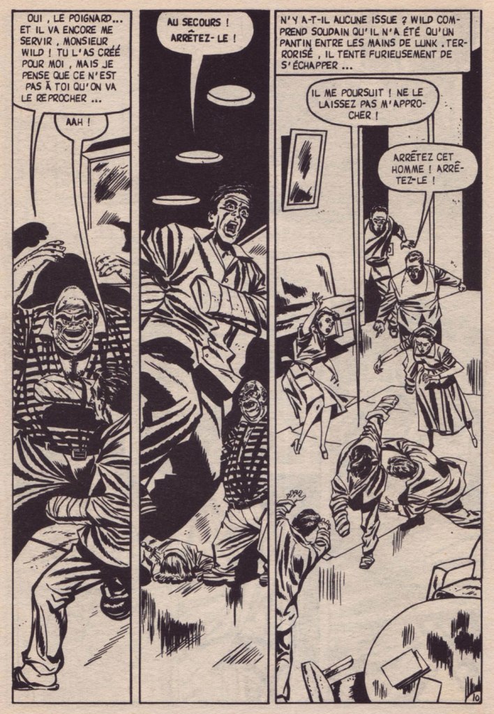
The Devil’s Creation originally saw print in Beware! Terror Tales no. 2 (July 1952, Fawcett). Scripter unknown, art by Mike Sekowsky (1923-1989).On a small town kid’s budget, some US comic books were highly unlikely to turn up on my local spinner rack. Besides, I didn’t even know English yet. But these French digests (162 pages for 35 cents!) could be a godsend. This one came out slightly before my time, but I somehow landed a second-hand copy. This is my dog-eared Eclipso no. 9 (Oct.-Dec. 1970, Arédit); I was, within its pages, introduced to — besides Eclipso — Deadman, The Spectre, The Doom Patrol, The T.H.U.N.D.E.R. Agents and Mark Merlin.
Amid all this fine, but sanitised Silver Age fare, here was one short story that sharply stood out by its merciless brutality. I’m still mystified at how this seemingly random story, which hasn’t even been reprinted once in North America, so incongruously landed in this collection. Amusingly, Sekowsky appears elsewhere in the issue, pencilling the light-hearted A Day in the Life of Dynamo (from Dynamo no. 1, Aug. 1966, Tower). Say what you will, the man was versatile.
Notice how they took away his gun? Censorship was pretty strict in France when it came to publications for youth. In reformatting stories for a different size and ratio, this publisher’s efforts were often pretty dismal; this, however, was an exception. I daresay the pacing was even improved. You simply never know!
-RG
*Not having made it through much of his oeuvre, my favourite King is the non-fiction Danse Macabre (ranked his 51st best book). Fun fact: ill-advisely, the French have retitled King’s famous short story collection Night Shift (ranked no. 13)… Danse macabre. The real DM was retitled Anatomie de l’horreur (‘Anatomy of Horror’). Now I’m sure that didn’t confuse anyone.
« In old New York it was Turkey Mike, Muggsy and the Big Six. In San Francisco, Baby Bull, Stretch, and the Say Hey Kid. Then came the Count, the Hackman, Jack the Ripper and Will the Thrill. Barry and Jeff Kent, but a dearth of nicknames, that is, until… The Giants got the Panda. » — Scott McCaughey, “Panda and The Freak“
In those callow days of youth when I still cared about big league baseball — having lost interest in such matters when Montréal lost its team — the post season was over and done by, say, the 20th of October. Nowadays, with all the extra teams and trimmings, it just seems to go on and on.
I long for the days when only ball players and little kids wore baseball caps, to be honest. Ah, but the sport yet holds some fond memories for me. I recall most fervently the rather outré facets of it, fostered and amplified by the sport’s scads of iconoclasts and loonies*.
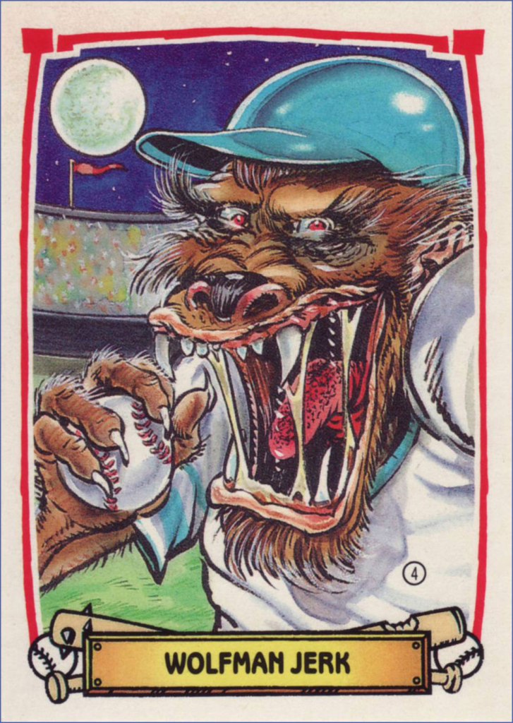
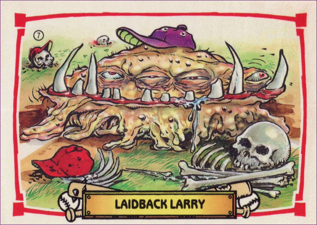
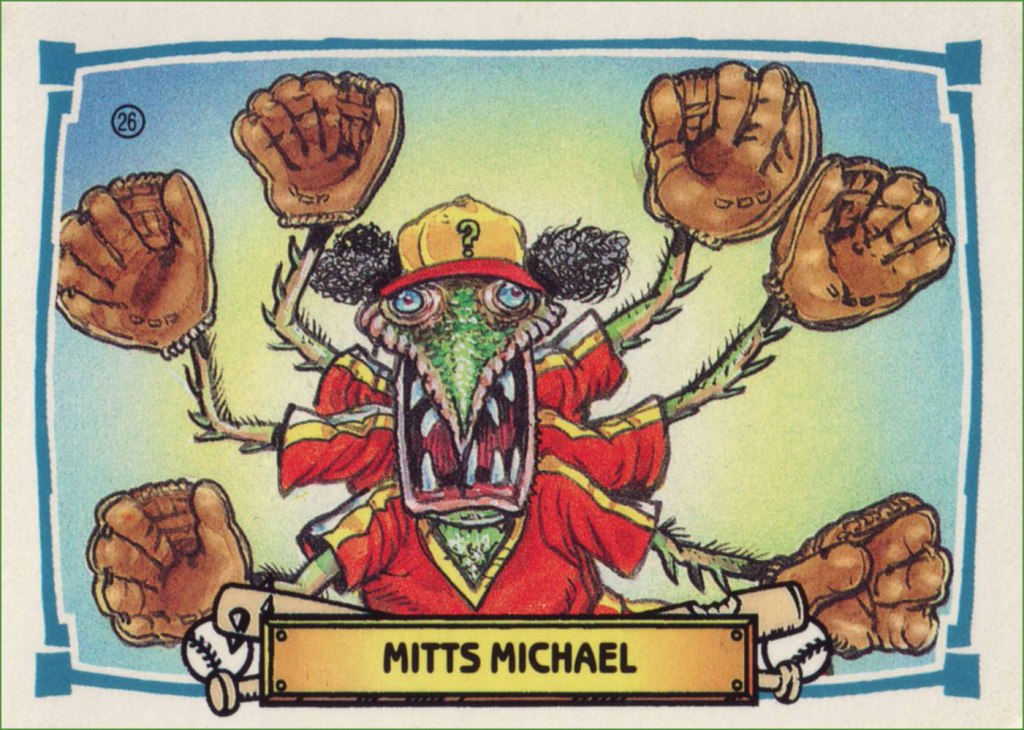
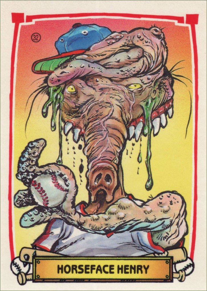
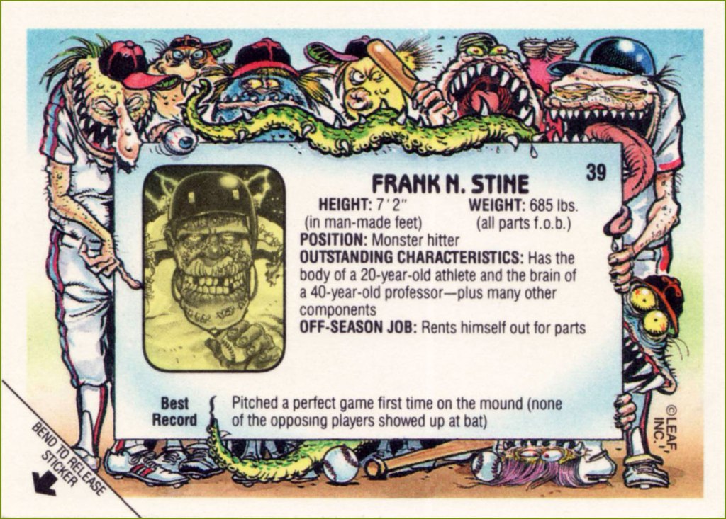
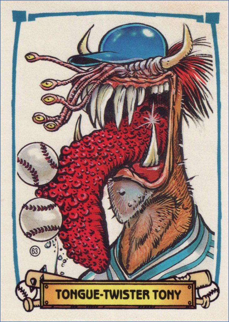
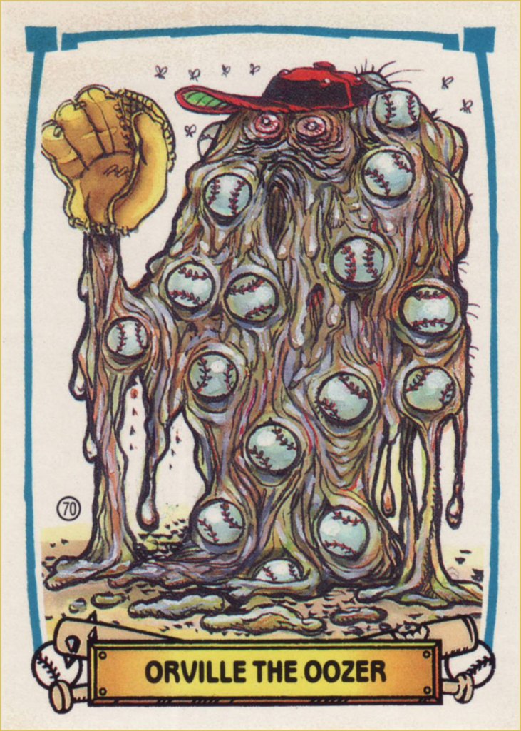
And while we’re on the subject, here are some highlights of Leaf/Donruss‘ 1988 card set Baseball’s Greatest Grossouts, illustrated by the busy yet ever-dazzling B. K. Taylor (Sick Magazine, The National Lampoon, The Muppet Show — he designed Dr. Teeth! — Sesame Street, Dynamite, Mulan…).
I’m mostly featuring the front of the cards, but the backs were also a treat. Love that grotesque wraparound artwork!
-RG
*splendidly — and catchily! — eulogised by supergroup The Baseball Project, featuring members of REM, The Young Fresh Fellows and Dream Syndicate. Four albums on, and their latest, Grand Salami Time!, may just be their finest hour. End of commercial, play ball!
« the escape from the black widow spider / is a miracle as great as art. / what a web she can weave / slowly drawing you toward her… » — Charles Bukowski, The Escape
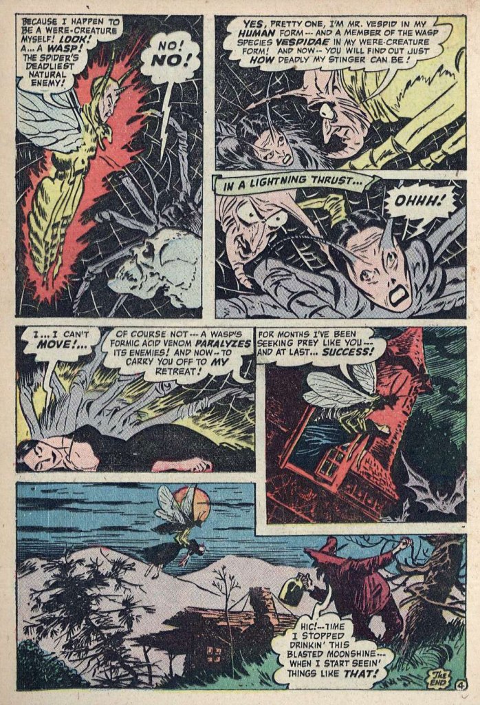
This time around, here’s an over-the-top gem from ACG. No matter what anyone might think, I hold that the sloshed neighbourhood yokel bookending the tale is its star.
The striking artwork is by the mysterious King Ward.
I’d be inclined to say that the « In a lightning thrust… » panel surely wouldn’t have passed muster with the censors… but this was pre-Code horror, after all!
Incidentally, that bit about wasps and spiders, while essentially factual, smacks of your typical comic book oversimplification. Here’s the real-world lowdown.
It wasn’t the cover story — good thing, too: how much more of the plot could they have given away? — but said cover’s a nice one by Ken Bald (1920-2019), so I’m throwing in it. This is Forbidden Worlds no. 12 (Dec. 1952, ACG).
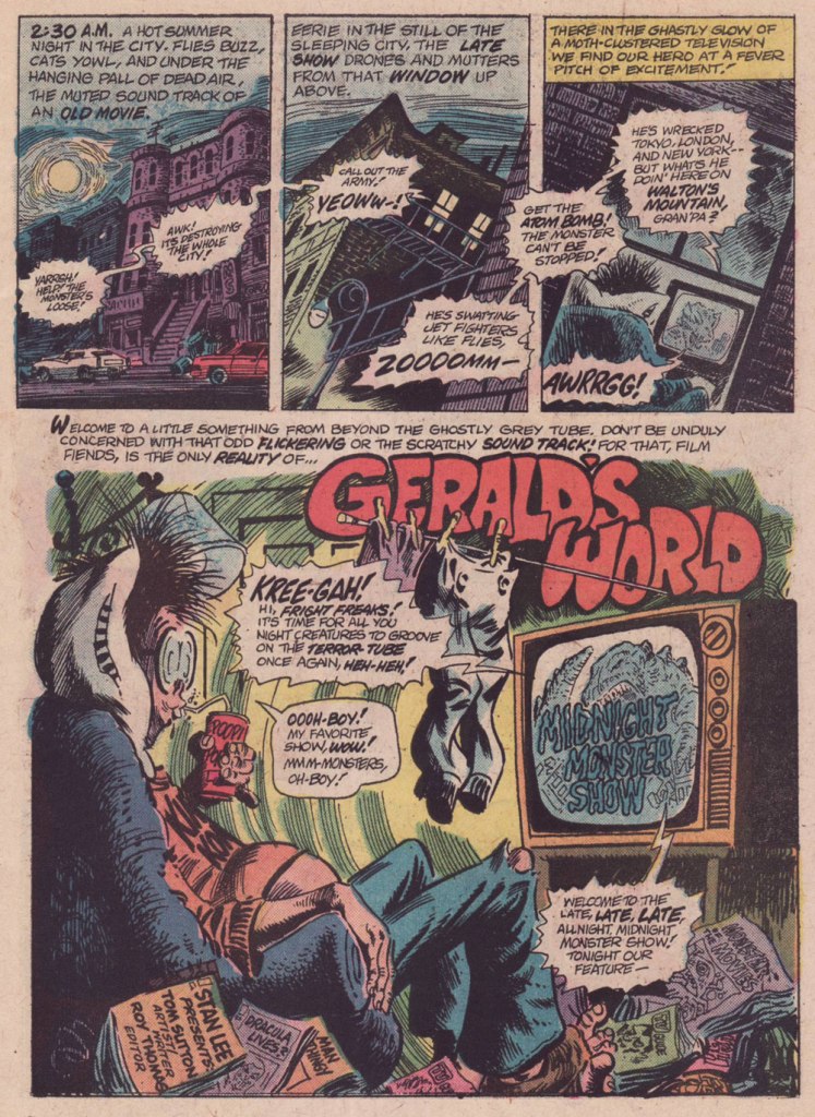
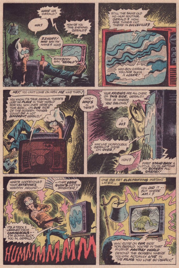
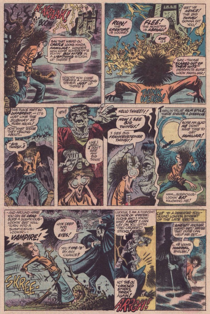
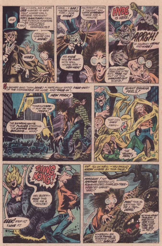
« … so I’d work on it until three or four o’ clock in the morning — that is the time to do Loevecraftian machinations. » — Tom Sutton (2001)
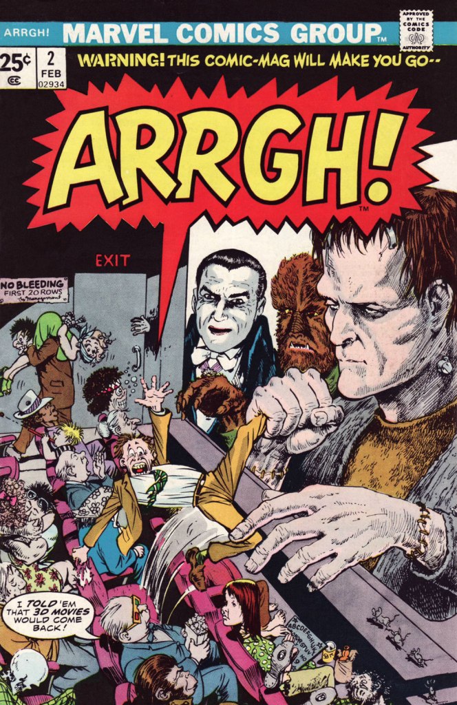
If you ask me, Marvel’s attempts at humour never came off*, being both strained and generally directed at superheroes, who are ridiculous in the first place. It’s like mocking pro wrestling — What’s the point?
Marvel did half-try its clammy hand at a horror humour comic book midway through the 70s, and while much of it looked decent, it was consistently unfunny. You can give it your best Will Elder, but it won’t stick if you don’t have that rare magic comical gene.
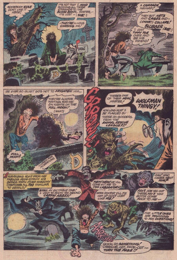
And while I’d love to say that Tom Sutton (1937-2002) had it, I’m afraid he didn’t. But Gerald’s World was a story close to his heart, to the point where he actually remembered creating it and having fun doing so.
« Right, and I did “Gerald”, who stayed up all night watching Fay Wray or something like that. I had fun with those! You know there were people who really didn’t like those things? » (Comic Book Artist no. 12, 2001)
It’s overstuffed, but it’s brimming with mood and solid craft. Take it away, Tom!
For a dose of real-life, depressing horror, read the definitive, late-in-life Tom Sutton interview, ‘An Odd Man Out‘. I’m afraid it’s unlikely to leave you swooning with affection and goodwill for the comic book industry.
And here’s Marie Severin‘s cover for that issue. This is Arrgh! no. 2 (Feb. 1975, Marvel). By issue five, the final one, Marvel were down to licencing 1954 Get Lost! material from Ross Andru and Mike Esposito.
-RG
*there’s always an exception, isn’t there? I’ll proudly vouch for Scott Gray and Roger Langridge‘s Fin Fang Four stories, circa the late Oughties. Recommended? You bet.
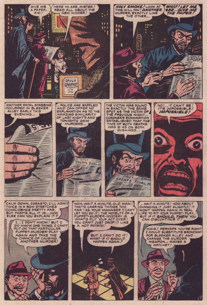
« Master of puppets, I’m pulling your strings / Twisting your mind and smashing your dreams / Blinded by me, you can’t see a thing / Just call my name ’cause I’ll hear you scream / Master, master! » — Metallica
I’ve never been a Jim Mooney (1919-2008) fan, though he’s undeniably had a long and respectable career as a penciller (Tommy Tomorrow, Supergirl, Dial H for Hero, Omega the Unknown) and inker (Spiderman, Thor… and countless others). I’ve always found his work a bit stodgy and lightweight.
As these things usually go, however, if you keep an open mind, you’re bound to come up with exceptions, and here’s one.
While Atlas’ pre-Code horror comics were generally saddled with indifferent or nonsensical writing, the artwork on offer was often surprisingly wild. I mean… they even got straight-laced Joe Sinnott to go downright weird on a couple of occasions.
Here’s a short story that’s compellingly sombre, sinister and paranoid, and Mooney perfectly conveys its oppressive mood.
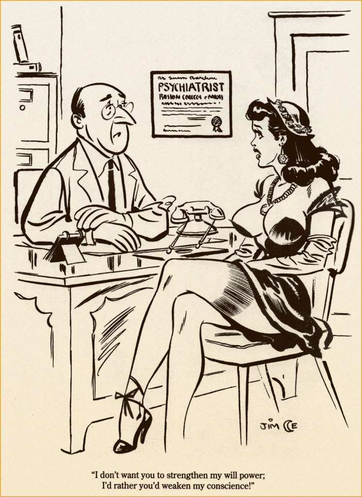
The ending is daft… and at the same time, inspired lunacy that takes it to another level. While I’m drawing from a 1974 reprint, here’s the cover from its original publication, Spellbound no. 13 (March 1953, Atlas); cover pencilled and inked by Carl Burgos, colours by Stan Goldberg. Working in the Goodman Family salt mines (in this case, the Humorama line of ‘girlie’ digests, at ten bucks a cartoon, writing included), Mooney was probably more in his element, nimbly bridging the cartoonish and more academic semi-realism, not a common skill!
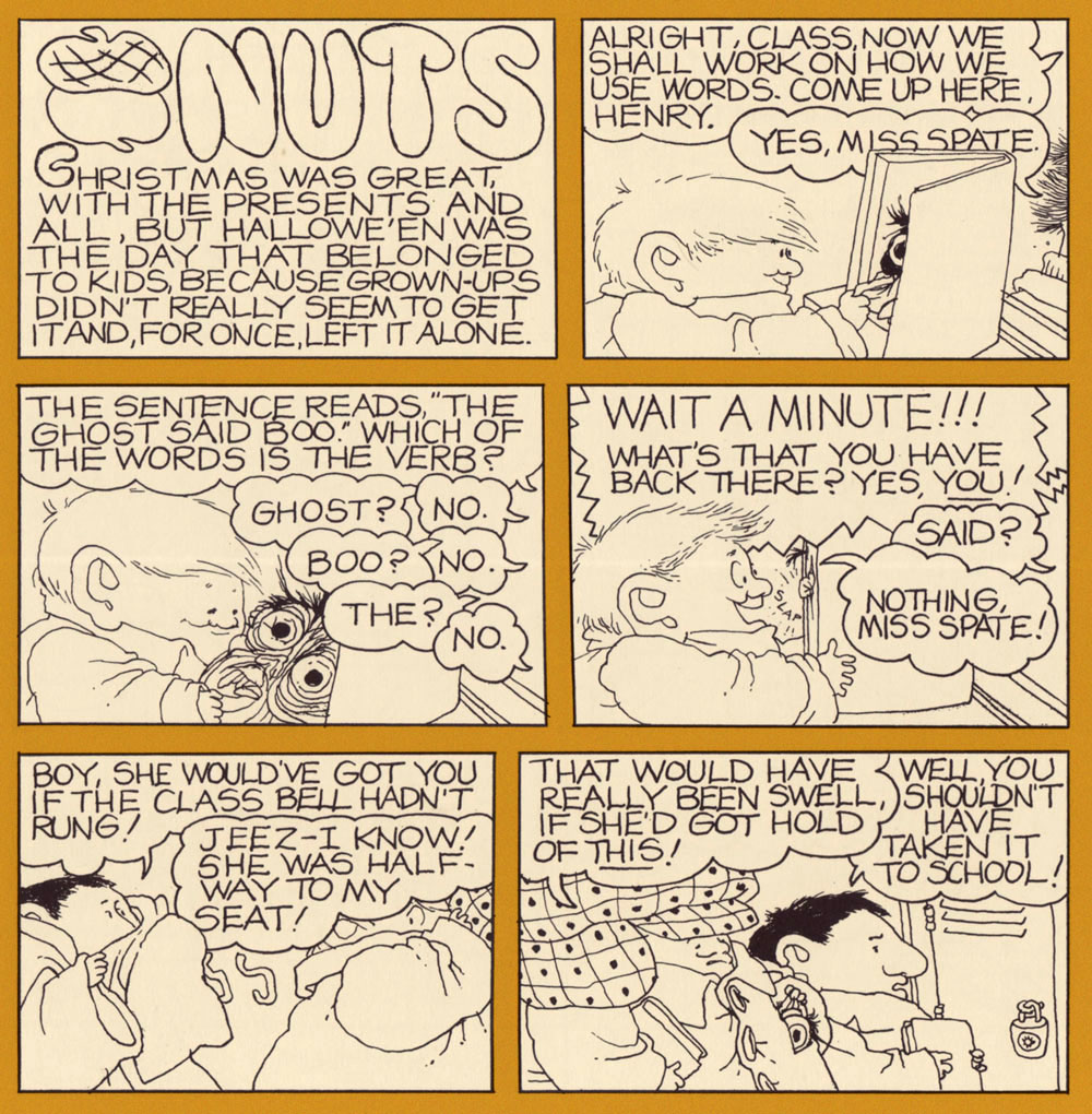
« They wanted me to do something that would be absolutely horrific, and so I was thinking silly monsters and putting all kinds of political twists on it. Then I began thinking, what is really, really scary and hasn’t been faced? I thought of being a kid. » — Gahan Wilson
Gahan Wilson (1930-2019), who else? I’ll gladly confess that it’s always a bit daunting to pick the opening and closing salvos of a countdown… especially the opener.
I’m fairly confident there’ll be no controversy as to my decision to bestow the inaugural spot to one of Mr. Gahan Wilson’s creations.
After all, Gahan was truly one (along with colleagues Addams and Gorey, to name but an obvious pair) of those gnarly souls — bless and/or curse them all — who made each day Hallowe’en… in the finest way.
« Remember how confusing it was, being a little kid? Remember trying to make sense of the weird rules grownups always made you follow, and how you always guessed wrong and which ones they’d figure were really important?Remember how small you were and how brave you had to be to get through it all? »
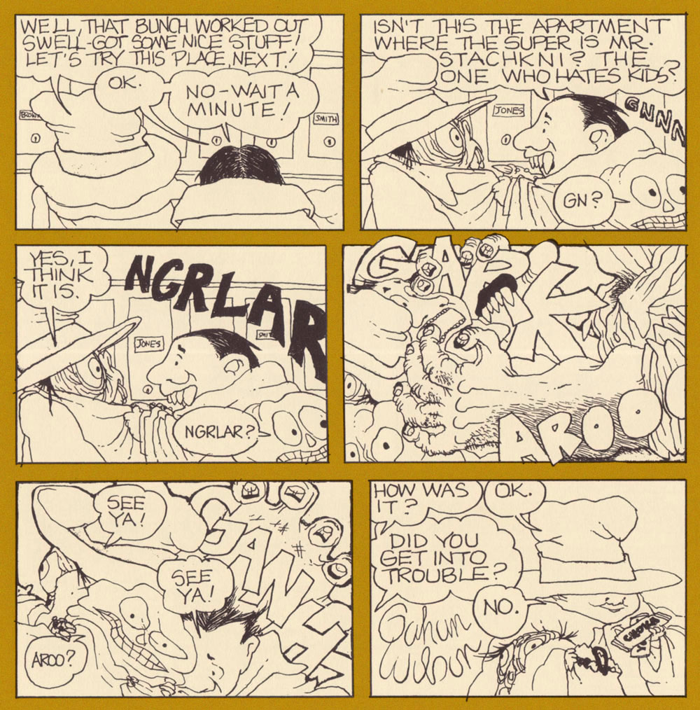
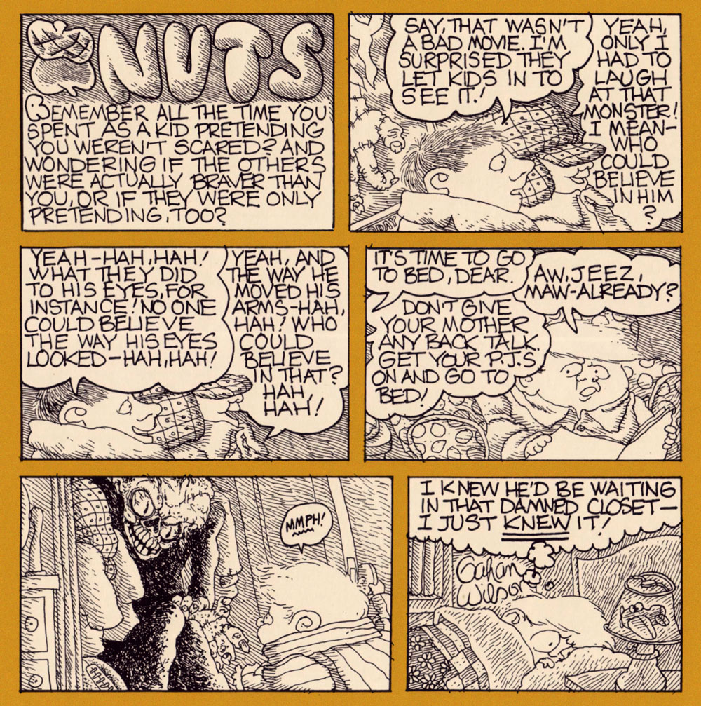
Oh, what the heck. Here’s a bonus strip, still a perfect fit for the occasion:
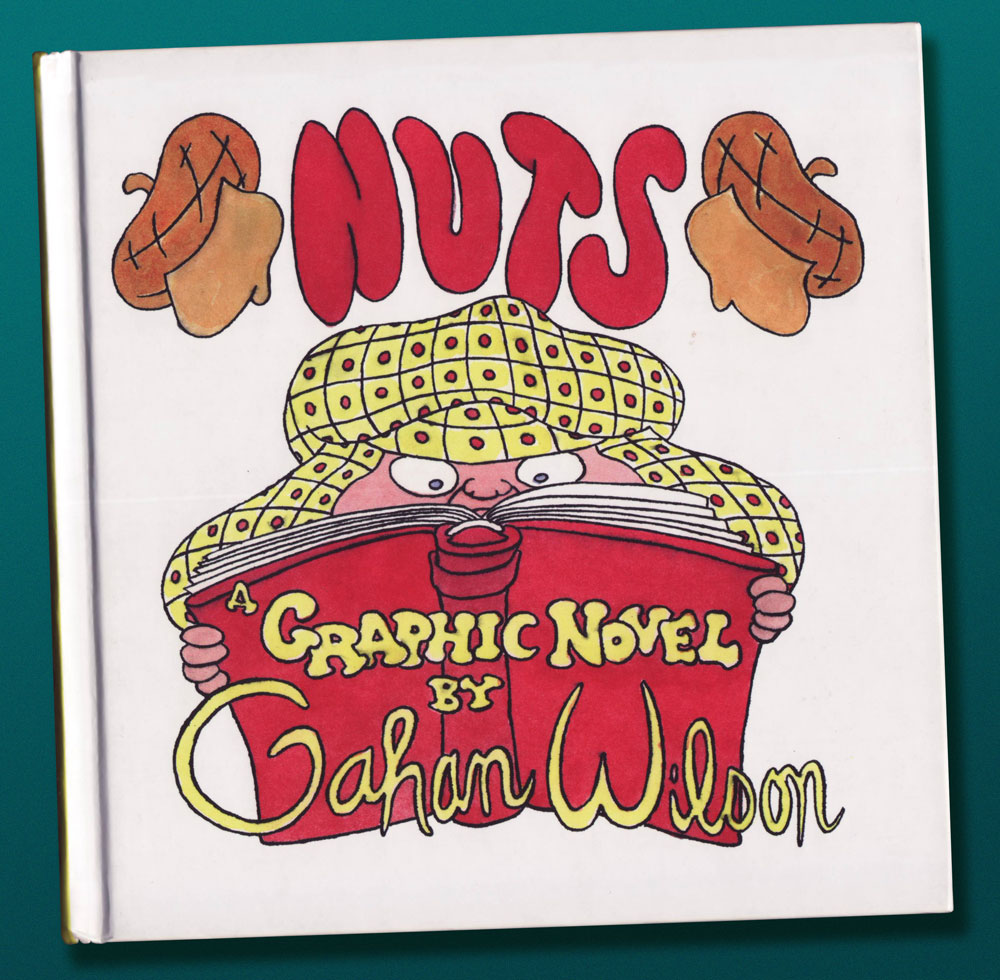
Incidentally, for those entirely unfamiliar with it, Nuts was Mr. Wilson’s first sequential strip, and it was published in the pages of The National Lampoon between 1972 and 1986.
… I bring you a of ‘clip show‘ of sorts: excerpts from past entries of this blog, but with a slight twist. For, unlike your textbook clip show, I’ll be drawing from episodes you’re probably unfamiliar with. After all, while this is my 500th piece, this is our blog’s eight hundred and fortieth: quite enough of a tangle to get hopelessly disoriented in.
I have culled from the earliest days of WOT?, when we had precious few readers — each one precious! Five picks from the lot seems a reasonable ratio: neatly one per hundred.
While many of our posts from those days have since, one way or another, found their audience (or vice versa), these dispatches have languished in obscurity — deservedly or not, who can say?
Here they are, in chronological order and everything:
This one was a gathering of English fantasy artist Patrick Woodroffe (1940-2014)’s covers for Warren Magazines. You may have seen his fabulous cover for Judas Priest’s 1976 LP Sad Wings of Destiny.
A ghoulish and gloriously fitting backup feature for Pat Mills’ unhinged Death Race 2020 (1995-96, Roger Corman’s Cosmic Comics). I collected them all so you don’t have to!
Incidentally, this is all you’ll be seeing of me this month — it’s not a case of burnout: I’m just furiously cobbling together this year’s Hallowe’en Countdown, and that takes time. Thanks for your patience and loyalty, and see you in October!
« If you take drawing seriously, you never quite feel you’ve arrived. » — Ed Sorel
This time out, I’m pinch-hitting for my co-admin ds, who’s burning the midnight oil these days.
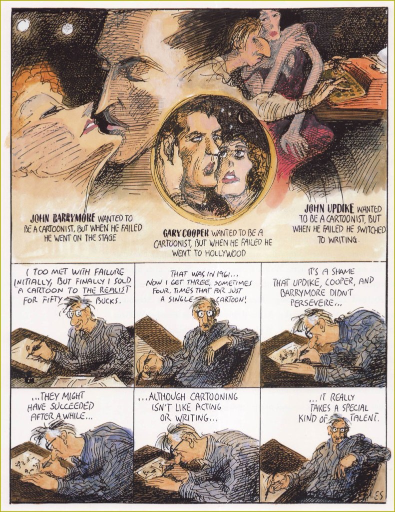
Just about a month ago, when I wrote a piece about Seymour Chwast (b. Aug. 18, 1931), it occurred to me that I should also devote post-haste (just in case) some column space to his fellow surviving Push Pin Studios co-founder, Edward Sorel (b. March 26, 1929). Let us celebrate the living while we can. The dead don’t appreciate nearly as well such gestures .
Opting for a freelancing career, Sorel left Push Pin, just a few years after its founding. He made it, all right, becoming one of the greatest caricaturists of the century. But he was every bit as accomplished a writer, which elevates his work above the ‘merely’ visual.
I’ve always been blown away by how deceptively easy he makes it all look, and that’s what’s so impressive: very loose on the surface, but with an underlying, laser-sharp precision. I could easily go on at some length, but Sorel’s career and art are well-documented themes. Check out, for instance, The Enigmatic Edward Sorel(From The Comics Journal), or this fine New York Times review of his recent memoir (circa 2021), Profusely Illustrated.
And now, some of the man’s work:
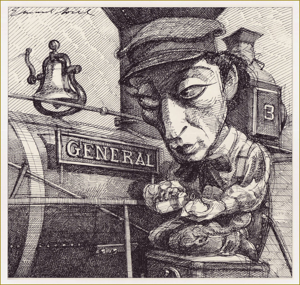
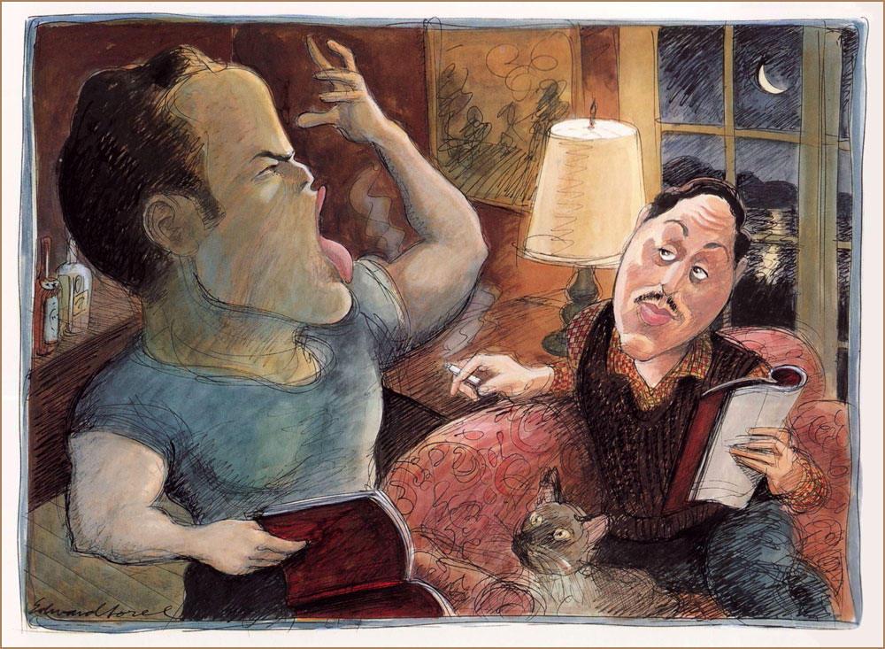
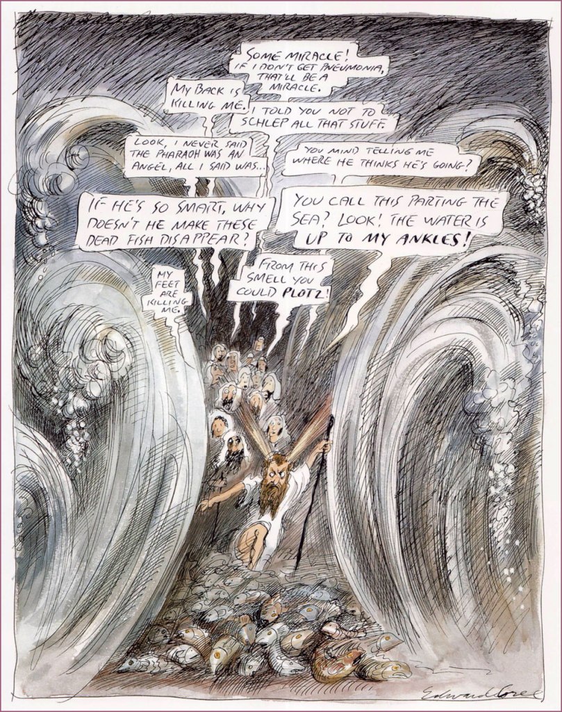
« My long association with Penthouse was unique. They bought every idea I submitted to them, and never changed anything except my spelling. This solipsistic strip appeared in 1990. »He can draw *anything*! This one appeared as The New Yorker‘s Jan. 31, 1994 cover illustration.I suppose every cinephile has his favourite Hitchcock film; mine’s The Lady Vanishes (1938). An entry in Sorel’s “Movie Classics” series, published in the March, 1981 issue of Esquire. « The General, starring Buster Keaton, is the only silent movie I included in my “Movie Classics” series. Based on an actual incident in the Civil War, it often has the look of a Mathew Brady photograph. » From Esquire, Dec. 1980.« Tenor Enrico Caruso is a guest at the St. Francis Hotel when the 1906 earthquake hits San Francisco. He vows *never* to return to a city “where things like this are permitted”. From Sorel’s pictorial essay “Keyhole History” (GQ, Oct. 1984).More rollicking blasphemy for Penthouse (Dec., 1992). Ah, yes. « The 1973 Academy Awards are remembered for Marlon Brando’s refusal to accept his Oscar for The Godfather. His emissary, Apache tribe member Sacheen Littlefeather, explained that Brando’s rejection of the award was to protest Hollywood’s depiction of Native Americans. Backstage, John Wayne was apoplectic. As John Lahr wrote in his article “The Birth of the Oscar“, “The Duke, who had dispatched many an Apache on film, didn’t take kindly to Brando’s protest… Wayne had to be restrained by six men from yanking Littlefeather off the stage.” From The New Yorker, March. 21, 1994. And speaking of Brando… « Marlon Brando is sent up to Cape Cod to read the part of Stanley Kowalski in A Streetcar Named Desire for Tennessee Williams‘ approval. First he fixes the nonfunctioning electricity and plumbing, then he auditions. His performance was stellar in every role. From Sorel’s “First Encounters” series, this entry appeared in Atlantic Monthly‘s July, 1994 issue. Note the kitty’s rapt expression.« Exodus revisited: an educated guess as to what Moses endured as he led his people through the Red Sea. A cartoon for Penthouse, the only mass-circulation magazine to welcome my blasphemy. » Penthouse (like the man said), Apr. 1995. Oh, and Plotz: To burst from strong emotion; often used humorously to express minor shock or disappointment (פּלאַצן, platsn, ‘crack’; cf. German: platzen;) and Schlep: To drag or haul (an object); to walk, esp. to make a tedious journey (שלעפּן, shlepn; cf. German: schleppen;).« Another of my egocentric ramblings, this one a rationalization for not becoming a great artist. » It appeared in the Aug. 21/28 issue of The Nation.« How Was I Supposed to Know? », from The Nation, Sept. 24, 1990. Oh, the sequels just write themselves.Here’s a rather famous one: « Back in the mid-sixties, my friend George Lois had an idea for an Esquire cover that couldn’t be done with photography. He asked me to do it, and I panicked — i.e. I tightened up. When I handed him my finish, he rolled his eyes and said he’d give me until the next morning to do it over. I went beyond panic, but nevertheless did a drawing we were both happy with. » It appeared on the cover of Esquire’s April, 1966 issue, with the caption of “The problems of power for Frank Sinatra”.« Director Michael Blakemore, at a rehearsal of Woody Allen’s one-act contribution to Death Defying Acts, watches in horror as Allen scribbles copious stage directions for him to execute. (Caricaturing Woody Allen is so easy that after drawing him, many an amateur comes to think of himself as a pro.) » From The New Yorker, June 3, 1996. Look at that pen move!
« I know you’re lookin’ for a ruby in a mountain of rocks, but there ain’t no Coupe de Ville hidin’ at the bottom of a Cracker Jack box. » — Jim Steinman
Crumpets!
It began with crumpets. I was picking up a couple of packages of those scrumptious British griddle cakes at the only store in our small town that carries them — as far as I can tell. Glancing about, I noticed on a nearby shelf something I’d never encountered: packages of Cracker Jill*.
I’d been toying with the notion of a Cracker Jack post, but this surely was a sign. When I got home, the merest bit of research turned this up:
« Introducing Cracker Jill™! After more than 125 years with our iconic Sailor Jack mascot, we’re adding Jill to the team to celebrate the stories of the women and girls who are breaking barriers in sports. With her tenacity, vibrancy, and strength, Cracker Jill™ takes inspiration from the women that change the game on the playing field, and beyond.
Join us in supporting the next generation of athletes by donating to the Women’s Sports Foundation through CrackerJill.com. With a $5 donation or more, we’ll send you a bag of Cracker Jill™ while supplies last. Remember, keep an eye out for Cracker Jill™ in baseball stadiums around the country. »
It’s a most worthy cause, obviously, but a) Jack the Sailor (and his pooch Bingo) has only been the brand mascot since 1916. A mere 107 years, so the math’s off. And b) “Introducing”? There was already a Cracker Jill. Exhibit A, this product from 1977:
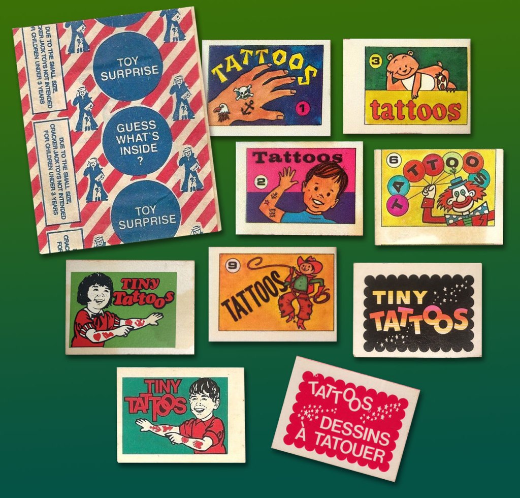
Prudently keeping in mind that this is a huge topic, with reams of historical ramifications, I’ll narrow my focus on a tiny area of the map: the four Cracker Jack prizes I’ve held on to for decades, and that turned up in a box I was browsing through the other day.
« Prizes were included in every box of Cracker Jack beginning in 1912. One of the first prizes was in 1914, when the company produced the first of two Cracker Jack baseball card issues, which featured players from both major leagues as well as players from the short-lived Federal League. Early “toy surprises” included rings, plastic figurines, booklets, stickers, temporary tattoos, and decoder rings. Books have been written cataloging the prizes, and a substantial collector’s market exists. » [ source ]
Like many a cartoonist (just ask Chip Kidd, Charles Burns, Mark Newgarden, Ben Katchor, Wayno, Chris Ware…), I’ve always been irresistibly drawn to the anonymous sprouts of advertising and industry: the artwork adorning matchbooks, cheap novelties and their packaging, beer coasters, liquor labels… so much toil that surely paid peanuts (and perhaps popcorn), unsigned and unappreciated. But a surprising portion of that work, ubiquitous and yet invisible, was created by skilled craftsmen. There’s a necessary economy of means, a simplicity of line — saving time and allowing for crappy, ‘it’ll do’ reproduction, but also effective design and a certain timeless je ne sais quoi.
Back when The Cracker Jack Company was its own entity, a lot more care and attention were bestowed upon minute details. Most of these tattoo booklet cover designs predate the company’s 1964 acquisition by dairy company Borden. The bottom right booklet is a Canadian variant from the late 1970s-early 1980s.
And so, here’s the cream, so to speak, of my small collection of Cracker Jack temporary tattoos. Enjoy!
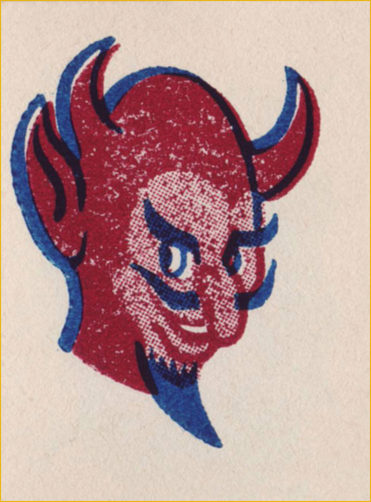
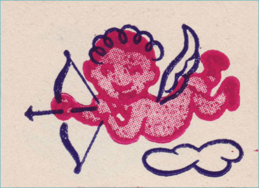
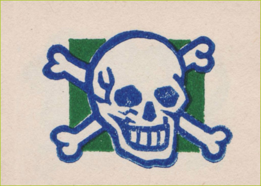
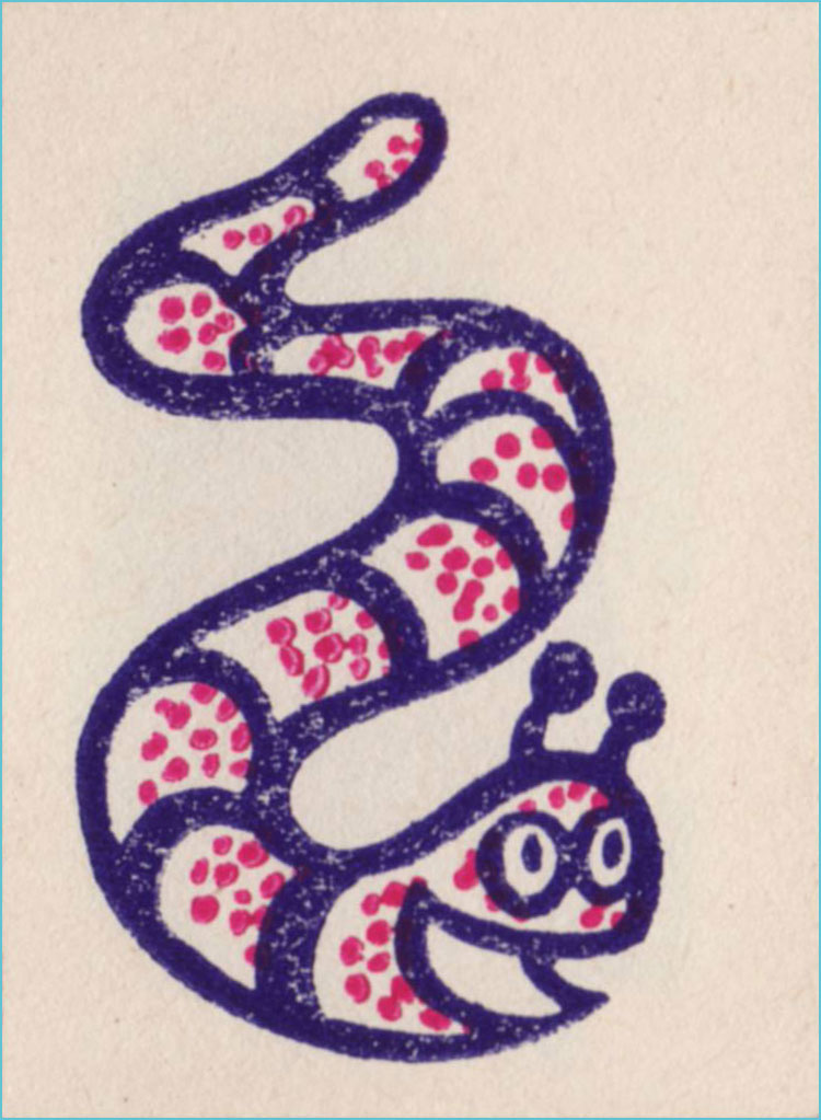
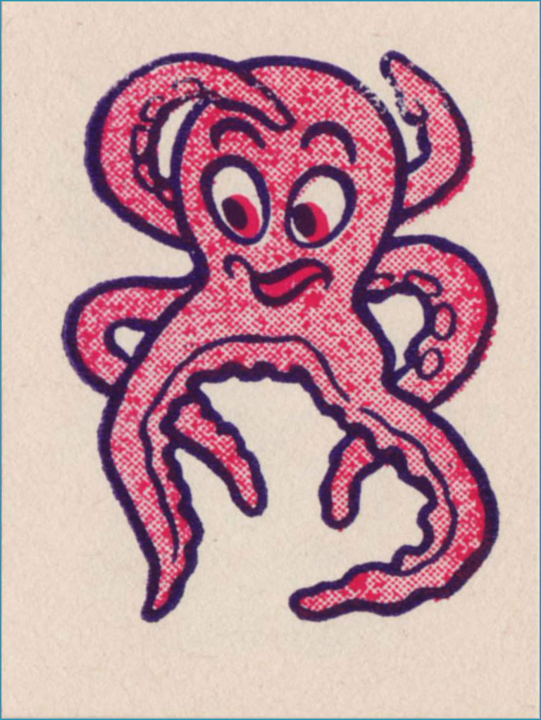
I’m picturing some Bible Belt toddler proudly sporting this one on his arm and giving grandma a massive coronary.Terrible reproduction, obviously, but this line work is splendid. Does the grin make this one less bad-ass… or more?I just love the sheer randomness of some of these entries. I presume no-one was really paying attention.Surely Dan Clowes must have encountered this one. You never know what’s going to linger in your DNA.Well, they got all the accents right in the French text, though the execution, I’m sure you’ll agree, could have been more elegant.Since our Tentacle Tuesday feature is currently on hiatus, I can use this charming pair of cephalopods.He’d make a fine sports team logo… well, not nowadays, since all the humour, joy and brightness have been painstakingly excised from pro sports design. Gotta look *tough*!This did not need a second colour. As a tattoo, I’m sure it was a murky fiasco. But it’s a nice bit of drawing.
-RG
*I’m only a year behind the news on this item, which isn’t too bad in my case.