Tentacle Tuesday: Eightball Eyeballs

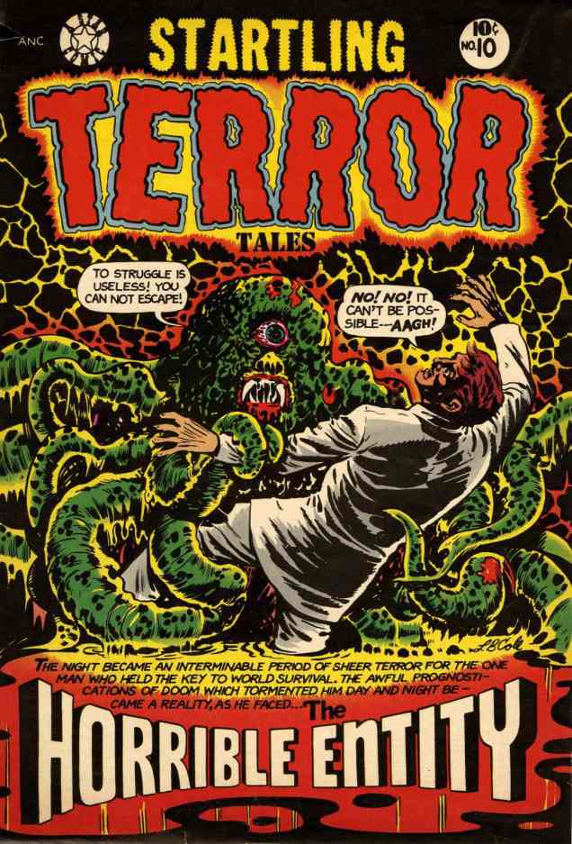
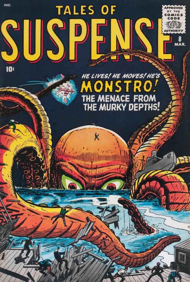
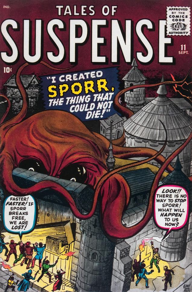
Compared to their bodies, octopuses have fairly small eyes. Yet in comics they often sport saucer-sized peepers, and like villains in a bad Broadway production, they love to glare menacingly at their potential victims from under their impressively wrinkled brows.

Case in point, these two Tales of Suspense covers, close cousins despite the change of scenery. They’re both from 1960, both penciled by Jack Kirby and inked by Dick Ayers. Both monsters promptly acquire loving nicknames from people you would think have more important things to think of, like not getting eaten and/or crushed. Meet Monstro and Sporr!

TalesofSuspense8
Tales of Suspense #8, March 1960. An octopus who was minding his own business gets temporarily but dramatically enlarged by radioactivity from nuclear tests (*communist* nuclear tests). “He lives! He moves!” – I fail to see why that’s amazing more than, oh, say “this thing’s gigantic on a scale heretofore unknown to man”.


TalesofSuspense11
Tales of Suspense #11, September 1960. A well-intentioned but overly enthusiastic scientist exposes an amoeba to an « experimental death ray » and the poor thing grows into this.

TentacleTuesdayIcon

Not all puppy-eyed octopuses have two baby blues; unlucky cephalopods end up with Cyclopean anatomy and a bad case of suffering the wrath of grapes – a cherry in a glass of buttermilk, anyone?*

The Occult Files of Dr. Spektor #19Painting
The original art for the cover of The Occult Files of Dr. Spektor #19 (Gold Key, April 1976). It was painted by Filipino artist Jesse Santos. Dr. Spektor is our protagonist, yet he looks particularly baleful here, hunchbacked and grinning, nothing like the kind of  dashing  hero who’d rescue a drowning maiden.
The Occult Files of Dr. Spektor19Page
A panel from « Loch of the Leviathan », also drawn by Jesse Santos, and written by Don Glut. I just love this panel – the gentle curve of tentacles, the skeleton and his pleading gesture…

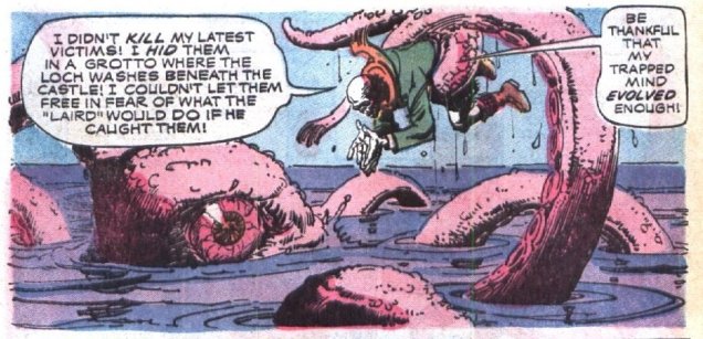
I highly recommend the issue, certainly because of the art, but equally the story. You won’t find a straightforward man-finds-monster, man-kills-monster plot-line here; and there’s also bikini babes for your viewing pleasure.

* Your eyes look like two cherries in a glass of buttermilk
Don’t roll those bloodshot eyes at me
I can see you’ve been out on a spree
(Wynonie Harris, Bloodshot Eyes)

TentacleTuesdayIcon

Sometimes octopuses have big eyeballs *and* a vocabulary all their own.

LurkAkim
Octopus language is the biggest mystery after “what does the fox say?” I bet you never knew that octopuses go “LURK LURK?!”

Akim was an Italian comic, published from 1950 to 1983, and translated into several languages, most notably French. Drawn by Augusto Pedrazza and wrtten by Roberto Renzi, Akim was a « tarzanide », which is to say heavily “inspired” by Tarzan, if not directly ripped off from it.

The LURK LURKs in panel above were no one-time occurrence. The octopuses in this story keep saying it again and again, and with different intonations, which I find hilarious. Turns out, a whole range of emotions can be expressed with this small four-letter word! My thanks go to co-admin and partner RG, who noticed this unpromising, poor-excuse-for-a-comic in a store and pointed out why we should pick it up after I had scoffed at it.

LurkAkim2
I can’t help but feel that the octopus is trying to say something important, but all its mouth (?) can form is a piteous luuurrrkk.

~ ds


Happy Birthday, by Crom!

« Whatever got Juan is coming for me, too! »

It’s birthday number one hundred and twelve for pulp wordsmith Robert Ervin Howard (January 22, 1906 – June 11, 1936) who, in his tragically short lifespan, yet found time to unleash upon the world Conan the Barbarian, Solomon Kane, Kull of Atlantis and, more significantly for this reader, the chilling classic Pigeons From Hell, a short story posthumously published in Weird Tales’ May, 1938 issue.

ChillsBrunner

Howard’s The Horror From the Mound, originally published in the May, 1932 issue of Weird Tales Magazine, presumably had its title sanitized here because the H-word was still verboten in the early 1970s. Hailing from the second issue of Marvel’s Chamber of Chills (January, 1973), it was reprinted in glorious black and white in 1975’s Masters of Terror no. 1 (original title restored, hurrah!)

MastersTerror1A
And here it be. Seems a bit inaccurate to refer to a group of mostly pulp writers (some long dead) from the 30s to 50s as “Modern-Day Masters of Terror”, but I suppose it depends on one’s definition of “Modern-Day”. Cover illustration by Gray Morrow from a drawing by noted fabulist, fervent Trump supporter and fellow Hair Club for Men habitué Jim Steranko.

Gardner Fox and Brunner give it their all, but the story could have used more pages to truly do justice to Howard’s moody proto-weird western.

Read the full adaptation here:
http://thehorrorsofitall.blogspot.ca/2009/02/monster-from-mound.html

Better yet, read Howard’s tale:
http://gutenberg.net.au/ebooks06/0601761h.html

And Pigeons From Hell, while you’re at it:
http://gutenberg.net.au/ebooks06/0600721h.html

-RG

“He sure is my heap hep dream beam!”* In praise of Bob Lubbers (1922-2017)

Mr. Lubbers (pronounced LEW-bers) , born January 10, 1922, left us last summer at the venerable age of ninety-five. As it happens, he also left us some fine, fine artwork.

My initial encounter with Bob Lubbers‘ work came in 1978, when he provided a handful of covers and a couple of issues to Marvel’s Human Fly, a book about masked Canadian stuntman Rick Rojatt, whose real-life, non-funnybook story is a gripping read**. Anyway, the series was usually pencilled either by Lee Elias*** or by the mighty Frank Robbins; by the time Lubbers came along, Robbins had rightly had his fill, given the comics industry the one-finger salute and decamped to México to retire and paint in peace. Wise man.

HumanFly16A
Lubbers’ fourth and final The Human Fly cover (no. 16, Dec. 1978, Marvel). Inks by Bob McLeod. Inside, “Niagara Nightmare!” is written by Bill Mantlo, with art by Lubbers and Ricardo Villamonte.

I then became aware of Mr. Lubbers as one of the Golden Age’s primo ‘good girl’ cover artists, with Fiction House, no less. That’s what I’ll chiefly focus on here. Can you honestly blame me? Unlike some of his peers (hello, Bill Ward), he wasn’t just good at, and interested in, the saucy depiction of lightly-clad sirens: he could draw anything with finesse and brio.

Wings82A
Mouth-breathing, slope-browed… I guess he’s not the hero in this one. Wings Comics no. 82 (June 1947, Fiction House.)
Wings90A
Arguably the most (in)famous of Lubbers’ Wings covers. “Classic bondage and headlights cover!”, cry the ancient fanboys. Wings Comics no. 90 (Feb. 1948, Fiction House.)
Wings91A
If our man of the hour had rescue in mind for the imperilled damsel, dropping a payload (you heard me!) a hundred feet away from her is likely to… make the situation a bit messy. Wings Comics no. 91 (March 1948, Fiction House.)
Wings94A
« Seriously? The engine is on fire, we’re being strafed, I’m hogtied and helpless, and he’s still going to threaten me with a gun? » Wings Comics no. 94 (June 1948, Fiction House.)
Wings98A
The life of a crocodile dentist isn’t an easy one, but the satisfaction of a job well done is its own reward. Wings Comics no. 98 (Oct. 1948, Fiction House.)
Wings100A
Here comes the mother of all rope burns, sister. You’re supposed to grab the loop! Wings Comics no. 100 (Dec. 1948, Fiction House.)
AuthenticPolice5A
The exception to the Fiction House Wings set: Authentic Police Cases no. 5 (Oct. 1948, St. John.) The babes never could resist a bad boy.

Yet farther along, I would learn of his large and distinguished body of comic strip work: Long Sam, Secret Agent X-9, Tarzan, The Saint, Lil’ Abner, and best of all, his most personal work, Robin Malone (1967-70). On the latter, I can’t praise enough Tom Heintjes‘ definitive article (Hogan’s Alley no. 19, 2014), here’s a version of it: www.hoganmag.com/blog/the-life-and-death-of-robin-bob-lubbers-robin-malone

… and don’t forget to scroll down, down, down so you can sample (though it’s never enough!) the article’s lavish bounty Robin Malone Sunday strips.

*From the Captain Wings adventure « The Spider and the Fly-Guy » (Wings Comics no. 82) Read it right here (or pick from a generous selection of Wings Comics issues at Comicbookplus.com)

**speaking of which, check out this fine piece about The Human Fly’s rocket bike and the stunt that ended his career: http://kymichaelson.us/human-fly. You have to admit that jumping over 27 buses is a tad ambitious… and he was originally going to try for 36!

***likely picked for the job due to his fine work on another masked stuntperson character, Harvey’s The Black Cat.

– RG

Unexpected Delights: John Severin, 1971-72

« And you always get your finger in the frame* »

I’m inordinately fond of Marvel’s brief flirtation with “picture frame” covers, which lasted but a year, opening with books cover-dated November 1971, at the tail end of Stan Lee’s run as editor-in-chief, and fading away less than a year later during Roy Thomas’ tenure. Figures.

This period coincided with one of John Severin’s passages at Marvel. At the time, the self-proclaimed « House of Ideas » was endeavouring to flood the market with crap, aiming to force DC to overextend itself to retain its market share, and, reportedly, to drive Gold Key out of business. So Marvel let loose a torrent of unannounced and unnecessary reprints, at most commissioning new covers to sell the bill of goods.

Tactically, it was a tawdry page out of the infamous Israel Waldman* book: in the late 1950s to mid-60s, the canny cheapjack publisher issued a line of comics (IW/Super) reprinting material he owned and often didn’t, in the case of some of the more nebulous copyrights (namely Quality’s The Spirit, Doll Man and Plastic Man)… accidentally on purpose. Anyhow, Waldman paid a few handpicked freelancers top dollar (to get his money’s worth… I did say he was canny) to create enticing new covers to adorn his shoddy reprint rags. And I do mean rags: the paper stock used was even worse than the low industry standard… just try to find any IW comic book in decent shape nowadays!

Among the cover artists Waldman recruited were the Ross Andru / Mike Esposito team, Everett Raymond Kinstler, Jack Abel… and John Severin.

But getting back to 1971-72, here’s a chronological and alphabetical sampling of my favourite Severin turd-polishing covers from Marvel’s brief « picture frame » flirtation, out of the 35 or so he created solo at the time. Several of these are refreshingly uncluttered and moody… for Marvel.

TwoGunKid-101A

SeverinMOTP15A

Sgt-Fury98A
Someone at Marvel loved to rip-off the 1967 Lee Marvin-led epic “The Dirty Dozen“; probably Gary Friedrich. The very next month, the Deadly Dozen would team up with another Irishman stereotype to form “Combat Kelly and The Deadly Dozen”, I kid you not. Oh, and a diverse cast in a Marvel war comic? Oh, right, they’re ex-convicts… and they get slaughtered in the last issue. Oops.

TombOfDracula2A

WesternGunfighters9A

WhereMonstersDwell15AFear8A

MightyMarvelWestern17A
Ah, Severin’s Rawhide Kid. Don’t miss Severin and writer Ron Zimmerman’s brilliant and daring 2003 reboot of the Kid, “Slap Leather”.

Kull3A

*Del Amitri, “In the Frame” (1995)

**all about Marvel’s “picture frame” era: https://www.cbr.com/marvel-comics-picture-frame-cover-era/

***The gory details on the IW/Super story: http://toonopedia.com/iw-super.htm

-RG

Felicitous Festivities, Funky Flashman!

Today is birthday number ninety-five for Stanley Lieber, aka Stan Lee. He was hatched on December 28, 1922. Have a good one, Stan.

FunkyFlashman
Jack Kirby recalls with fondness his former editor and his toady, in “Funky Flashman!” (Mister Miracle no. 6, January-February 1972, DC).

On this momentous occasion, let’s hear about Stan from some of his colleagues, who knew The Man and obviously loved the experience:

Wally Wood:
« Did I say Stanley had no smarts? Well, he DID come up with two sure fire ideas… the first one was ‘Why not let the artists WRITE the stories as well as draw them?’… And the second was … ‘ALWAYS SIGN YOUR NAME ON TOP… BIG’. And the rest is history… Stanley, of course became rich and famous … over the bodies of people like Bill [Everett] and Jack [Kirby]. Bill, who had created the character that had made his father rich wound up COLORING and doing odd jobs. »

EC legend Bernie Krigstein, who collaborated with Stan at Atlas, and whose « Suppressed Desire » is featured in Spellbound no. 17 (September 1953) , with a glorious cover by the above-mentioned Bill Everett.

EverettSpellbound17A

In the course of a 1960s interview with comics scholar John Benson, Krigstein responded to Benson’s statement of « I guess you know that Stan Lee has been the spearhead of the so-called current revitalization of comics »:

« I’m delighted to learn that. Twenty years of unrelenting editorial effort to suppress the artistic effort, encourage miserable taste, flood the field with degraded imitations and non-stories have certainly qualified him for this respected position. »

Then Gil Kane, who was Marvel’s principal cover artist for much of the 70s, and who collaborated with Lee on The Amazing Spider-Man in some of its most popular years, including the infamous, comics-code unapproved “drug” issues (nos. 96-97, May-June 1971), on the respective creative roles of Stan and Jack Kirby:

« On each page, from 1964 – 1970 next to every single panel Jack wrote extensive margin notes explaining to Lee what was taking place in the story. It took Jack about 2 weeks to do a single story, it may have taken Lee as little as 4 hours to add text to Jack’s art. »

And Steve Ditko, in a letter to the editor of Comic Book Marketplace, published in the magazine’s 63rd issue in 1998, on his and Stan’s respective roles in crafting an issue of Spider-Man:

« The fact is we had no story or idea discussion about Spider-Man books even before issue no. 26 up to when I left the book. Stan never knew what was in my plotted stories until I took in the penciled story, the cover, my script and Sol Brodsky took the material from me and took it all into Stan’s office, so I had to leave without seeing or talking to Stan. »

Further  illuminating reading: http://kirbymuseum.org/blogs/effect/2015/07/25/according-to-kirby-1/

Once again, Happy Birthday to the Funky Flashman! ’nuff said and all that rot.

-RG

Tentacle Tuesday: Groping Vines and Other Shenanigans

What better way to start Tentacle Tuesday than with the Big Pop-Up Book of Giant Squids? Sensitive people may want to skip this one.

PopUpTentaclesA
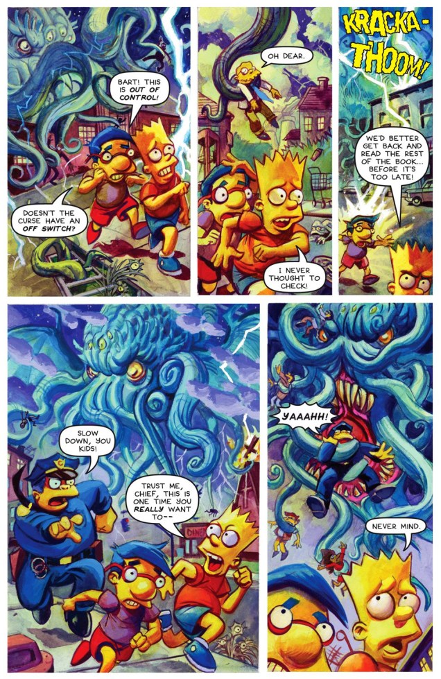
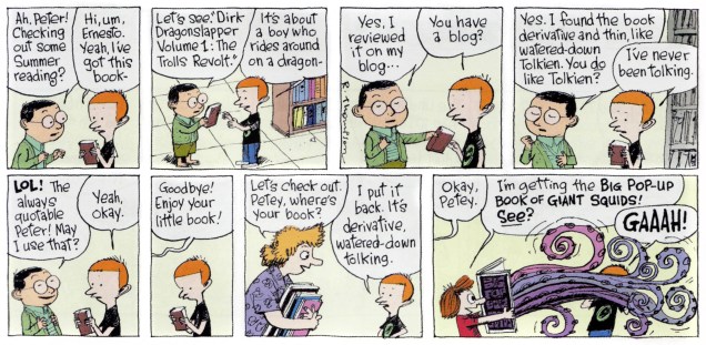
« Dirk Dragonslapper », other than making me giggle every time, sounds like an actual character from some fantasy trilogy, which may be a comment on the state of fantasy these days (hint: it’s not fantastical). I’ll go with the cephalopods, thanks!

Incidentally, there’s a lot of dreadful fantasy covers out there (and that’s quite out of the scope of this blog, anyway), but I can’t resist sharing this one with you.

Swords-In-The-Mist-cover

Poor Fritz Leiber! An octopus holding a bunch of swords at completely ridiculous angles, a squat muscle-bound freak with a bare ass and some booby green-and-purple women floating a distance away. Thanks, Peter Elson.

TentacleTuesdayIcon

Let’s take a break from cuteness. Next up is some serious cause for alarm from Tom Sutton, who’s excellent at psychological horror. His weird art is full of details one can sink into; his sketchiness and sweeping lines leave one with the disquieting impression of being inextricably pulled into a distorted, nightmarish world.

ABuddingEvilTomSutton1
Damsel in distress from « Budding Evil », Haunted no. 17 (July 1974, Charlton), both scripted and drawn by Tom Sutton. Tell me you can look at the girl’s face as she’s getting strangled by tentacles and not get goosebumps.
ABuddingEvilTomSutton2
The meat-eating flowers have seriously disturbing “buds”… the best of us would have fainted!

There’s an inspired essay about Sutton here which I heartily recommend! I’ll take the liberty of borrowing a great Sutton quote from it (itself taken from a 2000 interview by Jon B. Cooke for Comic Book Artist no. 12). Voilà:

« They published weird stuff, and I have always been fascinated by weird stuff, and the weirder the better….  I do owe a certain amount to Charlton, because they allowed me to write a lot of ditties of my own, to paint a lot of horrible covers, and they never, ever, ever remarked on my technique. »

TentacleTuesdayIcon

Brr. I think we need an example of straightforward macho heroism to counter-act the icky impression left by the creeping horror glimpsed above. Here’s Doc Savage to the rescue, as usual. Watch the epic struggle between muscled man and malevolent tentacled beast!

DocSavageKenBarr
Original cover art for Doc Savage no. 8 (Marvel, Spring 1977) by illustrator Ken Barr. And no, I don’t have the answer as to why Doc Savage’s normally bronze hair looks like a white bathing cap here. However, Barr seems to have enjoyed painting it – just look at that glistening musculature!

Let’s see the cover as it was published:

DocSavageCover8
A bit too much text, guys. C’mon, you have a tentacled monstrosity with indubitably evil eyes, a man with rippling muscles and bulging veins… We’ve figured out that Doc is its next victim (just as surely as we know that he will come to no real harm).

Interestingly, upon opening the magazine, the first thing one sees is a Tom Sutton illustration. Small world! The cover story, « The Crimson Plague », is an adaptation of a novella published in Doc Savage Magazine in September 1939, and most likely written by Lester Dent (as Kenneth Robeson), who’s responsible for most of the classic Doc Savage epics. It’s an « adventure in which Doc Savage and his team deal with kidnapped scientists, captured comrades, and the deadly secret of the Octo-Brain » (sounds exciting, doesn’t it?) and is illustrated by Ernie Chan.

~ ds

Tentacle Tuesday: tentacles, some fresh, some older than time

Welcome to Tentacle Tuesday! We now have an official logo for T.T., courtesy of my husband and fellow blogger. It’s brand-spanking new, so here it is in a fairly high resolution.

TentacleTuesdayLogoA

Give him a round of applause… oh, what’s that, it’s hard to applaud with tentacles? Okay, a round of « squish, squish », then.

Let’s begin (proper) with « The Thing on the Roof », adapted by Roy Thomas from a story by Robert E. Howard. The latter was a member of the renowned Lovecraft circle, so the Chthulian vibe of this is no accident. It’s illustrated by Frank Brunner, who does a bang-up job – the man was asked to draw the love child of a dragon and an octopus, and he did not disappoint!

ChamberOfChills3ThingontheRoof
The Thing on the Roof from Chamber of Chills no. 3 (May 1973, Marvel.)

Continuing in a similar vein (but fast-forwarding 40 years), here’s a terrific story from Bart Simpson’s Treehouse of Horror #19 (September 25th, 2013) which is so chock-full of tentacles that it could be a post all by itself. Written by Lovecraftian Len Wein and illustrated by Demonic Dan Brereton, it ranks as one of the top Treehouse comic stories as far as I’m concerned… but then I might be slightly biased. Or possessed by Chthulhu, whichever.

TreehouseofHorrorChthulhu1
I want a Lovecraft vacuum cleaner. *hint, hint*
TreehouseofHorrorChthulhu2
In this story, *everything*, animate and inanimate, sprouts tentacles.
TreehouseofHorrorChthulhu3
The dramatic/sublime/ludicrous wrap-up! Sorry to give the plot away. Yum, they even remembered to stick an apple in Milhouse’s mouth (it keeps him from screaming, I suppose). Did Lisa forget she’s a vegetarian?

I couldn’t help but post at least three pages of this story – hell, I was tempted to post it in its entirety – but I’ll let you do the work. Go read the whole thing here.

And to wrap up, let’s go back half a century or so, to the Miss Horrible Entity 1954.

StartlingTerrorTales10
This striking cover is by L.B. Cole, who can always be relied on to provide us with some eye-popping colours. He’s also got a knack for depicting especially disgusting, moist and fleshy tentacles, don’t you think? Startling Terror Tales no. 10 (August 1954).

What I want to know is who, upon being startled by a cephalopod cyclops with vampire fangs and one very bloodshot eye, describes it as an “entity”? “Monster”, sure, even “beast” or “demon” or “creature”, but “entity” (defined as “a thing with distinct and independent existence” by Webster’s)? If you’re going to be *that* stuffy, maybe you deserve to get eaten.

~ ds


The Great American Comic Strip Catastrophe of ’78

« At last I will feast upon fried blob! »

If you’ll just bear with me, we’ll take a peek at a bit of an obscurity, one that’s struck a resonant chord in me. It’s called Bob Blob, and I first encountered it in the June, 1978 issue of Marvel’s Dynamite Magazine knockoff, Pizzazz (1977-79). “The Great American Comic Strip Catastrophe” had been part of the magazine’s lineup since its inaugural issue, but had pretty thoroughly failed to live up to the promise of its title. With issue 9, the magazine’s “First National Edition“, Jon Buller‘s Bob Blob oozed into view and relieved readers from the pedestrian ‘funny animal’ antics just taking up space and failing to bring about the announced, and hoped-for, comic strip catastrophe.

For its final four issues, Pizzazz adopted as its motto “Humor in the Marvel Manner“. If you ask me, that’s what dragged the magazine down: Dr. Doom knock-knock jokes? Er, no thanks. It’s when the humour veered away from said ‘Marvel Manner’ that Pizzazz acquired some actual pizzazz. Bob Blob was at once hi-concept and lowbrow, and one gets the sense that Jon Buller could have spun endless, increasingly surreal variations on his theme, but the magazine lasted but a scant sixteen issues, and ran only eight Bob strips.

Here they are, in order of publication and everything!

BobBlob01A

BobBlob02A
This particular strip anticipates Larry Cohen‘s cautionary horror satire The Stuff (1985).

BobBlob03ABobBlob04ABobBlob05ABobBlob06ABobBlob07ABobBlob08A


According to Jon Buller, Bob was born… well, let him tell the story:

BullerBob
Read in full Jon Buller’s story in cartoon form, of which this is panel 8 of 13 (go ahead, it’s concise, splendidly told, and well worth your time)

Buller went on to illustrate countless books (sixty at last count!) written by his equally talented wife, Susan Schade. To name but a few: Riff Raff Sails the High Cheese, Anne of Green Bagels, Dracula Marries Frankenstein, No Tooth, No Quarter!, Baseball Camp on the Planet of the Eyeballs, Ron Rooney and the Million Dollar Comic

Check out their website: http://www.bullersooz.com/index.html

– RG

Happy 90th birthday, Mr. Ditko!

« Don’t be so sure! A guy that popular — he’d be a fool to fold up his act while he’s such a hot item!* »

I’ve been a Steve Ditko fan for as long as I can remember. In fact, I was a fan even before I actually saw his work. “How’s that even possible?”, you may ask. Well, when I was five, this neighbour from across the street was showing off a comic book he had just picked up, which was Teen Titans no. 29**. I was instantly captivated by two costumes on the cover: Hawk and Dove’s, designed by Ditko a couple of years earlier.

I do believe I had encountered a Ditko comic book just a bit earlier, a copy of The Many Ghosts of Doctor Graves no. 20 (June, 1970), acquired by my brother en route to the family vacation on Prince Edward Island. But that one had a (fine) cover by Pat Boyette, and I don’t recall the Ditko story within, « An Ancient Wrong ».

The bottom line is that Ditko’s been a precious part of my life for a spell. It would be easy to take him from granted, so let’s not, if you don’t mind.

Which brings us to our little tribute: running ninety covers covers would be about as practical as ninety candles on our birthday boy’s cake, so I’ll just drop a decimal and stick to a more manageable nine… I won’t even give a nod to such fickle and hollow notions as popularity, historical importance, or iconicity. I’m going with my favourites. That’s the way Steve would do it… and even if he wouldn’t, I’d still go this route.

UnusualTales9A
« Nobody here in Crestville will ever forget that night! »
A tiny reproduction of this cover, that of Unusual Tales no. 9 (Nov. 1957, Charlton), in some late-70s edition of the Overstreet Comic Book Price Guide hooked me, and still grabs me. In the post-code era, particularly in its early days, you had to be mighty resourceful to fruitfully mine the mystery genre, what with all the verboten topics and tropes. The issue holds a whopping four, 1957-vintage Ditko stories, including the title piece, which you can read here:
http://ditko.blogspot.ca/2012/01/unusual-tales-night-of-red-snow.html
ASM2A
The Amazing Spider-Man no. 2 (May 1963, Marvel). Beyond Ditko’s departure (no. 38 was his final contribution), I have no further interest in Peter Parker and his costumed alter-ego.
Creeper4A
« Name’s Bulldog Bird! This is Sumo! We’re secret agents from the sovereign kingdom of Offalia! »
For most of the brief run of his book (issues 2 to 6), the Creeper had to contend with a faceless enemy, Proteus, who turns out to be someone very close to him. It was as though Ditko felt the need to replay the Spider-Man – Green Goblin secret identity dynamic, not the way *he* had envisioned it (which was to make the Goblin a total stranger, a situation he’d meticulously set up in the background), but the way Lee had, as if to show his former editor how to do it properly.
This is Beware the Creeper no. 4 (Nov.-Dec. 1968, DC), “Which Face Hides My Enemy?” Pencils and inks by Steve Ditko, plot and dialogue by Dennis O’Neil
Hawk&Dove2A
« You’re still wasting your time reading! Why don’t you build up that sickly body of yours? »
DC’s Hawk and Dove (introduced in Showcase no. 75, June 1968, DC) was, as its title and covers amply make clear, a study in contrast and opposition: aggression vs pacifism, the letter of the law vs the spirit of the law, Steve Ditko vs Steve Skeates…
The concept may have been of its time, but the industry as it stood wasn’t ready to explore the issues without stacking the deck. This was still, after all, a mainstream superhero comic book of the Sixties. This is issue 2, “Jailbreak!” (Oct.-Nov. 1968), Ditko’s third and final issue with his creations. As for Ditko’s abrupt departure from DC is concerned, the reason cited at the time was a relapse of tuberculosis, a disease that had plagued Ditko in his youth. Others have invoked more political explanations, but Ditko *was* out of the game for several months, which fits the convalescence scenario. His absence until 1975 from DC fits the politics one. Why credit one single factor when several, taken together, are more plausible?
GhostManor5A
« Come off it, yer Lordship! This ain’t no blinkin’ time ter do the art connoisseur bit! »
The rakish 14th Lord Garland proves a bit of a disappointment to his forebears. Sir Steve Ditko’s cover proffers a scenic victim’s perspective… but who’s the hazy, phosphorescent figure shambling down the stairs to meet us?
This is Charlton Comics’ Ghost Manor no. 5 (second series, June 1972, Charlton). Inside, you’ll find a trio of Joe Gill chillers: “Dead Man’s Eyes”, illustrated by Joe Staton; “Devils at My Door”, illustrated by Charles Nicholas and Vincent Alascia, and of course, the pièce de résistance, “The Last Garland”, brought to you in panoramic Ditko-vision.
GhostlyTales97A
Ah, the largely lost art of the *soft* sell. Charlton’s cadre of artists hewed much closer to the ambience favoured by aficionados of the spectral than did the esteemed competition. You know, more Montague Rhodes James than, say, Rob Zombie.
Here, Ditko demonstrates how (dis)quiet and mystery is evoked. Dignified silence can be very attractive when everyone around is shouting. Ghostly Tales no. 97 (August 1972, Charlton) features “The Eye of the Cat”, actually handled by Don Perlin, while Ditko delivers visuals for Joe Gill’s “Journal of a Hanged Witch”. The issue also features “Poltergeist”, an effective collaboration between Creepy Magazine founder Russ Jones and the multitalented Bhob Stewart.
Haunted16A
My particular favourite among Ditko’s covers for Charlton’s Haunted (75 issues, 1971-84.) The merrily saturated colour scheme, the composition and its geometric simplicity, that well-chosen angle… the contagious joy of a master at play. This be Haunted no. 16 (June 1974, Charlton.)
BeyondtheGrave2A
« If you visit that grave on a dark night, you may be surprised… for there is a sentry stationed there…to honor the dead? Or to make sure that General Kugar never leaves his grave? »
Here’s a cover showing the sort of solemn dignity and restraint that made Charlton’s line of ghost books so attractive to me right off the (vampire) bat. No one’s shouting deceptive hype or explaining the action; the elusive allure is undisturbed, unlike the sanctity of the tomb. 
DC, under Infantino and Cardy, generally understood this, but Marvel virtually never did or cared to. But hey, what sold and what I liked rarely sat at the same table.
Beyond the Grave no. 2 (Oct. 1975, Charlton).
Shade3A
Ah, Shade. Ditko’s last great creation, cut off in its prime by the Great DC Implosion of ’78. Later misunderstood and corrupted by hacks. Finally reprinted, including formerly unpublished issue 9, in volume 1 of The Steve Ditko Omnibus (2011). It’s still a frustrating experience, but at least issue 8’s cliffhanger has been resolved, and what happens in the Zero Zone doesn’t stay in the Zero Zone, if you know what I mean. This is Shade the Changing Man no. 3 (Oct.-Nov. 1977, DC)

*Jack Ryder (aka The Creeper)’s closing quip from “The Coming of the Creeper!”, plot and art by Steve Ditko, script by Don Segall (Showcase #73, Mar.-Apr. 1968, DC)
**Since it played such a crucial rôle in my Ditko inculcation, here’s the Teen Titans issue in question.

TeenTitans29A
Teen Titans no. 29 (Sept./Oct. 1970, DC) Cover by Nick Cardy (likely co-designed by Carmine Infantino and coloured by Jack Adler), illustrating “Captives!”, written by Hawk & Dove scenarist Steve Skeates and illustrated by Nick Cardy.

– RG

Hallowe’en Countdown, Day 27

« Trent’s home under th’bed! »

Marvel’s Dynamite Magazine ersatz, Pizzazz (15 issues, 1977-79), despite ratcheting its model’s celebrity coverage by several notches, while providing the House of Ideas’ usual rabid circle-jerking… wasn’t all bad. For one thing, there was its inspired recycling of Harvey Kurtzman’s splendid Hey Look! one-pagers from the 1940s, lovingly recoloured and presented with painstaking attribution. Fan on board!

And when Pizzazz reached beyond the Bullpen for ink slingers, it often struck paydirt, landing a heady mix of established and burgeoning talent, such as Jon Buller, John Holstrom, Bobby London, Ken Weiner (aka Ken Avidor), Rick Meyerowitz… and Graham Hunter.

PizzazzHalloweenA
The original caption: « Have a HAPPY HALLOWEEN! PIZZAZZ SAYS THANKS… Look at this picture. If you’ve ever written us, you may find your name in it. If not, take a look next month, or a few months after.PIZZAZZ says a big, warm THANK YOU to everybody who’s written us. And KEEP THE MAIL COMING – some month maybe your name will be in the picture! » The feature ran for the final seven issues of the magazine (including a gorgeous Xmas double spread.) This was Pizzazz no. 13 (October, 1978, Marvel). Say, is that your name in there?

Hunter was a bafflingly brilliant pick: his career in comics, as far as I know, consists in the main of a string (1946-47) of one-pagers featuring early soft drink product placement shill/mascot, the prosaically-named Pepsi, the Pepsi-Cola Cop. Guess what he was pushing!

TCV17N4AB
This is Treasure Chest of Fun and Fact vol. 17 no. 4 [310] (October 26, 1961). The issue features TC’s strident screed This Godless Communism, illustrated by EC veteran Reed Crandall. It still sucks. I said they were entertaining, but I draw the line at reactionary politics. Read it for yourself right here, but don’t say I didn’t warn you.
Of greater interest is the handful of covers Hunter created for the surprisingly entertaining Catholic comic book Treasure Chest of Fun and Fact, and this is what must have landed him the Pizzazz gig, a couple decades down the pike.

Nailing this sort of humorous bird’s-eye-view crowd action scene requires some rather astonishing artistic chops. Perspective, proportions, movement, comic exaggeration… and that’s just the basics. This sort of thing was popularized by Dudley Fisher’s Right Around Home strip, which débuted in 1938.

RAHTouristsA
A Right Around Home Sunday from 8-20-39 (King Features Syndicate). Here’s a fine, informative article about the strip, from the indispensable comics mag Hogan’s Alley.

– RG