A Fading Presence of Lived Memories: Denys Wortman’s New York

« I can’t decide whether to give up peanut butter on account of its calories, or to eat it on account of its vitamines… »

When it comes to what Amazon loosely classifies as ‘literary graphic novels’ (very much a meaningless category), it’s rare for me to stumble across something completely unfamiliar on a bookstore shelf, unless of course it’s something hot off the press. Denys Wortman’s New York: Portrait of the City in the 30s and 40s (Drawn & Quarterly*, 2010), which I spotted in the well-stocked The Comic Hunter (Moncton, Canada), looked unfamiliar and intriguing. 

The edition I purchased is from 2010; I wasn’t able to find out when this one, with an arguably more striking cover, was published. This illustration had the caption of ‘If I have to come down to buy them, you’ll have to come down on your prices’, and was drawn on August 30th, 1948.

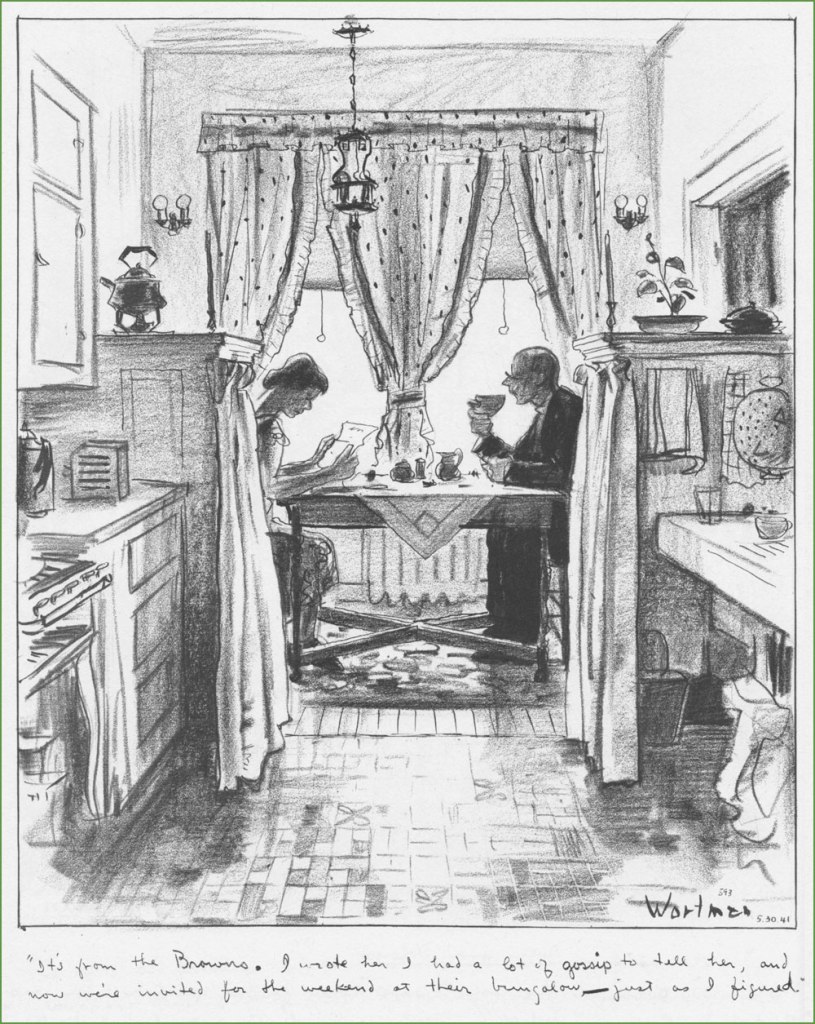
I’d never heard of Wortman, but just a quick skim through this volume showed that he clearly had an amazing ability to evoke a certain place and time, and fill it up with characters so real that one wouldn’t be surprised to run into them on the street. Nostalgia for a place one never experienced is a recurring feature of the human mind – Wortman’s New York is one I am familiar with from books and movies, and that faded away long before I was born. One would also be remiss in failing to express admiration for DW’s living, breathing linework. His attention to the minutest details are used to recreate scenes from lives of people who certainly didn’t have an easy time of it, yet still inspire a sort of familiar comfort almost a hundred years later.

To get some bibliographical stuff out of the way (for a full story, I shall direct you to the website maintained by Wortman’s eighth son), Denys Wortman was born in 1887 and died in 1958 at 71. Among other things, he also drew Metropolitan Movies, a comic strip that ran between 1924 and 1954 and is mostly remembered (if that’s the right term here) for two of its characters, a couple of cheerful vagrants named Mopey Dick and the Duke.  

It was a tad difficult to decide which pages to feature, so I tried to go for a variety of scenery. Wortman must have been a Gerald Kersh character to possess such an intimate knowledge of all these industries, markets, streets, and types of human beings… I invite you to a bit of time travel.

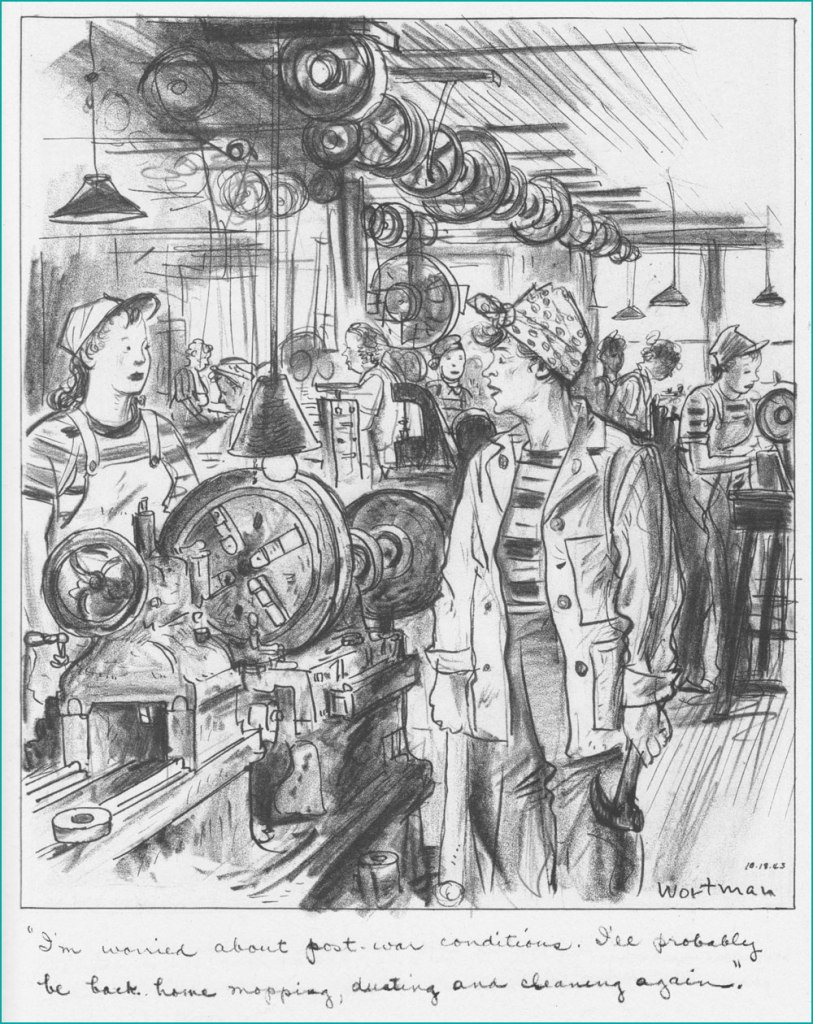
« In art school days there was much talk about “character,” but I feel there was a small amount of misapprehension mixed up with its interpretation. I could not see then and I can’t now why a man with a lot of whiskers has any more character than one who is clean-shaven. Nevertheless I would prefer to draw the former. And I would prefer to draw him after he has lived long enough for Experience to have etched lines in his face — the more the better. Because the more lines and markings he has in his face the more chance I have of finding ones that I can match with lines on my paper to help create the illusion that the face I am drawing has bones under the skin, that the eyes are seeing things, that the mouth is speaking, and that the man has a soul. »

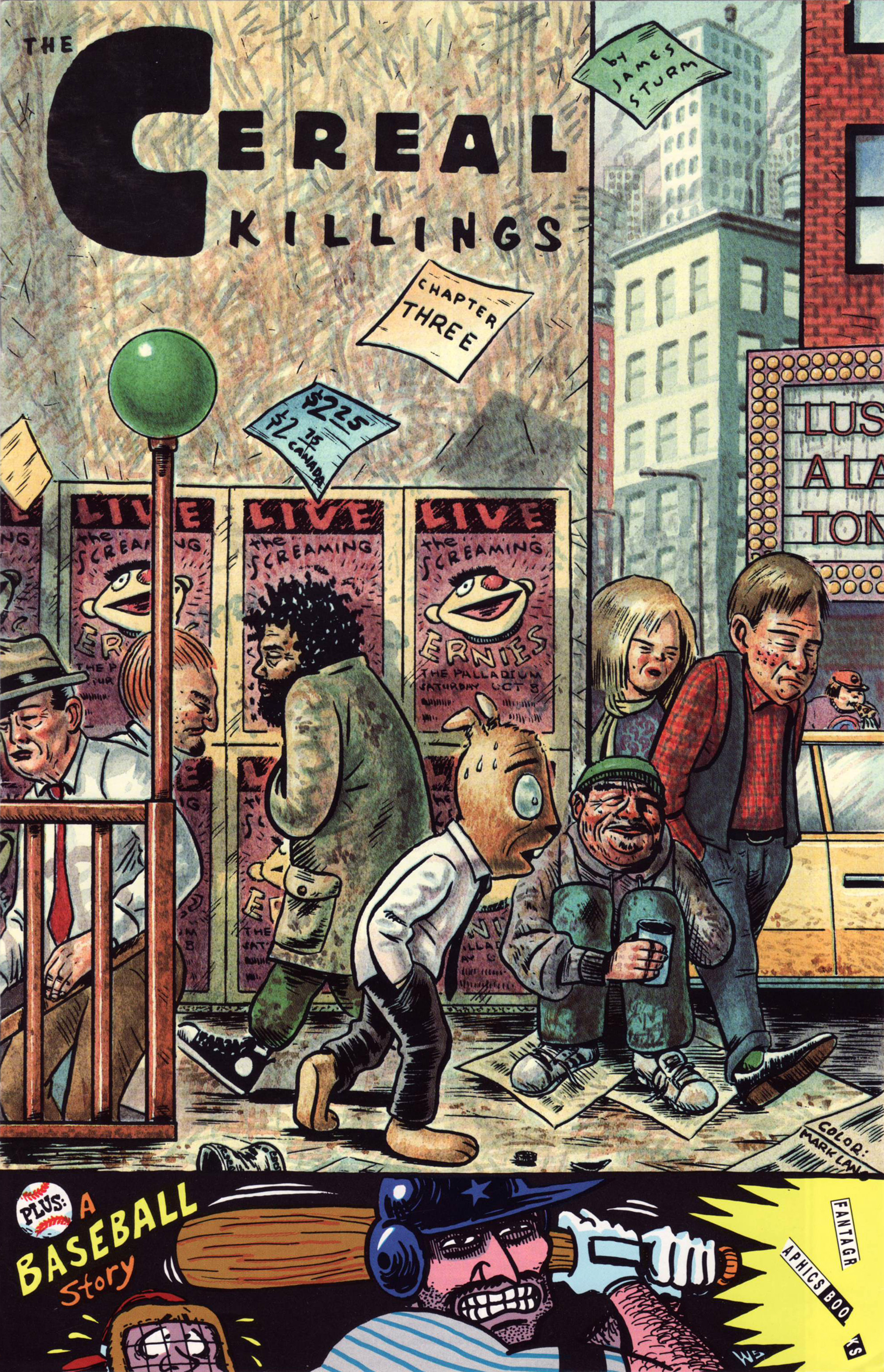
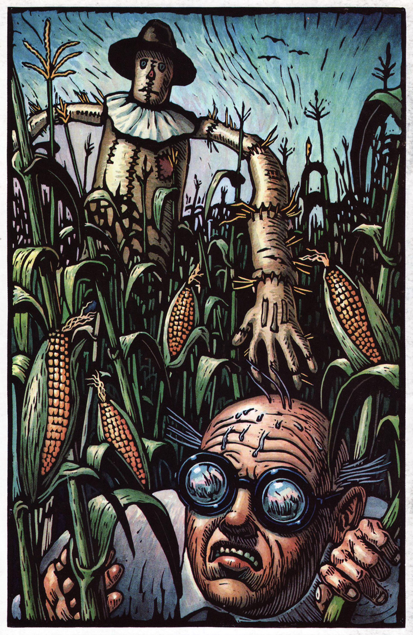
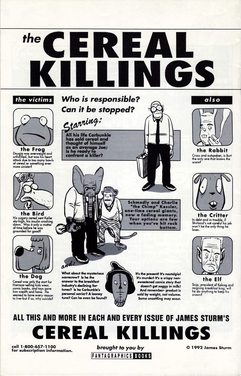
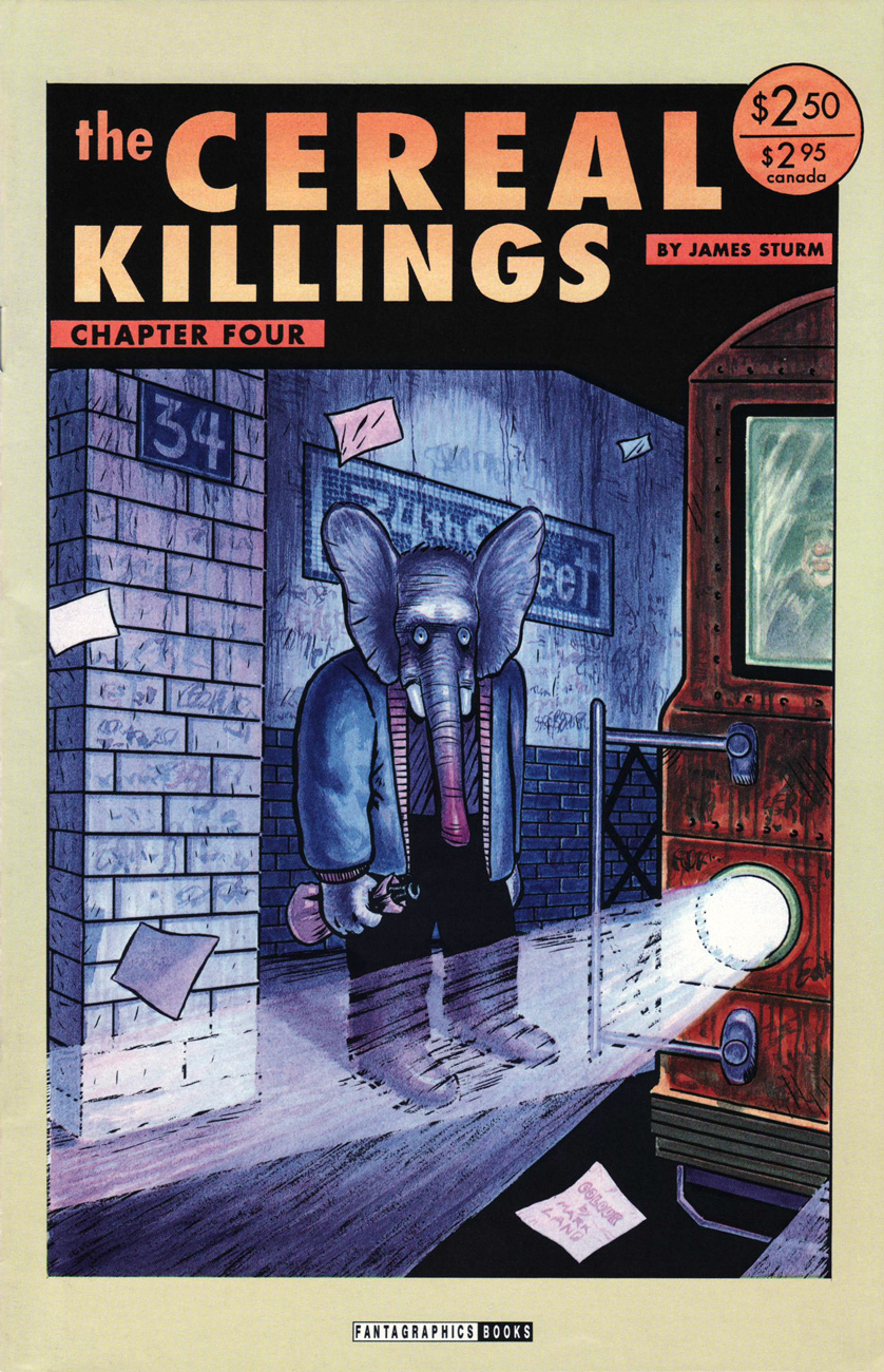
It must be mentioned that these drawings have been rescued from the mists of forgetful time by WOT favourite James Sturm (see Free Inside Package: James Sturm’s The Cereal Killings (1992-95)), who hunted down Wortman’s son and his astonishingly large, apparently languishing archive of his dad’s illustrations.

I’ll end this with a great quote from the foreword to Denys Wortman’s New York, written by Robert W. Snyder

« You can still see traces of Wortman’s New York in crowded Manhattan side streets, spirited New Deal Murals, and soaring skyscrapers**. Harder to find are the feelings and lived memories of this place. The sailors and their sweethearts who strolled the boardwalks of Coney Island are now, in their eighties, a fading presence. To understand them, and how they lived in a city that inspired hope and fear, idealism and wisecracks, solidarity and individuality, there is no better place to look than a Denys Wortman cartoon. »

~ ds

* I tend to not like what D&Q publishes, but this is another pleasant exception to the rule (here’s the original exception).

** This immediately comes to mind.

And now, for my 500th post…

… I bring you a of ‘clip show‘ of sorts: excerpts from past entries of this blog, but with a slight twist. For, unlike your textbook clip show, I’ll be drawing from episodes you’re probably unfamiliar with. After all, while this is my 500th piece, this is our blog’s eight hundred and fortieth: quite enough of a tangle to get hopelessly disoriented in.

I have culled from the earliest days of WOT?, when we had precious few readers — each one precious! Five picks from the lot seems a reasonable ratio: neatly one per hundred.

While many of our posts from those days have since, one way or another, found their audience (or vice versa), these dispatches have languished in obscurity — deservedly or not, who can say?

Here they are, in chronological order and everything:

Unexpected Delights: John Severin, 1971-72 (Published on Jan. 5, 2018)

While it seems like everyone and their probation officer dig Severin, this look at Marvel’s ‘Picture Frame’ era got lost in the shuffle.

“Cartography of a nowhere-land”: Patrick Woodroffe at Warren (Published on Apr. 26, 2018)

This one was a gathering of English fantasy artist Patrick Woodroffe (1940-2014)’s covers for Warren Magazines. You may have seen his fabulous cover for Judas Priest’s 1976 LP Sad Wings of Destiny.

Free Inside Package: James Sturm’s The Cereal Killings (1992-95) (Published on June 10, 2018)

A love letter to one of my favourite series, sadly obscure. I’m still surprised and grateful that it got finished — and in such fine fashion.

Barracks Life With Le Sergent Laterreur (Published on June 23, 2019)

A truly singular concoction from the pages of Pilote at its 1970s peak. Honestly, you don’t need to read French to grasp its appeal.

Celebrity Car Crash Corner! (Published on Aug. 24, 2019)

A ghoulish and gloriously fitting backup feature for Pat Mills’ unhinged Death Race 2020 (1995-96, Roger Corman’s Cosmic Comics). I collected them all so you don’t have to!

Incidentally, this is all you’ll be seeing of me this month — it’s not a case of burnout: I’m just furiously cobbling together this year’s Hallowe’en Countdown, and that takes time. Thanks for your patience and loyalty, and see you in October!

-RG

Tentacle Tuesday: The Menace of the Mechanical Octopus

« The tentacles of  my followers shall seek you out and destroy your swiftly! »

If you like joyous nonsense, this post is for you! As if humanity wasn’t besieged enough by actual cephalopods, evil-but-brilliant minds insist on creating machines with tentacles to horrify and maim. Pain to some, amusement for us!

First, some definite eye candy. The following story is not only convincingly illustrated, but also makes some sense on a scientific basis. The Menace of the Mechanical Octopus was scripted by Ed Herron, and pencilled and inked by Jack Kirby. It was published in Word’s Finest Comics no. 97 (October 1958).

World'sFinestComics97-JackKirby-TheMenaceoftheMechanicalOctopus

World'sFinestComics97-JackKirby-TheMenaceoftheMechanicalOctopus2

World'sFinestComics97-JackKirby-TheMenaceoftheMechanicalOctopus3

Now we move on to that goofy-yet-fun series, DC’s House of Mystery.  I will readily admit that I’m not always a fan. At worst, some of the stories published within its pages have plots so random that amusement becomes irritated incredulity. But keep an open mind, and there are also very creative (sometimes “were these people on drugs?” creative) plots to be enjoyed and great art to be relished.

House-of-mystery-96
House of Mystery no. 96 (March 1960), cover is pencilled by Dick Dillin and inked by Sheldon Moldoff.

The cover story, The Pirate Brain, was illustrated by Lee Elias:

House-of-mystery-96-thepiratebrain

House-of-mystery-96-thepiratebrain-2
The ‘weird, giant seeds’ look remarkably like ice cream cones.

House-of-mystery-96-thepiratebrain-3

Our next stop concerns Robby Reed, the original owner of the Dial H for Hero gizmo, and his epic (of course) battle with… well, a whole bunch of villains. House of Mystery no. 156 (January 1966) is where he made his début, transforming into the Cometeer, Giantboy and the Mole. So many adventures, all in one (half) issue! This story was scripted by Dan Wood and illustrated by Jim Mooney:

House-of-mystery-156-Giantboy-comeeter-andthe-mole

HouseofMystery156-Giantboy-comeeter-andthemole2

From Giantboy we move on to Colossal Boy, more precisely to Colossal Boy’s One-Man War, scripted by Jerry Siegel, pencilled by Curt Swan, and inked by Sheldon Moldoff. It was published in Adventure Comics no. 341 (February 1966).

Adventures_341-theWeirdoLegionnaire

Adventures_341-theWeirdoLegionnaire2
A story in which everybody talks way too much, and only in clichés.

Skipping ten years ahead, we end up in Marvel territory –

Amazing_Adventures_31-Killraven
Amazing Adventures no. 31 (July 1975). The cover is by Philip Craig Russell with modifications by John Romita; lettering by Gaspar Saladino.

The cover story, The Day the Monuments Shattered, is scripted by Don McGregor and illustrated by Russell:

Amazing_Adventures_31-TheDaytheMonumentsShattered-CraigRussell
Not Russell’s best work, I think we can safely say.

As a final note, here are some indubitably mechanical, yet not-quite-tentacles – a worthy addition to this post, as far as I’m concerned.

Challengers11A
Challengers of the Unknown no. 11 (Dec 1959 – Jan 1960). Cover by Bob Brown, with colours and grey tones by Jack Adler. I love the perturbed flying dinosaur, whose hooves suggest that he has some cow ancestors.

FantasticFour-Unstable_Molecules2
Startling Stories: Fantastic Four – Unstable Molecules no. 2 (April 2003). The cover is by Craig Thompson.

FantasticFour-Unstable_Molecules2-2
Disappearing Acts is scripted by James Sturm and illustrated by Guy Davis with assistance from James Sturm. The Vapor Girl insertions (imaginary alien escapades) are by Robert Sikoryak.

If you liked this post, don’t forget to visit Tentacle Tuesday: Mechanical Tentacles, too!

≈ ds

Free Inside Package: James Sturm’s The Cereal Killings (1992-95)

« You cannot work with men who won’t work with you. » — John Harvey Kellogg

Before he created his justly celebrated The Golem’s Mighty Swing, wrote the mini-series Fantastic Four: Unstable Molecules, or co-founded The Center for Cartoon Studies, James Sturm (b. 1965) committed to paper and ink a mind-expanding, if little-noticed, saga entitled The Cereal Killings, complete in eight issues and published by Fantagraphics between 1992 and 1995. Sturm valiantly struggled through ocular problems during that period, undergoing no less than three retinal operations, leaving him with one good eye.

CerealKillings3A
The Cereal Killings no. 3 (Sept. 1992), colours by Mark Lang. Hey, I’d pay good money to see The Screaming Ernies perform. I’d settle for a t-shirt!

Sturm dug well beyond the shallow pun of the title and implacably hauled it to its logical conclusion. TCK has been likened to a Watchmen with a cast of funny animal cereal mascots, and that’s not that far off the mark. But beyond its conceptual debt to Alan Moore’s superhero deconstruction, Sturm’s story actually takes aim at more adult concerns and issues, made all the more harrowing and poignant by how psychologically credible his cast of cereal pitchmen and acolytes is. Corporate malfeasance, petty theft, betrayal, bitterness, grandiloquence, blind ambition, dementia, remorse… and wisdom. You name it, it’s all there, in a gripping, kaleidoscopic and haunting narrative.

CerealKillingsVerso2A
Sturm, Fantagraphics & Co. made splendid use of the entire, (actual) ad-free magazine to flesh out the concept. This is Mark Lang’s gorgeous depiction of The Scarecrow and Carbunkle. These are our good guys, appearances notwithstanding.

CerealKillingsVerso3A
Issue 3’s back cover provides a helpful look at our cast of characters.

Cereal4A
This is the cover of TSK no. 4, featuring Schmedly the Elephant, who wishes he *could* forget. Colour by Mark Lang.

CerealKillings8P5A

CerealKillings8aA
A crucial flashback scene from the eighth, and ultimate, issue (Jan. 1995). It would appear that The Scarecrow is a stand-in for cereal giant Kellogg’s founder, John Harvey Kellogg.

« It’s the present! It’s nostalgia! It’s a crispy non-sweetened comix story that doesn’t get soggy in milk! And remember — product is sold by weight, not volume. Some unsettling may occur. »

The series has never been collected or reprinted, so you’ll have to do the work… I think I noticed a torrent file somewhere. Sturm at one point intended to issue a revised collected edition, but has apparently changed his mind since. That’s no way to treat one’s masterwork, neglected as it may be.

-RG