« History deals mainly with captains and kings, gods and prophets, exploiters and despoilers, not with useful men. » — Henry Louis Mencken
A few months ago, I was reading an old John Severin interview (in Graphic Story Magazine no. 13, Spring, 1971, Richard Kyle, editor) conducted by John Benson, and this passage stuck with me:
BENSON : Who are your favorite comics writers that you’ve worked with?
SEVERIN: I don’t even know who writes half the stories. Well, there are two guys, but they aren’t essentially comics writers. I like to work with Jerry DeFuccio and with Colin Dawkins. They write stories.
Which in turn led me to another Severin interview, this one conducted by Gary Groth in the early 2010s.
GROTH: In the back of the book, I’m looking at one issue of Son of Tomahawk actually, which I guess is a post-Tomahawk spin-off, but Frank Thorne does the lead feature and you did a really beautiful backup, I think one of your best strips during this period called Spoilers, that Jerry DeFuccio wrote.
SEVERIN: Really?
GROTH: You don’t sound like you have any recollection of this whatsoever.
SEVERIN: No, not at all. Oh, there’s an awful lot of stuff. Once I do a script and turn it in, it’s only with minor exceptions that I’ll remember the thing next week! I might remember it later on if somebody reminds me of something, but if somebody said, “What did you do last week?” I’d be damned if I know.
Severin’s reaction, to me, is a reminder of two things: first, that some artists (and fans!) are only interested in the visual aspects of comics. And second, that work conditions in the comics field (and most other commercially driven endeavours) are pretty inhumane if you have to just keep chugging on, with little time or impetus to look back and sniff the newsprint, let alone reflect.
Jerome ‘Jerry’ DeFuccio (1925 – 2001) was born on this day, ninety-eight years ago. While he’s most closely associated with his quarter-century stint as associate editor of Mad Magazine, readers of EC’s war/adventure titles know he could also pen, in excellent fashion, a thoroughly gripping yarn. Here’s one of the handful he later did for DC, for editor Joe Kubert. And while Son of Tomahawk wasn’t commercially successful, it was a highlight of its era, a truly adult comic book. See for yourself:
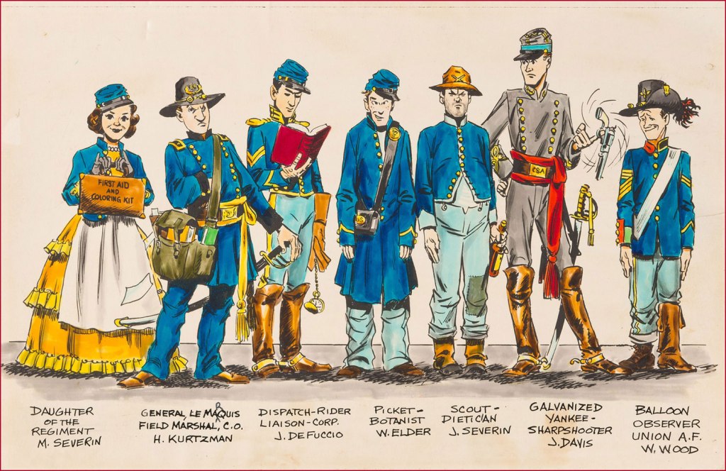
‘Spoilers!’ saw print in Tomahawk no. 135 (July-Aug. 1971, DC). Here’s a lovely illustration of some of the EC gang, in civil war drag . Like it says, DeFuccio’s third from the left. Ink and wash over graphite pencil on Bristol board. » Drawn in the 1950s, this piece saw print in 1983, in issue 9 of the excellent EC fanzine Squa Tront.
GROTH: Was DeFuccio working for Mad at that time?
SEVERIN: Yeah.
GROTH: It seems like you remained friends with DeFuccio for a very long time.
« Carefully, the old man utters a cacophonous incantation… then lets his mind go blank. » — Stephen Skeates
We recently (last March 30) lost a fine fellow and writer in Steve Skeates (1943-2023). I’ve long appreciated his work, as I felt he was among the very few ‘mainstream’ comic book writers who could actually be funny, not to mention gripping or thought-provoking*, whatever the situation demanded.
At its peak, his writing also stood out by virtue of its containing actual creative ideas rather than the usual mishmash of bromides and creativity-stifling continuity that the fanboys clamoured for.
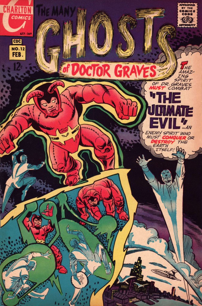
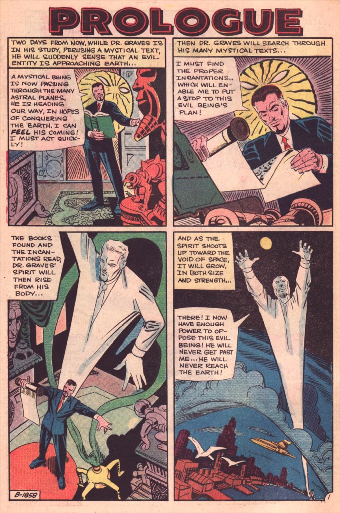
Today, I’ll showcase a bicephalous favourite, The Spectre in « The Parchment of Power Perilous » and Dr. Graves in « The Ultimate Evil », both springing from the same author… and the same plot.
How did this come to pass? Skeates told the story in an article entitled « Graves Acting Strangely: The Ultimate Evil Reconsidered », published in Charlton Spotlight no. 5 (Fall 2006, Argo Press, Michael Ambrose, editor).
« … at that particular point in time, I was totally unaware of the unique manner in which Julie [Schwartz ] approached his profession, typically in the dark when it came to the fact that this longtime comic book icon was far more actively involved in the plotting process than any other editor up at DC. […] I ambled into Julie’s well-kempt office armed with an intricate plot… something I had stayed up half the night before constructing, working, reworking, polishing and repolishing, only to have Julie read it over, extract a couple of ideas he liked, and unceremoniously toss the rest of it away. […] the two of us set about constructing what basically amounted to a brand-new plot based on those couple of ideas of mine that Julie liked, ideas that had somehow gotten his creative juices flowing. »
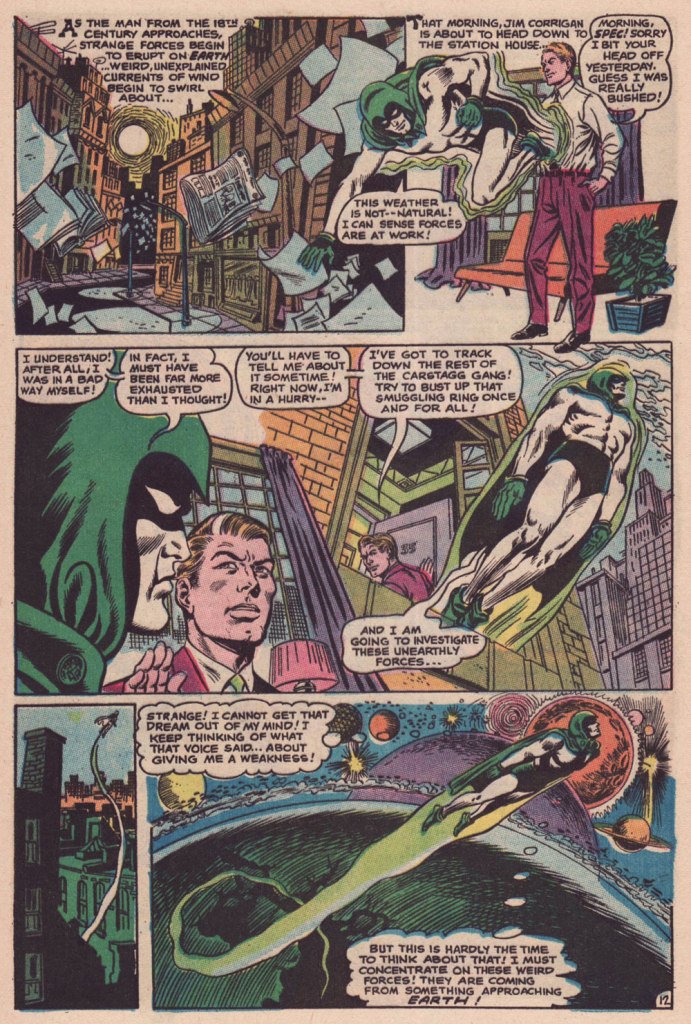
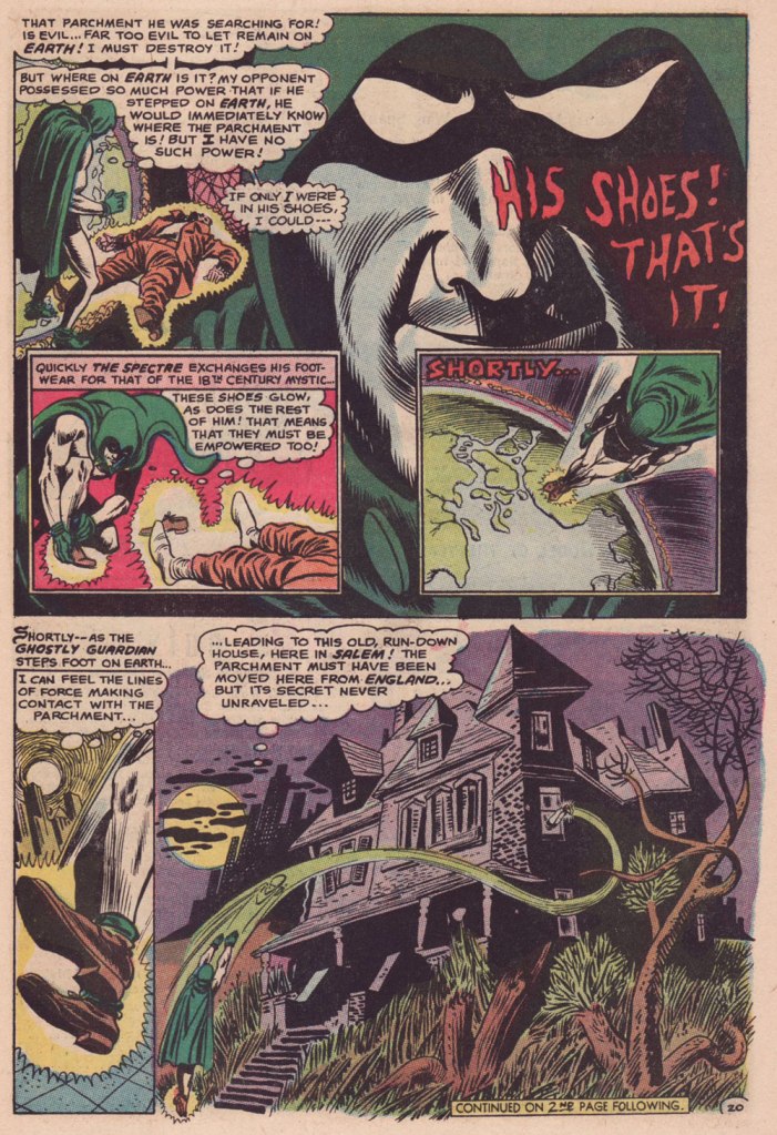
Charles J. “Jerry” Grandenetti (1926-2010) shows to breathtaking advantage his mad compositional virtuosity, anchored by Murphy Anderson’s rational inks. Skeates again: « … inker Murphy Anderson was the perfect stabilizing force, his meticulously detailed inks reining in Grandenetti’s insanity just enough so that even the latter’s wildest notions — colliding planes (no, not aircraft — planes of existence), his frequent disdain for panel borders, the same character shot from two or three separate angles within seemingly the same panel, etc. — became perfectly understandable, making the story so much utter fun to follow (even for someone like me who obviously knew exactly where it was going. ) »Grandenetti’s two previous issues on the title, illustrating Gardner Fox’s Pilgrims of Peril (check out a stunning excerpt here) and The Ghost That Haunted Money!, had demonstrated that he likely was the only match for Ditko when it came to depicting hallucinatory other-dimensional vistas. Let’s face it, just about all who followed Ditko on Doctor Strange either half-heartedly aped Ditko’s designs or drew other dimensions as if they were Wally Wood’s outer space (or Dali’s The Persistence of Memory). Well, save for Tom Sutton, I guess. Grandenetti could have done a great job, but honestly, I like his career as it is. The day Steve Ditko walked away from Doc Strange is the day the character ceased to exist, as far as I’m concerned.Five pages from The Spectre n. 8 (Jan.-Feb. 1969), edited by the… mighty hand of Schwartz. Special kudos to the uncredited colourist (though DC’s assistant production manager Jack Adler surely supervised), who did a superlative job, making discerning use of bold contrasts and close harmonies. It would have been so easy to end up with a garish mess!
Unlike (with one notable exception, initials SD) his colleagues who scampered from Charlton to DC along with editor Dick Giordano (Denny O’Neil and Jim Aparo, for instance) in the late 1960s, Skeates maintained his Charlton work for a time. He explained: « I simply possessed too much affection for what I was producing for that Derby, Connecticut company to do anything along those lines. » Skeates enjoyed « … contributing to Charlton’s take on the “mystery” anthology, ghostly compilations somehow edgier, funkier, and far more fun than those produced by DC and Marvel. »
« Furthermore, unlike DC, Charlton didn’t require that I first submit a plot outline, get it approved, and then write my story. Instead, I could just suddenly turn in a finished product, on spec, a way of working I very much preferred — diving right in with the plot idea only sketchily there, not boxed in even by myself but allowing the story to work itself out, to go where it wanted to go. » Amen.
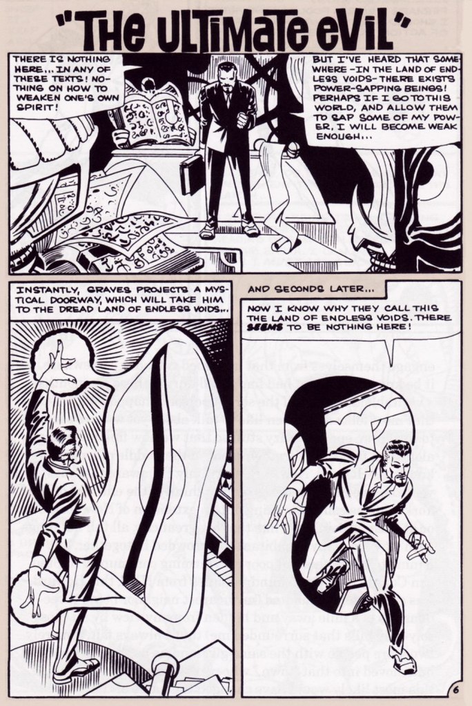
The one time we saw the Doctor M. T. Graves truly get his mystical groove on was in this tale of two Steves, Skeates and Ditko, a splendid bit of recycling-but-not-quite.
And he’s how the whole ball of wax coalesced: « I suddenly remembered that fairly intricate Spectre plot that Julie had long ago summarily tossed aside. Hey, y’know, I might just be able (especially if I placed most of my emphasis on those portions that Julie hadn’t extracted, working on the bulk of my original plot while rather downplaying those couple of ideas that Julie and I had built our new plot on) to transform that baby into a workable Dr. Graves adventure! »
This is The Many Ghosts of Doctor Graves no. 12 (Jan.-Feb. 1969, Charlton). Edited by Sal Gentile.
« Boom! I was into it, writing this story nearly as fast as I could type. Of course, to in effect have Graves play the role of the Spectre, I could see no way around making certain alterations to my protagonist’s makeup, making him far more mystically powerful than he had ever before seemed, more like Marvel’s Doctor Strange than anyone else…
Yet I could see no real problem in any of that, unless of course someone up at Charlton wound up doing something supremely silly like assigning the art for this story to none other than Ditko himself — which, as it turned out, is exactly what happened! »
Some — perhaps all, who knows? — of this tale’s original art (or at least production photostats) has survived, and gives us the opportunity to gaze upon Ditko’s artwork in its raw state, so to speak.
Hail and farewell, Mr. Skeates. You will be missed.
I was all set to write about a certain topic… but one hurdle stopped me cold: having recently moved, we are (mostly me, I confess) still somewhat living in boxes. So… where’s that other book? In any one of a hundred or more boxes. Fortunately, I try to always have a backup plan.
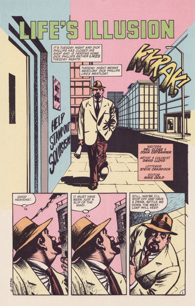
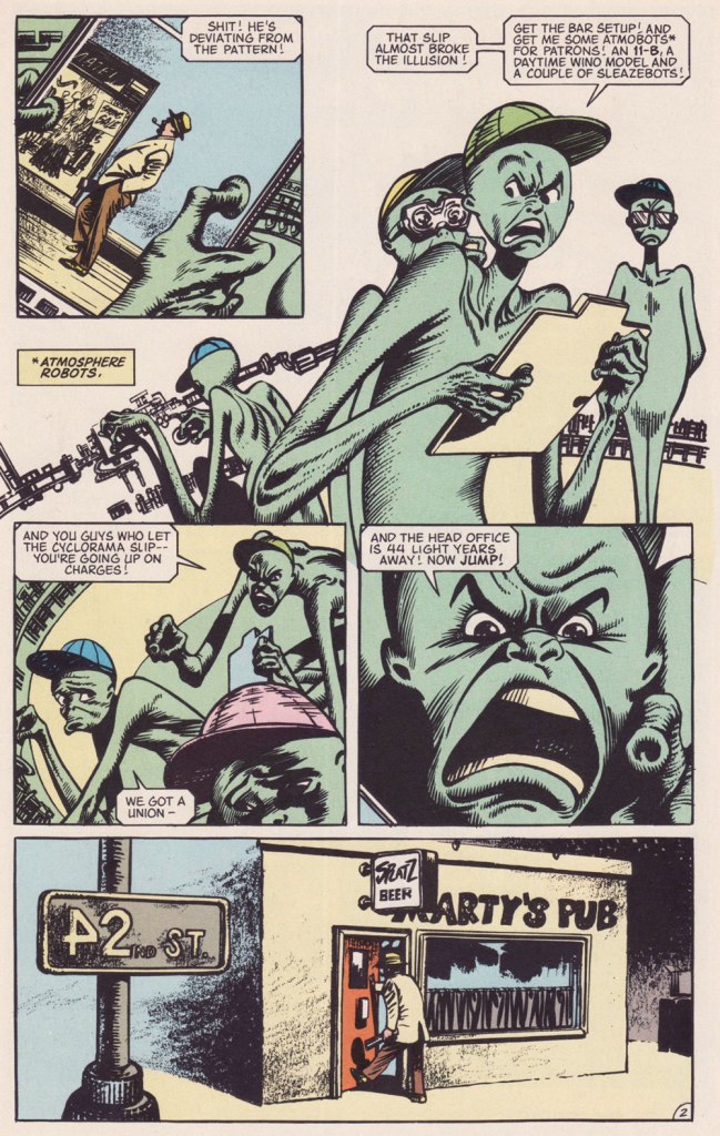
This isn’t the first time I draw attention to an offering from DC’s ambitious but ill-fated Wasteland (1987-88) under the Treasured Stories rubric. See also Foo Goo and American Squalor for more details and to (beware!) suffer a case of thematic whiplash. Whatever warts and blemishes Del Close and John Ostrander‘s Wasteland creations may have borne, they weren’t interchangeable.
Today’s yarn is a spot-on homage to author Philip K. Dick (1928-82), down to the name and occupation. The ‘real’ PKD may have been fond of meat loaf as well, for all I know.
Possibly a reference to PKD’s 1966 novel The Crack in Space?Another cute detail: « From 1948 to 1952, he worked at Art Music Company, a record store on Telegraph Avenue » (in Oakland, CA). Oh, and Robin Williams was a Del Close fan… and vice versa.Life’s Illusion appeared in the final semi-decent issue of Wasteland, no. 10 (Sept. 1988, DC)… beyond that point, it was a painful slide into the abyss. Anyway, I love how this story is able to deftly juggle its elements of comedy, tragedy and Dickian metaphysics without dropping the ball. Poor Mary.
PKD had been on my mind lately. Last fall, while rambling around town, I came upon a Little Library housing one of his books, a French-language edition of 1964’s The Three Stigmata of Palmer Eldritch. I’d read the original paperback edition in 1992, but wasn’t sure I quite grasped its dénouement, and had no-one to compare notes with.
Somewhere, eons ago, I’d read that Dick’s manuscripts for his 1960s paperback originals were abridged (i.e. gutted) to fit the publishers’ format and predetermined page count. But this might be apocryphal. As it stands, I can find no trace of such a claim. The story went on to say that publishers in Belgium and France, where the author was more of a draw than in North America, based their renditions upon Dick’s unexpurgated manuscripts, leading to, unusually for translations, results hewing closer to the writer’s intent. It helps that Dick, not given to extravagant stylistic flourishes, is relatively easy to translate.
« This is an illusion ». Here’s the tome in question, published in 1977 by Belgium’s Éditions Marabout, using Guy Abadia’s 1969 translation. Despite the fact that the book’s been retranslated since, I’ve no quibble with this version, save for the lack of credit for the cover illustrator.
I’m currently halfway through, and so far all is clear; I may have to confer with my younger self to explain the plot to him, poor thing.
« The thing to do was kill it. Obviously. » — Ira Levin, Rosemary’s Baby
Last year, in the course of my post celebrating Luís Dominguez’s life and covers, I noted in passing, about The House of Mystery no. 235 (Sept. 1975, DC), that it held the only DC ‘horror’ story I ever found actually scary.
Since I’d hate to just leave you with such a tease, here it is, so you can be your own judge of the yarn’s merits (or its failings, however the chips may fall).
Don’t ever fall for the notion that cartoony and scary are inversely proportional. Brr.
That poor, fragile, lonely woman! It’s not enough to be trapped in a loveless marriage with the world’s coldest fish, but any sympathy and hope she seems to receive from anyone is mere pretence in the process of gaslighting her. Of course, the plot is redolent of Rosemary’s Baby and The Exorcist and other, and much needed, contemporary critiques of the obligations and ambivalences of motherhood — unthinkable in earlier days — but it has its own points to make.
This is, to my knowledge, one of the few horror stories in mainstream comics of that period to be both written and illustrated by women: Maxene Fabe and Ramona Fradon, respectively. While Fradon is justly celebrated for her defining work on Aquaman in the 1950s and on Metamorpho in the 1960s, Ms. Fabe’s is likely a less familiar name to most comics readers. In the 1970s, she wrote around twenty-five scripts for DC comics, almost exclusively short horror and humour pieces for editor Joe Orlando. Of these, four are Fabe and Fradon collaborations: the (almost) equally dark conte cruelLast Voyage of the Lady Luck in House of Secrets no. 136 (Oct. 1975, DC); the more conventional The Swinger in Secrets of Haunted House no. 3 (Aug.-Sept. 1975, DC), working from a plot by Mike Pellowski, and finally, the sardonically humorous Bride of the Pharaoh in House of Mystery no. 251 (Mar.-Apr. 1977, DC).
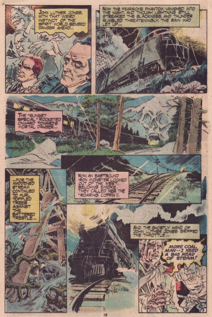
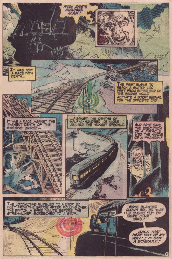
« Trouble with you is the trouble with me / Got two good eyes but we still don’t see / Come round the bend, you know it’s the end / The fireman screams and the engine just gleams » — Robert Hunter
Another quite slight tale, but I’ve always loved this one for its nocturnal, storm-tossed ambiance. And it takes considerable illustrative skill to bring to life such a compact vignette with clarity and visual interest. Especially while hobbled by pedestrian colouring and hazy printing.
While the scripter goes uncredited (though it’s presumably editor Murray Boltinoff), the artist is Rodolfo “Rudy” Florese (1946-2003); he was one of the band of solid Filipino craftsmen that brought extra style and diversity to the US Comics industry in the 1970s. The lion’s share of Florese’s American contribution went to DC’s Tarzan titles. Take it away, boys!
Yeah, that’s right: in such stories, Death always betrays himself by picking an oddball moniker like “Mort Todd” or some such dead giveaway. To be fair, Satan and Dracula also indulge in the corny practice. Dr. Shreck, anyone? Think it never happens in “real” life? Let us consider the case of smarmy Albertan reprobate Pierre Poilièvre, whose name basically translates as Pierre Pea-Hare.
The Roaring Coffin originally saw print in Ghosts no. 40 (July 1975, DC), which bore this enticing Luis Domínguez cover.
« If you will die for me, I will die for you and our graves will be like two lovers washing their clothes together in a laundromat. If you will bring the soap I will bring the bleach. » — Richard Brautigan
Many, many creators, some pretty high profile, have turned their hand at writing the character of John Constantine. And several were inspired to excellence. I haven’t really been keeping up, but I was quite keen on the plots and portrayals deployed by co-creator (with Stephen Bissette, Rick Veitch and John Totleben) Alan Moore, then by the underrated Jamie Delano, but also on brief-but-intriguing turns by Eddie Campbell and… John Smith*. John who? The Grand Comics Database (GCD) lists Mr. Smith as born in 1967 and having been “Managing editor on IPC nursery titles. Editor at IPC. Writer for various titles.” That’s the sum of it.
Flashback to 1992: I had recently quit buying Hellblazer when Garth Ennis, Will Simpson and various hands took over as the art aggregation. By issue 49, the Preacher “Dream Team” of Ennis and Steve Dillon had been assembled: from then on, it would be paper-thin elongated faces and bad teeth all the way. Uh, no thanks.
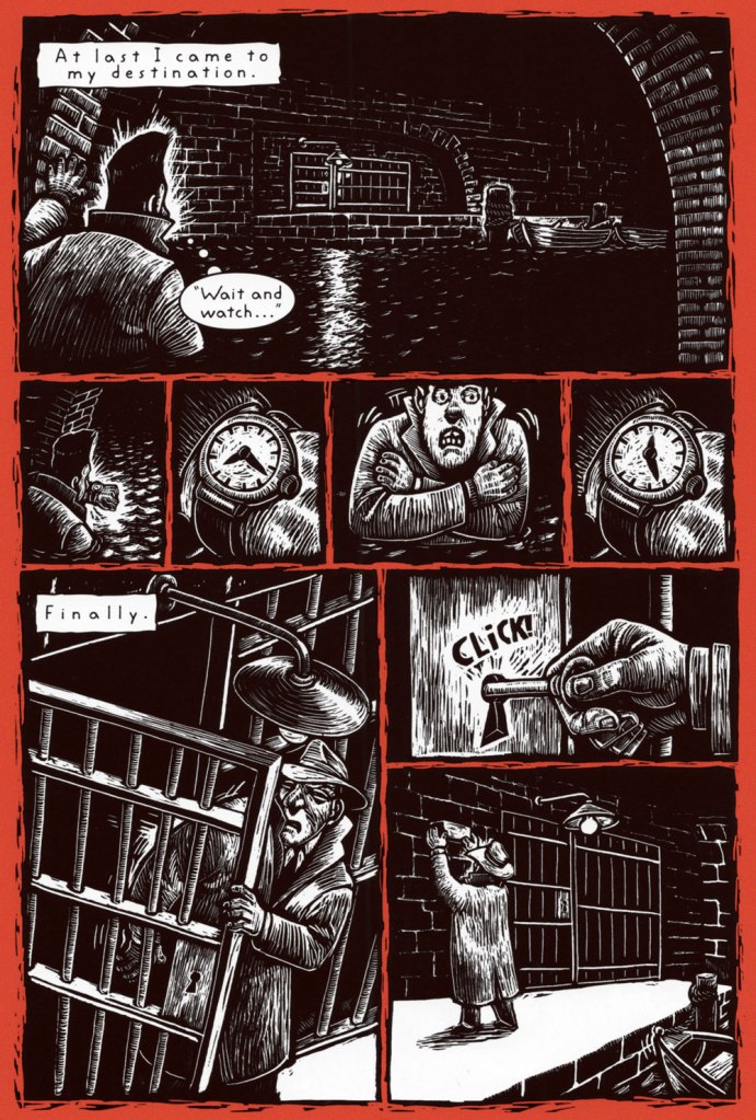
But ah, there was the briefest of respites for those of us paying close attention: a singular gem of an issue, masterfully scripted, terrifying mood piece in which very little is seen (or even glimpsed) but much is suggested. And the art duties were handled by the very good Sean Phillips, who’s since been squandering his talent on Ed Brubaker‘s derivative “I watch a lot of cable TV” witless fake noir tripe. But hey, people like that stuff, so who am I to criticise?
Anyway, I don’t have it in me to spoil the plot… not that it’s very much about the plot of this very special issue. Here are some choice excerpts, and perhaps you’ll catch a glimpse of what I see in it.
This is John Constantine Hellblazer no. 51 (March 1992, DC/Vertigo). Art by Sean Phillips.
Understated, quotidian horror. A job well done.
-RG
*I also really enjoy the pulpy adventures of Wyatt Blassingame‘s diminutive gumshoe John Smith, but that’s another set of prints.
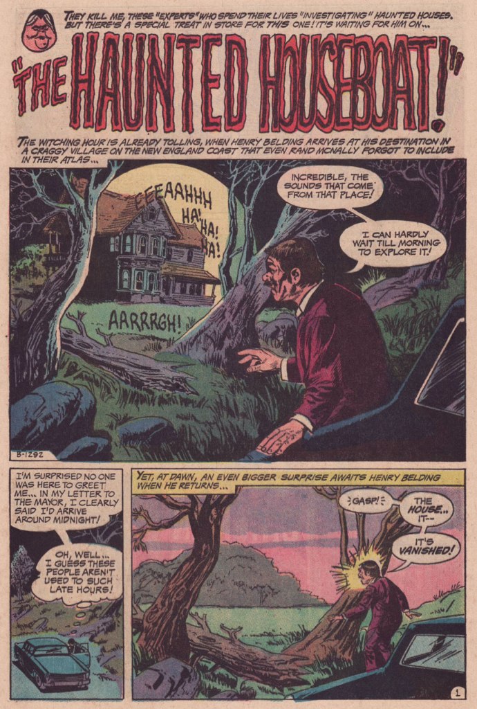
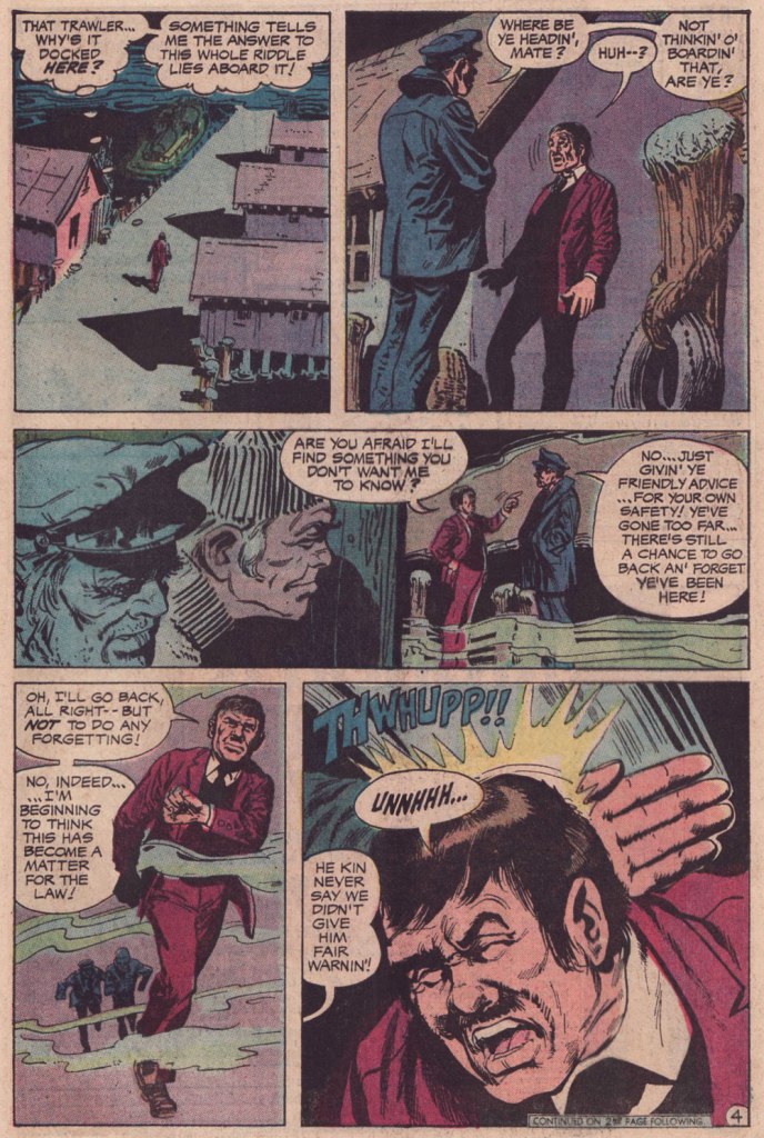
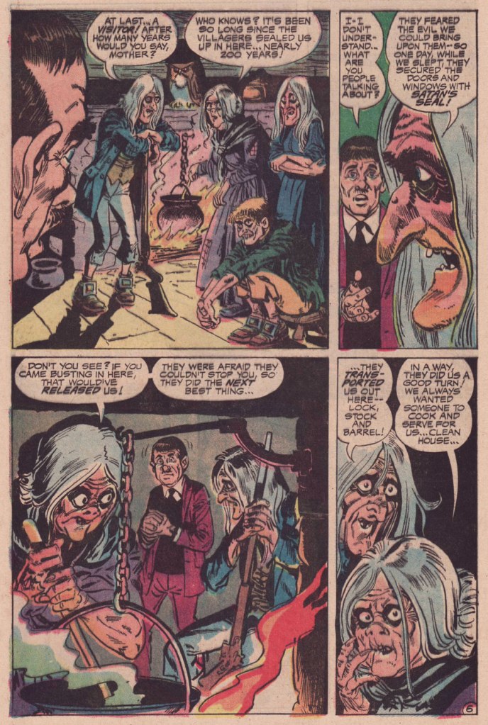
« I lived on a houseboat in Amsterdam for a year. It was intense, and it’s possible that I even had a few blackouts. » — Wolfgang Beltracchi
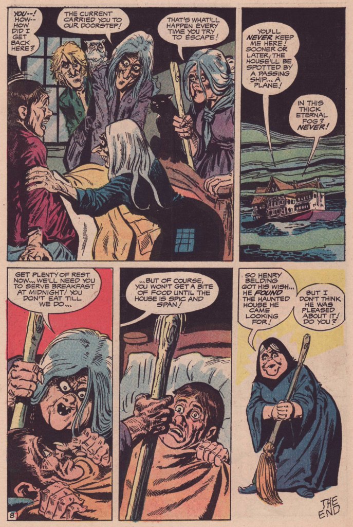
Today’s featured tale is an old favourite illustrated by one of American comics’ perennial mal-aimés, the much-maligned Jack Sparling (1916-1997), a prolific, reliable, distinctive stylist who toiled for just about every publisher on the block. Of course, he’s persona non grata with the superhero set (a compliment in my book!) but his chief strengths lay just about everywhere else, in humour, horror, crime and adventure… you name it.
I love how cosy — that pervasive, foggy ambience! — yet harrowing this tale is. Nice to see one of those insufferable, know-it-all ‘ghost busters’ get his bitter requital. And who knew that some witches were so neat, so domestically inclined? Work that mop, boy!
The writer’s uncredited, and that’s a shame, because this is anything but formulaic — and DC’s mystery books were formulaic to a fault, especially under Joe Orlando‘s guidance. I suspect the author to be editor Murray Boltinoff — he often pitched in, under sundry bynames.This is It’s Midnight… The Witching Hour!no. 21 (June-July 1972, DC), edited by Murray Boltinoff and with cover art by Nick Cardy.
« Contained in these works were not only all the important philosophical developments of modern society… there were even answers to as yet unposed questions. » — Cypher has an epiphany
This week’s topic reminded me of the crucial role an enlightened comic shop owner, especially pre-internet, could play in one’s edification in the medium. Case in point: while I can’t consider him a mentor, my old comic shop guy, being adventurous and open-minded, made a lot of obscure titles available, without necessarily pushing them on his customers. And in a world of ‘super-heroes or bust’, such availability is crucial.
Which brings us to Mr. Brad Teare (b. 1956, Moscow, Idaho). I’ve always had special fondness for comics that bloomed outside the usual channels, like hardy plant life rising up in cracks and miraculously subsisting on nearly nothing.
You know, like this.
From what I can tell, Teare’s first professional comics work appeared in a non-consecutive pair of issues of Heavy Metal magazine, during that blessed but oh-so-brief ‘Tundra‘ period when surprisingly enlightened Teenage Mutant Ninja Turtles co-creator Kevin Eastman published, at considerable loss (between 9 and 14 million simoleons), some of the finest comics of the 1990s.
Eastman had purchased Heavy Metal in January, 1992. In the March issue, Brad Teare’s Cypher made its first of two appearances in HM, in marked contrast to the magazine’s prevalent ‘dystopias with titties for arrested adolescents’ aesthetic.
The following year, Teare self-published (under the Crypto Graphica banner, out of Providence, Utah, pop. 7,000 or so) Cypher no. 1, with a cover clamouring that it contained the ‘Complete Cypher Trilogy!’. Teare intended to produce further issues, but the market evidently wasn’t built for it. The book is so obscure that even the Grand Comics Database (GDC) has never heard of it. But my comic shop guy did place an order, and found at least one receptive reader eager to snap up a copy. I waited and waited for a second issue, but in vain.
This is Cypher no. 1 (1993, Crypto Graphica). Have I mentioned how much I enjoy the artistic technique of ‘scratchboard’? I have indeed!This back cover one-pager from Cypher no. 1 has never been reprinted, I believe.
Then, four years down the road, Gibbs-Smith, “a proud independent publisher and distributor“, founded in 1969, also Utah-based… and still around, assembled and issued a compact (22,5 x 16 cm) hardcover Cypher collection, gathering material that Teare must have intended for at least a couple more issues of his series. Aside from an oddly ‘meh’ cover, overworked and underwhelming, it’s a gorgeous package. It also has managed to fly below the GCD’s radar all these years.
Cypher finds himself new employment. This is the version from Cypher no. 1; perhaps because of the smaller format, the collected edition replaced Teare’s lovely, expressive hand-lettering with a computer font.A spooky sample from ‘Minotaur‘, from the 1997 Gibbs-Smith collected edition.
In the meantime, Teare kept his hand in, providing a pair of highlights to DC/Paradox Press’ well-written but frustratingly visually scattershot The Big Book Of series (1994-2000), also finding success as a freelance illustrator (Random House, The New York Times, Sony, Turner Interactive, Flying Buffalo) in all manners of media.
From The Big Book of Urban Legends (Dec. 1994, Paradox Press/DC).From 1997, a typical spread from the charming Dance, Pioneer, Dance! Written by Rick Walton, it offers a slightly fictionalised account of the westward migration of Brigham Young and a band of his fellow Mormons.From The Big Book of Vice (March 1999, Paradox Press/DC). A fascinating bit of history!
Though he’s nowadays a celebrated and prolific painter of the Utah landscape, he hasn’t altogether turned his back on comics, bless his soul. The final chapter of Cypher (to date?), ‘Sub-Wayward’, introduced, in the story-within-a-story tradition, scientist turned reluctant underground hero The Subterranean. And so, long story short, we find ourselves with a Teare book that’s readily available (for the time being)!
« This comic details the thrilling origin of The Subterranean from his humble beginnings at HyperLabs in New York City to his role as sole defense against a terrible evil perpetrated by the Thanatos twins, former colleagues at HyperLabs. This character of The Subterranean is a spin-off from the critically acclaimed graphic novel Cypher. »
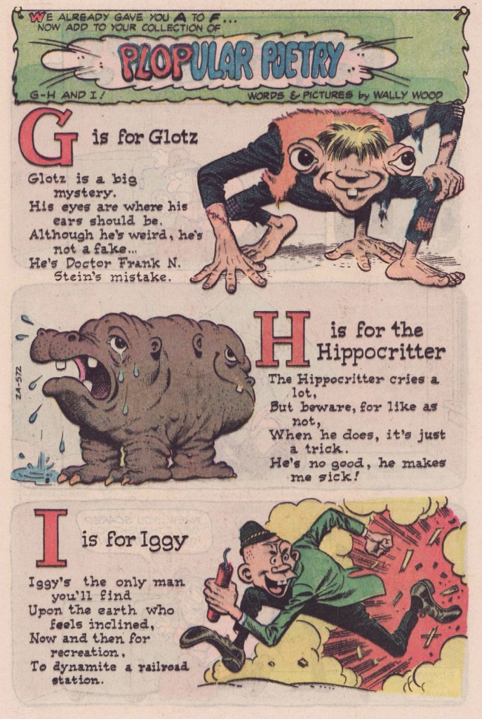
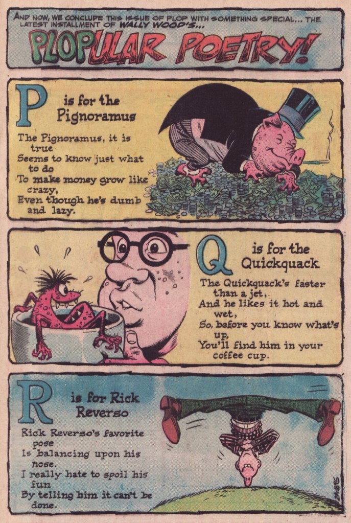
Here’s a seldom-seen 1970’s Wally Wood treat: he concocted this irreverent alphabet for Plop! (1973-76), DC Comics’ surprisingly solid yet nearly forgotten gallows humour anthology — forgotten? oh, it’s the same old recipe: just let the material remain out of print for nearly half a century (and counting)*, fold in gradually the dust and grime of neglect, and let wither, uncovered, until utter oblivion is achieved.
While Plopular Poetry is minor ‘woodwork’, it represents some of the best produced by poor Woody at this late stage in his life.
Published in Plop! no. 18 (Nov.-Dec. 1975, DC).Published in Plop! no. 19 (Jan.-Feb. 1976, DC).Published in Plop! no. 20 (Mar.-Apr. 1976, DC).Published in Plop! no. 21 (May-June 1976, DC).Published in Plop! no. 22 (July-Aug. 1976, DC).Published in Plop! no. 23 (Sept-Oct. 1976, DC). According to his protégé Ralph Reese, this is Woody doing his own lettering on the poems. … and that was it. Plop! had run its course, cancelled with its 24th issue, five letters short of an alphabet. Published in Plop! no. 24 (Nov.-Dec. 1976, DC). Were the five final letters ever produced? I’ve been keeping my eyes open all these years… but I’m still waiting.
As a bonus…
Wood’s cover preliminary for Plop! no. 19’s cover boy, Smokin’ Sanford. Rendered in blue pencil on paper.A more refined version of Sanford, rendered in graphite over blue pencil.This is Plop! no. 19 (Jan.-Feb. 1976, DC), Wood’s fourth and final cover for the title, with sidebars and logo design by Sergio Aragonés; edited by his buddy from the EC days (and even earlier), Joe Orlando. Do I detect another, highly meticulous hand in the inking (Ralph Reese comes to mind, but he says he never worked on Plop!, and if one of us is wrong, odds are it’s me), or is Sanford’s wacky tobaccy messing with my mind?
And here’s a glimpse into the creative process! Note the disappearance, in the end, of Sanford’s threads and spectacles.
-RG
*aside from a pair of obscure digest reprints in the mid-eighties.
« Bicycles are pieces of art. You get that combination of kinetic engineering, but then, besides the welds, the paint jobs, the kind of the sculpture of it all is quite beautiful. Bikes have such great lines, and all different styles. » — Robin Williams
I’ve been cycling a lot more of late. I’d been using my bike less frequently in recent years, unnerved by the increasingly frantic (and distracted, not a good combo) vehicular traffic of the city. But with my wife taking an interest in the activity, I found myself with a reason to get back in the saddle. This spring, we found a newly opened bike shop, earthy, grimy and unpretentious, where we got our bikes expertly tuned up.
I’ve always loathed those cliquish hipster joints that, in addition to selling overpriced junk, also seem responsible for the ubiquity of those middle-aged, over-equipped, spandex-clad Sunday cyclists, who feel it their sacred duty to pass you, whatever the pace, weather or road conditions, looking for all the world like overstuffed sausages in their lycra casings. The sporting analogue, if you will, of the rich kid who ‘needs’ the most expensive guitar in the shop… never mind that he can’t play a note.
You hopefully will indulge me in this little exercise in nostalgia. I miss the days when our bikes got us around, granted us greater autonomy and kept us in shape. This lifestyle took a backseat in the 1980s, when the BMX craze began to overstate the extreme and the competitive facets of the sport. Now, it’s all ultimate sport this and boot-camp fitness that. Ah, whatever happened to plain old utilitarian fun?
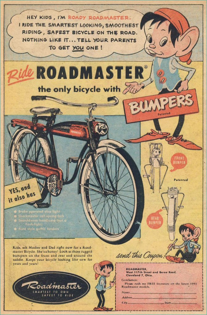
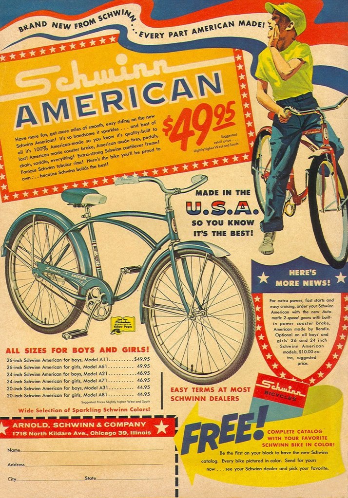
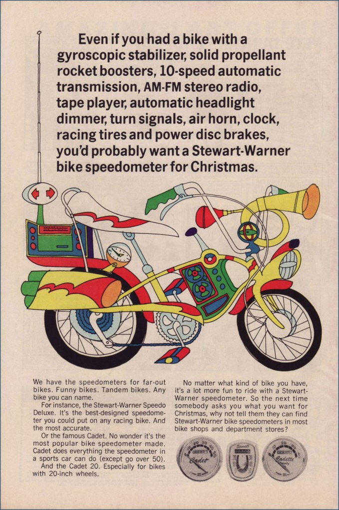
Judging from this ad (circa July, 1951), bicycle makers were trying to make their steeds mimic the clunky look of the era’s motorcycles. Aesthetics would soon improve. Here’s a fairly typical ad, circa 1961. Free catalogue, not to mention a healthy dollop of American jingoism, like it or lump it. Speaking of Schwinn, check out their well-produced promo comics Bicycle Book, from 1949.Ah, yes, the U.S. Royal twins, Roy and Al. In the tradition of the accidentally named Smith Brothers, “Trade” and “Mark”. Unsurprisingly, scouting magazine Boys’ Life was an ideal market for bike-themed ads. This one appeared in the May, 1966 issue. Artist unknown… anyone?You can tell how important the bicycle scene was: not only were manufacturers hawking bicycles, but there was also the ‘aftermarket’ trade of gizmos and doodads. I’ve long supposed ‘speedometer’ to be a dumbed-down term for a tachometer. Even after consulting this ‘helpful’ chart, I’m still not convinced it isn’t. To quote sometime Beach Boys lyricist, DJ and racing enthusiast Roger Christian: “Tach it up, tach it up / Buddy, gonna shut you down.“
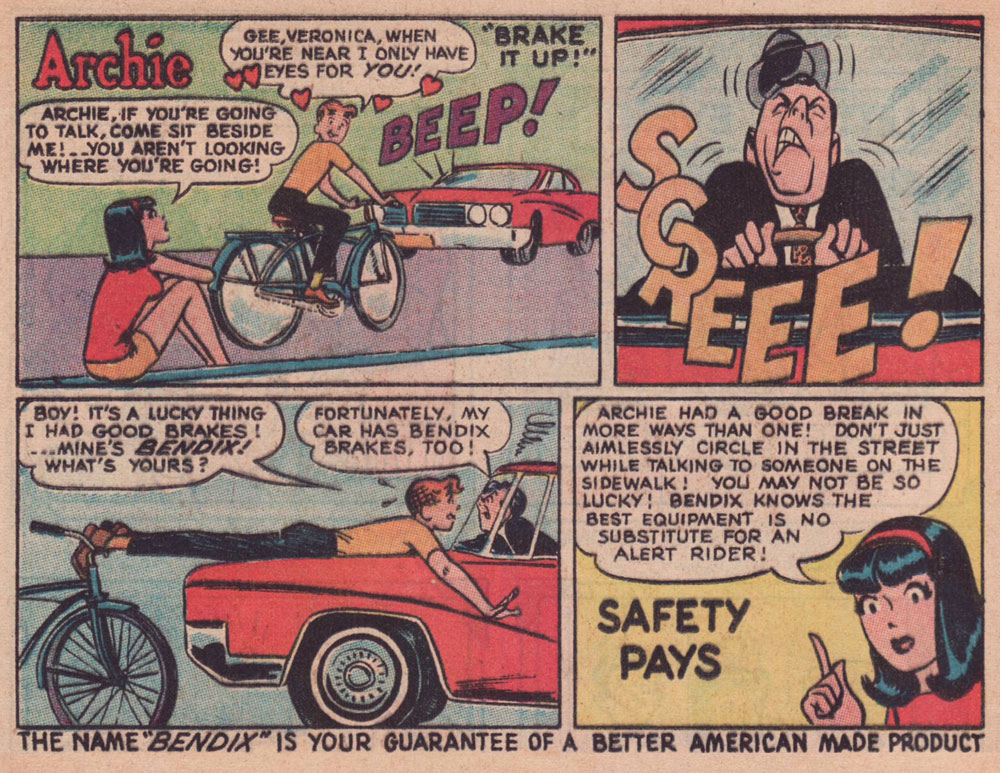
Through much of the 1960s, Bendix (the corporation, not Bill!) commissioned a long-running series of custom ads featuring the Riverdale Gang, illustrated by resident Archie artist Harry Lucey.
This one’s from April, 1965.Archie, the voice of reason? Only in ads and public service announcements. This one’s from October, 1966.This one’s from July, 1968.Ah, that’s more like the Archie Andrews we’re accustomed to. This one’s from August, 1968. I daresay we’ve all encountered too many such ‘cyclists’.An apt reminder that the rich kids always did boast the best, most up-to-date equipment, whatever the sport. Also, I can’t help but think that the cape and tiger tail are just kind of… reckless. Clearly, corporate shill Tigerboy is failing to heed the lessons of Isadora Duncan’s tragic death. Thanks to the ever-thrilling Jack Davis artwork, this is the unsurpassed classic among bicycle ads. It appeared in select DC and Archie titles cover-dated November, 1968. While banana seats may be considered in most quarters as retro kitsch, I earnestly hold that they were bold and cool. Aesthetic and structural experimentation had arrived at the forefront of the cycling industry. This ad appeared in comics cover-dated February, 1969. And here’s a look at a (flawlessly) surviving model. Man, the elegance of those lines!
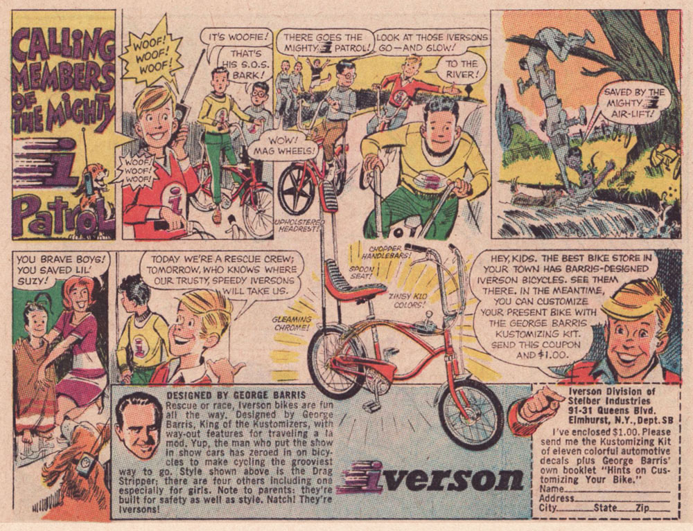
As the 1960s drew to a close, another series of custom comics ads appeared — just under the wire. They spotlight the creations of the famous ‘King of the Kustomizers’, George “Barris” Salapatas (1925-2015), very much in demand thanks to his recent triumph with the Batman tv show’s Batmobile.
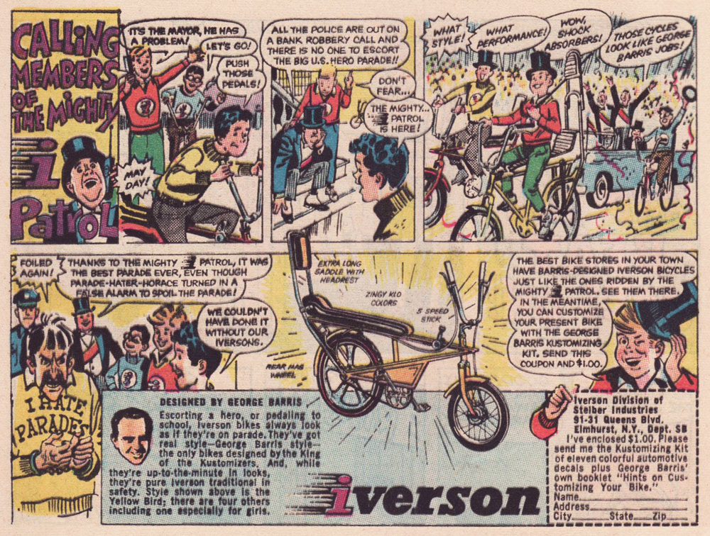
This one appeared in various DC titles cover-dated November, 1969. If I had to take a stab at artistic attribution, I would go with the versatile Creig Flessel (1912-2008). Something tells me that in real life, the human chain stunt the Mighty i Patrol pulls would have led to four drowned kids instead of just one — but I’m sure Woofie would have dog-paddled his way to safety.This one appeared in DC titles cover-dated December, 1969. Read a gripping first-hand account of working on the assembly line at the Iverson bicycle factory, circa 1975!I’m assuming that the kid with the sombrero nicked it from Bazooka Joe’s kid brother Pesty. This final adventure saw print in DC titles cover-dated January, 1970.This, however, is the advert that really worked on me. When I got my first grown-up ten speed bike, a few years later, it was a Browning, which lasted me at least a quarter-century, until it snapped right at the load-bearing juncture of the rear fork… the one place where even welding wouldn’t help.
I switched to my backup, a hybrid bike I bought in 1987. It’s still running beautifully. In terms of value for money, a well-maintained bicycle is pretty unbeatable.
My well-thumbed copy of Adventure Cycling in Europe (1981). « Say, Uncle John, did Browning replace you with a pretty-boy model for your comic book ad? » « They sure did, but you know what’s even worse? » « I don’t know, Uncle John, what is? » « I don’t even have a nephew either! » All kidding aside, though it’s over forty years old, it’s still an insightful, entertaining and helpful book. When you go low-tech, change occurs at a slower, more forgiving pace.
I leave you with a song, whence comes the title of this article. It’s from a lesser-known but excellent Donovan album, Open Road, from 1970.


