Recalling Tomorrow With Dean Motter

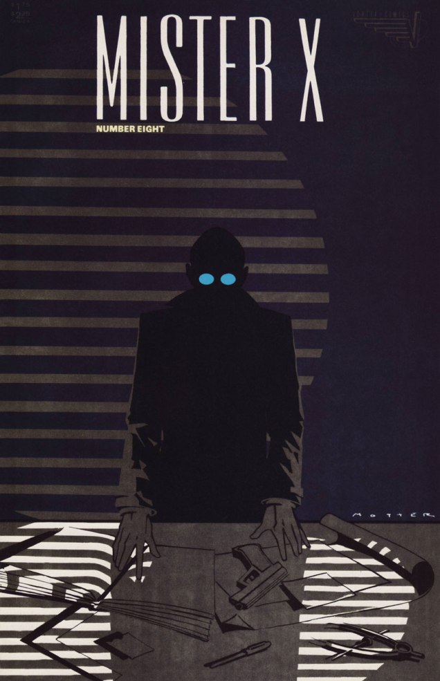
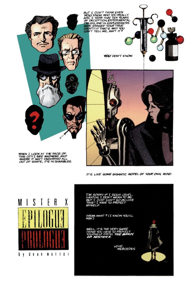
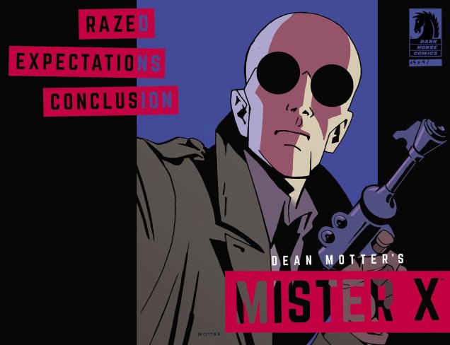
« Mister X has always puzzled me. I’ve never been exactly certain where he came from. It seems like he has always been present — maybe not skulking through the perplexing shadows of the city so much as through some kind of collective unconsciousness. » — Dean Motter (1986)

On this day, back in 1953, the celebrated art director, graphic designer, writer-illustrator and cartoonist Dean Motter was born in Berea, Ohio, not far from Cleveland.

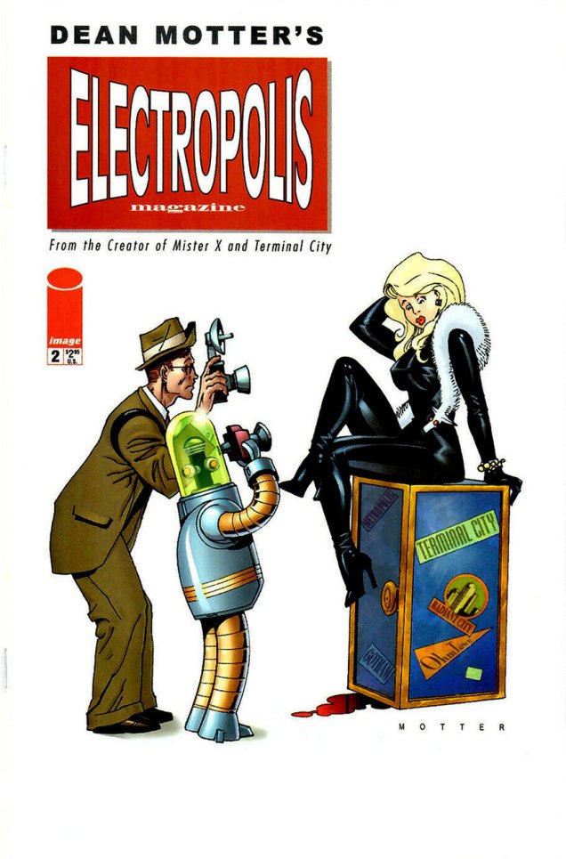
Over the course of his illustrious career, Motter has flitted in and out of comics, often in tandem with a rather remarkable array of collaborators, among them Jaime Hernandez, Paul Rivoche, Seth, Ty Templeton and Michael Lark… but just as frequently on his own.

As you’ll see, though he is quite adept in a vast range of media and techniques, nearly all of his mature work is lovingly filtered through his abiding interest in Will Eisner’s The Spirit, film noir, Art Deco, German Expressionism, with, I’d say, a soupçon of Soviet Propaganda art… resulting in a surprisingly cogent and coherent retro-futurist vision. The future as seen from the past, in short. And that’s just the visuals.

Andromeda01A
Ah, youthful indiscretions! Motter’s cover for the inaugural issue of the tabloid version of Andromeda (1974, Media Five; Bill Paul, editor). Herein, Motter wears some rather less highfalutin’ influences on his sleeve, notably those of Mssrs. Brunner, Kane and Steranko. « Focus Fire ~ white Eclipse The Aurora Anti-Cosmos Splitting Heavens Apocalypse. »… concluded Young Master Motter’s epic poem, Celestial Circuit Cirkus.
MotterMegatronLP_A
An early appearance from (a yet-unnamed?) Mister X, snuck its way onto a Canadian reissue of Patrick Cowley‘s Megatron Man (1982, Attic Records). And here is a later, rather dodgy recycling of his artwork that must give Dean some choice nightmares.
MisterX06A
A nice change of pace to showcase his range, this is Motter’s cover for Mister X no. 6 (Dec. 1985, Vortex). This splendid logo, débuting here, would thankfully return from time to time.
MotterMrX08A
This is Mister X no. 8 (Oct. 1986, Vortex); In its subtlety, this cover stretched the limits of what was technically possible in comics printing at the time, in terms of saturation and contrast.
ShatteredVisageA
In the late 1980s, Motter jumped at the chance to write and illustrate Shattered Visage (oh dear me, a Shelley quote!) a sequel to 60s British television classic The Prisoner (4 issues, prestige format). This is the (much improved) cover to a 2019 reprint (Titan Books) of the original 1990 DC Comics collected edition.
Electropolis02A
This is Electropolis no. 2 (Sept. 2001, Image), a spin-off of his Terminal City limited series (1996-97, DC Comics).
MotterXEpilogueA
Page two of Epilogue Prologue from A1 no. 1 (Atomeka Press, 1989), story and art by Motter.
MisterXEviction02A
Cover from Mister X: Eviction no. 2 (June 2013, Dark Horse).
MisterXEvictionA
The cover of Dean Motter’s Mister X: Eviction & Other Stories (Nov. 2013. Dark Horse).
MotterRazed04A
Front and back cover spread of Mister X: Razed no. 4 (May 2015, Dark Horse). Unusually done in gouache, if I’m not mistaken.
MotterTheShadow025A
One of the current comics field’s crasser, most mercenary outfits, Dynamite Entertainment specializes in the frivolous mangling and mingling of established franchise properties, with the wankbait titillation ramped way the hell up and variant covers out the wazoo. Sample titles: Red Sonja & Vampirella Meet Betty & Veronica (twelve issues so far, as it’s so very high-concept), Barbarella / Dejah Thoris, or Army of Darkness / Xena… I mean, check out this train wreck of a lineup. Such is the power of their brain-dead crappitude that they even managed to produce an abysmal mini-series from a Roger Langridge script, a career first for the great man. Their not-so-secret weapon: in the hallowed publisher’s tradition of the old bait-and-switch, they don’t scrimp on the slick-as-spit cover artwork. This is The Shadow no. 25 (May 2014); a variant cover, need you even ask?

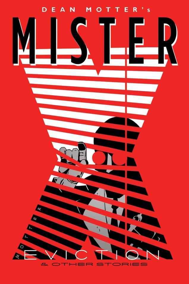
Aside from his comics work, Motter spent a considerable part of the 1980s working for the Canadian arm of what was then the biggest (and possibly stingiest) record label in the world, CBS/Sony, shepherding or designing beautiful and clever covers for albums that were often neither… but that’s an art director’s job, cynical as it may seem. Anyway, you know you’ve made it when your work rates a pastiche decades on; to wit:

MotterCoversA
This reminds me of how a single-minded, contrarian generation of Chuck Klostermans has taken over music criticism in order to wipe away the work of the Obama Administration Robert Christgaus and Dave Marshes of this world, aiming to vindicate and impose their beloved childhood bands, which once were the reigning critics’ whipping boys. Nowadays, you’ll find 4 and 5 star ratings (out of five, there’s no room here for moderation!) of Van Halen, Kiss, Loverboy and Journey albums, which was unthinkable at the time of their release. Plus ça change…

What is there left to do but to warmly wish Mr. Motter the finest of birthdays… at a safe distance? Alles Gute zum Geburtstag!

– RG

Tentacle Tuesday: “…to swallow yesterday”

« The tentacles of today reach out like an octopus to swallow yesterday. »

That’s a quote from Gladys Taber, columnist for Ladies’ Home Journal in the 19th century, and almost as good as “put your foot down with a firm hand”.

Another thing tentacles of today… or any day… do is reach out for women, preferably ones in skimpy outfits. ’nuff said.

By now, I’m completely confused about who Ms. Marvel is supposed to be, but here is some version of her battling an octopus with a heavy hangover or a bad case of conjunctivitis. This blondie is Carol Danvers, I believe, though, that her usually bare stomach has been wrongly coloured red… but I can’t muster enough interest to care.

MsMarvel16
Ms. Marvel no. 16 (April 1978, Marvel). Cover pencilled by Dave Cockrum and inked by Terry Austin.

The next one is a scene from a fantasy world, though pray note that the tentacle grabs the woman, not the guy who’s right behind her, nor the gorilla (?) who’s right in front of her.

In case anybody is wondering about the plot of this 6-issue series by Bo Hampton, « A wizard, an air force pilot, and a young woman on a mysterious quest, join forces on a “lost planet” accessible only through magic corridors. As Ambrose Bierce, a self-taught wizard who disappeared from Earth in 1914, tells them, when the evil Zorrin family conquered the planet Iriel, they killed off its scientists so it could be dominated by the Zorrins’ magic. Before they can return to Earth, the heroes have to destroy the lotus potion which subjugates the world’s populace to the Zorrins’ will. » (source)

LostPlanet3
Lost Planet no. 3 (September 1987, Eclipse), cover by Bo Hampton.

There’s very little science in these Thrilling Science Tales – and would you expect any from a story with a protagonist named Stormy Tempest? (any relation to Joey?) Trying to untangle her hair from the tentacle’s suckers/cilia is going to be horrendously painful, but I suppose she has more serious things to worry about.

ThrillingScienceTales2
Thrilling Science Tales no. 2 (1990, AC Comics). Cover pencilled by Mark Heike and inked by John Dell. The brown slime oozing from the tentacle’s embrace is profoundly disturbing, IMHO.

The following is not exactly a worthy use of Mark Schultz‘ talents, but at least it’s a nice, intriguing cover. The insides are not drawn by him, in case you’re wondering.

Subhuman4
SubHuman no. 4 (February 1999, Dark Horse), cover by Mark Schultz.
Pulpo comics
This Mexican science-fiction comics anthology was published in 2004. The cover is by Mexican cartoonist and illustrator Bernardo Fernández, who’s also the editor.

I’ll wrap up with some eye candy – I was pleasantly surprised to discover that it was actually drawn by Bruce Timm and not one of his many imitators. A Timm comic with tentacles and more than a subtle hint of seduction? I’m very pleased, indeed.

Batman- HarleyandIvy2-Bruce-Timm
A page from Batman: Harley & Ivy no. 2 (July 2004, DC). Jungle Fever! is scripted by Paul Dini and drawn by Bruce Timm. I recommend reading the whole thing, if only for the art.

∼ ds

Tentacle Tuesday: Dark Horse, Pt. 1

Today’s Tentacle Tuesday is dedicated to Dark Horse Comics, one of the largest independent comic companies (the third largest, period, after Marvel and DC – at least according to their website). That being said, I’m not a huge dusky stallion fan – one of my gripes is that this publisher tends to reprint older comics (like the Harvey Comics Treasuries) on inappropriately glossy paper, as well as ramp up the contrast on the art until the background is so dazzlingly white you could probably blind yourself with it. On the other hand, a lot of mangas translated to English are published by their imprint, Dark Horse Manga – I am profoundly grateful for What’s Michael?, for instance (even though it’s not the first thing that comes to mind, manga-wise).

Throughout DH’s run (it was formed in 1986), it has housed the work of quite a few influential artists and writers, as well as published many long-running and award-winning series. Overall, this publishing house is a force to be reckoned with… and a lot of their pet series (like Hellboy) have tentacles galore. Shall we take a look-see?

Ragemoor#2-JanStrnad-RichardCorben
Ragemoor no. 3 (May 2012), cover by Richard Corben.

I’ll get around to reading Dept. H one of these days, but in the meantime, some tentacles from this suspenseful (or so say the reviews!) deep-sea who-dunnit:

DarkHorseDept.+H+hardcover+v1
Dept. H no.1 (April 2016), cover by Matt Kindt.
DeptH7
Dept. H no. 7 (October 2016), cover by Matt Kindt, colours by Sharlene Kindt.
DarkHorseBlack Hammer Justice League#1
Black Hammer / Justice League no. 1 (July 2019), a variant cover by Yuko Shimizu.

I mentioned Hellboy earlier – speaking of that, unsurprisingly, a large chunk of today’s post features covers from this ever popular series. But am I going to show you regular covers? Naah, too obvious.

«Dark Horse Comics printed a precious few blank covers on the landmark Hellboy and the B.P.R.D. 1952 #1, and the Hero Initiative commissioned 100+ top artists to do an original drawing on each cover. Presented here is the gallery of ALL 109 original covers!» (See them here.)

I picked a few that I liked, but make sure you click on that link because about three quarters of those commissioned covers are awash in tentacles. Now that’s what I call good, nay, great commission art!

HellboyandtheBPRD1952-ChrisIvy
Cover by Chris Ivy. Chosen because despite the abundance of all manner of creatures, the eye is automatically drawn to the Cthulhian horror that’s politely waiting its turn for devouring and whatnot.
HellboyandtheBPRD1952_lanagan_walter
Cover by Walter Flanagan. They’re somewhat, shall we say, timid tentacles, but that’s what I like about ’em.
HellboyandtheBPRD1952_glendenning_ben
Cover by Ben Glendenning. Chosen because of the WTF factor of a creature with a dozen scaly, plant-like tentacle-arms.
HellboyandtheBPRD1952__crain_clayton
Cover by Clayton Crain. Probably the most gruesome cover of today’s post, included for the blood and entrails and disquieting albino-ness of it all.
HellboyandtheBPRD1952__allison_grace
Cover by Allison Grace. I hope that cigarette isn’t implying anything… untoward has happened.

And a last cover, just to leave you on a quiet, peaceful note…

AliensDefiance-no6- October2016
Aliens: Defiance no. 6 (October 2016).

This is, by no means, an exhaustive list – stay tuned for a Part 2, coming to your computer and cellphone screens sometime soon (when you least expect it!)

~ ds

Tentacle Tuesday: Have Tentacles, Will Space-travel

« When the blast of a rocket launch slams you against the wall and all the rust is shaken off your body, you will hear the great shout of the universe and the joyful crying of people who have been changed by what they’ve seen… »*

Greetings, dear astronauts! Today’s Tentacle Tuesday concerns itself with that “religious experience”, space travel… with tentacles in tow, of course. Some comics may announce their interplanetary theme by putting SPACE into the title of the series (and making sure it’s big and bold!), while others deploy a little subtlety and coyly refer to the unknown, or the unexpected. Either way, we’re in for a grand old time exploring space along with the brave men and women (err, mostly men) who found themselves exclaiming “ooh, tentacles!” while exploring some mysterious planet.

In chronological order, then…

SpaceSquadron5A
Space Squadron no. 5 (February 1952, Atlas). The cover is *probably* by Joe Maneely.
WorldsUnknown4
Worlds Unknown no. 4 (November 1973, Marvel), (bad) cover by Dick Giordano. Some people have the knack for coming up with original and scary monsters, and some don’t. ’nuff said.
StarHunters1
Star Hunters no. 1 (October-November 1977, DC), pencils by Rich Buckler and inks by Bob Layton. The green thingies may be snakes/dragons, not tentacles, but they’re doing a convincing impersonation.
Unexpected221
The Unexpected no. 221 (April 1982, DC), cover by Joe Kubert. Now *there’s* a convincingly moody and frightening cover – no big pyrotechnics, just a strong hint of suffocation by a strangely-shaped cloud of ectoplasm. Shudder.
PulpFictionLibraryMysteryinSpace
Pulp Fiction Library: Mystery in Space (September 1999, DC). Cover by Mitch O’Connell. This 228-page anthology features a bunch of reprinted stories (from the early 50s to the the early 80s) originally published in Real Fact Comics, Mystery in Space, Strange Adventures and Action Comics.
TheGoon11
The Goon no. 11 (March 2005, Dark Horse), cover by Eric Powell.
TheGoon11-detail
Yeah Franky, what the hell are you doing?

Check out part 1 of this interplanetary tentacle exhibit here: Grabby Denizens of the Airless Void.

Incidentally, today I was given a nice gift at work: Buddha’s Hand, or the fingered citron, a type of citrus someone described as a “Monsanto-produced cross between calamari and a lemon”. How very appropriate for Tentacle Tuesday! Here’s a picture of my very own tentacled beauty:

MainBouddhaA

« I have never listened to anyone who criticized my taste in space travel, sideshows or gorillas. When this occurs, I pack up my dinosaurs and leave the room. »*
~ ds
*All quotes by the great Ray Bradbury

An Inconvenient Prescience: Harvey Pekar’s “Stupid Capitalists!” (2000)

« And it’s worse when I try to remember
When I think about then and now
I’d rather see it on the news at eleven
Sit back, and watch it run straight down »
Warren Zevon, Run Straight Down (1989)

Just a brief little post today, with a thought to our friends in the USA who have an important opportunity coming up tomorrow.

Despite the vividness of his ‘cranky old man’ image, Harvey Pekar (1939-2010) wasn’t some coot screaming at the kids to get off his lonke or ranting about aliens in the drinking water. He was a keen-eyed observer with astounding perspective. Witness this unnervingly accurate and oh-so timely piece from eighteen years ago. Illustrated by Josh Neufeld, it was published as the back cover of the one-shot American Splendor: Bedtime Stories (2000, Dark Horse, edited by Diana Schutz).

PekarCapitalistsAHigh time for a muzzling of a certain tiny fingered, Cheeto-faced, ferret wearing shitgibbon, wouldn’t you say? Make America Splendid again… do it for old Harv, do it for yourselves.

-RG

Urban Legend Fun: The Spider in the Hairdo

« We are all susceptible to the pull of viral ideas. Like mass hysteria. Or a tune that gets into your head that you keep humming all day until you spread it to someone else. Jokes. Urban legends. Crackpot religions. Marxism. No matter how smart we get, there is always this deep irrational part that makes us potential hosts for self-replicating information. » — Neil Stephenson

True story! It happened to a friend of a friend of a relative of an acquaintance of the hairdresser of the nephew of the uncle of the garage mechanic of the girdle maker of a cousin of a U.F.O. abductee ex-classmate of my brother’s. Or so he obliquely claimed under hypnotic regression.

Apparently, this tale gave rise (I know, I know) to a variant called The Cucumber in the Disco Pants.

And remember, always check with Snopes.com before propagating dubious claims.

Spider in the Hairdo! is a juicy excerpt from Dark Horse’s one-shot Urban Legends no. 1 (June, 1993). Adaptation by the self-proclaimed « World’s Best Artist », Mitch O’Connell. I can think of far less worthy candidates for the position.

Should you be craving more from Dr. Mitch, here’s where to go for your fix: www.mitchoconnell.com.

And if, like me, you can’t get enough of such urban folklore, check out any of Jan Harold Brunvand’s score of splendidly compelling books on the subject. When it comes to urban myths, Dr. Brunvand is the authority.

MitchGirl'sHeadA

As a bonus, here’s Arthur Adams‘ slightly subsequent take on the same myth, published in DC/Paradox Press’ inaugural entry in its ‘Big Book of…’ series, The Big Book of Urban Legends (1994).

SpiderHairdoArtAdamsA

By their very nature, the Big books (seventeen in all) tended to be pretty hit or miss, not, for once, because of the writing, but chiefly due to the evident paucity, in the current comics industry, of artists versatile enough to credibly depict low-key, quotidian, humorous or historical situations. Is it counterintuitive, or fitting, that artists on the cartoonier end of the scale (Rick Geary, Roger Langridge, Gahan Wilson, Hilary Barta, Ty Templeton, Danny Hellman, Sergio Aragonés…) tended to fare best in producing this type of « documentary » work? I haven’t quite made up my mind. All I know is that the superhero specialists and photo tracers just brought embarrassment upon themselves *and* the unfortunate reader.

– RG

Once More Around the Sun, Rick Geary!

« Hey — if you’re looking for that curly machine, I saw some beasts run off with it. »

Missouri native Rick Geary, born 72 years ago today, on February 25, 1946 (in Kansas City, which isn’t in Kansas, despite its name) is in a classe à part: a true iconoclast, he’s quietly, steadfastly carved out for himself (and his fans) a varied and consistently strong œuvre, seemingly free from petty compromise.

GearySelf85A
A 1985 self-portrait.

He first gained notice in the mid-70s through his fanciful contributions to National Lampoon and Heavy Metal, and just kept up the pace from there. These days, he mostly concentrates on his true crime graphic novels series, published by NBM. One gets a sense of a man who works in comics because he’s passionate about the possibilities the form offers. A 1994 recipient of the National Cartoonist Society’s Magazine and Book Illustration Award, he certainly doesn’t need to work in the comics industry.

GearyPetMiraclesA
This charming one-pager saw print in the anthology Animal Confidential (May 1992, Dark Horse.)

He’s collaborated with fellow oddball genius Bob Burden, of Flaming Carrot fame, a dream pairing that manages to surpass the lofty expectations it implies. Their take on Art Clokey‘s legendary claymation characters Gumby and Pokey manages to be true to its source and to espouse both Burden and Geary’s respective slants.

Here’s a sequence from Gumby no. 1 (July 2006, Wildcard Ink.) Story by Burden, art by Geary, and let’s not forget the contribution of hue ace Steve Oliff. When it comes to Gumby comics, however, mind your step: don’t settle for anything less than Burden (whether with Arthur Adams or Rick Geary). A recent revival fumbles the childlike mood of infinite possibility and mires itself in mere childishness instead.

GearyGumby1AGearyGumby2AThe Exploits of the Junior Carrot Patrol (2 issues, 1989-1990) was a solo Geary endeavour, but  « based upon characters and concepts created by Bob Burden ». Pictured here is #2. From left to right: Dusty, Ethel and Chuck.

JuniorCarrot2A

GearyStampA
Perhaps the ultimate bonafide as a Geary-head: I am the proud possessor of a rubber stamp designed by the great man himself. Furthermore, I have it on good authority that one of our regular readers proudly wields a genuine Geary rubber stamp of his own, albeit a different one. For this particular print, I took advantage of the vegetable world’s finest provider of ink: a slice of beet.

Happy birthday, dear Mr. Geary!

– RG

Tentacle Tuesday: Your Basic Contemporary Tentacle

Today’s Tentacle Tuesday veers away from more traditional tentacles and such, straying into more current territory where normal octopuses fear to tread. In a battle between a member of the Octopoda and a Lovecraftian horror, the latter would indubitably win…

Exhibit no. 1: a painting by Julián Totino Tedesco that uses the classic combination of sexy and frightening. It was used as the cover of Creepy no. 21 (Dark Horse Comics, August, 2015)…

JulianTotinoTedescoCreepy21

And here’s the actual cover:

Creepy21
I think adding « NEXT STOP: TERROR » was a tad unnecessary, not to mention cheesy. Isn’t a girl with a tentacle coming out of her face terrifying enough? Dark Horse pompously describes this issue as « featuring spooky sequential storytelling from graphic greats », promising we’ll be « sweating with sickening satisfaction », proving that there *is* such a thing as too much alliteration.

TentacleTuesdayIcon

Next up is a charming bibliophile, who looks mournful rather than scary.

providence-raulo-cover-04-greatrace_copy
« Stop interrupting while I’m trying to write! » Providence no. 11 (December 2016). Century Variant art by Raulo Caceres, a Spanish comic artist.

No-one will be surprised to find out that Providence (12 issues published from 2015 to 2017), written by Alan Moore and illustrated by Jacen Burrows, is meant to be considered as belonging to Lovecraft’s Cthulhu Mythos. In his 2013 interview with Pádraig Ó Méalóid, Moore had pointed out that Providence required a staggering amount of research on his part, and that he had been « living and breathing » Lovecraft while writing it. The following exchange illustrates this research-focused approach:

AM: I’m even trying to check out what the weather was like, which is difficult to establish other than in broad generalities, but I can at least sort out what the sky looked like, and what the phases of the moon were – which is something that Lovecraft used to take pains to do, so I feel that I should as well.

PÓM: Find out if the moon was gibbous, or something like that?

AM: Yes, that was it, he used to – yeah, gibbous, the gibbous moon, which is nearly, what, three-quarters full, waxing or waning?

PÓM: Yeah, three-quarters full. It’s a wonderfully Lovecraftian word.

AM: In one of his stories he changed all the dates in it because he found out that a gibbous moon hadn’t happened on the day that he said it had. He said, ‘this is a lesson for all aspiring writers of fiction.’ And I’ve taken that to heart.

TentacleTuesdayIcon

Finally, we have another Dark Horse entry:

Hellboy2ActualCover
Hellboy: Seed of Destruction no. 2 (1994).

The sketch for the cover (1993):

MignolaHellboyTentaclesSketch
Now we know what’s behind the hand-and-sword symbol!

Hellboy: Seed of Destruction, the first Hellboy mini-series (4 issues, March-June 1994), was plotted/illustrated by Mike Mignola and scripted by John Byrne. (It was also the basis for 2004’s Hellboy movie, which you can safely ignore, IMHO.) You can read the whole thing here. The individual issues were collected in a paperback in 1994, which also contains a couple of bonus stories from various sources.

The insides have sufficient tentacles to please even the pickiest, most tentacle-crazed reader:

HellboySeedsofDestruction2

HellboyTentacles1

~ ds