Treasured Stories: “The Mine’s All Mine” (1972)

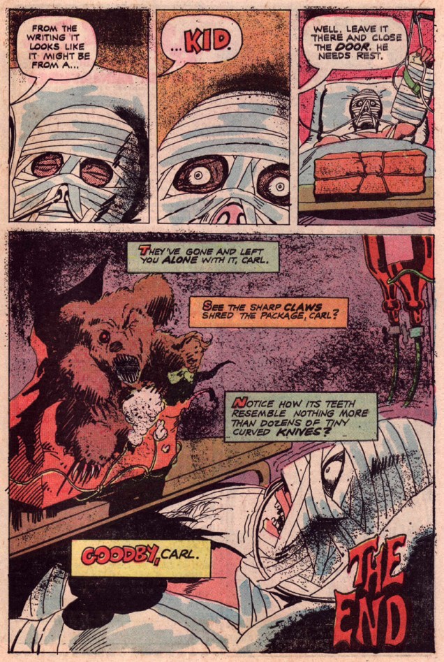
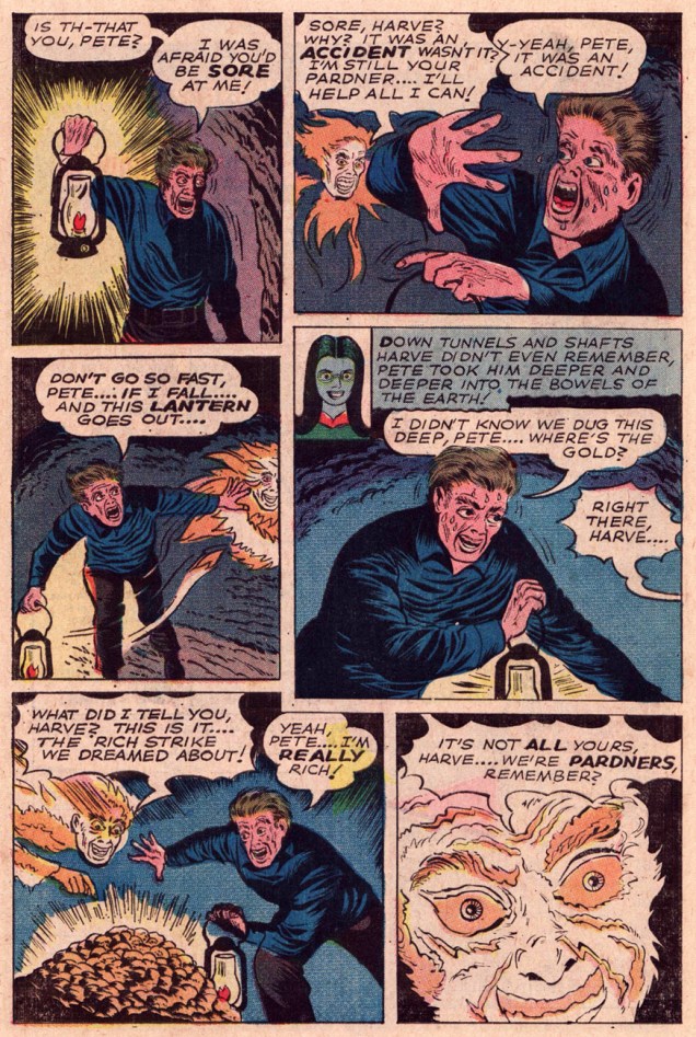
« That’s funny… I didn’t leave the lantern lit… wonder if anybody’s in there? »

In 1972, Golden Age journeyman cartoonist Stanley Josephs Aschmeier (1912-1992) wrapped up his career in comics with a single tale for Charlton, a publisher he’d briefly worked for two decades prior*, pre-Code. Yet earlier, at DC, he’d had a hand in creating Johnny Thunder and Thunderbolt (1939) and Dr. Mid-Nite (1941), the original sight-impaired costumed hero.

While Aschmeier’s already-manic drawing style hadn’t changed much in the intervening years, the industry certainly had, which made him a man well out of time. Still, as with his peer, sudoriparous Rudy Palais‘ final work for Charlton, the nervous energy and artistic freedom yielded something unusual and charming. While this sort of semi-primitive outsider approach decidedly isn’t for everyone, it’s a breath of fresh air. I found it unsettling and baffling when I first encountered it all those years ago, and it hasn’t lost its jolt, unlike many fan favourites I could name.

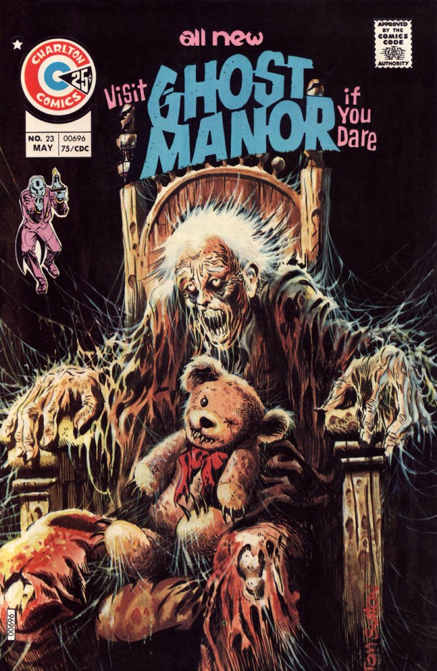
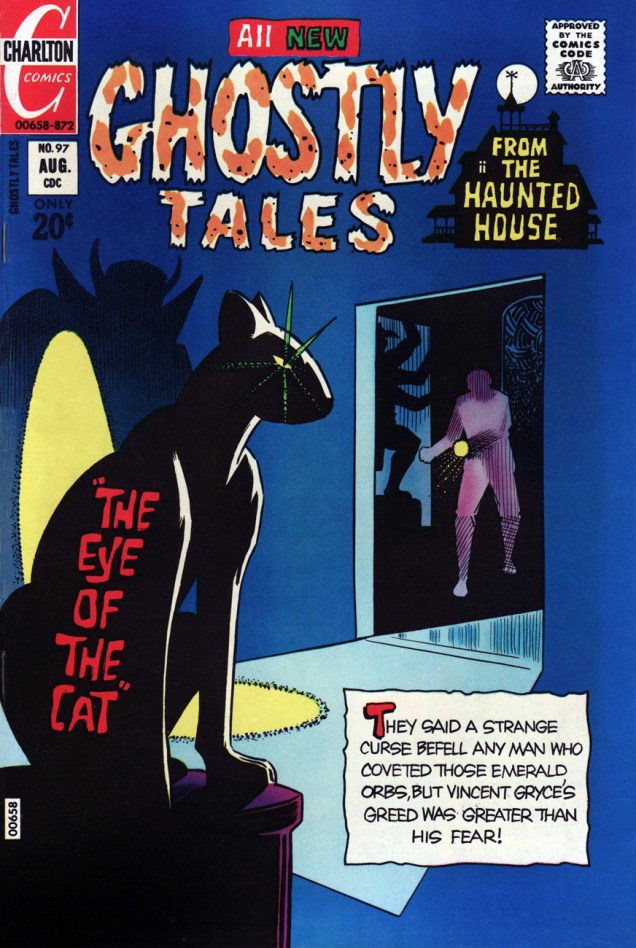
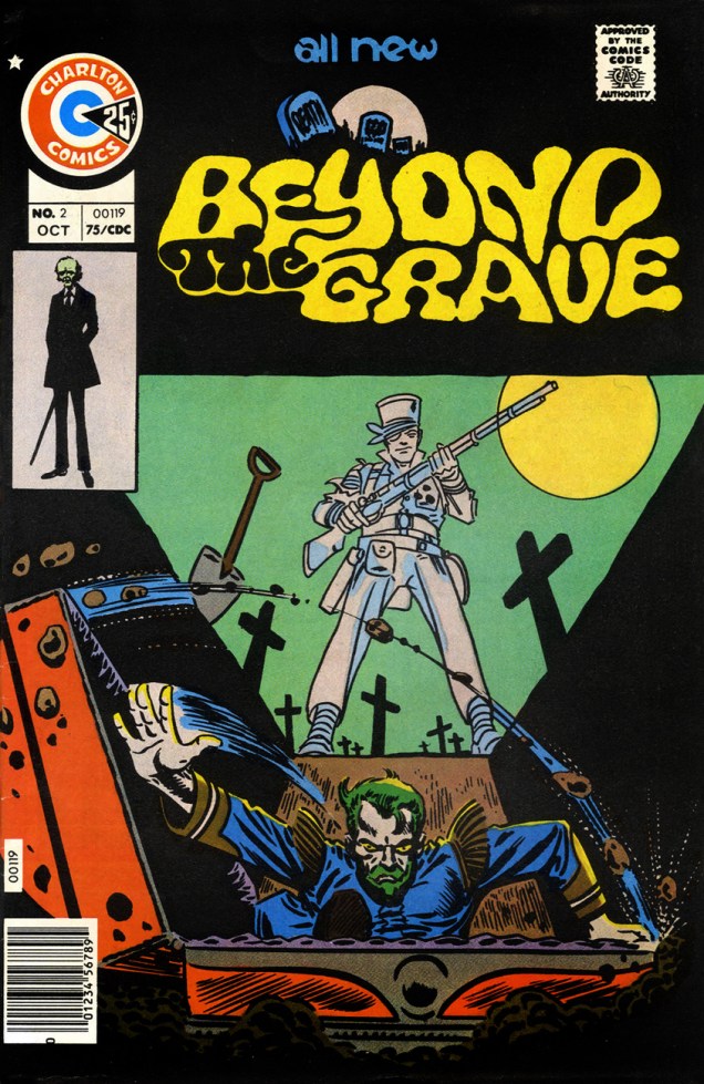
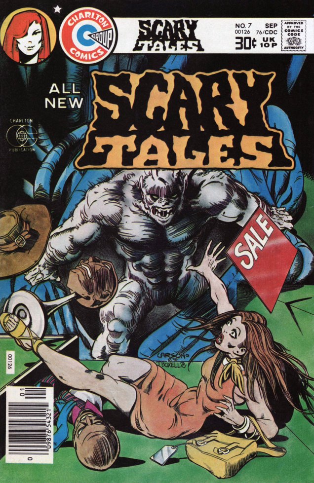
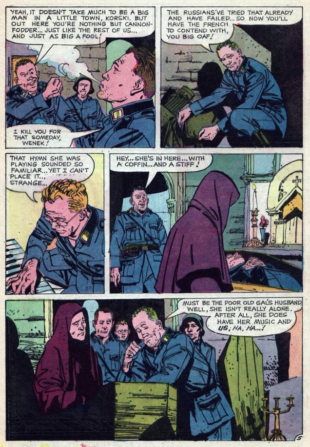
Without further preamble, here’s Joe Gill and Stan Asch (his abridged nom de plume)’s tale, from Ghostly Haunts no. 27 (Nov. 1972, Charlton.)

MineAllMine01A

MineAllMine02A
By this point, Aschmeier had evolved (or devolved) a highly stylized, woodcut-like approach. Bizarre as it may be, it sure works for me. That’s one of my favourite things about Charlton: leave your “house style” at the door!

MineAllMine03AMineAllMine04A

MineAllMine05A
Note Aschmeier’s interesting depiction of a revenant, quite unlike Steve Ditko’s lime green, vaporous wraiths or Pat Boyette’s rotting cotton shamblers. Pete Eklund’s shade is more akin to a dancing flame, an electric apparition.

MineAllMine06A

MineAllMine07A
Here’s a guy who *really* gets it!
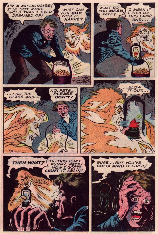
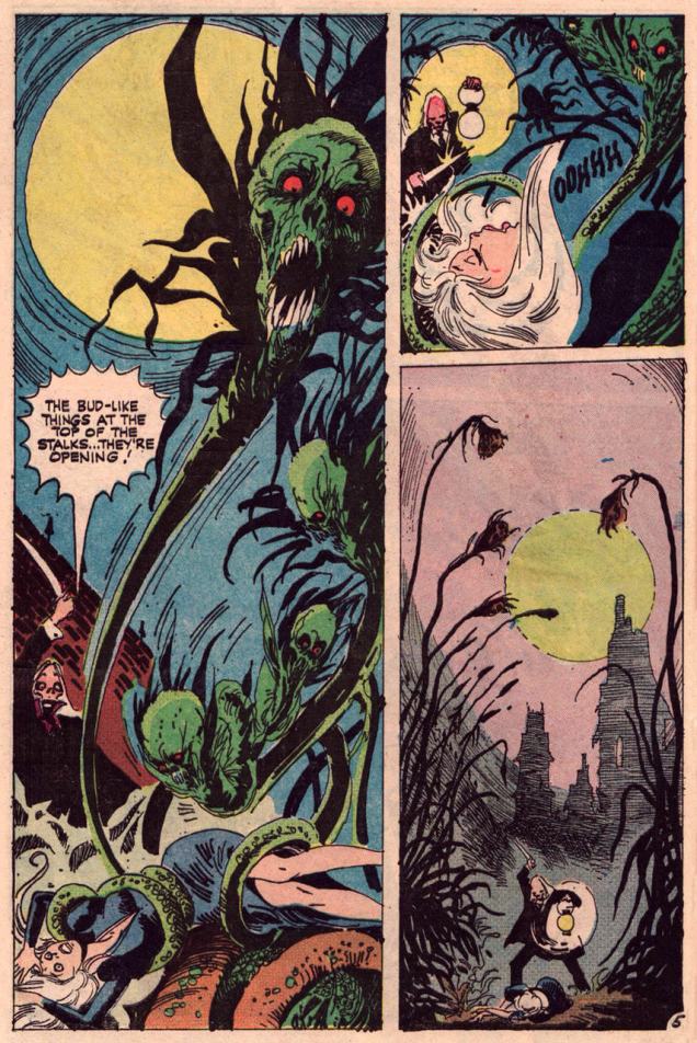
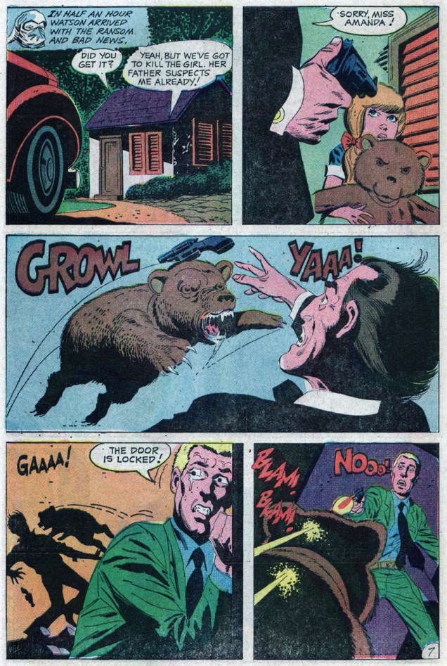
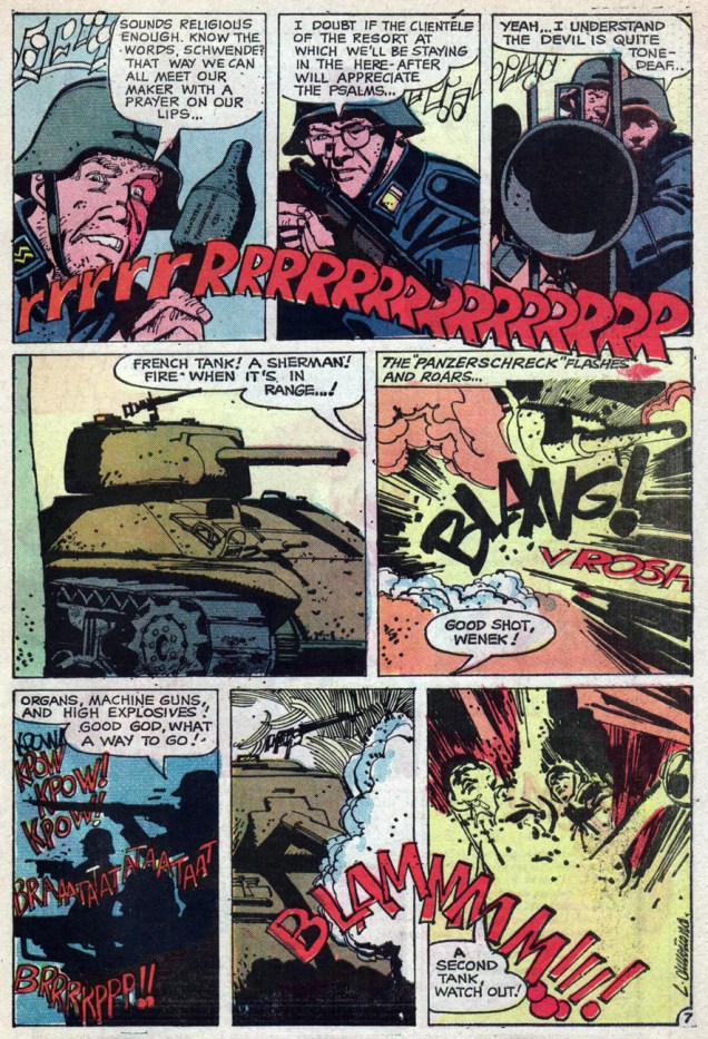
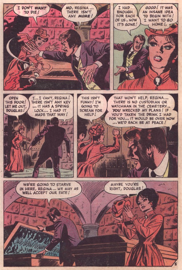
That final panel is one of the most unhinged I’ve had the pleasure of encountering.

As for the story, it’s the soul of the thing: to my mind, what made writer Joe Gill’s work special was his common-sense response to the meagre number of available plots: when the mood struck him, he focused on ambiance, tone and character, as he does here.

I love that our protagonist, Harve Davis, is so shiftless, so insignificant, that the reader can’t even be bothered to hate him: throughout the story, we witness his well-earned unpopularity, and what a shabby and piteous creature he is. He murdered the only man who gave him the time of day, and he was too dense and self-absorbed to be anything but resentful of it. I do feel that the tale’s very construction supports this view: it opens on the commission of his crime, and the aftermath is a fateful tumble of dominos.

NanaA
And yes, the story is narrated by Winnie the Witch, the Nana Mouskouri of the ghostly storyteller set. Many have noted the resemblance.

*For stylistic comparison, take a gander at a 1944 Mr. Terrific tale by Mr. Aschmeier, and some of his crime comics work from Lawbreakers Suspense Stories no. 14 (Sept. 1953, Charlton), featuring three Aschmeier-illustrated pieces, Flight!, The Green Light and The Face in the Glass. Enjoy!

– RG

Treasured Stories: “The Organist and the SS” (1972)

« They were bitter, war-weary men and the old woman’s music was comforting — perhaps too comforting… »

Writer and occasional penciller William ‘Willi’ Franz (born 1950) broke into the comics industry at the tender age of 15, selling his first script to Charlton editor Dick Giordano in 1966.

WilliPolaroidA
Will Franz, September 1971. A photo « …taken at the Manhattan insurance company where I worked as an accounting technician. My wall is covered with cartoons I made of various office friends and personnel. » Source: Will Franz and Charlton Spotlight.

While best known for his fruitful collaborations with his mentor, the great Sam Glanzman (1924-2017), namely The Iron Corporal, The Devil’s Brigade and most enduringly The Lonely War of Willy Schultz, Franz also scattered a few gems that the light has mostly missed.

My favourite among these has to be his final story for Charlton, The Organist and the SS, published in Attack no. 8 (Nov. 1972). Franz’s bleak, nuanced and markedly pacifist tales had drawn the military’s ire, back in the late ’60s, and this somber little piece of doom might have, too, if anyone had been paying attention.

As Franz recalls in a 2015 interview with Richard Arndt, published in Charlton Spotlight no. 9 (Winter-Spring 2015-2016):

« I was told that a lot of Charlton sales were on military bases. They were a staple on Army bases. I, and my stories, were dropped in 1969, out of the blue. Things were heating up in Vietnam.

I was blacklisted at Charlton because a guy had put my name and stories down as one of the reasons he registered as a conscientious objector. I found out other people were throwing my name around. Someone in the army apparently said that my stuff, maybe like [Archie] Goodwin’s stuff, was too blood and guts. It was going to make soldiers *not* want to kill the gooks. The army can’t have that! »

Well, evidently Charlton (presumably managing editor George Wildman, bless his heart) let Will sneak back into the fold, if briefly, after the heat was off, otherwise I’d be writing about some other topic entirely.

Without further preamble, please savour this pitch-black, existentialist play of war and death, but mind the thorns.

OrganistSS01AOrganistSS02AOrganistSS03AOrganistSS04AOrganistSS05AOrganistSS06AOrganistSS07AOrganistSS08A

OrganistWilliLayout
Will’s layout for the opening splash of our story. It’s always a treat to see what liberties the illustrator takes… or doesn’t.

This issue is chock-full of arrivals and departures: it opens with a story from new recruit Warren Sattler, trying his hand at a few short mystery and war stories before he found his niche in excellent collaborations with Joe Gill on Billy the Kid and Yang; next up is Jack Keller, who was winding up his comics career, what with Charlton’s remaining pair of hot rod books, Drag ‘n’ Wheels and Hot Rods and Racing Cars, soon to be scrapped. He would move, appropriately enough, to making a living selling cars. Finally, Argentine ace Leo Duranoña (b. 1938) was just passing through Charlton, crafting a handful of finely-hewn tales before moving on to DC and Warren… among others.

-RG

Tentacle Tuesday: Spunky Skirmishes

Tentacle Tuesday! The name of the game this time: epic battles (It’s the end of January, and I’m in a belligerent mood.)

First, I’d like to share these wonderfully weird and colourful Hindi comic covers that I’ve been reserving for a while.

ChitraBhartiKathamala8
Chitra Bharti Kathamala was a popular Indian comic book publication during the early 1980s. This is Chitra Bharti Kathamala #8, although I wasn’t able to find out more information about it – Hindi presents a formidable language barrier. It’s rather charming that the artist seems to have never seen an octopus in his life.

Apparently India’s love (hate? senseless violence?) affair with octopuses has been going on for a while, because here’s another tentacled cover:

VijayKadamRajComics
The cover was painted by Vijay Kadam… and will haunt my nightmares. As far as I could suss out, this is published by Raj Comics. Kadam’s son, Harshvardhan Kadam, is a mural artist (see some of his murals here.)

My (somewhat) educated guess is that these covers are from the late 80s, early 90s. If you’d like to see more, hoist your sails over to the Monster Brains blog over here.

Incidentally, while attempting to glean more information about this, I stumbled upon some hilarious, more modern Indian comic covers, namely these three:

Tentacles1205705-spcl_0071_e
Nagraj no. 44, Jan 1995. What the fucking fuck is going on here, and how does it make any sense anatomically?
Tentacles1205706-spcl_0075_h
More tentacles – unless the spiky guy’s legs are actually alligator’s tails… Nagraj no. 50, Jan 1996.
Tentacles1213078-spcl_0435_h
Nagraj no. 75, Jan 2003. No tentacles but I couldn’t resist the adorable gore. Once one’s gaze pulls away from the spaghetti entrails, one notices that the woman hacking Nagraj to pieces seems to be having the time of her life… and that the female creature in the background has a completely improbable lower torso.

TentacleTuesdayIcon

For our next heroic skirmish, a scene with dramatic waves, a half-naked damsel, a hot guy, and an an intense octopus with a Rasputin-esque furrowing of the brow. Basically, the glorious pen of Enrique Nieto was guaranteeing eye candy for everyone, whatever their pervy proclivities.

MonsterHunters10A
Monster Hunters no. 10, October 1977. The cover is by the glamorous Enrique Nieto!
NietoKrakenA
The original art for an inside page from « Night of the Kraken! » Script by Nicola Cuti, art by Enrique Nieto.

Speaking of octopuses laying eggs (and they do), do you know how these creatures reproduce? Once the male octopus places a sac of sperm into the female’s body cavity with his « mating arm» (yes, he has a dedicated arm just for that purpose), the female lays her eggs, and spends the rest of her time protecting them and keeping them clean. Both the male and female octopuses stop eating after mating, the male drifting around aimlessly, the females dedicating all their energy to safeguarding their offspring. Both die soon after of either starvation or predation. Given these conditions, anybody seeking to destroy the last living female octopus is a fucking asshole – don’t the poor things have it hard enough already?!

TentacleTuesdayIcon

I’ll wrap up with a little cozy scene in which male friendship prevails over the evil tentacles of a sinister, swirly-eyed creature. Aw, you guys…

AventurasdelFBI
Aventuras del FBI no. 32: El Triunfo del Bien, 1970, published by Rollán. Drawn by Luis Bermejo and Manuel López Blanco.

« Aventuras del FBI» was a Spanish comic published Rollán Editorials, published in little stapled black-and-white books with colour covers. Auto-translating an article about Aventuras gave me this little gem: « Adventure series of an FBI agent named Jack Hope, who is accompanied on his missions by a young man named Bill Boy and a man steeped in meat and joke, Sam. » I don’t know what a man “steeped in meat and joke” is, but it sounds promising!

~ ds

Treasured stories: “Abide With Me” (1975)

« She stared at Douglas… at this man she had judged to be an ideal mate… yet he had this very fatal flaw. »

Even to the occasional reader of mystery or ghost comic books from the late 60s to early 80s, the absurdly narrow range of plot variations must have been glaringly obvious. Same goes for any genre, of course…

For instance, at DC, mainstays Jack Oleck and Carl Wessler drove the same hoary scenarios into the old sod with numbing insistence (editor Joe Orlando‘s insistence, presumably): the greedy nephew murdering his rich, elderly uncle, the avaricious white explorer / big game hunter / mercenary purloining the sacred idol and incurring its terrible vengeance, the bank robber on the lam getting his ironic comeuppance, satanists vs werewolves vs vampires vs witches and so on… Still, the occasional inspired yarn did crop up, often to the outraged bafflement of readers.

On the other hand, Charlton was the field’s top producer of ghost stories, wisely keeping away from Marvel and DC’s spandex preserve. While one hears (correctly) about artistic laisser-faire attracting maverick stylists, Charlton’s ace in the hole, and the backbone of its comics line, was the remarkably prolific and versatile writer Joe Gill (1919-2006). Unlike his counterparts at DC, Warren, and most famously EC Comics before them, Gill rarely resorted to the O. Henry “twist” ending. An overplayed strength becomes a weakness, and so the “sting in the tail” soon was anything but. Having to write most of Charlton’s line, Gill could afford to experiment and improvise. Fact is, he pretty much had to. In my view, Gill’s work stands out from most of his peers’ in that it seems nourished by high and extensive erudition. When a Gill character discusses business deals or the combustion engine, it’s not just hot air and a family-size tub of Fluff.

Here’s a favourite of mine, a tale scripted by Gill and illustrated by Sururi Gümen (1920-2000). It appeared in Ghost Manor no. 23 (May, 1975, Charlton). The nearest it skirts a ghost story is when Regina says « I… I’ve heard that people who die unhappily haunt the place where they die! »

Abide1AAbide2AAbide3AAbide4AAbide5AAbide6AAbide7A

I love how Abide With Me carves out its own niche between romance and horror without calling upon any of these genres’ habitual devices. It’s like a well-played game of chess, a philosophic two-character play, a gravesite deliberation. Hope you’ve enjoyed it too!

– RG

Tentacle Tuesday: Groping Vines and Other Shenanigans

What better way to start Tentacle Tuesday than with the Big Pop-Up Book of Giant Squids? Sensitive people may want to skip this one.

PopUpTentaclesA
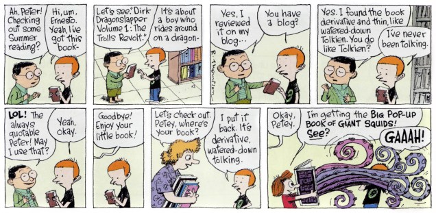
« Dirk Dragonslapper », other than making me giggle every time, sounds like an actual character from some fantasy trilogy, which may be a comment on the state of fantasy these days (hint: it’s not fantastical). I’ll go with the cephalopods, thanks!

Incidentally, there’s a lot of dreadful fantasy covers out there (and that’s quite out of the scope of this blog, anyway), but I can’t resist sharing this one with you.

Swords-In-The-Mist-cover

Poor Fritz Leiber! An octopus holding a bunch of swords at completely ridiculous angles, a squat muscle-bound freak with a bare ass and some booby green-and-purple women floating a distance away. Thanks, Peter Elson.

TentacleTuesdayIcon

Let’s take a break from cuteness. Next up is some serious cause for alarm from Tom Sutton, who’s excellent at psychological horror. His weird art is full of details one can sink into; his sketchiness and sweeping lines leave one with the disquieting impression of being inextricably pulled into a distorted, nightmarish world.

ABuddingEvilTomSutton1
Damsel in distress from « Budding Evil », Haunted no. 17 (July 1974, Charlton), both scripted and drawn by Tom Sutton. Tell me you can look at the girl’s face as she’s getting strangled by tentacles and not get goosebumps.
ABuddingEvilTomSutton2
The meat-eating flowers have seriously disturbing “buds”… the best of us would have fainted!

There’s an inspired essay about Sutton here which I heartily recommend! I’ll take the liberty of borrowing a great Sutton quote from it (itself taken from a 2000 interview by Jon B. Cooke for Comic Book Artist no. 12). Voilà:

« They published weird stuff, and I have always been fascinated by weird stuff, and the weirder the better….  I do owe a certain amount to Charlton, because they allowed me to write a lot of ditties of my own, to paint a lot of horrible covers, and they never, ever, ever remarked on my technique. »

TentacleTuesdayIcon

Brr. I think we need an example of straightforward macho heroism to counter-act the icky impression left by the creeping horror glimpsed above. Here’s Doc Savage to the rescue, as usual. Watch the epic struggle between muscled man and malevolent tentacled beast!

DocSavageKenBarr
Original cover art for Doc Savage no. 8 (Marvel, Spring 1977) by illustrator Ken Barr. And no, I don’t have the answer as to why Doc Savage’s normally bronze hair looks like a white bathing cap here. However, Barr seems to have enjoyed painting it – just look at that glistening musculature!

Let’s see the cover as it was published:

DocSavageCover8
A bit too much text, guys. C’mon, you have a tentacled monstrosity with indubitably evil eyes, a man with rippling muscles and bulging veins… We’ve figured out that Doc is its next victim (just as surely as we know that he will come to no real harm).

Interestingly, upon opening the magazine, the first thing one sees is a Tom Sutton illustration. Small world! The cover story, « The Crimson Plague », is an adaptation of a novella published in Doc Savage Magazine in September 1939, and most likely written by Lester Dent (as Kenneth Robeson), who’s responsible for most of the classic Doc Savage epics. It’s an « adventure in which Doc Savage and his team deal with kidnapped scientists, captured comrades, and the deadly secret of the Octo-Brain » (sounds exciting, doesn’t it?) and is illustrated by Ernie Chan.

~ ds

On This Day: November 16, 1902

A cartoon appears in the Washington Post, prompting the Teddy Bear Craze, after President Teddy Roosevelt refused to kill a captive bear tied up for him to shoot during a hunting trip to Mississippi.

Boy, American presidents sure were different back in those days.

TeddyRooseveltBerryman1902A
The history-making cartoon by Pulitzer Prize–winning cartoonist Clifford K. Berryman (1869-1949), who worked with the Washington Post from 1891-1907, then with the Washington Star from 1907-1949.

Which brings us to Teddy Bears (as they became known henceforth) returning the favour of protecting the vulnerable and innocent.

The earliest instance that comes to mind is Johnny Craig and “Ghastly” Graham Ingels’ holiday charmer, Shoe-Button Eyes!, which appeared in The Vault of Horror no. 35 (Feb.-Mar. 1954, EC), wherein a blind, put-upon little boy gets a new set of peepers… the hard way.

Post-Code, this sort of harsh poetic justice had to be handled very gingerly, if at all. The vengeful bear turned up again in Nicola Cuti and Jack Abel’s elegantly-told The Teddy Bear, in Haunted no. 15 (Nov. 1973, Charlton.)

TeddyAbelA
Quoth the plush companion: « I was sent to you to protect you and I will! » Spoiler alert: the butler did it.

A couple of years down the pike, “Grisly”* Tom Sutton took up the gauntlet with his «Terrible Teddy!», from Ghost Manor no. 23 (May 1975, Charlton). Here it is, presented in its glorious entirety (including Sutton’s gnarly painted cover).

Ghost-Manor23A

TerribleTeddy1ATerribleTeddy2ATerribleTeddy3ATerribleTeddy4ATerribleTeddy5ATerribleTeddy6A

– RG

*perhaps more appropriately “Grizzly”, in this instance.

Purple Tentacle Tuesday

Greetings. Today’s theme: purple tentacles! (No, that’s not a euphemism.)

First up on our list is this beauty of an octopus, the Octo Rod.

This intrepid purple fella is part of Topps’ 1980 series, Weird Wheels, which had 55 cards in all. The credit for the gorgeous artwork is split between Norman Saunders and Gary Hallgren; nobody’s quite sure which artist worked on which card, and whether Saunders actually painted the images himself, or just retouched paintings by somebody else.

Sadly, Weird Wheels just didn’t sell all that well, so you can still purchase them for fairly cheap today. You can see the whole set here (and please do feast your eyes on them, they’re quite stunning).)

OctoRod21Hallgren
Octo Rod is no. 21, 1980. The art is by Gary Hallgren, at least according to David Saunders, Norman Saunders’ son.

Speaking of David Saunders and his dad, here’s a quote from “Norman Saunders” (a book written by David in 2009):

« In 1980, at the age of 73, with failing eyesight, cataracts, and advanced emphysema, Norman Saunders defied doctor’s orders and went back to work on one last card set. Weird Wheels are painted with full control of his creative powers, but with a morbid humor that reflects his attitude towards mortality. When reprimanded by his son for risking his life on low paying work, the artist said, ‘It’s fun! I gotta keep working! What the hell else am I gonna do?!‘ »

Saunders passed away in 1989, at 82, after a remarkably prolific and varied career.

Moving on, here’s a thrilling scene of purple tentacles vs Nemesis:

AdventuresIntoTheUnknownTentacles
This is ACG’s Adventures Into the Unknown no. 157 (June-July 1965). The cover is by Kurt Schaffenberger (who signed as Jay Kafka here). “Case of the Tittering Texan” sounded intriguing – I figured that the Texan was being tickled by a tentacle – but no, he’s just a stuttering, crazy, power-hungry villain in a cowboy hat and spurs. Same old, same old…

I would also like to mention that Nemesis *is* wearing pants (well, shorts, at any rate), but his costume is still gosh-darned stupid. You try wearing a hood under water and see how far it gets you. I’m normally a fan of ACG‘s Adventures, but Nemesis is by no means a favourite character of mine.

Further developing the theme of violaceous violence, here’s another:

GhostlyHaunts31
« Giant squid, giant water rats! Are we in New York, or are we on Mars? Down here, it’s hard to tell! » Ghostly Haunts no. 31, April 1973, cover by Jack Abel.

“Sewer Patrol”, the cover story, is also illustrated by Abel, with an excellent script by Nicola Cuti – it’s a story about people who dump their pets (and still-alive food) when they don’t want them anymore… and where and how these pets end up. (The answer to that, of course, is “mutated, gigantic and in the sewers.”)

~ ds

Remembering Don Newton (1934-1984)

« Herbal tea. My own recipe.
It’s added years to my life.
May I offer you a cup? »

After producing some exceptionally solid fan art (chiefly for the long-lived Rocket’s Blast Comicollector (153 issues, 1961-1985), Arizona art teacher Don Newton made his jump into the pro leagues in 1974 with Charlton, where he got his chance to show off his considerable painting skills. After a handful of mystery stories, he took over Charlton’s version of Lee Falk and Ray Moore‘s The Phantom, which he drew for six issues (and one cover) before the title was cancelled… along with the rest of Charlton’s original comics line, really.

Phantom68ORIG_A
Newton’s original cover painting for issue 68 (December, 1975, Charlton) of The Phantom, illustrating the tale of The Beasts of Madame Kahn by Nicola Cuti and Newton.
NewtonPhantom73A
Newton’s cover painting (in acrylics, if you must know) for the penultimate issue of The Phantom’s Charlton run, no. 73 (October, 1976), “The Torch”, written by Ben S. Parillo (alias Bill Pearson), pencilled and inked by Don Newton. The wizened mastermind is a fella who simply goes by the name of ‘Raven’.
GhostlyTales115A
« How could a snake be alive here, buried deep in the earth for thousands of years? » Don Newton’s painting (Ghostly Tales no. 115, May, 1975) depicts a scene from Joe Gill and Steve Ditko’s “Wings of Death!”
TeenConfessions89A
« Turn her loose, Pike… I want to road-test the new talent! » Mr. Newton illustrates the Unknown Scribe and Demetrio Sánchez Gómez‘s biker operetta “Running Wild!”, from Teen Confessions no. 89 (June, 1975, Charlton.)

Newton would go on to DC (and a couple of brief dalliances with Marvel), illustrating Batman, Captain Marvel (er, “Shazam!”), Aquaman, Star Hunters, and The New Gods for DC, before being, all too soon, felled by a heart attack at the age of 49. Most of the time, though, he provided great art to ho-hum stories.

Against all odds, around 1982, scripter Gerry Conway, a name synonymous with half-assed, content-free hackwork since the early ’70s, actually blossomed into a decent writer. Fortuitously, while assigned to pencil Batman’s adventures in Detective Comics, Newton was paired with prolific* Filipino legend Alfredo Alcala, and the stars were in proper alignment. You won’t have to take my word for it, however. Feast your eyes on the palpable ambiance from the Conway-Newton-Alcala trio.

NewtonHugo1A
Picking up strands from Steve Englehart‘s  run on the book (nos. 469–476, in 1977-78), creepy-but-buff scientist Hugo Strange returns to pester his murderer, crooked politician Rupert Thorne. Colourist Adrienne Roy’s hand is betrayed by the 100% magenta/30% black mix.
NewtonHugo2A
Well, I have to show Newton’s actual Batman, don’t I? His was one of the few characterizations that were physically believable. You could buy this guy as an acrobat, as a fighter *and* as detective. Alcala often overwhelms whomever he’s inking, but since Newton’s pencils were probably tight as a camel’s ass in a sand storm, both men’s contributions mesh splendidly with no loss of identity. Pages 2 and 7 from Detective no. 520 (Nov. 1982).

– RG

*How prolific was Alcala? « It is said that his fastest page rate was twelve pages in a nine-hour sitting. » And the scary thing is that it hardly ever looked rushed or less than committed, unlike the work of some other inkers we could name. What a guy.

Happy 90th birthday, Mr. Ditko!

« Don’t be so sure! A guy that popular — he’d be a fool to fold up his act while he’s such a hot item!* »

I’ve been a Steve Ditko fan for as long as I can remember. In fact, I was a fan even before I actually saw his work. “How’s that even possible?”, you may ask. Well, when I was five, this neighbour from across the street was showing off a comic book he had just picked up, which was Teen Titans no. 29**. I was instantly captivated by two costumes on the cover: Hawk and Dove’s, designed by Ditko a couple of years earlier.

I do believe I had encountered a Ditko comic book just a bit earlier, a copy of The Many Ghosts of Doctor Graves no. 20 (June, 1970), acquired by my brother en route to the family vacation on Prince Edward Island. But that one had a (fine) cover by Pat Boyette, and I don’t recall the Ditko story within, « An Ancient Wrong ».

The bottom line is that Ditko’s been a precious part of my life for a spell. It would be easy to take him from granted, so let’s not, if you don’t mind.

Which brings us to our little tribute: running ninety covers covers would be about as practical as ninety candles on our birthday boy’s cake, so I’ll just drop a decimal and stick to a more manageable nine… I won’t even give a nod to such fickle and hollow notions as popularity, historical importance, or iconicity. I’m going with my favourites. That’s the way Steve would do it… and even if he wouldn’t, I’d still go this route.

UnusualTales9A
« Nobody here in Crestville will ever forget that night! »
A tiny reproduction of this cover, that of Unusual Tales no. 9 (Nov. 1957, Charlton), in some late-70s edition of the Overstreet Comic Book Price Guide hooked me, and still grabs me. In the post-code era, particularly in its early days, you had to be mighty resourceful to fruitfully mine the mystery genre, what with all the verboten topics and tropes. The issue holds a whopping four, 1957-vintage Ditko stories, including the title piece, which you can read here:
http://ditko.blogspot.ca/2012/01/unusual-tales-night-of-red-snow.html
ASM2A
The Amazing Spider-Man no. 2 (May 1963, Marvel). Beyond Ditko’s departure (no. 38 was his final contribution), I have no further interest in Peter Parker and his costumed alter-ego.
Creeper4A
« Name’s Bulldog Bird! This is Sumo! We’re secret agents from the sovereign kingdom of Offalia! »
For most of the brief run of his book (issues 2 to 6), the Creeper had to contend with a faceless enemy, Proteus, who turns out to be someone very close to him. It was as though Ditko felt the need to replay the Spider-Man – Green Goblin secret identity dynamic, not the way *he* had envisioned it (which was to make the Goblin a total stranger, a situation he’d meticulously set up in the background), but the way Lee had, as if to show his former editor how to do it properly.
This is Beware the Creeper no. 4 (Nov.-Dec. 1968, DC), “Which Face Hides My Enemy?” Pencils and inks by Steve Ditko, plot and dialogue by Dennis O’Neil
Hawk&Dove2A
« You’re still wasting your time reading! Why don’t you build up that sickly body of yours? »
DC’s Hawk and Dove (introduced in Showcase no. 75, June 1968, DC) was, as its title and covers amply make clear, a study in contrast and opposition: aggression vs pacifism, the letter of the law vs the spirit of the law, Steve Ditko vs Steve Skeates…
The concept may have been of its time, but the industry as it stood wasn’t ready to explore the issues without stacking the deck. This was still, after all, a mainstream superhero comic book of the Sixties. This is issue 2, “Jailbreak!” (Oct.-Nov. 1968), Ditko’s third and final issue with his creations. As for Ditko’s abrupt departure from DC is concerned, the reason cited at the time was a relapse of tuberculosis, a disease that had plagued Ditko in his youth. Others have invoked more political explanations, but Ditko *was* out of the game for several months, which fits the convalescence scenario. His absence until 1975 from DC fits the politics one. Why credit one single factor when several, taken together, are more plausible?
GhostManor5A
« Come off it, yer Lordship! This ain’t no blinkin’ time ter do the art connoisseur bit! »
The rakish 14th Lord Garland proves a bit of a disappointment to his forebears. Sir Steve Ditko’s cover proffers a scenic victim’s perspective… but who’s the hazy, phosphorescent figure shambling down the stairs to meet us?
This is Charlton Comics’ Ghost Manor no. 5 (second series, June 1972, Charlton). Inside, you’ll find a trio of Joe Gill chillers: “Dead Man’s Eyes”, illustrated by Joe Staton; “Devils at My Door”, illustrated by Charles Nicholas and Vincent Alascia, and of course, the pièce de résistance, “The Last Garland”, brought to you in panoramic Ditko-vision.
GhostlyTales97A
Ah, the largely lost art of the *soft* sell. Charlton’s cadre of artists hewed much closer to the ambience favoured by aficionados of the spectral than did the esteemed competition. You know, more Montague Rhodes James than, say, Rob Zombie.
Here, Ditko demonstrates how (dis)quiet and mystery is evoked. Dignified silence can be very attractive when everyone around is shouting. Ghostly Tales no. 97 (August 1972, Charlton) features “The Eye of the Cat”, actually handled by Don Perlin, while Ditko delivers visuals for Joe Gill’s “Journal of a Hanged Witch”. The issue also features “Poltergeist”, an effective collaboration between Creepy Magazine founder Russ Jones and the multitalented Bhob Stewart.
Haunted16A
My particular favourite among Ditko’s covers for Charlton’s Haunted (75 issues, 1971-84.) The merrily saturated colour scheme, the composition and its geometric simplicity, that well-chosen angle… the contagious joy of a master at play. This be Haunted no. 16 (June 1974, Charlton.)
BeyondtheGrave2A
« If you visit that grave on a dark night, you may be surprised… for there is a sentry stationed there…to honor the dead? Or to make sure that General Kugar never leaves his grave? »
Here’s a cover showing the sort of solemn dignity and restraint that made Charlton’s line of ghost books so attractive to me right off the (vampire) bat. No one’s shouting deceptive hype or explaining the action; the elusive allure is undisturbed, unlike the sanctity of the tomb. 
DC, under Infantino and Cardy, generally understood this, but Marvel virtually never did or cared to. But hey, what sold and what I liked rarely sat at the same table.
Beyond the Grave no. 2 (Oct. 1975, Charlton).
Shade3A
Ah, Shade. Ditko’s last great creation, cut off in its prime by the Great DC Implosion of ’78. Later misunderstood and corrupted by hacks. Finally reprinted, including formerly unpublished issue 9, in volume 1 of The Steve Ditko Omnibus (2011). It’s still a frustrating experience, but at least issue 8’s cliffhanger has been resolved, and what happens in the Zero Zone doesn’t stay in the Zero Zone, if you know what I mean. This is Shade the Changing Man no. 3 (Oct.-Nov. 1977, DC)

*Jack Ryder (aka The Creeper)’s closing quip from “The Coming of the Creeper!”, plot and art by Steve Ditko, script by Don Segall (Showcase #73, Mar.-Apr. 1968, DC)
**Since it played such a crucial rôle in my Ditko inculcation, here’s the Teen Titans issue in question.

TeenTitans29A
Teen Titans no. 29 (Sept./Oct. 1970, DC) Cover by Nick Cardy (likely co-designed by Carmine Infantino and coloured by Jack Adler), illustrating “Captives!”, written by Hawk & Dove scenarist Steve Skeates and illustrated by Nick Cardy.

– RG

Hallowe’en Countdown, Day 31

« I’m going to die and they’re laughing! »

It surely won’t shock you that the most difficult decision, in such a countdown, lies in crowning numero uno. There are, after all, plenty of worthy candidates. But one also seeks to avoid undue repetition. After a couple of false starts, I opted for a long-time favourite that’s never received its due.

Here, then, is Steve Ditko (and an unknown scenarist)’s expertly-paced department store nightmare, “Halloween Scene”, from Scary Tales #7 (Sept. 1976, Charlton). It occurs to me that Mr. Ditko is about to turn 90 in a couple of days… they didn’t call him “Sturdy Steve” for the alliteration alone, as it turns out.

HalloweenScene1AHalloweenScene2AHalloweenScene3AHalloweenScene4AHalloweenScene5AHalloweenScene6A

HalloweenScene7A

As a bonus (Hallowe’en comes but once a year, after all!), have a peek at the issue’s fine cover and its original art.

ScaryTales07ORIG
Pencils by future “Good Girl” specialist (see his Haunted House of Lingerie series, in the name of research, of course) Rich Larson (with ink and airbrush work by artistic partner Tim Boxell).
ScaryTales07A
The published version offers reasonably accurate reproduction, though one misses some of the details hidden behind the logo. Nature of the Beast of Commerce…

Well, that’s it for this year. Happy spookfest to all, and see you next time, hopefully.

I pity inanimate objects
Because they cannot move
From specks of dust to paperweights
Or a pound note sealed in resin
Plastic Santas in perpetual underwater snowstorms
Sculptures that appear to be moving but aren’t
I feel sorry for them all.

Godley and Creme – I Pity Inanimate Objects (1979)

-RG