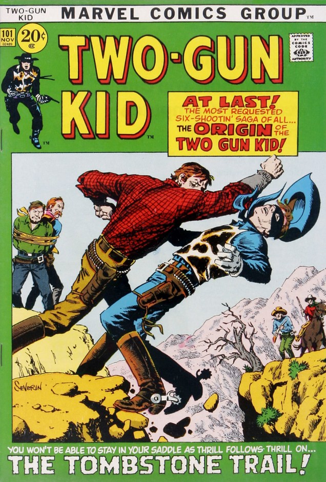
I’m inordinately fond of Marvel’s brief flirtation with “picture frame” covers, which lasted but a year, opening with books cover-dated November 1971, at the tail end of Stan Lee’s run as editor-in-chief, and fading away less than a year later during Roy Thomas’ tenure. Figures.
This period coincided with one of John Severin’s passages at Marvel. At the time, the self-proclaimed « House of Ideas » was endeavouring to flood the market with crap, aiming to force DC to overextend itself to retain its market share, and, reportedly, to drive Gold Key out of business. So Marvel let loose a torrent of unannounced and unnecessary reprints, at most commissioning new covers to sell the bill of goods.
Tactically, it was a tawdry page out of the infamous Israel Waldman* book: in the late 1950s to mid-60s, the canny cheapjack publisher issued a line of comics (IW/Super) reprinting material he owned and often didn’t, in the case of some of the more nebulous copyrights (namely Quality’s The Spirit, Doll Man and Plastic Man)… accidentally on purpose. Anyhow, Waldman paid a few handpicked freelancers top dollar (to get his money’s worth… I did say he was canny) to create enticing new covers to adorn his shoddy reprint rags. And I do mean rags: the paper stock used was even worse than the low industry standard… just try to find any IW comic book in decent shape nowadays!
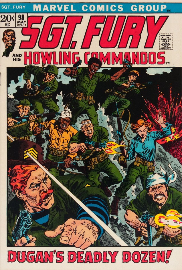
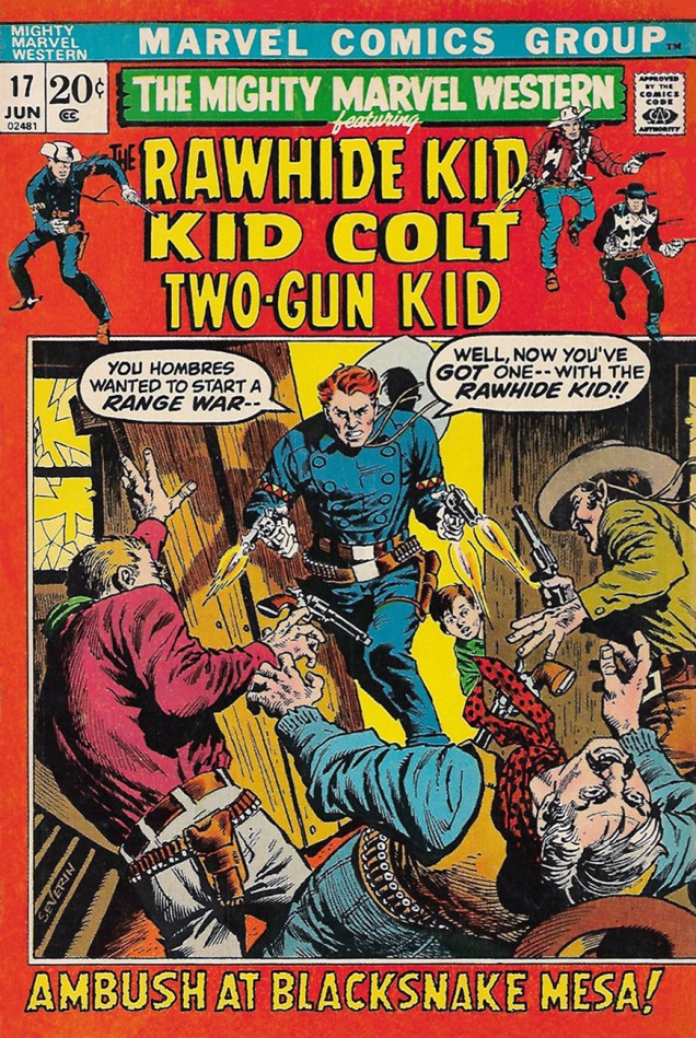
But getting back to 1971-72, here’s a chronological and alphabetical sampling of my favourite Severin turd-polishing covers from Marvel’s brief « picture frame » flirtation, out of the 35 or so he created solo at the time. Several of these are refreshingly uncluttered and moody… for Marvel.
Someone at Marvel loved to rip-off the 1967 Lee Marvin-led epic “The Dirty Dozen“; probably Gary Friedrich. The very next month, the Deadly Dozen would team up with another Irishman stereotype to form “Combat Kelly and The Deadly Dozen”, I kid you not. Oh, and a diverse cast in a Marvel war comic? Oh, right, they’re ex-convicts… and they get slaughtered in the last issue. Oops.
Ah, Severin’s Rawhide Kid. Don’t miss Severin and writer Ron Zimmerman’s brilliant and daring 2003 reboot of the Kid, “Slap Leather”.
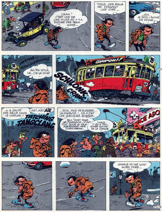
Ninety-three years ago today (January 3, 1924, that is), master bédéisteAndré Franquin was born in Etterbeek, Belgium.
His œuvre is an embarrassment of riches, but heck, here’s a diabolically ingenious Gaston Lagaffe strip whose mise-en-scène is so solid and visually limpid that the only dialogue needed to truly “get it” is the punchline: « Never seen such a tough nut… »
Originally published in Spirou no. 1599 (Dec. 5, 1968, Éditions Dupuis.)
It would be unfair and inaccurate to single anything out as André Franquin’s «masterpiece», given the consistently high calibre of his output. Let’s settle for stating that Gaston was in all likelihood his most popular creation, as luck would have it.
The legendary gaffeur first messed up in a two-panel cameo in the Spirou et Fantasio adventure Le voyageur du Mésozoïque in 1957. Later S&F tales were dotted with Gaston cameos, and the accident-prone office boy soon (crash-) landed his own half-page strip, which ran from the late 50s to the late 90s, though mostly consisted of reprints after the early 80s.
Gaston’s second strip collection, issued in 1963 in the original “landscape” format, deemed an oddity at the time.
As for translations, Gaston’s popular in a bevy of languages, but not, of course, in English. Fantagraphics’ Kim Thompson was a huge fan, and translated a handful of strips, which were published (as Gomer Goof) in issues of the anthologies Prime Cuts and Graphic Story Monthly.
Speaking of Gomer, Anglophone readers are in for a treat: UK publisher Cinebook has, just last October, issued a collection (only 48 pages, but you have to start somewhere… and perhaps small) entitled Mind the Goof! Check it out here.
Welcome to the first Tentacle Tuesday of 2018. Exciting, isn’t it?
Since it’s currently chillingly cold outside (or so the weather networks tell us), let’s bask in a bit of warmth and visit some exotic places where heat reigns supreme all year ‘round.
What’s the first thing to do on a vacation? Take a leisurely walk, of course. However, I’d advise against venturing into a swampy forest. Some people never listen to sage advice, however…
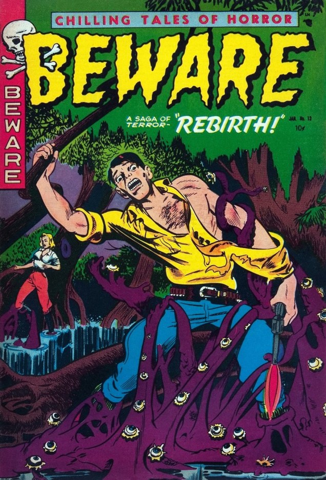
This is Beware no. 13 (1953), with a cover by Harry Harrison. « Out of the filth and mud-spawned deep it came, this horrible slug-white creature that wanted only one thing — to be loved! » Wait, what? “Rebirth”, the cover story, also illustrated by Harrison, clearly has absolutely nothing to do with the cover.
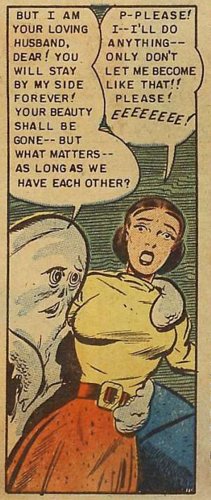
I’m quite fond of Harry Harrison as a writer, but as an artist he seems to have been rather middling. Although advertised as a “saga of terror”, Rebirth is an intriguing story in which the “horrible slug-white creatures” are actually far more likeable than the regular humans, who are back-stabbing, greedy assholes. Not that the plot makes much sense.
The “white slug” may be well-intentioned, but he tends to launch into pompous speeches at the drop of a hat.A heart-warming, romantic scene.
Okay, so a walk through a forest didn’t pan out quite as hoped. Let’s take a soothing dive into welcoming, warm waters. Did I say “welcoming”? Perhaps a little *too* welcoming.
Terrors of the Jungle no. 20 (December 1952), cover by L.B. Cole. Normally I like Cole’s use of bright colours, but on this cover he goes all the way into gaudiness. However, the octopus is quite handsome, and he’s got startlingly human, expressive eyes. I’m rooting for him! Once again, the cover has little to do with the cover story.
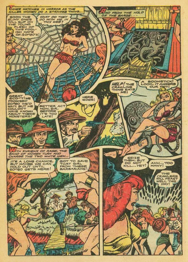
The Creeping Scourge, credited to the Iger Shop (that my spellchecker keeps correcting to “tiger shop”), a comics packager that was officially known as the Eisner and Iger Studio, is an entertaining romp with babes in bondage, wild natives, catfights, blood sacrifices, etc. For example:
A typical page from The Creeping Scourge, published in Terrors of the Jungle no. 20 (December 1952). « Help! The crawling thing eats me! » is a pretty snappy catchphrase.
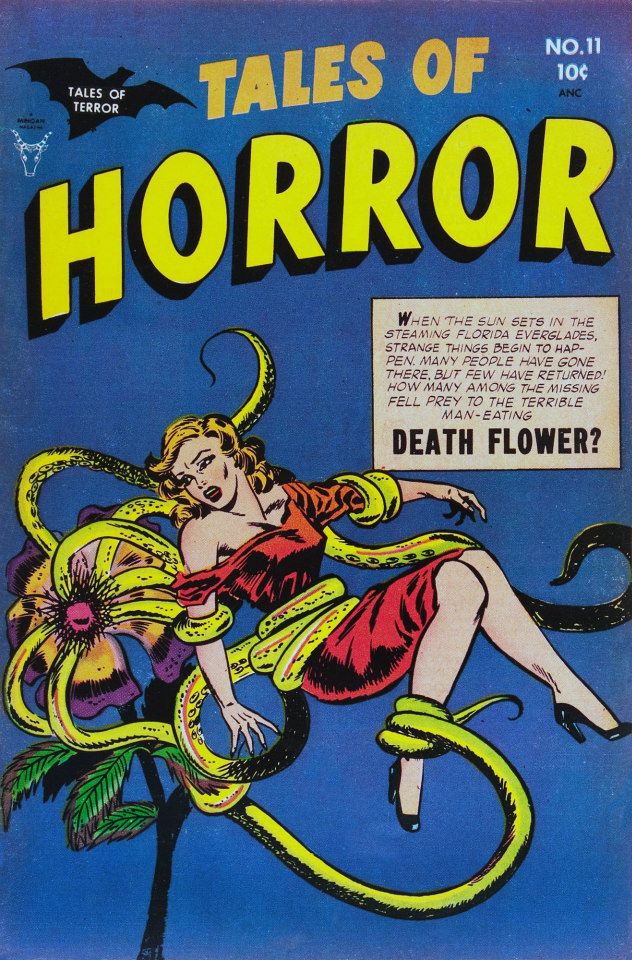
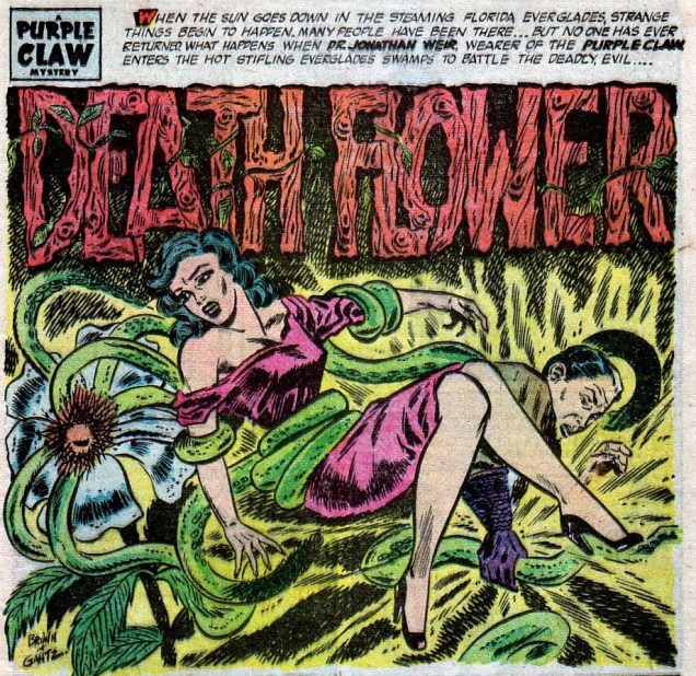
For the botanically-minded, a vacation is a fine opportunity to admire some heretofore unseen exotic plants. Take a look at this sweet little flower:
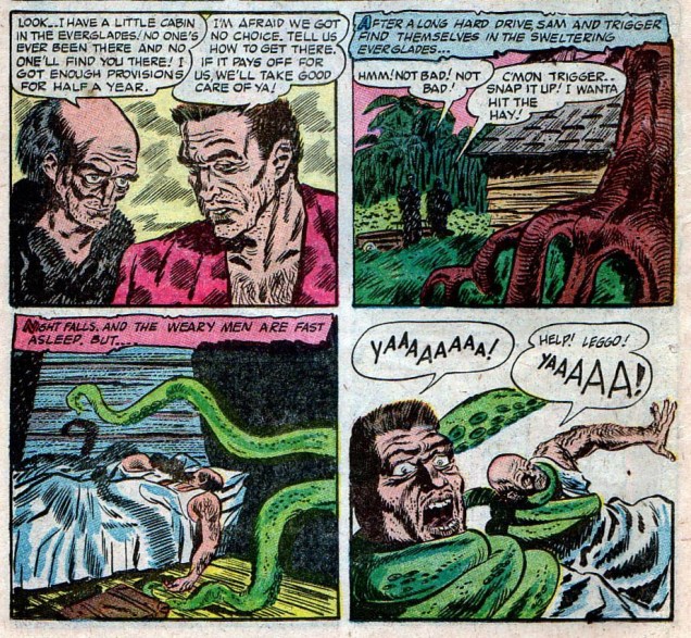
« In the middle of the everglades, there’s a flower that’s different from any you’ve seen… » Tales of Horror no. 11 (June 1954). Pencils by Ben Brown, inks by David Gantz. Death Flower tells the blood-curdling tale of a creepy old man who lives in the Florida swamps and feasts on human flesh – after having turned into a flower, of course.The opening panel of Death Flower, also drawn by the Ben Brown (pencils) and David Gantz (inks) team.Wouldn’t *you* trust this old man? Just look at him – such honest eyes, such a confidence-inspiring face. Yes, of course we’ll go to your cabin, venerable oldster!
That’s it for our little holiday pleasure trip – come to think of it, I’ll remain where it’s cold and snowy, thanks.
I understand that this image has to do with the tradition of greeting the new year by banging on pots and pans and generally making a racket, but I presume that both sailor-garbed primate and pneumatic drill were optional, particularly in times of scarcity.
Art by Stephen Douglas, from Famous Funniesno. 138 (January, 1946). FF number one (July, 1934) was likely the second comic book issued, and the first one *sold*. It was published by Eastern Color / Dell Comics.
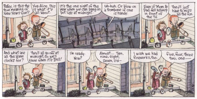
And while we’re on the subject of ushering in the New Year by making a hellacious din, let’s treat ourselves to a couple of relevant Cul de sac pieces. The first returns us to the strip’s formative, water-coloured years, when it appeared weekly (2004-2007) in The Washington Post‘s weekly magazine section.
The Washington Post Magazine, Dec. 31st, 2006. Richard Thompson: « From when Petey played the trombone, and I found it too hard to draw. »The master tackled the theme again in this brief sequence from Dec. 31, 2008- Jan. 1st, 2009.
Nothing left to do now but to wish a joyful 2018 to all you monkeys and assorted critters!
Today we talk about an artist who had an asteroid dedicated to him! (27178) Quino was discovered in 1999.
Quino is the nom de plume of Joaquín Salvador Lavado, an Argentine cartoonist born in 1932 and still with us today (currently 85 years old, for those in the audience who aren’t too good at mathematics). He’s best known for his character Mafalda (heroine of a self-titled comic strip), a lively and precocious 6-year old girl who sought to change the world for the better (but hated soup – how can anyone improve the world without soup?) This comic strip, which ran from 1964 to 1973, is said to have been influenced by Schulz’s Peanuts – for instance, Umberto Eco made that comparison in 1968 – but it makes me think more of Bushmiller’s Nancy. Comparisons aside, I heartily recommend it.
You won’t be surprised to find out that Quino wrote in Spanish – being Argentine and all – but some of his strips, notably Mafalda, have been translated into a variety of languages… by which I mean mostly French. I was harbouring the hope that this great artist had been able to reach many countries with his art, but it seems that his non-Mafalda cartoons (and he’s done quite a few after he quit Mafalda in 1973) aren’t really available in languages other than Spanish or French. As consolation, it seems that at least Mafalda was a big hit in not only Latin America, France and Québec, but also Asia, even meriting a translation into Chinese.
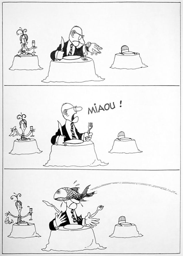
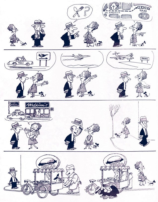
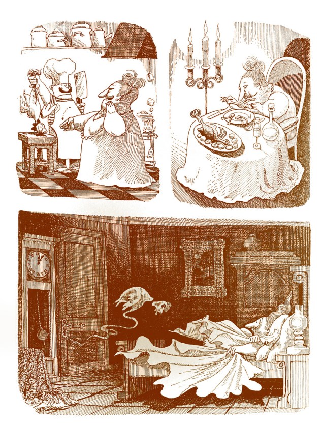
The following three comics were scanned from Manger, quelle aventure! (eating, what an adventure) published in 2016 by Glénat. I was looking for something mute but amusing to sidestep linguistic barriers, and I hope that these qualify. Check out Quino’s beautifully squiggly, decorative lines!
Today is birthday number ninety-five for Stanley Lieber, aka Stan Lee. He was hatched on December 28, 1922. Have a good one, Stan.
Jack Kirby recalls with fondness his former editor and his toady, in “Funky Flashman!” (Mister Miracle no. 6, January-February 1972, DC).
On this momentous occasion, let’s hear about Stan from some of his colleagues, who knew The Man and obviously loved the experience:
Wally Wood:
« Did I say Stanley had no smarts? Well, he DID come up with two sure fire ideas… the first one was ‘Why not let the artists WRITE the stories as well as draw them?’… And the second was … ‘ALWAYS SIGN YOUR NAME ON TOP… BIG’. And the rest is history… Stanley, of course became rich and famous … over the bodies of people like Bill [Everett] and Jack [Kirby]. Bill, who had created the character that had made his father rich wound up COLORING and doing odd jobs. »
EC legend Bernie Krigstein, who collaborated with Stan at Atlas, and whose « Suppressed Desire » is featured in Spellbound no. 17 (September 1953) , with a glorious cover by the above-mentioned Bill Everett.
In the course of a 1960s interview with comics scholar John Benson, Krigstein responded to Benson’s statement of « I guess you know that Stan Lee has been the spearhead of the so-called current revitalization of comics »:
« I’m delighted to learn that. Twenty years of unrelenting editorial effort to suppress the artistic effort, encourage miserable taste, flood the field with degraded imitations and non-stories have certainly qualified him for this respected position. »
Then Gil Kane, who was Marvel’s principal cover artist for much of the 70s, and who collaborated with Lee on The Amazing Spider-Man in some of its most popular years, including the infamous, comics-code unapproved “drug” issues (nos. 96-97, May-June 1971), on the respective creative roles of Stan and Jack Kirby:
« On each page, from 1964 – 1970 next to every single panel Jack wrote extensive margin notes explaining to Lee what was taking place in the story. It took Jack about 2 weeks to do a single story, it may have taken Lee as little as 4 hours to add text to Jack’s art. »
And Steve Ditko, in a letter to the editor of Comic Book Marketplace, published in the magazine’s 63rd issue in 1998, on his and Stan’s respective roles in crafting an issue of Spider-Man:
« The fact is we had no story or idea discussion about Spider-Man books even before issue no. 26 up to when I left the book. Stan never knew what was in my plotted stories until I took in the penciled story, the cover, my script and Sol Brodsky took the material from me and took it all into Stan’s office, so I had to leave without seeing or talking to Stan. »
Most of us may be in a winter holidays kind of mood, but tentacles don’t take holidays, especially not on the last Tentacle Tuesday of the year. While you lounge around in front of a roaring fire (or, more likely, in front of a TV screen), the tentacles continue their arduous work… of grabbing (and possibly disrobing) women.
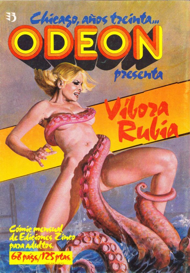
However good they may be at undressing their victims, did you know that octopuses take the utmost care to hide indecent lady-parts from the audience? Case in point (it would have been much more efficient to grab her by the neck or midsection):
« Víbora Rubia » means « blonde viper » in Spanish, and « Chicago, anos treinta » is pretty self-explanatory – Chicago in the thirties. Víbora Rubia (or Vipera Bionda in Italian), is the heroine of an Italian erotic comic series that was regularly printed in Italian comics magazine Odeon and occasionally translated into Spanish. This is one such Spanish edition, 1978, cover painted by Emanuele Taglietti. No, I have no idea what Chicago has to do with a quasi-nude chick in an octopus’ embrace.
As far as I can figure out (Italian not necessarily being my forte), « Odeon » was an Italian comics anthology for adults published from 1977 to 1988. While the earlier issues proudly displayed the enticing warning « for 18 years and older! », later issues modestly called themselves « relatos gráficos para adultos », which loosely translates to « graphical records for adults ». Ironically, the relatively staid covers of early issues became progressively smuttier and more risqué, with bare breasts galore and more rape and bondage scenes than you can shake a stick at, the whole thing veering more than just a little bit into over-the-top ridiculousness. Frankly, I don’t even know why the octopus is bothering to hide the blonde’s nipples.
You can see a gallery of Odean covers here. NSFW, obviously.
Continuing the march into tentacular extravagance, here’s a couple of panels from a comic called « La mort amoureuse » (either “Death in love” or “romantic death”, depending on how one interprets it). It’s a rather violent story of Death (personified as a lusty though decrepit female), her equally prurient servant Destiny, her two semi-amphibian lovers (a torero and a rock singer kidnapped from the world of the living), and a beautiful woman in a capsule fished out of the sea.
A page from « La mort amoureuse » by OXO, a Spanish artist whose name is Eusebio Perdices… which is all I’ve been able to find out about him. Published by Les Humanoïdes Associés, 1987. The lads are polite enough to thank Miss Octopus for her help.
I found this comic to be charmingly over the top, proving that digging through stacks of haphazardly piled up comics in the back of a comic store sometimes pays off. It opens with the story of a lesbian mermaid who dies of a broken heart when her lover callously betrays her, and merrily makes its way through all sorts of sexy shenanigans, amputations and transplants (as well as one decapitation), with dangling eyeballs and dream sequences cheerfully peppering the plot. The sex scenes aren’t explicit (although they’re “suggestive as hell”, as one of my friends would put it, and everyone is quite sex-starved), but the dialogue is equal parts titillating and gross, which elicited quite a few disgusted nose-crinkles and chuckles from me.
Here are two quotes, picked from two randomly selected pages, with quick (and rather literal) translations into English so you can get a feel for OXO’s poetic style. Memorize these in French and you can impress your lover during your next tryst – don’t forget to thank me later.
« Laisse-moi sucer, pour tuer le temps, et pour trouver l’oubli, la moëlle amère de tes os! » (Let me suck, to kill time and find oblivion, the bitter marrow of your bones!)
« Je suis au parfum: la passion est biodégradable! Amour et chair se putréfient également! Laisse-moi plutôt rêver de ton puissant gourdin… ta queue, tendre et primesautière, qui me défonce et défroisse un peu plus les plis de mon vagin flétri. » (I’m well aware: passion is biodegradable! Love and flesh both putrefy! Rather let me dream of your powerful cudgel… your tail, tender and impulsive, which shatters and smooths the folds of my withered vagina!)
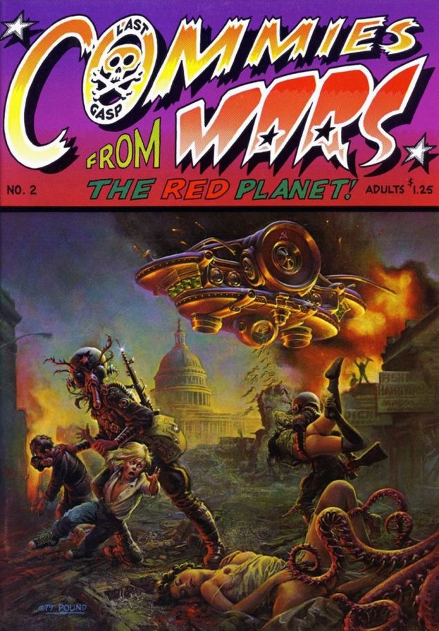
And for our last entry, here’s a cornucopia of fun: Communists! Tentacles! Aliens with good taste in girls! Uncensored nipples! (Actually, the nipples *were* censored on my scan of this cover, but co-admin RG restored them to their former glory with a bit of Photoshop. Thanks, partner.)
Commies From Mars no. 2 (Last Gasp, December 1979). The cover is by John Pound. The fallen gal seems to be enjoying herself more than her still-conscious friends… but those spikes, ouch. Once again, the tentacled beast makes sure to modestly cover its victim’s privates from prying eyes.
Actually, I’ll be a generous little communist sympathizer and give you a two-for-one: here’s another issue of the same series, also with tentacles. Why break a formula that works?
Commies From Mars no. 3 (Last Gasp, February 1981). Cover also by John Pound, a man equally at ease drawing hot babes and mean tentacles.
Irving Phillips (1904-2000)…« has been an actor, a violinist, a Hollywood script writer, the Humor Editor of ‘Esquire’ magazine, a playwright, as well as a very successful syndicated cartoonist.* »
He was most notably the creator of The Strange World of Mr. Mum, which was published from 1958 to 1974 (the Sunday edition began in 1961); at its peak, the strip appeared in 180 newspapers.
Mr. Mum, as his name suggests, is the silent observer of various strange happenings. Anything can, and does, happen in Mum’s world, and much of it is delightfully surreal.
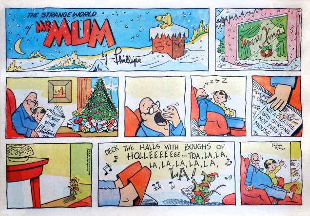
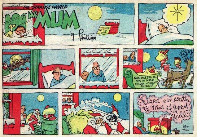
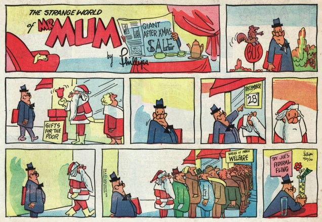
Today, as befits the season, we propose a handful of Christmas (and post-holiday) themed Mr. Mum Sundays.
Originally appeared on December 21, 1969.Originally appeared on January 4, 1970.Originally appeared on December 20, 1970.Originally appeared on December 27, 1970.
As Mr. Mum himself might say, were he ever inclined to chime in: « Have a Merry Christmas! » May you find some good comics in your holiday stash. And try Joe’s Federal Fling… it’s tastier than eggnog.
Craving more Mr. Mum? Then scoot over to Ger Apeldoorn’s The Fabulous Fifties blog, where a veritable Mum trove awaits !
– RG / ds
*quoted from a interview with Mr. Phillips in Cartoonist Profiles no. 4, (November, 1969).
It’s kind of sobering to chance across some regional comics… sometimes they’re of such high quality that I tend to wonder at, and regret, the vast bounty cast aside and left in the dust. How much more similarly fine stuff is out there is anyone’s guess. It makes me long for the days of greater cultural variety on a smaller scale, of humble local stations, local stardom and the unpredictable crazy quilt of regional popularity.
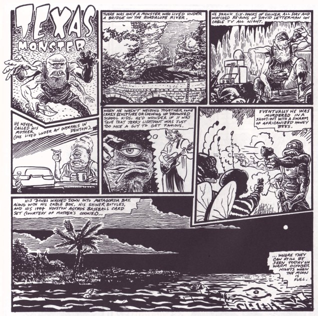
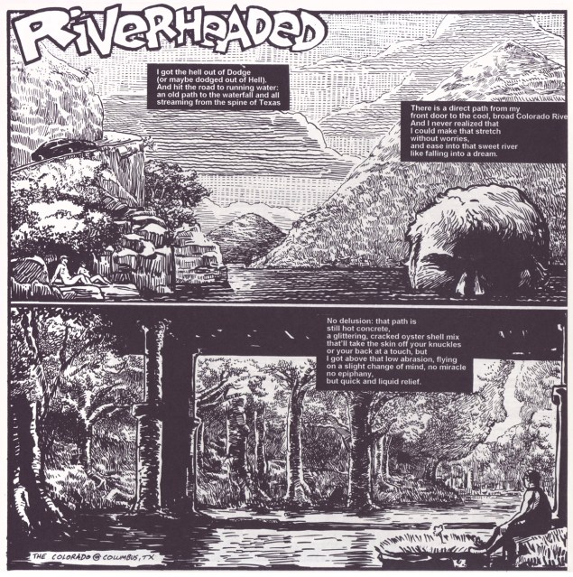
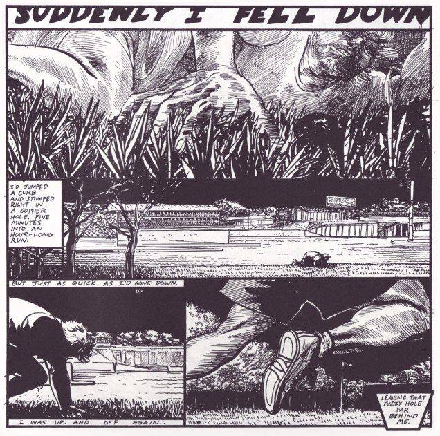
Houston, Texas’ Scott A. Gilbert is a prime example. If not for his being awarded a Xeric Grant in 1995, which financed the publication of It’s All True!, a concise 52-page collection of his favourite True Artist Tales, even fewer of us would have been exposed to his freewheeling talent. Without further ado, here are some of my picks from the booklet.
A Whiff of Hypocrisy (1992)One Art History (1993)Texas Monster (1994)Riverheaded (1994)I Fell (1994)
Gilbert’s True Artist Tales was published in rival alternative weeklies Public News (1988-97), and Houston Press (1997-2000). To answer our opening question, Gilbert got $25 a strip at Public News and $30 at Houston Press.
And for a bit more context, here’s an illuminating presentation that former Comics Journal managing editor Robert Boyd gave last year during a retrospective of Gilbert’s art Boyd was curating (now there’s something you don’t often see these days: the use of “curating” in its proper context!)
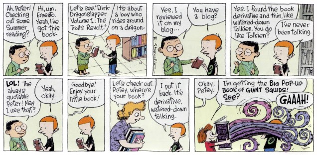
What better way to start Tentacle Tuesday than with the Big Pop-Up Book of Giant Squids? Sensitive people may want to skip this one.
« Dirk Dragonslapper », other than making me giggle every time, sounds like an actual character from some fantasy trilogy, which may be a comment on the state of fantasy these days (hint: it’s not fantastical). I’ll go with the cephalopods, thanks!
Incidentally, there’s a lot of dreadful fantasy covers out there (and that’s quite out of the scope of this blog, anyway), but I can’t resist sharing this one with you.
Poor Fritz Leiber! An octopus holding a bunch of swords at completely ridiculous angles, a squat muscle-bound freak with a bare ass and some booby green-and-purple women floating a distance away. Thanks, Peter Elson.
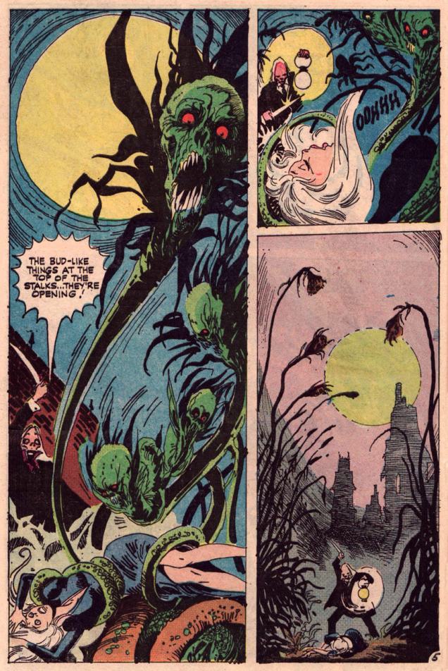
Let’s take a break from cuteness. Next up is some serious cause for alarm from Tom Sutton, who’s excellent at psychological horror. His weird art is full of details one can sink into; his sketchiness and sweeping lines leave one with the disquieting impression of being inextricably pulled into a distorted, nightmarish world.
Damsel in distress from « Budding Evil », Hauntedno. 17 (July 1974, Charlton), both scripted and drawn by Tom Sutton. Tell me you can look at the girl’s face as she’s getting strangled by tentacles and not get goosebumps.The meat-eating flowers have seriously disturbing “buds”… the best of us would have fainted!
There’s an inspired essay about Sutton here which I heartily recommend! I’ll take the liberty of borrowing a great Sutton quote from it (itself taken from a 2000 interview by Jon B. Cooke for Comic Book Artistno. 12). Voilà:
« They published weird stuff, and I have always been fascinated by weird stuff, and the weirder the better…. I do owe a certain amount to Charlton, because they allowed me to write a lot of ditties of my own, to paint a lot of horrible covers, and they never, ever, ever remarked on my technique. »
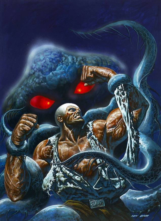
Brr. I think we need an example of straightforward macho heroism to counter-act the icky impression left by the creeping horror glimpsed above. Here’s Doc Savage to the rescue, as usual. Watch the epic struggle between muscled man and malevolent tentacled beast!
Original cover art for Doc Savageno. 8 (Marvel, Spring 1977) by illustrator Ken Barr. And no, I don’t have the answer as to why Doc Savage’s normally bronze hair looks like a white bathing cap here. However, Barr seems to have enjoyed painting it – just look at that glistening musculature!
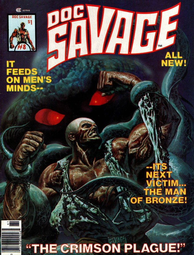
Let’s see the cover as it was published:
A bit too much text, guys. C’mon, you have a tentacled monstrosity with indubitably evil eyes, a man with rippling muscles and bulging veins… We’ve figured out that Doc is its next victim (just as surely as we know that he will come to no real harm).
Interestingly, upon opening the magazine, the first thing one sees is a Tom Sutton illustration. Small world! The cover story, « The Crimson Plague », is an adaptation of a novella published in Doc Savage Magazine in September 1939, and most likely written by Lester Dent (as Kenneth Robeson), who’s responsible for most of the classic Doc Savage epics. It’s an « adventure in which Doc Savage and his team deal with kidnapped scientists, captured comrades, and the deadly secret of the Octo-Brain » (sounds exciting, doesn’t it?) and is illustrated by Ernie Chan.












 ~ ds
~ ds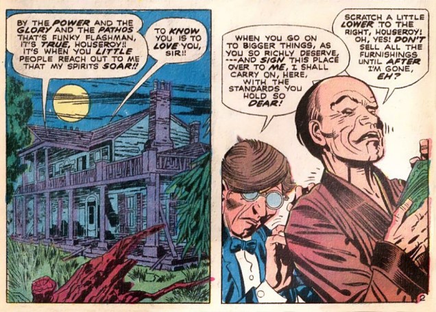








 « Dirk Dragonslapper », other than making me giggle every time, sounds like an actual character from some fantasy trilogy, which may be a comment on the state of fantasy these days (hint: it’s not fantastical). I’ll go with the cephalopods, thanks!



 Who's Out There?