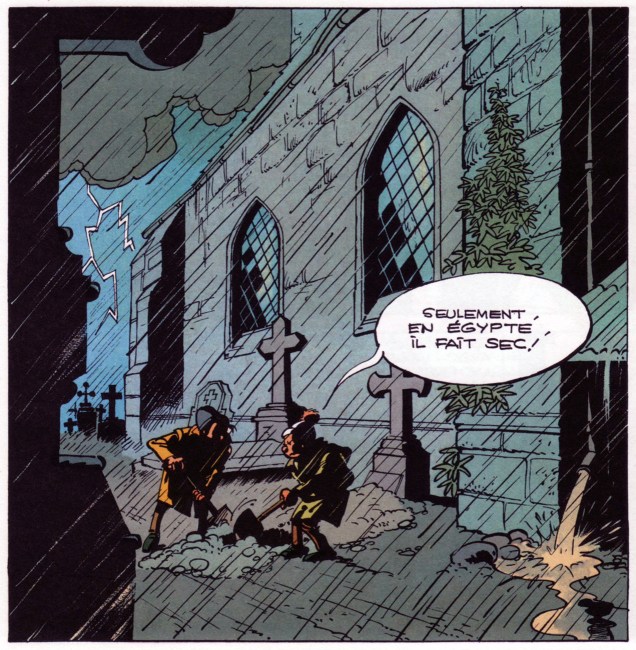
« But dreams come through stone walls, light up dark rooms, or darken light ones, and their persons make their exits and their entrances as they please, and laugh at locksmiths. » ― Sheridan Le Fanu, Carmilla
This splendid piece comes from the pen of legendary Belfast (Ireland, of course, Eire for you purists) artist Rowel Friers (1920-1998). I unearthed it from a lovely volume ambitiously, but not unjustifiably, titled Best Cartoons from Abroad – 1955, edited by Lawrence Lariar and Ben Roth (Crown Publishers, 1955). It first saw print in Dublin Opinion, a monthly Irish satirical magazine (1922-1968). DI was founded by a pair of cartoonists, Arthur Booth and Charles E. Kelly, and a writer, Thomas J. Collins.

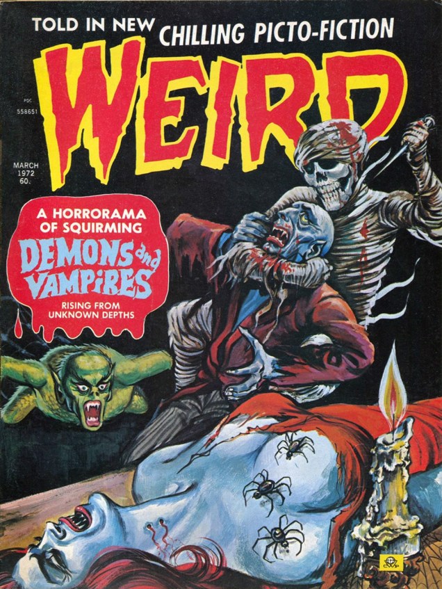
As Hallowe’en is Celtic in origin, it stands to reason that we salute the vital Irish contribution to this most awesome of holidays. For those needing a little refresher, here’s a most helpful précis on the subject, from irelandeye.com:
« Hallowe’en is a remnant of Ireland’s pagan, Celtic past. Samhain was an important Celtic feast celebrated on the last day of October, marking the beginning of winter and the New Year. This fire festival was celebrated at night with ritual sacrifice by the druids of animals. The Celts feasted on the fruits and harvests of the autumn. Ireland’s conversion to Christianity absorbed this Celtic festival and established two significant feast days, All Saints’ Day on 1 November and All Souls’ Day on 2 November. Ireland has always had a special reverence for the dead. Even into the twentieth century, many people in rural Ireland believed that dead family members returned to the fireside on All Souls’ Night. Families went to bed before midnight and left the fire lit. Chairs were arranged around the fireside for the dead family members who returned to the house. »

-RG


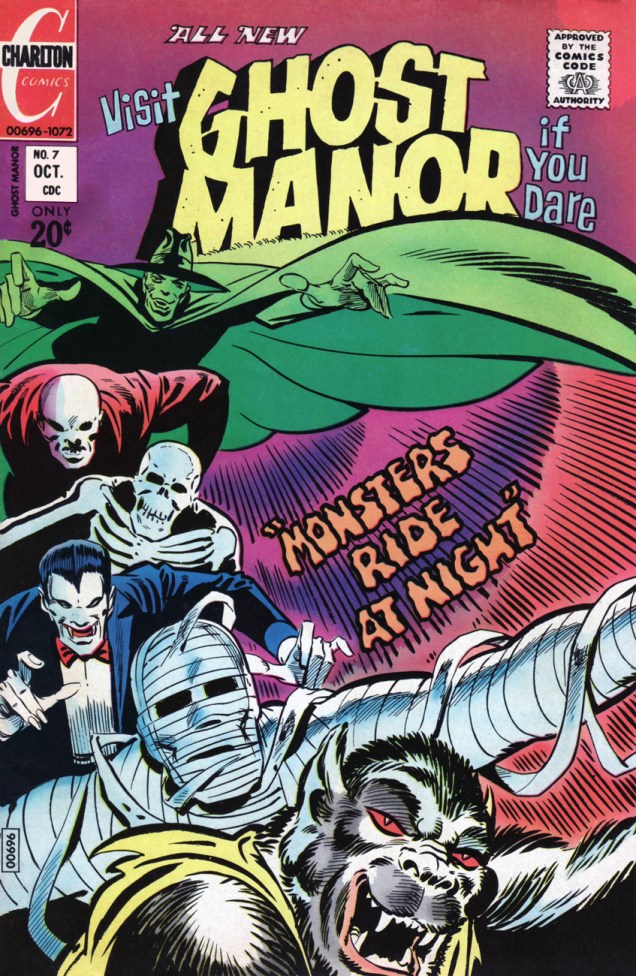
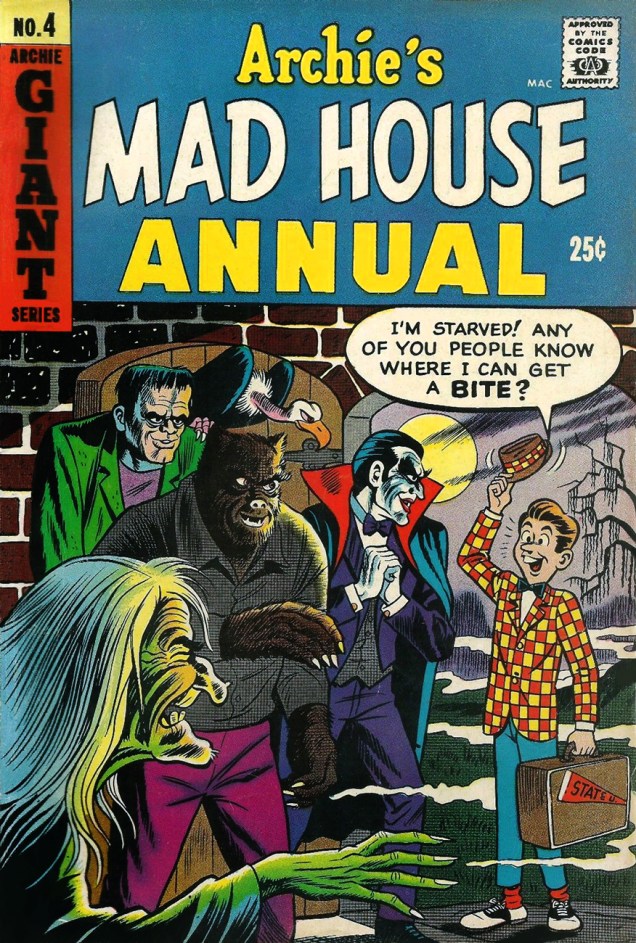 An idea they liked so well they used it (at least) twice. Bonus points for bothering to redraw it! This was Archie’s Mad House Annual no. 4 (1966-67), cover art by the aforementioned Bob White.
 -RG
-RG