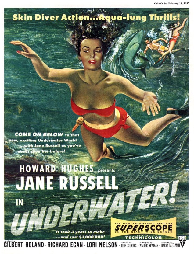
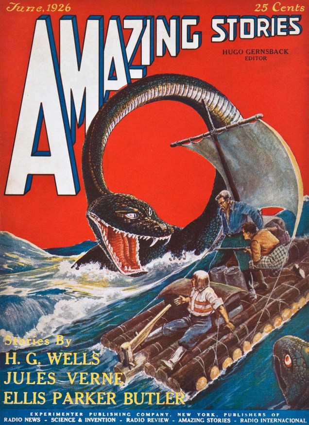
For today’s Tentacle Tuesday post, I’d like to highlight some comic book artwork from the Golden Age, which is to say the period between the early (or late, depending on who you ask) 1930s and 1956, the year Showcase #4 was published, heralding the new era of superhero comics. (Our other TT post dedicated to the Golden Age was about Planet Comics; visit it here).
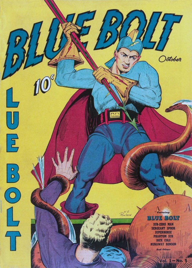
The Blue Bolt gets tangled up in quite a few (crushing, of course) tentacles. Art by Jack Kirby.
And a few pages later….


It might be surprising to see the Shadow in the grip of an octopus, but there’s probably not that many creatures he *hasn’t* grappled with!
When a radio show was introduced in 1930 to boost the sales of Detective Story Magazine, the company (Street & Smith Publications) wasn’t expecting its freshly-minted narrator, The Shadow, to hog the limelight – but that he did, as listeners found this sinister character far more compelling than the stories he was narrating.
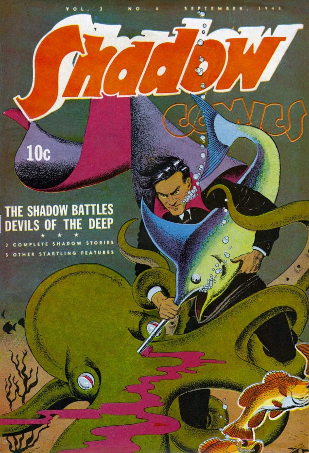
As his fans kept requesting copies of The Shadow magazine (which didn’t even exist at the time), Street & Smith obliged and The Shadow Magazine was born in 1931. The Shadow’s step-father is Walter B. Gibson, writing under the pen-name of Maxwell Grant. He wrote « more than 300 novel-length » Shadow stories to meet the demand of a public greedily clamouring for its hero, although at some point several writers were hired to lighten Gibson’s ridiculous workload. The Shadow soon slunk beyond the confines of pulp novels and into comics: a syndicated daily newspaper comic strip (written by Gibson and illustrated by Vernon Greene), preceded (by a month) by a comic book published by Street & Smith, which was supposed to attract a younger audience to pulp magazines (101 issues, from 1940 to 1949).

Speaking of heroes, Wiki calls The Shadow « a film noir antihero in every sense »; now, I’ll concede the film noir, but I’ll balk at calling him an anti-hero, at least in this incarnation, as *that* term is defined as « a character who lacks conventional heroic qualities such as idealism, courage, and morality », all of which The Shadow has abundant reserves of. He’s a bit laconic and brusque with this conspirators, but that’s understandable when he had to destroy peace-threatening crime rings and bring brilliant crime-perpetrators to ruin at least twice a month.

Who’s that handsome guy shooting commercials for Crackety-Wackett Cereal? Why, it’s Lars of Mars, the debonair Martian! In between fighting his communist arch-enemy (it was the 50s, what can I say?) and robots harassing women, Lars likes to relax by grappling with tentacled creatures.

Lars of Mars was created by Siegel in 1951 for Ziff-Davis. There are only two issues (bizarrely numbered 10 and 11). The art for Lars of Mars, done by Murphy Anderson, is very nice indeed, but you don’t have to take my word for it. Feast your orbs on the first two delightfully nonsensical LoM stories on Pappy’s Golden Age blog.


« Scarlet’s adventures are never run-of-the-mill. Instead she enters into every phase of American life – whether on the baseball field or in a night club – always finding a way to help her clients, aid the forces of law and order… and bring plenty of thrills and laughs to her readers. » Apparently « every phase of American life » includes being on the ocean’s floor, trying to stab an octopus with only 5 arms. Hmm…

Incidentally, Invisible Scarlet O’Neil is supposed to be the first heroine with superpowers (well, one superpower: invisibility).
If I may be excused for going off-tentacle-topic, « Blood of a Monster », the title story that takes up half of this issue, is surprisingly good (though it doesn’t really contain tentacles aside from a minor mention of cephalapoda at the beginning). The art (by the aforementioned Russell Stamm) is moody and quite unhinged in places.

I enjoyed « Grave of Greed », the second half of the issue, even more, because it involves mushroom picking as part of the plot!

Read the full issue here – it’s worth the detour, I think!
Stay tuned for our next Tentacle Tuesday post! In the meantime, visit our previous TTs (we’re getting to have quite a backlog) for your tentacle fix.
~ ds


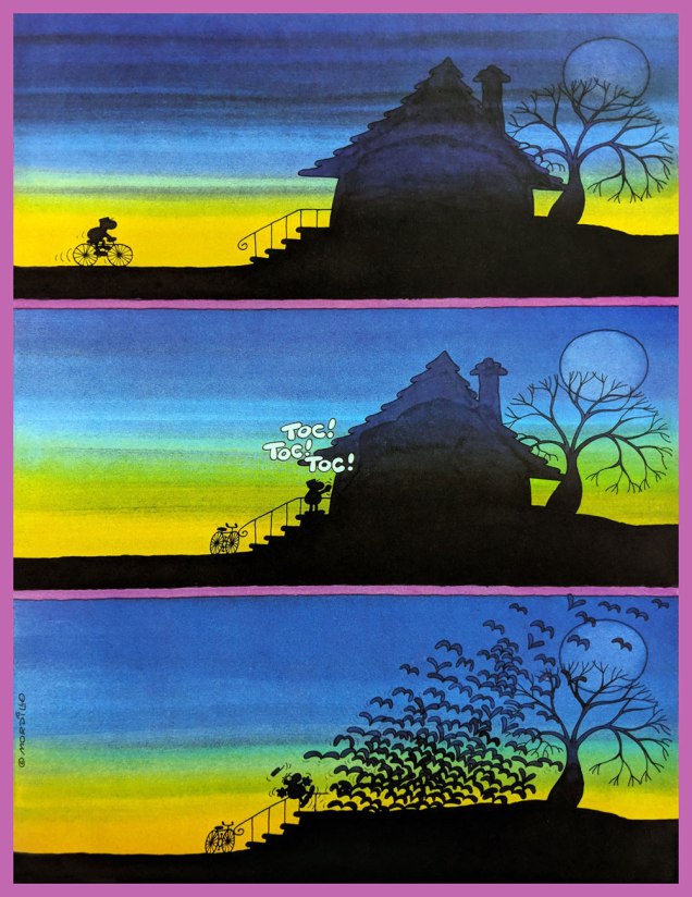


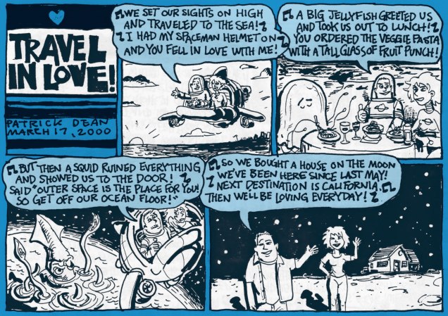
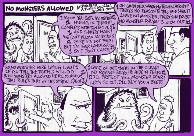
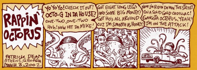
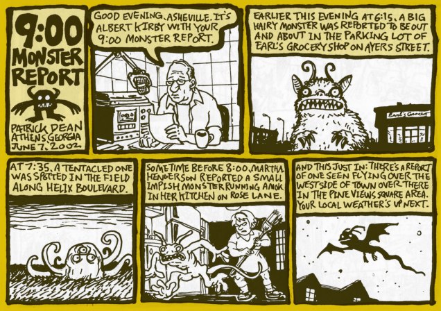
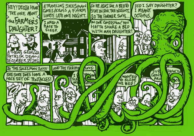
 , those of you who like a friendly octopus and can appreciate understated wit and off-beat humour, stick around as we travel into a land created by Patrick Dean (not British Ambassador to the States). A word of warning – people randomly bursting into song and cohabiting with monsters is quite normal here.