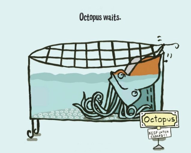
« … there arose such a clatter, I sprang from my bed to see what was the matter. Away to the window I flew like a flash, tore open the shutters and threw up the sash. » ― Clement C. Moore, A Visit From St. Nicholas (1823)
Not too long ago, we glanced at the interesting case of Tower’s teen line, another instance of works insufficiently popular to be properly reprinted, yet still sought after by collectors and aficionados and consequently on the pricey side. And so it is within this limbo that Tippy Teen and Go-Go and Animal find themselves consigned, in the rather fine company of Sugar and Spike and Angel and the Ape. Let’s not strand them there for the duration, please.
So why do I consider Tippy Teen superior to Archie? For one thing, while there’s some underwhelming artwork to be found here and there (sorry, Doug Crane), there’s nothing dismal (no Al Hartley, no Dick Malmgren, no Gus Lemoine, no Stan Goldberg…), and the writing is generally superior, thanks to, among uncredited others, the great Jack Mendelsohn (recycling and updating his old scripts, but that’s not the end of the world).
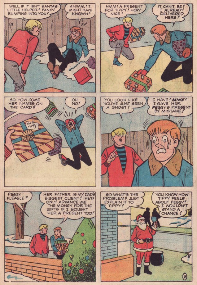
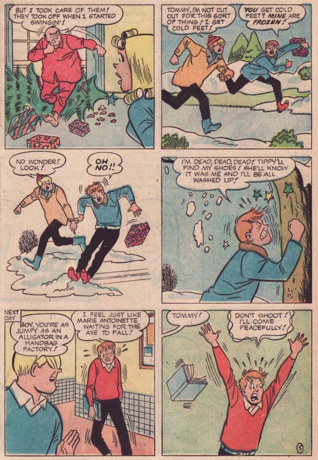
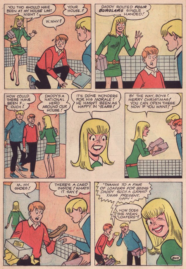
Here’s a little seasonal piece I find quite witty and charming. The well-paced work of an anonymous scripter and my beloved Samm Schwartz, it appeared in Tippy Teen no. 18. The whole issue’s quite solid, and since it’s in the public domain, you can enjoy it right here.
This is Tippy Teen no. 18 (March 1968, Tower). Cover artwork by Samm Schwartz.What kind of a grinch would I be if I failed to include the Monkees pin-up promised on the cover? I shudder to even entertain the notion. In the usual order, Messrs. Peter Tork, Mickey Dolenz, Davy Jones and Michael Nesmith.
In my ceaseless quest for tentacles, once in a while, I return to a previous theme – in this case, the Franco-Belgian tradition of comics. To start at the beginning, visit Tentacle Tuesday, Franco-Belgian edition parts 1 and 2, and Tentacle Tuesday: Tentacules à la mode.
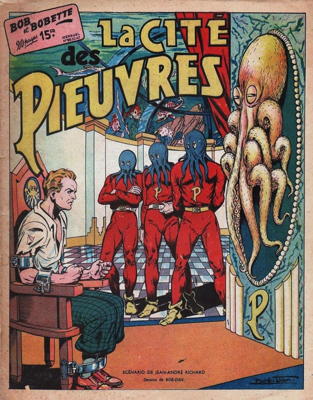
We start some 70-some years ago, with an issue of Bob et Bobette, a Belgian feature created by Willy Vandersteen in 1945. Well, to be more precise, the latter created Suske en Wiske — when the strip became popular in its native De Standaard (a Flemish daily newspaper), it was picked up by Tintin magazine, after Vandersteen agreed to modify it somewhat according to Hergé (who was the magazine’s artistic director) and his Ligne claire guidelines. The main characters were renamed – far from the last time that happened: in Britain, they were known as Spike and Suzy, and as Willy and Wanda in the United States.
Bob et Bobette no. 55: La cité des pieuvres (1947). Scripted by Jean-André Richard and illustrated by Robert Dansler, who was often known as Bob Dan. That lovely sepia paper… I can just smell it.
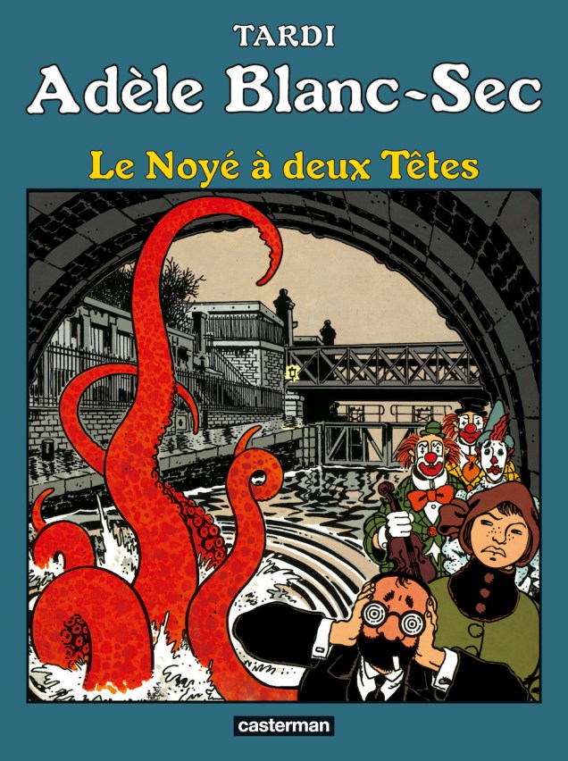
I’ve never read a whole album of The Extraordinary Adventures of Adèle Blanc-Sec, though I like its premise (an intrepid, independent héroïne? yes, please) and Jacques Tardi‘s art (depending; sometimes I love it, sometimes I’m indifferent, but it’s certainly good enough for purposes of following a story). Chalk it down to something I never got around to, I guess. Irritatingly, in 2010 we have been *ahem* ‘blessed’ with a movie based on this comic, directed by the ever sharp-witted Luc Besson (who royally fucked up a movie adaptation of Valérian et Laureline in 2017, so he seems to be making this into a specialty).
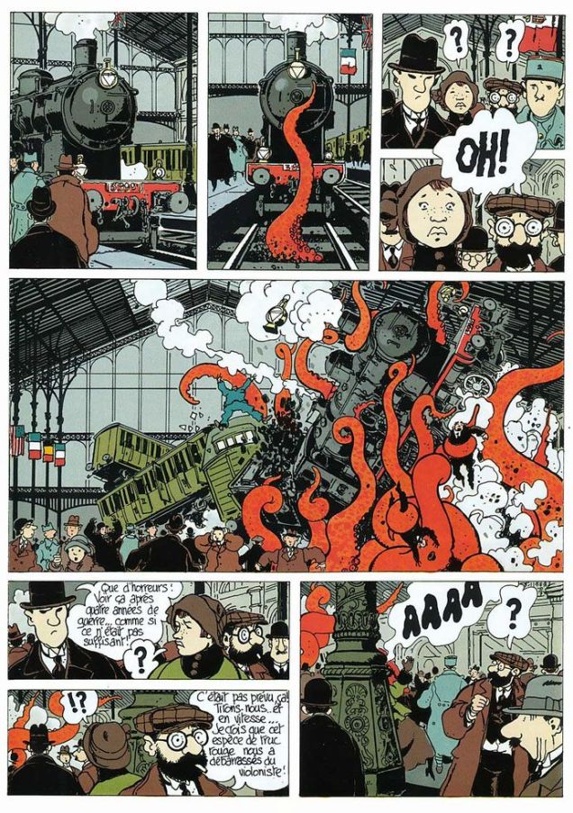
Le Noyé à deux têtes is the sixth volume of LesAventures extraordinaires d’Adèle Blanc-Sec, a series by Jacques Tardi. In 1984, it was serialised in À suivre, a Franco-Belgian magazine, and collected as an album a year later (both by Casterman).A peek at the tentacles within.
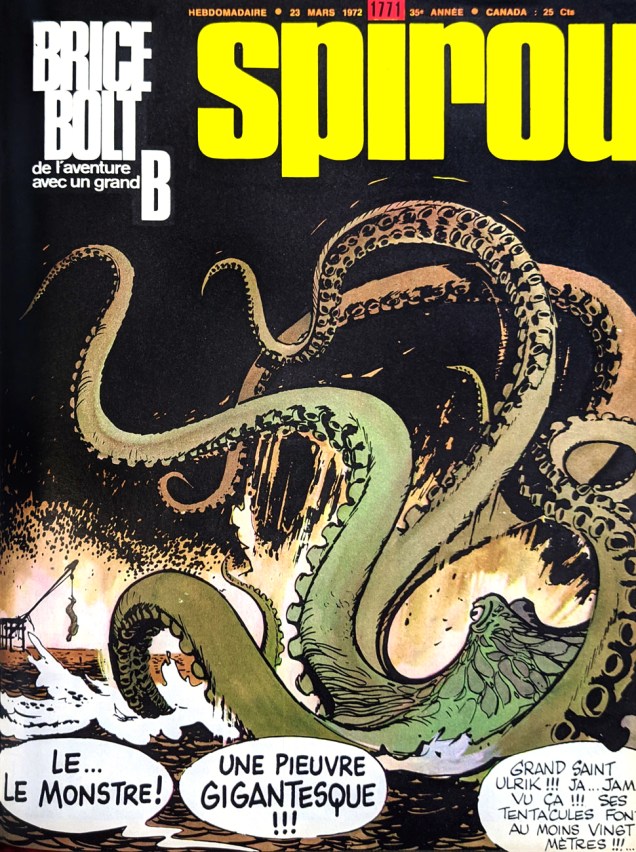
I mentioned the comics magazine Le journal Tintin earlier – here’s a cover from its competitor, Spirou (Le journal de Spirou), published by Éditions Dupuis since 1938. The respective publishers (Raymond Leblanc for Tintin, and Charles Dupuis for Spirou) of these magazines had a gentleman’s agreement: an artist’s work could only be published in one or the other, never both. Incidentally, there was an interesting exception in the case of André Franquin, who moved his wares from Spirou to Tintin after a quarrel with its editor – and, contractually obligated to work for Tintin for five years, simultaneously continued to provide Spirou with stories.
Spirou no. 1771 (march 23rd, 1972), art by Puig.Brice Bolt, a feature launched in 1970, was soon abandoned after but two episodes (although to be fair, they were lengthy – the strip lasted until 1972)… from the sound of it, for being a little too modern for its time. After the publication of the first chapters, letters came in complaining that the story was too scary, the animals too monstrous, the illustration style too realistic. The “monstrous animals” included an army of giant crabs, a behemoth squid (just up our street!), colossal vampire bats, and ginormous Komodo dragons.
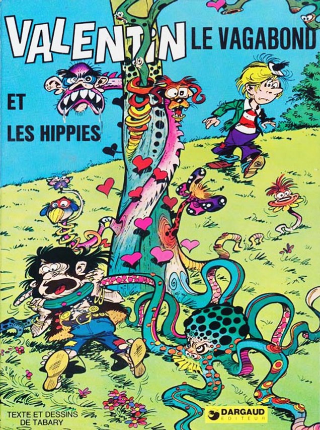
Valentin le vagabond was created by René Goscinny et Jean Tabary in 1962 for publication in Pilote. After 1963, Tabary carried on alone, scripting and illustrating all by his lonesome, Goscinny having his hands full with other projects. Valentin le vagabond et les hippies is the final story of this series, originally serialised in issues 709 to 719 in 1973.
Valentin le vagabond: Valentin et les hippies (Dargaud, 1974). Story and art by Jean Tabary.An excerpt from Pilote no. 719 (1973). The tree is a hippie tree, as it was treated with LSD… now it’s got tentacles. Naturally.
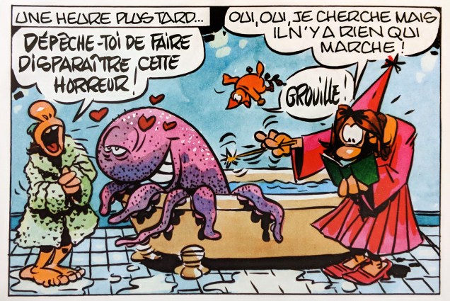
The French are surely not immune from scatological humour. The Kaca fairy (I’ll give you three guesses for what “kaca” means in French) is a rather inept witch. She accidentally conjures up an octopus who’s a little too intent on being liked, and the rest of the comic deals with the attempts to whisk him away again.
« Hurry up and make this monstrosity disappear! » « Yes, yes, I’m looking, but nothing works! » Panels from La fée Kaca (Humanoïdes Associés, 2007) by Florence Cestac.The octopus tries to convince everybody that they should allow him to stick (ha, ha) around – « for instance, I stick myself to the wall and leave you with all the room you need! ».
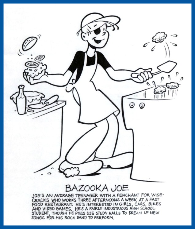
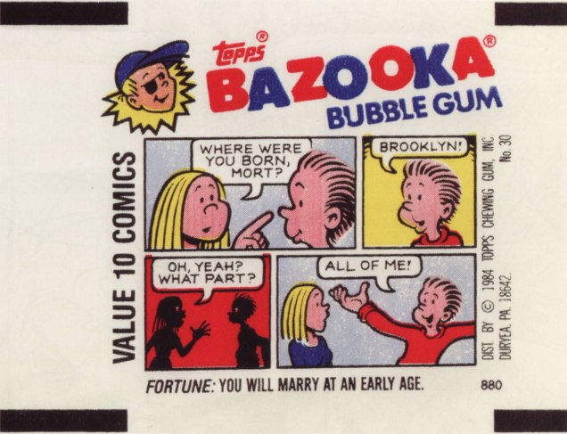
« So to this my life has come: there’s meaning in a piece of gum » — Parthenon Huxley, Bazooka Joe
We recently lost another fine cartoonist in Howard Cruse (May 2, 1944 – Nov. 26, 2019), and while he’s most frequently celebrated for his pioneering work in Queer comix and his graphic novel Stuck Rubber Baby, I’m much fonder of his comparatively ‘lightweight’ humorous work. In other words, I’ll take the wacky short stories over the Ponderous Magnum Opus, thank you.
And things don’t get any lighter than Bazooka Joe, now do they?
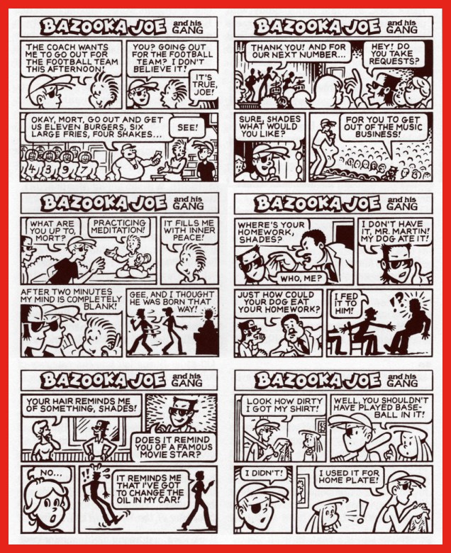
In 1983, Howard Cruse was engaged by Topps to redesign Bazooka Joe and illustrate a new set of strips, the series’ first true update since co-creator* Wesley Morse‘s passing in 1963. Topps, figuring on more-or-less total turnover of its kiddie audience, had been rotating batches of strips every seven years, drawing on the vast hoard of unpublished strips left by Morse, and now and then hiring freelancers to pad out the lot.
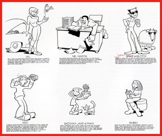
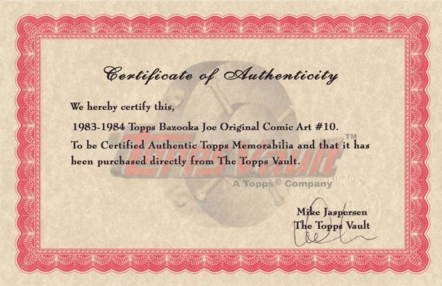
An unpublished Howard Cruse instructional comic, mid-1980s. Cruse recalled: « I always liked this strip because it’s practically the only time I was invited to draw the character at a size large enough to allow some stylistic personality. » I added the colouring, just because.Howard Cruse Bazooka Joe model sheet, prepared for 1983 revamp.Cruse’s model sheet for the rest of the 1983-vintage cast.Chameleonic cartoonist R. Sikoryak, who contributed gags to the second Cruise series, posits that « One of the pleasures of the traditional comic strip is the conciseness of words and pictures, and the Bazooka format takes this compression about as far as humanly possible. As with haiku, there is a great power in the constraints that must be respected in obeying a format. »Samples of the 1983-84 vintage.Jay Lynch explains: « Despite the brand managers and marketing companies responsible for the various revamps of Bazooka Joe over the years, and their valiant attempts to make the characters and the gags more ‘hip‘, I’ve always thought that the primary appeal of these tiny comics was their overall lameness. Back when I wrote Bazooka Joe, I’d usually start by going through turn-of-the-century joke books and rewriting the ancient quips to turn the 1908 ragtime aficionados into 1990’s heavy-metal enthusiasts… »Some thoughtful suggestions from Cruse for the 1988 crop.From my personal collection, original artwork supposedly from the 1983-84 batch… but something doesn’t add up. Incidentally, actual size is 3 x 3 5/8 inches.The accompanying certificate of authenticity raises more questions than it answers. To wit, as Mr. Cruse elucidates: « When I was asked… to reconceive Bazooka Joe as a teenager and provide him with a new ‘gang‘, the only holdover from the earlier tykes… was Mort, the weird sidekick who wore a turtleneck pulled up to his eyes. Len [Brown] and Art Spiegelman… thought the ultra-lengthy turtleneck was a bit – in fact, was literally – over the top, though. So for my first series of strips the sweater’s collar was brought down below Mort’s chin… Apparently this change disturbed some nameless traditionalists at Topps, so when I was hired to draw a second batch of strips in 1988, the turtleneck was restored to its original position… » In that case, if my original is from the ’83-’84 series, why is Mort’s turtleneck in its traditional, and proper place?Another certificate, this one appearing on the back of Bazooka Jerk (Garbage Pail Kids Giant Series Stickers no. 1, from 1986). Illustrated by Howard Cruse.
Then, in 1990, when the time came for another series, Topps opted to subcontract the work to a marketing company that dismissed Cruise’s work as « too goofy », according to Jay Lynch. Then Lynch, Pete Poplaski and Grass Green took up the gauntlet, which is a fascinating tale in itself… but one for another day.
If such lowly cartoon ephemera hold even the slightest sway over you, you’ll likely be very interested in Topps’ Bazooka Joe and His Gang (2013, Abrams ComicArts, edited by Charles Kochman), which proved an invaluable resource in cobbling together this post.
« Bazooka Joe has become the personification of the lowest form of humor. And this is why he’s one of the most widely known comics characters on the planet. Sure, the jokes were cornball. But that’s their appeal. » — Jay Lynch
-RG
*with Topps executive (and Golden Age comic book artist) Woody Gelman.
« Make it a rule never to give a child a book you would not read yourself. » ― George Bernard Shaw
Indoctrinating children has to start early – if you want to make sure the aforementioned little ones will share your obsessions and spend their lives in a futile quest for the same peccadilloes you wasted your youth on, it’s best if you start proselytizing even before they can read. To that effect, quite a few authors of children’s comic books made sure to focus on cephalopods. I am happy to provide you with this abridged list of where to start when you need to convince some tot in your care that 1. octopuses are cool and 2. that they are entirely too intelligent and fascinating to ever be eaten.
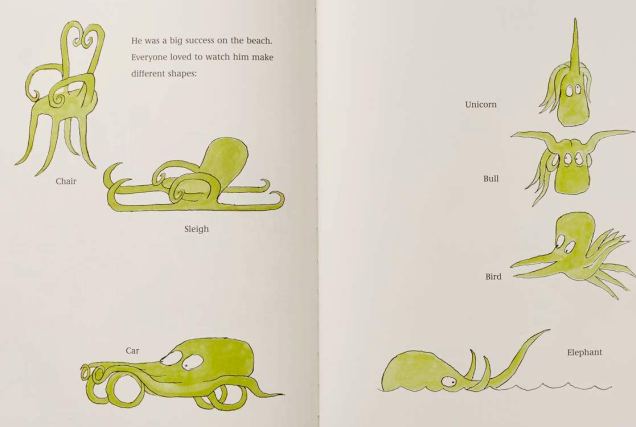
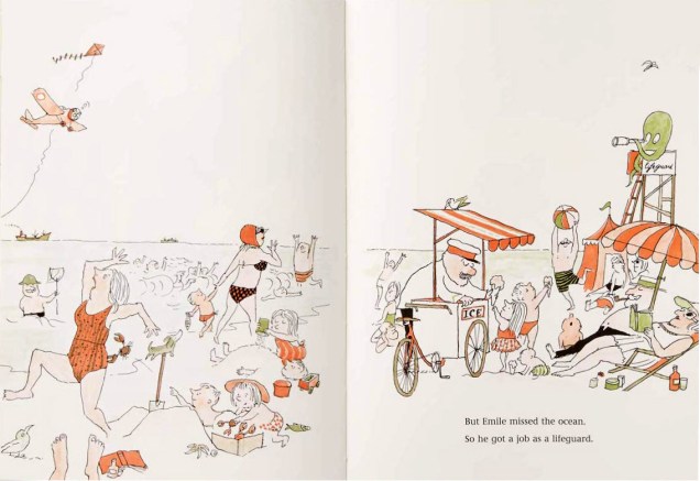
Pages from Tomi Ungerer‘s Emile: The Helpful Octopus (first published in 1960):
Pages from Octopus Escapes! (2018), written by Nathaniel Lachemeyer and illustrated by Frank W. Dormer:
A page from Also an Octopus(2016), written by Maggie Tokuda-Hall and illustrated by Benji Davies:
Page from Touchy the Octopus Touches Everything(2019), written by Amy Dyckman and illustrated by Alex Griffiths:
Before someone complains that this post doesn’t include any “real” comics (what kind of pedant are you, bubba?):
Dexter’s Laboratory no. 16 (December 2000), pencilled by Genndy Tartakovsky and inked by Bill Wray.Splash page from Dee-Dee’s Pony Tale, scripted by John Rozum, pencilled by John Delaney and inked by Jeff Albrecht. Did children really need to see a unicorn pony transformed into a three-headed Slavic dragon with tentacles? Well, yeah.Cartoon Cartoons no. 23 (December 2003), cover by Bill Wray.Page from Sunken Leisure, scripted by Robbie Busch, pencilled by Stephen DeStefano and inked by Bill Wray.
Finally, as a treat for the adults in the audience, I’ll end on an uplifting note (quite necessary after all that carnage by Dexter et al.): a cartoon by Jüsp (who ist tot, which is to say is dead – he died in 2002), published in Die Woche, an German illustrated weekly newspaper published from 1898 to 1944.
« Slap him up and down upon the floor Tickle his feet and hear him giggle Then unzip him down the middle Give that gibbon what he’s hollerin’ for! » — Stuff That Gibbon (words and music by Bill Oddie)
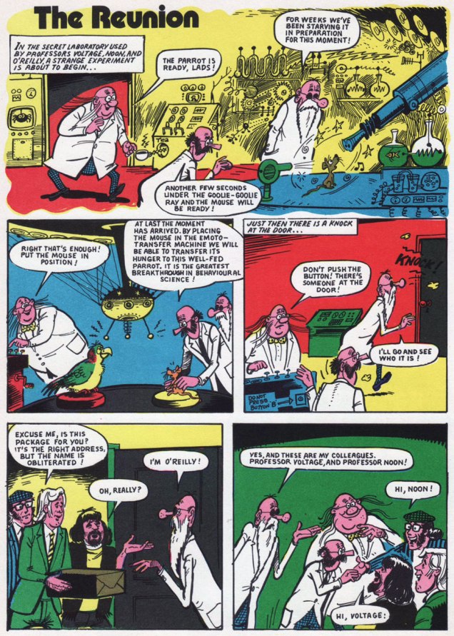
Back in the late 1970s, before I had even heard of Monty Python’s Flying Circus, nor even of Benny Hill, for that matter… I discovered The Goodies, thanks to the CBC’s belated programming of their exploits*. While The Goodies do share a *lot* of DNA with the Monty Python gang (they were school chums, close friends, collaborators and friendly competitors practically all along the way), this trio’s comedic format veers sharply away from the Pythons’ methods: Graeme, Bill and Tim play ‘amplified’ versions of themselves, and use the skit format sparingly, reserving it for mid-show intermission ‘blackouts‘.
While the trio was formed in 1970, it only made its comic strip début (and bow) in 1973**, where they held a weekly feature in the pages of Cor!!, also making an appearance in the magazine’s 1974 annual and The Goodies Annual, the whole lot hitting kiosks in ’73.
« Apparently licensed for just the one year, The Goodies were unique in the fact they were the only adapted characters featured with the comic’s pages with copyright credit being given to Bill Oddie, Tim Brooke Taylor (sans hyphen) and Graeme Garden. According to Robert Ross’ book The Complete Goodies, the strips were all authorised and approved by The Goodies prior to publication and Tim still displays an original Cor!! strip in his study. »
Scans (and detailed synopses!) of The Goodies’ Cor!! shenanigans are helpfully provided by their fan site, goodiesruleok.com.
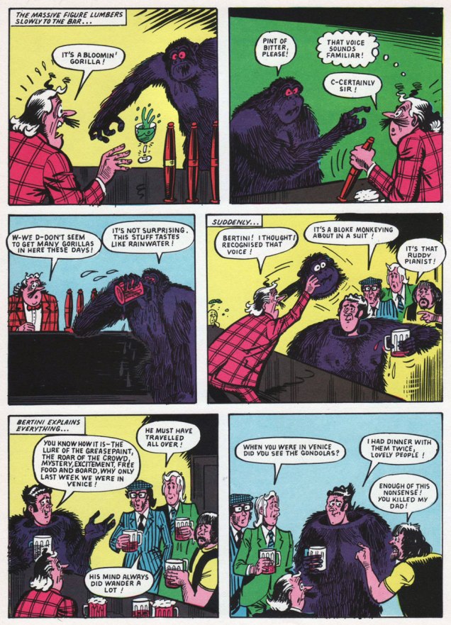
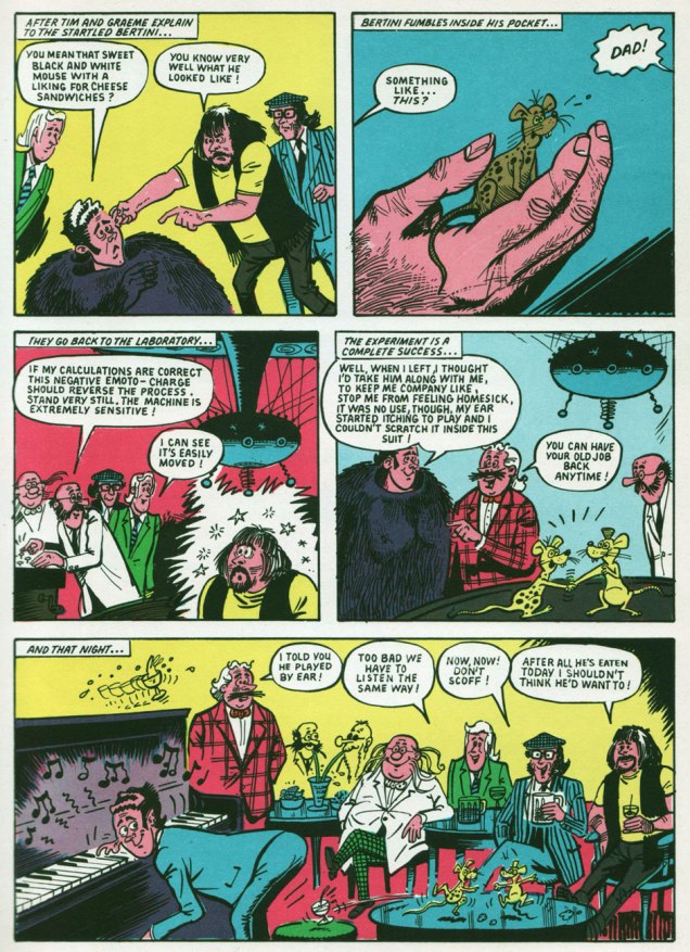
And now, some introductions from the aforementioned The Goodies Annual 1974 (the only one of its kind, poor thing):
The Goodies’ brainbox, Graeme Garden, born in Aberdeen, Scotland, on Feb. 18, 1943. « He lists his hobbies as painting, drawing, playing the guitar and banjo, apologising for playing the guitar and banjo, trying not to travel in cars and, of course, being a Goodie. »The Goodies’ resident singer-songwriter and ornithologist, Bill Oddie, born in Rochdale, Lancashire, on July 7, 1941.« Tim Brooke-Taylor was born very suddenly in Buxton on July 17th, 1940, among those dark, satanic hills of Derbyshire. » I like the sound of that… very Luke Haines. He was The Goodies’ conservative type, and the one who greatly relishes essaying the cross-dressing roles. And he was, after all, the fair one without any of that pesky, telltale facial hair.
Among other, er, goodies, the annual contains a whopping 33 pages of comics. However, as it was fairly typical for UK comics of the period, no creator credits appear anywhere.« The comic strips form a large part of the official Goodies Annual, although “none of us had anything to do with the design or stories”, explains Graeme, “but we were very happy with the results.” »
Goodies, Goodies
Take a little good advice, try a trip to paradise It’s not hard to find, you’ve got it on your mind Can’t pretend it wouldn’t be nice It’s whatever turns you on, Goodies
A circus or a seaside pier, a sausage or a can of beer A stripper or a clown, prices going down You can make it happen here Fun for all the family, Goodies
Goodies are coming for you and you and you and you It’s anything you want it to be, a record or an OBE A four minute mile, a policeman with a smile I know you won’t believe what you see.
(The first Goodies Theme; words and music by Bill Oddie.)
-RG
*« In Canada, the series was shown in on the CBC national broadcast network during the late 1970s and early 1980s, in the traditional “after school” time slot, later a Friday night 10 pm slot, and occasionally in a midnight slot. Several episodes were also shown on the CTV Television Network. In the mid-1970s it was shown on TVOntario on Saturday evenings, repeated on Thursday evenings, until being replaced by Doctor Who in 1976. » [ source ]
**I hear they’ve turned up in The Beano, circa 1994.
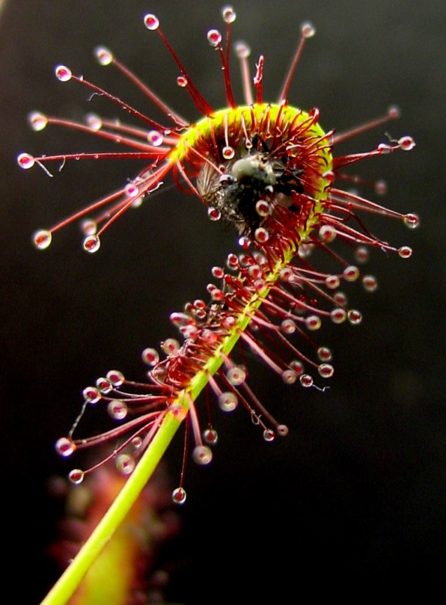
« Drosera’s snap tentacles — which can sense moving prey — catapult insects directly onto the glue tentacles at the plant’s center, where the prey is digested. What’s more, the catapult system is very effective—the insect almost never escapes. » (source)
Which child hasn’t passed through a temporary fascination with Venus flytraps in particular, and carnivorous plants in general? From there it only takes a tiny shift of the imagination to arrive at man-eating plants, which grab their victims with murderous tentacle-like tendrils, crawling vines and grabby creepers. Today we delve into one of my favourite sub-categories of tentacle obsession: plant tentacles.
This spine-chilling greenery often deploys its lethal vines in some remote corner of the Earth (well, in comics, at any rate). This, I firmly believe, is far scarier than the idea of other planets harbouring these carnivorous forms of life. After all, our chances of landing on Mars or somesuch are slim, and we’re a lot more (though not very) likely to wind up in some mysterious jungle.
But first, we deal with that old trope about a power-mad scientist breeding some man-devouring monstrosity in a pot, garden or greenhouse.
Shadow Comics v. 2 no. 8 (November 1942, Street & Smith), cover by Vernon Greene.Page from Horror House, the cover story, scripted by Walter Gibson and illustrated by Jack Binder.The Botanist of Death, scripted by Joe Blair and illustrated by Lin Streeter, was published in Blue Ribbon Comics no. 19 (December 1941, Archie)Gespenster Geschichten no. 550. One would think that a vampire getting restrained by a carnivorous plant is actually a *good* thing, but the lady seems unimpressed. Maybe she wanted to get bitten?
When I was a wee girl, my dad would give me piles of adventure books to read. Quite a few of them involved some intrepid explorers discovering (or literally falling into) a jungle (often hidden in some volcanic crater) in which prehistoric creatures had somehow survived (among the novels I remember reading were Sannikov Land and Plutonia by Vladimir Obruchev, The Lost Worldby Conan Doyle,Journey to the Center of the Earth by Jules Verne, The Land That Time Forgot by Edgar Rice Burroughs, etc.) Cue dinosaurs and woolly mammoths! As I loved dinosaurs, I didn’t mind this recurring theme, which by now seems a little, shall we say, hackneyed.
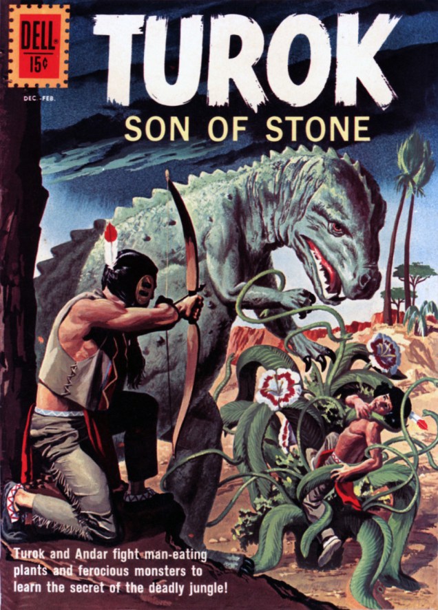
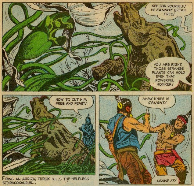
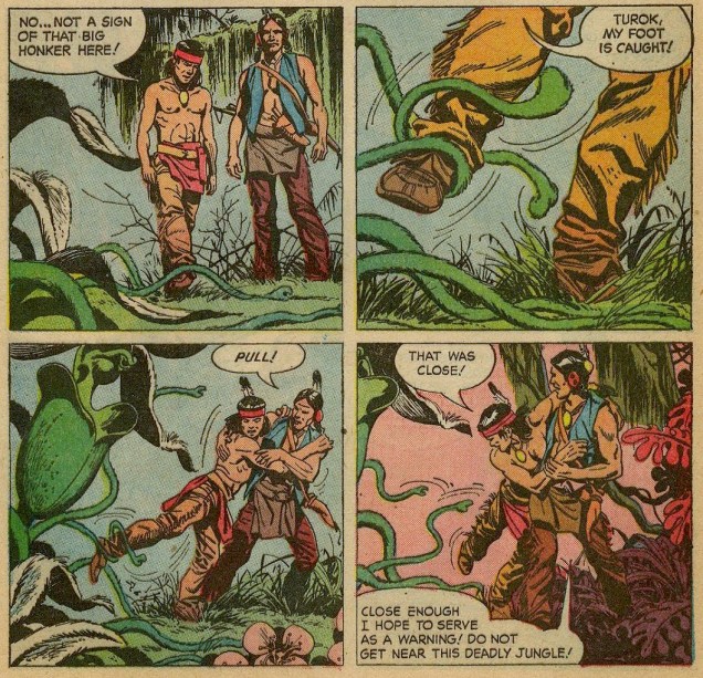
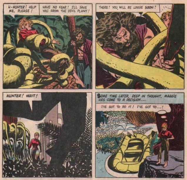
Turok, Son of Stone no. 26 (Dec. 1961-Feb. 1962, Dell), cover by George Wilson.
The cover story, The Deadly Jungle, is scripted by Paul S. Newman, penciled by Giovanni Ticci and inked by Alberto Giolitti.
Very much on topic is this installment of Land Unknown(a comic adaption of the 1957 science fiction movie), scripted by Robert Ryder and illustrated byAlex Toth, published in Four Color no. 845 (August 1957, Dell).
By the way, the Drosera plant (more precisely, a genus that includes about 152 species) – called Sundew in common parlance – is not only lethal, but beautiful, too.
A real-life plant tentacle in action – goodbye, little insect.
« I have the best roommates in the world! It creates a fun sense of family… and that’s really important to me. Things can get so lonely without it. » — Kristen Bell
I think it first struck me how afraid of bright colour* we’d become, as a society, from years of ads for Bose’s odiously-designed Wave® sound systems, as consistently expensive are they are hideous (so they must sound fantastic!), circa the early 2000s.
Available in all your favourite colours, neither of which is technically a colour: Platinum White or Graphite Gray.Be still my fluttering heart: in 2009, Bose figured “what the heck, let the paint chips fall where they may!” and introduced a new “colour”: yes baby, Titanium Silver!
Today, I’m going to (gasp!) restore some colour to your lives. This may lead to a sudden jolt, so avert your eyes if necessary.
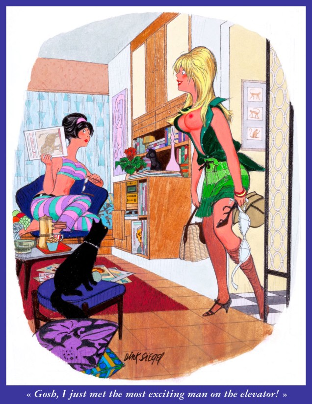
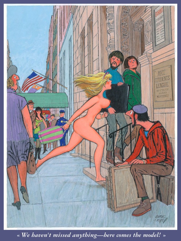
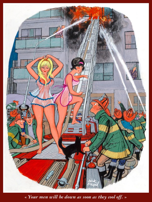
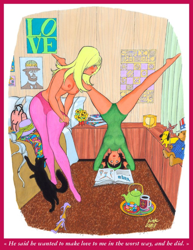
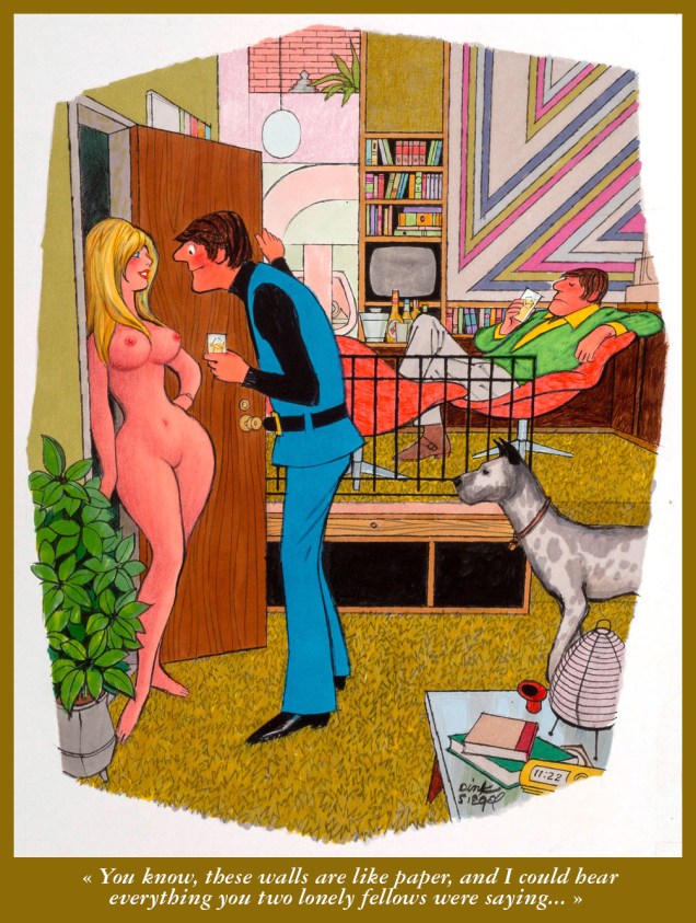
Strictly speaking, I don’t have a favourite Playboy cartoonist — honestly, how could I, with that sumptuous, half-century-plus embarrassment of multifarious riches? Ah, but I certainly hold Leo ‘Dink’ Siegel (June 30, 1910 — Dec. 28, 2003) in quite lofty regard, thanks to his fantastic sense of design, his bold, delicious colour palette and his fastidious attention to detail (pay and treat your cartoonists well, and see what you get!). Today, I’ll concentrate on Siegel’s ‘roommates’ series; there’s generally a black pussycat hanging about, a fine furry bonus.
Here we go!
From Playboy Magazine (Mar. 1966). From what I can discern, Siegel mostly worked in gouache and coloured pencils.From Playboy Magazine (Nov. 1966).From Playboy Magazine (Dec. 1966). One can’t help but wonder whether Mr. Siegel had a sideline in interior design.From Playboy Magazine (Aug. 1967). I see art students were always fairly blasés.From Playboy Magazine (Sept. 1967).From Playboy Magazine (Jun. 1968).From Playboy Magazine (date unknown).From Playboy Magazine (Mar. 1970).From Playboy Magazine (Apr. 1970). I love that the girls seem to have an existence beyond the confines of the jokes: they have jobs, various hobbies and interests and, obviously, active social lives.From Playboy Magazine (Aug. 1971).
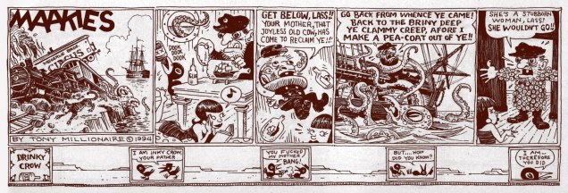
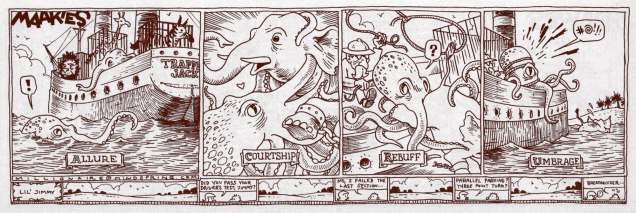
Once upon a time, in a kingdom beyond the seven seas, a little boy lived under the name of Scott Richardson in a seaside town (let’s call it Gloucester and pretend it’s in Massachusetts). His whole family were artists, and he would watch his grandparents paint the sea, the ships that sailed it and the people who commanded the ships. It must have come as no surprise at all when the boy, too, started to draw. Eventually, he grew up, moved around a lot, almost started a major war and somewhere along the way, acquired the nom de plume of Tony Millionaire (which, according to him, « comes from Old French. It means a person who owns a thousand slaves. Serfs, not slaves. »
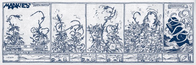
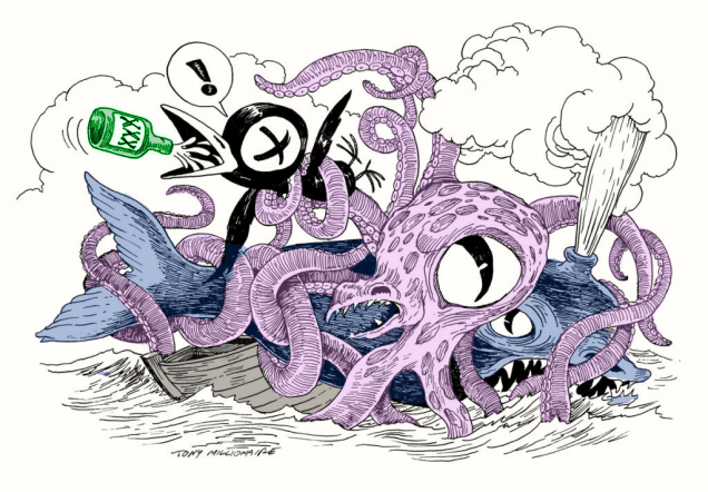
How’s that for a little fairytale? You will forgive me for the jejune introduction, but something about Millionaire’s art is magic. It is easy to underestimate how good an artist he is because his art is so cartoony, and his characters so outlandish: his award-winning, syndicated strip Maakies, for instance, concerns itself with a perpetually blotto stuffed crow (Drinky Crow) and his best pal, a sock monkey (Uncle Gabby). Both were TM’s childhood toys. All children make up stories about their playthings. What’s magic isn’t that he was able to create a world for his toys to inhabit, it’s that he was able to pull us, the audience, in with him.
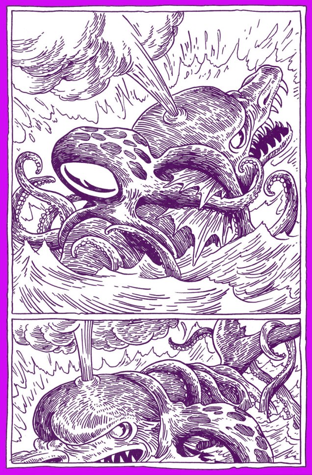
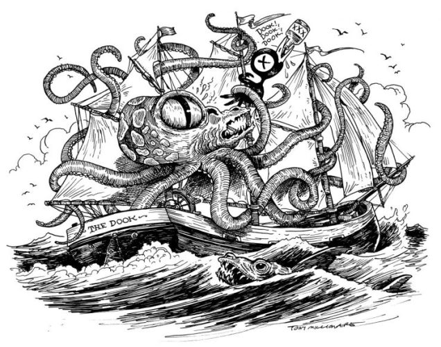
His art is also stunning on a purely technical level: the impeccable geometry of his Victorian houses, the zest of his epic battle scenes (often between a whale and a kraken, it should be noted), the lushness of the gardens inhabited by fairies, gossiping insects having tea, and mice with puritanical sensibilities.
A couple of other things about Tony Millionaire: he’s really funny (or “drunkenly charming”, if you prefer; read his interview with John F. Kelly from 1999), and he clearly loves drawing tentacles, gleefully sticking them hither and tither. He’s clearly long overdue for an inauguration into the elite hall of Tentacle Tuesday Masters. I’m not here to provide you with hard facts about when and how, either about the newspaper strip Maakies or about the comic series Sock Monkey. You can get that from elsewhere. But I do believe that this is the only website where you can get your tentacle fix *and* your TM fix all at once (courtesy of co-admin RG who did all the scanning work!)
Anyway, enough of this chit-chat, and let the tentacles abound!
« Maakies is me spilling my guts… Writing and drawing about all the things that make me want to jump in the river, laughing at the horror of being alive. »
As fun as Maakies are, I find that one gets weary of them quickly – they’re like chips that burst with flavour to the point of causing desensitization. I believe that Sock Monkey is where Millionaire really gets to shine; I fondly remember being bowled over by Sock Monkey: the Inches Incident, in which TM really put his nautical sensibilities to use. The other books from this series only reinforced this impression – the art was so much lusher, and the moral complexity of these stories made each tale bittersweet. The artiste himself summarized it well, stating that « Sock Monkey is me trying to rise above all that bullshit, to be more poetic, looking at the bright side, remembering the things that used to delight me as a child. At the same time, the main theme to all the Sock Monkey books is the crashing of innocent fantasy into bone-crushing reality. »
Fantagraphics published a full collection of Sock Monkey strips, but you can also read three of them right here online. I would of course strongly suggest supporting the publishing house and the author by purchasing the book, but what kind of high moral ground can it be if one is not offered a choice?
« Silence at the proper season is wisdom, and better than any speech. » — Plutarch
When I think of cover layouts, I always recall the sage advice of my art school book design teacher, who posited that « a poster should be One Angry Fist », as you only have a second or two to make your point to the undecided consumer. That knuckle sandwich is what gets your message across, not a bunch of clichés and slogans; these only detract from the power of your image.
While we’re obviously dealing, in comics, with a commercial medium, it’s hard to not view it as creative interference, a lack of confidence**. While all publishers indulged in cover overhyping to some degree, Marvel and DC were the main offenders, and DC at least had superior title and logo designers***.
In the 60s, Jack Kirby created a massive amount of stunning cover art for Marvel… which editor Stan “Ne’er ’nuff Said” Lee buried, as often as not, under his trademark wiseass hyperbole. One might argue that this hardsell approach worked, commercially speaking. Artistically, on the other hand… well, the debate lingers on.
One could counter that cover hype only increased in the subsequent decades (imitated, amplified and distorted), and that stands to reason. That trend is pretty universal, since everything is getting louder, literally and figuratively: commercials, recordings, everyday life. Indeed: louder, sweeter, saltier, faster, meatier and of course cheesier.
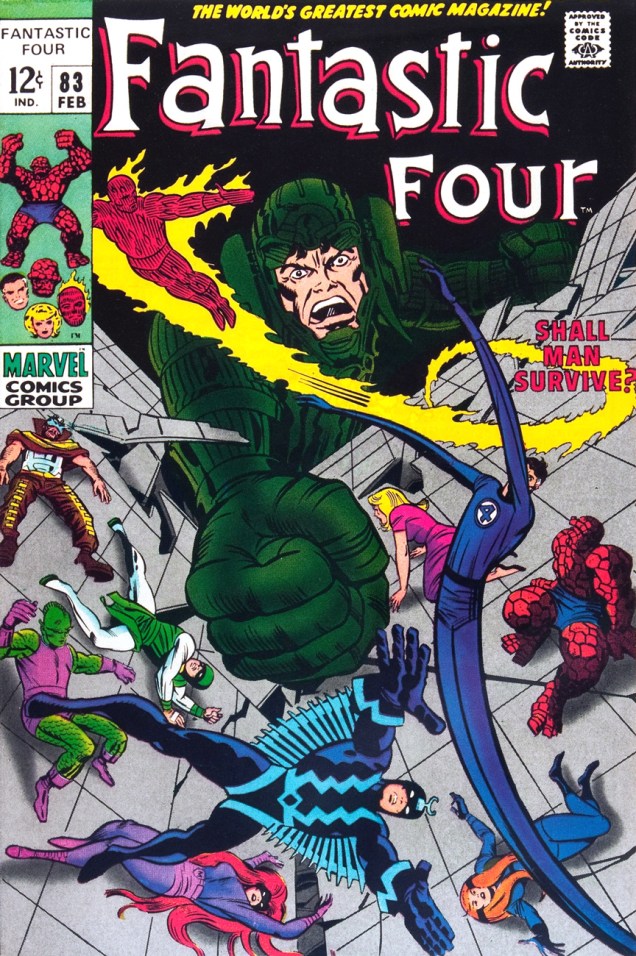
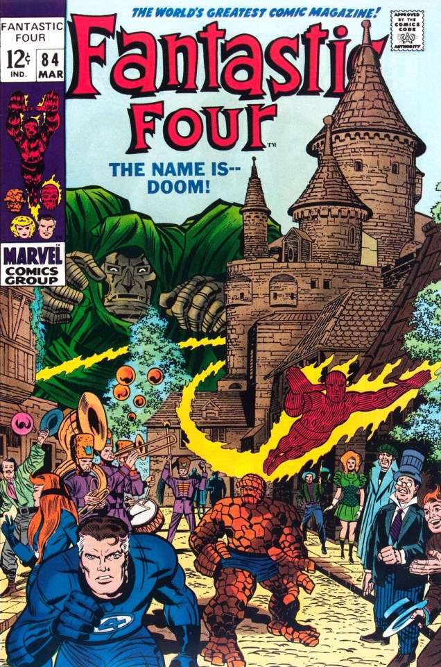
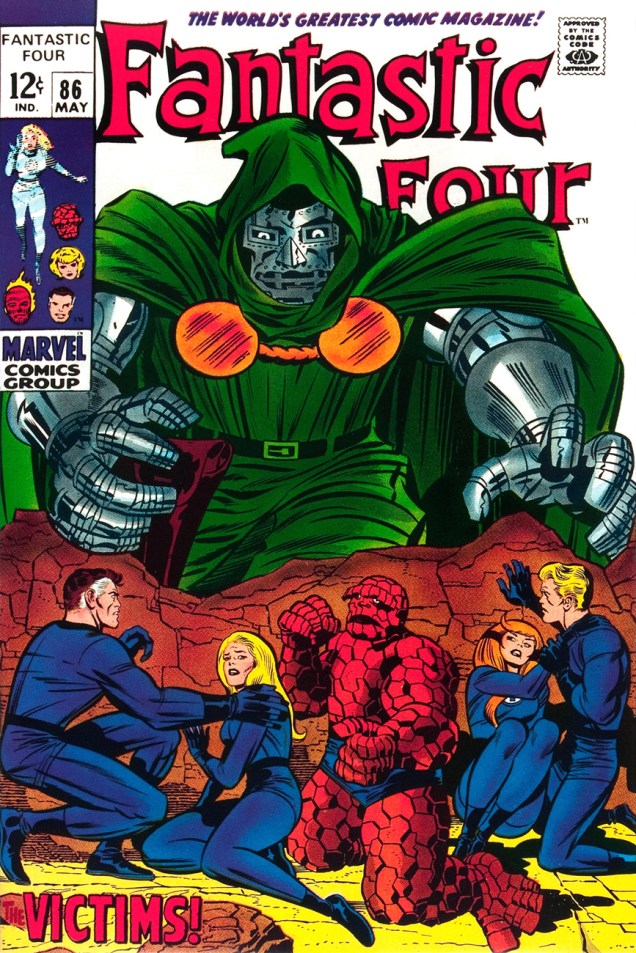
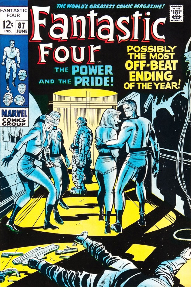
Ah, but for what seems like a mere blip in its history, which is to say around ’68-’69*, Marvel somewhat dialled down the verbiage and let some prime Kirby compositions enjoy a bit of breathing room (at least on Fantastic Four, the company’s second-best seller — and number 16 overall for 1968).
This particular streak is circumscribed by two ho-hum (by lofty Kirby standards) covers: flat FF 81 and messy FF 88 (featured here)… which leaves us with plenty of goodies in the middle. Let’s take the tour, shall we?
This is Fantastic Four no. 82 (Jan. 1969, Marvel). Inks by Joe Sinnott. Silence by Stan Lee. Now isn’t that better?Maximus tries to usurp Black Bolt’s throne, like clockwork. Just a discreet story title… though even then, it’s still intrusive. This is Fantastic Four no. 83 (Feb. 1969, Marvel)See picturesque Latveria. Enjoy the charms of its capital, Doomstadt, located just north of the Kline River. Don’t forget to drop in for some howdy-dos at the small but proud nation’s administrative centre, Castle Doom. This is Fantastic Four no. 84 (Mar. 1969, Marvel). Beyond-meticulous inks by Mr. Sinnott.This is Fantastic Four no. 85 (Apr. 1969, Marvel). Again, did we even need a title? Mechanical lettering, to boot, so it’s not even expressive.Short of a classic, but a nice entry nonetheless. And quiet! This is Fantastic Four no. 86 (May 1969, Marvel).This is always the first image that springs to (my) mind when people bone-headedly claim that Kirby’s work is too over-the-top, ham-fisted and frantic. Even the colours (Stan Goldberg, is that really you?) are admirably subdued. Of course, Stan had to panic and turn on the hype in the eleventh hour. The title would have sufficed. This is Fantastic Four no. 87 (June 1969, Marvel). Giacoia-esque inks by Mr. Sinnott.There. Isn’t that better? The might of Photoshop harnessed to noble ends.
In the face of all this, is it any wonder I found so refreshing the design quietude and purity of some recent comic books covers, such as the Chris Samnee creations we recently spotlighted? There’s hope, thanks to some enlightened folks out there.
**Steve Ditko, for one, grasped that if you couldn’t have your publisher’s confidence and trust in your craft and visual salesmanship, you could go elsewhere and enjoy a publisher’s laisser-faire.
***Marvel would even, in the 70s, hire on the sly, for freelance jobs, DC’s reigning lettering ace, Gaspar Saladino. Heaven knows The Avengers badly needed a logo makeover.
I think the most disappointing scientific discovery of recent years is that there appears to be no octopuses on the moon. Not one teensy-weensy tentacle was spotted by the lunar rovers (that we dispatched to the Moon for that very purpose, of course). But comics had led us to expect otherwise!
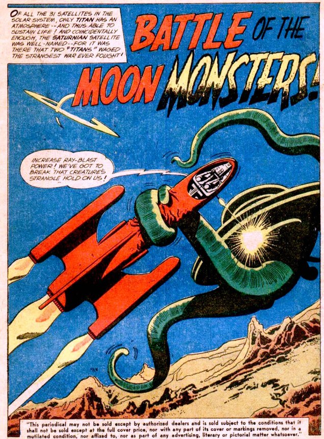
Mystery in Space no. 51 (May 1959), cover by Gil Kane.
The inside offers us even more tentacles:
Battle of the Moon Monsters! was scripted by Gardner Fox, pencilled by Carmine Infantino and inked by Joe Giella.
In the end, our protagonists realize that the tentacled monster is actually a spaceship, and one manned by humans, at that… after which both parties have a good laugh about having almost annihilated one another. A peculiar sense of humour, those astronauts.
A bit of comic relief…
Panels from the one-pager Outer Spacewith art by Bob White, printed in Archie’s Madhouse no. 21 (September 1962)
And back to our scheduled program of lethal, tentacle-sprouting monsters that attack the moment anyone sets foot on the moon.
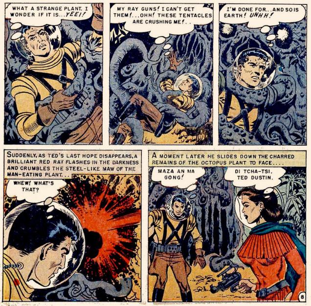
« Traveling at an incredible speed, the rocket reaches the moon in twenty three hours and lands in the gigantic crater… » And what is waiting for our hero, freshly stepped from his rocket? Funny you should ask… Page from Rocket to the Moon (1951 one-shot, Avon) scripted by Walter Gibson and illustrated by Joe Orlando.
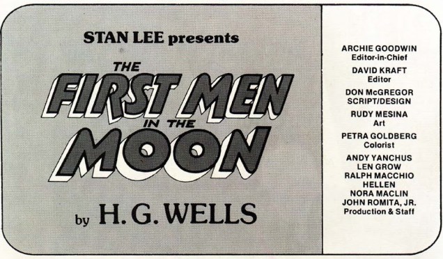
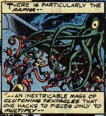
Here’s a good instance of the good folks at Marvel getting quite confused. The First Men in the Moon, published in 1901, was written by H. G. Wells. From the Earth to the Moon was written in 1865 by Jules Verne. Which one is this supposed to be an adaptation of, then? I can confirm that the vaguely ant-like creatures with tentacles are H. G. Wells’ creation. His Selenites are described as following: « They are vaguely similar to quasi-humanoid ants, about five feet tall, with a light physical constitution enclosed in an exoskeleton from which slender jointed limbs and whip-like tentacles protrude. »
Marvel Classics Comics no. 31 (1978), cover by Alan Weiss.
However, the first page of this comic informs us that…
So I guess whoever laid out the cover screwed up. The insides, scripted by Don McGregor and drawn by Rudy Mesina, are considerably better drawn, and an unqualified tentacular treat.
I think the artist just wanted to draw tentacles, and this post is clearly not the place where he is likely to be judged for that little peccadillo.
Did this adaptation succeed in being faithful to and respectful of Wells’ influential novel? Well, not really, although an honest attempt was made. But I found that it focused far too much on the fight scenes, and left out quite a few complex nuances as well as skewing the philosophical underpinnings of The First Men in the Moon. That being said, if you like tentacles, I heartily recommend reading this issue. I cringe at the very idea of recommending something from the Marvel Classics line, but honestly must prevail. Really, it’s good fun. Take a look —
Did the artist go into tentacle overdrive? Oh boy, did he ever!