Greetings! I am on vacation this week – on vacation from work, that is, but never from tentacles! Stowed away on a tropical island (with a WiFi connection, ça va de soi), hoping to glimpse an octopus going about his business in the ocean, enjoying the tropical foliage… Speaking of the latter, some of the plants that grow around here are distinctly tentacular in nature.
So you see, I really had very little choice in regards to the topic of today’s Tentacle Tuesday installment! I’ve decided to stick to the 40s and 50s, as there are really many more cannibal plants out there than one could possibly shake a stick at.
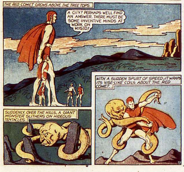
This installment of Red Comet is illustrated by Joe Doolin, and published in Planet Comics no. 14 (September 1941). Frankly, these things seem a little too bulky to carry about with you. Just imagine if somebody tried to walk around carrying a triffid.I believe the Red Comet had the ability to explode things with his mind, but clearly there were some restrictions.A page from an installment of Gale Allen and the Girl Squadron, illustrated by Fran Hopper. Gasp, a woman comics artist! A rare thing indeed, back in the Golden Age. Published in Planet Comics no. 28 (January 1944). Gale Allen ends up in this very position quite often, though tentacles aren’t always involved.
Incidentally, may I just point out that the Girl Squadron’s costumes (as they go on their intergalactic, dangerous missions) wouldn’t be out of place in a modern music video? Fran Hopper could draw cute girls with no trouble at all – and she also seemed aware that breasts are affected by gravity (but just a little bit, one wouldn’t want to be *too* realistic).
The ruler of Carnivoria not only has poor taste in titles (most lands are governed by meat-eaters of one kind or another – in that sense, Canada could be called Carnivoria with the same degree of accuracy), but also poor taste in clothing: is that goofy hat supposed to be regal?
For a chuckle, visit the post about Gale Allen And Her Girl Squadron on the Stupid Comics blog, featuring fun images like this one:
From the usual team: written by Douglas McKee and illustrated by Fran Hopper.
Eye candy for men *and* women readers! 😉
Back to tentacles… and on to Fred Guardineer, who also drew cuties of both sexes:
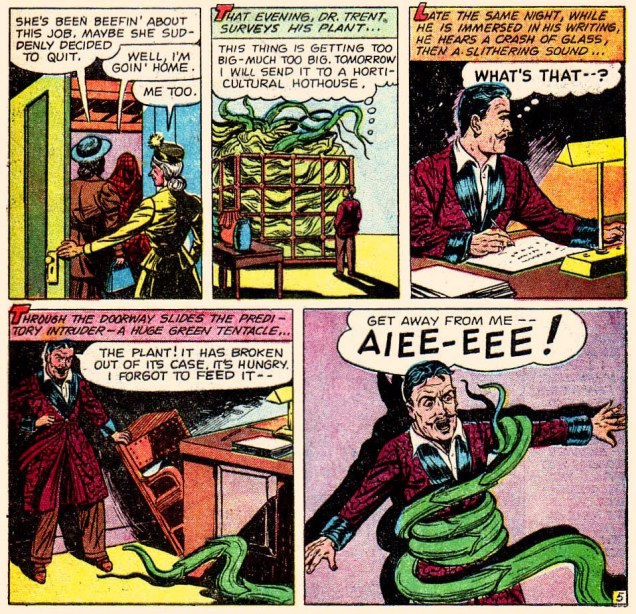
The Harp of Death! is illustrated by Fred Guardineer. Printed in Manthunt no. 7 (April 1948).Evil Guy has the body of an eagle (with hands and feet, though), and raises deadly cannibal plants that respond to whistling. Does that seem a tad… random to you?A page from Appetite for Death, drawn by Henry Kiefer. Published in Beware no. 12 (November 1954).There’s something distinctly wrong with the guy’s anatomy.
« What’s the point in eternity… if nothing ever changes? » — White Ant gets in the final bon mot (Captain Oblivion no. 1)
In the mid-1980s, the surprise success of Kevin Eastman and Peter Laird‘s Teenage Mutant Ninja Turtles touched off a veritable avalanche of ever crappier, hastily-assembled and cheaply-produced knockoffs — at least Eastman and Laird initially meant their creation as a joke. Oh, there were some real gems amidst the rubbish, but as Sturgeon’s Law tells us, the bad greatly outweighed the good, let alone the great. This is now known as the Great 1980s Black and White Comics Glut.
Among the good-to-great (well, to my taste) were a score of short-lived onomatopoeic humour anthologies such as !Gag! (Harrier), Honk! (Fantagraphics), Splat! (Mad Dog Graphics), Bop, Buzz, Twist (along with the venerable Snarf, all from Kitchen Sink)… the mutant progeny of Zap Comix, I suppose.
It was within the pages of Honk! that I was greeted by such across-the-pond talent as Eddie Campbell, Glenn Dakin, Phil Elliott and Paul Grist. Their work provided a sorely-needed gust of English country air to the superhero-fatigued reader, though one had to keep both eyes open, as alternative comics publishing in the ’80s was a maddening mixture of whack-a-mole and ‘throw stuff at the wall and see what sticks‘.
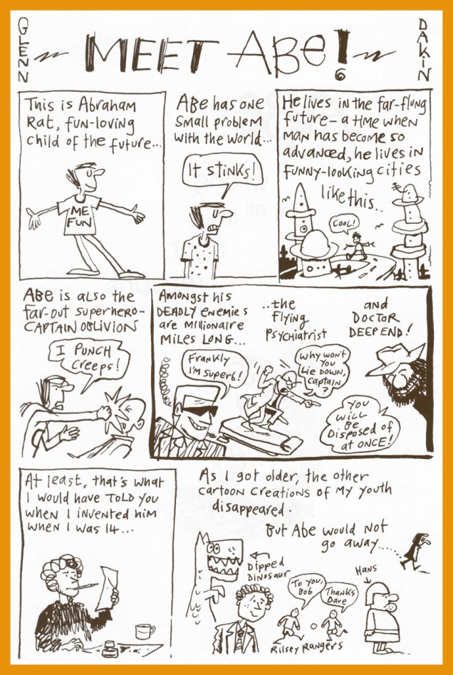
Now that the stage is set, I’ll share some of my favourite Dakin strips. He’s been a busy chap, creating several solo series: Temptation, Captain Oblivion/Abe Rat, Robot Crusoe; collaborations: Paris: the Man of Plaster (with Steve Way), Mr. Day and Mr. Night, The Man From CancerandGreenhouse Warriors (all with Phil Elliott), as well as YA novels (the spooky Candle Man) and animation (the astonishing Shaun the Sheep).
Today, I’ll focus of my very favourite Dakin creation (his most understated and personal), the fancifully autobiographical Abe Rat.
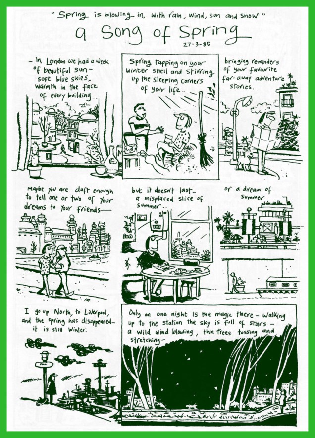
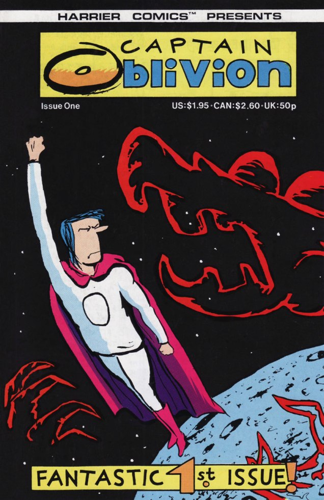
A Song of Spring was originally published in Fast Fiction no. 14 (April 1985, Fast Fiction).As this Captain Oblivion one-shot was left out of the Abe collection (the original artwork was lost!), the completist will want this one as well… and will not be disappointed nor go broke in the process. This is Captain Oblivion no. 1 (Aug. 1987, Harrier). Cover colours by Mr. Phil Elliott.
Dakin’s comrade-in-ink Eddie Campbell (Abe’s his fave Dakin strip too) provides the introduction to the collection, and therein shares these thoughts: « Back when we were doing our little photocopied comics (what I term ‘small press’) in the ’80s, we constantly challenged each other to take the comics form in new directions. Dakin evolved in exciting ways in his Abe stories. The were autobiographical, but more concerned with the inner life than the physical one. He arrived at an approach which I termed ‘discourse’. He would devise characters and symbols, and borrow others, combining them in argumentative juxtapositions. There would be passages where he’d use a character from history or a novel to push his contemplation towards a resolution. Once he even called a halt to proceedings and ran a variant ending. »
Thanks for reading, hope you enjoyed making Abe’s acquaintance.
As Tentacle Tuesday creeps by once again, we found ourselves knee-deep in ghosts and devils – adorable, baby-featured ones. As a matter of fact, if you’re the kind who breaks out in hives when exposed to an overdose of cuteness, I would suggest skipping this week’s installment.
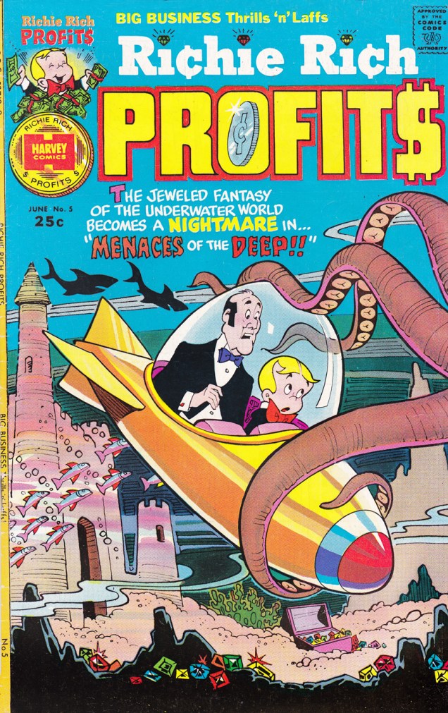
The best-known titles published by Harvey Comics, whether comic book adaptations of an animated cartoon (for instance, Casper the Friendly Ghost or Baby Huey, both adapted from Paramount’s Famous Studios cartoons) or original series, are certainly no passion of mine for the simple reason that the stories are, for the most part, quite boring. Their strained slapstick elicits, at best, a semi-chuckle: each character is so tied to a shtick that the whole thing becomes predictable very quickly. Hot Stuff, the little devil with temperature regulation problems, constantly burns through and/or melts stuff. Little Dot draws polka dots on everything – or hangs out with giraffes. Little Lotta demolishes all food in sight à la Garfield. Richie Rich swims in money, eats money, inhales money. Wendy the Good Little Witch is nauseatingly boring (I disagree with that being a viable definition of “good”).
All of these characters have redeeming features – their heart is in the right place and they enthusiastically come to the aid of friends and animals. The Harvey Girls, as they’re called (Little Lotta, Little Dot and Little Audrey) are clever and enterprising, if spoiled and headstrong, which is a pleasant change from females in need of rescuing. I wouldn’t go as far as calling their antics “proto-feminist”, notwithstanding the lofty claim made to that effect in the introduction to the Dark Horse Harvey Girls anthology.
One can hem and haw about it all day, but there is one redeeming and indisputably striking feature, and it’s one to contend with: the covers are beautiful! Lovingly designed, gorgeously coloured, they’re pure eye candy.
We have artist and art editor Warren Kremer, who worked at Harvey for some 35-odd years starting in 1948, to thank for that. See my colleague’s Little Dot’s Playful Obsession and his spotlight on Spooky the Tuff Little Ghost for more details. Me? I shall simply concentrate on tentacles.
Casper & Nightmare no. 21 (1968). Casper the Friendly Ghost was adapted from Famous Studios‘ animated cartoon, and soon gave birth, so to speak, to a score of spinoffs, such as Spooky the Tuff Little Ghost and Wendy the Good Little Witch.Richie Rich no. 128 (September 1974). Richie Rich, yet another Warren Kremer character, debuted in Little Dot. Don’t you just love the super-bashful octopus?Devil Kids Starring Hot Stuff no. 67 (December 1974). Hot Stuff the Little Devil is another Kremer character.Richie Rich Profits no. 5 (June 1975)Casper Digest no. 2 (December 1986). This would be a far nicer image sans all the page-cluttering copy (and bar code)!
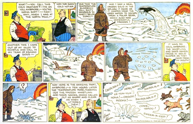
« Polar exploration is at once the cleanest and most isolated way of having a bad time which has been devised. » ― Apsley Cherry-Garrard, The Worst Journey in the World (1922)
Gene Ahern‘s Room and Board (March 17, 1937, King Features).
Of course, it’s all piffle and bunk, but it brought to mind a passage from a favourite article on weather peculiarities in Siberia, Marcel Theroux‘s The Very, Very, Very Big Chill(published in Travel & Leisure in 2000):
« Local people told me that at minus 60 and below, a dense fog settles in the streets, and pedestrians leave recognizable outlines bored into the mist behind them. A drunkard’s tunnel will meander and then end abruptly over a prone body. At minus 72, the vapor in your breath freezes instantly and makes a tinkling sound called ‘the whisper of angels.’ »
Then I thought: « all very nice, but that makes for a rather meagre post »… so I decided to toss in a few bonus images featuring that venerable recurring motif… and got carried away.
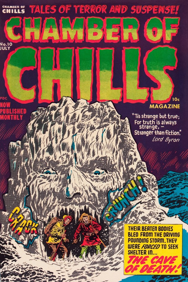
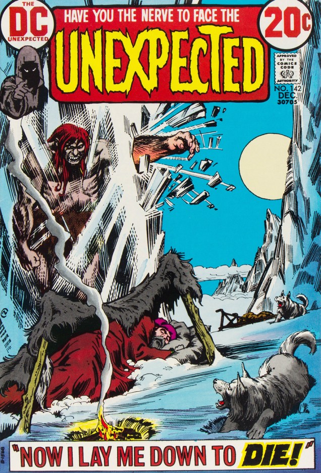
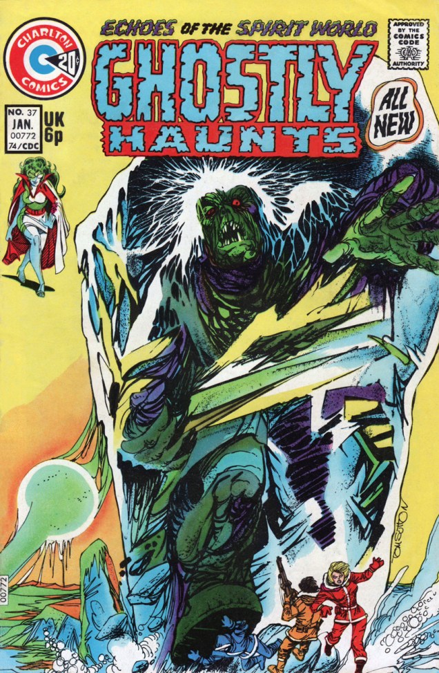
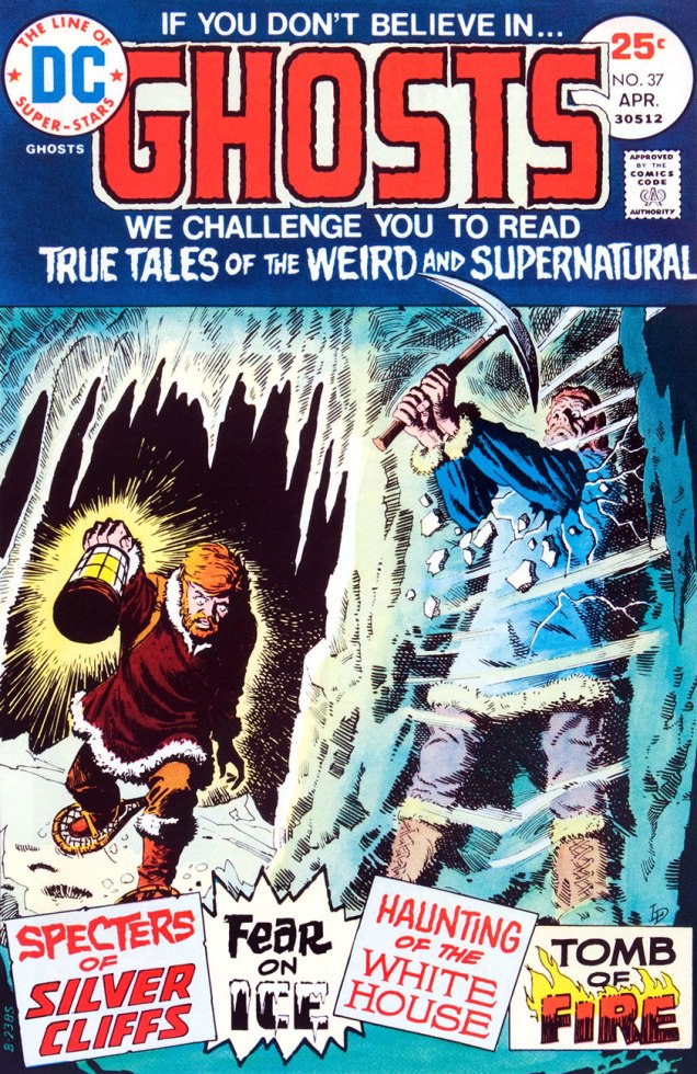
This is Astonishing no. 36 (Dec. 1954, Atlas), the title’s penultimate pre-Code issue… not that Atlas ever crossed the line into gruesome. The cover-featured yarn is The Man Who Melted!, an amusing load of utter rubbish you can read here. Cover art by Carl Burgos.This is Chamber of Chills no. 10 (May, 1974, Marvel), and most everything’s the same, save for the colour palette and the now-hostile expression on the caveman’s mug.And this is alsoChamber of Chills no. 10 (July, 1952, Harvey)… the original, whose title Harvey Comics left curbside for Marvel to recycle when they went all kid-friendly in the Comics-code-ruled Silver Age. Cover designed and art-directed by Warren Kremer and illustrated by Lee Elias. For some insight into these collaborators’ working methods on the horror titles, here’s our post on that very topic. Incidentally, what’s up with the hifalutin Lord Byron quote, Harvey folks? This wacky fare is quite plainly fiction… what’s your point? [Read it here.]This is Tales of The Unexpected no. 101 (June-July 1968, DC). Layout and pencils by Carmine Infantino, inks by George Roussos. Infantino, promoted the previous year to editorial director (he would soon rise to the rank of publisher), brought in the versatile Nick Cardy to serve as his right-hand man on the artistic front; together, they designed all of DC’s covers until both men stepped down in 1975.This is House of Mystery no. 199 (February, 1972, DC), illustrating Sno’ Fun! a rare (possibly unique, really) collaboration between Sergio Aragonés (script) and Wally Wood (pencils and inks). Cover designed by Infantino and Nick Cardy, pencilled and inked by Neal Adams and coloured by Jack Adler.This is Unexpected no. 142 (Dec. 1972, DC); cover art by Nick Cardy.This is Unexpected no. 147 (June, 1973, DC); cover art by Nick Cardy.This is Unexpected no. 150 (Sept., 1973, DC); cover art by Nick Cardy.« Hey, look! The critter is frozen whole… it’s in pretty good shape! » Tom Sutton vibrantly sells Joe Gill and Steve Ditko‘s cautionary tale of arctic drilling gone awry, The Ancient Mine. Also in this issue: Steve and Pete Morisi‘s Surprise!, and Gill and Fred Himes’ touching Pipe Dream. This is Haunted no. 37, (Jan., 1974, Charlton), presented by the publisher’s blue-skinned, green-haired answer to Nana Mouskouri, Winnie the Witch.« … that face haunts me… was it a man or a beast? » Ah, the Seventies. Left dazed and frazzled by his whirlwind life of slow-mo violence, glamorous excess and substance abuse, not to mention radiation poisoning, the inevitable occurs: The Hulk wanders onto the wrong set, as well as the wrong publisher’s! Against all odds, he handles the rôle with aplomb and commendable gravitas. A page from Gill and Ditko’s The Ancient Mine. Read it here!This is Ghosts no. 37 (April, 1975, DC), featuring Luis Dominguez‘s first (or many) cover for the title, a passing of the torch from Nick Cardy, who’d handled nearly every one of the preceding three dozen…. minus two: number 7’s cover was the work of Michael Kaluta and number 16‘s that of Jack Sparling.
Oh, and since I wouldn’t want any of you superhero aficionados to think I’m freezing you out, here’s another demonstration of Mr. Infantino‘s “encased in ice” idée fixe.
Mr. Freeze, who first popped up in Batman no. 121 in 1959, initially known as, er… Mr. Zero (Celsius, Fahrenheit or Kelvin?) before being revamped and renamed for the mid-60s Batman TV show, a makeover that carried over to the comics, but tragically didn’t include his outfit. This is Detective Comics no. 373 (March, 1968, DC); layout by Infantino, finishes by Irv Novick. [ read it here!]… and I can just about hear the « but what about Cap? » troops tromping down the hall, so…
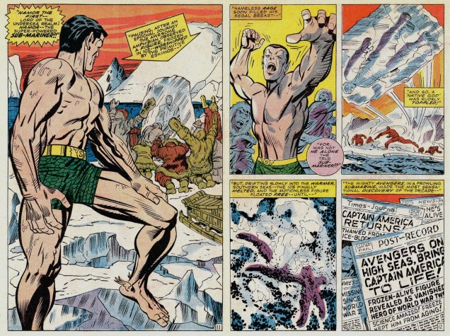
Namor goes all First Commandment on some poor Inuits (surely they’ve seen frozen bodies before?), displaying an unseemly level of insecurity for someone of his standing. This recap hails from King Kirby’s sensational feat of deadline rescue on the behalf of a tardy Jim Steranko (to be fair, it was worth the wait). George Tuska‘s inks are a surprisingly good fit! This is Captain America no. 112, Lest We Forget! (April 1969, Marvel). [ read it here!]My co-admin ds was just telling me yesterday about a client who, upon remarking to a succession of winter-kvetchers that actually, we’d had a pretty mild January, was invariably met with goggling bafflement, as if he’d just then grown a second head. In related news, it was just announced that said month of January was, indeed, the planet’s warmest on record. There is, naturally, an xkcd strip about this sort of circular denialism.
Some folks seem to display a knee-jerk reaction to the legacy left behind by men and women who lived decades ago: that of condescension. Surely, if it was something that our grandparents believed in, something that made their imaginations soar or intrigued them, by now it’s no longer relevant or just utterly jejune. Frankly, I’d poo-poo this repulsive straw-man I’ve just erected, if it wasn’t for the fact that these narrow-minded airheads actually do live among us. “I’ll listen to music from before my time when today’s musicians stop releasing such excellent music”, somebody daft once opined, and the same (ahem) logic seems to be apply to other forms of culture. If TV shows from two years ago are ancient (overheard at a restaurant), what can we possibly think of comics from 70, 80 years ago?
As you probably noticed, this blog suffers from no such delusions: there’s plenty of intelligent, touching, excellent-all-around material to be dug up from (in this instance) the Golden Age.
Sorry about the varying quality of the images; some of these stories have been reprinted in recent years (and thus, thoroughly cleaned up, or even lovingly restored from original art); and some of them are only available in the original form, which is to say shoddily printed, dubiously coloured, and not all that well preserved. The Golden Age was, as I noted previously, a long time ago…
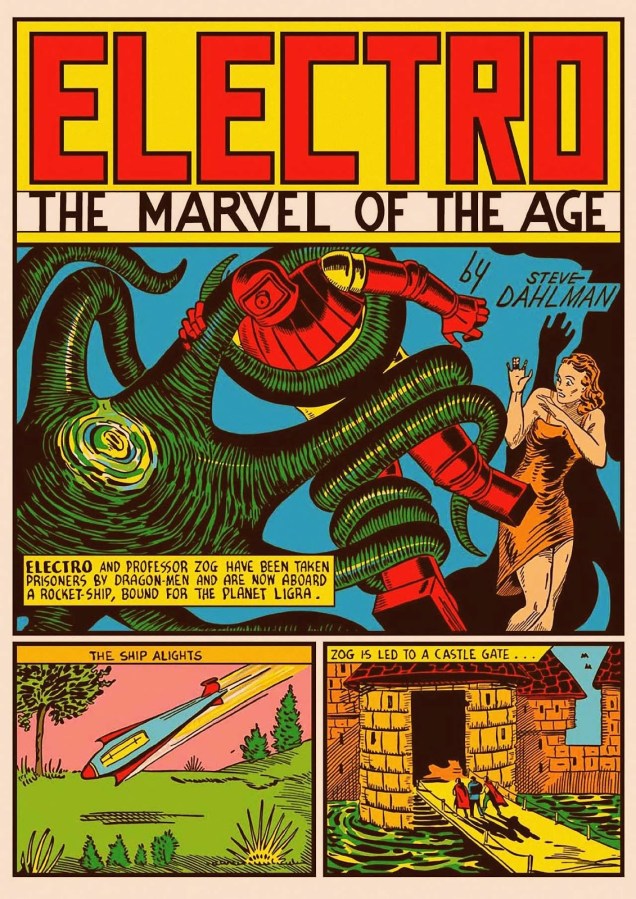
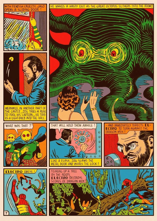
All right, let’s begin! I have a few favourites in this post, and our first story is one of them. I had access to a pristine, cleaned up, painfully white-papered version of it from Golden Age Marvel Comics Omnibus no. 1 (2009), but I by far prefer the following version, which keeps the colours, shall we say… less blinding? This is On the Planet Ligra, originally published in Marvel Mystery Comics no. 9 (Marvel, July 1940). It is scripted by Steve Dahlman, who did a very nice job of it, too. It’s worth a read in its entirety; find it here.
The next few pages demonstrate the dodgy printing I was referring to earlier…
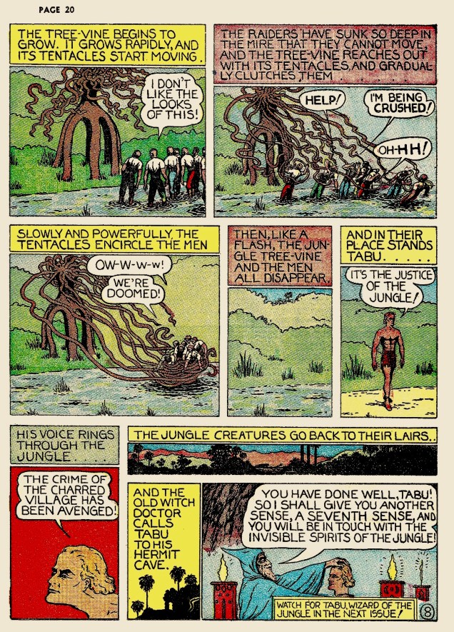
Slave Planet is scripted by Herman Bolstein (as Starr Gayza; what a nom de plume!), and illustrated by Arthur Peddy, possibly with some help by Will Eisner on inks. Published in Planet Comics no. 4 (Fiction House, April 1940). Incidentally, we have a whole bevy of Fiction House Tentacles at Tentacle Tuesday: Planet of Tentacles, courtesy of Fiction House.Mystery of the Vanishing Men, published in The Red Comet no. 8 (Fiction House, September 1940), is illustrated by Alex Blum.Another page from Mystery of the Vanishing Men.
This next part I like a lot, because I’m quite fond of Henry Fletcher, Barclay Flagg and perhaps even Hank Christy. These are all the same person, of course: Fletcher Hanks, The Most Bonkers Comic Book Creator of All-Time, according to Mark Peters. For now, let’s just look at some tentacles, although I will doubtlessly return to this theme at some later juncture.
Because of Fletcher Hanks’ relative cachet, comic scholars and restorers seem to have paid a little more attention to his work of late, and at a result, we can admire the two following pages in all their mighty crispness.
A page from Stardust « featuring the Octopus of Gold!», published in Fantastic Comics no. 16 (Fox, March 1941), scripted and illustrated by Fletcher Hanks. The Slave Raiders is scripted and illustrated by Fletcher Hanks. It was originally published in Jungle Comics no. 1 (Fiction House, January 1940).
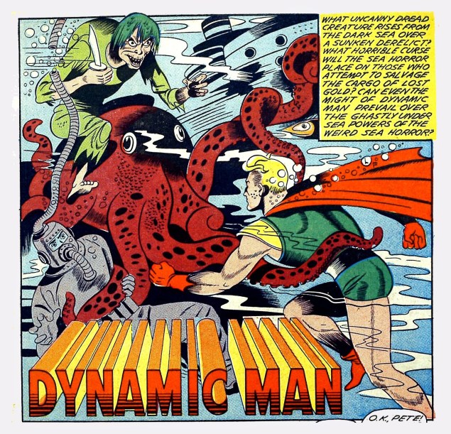
Getting off the Hanks bandwagon, we move into nonetheless enjoyable territory with Dynamic Man. These panels are from an unnamed story (with matching unknown artist ) published in Dynamic Comics no. 9 (Chesler/Dynamic, 1944).
This has no tentacles, but I enjoyed these two panels far too much to not share: the guys’ New Yawk accents, and the witch’s demented rictus (not to mention that it’s all happening underwater).How many more rhetorical questions are you going to ask us?
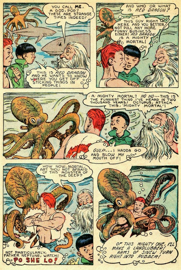
Last but not least, as boring people say, is my second favourite of today’s post, both because I love the art and because the story gave me something to sink my teeth into. .
Super-Magician Comics vol. 5 no. 8 (Feb-March 1947), cover by Edd Cartier. Dig the guy’s dopey, sneezy expression… contrasted with the octopus’ hypnotic stare.
Twilight of the Gods, the cover story, is also illustrated by Edd Cartier. It’s surprisingly nuanced, doesn’t fall into horrible stereotypes despite the presence of several Chinese characters, and even has an interesting moral. Read it here.
Next week, I’ll return to my usual diet of the Latest Published Thing as well as superhero crossovers! Just kiddin’.
« Some men are like flies… without a plan – without direction… they flit restlessly about the world… escaping one danger… and another… only to fall into the spider’s web… » — Bleak’s prospects are grim (Jan. 4, 1948)
Here we are, making our way through Kitchen Sink’s valiant chronological reprinting of Eisner’s post-WWII The Spirit, namely strips from December 1947 to December 1948; still at the peak, with a bit of fatigue on the horizon. At any rate, this particular vintage inspired a score of the master cartoonist’s most sublime new covers… as you’ll witness.
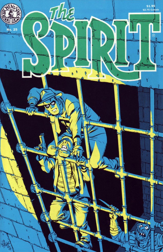
Kitchen Sink Press’ The Spirit no. 25 (Nov. 1986) cover-features Eisner’s famous and much-reprinted jailbreak saga, Slippery Eall (aka ARiver of Crime), originally published on November 30, 1947. The story features inmates bearing the mugs of Eisner studio contributors: letterer Abe Kanegson is Bellows; penciller-inker Jerry Grandenetti is Dapperish; and Eisner himself is Slippery Eall. Also in this issue: Death of Hugo (Dec. 7, 1947), Snow (Dec. 14) and Christmas Spirit of 1947: Joy (Dec. 21). Cover by Will Eisner. Cover colouring by Pete Poplaski.
Speaking of the slammer, Eisner muses sardonically on the cartooning life: « Working in this field is a very, not lonely, but solitary life. All of us come to realize how many hours we’ve been chained to the drawing board. We used to talk in the studio about how if we were sent to jail, it wouldn’t make any difference. We could still turn out comics and our lives would not be a hell of a lot different. »
Here’s that celebrated opening splash, from its appearance in Will Eisner’s 3-D Classics featuring The Spirit no. 1 (Dec. 1985, Kitchen Sink); get those glasses out!
From Dave Shreiner’s ongoing talk with Eisner, published in The Spirit no. 26‘s Stage Settings column: “Eisner has always been a functionalist, rarely a decorative artist producing something for its beauty alone. He is a powerful artist in that nearly every device he uses serves more than one purpose. With a bit of prodding, he took issue with the seemingly prevalent attitude among comic book artists that splash pages serve as a second cover to a story: there for decoration and enticement, but redundant to the story.”
Eisner: « A lot of the artwork done in this field is for a kind of personal satisfaction. It’s used to display artistic muscle, rather than confining itself to an artistic purpose. I believe a lot of artists fear addressing themselves to a purpose because they’re afraid that the showiness, or dazzle dazzle of their artwork, will probably be diminished.
Consequently, they feel the approval level, the applause meter, will fall off somewhat. We’ve talked before about one of the problems facing artists in the comic book field being that their work is judged essentially on the physical appearance of it. It’s the artwork, rather than the content. That fact contributes to comic books being looked down upon. »
This is The Spirit no. 26 (Dec. 1986), and it brings us ‘Umbrella Handles’ (Dec. 28, 1947); The Name Is ‘Powder’ (Jan. 4, 1948); The Fallen Sparrow (Jan. 11, 1948); and Just One Word Made Me a Man (Jan. 18, 1948). Colours by Pete Poplaski, grey toning by Ray Fehrenbach.This is The Spirit no. 28 (Feb. 1987), and it features Life Below (Feb. 22, 1948); The Return of Roger (Feb. 29, 1948, evidently, like 2020, a leap year); The Strange Case of Mrs. Paraffin (Mar. 7, 1948); and War Brides (Mar. 14, 1948). Colours by Pete Poplaski, grey toning by Ray Fehrenbach.
On the subject of the inspiration behind cover-featured Life Below, Eisner explains: « I was trying to find a unique, or exciting and startling setting within a normal situation. It always intrigued me that cities, particularly New York City, had miles and miles of catacombs under the streets. People doing city stories frequently overlook the potential of them. Underneath the city are layer after layer of story material. »
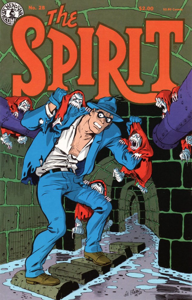
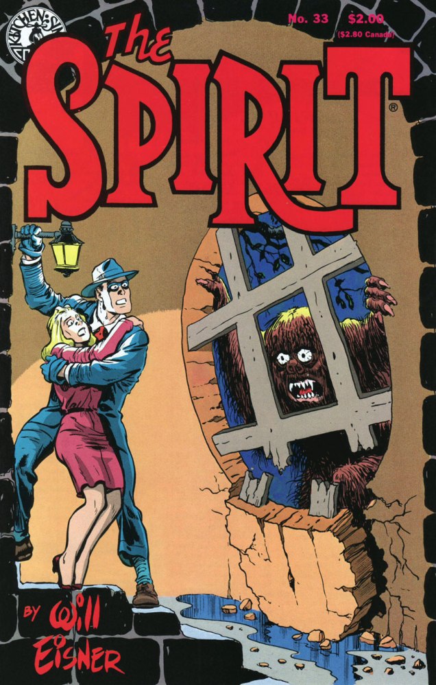
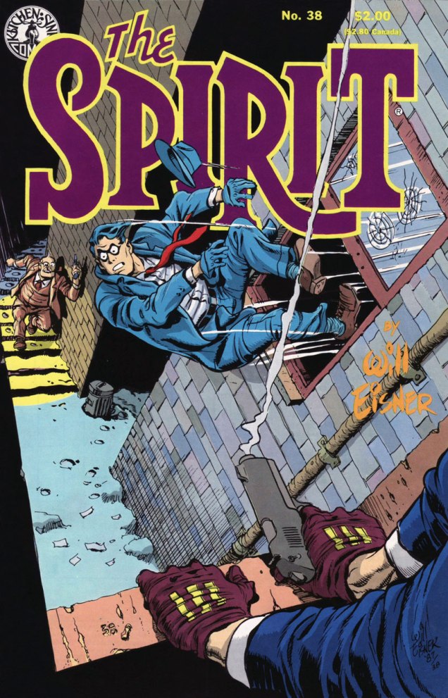
This is The Spirit no. 31 (May 1987), featuring The Last Hand (May 16, 1948); Assignment: Paris (May 23, 1948); The Emerald of Rajahpur (May 30, 1948); and The Guilty Gun (June 6, 1948). Colours by Pete Poplaski, grey toning by Ray Fehrenbach.This is The Spirit no. 33 (July 1987), featuring The Springtime of Dolan (July 11, 1948); Barkarolle (July 18 1948); cover-featured The Thing (July 25th, 1948), an adaptation of Ambrose Bierce‘s short story The Damned Thing and quite the Jerry Grandenetti showcase; and The Eisner Travel Agency (Aug. 1st, 1948). Cover colours by Dave Schreiner.This is The Spirit no. 35 (Sept. 1987), comprising cover-featured The Story of Gerhard Shnobble (Sept. 5, 1948); Cache McStash (Sept. 12, 1948); Lorelei Rox (Sept. 19, 1948); and Ace McCase (Sept. 26, 1948). Cover colours by Ray Fehrenbach. That poor Mr. Schnobble (the little flying guy with the grin and the bowler hat)… his is among the most tragic fates in comics.This is The Spirit no. 36 (Oct. 1987), and it brings cover-featured Tooty Compote (Oct. 3, 1948); Gold (Oct. 10, 1948); Nazel B. Twitch (Oct. 17, 1948); and Pancho de Bool (Oct. 23, 1948). Cover colours by Ray Fehrenbach. Striking shadow effects: the KS production team sure knew how to make the most of the relatively primitive mechanical means at its disposal.This is The Spirit no. 37 (Nov. 1987), and it hits us with Halloween (Oct. 31, 1948); cover-featured Plaster of Paris (Nov. 7, 1948); The Chapparell Lode (Nov. 14, 1948); and Quirte (Nov. 21, 1948). Cover colours by Ray Fehrenbach. Note the witty symmetry of the matching KS logo, top left.This is The Spirit no. 38 (Dec. 1987), which lands expertly and rolls with The Amulet of Osiris(Nov. 28, 1948); cover-featured The Coin (aka Stop the Plot!, Dec. 5, 1948), an action-packed humdinger featuring the return of The Octopus; Two Lives (Dec. 12, 1948); and Christmas Spirit of 1948 (Dec. 19, 1948). Cover colours by Ray Fehrenbach. A dizzying honey of a cover.
Past this juncture, the strip’s slow, inexorable decline commences, and the covers reflect that fact. But not to worry: Eisner was a consummate pro, and the rest of the run is not without its gems. Besides, I’ll be cherry-picking ’em for you.
If you’ve just arrived at the intermission, fret not: take your seat and relax, here’s what you missed so far :
… or point your clicker on our general category, That’s THE SPIRIT!, and summon the lot at once… but in reverse chronological order; that’s the minute toll this dab of convenience exacts.
Today’s installment of Tentacle Tuesday provides us with another healthy dose of tentacles of a vegetal nature. With my co-admin RG’s blessing, I decided to be a little unorthodox and instead of my usual piecemeal approach, share one single story.
I must admit to having no rapport whatsoever with Star Trek – I did not watch the show as a child (or as an adult), and haven’t even managed to pick up characters, plot lines or cultural references from the surrounding atmosphere, aside from the stuff *everybody* knows.
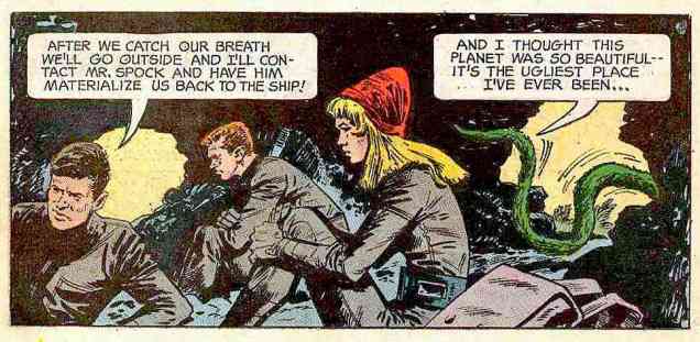
But The Planet of No Return (published in Star Trek no. 1 (October 1967, Gold Key), scripted by Dick Wood and illustrated by Nevio Zeccara) is a delight for any keen child who’s ever been mesmerized by the notion of a carnivorous plant and has carried that love through the years into adulthood. I’ll hold my hand up there! It’s also right in the sweet spot of a Venn diagram, the riveting intersection of “interested in Venus flytrap plants” and “fascinated with tentacles”. I’m not featuring the full story (you can read it here), preferring to tantalize my audience with the many tentacle-laden panels of grabby, aggressive human-devouring plants.
Incidentally, “cannibal plant” is a misnomer (shame on you, Pavel Chekov!) – cannibals involve individuals consuming individuals of the same species.
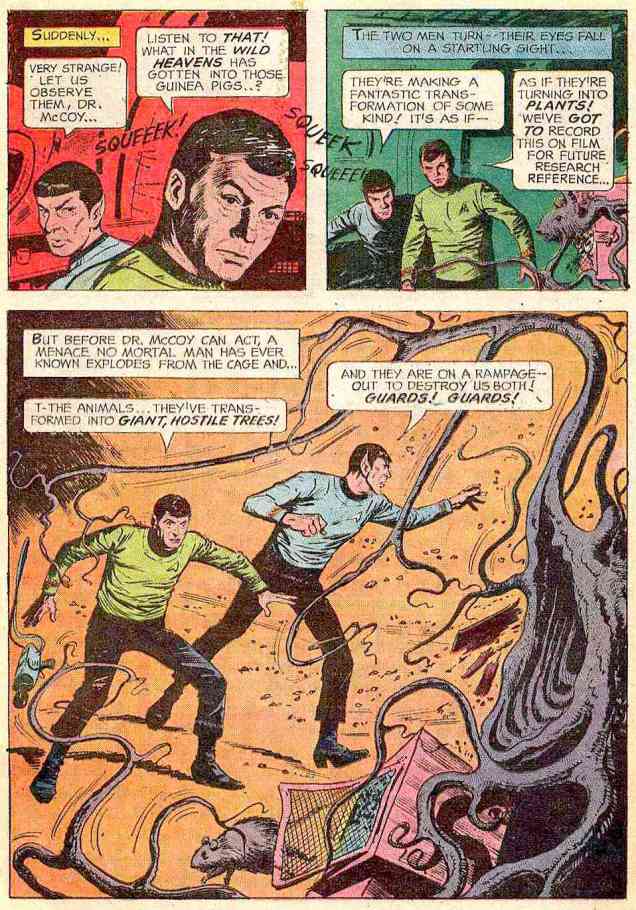
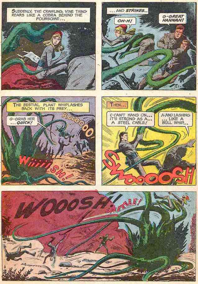
It all starts with some strange plant spores sucked in through the ship’s ventilation system while it’s drifting next to an unexplored planet…
The ship gets teleported to the planet to pursue their original exploration mission as planned… and get almost eaten by a tentacled “cannibal” (once again, not actually a cannibal) plant. A “giant plant tree”, strangely mobile, saves them from this worse-than-death fate… and turns out to have been Hunt, one of their teammates transformed into plant life by spores. No, I don’t know who Hunt is, either – he’s certainly not on the official Star Trek character list, introduced seemingly to be promptly killed after performing his heroic deed.
Well, okay, if the plant tried to eat a tree, maybe it is, technically, a cannibal.
The now four-people team (the fifth one, Hunt the tree, dies after his epic battle with the Cannibal Plant) continue further into the wilderness… and stumble across a village of sentient plants, who don’t take kindly to intruders. Geez, can you blame them?
After shooting at (and presumably maiming) various denizens of the plant village, the humans retreat to a cave and conclude that this planet is ugly. Sentient plant life is not amazing enough for them, apparently. I suppose being part of Star Trek makes one really blasé about such things.
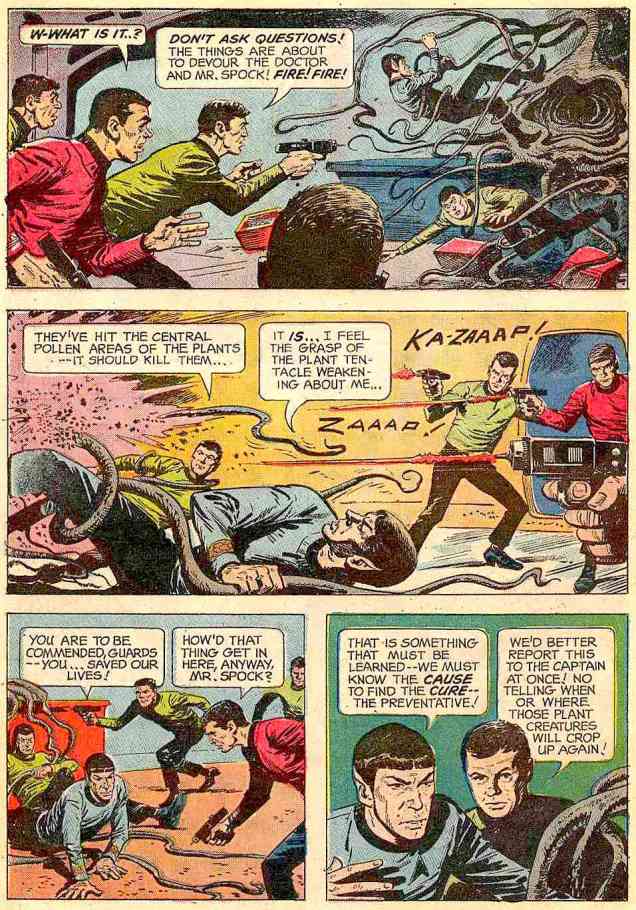
Janice Rand has it coming for being annoying and whiny…
At this point, we’re more or less done with tentacles, but I can’t leave you on this cliffhanger (especially if you don’t have some time to waste reading a comic of questionable taste).
Here’s how it ends:
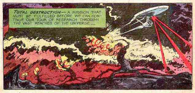
What does this “bestial plant” want with Janice? It wants to put her into a cattle pen, of course! Aiming to rescue her from its clutches, our intrepid explorers break into the pen, and, observing the landscape, conclude that the plants are raising dinosaur-like creatures who consume vegetable-type plants. «The lower plant life on their social scale are used as fodder… food for the beast creatures! Vegetable food!» Oh, and «The vegetables are alive – they’re making sounds also!» So sentient plants are farming animals whom they feed on other sentient plants. (At this point, I was muttering “what is wrong with this comic?”) It turns out that the superior plants eat the animals, who eat the inferior plants, and Janice is now one of the cattle, about to be sent into the giant trees-cum-slaughter-houses to be transformed into food. During the climax of the story, the slaughterhouse trees are blown to smithereens by Mister Spock and his laser beam destruct ray (it’s automatic, it’s systematic, it’s hydromatic), and everybody is teleported back into the relative safety of the ship. The surface of the planet (a.k.a. “hideous little globe”) is then obliterated by laser beams – just in case.
So how come only Hunt got transformed into a tree? Are we to assume that the other members of the team are immune?
« It’s wisest always to be so clad that our friends need not ask us for our names. » — James Fenimore Cooper
(Being a compendium of fashion faux-pas and various sartorial eccentricities.)
Now here’s a figure shrouded in mystery (and little else): Captain Wizard, whose sole appearance was on the cover (and not enough of it) of Atomic Bomb no. 1 (Gerona/Jay Curtis, 1946), a scarce one-shot. Artist unknown, regrettably.
What are this intriguing man of (relative) mystery’s abilities, aside from autonomous flight, quasi-nudity, bountiful love handles and a snazzy roué moustache? Did he “scare straight” hapless criminals with his sweaty, virile bear hugs? Sigh… I fear we shall never truly know. He’s in the public domain, the gent’s overdue for a revival!
I suppose there are many ways to compete for the prized title of « Most outré criminal Batman and Robin have ever encountered » (awarded every other year in October at Gotham City Hall; call 608-555-1313 for reservations): powers, weapons, motivations, henchmen, moniker, targets, modus operandi…
The Killer Moth made his play for the brass ring by donning the most garish and unsightly garb imaginable. Here he is making his début in Batman no. 63 (Feb. 1951), The Origin of Killer Moth! This sorry buffoon’s inception is credited to Bill Finger, Dick Sprang and Lew Schwartz, presumably to dilute the blame.
Of course, it’s unfair of me to pick on Killer Moth’s costume. I’m sure he took full opportunity to hone and refine his look over the next couple of decades. Plenty of down time to mull things over at his leisure in the clink, right?
To precious little avail, apparently. Here he is a quarter century on, in Batman Family no. 10 (April, 1977); his wings have arguably been upgraded to a cape, but he’s still evidently daltonic. Cover by Bob Brown and John Calnan. Sadly, this was some of veteran Brown’s last published work; he passed away from leukaemia in January, 1977.
Another entry from the closet of shame. His Very Name Invokes Terror… among the dandies of the Serengeti, who blanch and quake at the notion of being seen in public with him. However, that headgear of his reportedly drove Sir Elton mad with envy.
Showcase no. 66 (Jan.-Feb. 1967), The Birth of B’wana Beast, pencilled (and possibly scripted, but who’d admit it?) by Mike Sekowsky and inked by George Roussos. Edited by George Kashdan… who was unceremoniously relieved of his editorial duties after a mere two Showcase issues, both featuring B’wana Beast.
With Jack Kirby and Steve Ditko having decamped (not to mention Stan futilely slouching towards Hollywood), Marvel in the early 70s had not only lost its visionary plotters, but also its ace character designers.
Also, after 30 years or so of men in suits and hats, it was deigned that the younger and hipper generation should have characters whose wardrobe bore at least a tangential relationship to its own.
Created for the 100th issue of Daredevil by scripter Steve Gerber and penciller Gene Colan (who ended his initial long run on the title with that issue; was Angar the final straw, or was it the even more wince-inducing toadying to Jann Wenner?), Angar the Screamer was, to quote the amaranthine words of Wikipedia, « … born in San Francisco, California. He became a hippie and a radical social activist. He volunteered for an experiment that endowed him with sonic powers that caused people to hallucinate. » Groovy. Perfect for… 1973?
If anything, we can be grateful that Angar’s colour scheme is relatively restrained. I suppose it makes sense for a flower child to opt for earth tones. This is the concluding, cliff-hanging panel from Mind Storm! (Daredevil no. 100, June, 1973). Pencils by Gene Colan, inks… nay, “embellishments” by John Tartaglione. Read that, er… masterwork right here.Poor DD’s saddled with calves thicker than his thighs. Cover art by Rich Buckler and Frank Giacoia, with the usual fussing and turd polishing by John Romita Sr..
This is Angar’s first cover appearance, Daredevil no. 101 (July 1973), in a tale that could only be called… Vengeance in the Sky With Diamonds!
There *are* indeed tentacles within, so you’ll likely encounter these, some enchanted Tentacle Tuesday…
By now, we have surely established that in the compendium of made-up monsters, tentacles are an artistic short-cut for evoking an especially terrifying creature. As it turns out, if there’s one way to make an already spine-chilling abomination even scarier, it’s to equip its gaping maw with teeth. Be it fangs borrowed from some unfortunate vampire, the implausibly symmetrical dentures of a TV show host, or clearly carnivorous, sharkish chompers, artists have been inserting teeth where no teeth should be long before you or I were born.
« But Grandmother! What big teeth you have! », once quipped Little Red Riding Hood in the 19th century, and this fear of teeth has clearly followed us into the Modern Age.Take a look —
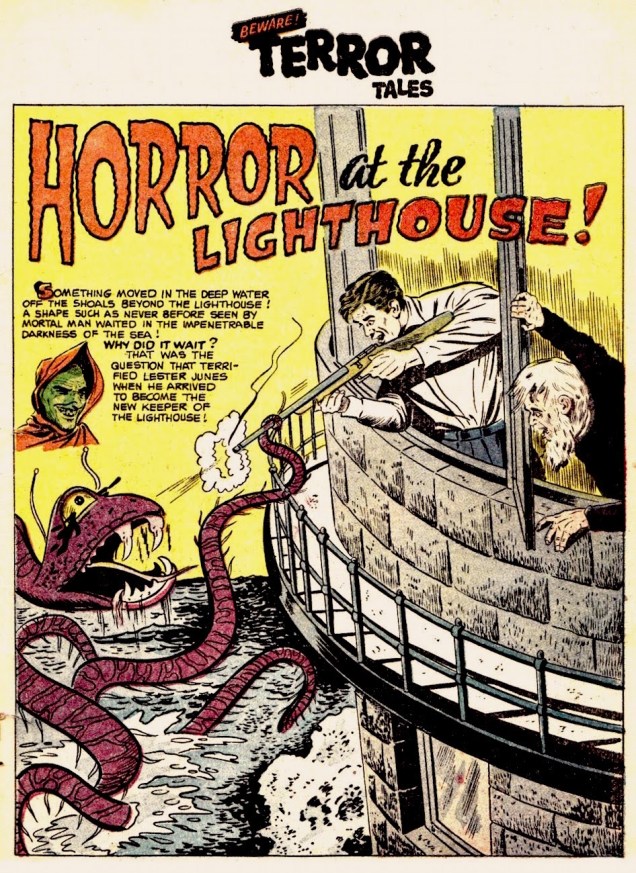
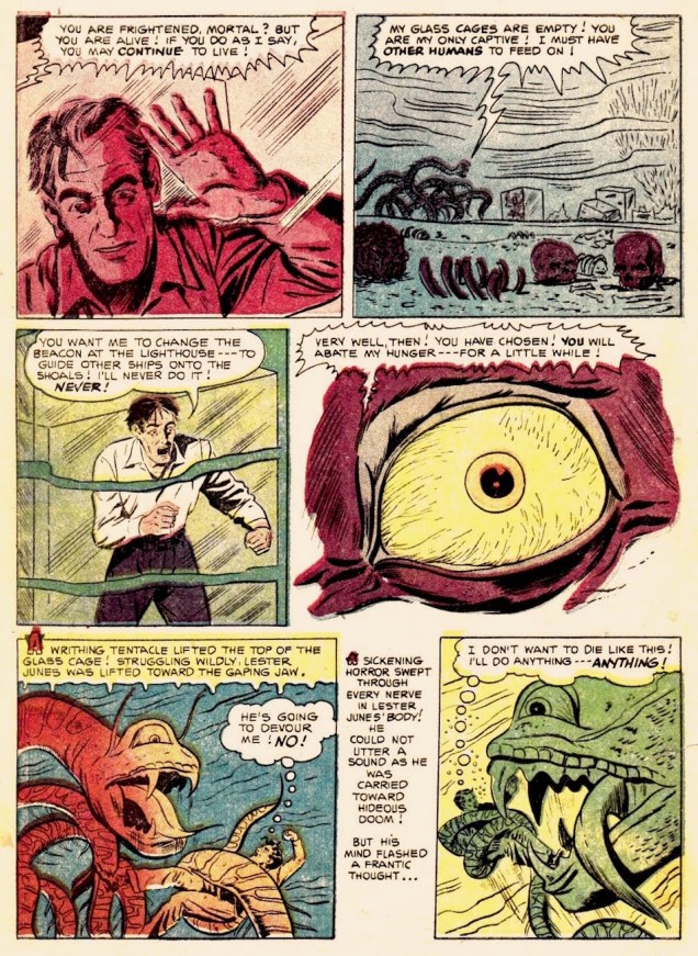
Sheldon Moldoff was probably thinking of a snake’s fangs when he came up with this cutie:
A page from Horror at the Lighthouse!, published in Beware! Terror Tales no. 6 (Fawcett Comics, March 1953). Scripted by Bill Woolfolk, drawn by Sheldon Moldoff. Read the full story at The Horrors of It All.
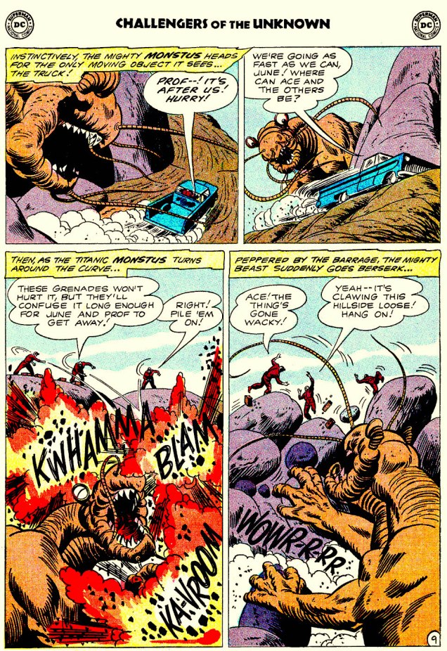
This cross between a dinosaur and a mole (or is that more of an ant?) boasts an enviable set of sparklingly white dentition:
Challengers of the Unknown no. 22 (Oct-Nov 1961), cover by Bob Brown.Aw. You’d go “wacky”, too, if some jerk piled on grenades on you.
One thing you can say about tentacled monsters, it’s that they sure keep their denticulations (yes, it’s a word) impeccably clean. Maybe they choose their victims based on that, like cats gleefully enjoying the crunch of a good teeth-cleaning croquette?
Holy crap, look at those white chompers (that are about to get a little marred with blood, gristle and whatnot)! Weird Mystery Tales no. 9 (Dec 1973 – Jan 1974), cover by Luis Dominguez.
On the other hand, some monsters could have used a set of braces (this one is an orphan, which is why it had to make do with a British set of teeth).
Eerie no. 131 (June 1982), cover by Rudy Nebres. Can you imagine trying to chew anything with such a set?!
A somewhat similar (but a lot less overcrowded) set of ivories for gnawing and gnashing can be spotted in water:
A collectible card (from sometime in the 2000s) by illustrator Chet Phillips.Here you can admire his series about Japanese monsters, or visit his website, chetart.com.
This toothy post is now at its end – happy brushing (and flossing — it’s important!) to all, and ’til next Tentacle Tuesday!
~ ds
p.s. Not particularly related to comics, but I found this photograph distinctly on the side of scary:
Captioned « Women in London sit down for express teeth whitening ». I think they’re about to be transformed into aliens, or contaminated with some deadly germ, or perhaps just burnt to a crisp by some mysterious rays. Have I been reading too many comics?
« … Out behind a tree there jumped a great bighungry wolf
‘Pardon me’, he said, real cool ‘Why make the scene alone? A crazy chick like you should have a handsome chaperone’ » — Ridin’ Hood (The Coasters, 1962)
It could be quite convincingly claimed that Jean Ache (1923-1985, né Jean-Baptiste Huet in Le Havre, France) was the most versatile, chameleonic artist of his generation. Not only was he able to accurately adopt any style he chose, “high” or “low”, but he also wielded a panoply of styles of his own devising. To support my claim, take a peek at noted historian Henri Filippini‘s comprehensive survey of Ache’s career (in French), which includes a generous gallery of his multifaceted art. [ Part One ] and [ Part Two ]
From 1971 to 1973, near the end of René Goscinny‘s enlightened regime (his Astérix compèreAlbert Uderzo ably serving as art director), French bédé periodical Pilote featured a high-calibre series of “high art” pastiches. It was entitled Le Musée Pilote.
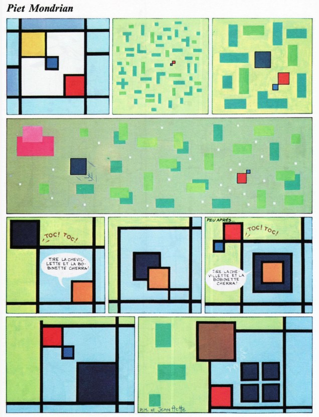
The pages of 1973’s PiloteAnnuel revealed an Ache tour de force, wherein he retold the classic tale of Little Red Riding Hood in comics format *and* in the style of a number (seven, to be exact… but not *the* Group of Seven) of famous painters. The set bore the following cheeky introduction: « Within the scope of the Musée Pilote, we came to realise that numerous artists had never tried their hand at comics. Thanks to our friend Jean Ache, it is now a done deal, and we are pleased to present the tryout pages crafted by these illustrious beginners. It is for you to decide whether these attempts are conclusive, and if these young people’s efforts should be encouraged. »
Here we go!
After Henri Rousseau (French, 1944-1910). Incidentally, « Tire la chevillette, la bobinette cherra » means « Pull the bobbin, and the latch will go up. »After Fernand Léger (French, 1881-1955).After Bernard Buffet (French, 1928-1999).After Pablo Picasso (Spanish, 1881-1973).After Giorgio de Chirico (Italian, 1888-1978).After Joan Miró (Spanish, 1893-1983). My first encounter with Miró came through this item; if I’d been hipper, it might have been this instead… but I was only six years old at the time.After Piet Mondrian (Dutch, 1872-1944).And here’s the cover. This is PiloteAnnuel 74 (no. 731 bis, Nov. 1973). It comprised, in roughly equal measure, a selection of the past year’s best work and new material.
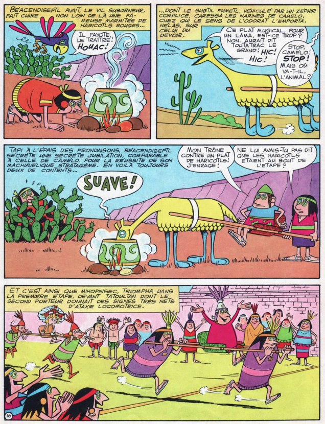
My initial brush with Ache came in the early 1970s and his short-lived Pastec (1968-70, 9 issues, plus one album). I only ever got my hands the album (« L’Agent secret chante à minuit », 1971), but I never forgot. Like many a childhood fascination, it came out of nowhere, then vanished.
A sample from Pastec no. 4 (January 1969, Société française de presse illustrée). The birdie is Psitti, Pastec’s loyal Ara; the Llama is Camélo; and Pastec himself is the displeased fellow with the green hat in the middle tier.
I honestly hadn’t planned to write two consecutive posts about nearly-forgotten French artists named Jean, but something else fell through… and here we are. Sorry!