Tentacle Tuesdays have been a fixture of this blog since the very beginning (which is to say September, 2017). I am not about to run out of material, but over the years I do tend to accumulate odd and ends that don’t neatly fit into a theme. Though I know of at least one faithful reader of this blog who doesn’t like it much when a TT entry is all over the place, hopefully there’s something in here for everyone. Just consider it the equivalent of spring cleaning in my archives!
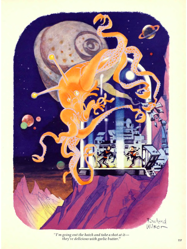
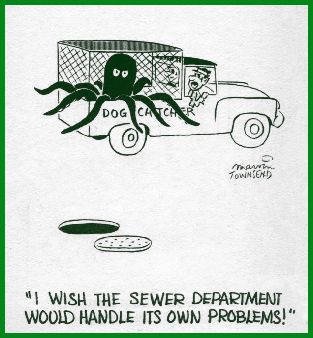
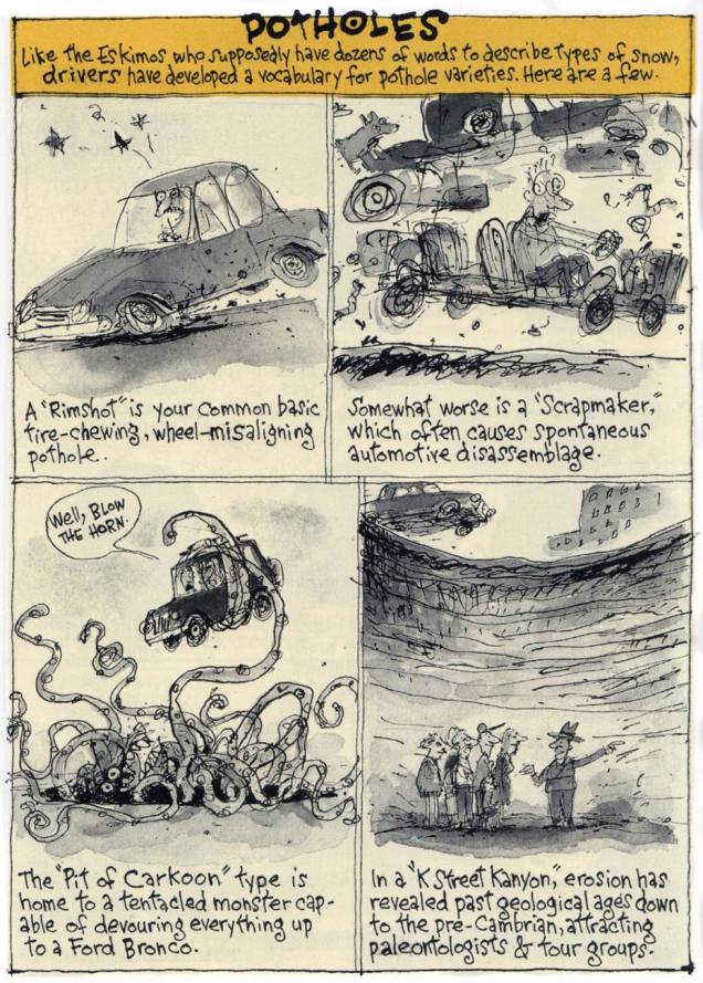
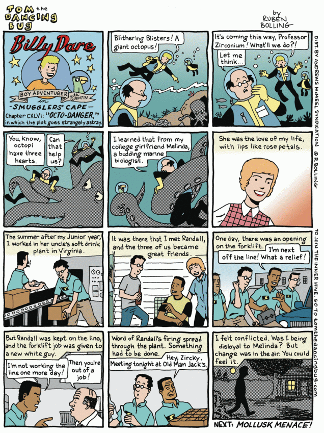
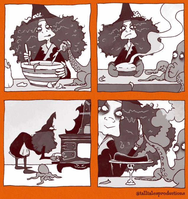
Panel from Treasure Chest Vol. 19 no. 6 (Nov. 21, 1963). Written by Dave Hill and illustrated by Fran Matera. Everybody in this panel is adorable, but the octopus is especially fetching, I think.A cartoon by Rowland Wilson, from Playboy‘s June, 1980 issue. Several tons of meat are going to need a lot of butter. It would be much more economical for the creature to eat the astronaut!The author of this charming cartoon is Marvin Townsend, the subject of a whole Halloween Countdown post by co-admin RG. That’s a bigger honour in this parts than being a Tentacle Tueday master, as TTs come around once a week, and the Halloween count-down takes place once a year (to be more precise, for 31 consecutive days and not one day more).This tentacled-monster-pothole was dreamed up by Richard Thompson and appeared in his Poor Richard’s Almanac. It would make being stuck in traffic jams a lot more entertaining, don’t you think?Customer Service Wolf is a hilarious comic strip by Australian illustrator Anne Barnetson, who has worked in a bookstore for long enough for have encountered all kinds of annoying customers. Anyone who has toiled in retail will know that most people are insane, but a bookstore is a backdrop for a very special kind of lunacy.Ruben Bolling‘s Tom the Dancing Bug can be pleasantly surreal. If there are tentacles involved, so much the better!I’ve been following British sculptress Caroline McFarlane-Watts and her company Tall Tales Productions for a while. She makes incredibly detailed sculptures of all sorts of things, most notably of witches and their ménage (take a discreet peek at their activities on her website, but be careful, they’re cantankerous old bats). McFarlane-Watts also draws, sometimes comics. This pink (take my word for it) octopus is a witch’s best pal!
Thanks for sticking around while I got things off my chest!
« In the sphere of thought, absurdity and perversity remain the masters of the world, and their dominion is suspended only for brief periods. » — Arthur Schopenhauer
If you were to query me as to my absolute favourite comic strip of the 1980s (just humour me!), I wouldn’t waffle one bit: it’s Sam Hurt‘s Eyebeam.
Oh, the Eighties were rightfully dominated by a trio of titans: Bill Watterson‘s Calvin and Hobbes, Berkeley Breathed‘s Bloom County and Gary Larson‘s The Far Side. While I’m fond of all three, I find C&H too repetitive to revisit, I can no longer quite relate to Bloom County and… I still treasure the Far Side. But it doesn’t quite inspire the same devotion I hold for Eyebeam above all.
As I noted just last week, certain subjects are just too dang daunting to tackle. Eyebeam is one of these thorny critters, thanks to its convoluted history, vast, nearly boundless cast of characters, constantly shifting form and focus… I won’t even try.
I have, however, devised an elegant loop-hole: In 1989, Hurt initially shelved Eyebeam after…
« taking an offer from United Feature Syndicate to start a new strip based on the Peaches character, Queen of the Universe. Hurt’s freewheeling style did not translate as well under the syndicated system, which was apparently hoping for a female Calvin character, and the latter strip was not a success. Hurt described the strip’s demise as the result of “a printing accident… [it] drowned in a sea of red ink. »[ source ]
Queen of the Universe lasted two dazzling years, and the strip’s entire run has thankfully been gathered into three handsome-but-affordable volumes and published by Hurt himself. These may be purchased directly from the distinguished artiste.
And if you’re unfamiliar with Mr. Hurt’s winningly peculiar brand of brilliance, here’s my sampling of Queen of the Universe (it wasn’t easy!), which includes some early Peaches appearances from Eyebeam. Someday I’ll screw up the reckless fortitude to delve into that sweet, singular quagmire… but this isn’t that day.
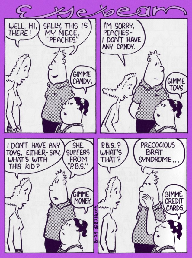
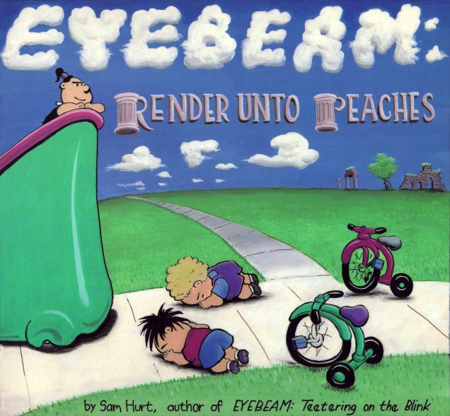
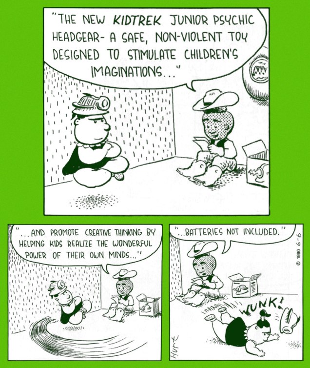
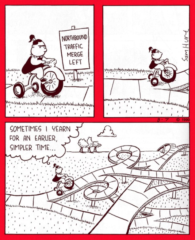
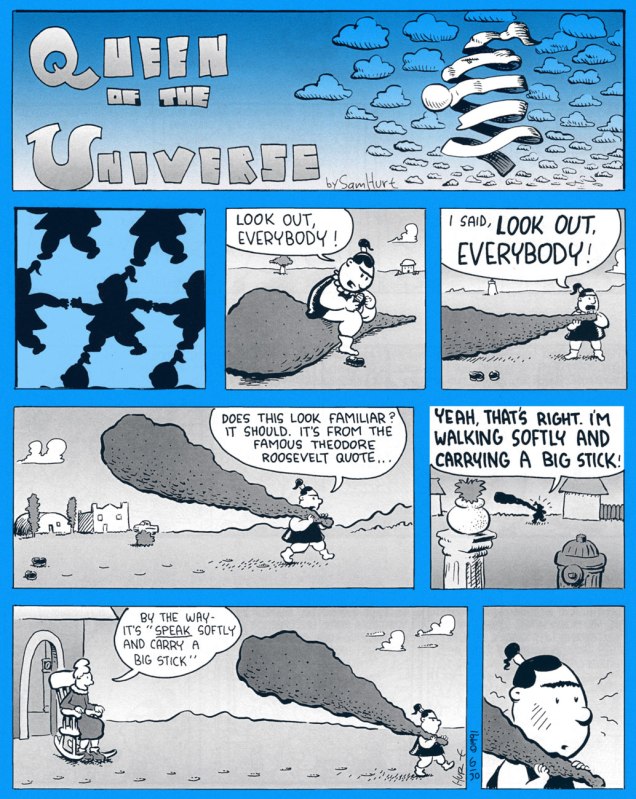
Peaches is introduced in Eyebeam (Aug. 25, 1983… t’was a Thursday)Somewhere down the line, Eyebeam’s old roommate (and Peaches’ uncle) Ratliff got saddled with his sister’s kids in presumably permanent fashion.By the time the seventh Eyebeam paperback collection (1988’s Render Unto Peaches, Texas Monthly Press) appeared, bossy Peaches had pretty much taken over the feature, as you can surely see.Hurt’s trademark surrealism smoothly carried over to his new feature. This is the March, 1991 strip.The second Queen of the Universe Sunday strip, from May 5, 1990.Peaches feeds this toothsome pet on ‘Purina Croc Chow’. From July 7, 1990.The bent utensils are, of course, a reference to discredited ‘psychic’ charlatan Uri Geller. His spoon-bending act was publicly and elegantly debunked by none other than James ‘The Amazing’ Randi, who gets his second mention on our blog this week. « If Uri Geller bends spoons with divine powers, then he’s doing it the hard way. » —James RandiI love how Sam Hurt leaves the question of Peaches’ great powers somewhat ambiguous. The cowboy is her best pal Kid Kareem.Peaches’ tricycle is an Electra 5000, obtained gratis through threatening to expose the IRS to some of the toy store owner’s “more creative accounting practices”. From Aug. 7, 1990.From July 23, 1990. Nice and deadpan, which must have baffled many a casual reader.Now and again, Peaches will flub one. Sunday strip from June 30, 1991.As ace newscaster Trish Tringle, Peaches never misses an opportunity to humiliate the neighbourhood’s ‘stupid boys’. Many a time has an ‘anonymous source’ or ‘concerned citizen’ alerted the authorities to some dodgy boyish shenanigans. From March 14, 1991.
It’s difficult to impress me with a magician, unless we’re talking real-life magicians with a strong skeptical streak, like James Randi or Ricky Jay. Given that the concept of a person who has access to ‘mystical’ forces and who can manipulate beings (supernatural or otherwise) has been around for as long as humans have been able to communicate with one another, be it through grunts and squeals, it’s pretty damn difficult to come up with a new wrinkle to this old tired nag. Having no previous experience with the series, I had no high expectations for Steve Ditko‘s Doctor Strange, but I was pleasantly surprised. I liked the earnest, solemn Dr. Strange from the beginning, but it’s Ditko’s mind-boggling, soaring surrealistic landscapes that bloomed over time that really impressed me. It’s not an easy feat to make the reader feel like he’s being transported into another dimension, but Ditko pulled it off beautifully, making us feel Dr. Strange’s disorientation as he gets sucked into yet another psychedelic terrain.
The Dr. Strange stories of the 1960s constructed a cohesive cosmology that would have thrilled any self-respecting theosophist. College students, minds freshly opened by psychedelic experiences and Eastern mysticism, read Ditko’s Dr. Strange stories with the belief of a recent Hare Krishna convert. Meaning was everywhere, and readers analyzed the Dr. Strange stories for their relationship to Egyptian myths, Sumerian gods, and Jungian archetypes.
What does this have to do with the current post? Precious little, actually. I’m a firm believer of not recycling dramatis personae past their due by date (defined, of course, as that time when their creator/author moves on to greener pastures, by design or because he has to). Doctor Strange moulded by other hands loses his raison d’être and becomes just another Joe in a funny cape, uttering ineffable, paranormal gobbledygook. Oh, sure, he’s aided by more mystical artifacts than before. How exciting… if you are excited by gadgets and gimmicks, that is.
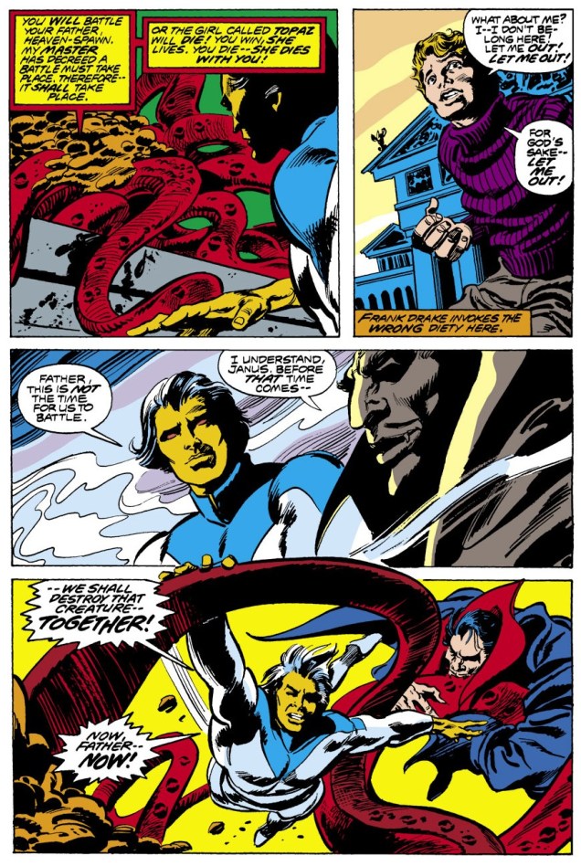
He also encounters a lot of tentacles, apparently the most mystical, otherworldly apparitions *this* crew could think of. Welcome to 70’s (for the most part) Doctor Strange!
Marvel Premiere no. 6 (January 1973). Cover by Mike Ploog and Frank Giacoia.
The Shambler from the Sea is scripted by Gardner Fox, pencilled by Frank Brunner, and inked by Sal Buscema and Ralph Reese:
Dr. Strange no. 1 (June 1974). Cover by Frank Brunner.
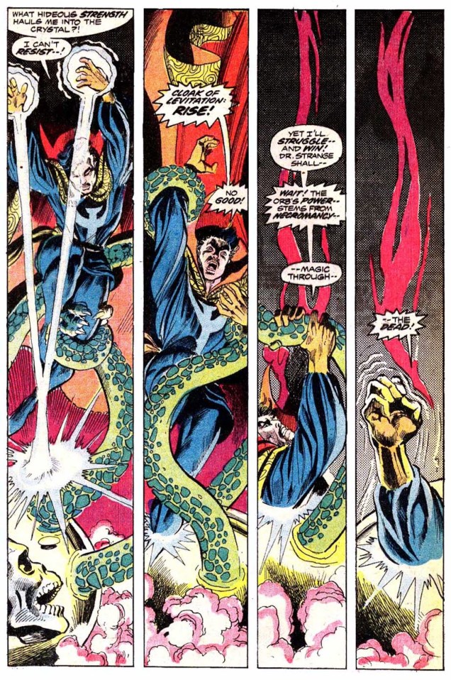
Through an Orb Darkly is scripted by Steve Englehart and Frank Brunner, pencilled by Frank Brunner and inked by Dick Giordano:
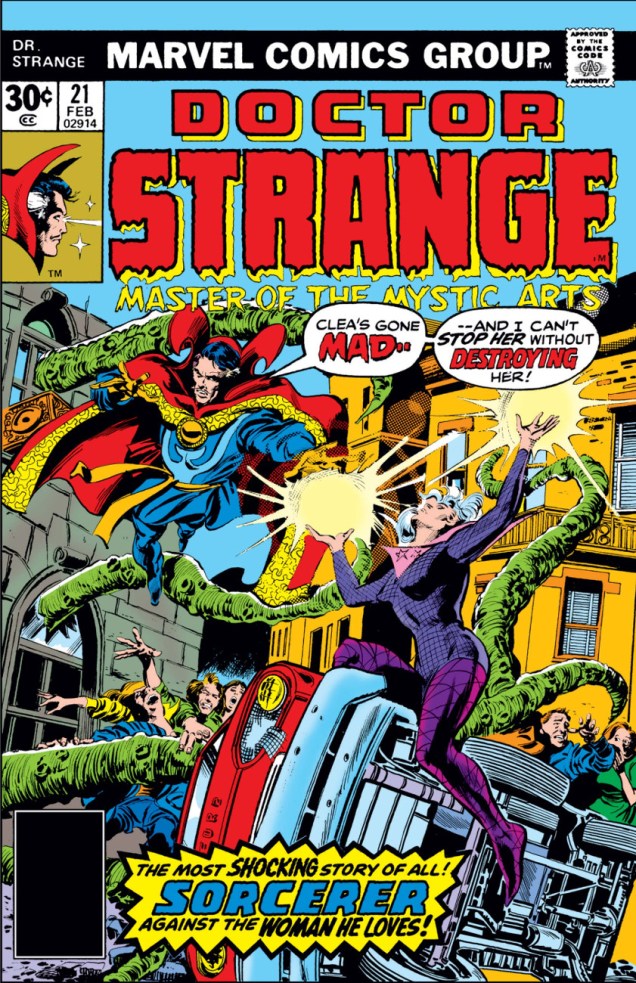
Doctor Strange no. 21 (February 1977). Cover pencilled by Gene Colan and inked by Tom Palmer. Is Clea basically humping the (impeccably, gleaming clean) side of the car, basically?
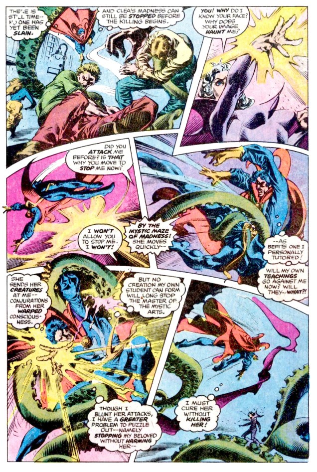
Mind Trip!, scripted by Marv Wolfman and drawn by Rudy Nebres, was published in Doctor Strange no. 22 (April 1977):
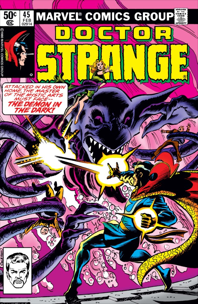
That’s quite a group scene *slurp slurp slurp*“Why does your image haunt me? Why are my boobs perkily gravitating towards the light?” I can’t even muster a passing interest in figuring out what’s happening in this mess.Doctor Strange no. 23 (June 1977). Cover pencilled by Gene Colan and inked by Tom Palmer.Doctor Strange no. 30 (August 1978). Cover by Frank Brunner.
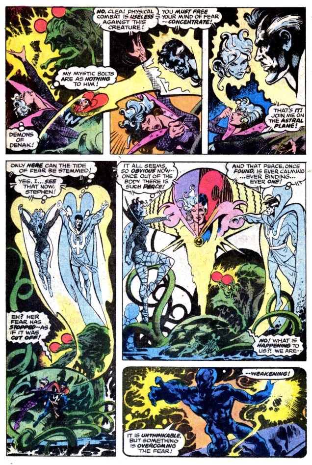
A Gathering of Fear! is scripted by Roger Stern and illustrated by Tom Sutton:
« It is the beginning of wisdom when you recognize that the best you can do is choose which rules you want to live by, and it’s persistent and aggravated imbecility to pretend you can live without any. » — Wallace Stegner
It’s funny how, closing in on 300 posts, I’m only getting around to discussing some of my very favourite series. As my co-conspirator ds points out, these are far harder to do justice to.
Many of these were abject commercial failures, but providential glimpses into fully-formed universes we must leave forever unexplored save in our dreams. In the eighties and nineties, Fantagraphics were particularly courageous in following up on their principles (explicitly elaborated upon in the pages of The Comics Journal) and publishing material for which there wasn’t much of an obvious market. For instance, the four issues of Jim Woodring‘s pre-Frank anthology, Jim. Still my favourite work of his… but a definite commercial non-starter.
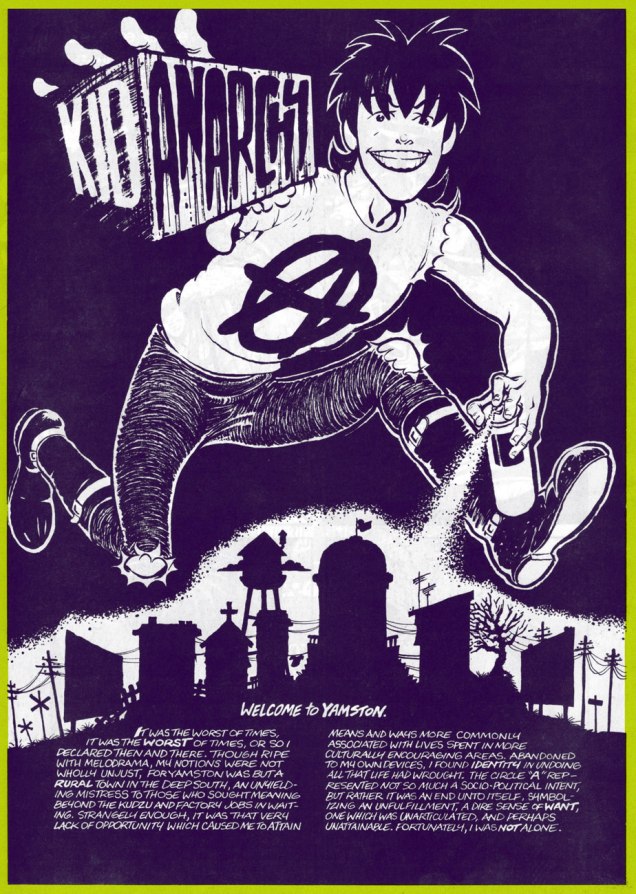
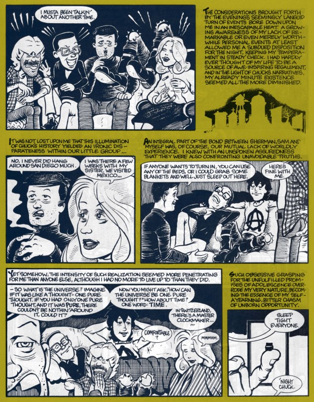
Meet Tommy Delaney, alias Kid Anarchy. This is Kid Anarchy no. 1 (Mar. 1991, Fantagraphics). Colours by Roberta Gregory.
He’s not really an anarchist, you know. This amusingly led an overly literal-minded, self-styled hardcore aficionado (from the nerve centre of American Punk, Monroe, LA) to testily complain to the authors: « Where do you get off calling your lame comic ‘Kid Anarchy’?!! Yup, I thought for sure this might have something to do with Anarchy, hardcore, social and political matters and so on, but what does it turn out to be? A deadbeat story about a bunch of rednecks sitting around a house. You guys suck! Why don’t you get your shit together and do something you understand, like a story about two posers wanking each other! Get a life! »
Ah, but Kid Anarchy could have been utter offal… had it conformed to that (mis)reader’s expectations. Anyway, see for yourself.
In full, the sequence that introduces our players. From Kid Anarchy no. 1.Trading tales of youthful escapades until the wee hours, also from the first issue. Worth noting is the complementarity of the narrative and the dialogue, always a plus for this reader.Let’s head over to Sears and sit for a group portrait, from the back cover of the inaugural issue.
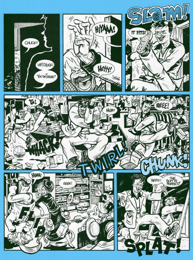
Two non-consecutive pages from a favourite sequence about the joys of grease. I no longer indulge in cheap-o burgers these days, but I get the same thrill from a paper bag full of samosas. One of the Kid’s wiser moments. The “goodness within”, indeed! Too bad he ends up accidentally leaving his “greasy-ass bag” behind in Sam’s van.Nina gets her cover spotlight, showing us a glimpse of Pandemonium’s tatty arrière-boutique. This is Kid Anarchy no. 3 (Nov. 1992, Fantagraphics)It’s not all quiet and introspection! Moonchow goes wild in the local Salvation Army dressing room! From Kid Anarchy no. 3.
To me, the deeply poignant charm of KA rests in its character study of a band of outsiders, drawn together by virtue of greater difference from the rest of the populace than from one another. While each of them outwardly appears to represent a ‘type’, this facile pigeonholing is defeated and contradicted at every turn. Not one of them fits the tidy category that convention and circumstance seek to wedge them into. Also notable is the tonal choice undergirding the narrative: let’s face it, young Tommy is generally a sullen, immature prick, while the authorial voice of his older self is honestly rueful and brimming with hard-earned insight. I would have loved to see where the story was bound: would the gang dissolve? Would we follow Tommy with a new entourage? What’s the sinister secret behind Pop’s low prices?
As it was, the third issue, appearing over a year after the second, made it clear that it was an indulgent boon from the publisher.
Artist John Michael ‘Jim’ McCarthy would go on to briefly (and often brilliantly) produce monster erotica for Fantagraphics’ company-rescuing Eros and Monsterbrands in the ’90s. Then the dusky lights of independent, impenitent, low-budget cinema beckoned! As for his old pal, writer George Cole… I just don’t know. Anyone?
British comic weeklies are a world unto themselves, with their own styles and jargon. A few books have been written on the subject, and a handful of dedicated bloggers have endeavoured to provide interested readers with cover and story scans, as well as historical information, but overall this is largely an unmined field. I don’t know if this situation is caused by a relative lack of interest, or simply because there is just so much material to cover (the most popular of weeklies have thousands of issues). The other problem is that for reasons of mercantile interests (i.e. sales), a lot of these weeklies would be merged with other weeklies, sometimes keeping a double name and occasionally getting renamed altogether, every so often de-merging to continue under the original name to be cancelled altogether or perhaps merge again. Short of being a scholar specialising in this field, keeping track of all this is about as daunting as attempting to interpret this extremely confusing roadway sign.
I’m just a dabbler, tentatively poking a toe into these somewhat intimidating waters once in a while. So far, tentacle-wise, we’ve talked about Eagle’s Dan Dare, the forgotten British master Roy Wilson, and 2000 A.D., among other things… you can see all our British posts here.
The two most popular British comics are deemed to be The Beano and The Dandy, both weeklies for children published by D.C. Thomson (I really have to force myself to not add a p to that) starting in the 1930s. The former reached its four thousandth (!) issue in August 2019, and the latter counts as the world’s third-longest running comic (spot number on is taken by Italian Il Giornalino, and spot number two belongs to Detective Comics).
It’s pretty difficult to find high-res scans of most issues of any of the weeklies discussed in this post, so I was definitely limited by that. However, I believe I still managed to cobble together a fairly representative selection, with the help of co-admin RG who had to unwarp, re-colour and trim the heck out of some of these covers. Thanks, partner!
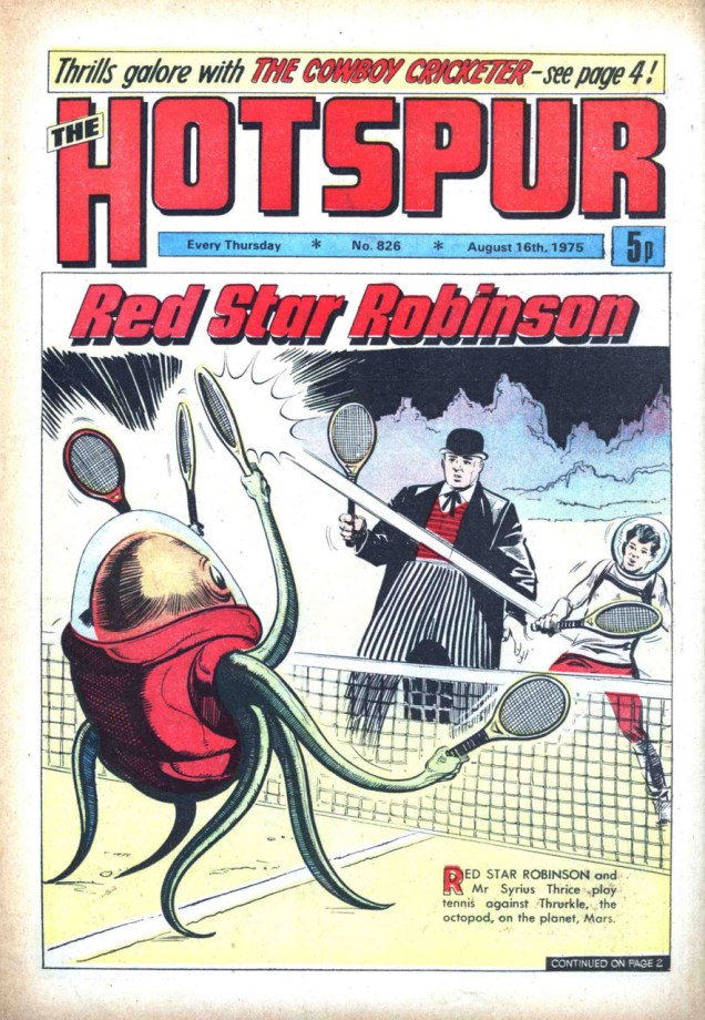
The weekly The Hotspur was published by D.C. Thomson. From its inception in 1933 up until 1959, it was a boys’ story paper, containing text stories and illustrations but no comic strips. It became a comic magazine in October 1959, with the last issue published in January 1981. This is The Hotspur no. 751 (March 9th, 1974).Hotspur no. 778 (September 14th, 1974).The Hotspur no. 826 (16th August, 1975).
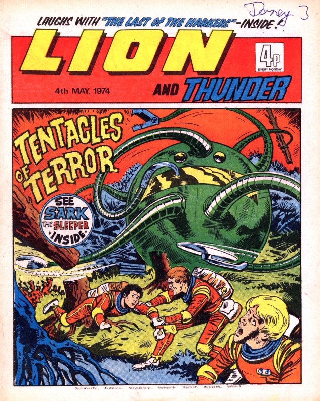
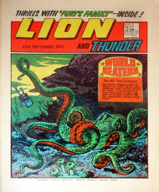
Lion, published by IPC, was brought to life to compete with the Eagle periodical, which was the home of ever-popular Dan Dare. For proper competition, this new weekly publication needed a science-fiction romp, too, and that’s how Captain Condor – Space Ship Pilot got started. In 1969, the Lion gobbled up its rival Eagle (yum) and they merged into Lion & Eagle (sounds like a pub, not a publication! – RG). As for Lion and Thunder, that was the result of the periodical Thunder (also published by IPC) getting incorporated into Lion in 1972, after only 22 issues. I guess “Thunder Lion” would have put the cart before the horse, or the minor, unsuccessful periodical ahead of the major one.
The Wizard was a weekly “story paper” launched in September 1922, published by D.C. Thomson. It got as far as issue no. 1970, merging with The Rover in 1963 and continuing under Rover and Wizard for a while. The Wizard was relaunched in 1970, and endured until 1978.a while. The Wizard was relaunched in 1970, and.
The Wizard no. 88 (16th October 1971), The Wizard no. 90 (30th October 1971) and The Wizard no. 233 (27th July 1974). I was only able to find these covers in low resolution, sorry!
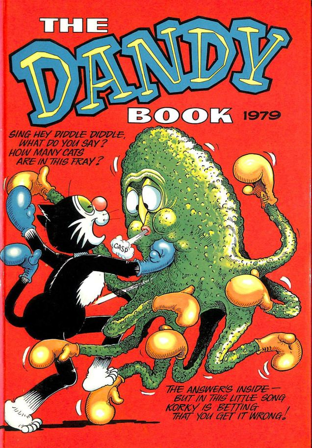
Last (but not least, as they say), no post of this type would be complete without a couple of issues of the aforementioned Dandy!
The Dandy no. 2109 and The Dandy no. 2138.Good old Korky!
« Don’t you know there ain’t no devil, it’s just god when he’s drunk. » — Tom Waits, Heartattack and Vine (1980)
Another week, another heat wave… I had something else in the pipeline for this week, but the canicular conditions brought to mind Hot Stuff The Little Devil (heat rises!) and his creator Warren Kremer‘s monumental parade of beautifully conceived and crafted calefaction variations.
As you may already know, the Harvey Comics stable consists, in the main, of one-note characters erected upon the visual template of licensed 1940s animation properties Casper the Friendly Ghost (Richie Rich, Hot Stuff, Spooky) for the boys, and Little Audrey (Little Dot, Wendy the Good Little Witch, Pearl) for the girls.
Would I kid you? (truthfully, I might). There’s even a meme about it.
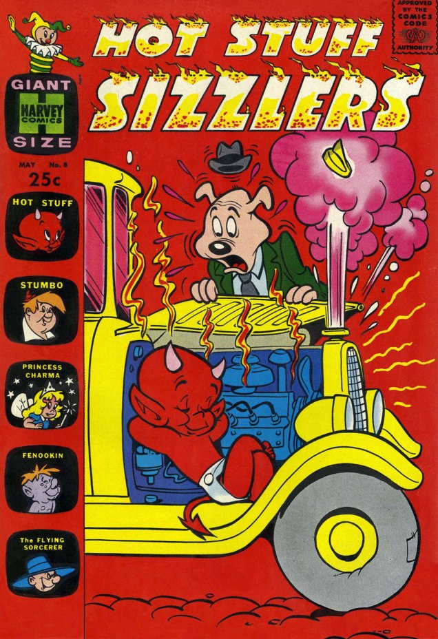
We’ve already presented cover galleries from Spooky and Little Dot (as well as a Hallowe’en-themed array), and it’s now Hot Stuff’s turn to toast and roast. Though we’ve both been rather dismissive of the contents of Harvey Comics, I must point out that if there is a specific series that burns brighter than its brethren do, it’s Hot Stuff’s… at least during the line’s creative peak, the 1960s. Here’s an example of a good one.
Each cover is the brainchild and handiwork of Harvey’s indefatigable resident genius and art director, Warren Kremer. Obviously, one man does not a company make, and his able colleagues Howie Post, Ernie Colón, Sid Couchey and Sid Jacobson were hardly lightweights or slouches… but Kremer was the cover generator.
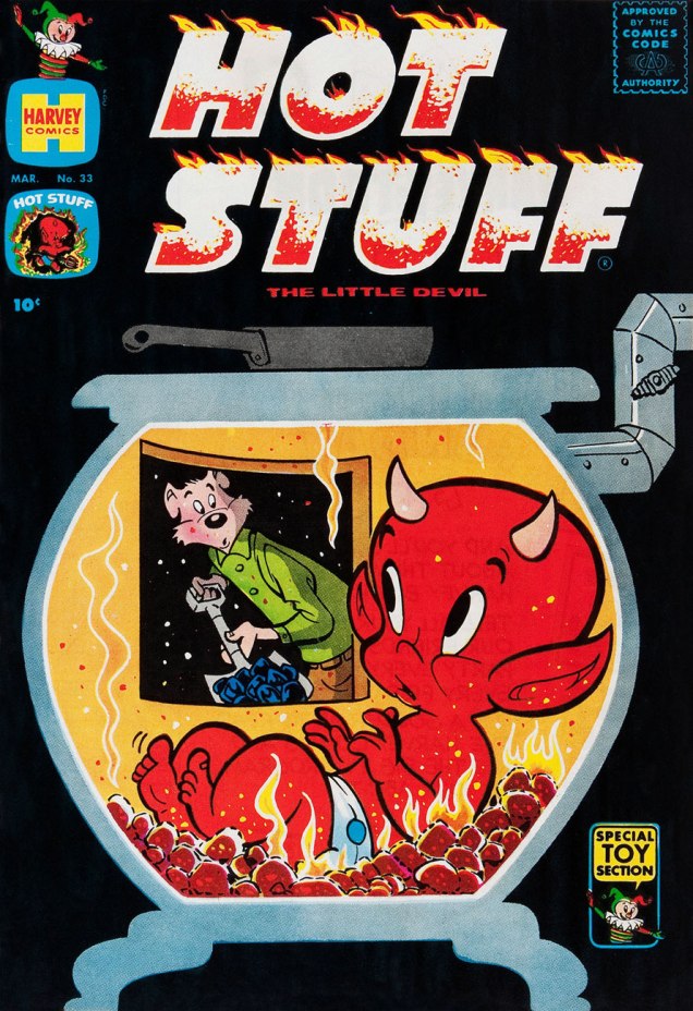
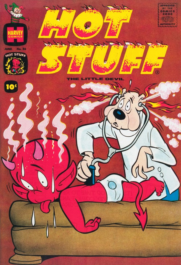
This is Hot Stuff, the Little Devil no.9 (Feb. 1959, Harvey). Is this helping? Probably not. Sorry!This is Hot Stuff, the Little Devil no.15 (Sept. 1959, Harvey).This is Hot Stuff, the Little Devil no.33 (Mar. 1961, Harvey). I especially admire Kremer’s black covers, though they complicated the printing and make issues in pristine (or even decent) shape a scarce proposition.This is Hot Stuff, the Little Devil no.34 (Apr. 1961, Harvey).This is Hot Stuff, the Little Devil no.36 (June 1961, Harvey).Ah, so that ol’ devil moon is not merely made out of cheese, but of stinky cheese to boot? Good to know. This is Hot Stuff, the Little Devil no.41 (Nov. 1961, Harvey). Fun fact: because of its distinctive holes, Swiss Gruyère is the shorthand cartoon cheese.This is Hot Stuff Sizzlers no.7 (Feb. 1962, Harvey).This is Hot Stuff Sizzlers no.8 (May 1962, Harvey).This is Devil Kids Starring Hot Stuff no.3 (Nov. 1962, Harvey). One wonders why other comics publishers didn’t show the same lack of regard for the Comics Code Authority Stamp of Approvaltypically demonstrated by Kremer and Harvey. Their ‘shove it in a corner and colour it invisible’ approach is refreshing. I suppose that, like other publishers specialized in the nominally wholesome ‘kiddie’ market, Harvey’s code approval was a formality.This is Hot Stuff, the Little Devil no.68 (Oct. 1965, Harvey). Listen to this excellent ‘word jazz‘ piece by the late, great Ken Nordine (1920-2019), on the fecund topic of… Fireflies.This is Devil Kids Starring Hot Stuff no.21 (Nov. 1965, Harvey). A little better, cooling-wise?This is Hot Stuff, the Little Devil no.77 (Apr. 1967, Harvey). And how’s this?
That’s it for now! Keep cool, and may your asbestos underwear never chafe!
« Chanoc was set in the fictional Mayan fishing village of Ixtac somewhere near Veracruz. The heroes struggled against corrupt foreigner and larger-than-life sea and jungle animals, especially sharks and octopi. An important feature of the comic book was its use of local colour and coastal lore… »
I’m always unpleasantly amazed when I stumble upon a comic series that ran over a thousand issues… and that I’ve never heard of until now. The sting of it is only slightly alleviated by the fact that it was published in a language I don’t speak. I have already written about long-running (and abounding with tentacles) German series Spuk Geschichten; today it’s the turn of Mexican Chanoc. We may be unable to travel right now, but at least we can accompany pearl diver and fisherman Chanoc and his goofily-mustachioed grandfather Tsekub Baloyán in Aventuras de Mar y Selva (adventures on land and sea – in the context of this post, mostly the sea).
Chanoc actually started out as a rejected screenplay by Dr. Ángel Martín de Lucenay, who, undeterred by this failure, cobbled the story into a proposal for a comic strip and brought it to publishing house Publicaciones Herrerías (taken over at a later junction by Novedades Editores). Ángel Mora was recruited to provide the art, and the first issue (32 pages in full colour!) came out in October 1959. Martín died after having written only 20 episodes, and young writer Pedro Zapiain Fernández was hired. He plotted Chanoc for the next eleven years until 1971, at which point his services were dismissed for a variety of reasons.
In Not Just for Children: The Mexican Comic Book in the Late 1960s and 1970s, author Harold E. Hinds argues that it’s Fernández’s involvement that made Chanoc a best-seller.
« In order to continue to improve the characterization of Veracruz culture, Zapiain immersed himself in the coastal environment. He fished, sailed, deep-sea dived, hunted sharks, and was even shipwrecked in a hurricane.
Many of the scenes and characters in the comic book are modeled on real Veracruz vistas and people. Zapiain slowly transformed Chanoc. Adventure faded in importance, although many issues still contained at least one adventure subplot. Comedy became Chanoc’s trademark, the humour ranging from wit and repartee to parody and slapstick comedy. Mild polictal satire and social ciriticism were intoducted and sports themes became a staple. » /source/
Conrado de la Torre took over the writing when Zapiain (who, incidentally, died in 1979, at 48) was fired, but by most accounts Chanoc’s heyday was over, though I’ve seen mentions of the strip still being published as late as mid-90s. Many artists have contributed to Chanoc during the golden years: «painters Landa and José Luis Gutiérrez (both as cover artists ); Guillermo Vigil , who later created the comic El Payo; Antonio Morales, the screenwriter for Viruta y Capulina , and Antonio Salazar Berber, the first sports cartoonist and creator of mascots for Mexican soccer teams. » /source/
My (rather lengthy, sorry) introduction is now done, and we can move onto the octopuses I promised you!
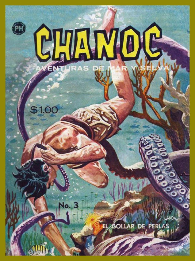
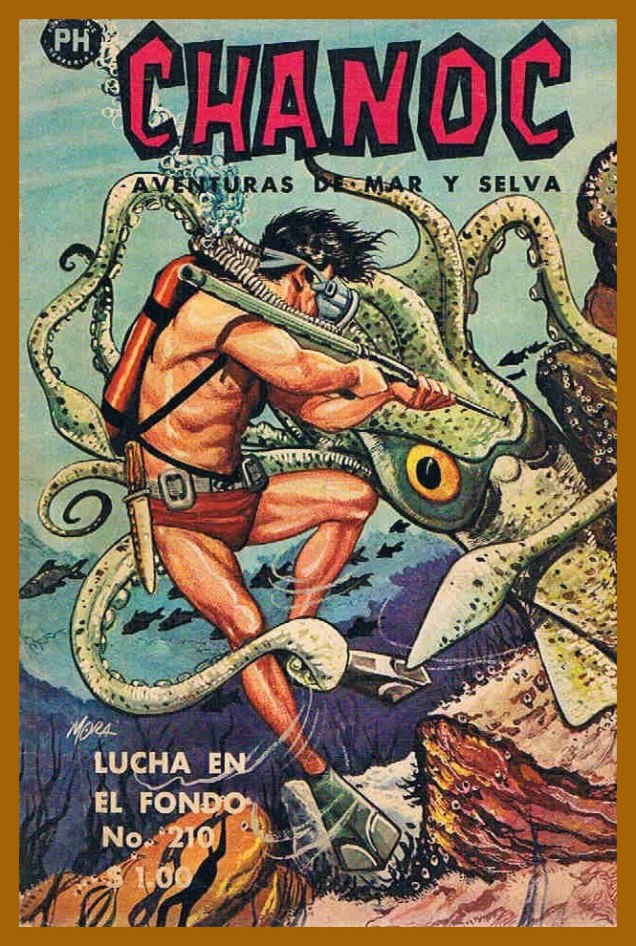
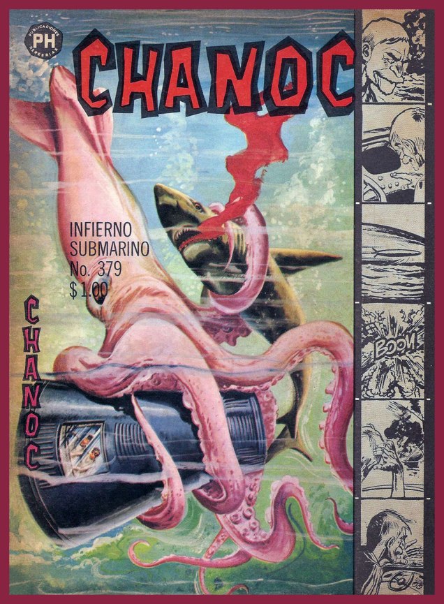
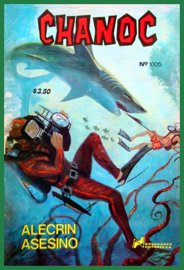
Chanoc no. 3 (October 1959). You can read the issue here (in Spanish!)Some panels from the insides of Chanoc no. 3.Chanoc no. 77Chanoc no. 210Chanoc no. 379Chanoc no. 510Chanoc no. 896Chanoc no. 1005 (1978). Nice shorts, grandpa!
Some covers are, sadly, only available online in extremely poor resolution, so here are two more:
Chanoc no. 139 and Chanoc no. 193 (1963).
« The comic book may be more popular in Mexico than in any other Latin American country. In this essay, Harold Hinds speculates that its decline was due to a number of factors, including the degeneration of one of its main characters, Tsekub, into a mere clown, the inaccessibility of its increasingly “slangy” language, and its tendency towards cuteness rather than meaningful satire. He then examines the main characters. Chanoc is a kind of highly moral Tarzan‐figure who protects the defenseless against villainous exploiters. Tsekub, Chanoc’s sidekick and antithesis, is an old man with a young spirit whose zest for life provides much comedy. Hinds points out that in addition to adventure and humour, Chanoc’s main components, the comic book also deals with foreign, particularly U.S., interference, in Mexico and elsewhere. He also considers a variety of ways in which Chanoc reflects, at times quite subtly, Mexican culture and society; e.g., aspects of regionalism, nationalism, mestizo character, machismo, and modernisation are briefly explored. » (excerpt from Harold E. Hinds’ Chanoc : Adventure and Slapstick on Mexico’s Southeast Coast)
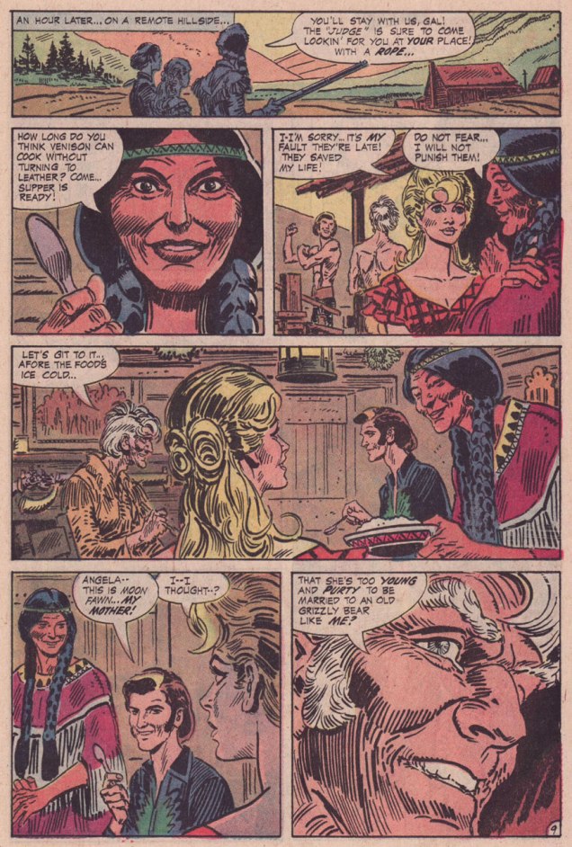
« Who are these men, Tomahawk? » « My Rangers! We fought against renegades… from Pennsylvania to Kentucky! When the country got too crowded, Moon Fawn and I moved out West… where a man has room to breathe! » — Tom Hawk sums up his change of station.
Inevitably, with the Silver Age and its superhero reascendancy, to the eventual detriment of all other genres, the historical adventure strip’s slow decline set in.
As Don Markstein put it:
« Toward the latter part of the ’50s, practically all DC comics ran aliens, monsters and other goofy sci-fi stuff on the covers, no matter how badly it clashed with the title’s subject matter — even war comics often sported dinosaurs in that position. And so, all through the late 1950s and early to mid ’60s, Tomahawk fought gigantic tree men, miraculously-surviving dinosaurs, mutated salamanders, and other menaces that seem somehow to have escaped the history books. There was even a giant gorilla among them, and putting a gorilla on the cover was also a contemporary trend at DC. »
It all comes down to the editor, and Tomahawk was long edited by Jack Schiff, who just adored that sort of (admittedly fun) claptrap, then by his associate Murray Boltinoff, who at least was more flexible.
To wit, with issue 116 (May-June 1968) came a change and a relative return to the feature’s roots. First, Neal Adams was brought in to provide covers, and the more outré aspects were phased out. With issue 119 (Nov.-Dec. 1968), the book’s final creative team was brought aboard: writer Robert Kanigher and illustrator Frank Thorne (1930-2021), eventual creator of Moonshine McJugs. Thorne replaced Fred Ray (1920-2001) who, while he wasn’t a Tomahawk originator, had been chronicling the mountain lion’s share of his exploits since 1947. He would draw a handful of short pieces for DC’s war books before leaving the comics field in the early 1970s, writing historical non-fiction and art directing and illustrating for publications Civil War Times Illustrated, American History Illustrated, True Frontier, The West and Yank (despite the title, not a porno mag).
With the heart of the creative team in place, it was a change of editors that prompted Tomahawk’s final mutation, and arguably its most interesting: Joe Kubert took over the editorial reins, and the action was moved four decades or so forward in time. Tom ‘Tomahawk’ Hawk had settled down with a Native woman, Moon Fawn, sired a pair of sons, and was by then a lanky, crotchety old coot, but not quite helpless. His elder son Hawk was the protagonist, and they encountered frontier-style prejudice, greed, corruption, tribalism, paranoia… you guessed it: it was a ‘socially-relevant‘ comic, but hardly the cringe-fest that was the concurrent Green Lantern/Green Arrow. I daresay that Kubert and Kanigher’s respective politics were rather too complex for that.
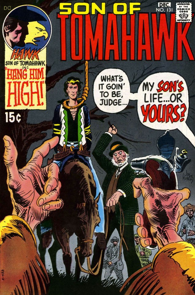
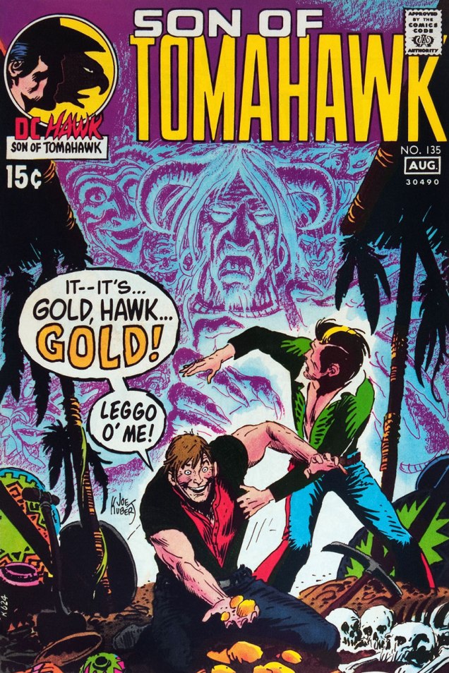
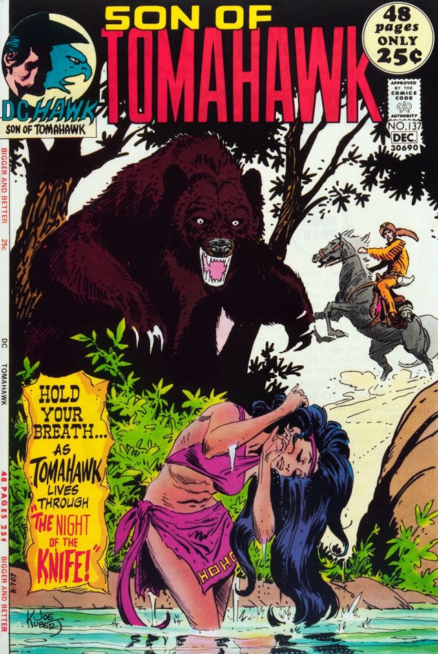
This is Tomahawk no. 131 (Nov.-Dec. 1970, DC). Inside: Hang Him High!, written by Robert Kanigher and illustrated by Frank Thorne. I like how nonplussed Hawk is at the prospect of doing the Brand New Tennessee Waltz..This is Tomahawk no. 132 (Jan.-Feb. 1971, DC). Inside: Small Eagle… Brother Hawk!, written by Robert Kanigher and illustrated by Frank Thorne.This is Tomahawk no. 133 (Mar.-Apr. 1971, DC). Inside: Scalp Hunter, written by Robert Kanigher and illustrated by Frank Thorne.This is Tomahawk no. 134 (May-June 1971, DC). Inside: The Rusty Ranger, written by Robert Kanigher and illustrated by Frank Thorne.This is Tomahawk no. 135 (July-Aug. 1971, DC). Inside: Death on Ghost Mountain!, written by Robert Kanigher and illustrated by Frank Thorne, and the powerful Spoilers, written by Jerry DeFuccio and illustrated by John Severin. This was my admittedly random introduction to the series.This is Tomahawk no. 136 (Sept.-Oct. 1971, DC). Inside: A Piece of Sky!, written by Robert Kanigher and illustrated by Frank Thorne, plus an extraordinary Firehair tale by Kubert… but then they all are.This is Tomahawk no. 137 (Nov.-Dec. 1971, DC). Inside: Night of the Knife!, written by Robert Kanigher and illustrated by Frank Thorne, plus a selection of fine reprints.This is Tomahawk no. 138 (Jan.-Feb. 1972, DC). Inside: Christmas, written by Robert Kanigher and illustrated by Frank Thorne, as well as an assortment of worthy reprints boasting artwork by Nick Cardy, Sam Glanzman, Norman Maurer and Mort Drucker.This is Tomahawk no. 138 (Mar.-Apr. 1972, DC). Inside: Death Council, written by Robert Kanigher and illustrated by Frank Thorne, plus a clutch of reprints illustrated by Fred Ray, Gil Kane, and none other than Frank Frazetta.This is Tomahawk no. 140 (May-June 1972). Inside: The Rescue!, written by Robert Kanigher and illustrated by Frank Thorne. Gaspar Saladino‘s brand new logo, a rare misfire, was unveiled just in time for the book’s cancellation.
As for the interior art, I’d say it’s Frank Thorne’s finest work. The notorious Alexander Toth would of course disagreed, far preferring Thorne’s work when Thorne’s style bore a heavy… Toth influence (here’s an example from 1957.) For comparison, here’s a pair of interior pages from Tomahawk no. 131‘s Hang Him High!
Thanks to their production manager, Jack Adler, DC had the finest, most nuanced colouring in the field in the late 60s and early 70s.
Toth would, in (final) conversation with The Comics Journal publisher Gary Groth, in 1996, froth forth:
« I repeatedly warned Frank: “For Christ’s sake, get the hell away from Kubert. He’s not doing you any good. His influence on you is negative, not positive, so get the hell away from him and stop aping his style and stop putting on all that shit that you lived without for years. You did nice, clean, hard-lined stuff, and it’s been detrimental to your work.” He confessed: “Yes, Joe Kubert and his style are hard to resist.” So, yes he had the influence, and he liked it. Well, good luck. »
« Kate’s death scream gags stillborn in her throat as the tentacles dart toward her, slithering hungrily across her body. »
Here’s a quick association exercise: as fast as you can, name words that come to mind when somebody says “Dracula”. Um, fangs! Stake! Blood, cape, biting! … Tentacles? Say what?
It would have never occurred to me to look for tentacles in Dracula, giant-size or otherwise, so thanks to admin RG for this splendid suggestion.
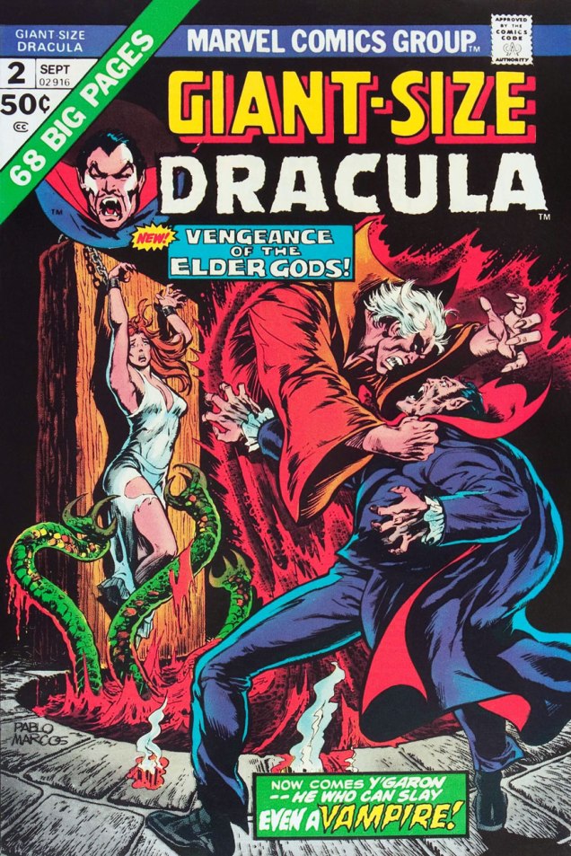
Giant-Size Dracula no. 2 (September 1974). Cover by Pablo Marcos.
You’re not sure those green things were tentacles? If it quacks like a duck, it may well be an aquatic bird – and if it slithers towards female “human flesh”, count it as tentacles! Call Them Triad… Call Them Death! is scripted by Chris Claremont, pencilled by Don Heck and inked by Frank McLaughlin. I have to say that the art is distinctly subpar, as far as I’m concerned.
The writing isn’t brilliant, either.
“Words are inadequate”.
Perhaps it’s the drab colours that weigh this down, and the original art would be a considerable improvement? Nope, sorry.
As further example of the ineptitude of this art team, a quick question: does this look like he’s slapping her?
She was lying face down, but she somehow manages to flip over instantly.
However, I have no wish to engage in Don Heck bashing – he had his moments, it’s just that this story wasn’t one of them. Instead, I will direct you to this article explaining how Harlan Ellison mocked Heck once upon a time, several lifetimes ago. Also, ouch.
Harlan Ellison: There are guys who’ve got very minimal talents and it doesn’t matter whether they corrupt it or not. I could name them and would happily name them, but why bother? There’s no sense kicking cripples. I mean, all you have to do is open up comic books from Marvel and DC and take a look at them. You see these guys have a very minor-league talent and, to say, “Well, these people are wasting their talent” is ridiculous. I mean, they’re never going to be any better. What’s the name of the guy who used to do… over at Marvel… he use to do… [Pause]… the worst artist in the field.
Continuing our foray into Draculas of colossal proportions tangling with tentacles…
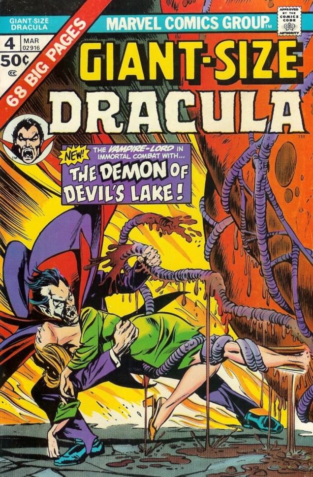
Giant Size Dracula no. 4 (March 1975). Cover pencilled by Gil Kane and inked by Tom Palmer.
Sadly, the tentacles promised on the cover don’t really appear in the cover story. Time to move to another series —
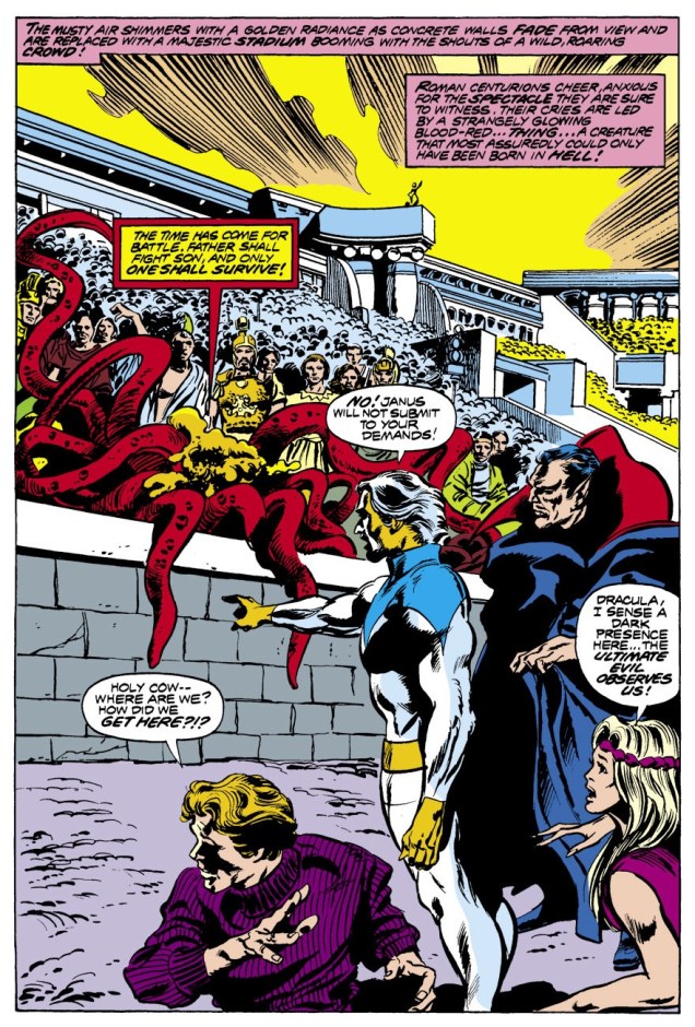
Tomb of Dracula no. 62 (January 1978), pencilled by Gene Colan and inked by Tom Palmer.
What Lurks Beneath Satan’s Hill? (tentacles, obviously) is scripted by Marv Wolfman, pencilled by Gene Colan and inked by Tom Palmer.
This has been scanned from the reprint, which in my opinion looks worse, not better.
The story continues in number 63 –
Tomb of Dracula no. 63 (March 1978). Cover pencilled by Gene Colan and inked by Tom Palmer.
The Road to Hell!is scripted by Marv Wolfman, pencilled by Gene Colan and inked by Tom Palmer:
« All-you-can-eat-calamari — dive in! »
Next up (eventually), an equally random concept: Werewolf VS tentacles!
« You know, I once took a ride in a Volkswagen convertible driven by Harvey Kurtzman, with fellow passengers Terry Gilliam and Robert Crumb. Had we been smacked by a garbage truck the history of humor and popular culture would have been slightly changed. Interestingly not one of us had the slightest interest in any of the other three. Except, I am pretty sure we all hated Kurtzman, but who didn’t? » — Daniel Pinkwater
This post was originally going to be an interview. Having belatedly discovered Norb (1989-1990), I got in touch with Daniel Pinkwater (who better to ask?), intending to pepper him with questions, but he was so very helpful, providing me with all the background material I could have desired, that his prediction that « … since I have nothing to add, you may not need to formulate any questions for me » … came to pass. And so I gladly yield the floor to the sterling Mr. Pinkwater.
Tony Auth was a brilliant artist. He had an important day job as editorial cartoonist for the Philadelphia Inquirer. I think it was his first job, which he held for decades, and he was a Pulitzer Prize winner. We talked about doing ‘something’ together for a couple of years. Tony wanted to do a daily/Sunday newspaper strip, so we did that. Every day we’d remind one another, ‘keep it stupid.’ The fact was, we had no idea how stupid a commercial strip needed to be.
Stroke of luck, Denny Allen, who was temporarily in a position of influence at King Features had approached me years before about doing a strip. We met the power elite at King Features. I won’t characterize them except to say that the concept of stupid did not elude them, nor would it have been likely to. We negotiated for, and received a substantial advance from King, covering two years. I understand this was unheard of in the highly competitive rat race with a great many submissions coming in every day from marginally talented cartoonists.
So we went to work. My part was utterly easy. I would write the dailies and the separately plotted Sunday strip every Saturday while watching Dr. Who. Tony was putting in long hours in addition to his job at the newspaper. The strip launched in something like 70 papers, and I was told this was a big launch and unusual for the times.
We started in the vacancy created when Bloom County ceased production. The response from readers consisted entirely of actual hate-mail, letters saying it was hoped we would die, crude drawings of tombstones and daggers dripping blood. The only piece of positive fan mail I remember came from Jules Feiffer. A few papers dropped the strip, some in response to outrage from readers for whom the comics page was their literature. The typical letter read, ‘I hate NORB, it makes me feel stupid.’ Fair enough, I thought.
I understood that as few as 10 negative letters were enough to spook a paper into dropping a feature. My wife did a bit of research and discovered that all new strips have it rough initially, but if one survives two years it becomes un-droppable, and it is the editorial staff who get the threatening letters. Interestingly, Tony, who was a fair-minded political cartoonist, and got abuse all the time, (he’d had his office trashed by the right and the left at different times over the same issue, for example), and didn’t mind it, regarded the comic strip as the product of his heart, and was hurt by the unfair criticism.
So, at the end of the first year, Tony, exhausted by working two full-time jobs, depressed by the evidence that nobody seemed to like the strip, unwilling, as I was, to follow the advice from the comics/humor expert at King Features, let me know that he was not having any fun. ‘So, shall we quit?’ I asked. Since he was carrying 90% of the weight, I didn’t feel it should be my call. King was delighted to kill the strip because that meant they wouldn’t have to pay us the second year’s advance, and apparently they thought that saving money was the same as making money.
Exactly a year after the strip stopped appearing the fan mail started to come in, ‘Where’s NORB?’ ‘NORB was my favorite comic.’
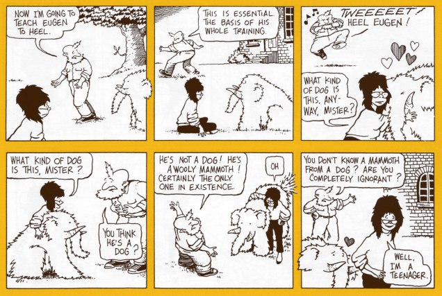
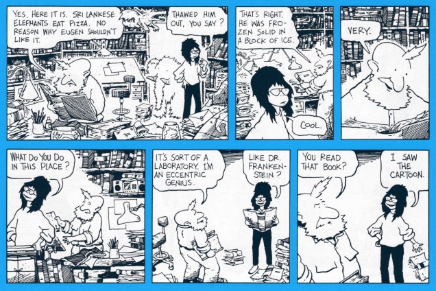
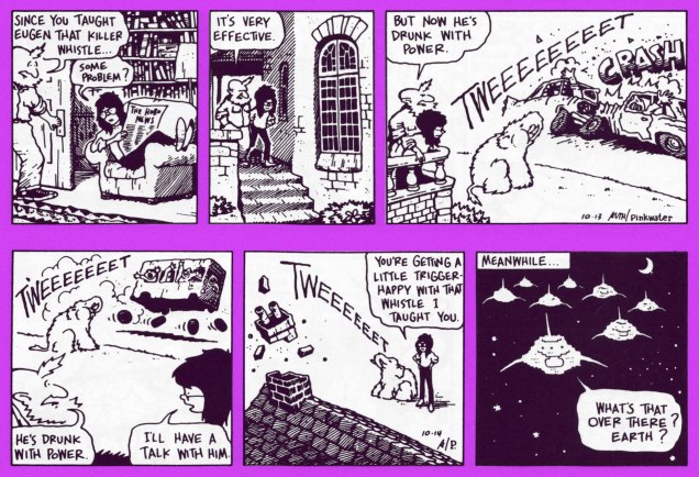
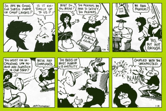
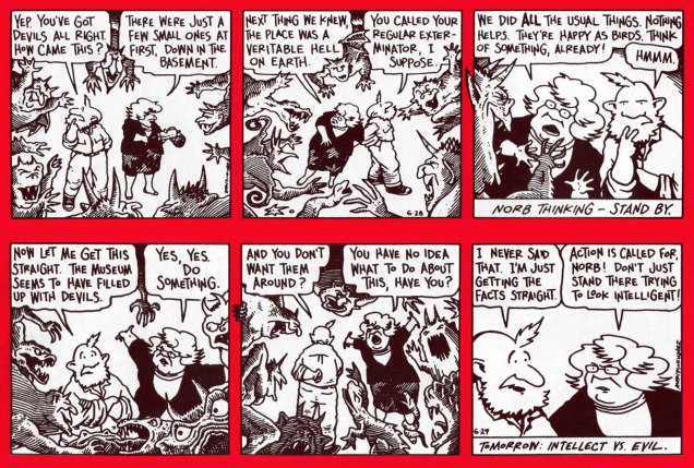
A pair of dailies from the first week, whereupon we meet our protagonists and our protagonists meet.From week two. It’s lovely that Mr. Pinkwater opted to bring along a character from his Snarkout Boys novels (The Snarkout Boys and the Avocado of Deathand The Snarkout Boys and the Baconburg Horror), Bentley Saunders Harrison Matthews, aka Rat Face aka Rat. She fits right in. That kind of freedom is among the foremost perks of owning your work.
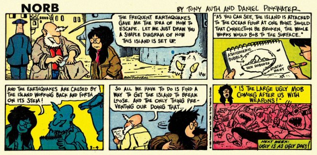
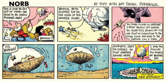
A four-day sequence, to give you a better sense of the strip’s flow. I love how the alien armada is basically pixelated. Spoiler: They won’t get very far with their plan of conquest.Front cover of Mu Press‘ collection of the Nord dailies, published in 1992. To quote the late SF luminary Vonda McIntyre in her INTROdadaDUCTION: « When [Mu Press] decided to reprint NORB, I jumped at the chance to write this essay. Only then did I discover that writing it didn’t mean I got to reacquaint myself with the Sunday strips… it meant I got to see the daily strips, which I didn’t even know about, for the first time. »Now and then, Pinkwater would drop out of the narrative, go into meta-textual mode and engage the critics in an entertainingly passive-aggressive fashion. I do prefer the plot-driven strips, however… as does Rat. « Problem, Norb-Baby. Humorous adventure with a touch of satire is out this year. I don’t know where to put you. » (07/13/1990)« You’ll pay for treating my employer like a baked ham, you evil person! ». Don’t worry, Norb’ll be okay: « Explain. Were you sliced like a radish or not? » « Oh, I was! But it was in the future. »Anything goes, in the most winning sense. The noble Norse warriors were soon to realize that at Trump’s, you simply can’t out-chump the boss.Norb is an exemplar of the narrative strip that doesn’t take itself seriously: while the story proper is intriguing, any individual fragment is quite entertaining on its own.Never having been reprinted, the Sunday strips are rare as hen’s teeth, and those who possess them presumably clipped them out of their local paper back in the day. Foresight! As is often the case with King Features continuity strips, Sundays and dailies feature separate storylines.Several years ago, Norb was featured as the Obscurity of the Day on the excellent Stripper’s Guide blog. There you’ll find a handful more of these gorgeously-coloured (aside from all their other evident virtues) Sundays, and more dirt about Norb.Et pour conclure, Auth’s back cover illustration from the Norb collection.
« It’s pretty clear that you take the whole subject of comics and cartooning a lot more seriously than I do. » Guilty as charged. Thanks for your most kind coöperation, Mr. Pinkwater!
This post is dedicated to the memory of Mr. Tony Auth (1942 – 2014).