« I don’t understand retiring. I don’t know what I’d do. I don’t play golf. I have to sit at a drawing table or else it’s a wasted day. The nature of the work can change here, but I have to be doing something, especially with my hands. » — Seymour Chwast
Nobody really expects those we deem “immortals” to actually live forever… but I suspect some part of us does, or at least hopes so.
From the perspective and pantheon of folks of a certain age and time — let’s say, people born in the 20th century — the ranks have been brutally thinned of late. To name but particularly long-lived visual art masters, recent years have claimed Al Jaffee, Gahan Wilson, Milton Glaser, Steve Ditko, Jean-Jacques Sempé, John Severin, Gene Deitch, Ken Bald…
I haven’t yet reached that fateful age when reading the paper largely consists of scanning the obituary column to learn which of your friends (and possibly enemies) have died, but I fully grasp the concept… and shudder in sympathy.
And so on to my point: it’s easy to take genius (or mere talent, for that matter) for granted, and so I generally endeavour to salute valued creators while they’re still around, instead of paying belated lip service to their greatness once reminded of their existence by news of their passing.
For years, I’ve been meaning to devote a post to Seymour Chwast… and dragging my feet. He’s had such a long, inspiring — and daunting — career. But the other day, when Tony Bennett died, aged 96, I took it as a sign not to reserve my tribute for Mr. Chwast’s next birthday (that’s late next month). Here goes.


Design historian Steven Heller explains: « Push Pin’s principal cofounders, Seymour Chwast (b. 1931) and Milton Glaser (b. 1929), two native New Yorkers who met while attending Manhattan’s Cooper Union, brought distinct tastes and preferences — as well as chemistry — to their unique partnership. Chwast savored American comic strips and pop culture while Glaser studied etching in Italy and was passionate for Italian Renaissance painters. The former injected a cartoonist’s abandon into his artwork, the latter introduced a sublime elegance. Despite their formal differences, both shared the conviction that postwar design and illustration should not be limited to prevailing practices — either sentimental realism or reductive simplicity. They rejected rote methods and rigid styles while concocting incomparable ways of transforming old into new… »
The following encapsulates even more succinctly the duo’s boundless contribution: « Seymour Chwast and Milton Glaser are legendary graphic designers who founded Push Pin Studios, where they rebelled against the swiss style establishment – blending illustration with design. » [ source ]
Amen: from my standpoint as an art student back in the early 1980s, I’ll say one thing about Swiss design: that shit was oppressive.
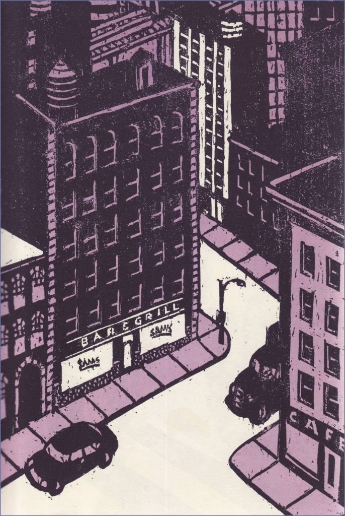
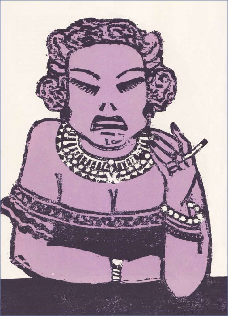
To sidestep the perils of losing my way amidst such a gargantuan topic, I’ve opted to focus on a favourite entry in the Chwast œuvre.


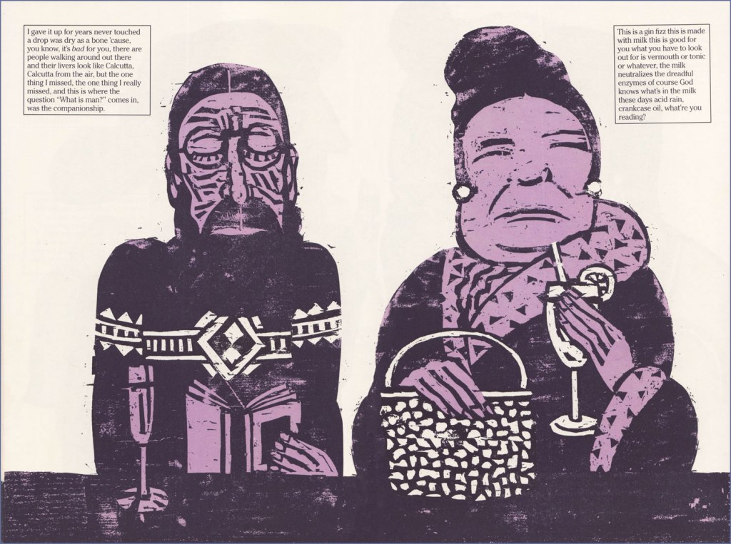


I wouldn’t want to short-change Barthelme’s contribution… as a collaboration, this truly works a treat. Here’s an amusing passage I encountered on the subject of this routinely misunderstood author: « Donald Barthelme was, by his own design, a hard writer to categorize. Even at the height of his fame, in the late 70s and early 80s, there were readers who just didn’t get him, or suspected his work was a hoax or a joke they weren’t in on. At The New Yorker, where he was a regular contributor for decades, clerks in the library were expected to type up on index cards brief summaries of every article, fact or fiction, that appeared in the magazine. Barthelme’s cards sometimes contained just one word: “gibberish.” » [ source ]

Many happy returns and thanks for the inspiration, dear Mr. Chwast!
– RG