Panning the murky old print stream for the odd glimmering nugget
They Called It… The Golden Age!
That’s the period opening with the advent of the first comic books, in the early 30s, and ending with the release of Showcase no. 4 in 1956 (introducing the new Flash), which signals the passage to the next era, the Silver Age, of course.
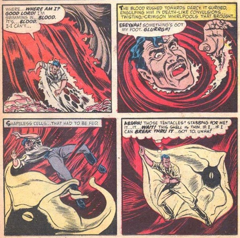
The source of tentacles in Golden Age comics seems inexhaustible – every time I think I have reached the bottom of the well, I find myself awash in cephalopods. That being said, a lot of these octopusoid appearances are one-panel cameos, and even when the tentacles linger for a few pages, the shitty printing, questionable scans or bare-bones art don’t exactly incite me to use this material in a Tentacle Tuesday. Today’s crop is all Golden Age, running the gamut from 1939 to 1952, and composed of pages/covers I can enthusiastically endorse.
George (of Harry J. Tuthill’sThe Bungle Family, ‘one of the most under-rated comic strips in the history of American cartoonery’ according to Art Spiegelman,‘one of the top hundred comics of the 20th century‘, according to The Comics Journal) may be thoroughly bundled up in tentacles, but he still keeps a sort of prosaic calm that I admire.
Feature Comics no. 23 (August 1939, Quality Comics). Cover by Ed Cronin. As for Charlie Chan, he was originally a private detective in a series of novels by Earl Derr Biggers, from which a number of movies were made. Opinions are divided about whether he was a breakthrough Asian character (tired of Yellow Peril stories, Biggers conceived him specifically as an alternative to stereotypical, ‘sinister and wicked‘ Chinese) or perpetuated a lot of the same preconceived notions that were circulating at the time (and, alas, are still with us today).
Just look at the canines the red devil is ready to plunge into Black Hood’s leg! Throw in a fanged octopus, and this cover has as much action as one would possibly want. Sadly, nothing of the sort actually goes on in this issue.
Top Notch Comics no. 16 (June 1941. Archie Comics). Cover by Al Camy.
Page from Fisherman’s Luck, published Star-Spangled Comics no. 41 (February 1945, DC).
This page from Boy Meets Robotdog was printed in Star-Spangled Comics no. 75 (December 1947, DC). I would certainly come to this house!
We really like Howard Nostrand at WOT, though so far he has been woefully under-featured in our posts!
This page is from The Man Germ, scripted by Nan Barnett and illustrated by Howard Nostrand. This story was published in Chamber of Chills Magazine no. 13 (October 1952, Harvey Comics).
Finally, I have a soft spot for these tiered layouts that Rugged Action employs… especially when an octopus with tender, moist eyes is moonlighting in one of them.
Rugged Action no. 1 (December 1954, Marvel). Cover by Carl Burgos.
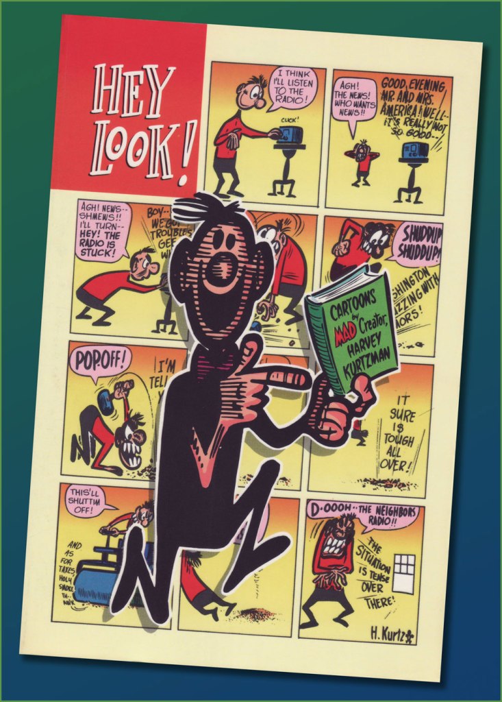
« Hey, Look! is essential reading for any cartoonist. » — the late and much-missed Patrick Dean, who truly knew what he was talking about.
Sometimes I think of a post topic and dismiss it with a ‘nah, too obvious’… but on some of my brighter days, I run the idea past my wife, who provides a welcome reality check: ‘Obvious to whom?‘, she asks. Well, there’s been a collected edition… which has been out of print for most of the nearly thirty years since it hit the stands. Fair enough.
As I’ve been lately foraging through the crumbling back pages of Golden Age humour comics (see my previous post), it would be negligently immoral for me to pass over one of the crown jewels of the genre, the era and the medium.
One* of the redeeming features of Marvel’s overwhelmingly crass Dynamite (magazine) rip-off, Pizzazz, was its reprinting of a handful of Harvey Kurtzman‘s majestic Hey Look! strips. Of course, it made perfect economic sense: grab some already (and barely)-paid-for, all-but-forgotten ‘filler’ from the 1940s, slap some new colour on ‘em, and wham! One less egg to fry.
Here’s the collection in question. Published in 1992 by the venerable Kitchen Sink Press, it has yet to be improved upon. In addition to all the Hey Look! strips, it includes an unsurprisingly excellent introduction by the erudite John Benson, and further sweetens the pot with Kurtzman’s other Timely features of the era, namely Genius, Egghead Doodle and Potshot Pete. The latter is particularly worth a look-see.
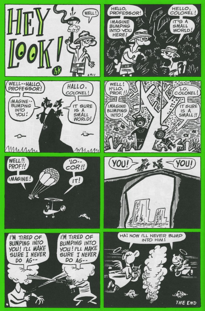
The earliest Hey Look! strips are cute and of some historical significance, but rather scattershot and tentative. Here’s roughly where Kurtzman starts to really, and consistently, cook. Originally published in Gay Comics no. 33 (Aug. 1948, Timely).
Mr. Kurtzman was ahead of the game, anticipating the superhero genre’s dark turn of the mid-80s and beyond, and pointing out its inherent fascism. Already a bit too close too home at the time of its creation, this piece languished in limbo until its publication in 1966 in a limited-edition portfolio.
Originally published in Nellie the Nurse no. 16 (Dec. 1948, Timely).
Originally published in Hedy Divine no. 30 (Dec. 1948, Timely).
Originally published in Joker no. 35 (Jan. 1949, Timely).
Originally published in Millie no. 16 (Feb. 1949, Timely). Always experimenting: dig here Kurtzman’s elegant use of the scratchboard technique.
Originally published in Nellie the Nurse no. 19 (Apr. 1949, Timely). With the miniaturisation of electronics, and cameras in particular, there’s (of course) been an opposing movement toward huge telephoto lenses. Read into it what you will.
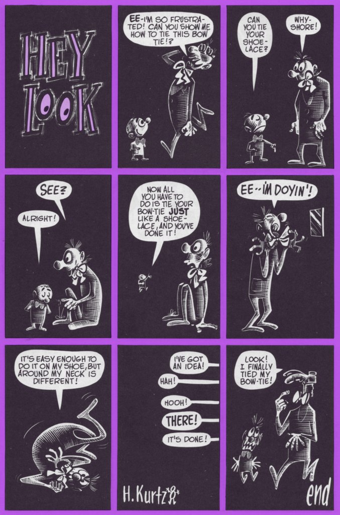
I was, and remain, especially fond of this one, originally published in Gay Comics no. 37 (Apr., 1949) and reprinted in Pizzazz 15 (Dec. 1978)… the one with the Battlestar Galactica cover. ‘Cabazziz’ is made up, but Podunk has roots.
Originally published in Patsy Walker no. 22 (May 1949, Timely). Incidentally, generic ‘teen’ humour character Patsy Walker has since (circa 1976) been refashioned and recycled, in the tried-and-true ‘waste not, want not’ Marvel manner, into a superheroine, Hellcat. Sheesh.
« I think the most gruesome thing in life is people — if they let themselves go. I’ve been letting myself go for years, and I’m beginning to feel gruesome. I want to entertain and communicate. I don’t want to hurt anyone’s feelings, but I have to be honest — like that old baseball umpire — and call ’em like I see ’em. My drawings aren’t as bad as the models themselves. » — Basil Wolverton
Here at WOT? headquarters, we’re both card-carrying, fervent Basil Wolverton* fanatics, but we haven’t devoted the column space commensurate with our affection for his work. Why? Because Wolverton, despite toiling in underpaid obscurity for most of his career and inevitably never becoming a household name, was always a critic and historian’s darling, insofar as there was a scholarly press to express its appreciation. Things began to turn around in the early 1970s, just in time.
Whatever subject or genre he put his hand to, Wolverton’s singular style shone through, and not as a handicap: his funnies were hilarious, his horror was harrowing… but they were distinctly from that same, most gifted of hands.
The artist at work (presumably) on his caricature of Red Skelton, circa 1949.
Most of Basil’s humour work was (with the partial exception of Powerhouse Pepper, 1942-49) relegated to ‘filler’ features, generally hidden gems glittering in the mediocre midst of loads and loads of higher-profile rubbish. Don’t just take my word for it: here’s a typical example of the sorry setup.
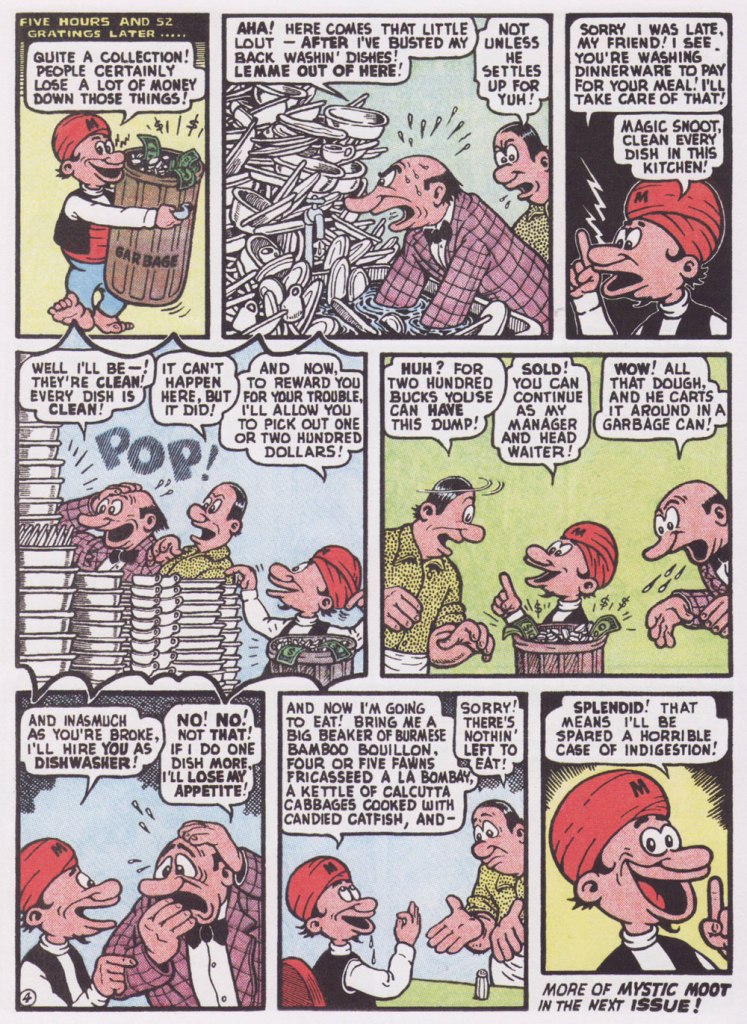
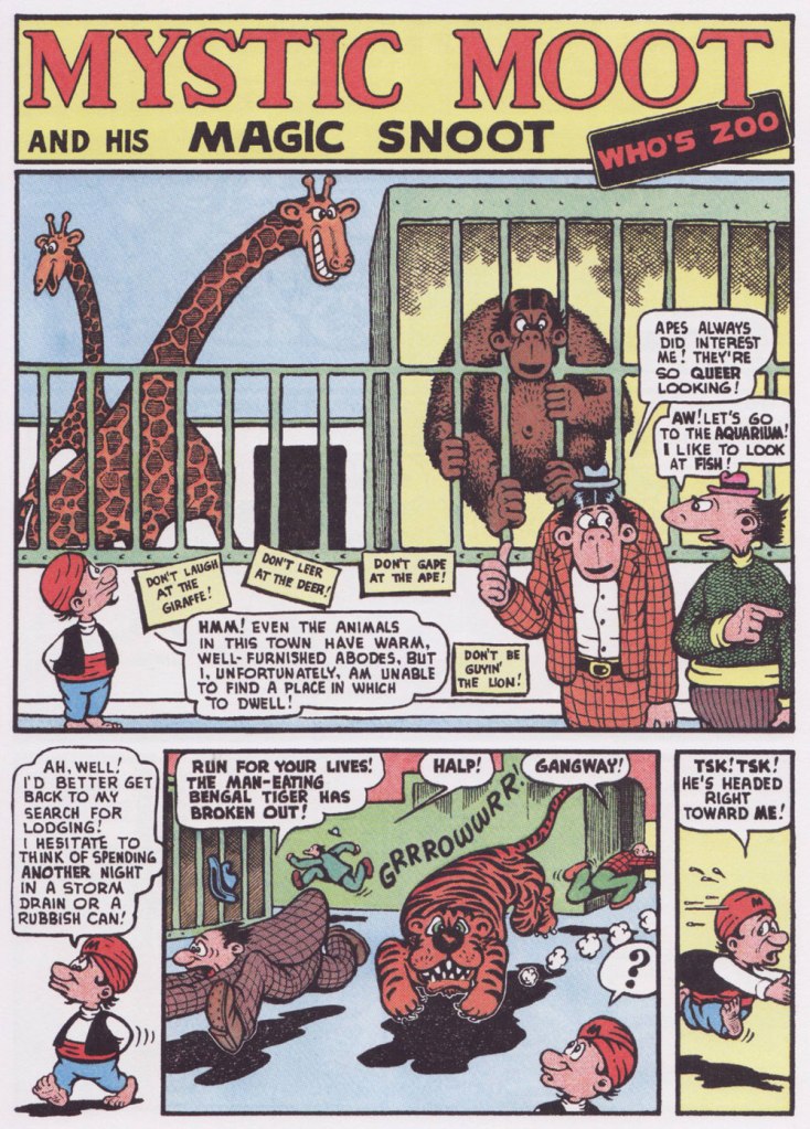
From this thrilling new assemblage, I’ve picked a pair of short samples, both featuring my favourite Wolverton protagonist, Mystic Moot (and his Magic Snoot). Sadowski informs us that:
« In July 1945, editor Virginia Provisiero invited the artist to submit ideas for a four-page ‘magic or mystic character’. He responded with Champ Van Camp and his Magic Lamp, but the editor suggested ‘a weird magician who had hocus-pocus powers instead of this lamp and genie affair‘. Wolverton hit the bull’s-eye with his second try, Mystic Mose and his Magic Nose, though Managing Editor Will Lieberson came up with a catchier moniker. »
Historian Henry Steele, in his indispensable overview of Wolverton’s career (published in Bill Spicer‘s blandly-titled but most excellent Graphic Story Magazine‘s issues 12 and 14, circa 1970-71), eloquently describes Mystic Moot as :
« Basically a kindly and almost simple soul, he is eternally cheerful and never at a loss. He is perennially helping others, usually unfortunate nobodies liked the jobless glutton, the bankrupt small businessman, the farmer with no crop, the henpecked husband, intimidated lumberjacks and prospectors, widows, orphans and kindred down-and-outers. He uses his magic powers only in the most haphazard ways, and never relies on them on his own behalf unless it is absolutely necessary.
Perhaps because of the passive Eastern philosophy of its subject, Mystic Moot strikes one as being the most minor key of all Wolverton’s features — which, while it implies difference, does not mean inferiority in any sense. »
Originally published in Comic Comics no. 2 (May 1946, Fawcett).
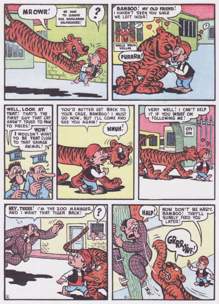
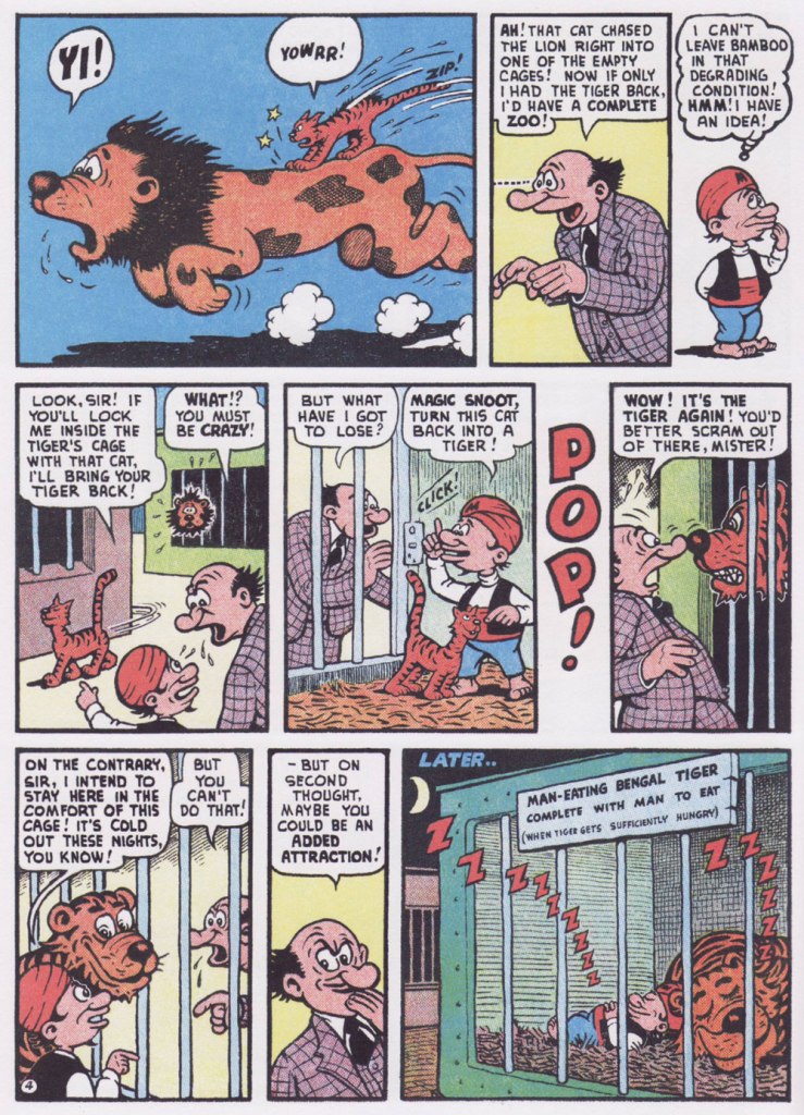
Here’s one for my fellow animal lovers out there!
Originally published in Comic Comics no. 7 (Oct. 1946, Fawcett).
« I don’t mind if my skull ends up on a shelf as long as it’s got my name on it. » —Debbie Harry
A couple of years back, I spotlighted a story by a neglected Golden Age favourite of mine, Anthony Lewis “Tony” DiPreta (July 9, 1921 – June 2, 2010), the wacky The Hidden Vampires! I advise reading it first for comparison (and a bit of background on the artist).
A whole hour! People were armed with unwavering patience back in the day.
So the suits’ great flash of inspiration is not to update a fifteen-year old movie (from 1937!), nor remake it: they’ll just trot it out again. Picture doing this with 2006’s biggest horror hit, Saw III. How do you think it would fare today?
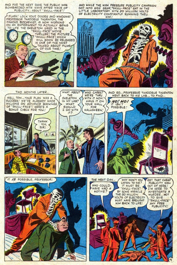
You’d think a seasoned publicist would be a savvier negotiator. I mean, all he needs is some random skeleton. Adjusted for inflation, a thousand 1952 dollars would today be worth 9,829 bucks. But that’s nothing compared to his liberal waste of electric current: the voltage used to execute a convict in the electric chair is around 2,000 volts for less than a minute… and that makes the lights dim all over the area*. Now multiply the voltage by 25,000, and the duration (let’s round it off to a minute, for simplicity’s sake) 80,640 times longer. Picture the resulting electric bill, not to mention the repercussions on the power grid, all for a stunt that could have simply been faked (i.e. just say there’s live current… no-one’s going to check). Oh, and what’s a “famous biochemist” doing on a film studio’s payroll? Come to think of it, it’s not that odd: Thornton was a cynical, opportunistic money-grubbing parasite, the Dr. Memhet Oz of his day…
Note these stellar examples of one of DiPreta’s trademark horror ambiance moves: lighting from below, projecting stark, expertly-delineated shadows.
One has to wonder why Fenton insists on addressing the resurrected ‘Demon’ (he was a demon on the sousaphone) incorrectly as “Skull-Face” (that’ll only aggravate him, you dolt!). Would it have helped if he’d added air quotes?
The ho-hum Sol Brodsky cover of Mystery Tales no. 6 (Dec. 1952, Atlas), but hey, our pal “Skull-Face” is the featured attraction!
The comics industry’s traditional garish colour and murky reproduction fail (spectacularly!) to do justice to DiPreta’s spare, confident and elegant inking line. To remedy the situation, here’s a look at a surviving piece of original art. It hails from “One Must Die” (scripted by Carl Wessler), from Crime Can’t Win no. 11 (June 1952, Atlas), the publisher’s knockoff of Lev Gleason‘s influential Crime Does Not Pay.
A slick Joe Palooka Sunday from July 24, 1966. DiPreta enjoyed quite a run on the strip, illustrating it from 1959 to its 1984 finale.
I can’t help returning to Warren Kremer (today’s his birthday, not coincidentally; he was born on June 26, 1921, passing away on July 23, 2003), first because I adore his work, and second because I quite concur with Jon B. Cooke‘s bold but sensible assertion that Kremer…
« … is an extraordinarily talented artist. A master of design, character nuance and just plain exquisite drawing ability, he is perhaps the most underrated – or even worse, ignored – comic book creator of significance in the industry’s history. »
And why is that? A combination of working outside the superhero genre and of doing it, uncredited and for decades, on the ole Harvey Family Plantation.
This blog’sIt’s a Harvey World category might as well be called It’s a Kremer World, since he’s pretty much had the spotlight to himself.
But Kremer’s comics career precedes his arrival at Harvey; after working for the pulps in the late 1930s, he entered the comic book field, and a sizeable chunk of his early work was done for Ace Magazines (1940-56), and this is the area we’ll be exploring today.
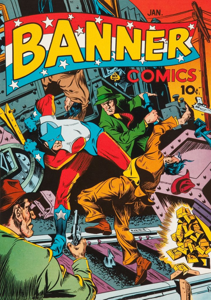
A rare foray into super-heroics, this is Banner Comics no. 5 (Jan. 1942, Ace); the guy with the star mask is ‘Captain Courageous’.
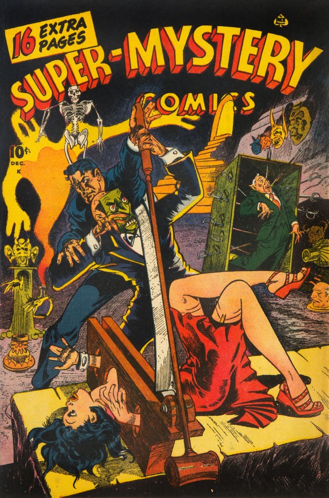
This is Super-Mystery Comics vol. 5 no. 6 (June 1946, Ace), featuring Mr. Risk in Riddle of the Revolutionary Portrait. Read it here! Kremer was signing as ‘Doc’ at the time.
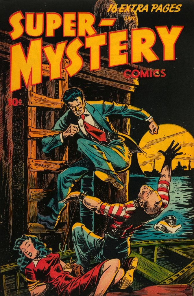
Dig all that detail! This is Super-Mystery Comics vol. 6 no. 3 (Dec. 1946, Ace), featuring Bert and Sue in The Adventure of the Murdered Medium; read it here!
Boasting a snazzy new logo, this is Super-Mystery Comics vol. 7 no. 3 (Jan. 1948, Ace), featuring Bert and Sue (Ace’s Nick and Nora?) in Hell Bent for Election!. Read it here!
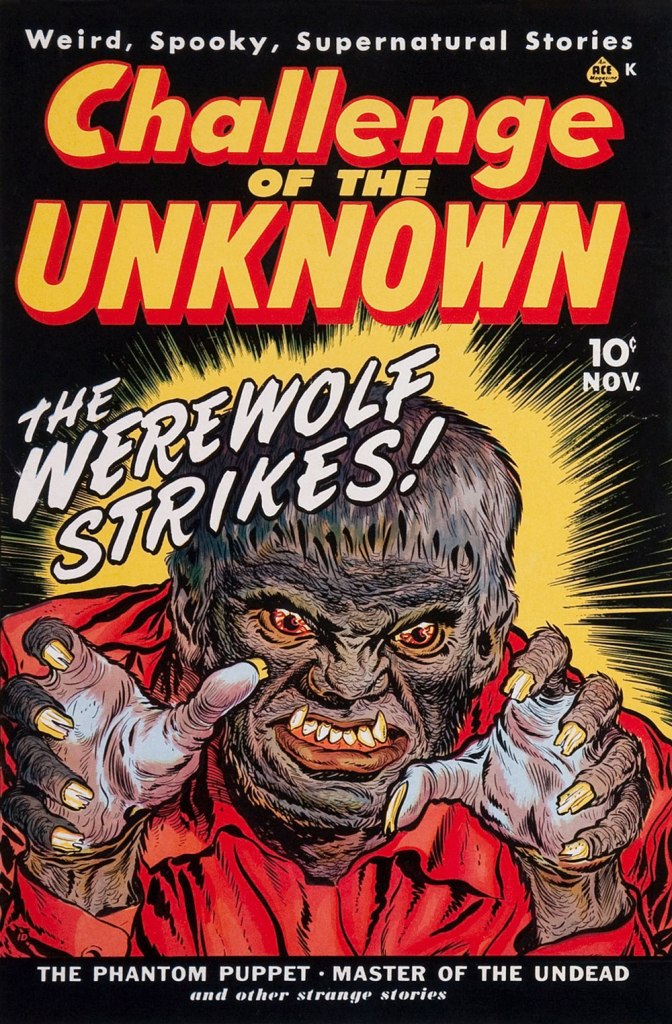
Eight years before DC’s Challengers of the Unknown, Ace came up with Challenge of the Unknown… àchacun son tour. This is the first of its two-issue run, no. 6 — but of course! (Sept. 1950, Ace); pencils by Kremer, inks possibly by Al Avison. Read it here!
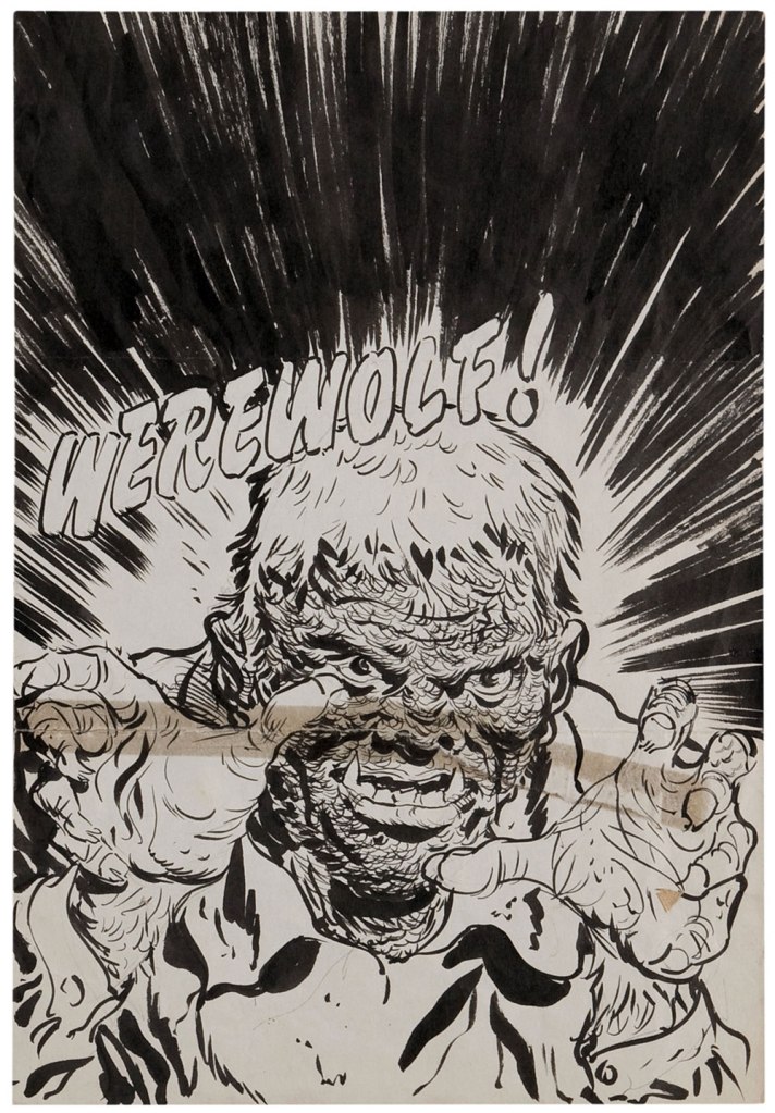
Three steps to a Werewolf. Kremer’s rough cover design…
The printer’s cover proof…
… and final publication switcheroo! One might surmise that someone got cold feet about CotU. This is The Beyond no. 1 (Nov. 1950, Ace). Read it here!
This is The Beyond no. 2 (Jan. 1951, Ace). A solid demonstration of dramatic perspective.
Here’s Mr. Risk again, in the first and penultimate issue of his own series — no. 2 (Dec. 1950, Ace) featuring The Case of the Psychopathic Lady and The Case of the Jinxed Air Line — the next issue was number 7! Read this one here.
Again, all that beautifully-rendered detail. This is The Beyond no. 3 (Mar. 1951, Ace), featuring The Keeper of the Flames. Read it here (preferably by candlelight)!
One of the most rewarding things for the Kremer fan is that the man thoroughly documented his creative process. In other words, he saved a lot of his art, including sketches, notes and preliminaries.
And the final version, from The Beyond no. 30 (Jan. 1955, Ace). See how Kremer had it all worked out, down to the colouring? Amazing. Oh — and read it here!
Happy birthday, Mr. Kremer — wherever it is you may roam!
Being in the throes of a heatwave is no fun. Given that I currently feel like my brain is melting, I shall keep this post to a minimum of text and a maximum of visual thrills. Luckily, today’s little collection of pretty forgotten comic book covers is quite fun, with covers that tantalize and mystify. Some of them also involve a lot of splashing around, which is a distinctly enjoyable thought right now. Let’s dive in, shall we?
Detective Eye no. 2 (December 1940, Centaur). Cover by Frank Thomas. It’s anything, and everything, goes on this cover! A lively party, indeed.
Funny Pages no. 36 (April 1940, Centaur). Cover by Harold DeLay. Note how the woman’s traditional, yet strangely tight and semi-transparent garb highlights her figure.
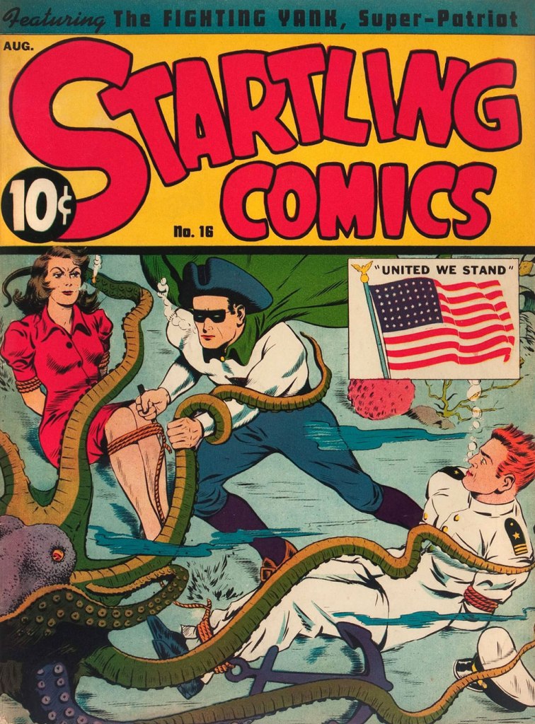
Startling Comics no. 16 (August 1942, Pines). Cover by Jack Binder. The woman is clearly fed up with all this silly boy nonsense and this is the last time she goes anywhere with these two.
Sparkler Comics no. 47 (September 1945, United Feature). Cover by Burne Hogarth. I always wonder about these tight leopard shorts – made out of leopard skin with some elastane mixed in, no doubt!
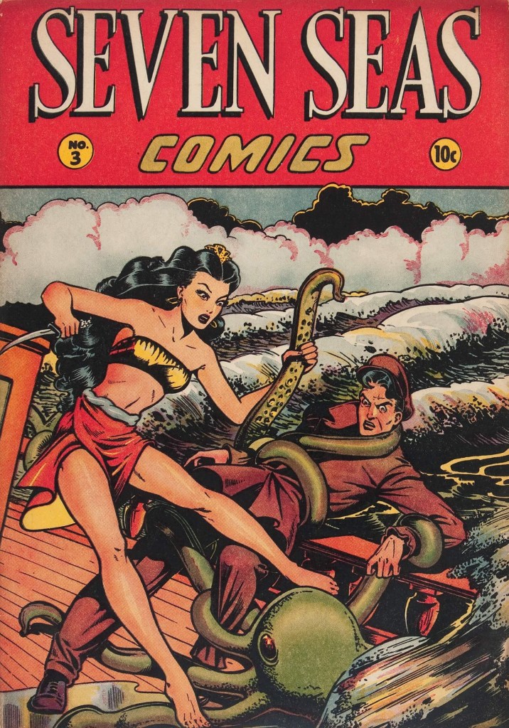
Seven Seas of Comics no. 3 (1947, Iger). Cover by Matt Baker. It is highly unusual for the octopus to grab the man instead of the woman; it must have something specific in mind.
« The cemeteries are full of irreplaceable people who were all replaced. » — Georges Clemenceau
Commercially and creatively, the 1950s held some of the best and the worst years for the American comic book industry. Basically, the first half was a glut and the second, a massacre. This is all well-trod ground. Today, we’ll stick to one artist and his main employer.
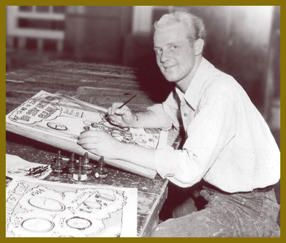
In his one intensely-prolific decade as a professional cartoonist, Joe Maneely (1926 – 1958) produced the overwhelming bulk of his work for publisher Abe ‘Martin’ Goodman’s Timely/Atlas, which would become Marvel Comics by the decade’s end.
The artist at his table. Herb Trimpe lets us in on the secret of Maneely’s prodigious speed (said to produce up to six pages a day, pencils and inks): « his pencils [were] almost nonexistent; they were like rough, lightly done layouts with no features on the faces … It was just like ovals and sticks and stuff, and he inked from that. He drew when he inked. That’s when he did the work, in the inking! ». Talk about unerring confidence!
Atlas historian Dr. Michael J. Vassallo sums up the Tao of Goodman (and, by and large, Marvel’s):
« As one genre faded, another would add titles to compensate. It didn’t matter if the new titles were basically redundant titles with new names. Goodman followed all trends in the comic book industry and the publishing industry in general.
A savvy businessman, he rarely led, mostly followed, but had the resources to follow with gusto, overwhelming competitors with product. »
As Ger Apeldoorn tells it, Maneely was a mere thirty-two years of age and at his frenetic artistic peak when tragedy struck:
« … on June 7, 1958, after going out for the night (with old-time friends John Severin and Walt Kelly assistant George Ward) he stepped out on the balcony of the train to get some air, fell between two trains and died. For a long time the story was that he had been drunk, but according to Dan Goldberg* he had lost his glasses earlier that week and that may have been a contributing factor. »
If the inspiring story of Joe Maneely, and its heartbreaking and sudden end is at all remembered these days, it has chiefly been through the diligent efforts of aficionado-historians such as Jim Vadeboncœur Jr. and the aforementioned Dr. Vassallo. Now why would an artist of such calibre fade so swiftly from memory? Since that happens all of the time (what one might term ‘invisible evidence‘), let’s move past the realm of the rhetorical and be more… specific. But first, some samples of the late Mr. Maneely’s goodies.
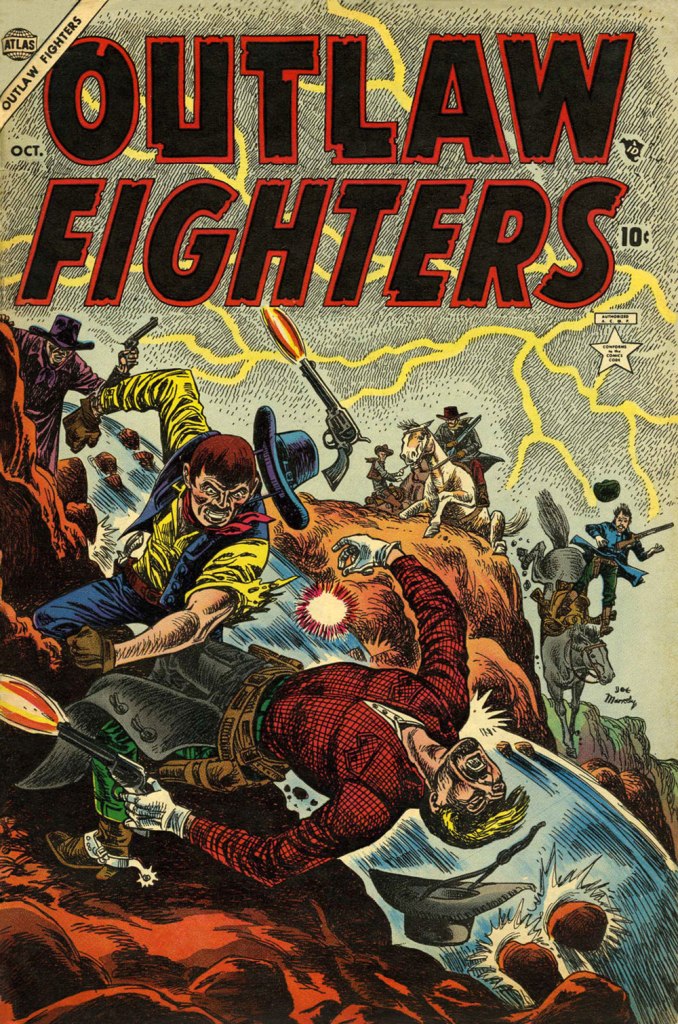
This is Outlaw Fighters no. 2 (Oct. 1954, Atlas).
This is Jungle Action no. 1 (Oct. 1954, Atlas). With spandex yet to hit the market (and even then), Leopard Girl’s costume must have been quite… stifling.
This is Mystery Tales no. 23 (Nov. 1954, Atlas).
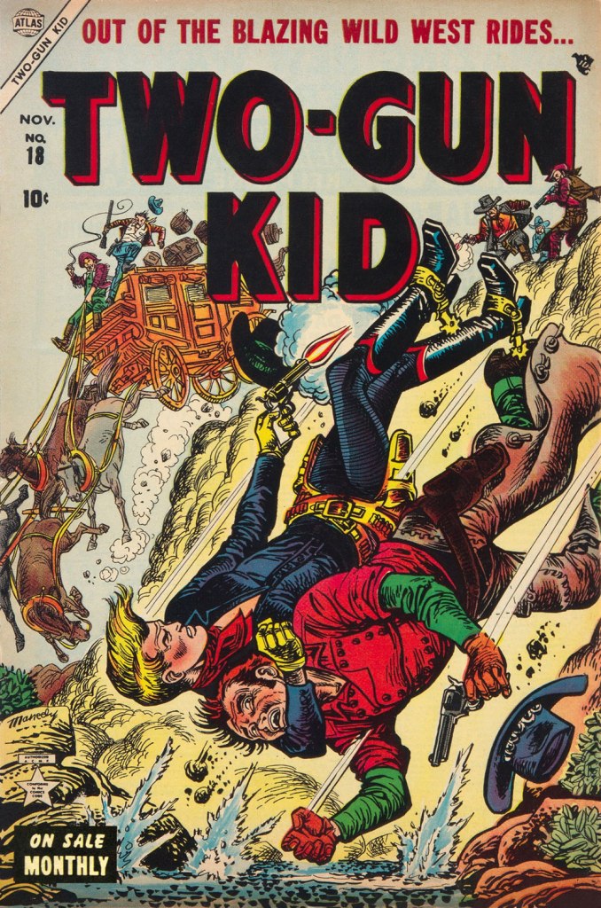
This is Two-Gun Kid no. 18 (Nov. 1954, Atlas). I doubt anyone’s going to land comfortably. Particularly those poor horses.
This is Journey Into Mystery no. 22 (Feb. 1955, Atlas).
“Oh, Stan — you’re so butch!” This is Rugged Action no. 2 (Feb. 1955, Atlas). To my eye, the bottom panel evokes Harvey Kurtzman‘s early style (think Two-Fisted Tales at EC); ironic, given that Maneely was as confident and speedy in his drawing as Kurtzman was painstaking and slow.
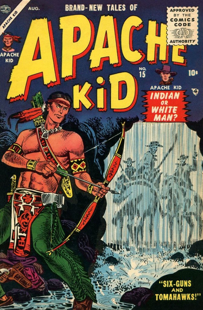
This is Apache Kid no. 15 (Aug. 1955, Atlas). The publisher also had in its roster Arizona Kid, Kid Colt, The Kid from Dodge City, The Kid from Texas, Kid Slade, The Outlaw Kid, Rawhide Kid, Ringo Kid, Texas Kid, Two-Gun Kid, The Gun-Barrel Kid… did someone say ‘redundant’? Why, yes, someone did.
This is Police Badge #479 no. 5 — the sole issue, really; its numbering picked up from Spy Thrillers… and went no further (Sept. 1955, Atlas). Maneely was another of that rare breed who could draw anything… because they enjoyed drawing everything. Dig all that well-observed detail!
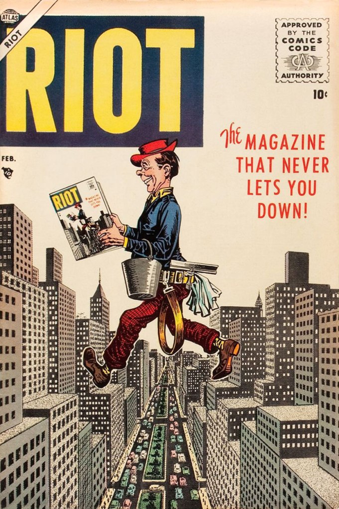
Atlas published, in quick succession, no less that four short-lived Mad clones: Crazy, Riot, Snafu and Wild, each lasting from three to seven issues. None were particularly funny either, even if they did look quite good. This is Riot no.4 (Feb. 1956, Atlas) featuring what is termed, in comic book circles, an ‘infinity’ cover.
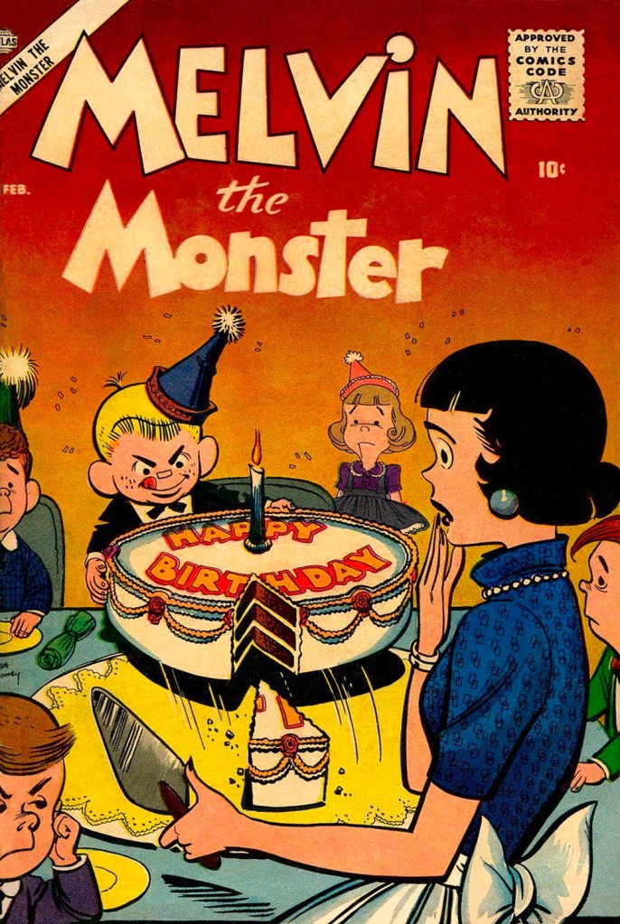
This is Melvin the Monster no. 4 (Feb. 1957, Atlas); Dr. Vassallo writes, in his in-depth Maneely overview for Alter Ego magazine (no. 28, Sept. 2003): « Stan Lee and Joe Maneely’s Melvin the Monster… duplicated everything they could about Hank Ketcham’s Dennis the Menace — art style, comic strip format, even upper-&-lower-case lettering style — everything except the warmth and innocence.»
This is Kid Colt Outlaw no. 69 (Feb. 1957, Atlas). Along with everything else, I love his way with flora and fauna. Incidentally, most of these covers were coloured by Stan Goldberg.
And so… why have Maneely’s star and memory dimmed so? It has been proposed, and I agree, that it’s because he just didn’t draw superheroes (a couple of Sub-Mariner covers being the lone exceptions), and Marvel itself hardly lifted a finger, over the years, to preserve the reputation of one of its principal architects.
The artist’s promotional letterhead illustration, circa 1948.
There’s been much idle speculation as to what course comics history would have taken had Maneely lived. Stan Lee wrote, in his usual disingenuous way, that:
« How I wish the world (and I) could have seen what he’d have done with the F.F., Spidey, Thor and all the other Marvel super-heroes! It’s a true tragedy that we’ll never have the chance. »
Let’s be honest here: Maneely was an incredible artist, and he made Stan look good, but Joe wasn’t a writer, and certainly not a world-builder in the fashion and class of Jack Kirby, Steve Ditko, Walt Kelly, Carl Barks, John Stanley, Basil Wolverton… and precious few others. Without Kirby, the so-called Marvel Age never would have come to pass. Not to mention that Maneely, with a wife and three daughters to feed and support, had just begun to work for one of DC’s friendliest editors, Murray Boltinoff**. He would have been unlikely to drop a better-paying, likely secure gig to drop everything and return to Marvel’s uncertain prospects. Ah, and I see Mark Evanier views it along the same lines.
Oh, and I’ve mentioned in the past Maneely’s likely influence (mostly in the inks) on his contemporary Rocco Mastroserio. Take a look at this gallery of his covers and see if you agree.
-RG
*Stan Goldberg, actually.
**as a matter of fact my first encounter — as a child — with Maneely’s work was through a reprint of one of his DC stories: The Doomsday Drum (House of Secrets no. 9, March-April 1958).
This year, since I am currently working from home and spending a lot of time on the balcony, I decided to take another crack at planting a few things in containers and taking a chance with the local squirrels’ tendency to root through soil and munch on whatever’s planted. Still, for all my adorable-yet-annoying rodent problems, I have to admit that I have it much better than some folks: there are no tentacles in this garden, thank you very much.
If you should ever see something of this sort emerging from the pot, run the other way!
ACG’s Adventures into the Unknown can always be relied upon for an octopus or two (or ten) – just see Tentacle Tuesday: ACG’s Adventures Into the Tentacles, for example. Tentacles of the plant variety also make a frequent appearance, of all shapes and sizes and degrees of grabbiness.
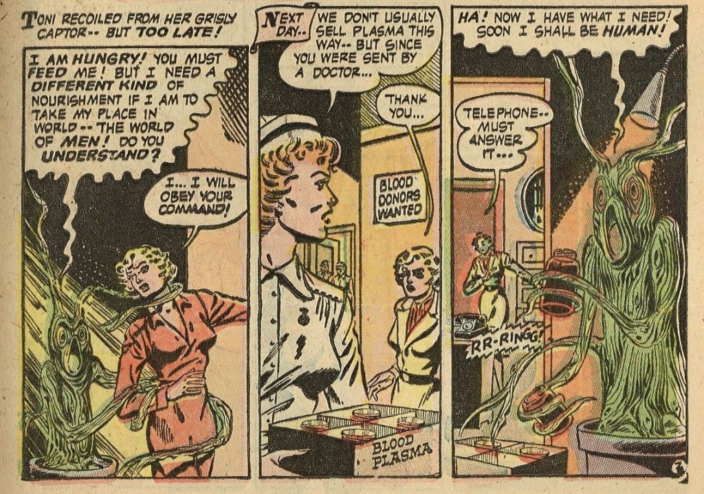
The Plant That Lived, illustrated by Harry Lazarus, was published in Adventures into the Unknown no. 38 (December 1952, KenACG). What happens when a young woman is forced to tend to a plant’s roots against her will?
It all starts with a dog in a botanical garden.
An interesting plot point, revealed at the end of the story, is that the plant’s fervent desire to become human is explained by his love for Phil Benson, the young botanist. I kind of want to see a follow-up story about that couple and the problems a plant-man pairing would be confronted with. And the classy blonde? She can find somebody else to hang out with.
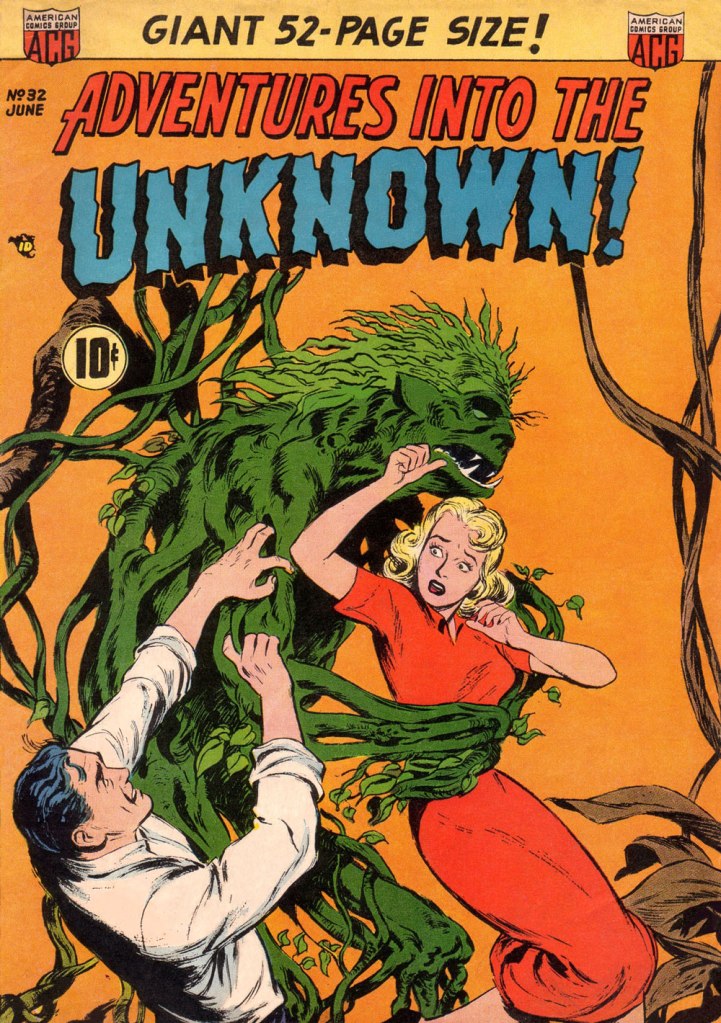
A very similar blonde in a red dress was featured on the cover of an earlier issue, Adventures into the Unknown no. 32 (June 1952, ACG). It may not explicitly feature tentacles, but it is close enough in spirit for me to happily welcome it to the fold!
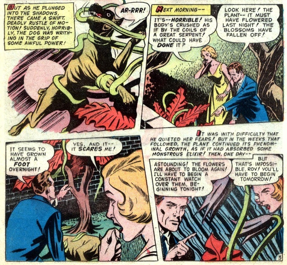
Another plant-tentacle offering from ACG comes from The Garden of Horror, illustrated by Lin Streeter, published in Adventures into the Unknown no. 48 (October 1953, ACG). This somewhat wordytale concerns itself with an archeologist who comes upon some strange seeds in a ruined temple in an unspecified ‘remote corner of Africa’. Arriving home, he plants them, and – surprise, surprise! – gets a little more than he bargained for. A dog is also involved, though this time it does not escape unscathed.
Carla gives her unscientifically-minded beau (strangely unconcerned with the killed dog, and later in the story, a similarly-dispatched burglar) an ultimatum: either he destroys this evil plant, or it’s all over between them! He chooses the plant – what the hell, she was a nag, anyway.
A subsection of mansplaining is giving directions that are not needed – I think Carla had the idea of ‘cutting the coils’ long before Roy told her to.
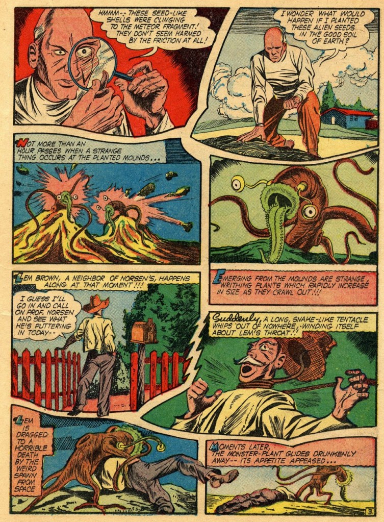
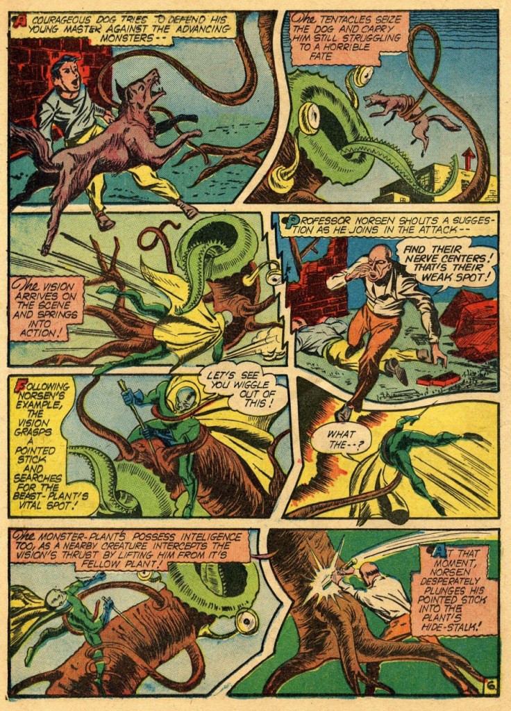
Continuing the theme of the strangulated man and the tentacle-throttled dog, we have two pages from a The Vision story (without a title) published in Marvel Mystery Comics no. 26 (December 1941, Marvel). A scientist finds some strange seeds and plants them. Does that sound familiar?
The tentacled creatures look like they’ve just woken up after a long night of partying with a terrible hangover. I love it!
Fortunately, the brave doggo that gets trapped by tentacles is saved in the nick of time by the Vision. Aarkus, aka The Vision, was created by Joe Simon and Jack Kirby (much like all roads once led to Rome, sometimes it seems that the latter has had a hand in creating nearly everything), as an alien enforcement officer from a dimension called Smokeworld. I stand by the side of any alien who saves braves doggos from a ‘horrible fate’!
This is neither here nor there, but The Vision has been repurposed by Roy Thomas in the late 1970s as part of the Avengers. I quote: « A great fan of Golden Age heroes, [Roy Thomas] first thought to bring back Aarkus, a 1940s hero who had been called the Vision due to his spectral appearance and smoke-based abilities. He discussed the matter with Marvel editor Stan Lee, who enjoyed the idea of a new member, but didn’t want it to be an alien or visitor from another dimension. After he suggested creating a new character entirely and that it could be an android instead, Thomas compromised by creating a new android character who resembled Aarkus and also called himself Vision. » Err, how is using the same name/moniker and a differently-coloured, but otherwise very similar costume considered “creating a new character”?
Glancing at some previous Tentacle Tuesdays, I realize I’ve actually built up a healthy nursery of plant instalments. If you’re still in a horticultural mood, here are some of them:
« When a naked man is chasing a woman through an alley with a butcher knife and a hard-on, I figure he isn’t out collecting for the Red Cross. » — Clint Eastwood in Dirty Harry (1971)
As is often the case, I had something else in the pipeline for this week… but then I came across a beautiful biography of a wise man whose birthday was just around the corner. Now if the other guy (he’s 88) can just hold on and stay alive another week, things’ll be just fine.
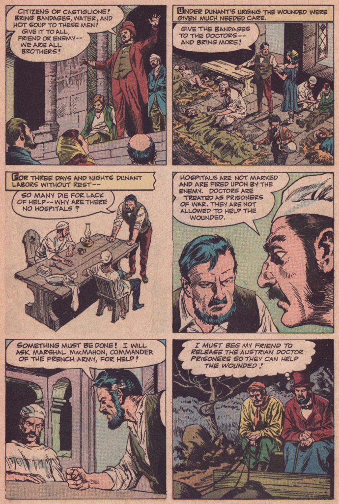
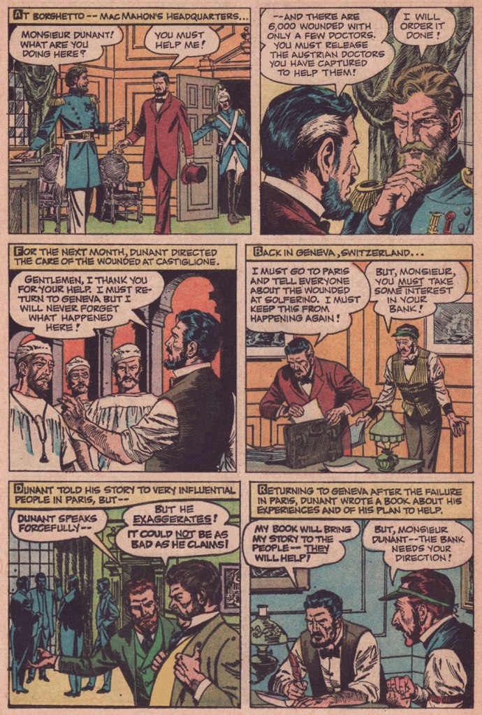
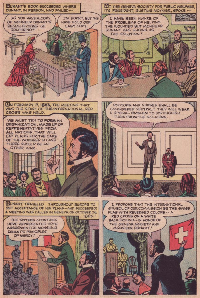
In these riotous days when acts and thoughts of kindness and compassion are being denounced as political and partisan, we would do well to remember the life and example of International Red Cross founder, Henri Dunant (né Jean-Henri Dunant, May 8, 1828 in Geneva, Switzerland). Read on…
To Treasure Chest’s credit, they’re not being tribal or sectarian at all: Dunant wasn’t even Catholic, but rather Calvinist.
As you can witness, Reed Crandall (1917-1982) was not the type of artist to cut corners. Unlike some of his peers who could not be bothered to properly draw, say, details of background, period or costume, Crandall lavished attention and care to each and every element, yet without overpowering the narrative. His pages aren’t mere sequences of panels: they’re smartly composed for smoothness of flow and tonal balance.
Though nowadays his fame rests largely upon his brief but fruitful association with EC Comics (1953-56) and its echo at Warren Magazines (1964-1973), the greater bulk of his work was produced for Quality Comics (1941-1956) and for the catholic comics anthology Treasure Chest of Fun & Fact (1960-1972). All Men Are Brothers was, as it happens, his first work to be published in Treasure Chest.
Here’s a tongue-in-cheek but revealing snippet from a profile of Crandall that appeared in Creepy no. 10 (Aug. 1966, Warren):
« Combined with Reed’s fantastic drawing ability and mastery of rendering technique, is the rare ability to take any subject or setting and impart to it a complete sense of realism and authenticity. This, along with the fact that he is one of the most genial and unassuming men in the comics field, has earned him the high regard of his fellow artists, in addition to a growing circle of reader-admirers.
Asked about his ambitions, Reed replied: “To live in an ivory tower and to try to learn to draw and paint, also to pursue unendurable pleasure indefinitely prolonged.” It looks to us as though the drawing and painting are pretty far along already, so surely the ivory tower and prolonged pleasure can’t be too far behind… and in our opinion, it couldn’t happen to a nicer guy! »
As for writer John Randolph, who knows? He scripted twenty or so non-fiction pieces for TC between 1955 and 1962, then appears to have moved on. It must be noted that he understood the comics medium, as his work (often with Crandall) was well-paced and not overwritten, the words and visual in steady harmony. Many a writer, lacking the restraint and finesse required for the collaborative pas de deux of comics, tends to crowd out the illustrator, box him in (j’accuse, Al Feldstein!) or pointlessly restate what’s right there in the visuals (Et tu, True Believer?). Add to that the difficulty of elegantly condensing a life or career in six pages… as in this case. Take a bow, Mr. Randolph, whoever you are.
All Men Are Brothers originally appeared in Treasure Chest of Fun & Fact vol. 16 no. 7 (Dec. 8, 1960, Geo. A. Pflaum); cover by Crandall.
Crandall is most closely associated with the long-running Quality (and DC thereafter) character of Blackhawk (a Will Eisner co-creation). This is Modern Comics no. 78 (Oct. 1948, Quality). Between the operas, musicals, and films, John Luther Long’s Madame Butterfly sure gets around! Read the issue here!
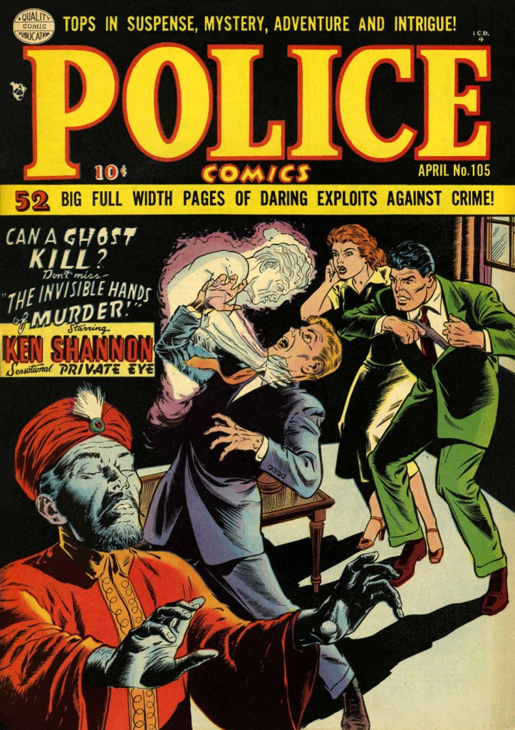
More orientalism, but what a cover! This is Police Comics no. 105 (Apr. 1951, Quality). This title was the former and first home of longtime headliner Plastic Man, who bowed out with issue 102. Superheroes, you’ll recall, suffered fading popularity by the early 1950s. Read the issue here!
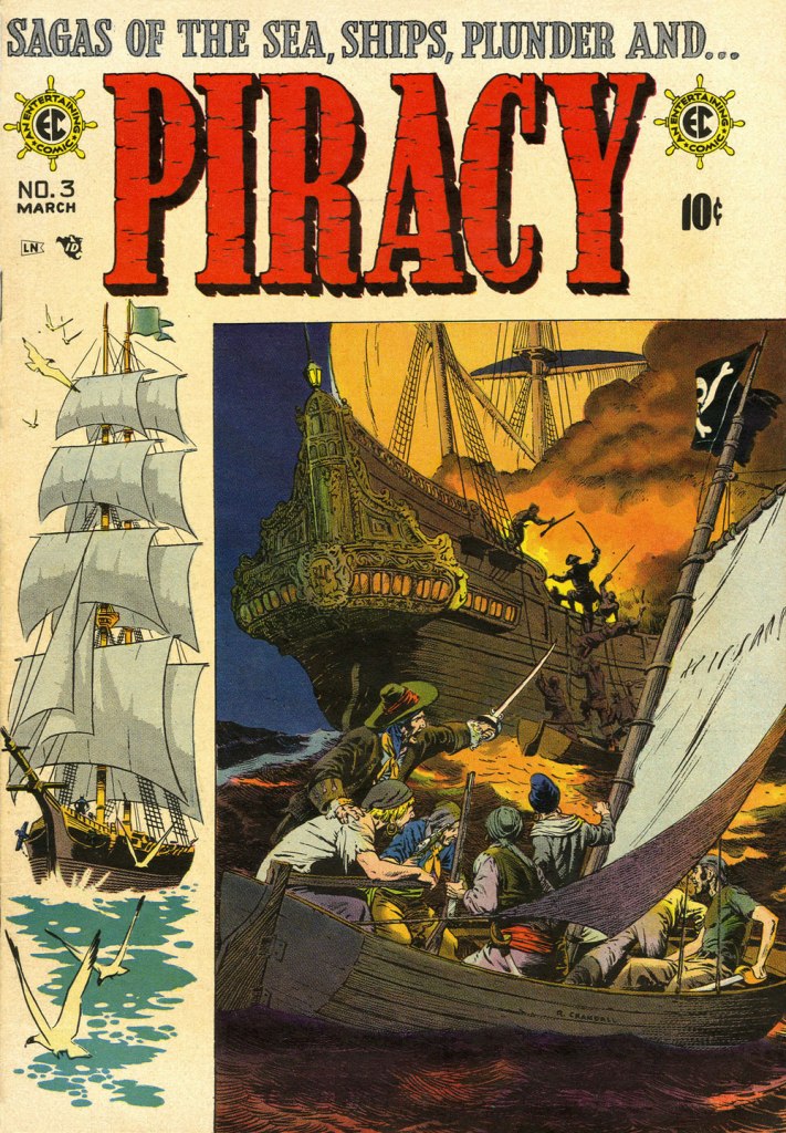
While Crandall arrived a bit late to the EC party, he made his lasting mark. Versatile as he was, I’d argue he was most in his element on this swashbuckling title, one of EC’s last-ditch, doomed attempts to placate the censors. Wally Wood drew the ship on the left, a recurring element of the cover layout. EC colourist Marie Severin (1929-2018) truly deserves a long round of applause for the sublime job she performed here. This is Piracy no. 3 (Feb.-Mar. 1955, EC).
« Don’t change your tack when the timbers crack On the dark and the rolling sea… » *
I am relatively indifferent to tales of adventure, but the siren song of the ocean sometimes prompts me to venture into reading tales about ruthless pirates or valorous seafarers and the perilous voyages they undertake on ships big and small, magnificent or modest. Who hasn’t felt a thrill at spotting a handsome vessel on the water, even if that water is but a canal running through the city? The other point of interest of this discussion is that where there’s an ocean and a ship upon it, there is a (preferably) giant octopus somewhere nearby, only waiting to shred the ship’s hull to smithereens and voraciously gobble up its shipmates.
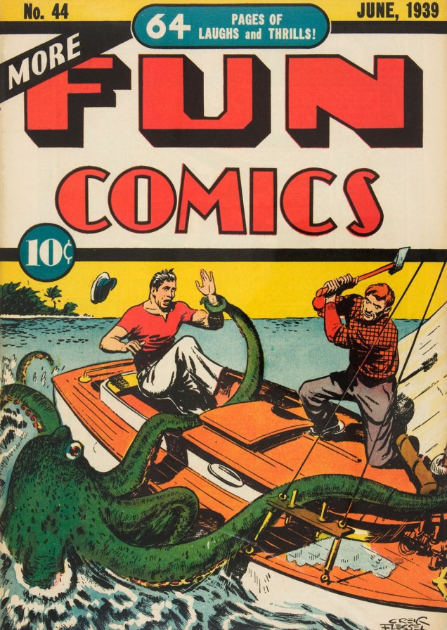
Here is a modestly-sized yet utilitarian boat with a handsome octopus in tow. Maybe he just wanted to climb on deck to rest a while, like this otter?
More Fun Comics no. 44 (June 1939). Cover by Creig Flessel.
A similar boat (I don’t know whether it’s my profound lack of knowledge of boats that makes it seem that way) was attacked by a bigger, scarier – downright malevolent! – octopus some twenty years later. See Kyle “Ace” Morgan, Matthew “Red” Ryan, Leslie “Rocky” Davis and Walter Mark “Prof” Haley scramble for safety while an enraged octopus seeks to devour them! Oh, sorry, I’m being melodramatic.
Challengers of the Unknown no. 77 (Dec. 1970 – Jan. 1971, DC). Pencilled by Jack Kirby, inked by Jack and Rosalind (Roz) Kirby.
This cover has actually been recycled from Showcase no. 12 (Jan.-Feb. 1958, DC), where the background was yellow and the water a more normal shade of blue-white. I do like how the octopus stands out against a black background, however (and the multi-coloured water really sets off his beady, evilly-glowing green eyes!)
Of course these encounters also take place within the stories, as opposed to on the cover.
Page from The Outcasts of the Seven Seas, scripted by Bob Haney, pencilled by Howard Purcell, and inked by Sheldon Moldoff, was published in Sea Devils no. 23 (May-June 1965).
Time to move underwater, a very natural setting for an octopus attack. Here we have a submarine tenderly wrapped in tentacles:
Page from The Human Torch in the Clutches of the Puppet Master!, (over)scripted by Stan Lee, pencilled by Dick Ayers and inked by George Roussos. This story was published in Strange Tales no. 116 (Jan. 1964, Marvel).
Last but not least, I’ve kept this neat little submarine until the end:
Voyage to the Deep (IDW Publishing, 2019), a collection of Dell Comics’ short-lived, four-issue series published from 1962 to 1964 and illustrated by Sam Glanzman. Note the introduction by WOT favourite Stephen Bissette!
Glanzman is also a favourite of ours, though we haven’t talked about him much (yet). In case you’re wondering what the insides of one of those issues looked like – good, they looked really good! Note the octopus proudly perched in the middle of the page.
Page from Voyage to the Deep no. 1 (September-November 1962, Dell). Art by Sam Glanzman.


