Panning the murky old print stream for the odd glimmering nugget
Oh, the Horror: the 1950s
The 1950s, as we all know, brought us the acme (and nadir) of horror comics. A zillion publishers, most of them long gone, got into the gore game before the censors stepped in. Let’s take a look at what led to the neutering of the comics industry…
« … his appreciation for city life was such that when I was a little girl and we would be going on walks, he would periodically draw my attention to the colorful and interesting patterns created by garbage strewn about on the streets, or by dilapidated storefronts with their torn-off signs. » — Gina Kovarsky on her father’s perspective
Funny how history works: for every world-famous New Yorker cartoonist, there’s another who’s just about been forgotten, yet is every bit the equal of his more celebrated colleague.
Anatol Kovarsky (born in Moscow in 1919, lived and thrived to the impressive age of 97) began working for the New Yorker in 1947, who published his cartoons and cover illustrations until 1969, when the man turned his full attention to painting.
This specific piece first saw print in The New Yorker in 1956, and was collected later that year as part of the classic Kovarsky’s World (Alfred A. Knopf).
Today, 102 years ago (!), on May 18th, 1917, William Blake Everett came into the world. He did not become a poet like his ancestor William Blake, nor a politician like Richard Everett, another famous forebear, who founded the city of Springfield, Massachusetts. Bill Everett’s father wanted him to become a cartoonist, and his wish came true, though the elder Mr. Everett died long before before the rebellious Bill found his place in the comics industry.
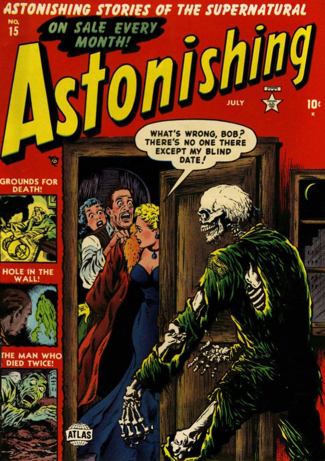
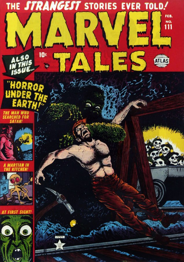
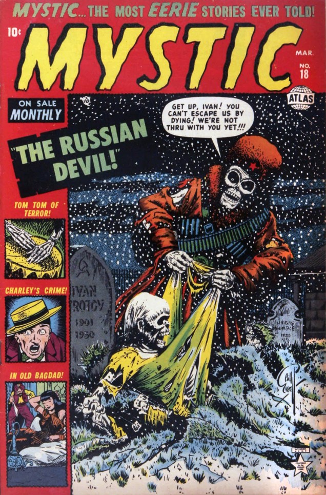
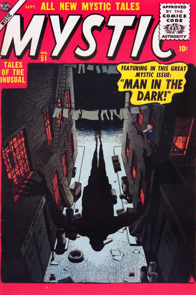
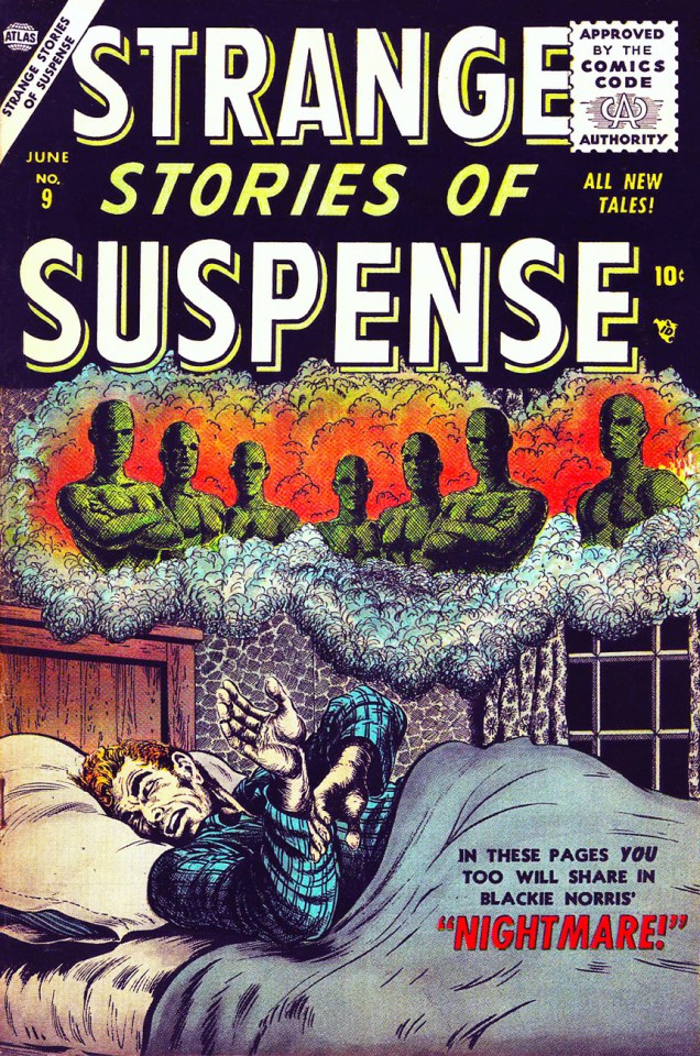
Bill Everett is best known for creating Namor the Sub-Mariner (visit out Tentacle Tuesday: Prince Namor for an overview of this character’s story and adventures… or read The Brilliance of Bill Everett’s Sub-Mariner, Marvel’s Superman, a great article from Sequart Magazine), but he also had his hand in the creation of Daredevil and Simon Garth, Zombie. Everett excelled in many genres – superheroes, horror, fantasy, science-fiction – but today, since there are far too many covers to feature, I will force myself to focus on horror. Welcome to the ghoulish gallery of my favourite Bill Everett covers! (They’re not necessarily the goriest or scariest – sometimes it’s a mood of quiet menace or a striking composition that sways me.)
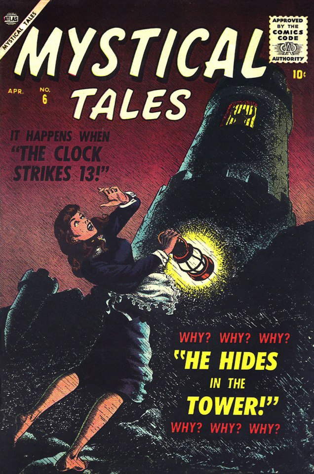
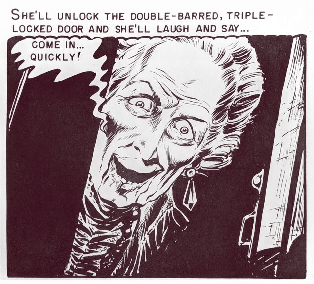
Venus no. 19 (April 1952). The silent, smirking watchers in the corner are far creepier than the skeleton embracing her!Astonishing Tales no. 15 (July 1952). Do a lot of daughters address their fathers by their first name?Marvel Tales no. 111 (February 1953)Mystic no. 18 (March 1953).Journey Into Mystery no. 9 (June 1953)Marvel Tales no. 117 (August 1953)Mystic no. 51 (September 1956). I love these silent covers where the menace is suggested rather than shown in detail.Strange Stories of Suspense no. 9 (June 1956)Marvel Tales no. 151 (October 1956). Here it’s the composition I especially like – the giant hair isn’t that scary.Mystical Tales no. 6 (April 1957). I admit the WHY? WHY? WHY? amuses me WHY? WHY? WHY?; – one inquiry should have sufficed. Speaking of “WHY?”… Why is she barefoot? Those rocks have to be treacherously slippery at the best of times, let alone in a rainstorm.
« You really saw that things were not at all what was portrayed in the mass media… at least not in our neighborhood. It was just a conclusion that most of the kids of that age came to, that things were extremely corrupt. » — Spain Rodriguez
While plenty of cartoonists trod the path of autobiography before him, it took Manuel ‘Spain’ Rodriguez (1940-2012) to truly show how it should be done: here at last was a genuine full-blooded practitioner, hardly content to merely observe from the sidelines, blending with the wallpaper. Lover, brawler, consummate graphic storyteller: a scarce combination indeed.
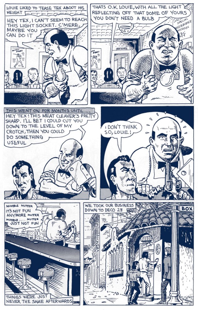
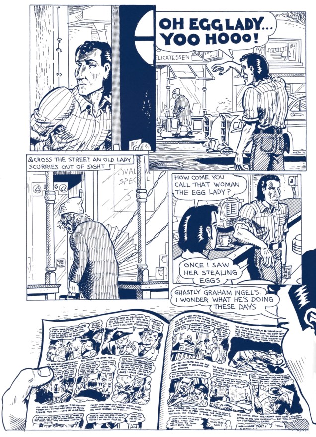
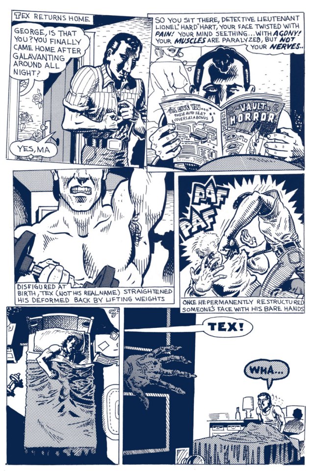
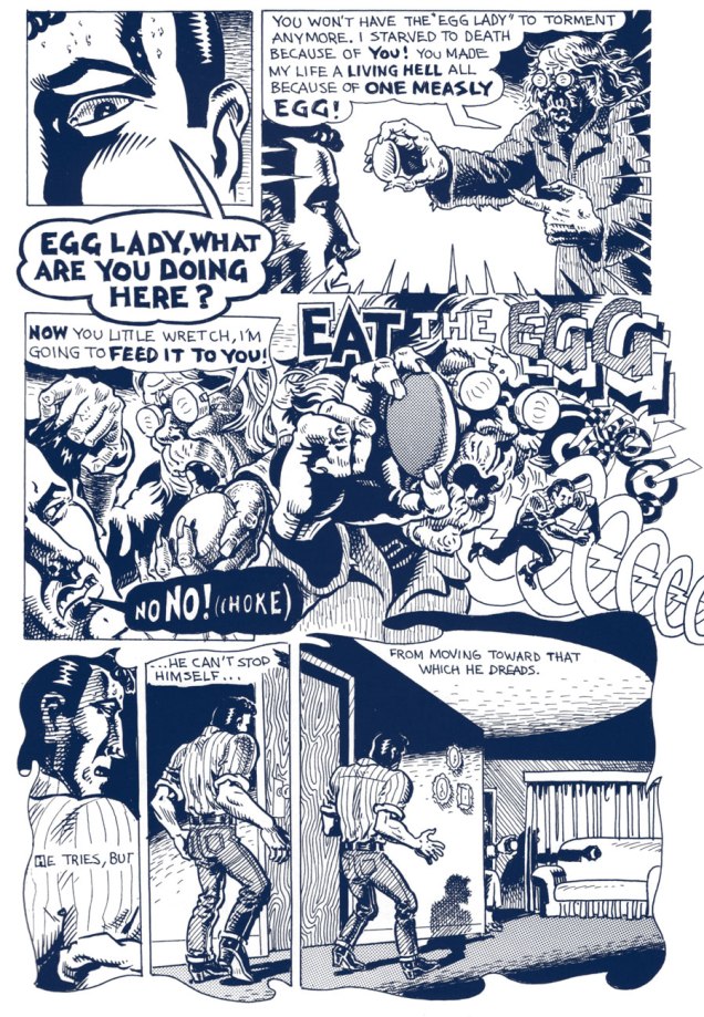
The following tale belongs to a cycle recounting the exploits and insights of The North Fillmore Intelligentsia, Spain’s closest compadres in Buffalo of the 1950s. Tex’s Bad Dream… originally appeared in Blab! No. 3 (Sept. 1988, Kitchen Sink Press); indeed, Spain’s recollections became, over time, the sole reason to purchase the once-excellent Blab! Mercifully, most of these were collected, in their usual exemplary fashion, by Fantagraphics, as Cruisin’ With the Hound (2012). You’ll still be lacking the mysteriously-omitted, quite essential « How I Almost Got Stomped to the “Still of the Night” by the “Five Satins » (Prime Cuts No. 2, Mar. 1987, Fantagraphics), which you can find in another Spain anthology, My True Story (1994, Fanta again).
In the meantime, enjoy, with my compliments, this true-life tale of original EC Fan-Addicts, facial restructuring, cautionary dreams, isometrics and pork sandwiches.
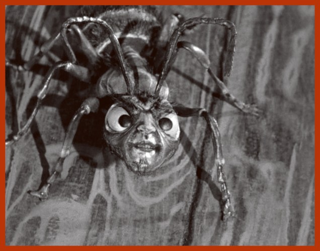
Occasionally, I notice a comic book cover with a tentacled monster so peculiar that one starts wondering whether the artist was on drugs or just couldn’t give a shit. That is not a criticism, however: where grabby appendages are concerned, the weirder, the better. Even if some of these guys have a face (muzzle? rictus?) even a mother couldn’t love, or their anatomy defies all laws of biology, we’ll welcome them with open arms!
As usual, in chronological order.
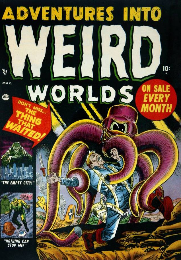
First in our line-up is this little fella in a hat. At least he looks like he’s wearing a cap, although perhaps he just has a square head with a skin flap hanging over the sides. At first glance, his tentacles are hollow, although their flesh is probably just a dull shade of battleship grey. So what’s this “thing that waited”? Soviet soldiers who are actually alien invaders. Duh.
Adventures Into Weird Worlds no. 3 (March 1952), cover by Joe Maneely.
This next cover is probably a little more standard for pseudo-octopus fare: a lady with huge, ahem, bazooms (Russ Heath liked ’em busty, it seems – seriously, just look at the size of those things!) threatened by some horrific monster who’s dispatching her companion as expediently as possible. Still, the somewhat Wolverton-esque, grave-dwelling aliens with pincers at the end of their tentacles are odd-looking enough to squeeze their way into this post.
Spellbound no. 20 (March 1954), cover by Russ Heath.
This toupee-clad creature with evil gimlet eyes doesn’t look much like a pet, if you ask me. How are those grabby little arms attached to its head, anyway? Wait, who am I talking about, again? 😉
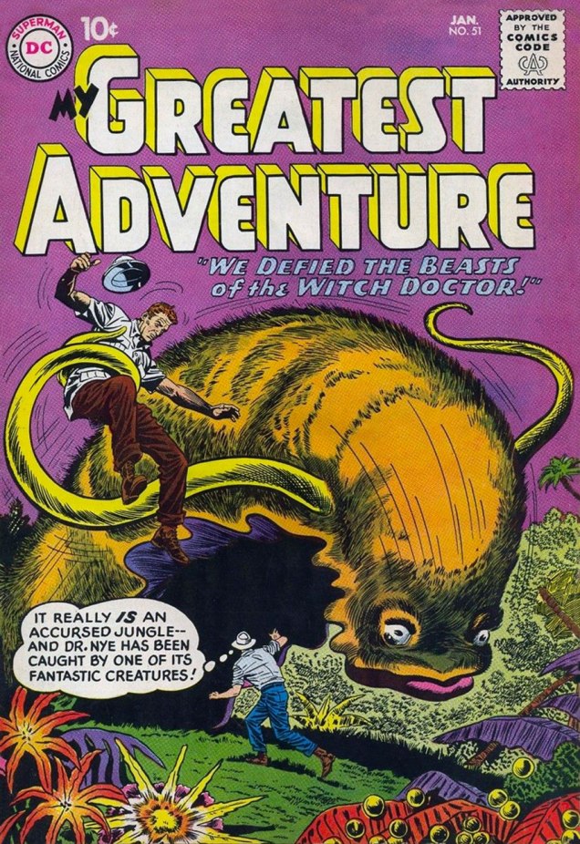
“My Greatest Adventure” was a title that promised much, and it must have been difficult to live up to it every month. Witness the following “fantastic” creature – a furry slug with disturbingly fleshy lips and tentacles. I can’t vouch for my reaction had I been an excitable ten-year old, but to this blasé adult, the poor beast summoned by some psycho witch doctor (the jungles seem to be always overrun with them) is just begging to be put out of its misery.
Our next exhibit finally features a proper alien, one who looks strange but at least makes sense as a unified, functioning creature. I love his sadly drooped whiskers, his dejected expression that’s strangely at odds with his pontifical speech.
Tales of the Unexpected no. 66 (October 1961), cover by Bob Brown.
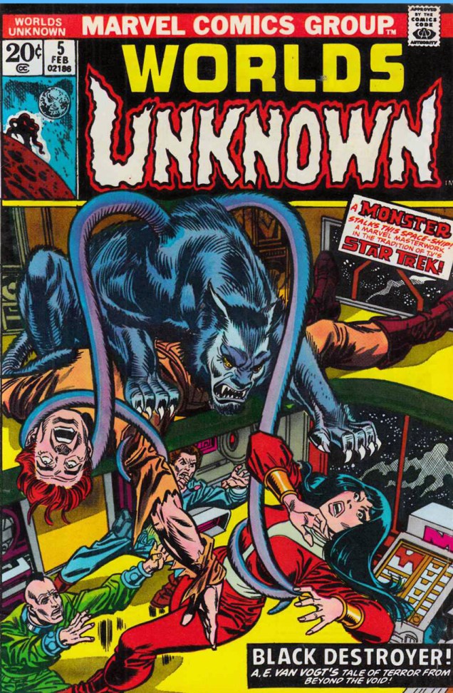
« Make him a werewolf! But in space! And give him tentacles! » Yeah, guys, that went over really well. A Marvel Masterwork, my ass. But wait: Black Destroyer! is an adaptation of A. E. van Vogt’s short story from 1939. And did Cœurl, the black cat-like creature, have tentacles in the story? Why, yes, he did.
« His great forelegs—twice as long as his hindlegs—twitched with a shuddering movement that arched every razor-sharp claw. The thick tentacles that sprouted from his shoulders ceased their weaving undulation, and grew taut with anxious alertness. Utterly appalled, he twisted his great cat head from side to side, while the little hairlike tendrils that formed each ear vibrated frantically, testing every vagrant breeze, every throb in the ether. » (read the full story here.)
Worlds Unknown no. 5 (February 1974), cover pencilled by Gil Kane and inked by Frank Giacoia. Cœurl looks like he’s floating on top of the corpse – I don’t think the artists spent too much time watching an actual cat at work.
My last offering for today is the cutest, featuring an adorable blue varmint who gets my full sympathy and support. Weird? Sure, a bit – he’s got a tentacle sprouting out of his forehead – but beauty is in the eye of the beholder, right? This cover also proves that monsters are just as interested in tooth-whitening procedures as us humans.
At its best, Maurice Whitman’s art has the power to capture one’s imagination. He has an excellent eye for dynamic layouts, and his ghoulies and creepies are often drawn in a kind of a squiggly, sketchy way that really brings them alive for me. Not to be forgotten are his shapely women, usually in various states of déshabillé. Sometimes his covers are too chaotic, and don’t really hold together, leading the viewer to scratch his (or her!) head in confusion; but when it works, when all the pieces fall into place, his art can be glorious.
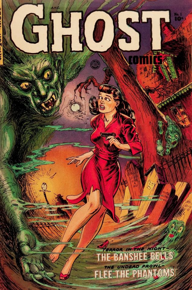
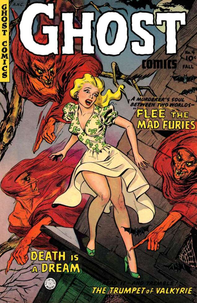
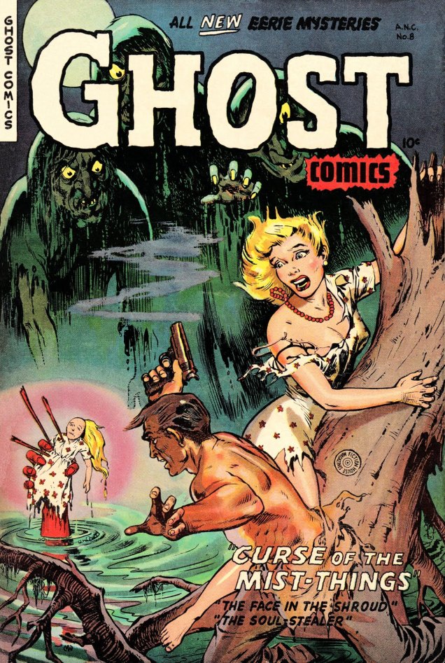
Ghost Comics had but 11 issues published between 1951 – 1954, so I could have included all of them in this post… but you can see a gallery of these covers on other websites, and besides, some of them are firmly in the “doesn’t quite work” category. Here are my favourites, then – five out of eleven, not bad!
Ghost Comics no. 1, 1951. I like the details, such as the lost shoe, the cute little ghost in the bottom right corner, a mysterious dark figure by a lamppost (as if the green demon wasn’t terrifying enough)… and the warping of the scene really works, imho.
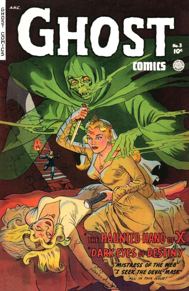
The following cover is kind of the raison d’être of this whole post – I adore it. Whitman put so many reach-out-and-touch-it details into it – talk about the juxtaposition between terror and sex-appeal! The woman’s négligé is probably the sheerest it has been my pleasure to encounter in pre-code comics. Her hair is also beautifully drawn, especially that little curl that seems to be reaching for the candle.
Clearly, I’m not the only one to pay special attention to this cover – it was chosen as the cover of Ghosts and Girls of Fiction House!, another addition to Craig Yoe’s Chilling Archives of Horror Comics.
Ghost Comics no. 3, 1952. This one has crisper, cleaner lines, but the potent composition calls out to the viewer (and after a few minutes spent in contemplation of the art, you can start wondering what the hell is going on here, and how on earth does it make any sense?)Ghost Comics no. 4, Fall 1952. Whitman was clearly fond of a certain type of blonde… not that anyone’s objecting. The two teeny bats on the right have captured my heart.Ghost Comics no. 8, 1953. Come on, witch, you could have made a better effort with the doll’s hair! Are these the furies from no. 4?
All issues, should you want to read them, can be found at comicbookplus.
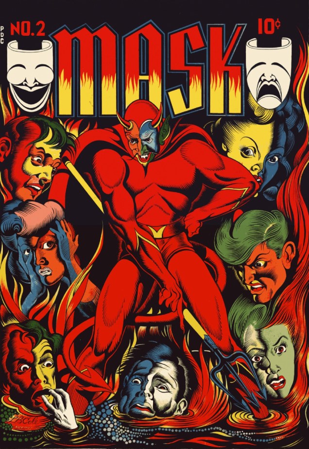
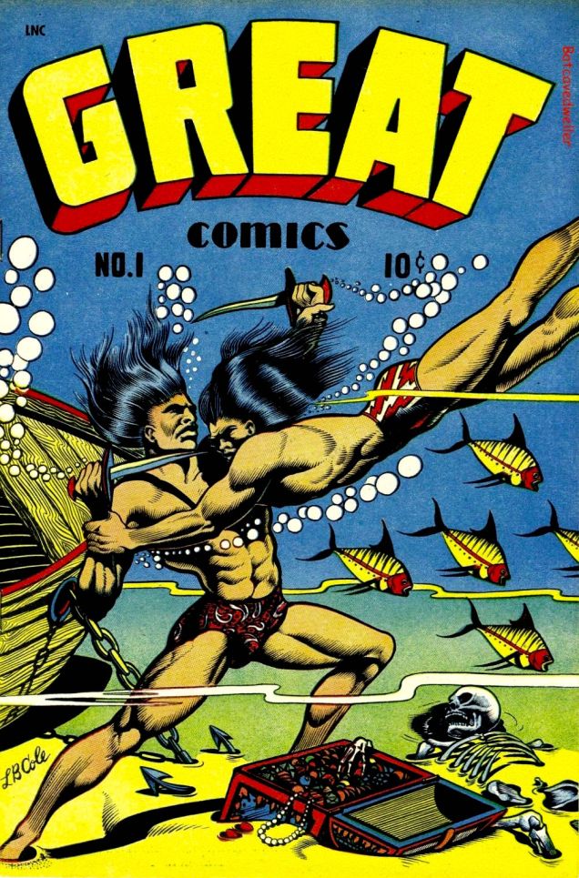
There’s probably no need to write a panegyric on Leonard Brandt Cole, 1918-1995. (But did you know he had a doctorate in anatomy and physiology?) The first thing that springs to mind is his use of primary colours over frequently black backgrounds, what he referred to as “poster colours”. Indeed, most L.B. Cole covers would, and occasionally do, make great posters. Going into biographical detail, one might also mention his publishing company, Star Publications, founded in 1949 and singled out in Fredric Wertham’s 1954 exposéSeduction of the Innocent for the “grisly” nature of its published horror titles. Then there’s his work as art director and editor at Dell in the early 1960s… but as usual, I’ll let others get to the nitty-gritty of his life and career. Here are some of my very favourite L.B. Cole covers, in chronological order.
Mask Comics no. 2, April-May 1945 (Rural Home). Read it here. The classically-oriented study of human expressions had me smitten even before I noticed the devil’s muscular thighs.Great Comics no. 1, 1945 (Novack Publishing). Read it here.
« An avid science fiction fan, Cole was known for slipping in sci-fi elements even when they weren’t appropriate, such as rocket ships and ray guns appearing on the covers of Captain Flight Comics and Contact Comics. Both titles were supposed to be devoted to contemporary aviation. » (source) Fuck being appropriate, I say!
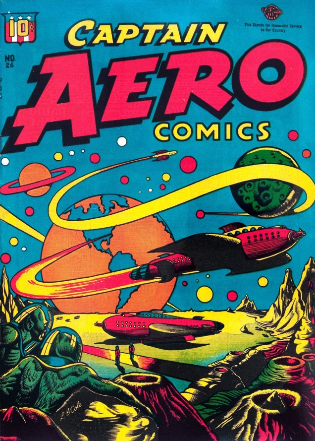
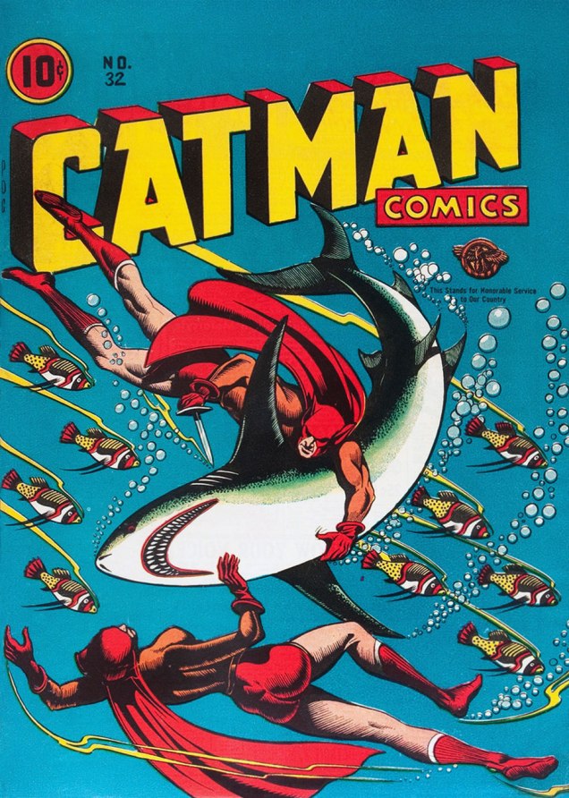
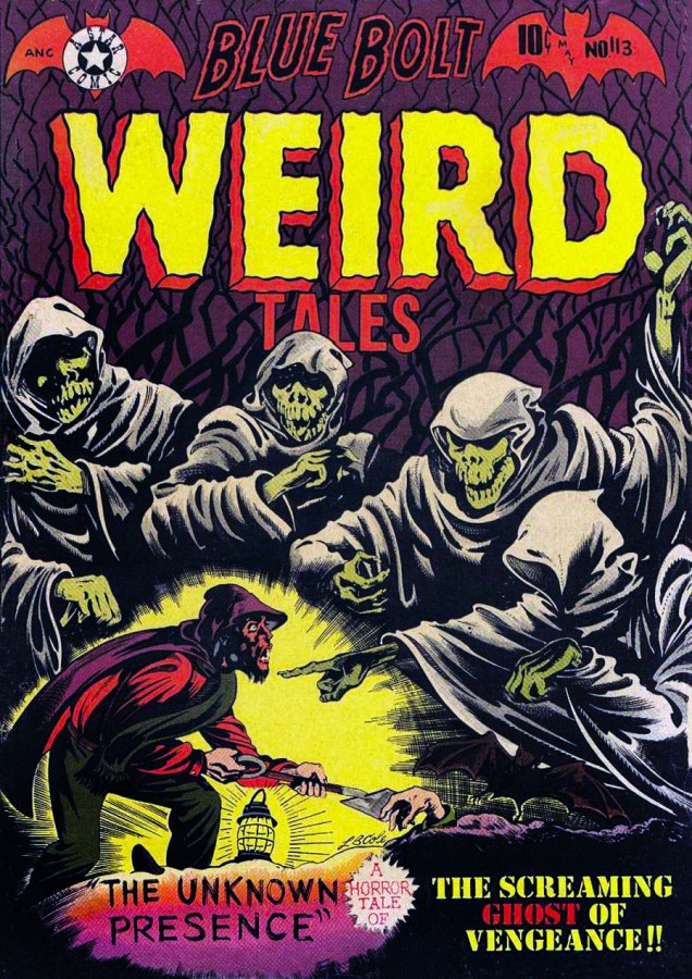
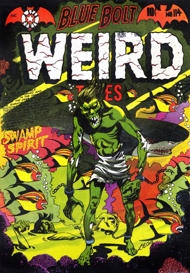
Captain Aero Comics no. 26, August 1946 (Continental Magazines). Read it here. This is like a Soviet poster in overdrive.Cat-Man Comics no. 31, June 1946 (Continental Magazines). A great scene, isn’t it? Though shoddily printed, the tension of the moment comes through loud and clear, and I love the dots of snow in the darkness. Cat-man isn’t to be confused with Catman, a supervillain and enemy of Batman (first appearance in Detective Comics in 1963). Catman: a professional trapper of jungle cats turned to crime for the usual reason (i.e. boredom) after procuring himself a costume made out of ancient African cloth (?!) Cat-man: raised by a tigress to be an upstanding member of society and scourge of criminals, with 9 lives, super-strength and night vision at his disposal. The moral – be kind to tigers! Read the issue here.Cat-Man Comics no. 32, August 1946 (Continental Magazines). Cat-Man (created by Irwin Hasen), usually paired up with sidekick Kitten (created by Charles M. Quinlan), a former circus acrobat. That’s them frolicking underwater on this cover – tigers love water, by the way. This is the last issue of Cat-Man, so Kitten, who was 11 years old when her association with son-of-tigress began, is at her shapeliest. Mr. Cole wasn’t well-versed in anatomy for nothing. Read it here.“Into its gurgling ghastliness goes Peep… sailing blithely in the rocket car...” I somehow imagine that read out loud with a British accent. And yes, there’s a character named “Peep” in the story. Jeep Comics no. 3, March-April 1948 (Spotlight Publishers). Read the issue here.Guns Against Gangsters vol. 1 no. 6, July-August 1949 (Premium). Read the issue here. Another cover with that blue-green-yellow gradation, and while I love these colours together, it’s the cartoony shark that gets my vote (and sympathy). Sadly, when one pits a woman in high heels and a miniskirt against a huge shark, the latter will always lose.Blue Bolt no. 105, April-May 1950 (Star Publications). I can’t resist the combination of a dragon/bird flown straight out of a Slavic fairy-tale with stylish space opera.Blue Bolt Weird Tales of Terror no. 113, May 1952 (Star Publications). A genuinely spooky cover.Blue Bolt Weird Tales of Terror no. 113, August 1952 (Star Publications). « It was a terrible thing that moaned and cried out in the dark vistas of the deep bayous… » This cover is busy, no doubt about it, but I think it works. That slow, grotesque shuffle through water… brrr! Say what you will about L.B. Cole’s style or his propensity for using reds and greens, but the guy knew what he was doing.
« I hate war, Steve! I hate the people who cause it and I hate them with very atom of my being! So I pretend to respect the enemy, even like him. I try to minimize him with love! » — Gen. Maximillian R. Hart, The Zanti Misfits
Feast your rheumy peepers on Bernard Baily‘s (co-creator, with Jerry Siegel, of The Spectre) famous cover for issue 4 of Gilmore Publications’ Weird Mysteries, April 1953. The cover’s creepy promise was squandered, since Baily’s friendly lil’ fella never appears within the issue.
This one also contains a classic, though rather thin, Basil Wolverton story, « The Man Who Never Smiled ».A few years ago, the cover’s original artwork was auctioned off for the tidily respectable sum of $33,460.00.
It fell to the American Comics Group (ACG) to follow up on the notion, about a year later in the pages of its Forbidden Worlds No.30 (June, 1954) and the cover-featured « The Thing on the Beach! » by the unknown scripter, and artist Harry Lazarus (not theHarry Lazarus, but one of the three Lazarus brothers working in the comics industry in the Golden Age.)
« It started with brutal murder… until nature decreed a weird revenge! »
Rogers was a right mother from the start, but when his captain had his fill of his homicidal shenanigans, dropping him off on a remote island to cool him off, a funny thing happened. He found nothing in the place save ants, which had made short work of the unlucky goat population and the local flora. So what did the crazy bastard do? He gobbled ants. For weeks. And became a giant ant himself, it follows. You are what you eat, right?
Anyway, Rogers has got to be the most pragmatic villain ever, quite content, in the end, to be The Thing on the Beach!
Which brings me back to where I started: some say (okay, well, I do) that Baily’s WM4 cover may have inspired The Outer Limits’ ultra creepy The Zanti Misfits. Or maybe they’re just oddball products of the same era.
« It was the town dandy! That spiffy cigar-store indian! Within the impact of a second I knew what I had to do! » – Ron gets it wrong.
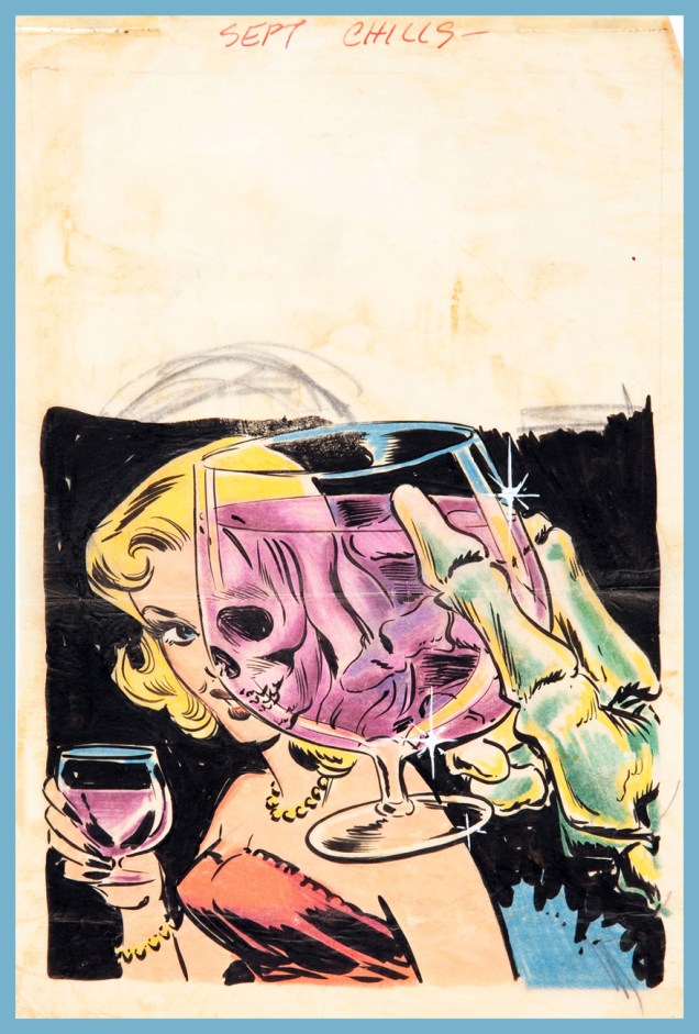
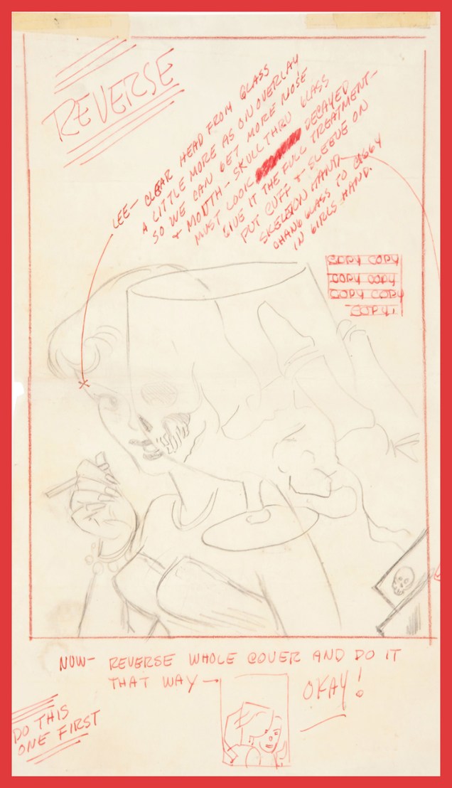
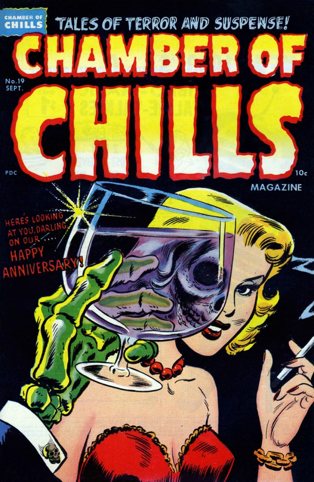
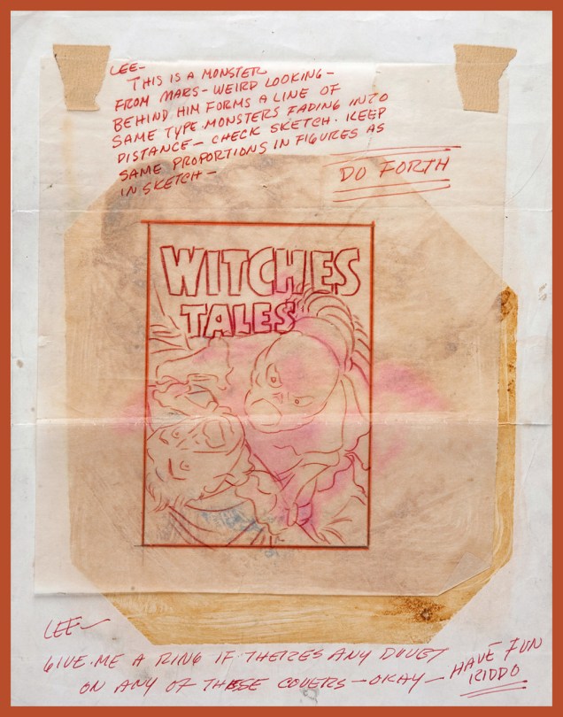
It’s become a historical footnote that, before fully settling into their (for a time) winning formula of lighthearted, cartoony monomania with Casper, Richie Rich, Little Dot and their ilk, Harvey Comics had published, pre-Code, some of the most, er… transgressive horror comics in the field. And before he settled down to designing and pencilling the lion’s share of Harvey Comics‘ admittedly inventive and arresting covers, art director Warren Kremer had fulfilled many of the same in-house duties in the more daring and diverse pre-Code years. A remarkably inventive and versatile artist, Kremer’s true worth has historically been obscured by his retiring, behind-the-scenes status, as well as the Harvey family’s plantation mentality. Today, let’s take a peek at the nuts and bolts of his collaborative partnership with cover artist Lee Elias, who would go on to become one of DC’s most straight-laced artists (though his talent remained undimmed.) It would seem, and it’s quite understandable, that a lot of artists who’d merrily produced horror comics in the early 1950s got burned by the ensuing censorious witch hunt / backlash… and became quite timid thereafter.
Warren Kremer’s original cover sketch and colour guide.… and his instructions to the final artist, in this case Lee Elias.As it appeared in print, this is Chamber of Chills Magazine no. 19 (Sept. 1953.) Marvel borrowed the title in the 1970s… Harvey clearly had no further use for it.
Another one? But of course!
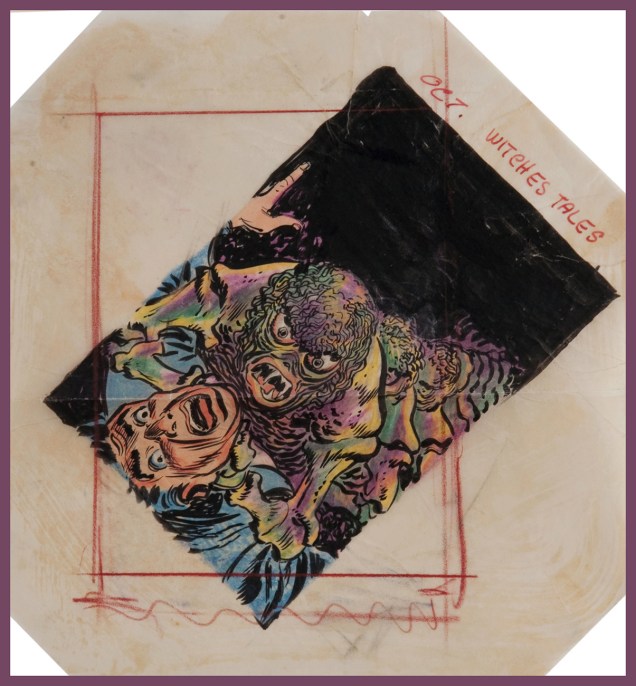
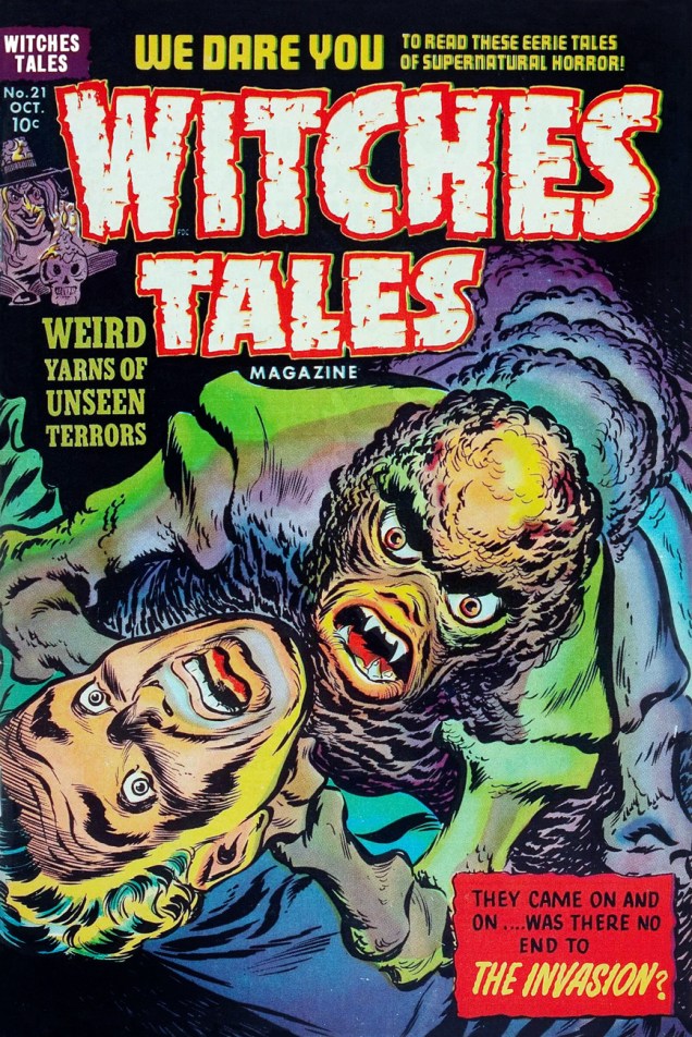
Kremer was evidently a believer in the « tilt the drawing to make it more dynamic » rule of layout (as DC’s Carmine Infantinonotoriously was)Kremer to Elias, again. An illustrator is quite blessed indeed when he gets to work with such a talented, insightful and friendly art director.Elias’ finished version, as it appeared on the stands. This is Witches’ Tales Magazine no. 21 (Oct. 1953).
« When the dark mists rise up from the graveyard, and shutters bang in the windows of old abandoned houses, and the lights burn late in the back rooms of funeral parlors, the hour has struck for the Autumn People. » — anonymous back cover blurb
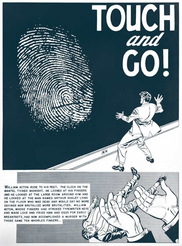
Frank Frazetta‘s cover for Ballantine Books’ October 1965 collection of EC adaptations of Ray Bradbury short stories (such a string of possessives!), namely « There Was an Old Woman » (art by Graham Ingels) « The Screaming Woman » (Jack Kamen), « Touch and Go », aka « The Fruit at the Bottom of the Bowl » (Johnny Craig), « The Small Assassin » (George Evans), « The Handler » (Ingels), « The Lake » (Joe Orlando, some of the finest, most sensitive work of his incredibly-brief peak, which he would coast on for the rest of his career), « The Coffin » and « Let’s Play Poison » (Both Jack Davis).
I’m feeling foolishly generous, so here’s a panel from each story. Owing to personal bias, Mr. Craig is the only one who gets a full page to show off. Seriously, though, scripting his own stuff afforded him greater latitude in storyboarding his work… and how it shows!
« Ghastly » Graham Ingels.Jack Kamen.Johnny Craig.Mr. Ingels again.George Evans.Joe Orlando.Jack Davis once…… and Jack Davis twice.
I first encountered Bradbury through « The October Country » (1955), which turned out, I was to discover later, to be a heavily-revised version of his initial, Arkham House-issued collection, « Dark Carnival ».
« When given the chance to rerelease the out-of-print collection in 1955, Bradbury seized the opportunity to revisit his first book and correct the things he deemed inadequate. (Ever the perfectionist, Bradbury was, throughout his career, often discontent with calling a book done, even after its publication.) He rewrote a number of stories, made light revisions on others, cut twelve tales altogether, and added four new ones to round out the collection. The stories Bradbury discarded he thought too weak, too violent, or too primitive, and not representative of where he was as a writer at that moment. »
As it happens, several of the stories that caught Gaines & Feldstein’s fancy were the very ones that Bradbury was in the process of disowning. Ditching « The Coffin » or « Let’s Play Poison » or, for different reasons, « The Black Ferris » (as he was to expand it into « Something Wicked This Way Comes » a few years down the line) I can understand, but losing the incredible « The October Game »? Especially since he was making (lots of) room for his most plodding story, the seemingly-interminable (at 44 pages) « The Next in Line ».
There was a companion volume devoted to EC’s adaptations of Bradbury science-fiction tales, « Tomorrow Midnight », also boasting a Frazetta cover.
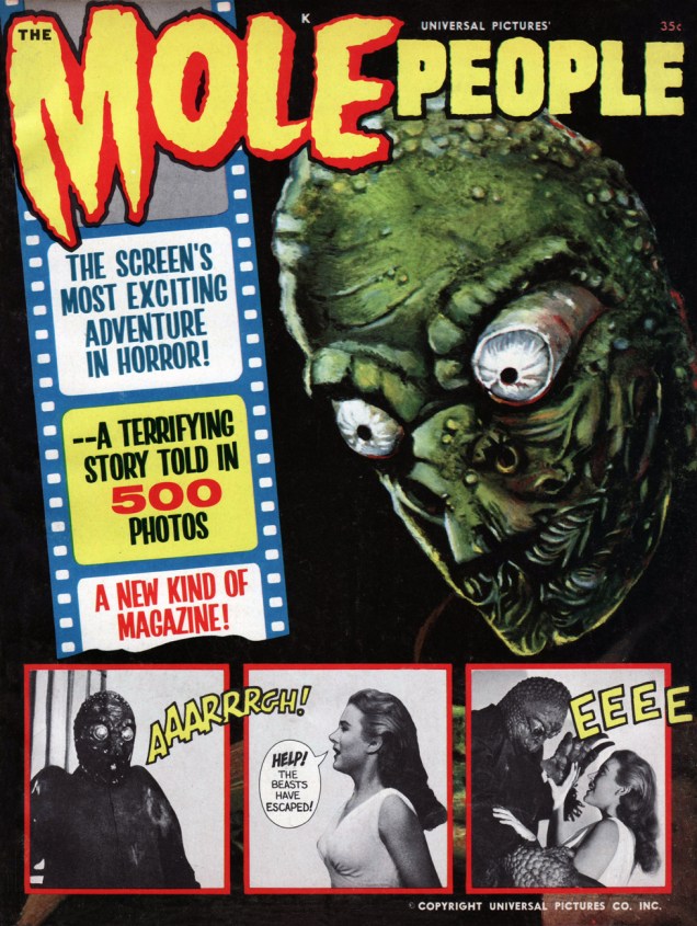
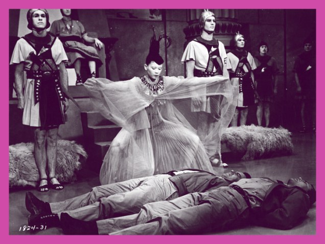
« I don’t like mushrooms! We’ll find a way out yet! » – John Agar as Dr. Roger Bentley
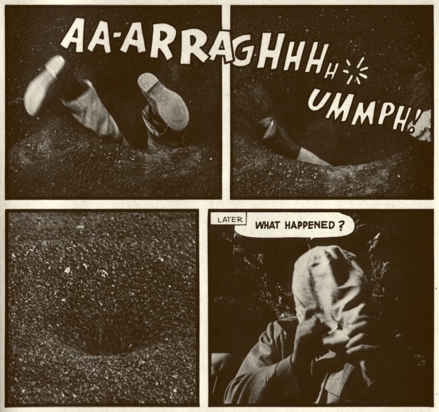
Fumetti: from the italian, it means « little smoke », describing the word balloons as they emanate from characters’ mouths. It’s comics, in other words. In English, it has come to denote comics created using photos instead of illustrations, also known as Fotonovela or, in French, photo-roman. Confused? No need to be. Here’s a rare American specimen of the beast, issued by Warren Publications, home of Famous Monsters of Filmland, Creepy, Eerie and Vampirella, in MCMLXIV (hey, that’s what the indicia says!).
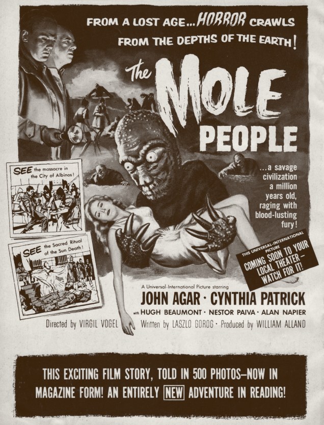
The back cover image, featuring the film’s wacky poster art.
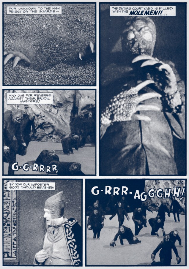
We’re dealing with the familiar (but welcome) scenario, in the worthy tradition of Herbert George Wells‘ The Time Machine… of the Normals turning out to be evil pricks and the presumed Monsters really being sweet if you treat them with any kind of basic decency.The human prisoners are treated to an exclusive semi-musical number by a young Björk Guðmundsdóttir.This Captain Company ad from the 1970s always made these titles seem so mysterious and enticing. The Mole People are first in the middle row. Dan Clowes was a big fan of that first Screen Thrills cover.The far scarier real-life version.