Tentacle Tuesday: Earth in Dire Peril!

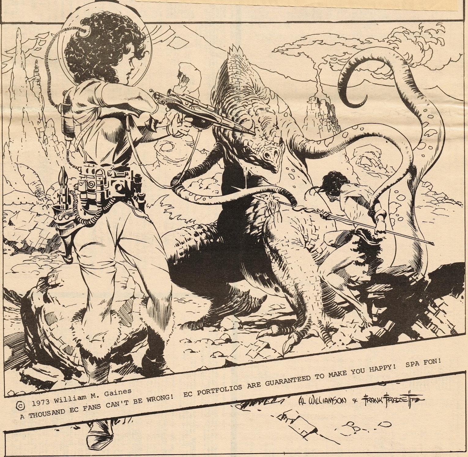
One of the oft-recurring themes of tentacles-in-comics-land is one of aggressive invasion. No, I don’t mean body cavity invasions, you creepos! I mean the large-scale kind: cephalopodian aliens who insidiously infiltrate human ranks, hypnotize or control people’s minds with all sorts of high-tech hanky panky, or just plain deploy their far-out weapons and open martial festivities without as much as a how-do-you-do. Their goal is, naturally, full dominion and control of planet Earth. Sometimes it’s because our planet has something they want (water, minerals, or just plain real estate), occasionally they want to feed on us… or they just got out on the wrong side of the bed and are cranky and territorial.

Let’s see a few case scenarios on this installment of Tentacle Tuesday!

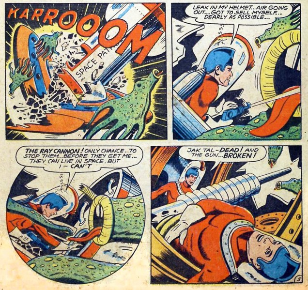
Our first story doesn’t explain why the aliens want to attack the planet or capture humans, but their nefarious scheme threatens life as we know it! Jet Black and Jak Tal, patrolmen of the 21st century, encounter some space-dwelling aliens who are up no good at all. Though they’re cute as can be, it can’t be too practical to have one’s tongue hanging out all the time… The Men from Deep Space, illustrated by Fred Guardineer, was published in Manhunt no. 6 (March 1948).

Manhunt#6-The-Men-from-Deep-SpaceManhunt#6-The-Men-from-Deep-Space-2

Manhunt#6-The-Men-from-Deep-Space-3

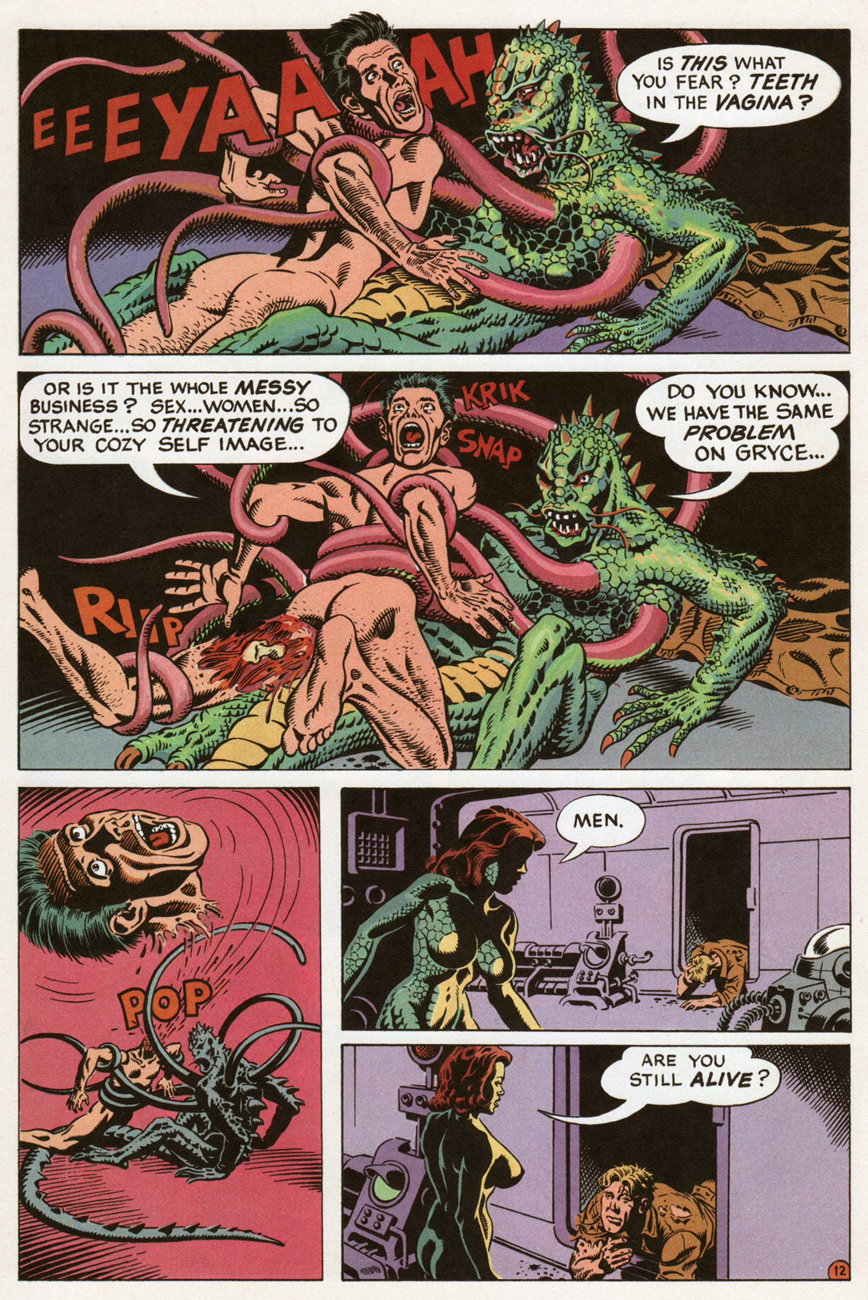
In example number two, the tentacled Organus is after humans because he has the munchies. Well, I suppose that’s as good a reason as any to propel your tongue towards somebody else’s face in the middle of a conversation. The Soul-Thief from the Stars, scripted by Paul Levitz, pencilled by Pat Broderick and inked by Bruce Patterson, was published in The Legion of Super-Heroes no. 284 (February 1982).

LegionofSuperHeroes284- The Soul-Thief from the Stars

LegionofSuperHeroes284- The Soul-Thief from the Stars-2

LegionofSuperHeroes284- The Soul-Thief from the Stars-3
Get a room, you two.

Let’s move on to the next instance of grabby critters wanting supremacy over humans, shall we?

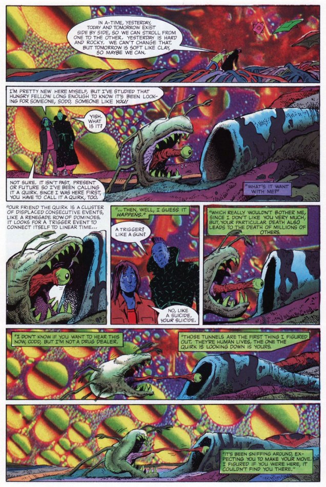
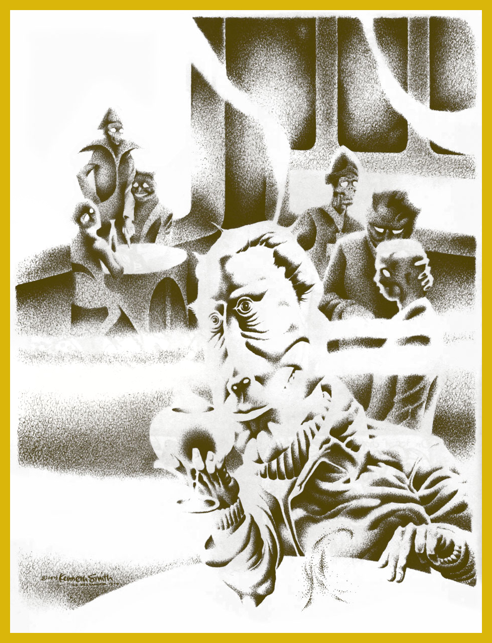
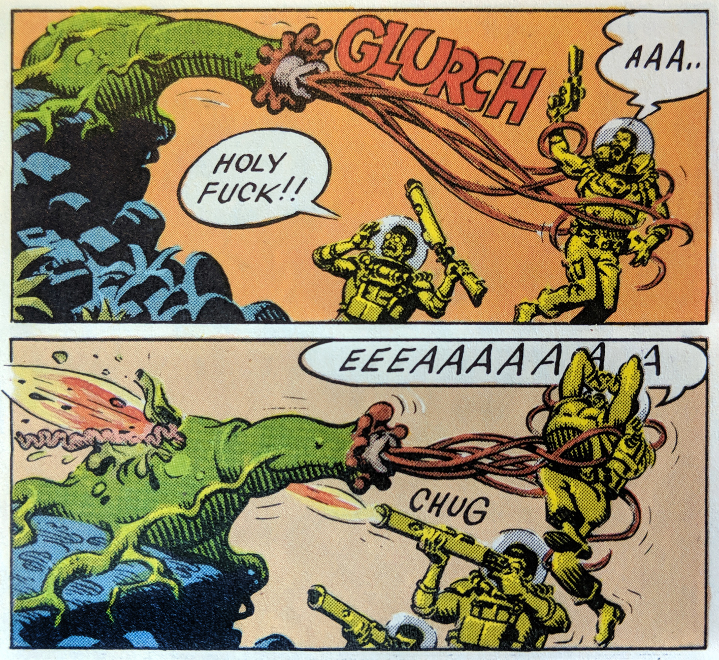
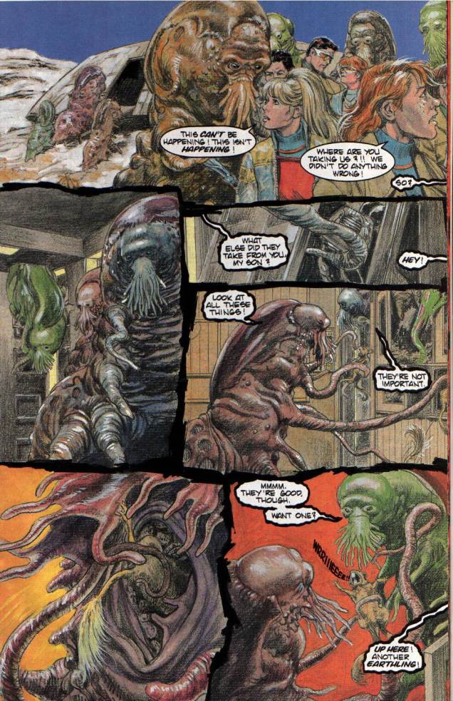
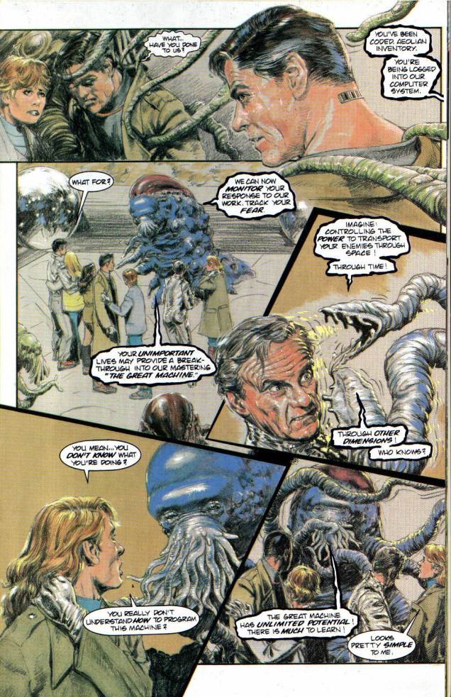
One long-winded, epic story of tentacled ones began in 1993, with Lost in Space: Voyage to the Bottom of the Soul. The story has everything that makes one of those invasion yarns entertaining – cruel cephalopod captors, barbaric vivisection experiments, computer codes assigned to every prisoner for better monitoring…. The bulk of this happens in the pages of Lost in Space: Voyage to the Bottom of the Soul no. 13 (August 1993) and Lost in Space: Voyage to the Bottom of the Soul no. 14 (September 1993), scripted by Bill Mumy (the original Will Robinson himself) and illustrated by by Michal Dutkiewicz.

LostinSpace13-1

LostinSpace14-2

LostinSpace14-3
Bradford, is that you?!

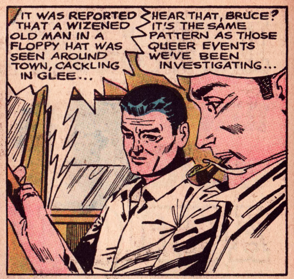
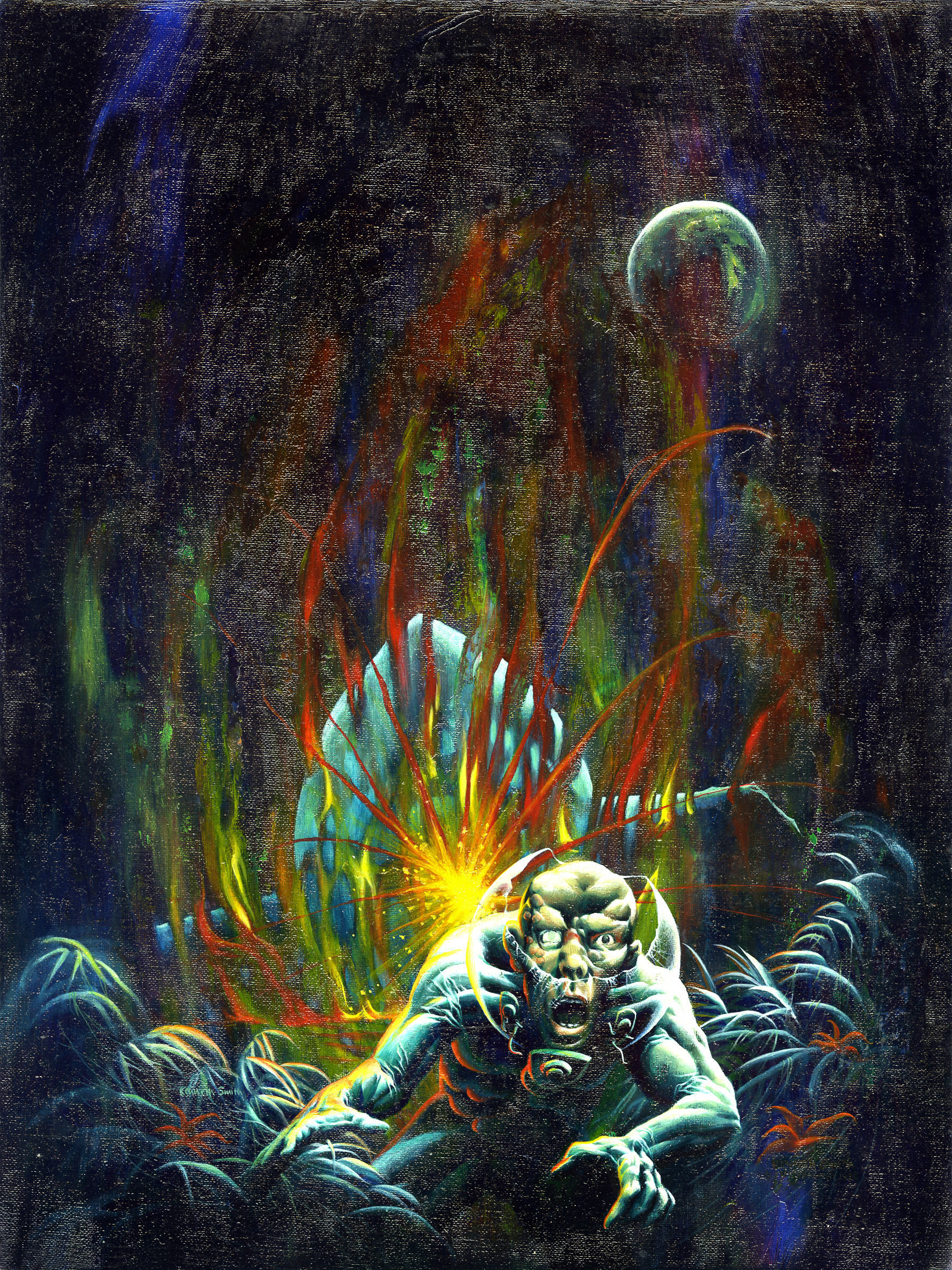
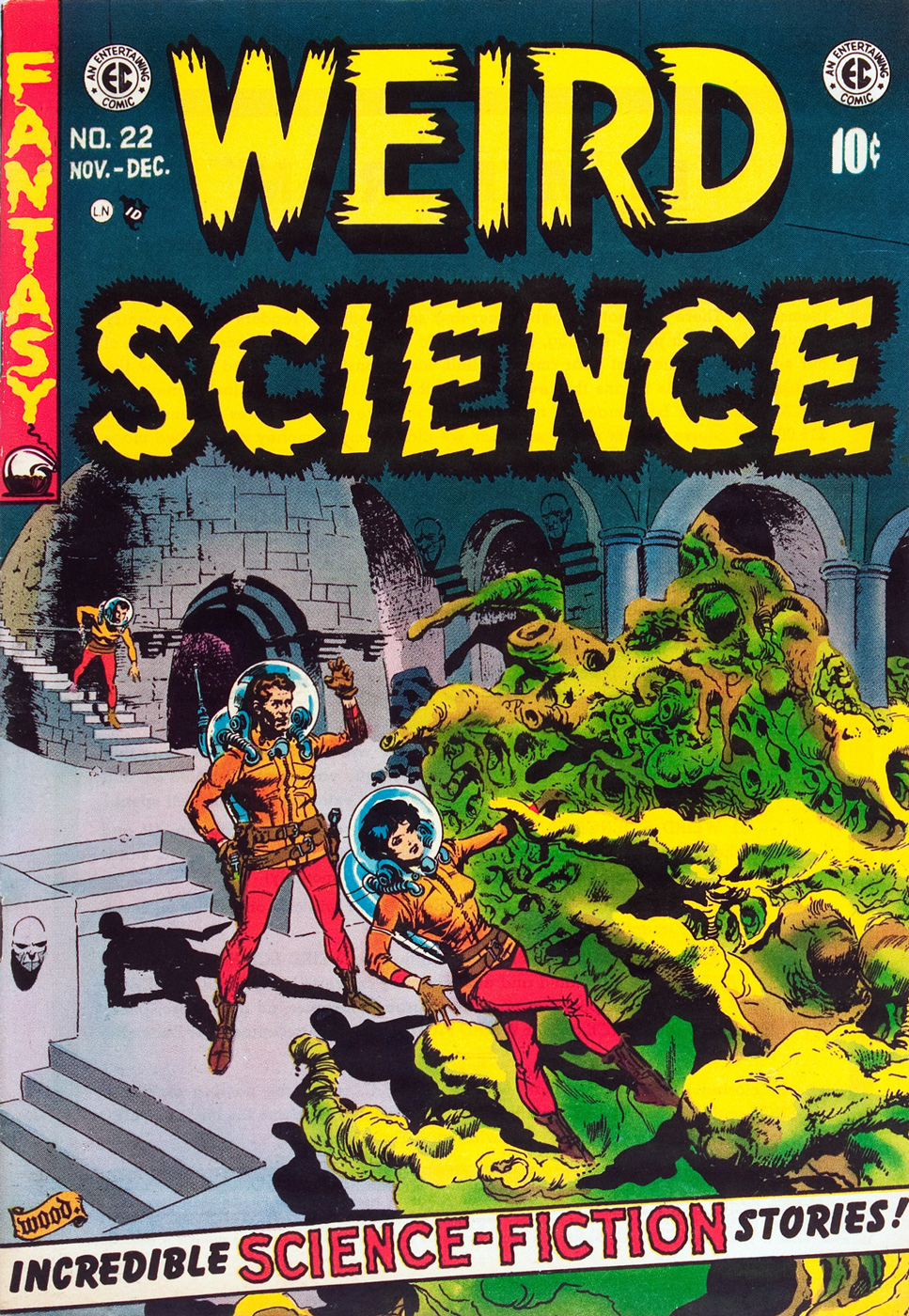
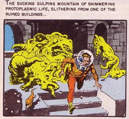
Oh yeah, I also mentioned insidious infiltration, a sly, Machiavellian approach to alien invasion. The Seeds of Jupiter, written and drawn by Al Feldstein and published in Weird Science no. 8 (July-August 1951), fits *that* particular bill.

AlFeldstein-SeedsofJupiter-WeirdScience8

AlFeldstein-WeirdScience8-2

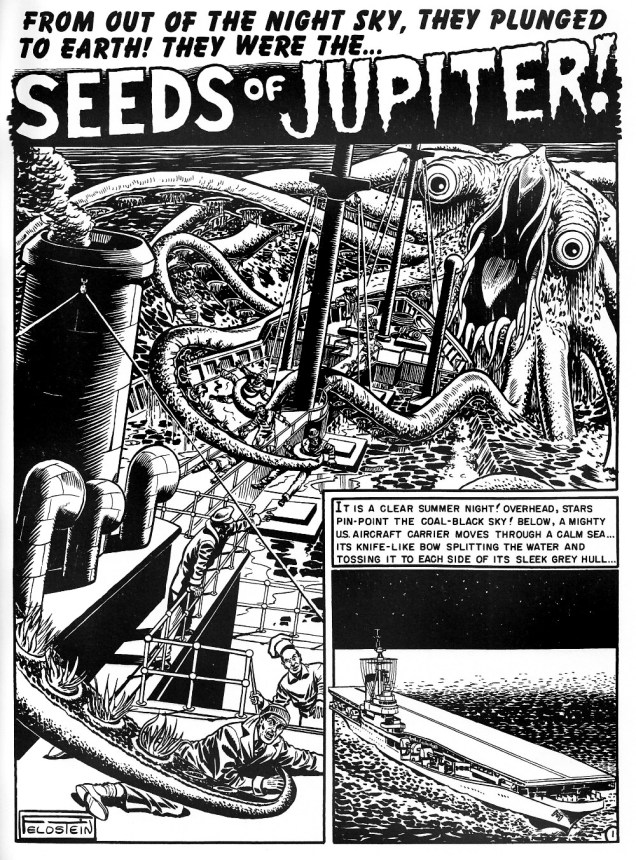
By the way, apparently the following scene inspired the “alien bursting out of some poor sod’s chest” sequence in the 1979 movie Alien.

AlFeldstein-SeedsofJupiter

What? You don’t believe that it’s truly an invasion? You say the seeds ended up on earth by accident? Well, listen to the man with funny hair*. He does not lie.

AlFeldstein-WeirdScience8-3

~ ds

*obviously a hairpiece.

Mind the Quirks and Glitches: Petrucha & Sutton’s Squalor

« I, I know this place. I’ve been here when I’m wasted. » « Sure, and a man who drives his car off a cliff knows what it’s like to fly. » « He does if he’s headed DOWN. » — Squalor and Todd debate the nature of reality

Compared to his 1970s, the ensuing decade was surely no picnic for Tom Sutton (1937-2002). After producing a massive body of work for Warren, Skywald, Marvel, Charlton and DC by the late Seventies, the mid-1980s found Sutton trudging through a long run (« It lasted hundreds of years. ») of abysmal Star Trek comics to put food on the table. This was the movie franchise Star Trek, with Bill Shatner’s permed hairpiece and those atrocious red velour outfits. Worst of all, inker/saboteur Ricardo Villagrán dogged his every move, casually pulling a Colletta on him*.

Oh, Sutton did work for other publishers in the 80’s, mainly the once-promising upstart First (1983-91), but the rote fantasy of The Black Flame and the hollow tough-guy posturing of Grimjack (coming soon to a screen near you, apparently) didn’t offer much of substance as alternatives to the Big Two’s sludge.

Still, First merits full credit for green-lighting the last great Sutton project, Squalor (1989-90). It was part of a line called First Fiction**, which looked like an eleventh-hour push to get into mainstream bookstores without quite committing to the graphic novel format and its price tag. Cardboard covers, full colour, slick paper; certainly more durable than the average comics pamphlet. Let’s take a look, shall we?

PotterSqualor01CoverA
The inspired choice for the series’ covers was photo-montage artist J. K. Potter., whose work I recalled from Twilight Zone and Night Cry magazine covers, as well as a clutch of memorable paperback covers. Joe R. Lansdale‘s By Bizarre Hands comes to mind. Now remember, young Photoshop pups, these had to be created the hard way.

SuttonSqualor01_06A

SuttonSqualor01_07A
Since you asked, panel four refers to the inevitable American Bandstand teenybopper analysis.
SuttonSqualor01_15A
« Welcome to A-Time… not another dimension, not a parallel world, but your very own neighborhood bereft of linear time. In A-time, past, present and future merge like expressway off-ramps, six-legged quirks hunt the time trails, and archetypes leave footprints. »

SuttonSqualor02_42ASuttonSqualor03_63ASuttonSqualor04_95A

So yes, we have an accomplished illustrator on board… but do we have a proper story to hang the visuals upon? What do you know, we do! In a freakish bit of convergence, a newcomer to comics, Stefan Petrucha, then a freelance technical writer, happened along with a fully fleshed-out, unconventional concept, one ideally suited to Sutton’s strengths. And then someone fished it out of the slush pile.

So what’s Squalor about? It’s a bitch to summarize, but it involves alternate time streams, the oft-elusive nature of genius, conspiracy theories, synchronicity, archetypes, and the road map of reality. Fair enough? I surmise that we have Mr. Petrucha’s experience as a technical writer to thank for his capacity to hold his magic bus to the right side of the road through to the end of the journey.

PotterSqualor03CoverA
This is Squalor no. 3 (July, 1990) J.K. Potter does the cover honours again.

Petrucha wrote, in Squalor no. 4‘s concluding notes: « Personally, I would love to write more Squalor. In fact, I have a few document files chock full of plot ideas. We’ve seen quirks, glitches, and an archetype up close, but what about paradigms, totems, and babblers? I’d also like to write a graphic novel about Todd Penderwhistle’s coat. Maybe that’s why I’ve had so much trouble breaking into this business. »

While he did break into the business, he’s never again been afforded the chance to handle such a personal project. Squalor was Tom Sutton’s final such endeavour***, though I can’t help but think that he was more than a bit broken by his Star Trek stint.

In 2016, Squalor was at long last collected as a graphic novel by Caliber Press, to what I presume was general indifference. As for the original issues, one can still get copies online for less than the original cover price, which is a bargain and a golden opportunity, but rather bittersweet.

SqualorButton
I still have my Squalor pin-back promo button (logo designed by art director Alex Wald) from ’89. Whee.

-RG

*From Gary Groth‘s definitive interview with Sutton (The Comics Journal no. 230, Feb. 2001) ): « No, I did not ink this thing. This was inked by a fellow who I was told inked in bed watching television. The enthusiasm of this man was evident. He was a pro. Oh, he was very slick. He was very, very good. It was exactly what the book didn’t need. What the book needed was Mœbius. Hear what I’m saying?

This will sound really dumb, but even after all of that crap I had gone through I went into this thing and I said, This is going to be fun. This is going to be creative work. I worked like hell on the thing. I penciled backgrounds you wouldn’t believe, with all the scopes and all of those things. I thought I was Wally Wood. I forgot that Wally inked his stuff himself. I had to leave it up to Ying Yang watching TV or something. They actually took your backgrounds out and erased them. I never realized it until I saw the fucking comic book and I said, I drew something there. A large something. A complex something. »

GROTH: « And this would have been for sheer expediency’s sake? »

SUTTON:  « I suppose so. Because he knew he could get away with it. He knew something that I didn’t realize until later, that that book had a special job. And that job was to promote movies. » [ source… well worth your time! ]

**The other “volumes” of First Fiction were nothing special, to put it kindly.

*** Unless you wish to count his pseudonymous (as Dementia) late ’90s, er, erotic comics, such as The Crypt of Cum!, The Vault of Whores! or Bustline Combat! He certainly gave them his all.

Marooned in Time With Paul Gillon

« We all have our time machines. Some take us back, they’re called memories. Some take us forward, they’re called dreams. » — Jeremy Irons

Today, we note the birth anniversary of the powerful French bédéiste Paul Gillon (May 11, 1926- May 21, 2011). Working in a classical, realistic style, he began his career in comics with the weekly Vaillant. For daily newspaper France-Soir, he co-created the daily soap opera strip 13, rue de l’Espoir (1959-1962, scripted by Jacques Gall and François Gall), strongly inspired by Elliot Caplin and Stan Drake’s The Heart of Juliet Jones, but set in Paris.

Then, in 1964, for the short-lived bédé newspaper Chouchou (an eight-pager published for a mere 14 issues, a tragedy!), Gillon co-created, with scripter J.C. Valherbe (alias Jean-Claude Forest, of Barbarella fame), one of the great classics of French science-fiction comics, Les naufragés du temps (“Castaways of Time”). Several wonderful features (for instance, Georges Pichard‘s Ténébrax) were left stranded by Chouchou’s demise, including (literally) Les naufragés.

Fortunately, its authors deemed its premise too worthy to let the matter drop forever. Nearly a decade on, Gillon tweaked the saga’s opening pages and resumed the narrative, which France-Soir published. Forest scripted the first four collections (1974-76), then Gillon took full command of the strip, which found a warm new home in Métal hurlant from 1977 right to the end of the series with Le cryptomère (The Cryptomeria), collected in 1989.

GillonNaufragés01AGillonNaufragés02AGillonNaufragés03A

Les naufragés’ premise is this: In 1990, a man (Chris) and a woman (Valérie) are placed into suspended animation. A thousand years hence, the man is picked up and woken. Where’s the woman?, he wants to know. A futuristic bout of cherchez la femme ensues, to make a long story short.

Forest, wrote, in 1967, of his original plans for the saga: « Chris was searching for an image. After many adventures, he manages to find Valérie only to realize that this image no longer fitted that of his dream. »

The sequence presented here comprise the second, third and fourth pages of the first tale, as they appeared in Chouchou in 1964. Say, that cool metal creature reminds me of one of the most ridiculous Marvel super-baddies of the 1960s, disgruntled government employee Alexander Gentry, aka… (see below for the answer).

GillonNaufragésÉtoileA
The first album in the series, L’étoile endormie (The Sleeping Star) – 1974
GillonNaufragésCannibaleA
The fourth album in the series, L’univers cannibale (The Cannibal Universe) – 1976
GillonNaufragésChimèreA
The fifth album in the series, Tendre chimère (Sweet Illusion) – 1977

A peek at a page of original art from album 3, Labyrinthes (1976):

NaufragésOriginalA

More about the series: http://www.coolfrenchcomics.com/naufragesdutemps.htm

… and you can read the entire series here (if you can read French) or, if not, just admire the artwork.

– RG

… and here’s your answer:

TTA48PorcupineA
Stan Lee and Don Heck‘s The ‘Dreaded’ (ha!) Porcupine, or what happens when neither Steve Ditko nor Jack Kirby are on hand to design your costume (and ghost-write your story). Incidentally, Stan, porcupines don’t project their quills. Here he is depicted by Kirby, from the cover of his inaugural appearance, in Tales to Astonish no. 48 (October, 1963).

The Case of the Cackling Conjurer!

« Never keep up with the Joneses. Drag them down to your level. » — Denis Charles Pratt (1908-1999)

Longtime companions Bruce and Alex, who spend their days tracking down and investigating “queer events”, presumably for a guide they’re putting together, happen to drive near Oakville, where a gleeful oldster is on a tear.

BailyQueer1A

I’m thinking Quentin Crisp, because his fellow raconteur and bon vivant Sir Noël Coward wasn’t especially into large, floppy hats.

QuentinCrispA
« The very purpose of existence is to reconcile the glowing opinion we hold of ourselves with the appalling things that other people think about us. » — Quentin Crisp ( Denis Charles Pratt)

BailyStraightLineA
You don’t say, Bruce! Let’s face it, screwball ideas hardly ever fail to bear fruit in these zany yarns.

BaileyQueer2A
More action-packed merriment with Bruce & Alex, roving queerness inquirers!

Alex has a plan, and Bruce grasps instantly what Bruce has in mind. It’s like they’ve done this before. Somehow, Alex’s brainstorms always involve Bruce disrobing, and, judging from his expression, he’s unfailingly eager to comply.

This saga is that of The Cackling Conjurer (Strange Adventures no. 201, June 1967, DC), writer regrettably unknown, art by that magnificent oddball Bernard Baily. Edited, of course, by Jack Schiff; he may have screwed DC out of Jack Kirby’s talent throughout the 1960s, and nearly drove the Batman titles over the cancellation cliff, but he certainly produced some perversely entertaining crap. Incidentally, Schiff retired from comics two issues after this one, but surely that’s mere coincidence.

StangeAdventures201A
As you can see, the rest of the issue was quite mundane and utterly devoid of eccentricity. Cover by Carmine Infantino and George Roussos. That’s a rather… intimate hold the Mod Gorilla Boss has on Animal-Man, don’t you think?

– RG

Kenneth Smith’s Singular Warren Visions

« Quodo seemed to be a paradise. It was a lush green planet of peace and solitude. Then the pilot met the blonde… » — Nicola Cuti, “Weird World”

Kenneth Smith (1943-), the fantasy artist, inhabits the same body as Kenneth Smith, the retired philosophy professor and incorrigible obfuscator. Whereas someone like, say, Bertrand Russell would make his point clearly and concisely, Kenneth would just pile it higher and higher, leaving the reader entangled in a maze of syntax and syllogism.

Since you may not be familiar with the man’s infamous column in The Comics Journal, Dramas of the Mind, here’s a typical quotation from the man, where he, er… takes on “obscurantism”:

« In characterizing realities no less than in taking positions on issues, consciousness generalizes, i.e. genericizes: in articulating or formulating, it reduces things, even our own selves, to forms, abstractions, idealizations, types, archetypes, simplisms. “Thinking” is an activity that ultimately grounds or resolves itself in the satisfying, self-certain form of orthodoxies, preconceptions, uncriticized and imperative norms; and it is overwhelmingly inept to recognize just how pathetic, parasitic or placental is its relation to its “own” fundamental norms of understanding and valuation. Rarely if ever does any act of thinking grow so laserlike or iconoclastically intensive as to escape from the dense miasma of what is acceptable. To think what actually is is even more contranatural for humans than to see what actually is: as subjectivizing as “seeing” is, “thinking” is many degrees or magnitudes more saturated with conditioned biases, delusions, self-deceptions. A program of hygiene or asepsis for the sanity, acuity and clarity of syncretic or wholesided thinking—a discipline of orthotics for sobering, grounding and polemicizing of well-formed gnoseonoesis—is needless to say unknown in modernity. Not just language but virtually all of intellect, education, culture, etc. have been adapted into utilities, tools whose very aspectivity militates against the nakedness of “evidence,” which is to say, against candor and against truth: regardless of what it may be called, “evidence,” even the most obvious and blatant, is in actuality not so “evident” to most people, and the modern development of “sophistication” or “education” typically worsens the obscurantism. »

For all that, I’ll take a guy with such an overflowing abundance of vocabulary and ideas that he doesn’t know when to quit… over most of the boneheads frequently passing for writers nowadays. Still, if you don’t mind, we’ll (mostly) stick to his Warren artwork today.

Creepy35A
Creepy no. 35 (Sept. 1970). Regardless of its month of release, its lovely shades of emerald bring thoughts of springtime to mind.

Creepy36A
Creepy no. 36 (Nov. 1970), unique amidst Smith’s Warren covers in that it presents the human form in a somewhat less… grotesque fashion.

SmithCreepy41A
This is Creepy no. 41 (Sept. 1971). Owing to its lower than usual print run, this ranks amongst the scarcest Warren issues.

CreepyAnnual1971A
This is Creepy 1971 Annual, all reprints, but quite a choice roster of them: Ditko, Toth, Boyette, Craig, Crandall, Sutton, Adams, and Torres.

EerieAnnual71A
And here we have Mr. Smith’s last, and arguably least, Warren cover. Only a detail of the full painting was used. Eerie 1971 Annual also features naught but reruns.

SmithEerieAnnual1971ORIG
And this is the original painting in its entirety. Sorry about the glare, but this is likely the only publicly available image of this privately-owned piece.

Bonus time: Mr. Smith created this lovely piece to illustrate R.A. Lafferty‘s masterful short story Mr. Hamadryad. I first encountered them* in the anthology Prime Cuts no. 1 (Jan. 1987, Fantagraphics). Hey, any fan of Old Man Lafferty’s is someone I’d happily clink glasses with. Cul sec, Mr. Smith!

SmithHamadryadA
« I believe that Mr. Hamadryad was the oddest-looking person I had ever seen. Surprisingly I regarded him so, for I first became aware of him in The Third Cataract Club in Dongola, and some very odd-looking gentlemen came into The Third Cataract. If you cock an eyebrow at someone in that place, then he’s really odd. » — R.A. Lafferty

*Smith’s illustration first graced Lafferty’s tale in the limited edition (1000 copies) collection Golden Gate and Other Stories (1982, Corroboree Press, MN). However, “Mr. Hamadryad” first turned up in STELLAR I (Judy-Lynn Del Rey, ed., 1974).

-RG

Tentacle Tuesday: EC’s Weird Tentacles

Today’s Tentacle Tuesday delves into William Gaines’ EC and the glorious 50s (well, glorious for *some* things, at any rate). “Weird”, you say? Why, weird simply must include tentacles!

It’s a mixed bag: those of you who dislike Al Feldstein (and I know my co-admin RG would raise his hand readily) may be terribly annoyed by this post, but patience, my friends! there’s a lot of Wally Wood (a Tentacle Tuesday master, by the way!) in here, too, and who in their right mind would admit to detesting Wally Wood?

(As for myself, in case somebody is wondering, I like Feldstein’s artwork just fine.)

WeirdScience#6
Weird Science no. 6 (March-April 1951). Cover by Al Feldstein.

« EC’s flaws are pretty obvious: even when the artists were striving for greater seriousness than the ironic gore of the horror stories or the outrageous early sci-fi plots or even the clever but predictable crime and suspense stories, the writing was often overwrought, prolix, and ham-fisted, and the artists were straightjacketed by EC’s rigid visual grid. They were Entertaining Comics first and foremost, but they also seemed compelled to break out of their commercial formulas, however finely realized, and publish stories that were fiercely honest, politically adversarial, visually masterful, and occasionally formally innovative…» (source: Gary Groth’s Entertaining Comics)

WeirdScience#10
Weird Science no. 10 (November-December 1951), art by Wally Wood.

WeirdFantasy#15
Weird Fantasy no. 15 (Sept-Oct 1952). Cover by Al Feldstein. The best cover that Feldstein has ever drawn? Quizás, quizás, quizás! The monster is doing a traditional Slavic dance, I think.

« While [Feldstein was] freer than most writers of his era to indulge his fantasies, he was also more punitive toward the characters who acted them out. John Updike tormented adulterers with depression and guilt. Feldstein lopped off their heads or burnt them alive. If they received a scarlet letter, it was branded on their flesh. In real life, sexual misbehavior might have cost one alimony. Feldstein made Shahira law seem like Thomas Jefferson had drafted it. Feldstein reflected a society which, while fascinated by sex, was terrified or ashamed of this fascination. » (source: Bob Levin in Let Us Now Praise Al Feldstein)

WeirdScienceFantasyAnnual#1
Weird Science-Fantasy Annual no. 1 (1952), art by Al Feldstein.

Weird Fantasy #21
Weird Fantasy no. 21 (Sept-Oct 1953). Cover by Al Williamson and Frank Frazetta.

Weird Fantasy #21-detail

WeirdScience#22
Weird Science no. 22 (November-December 1953), cover by Wally Wood.

WeirdScience22detail
Detail from the title story, “My World”, scripted by Al Feldstein and drawn by Wally Wood. You can read the story over at Mars Will Send No More.

WeirdScienceFantasy#27
Weird Science-Fantasy no. 27 (January-February 1955), art by Wally Wood.

~ ds

Tentacle Tuesday: Convoluted Critters

Occasionally, I notice a comic book cover with a tentacled monster so peculiar that one starts wondering whether the artist was on drugs or just couldn’t give a shit. That is not a criticism, however: where grabby appendages are concerned, the weirder, the better. Even if some of these guys have a face (muzzle? rictus?) even a mother couldn’t love, or their anatomy defies all laws of biology, we’ll welcome them with open arms!

As usual, in chronological order.

First in our line-up is this little fella in a hat. At least he looks like he’s wearing a cap, although perhaps he just has a square head with a skin flap hanging over the sides. At first glance, his tentacles are hollow, although their flesh is probably just a dull shade of battleship grey. So what’s this “thing that waited”? Soviet soldiers who are actually alien invaders. Duh.

AdventuresintoWeirdWorlds3
Adventures Into Weird Worlds no. 3 (March 1952), cover by Joe Maneely.

This next cover is probably a little more standard for pseudo-octopus fare: a lady with huge, ahem, bazooms (Russ Heath liked ’em busty, it seems – seriously, just look at the size of those things!) threatened by some horrific monster who’s dispatching her companion as expediently as possible. Still, the somewhat Wolverton-esque, grave-dwelling aliens with pincers at the end of their tentacles are odd-looking enough to squeeze their way into this post.

Spellbound20A
Spellbound no. 20 (March 1954), cover by Russ Heath.

This toupee-clad creature with evil gimlet eyes doesn’t look much like a pet, if you ask me. How are those grabby little arms attached to its head, anyway? Wait, who am I talking about, again? 😉

HouseOfMystery87
House of Mystery no. 87 (June 1959), cover by Bob Brown.

“My Greatest Adventure” was a title that promised much, and it must have been difficult to live up to it every month. Witness the following “fantastic” creature – a furry slug with disturbingly fleshy lips and tentacles. I can’t vouch for my reaction had I been an excitable ten-year old, but to this blasé adult, the poor beast summoned by some psycho witch doctor (the jungles seem to be always overrun with them) is just begging to be put out of its misery.

MyGreatestAdventure51
My Greatest Adventure no. 51 (January 1961), pencilled by Dick Dillin and inked by Sheldon Moldoff.

Our next exhibit finally features a proper alien, one who looks strange but at least makes sense as a unified, functioning creature. I love his sadly drooped whiskers, his dejected expression that’s strangely at odds with his pontifical speech.

Tales oftheUnexpected66
Tales of the Unexpected no. 66 (October 1961), cover by Bob Brown.

« Make him a werewolf! But in space! And give him tentacles! » Yeah, guys, that went over really well. A Marvel Masterwork, my ass. But wait: Black Destroyer! is an adaptation of A. E. van Vogt’s short story from 1939. And did Cœurl, the black cat-like creature, have tentacles in the story? Why, yes, he did.

« His great forelegs—twice as long as his hindlegs—twitched with a shuddering movement that arched every razor-sharp claw. The thick tentacles that sprouted from his shoulders ceased their weaving undulation, and grew taut with anxious alertness. Utterly appalled, he twisted his great cat head from side to side, while the little hairlike tendrils that formed each ear vibrated frantically, testing every vagrant breeze, every throb in the ether. » (read the full story here.)

WorldsofUnknown5
Worlds Unknown no. 5 (February 1974), cover pencilled by Gil Kane and inked by Frank Giacoia. Cœurl looks like he’s floating on top of the corpse – I don’t think the artists spent too much time watching an actual cat at work.

Read the comics version of Black Destroyer! here.

My last offering for today is the cutest, featuring an adorable blue varmint who gets my full sympathy and support. Weird? Sure, a bit – he’s got a tentacle sprouting out of his forehead – but beauty is in the eye of the beholder, right? This cover also proves that monsters are just as interested in tooth-whitening procedures as us humans.

TheDefenders72
The Defenders no. 72 (June 1979), pencilled by Herb Trimpe and inked by Al Milgrom.

~ ds

Tentacle Tuesday: Have Tentacles, Will Space-travel

« When the blast of a rocket launch slams you against the wall and all the rust is shaken off your body, you will hear the great shout of the universe and the joyful crying of people who have been changed by what they’ve seen… »*

Greetings, dear astronauts! Today’s Tentacle Tuesday concerns itself with that “religious experience”, space travel… with tentacles in tow, of course. Some comics may announce their interplanetary theme by putting SPACE into the title of the series (and making sure it’s big and bold!), while others deploy a little subtlety and coyly refer to the unknown, or the unexpected. Either way, we’re in for a grand old time exploring space along with the brave men and women (err, mostly men) who found themselves exclaiming “ooh, tentacles!” while exploring some mysterious planet.

In chronological order, then…

SpaceSquadron5A
Space Squadron no. 5 (February 1952, Atlas). The cover is *probably* by Joe Maneely.

WorldsUnknown4
Worlds Unknown no. 4 (November 1973, Marvel), (bad) cover by Dick Giordano. Some people have the knack for coming up with original and scary monsters, and some don’t. ’nuff said.

StarHunters1
Star Hunters no. 1 (October-November 1977, DC), pencils by Rich Buckler and inks by Bob Layton. The green thingies may be snakes/dragons, not tentacles, but they’re doing a convincing impersonation.

Unexpected221
The Unexpected no. 221 (April 1982, DC), cover by Joe Kubert. Now *there’s* a convincingly moody and frightening cover – no big pyrotechnics, just a strong hint of suffocation by a strangely-shaped cloud of ectoplasm. Shudder.

PulpFictionLibraryMysteryinSpace
Pulp Fiction Library: Mystery in Space (September 1999, DC). Cover by Mitch O’Connell. This 228-page anthology features a bunch of reprinted stories (from the early 50s to the the early 80s) originally published in Real Fact Comics, Mystery in Space, Strange Adventures and Action Comics.

TheGoon11
The Goon no. 11 (March 2005, Dark Horse), cover by Eric Powell.

TheGoon11-detail
Yeah Franky, what the hell are you doing?

Check out part 1 of this interplanetary tentacle exhibit here: Grabby Denizens of the Airless Void.

Incidentally, today I was given a nice gift at work: Buddha’s Hand, or the fingered citron, a type of citrus someone described as a “Monsanto-produced cross between calamari and a lemon”. How very appropriate for Tentacle Tuesday! Here’s a picture of my very own tentacled beauty:

MainBouddhaA

« I have never listened to anyone who criticized my taste in space travel, sideshows or gorillas. When this occurs, I pack up my dinosaurs and leave the room. »*
~ ds
*All quotes by the great Ray Bradbury

Tentacle Tuesday Masters: Rand Holmes

We have just come back from a lovely vacation in Nova Scotia, one of Canada’s maritime provinces. In the honour of this all-too-short getaway, this Tentacle Tuesday is about Canadian artist Randolph Holton Holmes, who was born in Nova Scotia in 1942 and passed away in British Columbia in 2002, completely at the other end of this big country.

« Rand Holmes was Canada’’s most revolutionary artist in his heyday, the star cartoonist at the Georgia Straight newspaper in British Columbia during the 1970s. His hippie hero, Harold Hedd, became the spokesman of the emerging counterculture as he avoided work, explored free love, and flouted drug laws. The Adventures of Harold Hedd spread across the globe in the wave of underground comix and newspapers of the era and Holmes became famous — or at least notorious. While his comic character was bold and blatant, the artist was shy and quiet, well on his way to becoming a complete hermit. » (excerpt from Fantagraphics’ The Artist Himself: A Rand Holmes Retrospective)

Glimpsing through Holmes’  body of work, one quickly becomes aware that he displays a special affinity for drawing busty women… and (of more interest to this current post) that he loves to insert tentacles at the drop of a hat, especially if ETs of some kind are involved. A lot of artists use tentacles as a short-hand for aliens, and he’s not alone in that… much to my personal satisfaction.

RandHolmes-SlowDeath-1974
Slow Death no. 6 (Last Gasp, January 1974). Colonel “Saunders”?

FogCityComics-RandHolmes
Fog City Comics no. 2 (Stampart, October 1978).  “Science fantasy at its finest” may be an unfulfilled promise; by all accounts, Rand Holmes’ Killer Planet is the best story of the issue. Fog City Comics was an all-Canadian underground comix anthology and lasted a mere 3 issues.

As I mentioned Holmes’ story Killer Planet, here’s a peek at its manifold tentacles:

DeathRattle1-RandHolmes
A panel from Killer Planet, both written and illustrated by Rand Holmes, originally published in the aforementioned Fog City Comics no. 2, coloured by Bill Poplaski and reprinted in Death Rattle no. 1 (2nd series, Kitchen Sink Press, Oct. 1985).

DeathRattleScarfA
What kind of idiot eats fruit growing on an obviously life-threatening planet? Panels from Killer Planet, both written and illustrated by Rand Holmes, published in Death Rattle no. 1 (Kitchen Sink Press, October 1985).

DeathRattle1-RandHolmes-KillerPlanet
Panels from Killer Planet, both written and illustrated by Rand Holmes, published in Death Rattle no. 1 (Kitchen Sink Press, October 1985). Note the cute mushrooms in the bottom left corner.

And lastly, for contrast with the cover of Slow Death and its throes-of-ecstasy coupling scene, there’s this:

DeathRattle5-RandHolmes-JunkyardDog
Vagina Dentata! A page from “Junkyard Dog“, written by Mike Baron. It was published in Death Rattle no. 5 (Kitchen Sink Press, June 1986). The (telepathic) alien female wasn’t unjustified in, erm, chewing up her rapist (the intercourse wasn’t consensual) – he was an unapologetic asshole.

~ ds

Tentacle Tuesday: Scuttle Over to British Shores

Finally, Tentacle Tuesday is here, and the tentacles are back with a vengeance! I’ve been waiting all week to spring ’em on you.

This cutie, the Triclopus, kindly agreed to let us use his, err, face to kick off the Tentacle Tuesday festivities.

Triclopus-KenReid

The Triclopus is a Ken Reid creation from August 31st, 1974. There’s a full list of Creepy Creations (published in the British Shiver and Shake) – with pictures! – over at Kazoop!, a great blog about British humour comics of the 60s and 70s. Go check it out. As for Ken Reid, we’ve previously talked about him here.

TentacleTuesdayIcon

ChrisRidell-alienography
Excerpt (or, as the Brits would say, extract) from Alienography by Chris Riddell (2010).

Chris Riddell is a British illustrator, writer of children’s books, acclaimed political cartoonist, talented doodler, etc. His hand-lettering (not at all on display in Alienography, I admit) is sort of Richard Sala, Edward Gorey-ish, as is his somewhat macabre sense of humour. Visit Riddell’s blog here.

TentacleTuesdayIcon

This splendid illustration by Roger Langridge (tentacle artist par excellence) was published in Doctor Who Magazine no. 300 (February, 2001) to accompany some-article-or-other about “Spearhead from Space” (a Doctor Who episode, the seventh season opener, if you really must know).

RogerLangridge-DrWho

A bit more information about the cool Dr. Langridge-and-Dr. Who pairing:

“Within Doctor Who comics, he can be regarded as effectively the current Doctor Who Magazine “house letterer”, having lettered the overwhelming majority of comics since his debut on DWM 272’s Happy Deathday in late 1998. Almost every issue of DWM published in the 21st century was lettered by Langridge.

He has also occasionally pencilled, inked and even coloured some stories along the way. Deathday, for example, was also his Doctor Who pencil and ink debut, and was followed by artistic duties on TV Action!, the back half of The Glorious Dead (where he was co-credited as penciller with Martin Geraghty), The Autonomy Bug, Where Nobody Knows Your Name, The Green-Eyed Monster, Death to the Doctor!, and Planet Bollywood. He is thus perhaps the only artist to professionally draw all eleven incarnations of the Doctor, even though many of his renderings were obvious parodic in Death. Finally, he coloured Me and My Shadow and Where Nobody Knows Your Name.” [source]

TentacleTuesdayIconThe Wizard, a weekly British publication put out by D.C. Thomson (without a P, though it’s tempting), was created in 1922 and lasted all the way until the late seventies (with periodic interruptions for a merger and several title changes, from “Wizard” to “Rover and Wizard” to “Rover” and then again back to “Wizard” in 1970 until its final demise in 1978).

TheWizard-Oct26-1974
This edition of The Wizard is from October 26th, 1974, but I unfortunately have no idea who the artist is.

Between WWI and WWII (and sometimes beyond), D.C. Thomson published a number of weekly magazines/papers aimed at boys between 8 and 16. They cost 2 pence, and were thus known as “Tuppenny Bloods”, or the Big Five: Adventure, Rover, Skipper, Hotspur and the aforementioned Wizard. What could one hope to find in a Tuppenny? Short stories with illustrations, some comics, some non-fiction articles…. pretty much everything a growing boy (and girl!) with a lively mind would want.

TentacleTuesdayIcon

2000AD-1979A
2000 AD no. 142 (1979). I call this the “dragons’n’tentacles” ploy. Other than tentacles on the cover, this issue contains part 3 of Judge Dredd: The Black Plague, which I highly recommend, and some Stainless Steel Rat adventures.

~ ds