Hot Streak: Gil Kane’s Green Lantern

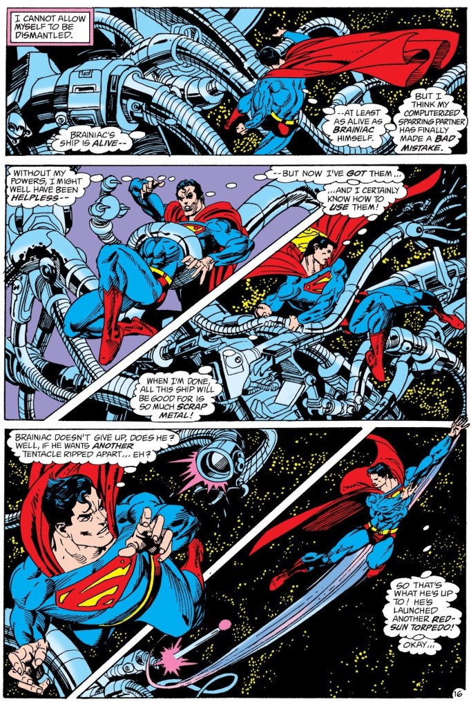
« It was exactly an assembly line. You could look into infinity down these rows of drawing tables. » — Gil Kane

Some of our more sensitive readers may have noticed that we’ve been none too gentle with Gil Kane (1926-2000) in the past, dealing him some rather rough lumps at times. But that’s not the whole story: in taking stock of such a protracted and prolific (dare I say profligate?) career as his, much of it inevitably spent on autopilot, one must be discerning. In other words, I like some of Kane’s work, but there’s plenty of it I don’t care for. Still, WOT’s rule of thumb is that if we altogether loathe an artist and/or his work, we’ll just turn a blind eye.

And speaking of the sense of sight, what makes a great comic book cover? Must be my art school training and subsequent work in advertising tipping the scales, but to me, design and layout reign primordial as ingredients… as values. I’m often dismayed at many a would-be critic’s apparent method of assessing an image’s artistic worth, namely: how many popular characters does it feature? Is it action-packed? Is the issue sought-after and expensive? Does it feature a famous character’s début? Is it drawn by a fan-favourite artist who unquestionably can do no wrong… because he’s a fan-favourite artist who unquestionably can do no wrong? (and how dare you claim otherwise!)

Gil Kane reportedly generated around eight hundred covers for Marvel in the 1970s… of all levels of craft and quality. With that kind of frenzied output, it’s impressive that most were perfectly serviceable, given that there certainly was no time for meticulous, sober planning. They were generally over-captioned (not Kane’s fault!) and crassly sensationalistic, but that’s what Marvel sought and settled for.

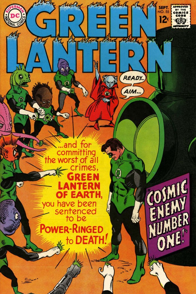
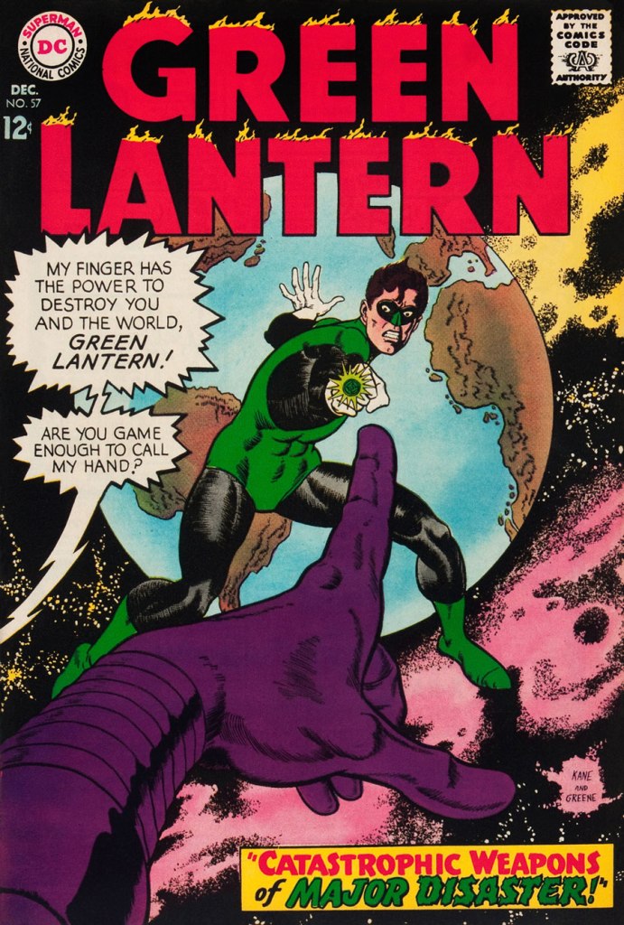
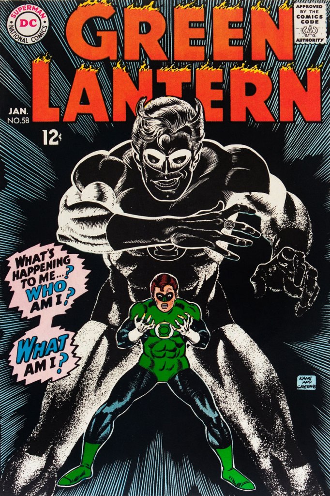
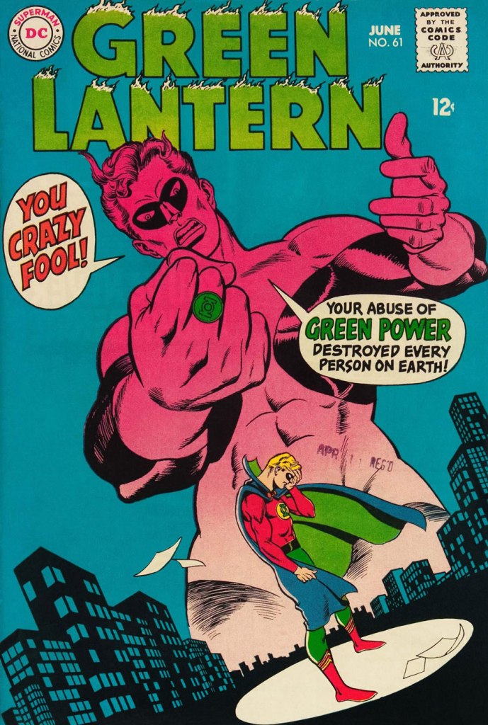
It’s a shame that Kane and his former classmate at the School of Industrial Art (back in the early 40s!), DC lynchpin Carmine Infantino didn’t get on too well, because their Silver Age collaborations had a special spark… must have been the animosity. It had been noted by the DC brass, as early as the late 50s, that Carmine’s covers reliably caught prospective buyers’ attention and dimes. And so, by 1967, he was unofficially designing most of the publisher’s covers, and certainly the covers of all titles edited by Julius Schwartz. Green Lantern was among these.

So we turn today’s spotlight on a hot streak of seven. Kane gets his name in the title, but it would be more accurate to say they were Infantino-designed, Gaspar Saladino-lettered, Jack Adler-coloured, Gil Kane-pencilled and Murphy Anderson and Sid Greene-inked covers. The streak begins after Green Lantern no. 54’s downright poor cover, and ends with the interruption of Kane’s impressively long run of consecutive issues.

We begin with Green Lantern no. 55 (Sept. 1967, DC). Harmonious, easy-to-parse arrangement of numerous elements and exemplary integration of text. Design by Infantino, pencils by Kane, inks by Murphy Anderson, lettering by Gaspar Saladino, colours by Jack Adler. Oh, and lest we forget: logo designed by Ira Shnapp (circa 1964), classic Green Lantern uniform designed by Kane (circa 1959).
This is Green Lantern no. 56 (Oct. 1967, DC). Kane was never much for varying his monsters (see below). Pencils by Kane, inks by Anderson.
For a bit of comparison on how things were done from company to company, this is Tales to Astonish no. 91 (May, 1967, Marvel). This is what happens when there’s no planning or attention to detail: in an already-crowded cover, did we really need that ugly box advising us of the presence of The Abomination? He’s right there! (maybe the abomination refers to the cover itself). And the foreshortening nightmare that is the baddie’s left arm was so dire that, when a fan commissioned Arthur Adams to produce a recreation of this cover (which, things being as they are, many surely consider ‘iconic’)… he wisely corrected the anatomy and tweaked the poor composition. Interesting how Marvel’s heavy-fingered yes-man, art director John Romita Sr., was always game to “fix” Ditko and Kirby art, but saw nothing wrong with this one.
This is Green Lantern no. 57 (Dec. 1967, DC), featuring Catastrophic Weapons of Major Disaster!, written by Gardner Fox, pencilled and inked by Kane. Cover by Kane and Greene… love the placement of the signatures!
This is Green Lantern no. 58 (Jan. 1968, DC), featuring Peril of the Powerless Green Lantern! (a Julius Schwartz title if there ever was one), written by Gardner Fox, pencilled by Kane and inked by Greene. I’m not overly fond of the Kane-Greene mix, but Sid Greene, as a penciller-inker did some splendid work on the Star Rovers series (1961-64), co-created and scripted by Gardner Fox.
An issue whose price few can afford unless they bought it off the racks, this is Green Lantern no. 59 (March 1968, DC); pencils by Gil Kane, inks by Murphy Anderson. Featuring the introduction of GL alternate Guy Gardner, who was to be dubiously re(jack)-booted in the 1980s, by Steve Englehart and Joe Staton, as a jackass with an ugly uniform and a worse haircut. Notwithstanding the fact that the Green Lantern Corps would never bestow power and stewardship on such an immature and pompous loose cannon.
This is Green Lantern no. 60 (April 1968, DC); an evident Infantino design, with pencils by Kane and inks by Anderson… which interestingly ends up producing a prototype of Brian Bolland‘s distinctive style… a decade early.
This is Green Lantern no. 61 (June 1968, DC); pencils by Kane, inks by Greene, and featuring (groan) Thoroughly Modern Mayhem!, scripted by Mike Friedrich, pencilled by Kane and inked by Greene. Co-starring Alan Scott, the Golden Age Green Lantern.

-RG

Tentacle Tuesday: Hand Me My Helmet, Harry

The first helmets were used by Assyrian soldiers in 900 B.C., and they were made of thick leather and bronze to protect the head from blunt objects, swords and arrows during combat. Research shows that helmets can significantly reduce the severity of injuries sustained from head trauma. That’s why it’s so important to always wear a helmet when taking part in a potentially dangerous activity.

You may argue that helmets are just a way to be able to breath underwater, a compromise between the bulky scaphandre (less elegantly ‘diving suit’ in English) and the scuba diving mask. Breathing, ha, that’s just a distraction to the real purpose of a helmet during an octopus encounter: it makes the diver’s head look a little like an octopus’ head, thus confusing him and giving a much necessary advantage.

Install yourself comfortably following the example of this happy family of cephalopods, and let’s have a look…

I first encountered David Wiesner when I bought his Mr. Wuffles! book on a whim (it had cats!), but Flotsam, a collection of underwater life illustrations published in 2006, is also clearly of some interest.

Out first helmet of the day is a reasonable imitation of a diving suit! The following page is from Prisoner of the Undersea World!, scripted by Gardner Fox, illustrated by Sid Greene, and published in Strange Adventures no. 155 (August 1963, DC).

I am not sure how he could drink and eat without taking his helmet off, and taking it off would surely mean drowning – luckily, the frogs were smarter than him!

I am pleased to report that not only did the octopus come out of that encounter in one piece, no frog denizens were seriously harmed, either (which makes this tale pretty special, since human heroes tend to go and annihilate anything they don’t understand).

Actual attempts at establishing communication? Colour me impressed!

Our second is a helmeted beauty (albeit twisting in a way that isn’t anatomically feasible) and some of her teammates from U.N.D.E.R.S.E.A. (or United Nations Department of Experiment and Research Systems Established at Atlantis).

Undersea Agent no. 2 (April 1966, Tower Comics), pencilled by Mike Sekowsky and inked by Frank Giacoia.

The cover story is rife with tentacles, but unfortunately doesn’t feature the scene depicted above at all.

Panel from The Return of Dr Fang, scripted by D. J. Arneson, pencilled by Ray Bailey and inked by Sheldon Moldoff.

On the other hand, Buried Under the Sea, a fun read nicely illustrated by Mike Sekowsky on pencils and Joe Giella and Frank Giacoia on inks, has plenty of sea-helmets… but no cephalopods. One can’t have everything, alas!

One easily understands why she made it onto the cover of the comic!

From helmets that are actually connecting to some diving equipment and oxygen canisters, we move on to ones which are just like an upside-down fish bowl somehow magically sitting on the wearer’s shoulders. Style always takes priority over silly things like actually being able to breathe. For more Adam Strange, scoot over to Tentacle Tuesday: Tangles with Adam Strange!

DC Super Stars no. 8 (October 1976, DC), cover by Ernie Chan (signing as Ernie Chua). This issue features a bunch of reprints, mainly reprinted stories from Mystery in Space.

Speaking of Mystery in Space, no. 21 (August-September 1954) has a very appropriate story… proving that the ol’ anti-cephalopod helmet can be used out of water. This is a page from Interplanetary Merry-Go-Round, scripted by Otto Binder and illustrated by Sy Barry… who’s still with us and about to celebrate his 93rd birthday!

Maybe the Martian monster is going ‘beserk’ (sic) because it’s a sentient creature who’s been chained and used for the amusement of stupid crowds?

~ ds

Treasured Stories: “Smalltown Stardom” (1999)

« I’m going down to the Dew Drop Inn / See if I can drink enough / There ain’t much to country living: sweat, piss, jizz and blood » — Warren Zevon, Play It All Night Long

Kevin Nowlan (b. 1958, Chandron, NE) is one of those artists whose style I’ve always admired, and I’m far from alone in this sentiment. However, when it comes to what I think he should be applying his tremendous talent to, I’m squarely in the minority. Most people would evidently have him drawing Batman or the X-Men or other spandex fanboy favourites… but I feel there’s far more to him. He’s too good for the mainstream comics industry as it exists.

Always a meticulous artist he’s slow as (anti-gravity?) molasses in February, but while that’s led to a relatively modest body of work, it’s all solid. Even early in his career, his path was set, as evidenced by this bit of biography that appeared along with the opening instalment of his short-lived fantasy series, Grimwood’s Daughter (written by Jan Strnad) in Dalgoda no. 2 (Dec. 1984, Fantagraphics):

He discovered that working as gun-for-hire, illustrating scripts for which he had no respect, turning out more art than he could comfortably (and conscientiously) handle, and being forced by publishing schedules to allow as four artists to ink a single story, was artistically debasing and depersonalizing.

Like other creators (say, Adam Hughes and Frank Frazetta, for instance) of the popular but leisurely persuasion, he’s got imitators that can produce at five times his rate of speed. Good; let them take care of the superhero stuff.

Nowlan’s always possessed a sure hand with wry understatement, but he’s not a writer, and that’s a thorny problem when lacking a reliable accomplice to handle that part of the equation. So Nowlan’s done more than his share of covers, pinups and inking jobs.

Ah, but then along came Alan, whom you’ve all met. That hirsute prankster from Northampton understood. He had in his mind’s eye just what Mr. Nowlan needed to truly stretch out and shine, the absurd deeds of Jack B. Quick, Boy Inventor.

JBQ was supposed to be one of a quartet of regular features appearing in the Moore-scripted anthology title Tomorrow Stories, but Nowlan didn’t last long on a schedule, and there are but a handful of JBQ tales, all excellent, capped by the fitting double-length finale, I, Robert. (Tomorrow Stories Special no. 1, Jan. 2006). The feature was (for the most part) replaced by an unfunny waste of Hilary Barta‘s talent, a woeful would-be Plastic Man ersatz, Splash Brannigan. Alan Moore can wring humour out of nearly anything, but as Splash and (even worse) The First American show, superhero parodies are his Waterloo.

JBQ, on the other hand, provides values rarely encountered, let alone appreciated, in mainstream American comics: deadpan, understated humour, surreal but non-cloying whimsy, and a rigorous, steadfast adherence to the mechanics of internal logic, no matter how outlandish things get. In prose, one might chance upon that sort of approach in the works of Marcel Aymé or R.A. Lafferty. But even there, it’s hardly routine. Oh, and given that it’s Alan Moore we’re dealing with, it’s a huge bonus that the JBQ stories are quite rape-free!

But let’s commence from the top, with the dizzying tale of Smalltown Stardom (Tomorrow Stories no. 1, Oct. 1999, America’s Best Comics). No need to shove, there’s plenty of room at the trough!

Find out more about the infamous Black Hole of Calcutta!

Is it just me, or can you also picture Thomas Dolby as a grown-up Jack?

-RG

Tentacle Tuesday: It’s a Bird! It’s a Plane! It’s a Tentacle!

« A kryptonian octosaur — the most fearsome creature of my long-dead home planet — here — on earth! »

Since Batman was already awarded a Tentacle Tuesday back in April (see Tentacle Tuesday: All Aboard the Batmarine!), it is time to allocate one to the other superhero that crops up all the freaking time, namely good old “Supes” (for those who are on familiar terms with him). I won’t hide from you that I have very little interest in the adventures of the aforementioned character, but I made a pledge to follow tentacles wherever they may lead me. The octopus of comics demands sacrifices!

The Man of Steel. The Last Son of Krypton. The Son of Jor-El. Metropolis’ favorite son. The Man of Tomorrow. Champion of the Oppressed. The Big Blue Boy Scout. The iconic Cape. The definitive Flying Brick. The Big Good of The DCU. The Superhero.

[source]

First, we have a number of inside pages of varying interest, depicting tentacles both organic and mechanical —

A page from The Superman Super-Spectacular!, scripted by Edmond Hamilton, pencilled by Curt Swan and inked by George Klein, was published in Action Comics no. 309 (February 1964).
A page from The Demon Under the Red Sun!, scripted by Otto Binder and illustrated by Al Plastino, was published in Superman no. 184 (February 1966).
The Demon Under the Red Sun!, part two. Superman wields his rapier-like wit to defeat the poor beastie. This was years before the Flying Spaghetti Monster!
A page from The Power of the Parasite, scripted by Jim Shooter and illustrated by Al Plastino, was published in Action Comics no. 361 (March 1968).
A panel from The Monster Who Unmasked Superman!, scripted by Cary Bates, pencilled by Curt Swan and inked by Murphy Anderson, was published in Action Comics no. 431 (January 1974).
The Monster Who Unmasked Superman!: aggressive tentacle grabbery ensues.
Page from Balance of Power!, scripted by Len Wein, pencilled by Dick Dillin and inked by Dick Giordano, was published in Justice League of America no. 111 (May-June 1974).
A page from …With But a Single Step!, scripted by Marv Wolfman and illustrated by Gil Kane, was published in Action Comics no. 545 (July 1983).

As a tastier, second part of our programme, I offer you an intriguing cover by Dave Gibbons:

Superman Annual no. 11 (September 1985)

And a page (or three) from what co-editor RG calls “the ultimate Superman story” (and I will absolutely take his word for it) — For the Man Who Has Everything… scripted by Alan Moore and illustrated by Dave Gibbons.

The tentacle mantle is taken up by other characters — pesky, clingy little buggers, aren’t they? « It’s called a Black Mercy. It’s something between a plant and an intelligent fungus. It attaches itself to its victims in a form of symbiosis, feeding from their bio-aura. Why, it gives them their heart’s desire…. », explains Mongul, the ‘benefactor’ who got Superman into this spot of trouble.

Mongul gets his comeuppance! And his heart’s desire of world domination, courtesy of the Black Mercy.

¤ ds

Tentacle Tuesday Masters: Matt Howarth and His Keif Llama

Wasting the wide range of my xeno-tech training on a home office job was like putting a carpenter in charge of the psycho-ward. Like any fish out of water, I didn’t fit in. Bureaucracy said I didn’t belong.

So they finally shipped me out.

Murder on the O’Brien Express‘, published in Keif Llama – Xeno-Tech no. 4

« The ability to think like another species is a rare and galactically valuable gift. Those who are capable of it are called xenotechs. »

Technically, Kēif Llama (pronounced keef yamma) is a government official specializing in communication with alien species. Off record, she tends to poke her nose into beehives, and wards off attempts to deter her from doing so until she gets to the bottom of whatever’s happening, often pursuing the investigation far beyond formal confed business. When the government wants her to provide an quick’n’easy solution, or to hush things up, she kicks up a well-justified fuss. For this reason, despite being a top-notch xeno-tech, the planets to which she gets sent are further and further away from civilized life, the missions assigned to her increasingly inconsequential. Inconsequential to the government, that is – following the thread of a seemingly random event, Llama often stumbles upon some serious plot, often than not concocted by some evil corporation (and occasionally supported by the government itself).

The back cover of Particle Dreams no. 1 (October 1986, Fantagraphics).

Her name is probably a sly wink to Keith Laumer, a sci-fi/fantasy writer whose Retief series is about a diplomat solving alien conflicts on various planets. Except that Retief always comes out with his nose clean and his credentials reinforced by his success. Llama, on the other hand, stumbles through the puzzling and melancholy worlds she’s banished to with an increasing sense of despondence and powerlessness. She often lacks information to make informed decisions, though not through lack of trying; and in this universe of shades of grey, it is often unclear which is right and which is wrong. Saving one alien life can lead to a whole planet perishing. Overlooking a minor detail means disaster, and when hindsight is 20/20, her burden of guilt is heavy to bear.

Particle Dreams no. 4 (June 1987, Fantagraphics).

In FF1986: Keif Llama, Lars Ingebrigtsen, who likes this series with a few reservations, argues that “The stories are problematic. More than a few of them end with a sense of “Huh? That’s the end? Did I miss something?” And most of them feature a genocide of some sort or another. After a while, it starts grating on you.” I would respectfully disagree: these stories are a bit like a slice of life. Sometimes we start in the middle of something that’s already under way, and sometimes we get but a small glimpse of some larger, out-of-reach picture. Not everything gets explained, but that’s not because Howarth couldn’t tie the ends of this plot together: he’s our guide through strange worlds, but even a guide doesn’t know everything. This is *excellent* science-fiction, as far as I’m concerned, imaginative and wide of scope. And Llama does have her moments of triumph (made more precious by their rarity), when she manages to outwit the fools, the bureaucrats, the religious fanatics whose actions would lead to a destruction of a precarious ecological balance or a grave injustice. Howarth’s hallmark humorous winks are scattered throughout the stories, giving the readers a welcome respite from the frequently heavy subject matter.

But more importantly, it’s those ‘problematic’ – whether downright cryptic or just lacking closure – endings that make Kēif Llama into a truly striking body of work. Depressing, it can certainly be (thus the importance to not binge-read your way through these comics, assuming you get your hands on a bunch of them at the same time). Yet as we accompany Llama on her ‘journey of discovery’ that leads her (and us) through a maze of corrupt (or just so weary they can’t be bothered) officials, profit-hungry conglomerates, macho idiots who can’t bear to take orders from women, and alien locals who mostly want to be left alone or refuse to explain their culture to an ‘ugly and smelly’ human, the weight of the universe Howarth has created settles squarely on our shoulders, and keeps us pinned until some uncomfortable truths are faced, commonly held beliefs are unravelled, and a few tears are shed. Happy endings often come at a heavy sacrifice.

Page from Particle Dreams no. 4 (June 1987, Fantagraphics).

On a lighter note, fans of Matt Howarth will indubitably have noticed the abundant presence of tentacles in all of his series. Howarth is exceptionally good at drawing aliens: tangible, ‘believable’ aliens who come in a staggering variety of shapes and sizes, and rarely look like some Earth animal with extra appendages (something artists of more limited imagination resort to quite a lot).

Patience, published in Particle Dreams no. 6 (November 1987, Fantagraphics).
Keif Llama – Xeno-Tech no. 3 (November 1988, Fantagrahics).
A page from The Thorn Beneath the Rose, published in Keif Llama – Xeno-Tech no. 3 (November 1988, Fantagraphics).

A small-time sheriff, alien as he may be, summarizes the type of thanks Llama frequently gets in this tirade: « You’re an ambulatory disaster area, Llama. Smuggling fiascos, international incidents, they can’t even ship you to the frontier without trouble following you. You’re in transit to Edison-Blue, Llama. I don’t want you or your bad luck in my town any longer than is painfully necessary. »

Keif Llama – Xeno-Tech no. 4 (December 1988, Fantagraphics).
A page from Down and Out There, published in Keif Llama – Xeno-Tech no. 5 (January 1989, Fantagraphics).
Page from Dee-Pendence, published in Keif Llama Xenotech vl 2. no. 3 (December 2005, Aeon).

✶ ds

Tentacle Tuesday: Get Yer Wellies On!

British comic weeklies are a world unto themselves, with their own styles and jargon. A few books have been written on the subject, and a handful of dedicated bloggers have endeavoured to provide interested readers with cover and story scans, as well as historical information, but overall this is largely an unmined field. I don’t know if this situation is caused by a relative lack of interest, or simply because there is just so much material to cover (the most popular of weeklies have thousands of issues). The other problem is that for reasons of mercantile interests (i.e. sales), a lot of these weeklies would be merged with other weeklies, sometimes keeping a double name and occasionally getting renamed altogether, every so often de-merging to continue under the original name to be cancelled altogether or perhaps merge again. Short of being a scholar specialising in this field, keeping track of all this is about as daunting as attempting to interpret this extremely confusing roadway sign.

I’m just a dabbler, tentatively poking a toe into these somewhat intimidating waters once in a while. So far, tentacle-wise, we’ve talked about Eagle’s Dan Dare, the forgotten British master Roy Wilson, and 2000 A.D., among other things… you can see all our British posts here.

The two most popular British comics are deemed to be The Beano and The Dandy, both weeklies for children published by D.C. Thomson (I really have to force myself to not add a p to that) starting in the 1930s. The former reached its four thousandth (!) issue in August 2019, and the latter counts as the world’s third-longest running comic (spot number on is taken by Italian Il Giornalino, and spot number two belongs to Detective Comics).

It’s pretty difficult to find high-res scans of most issues of any of the weeklies discussed in this post, so I was definitely limited by that. However, I believe I still managed to cobble together a fairly representative selection, with the help of co-admin RG who had to unwarp, re-colour and trim the heck out of some of these covers. Thanks, partner!

Hotspur751
The weekly The Hotspur was published by D.C. Thomson. From its inception in 1933 up until 1959, it was a boys’ story paper, containing text stories and illustrations but no comic strips. It became a comic magazine in October 1959, with the last issue published in January 1981. This is The Hotspur no. 751 (March 9th, 1974).

Hotspur778
Hotspur no. 778 (September 14th, 1974).

Hotspur826
The Hotspur no. 826 (16th August, 1975).

Lion, published by IPC, was brought to life to compete with the Eagle periodical, which was the home of ever-popular Dan Dare. For proper competition, this new weekly publication needed a science-fiction romp, too, and that’s how Captain Condor – Space Ship Pilot got started.  In 1969, the Lion gobbled up its rival Eagle (yum) and they merged into Lion & Eagle (sounds like a pub, not a publication! – RG). As for Lion and Thunder, that was the result of the periodical Thunder (also published by IPC) getting incorporated into Lion in 1972, after only 22 issues. I guess “Thunder Lion” would have put the cart before the horse, or the minor, unsuccessful periodical ahead of the major one.

LionandThunder1974-May4
Lion and Thunder no. 4 (4th May 1974). Take a look inside this issue at the Great News for All Readers! blog.

Lion_and_thunder27A
Lion and Thunder ( 27th November 1971).

Lion_and_Thunder23A
Lion and Thunder no. 23rd September 1972.

The Wizard was a weekly “story paper” launched in September 1922, published by D.C. Thomson. It got as far as issue no. 1970, merging with The Rover in 1963 and continuing under Rover and Wizard for a while. The Wizard was relaunched in 1970, and endured until 1978.a while. The Wizard was relaunched in 1970, and.

TheWizardCollageA
 The Wizard no. 88 (16th October 1971), The Wizard no. 90 (30th October 1971) and The Wizard no. 233 (27th July 1974). I was only able to find these covers in low resolution, sorry!

Last (but not least, as they say), no post of this type would be complete without a couple of issues of the aforementioned Dandy!

TheDandyCollageA
The Dandy no. 2109 and The Dandy no. 2138.

TheDandyBook1979
Good old Korky!

Should your organism require more British weeklies, give Great News for All Readers a shot, or a-fix your peepers on Blimey! The Blog of British Comics, both excellent sources of the stuff.

∼ ds

Strange Sports, Weird Kids and More: Don Maitz at Warren

« Naturally there was quite a ruckus when everyone found out who… and what Rah was. But there wasn’t any rules concernin’ the eligibility of a mummy to play ball, so the Jets’ victory stood… » — from Roger McKenzie’s The Return of Rah

Carrying on with our irregular survey of significant Warren cover artists whose names and reputations are somewhat less inextricably linked with the publisher than the usual suspects, and thereby sometimes overlooked. Fresh out of art school, and on his way to a truly remarkable, award-peppered career, Don Maitz (born 1953, Plainville, CT) graced a brace of Warren Mags with some of his earliest professional imaginings, which I’ve gathered here.

MaitzCreepy93A
A lot of people apparently don’t much care for Warren’s late 70s sports-themed issues, but I like ’em, given that they feature a trove of gorgeous Carmine Infantino artwork, when he was experimentally-paired with a dizzying assortment of inkers (in this issue, John Severin, Alfredo Alcala, Alex Niño… and, well, Dick Giordano). At their best, the sports issues allowed him to revisit with more latitude (though less ingenuity, I’d argue) the Strange Sports Stories format he’d initiated in 1962 with writer Gardner Fox and editor Julius Schwartz. This is Creepy no. 93 (Nov. 1977, Warren). Senior editor Louise Simonson* (née Mary Louise Alexander) was commendably trying to spice up what had become a stale formula, but it turned out that there just wasn’t sufficient overlap between Warren readers and sports fans. A more staggered release programme might have cushioned the blow: as it was, Warren readers got two sports-centric issues in November 1976, then another pair in November 1977.

MaitzEerie88A
I hope that headline was meant ironically, because (spoiler alert), the humans are the monsters and the aliens… aren’t, in Bill Mohalley and Nicola Cuti’s Deathball 2100 A.D., a sordid, derivative (Rollerball + Death Race 2000, geez) and heavy-handed tale made uglier by Dick Giordano’s usual stiff, graceless visuals. Nice cover, though. This is Eerie no. 88 (Nov. 1977, Warren).

MaitzCreepy94A
Well, now! This marvellous vision, marking quite a tonal break from the usual Warren diet, corresponds to no particular tale within this ‘bad seed’ issue, yet teems and brims with story, with nary malice… but so much wonder. A bold move on the part of editors Simonson and Nick Cuti. This is Creepy no. 94 (Jan. 1978, Warren).

MaitzCreepy95A
This handsome simian trio deserves better than their association with Cary Bates and Esteban Maroto‘s rather juvenile, Lord Greystoke-slandering Murder on the Vine. You’ve done better, boys. This is Creepy no. 95 (Feb. 1978, Warren), a cover bearing more than a mere whiff of Frazetta.

MaitzEerie91A
The probability of violent demise aside, isn’t this just the most unctuously idyllic autumnal scene? This is Eerie no. 91 (March 1978, Warren).

MaitzEerie93A
Though this one is to my mind the lesser entry in the parade, I must concede that it’s presented in exemplary fashion: the colour choices, the placement of the type, even the integration of that unholy blight, the bar code. This is Eerie no. 93 (June 1978, Warren).

MaitzEerie94A
Young master Maitz’s final Warren cover (chronologically speaking): this is Eerie no. 94 (Aug. 1978, Warren), illustrating Nicola Cuti and Leo Durañona‘s Honor and Blood. « Can the child born out of an unholy union between man and vampire grow up to lead a ‘normal’ life? You can’t escape the sins of your parents. Their errors ripple faintly down the generations! » “Er, what’s with the deer head?”, you may ask. The answer, from the story: « The bride was never to see the weak, corrupted face of her human husband. She wedded the Elk, symbol of the Beast. »

BlackGoatA
« A lowly elk, “symbol of the Beast”? Maaa, you’re just making shit up, Nick. » The feeling on that point seems, in fact, quite unanimous.

MaitzUnsafeFootingORIG_A
And here’s a privileged peek at Mr. Maitz’s Creepy 94 cover painting original (Mixed media on Masonite, 24” x 18”), which, as it turns out, is entitled Unsafe Footing, which makes me love it even more.

CapnMorgA
As a rum enthusiast, I am naturally aware of the Captain Morgan brand… whose mascot (circa 1982) is, as it happens, Maitz’s most familiar creation… to date. Prost!

-RG

*Yes, that Louise Simonson (Jones à l’époque)

Recalling Tomorrow With Dean Motter

« Mister X has always puzzled me. I’ve never been exactly certain where he came from. It seems like he has always been present — maybe not skulking through the perplexing shadows of the city so much as through some kind of collective unconsciousness. » — Dean Motter (1986)

On this day, back in 1953, the celebrated art director, graphic designer, writer-illustrator and cartoonist Dean Motter was born in Berea, Ohio, not far from Cleveland.

Over the course of his illustrious career, Motter has flitted in and out of comics, often in tandem with a rather remarkable array of collaborators, among them Jaime Hernandez, Paul Rivoche, Seth, Ty Templeton and Michael Lark… but just as frequently on his own.

As you’ll see, though he is quite adept in a vast range of media and techniques, nearly all of his mature work is lovingly filtered through his abiding interest in Will Eisner’s The Spirit, film noir, Art Deco, German Expressionism, with, I’d say, a soupçon of Soviet Propaganda art… resulting in a surprisingly cogent and coherent retro-futurist vision. The future as seen from the past, in short. And that’s just the visuals.

Andromeda01A
Ah, youthful indiscretions! Motter’s cover for the inaugural issue of the tabloid version of Andromeda (1974, Media Five; Bill Paul, editor). Herein, Motter wears some rather less highfalutin’ influences on his sleeve, notably those of Mssrs. Brunner, Kane and Steranko. « Focus Fire ~ white Eclipse The Aurora Anti-Cosmos Splitting Heavens Apocalypse. »… concluded Young Master Motter’s epic poem, Celestial Circuit Cirkus.

MotterMegatronLP_A
An early appearance from (a yet-unnamed?) Mister X, snuck its way onto a Canadian reissue of Patrick Cowley‘s Megatron Man (1982, Attic Records). And here is a later, rather dodgy recycling of his artwork that must give Dean some choice nightmares.

MisterX06A
A nice change of pace to showcase his range, this is Motter’s cover for Mister X no. 6 (Dec. 1985, Vortex). This splendid logo, débuting here, would thankfully return from time to time.

MotterMrX08A
This is Mister X no. 8 (Oct. 1986, Vortex); In its subtlety, this cover stretched the limits of what was technically possible in comics printing at the time, in terms of saturation and contrast.

ShatteredVisageA
In the late 1980s, Motter jumped at the chance to write and illustrate Shattered Visage (oh dear me, a Shelley quote!) a sequel to 60s British television classic The Prisoner (4 issues, prestige format). This is the (much improved) cover to a 2019 reprint (Titan Books) of the original 1990 DC Comics collected edition.

Electropolis02A
This is Electropolis no. 2 (Sept. 2001, Image), a spin-off of his Terminal City limited series (1996-97, DC Comics).

MotterXEpilogueA
Page two of Epilogue Prologue from A1 no. 1 (Atomeka Press, 1989), story and art by Motter.

MisterXEviction02A
Cover from Mister X: Eviction no. 2 (June 2013, Dark Horse).

MisterXEvictionA
The cover of Dean Motter’s Mister X: Eviction & Other Stories (Nov. 2013. Dark Horse).

MotterRazed04A
Front and back cover spread of Mister X: Razed no. 4 (May 2015, Dark Horse). Unusually done in gouache, if I’m not mistaken.

MotterTheShadow025A
One of the current comics field’s crasser, most mercenary outfits, Dynamite Entertainment specializes in the frivolous mangling and mingling of established franchise properties, with the wankbait titillation ramped way the hell up and variant covers out the wazoo. Sample titles: Red Sonja & Vampirella Meet Betty & Veronica (twelve issues so far, as it’s so very high-concept), Barbarella / Dejah Thoris, or Army of Darkness / Xena… I mean, check out this train wreck of a lineup. Such is the power of their brain-dead crappitude that they even managed to produce an abysmal mini-series from a Roger Langridge script, a career first for the great man. Their not-so-secret weapon: in the hallowed publisher’s tradition of the old bait-and-switch, they don’t scrimp on the slick-as-spit cover artwork. This is The Shadow no. 25 (May 2014); a variant cover, need you even ask?

Aside from his comics work, Motter spent a considerable part of the 1980s working for the Canadian arm of what was then the biggest (and possibly stingiest) record label in the world, CBS/Sony, shepherding or designing beautiful and clever covers for albums that were often neither… but that’s an art director’s job, cynical as it may seem. Anyway, you know you’ve made it when your work rates a pastiche decades on; to wit:

MotterCoversA
This reminds me of how a single-minded, contrarian generation of Chuck Klostermans has taken over music criticism in order to wipe away the work of the Obama Administration Robert Christgaus and Dave Marshes of this world, aiming to vindicate and impose their beloved childhood bands, which once were the reigning critics’ whipping boys. Nowadays, you’ll find 4 and 5 star ratings (out of five, there’s no room here for moderation!) of Van Halen, Kiss, Loverboy and Journey albums, which was unthinkable at the time of their release. Plus ça change…

What is there left to do but to warmly wish Mr. Motter the finest of birthdays… at a safe distance? Alles Gute zum Geburtstag!

– RG

Treasured Stories: “The Imitation People” (1968) – Part 2

« Maybe one day I’ll feel her cold embrace and kiss her interface; ’til then, I’ll leave her alone. » — Jeff Lynne, Yours Truly, 2095

Without further tergiversation — here’s the thrilling conclusion of our tale!

AparoImitation09A
Citizen Glutt swears by the misogynist’s playbook: talk *about* a woman in her presence, not *to* her; objectify her, allude to her sexual prowess, but in no way address the issue she brought up. “How close to a human can you build them, Simms? Hmmm?” Looks like Glutt is ready to place his order.

AparoImitation10AAparoImitation11A

AparoImitation12A

AparoImitation13AAparoImitation14A

AparoImitation15A
Note the reborn Simms’ moment of hesitation: he doesn’t quite know himself the answer to Clarissa’s query. And ‘I know, Clarissa!‘ is a perfectly fitting ending; it perhaps means that he can now sense things the way Clarissa always could. Congratulations, you two; you’ve earned your happiness.

In case anyone’s wondering, why do I treasure this particular tale?

Let me count the ways and means: the cosmic adventures are treated as asides, ceding centre stage to Warren Simms’ and Clarissa’s slow-simmering pas de deux. Whatever surprise comes at the dénouement had been carefully and honestly foreshadowed and backgrounded, respecting the reader’s intelligence. Unsavoury implications of the robot/human relationship are brought up, then coyly cast aside, in a ‘we know, but we’re not going there‘ move.

For me, it’s mostly about Joe Gill’s sober, understated writing, though I can hardly envision anyone turning in more lushly complementary visuals than did Mr. Aparo. I’d be over the moon to say that The Imitation People was one bead on a long string of commensurate efforts, but nope, it’s just about a one-off. It was only preceded by Denny O’Neil and Pat Boyette‘s classic Children of Doom (read it here).

Thoughtful science-fiction* in American comics as always been poorly served: with meagre exceptions, it’s been a numbing, near-constant diet of space opera.

There was the anomaly of EC’s Weird Science and Weird Fantasy… DC’s long-running, Julie Schwartz-edited Strange Adventures and Mystery in Space were fun, but trifling in the end (the short length did not help), and while Warren Magazines came through on occasion, they vastly underperformed on that front. Western Publishing’s Starstream tackled some classic adaptations, but the results were a bit staid. Grandmasters Jack Kirby and Will Eisner, of course, could handily pull off the feat: the former’s OMAC was a wonder of anticipation (with an honourable mention to his 2001: A Space Odyssey), and the latter’s tense serial Life on Another Planet (also collected as Signal From Space) kept its focus on the human drama.

The 1980s saw things progress somewhat, thanks to Jan Strnad and Dennis Fujitake‘s efforts on Dalgoda, then Retief (adapting Keith Laumer), Don Simpson‘s Border Worlds and Matt Howarth‘s stellar Keif Llama Xenotech (a Keith Laumer homage… I sense a pattern), but this foothold was a precarious and marginal one. The mainstream evidently sees non-franchise, progressive science-fiction as a commercial non-starter… and who’s to say it’s wrong? It’s not as if it’s irrelevant, as the downloading of human consciousness is a long-running wet dream of our beloved technocrats.

Maybe we need a film version to get the ball rolling.

ImitationCastA

« The perfect touch is cold and clean / she steals your soul / when kissing the machine » — Andy McCluskey

-RG

*I’ve always preferred the more encompassing alternate French term for science-fiction, ‘Anticipation’… but what can you do?

Treasured Stories: “The Imitation People” (1968) – Part 1

« You are not as strong as the Robots. You are not as skillful as the Robots. The Robots can do anything. You only give orders. You do nothing but talk. » — Karel Čapek, Rossum’s Universal Robots (1921)

From the Department of Promises Kept: nearly a year ago, while featuring the late 60s run of DC’s Aquaman, I happened to posit that « Aparo returned to the character just a few years down the road, but by then, he’d already begun his long, painful artistic deterioration. » One reader disagreed. Another clamoured for some Aparo art, presumably his better stuff.

In the spirit of Anton Chekhov‘s* « show, don’t tell » principle, here’s my pick for Jim Aparo‘s finest hour. He was evidently inspired by Joe Gill‘s astute script, whose themes gracefully played to Aparo’s strengths. Here we go!

SpaceAdventures4A
This is Space Adventures no. 4 (Nov. 1968, Charlton); edited by Sal Gentile.

AparoImitation01
Back in those days, Aparo (1932-2005) pencilled, inked *and* distinctively lettered his own work. Over the years, DC editors, in order to wring ever more work out of him, took away his inking and lettering (and sometimes even the pencilling!) duties. Inevitably, diminishing returns ensued.

AparoImitation02AAparoImitation03AAparoImitation04AAparoImitation05AAparoImitation06AAparoImitation07AAparoImitation08A

Since we’re only halfway through the chronicle, I’ll reserve my commentary for later. Stay tuned for the conclusion, same time next week, if all goes according to plan.

-RG

*Not to be confused with the celebrated author of Chekov’s Enterprise and Chekov’s Federation Cookbook. « Chekhov, you baboon! Chekhov! »