Hot Streak: Jack Kirby’s Fantastic Four

« Silence at the proper season is wisdom, and better than any speech. » — Plutarch

When I think of cover layouts, I always recall the sage advice of my art school book design teacher, who posited that « a poster should be One Angry Fist », as you only have a second or two to make your point to the undecided consumer. That knuckle sandwich is what gets your message across, not a bunch of clichés and slogans; these only detract from the power of your image.

While we’re obviously dealing, in comics, with a commercial medium, it’s hard to not view it as creative interference, a lack of confidence**. While all publishers indulged in cover overhyping to some degree, Marvel and DC were the main offenders, and DC at least had superior title and logo designers***. 

In the 60s, Jack Kirby created a massive amount of stunning cover art for Marvel… which editor Stan “Ne’er ’nuff Said” Lee buried, as often as not, under his trademark wiseass hyperbole. One might argue that this hardsell approach worked, commercially speaking. Artistically, on the other hand… well, the debate lingers on.

One could counter that cover hype only increased in the subsequent decades (imitated, amplified and distorted), and that stands to reason. That trend is pretty universal, since everything is getting louder, literally and figuratively: commercials, recordings, everyday life. Indeed: louder, sweeter, saltier, faster, meatier and of course cheesier.     

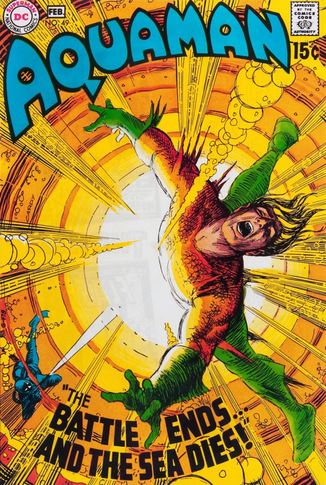
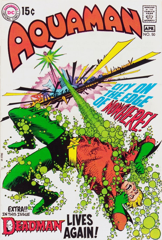
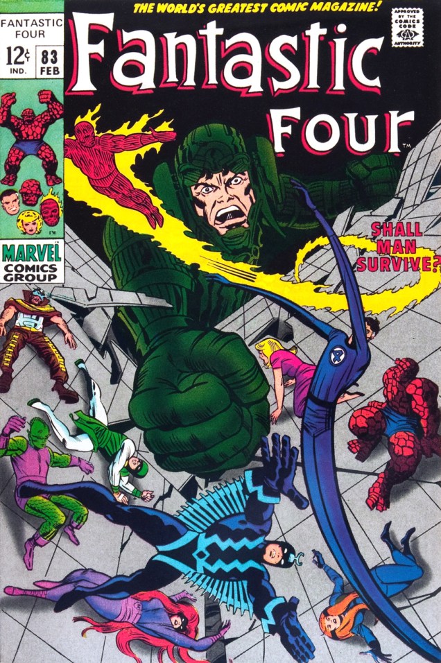
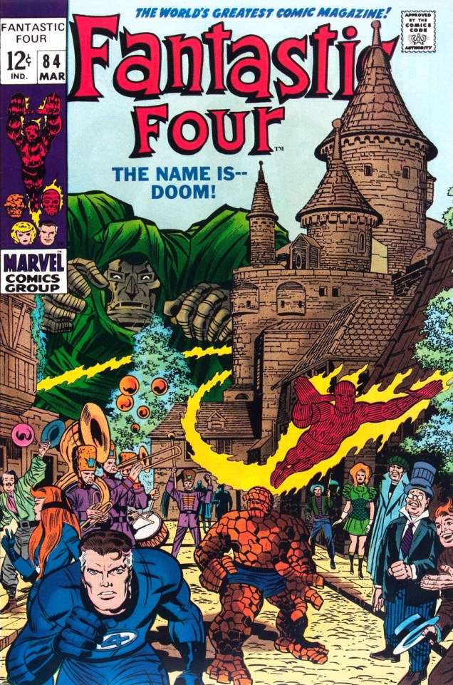
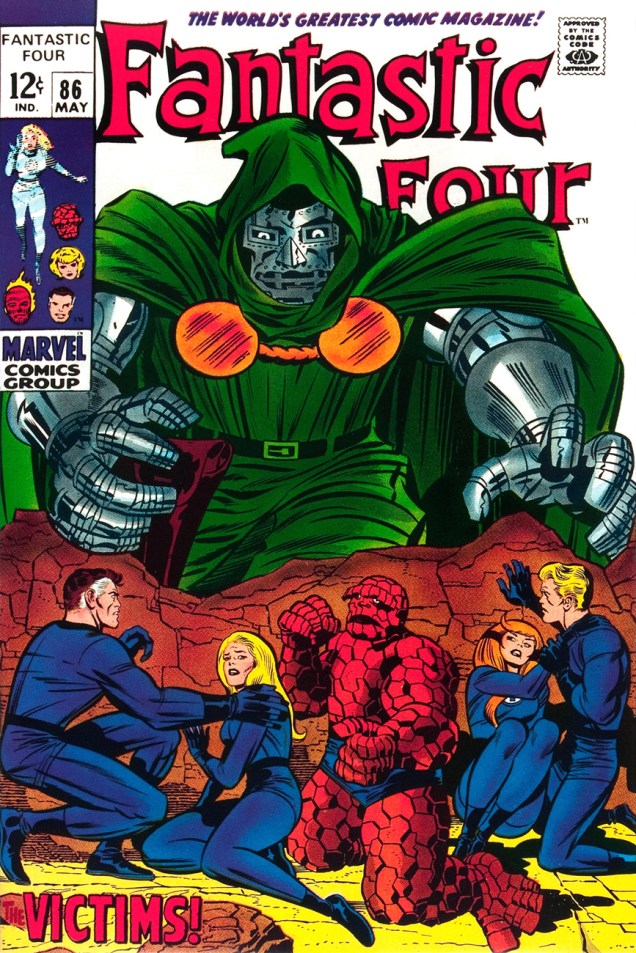
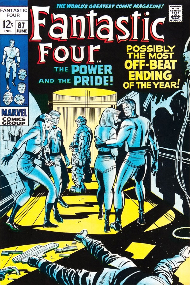
Ah, but for what seems like a mere blip in its history, which is to say around ’68-’69*, Marvel somewhat dialled down the verbiage and let some prime Kirby compositions enjoy a bit of breathing room (at least on Fantastic Four, the company’s second-best seller — and number 16 overall for 1968).

This particular streak is circumscribed by two ho-hum (by lofty Kirby standards) covers: flat FF 81 and messy FF 88 (featured here)… which leaves us with plenty of goodies in the middle. Let’s take the tour, shall we?

KirbyFF82A
This is Fantastic Four no. 82 (Jan. 1969, Marvel). Inks by Joe Sinnott. Silence by Stan Lee. Now isn’t that better?
FF83a
Maximus tries to usurp Black Bolt’s throne, like clockwork. Just a discreet story title… though even then, it’s still intrusive. This is Fantastic Four no. 83 (Feb. 1969, Marvel)
FF84a
See picturesque Latveria. Enjoy the charms of its capital, Doomstadt, located just north of the Kline River. Don’t forget to drop in for some howdy-dos at the small but proud nation’s administrative centre, Castle Doom. This is Fantastic Four no. 84 (Mar. 1969, Marvel). Beyond-meticulous inks by Mr. Sinnott.
FF85a
This is Fantastic Four no. 85 (Apr. 1969, Marvel). Again, did we even need a title? Mechanical lettering, to boot, so it’s not even expressive.
FF86a
Short of a classic, but a nice entry nonetheless. And quiet! This is Fantastic Four no. 86 (May 1969, Marvel).
FF87a
This is always the first image that springs to (my) mind when people bone-headedly claim that Kirby’s work is too over-the-top, ham-fisted and frantic. Even the colours (Stan Goldberg, is that really you?) are admirably subdued. Of course, Stan had to panic and turn on the hype in the eleventh hour. The title would have sufficed. This is Fantastic Four no. 87 (June 1969, Marvel). Giacoia-esque inks by Mr. Sinnott.
FF87b
There. Isn’t that better? The might of Photoshop harnessed to noble ends.

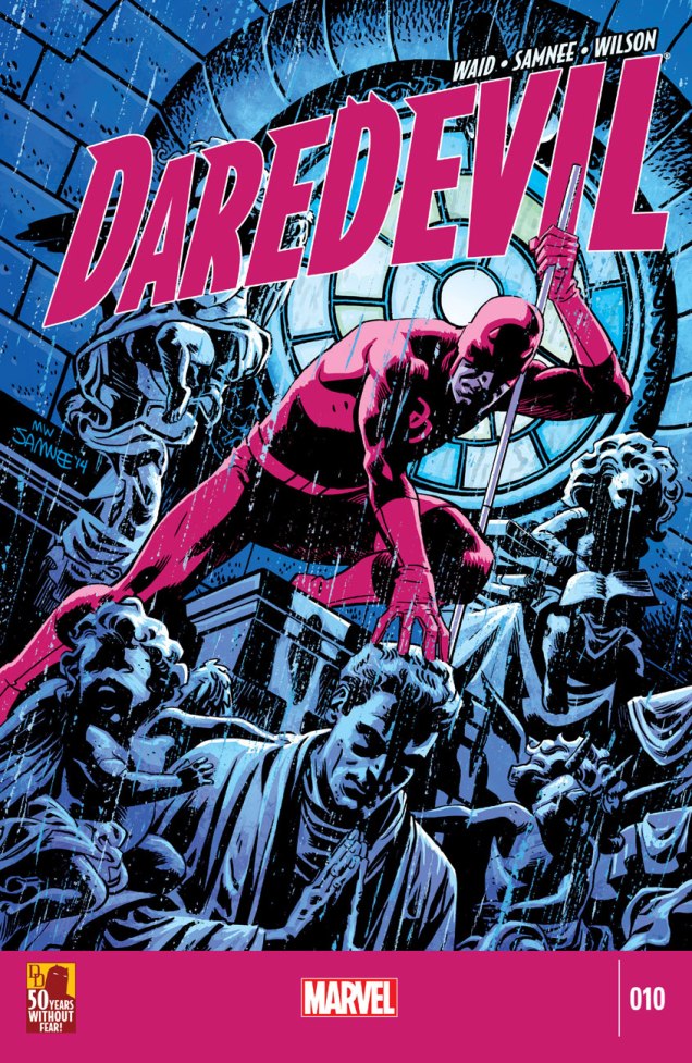
In the face of all this, is it any wonder I found so refreshing the design quietude and purity of some recent comic books covers, such as the Chris Samnee creations we recently spotlighted? There’s hope, thanks to some enlightened folks out there.

-RG

*which closely dovetails with Martin Goodman‘s sale, in the fall of 1968, of Marvel/Magazine Management to the Perfect Film & Chemical Corporation (later Cadence Industries). Probably a coincidence, but who can say?

**Steve Ditko, for one, grasped that if you couldn’t have your publisher’s confidence and trust in your craft and visual salesmanship, you could go elsewhere and enjoy a publisher’s laisser-faire.

***Marvel would even, in the 70s, hire on the sly, for freelance jobs, DC’s reigning lettering ace, Gaspar Saladino. Heaven knows The Avengers badly needed a logo makeover.

Hot Streak: Chris Samnee’s Daredevil

« Oh, this is perfect . . . this is exactly what comic books are supposed to look like. » — Chris Samnee on encountering Frank Robbins‘ “Man-Bat Over Vegas” [ source ]

For a change of pace, here’s an artist in the prime of life and at the peak of his powers.

Chris Samnee, born in 1979, first caught my interest when he collaborated with Roger Langridge on Thor: The Mighty Avenger, for which he reaped the 2011 Harvey Award for Most Promising New Talent. But some of my superhero-lovin’ friends had been raving about Samnee’s work for a while.

While obviously a man of his time, he’s clearly drunk deep from the well of classic illustration, comic books and most of all, comic strips. It’s hard to miss in his work echoes of Alex Toth, Doug Wildey, Frank Robbins, Milton Caniff, Will Eisner, Roy Crane… an artistic heritage not too unlike his fellow Daredevil alumnus David Mazzucchelli‘s… fine company, plumb in that sweet spot between ‘realistic’ and ‘cartoony’, and wisely drawing from both.

As befits a first-rate cover artist, Samnee thoroughly thinks and feels his pictures through, thumb-nailing his layouts and planning his moves. Here are some of his preliminaries from The Rocketeer: Cargo of Doom (2011), for which he shared (with David Aja) the 2013 Will Eisner Award for Best Penciller/Inker.

SamneeRocketeerLayoutsA
Cargo of Doom marks the first time ever when the character of Betty isn’t sexualized to the hilt. That’s got to count for something.
SamneeDaredevil09A
This is Daredevil no. 9 (Dec. 2014). Incidentally, after the intrusion of bar codes on covers in 1975, followed by an increasingly hard-sell culture, the kind of elegantly spare, striking design I personally gravitate to hasn’t had it easy. A surprising step in the right direction came in recent years with the demise of the Comics Code, the introduction of digital editions and the appearance of a handful of enlightened editors (take a bow, Axel Alonso!), first at DC/Vertigo, then (as usual) later at Marvel.
SamneeDaredevil010A
This is Daredevil no. 10 (Jan. 2015). Another example of a digital edition: compare this to a 1970s Marvel cover!
SamneeDaredevil011A
This is Daredevil no. 11 (Feb. 2015). The Stunt-Master, seen here, first appeared in Daredevil no. 58 (Nov. 1969). It was the era of Evel Knievel and his Daredevils.
SamneeDaredevil012A
This is Daredevil no. 11 (Feb. 2015). Hey, even more room for the art!
SamneeDaredevil013A
And this is Daredevil no. 13 (Apr. 2015).

And speaking of inks, he sharply stands out in that regard in today’s assembly-line industry. It’s different for every artist, but Samnee loves to ink. He claims: « My pencils are just awful. I can’t imagine anybody else inking me nowadays because most of the work is done in the ink. ». I can relate.

While I greatly enjoyed Thor: The Mighty Avenger, the covers were solid but not outstanding. But Mr. Samnee’s still improving (!), and so a couple of years down the pike, and with the crucial input of colourist Matthew Wilson, a man without fear of colour saturation, we have a hot streak! And yeah, surrounding issues 8 and 14 kind of fell flat, so it’s a fairly short one. But there are quite a few quite outstanding covers outside of this subjective selection, so keep an eye out, and prepare to have it dazzled.

-RG

Hot Streak: Nick Cardy’s Aquaman

« Who’s Aquaman? I never heard of him! »
« He’s one of the super-beings from the place called Earth! He lives at the bottom of the ocean! » —  Steev & Jimm, rubberneckin’ in Aquaman no. 51

Some may have wondered at the deep, abiding affection held, by a certain savvy contingent of comics aficionados, for sea king Aquaman. After all, he’s a bit of a second-stringer, and he’s had a pretty spotty record for decades. Well, I’d say one has to have encountered the erstwhile Arthur Curry at his peak, in the hands of the Stephen Skeates, (writer) Jim Aparo (penciller-inker-letterer), Dick Giordano (editor-poacher), Nick Cardy (cover artist), Carmine Infantino (editor-in-chief/art director), Jack Adler (colourist) and Gaspar Saladino (cover letterer) set.

Fond as I am of Nick Cardy and Ramona Fradon‘s work, the series’ Skeates-Aparo period is more my speed. I can’t quite put my finger on it. There’s a whiff of the end of the world, something ominous and immediate about it, despite the fanciful settings. I guess it was « relevance », but with a lighter touch and without the cringe-inducing bathos of the concurrent Green Lantern-Green Arrow series. Because of Aquaman’s aquatic nature, environmental doom seldom seems far. The Skeates-Aparo rampage lasted from issue 40 (June 1968) to number 56 (April 1971). Aparo returned to the character just a few years down the road (Adventure Comics no. 441, Sept. 1975), but by then, he’d already begun his long, painful artistic deterioration.

WhoThereLogotype

But back to the covers: this represents, in my view, Cardy’s second hot streak on this title. From the beginning of his career (in 1940 with the Iger/Eisner shop!) Cardy had always been a reliably competent artist, but rarely a very exciting one. That all changed in the mid-Sixties when newly minted art director/editor-in-chief Carmine Infantino made him his right-hand man and co-designer of DC’s covers. This greater latitude gave Cardy wings. Cardy’s first Aquaman hot streak opens on issue 37 (Jan.-Feb. 1968) and closes with issue 45 (May-June 1969). Issues 46 to 48 are nice enough, but short of transcendence… beyond that bump in the road, we’re set for a smooth run of splendid covers.

CardyAquaman49A
This is Aquaman no. 49 (Jan.-Feb. 1970). Cover pencils and inks by Cardy, colours by Jack Adler, Aquaman logo by Ira Schnapp, title lettering by his worthy successor, Gaspar Saladino. Edited by Dick Giordano, directed (and likely laid out) by Infantino.
CardyAquaman50A
This is Aquaman no. 50 (Mar.-Apr. 1970), sporting a Cardy cover that couldn’t have been more evidently designed by Carmine Infantino, with more Saladino magic on the titles and Deadman logo. Gestalt: it’s what great collaboration is all about! It seems fair to assume that the title is a nod to the Harlan Ellison-scripted 1967 Star Trek episode, The City on the Edge of Forever.
CardyAquaman51A
This is Aquaman no. 51 (May.-June 1970). I don’t usually pilfer Tentacle Tuesday material… but I’m inclined to make an exception for a (sea) worthy cause. Design-wise, Infantino and Cardy took full advantage of the aquatic action settings. Up, down, sideways — anything goes!
CardyAquaman52A
This is Aquaman no. 52 (July-Aug. 1970). A wistful, disorienting experiment in colour and design economy. You’d never see such a *hushed* cover chez Marvel.
CardyAquaman53A
This is Aquaman no. 53 (Sept.-Oct. 1970). A fine instance of the notorious “Infantino tilt”. Michael Kaluta on Infantino’s cover design input: « My approach to a cover, when I got to do my own ideas, was to show the picture straight on, staged, unless it was a dramatic perspective view. Almost every time I’d bring one of these sketches in to Carmine he’d turn the paper about 30 degrees to the right and demand that that made the composition 100% stronger, more “grabby”… and I’d have to agree about 50% of the time… »
CardyAquaman54A
This is Aquaman no. 54 (Nov.-Dec. 1970). Did I mention that DC’s books of the early ’70s had a general predilection for the macabre and the moody? Fine by me, then and now.
CardyAquaman55A
This is Aquaman no. 55 (Jan.-Feb. 1971). The fact that this complex idea works so well on the page is evidence of some first-rate design work, with some heady colouring mojo sealing the deal.
CardyAquaman56A
This is Aquaman no. 56 (Mar.-Apr. 1971). Would you believe that this story was continued over three years later in Marvel’s Sub-Mariner no. 72 (Sept. 1974). Seems sneaky Steve Skeates slipped something past sleepy editor Roy Thomas. In an interesting bit of coincidence, it was each of the competing oceanic monarchs’ final issue. On another note, I presume that the title is a takeoff on Norman Greenbaum‘s 1967 song The Eggplant That Ate Chicago (popularized by Dr. West’s Medicine Show and Junk Band), itself likely an homage to Arch Oboler‘s infamous 1937 Lights Out radio episode, The Chicken Heart (That Ate the World). Phew!

Under normal circumstances, this run of covers would have turned out quite differently for, as Steve Skeates told me a few years ago, « The only reason Jim [Aparo] didn’t do the covers was that he lived out of town, couldn’t come in for cover conferences! »

-RG

Hot Streak: Joe Kubert’s The Atom and Hawkman

« Calm down, Harris… this is no teleportational phenomenon we’re dealing with… » — Hawkman, “Yo-Yo Hangup in the Sky!”.

In 1968, though DC was still handily outselling Marvel, the industry leader was beginning to feel the heat. Now, to be fair, not nearly as much as revisionists would surmise: Marvel’s top-seller, The Amazing Spider-Man, was only in twelfth place. Of course, Marvel was hobbled by distribution issues, but that problem would come to an end that very year.

Anyway, as neither of DC’s solo titles The Atom (38 issues, June-July 1962 – Aug.-Sept. 1968) nor Hawkman (27 issues, Apr.-May 1964 – Aug.-Sept. 1968) were doing all that well (both of them missed the top sixty in 1968), it was decided to attempt to merge the books in order to perhaps save them. Well, it didn’t work, but some splendid covers were created, and that’s what brings us here.

AtomHawk39A
The Atom and Hawkman no. 39 (numbering continued from Atom’s book, not Hawkman’s), November 1968. Insides by Robert Kanigher, Murphy Anderson and Joe Giella. Which one’s the Titan and which the Fury? They take turns. Check it out here.
AtomHawk40A
The Atom and Hawkman no. 40 (Jan. 1969) holds a rare treat: a highly unusual pairing, one that was only repeated once to my knowledge (in the following issue): Joe Kubert on pencils and Murphy Anderson on inks. The tale is The Man With an Inbuilt Panic Button, scripted by Gardner Fox. Peruse it here while you can.
AtomHawk41A
My candidate for the slightest cover of the Atom/Hawkman combo title, but only since the competition is so fierce, and well, it’s kind of busy. This is The Atom & Hawkman no. 41 (Feb.-Mar. 1969), edited by Julius Schwartz and featuring Return of the Seven-Year-Dead Man, written by Gardner Fox, pencilled by Dick Dillin and inked by Sid Greene, and Yo-Yo Hangup in the Sky!, written by Fox, illustrated by Kubert and Anderson. Feast your eyes here.
AtomHawkman42A
This is The Atom and Hawkman no. 42 (Apr.-May 1969). Read it here!
AtomHawkman43A
Robert Kanigher & Joe Kubert’s Gentleman Ghost, first appeared (so to speak) in Flash Comics no. 88 (Oct. 1947) had not been seen (hee hee) since the Golden Age, and he returned to pester Hawkgirl and Hawkman in Come to My Hanging, scripted by Kanigher and illustrated by Murphy Anderson. Meanwhile, The Atom stars in Buzzin’, Buzzin’ — Who’s Got the Buzzin’?, scripted by Dennis O’Neil, pencilled by Dick Dillin and inked by Sid Greene. This is The Atom and Hawkman no. 43 (June-July 1969). Read it here!
AtomHawkman44A
Kubert clearly relished delineating his Gentleman Ghost, and who could blame him? That sticky-fingered filcher is one snazzy-looking felon. This is The Atom and Hawkman no. 44 (Aug.-Sept. 1969). Read it here!
AtomHawkman45A
This is The Atom and Hawkman no. 45 (Oct.-Nov. 1969), featuring Queen Jean, Why Must We Die?, by Denny O’Neil, Dick Dillin and Sid Greene, whereas our heroes are enslaved by Ray “The Atom” Palmer’s girlfriend, Jean Loring. It was a common theme in DC Comics, just ask Superman and Green Lantern, for starters. Anyway, read the whacked-out tale here.

As a bonus, one could consider the final issue of Hawkman (no. 27, Aug.-Sept. 1968), the first entry in Kubert’s streak. Well, I do, and that’s that.

Hawkman27A
It is said that late each year, Thanagarians mark the winter solstice by taking to the snowy skies to join cuddly flying Yeti in frolic. Look at them cute lil’ buggers. When the Snow-Fiend Strikes! is scripted by Raymond Marais, pencilled by Dick Dillin and inked by Chuck Cuidera.

-RG

Hot Streak: Steve Ditko’s Ghostly Haunts

« There’s no room for professional jealousy around the graveyard, chums… life is too short, as they say… but what comes after that short life may stretch into all eternity! »

I could carry on endlessly (or so it would seem) on any number of obscure topics, but it’s healthy, every once in a while, to take a deep breath, empty one’s mind of its flotsam and jetsam, and reach for an old favourite.

I hadn’t yet written anything about Steve Ditko‘s passing, as I figured it would get lost in the mad shuffle of tributes. That base was well-covered. Still, while I’d known all along the day would come, it was hard to imagine a world without that reclusive genius, likely my very first artistic inspiration.

I didn’t see much of Ditko’s 60s Marvel work until the late 70s pocket book reprints (the period equivalent of watching a movie on one’s cellphone), but the Charlton ghost books grabbed me at a tender age. And so…

As my candidate for Steve Ditko’s finest cover run, at any company, I submit issues 22-27 and 29-30 (curse you for the interruption, Joe Staton!), from January 1972 to March 1973, final year of Ditko’s peak period, imho.

ghostlyhaunts22a
Ghostly Haunts no. 22 (Jan. 1972), an excellently-balanced all-around winner, with the whimsical “Wh-Who’s in Th-There?” (w: Joe Gill p: Charles Nicholas i: Vince Alascia), “Witch’s Brew“, a taste of creepy suburbia with a whiff of Rosemary’s Baby brimstone (w: Joe Gill, p/i Pat Boyette) and our headliner, “The Night of the Lonely Man!” by Gill and Ditko. Read the whole pamphlet here, folks.
ghostlyhaunts23a
Ghostly Haunts no. 23 (Mar. 1972), offers two Gill-Ditko stories: “Treasure of the Tomb” and the cover-featured “Return Visit!“… and I’d be hard-pressed to pick the superior entry. The reader wins. Ah, you cast the deciding vote: read them both here.
ghostlyhaunts24a
Ghostly Tales no. 24 (Apr. 1972), another strong issue, thanks to Gill and Boyette’s “The Other One!” and of course Ditko illustrating “A Man Who Was Here“, Joe Gill’s parable about a Tennessee mountain man displaced, but not entirely, by the construction of a modern superhighway. Read the entire issue here, ladies and gentlemen.
ghostlyhaunts25a
« The butler’s a real monster! » Ghostly Tales no. 25 (June 1972) is where Mr. Ditko demonstrates his unmatched virtuosity in the delicate task of incorporating several elements of a tale without winding up with the dog’s breakfast. Compositional alchemy of the highest order! The cover tale aside, Joe Gill’s wonderfully-titled “What Will Lance Surprise Us with This Time?“, illustrated by Fred Himes, is loads of fun. Read “I’ll Never Leave You!here.
ghostlyhaunts26a
Roger C. Feeney, Indian Affairs bureaucrat from Washington, DC, appears to have stumbled onto the wrong sacred Hopi cave. Uh-oh, Roger, it appears you’ve been noticed by… something. This is Ghostly Haunts no. 26 (Aug. 1972). Beyond the classy Ditko cover, it’s just an okay issue.
ghostlyhaunts27a
« Why does it happen each year? Citizens of Trappton don’t know it, but it always begins right here… at an unmarked grave… » Presumably bearing no direct relation to the 1967 Michael Winner- Orson Welles – Oliver Reed film, I’ll Never Forget What’s-His-Name“, the Gill-Ditko cover story is a classic, the tale of a forgotten man, Bertram Crumm, who merely wanted his existence recognized by the town that spurned him during his lifetime.
It’s too bad Charlton only occasionally featured mystery host Dr. Graves in active (rather than narrative) roles, because when they did, the results were pretty gripping. Unusually, Graves guests outside his own book and in Winnie’s, and we find ourselves with a classic on our hands. This is Ghostly Haunts no. 27 (Nov. 1972). Read the Gill-Ditko story here, but don’t miss the fabulously oddball “The Mine’s All Mine!” by Gill and Stan Asch, featured right here.
ghostlyhaunts29a
« Maybe I’m going mad! I keep imagining I hear his voice! » Ghostly Haunts no. 29 (Jan. 1973) features a striking (gold) exercise in fearful symmetry announcing the Joe Gill – Ditko saga of two untrustworthy acolytes in the Canadian North. Check out “Partners!here.
ghostlyhaunts30
« Ugh! It’s really hideous! Is it a self-portrait of the real you?»  We put the finishing touches on our tour of Steve Ditko covers from 1971-72 with Ghostly Haunts no. 30‘s “Fear Has Three Dimensions” (Mar. 1973). Despite a theme right in Ditko’s wheelhouse, none of his art appears within; the cover feature is handled by Wally Wood disciple Wayne Howard, and the other tales are deftly told by Fred Himes and Warren Sattler.

That just about wraps it up. For further reading on the topic, I recommend you check out Ben Herman’s perspective on some of these very stories, and on Ditko’s spooky Charlton work of the 70s in general.

« Poor Agatha Wilson still has screaming fits! »

-RG