Panning the murky old print stream for the odd glimmering nugget
By the Light of the Silver Age
We know when the Silver Age begins, but when exactly does it come to a close? Since it’s just arbitrary retrofitting, a bunch of events and dates have been posited, mostly from the early 1970s: Kirby leaving the Fantastic Four and Marvel, the “relevance” of Green Lantern/Green Arrow… The cut-off points of decades have been pretty misleading in the past while the middles have often been more pivotal: for instance, the years 1955 to 1965 are more of a piece than 1950-60, for instance. Same goes for 1965 to 1975. I therefore deem the end of the Silver Age to be the end of 1975, when Carmine Infantino stepped down as DC publisher, along with his brilliant art director Nick Cardy. Replace them with inexperienced Jenette Kahn* and the legendary (but not in a good way) Vince Colletta as art director, and you have a pretty massive sea change. Compared to that, comics from 1969 are virtually identical to releases from 1970. *creating Dynamite Magazine for Scholastic is what got Kahn the job. She only stayed for four issues, and Jane and Bob “R.L.” Stine likely did most of the heavy lifting, since the magazine only improved following Kahn’s departure. – RG
A favourite trope of tentacular obsession in comics is populating stories with monsters boasting exceptionally long arms (sometimes more than one pair) that they can wind around stuff with ease. In other words, monsters with tentacle forelimbs. You’d have to abstain from comics altogether to never encounter that of which I speak (or stick to slice-of-life comics, I guess). A little demonstration is in order.
Here’s a trick question: what kind of being lives on planet Octo? Duh: Octo-men! The following Flip Falcon story, illustrated by Don Rico (and not “Orville Wells”, despite claims to the contrary), was printed in Fantastic Comics no. 17 (April 1941).
Interesting that “dog” is used as a slur even on planet Octo, despite there clearly being no canines around.Nasty little brutes, aren’t they?
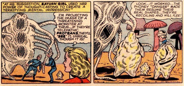
The Super-Tests of the Super-Pets! (scripted by Edmond Hamilton, penciled by John Forte and inked by Sheldon Moldoff) is every bit as goofy as it sounds. I actually enjoyed reading it, much to my own amazement. Anyway, while Proty II (Chameleon Boy’s pet) transforms into quite a few creatures to pass the super-test, he clearly favours tentacular forms (and who could blame him?) This was published in Adventure Comics no. 322 (July 1964).
Speaking of Proty II and ectoplasm, a dozen issues later, the Legion decides to visit his home planet, which is just full of these jello-marshmallow doughboys, Protean citizens all. Part I: The Unknown Legionnaire and Part II: The Secret of Unknown Boy! (both parts scripted by Edmond Hamilton, penciled by John Forte and inked by Sheldon Moldoff) were published in Adventure Comics no. 334 (July 1965).
To terrify Proteans, whose appendages are borderline tentacles, Saturn Girl decides to conjure up a… monster with tentacles.In case you didn’t believe me that Proteans have “tentacles”.The shape-shifting Proteans turn into more streamlined versions of themselves, with more pronounced tentacles. I swear, everyone is obsessed.
Next, I’d like to regale you with a fight scene illustrated by Murphy Anderson (yum!): Scourge of the Human Race!, scripted by Gardner Fox and published in Hawkman no. 15 (August-September 1966).
Isn’t it a lovely last panel?
If I Can’t Be Clark Kent… Nobody Can!, published in Action Comics no. 524 (October 1981), scripted by Martin Pasko, penciled by Curt Swan and inked by Frank Chiaramonte, offers us a nice helping of tentacles.
If I should see an octopus Lift its arms out of the sea Or see its shadow rising up Cross the rooftops above the streets I’d follow those dancing limbs To the spinning edge of the sky Where all the boats fall off the world Into the octopus’s eye
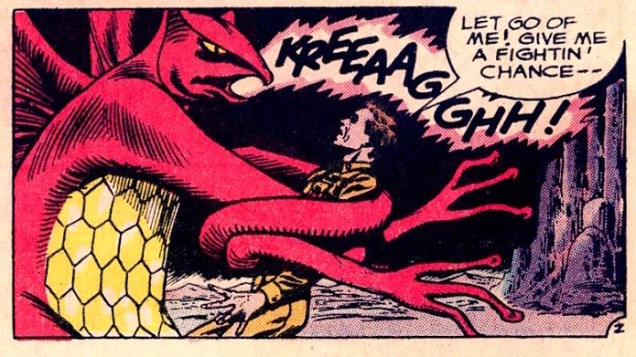
Sea Devils no. 1 (September-October 1961). Cover by Russ Heath.The Sea Devils vs. the Octopus Man! is scripted by Robert Kanigher and illustrated by Russ Heath.
The same team returns to tentacles with Sea Devils no. 6:
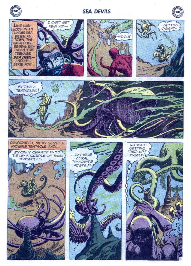
The Flame-Headed Watchman!, scripted by Robert Kanigher and drawn by Russ Heath, was published in Sea Devils no. 6 (July-August 1962).
Now we unfortunately have to leave Heath behind and walk over to the territory of Howard Purcell, whose art is not nearly as striking, but still quite serviceable.
Sea Devils no. 17 (May-June 1964), cover by Howard Purcell.The Impossible Maritime Menacesis scripted by Arnold Drake, penciled by Howard Purcell and inked by Sheldon Moldoff.Sea Devils no. 19 (September-October 1964), cover by Howard Purcell. Is it just me or does the guy on the left look like a Ditko villain?The Sea-Devil Robots is penciled by Howard Purcell and inked by Sheldon Moldoff.Sea Devils no. 21 (January-February 1965), cover by Howard Purcell.
The Forty-Fathom Doom!, scripted by Jack Miller, penciled by Howard Purcell and inked by Sheldon Moldoff, boasts quite an assortment of tentacles:
Everybody is almost in identical position as on the cover – but the octopus has lost his baby blues and gained a pair of poached eggs.
And, in case you’re wondering where that quote at the top of this post comes from… The ‘heh, heh’-ing octopus is Dr. Quad.
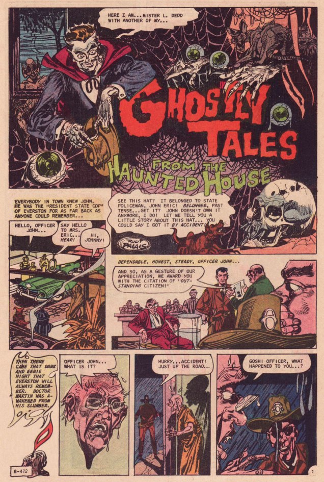
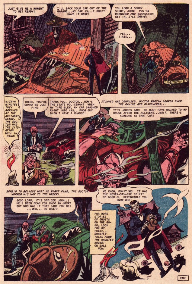
Golden Age pioneer Rudy Palais (1912-2004) wound down his career in comics with a smattering of terror tales for Charlton between the late 60s and the mid-70s. It’s a shame he didn’t do more, because his highly-stylized approach fit right into the Charlton non-mould. The inaugural issue of The Many Ghosts of Dr. Graves (May, 1967) features a pair of remarkable Palais two-pager sweatfests. Here’s one of them, a simple story effectively told, and wherein Ghostly Tales host Mr. L. Dedd plugs his own book.
Check out the sizzling stiletto heels Mr. Dedd’s sporting in the first panel!
« Phooey on trick or treaters! This year I’M going to have all the fun — play the tricks and eat the candy myself! » — foolish words from Donald
Whoa, lots of action for poor Unca Donald this Hallowe’en, some of it possibly malevolent. Best hand out the treats and be generous, to be on the safe side.
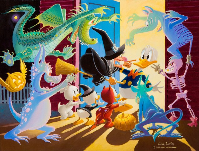
This lovely painting entitled Halloween in Duckburg was created in 1973 by the incomparable Carl Barks, aka The Good Duck Man. It’s based on his cover for Walt Disney’s Donald Duck no. 26 (Dell Comics, Nov. 1952), which in turn was based upon the Disney cartoon short Trick or Treat.
As a bonus, here’s a nice Donald mask (not that Donald… right colour, but too scary) for your trick or treating purposes, from the same issue’s back cover.
Sometimes I stumble upon a comic with a fight-to-the-death scene in which something-or-other- with-tentacles plays the role of a lethal enemy for our hero – but upon closer inspection, in turns out that the ferocious creature is… gosh-darned cute. I mean, how can you kill anything that has adorable whiskers, or tufted eyebrows like Oscar the Grouch?
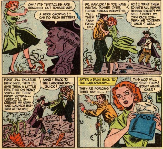
When your attackers are carrots with tentacles, and they really get on your nerves (although I think Ann is safer with them than with Dr. Maylor), I’d suggest throwing them into a nice big pot of soup, maybe… but if you please, do consider abstaining from flinging acid at them.
I do believe that prehensile vegetables fit into the category of “cute” – just look at their precious little root-legs! Page from Heroes Out of Time!, scripted by Manly Wade Wellman (hey, cool!), with some very stylish art by Bob Oksner on pencils and Bernard Sachs on inks, printed in Mystery in Space no. 3 (August-September 1951).
While we’re on that topic: things get delightfully wacky and madcap (not much) later in the story. Namely, Napoleon Bonaparte and Benjamin Franklin are summoned for help against the tentacled carrot-horde.
The Flaming Carrot would not be pleased by this massacre. If only to admire the art, you can read Heroes Out of Time!here.
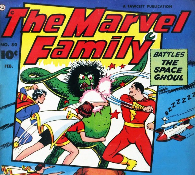
Thank you kindly for suppressing your urge to sock the creature sporting a unibrow and bloodshot eyes worthy of Christopher Lee; it’s also not his fault he got lumbered with such a shaggy wig.
Detail from the cover of The Marvel Family no. 80 (February 1953), pencils by C. C. Beck and inks by Pete Costanza.
Have the goodness to think twice before pitching lethal ice cubes at an owl, even if it somehow grows metal tentacles and threatens to make mince-meat of humanity, because owls are the very cutest.
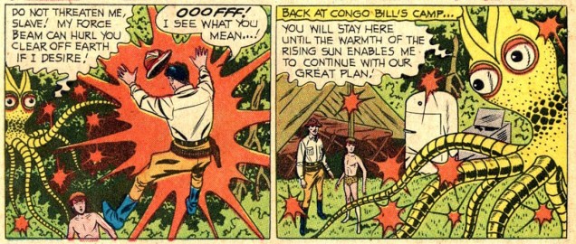
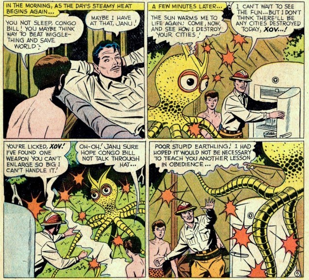
Panels from The Man-Ape Skin Diver!, scripted by Robert Bernstein and drawn by Howard Sherman, published in Action Comics no. 257 (October 1959).“Wiggle-thing”? Excuse me?
Pray, don’t kill anything that looks like it’s wearing a dragon wearing a really bad disguise, including a moustache that looks like a pile of hay.
A panel from Fate is the Killer (a preview of a Masters of the Universe story), scripted by Paul Kupperberg, pencilled by Curt Swan and inked by Dave Hunt, published as a promotional bonus in several DC titles cover-dated November, 1982.
If you would be so good as to spare the creature that looks like a mashup of a seal and a mole, especially if it gazes at you mournfully with world-weary sadness.
Masters of the Universe: The Vengeance of Skeletor! (1982), cover by Alfredo Alcala.
« The stranger’s face was entirely obscured by a broad-brimmed felt hat bent downward over his features; and the long, black coat looked almost like part of the thickening fog. » –Harry Vincent first encounters his future employer. (Shadow Magazine, April/June, 1931)
We note today the birth anniversary of Walter B. Gibson (September 12, 1897 – December 6, 1985), an extremely prolific writer and professional magician. Gibson is best known for developing the radio character of The Shadow, through nearly three hundred stories he wrote under the collective nom de plume of Maxwell Grant.
The Shadow’s had an interesting and varied career in comics, but Gibson’s novels (and the radio shows… Orson Welles!) are where it’s at. Still, let’s take a look around, shall we?
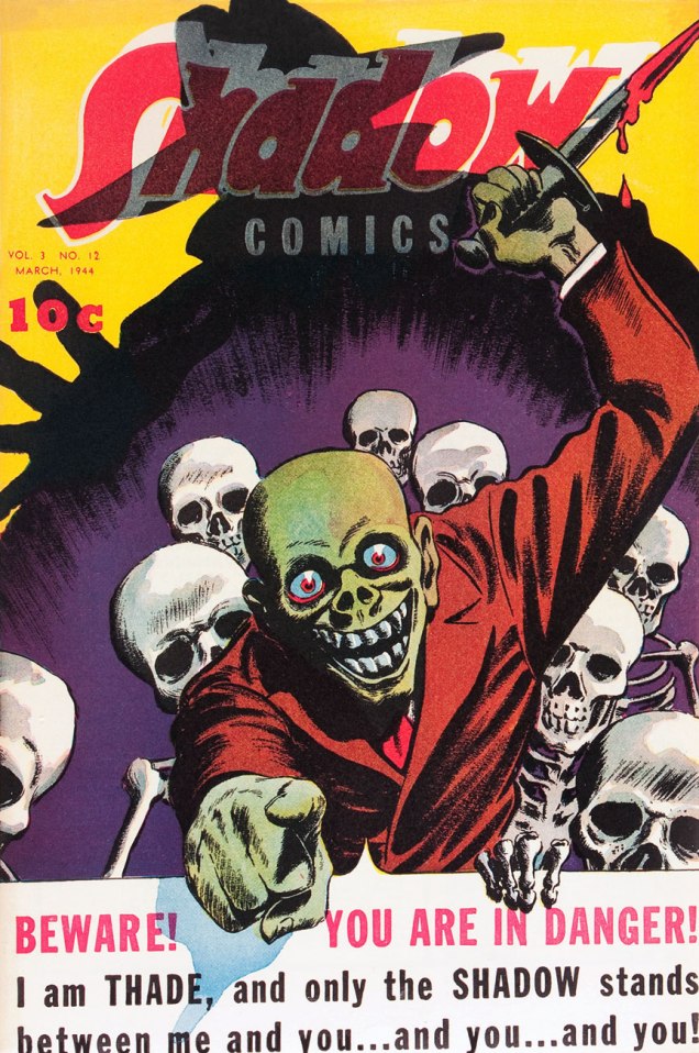
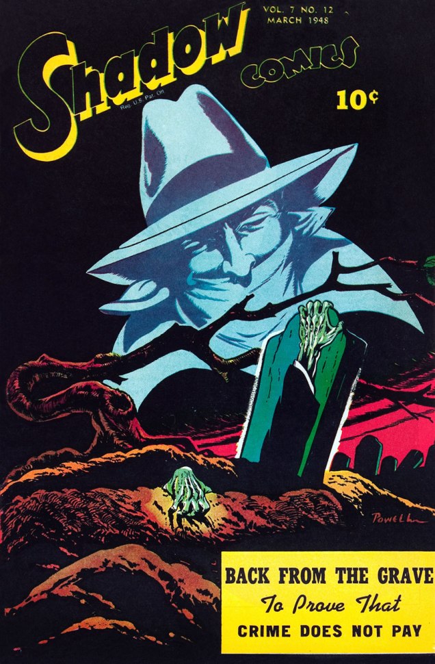
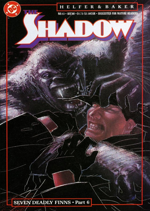
This is The Shadow Comics Vol. 3, no. 12 (March, 1944, Street and Smith); cover possibly by Vernon Greene. That Thade seems like a friendly sort, mayhap a tad overly so.This is The Shadow Comics Vol. 7, no. 12 (March, 1948, Street and Smith); cover by Bob Powell.Now why were Archie Comics allowed to take such ridiculous (though I’ll grant, perversely entertaining) liberties with The Shadow? Must have been a lull in the revival market, I suppose. This is The Shadow no. 1 (August, 1964, Archie), cover by Paul Reinman. You just wait until the subsequent issues…This, however, is not quite how Gibson envisioned and portrayed the mysterious Shadow. This off-model rendition hails from Archie Comics’ 8 issue, 1964-65 run, helmed by Superman co-creator Jerry Siegel and Golden Age journeyman Paul Reinman. This be The Shadow no.8 (September, 1965).A privileged peek at Frank Robbins‘ original cover art for The Shadow no.7 (Nov. 1974), second of his four (or so) covers for DC, featuring Night of the Beast!, scripted by Denny O’Neil. Yummy… but too short.Two great Street & Smith pulp heroes face off! Mr. Kaluta takes some artistic license here, however, since Ike (as The Avenger calls his throwing knife), is supposed to be small and almost needle-like, not a freakin’ butcher knife. Come to think of it, the Shadow’s trusty automatics look like something a Rob Liefeld character would wield. One doesn’t encounter often the final three issues of DC’s initial run of The Shadow. Post-Kaluta (save the covers) and post-Robbins, the art was handled by Filipino artist E.R. Cruz, who did a commendable job, while series regular Denny O’Neil (who wrote all issues except for number 9 and 11, Michael Uslan ably filling in) stayed until the curtain was drawn.Skipping the heinous Howard Chaykin revival, in which he delighted in sadistically dispatching The Shadow’s aged former operatives in gruesome ways (why do these people always call themselves fans of the original series?), we move on to the Andrew Helfer-Bill Sienkiewicz regular book. Better, but still not great. This is The Shadow no. 3 (Oct. 1987). Cover by Bill Sienkiewicz.Ah, now things perk up. A nasty but excellent tale, worthy of Michael Fleisher at his bugfuck best; the shade of Marshall Rogers and smart up-and-comer Kyle Baker were a good visual match. This is The Shadow no. 7 (Feb. 1988).This is Kyle Baker’s cover for the finale of his and scripter Andrew Helfer’s thrilling and hilarious Seven Deadly Finns saga (no. 13, March 1988) that made The Shadow such a must-read title. To quote Kate Bush, « What made it special made it dangerous », and the folks at Condé Nast, who hold the rights to the classic Street & Smith characters (also including Doc Savage and The Avenger) reportedly got twitchy* at the reckless liberties the Helfer-Baker team were taking and pulled the plug after issue 19, where a beheaded Shadow gets a big action robot body. The Shadow was rebooted the following year in more obedient hands, with quite pedestrian results.
As a bonus, let’s slightly depart from comics proper and admire a couple of paperback reissues from the brush of noted fabulist James Steranko.
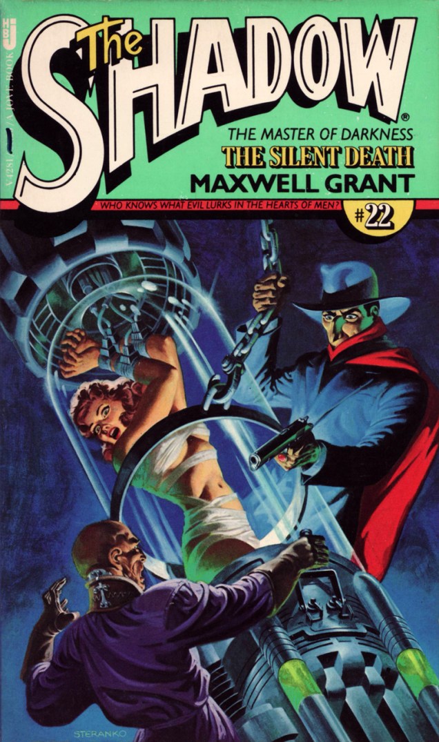
Steranko comes up with one of his subtlest, most unctuously moody covers for Pyramid’s 1974-78 series of Shadow paperbacks that introduced these classic pulp adventures to a new audience, picking up where its predecessors Belmont (1966-67) and Bantam (1869-70) had left off. Pyramid had one extra trick in its bag, though: Jim Steranko, who painted tantalizing covers for each of Pyramid/Jove’s twenty-three volumes. This particular case file, MOX, « from The Shadow’s annals as told to Maxwell Grant » originally appeared in The Shadow Magazine vol. 7, no. 6 (November, 1933).Natty dresser Jim Steranko has built up, over the years, quite a biography for himself. Of his numberless and prodigious accomplishments, my favourites are those that actually happened, such as a stunning series of cover paintings for Pyramid Books’ reprints of vintage Shadow pulps from the 30s and 40s. This one, twenty-second in a set of twenty-three, was published in March of 1978. The Silent Death initially saw print in The Shadow Magazine, Vol. 5, no. 3 (April 1, 1933.)
« He’s back from the dead / the telegram read / If you get on a flight / You could catch him tonight / You’ll find Commissar / He’s at the Munich Hilton Bar » — B.A. Robertson
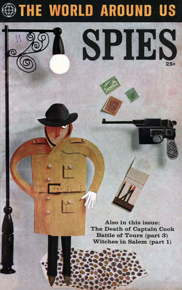
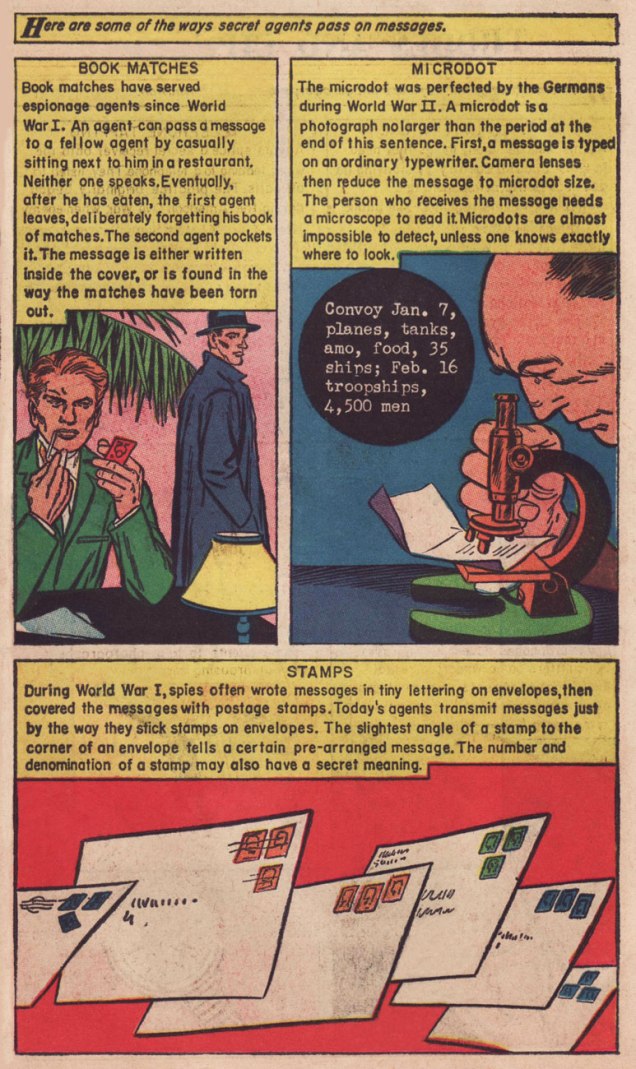
In 1958, Classics Illustrated publisher Gilberton tried something a bit different: a mostly non-fiction documentary title on various topics entitled The World Around Us, and featuring The Illustrated History of… Dogs, Space, Pirates, Great Explorers… depending on your area of interest, these could mean unrelenting tedium or sheer bliss. I haven’t encountered many issues, but the two I own, Ghosts and Spies, count among my prized paper possessions.
This is The World Around Us no. 35 (August, 1961), featuring this lovely mixed media piece by The Unknown Artist, whose cover remains defiantly unblown. On the inside, some fine company: George Evans, Norman Nodel, Edd Ashe, Jo Albistur… and Jack Kirby (inked by Dick Ayers)… the most beaten-down, anonymous, excitement-dialed-down-to-one Kirby you’re ever likely to see. Oh, he could do the job just fine, but the job, and the publisher, were not making anything of his regal strengths*. He would recall that this was « … the worst paying job of my entire life, including times I worked for free. »
Those early post-Code years were difficult ones for the diminished comics industry, and Kirby’s situation wasn’t exactly rosy: he’d been blacklisted at DC, thanks to the Jack Schiff / Sky Masters imbroglio, and his work at Harvey Comics had dried up. So what was a prolific artist to do, but pick up whatever bits of freelancing were available, here and there…
Quoting from Paul Gravett‘s review of Classics Illustrated: A Cultural History, we find this telling statement: « The most demanding editor was Roberta Strauss, a stickler for detail, who would count soldiers’ buttons or pleats in skirts and even called an editorial meeting in her hospital room only days after her son’s birth. » Give me Harvey Kurtzman‘s editorship** any old day!
**« Kurtzman’s editing approach to Two-Fisted Tales and Frontline Combat was a stark contrast to EC editor Al Feldstein‘s style. Whereas Feldstein allowed his artists to draw the story in any manner they desired, Kurtzman developed detailed layouts for each story and required his artists to follow them exactly. »
Some people automatically conflate “goofy” with “childish”, but goofiness comes in many guises: from the charmingly nonsensical to the playfully quirky, from the clearly brilliant but confusing to the fucking stupid. (It’s also a snow-boarding term – How do I tell if I’m Goofy or Regular?) Today’s Tentacle Tuesday is goofy, all right, but more in the category of seemingly drug-induced codswallop. Another word for Dial H for Hero is wacky; distinctly wacky, so wacky that (as co-admin RG put it) it’s hard to really dislike it.
Maybe I should backtrack for those in the audience who are not familiar with the concept of Dial H for Hero. Robby Reed, a lucky (?), plucky teenager with a propensity to shout “Sockamagee!” in moments of excitement, stumbles upon some sort of magical thingamajig in a cave that enables him to become a superhero at the drop of hat (well, a turn of a dial). The process has unpredictable and uncontrollable results, in the sense that Robby has no idea who he will become, or what powers will be at his fingertips.
I have nothing against the idea of a rotary phone cum magical dial – that idea is rather interesting, given that rotary phones are indeed mysterious objects to the current generation – but I find the stories a tad too random to be enjoyable. Yet that’s the aspect that some readers clearly relished. To quote a letter from House of Mystery no. 172 (January-February 1968) from Bethesda, MD’s Irene Vartanoff.
« One of the best things about DIAL H FOR HERO is the huge amount of imagination put into each story. When at least two new heroes with new powers, costumes, weaknesses, bodies, etc. have to appear in each story, it may make your writers rack their brains and work overtime, but the results are fantastic. »
Given all the transformations Robby has gone through and the many bad guys he has had the pleasure of defeating, it is unavoidable that he would 1) encounter some villains with tentacles 2) acquire some tentacles himself. Dial H for Highball on *your* old-fashioned phone, if you still have one gathering dust in the attic, and enjoy this gallery of fun nonsense.
The very first appearance of Robby Reed and his magical dial, and already we have tentacles:
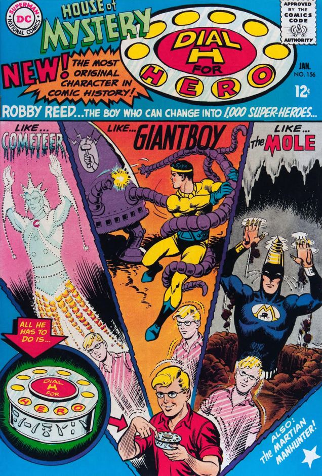
House of Mystery no. 156 (January 1966), cover by Jim Mooney. This is a good demonstration of how random some of the superheroes generated by the machine are.
This is the first Dial H for Hero story, and as such it has no other title. Scripted by Dave Wood, drawn by Jim Mooney. [RG: panel three looks suspiciously like the work of George Tuska. Ghosting… or swiping? Hmm…]I mentioned that Robby himself sometimes sprouts tentacles. Here’s a good example:
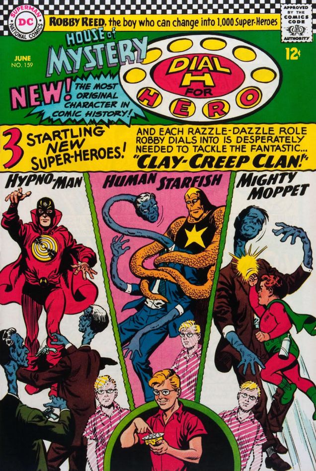
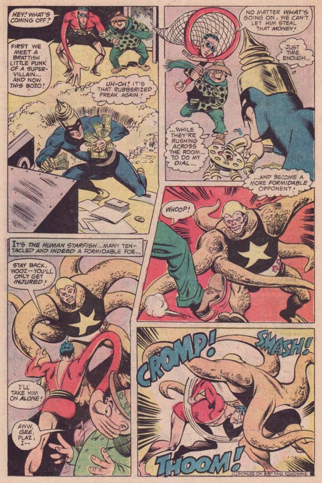
House of Mystery no. 159 (June 1966), cover by Jim Mooney. Another issue, another gallery of improbable heroes and villains…Human Starfish Robby Reed conveniently improves upon the concept of a normal starfish, developing prehensile appendages to capture a very stretchy criminal. The Clay-Creep Clan is written by Dave Wood, and drawn by Jim Mooney.
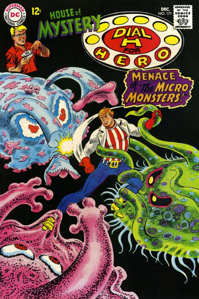
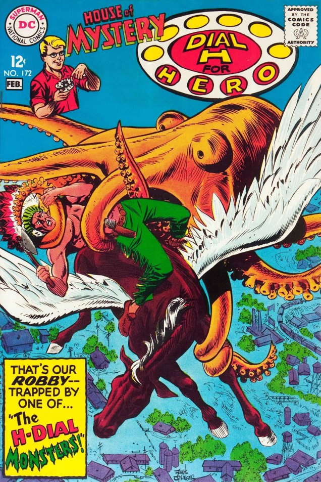
Jim Mooney was responsible for Dial H for Hero‘s art for many issues, from the onset of the series with House of Mysteryno. 156 (January 1966) to House of Mystery no. 170 (October 1967). Dial H for Hero lasted three more issues after Mooney’s departure. As luck would have it, no. 171 and no. 172 bring our most striking examples of tentacles yet. (The final DHFH issue, House of Mysteryno. 173, features a cover by Jack Sparling, with insides by Charles Nicholas and Sal Trapani.)
Arguably the prettiest cover of this post (my favourite, at any rate):
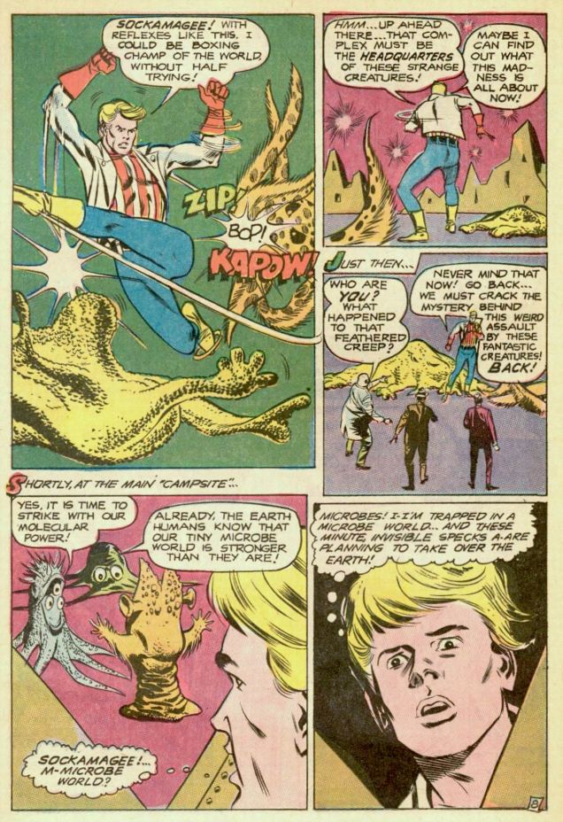
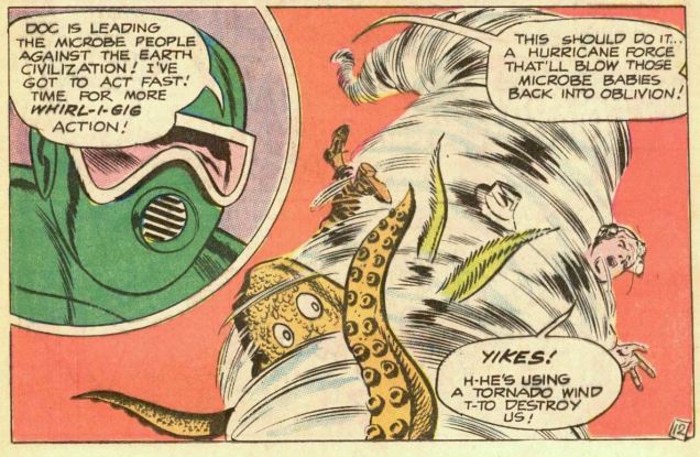
Back to fighting tentacles! House of Mystery no. 171 (December 1967), cover by Nick Cardy.The Micro-Monsters! is written by Dick Wood and illustrated by Frank Springer.
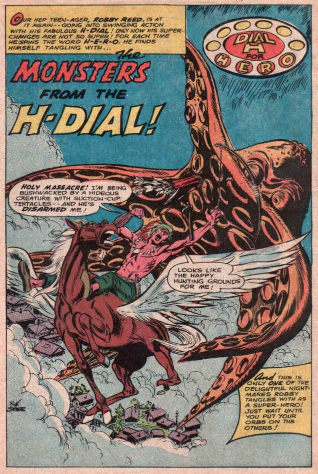
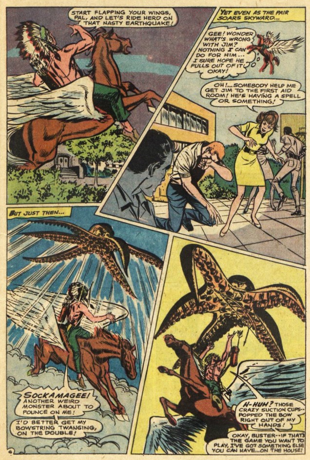
House of Mystery no. 172 (January-February 1668), cover by Frank Springer.The Monsters From the H-Dial! is written by Dick Wood and illustrated by Frank Springer.How does Chief Mighty Arrow defeat the flying octopus? Why, by shooting jet-propelled feathers from his headdress, of course.
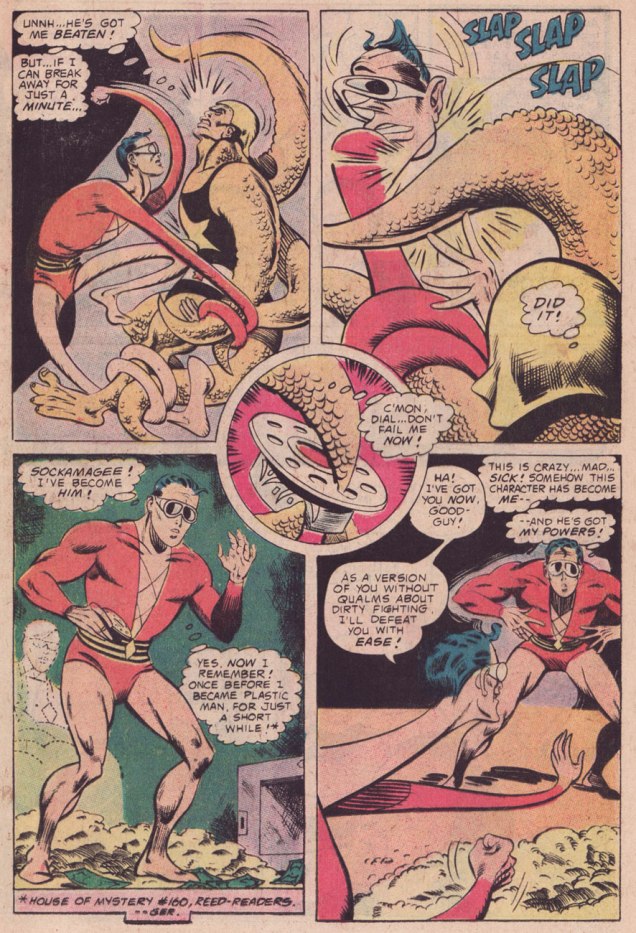
The last thing I’d like to mention is that my favourite Robby Reed appearance was in an issue of Plastic Man, of all places – to be more precise, in Plastic Man no. 13 (June-July 1976). In If I Kill Me, Will I Die? (read it here!), scripted by Steve Skeates, pencilled by Ramona Fradon and inked by Bob Smith, Reed not only gets to take on Plas (in more ways than one), but also falls deeply and magically in love with a professional hog-caller. Also, tentacles. Adorable *and* exciting!
« And they sure seem to understand each other! Listen to them jabber away! » « Oh, come on — you know that’s only baby-talk! It doesn’t mean anything! »
If you were to ask me (make that *us*; we’re unanimous on that point) what was the most consistently excellent American comics series of the Silver Age, the response would be Sheldon Mayer’s Sugar and Spike. « Say what? », I expect most of you will say. Look at it this way: S&S ran for 98 issues from 1956 to 1971, the entire series crafted by a single creator-writer-artist, whose commitment and level of quality never flagged. Unlike, say, Fantastic Four (the most likely pick, I expect), it didn’t take several issues to find its legs, it didn’t suffer from mediocre to dreadful inkers for half of its run, nor, well, the glory-hogging participation of Stan Lee. At Marvel, I’d be more inclined to propose Steve Ditko‘s (and dialoguists Stan Lee, Don Rico, Roy Thomas and Dennis O’Neil’s) run on Doctor Strange (1963-66)… but we again run into the snag of the directionless twaddle that followed Ditko’s departure. In terms of superheroes, my vote would go to Arnold Drake, Bob Haney and Bruno Premiani‘s Doom Patrol (1963-68). Yet my overall number two would have to be Carl Barks‘ Uncle Scrooge* (1952-66). There as well, lesser hands took over once Barks stepped away. It’s an industry, after all.
Speaking of lesser hands, « The Sugar and Spike tales flowed exclusively from Mayer, who had a contract stating no other artist or writer could produce stories featuring his toddler characters. That’s a rare sort of deal to cut (then or now) for a property that the publisher owns outright, but Sheldon Mayer had more than earned his place at DC as a prolific writer, artist and editor for many years. » Of course, that covenant was pointlessly broken by DC after Mayer’s passing. Shame on you, Keith Giffen. Mayer had also asked that his wonderful 1970s creation, The Black Orchid, never be given an origin or have her mystery dispelled. But of course, in 1988, that trust was pointlessly broken by DC. Shame on you, Neil Gaiman (« Well, Alan made the Swamp Thing a vegetable, I’ll make the Black Orchid a plant… he’ll be so proud of me! »)
It’s no exaggeration to claim that Sheldon Mayer (1917-1991) was one of the essential architects of the US comics industry. Without him, DC would have passed on Superman, and without the Man of Steel, it’s a cinch our culture would be in a vastly different state, pour le meilleur et pour le pire. But that’s just one of his many contributions, direct and indirect. Much praise has been heaped on Mr. Mayer, justifiably so. His work is inspired, lively, absolutely hilarious, and life-affirming. He truly was a versatile giant. Check out Ron Goulart’s recollections of his friendship with Mr. Mayer, for instance.
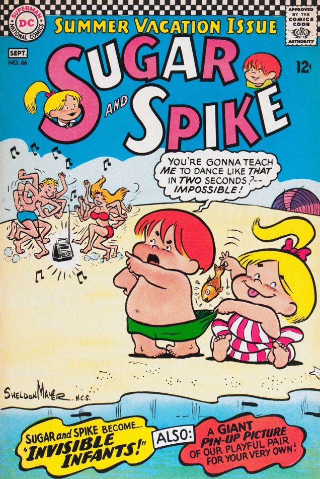
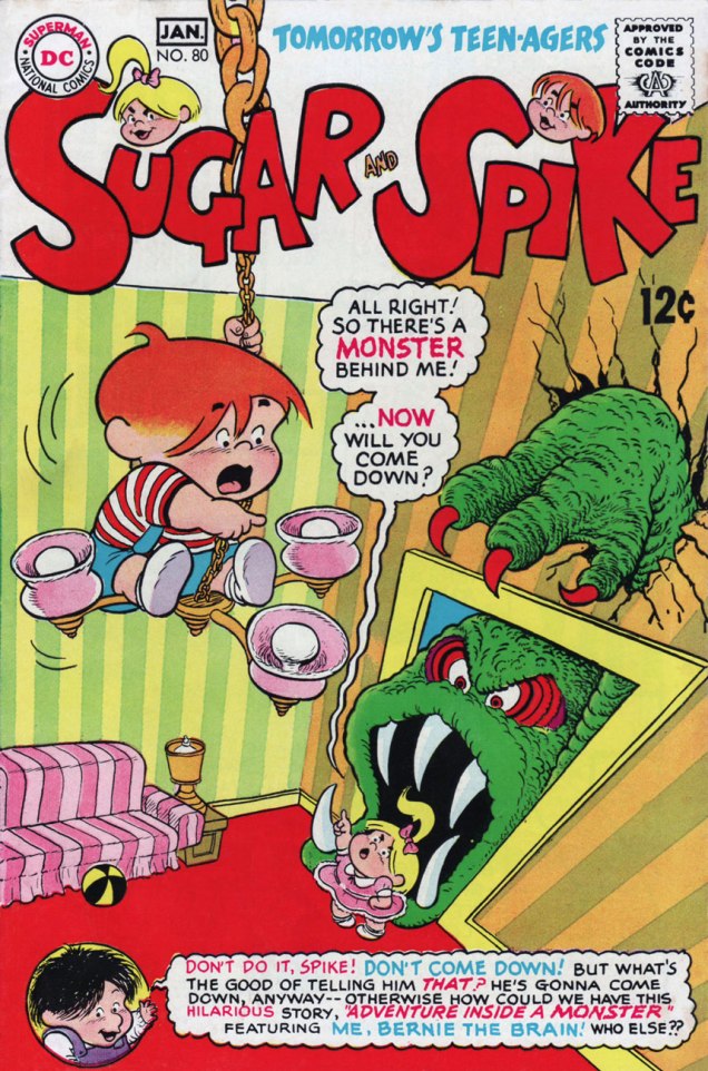
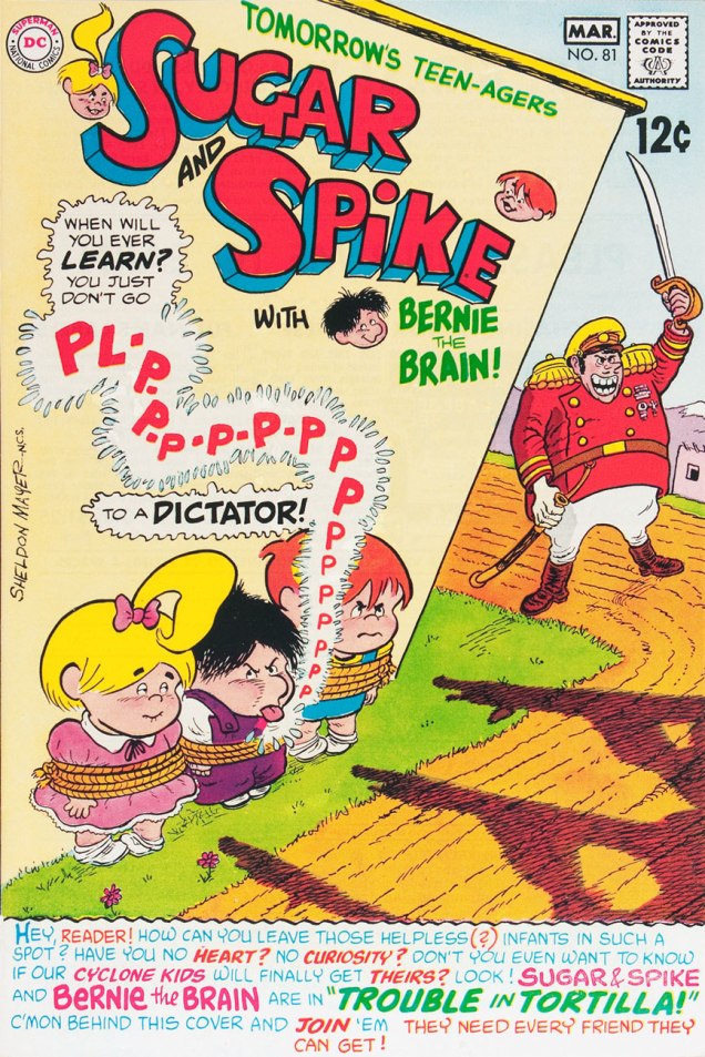
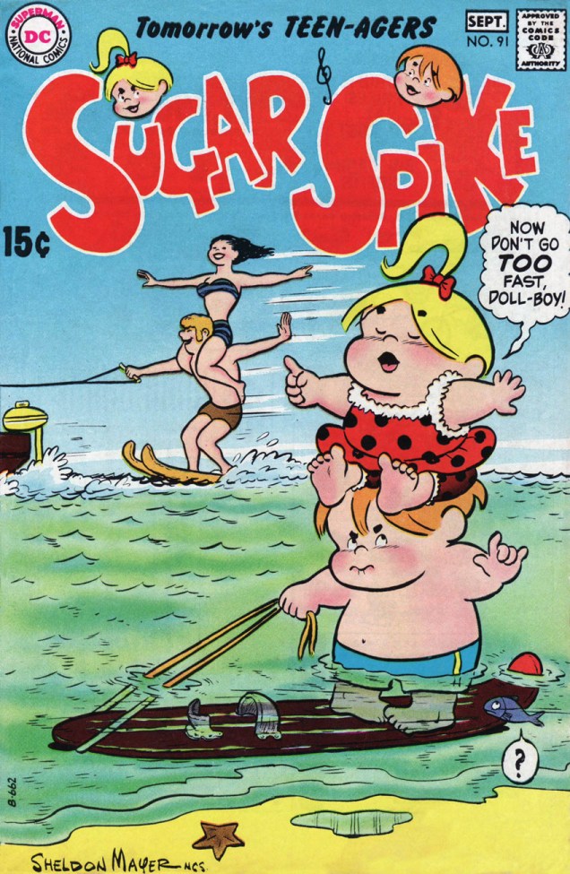
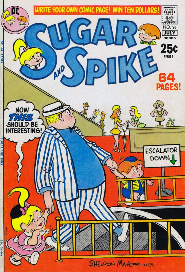
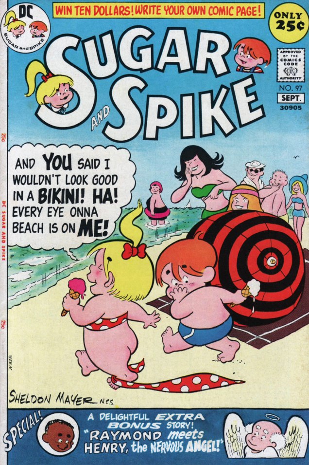
This is Sugar and Spike no. 36 (Aug.-Sept. 1961). In case you’re wondering, the NCS after Sheldon’s signature indicates his membership (in good standing!) in the National Cartoonists’ Society.This is Sugar and Spike no. 66 (Aug.-Sept. 1966).This is Sugar and Spike no. 79 (Oct.-Nov. 1968).This is Sugar and Spike no. 80 (Dec. 1968-Jan. 1969).This is Sugar and Spike no. 81 (Feb.-Mar. 1969).This is Sugar and Spike no. 91 (Aug.-Sept. 1970).This is Sugar and Spike no. 96 (June-Jul. 1971).This is Sugar and Spike no. 97 (Aug.-Sept. 1971). You’ll notice we’re featuring a lot of beach scenes… well, it’s seasonal!
In what I imagine to be another benefit of Carmine Infantino‘s editorial ascent, Mayer’s work took a wild turn with issue 72 of S&S. A fine new character, Bernie the Brain, was introduced, Mayer’s layouts suddenly adopted extreme and distorted perspectives and his inking grew more florid and detailed. Honestly, Mayer’s work at that point was the closest DC ever came in style to that of Underground Comix. These changes gradually ebbed, and by issue 90, things were more-or-less back to the old standard. The cause? failing eyesight (cataracts, to be exact), which led to the book’s cancellation, rather than the more banal dropping sales. Don’t worry, Mayer underwent successful eye surgery and intermittently returned to the drawing board. But he mostly wrote… beautifully. We’ll return to that soon.
Here are a few examples (show, don’t tell!) of the wild ‘n’ wooly Sugar & Spike:
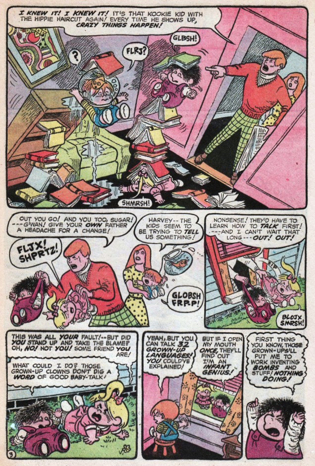
Page 15 from Sugar & Spike no. 79‘s The Mystery of the Swiped Sea-Turtle (Oct.-Nov. 1968)Page 4 from Sugar & Spike no. 80‘s Adventure Inside a Monster! (Dec. 1968-Jan. 1969)Page 3 from Sugar & Spike no. 84‘s Bernie the Brain’s Biggest Blunder! (Aug.-Sept. 1969)
Unfortunately, Sugar and Spike falls in that select category of comics series that aren’t popular enough to be fully reprinted (DC issued one volume in its Archive Editions series, usefully reprinting S&S nos. 1 to 10) and too popular to be truly affordable (Angel and the Ape is another). In addition, since the series sold well, but to a broader audience than the traditional fanboy collector set, the books are mighty hard to come by in decent condition, not to mention *complete*. The reason? Paper dolls. They enjoyed, for quite some time, great popularity. Sugar and Spike’s regular Pint-Size Pin-Ups frequently ran on the back of story pages (often the conclusion!), so their absence is a real collector’s bugaboo. Besides, they were quite charming, so why do without them?
Pint-Size Pin-Ups from Sugar and Spike no. 78 (Aug.-Sept. 1968). I should also point out that Mr. Mayer kept a sincere, attentive, unpatronizing relationship with his readers.
« Who’s Aquaman? I never heard of him! »
« He’s one of the super-beings from the place called Earth! He lives at the bottom of the ocean! » — Steev & Jimm, rubberneckin’ in Aquaman no. 51
Some may have wondered at the deep, abiding affection held, by a certain savvy contingent of comics aficionados, for sea king Aquaman. After all, he’s a bit of a second-stringer, and he’s had a pretty spotty record for decades. Well, I’d say one has to have encountered the erstwhile Arthur Curry at his peak, in the hands of the Stephen Skeates, (writer) Jim Aparo (penciller-inker-letterer), Dick Giordano (editor-poacher), Nick Cardy (cover artist), Carmine Infantino (editor-in-chief/art director), Jack Adler (colourist) and Gaspar Saladino (cover letterer) set.
Fond as I am of Nick Cardy and Ramona Fradon‘s work, the series’ Skeates-Aparo period is more my speed. I can’t quite put my finger on it. There’s a whiff of the end of the world, something ominous and immediate about it, despite the fanciful settings. I guess it was « relevance », but with a lighter touch and without the cringe-inducing bathos of the concurrent Green Lantern-Green Arrow series. Because of Aquaman’s aquatic nature, environmental doom seldom seems far. The Skeates-Aparo rampage lasted from issue 40 (June 1968) to number 56 (April 1971). Aparo returned to the character just a few years down the road (Adventure Comics no. 441, Sept. 1975), but by then, he’d already begun his long, painful artistic deterioration.
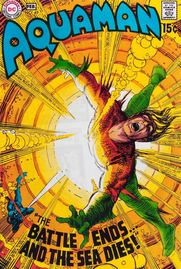
But back to the covers: this represents, in my view, Cardy’s second hot streak on this title. From the beginning of his career (in 1940 with the Iger/Eisner shop!) Cardy had always been a reliably competent artist, but rarely a very exciting one. That all changed in the mid-Sixties when newly minted art director/editor-in-chief Carmine Infantino made him his right-hand man and co-designer of DC’s covers. This greater latitude gave Cardy wings. Cardy’s first Aquaman hot streak opens on issue 37 (Jan.-Feb. 1968) and closes with issue 45 (May-June 1969). Issues 46 to 48 are nice enough, but short of transcendence… beyond that bump in the road, we’re set for a smooth run of splendid covers.
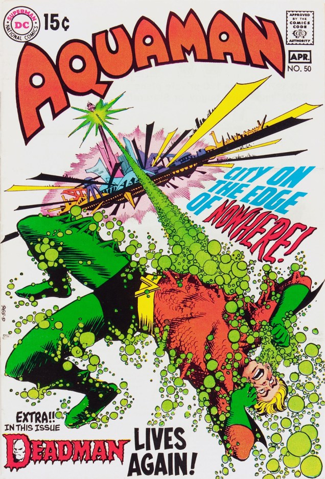
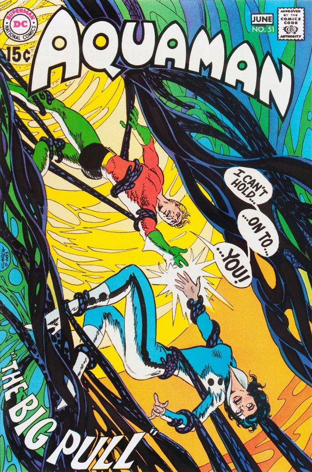
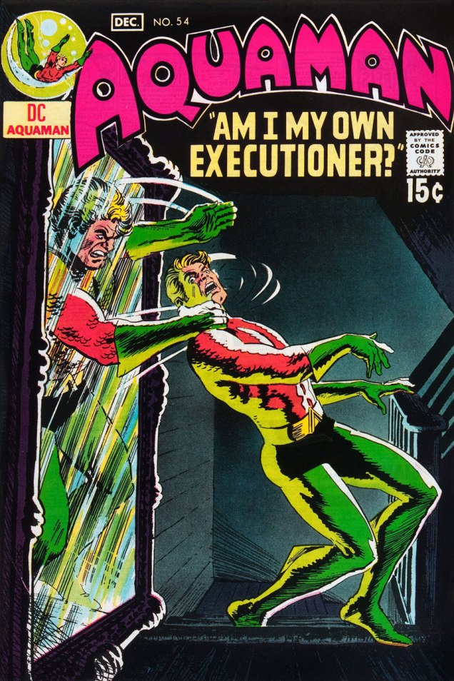
This is Aquaman no. 49 (Jan.-Feb. 1970). Cover pencils and inks by Cardy, colours by Jack Adler, Aquaman logo by Ira Schnapp, title lettering by his worthy successor, Gaspar Saladino. Edited by Dick Giordano, directed (and likely laid out) by Infantino.This is Aquaman no. 50 (Mar.-Apr. 1970), sporting a Cardy cover that couldn’t have been more evidently designed by Carmine Infantino, with more Saladino magic on the titles and Deadman logo. Gestalt: it’s what great collaboration is all about! It seems fair to assume that the title is a nod to the Harlan Ellison-scripted 1967 Star Trek episode, The City on the Edge of Forever.This is Aquaman no. 51 (May.-June 1970). I don’t usually pilfer Tentacle Tuesday material… but I’m inclined to make an exception for a (sea) worthy cause. Design-wise, Infantino and Cardy took full advantage of the aquatic action settings. Up, down, sideways — anything goes!This is Aquaman no. 52 (July-Aug. 1970). A wistful, disorienting experiment in colour and design economy. You’d never see such a *hushed* cover chez Marvel.This is Aquaman no. 53 (Sept.-Oct. 1970). A fine instance of the notorious “Infantino tilt”. Michael Kaluta on Infantino’s cover design input: « My approach to a cover, when I got to do my own ideas, was to show the picture straight on, staged, unless it was a dramatic perspective view. Almost every time I’d bring one of these sketches in to Carmine he’d turn the paper about 30 degrees to the right and demand that that made the composition 100% stronger, more “grabby”… and I’d have to agree about 50% of the time… »This is Aquaman no. 54 (Nov.-Dec. 1970). Did I mention that DC’s books of the early ’70s had a general predilection for the macabre and the moody? Fine by me, then and now.This is Aquaman no. 55 (Jan.-Feb. 1971). The fact that this complex idea works so well on the page is evidence of some first-rate design work, with some heady colouring mojo sealing the deal.This is Aquaman no. 56 (Mar.-Apr. 1971). Would you believe that this story was continued over three years later in Marvel’s Sub-Mariner no. 72 (Sept. 1974). Seems sneaky Steve Skeates slipped something past sleepy editor Roy Thomas. In an interesting bit of coincidence, it was each of the competing oceanic monarchs’ final issue. On another note, I presume that the title is a takeoff on Norman Greenbaum‘s 1967 song The Eggplant That Ate Chicago (popularized by Dr. West’s Medicine Show and Junk Band), itself likely an homage to Arch Oboler‘s infamous 1937 Lights Out radio episode, The Chicken Heart (That Ate the World). Phew!
Under normal circumstances, this run of covers would have turned out quite differently for, as Steve Skeates told me a few years ago, « The only reason Jim [Aparo] didn’t do the covers was that he lived out of town, couldn’t come in for cover conferences! »


 ~ ds
~ ds