Hoppel Poppel Comix

« I speak ten languages– all of them in Yiddish. » — Charles Rappaport

Like many a non-New-Yorker comics-loving goyim, my earliest encounters with Yiddish parlance came through Mad Magazine (furshlugginer, potzrebie, farshimmelt…), a practice initiated by its creator, Harvey Kurtzman, and carried on by his disciples and successors; unlike most of my ilk, however, my interest didn’t flag there, so I followed up Mad with Leo Rosten’s masterful The Joys of Yiddish.

As Art Spiegelman reminded us recently, in his controversial essay about the early American comic book industry, « the pioneers behind this embryonic medium based in New York were predominantly Jewish and from ethnic minority backgrounds. » Much like Mr. Spiegelman, I largely eschewed superheroes, unless nothing else was around. Of course, the trick to a varied diet is to stay alert to every possibility. Newspapers, naturally (it helps to live in or near a large metropolitan centre, though), random magazines, second-hand book stores, public and private libraries. Fluency in more than one language is a great asset, of course.

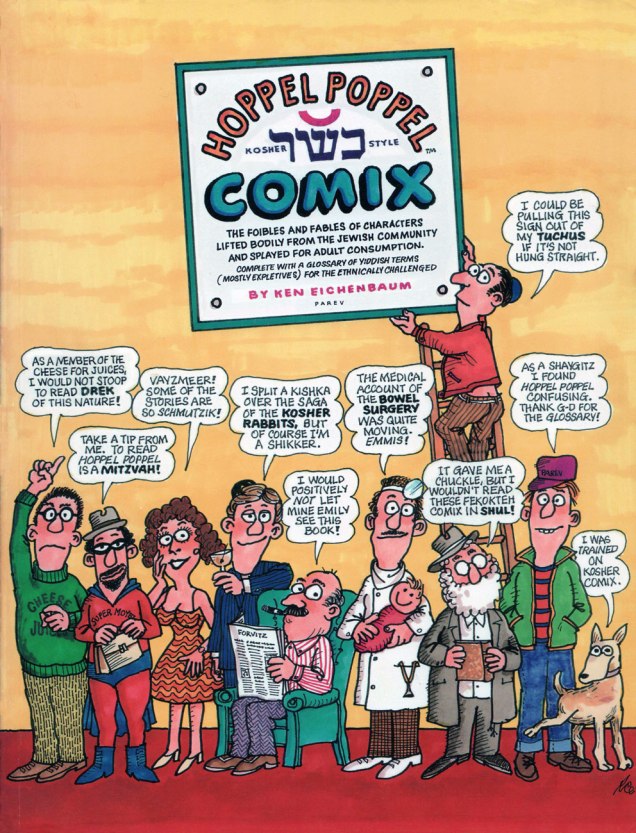
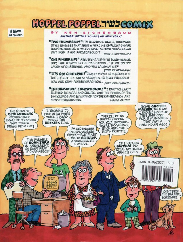
With the new possibilities opened up by the internet, I’ve grown quite fond of investigating obscure publications advertised or reviewed in old magazines. Case in point: a few years ago, I was flipping through The New Yorker‘s annual Cartoon Issue (another tip o’ the hat to Mr. Spieg) of 2001, and came upon this tiny, intriguing advertisement in its back pages.

HoppelPoppelAdA
Drek (rhymes with wreck): Dirt, shit, or inferior merchandise; Ferbissoner (fur-biss’-n-er): Someone who clenches their teeth all the time; a hard-ass; Bissel (biss-l): a little bit; Schmutzik (shmoot’ [as in book] – tzik): dirty; Tokkeh (tock’-eh): actually, or really.
Obviously, I looked up Hoppel Poppel Comix online, found a copy, ordered it, loved it… and here we are. My pick, The Medical Journal of B.M. Derschlog, turns out to have been the first story produced, and the impetus for the rest of the collection.

HoppelMedical01AHoppelMedical02AHoppelMedical03AHoppelMedical04A

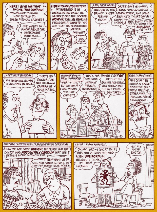
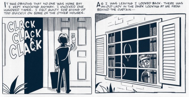
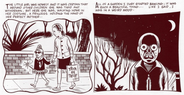
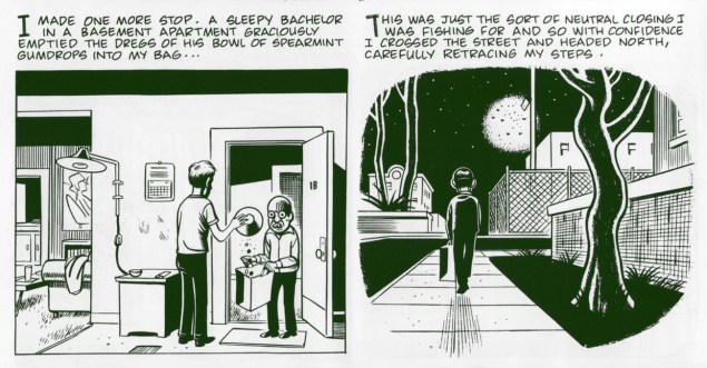
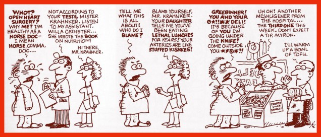
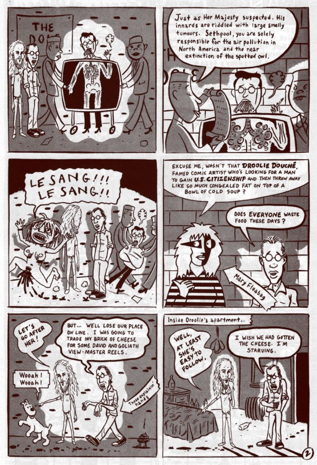
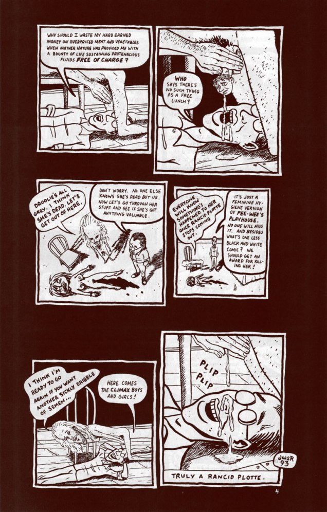
« Ken Eichenbaum’s comic book for adults began as cancer therapy. In 1999, Eichenbaum was diagnosed with colon cancer. While undergoing treatment, he began to come up with a 16-page thank-you card for those who had helped him through the ordeal. He was so encouraged by the response to that story, ‘The Medical Journal of B.M. Derschlog‘ — which lampoons his experience with the medical establishment — that he decided to write more illustrated tales. ‘I would lie in bed and there would be this shadow of illness. And I would come up with things that would make me chuckle to myself,’ says Eichenbaum, 70, who’s hesitant to talk about his cancer for fear of being seen as looking for sympathy. The result is a ‘graphic novel‘ — as these booklong comics are called — filled with sometimes funny, sometimes bawdy tales. Eichenbaum considers cartoonists Art Spiegelman and Ben Katchor to be two of his models, but ‘Hoppel Poppel‘ is less heart-wrenching than Spiegelman’s ‘Maus‘ and more slapstick than Katchor’s elliptical humor. » [source]

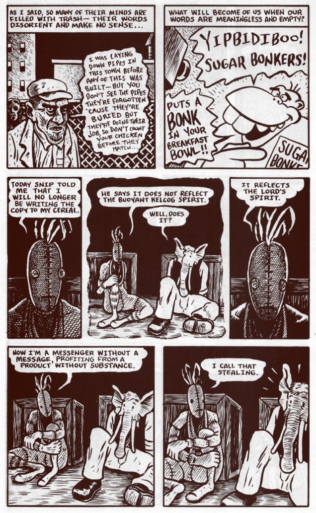
Mr. Eichenbaum was also clearly at ease with short-form gag strip (of these, the author coyly states: «… single-strip episodes, some of which may have previously appeared in Jewish community newspapers around the U.S. »). Some evidence:

HoppelSexAHoppelPinkAHoppelDrugsAHoppelDeliA

HoppelFrontCoverA
Cheese for juices : Jews for Jesus. Mitzvah (mitz’-Vah): A good deed, a commandment; Vayzmeer (vayz’-meer): A little prayer, like ‘help me’; Kishka (kish’-keh): Stuffed intestine, regarded by many as a delicacy; Shikker (shik’-ker): an inebriated person; the state of being drunk; Emmis (em’-miss; rhymes with tennis): truth!; Fekokteh (feh-kok’-teh): shitty; Shul (shul): a temple, as school; Tuchus (tuch’-es; rhymes with ruckus): buttocks– offensive; Shaygitz (shay’-gitz): a non-Jewish male.
HoppelBackCoverA
… and the back.

Well, it looks like a lovely day out there, so I’m off to pick up some potato knishes (like Mr. Kotter, I simply can’t kick that particular addiction)!

-RG

Tentacle Tuesday: Dark Horse, Pt. 1

Today’s Tentacle Tuesday is dedicated to Dark Horse Comics, one of the largest independent comic companies (the third largest, period, after Marvel and DC – at least according to their website). That being said, I’m not a huge dusky stallion fan – one of my gripes is that this publisher tends to reprint older comics (like the Harvey Comics Treasuries) on inappropriately glossy paper, as well as ramp up the contrast on the art until the background is so dazzlingly white you could probably blind yourself with it. On the other hand, a lot of mangas translated to English are published by their imprint, Dark Horse Manga – I am profoundly grateful for What’s Michael?, for instance (even though it’s not the first thing that comes to mind, manga-wise).

Throughout DH’s run (it was formed in 1986), it has housed the work of quite a few influential artists and writers, as well as published many long-running and award-winning series. Overall, this publishing house is a force to be reckoned with… and a lot of their pet series (like Hellboy) have tentacles galore. Shall we take a look-see?

Ragemoor#2-JanStrnad-RichardCorben
Ragemoor no. 3 (May 2012), cover by Richard Corben.

I’ll get around to reading Dept. H one of these days, but in the meantime, some tentacles from this suspenseful (or so say the reviews!) deep-sea who-dunnit:

DarkHorseDept.+H+hardcover+v1
Dept. H no.1 (April 2016), cover by Matt Kindt.
DeptH7
Dept. H no. 7 (October 2016), cover by Matt Kindt, colours by Sharlene Kindt.
DarkHorseBlack Hammer Justice League#1
Black Hammer / Justice League no. 1 (July 2019), a variant cover by Yuko Shimizu.

I mentioned Hellboy earlier – speaking of that, unsurprisingly, a large chunk of today’s post features covers from this ever popular series. But am I going to show you regular covers? Naah, too obvious.

«Dark Horse Comics printed a precious few blank covers on the landmark Hellboy and the B.P.R.D. 1952 #1, and the Hero Initiative commissioned 100+ top artists to do an original drawing on each cover. Presented here is the gallery of ALL 109 original covers!» (See them here.)

I picked a few that I liked, but make sure you click on that link because about three quarters of those commissioned covers are awash in tentacles. Now that’s what I call good, nay, great commission art!

HellboyandtheBPRD1952-ChrisIvy
Cover by Chris Ivy. Chosen because despite the abundance of all manner of creatures, the eye is automatically drawn to the Cthulhian horror that’s politely waiting its turn for devouring and whatnot.
HellboyandtheBPRD1952_lanagan_walter
Cover by Walter Flanagan. They’re somewhat, shall we say, timid tentacles, but that’s what I like about ’em.
HellboyandtheBPRD1952_glendenning_ben
Cover by Ben Glendenning. Chosen because of the WTF factor of a creature with a dozen scaly, plant-like tentacle-arms.
HellboyandtheBPRD1952__crain_clayton
Cover by Clayton Crain. Probably the most gruesome cover of today’s post, included for the blood and entrails and disquieting albino-ness of it all.
HellboyandtheBPRD1952__allison_grace
Cover by Allison Grace. I hope that cigarette isn’t implying anything… untoward has happened.

And a last cover, just to leave you on a quiet, peaceful note…

AliensDefiance-no6- October2016
Aliens: Defiance no. 6 (October 2016).

This is, by no means, an exhaustive list – stay tuned for a Part 2, coming to your computer and cellphone screens sometime soon (when you least expect it!)

~ ds

Mind the Quirks and Glitches: Petrucha & Sutton’s Squalor

« I, I know this place. I’ve been here when I’m wasted. » « Sure, and a man who drives his car off a cliff knows what it’s like to fly. » « He does if he’s headed DOWN. » — Squalor and Todd debate the nature of reality

Compared to his 1970s, the ensuing decade was surely no picnic for Tom Sutton (1937-2002). After producing a massive body of work for Warren, Skywald, Marvel, Charlton and DC by the late Seventies, the mid-1980s found Sutton trudging through a long run (« It lasted hundreds of years. ») of abysmal Star Trek comics to put food on the table. This was the movie franchise Star Trek, with Bill Shatner’s permed hairpiece and those atrocious red velour outfits. Worst of all, inker/saboteur Ricardo Villagrán dogged his every move, casually pulling a Colletta on him*.

Oh, Sutton did work for other publishers in the 80’s, mainly the once-promising upstart First (1983-91), but the rote fantasy of The Black Flame and the hollow tough-guy posturing of Grimjack (coming soon to a screen near you, apparently) didn’t offer much of substance as alternatives to the Big Two’s sludge.

Still, First merits full credit for green-lighting the last great Sutton project, Squalor (1989-90). It was part of a line called First Fiction**, which looked like an eleventh-hour push to get into mainstream bookstores without quite committing to the graphic novel format and its price tag. Cardboard covers, full colour, slick paper; certainly more durable than the average comics pamphlet. Let’s take a look, shall we?

PotterSqualor01CoverA
The inspired choice for the series’ covers was photo-montage artist J. K. Potter., whose work I recalled from Twilight Zone and Night Cry magazine covers, as well as a clutch of memorable paperback covers. Joe R. Lansdale‘s By Bizarre Hands comes to mind. Now remember, young Photoshop pups, these had to be created the hard way.

SuttonSqualor01_06A

SuttonSqualor01_07A
Since you asked, panel four refers to the inevitable American Bandstand teenybopper analysis.
SuttonSqualor01_15A
« Welcome to A-Time… not another dimension, not a parallel world, but your very own neighborhood bereft of linear time. In A-time, past, present and future merge like expressway off-ramps, six-legged quirks hunt the time trails, and archetypes leave footprints. »

SuttonSqualor02_42ASuttonSqualor03_63ASuttonSqualor04_95A

So yes, we have an accomplished illustrator on board… but do we have a proper story to hang the visuals upon? What do you know, we do! In a freakish bit of convergence, a newcomer to comics, Stefan Petrucha, then a freelance technical writer, happened along with a fully fleshed-out, unconventional concept, one ideally suited to Sutton’s strengths. And then someone fished it out of the slush pile.

So what’s Squalor about? It’s a bitch to summarize, but it involves alternate time streams, the oft-elusive nature of genius, conspiracy theories, synchronicity, archetypes, and the road map of reality. Fair enough? I surmise that we have Mr. Petrucha’s experience as a technical writer to thank for his capacity to hold his magic bus to the right side of the road through to the end of the journey.

PotterSqualor03CoverA
This is Squalor no. 3 (July, 1990) J.K. Potter does the cover honours again.

Petrucha wrote, in Squalor no. 4‘s concluding notes: « Personally, I would love to write more Squalor. In fact, I have a few document files chock full of plot ideas. We’ve seen quirks, glitches, and an archetype up close, but what about paradigms, totems, and babblers? I’d also like to write a graphic novel about Todd Penderwhistle’s coat. Maybe that’s why I’ve had so much trouble breaking into this business. »

While he did break into the business, he’s never again been afforded the chance to handle such a personal project. Squalor was Tom Sutton’s final such endeavour***, though I can’t help but think that he was more than a bit broken by his Star Trek stint.

In 2016, Squalor was at long last collected as a graphic novel by Caliber Press, to what I presume was general indifference. As for the original issues, one can still get copies online for less than the original cover price, which is a bargain and a golden opportunity, but rather bittersweet.

SqualorButton
I still have my Squalor pin-back promo button (logo designed by art director Alex Wald) from ’89. Whee.

-RG

*From Gary Groth‘s definitive interview with Sutton (The Comics Journal no. 230, Feb. 2001) ): « No, I did not ink this thing. This was inked by a fellow who I was told inked in bed watching television. The enthusiasm of this man was evident. He was a pro. Oh, he was very slick. He was very, very good. It was exactly what the book didn’t need. What the book needed was Mœbius. Hear what I’m saying?

This will sound really dumb, but even after all of that crap I had gone through I went into this thing and I said, This is going to be fun. This is going to be creative work. I worked like hell on the thing. I penciled backgrounds you wouldn’t believe, with all the scopes and all of those things. I thought I was Wally Wood. I forgot that Wally inked his stuff himself. I had to leave it up to Ying Yang watching TV or something. They actually took your backgrounds out and erased them. I never realized it until I saw the fucking comic book and I said, I drew something there. A large something. A complex something. »

GROTH: « And this would have been for sheer expediency’s sake? »

SUTTON:  « I suppose so. Because he knew he could get away with it. He knew something that I didn’t realize until later, that that book had a special job. And that job was to promote movies. » [ source… well worth your time! ]

**The other “volumes” of First Fiction were nothing special, to put it kindly.

*** Unless you wish to count his pseudonymous (as Dementia) late ’90s, er, erotic comics, such as The Crypt of Cum!, The Vault of Whores! or Bustline Combat! He certainly gave them his all.

“Just a feminine hygiene version of Pee-Wee’s Playhouse”: Russo & Wong’s ‘Rancid Plotte’ (1993)

« We’re not very accepting of people who act strangely. » — Chester Brown

Scott Russo’s Jizz, published by Fantagraphics in 1991-93 (10 issues in all), was a fearless, often downright incendiary and frequently fascinating repository of vitriol from the heart and soul of Mr. Russo. As his own drawing style was pretty rudimentary (but clean and distinctive), the auteur drew upon collage, détournement and plain old text pieces for variety. Russo may have been embittered and misanthropic, but the entertainment he proffered was quite deliberate; a fine, dexterous trick to pull off.

Here, from Scott Russo’s Jizz no. 10 (March 1993, Fantagraphics), is his merciless but spot-on takedown of publisher Drawn & Quarterly‘s stable of neurotics: Julie Doucet, Joe Matt, Chester Brown and Seth, rendered in a breathtakingly accurate facsimile blend of their respective styles and schticks. Script by Russo, art by his trusted confederate ‘Master’ Jeff Wong. Not particularly ‘safe for work‘, I should say.

RussoRancidPlotte01ARussoRancidPlotte02ARussoRancidPlotte03ARussoRancidPlotte04A

Russoolive01A

Russoolive02A
From Scott Russo’s Jizz no. 7 (Sept. 1991, Fantagraphics). I’ll always be grateful to Mr. Russo for this scathing exposé of the Olive Oil industry. My girlfriend at the time was taking a chemistry class at McGill University, during which they subjected various brands of olive oil to chemical analysis and essentially confirmed Russo’s claims. Now I merely snicker and shrug when I see someone shell out big bucks for the stuff… sometimes there’s no sense in trying to convince anyone.

-RG

Tentacle Tuesday Masters: Patrick Dean

« Did I say daughter? I meant octopus. »

If you’re looking for gory tentacles, fountains of flesh and mounds of blood (err… unless it’s the other way around?), screaming hordes being devoured by a famished cephalopod with a mean streak… go look at our other Tentacle Tuesdays posts, for today’s entry is not for you.

HoweverPatrickDean-OctopusPoetry
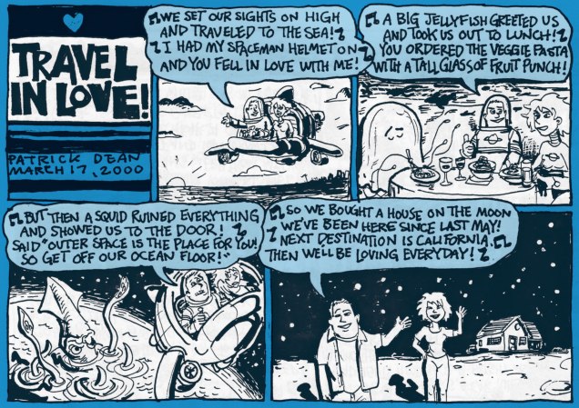
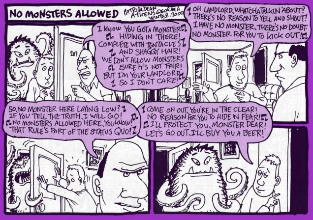
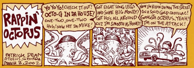
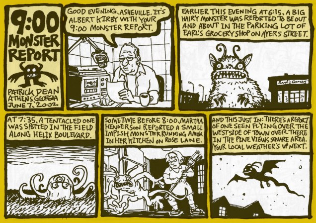
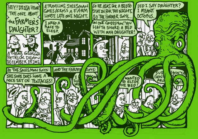
, those of you who like a friendly octopus and can appreciate understated wit and off-beat humour, stick around as we travel into a land created by Patrick Dean (not British Ambassador to the States). A word of warning – people randomly bursting into song and cohabiting with monsters is quite normal here.

Monsieur Dean likes monsters – nay, loves them – but he likes to contemplate them in their quieter moments: wooing a potential mate, politely asking for a BLT sandwich, watching a Julia Roberts movie or even reciting poetry.


PatrickDean-Octopus

All images in this post have been scanned from Big Deal Comics & Stories numbers 1 through 4 (published from 2000 to 2004), and lovingly coloured by my co-admin-cum-partner. I reread them recently in my ceaseless quest for tentacles, and while I remembered really enjoying them a few years back, I had forgotten how good they were. A lot of comics of a random, episodic nature are very much hit or miss, but these little gems are all gold, if you pardon my mixed metaphor. For instance, here’s PD’s summary of #3:

« More assorted one page strips. 28 pages of witches, cities, investigators, sailors, big shows, haunted houses, bees, record collections, band directors, roommates, octopuses, ham, radio towers, rainy days, treasure maps, J.D. Salinger, pork chops, and four leaf clovers. »

What kind of stone-hearted, dull-witted person would say “nope, not interested” to that? Luckily, not all Big Deal Comics are sold out – three issues are still available for purchase.

BigDeal1-PatrickDean-CathyA
The best part of Cathy’s letter is… well, you guessed.

Those musical interludes I coyly alluded to earlier? Here.

BigDeal-PatrickDean-JellyfishA

BigDeal2-PatrickDean-NoMonstersA

BigDeal3-PatrickDean-RappinA

BigDeal3-PatrickDean-ReportA

The best saved for last? I think so!

BigDeal3-PartrickDean-FarmerA

Don’t forget to visit Patrick Dean’s website, visit his FB page, or admire more of his art here.

~ ds

An Inconvenient Prescience: Harvey Pekar’s “Stupid Capitalists!” (2000)

« And it’s worse when I try to remember
When I think about then and now
I’d rather see it on the news at eleven
Sit back, and watch it run straight down »
Warren Zevon, Run Straight Down (1989)

Just a brief little post today, with a thought to our friends in the USA who have an important opportunity coming up tomorrow.

Despite the vividness of his ‘cranky old man’ image, Harvey Pekar (1939-2010) wasn’t some coot screaming at the kids to get off his lonke or ranting about aliens in the drinking water. He was a keen-eyed observer with astounding perspective. Witness this unnervingly accurate and oh-so timely piece from eighteen years ago. Illustrated by Josh Neufeld, it was published as the back cover of the one-shot American Splendor: Bedtime Stories (2000, Dark Horse, edited by Diana Schutz).

PekarCapitalistsAHigh time for a muzzling of a certain tiny fingered, Cheeto-faced, ferret wearing shitgibbon, wouldn’t you say? Make America Splendid again… do it for old Harv, do it for yourselves.

-RG

Hallowe’en Countdown II, Day 13

« In many ways, I thought, the perfect night would be a string of unanswered doors. » Dan Clowes, Immortal, Invisible

For our lucky thirteenth check on October’s calendar, we’ll stalk the neighbourhood through Dan Clowes’ eyes with his bittersweet and appropriately haunting Hallowe’en memoir, from the 16th issue of Eightball (Nov. 1995, Fantagraphics). It’s also available in their excellent “Caricature” collection.

ClowesImmortalSplashA

In the mid-90s, Clowes was going from strength to strength, having gradually evolved past the vastly entertaining but immature snarkiness of his early work… he’s certainly earned full marks for being true to his muse, instead of cranking out routine variations on Zubrick and Pogeybait or Needledick the Bug-Fucker.

As an draftsman, Clowes clearly isn’t a « natural »… he had, and has to work at it. But that’s fine, because his special gift rests in his storytelling. Yet it wouldn’t be the same if he merely wrote scenarios for others to illustrate, since his writing and artwork mesh wholly and perfectly.

As a chronicle of a certain early adolescent mindset, full of turmoil and intense, unpredictable emotions, « Immortal, Invisible » is nearly without peer, matched only by its companion and issue-mate, « Like a Weed, Joe ». I figure that just about any sensitive and perceptive person who’s suffered through the stages of a somewhat solitary and awkward late childhood and adolescence can find a bit of themselves in this tale. I know I can relate to its sense of bittersweetness and longing for the fast-receding innocence of childhood.

ClowesImmortal01AClowesImmortal02AClowesImmortal03AClowesImmortal04A

The full story is ten pages long, and if you aren’t already familiar with it, I couldn’t recommend it more fervently.

-RG

One Summer Solstice at the Old Fishing Hole…

« I had me a scientific career before… ah… circumstances forced me to take up fishin’… »

In case it’s escaped anyone’s notice, summer’s officially arrived.

Xenozoic7A

This is Xenozoic Tales no. 7 (Oct. 1988, Kitchen Sink), a series that presented, wonder of wonders, a post-apocalyptic future that wasn’t strictly doom and gloom. Cover by Mark Schultz. This issue features « The Growing Pool », written and drawn by Schultz, and “Crossed Currents”, written by Schultz and illustrated by Steve Stiles.

The lady is Hannah Dundee, and she may soon have to share her lunch. Something tells me this illustration is a pastiche of some The Saturday Evening Post-type cover.. there’s something charmingly old-fashioned about it, and I don’t mean Cambrian Age old.

SaturdayPostSummertime1933A
You know, that sort of thing. The Saturday Evening Post‘s August 5, 1933 cover by… who else? Norman Rockwell.
HannahPterodactylA
It’s the new falconry! Xenozoic Tales’ coexistence of humans and dinosaurs is not your run-of-the-mill anachronism: this is the world of tomorrow, not yesterday’s. This striking portrait of Ms. Dundee was conceived as a t-shirt design in the late 1980s. I should still have mine stashed somewhere…

– RG

The Expanding Ego Theory: Neal Adams at 77

« Now at this age, I look back and oh, Adams is probably one of the worst things that happened to the medium, when I look at it historically. » – Darwyn Cooke (2004)

On his 77th birthday, the legendary Neal Adams must surely look back on his storied career and radiantly beam (‘gloating’ is for lesser beings). Still, with all he’s accomplished (and with such brio!) in the fields of graphic storytelling, advertising, physics, the theatre and geology, who could find it in his heart to blame him? With so much to celebrate, let’s just stick to the highlights, shall we?

HeartThrobs120A
Why is the nasty little dude threatening the giantess? Why, Neal, why? Well, I suppose that is some people’s idea of romance. This is Heart Throbs no. 120 (June-July, 1969), edited by Joe Orlando.
AdamsAvengers95SplashA
I don’t know if you’ve ever pulled yourself out of the water onto a dock, but that… is not the way to do it. One might argue that Triton is an Inhuman, and as such, gravity and anatomy are trifles unworthy of his kind. From Avengers no. 95 (Jan. 1972, Marvel), a chapter in the “Kree-Skrull War”, cobbled together by Roy Thomas from discarded Kirby plot effluvium and Jerome Bixby and Otto Klement’s Fantastic Voyage.
AdamsGL_Flash226A
Ah, Neal Adams. He who brought naturalism and realism to comics. A panel from “The Powerless Power Ring!”, a Green Lantern backup strip from Flash no. 226 (March 1974, DC Comics.)
Jason-BrownA
Neal’s influence can’t be overstated, and not only in the fields of comics and geology. Here’s US figure skater Jason Brown‘s poignant tribute to that very Green Lantern tale, presented to warm applause at the 2014 Winter Olympics in Sochi. As Neal is fond of saying to any cartoonist he encounters, « You are all my children! »*
AdamsGrandFunkA
A concert poster reproducing Our Neal’s gatefold art for Grand Funk‘s 1974 LP, All the Girls in the World Beware!!! (which incidentally features their finest original composition, imho, Bad Time) Despite the difficult assignment, Neal comes through with flailing biceps and chicken legs; thank goodness his caricature chops are equal to his grasp of earth sciences. Curiously, half the groupie throng seems to be cloned from a particularly manic Marsha Brady, and most of the rest from Carol Burnett.
Grand_Funk_Nude_1973
They’re an American Band. From left to right: Don Brewer (he of the competent drum work), Mark Farner (he of the wild, shirtless lyrics), keyboardist Craig Frost (Homer didn’t rate him), and of course Mel Schacher (he of the bong-rattling bass.) One may wonder just who those guys in the poster are supposed to be.
SuperHeroDigestA
Faceplant time, or The perils of drawing comics whilst grabbing lunch, getting a massage on 52nd, or simply resting on your laurels. How does this cover make any sense? Just picture the scene from another angle, or if someone tried to build a model of it. Archie’s Super Hero Comics Digest Magazine no. 2 (1979 edition.)
Skateman1
As legendary as his renditions of established characters are, it is with his own creations that Neal Adams’ true legendary status rests: fabled names, always spoken in hushed awe, such as Ms. Mystic, Samuree, Cyberad, Crazyman, Megalith, Valeria the She-Bat… and of course Skateman, Jason Brown’s childhood idol. Here’s his premiere (and dernière) issue, published in November 1983 by Pacific Comics.
SkatemanA
And here’s a mock-up of the same cover. I’ll go to my grave wondering why they chose to run the cover sans this piquant, vernacular-rich dialogue, which would have shown once and for all that Neal the writer was every bit the equal of Neal, the artiste. Eat your heart out, Noël Coward!
Crazyman1A
Neal applies his Midas touch to another original creation: Crazyman! Double bag several copies of this number one, someday it’ll put your kids through college. It even comes with an embossed cover! By then, Adams was drawing donkey teeth on everyone, evidently his shorthand for “hilarious”. April 1992, Continuity Comics. You know, “The other superhero company”!

– RG

*as recounted by Yanick Paquette

Free Inside Package: James Sturm’s The Cereal Killings (1992-95)

« You cannot work with men who won’t work with you. » — John Harvey Kellogg

Before he created his justly celebrated The Golem’s Mighty Swing, wrote the mini-series Fantastic Four: Unstable Molecules, or co-founded The Center for Cartoon Studies, James Sturm (b. 1965) committed to paper and ink a mind-expanding, if little-noticed, saga entitled The Cereal Killings, complete in eight issues and published by Fantagraphics between 1992 and 1995. Sturm valiantly struggled through ocular problems during that period, undergoing no less than three retinal operations, leaving him with one good eye.

CerealKillings3A
The Cereal Killings no. 3 (Sept. 1992), colours by Mark Lang. Hey, I’d pay good money to see The Screaming Ernies perform. I’d settle for a t-shirt!

Sturm dug well beyond the shallow pun of the title and implacably hauled it to its logical conclusion. TCK has been likened to a Watchmen with a cast of funny animal cereal mascots, and that’s not that far off the mark. But beyond its conceptual debt to Alan Moore’s superhero deconstruction, Sturm’s story actually takes aim at more adult concerns and issues, made all the more harrowing and poignant by how psychologically credible his cast of cereal pitchmen and acolytes is. Corporate malfeasance, petty theft, betrayal, bitterness, grandiloquence, blind ambition, dementia, remorse… and wisdom. You name it, it’s all there, in a gripping, kaleidoscopic and haunting narrative.

CerealKillingsVerso2A
Sturm, Fantagraphics & Co. made splendid use of the entire, (actual) ad-free magazine to flesh out the concept. This is Mark Lang’s gorgeous depiction of The Scarecrow and Carbunkle. These are our good guys, appearances notwithstanding.
CerealKillingsVerso3A
Issue 3’s back cover provides a helpful look at our cast of characters.
Cereal4A
This is the cover of TSK no. 4, featuring Schmedly the Elephant, who wishes he *could* forget. Colour by Mark Lang.

CerealKillings8P5A

CerealKillings8aA
A crucial flashback scene from the eighth, and ultimate, issue (Jan. 1995). It would appear that The Scarecrow is a stand-in for cereal giant Kellogg’s founder, John Harvey Kellogg.

« It’s the present! It’s nostalgia! It’s a crispy non-sweetened comix story that doesn’t get soggy in milk! And remember — product is sold by weight, not volume. Some unsettling may occur. »

The series has never been collected or reprinted, so you’ll have to do the work… I think I noticed a torrent file somewhere. Sturm at one point intended to issue a revised collected edition, but has apparently changed his mind since. That’s no way to treat one’s masterwork, neglected as it may be.

-RG