Jean-Michel Folon: Just Another Belgian Genius?

« Less is more. » — Ludwig Mies van der Rohe

Once again, my initial instinct when I hit upon the notion of showcasing the work of Jean-Michel Folon was: « is he too obvious a subject? ». Then reason stepped in with: « to whom, exactly? »

Which brings me to my own tiny Folon anecdote: about twenty years ago, I was helping out a friend, who usually took off the month of January to travel. As it happened, it was usually the worst month for art freelancers, at least in my experience, so he was helping me out too.

Anyway, instead of working from home or some ad agency’s offices, I would work from his boutique, manning the four telephone lines while his regular employees handled the in-person traffic. One day, I took an order from a nice lady who, while I was filling out the relevant papers, gave her last name as Folon. « Like the illustrator? », I asked. « Yes indeed, he’s my cousin! », she replied, clearly delighted. « I’ve been living here in Canada for thirty years, and you’re the first person who’s ever asked! ». Which goes to show that one should think twice before extrapolating from one’s familiarity with a given subject. Or to put it simply, just because you’ve heard of someone, don’t assume everyone else does… whether they should have or not.

I can’t make mention of Folon without bringing up his strongest formative influences, Saul Steinberg (1914-1999) and André François (1915-2005); we’ll return to these gentlemen in due time.

To put it succinctly, Steinberg brought greater graphic and thematic purity to the gag cartoon… by dispensing with the gag, at least in the traditional sense. Not everyone dared to follow that perilous path, but Folon did, and similarly thrived.

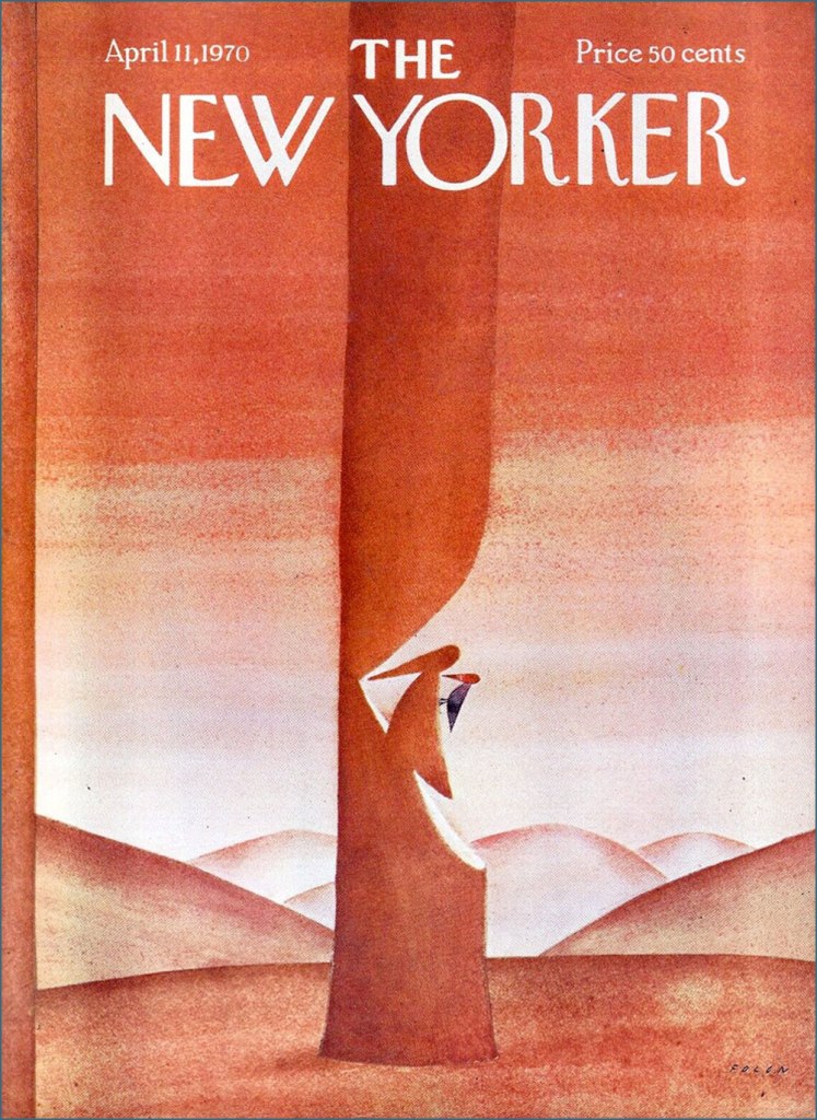
Born in Brussels in 1934, Folon initially studied architecture, but soon detoured into drawing and never returned to his early vocation, though he certainly erected his share of edifices… on paper. He timidly began submitting drawings in 1957. A decade later, he had scaled and conquered the lofty North American market, landing cover assignments with The New Yorker, Esquire and Fortune, among others.

For example, this model of witty understatement from the week of April 11, 1970.

He turned his confident, limpid vision across all printed media, but also sculpture, tapestry, stained glass and animation. He passed away in 2005, but not before designing and establishing his own museum. Be sure to check this stunning place out!

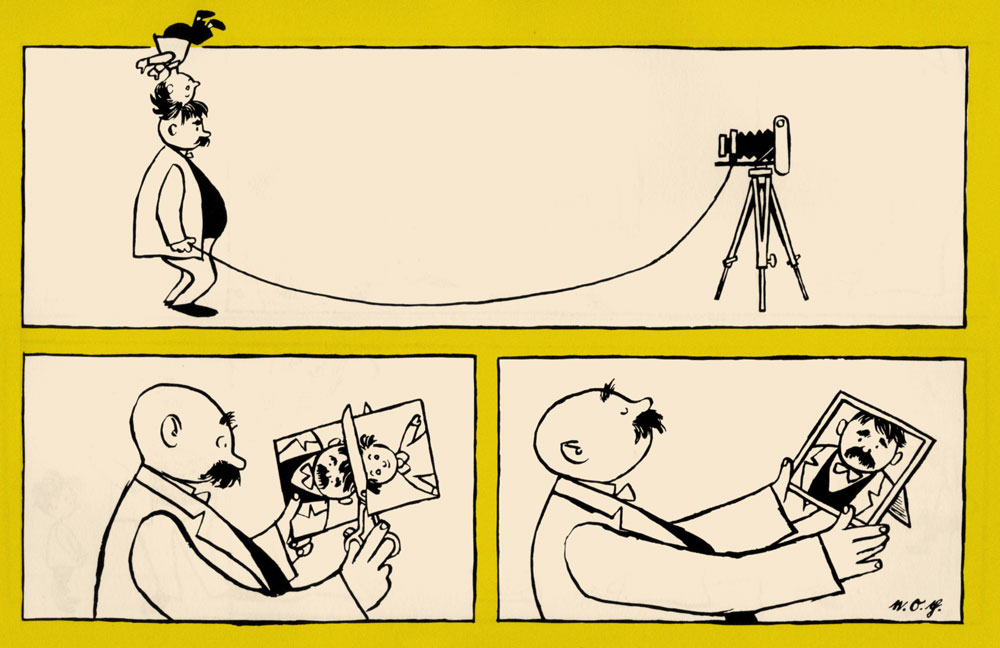
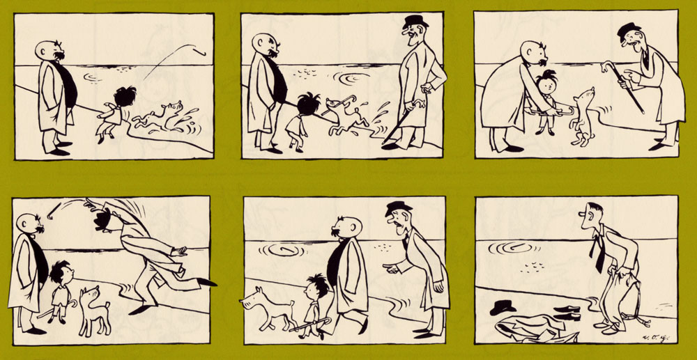
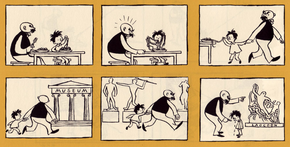
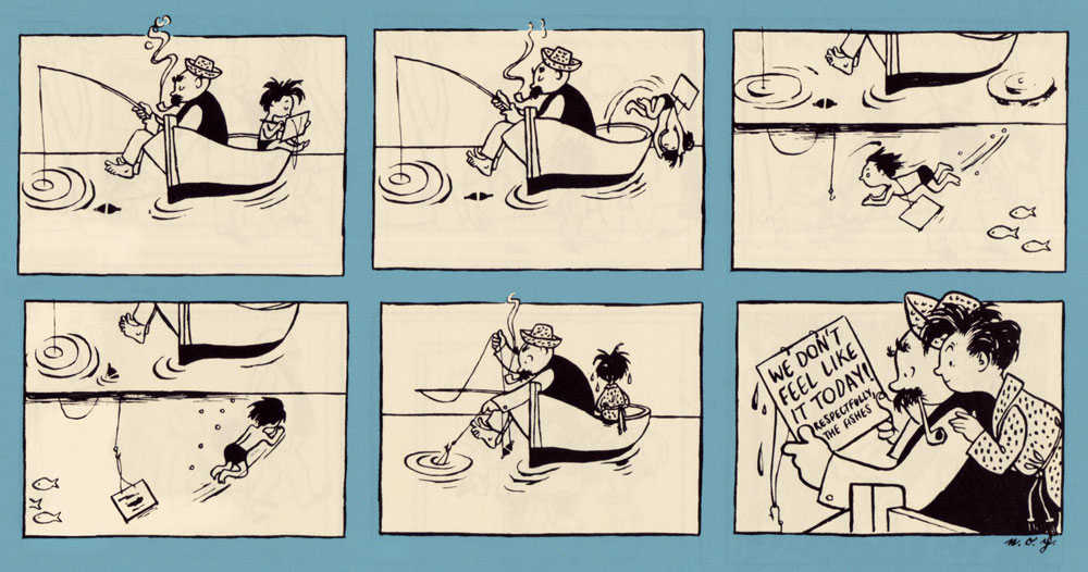
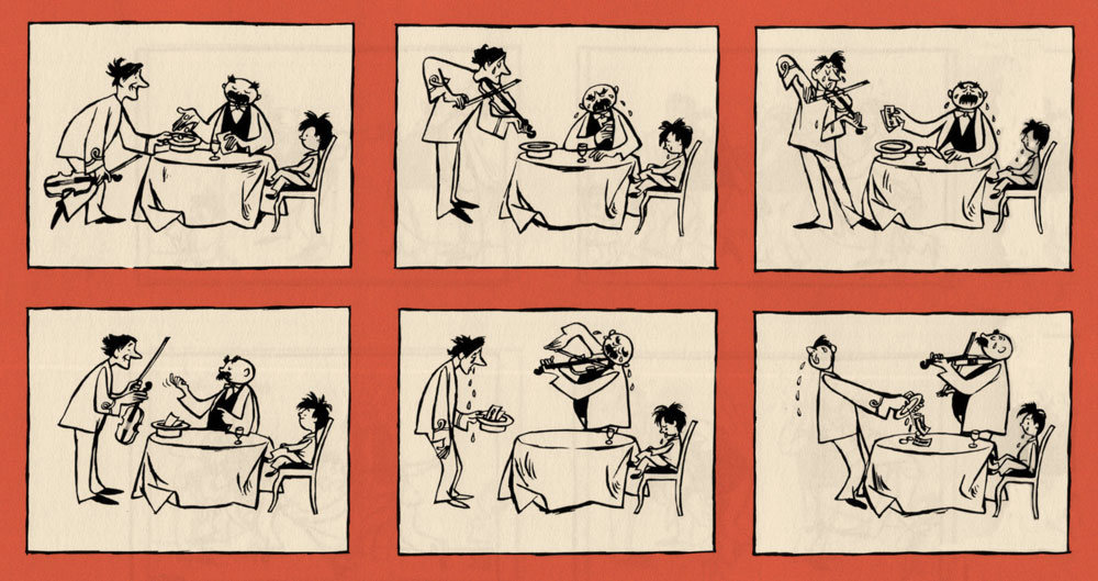
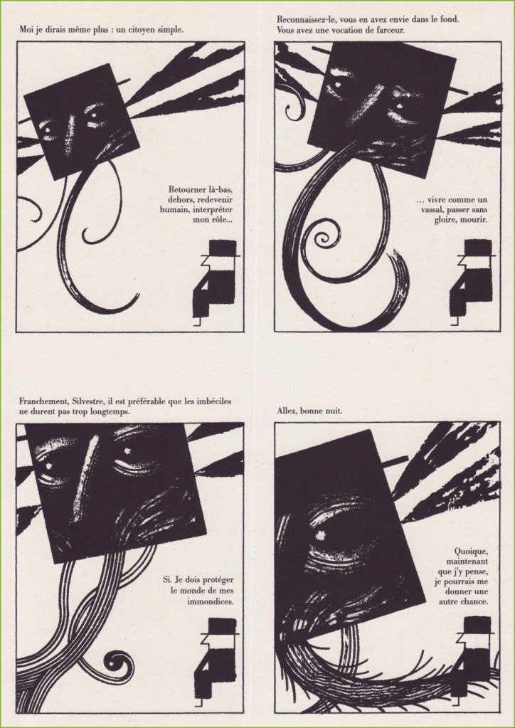
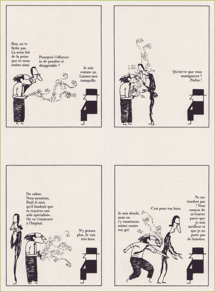
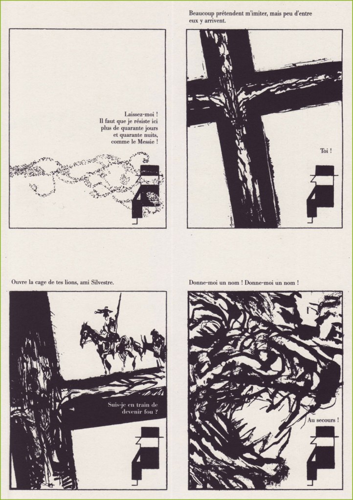
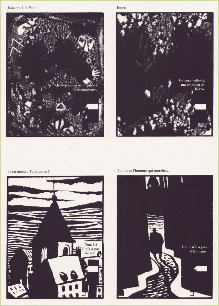
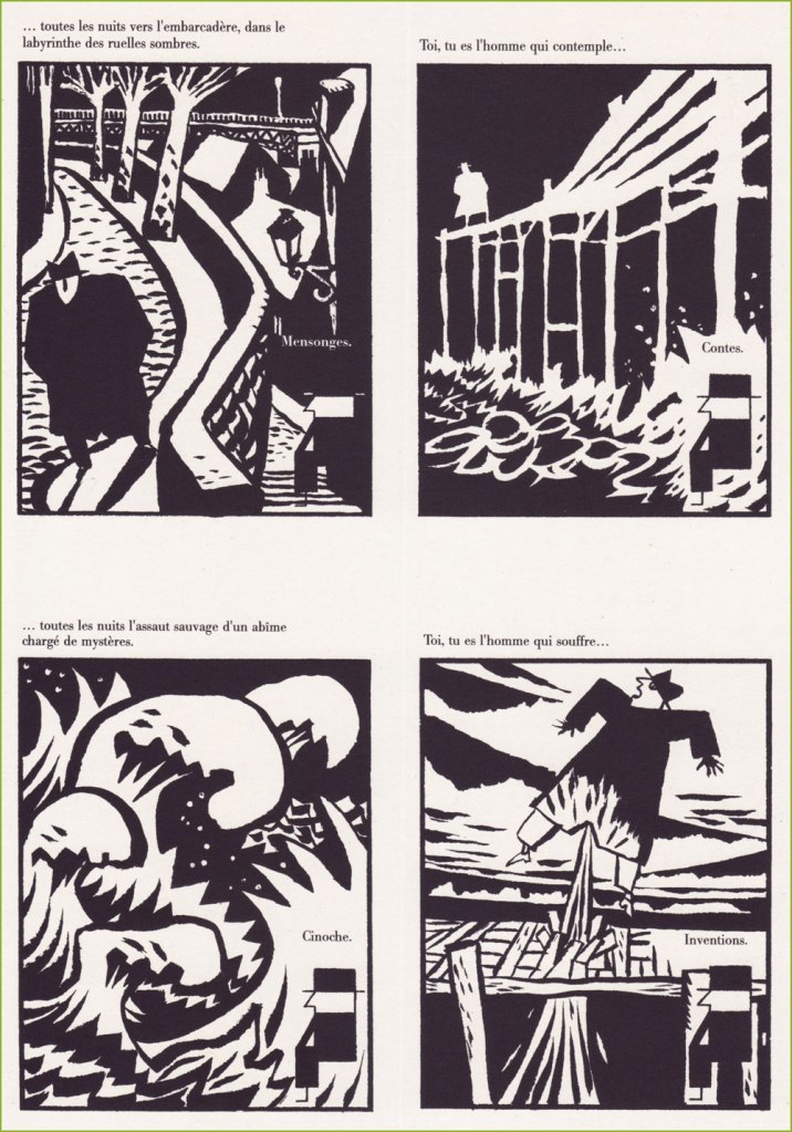
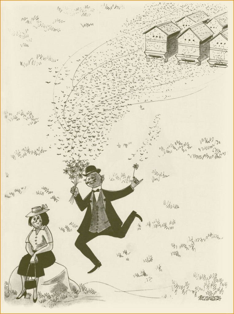
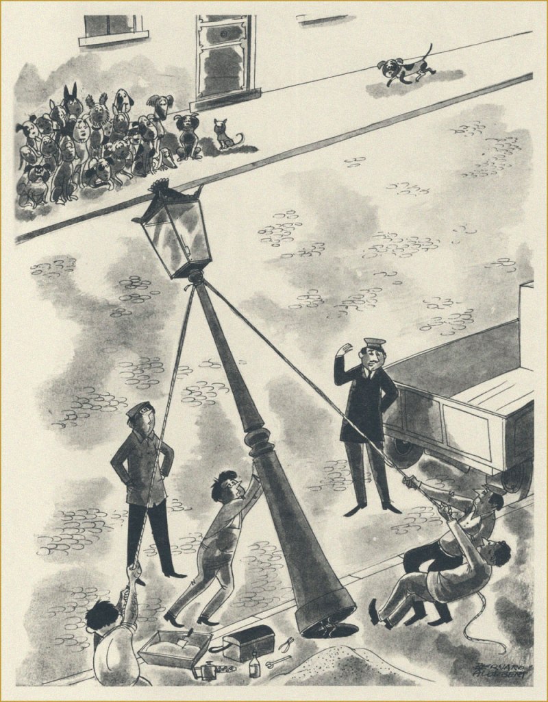
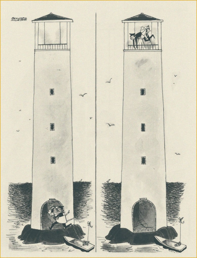
Such a multifaceted career and œuvre being too gargantuan in scope for a simple blog post, I’ll mostly stick to a sampling of some of Jean-Michel’s drawings, produced during his first decade as a professional artist.

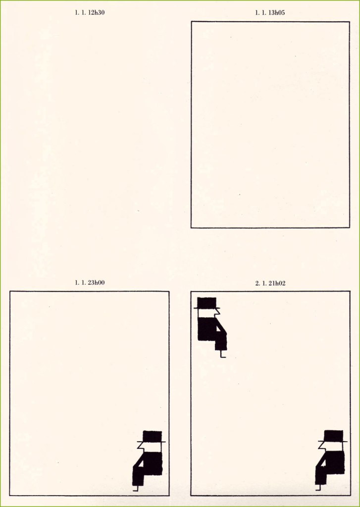
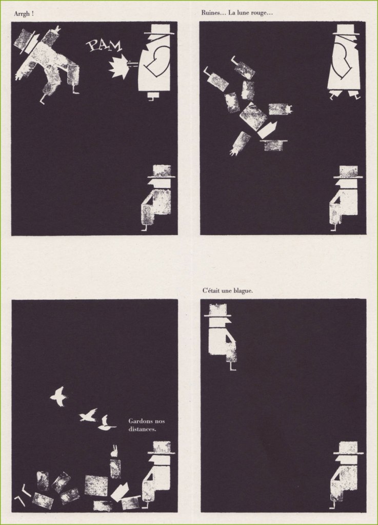
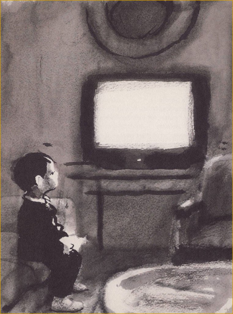
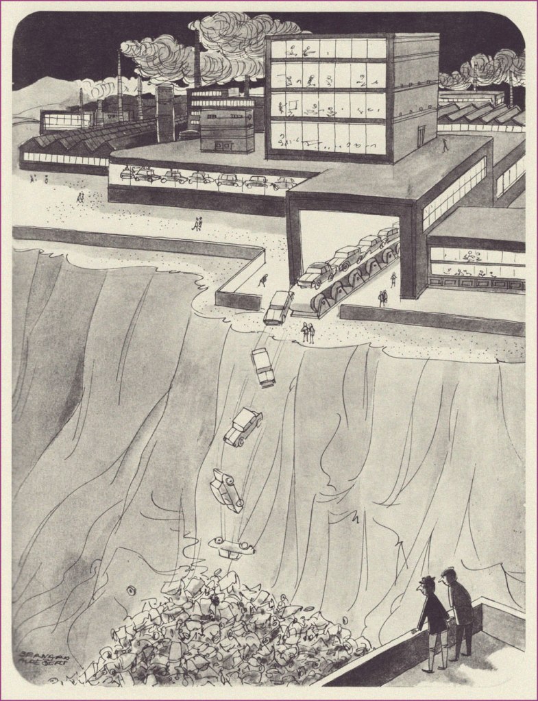
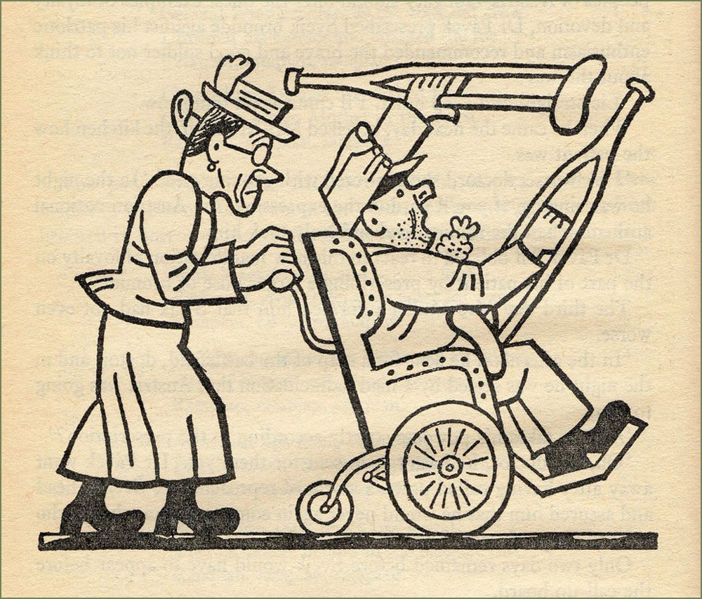
And here’s some of his later work:

This is Folon’s jacket for the 45 RPM single issue of Michel Colombier’s music (his adaptation of a baroque adagio by composer Alessandro Marcello). It had originally been recorded in 1971 for his US debut album, Wings (for Herb Alpert and Jerry Moss’ A&M label), which bore a variation of this Folon image as its European cover; the North American one was, to put it mildly, hideous.

Colombier, incidentally, belonged to that coterie of poor souls who did all the heavy lifting while their ‘collaborator’, Serge Gainsbourg, received and happily hogged all the credit.

In 1975, Colombier recycled the recycled adagio as the opening and closing theme for French public national television channel Antenne 2’s daily programming, accompanied by an appropriately graceful animated sequence by Folon.
Another local connection: Folon handled the artwork for this 1979 LP by musical whiz Jean Robitaille, who’d recently co-written the lovely 1976 Summer Olympics’ theme song. But my favourite Robitaille song has to be his duet with beloved songstress Renée Claude (1939-2020), St-Jovite, a fiendishly clever song about a singular sort of voodoo.
I must say I’m gobsmacked at the idea of the French post office selecting a Belgian artist to illustrate its stamp commemorating the 1989 bicentennial of the French Revolution. But what do I know? Folon did a great job.
When I state that Belgium seems to truly value its artists (see another example here), this is the sort of thing I mean: in 2010, five years after his passing, his native land issued a set of ten postage stamps saluting “The Magic of Folon”. ’nuff said.

-RG

Tomie and Soichi’s Snowy Winter Vacation

There are some weather phenomena one quickly learns to associate with specific plots – fog denotes something creepy or mysterious, rain evokes haunting melancholy, wind howls like the souls of victims. Snow is a bit less obvious, though its connotations often run the gamut from coziness to isolation. Manga artist Junji Ito (see Tentacle Tuesday: Junji Ito’s Remina) often uses weather to mirror his characters’ emotions, so it is no surprise that he has a few snowstorm stories under his belt. I welcome snow — in this part of the world, we were lucky enough to finally get a white landscape just in time for New Year’s — but I definitely not want to be trapped in the wintry world depicted by Ito!

Here are a few pages from Fun Winter Vacation, a chapter/self-contained story from Souichi’s Diary of Delights (1997). Souichi is a little creep with more than a slight penchant for the occult, so weird shit happens whenever he is present. That’s him hiding behind the tree in the first panel – fetching lad, isn’t he? One might say he brings people’s darkest thoughts out into the open. You can read the full story here (remember to read right to left!) I’ve heard some readers complain that this narrative doesn’t quite make sense… welcome to Ito’s dreamlike logic. These episodes are meant to be absorbed like a nightmare one can’t quite wake up from, not dissected in the manner of an A leads to B equation.

Revenge, originally published in the June 1993 issue of manga magazine Monthly Halloween, is standard Ito fare, and concerns itself with a woman so beautiful that she drives people to madness… in this case, the notorious Tomie, who dispatches a few new victims and nibbles on a wee bit of human flesh in this snowbound vignette.

Read Revenge in full here, and of course support Ito by purchasing his books. Publisher Viz Media is currently issuing plenty of them in a handsome hardcover format, including stories never previously translated to English.

~ ds

Hallowe’en Countdown VII, Day 16

« When asked if they would like to have sex with me, 30 per cent said, “Yes”, while the other 70 per cent replied, “What, again?”Silvio Berlusconi

A certain subset of Italian Fumetti — namely the sex and horror digests of the 1970s — constitutes a quagmire of oft-truly repellent material in which indisputable gems yet glimmer bright. Mostly the covers… designed to lure the sailor — or reader — to his doom.

While several of the most prolific artists of the medium were evidently talented fellows, only a couple (Averardo Ciriello being the other one) truly draw my interest, since, despite low pay and a breakneck production pace, they didn’t swipe much… or at all — unlike their colleagues. For most of the industry and society, consent and copyright appeared to be pretty fuzzy, casually dismissed notions.

I favour the work of Fernando Carcupino (1922-2003) over that of his contemporaries because he always knew how to keep things light, bright and original — never wallowing in poor taste or sadism, even when the subject matter called for it, and I thank him for it. Here are some highlights from his illustrious career.

A piece from La Settimana Umoristica no. 5 (Apr. 1954) entitled “Celluloid Terror”. All the classic ghouls are there, even that very year’s Creature From the Black Lagoon. Carcupino could spot an enduring classic from a long way off!
A selection of our fine products, as they appeared in print.
Vampirissimo no. 11 (Nov. 1975, Edifumetto). “An Abyss of Terror”.
Leaned in too close and got poked in the eye! I Sanguinari no. 9 (July 1975, Edifumetto). “Flamenco of the Damned”.
Il Vampiro no. 5 (March 1974, Edifumetto). “The Black Snow”. Why, hello, Mr. Chaney!
Lo Scheletro no. 13 (July 1974, Edifumetto). “The Grim Bell Ringer”.
Zora la Vampira no. 1 (Jan. 1974, Edifumetto) — “Human Flesh” In French, Zora became ‘Zara‘, for some reason.
Lo Scheletro no. 3 (March 1975, Edifumetto). “The Abominable King Kong”.
Tabù no. 23 (Oct. 1975, Edifumetto). “Please Don’t Bite My Butt”.
I Notturni no. 9 (Sept. 1973, Edifumetto). “Peter the Fornicator”. Impressive, given his mug.
Vampirissimo no. 8 (Aug. 1974, Edifumetto). “Death by Fright”. Oh, he’s a spooky one, all right.
Vampirissimo no. 7 (July 1974, Edifumetto). “Monster Dimension”. This is the sort of composition and treatment that Bill Sienkiewicz would “introduce” to mainstream comics a decade later, blowing the minds of Marvel Zombies who’d consumed naught but the House of Ideas’ offal, just as Jim Steranko had blown their older brothers’, a decade prior.
Lo Scheletro no. 7 (Apr. 1974, Edifumetto). “Demon in Love”.
This fine* monograph from Korero Press (2019) spotlights a certain facet of Carcupino’s œuvre, though it’s pretty light on the horror, which is fine by me. The narrow thematic focus (on sex, the other half of the equation) does manage to render the proceedings a tad tedious after a while, but that’s to be expected. For a better sense of the man’s versatility, check out his website.

-RG

*marred somewhat by the usual We Italians...” introduction, yet another variation on the line of “we are so passionate, we love women so much, we can’t control ourselves” bullshit. I guess it’s perfectly commonplace, for some people, to confuse misogyny with love . Right…

Circus Acrobats of Life: E. O. Plauen’s Father and Son

Today’s featured strip was once immensely popular in its native Germany, but who now remembers the name of Erich Ohser  (1903 – 1944) or his nom de plume E. O. Plauen*? Sic transit gloria mundi, alas.

Cartoonist and illustrator Ohser belonged to a set of three Erichs, the other two being Erich Kästner, a satirist and journalist, and Erich Knauf, a newspaper editor and poet. The three met in Leipzig and found in each other sympathetic souls with a common aesthetic and worldview. The Erich trifecta moved to Berlin at the end of the 1920s, where Knauf became the editor of publishing house Büchergilde Gutenberg, which published Ohser’s cartoons and illustrations as well as volumes of Kästner’s poetry.

All Erichs were ardently opposed to the emerging scourge of Nazis, but Ohser’s caricatures were particularly biting and ‘depicted [HItler and Goebbels]’ cohorts as gangs of dull-witted thugs, employing all the weapons of caricature: exaggeration and distortion, one-sided emphasis and intentional grotesquerie**. When Hitler came to power in 1933, Ohser’s work opportunities dried up completely as he was not admitted to the Reich Chamber of Culture, which meant that he couldn’t work at all. Fortunately, the editor of Berliner Illustrirte Zeitung finagled a special permission from the Ministry of Propaganda – Ohser could continue working, as long as he used a pseudonym and stayed firmly away from political material. Such was the birth, in 1934, of the weekly strip Vater und Sohn and the sobriquet ‘e.o.p.’, later expanded more officially to E. O. Plauen.

Ohser and his son Christian, who was surely an inspiration for the strip.

Father and Son won Ohser public acclaim, as well as financial success, but also many copycats and some inevitable appropriation – to Ohser’s chagrin, the strip’s characters were used to advertise Nazi charity drives and political events. Ohser ended the strip in 1937, probably because he felt that his creation was being misused by other hands, but he continued to work on cartoons and illustrations under the same pseudonym. He also had to put his talent at the service of the reviled enemy to survive, producing caricatures of anti-Nazi figures such as Churchill and Roosevelt for Nazi weekly newspaper Das Reich.

« I draw against the Allies – and not for the National Socialists’: This is how Ohser justified his disturbing caricatures of the 1940s to a friend of his, the writer Hans Fallada. He drew Russia as a murderous bear beast, America as a greasy, greedy capitalist, England as a bloodthirsty colonial ruler – it’s hard to believe that the same man gave the world the touching ‘Father and Son’ picture stories. » [source]

This uncomfortable position of living a sort of double life screeched to a halt when Ohser and Knauf were arrested in 1944 after being denounced by their roommate for anti-Nazi sentiment. Ohser committed suicide in his cell the night before the hearing. Knauf was killed a month later after being sentenced to execution by the court.

There are a few collections in various languages drifting about, but the definitive English-language one was published in 2017 by New York Review Comics. Here are a few excerpts from the latter, lovingly colorised (as is often the case around here) by co-admin RG. I also limited my selections to one-pagers, which leaves out (for example) the pleasantly surreal episode spanning many weeks when Father and Son get stranded on a desert island.

The advantage of mute strips is their universality! (Speaking of mute strips, go check out Mr. Mum’s International ‘Anything Can Happen’ Club…)

« Resemblance ». Ohser and his son Christian were regulars at the Berlin Zoo, which is reflected in a lot of strips, as is Ohser’s clear love and respect for animals.
« Nicely cropped »
« Unsuccessful overture »
« Too bad! »
« Cautionary example »
« A letter from the fishes »
« The birthday surprise »
« Trading sobs »
« Occupation: inventor »
Ohser’s son Christian holding a collection of Father and Son strips.

~ ds

* Plauen is the name of the town where Ohser grew up.

** From the afterword to Vater und Sohn (2015) by Elke Schulze, translated to English.

Curse Like a Russian: The Language of Peasant Revelry

« The world of mat is virtually inaccessible to foreigners studying Russian. It is too situational and semantically capricious, too dependent on ludic intonational subtleties. Mat is linguistic theatre, verbal performance art. It exploits the Russian language’s flexible range of suffixes and prefixes, and toys with phonetically similar words from the standard lexicon in order to generate anthropomorphic images. »

Invariably people ardently desire to learn bad words when encountering an immigrant who speaks a language they do not*. While one could surely write an essay arguing that the type of words used as expletives reveals something about the soul of the people in question (as a minimum, it’s a quick way to check what is considered more scandalous in that culture – genitals or religious terminology?), the allure of being able to say ‘fuck’ or whatever when it’s the only thing you can say in that language escapes me.

Idiomatic curses are another kettle of fish, a fascinating topic. Being the bearer of a language, one doesn’t often pause to think how weird a lot of sayings would sound to foreign ears. Russian cursing is quite popular in non-Slavic circles (see Elizabeth Olsen swearing at Conan in Russian on TBS**), and its basic components are very straightforward (assorted body parts). However, there is considerable artistry involved in combining these blocks and spinning them into a scathing sentence that will inflict proper psychological damage to the target. This could be said about many cultures indeed, but I can confirm that the Slavs cherish their curse slang and go about using it with tender love and great gusto.

Journalist Elmira Kuznetsova and Canadian cartoonist and animator Jess Pollard have undertaken the charming task of (literally) translating and illustrating some choice Russian curses. I’ll quote from an article about this project:

« Jess is learning Russian and one night I was trying to translate to her the Russian curse “На хую я вертел.” The phrase translates as “I don’t care” but the literal meaning is “I spun it on my dick”. Just for laughs, Jess drew a sketch depicting random things being spun on male genitalia. We laughed so hard both at the image and at the absurdity of the literal translation, we decided to make more illustrations. This turned into a comic magazine that we called “An Illustrated Treasury of Russian Curses” that was printed in a batch of 50 copies and sold to our friends. »

Please consider the following as a sampler of A Treasury of Russian Curses (A selection of curses for community building, successful business, and ideal first dates) — I selected a few favourites from volumes I, II and III. Follow this project’s Instagram account, and support a cool idea by buying printed copies or PDFs over at Pollard’s website.

I’d like to point out that the word ‘dick’ selected for these translations doesn’t carry even half the clout of the Russian equivalent, which is one of the Really Bad Words, with arguably more punch than ‘fuck’. The non seven-armed eight-dicked person looks genuinely horrified.
This is a downright poetic and melancholic mental image. Poor little dick.
Co-admin RG rightly pointed out that the bird illustrated resembles a swallow far more than a sparrow.
You will not be surprised to learn that this rhymes in Russian. This scene (complete with Pollard’s favourite smoking raven/crow that appears on the cover of every collection, as well as on her website) is very Slavic indeed, evoking folklore in which a bogatyr must choose which path to follow at crossroads (also note the typical helmet).
More like surfing — and infinitely more stylish, wouldn’t you say?

I give the highest recommendation to The unique power of Russia’s underground language, written by Victor Evrofeyev and published in The New Yorker (a beautifully translated version by Andrew Bromfield) on September 15, 2003. This post’s introductory paragraph is from it, but here are a few more quotes to whet your appetite:

« When I think of mat, I think of the monstrous energy field of that planet. Mat is a protean language in which archaic strata mix with modernity. It has a unique ability to break free of its erotic context and to characterize universal human feelings and conditions, to express admiration and contempt, ecstasy and catastrophe. »

« Although it retains its sense of blasphemy, mat, in its original form, was also a language of peasant revelry and the liberation of the flesh. In traditional folk culture, women sang obscene ditties as a challenge to their husbands or an invitation to their suitors. Pushkin’s bawdy early poem « Tsar Nikita and His Forty Daughters » describes a culture that has lost the cunt, or, rather, forty cunts: the Tsar dispatches his heralds in search of them and after arduous ordeals they are recovered. »

~ ds

* Life is full of such little repetitive ‘pleasures’, like having to tolerate jokes about magic mushrooms whenever talking about about how one likes to go mushroom picking…

** Why they’re both amused that a reference to the ‘female region’ can be used as a bad word in Russian is puzzling, as English easily offers ‘cunt’ as an equivalent.

Out of the Clutter: Silvestre’s ‘Simple’.

« Luckily, there are ideas. Ideas. When too many things go astray, stop or turn against you, the mind engenders favorable phantasms, worlds made to order, happy endings, golden images of yourself, utopias and holy readers (one is enough) capable of forgiving any affront and of remaining loyal beyond the limits of the reasonable. Ideas. Useful to keep going. » — Silvestre

Several years ago, during a visit to a favourite bédé store, I picked up, at random, an intriguing book, whose appeal largely lay in that it didn’t seem to be vying for my attention at all. If you’ve a certain bent of mind, the understated article will often exert a stronger pull than all the hard sell screamers in the world.

I read and enjoyed it, then the book faded deep into the collection, only to bob to the surface after our recent move.

See what I mean? Very low-key. This is the French edition of “Simple” by Silvestre (Jan. 2000, Éditions Amok), a translation of the Spanish original published in 1998 by Edicions de Ponent.

For a long time, I couldn’t find out more about it, and I still know precious little. It didn’t make much of a ripple in the pond, and its wake seems to have dimmed even further in the intervening years.

There’s little sense in my translating the dialogue (with one exception), but here’s the setup: our protagonist, Silvestre, sits in a corner and has exchanges with his demons and other monsters of the id. But they’re eloquent and visually arresting apparitions.

I love that, while seeming identical at a casual glance, each Silvestre figure is individual. The artist may have employed a stencil or a rubber stamp… at least that’s what I would have done.

Incidentally, Silvestre is a pseudonym of Spanish cartoonist-graphic designer-poet (et cetera) Federico Del Barrio (1957 –), which he reserved for his more explorative work.

In the words of Richard Dawkins, « in the beginning was simplicity. »
The visual fireworks soon arrive, scores of them artistic references. Am I imagining an allusion to Saul Bass‘ immortal Anatomy of a Murder poster?
« Jests help while away the time, sir. But if some of them fail to amuse you, I can teach you others. My repertoire is infinite. With me, you’ll never be bored. You’ll see, we’ll have a lot of fun. »
Silvestre’s tone toward his visitors is generally contemptuous and hostile, with one exception: he’s fully deferential when appears Her Majesty, the Great Muse of Comics.
A pair of his real-life collaborators turn up, and he’s not happy to see them. The chain smoker is writer Felipe Hernández Cava, and the lanky one Raúl Fernández Calleja, aka Raúl. Both look as if conjured by the magic pen of Marc Hempel!
Ah, and here (panel three) come Spanish icons Don Quixote and Sancho Panza, riffing on Pablo Picasso’s famous 1955 sketch.
Now we’re groping our way through a sticky, malignant fog of German expressionism and woodcut novels!
A page from the delicious and delirious final sequence… it was hard to choose just one. Such an expressive line!

-RG

Félicitations, Emmanuel Guibert!

« Drawing is of the spirit; colour is of the senses. » — Henri Matisse

I recently heard that the masterful Emmanuel Guibert (1964-) was inducted, early this year, to France’s Académie des Beaux-Arts, official recognition of the highest order, right up there with his 2020 Grand Prix at Angoulème or his knighthood of the Ordre des Arts et des Lettres.

Having long followed the man’s career, briefly met him and heard him speak, I’m convinced that he deserves every accolade he receives, and I know all this attention won’t even go to his head for, in addition to his staggering talent, the man just radiates patience and kindness.

In 2006, he was concluding a talk in Montréal by taking some questions from the audience, and an old lady asked an incredibly basic one… that most would have dismissed or shrugged off with a « how can you not know that already? ». But no, he gently responsed to her query in the most illuminating way, elevating the moment to the delight of everyone in the audience, including, of course, the lady with the question.

A 1997 illustration created for an issue of long-running (1971-) bright kids’ magazine Okapi on the theme of The Titanic. This shows the doomed ship’s third class restaurant.
A sequence from the album that first brought Guibert to prominence, La fille du professeur, a collaboration with Joann Sfar, whose script won the 1997 René Goscinny award at the Angoulème festival. Note the remarkable fluidity and animation of the choreography.
A sequence from his wild collaboration with WOT? favourite David B., 1999’s Le capitaine écarlate (The Scarlet Captain), which fancifully thrusts real-life author Marcel Schwob (1867-1905) amidst the lunatic fray.
The pirate ship, travelling through the sky on its own wave, is trapped betwixt an airship and the grappling hooks of the Parisian police posted on the Eiffel tower. Of course.
Here’s a glimpse into Guibert’s working method, two panels from Le capitaine écarlate: « Inking the pencils is always a problem: it’s even nonsensical to have to draw the same thing twice! Generally, the inking stiffens the drawing, since the pencilling stage is allusive and the inking stage is descriptive. So I try to do the opposite: I settle all the drawing problems in pencil and then, I put my page over a light table in order to reinvent the drawing in pen, leaving out a lot of the details. But that’s just a last resort. It’s hard to be quick and spontaneous while trying to convey subtle things. Ideally, I’d love to do without pencilling, but I need it to nuance my drawing. » (from a talk with Hugues Dayez published in La nouvelle bande dessinée, 2000, Éditions Niffle)
A page from his probable magnum opus, La guerre d’Alan, in which he recounts visually the real-life recollections of an American exile he met by chance in 1994 on the Île de Ré. This part of the saga is available in English as Alan’s War. Here, a bunch of malnourished GIs hike for an hour for a steak meal provided by a lumberjack. For Alan, coming from a family of modest means, it was his first time eating steak.
« Observe, improve yourself, fill up your noggin! » is the crux of his advice to young cartoonists. Leading by example, he’s constantly observing and rarely stops drawing. Thankfully, some collections of Guibert’s sketches have seen print, and they’re delightful. Here are some samples from Le pavé de Paris (Oct. 2004, Futuropolis), which is the exact size of a Parisian cobblestone, just like those lobbed at the police by demonstrating students during the tumultuous events of May 1968.
I’m in awe at his ability to discern and render infinitely delicate shifts and nuances of colour and tone, especially in low light.

« Drawing allows you to tear off pieces of reality and to take them home. In my notebooks, I know that the most beautiful drawings, the most vibrant ones, are those I did in places or before people that I want to keep near me. »

« This is why my notebooks are so precious to me: they are riddled with accidents and unrepeatable little things. And while I practically can’t bear to open one of my published books, I often find myself checking out my notebooks. »

A page, drawn in 1999 and intended for L’enfance d’Alan. Guibert initially planned to cover his friend’s life in order, but postponed the childhood part, since he possessed fuller documentation of Alan’s war years. In the end, this page didn’t make the cut, which gives you some idea of the very high standards Guibert sets for himself.
L’enfance d’Alan appeared in 2012, and was followed in 2016 by Martha & Alan; like the rest of the Alan Cope memoirs, they were published by L’Association.
The lion’s share of what’s kept me this long from showcasing one of my very favourite cartoonists: most of it is virtually impossible to scan, unless I’m willing to destroy the spine of some often rare, precious — and treasured! — volumes.

-RG

Bernard Aldebert: A Survivor’s Return

Like many a bibliophile, I enjoy browsing shelves in a used bookshop without any particular goal or author in mind. On one of my last forays, I found the following book:

I had never heard of Aldebert (at that point I was under the misapprehension that ‘Bernard’ was his first name, and ‘Aldebert’ his family name), and the jokes were a bit hit-or-miss, but more than just a few charming cartoons lay within… certainly enough to pick up this book from 1970 for the impressive sum of 12 dollars.

Jean Bernard-Aldebert (1909-1974) was a French illustrator with an interesting, if not devoid of tragedy, life. He started drawing for various satirical publications early on, at 19, and for some fifteen years his career was gradually gaining in traction, his cartoons appearing in such weeklies as in Ric et Rac, Marianne and L’os à mœlle. In 1944, this came to an abrupt halt when he was arrested and deported to a German concentration camp (one of the worst, and the last one to have been liberated by the Allies – Mauthausen) for having depicted Hitler as a chimpanzee in one of his caricatures. Miraculously, he survived, and even set his experiences down on paper – these 50 drawings were published as the album Chemin de Croix en 50 Stations in 1946.

After his return to France, he moved away from satire and caricature (frankly, who could blame him?) and onto more humorous publications like Paris Pin-Up and Fou rire, also illustrating many posters and ads, and drawing two comic strips for Ici Paris (Adonis and GIgolette).

This seemed appropriate, given that spring is clearly in the air!
Bernard-Aldebert might have moved away from satirizing serious topics, but it doesn’t mean he lost his sense of observation of the ludicrous aspects of life.
« If you had just a little imagination, you’d come to the beach! » This is my favourite cartoon from this collection.
If people still had to use a sickle, maybe fewer lawns would be tragically over-mown.
I don’t know what year this haunting photograph is from, but I think we can all agree that these eyes look like they’ve seen too much.

~ ds

The Brave Josef Lada

When I looked up Czech painter-caricaturist Josef Lada (1887-1957), I was surprised to find him called ‘one of the best-loved Czech painters of all time‘. There’s no question that Lada’s work remains immensely popular among Czechs, but I suppose the question for context would be « how many painters from that corner of the world are well known outside of outside of the Czech Republic and ex-USSR countries » (probably not many). Lada doubtlessly deserves his lasting fame, at any rate.

My familiarity with his style comes from his illustrations for Jaroslav Hašek‘s sardonically hilarious novel The Good Soldier Švejk, a favourite family book from which we can all quote at length, and which I own in several Russian editions (thanks to inheriting my grandfather’s copy). There have been many adaptations of Švejk, but I can only imagine him the way Lada depicted him. Visit BibliOdyssey for a glimpse of the good soldier.

While his renown is assured thanks to his work on Hašek’s magnum opus, the entirely self-taught Lada is also fondly remembered for his illustrations to children’s books (which he occasionally wrote himself), as well as paintings of pastoral life, probably inspired by his childhood in the small village of Hrusice. For a fuller biography, head over to The Genius of Josef Lada, the most complete source of information that I could find online in English.

Here’s an assortment of images from various books – among others, Ezopské bajky (The Fables of Aesop) from 1931; Kocour Mikeš (Tomcat Mikeš), written and illustrated by Lada between 1934 and 1936, and being a sort of a take on Puss in Boots; Nezbedné Pohádky (Naughty Fairy Tales) from 1946 – as well as some postcards and aforementioned village illustrations.

A typical pub night, 1929.
Winter Pleasures, 1936.

« In the first year of his life, [Lada] had a life-altering accident – he fell on his father’s knife and the injuries sustained permanently blinded his right eye. Some art historians later attributed the artist’s flat-perspective painting style to this incident.»

Lada’s depiction of ‘vodnik‘, an evil water spirit.
A page from Zvířátka (which translates to ‘beasts’ or ‘animals’), a book comprising a dozen animal illustrations.
A New Year postcard from 1928.
A collection of Lada’s caricatural cartoons – ‘A Hundred Cheerful Drawings’ – published in 1970. I found this little volume in a used bookstore, and was delighted to find what was clearly the work of the artist who illustrated Švejk – I didn’t know Lada by name, back then. I don’t speak Czech, but it’s still plenty fun to leaf through.

For more Lada art, visit the Notes From a Superfluous Man blog!

~ ds

Rowland Emett’s Ramshackle Poesy in Motion

« The whistle of the old steam trains … could conjure up visions of bleak distances with one solitary wail. » — M.C. Beaton

A couple of years back, I gave our readers an introductory sample of the genius (hardly too strong a word in his case) of Rowland Emett (1906-1990), and vowed I would return with a fuller, more lingering look.

Since I got the biographical trimmings out of the way that time, today, I’ll merely offer you an even dozen of my favourites.

Can’t tell a trébuchet from a catapult from a ballista? This handy guide will steer you right!
Prof. Lightning’s moniker is evidently well-earned.
Another inventive step in the harnessing of solar power.
While this particular train route sadly does not exist (as an editor once wrote, “the great Emett, whose crazy world seems so much saner than our own…”), there are some lovely birding tours available throughout that green and pleasant land, from Land’s End to John o’Groats.
Said nationalisation took place in 1948. Here’s a bit of background on that historic endeavour.

-RG