Hoppel Poppel Comix

« I speak ten languages– all of them in Yiddish. » — Charles Rappaport

Like many a non-New-Yorker comics-loving goyim, my earliest encounters with Yiddish parlance came through Mad Magazine (furshlugginer, potzrebie, farshimmelt…), a practice initiated by its creator, Harvey Kurtzman, and carried on by his disciples and successors; unlike most of my ilk, however, my interest didn’t flag there, so I followed up Mad with Leo Rosten’s masterful The Joys of Yiddish.

As Art Spiegelman reminded us recently, in his controversial essay about the early American comic book industry, « the pioneers behind this embryonic medium based in New York were predominantly Jewish and from ethnic minority backgrounds. » Much like Mr. Spiegelman, I largely eschewed superheroes, unless nothing else was around. Of course, the trick to a varied diet is to stay alert to every possibility. Newspapers, naturally (it helps to live in or near a large metropolitan centre, though), random magazines, second-hand book stores, public and private libraries. Fluency in more than one language is a great asset, of course.

With the new possibilities opened up by the internet, I’ve grown quite fond of investigating obscure publications advertised or reviewed in old magazines. Case in point: a few years ago, I was flipping through The New Yorker‘s annual Cartoon Issue (another tip o’ the hat to Mr. Spieg) of 2001, and came upon this tiny, intriguing advertisement in its back pages.

HoppelPoppelAdA
Drek (rhymes with wreck): Dirt, shit, or inferior merchandise; Ferbissoner (fur-biss’-n-er): Someone who clenches their teeth all the time; a hard-ass; Bissel (biss-l): a little bit; Schmutzik (shmoot’ [as in book] – tzik): dirty; Tokkeh (tock’-eh): actually, or really.
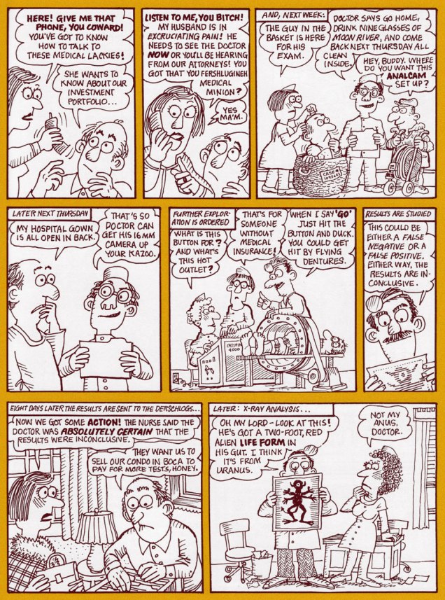
Obviously, I looked up Hoppel Poppel Comix online, found a copy, ordered it, loved it… and here we are. My pick, The Medical Journal of B.M. Derschlog, turns out to have been the first story produced, and the impetus for the rest of the collection.

HoppelMedical01AHoppelMedical02AHoppelMedical03AHoppelMedical04A

« Ken Eichenbaum’s comic book for adults began as cancer therapy. In 1999, Eichenbaum was diagnosed with colon cancer. While undergoing treatment, he began to come up with a 16-page thank-you card for those who had helped him through the ordeal. He was so encouraged by the response to that story, ‘The Medical Journal of B.M. Derschlog‘ — which lampoons his experience with the medical establishment — that he decided to write more illustrated tales. ‘I would lie in bed and there would be this shadow of illness. And I would come up with things that would make me chuckle to myself,’ says Eichenbaum, 70, who’s hesitant to talk about his cancer for fear of being seen as looking for sympathy. The result is a ‘graphic novel‘ — as these booklong comics are called — filled with sometimes funny, sometimes bawdy tales. Eichenbaum considers cartoonists Art Spiegelman and Ben Katchor to be two of his models, but ‘Hoppel Poppel‘ is less heart-wrenching than Spiegelman’s ‘Maus‘ and more slapstick than Katchor’s elliptical humor. » [source]

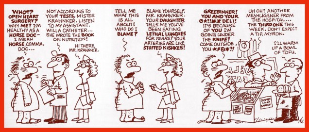
Mr. Eichenbaum was also clearly at ease with short-form gag strip (of these, the author coyly states: «… single-strip episodes, some of which may have previously appeared in Jewish community newspapers around the U.S. »). Some evidence:

HoppelSexAHoppelPinkAHoppelDrugsAHoppelDeliA

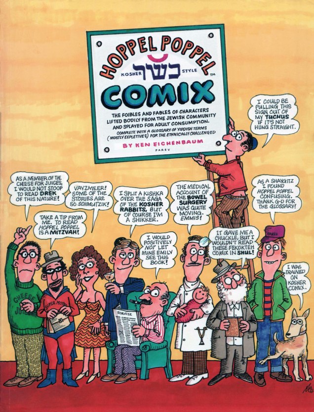
HoppelFrontCoverA
Cheese for juices : Jews for Jesus. Mitzvah (mitz’-Vah): A good deed, a commandment; Vayzmeer (vayz’-meer): A little prayer, like ‘help me’; Kishka (kish’-keh): Stuffed intestine, regarded by many as a delicacy; Shikker (shik’-ker): an inebriated person; the state of being drunk; Emmis (em’-miss; rhymes with tennis): truth!; Fekokteh (feh-kok’-teh): shitty; Shul (shul): a temple, as school; Tuchus (tuch’-es; rhymes with ruckus): buttocks– offensive; Shaygitz (shay’-gitz): a non-Jewish male.
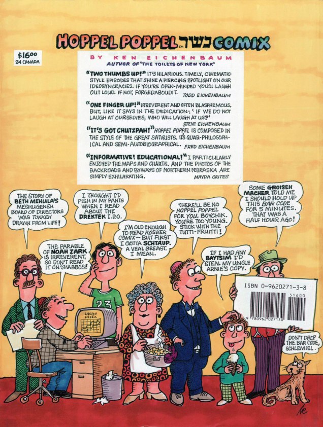
HoppelBackCoverA
… and the back.

Well, it looks like a lovely day out there, so I’m off to pick up some potato knishes (like Mr. Kotter, I simply can’t kick that particular addiction)!

-RG

Love and Romance and Enrique Nieto

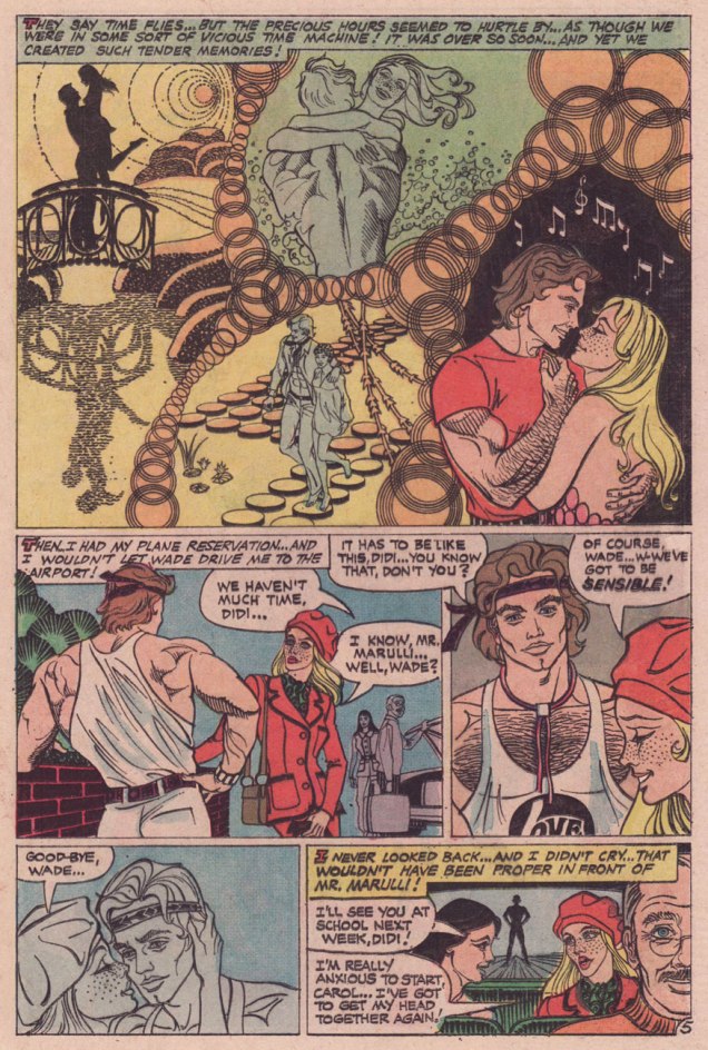
« The precious hours seemed to hurtle by, as if we were in some kind of vicious time machine! »

Today’s birthday number seventy-six for one of Charlton Comics’ most singular and hardest-working artistes, namely Enrique Nieto Nadal (born August 15, 1943, in Tangiers, Morocco, to Spanish parents), who injected some edgy excitement into the Charlton Comics line, handling with equal aplomb and virtuosity tales of romance, horror, war, adventure… and every combination thereof.

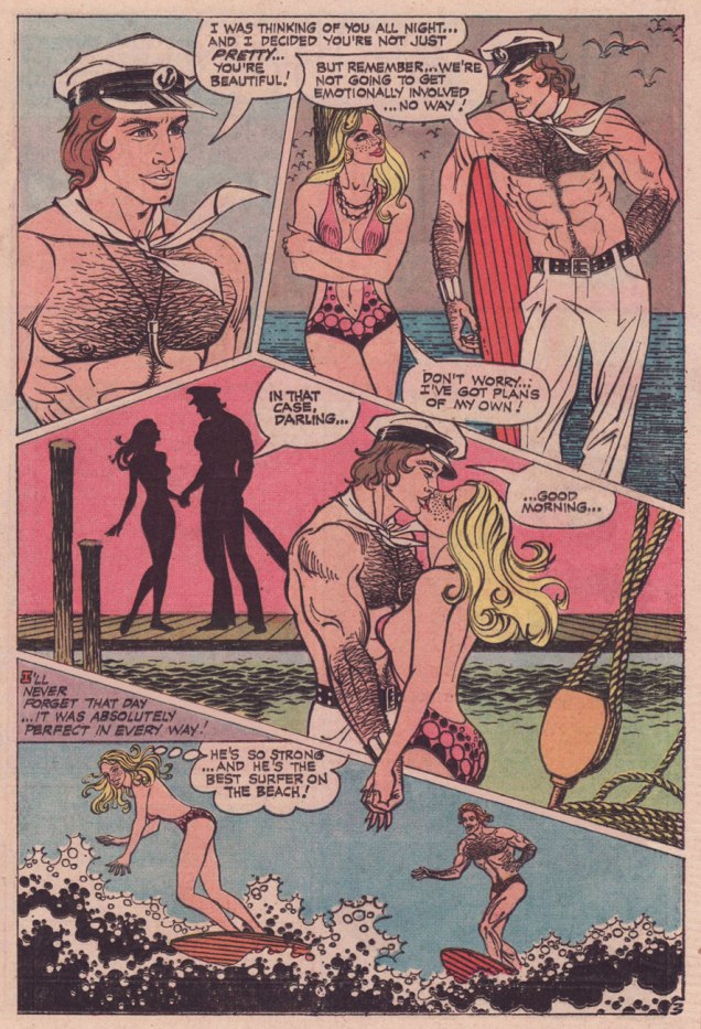
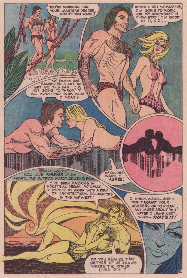
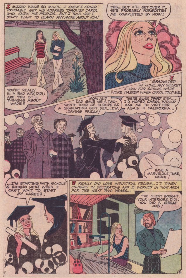
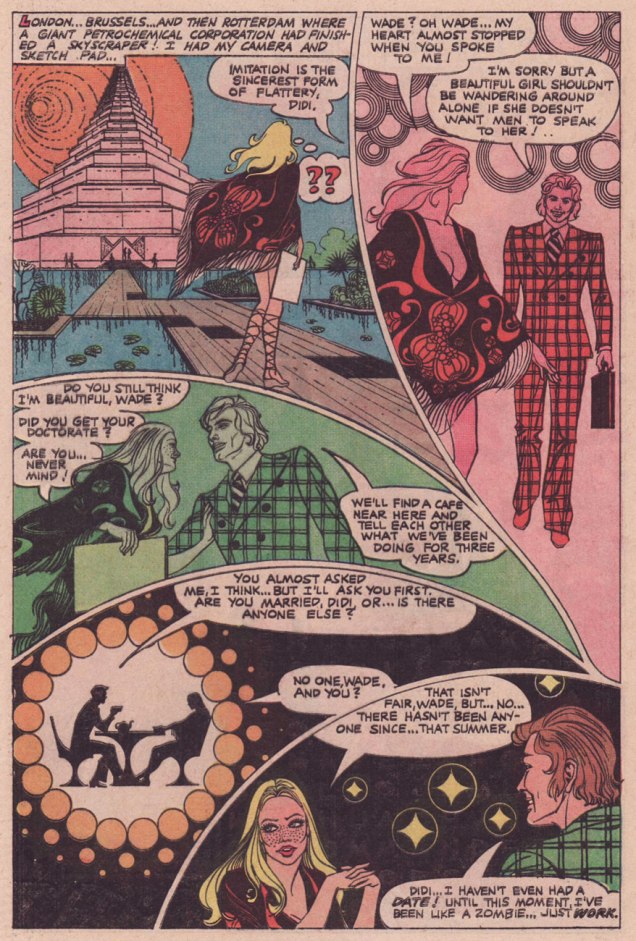
To mark this special occasion, I’ve picked out the lovely tale of A Strange Good-Bye from Love and Romance no. 20 (January, 1975); it provides a sterling showcase for his remarkable design chops and, as my dearest co-admin ds has earlier pointed out, Enrique’s tales provide, as a rule, beefcake and cheesecake in equally generous shares. Is anyone else that fair-minded?

NietoStrangeBye01ANietoStrangeBye02ANietoStrangeBye03ANietoStrangeBye04ANietoStrangeBye05ANietoStrangeBye06ANietoStrangeBye07ANietoStrangeBye08ANietoStrangeBye09A

I’m particularly fond of this yarn because of its unusual avoidance of most romance clichés: there are no scheming rivals, no duplicitous so-called friends, no disapproving parents, no melodrama… just two serious-minded, intelligent young people who are *really* into each other, but don’t lose their heads over it. And they may be yuppies, but  success wasn’t just handed to them. Call me a sap, but I can’t help but sincerely root for Wade and Didi.

Oh, and let’s face it, can you think of any other US romance comics that pack such an erotic charge? It may be subjective, but I’ve rarely seen such convincing depictions of tenderness and affection, physical and otherwise, between two characters… and in mainstream, comics-code approved funnybooks yet. Full marks to Mr. Nieto and his masterful understanding and depiction of body language… male and female.

While he’s not credited, it’s still obvious to me that Joe Gill is the writer; my favourite facet of his romance tales is how he grounds what could be stock situations in the everyday, endowing his characters with actual, credible occupations, as opposed to soap opera ones. When a character describes a business deal or an industrial process, it makes perfect sense. I suspect this to be a by-product of Gill’s authorship of a 1973 series of promotional career-choice Popeye-branded comic books. The research clearly fed his subsequent work, which is just as it should be.

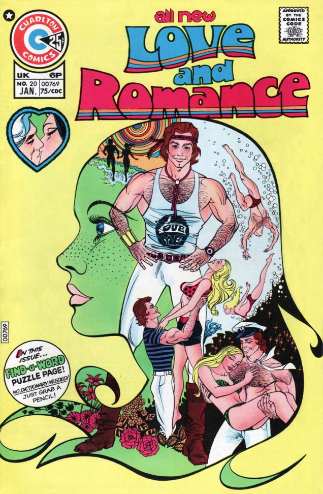
Love&Romance20A
A Strange Good-bye was the cover feature of Love and Romance no. 20 (Jan. 1975). Blast that puzzle page!

Well, once more… ¡feliz cumpleaños, Enrique!

-RG
Yesterday’s Tomorrow’s Teenagers: Sheldon Mayer’s Sugar and Spike

« And they sure seem to understand each other! Listen to them jabber away! » « Oh, come on — you know that’s only baby-talk! It doesn’t mean anything! »

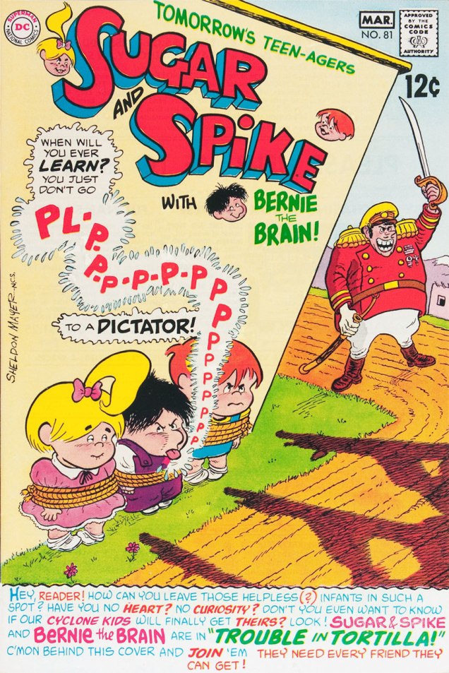
If you were to ask me (make that *us*; we’re unanimous on that point) what was the most consistently excellent American comics series of the Silver Age, the response would be Sheldon Mayer’s Sugar and Spike. « Say what? », I expect most of you will say. Look at it this way: S&S ran for 98 issues from 1956 to 1971, the entire series crafted by a single creator-writer-artist, whose commitment and level of quality never flagged. Unlike, say, Fantastic Four (the most likely pick, I expect), it didn’t take several issues to find its legs, it didn’t suffer from mediocre to dreadful inkers for half of its run, nor, well, the glory-hogging participation of Stan Lee. At Marvel, I’d be more inclined to propose Steve Ditko‘s (and dialoguists Stan Lee, Don Rico, Roy Thomas and Dennis O’Neil’s) run on Doctor Strange (1963-66)… but we again run into the snag of the directionless twaddle that followed Ditko’s departure. In terms of superheroes, my vote would go to Arnold Drake, Bob Haney and Bruno Premiani‘s Doom Patrol (1963-68). Yet my overall number two would have to be Carl Barks‘ Uncle Scrooge* (1952-66). There as well, lesser hands took over once Barks stepped away. It’s an industry, after all.

Speaking of lesser hands, « The Sugar and Spike tales flowed exclusively from Mayer, who had a contract stating no other artist or writer could produce stories featuring his toddler characters. That’s a rare sort of deal to cut (then or now) for a property that the publisher owns outright, but Sheldon Mayer had more than earned his place at DC as a prolific writer, artist and editor for many years. » Of course, that covenant was pointlessly broken by DC after Mayer’s passing. Shame on you, Keith Giffen. Mayer had also asked that his wonderful 1970s creation, The Black Orchid, never be given an origin or have her mystery dispelled. But of course, in 1988, that trust was pointlessly broken by DC. Shame on you, Neil Gaiman (« Well, Alan made the Swamp Thing a vegetable, I’ll make the Black Orchid a plant… he’ll be so proud of me! »)

It’s no exaggeration to claim that Sheldon Mayer (1917-1991) was one of the essential architects of the US comics industry. Without him, DC would have passed on Superman, and without the Man of Steel, it’s a cinch our culture would be in a vastly different state, pour le meilleur et pour le pire. But that’s just one of his many contributions, direct and indirect. Much praise has been heaped on Mr. Mayer, justifiably so. His work is inspired, lively, absolutely hilarious, and life-affirming. He truly was a versatile giant. Check out Ron Goulart’s recollections of his friendship with Mr. Mayer, for instance.

SugarSpike36A
This is Sugar and Spike no. 36 (Aug.-Sept. 1961). In case you’re wondering, the NCS after Sheldon’s signature indicates his membership (in good standing!) in the National Cartoonists’ Society.
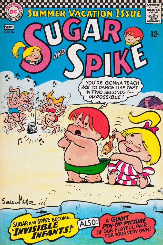
SugarSpike66A
This is Sugar and Spike no. 66 (Aug.-Sept. 1966).
SugarSpike79A
This is Sugar and Spike no. 79 (Oct.-Nov. 1968).
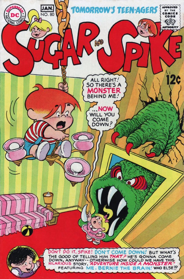
SugarSpike80A
This is Sugar and Spike no. 80 (Dec. 1968-Jan. 1969).
SugarSpike81A
This is Sugar and Spike no. 81 (Feb.-Mar. 1969).
SugarSpike91A
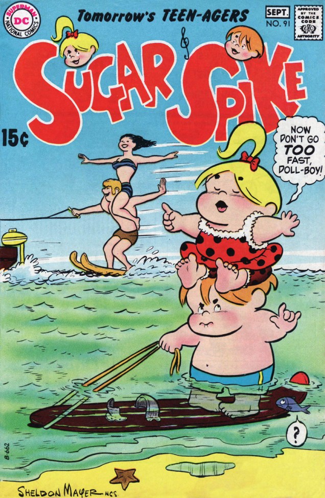
This is Sugar and Spike no. 91 (Aug.-Sept. 1970).
SugarSpike96A
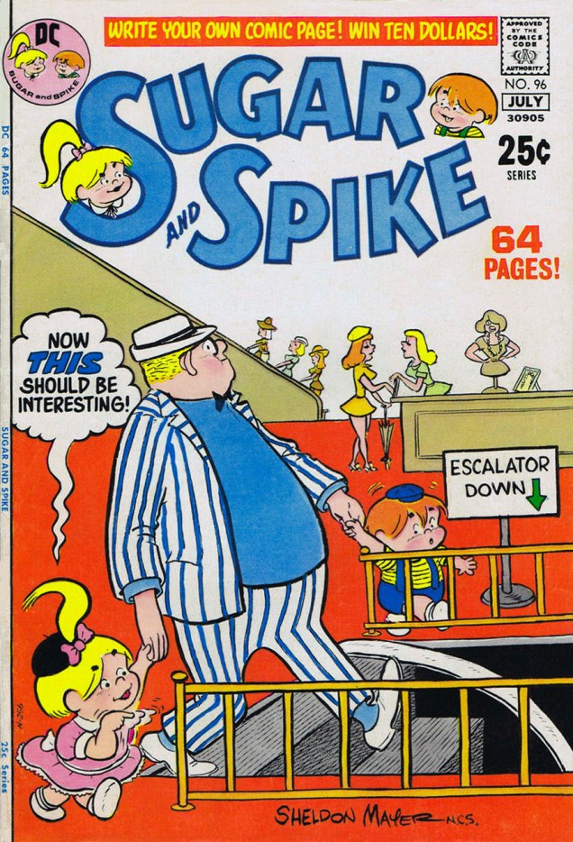
This is Sugar and Spike no. 96 (June-Jul. 1971).
SugarSpike97A
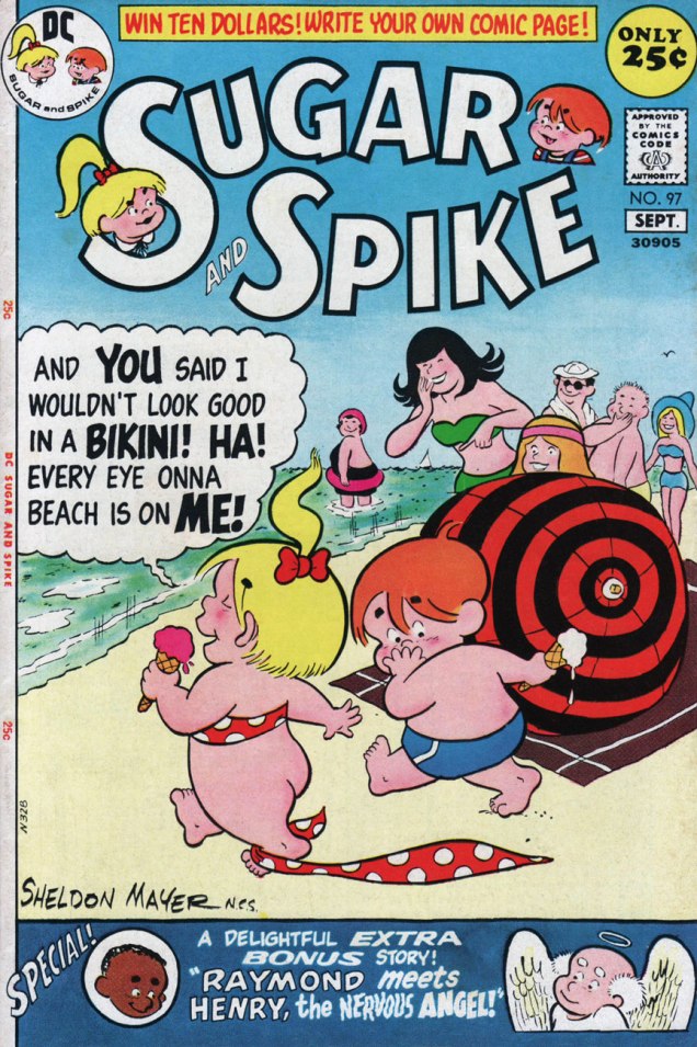
This is Sugar and Spike no. 97 (Aug.-Sept. 1971). You’ll notice we’re featuring a lot of beach scenes… well, it’s seasonal!

In what I imagine to be another benefit of Carmine Infantino‘s editorial ascent, Mayer’s work took a wild turn with issue 72 of S&S. A fine new character, Bernie the Brain, was introduced, Mayer’s layouts suddenly adopted extreme and distorted perspectives and his inking grew more florid and detailed. Honestly, Mayer’s work at that point was the closest DC ever came in style to that of Underground Comix. These changes gradually ebbed, and by issue 90, things were more-or-less back to the old standard. The cause? failing eyesight (cataracts, to be exact), which led to the book’s cancellation, rather than the more banal dropping sales. Don’t worry, Mayer underwent successful eye surgery and intermittently returned to the drawing board. But he mostly wrote… beautifully. We’ll return to that soon.

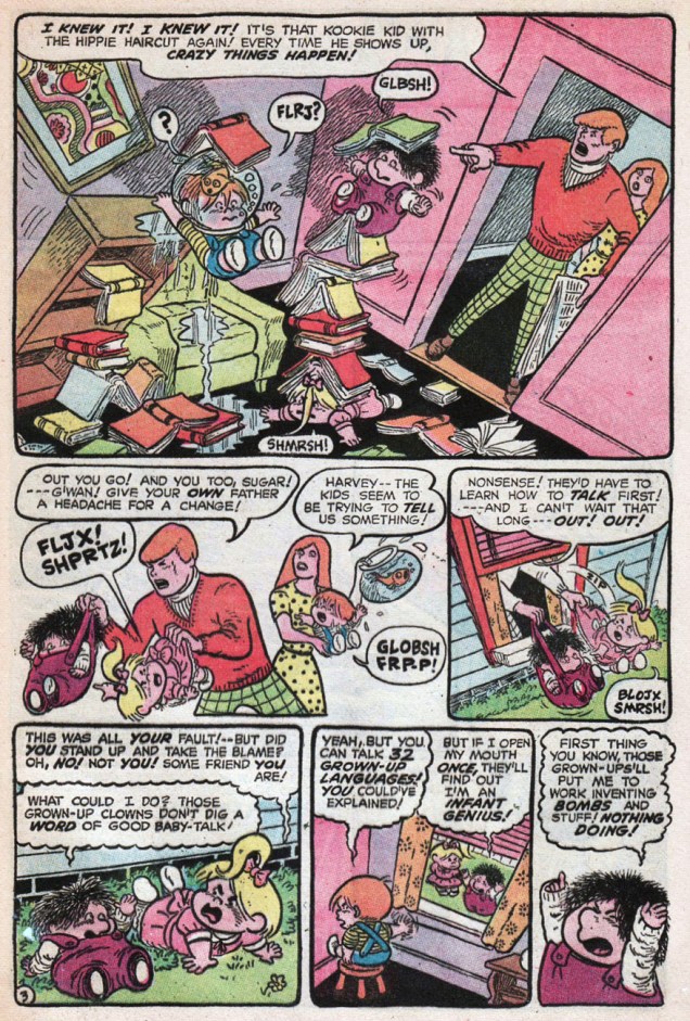
Here are a few examples (show, don’t tell!) of the wild ‘n’ wooly Sugar & Spike:

SugarSpike79P15A
Page 15 from Sugar & Spike no. 79‘s The Mystery of the Swiped Sea-Turtle (Oct.-Nov. 1968)
SugarSpike80Page04A
Page 4 from Sugar & Spike no. 80‘s Adventure Inside a Monster! (Dec. 1968-Jan. 1969)
SugarSpike84p3A
Page 3 from Sugar & Spike no. 84‘s Bernie the Brain’s Biggest Blunder! (Aug.-Sept. 1969)

Unfortunately, Sugar and Spike falls in that select category of comics series that aren’t popular enough to be fully reprinted (DC issued one volume in its Archive Editions series, usefully reprinting S&S nos. 1 to 10) and too popular to be truly affordable (Angel and the Ape is another). In addition, since the series sold well, but to a broader audience than the traditional fanboy collector set, the books are mighty hard to come by in decent condition, not to mention *complete*. The reason? Paper dolls. They enjoyed, for quite some time, great popularity. Sugar and Spike’s regular Pint-Size Pin-Ups frequently ran on the back of story pages (often the conclusion!), so their absence is a real collector’s bugaboo. Besides, they were quite charming, so why do without them?

S&SPintSize87A
Pint-Size Pin-Ups from Sugar and Spike no. 78 (Aug.-Sept. 1968). I should also point out that Mr. Mayer kept a sincere, attentive, unpatronizing relationship with his readers.

-RG
*my favourite Uncle Scrooge story: issue 60’s The Phantom of Notre Duck (Nov. 1965).

Hot Streak: Nick Cardy’s Aquaman

« Who’s Aquaman? I never heard of him! »
« He’s one of the super-beings from the place called Earth! He lives at the bottom of the ocean! » —  Steev & Jimm, rubberneckin’ in Aquaman no. 51

Some may have wondered at the deep, abiding affection held, by a certain savvy contingent of comics aficionados, for sea king Aquaman. After all, he’s a bit of a second-stringer, and he’s had a pretty spotty record for decades. Well, I’d say one has to have encountered the erstwhile Arthur Curry at his peak, in the hands of the Stephen Skeates, (writer) Jim Aparo (penciller-inker-letterer), Dick Giordano (editor-poacher), Nick Cardy (cover artist), Carmine Infantino (editor-in-chief/art director), Jack Adler (colourist) and Gaspar Saladino (cover letterer) set.

Fond as I am of Nick Cardy and Ramona Fradon‘s work, the series’ Skeates-Aparo period is more my speed. I can’t quite put my finger on it. There’s a whiff of the end of the world, something ominous and immediate about it, despite the fanciful settings. I guess it was « relevance », but with a lighter touch and without the cringe-inducing bathos of the concurrent Green Lantern-Green Arrow series. Because of Aquaman’s aquatic nature, environmental doom seldom seems far. The Skeates-Aparo rampage lasted from issue 40 (June 1968) to number 56 (April 1971). Aparo returned to the character just a few years down the road (Adventure Comics no. 441, Sept. 1975), but by then, he’d already begun his long, painful artistic deterioration.

WhoThereLogotype

But back to the covers: this represents, in my view, Cardy’s second hot streak on this title. From the beginning of his career (in 1940 with the Iger/Eisner shop!) Cardy had always been a reliably competent artist, but rarely a very exciting one. That all changed in the mid-Sixties when newly minted art director/editor-in-chief Carmine Infantino made him his right-hand man and co-designer of DC’s covers. This greater latitude gave Cardy wings. Cardy’s first Aquaman hot streak opens on issue 37 (Jan.-Feb. 1968) and closes with issue 45 (May-June 1969). Issues 46 to 48 are nice enough, but short of transcendence… beyond that bump in the road, we’re set for a smooth run of splendid covers.

CardyAquaman49A
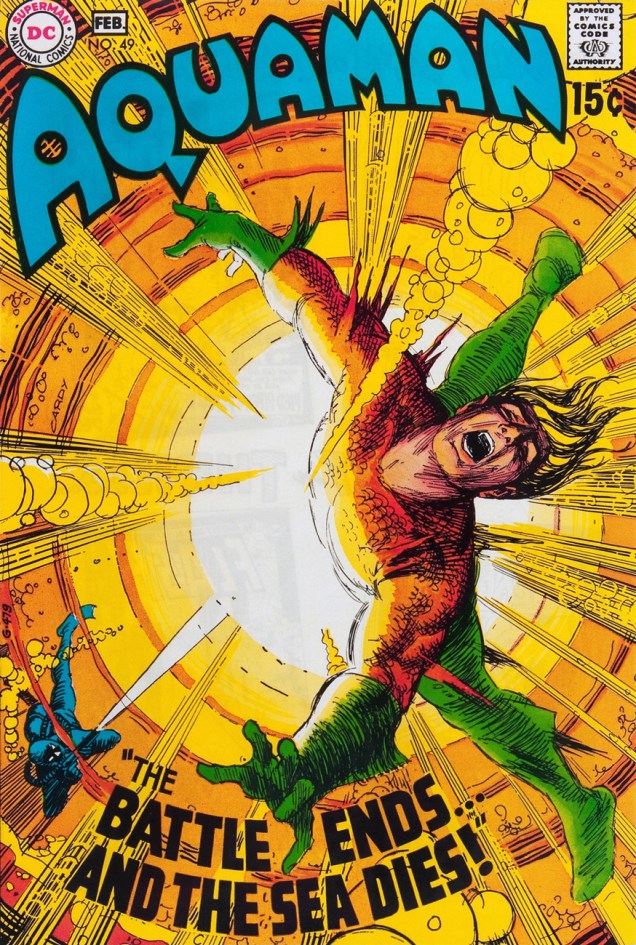
This is Aquaman no. 49 (Jan.-Feb. 1970). Cover pencils and inks by Cardy, colours by Jack Adler, Aquaman logo by Ira Schnapp, title lettering by his worthy successor, Gaspar Saladino. Edited by Dick Giordano, directed (and likely laid out) by Infantino.
CardyAquaman50A
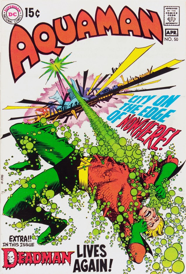
This is Aquaman no. 50 (Mar.-Apr. 1970), sporting a Cardy cover that couldn’t have been more evidently designed by Carmine Infantino, with more Saladino magic on the titles and Deadman logo. Gestalt: it’s what great collaboration is all about! It seems fair to assume that the title is a nod to the Harlan Ellison-scripted 1967 Star Trek episode, The City on the Edge of Forever.
CardyAquaman51A
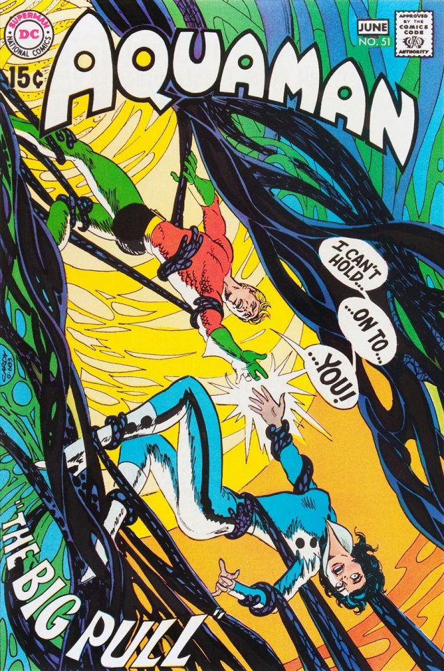
This is Aquaman no. 51 (May.-June 1970). I don’t usually pilfer Tentacle Tuesday material… but I’m inclined to make an exception for a (sea) worthy cause. Design-wise, Infantino and Cardy took full advantage of the aquatic action settings. Up, down, sideways — anything goes!
CardyAquaman52A
This is Aquaman no. 52 (July-Aug. 1970). A wistful, disorienting experiment in colour and design economy. You’d never see such a *hushed* cover chez Marvel.
CardyAquaman53A
This is Aquaman no. 53 (Sept.-Oct. 1970). A fine instance of the notorious “Infantino tilt”. Michael Kaluta on Infantino’s cover design input: « My approach to a cover, when I got to do my own ideas, was to show the picture straight on, staged, unless it was a dramatic perspective view. Almost every time I’d bring one of these sketches in to Carmine he’d turn the paper about 30 degrees to the right and demand that that made the composition 100% stronger, more “grabby”… and I’d have to agree about 50% of the time… »
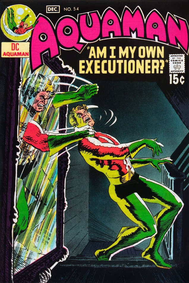
CardyAquaman54A
This is Aquaman no. 54 (Nov.-Dec. 1970). Did I mention that DC’s books of the early ’70s had a general predilection for the macabre and the moody? Fine by me, then and now.
CardyAquaman55A
This is Aquaman no. 55 (Jan.-Feb. 1971). The fact that this complex idea works so well on the page is evidence of some first-rate design work, with some heady colouring mojo sealing the deal.
CardyAquaman56A
This is Aquaman no. 56 (Mar.-Apr. 1971). Would you believe that this story was continued over three years later in Marvel’s Sub-Mariner no. 72 (Sept. 1974). Seems sneaky Steve Skeates slipped something past sleepy editor Roy Thomas. In an interesting bit of coincidence, it was each of the competing oceanic monarchs’ final issue. On another note, I presume that the title is a takeoff on Norman Greenbaum‘s 1967 song The Eggplant That Ate Chicago (popularized by Dr. West’s Medicine Show and Junk Band), itself likely an homage to Arch Oboler‘s infamous 1937 Lights Out radio episode, The Chicken Heart (That Ate the World). Phew!

Under normal circumstances, this run of covers would have turned out quite differently for, as Steve Skeates told me a few years ago, « The only reason Jim [Aparo] didn’t do the covers was that he lived out of town, couldn’t come in for cover conferences! »

-RG
Mind the Quirks and Glitches: Petrucha & Sutton’s Squalor

« I, I know this place. I’ve been here when I’m wasted. » « Sure, and a man who drives his car off a cliff knows what it’s like to fly. » « He does if he’s headed DOWN. » — Squalor and Todd debate the nature of reality

Compared to his 1970s, the ensuing decade was surely no picnic for Tom Sutton (1937-2002). After producing a massive body of work for Warren, Skywald, Marvel, Charlton and DC by the late Seventies, the mid-1980s found Sutton trudging through a long run (« It lasted hundreds of years. ») of abysmal Star Trek comics to put food on the table. This was the movie franchise Star Trek, with Bill Shatner’s permed hairpiece and those atrocious red velour outfits. Worst of all, inker/saboteur Ricardo Villagrán dogged his every move, casually pulling a Colletta on him*.

Oh, Sutton did work for other publishers in the 80’s, mainly the once-promising upstart First (1983-91), but the rote fantasy of The Black Flame and the hollow tough-guy posturing of Grimjack (coming soon to a screen near you, apparently) didn’t offer much of substance as alternatives to the Big Two’s sludge.

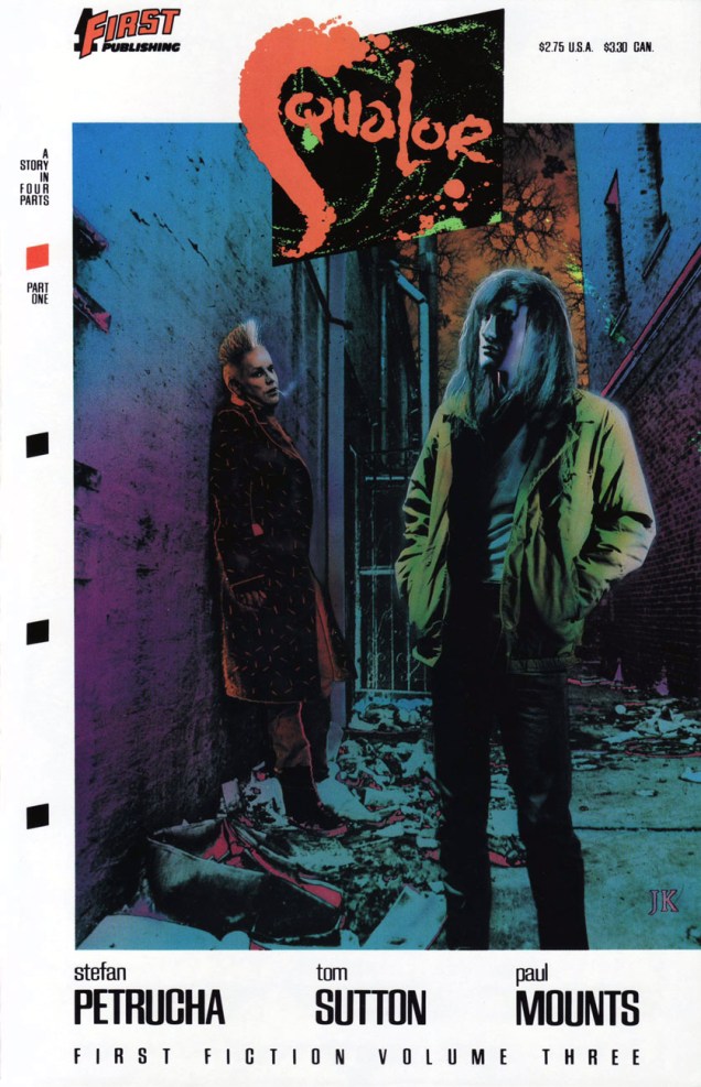
Still, First merits full credit for green-lighting the last great Sutton project, Squalor (1989-90). It was part of a line called First Fiction**, which looked like an eleventh-hour push to get into mainstream bookstores without quite committing to the graphic novel format and its price tag. Cardboard covers, full colour, slick paper; certainly more durable than the average comics pamphlet. Let’s take a look, shall we?

PotterSqualor01CoverA
The inspired choice for the series’ covers was photo-montage artist J. K. Potter., whose work I recalled from Twilight Zone and Night Cry magazine covers, as well as a clutch of memorable paperback covers. Joe R. Lansdale‘s By Bizarre Hands comes to mind. Now remember, young Photoshop pups, these had to be created the hard way.

SuttonSqualor01_06A

SuttonSqualor01_07A
Since you asked, panel four refers to the inevitable American Bandstand teenybopper analysis.
SuttonSqualor01_15A
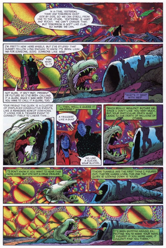
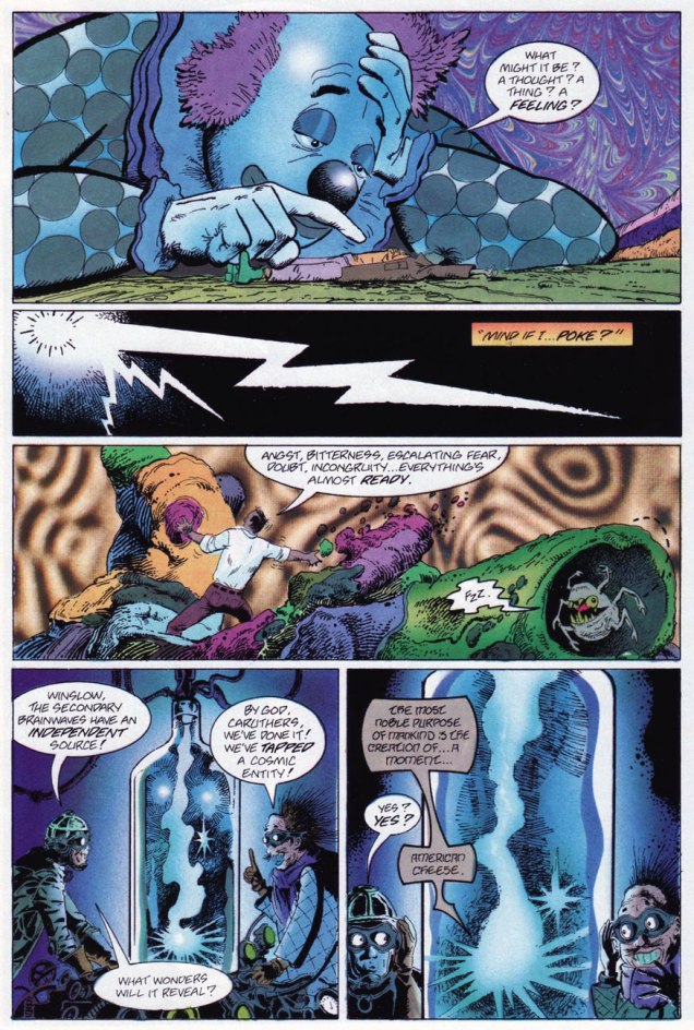
« Welcome to A-Time… not another dimension, not a parallel world, but your very own neighborhood bereft of linear time. In A-time, past, present and future merge like expressway off-ramps, six-legged quirks hunt the time trails, and archetypes leave footprints. »

SuttonSqualor02_42ASuttonSqualor03_63ASuttonSqualor04_95A

So yes, we have an accomplished illustrator on board… but do we have a proper story to hang the visuals upon? What do you know, we do! In a freakish bit of convergence, a newcomer to comics, Stefan Petrucha, then a freelance technical writer, happened along with a fully fleshed-out, unconventional concept, one ideally suited to Sutton’s strengths. And then someone fished it out of the slush pile.

So what’s Squalor about? It’s a bitch to summarize, but it involves alternate time streams, the oft-elusive nature of genius, conspiracy theories, synchronicity, archetypes, and the road map of reality. Fair enough? I surmise that we have Mr. Petrucha’s experience as a technical writer to thank for his capacity to hold his magic bus to the right side of the road through to the end of the journey.

PotterSqualor03CoverA
This is Squalor no. 3 (July, 1990) J.K. Potter does the cover honours again.

Petrucha wrote, in Squalor no. 4‘s concluding notes: « Personally, I would love to write more Squalor. In fact, I have a few document files chock full of plot ideas. We’ve seen quirks, glitches, and an archetype up close, but what about paradigms, totems, and babblers? I’d also like to write a graphic novel about Todd Penderwhistle’s coat. Maybe that’s why I’ve had so much trouble breaking into this business. »

While he did break into the business, he’s never again been afforded the chance to handle such a personal project. Squalor was Tom Sutton’s final such endeavour***, though I can’t help but think that he was more than a bit broken by his Star Trek stint.

In 2016, Squalor was at long last collected as a graphic novel by Caliber Press, to what I presume was general indifference. As for the original issues, one can still get copies online for less than the original cover price, which is a bargain and a golden opportunity, but rather bittersweet.

SqualorButton
I still have my Squalor pin-back promo button (logo designed by art director Alex Wald) from ’89. Whee.

-RG

*From Gary Groth‘s definitive interview with Sutton (The Comics Journal no. 230, Feb. 2001) ): « No, I did not ink this thing. This was inked by a fellow who I was told inked in bed watching television. The enthusiasm of this man was evident. He was a pro. Oh, he was very slick. He was very, very good. It was exactly what the book didn’t need. What the book needed was Mœbius. Hear what I’m saying?

This will sound really dumb, but even after all of that crap I had gone through I went into this thing and I said, This is going to be fun. This is going to be creative work. I worked like hell on the thing. I penciled backgrounds you wouldn’t believe, with all the scopes and all of those things. I thought I was Wally Wood. I forgot that Wally inked his stuff himself. I had to leave it up to Ying Yang watching TV or something. They actually took your backgrounds out and erased them. I never realized it until I saw the fucking comic book and I said, I drew something there. A large something. A complex something. »

GROTH: « And this would have been for sheer expediency’s sake? »

SUTTON:  « I suppose so. Because he knew he could get away with it. He knew something that I didn’t realize until later, that that book had a special job. And that job was to promote movies. » [ source… well worth your time! ]

**The other “volumes” of First Fiction were nothing special, to put it kindly.

*** Unless you wish to count his pseudonymous (as Dementia) late ’90s, er, erotic comics, such as The Crypt of Cum!, The Vault of Whores! or Bustline Combat! He certainly gave them his all.

Let’s Hear It for Bobby Sherman!

« You’ve got his likeness
emblazoned onto
the top of a tin box

Perfect big heart
perfect blue eyes
perfect teeth and
perfectly 
flowing locks » — The Motorz, ‘Bobby Sherman Lunchbox’

It’s birthday number seventy-six for singer, actor, songwriter, Charlton comics star and all-around swell guy Robert Cabot “Bobby” Sherman, Jr. (born July 22, 1943).

BobbySherman1A
This is Bobby Sherman no. 1 (Feb. 1972). Story and art by the much-maligned Tony Tallarico. You know what, though: he’s alright in our book. One of these days, we’ll make our case.

His Getting Together co-star, Wes Stern, also celebrates his birthday this Thursday, July 25. He’ll be seventy-two. You may remember Wes from his recurring rôle as Brenda Morgenstern’s shy, foot-fetishist beau Lenny Fiedler on Rhoda (early on, before the show utterly went South).

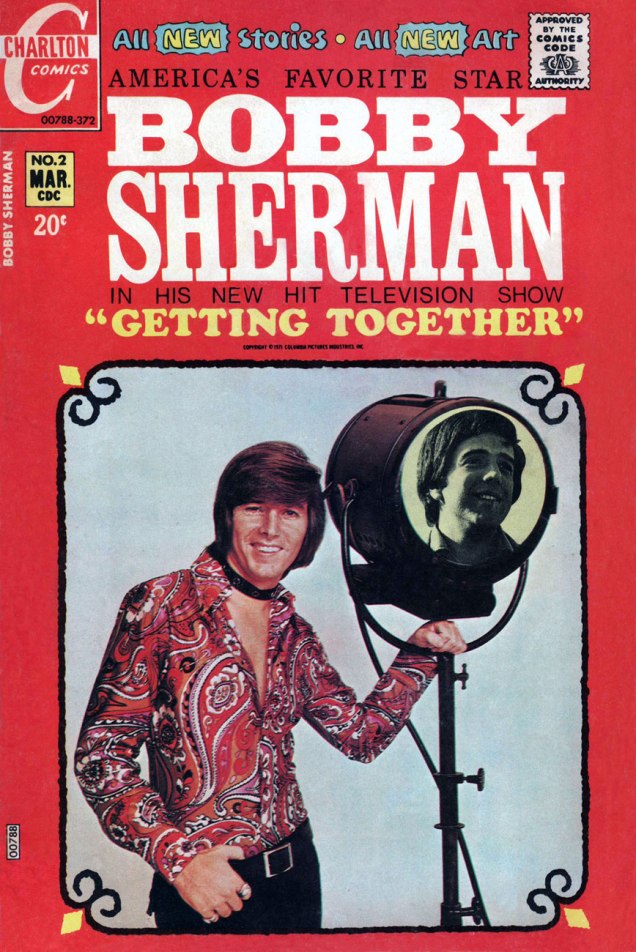
BobbySherman02A
This is Bobby Sherman no. 2 (Mar. 1972). Story and art by Mr. Tallarico.

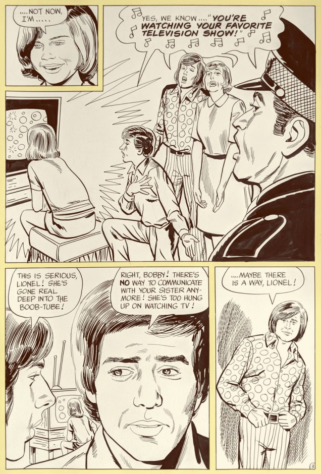
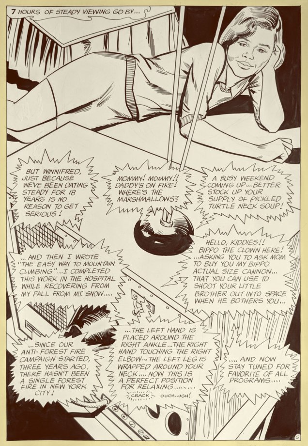
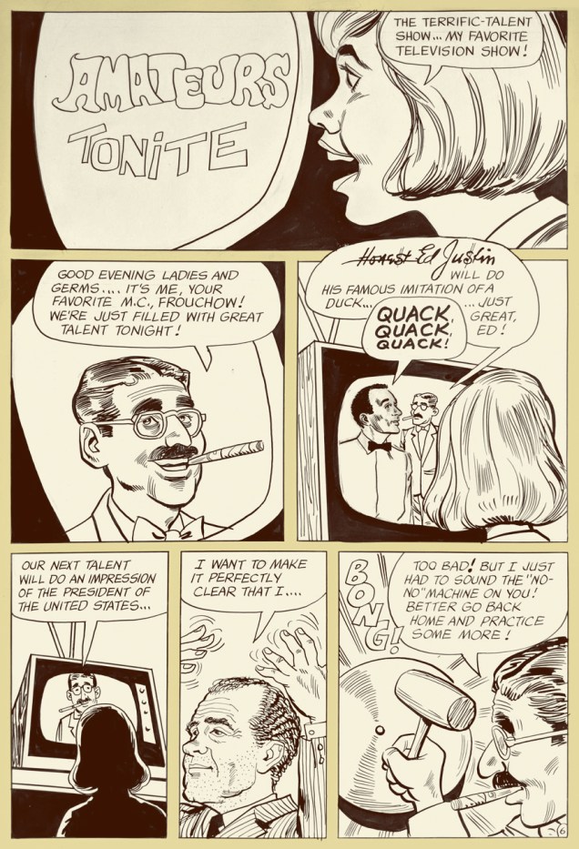
Bobby and Wes had the singular honour of starring in seven issues of their own Charlton comic book (February to October 1972). Our excerpt is number 2’s « A Guide to TV? », written and illustrated by Tony Tallarico and shot from the original art. Good-natured fun, especially when the Getting Together cast of characters is around. In the 1971 Fall season, the snappy little show was off to a promising start, but found itself, in the eleventh hour, scheduled against the powerhouse tv hit of 1971, Norman Lear’s abrasive All in the Family, and that was all she wrote.

BobbyShermanTV01ABobbyShermanTV02ABobbyShermanTV03ABobbyShermanTV04A

BobbyShermanTV05A
Ah, back in those innocent days when watching seven hours of TV was the stuff of humorous exaggeration. Now (depending on how it’s defined and whom you ask) it’s *below* the daily average.
BobbyShermanTV06A
Inside joke alert: “Honest Ed Justin” alludes to one of Bobby’s songwriting partners, Ed Justin. Here’s one of their musical collaborations. And, hey, two posts in a row featuring Tricky Dick cameos… I’m on a roll! Incidentally, ‘Amateurs Tonight” predates The Gong Show by nearly half a decade. Was Chuck Barris perchance a Charlton reader?

BobbyShermanTV07ABobbyShermanTV08A

But that’s all water under the bridge. By the mid-70s, Bobby basically walked away from the grind of public life, and the odd tour or charity event aside, he’s been volunteering with the LAPD, training recruits in first aid, CPR, and so forth. A solid citizen, no irony or sarcasm intended.

One more?

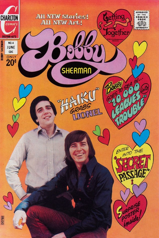
BobbySherman4A
This is Bobby Sherman no. 4 (June, 1972). M. Tallarico strikes again!

Once again, we wish the most joyous of birthdays to Bobby and Wes! 

-RG

Treasured Stories: “Happy Deathday, Sweet 16” (1972)

« Mom, my teacher, Mrs. White, has invited me to a slumber party at her house this weekend. She’s really nice. Can I go? »
« Sure, why not? »  —  from a Jack Chick tract, The Poor Little Witch (1987)*

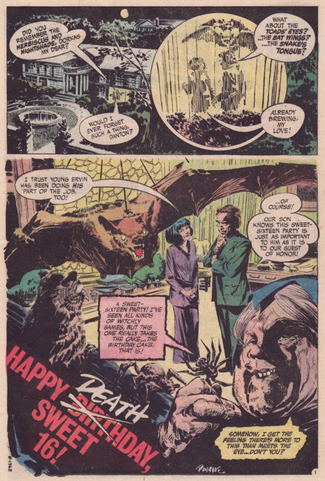
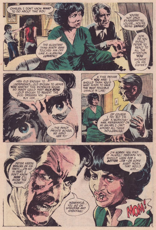
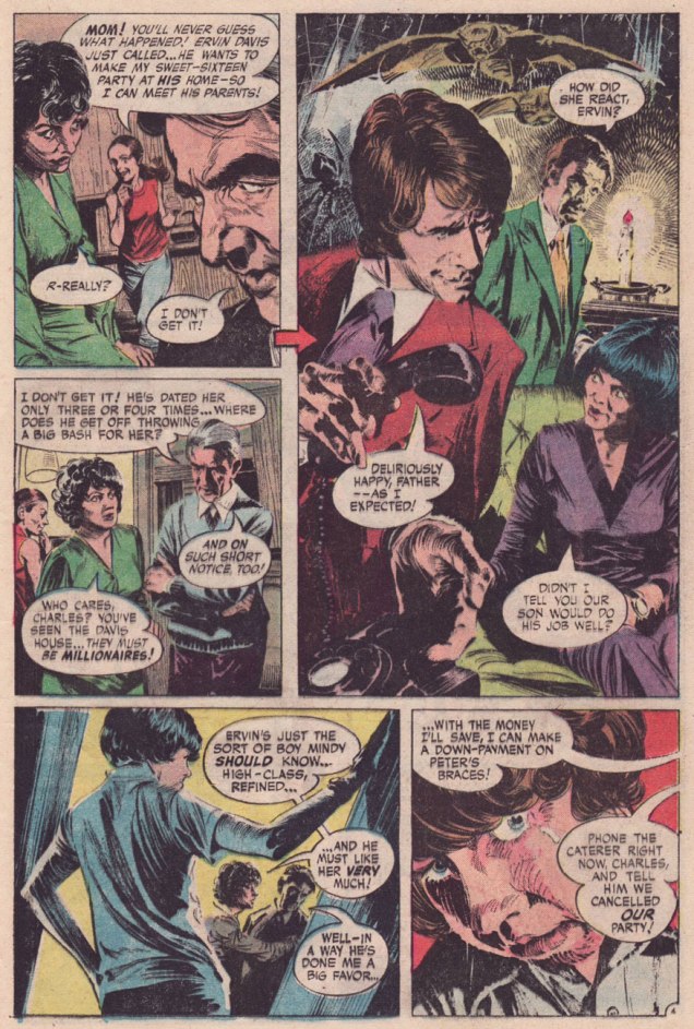
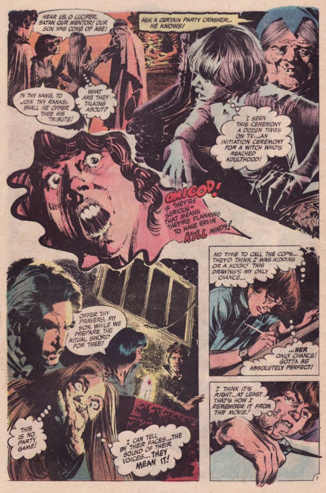
Today, we part the curtains and peek at the fair bosom of suburbia, circa 1972. In those gentle times of satanic panic, Tricky Dick’s political shenanigans, the oil crisis and all-around grooviness, the Manson ritual murders were recent history, Anton LaVey‘s The Satanic Bible (1969) and its sequel, The Satanic Rituals (1972) were all the rage, not to mention William Peter Blatty‘s The Exorcist (1971… the film another year away) and Ouija boards. DC Comics’ The Witching Hour (85 issues, 1969-1978) was well in keeping with the vibe of the times, and offered girls somewhat of an alternative to Archie, Little Dot and Young Romance. In fact, my recollection (and I’d welcome yours!) was that ghost and mystery comics overwhelmingly found favour with the ladies.

I’ve perhaps said it before, but DC’s mystery books were mostly well-drawn but mind-numbingly formulaic… but exceptions now and again slipped in.

PayneSweetSixteen01APayneSweetSixteen02APayneSweetSixteen03APayneSweetSixteen04APayneSweetSixteen05APayneSweetSixteen06APayneSweetSixteen07APayneSweetSixteen08APayneSweetSixteen09A

Happy Deathday, Sweet 16! was a bit of lightning in a bottle. It was illustrated by the hardly-prolific Canadian Bill Payne, who drew a dozen or so jobs for DC’s mystery and war titles, lettered a few more, then vanished. I suspect he had a day job in some advertising agency and did a bit of comics work on the side for kicks. If that’s the case, he certainly applied himself, bringing actual realism and a bit of the old ‘Ghastly’ Ingels grotesqueness to the table. The writer, however, is uncredited. The writing doesn’t quite feel like the work of any of DC’s workhorses… it’s markedly better, rising beyond the stock situations and packing in plenty of credible detail to flesh out the players in its scant eight and a half page allotment. Sibling rivalry, social aspirations**, marital and parental discord, class warfare… Lucky Peter, though: he somehow seems to have continual access to Shock Theater; for me, that’s the main cause for suspension of disbelief.

CardyWitchingHour25A
Nick Cardy‘s sweet ‘n’ sassy cover for The Witching Hour no. 25 (Nov. 1972). It’s fun to see one of his winsome romance cover girls put in a rather… perilous cross-genre appearance.

These days, I suppose the fundamentals haven’t changed, though with so-called Christians behaving in most unchristian fashion, and Satanists displaying a puckish (honestly, kind of adorable) sense of humour, things are… interestingly confusing.

-RG

*Read it here; but remember, it’s “available only in multiples of 10,000 at half-price.
** Let’s keep in mind that, as Lori Loughlin has pointedly pointed out, “Any mother would have done the same if they had the means to do so.”  

Will Eisner’s The Spirit at Kitchen Sink (pt. 2)

« Three A.M. The radiators in Commissioner Dolan’s office had long ago conked out… and those of us who could not go home waited… tried in various ways to ignore the damp cold made even more unbearable by the January rain. » — The Spirit, Jan. 8, 1950

Welcome back! Today, we wrap up Kitchen Sink Press’ experimental continuation of Warren Magazines’ run of The Spirit. By now, Denis Kitchen was probably coming to terms with the fact that building upon Warren’s non-system of random Spirit reprints was not only a dead end, but one with mercilessly diminishing returns, even with so deep and rewarding an archive as Will Eisner’s.

Still, don’t worry, we’re hardly running out of dazzling visuals to tickle your eyeballs with.

Spirit29A
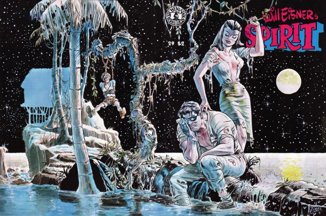
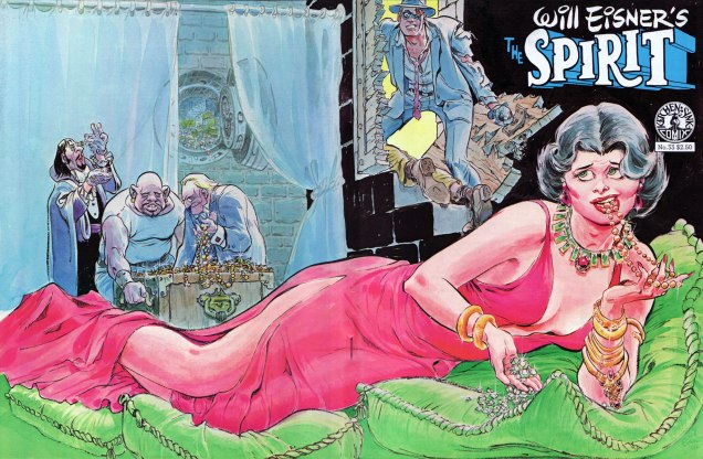
This is The Spirit no. 29 (June, 1981), featuring a mere four Spirit tales, namely: “Framed” ((Nov. 24, 1940); “Sasha’s Sax” (June. 28th, 1942); “Blood of the Earth” (Feb. 26, 1950); cover-featured “The Island” (March 26, 1950) , as well as plenty of fine new material by Eisner.
Spirit31A
This is The Spirit no. 31 (Oct. 1981), featuring four Spirit tales: “Wanted for Murder” (Feb. 5, 1942); “The Siberian Dagger” (Jan. 27, 1946); “Just One Word Made Me a Man!” (Jan. 18, 1948); “The Barber” (Oct. 22, 1950), some new Eisner material and the second instalment of “Shop Talk”, in which Eisner interviews one of his peers. This time out: Harvey Kurtzman.
Spirit33A
This is The Spirit no. 33 (Oct. 1981), featuring a quartet of Spirit tales: “The Haunted House” (Dec. 8, 1940); “Slim Pickens” (Dec. 15, 1940); “The Portier Fortune” (Dec. 1, 1946); “Dolan Walks a ‘Beat’!” (Apr. 17, 1949), an Eisner tutorial and a look at Eisner’s P*S Years.
Spirit39A
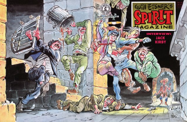
This is The Spirit no. 39 (Feb. 1983), featuring five Spirit adventures: “Dead Duck Dolan” (Mar. 2, 1941); “Tarnation” (Mar. 3, 1946); “Voodoo in Manhattan” (June 23, 1940); “The Van Gaull Diamonds” (Dec. 15, 1946), “Veta Barra” (July 29, 1951), and a 12-page Shop Talk with Jack Kirby!
Spirit30A
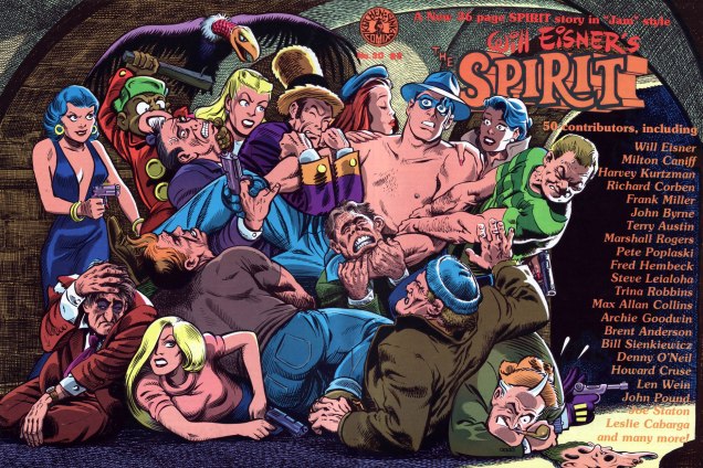
As a bonus, here’s the cover of The Spirit no. 30 (July, 1981), which features an amusing, but understandably uneven brand-new 36-page Spirit jam calling upon a whopping fifty pairs of paws. If only this had been the only time Frank Miller tried his hand at Will’s creation… The issue also features pair of vintage yarns: “Army Operas No. 1” (Dec. 21, 1941) and “Beagle’s Second Chance” (Nov. 3, 1946). Can you identify all the cover jam contributors? Beware, though: that Pete Poplaski is a redoubtable stylistic chameleon.
SpiritJamKeyA
Here’s the key.

After 25 issues of The Spirit magazine (on top of Warren’s run), Denis Kitchen and Will Eisner would press the reset button and begin again in the comic book format. In part three, we’ll see how that endeavour fared.

If you’ve just joined us mid-programme, fret not: simply rewind to our earlier instalments, if you will:

… or simply click on its general category, That’s THE SPIRIT!, and find yourself with everything at your purple-gloved fingertips (don’t think you fooled us, Octopus!)

-RG

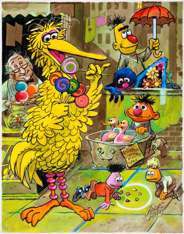
Sweepin’ the clouds away: Jack Davis’ Sesame Street

« Until now Mr. Cookie Monster refused to talk about the matter because his mouth was full, and it’s not polite to talk with your mouth full. » — Guest Star Robert McNeil

With the venerable MAD Magazine (1952-2019) bowing out after sixty-seven years, and kid’s educational show Sesame Street (singalong time!) about to hit the half-century mark, it seems à propos to salute one of the geniuses their respective histories share, Jack Davis (1924 – 2016)… rather than mire ourselves in the inevitable stack of lachrymose paeans to Harvey Kurtzman’s long-lost progeny.

So, are you in need of a bit of cheering up after a down-in-the-dumps day? Take a stroll down friendly Sesame Street with sweet Mr. Davis! Now isn’t this a place where you’d care to linger a spell?

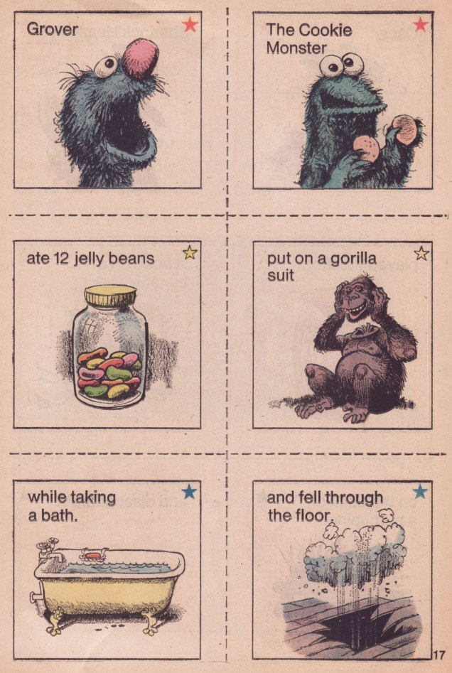
DavisCookieRemember1A
A lovely excerpt from the Sesame Street Annual (1972, Dell); according to the table of contents, it teaches ‘Planning’. Don’t worry, I won’t leave you in the lurch: the answers are at the end of this post. You’re welcome!
DavisHemlockPuzzleA
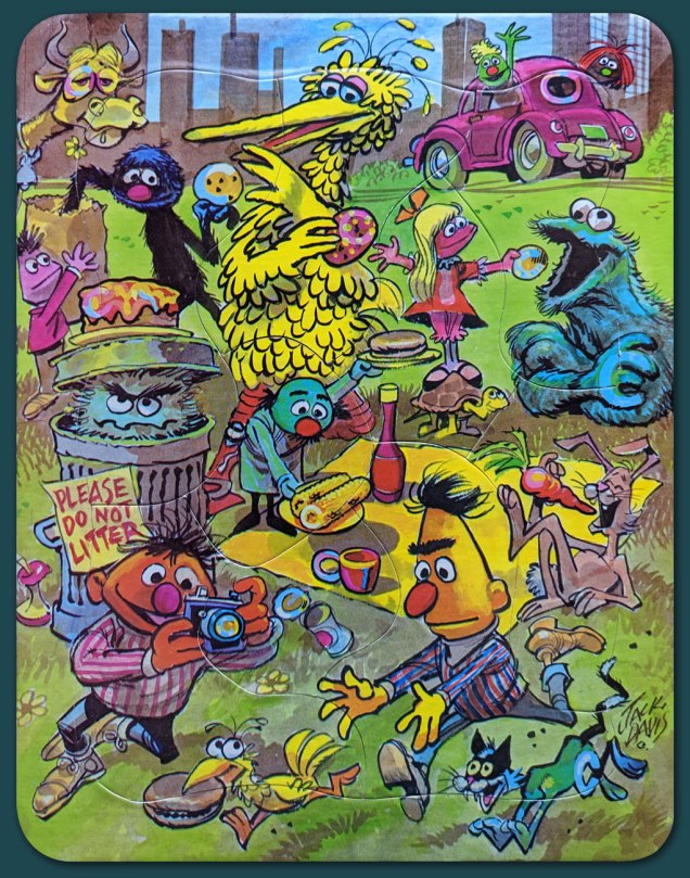
It’s a sunny day indeed when genial Jack Davis’ long legs come striding down Sesame Street! The series was called Sherlock Hemlock’s Hidden Answer Jigsaw Puzzles, and this is number one, The Puzzle of the Hidden C’s. Well, don’t just stand there gaping, how many can *you* spot, wise guy?
SherlockHemlockA
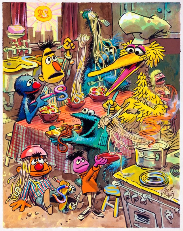
Spaghetti and chaos are on the menu in this scene that Davis was commissioned to create in 1971, early in the rise of the Muppet empire. This is number 2, The Puzzle of the Hidden S’s.
SherlockHemlock4A
This is number 3, The Puzzle of the Hidden Numbers. Each puzzle was packaged with a blue transparency “looking glass”, which could be used to discover hidden shapes in the picture. I’m afraid I don’t have one to spare, so you’ll have to procure your own.
DavisHemlockStreetA
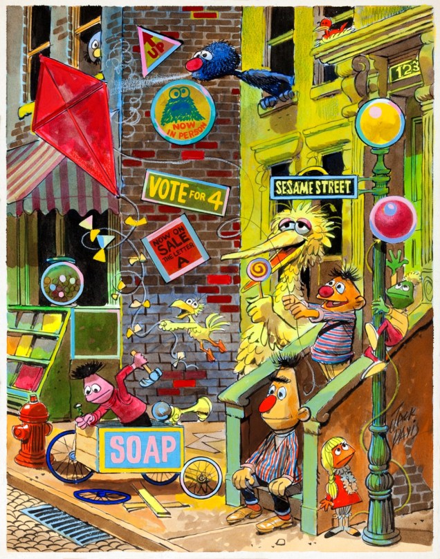
And here’s number four of the puzzle illustrations Mr. Davis created for Educational Toys’ Sherlock Hemlock’s Hidden Answer Puzzle series. This is número 4, The Puzzle of the Hidden Shapes… you know what to do next!

BlueLookingGlassA
Here’s the aforementioned [Yves Klein] blue looking glass you’ll need.
DavisMakeUpStory01ADavisMakeUpStory02ADavisMakeUpStory03A

DavisMakeUpStory04A
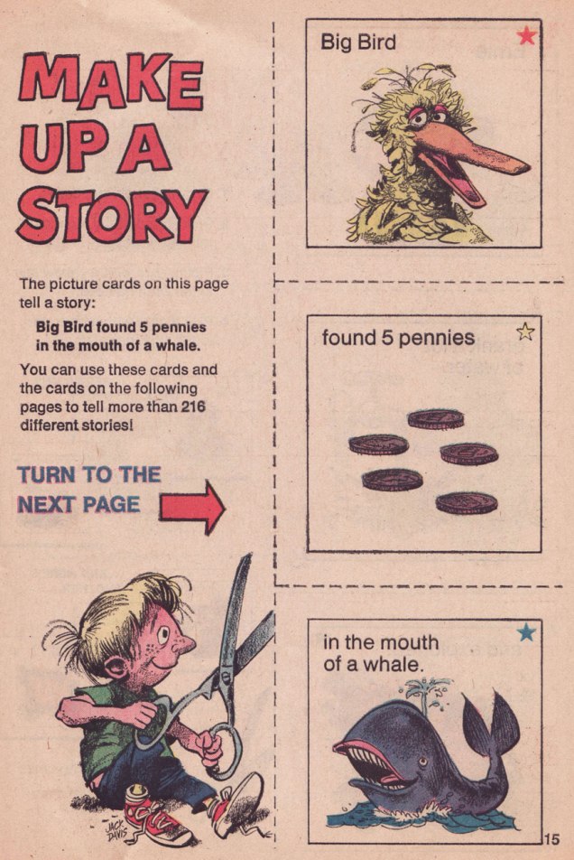
Another Davis-illustrated exercise in fun from the 1972 Sesame Street Annual, which also features some gorgeous contributions from Mel Crawford and Davis’ fellow Usual Gang of Idiots member, Al Jaffee. This one teaches, again according to the “Parents’ Guide to Contents”, “Pre-reading skills”.
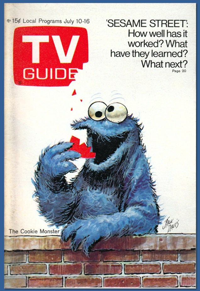
TVCookieA
As one of America’s most distinctive and deservedly successful illustrators, Davis created scores of splendid TV Guide covers, and he was uniquely well suited for this one. This is the July 10, 1971 issue. I never would have figured the mag’s logo to be edible, but then the Cookie Monster’s idea what’s fit to eat is pretty liberal.
SesameStreetPosterA
A very early Davis Sesame Street illustration initially used in The Sesame Street Learning Kit (Children’s Television Workshop, 1969); the show made its début on November 10, 1969, on the about-to-expire National Educational Television network. A merger soon turned the NET into the Public Broadcasting Service, which Sesame Street, now in its 49th season, calls home to this day.
DavisCookieRemember2A
And here’s your answer. Thanks for playing along!

In case one of you experts is wondering, I did leave out, deliberately, Davis’ single meatiest contribution to the show’s canon: The 1972 Sesame Street Calendar (which I look forward to reusing in 2028), twenty-five pages of pure Davis, including thirteen particularly lush watercolours. In order to do it justice, it’ll require at least one post of its own.

And as we’re on the topic of Sesame Street’s seemingly boundless creativity, I can’t recommend enough this recent profile of the enduring friendship of a pair of the show’s most pivotal songwriters.

« Never refer to me as an item. I’m a bird. » — Big Bird

– RG

Treasured Stories: “The Price” (1974)

« Apparently he had never learned that a white man’s foot, though it wabble ever so, is given him wherewith to kick natives out of the road. » — John Russell

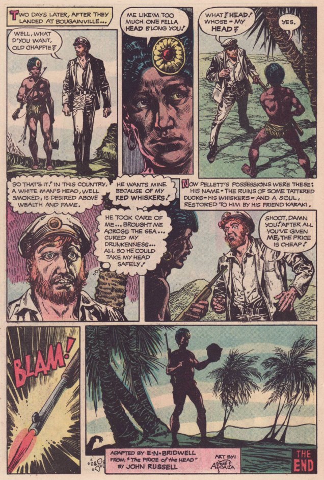
Welcome to another installment of Treasured Stories! This one’s a bit of a sequel, or rather a companion piece to an earlier entry, August Heat (from just about a year ago) as we’re featuring two of the same creators, namely scripter E. Nelson Bridwell (1931-1987) and penciller-inker Alfredo Alcala (1925-2000).

In this instance, we can surely witness judicious editorial sense at work, in terms of matching material to talent. While Bridwell likely selected the story, and though they’d worked together before, Alcala was a flawless choice to bring it to full visual bloom. A tale of the Pacific Islands illustrated by a Pacific Islander, and a masterful one at that… on both counts. Alcala’s expertly-paced, limpid, deliberate storytelling is a natural fit.

AlcalaPrice01AAlcalaPrice02AAlcalaPrice03AAlcalaPrice04AAlcalaPrice05AAlcalaPrice06AAlcalaPrice07AAlcalaPrice08A

It’s easy to underestimate how daunting a challenge, in most cases, is the effective transition of material from medium to medium. In this instance, the source is a much-anthologized short story by John Russell, originally published in Collier’s, May 20, 1916. You can judge for yourself after reading the original text here.

Russell’s stories sharply veer from the usual civilisation vs savages colonialist tripe of the era in that the natives are depicted as oft-complex but subtle beings and the whites, as often as not, as pompously delusional savages; one sees the pattern emerge upon reading a few of Russell’s South Pacific tales (collected in Where the Pavement Ends, 1921); in my own case, I found a trio of these in Dennis Wheatley‘s excellent anthology Shafts of Fear (1964), an update and expansion of his earlier A Century of Horror (1935).

Still, I strongly suspect that Bridwell’s exposure to The Price of the Head came not from books, but rather from a radio play, as all three of his DC short story adaptations (TPOTH, August Heat and The Man and the Snake had received that particular treatment. To his credit, Bridwell went back to the source for his version.

The Price of the Head was adapted several times for radio:
Listen to The Man in Black version (February 2, 1952)
Listen to Escape (version 2) from August 7, 1954

You’ll note that the racism so refreshingly absent from Russell’s story has been painstakingly restored for the radio programmes. Now that’s dedication!

Quite recently, I was delighted to hear that Mr. Bridwell has not entirely been forgotten; indeed, he is to be bestowed, though posthumously of course, the Bill Finger Award for Excellence in Comic Book Writing on Friday, July 19 2019, during the Eisner Awards ceremony at this summer’s Comic-Con International in San Diego, CA. Bravo!

Read all about it on Mark Evanier’s fine blog. And thank you, Mark!

-RG