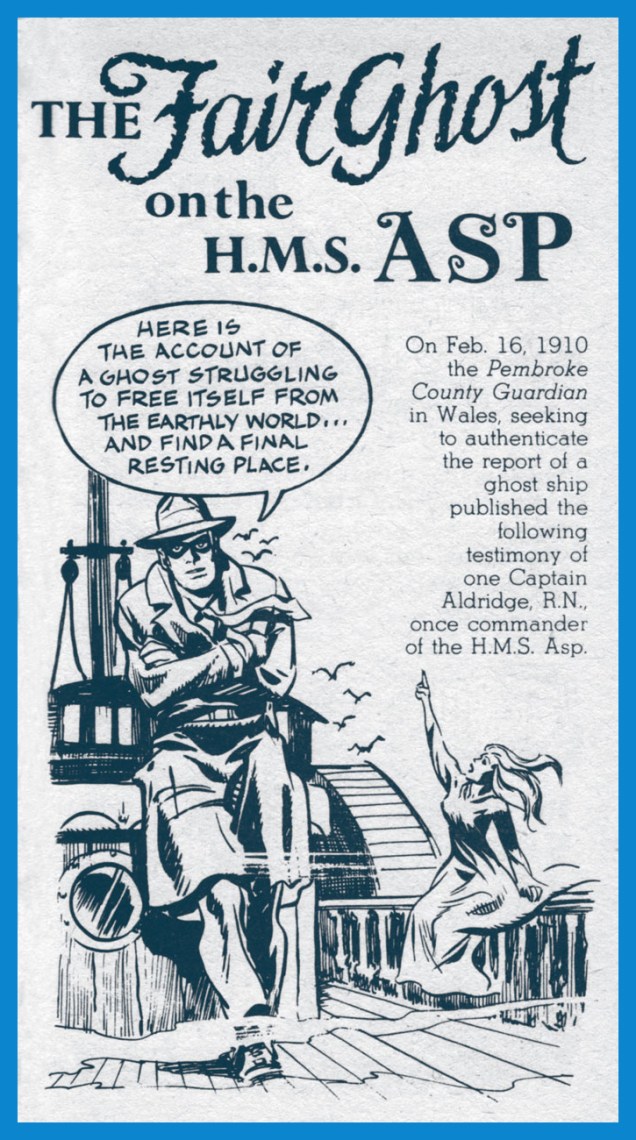
« In June, 1913, the family moved out in terror! … they simply abandoned the house in the Midlands. There is no record of successors. If you are looking to rent a house, cheap… it may still be there! »
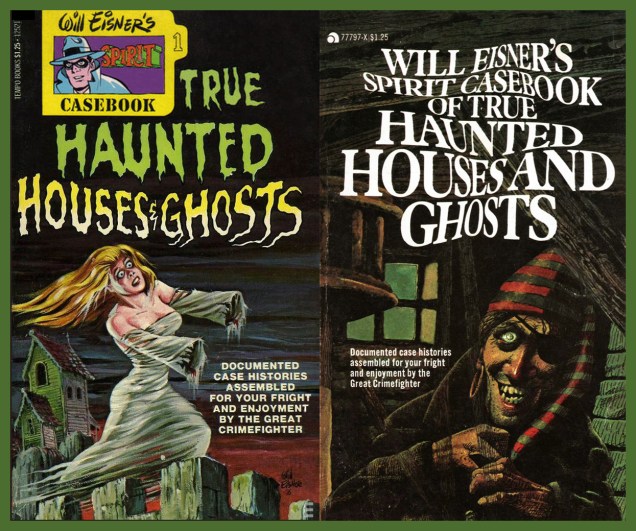
On this second day of our Hallowe’en countdown, let’s peer through the mists of time at 1976, when Will Eisner was still experimenting with marketing formats for comics-type material. This was still a couple of years before his A Contract With God and Other Tenement Stories (1978) appeared. During that period and beyond, Eisner was throwing a lot of material at the wall, in the finest exploitation tradition, hard on the heels of every bankable trend: Will Eisner’s Gleeful Guide to the Quality of Life, 101 Outerspace Jokes, Will Eisner’s Gleeful Guide to Communicating With Plants, Will Eisner’s Gleeful Guide to Living With Astrology, 300 Horrible Monster Jokes… and it wasn’t all good, as you can imagine.
This 160-page paperback from 1976 is arguably the cream of that crop; an easy choice for those of us who value Eisner’s expert hand at setting a shadowy mood.
Mr. Eisner’s original back cover.
Publisher Tempo Books seems to have had limited faith in the sales appeal (too gruesome?) of the original cover, as a variant edition was issued in short order, bearing a fine, but non-Eisner cover. Can anyone identify the artist?
They all climbed up on a high board fence — Nine little goblins, with green-glass eyes — Nine little goblins that had no sense, And couldn’t tell coppers from cold mince pies; And they all climbed up on the fence, and sat — And I asked them what they were staring at.
And the first one said, as he scratched his head With a queer little arm that reached out of his ear And rasped his claws in his hair so red — “This is what this little arm is fer!” And he scratched and stared, and the next one said, “How on earth do you scratch your head?”
And he laughed like the screech of a rusty hinge — Laughed and laughed till his face grew black; And when he choked, with a final twinge Of his stifling laughter, he thumped his back With a fist that grew on the end of his tail Till the breath came back to his lips so pale.
And the third little goblin leered round at me — And there were no lids on his eyes at all — And he clucked one eye, and he says, says he, “What is the style of your socks this fall?” And he clapped his heels — and I sighed to see That he had hands where his feet should be.
Then a bold-faced goblin, gray and grim, Bowed his head, and I saw him slip His eyebrows off, as I looked at him, And paste them over his upper lip; And then he moaned in remorseful pain — “Would — Ah, would I’d me brows again!”
And then the whole of the goblin band Rocked on the fence-top to and fro, And clung, in a long row, hand in hand, Singing the songs that they used to know — Singing the songs that their grandsires sung In the goo-goo days of the goblin-tongue.
And ever they kept their green-glass eyes Fixed on me with a stony stare — Till my own grew glazed with a dread surmise, And my had whooped up on my lifted hair, And I felt the heart in my breast snap to, As you’ve heard the lid of a snuff-box do.
And they sang “You’re asleep! There is no board fence, And never a goblin with green-glass eyes! — ’tis only a vision the mind invents After a supper of cold mince pies. — And you’re doomed to dream this way,” they said, —
“And you sha’n’t wake up till you’re clean plum dead!”
« It blew into the village from the sea one stormy night — a ghostly ship, with a ghostly crew and ghostly ways… » — Richard Middleton, The Ghost Ship. Read and/or listen to the entire yarn here!The Spook Upon the Stair, by Andrew McCullen, aka Robert Arthur (1965)
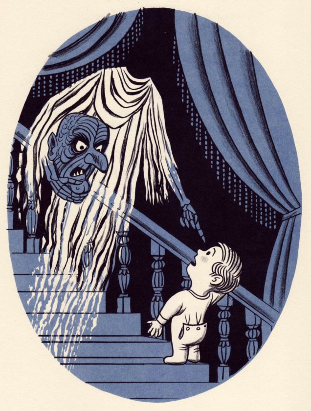
I met a spook upon the stair; He was a haunt who had no hair. In fact, he didn’t have a head (Which made me think he might be dead).
His head I saw beneath his arm, Safely tucked away from harm, But still to me it spoke, and said, “Before you go on up to bed, Please let me say you should not stare At ghosts you meet upon the stair.”
Thus spoke that spook, I do not lie, Before I could quite pass it by. “The thoughtful, gentle thing to do,” It said to me, as I say to you, “Is act as if they were not there, And never, never, never stare, Even though beneath an arm Their heads they carry, safe from harm.”
“However frightful they may be, Act as if you did not see, And if you did, would not have cared. Above all, never show you’re scared.”
This spook he spoke so plain and fair, I heeded him, right then and there. I hurried on up to the top And as I went I heard a pop. I turned — and there was nothing there. The spot the spook had been was bare.
If you dig his work (of course you do!), Jim Flora (1914-1988) you’ll be right chuffed to learn that his œuvre has been the subject of a quartet (at last count) of definitive and definitely gorgeous monographs, The Curiously Sinister Art of Jim Flora, The Mischievous Art of Jim Flora, The Sweetly Diabolic Art of Jim Flora and The High Fidelity Art of Jim Flora. Dig in!
– RG
*actually (fittingly) ghost-writing editor Robert Arthur (1909-1969), chiefly remembered as the creator of the Three Investigators series. We took a not-so-furtive peek at one of his excellent anthologies during last year’s countdown.
« Oh, this is perfect . . . this is exactly what comic books are supposed to look like. » — Chris Samnee on encountering Frank Robbins‘ “Man-Bat Over Vegas” [ source ]
For a change of pace, here’s an artist in the prime of life and at the peak of his powers.
Chris Samnee, born in 1979, first caught my interest when he collaborated with Roger Langridge on Thor: The Mighty Avenger, for which he reaped the 2011 Harvey Award for Most Promising New Talent. But some of my superhero-lovin’ friends had been raving about Samnee’s work for a while.
While obviously a man of his time, he’s clearly drunk deep from the well of classic illustration, comic books and most of all, comic strips. It’s hard to miss in his work echoes of Alex Toth, Doug Wildey, Frank Robbins, Milton Caniff, Will Eisner, Roy Crane… an artistic heritage not too unlike his fellow Daredevil alumnus David Mazzucchelli‘s… fine company, plumb in that sweet spot between ‘realistic’ and ‘cartoony’, and wisely drawing from both.
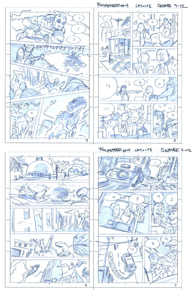
As befits a first-rate cover artist, Samnee thoroughly thinks and feels his pictures through, thumb-nailing his layouts and planning his moves. Here are some of his preliminaries from The Rocketeer: Cargo of Doom (2011), for which he shared (with David Aja) the 2013 Will Eisner Award for Best Penciller/Inker.
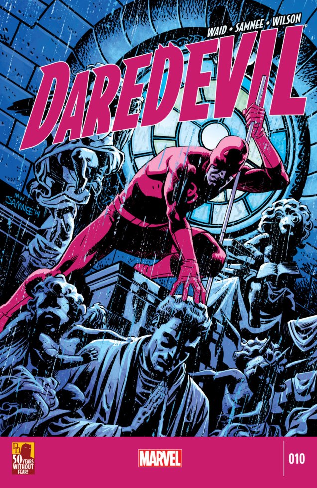
Cargo of Doom marks the first time ever when the character of Betty isn’t sexualized to the hilt. That’s got to count for something.This is Daredevil no. 9 (Dec. 2014). Incidentally, after the intrusion of bar codes on covers in 1975, followed by an increasingly hard-sell culture, the kind of elegantly spare, striking design I personally gravitate to hasn’t had it easy. A surprising step in the right direction came in recent years with the demise of the Comics Code, the introduction of digital editions and the appearance of a handful of enlightened editors (take a bow, Axel Alonso!), first at DC/Vertigo, then (as usual) later at Marvel.This is Daredevil no. 10 (Jan. 2015). Another example of a digital edition: compare this to a 1970s Marvel cover!This is Daredevil no. 11 (Feb. 2015). The Stunt-Master, seen here, first appeared in Daredevil no. 58 (Nov. 1969). It was the era of Evel Knievel and his Daredevils.This is Daredevil no. 11 (Feb. 2015). Hey, even more room for the art!And this is Daredevil no. 13 (Apr. 2015).
And speaking of inks, he sharply stands out in that regard in today’s assembly-line industry. It’s different for every artist, but Samnee loves to ink. He claims: « My pencils are just awful. I can’t imagine anybody else inking me nowadays because most of the work is done in the ink. ». I can relate.
While I greatly enjoyed Thor: The Mighty Avenger, the covers were solid but not outstanding. But Mr. Samnee’s still improving (!), and so a couple of years down the pike, and with the crucial input of colourist Matthew Wilson, a man without fear of colour saturation, we have a hot streak! And yeah, surrounding issues 8 and 14 kind of fell flat, so it’s a fairly short one. But there are quite a few quite outstanding covers outside of this subjective selection, so keep an eye out, and prepare to have it dazzled.
« You know, the dog food that Billy Jack loves! » — The Firesign Theatre
Ah, September the 18th. Today’s the birthday of the staggeringly accomplished William Stout (born in 1949), master of ancient reptiles, bootleg record covers, friend of The Firesign Theatre, former Russ Manning assistant (none but the best would do!), and I’ll spare you the illustrious details of his career in cinema. Still, let’s look around a bit, shall we?
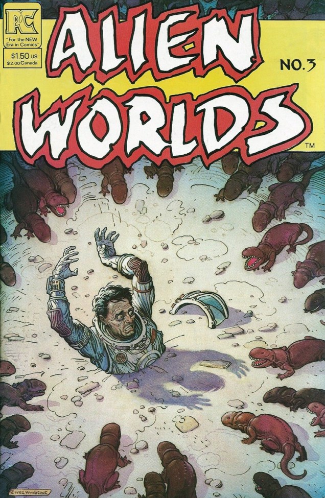
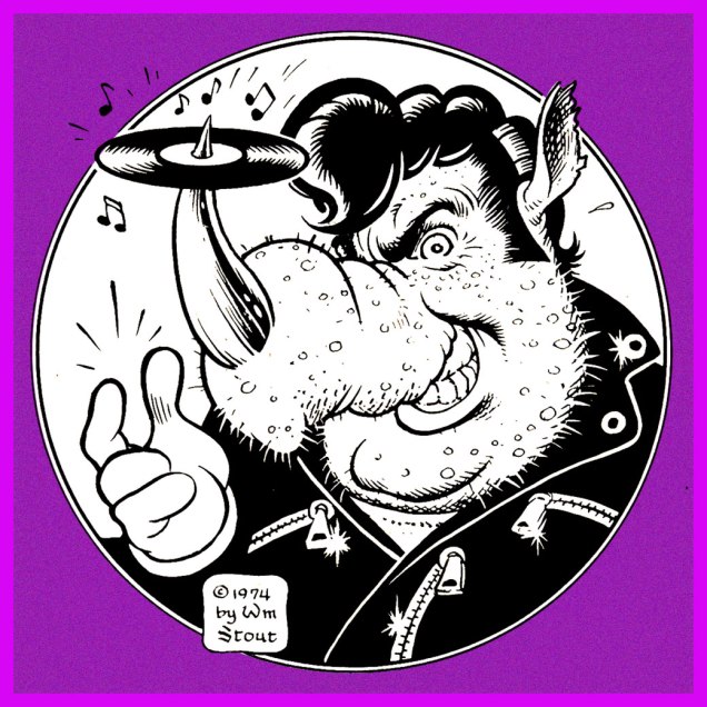
Here’s an unforgettable cover from Alien Worlds no. 3 (July, 1983, Pacific Comics). This scene gave me nightmares, and still raises a shudder. These critters look like a hybrid of a platypus and a piranha. Happy landings!Stout’s wonderful original logo for Rhino Records, circa 1974.
Speaking of ’74, isn’t that rhino a dead ringer for Swan’s oleaginous right-hand man, Philbin, from Phantom of the Paradise?
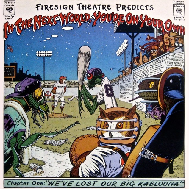
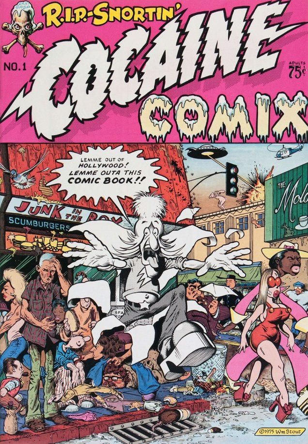
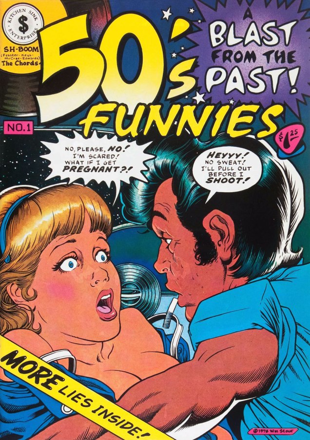
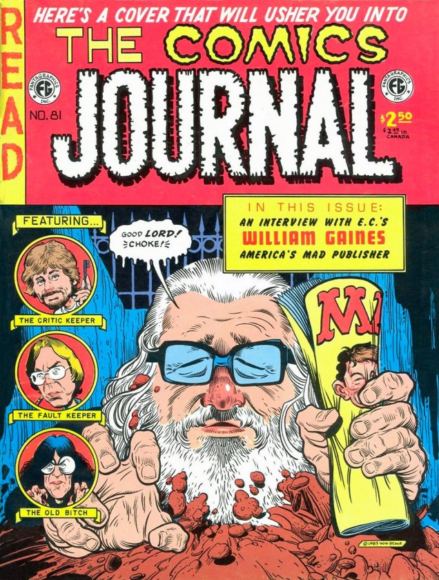
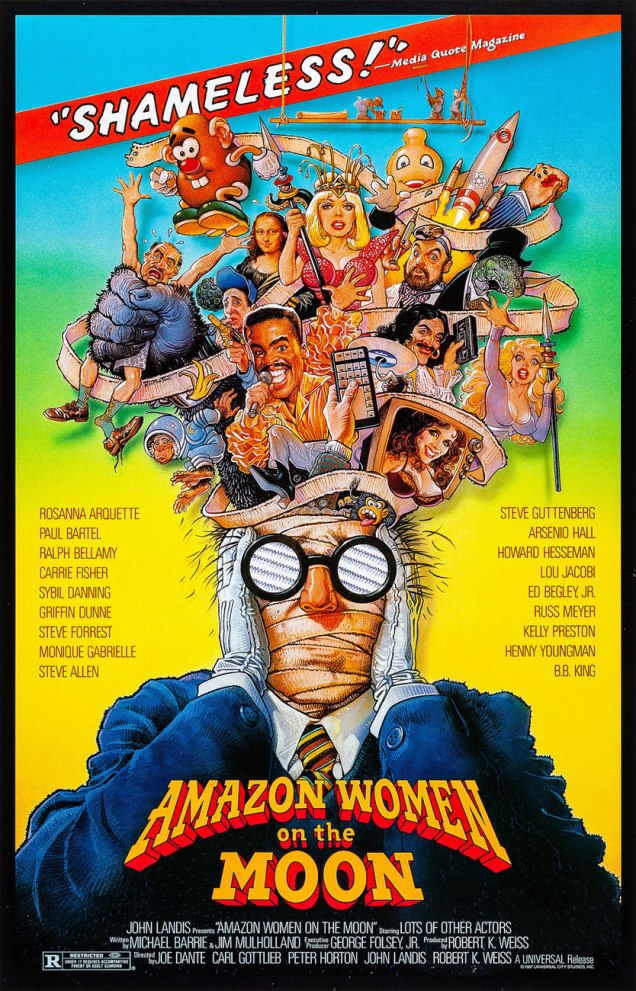
This is the back cover (the recto is equally sumptuous) for The Firesign Theatre‘s 1975 opus, In the Next World, You’re On Your Own, featuring a pair of classic sidelong suites, Police StreetandWe’ve Lost Our Big Kabloona.A clutch of underground classics? Sure. Here’s Cocaine Comix no. 1 (Feb. 1976, Last Gasp).Another number one (with a bullet, of course): 50’s Funnies no. 1 (1980, Kitchen Sink). More lies inside!A favourite page from Stout’s masterpiece (or certainly his great labour of love, at the very least): The Dinosaurs: A Fantastic New View of a Lost Era (1981, edited by Byron Preiss). This piece (the first he drew for the book) is entitled Hot Weather. « After lifting his head for air, he drank more and then wallowed his whole length and breadth into the ooze, vocalizing for the first time that day, and loudly. »Say hello to friendly Ed Gein. Weird Trips no. 2 (1978, Kitchen Sink). Please note the sinisterly customized Kitchen Sink Enterprises logo, Wrightson–brand coffee, and EC Comics narrator The Old Witch impishly peeking from a lower-right shelf. And yes, can’t go disemboweling your fellow man and woman without a copy of Gray’s Anatomy. Preparation is everything!Well, there never was any doubt that Mr. Stout was an EC Comics überfan. The Comics Journal no. 81 (May, 1983, Fantagraphics).I did bring up his Hollywood work, so here’s a sample. I wasn’t going to go with his the far-too-familiar Rock ‘n’ Roll High School poster… you all know it already, so where’s the fun in that? Of course, Joe Dante’s Amazon Women on the Moon again (1987) raises the eternal question: « Who made Steve Guttenberg a Star? »
And that’s Bill Stout for you: stunningly versatile, but always himself. Could any artist strive for more?
« The stranger’s face was entirely obscured by a broad-brimmed felt hat bent downward over his features; and the long, black coat looked almost like part of the thickening fog. » –Harry Vincent first encounters his future employer. (Shadow Magazine, April/June, 1931)
We note today the birth anniversary of Walter B. Gibson (September 12, 1897 – December 6, 1985), an extremely prolific writer and professional magician. Gibson is best known for developing the radio character of The Shadow, through nearly three hundred stories he wrote under the collective nom de plume of Maxwell Grant.
The Shadow’s had an interesting and varied career in comics, but Gibson’s novels (and the radio shows… Orson Welles!) are where it’s at. Still, let’s take a look around, shall we?
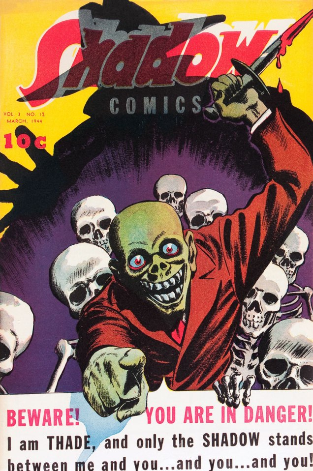
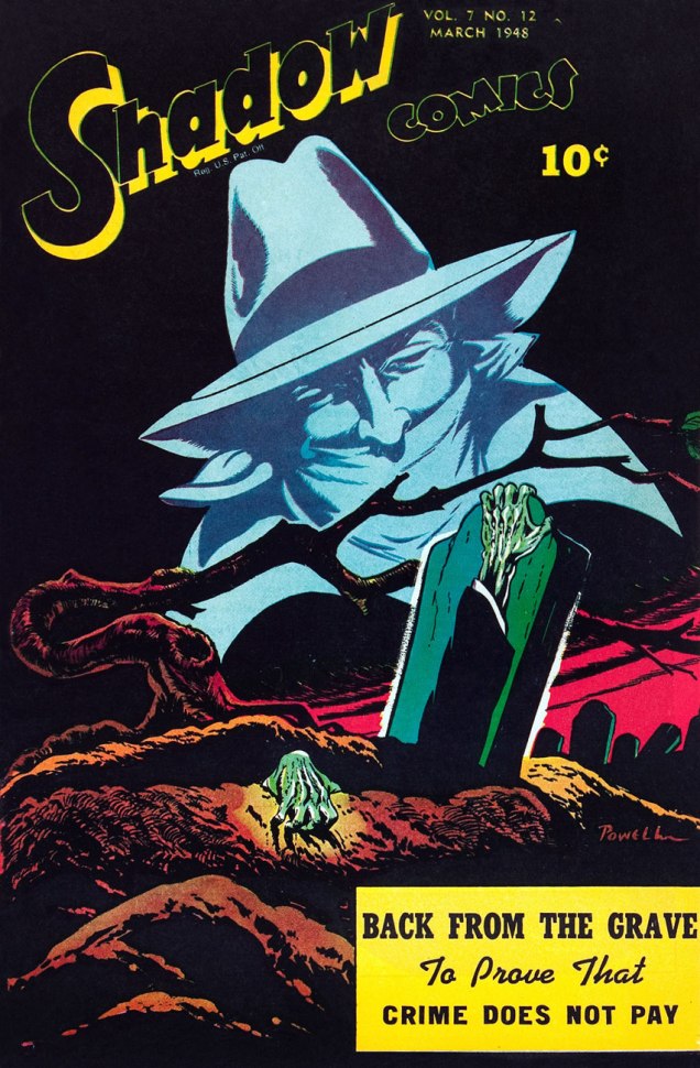
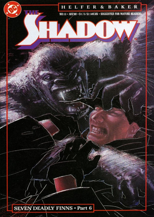
This is The Shadow Comics Vol. 3, no. 12 (March, 1944, Street and Smith); cover possibly by Vernon Greene. That Thade seems like a friendly sort, mayhap a tad overly so.This is The Shadow Comics Vol. 7, no. 12 (March, 1948, Street and Smith); cover by Bob Powell.Now why were Archie Comics allowed to take such ridiculous (though I’ll grant, perversely entertaining) liberties with The Shadow? Must have been a lull in the revival market, I suppose. This is The Shadow no. 1 (August, 1964, Archie), cover by Paul Reinman. You just wait until the subsequent issues…This, however, is not quite how Gibson envisioned and portrayed the mysterious Shadow. This off-model rendition hails from Archie Comics’ 8 issue, 1964-65 run, helmed by Superman co-creator Jerry Siegel and Golden Age journeyman Paul Reinman. This be The Shadow no.8 (September, 1965).A privileged peek at Frank Robbins‘ original cover art for The Shadow no.7 (Nov. 1974), second of his four (or so) covers for DC, featuring Night of the Beast!, scripted by Denny O’Neil. Yummy… but too short.Two great Street & Smith pulp heroes face off! Mr. Kaluta takes some artistic license here, however, since Ike (as The Avenger calls his throwing knife), is supposed to be small and almost needle-like, not a freakin’ butcher knife. Come to think of it, the Shadow’s trusty automatics look like something a Rob Liefeld character would wield. One doesn’t encounter often the final three issues of DC’s initial run of The Shadow. Post-Kaluta (save the covers) and post-Robbins, the art was handled by Filipino artist E.R. Cruz, who did a commendable job, while series regular Denny O’Neil (who wrote all issues except for number 9 and 11, Michael Uslan ably filling in) stayed until the curtain was drawn.Skipping the heinous Howard Chaykin revival, in which he delighted in sadistically dispatching The Shadow’s aged former operatives in gruesome ways (why do these people always call themselves fans of the original series?), we move on to the Andrew Helfer-Bill Sienkiewicz regular book. Better, but still not great. This is The Shadow no. 3 (Oct. 1987). Cover by Bill Sienkiewicz.Ah, now things perk up. A nasty but excellent tale, worthy of Michael Fleisher at his bugfuck best; the shade of Marshall Rogers and smart up-and-comer Kyle Baker were a good visual match. This is The Shadow no. 7 (Feb. 1988).This is Kyle Baker’s cover for the finale of his and scripter Andrew Helfer’s thrilling and hilarious Seven Deadly Finns saga (no. 13, March 1988) that made The Shadow such a must-read title. To quote Kate Bush, « What made it special made it dangerous », and the folks at Condé Nast, who hold the rights to the classic Street & Smith characters (also including Doc Savage and The Avenger) reportedly got twitchy* at the reckless liberties the Helfer-Baker team were taking and pulled the plug after issue 19, where a beheaded Shadow gets a big action robot body. The Shadow was rebooted the following year in more obedient hands, with quite pedestrian results.
As a bonus, let’s slightly depart from comics proper and admire a couple of paperback reissues from the brush of noted fabulist James Steranko.
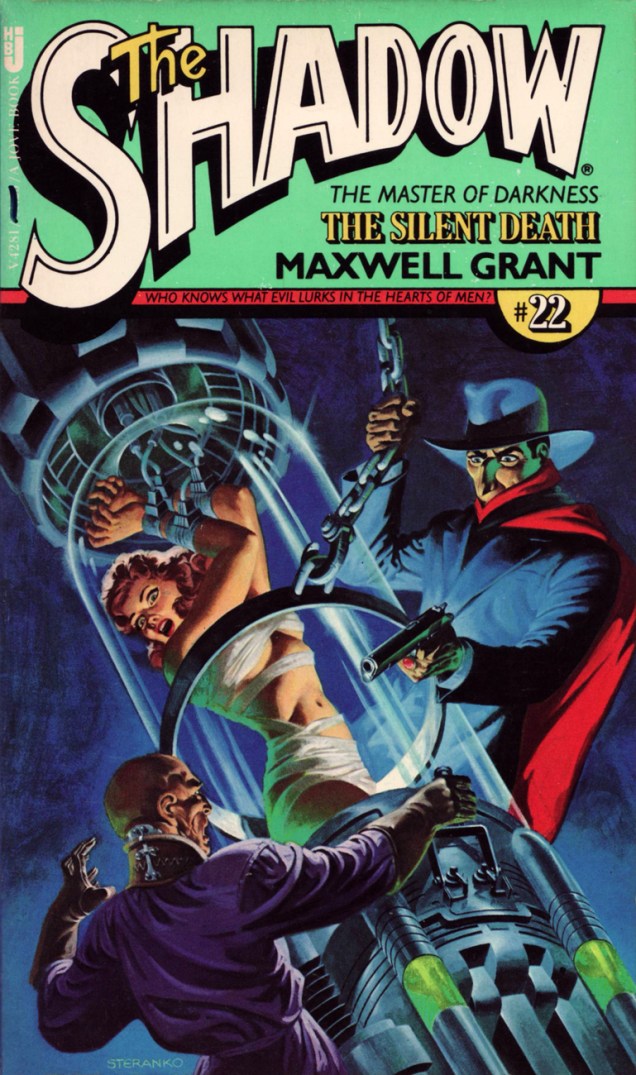
Steranko comes up with one of his subtlest, most unctuously moody covers for Pyramid’s 1974-78 series of Shadow paperbacks that introduced these classic pulp adventures to a new audience, picking up where its predecessors Belmont (1966-67) and Bantam (1869-70) had left off. Pyramid had one extra trick in its bag, though: Jim Steranko, who painted tantalizing covers for each of Pyramid/Jove’s twenty-three volumes. This particular case file, MOX, « from The Shadow’s annals as told to Maxwell Grant » originally appeared in The Shadow Magazine vol. 7, no. 6 (November, 1933).Natty dresser Jim Steranko has built up, over the years, quite a biography for himself. Of his numberless and prodigious accomplishments, my favourites are those that actually happened, such as a stunning series of cover paintings for Pyramid Books’ reprints of vintage Shadow pulps from the 30s and 40s. This one, twenty-second in a set of twenty-three, was published in March of 1978. The Silent Death initially saw print in The Shadow Magazine, Vol. 5, no. 3 (April 1, 1933.)
« J’fais dans la bande dessinée, qu’est bien plus pop que le ciné!* » — J.C. Forest (Une chanson, 1973)
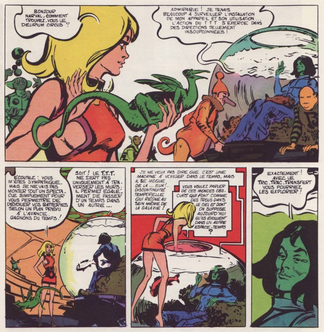
On the eighty-ninth anniversary of his birth, let’s salute in passing one of the great pioneers of French comics, namely Jean-Claude Forest (Sept. 11, 1930 – Dec. 29, 1998), Barbarella’s creator, the man who, in the early 1960s, ushered strictly-for-kids bandes dessinées into decidedly more risqué and adult realms of eroticism, fantasy and fun.
Born on September 11, 1930 in the Parisian suburb of Le Perreux-sur-Marne, he passed away in 1998 at the age of 68, but not before leaving behind a body of work of breathtaking depth and variety. Barbarella aside (sorry, miss): Le Copyright (the springboard for Nikita Mandryka‘s Le Concombre masqué), Hypocrite, Mystérieuse matin midi et soir (his wild riff on Jules Verne’s L’île mystérieuse), Bébé Cyanure, Les Naufragés du temps (illustrated by Paul Gillon), Enfants c’est l’Hydragon qui passe… « et j’en passe », as they say.
Here are a few highlights to give you a sense of the man’s imagination, versatility and tremendous draftsmanship, in chronological order.
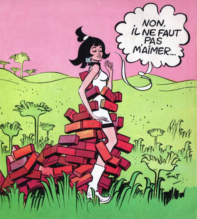
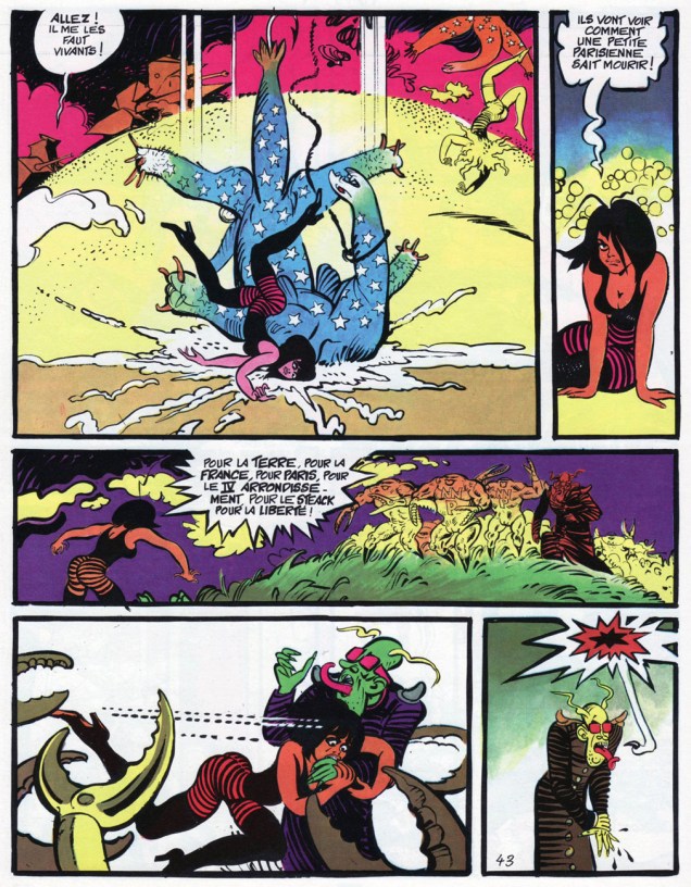
An excerpt is from Les colères du mange-minutes (1965-66), the second volume of Barbarella’s adventures. Yes, there was a film adaptation, but it’s, well, pretty vapid. Director Roger Vadim was kind of the Gallic John Derek; both were fair-to-middling directors whose chief talent was womanizing. Though one has to admit it *was* quite a talent.« No, you mustn’t love me… » Detail from the cover of giff wiff, revue de la bande dessinée no.22 (Dec. 1966), previewing its article on Forest’s 1965 experimental tv cartoon Marie Mathématique, which you can watch here. It features the dulcet tones of Le beau Serge, certainly one of the most overrated artistes of the 20th century. Too much competition to call the race to the bottom, though. 😉Born out of a misunderstanding between the editorial team of Pif Gadget and Forest, Mystérieuse matin midi et soir proved too labyrinthine for the magazine’s young readership, cost the publishers a bundle, and only two of its three parts appeared in Pif. Fear not, it was collected in album form the following year. This is a page from part 1, which saw print in Pif Gadget no. 111 (April, 1971).
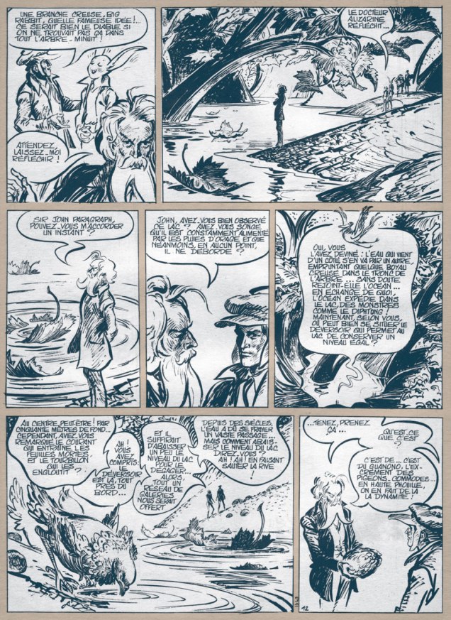
A sequence from the rollicking N’importe quoi de cheval…, featuring Hypocrite, another of Forest’s spunky heroïnes. From Pilote Mensuel no. 6 (Dargaud, Nov. 1974).
A pair of pages from the melancholy, elegiac Enfants, c’est l’Hydragon qui passe « Children, there goes the Hydragon » (Casterman, 1984).
I’m sure it’s mere coincidence, but the boy, Jules, seems to be modelled after yet another Gainsbourg “muse”, pop nymphette Vanessa Paradis.
« If you don’t want to be idolized by the masses, you don’t become an author, you become a plumber-welder! » — Entretien avec Mandryka, Les cahiers de la bande dessinées no. 28 (1975), conducted by Numa Sadoul
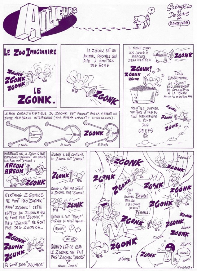
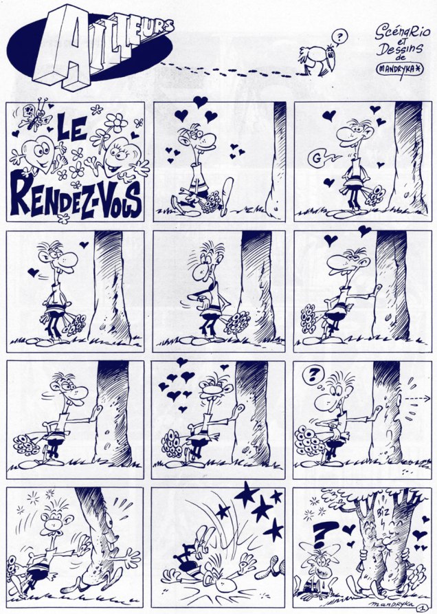
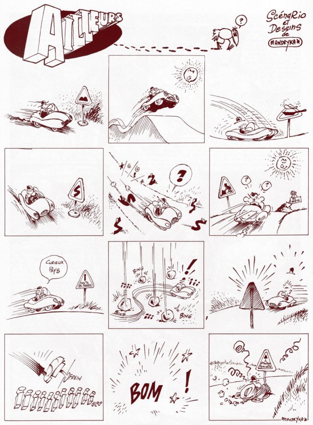
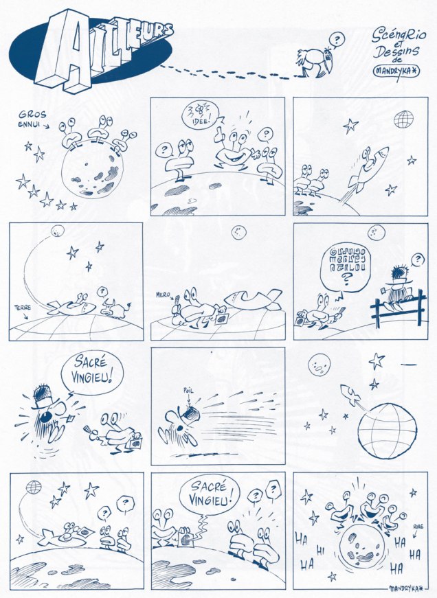
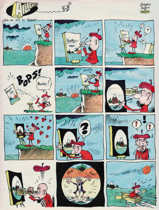
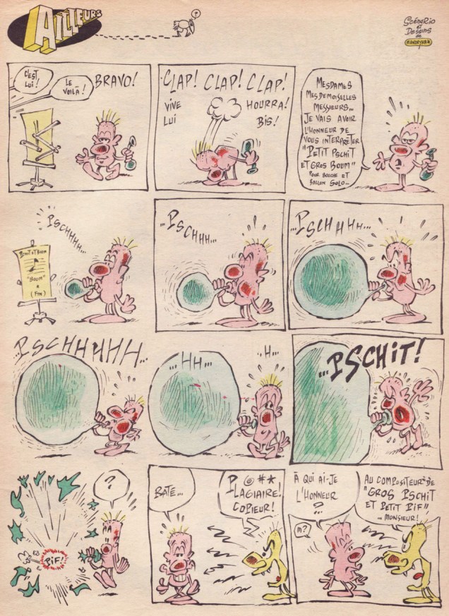
Nikita Mandryka was born October 1940 in Bizerte, Tunisia, to Russian émigré parents. His grandfather had fled the Russian Revolution in 1921 aboard a warship he was commanding. Nikita’s first professional strip appeared late in 1964 in Vaillant (Boff, in Vaillant no. 1024, Dec. 27, 1964), soon renamed Vaillant, le journal de Pif , then Pif Gadget in 1969. While he’s best known for his loquacious, dominoed cucurbit, Le Concombre Masqué, today we’re going to harvest the riches of his somewhat less familiar, but equally absurdist creation, the free-form strip Ailleurs (“Elsewhere”). The feature debuted with the inaugural issue of Pif Gadget and made its bow with issue 35, a few months down the line.
Mandryka left Pif Gadget on good terms (and returned over the years), and with a solid reason: while Pif’s editorial team rightly adored his work, its left-field humour left the majority of Pif’s young readership quite baffled, and sometimes infuriated. Mandryka’s place in the magazine may have been secure, but he yearned for an audience that actually understood him. This he would find at Pilote, with its teenage readership, and all the more so with L’Écho des Savanes (which he cofounded, in 1972, with Claire Bretécher and Marcel Gotlib).
Pif’s was an unusual case: its most singular, daring, arguably most valuable strips were those least appreciated by the kids. And that slice of the readership, you’ll have guessed it, tends to express its opinions more freely and vehemently than their elders, who did love (but more quietly) the somewhat abstract, second degré (offbeat, ironic) features, such as Marcel Gotlib and Henri Dufranne‘s Gai-Luron*, the recently-departed Massimo Mattioli‘s M. Le Magicien or Henri Crespi‘s Nestor. Still, the savvy editorial team, who after all had made the magazine a massive hit, keenly grasped the import of editorial balance and trusted its collective taste and instinct over the “wisdom” of the accountants and marketers… who, at the height of the magazine’s popularity, pulled a mutiny and… sank the ship. So, in hindsight, Mandryka was right to leave.
Ailleurs‘ début, from the inaugural issue of Pif gadget / Vaillant no. 1239 (March 1st, 1969); If it goes “zgunk”, it’s not a zgonk, it’s a zgunk.
As an english equivalent to « Sacré vingieu! », I propose « Dagnabit! »Ends with a sarcastic « Glory to the ten millionth discoverer of our planet! »« An original solution to the parking problem. »From Pif gadget no. 23 / Vaillant no. 1261 (July 1969); now you know what the legendarily stoic members of The Queen’s Guard do whilst at leisure.From Pif gadget no. 33 / Vaillant no. 1271 (Oct. 1969); idea provided by Tabary (Jean or his brother/ghost Jacques? We may never know).The final Ailleurs strip, from Pif gadget no. 35 / Vaillant no. 1273 (Oct. 1969). This would have made a great skit for Jacques Tati‘s peerless Mr. Hulot.Nikita’s just heard a really good one during this photoshoot for a L’Écho des Savanes advert.
« He’s back from the dead / the telegram read / If you get on a flight / You could catch him tonight / You’ll find Commissar / He’s at the Munich Hilton Bar » — B.A. Robertson
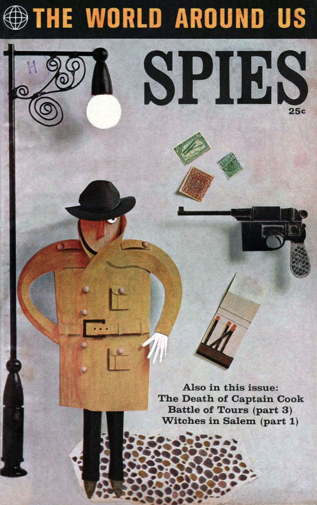
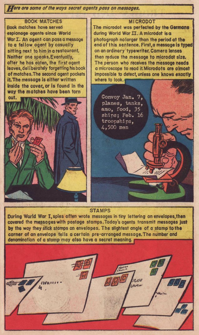
In 1958, Classics Illustrated publisher Gilberton tried something a bit different: a mostly non-fiction documentary title on various topics entitled The World Around Us, and featuring The Illustrated History of… Dogs, Space, Pirates, Great Explorers… depending on your area of interest, these could mean unrelenting tedium or sheer bliss. I haven’t encountered many issues, but the two I own, Ghosts and Spies, count among my prized paper possessions.
This is The World Around Us no. 35 (August, 1961), featuring this lovely mixed media piece by The Unknown Artist, whose cover remains defiantly unblown. On the inside, some fine company: George Evans, Norman Nodel, Edd Ashe, Jo Albistur… and Jack Kirby (inked by Dick Ayers)… the most beaten-down, anonymous, excitement-dialed-down-to-one Kirby you’re ever likely to see. Oh, he could do the job just fine, but the job, and the publisher, were not making anything of his regal strengths*. He would recall that this was « … the worst paying job of my entire life, including times I worked for free. »
Those early post-Code years were difficult ones for the diminished comics industry, and Kirby’s situation wasn’t exactly rosy: he’d been blacklisted at DC, thanks to the Jack Schiff / Sky Masters imbroglio, and his work at Harvey Comics had dried up. So what was a prolific artist to do, but pick up whatever bits of freelancing were available, here and there…
Quoting from Paul Gravett‘s review of Classics Illustrated: A Cultural History, we find this telling statement: « The most demanding editor was Roberta Strauss, a stickler for detail, who would count soldiers’ buttons or pleats in skirts and even called an editorial meeting in her hospital room only days after her son’s birth. » Give me Harvey Kurtzman‘s editorship** any old day!
**« Kurtzman’s editing approach to Two-Fisted Tales and Frontline Combat was a stark contrast to EC editor Al Feldstein‘s style. Whereas Feldstein allowed his artists to draw the story in any manner they desired, Kurtzman developed detailed layouts for each story and required his artists to follow them exactly. »
I’ve always been fond of this oddball little ad, which appeared in mid-70s comic books (in this case, a late 1974 DC 100-pager). It certainly demonstrates the considerable influence that pioneers such as Thimble Theatre creator Elzie Segar had on many an underground cartoonist.
If the advertised products had been iron-ons (à laRoach Studios*) instead of finished t-shirts, they’d be easier to find today. The Mickey Rat shirt is still being produced these days, though likely a grey market item… same as it ever was. On the other hand, I can find neither hide nor hair of the Hebrew Shazam shirt. Anyone? (2025 update: it’s available again here! A grateful tip of the hat to eagle-eyed reader Michael C. Rookard,)
A bountiful spread from The Natural Trading Company’s Mail-Order Catalog, which proposed T-Shirts – Posters – Art Prints – Buttons – Records – Comics… count me in!« Pinball Wizzard, you say? »
Here’s a bit of background on the Crazy World shirt, designed by (or swiped from) John Van Hamersveld, the genius behind the unforgettable The Endless Summermovie poster: « The face emblazoned across the chest of Mick Jagger in a 1972 New Musical Express feature on the Rolling Stones had a rich history according to its creator. The iconic image was the product of a mescaline and marijuana jag, after which Van Hamersveld was left with the enduring image of a man’s face with a big, toothy, wide smile. From a portrait of Jimi Hendrix he had made in 1968, Van Hamersveld came up with the Johnny Face logo the following year, which he used for promoting his own work. »
And there’s Mick, just like the man said.One of the current offerings. Oh, definitely a bootleg.
For me at least, it’s hard to look at Johnny Face without seeing in it echoes of The Face of Steeplechase, Coney Island’s widely-grinning mascot.
Trivia time: can you name the infamous individual behind the 1966 demolition of the beloved Steeplechase amusement park? Find the answer here.
As for the artist who crafted the Natural Trading Company ad, I was drawing a blank until a few years ago, when the wonderful Jay Lynch (1945-2017) kindly lifted the veil on that particular mystery: Jerry Kay was the stylish culprit. Much appreciated, Mr. Lynch!
– RG
*not to be confused with the originalRoach Studios, of course…
Death Race 2020 managed to be a pretty good series… for three issues (read ’em here!) The original creative combo was aces, three veterans from Brit SF institution 2000 AD, namely Pat Mills and Tony Skinner hatching the plots and Kevin O’Neill conveying them to visual glory. O’Neill scampered off after three issues (returning only to craft the series’ final cover), and things just weren’t the same without his sordid, madcap touch. It takes a special talent to depict compellingly *and* with a finely-tuned, subversive tone, this level of carnage and mayhem. Such talent, obviously, is ever in short, and possibly dwindling, supply.
But… we’re not here for the main feature. Buried in the back pages amidst the ads (mostly touting the alt-rock of the day) was a regular one-page hi-concept feature crafted by a succession of young (or young-ish) artistic iconoclasts. I suspect it was the fevered brainchild of former The Comics Journal managing editor Robert Boyd (1989-1990), also the editor of Death Race 2020. If this were Facebook, I’d show you my favourite example and move on to the next pretty shiny bauble. But through the pixie magic of blogging, I can afford to be utterly profligate and fling the whole delirious jumble your way. And so…
Story and art by Dave Cooper, from Death Race 2020 no. 1 (April, 1995).
Story and art by Pat Moriarty, from Death Race 2020 no. 2 (May, 1995).
Story and art by Bob Fingerman, from Death Race 2020 no. 3 (June, 1995).
Story and art by Jay Stephens, from Death Race 2020 no. 5 (August, 1995).
Story and art by Fábio Zimbres, from Death Race 2020 no. 6 (September, 1995). In these troubled days, I imagine many a Brazilian pines for the halcyon days of JK, faced with the reality of JB.
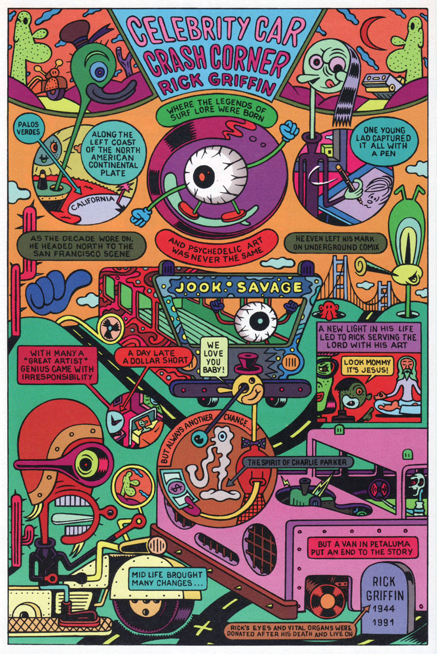
Story and art by Jaca Weiss and Robert Weiss, from Death Race 2020 no. 7 (October, 1995). For a look at some actual Rick Griffin art, look no further than here.
Story and art by Matthew Guest, from Death Race 2020 no. 8 (November, 1995).
To wit… a prime example of the aforementioned. By now, I’d like to think that most people have come to realize that the gendered driver question is a complex and fraught one. Here are some relevant statistics, if that’s your thing. You guessed it, things aren’t fair.
Drive safe, folks, and keep your eyes and mind on the road. The rest of us will appreciate it.
« Technology is constantly improving our lives. Look at the cellular telephone. Just ten years ago, virtually nobody was able to get into a car crash caused by trying to steer and dial at the same time; today, people do this all the time. » — Dave Barry


























 Who's Out There?