« … there arose such a clatter, I sprang from my bed to see what was the matter. Away to the window I flew like a flash, tore open the shutters and threw up the sash. » ― Clement C. Moore, A Visit From St. Nicholas (1823)
Not too long ago, we glanced at the interesting case of Tower’s teen line, another instance of works insufficiently popular to be properly reprinted, yet still sought after by collectors and aficionados and consequently on the pricey side. And so it is within this limbo that Tippy Teen and Go-Go and Animal find themselves consigned, in the rather fine company of Sugar and Spike and Angel and the Ape. Let’s not strand them there for the duration, please.
So why do I consider Tippy Teen superior to Archie? For one thing, while there’s some underwhelming artwork to be found here and there (sorry, Doug Crane), there’s nothing dismal (no Al Hartley, no Dick Malmgren, no Gus Lemoine, no Stan Goldberg…), and the writing is generally superior, thanks to, among uncredited others, the great Jack Mendelsohn (recycling and updating his old scripts, but that’s not the end of the world).
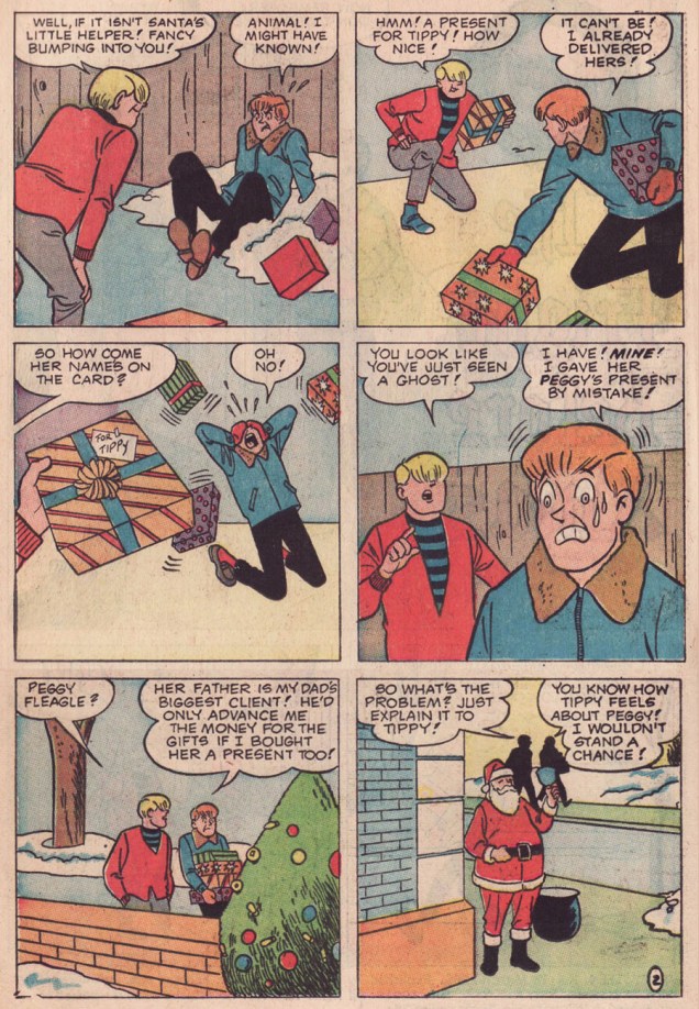
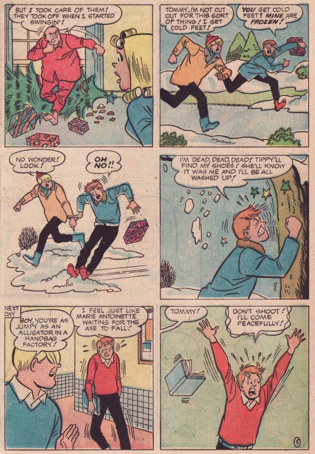
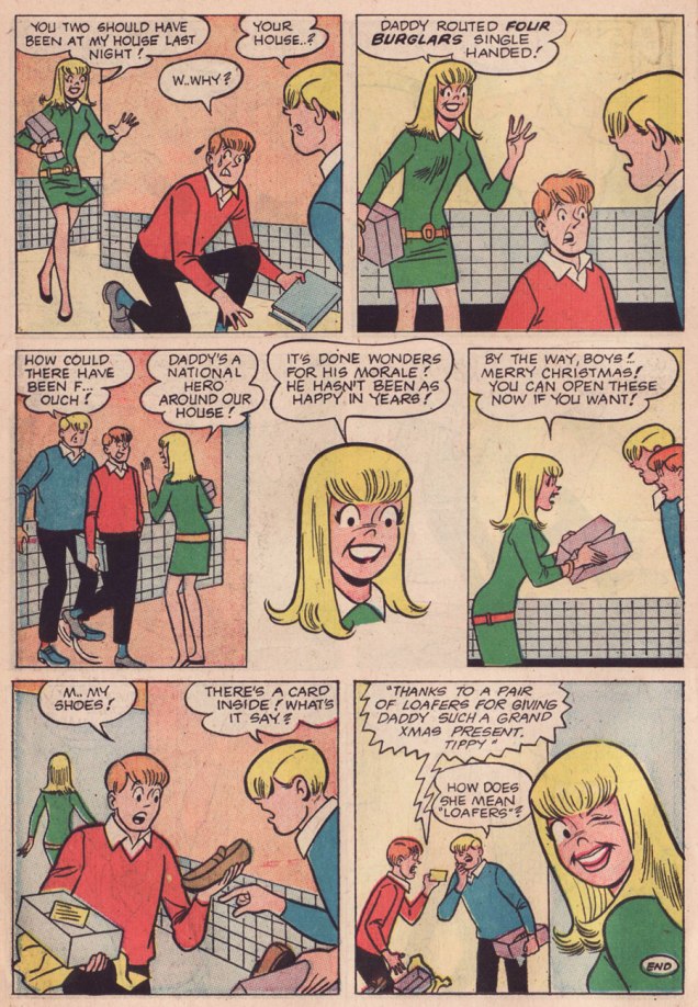
Here’s a little seasonal piece I find quite witty and charming. The well-paced work of an anonymous scripter and my beloved Samm Schwartz, it appeared in Tippy Teen no. 18. The whole issue’s quite solid, and since it’s in the public domain, you can enjoy it right here.
This is Tippy Teen no. 18 (March 1968, Tower). Cover artwork by Samm Schwartz.What kind of a grinch would I be if I failed to include the Monkees pin-up promised on the cover? I shudder to even entertain the notion. In the usual order, Messrs. Peter Tork, Mickey Dolenz, Davy Jones and Michael Nesmith.
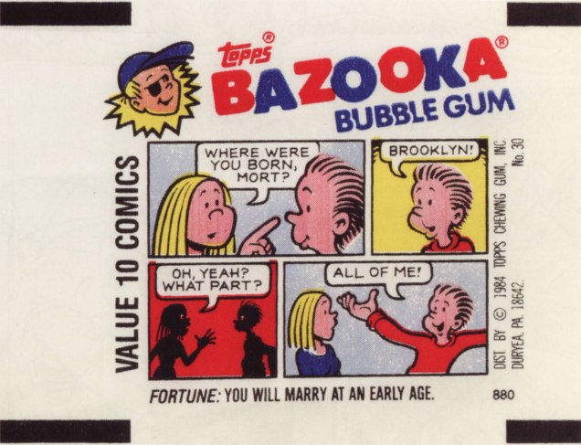
« So to this my life has come: there’s meaning in a piece of gum » — Parthenon Huxley, Bazooka Joe
We recently lost another fine cartoonist in Howard Cruse (May 2, 1944 – Nov. 26, 2019), and while he’s most frequently celebrated for his pioneering work in Queer comix and his graphic novel Stuck Rubber Baby, I’m much fonder of his comparatively ‘lightweight’ humorous work. In other words, I’ll take the wacky short stories over the Ponderous Magnum Opus, thank you.
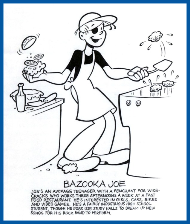
And things don’t get any lighter than Bazooka Joe, now do they?
In 1983, Howard Cruse was engaged by Topps to redesign Bazooka Joe and illustrate a new set of strips, the series’ first true update since co-creator* Wesley Morse‘s passing in 1963. Topps, figuring on more-or-less total turnover of its kiddie audience, had been rotating batches of strips every seven years, drawing on the vast hoard of unpublished strips left by Morse, and now and then hiring freelancers to pad out the lot.
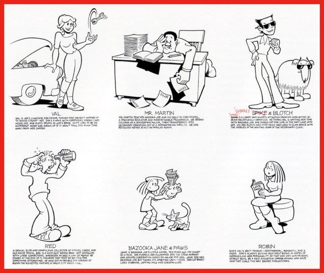
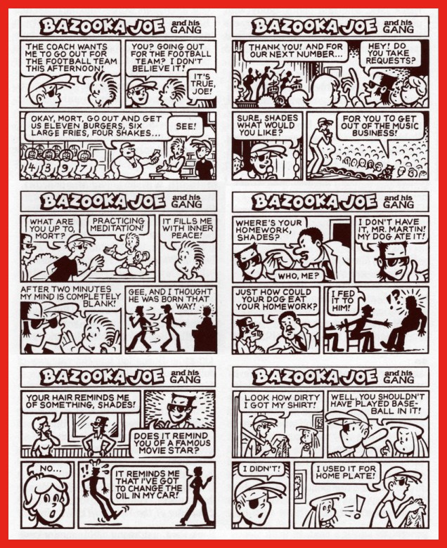
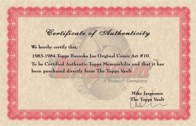
An unpublished Howard Cruse instructional comic, mid-1980s. Cruse recalled: « I always liked this strip because it’s practically the only time I was invited to draw the character at a size large enough to allow some stylistic personality. » I added the colouring, just because.Howard Cruse Bazooka Joe model sheet, prepared for 1983 revamp.Cruse’s model sheet for the rest of the 1983-vintage cast.Chameleonic cartoonist R. Sikoryak, who contributed gags to the second Cruise series, posits that « One of the pleasures of the traditional comic strip is the conciseness of words and pictures, and the Bazooka format takes this compression about as far as humanly possible. As with haiku, there is a great power in the constraints that must be respected in obeying a format. »Samples of the 1983-84 vintage.Jay Lynch explains: « Despite the brand managers and marketing companies responsible for the various revamps of Bazooka Joe over the years, and their valiant attempts to make the characters and the gags more ‘hip‘, I’ve always thought that the primary appeal of these tiny comics was their overall lameness. Back when I wrote Bazooka Joe, I’d usually start by going through turn-of-the-century joke books and rewriting the ancient quips to turn the 1908 ragtime aficionados into 1990’s heavy-metal enthusiasts… »Some thoughtful suggestions from Cruse for the 1988 crop.From my personal collection, original artwork supposedly from the 1983-84 batch… but something doesn’t add up. Incidentally, actual size is 3 x 3 5/8 inches.The accompanying certificate of authenticity raises more questions than it answers. To wit, as Mr. Cruse elucidates: « When I was asked… to reconceive Bazooka Joe as a teenager and provide him with a new ‘gang‘, the only holdover from the earlier tykes… was Mort, the weird sidekick who wore a turtleneck pulled up to his eyes. Len [Brown] and Art Spiegelman… thought the ultra-lengthy turtleneck was a bit – in fact, was literally – over the top, though. So for my first series of strips the sweater’s collar was brought down below Mort’s chin… Apparently this change disturbed some nameless traditionalists at Topps, so when I was hired to draw a second batch of strips in 1988, the turtleneck was restored to its original position… » In that case, if my original is from the ’83-’84 series, why is Mort’s turtleneck in its traditional, and proper place?Another certificate, this one appearing on the back of Bazooka Jerk (Garbage Pail Kids Giant Series Stickers no. 1, from 1986). Illustrated by Howard Cruse.
Then, in 1990, when the time came for another series, Topps opted to subcontract the work to a marketing company that dismissed Cruise’s work as « too goofy », according to Jay Lynch. Then Lynch, Pete Poplaski and Grass Green took up the gauntlet, which is a fascinating tale in itself… but one for another day.
If such lowly cartoon ephemera hold even the slightest sway over you, you’ll likely be very interested in Topps’ Bazooka Joe and His Gang (2013, Abrams ComicArts, edited by Charles Kochman), which proved an invaluable resource in cobbling together this post.
« Bazooka Joe has become the personification of the lowest form of humor. And this is why he’s one of the most widely known comics characters on the planet. Sure, the jokes were cornball. But that’s their appeal. » — Jay Lynch
-RG
*with Topps executive (and Golden Age comic book artist) Woody Gelman.
« Slap him up and down upon the floor Tickle his feet and hear him giggle Then unzip him down the middle Give that gibbon what he’s hollerin’ for! » — Stuff That Gibbon (words and music by Bill Oddie)
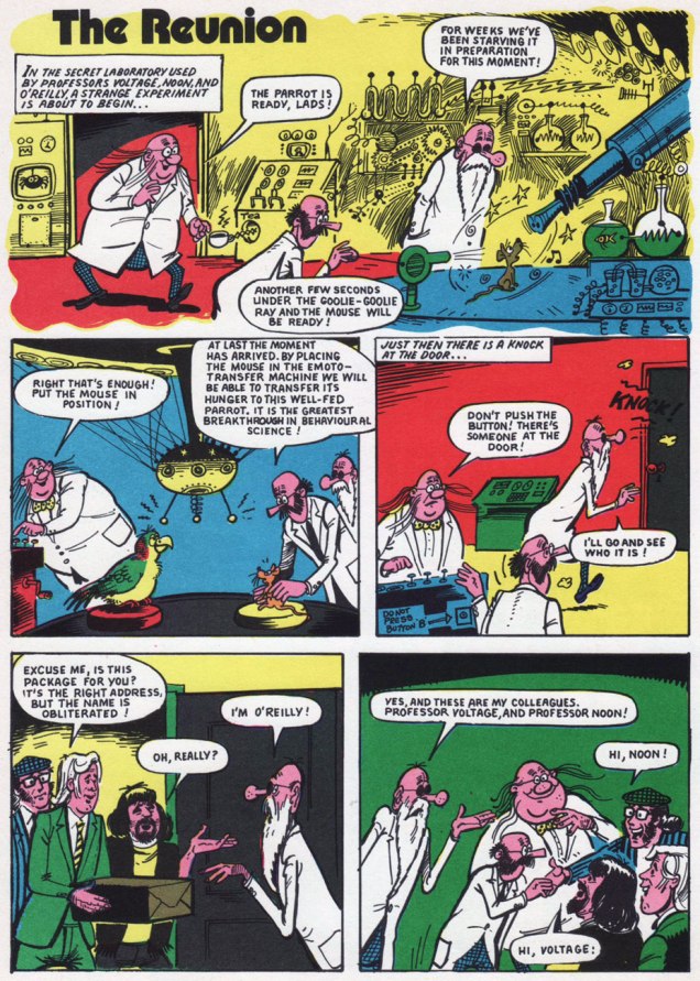
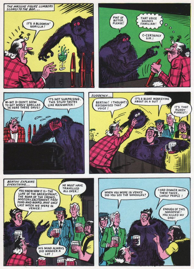
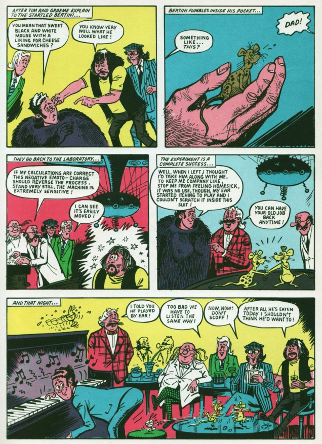
Back in the late 1970s, before I had even heard of Monty Python’s Flying Circus, nor even of Benny Hill, for that matter… I discovered The Goodies, thanks to the CBC’s belated programming of their exploits*. While The Goodies do share a *lot* of DNA with the Monty Python gang (they were school chums, close friends, collaborators and friendly competitors practically all along the way), this trio’s comedic format veers sharply away from the Pythons’ methods: Graeme, Bill and Tim play ‘amplified’ versions of themselves, and use the skit format sparingly, reserving it for mid-show intermission ‘blackouts‘.
While the trio was formed in 1970, it only made its comic strip début (and bow) in 1973**, where they held a weekly feature in the pages of Cor!!, also making an appearance in the magazine’s 1974 annual and The Goodies Annual, the whole lot hitting kiosks in ’73.
« Apparently licensed for just the one year, The Goodies were unique in the fact they were the only adapted characters featured with the comic’s pages with copyright credit being given to Bill Oddie, Tim Brooke Taylor (sans hyphen) and Graeme Garden. According to Robert Ross’ book The Complete Goodies, the strips were all authorised and approved by The Goodies prior to publication and Tim still displays an original Cor!! strip in his study. »
Scans (and detailed synopses!) of The Goodies’ Cor!! shenanigans are helpfully provided by their fan site, goodiesruleok.com.
And now, some introductions from the aforementioned The Goodies Annual 1974 (the only one of its kind, poor thing):
The Goodies’ brainbox, Graeme Garden, born in Aberdeen, Scotland, on Feb. 18, 1943. « He lists his hobbies as painting, drawing, playing the guitar and banjo, apologising for playing the guitar and banjo, trying not to travel in cars and, of course, being a Goodie. »The Goodies’ resident singer-songwriter and ornithologist, Bill Oddie, born in Rochdale, Lancashire, on July 7, 1941.« Tim Brooke-Taylor was born very suddenly in Buxton on July 17th, 1940, among those dark, satanic hills of Derbyshire. » I like the sound of that… very Luke Haines. He was The Goodies’ conservative type, and the one who greatly relishes essaying the cross-dressing roles. And he was, after all, the fair one without any of that pesky, telltale facial hair.
Among other, er, goodies, the annual contains a whopping 33 pages of comics. However, as it was fairly typical for UK comics of the period, no creator credits appear anywhere.« The comic strips form a large part of the official Goodies Annual, although “none of us had anything to do with the design or stories”, explains Graeme, “but we were very happy with the results.” »
Goodies, Goodies
Take a little good advice, try a trip to paradise It’s not hard to find, you’ve got it on your mind Can’t pretend it wouldn’t be nice It’s whatever turns you on, Goodies
A circus or a seaside pier, a sausage or a can of beer A stripper or a clown, prices going down You can make it happen here Fun for all the family, Goodies
Goodies are coming for you and you and you and you It’s anything you want it to be, a record or an OBE A four minute mile, a policeman with a smile I know you won’t believe what you see.
(The first Goodies Theme; words and music by Bill Oddie.)
-RG
*« In Canada, the series was shown in on the CBC national broadcast network during the late 1970s and early 1980s, in the traditional “after school” time slot, later a Friday night 10 pm slot, and occasionally in a midnight slot. Several episodes were also shown on the CTV Television Network. In the mid-1970s it was shown on TVOntario on Saturday evenings, repeated on Thursday evenings, until being replaced by Doctor Who in 1976. » [ source ]
**I hear they’ve turned up in The Beano, circa 1994.
« I have the best roommates in the world! It creates a fun sense of family… and that’s really important to me. Things can get so lonely without it. » — Kristen Bell
I think it first struck me how afraid of bright colour* we’d become, as a society, from years of ads for Bose’s odiously-designed Wave® sound systems, as consistently expensive are they are hideous (so they must sound fantastic!), circa the early 2000s.
Available in all your favourite colours, neither of which is technically a colour: Platinum White or Graphite Gray.Be still my fluttering heart: in 2009, Bose figured “what the heck, let the paint chips fall where they may!” and introduced a new “colour”: yes baby, Titanium Silver!
Today, I’m going to (gasp!) restore some colour to your lives. This may lead to a sudden jolt, so avert your eyes if necessary.
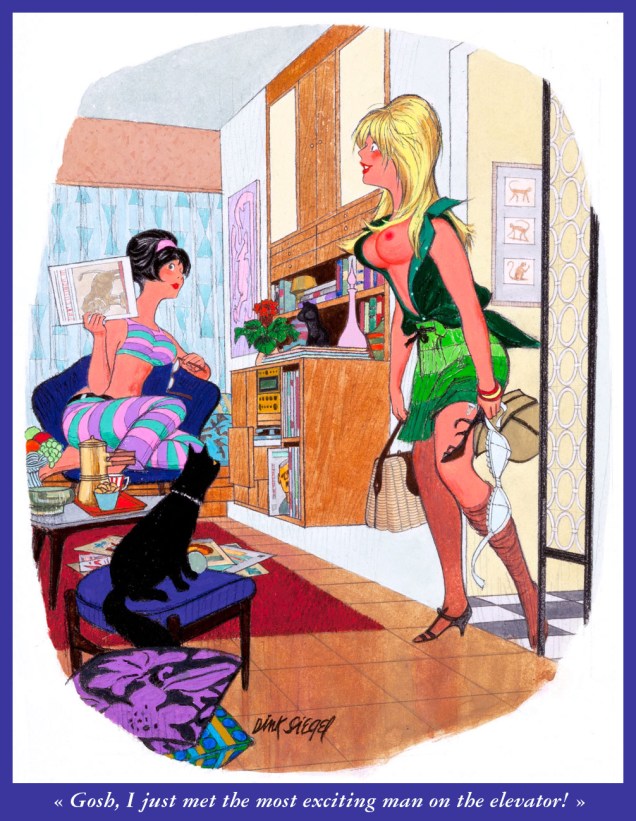
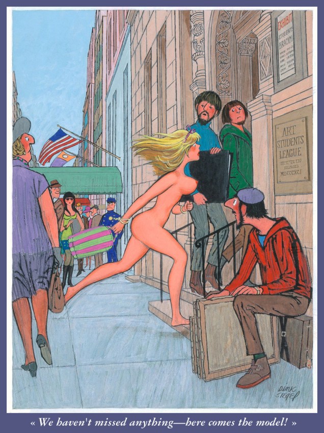
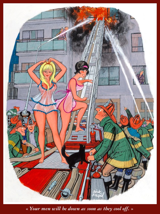
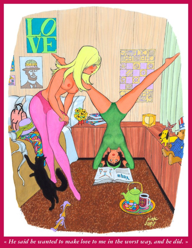
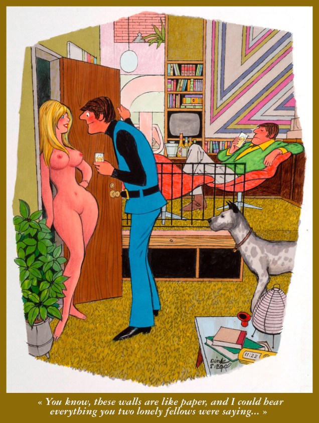
Strictly speaking, I don’t have a favourite Playboy cartoonist — honestly, how could I, with that sumptuous, half-century-plus embarrassment of multifarious riches? Ah, but I certainly hold Leo ‘Dink’ Siegel (June 30, 1910 — Dec. 28, 2003) in quite lofty regard, thanks to his fantastic sense of design, his bold, delicious colour palette and his fastidious attention to detail (pay and treat your cartoonists well, and see what you get!). Today, I’ll concentrate on Siegel’s ‘roommates’ series; there’s generally a black pussycat hanging about, a fine furry bonus.
Here we go!
From Playboy Magazine (Mar. 1966). From what I can discern, Siegel mostly worked in gouache and coloured pencils.From Playboy Magazine (Nov. 1966).From Playboy Magazine (Dec. 1966). One can’t help but wonder whether Mr. Siegel had a sideline in interior design.From Playboy Magazine (Aug. 1967). I see art students were always fairly blasés.From Playboy Magazine (Sept. 1967).From Playboy Magazine (Jun. 1968).From Playboy Magazine (date unknown).From Playboy Magazine (Mar. 1970).From Playboy Magazine (Apr. 1970). I love that the girls seem to have an existence beyond the confines of the jokes: they have jobs, various hobbies and interests and, obviously, active social lives.From Playboy Magazine (Aug. 1971).
« Silence at the proper season is wisdom, and better than any speech. » — Plutarch
When I think of cover layouts, I always recall the sage advice of my art school book design teacher, who posited that « a poster should be One Angry Fist », as you only have a second or two to make your point to the undecided consumer. That knuckle sandwich is what gets your message across, not a bunch of clichés and slogans; these only detract from the power of your image.
While we’re obviously dealing, in comics, with a commercial medium, it’s hard to not view it as creative interference, a lack of confidence**. While all publishers indulged in cover overhyping to some degree, Marvel and DC were the main offenders, and DC at least had superior title and logo designers***.
In the 60s, Jack Kirby created a massive amount of stunning cover art for Marvel… which editor Stan “Ne’er ’nuff Said” Lee buried, as often as not, under his trademark wiseass hyperbole. One might argue that this hardsell approach worked, commercially speaking. Artistically, on the other hand… well, the debate lingers on.
One could counter that cover hype only increased in the subsequent decades (imitated, amplified and distorted), and that stands to reason. That trend is pretty universal, since everything is getting louder, literally and figuratively: commercials, recordings, everyday life. Indeed: louder, sweeter, saltier, faster, meatier and of course cheesier.
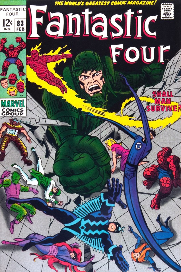
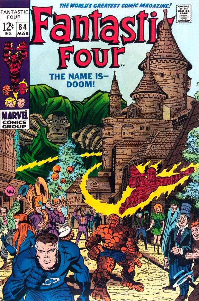
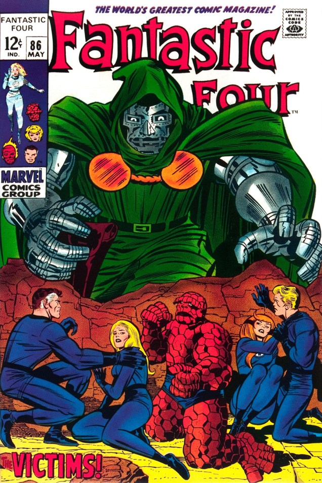
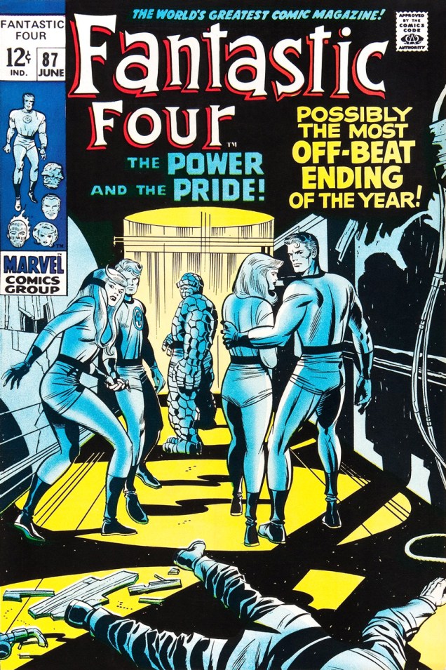
Ah, but for what seems like a mere blip in its history, which is to say around ’68-’69*, Marvel somewhat dialled down the verbiage and let some prime Kirby compositions enjoy a bit of breathing room (at least on Fantastic Four, the company’s second-best seller — and number 16 overall for 1968).
This particular streak is circumscribed by two ho-hum (by lofty Kirby standards) covers: flat FF 81 and messy FF 88 (featured here)… which leaves us with plenty of goodies in the middle. Let’s take the tour, shall we?
This is Fantastic Four no. 82 (Jan. 1969, Marvel). Inks by Joe Sinnott. Silence by Stan Lee. Now isn’t that better?Maximus tries to usurp Black Bolt’s throne, like clockwork. Just a discreet story title… though even then, it’s still intrusive. This is Fantastic Four no. 83 (Feb. 1969, Marvel)See picturesque Latveria. Enjoy the charms of its capital, Doomstadt, located just north of the Kline River. Don’t forget to drop in for some howdy-dos at the small but proud nation’s administrative centre, Castle Doom. This is Fantastic Four no. 84 (Mar. 1969, Marvel). Beyond-meticulous inks by Mr. Sinnott.This is Fantastic Four no. 85 (Apr. 1969, Marvel). Again, did we even need a title? Mechanical lettering, to boot, so it’s not even expressive.Short of a classic, but a nice entry nonetheless. And quiet! This is Fantastic Four no. 86 (May 1969, Marvel).This is always the first image that springs to (my) mind when people bone-headedly claim that Kirby’s work is too over-the-top, ham-fisted and frantic. Even the colours (Stan Goldberg, is that really you?) are admirably subdued. Of course, Stan had to panic and turn on the hype in the eleventh hour. The title would have sufficed. This is Fantastic Four no. 87 (June 1969, Marvel). Giacoia-esque inks by Mr. Sinnott.There. Isn’t that better? The might of Photoshop harnessed to noble ends.
In the face of all this, is it any wonder I found so refreshing the design quietude and purity of some recent comic books covers, such as the Chris Samnee creations we recently spotlighted? There’s hope, thanks to some enlightened folks out there.
**Steve Ditko, for one, grasped that if you couldn’t have your publisher’s confidence and trust in your craft and visual salesmanship, you could go elsewhere and enjoy a publisher’s laisser-faire.
***Marvel would even, in the 70s, hire on the sly, for freelance jobs, DC’s reigning lettering ace, Gaspar Saladino. Heaven knows The Avengers badly needed a logo makeover.
« What I don’t like about office Christmas parties is looking for a job the next day. » — Phyllis Diller
Between the poles of Abner Dean’s more normal magazine work and his often quite abstract, therapy-inspired books, lies his neglected Come As You Are, his most accessible single-theme work.
In few words but with devastating visual lucidity, Dean turns a probing spotlight on party dynamics, laying bare the casual cruelty, manipulations and seductions, feints and blindsides, alliances and betrayals, thrusts and parries. The results are often hilarious… but laden with uneasy recognition; despite the distance of nearly three-quarters of a century, little appears to have changed in the fundamentals… which really should come as no surprise to anyone.
Witness the following excerpts…
The front cover. The book is tellingly dedicated « To all those wonderful people who I hope will still ask me back. »
According to our resident mycologist, these are pretty much all toxic. The game is rigged!
From the back end of the book: « This is Abner Dean’s fourth adventure with the cross-eyed muse in that area of unexpected turning and hilarious insights that is particularly his own.
The first, in 1945, was It’s a Long Way to Heaven. People began seeing themselves and their friends as Dean saw them. They were startled and fascinated by the view. With What Am I Doing Here? in 1947 they winced and laughed again. Psychiatrists started using certain of his drawings for discussion with their patients. People began playing games of identification with individual pictures.
In 1949 came And on the Eight Day to make more Dean converts. And now here’s a fourth book about people to smoke out any unbelievers who may be lurking in corners at parties.
For those who like their incidental intelligence in an unbalanced phrase — Abner Dean was born in 1910, attended the National Academy in 1927, was graduated from Dartmouth in 1931, and hasn’t been away from a drawing board for more than a few days since then. He is happily married and lives in New York. »
This is our third look at Mr. Dean’s œuvre. If you’re left longing for more, read on:
« See? Brute force triumphs after all!!! » — Mr. Fly (Jan. 11, 1942)
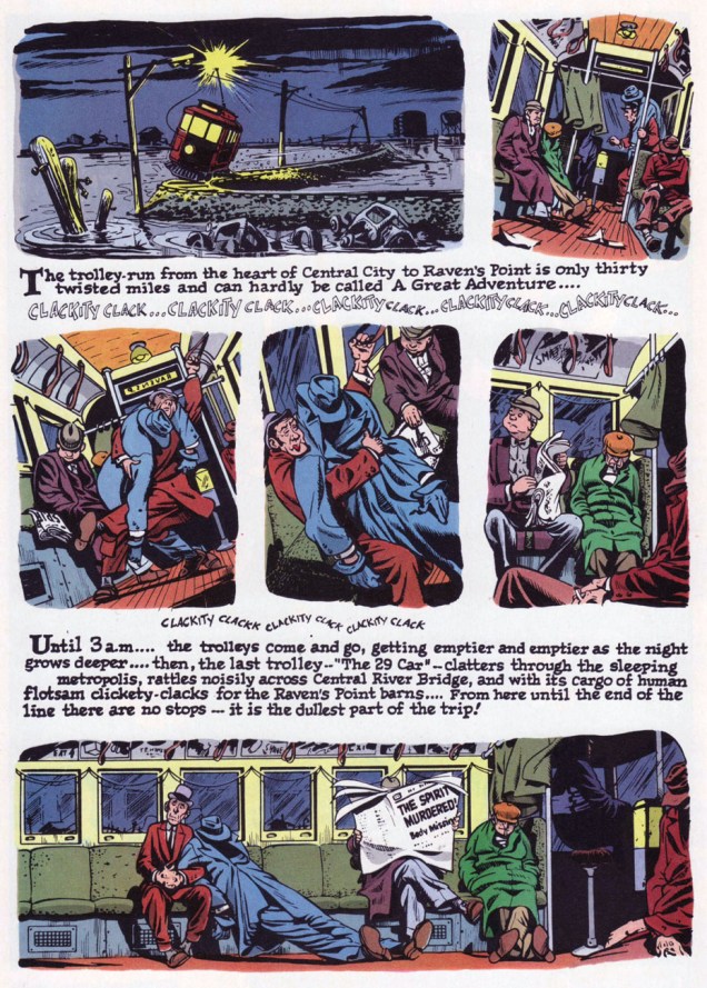
While Kitchen Sink’s ambitious chronological gathering of Eisner’s post-WWII The Spirit was intended to clean up and organize the series after decades of random, piecemeal reprinting, it was still a bit of a mess, at least early on. The methods of reproduction varied from issue to issue, and even within issues: three of four of issue one’s stories carry the original newspaper shadings, while one (« Hildie ») is newly-coloured and grey-toned. However, the folks at KSP can’t be faulted for this chaos: it all hinged upon which stories’ original line art remained in existence. Through it all, the publisher remained commendably hopeful but realistic and honest about the prevailing realities and conditions.
This is The Spirit no. 1 (Oct. 1983, Kitchen Sink). Colours by Pete Poplaski, grey toning by Ray Fehrenbach. Four tales are featured: The Christmas Spirit (Dec. 23, 1945), by Eisner and John Spranger; Dead End (Dec. 30, 1945), by Eisner, Spranger and Bob Palmer; Hildie (Jan. 6, 1946), by Eisner and Alex Kotzky; and Dolan’s Origin of the Spirit (Jan. 13, 1946), by Eisner, Spranger and Palmer.This is The Spirit no. 4 (March 1984, Kitchen Sink). Colours by Poplaski, grey toning by Fehrenbach. Four stories within, all by by Eisner, Spranger and Palmer: Nylon Rose (Mar. 17, 1946); The Last Trolley (Mar. 24, 1946); Yafodder’s Mustache (Mar. 31, 1946); and The Kissing Caper (Apr. 7, 1946).Here’s a fine example of the careful colour work executed by grey tinter Poplaski and colourists Fehrenbach (in this case) and Mike Newhall, taking evident pains to avoid overwhelming Eisner’s detailed line work. In terms of old-fashioned colouring, this was a notch (or seven) about what was being done in mainstream comics in the 1980s, a period of technological changes, of magnificent highs and painful lows. This is page two of noir classic The Last Trolley (Mar. 24, 1946), from The Spirit no. 4.
The colour question elicited ever-churning controversy and budgetary woes in the face of steadily diminishing sales. By issue 9, the custom colouring was abandoned to make way for the rather more economical, but muddy laser-scanning of original Spirit sections, and an extra story was added to issues 10 and 11; then inside colour was jettisoned for good, with gray toning retained. But issue size was reduced to 6 1/4” x 9 3/4″ (as opposed to the traditional comic book format, which is, as we all know, 6 5/8″ x 10 1/4″) for issues 12-16.
Denis Kitchen sums up the situation very aptly, circa issue 4, late in ’83:
« … the current color comic market demands a more sophisticated reprinting of these stories. There is nothing sacred about the original color. Though Eisner experimented boldly with color, he generally left coloring to assistants, and much of it was handled in a pedestrian manner.
We shoot these stories, where possible, from original art in Will Eisner’s archives. Where stats, negatives silverprints or other proofs are the only source, we use the best existing copies. Our colorists, where possible, use the original sections as color guides and are concerned with authenticity and precedent. Color changes, gray tones and other ‘augmentations’ are made with the approval of Will Eisner. »
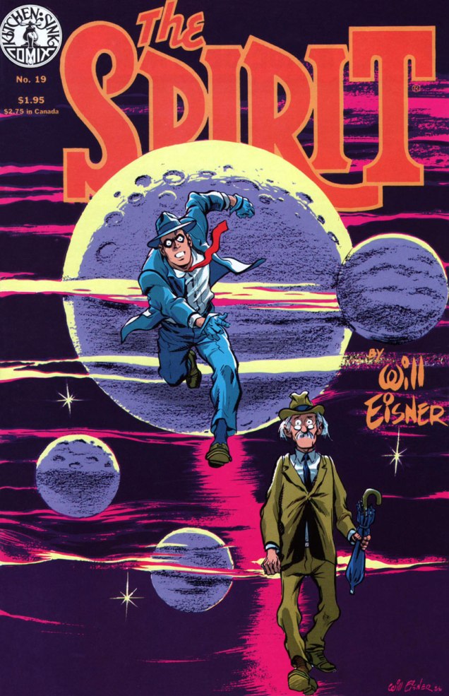
This is The Spirit no. 11 (Aug. 1985, Kitchen Sink). For this final colour issue, five stories, all by by Eisner, Spranger and Palmer: The Haunt (Oct. 27, 1946); Beagle’s Second Chance (Nov. 3, 1946); Caramba (Nov. 10, 1946); Return to Caramba (Nov. 17, 1946) and Coot Gallus (Nov. 24, 1946)This is The Spirit no. 17 (Mar. 1986, Kitchen Sink). Colours by Poplaski, grey toning by Fehrenbach. Four stories within, all by Eisner and Jerry Grandenetti: Be Bop (Apr. 20, 1947); Ev’ry Little Bug (Apr. 27, 1947); The Fix (May 4, 1947), and The Fortune (May 11, 1947).This is The Spirit no. 19 (May 1986, Kitchen Sink). Colours by Poplaski, grey toning by Fehrenbach. Four stories await within, each by Eisner, Grandenetti and letterer Abe Kanegson: Black Gold (June 15, 1947); Hangly Hollyer Mansion (June 22, 1947); Whiffenpoof!! (June 29, 1947), and Wanted (July 6, 1947).This is The Spirit no. 22 (Aug. 1986, Kitchen Sink). Colours by Poplaski, grey toning by Fehrenbach. Presenting a quartet of tales by Eisner, Grandenetti and Kanegson: A Killer at Large (Sept. 7, 1947); Into the Light (Sept. 14, 1947); End of the SS Raven (Sept. 21, 1947), and Orson Welles lampoon UFO (Sept. 28, 1947).
If you’ve just caught us mid-swing, nothing to worry about: earlier entries are at your beck and call as follows :
… or point and click on our general category, That’s THE SPIRIT!, and beckon everything at once… but in reverse chronological order; that’s the price you pay for convenience.
« I guess I look like a rock quarry that someone has dynamited. » — Charles Bronson
Welcome to our 400th post! I suppose a Steve Ditko birthday post would have been more momentous, but I did that already a couple of years ago, while he still drew breath.
Today, our man Charles Dennis Buchinsky, aka Charles Bronson (1921 – 2003… he would have turned 98 today — picture that!) squeezes in a rather routine bit part (merely credited as « The Pilot ») in Joe Molloy and Mike Zeck’s nonsensical hijacking melodrama Only a Toy. Heck, read it here if you don’t believe me.
Oddly enough, this expanded cameo came about just a year after Bronson’s megahit Death Wish, as Bronson reached the pinnacle of his earning power (in inverse proportion to the quality of his output, thanks to his long association with the shady Cannon Group). Presumably, he was just doing a favour for his old pal Zeck.
« Like an unpalatable salad » indeed; a word salad. Published in Charlton’s Scary Tales no. 2 (October, 1975). Edited by George Wildman.
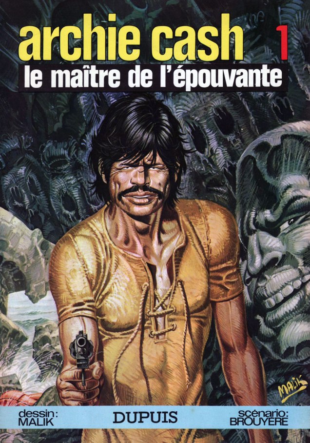
Ah, but this wasn’t the first time cartoonists had paid such tribute to Bronson: in 1971, writer Jean-Marie Brouyère and artist William Tai (aka Malik) created the South-America set Archie Cash series for Belgian bédé weekly Spirou. The series had a healthy run of 15 albums (what one would call a graphic novel over in North America) between 1973 and 1988.
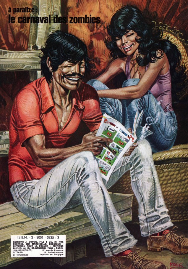
Front and back covers of Archie’s début, Le maître de l’épouvante (1973).And to give you a sense of the series’ narrative texture, page five from Le maître de l’épouvante; when it debuted in the fall of 1971, the series brought a welcome griminess and ethno-social realism to the squeaky-pristine pages of Spirou.
The Italians would then follow suit, “borrowing” Jean-Paul Belmondo‘s likeness for their Goldrake series around 1972, followed by Alain Delon‘s looks for Playcolt, and more exploitively, Ornella Muti‘s charms for Sukia. Mind you, all these liberties with celebrity likenesses don’t make Brian Hitch‘s laziness and lack of imagination any less reprehensible.
Anyway, back to our birthday boy: if you want to see Bronson at his finest, I recommend his early, pre-moustache TV showcase Man With a Camera (1958)… the 29-episode boxed set’ll cost you peanuts and it’s great value. Then, from his European period, you can’t go wrong with 1968’s Adieu l’ami (Farewell, Friend), co-starring the aforementioned Mr. Delon; 1970’s gloriously weird Le passager de la pluie (Rider on the Rain), 1971 winner of the Golden Globe for Best Foreign Film, and co-starring creepy Eva Green‘s mom (or should that be “mum”?), Marlène Jobert. And of course 1971’s Soleil rouge (Red Sun), co-starring, this time not only Delon, but none other than Toshirô Mifune!
« Our dried voices, when we whisper together are quiet and meaningless as wind in dry grass or rats’ feet over broken glass in our dry cellar. » — T.S. Eliot, The Hollow Men(1925)
It’s with a bittersweet little shiver that I wrap up this year’s WOT Hallowe’en countdown. In light of my fond feelings for the holiday, I didn’t want to go out with a massive fireworks display of a post, but opted instead for a quiet, succinct coda.
Nick Cardy‘s illustration impeccably epitomizes the spirit of Hallowe’en. No, it’s not about the candy collection ritual nor about the motley, garish masquerade… truly, it’s much as Ray Bradbury summed it up in his preface to his The October Country, « … that country where it is always turning late in the year. That country where the hills are fog and the rivers are mist; where noons go quickly, dusks and twilights linger, and midnights stay. That country composed in the main of cellars, sub-cellars, coal bins, closets, attics, and pantries faced away from the sun. That country whose people are autumn people, thinking only autumn thoughts. Whose people passing at night on the empty walks sound like rain… »
You can practically hear the echoes of sinister cackling drifting on the chill October breeze.
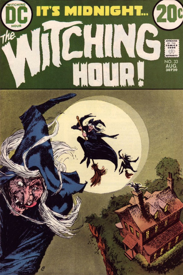
How’s this for perfectly-composed, uncluttered graphic majesty? A wisely understated palette, from top-to-bottom, holds it all together. One has to understand that this sort of soft-sell, muted grace could not make it to market without a tremendous amount of trust, cooperation and… no second-guessing. This is It’s Midnight… The Witching Hour! no. 33 (Aug. 1973, DC), edited by Murray Boltinoff. That lead witch looks quite… lusty. Where’s she off to, and why is the Comics Code Authority not stepping in?
This seldom-seen Nick Cardy cover graces quite an issue, by my reckoning: the blackly ironic Four Funerals, drawn by Ruben Yandoc and probably written by editor Boltinoff; George Kashdan‘s cynical Cold Ashes — Hot Rage, drawn by Alfredo Alcala (what, him again?); and Carl Wessler‘s convoluted A Choice Seat for… Doomsday!, illustrated by the mighty Jerry Grandenetti. Read it right here!
… and Happy Hallowe’en, one and all!
-RG
p.s. before I forget: how cool is it that the witches exit through the chimney?
« If it wasn’t for baseball, I’d be in either the penitentiary or the cemetery. » — Babe Ruth
Since the (so-called) World Series is still going on, this seems all the more appropriate.
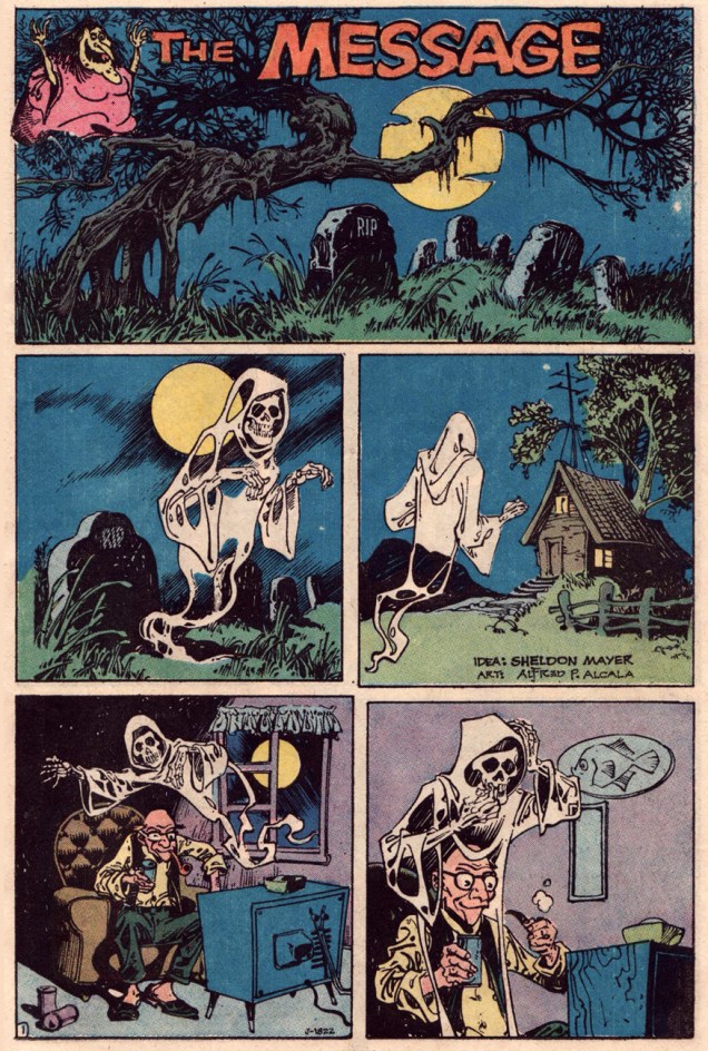
It was with this piece that I first began to grasp just how gifted and versatile Filipino giant Alfredo P. Alcala (1925-2000) was. He’s inarguably a grandmaster of eerie moods, but hardly bereft of a fun side. This brief piece, a dream collaboration between Sheldon Mayer and Alcala, was published in Plop! no. 1 (Sept.-Oct. 1973, DC). And what an issue that was, gathering such talents as Basil Wolverton, Sergio Aragonés, Mayer and Alcala, Frank Robbins, George Evans, John Albano, Stephen Skeates and Berni Wrightson… yikes! (read it here!)
As a bonus, here’s the *back* cover of Plop! no. 1, featuring Wolverton’s cover boy “Arms” Armstrong. Which provides me with the opportunity to inform you that this very week has seen the long-delayed publication of Greg Sadowsky’s Brain Bats of Venus: The Life and Comics of Basil Wolverton Vol. 2 (1942–1952), his definitive biography of that singular and fascinating man. Read all about it here!