« Wherever despotism abounds, the sources of public information are the first to be brought under its control. Where ever the cause of liberty is making its way, one of its highest accomplishments is the guarantee of the freedom of the press. » — Calvin Coolidge
Ah, the pitfalls of anchoring yourself to the news cycle: given the shocking news, last week, of the impending, unjustified closure of one of the greatest American journalistic institutions, the independent military daily newspaper The Stars and Stripes (founded in 1861!). I was all set to cobble together a series of posts showcasing the work of S&S’s greatest cartoonists, but then the massively unpopular decision was just as abruptly reversed. For now.
So I’ll stick to one post for the nonce (Shel and Tom will have to wait) and feature one of history’s greatest soldier cartoonists, William Henry “Bill” Mauldin (1921-2003), twice recipient of the Pulitzer Prize (1945, 1958), the Legion of Merit… and a host of other distinctions, both military and civilian.
Our baby-faced artist photographed during WWII.
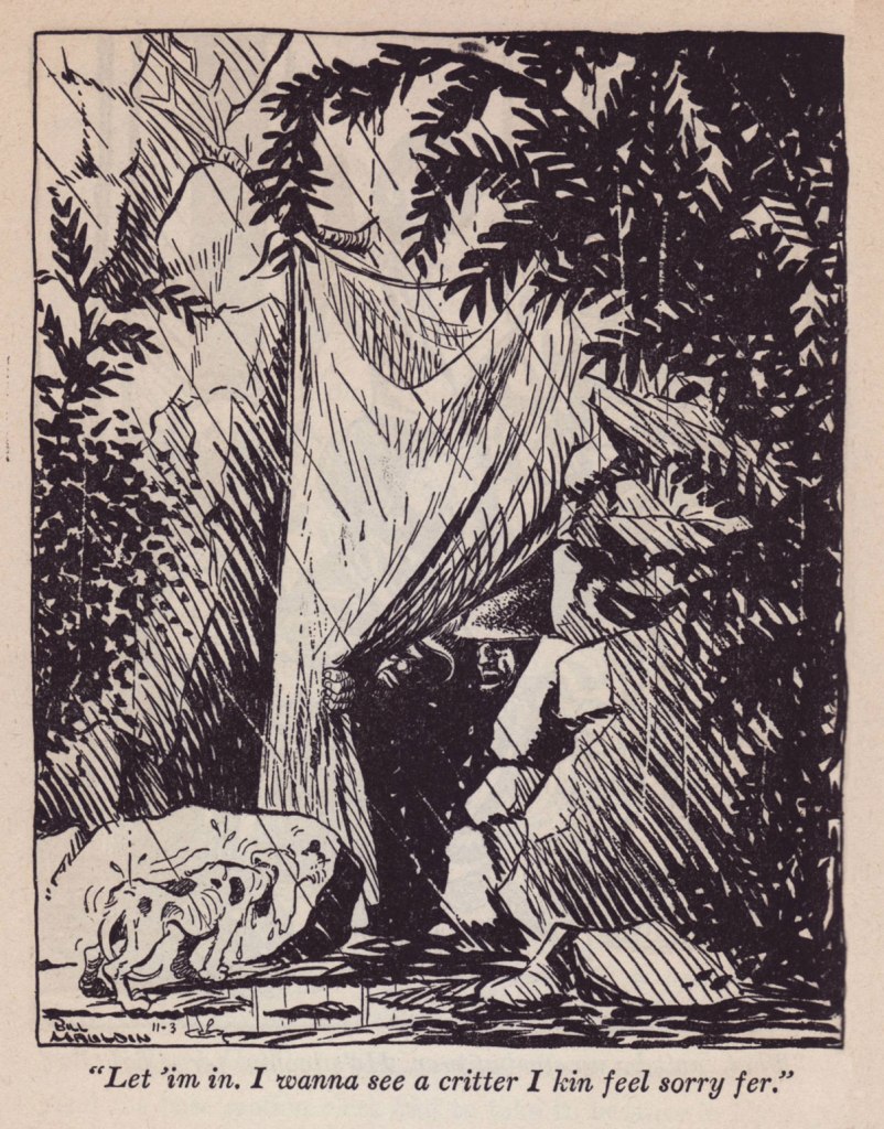
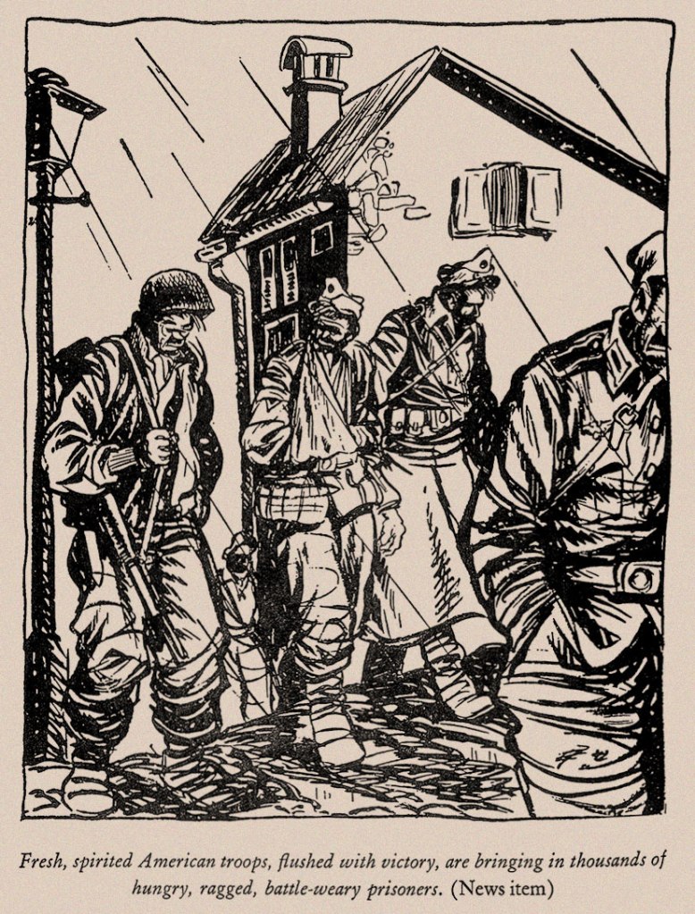
With but a single exception, the following are samples from his essential Up Front collection (1945), which Mauldin humbly opens with: « My business is drawing, not writing, an this text is pretty much background for the drawings. »
But such a background! Mauldin is, naturally, funny and insightful, but there’s much to learn therein, not merely about men in war, but just about everything under the sun. While so many nowadays mix up freedom and privilege, it’s good to be gently reminded of the high price of both.
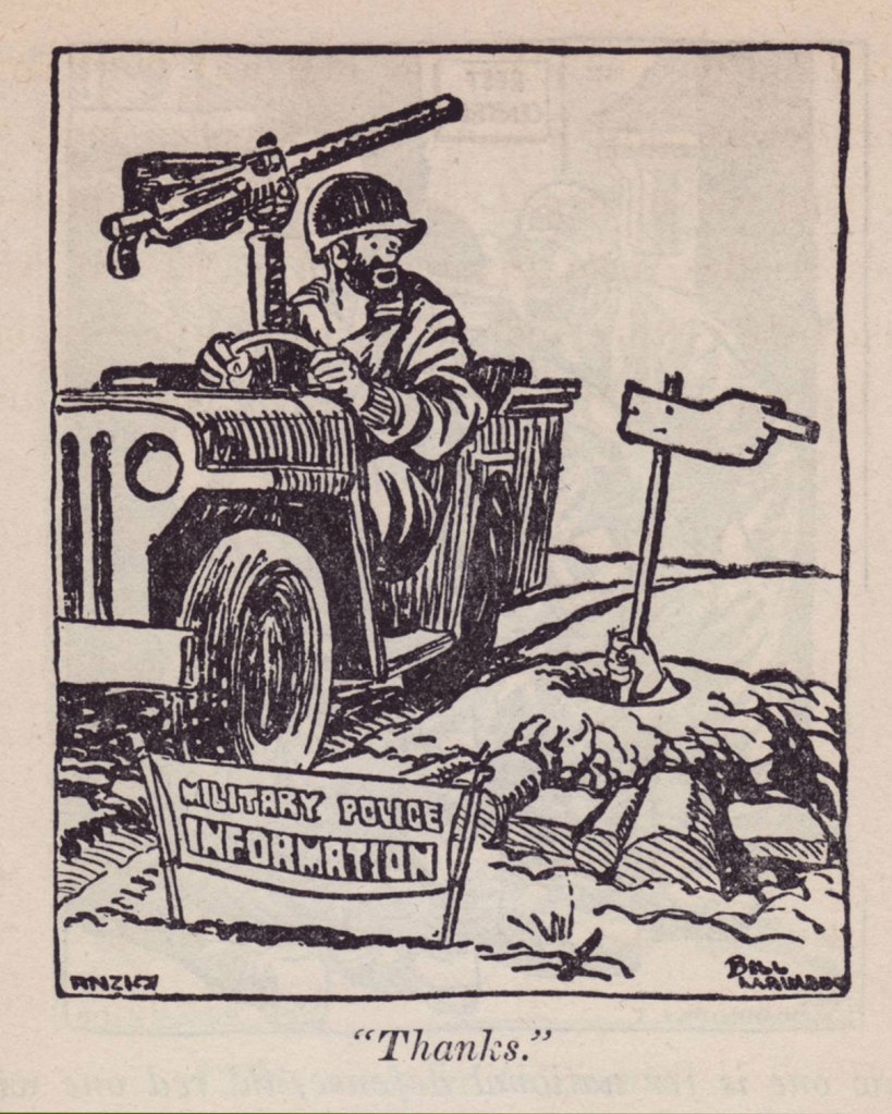
« Until some intelligent brass hat repaired a big brewery in Naples and started to send beer to Anzio, the boys at the beach-head were fixing up their own distilleries with barrels of dug-up vino, gasoline cans, and copper tubing from wrecked airplanes. The result was a fiery stuff which the Italians called grappa. The doggies called it ‘Kickapoo Joy Juice’, and took the name from the popular ‘Li’l Abner’ comic strip which Stars and Stripes printed daily. It wasn’t bad stuff when you cut it with canned grapefruit juice. »
Mauldin’s biographer, Todd DePastino, wrote, in his Bill Mauldin: A Life Up Front: « First published on October 13, 1944, this cartoon made the 23-year-old Bill Mauldin the youngest Pulitzer Prize winner in history. Both he and his editors at Stars and Stripes were astonished by the selection, which did not seem to them particularly noteworthy. »
For a deeper dive into Mauldin’s war through the eyes of his ragged infantrymen, scrounge yourself a copy of Fantagraphics’ glorious Willie & Joe: The WWII Years (2008).
In closing, shall we hear from another president?
« I have great respect for the news and great respect for freedom of the press and all of that. » — Donald J. Trump
« Flattery is like chewing gum. Enjoy it but don’t swallow it. » — Hank Ketcham
Going way back: When I was a wee lad (still in the single digits), my mother would accompany me to our area’s oldest and finest bookstore (Chicoutimi’s long-gone Librairie régionale). At the time, I had been purchasing bound collections of Belgian bédé publisher’s Spirou, the earlier the better. Even at that tender age, I held the conviction that things had already peaked.
A friendly employee ushered us into the restricted area of the bookstore’s top floor, a vast warehouse I never got a tour of… but it was immense! I was led to an aisle where, high above, dozens of older Spirou collections were kept, dating all the way back to 1962. I can afford to be specific, because I bought the oldest issue they had on hand (Album Spirou no. 84). At ten dollars a pop, they were reasonably-priced, but still costly for a child with a 1970s-scale allowance. For my parents, a reliable source of ideal birthday and Christmas gifts, however!
It was in their pages (no. 90, see below!) that, along with the established Spirou magazine series (Spirou et Fantasio, Boule et Bill, Buck Danny, Benoît Brisefer, Tif et Tondu, Gil Jourdan…), I encountered scads of unfamiliar entries. Of these, an early album caught mid-tale one that truly stuck with me through decades and therefore is the object of today’s post.
This is Album Spirou no. 90 (Sept. 1963, Dupuis), collecting the bédé weekly’s issues n° 1316 to 1328. Cover by André Franquin, depicting a scene from a Spirou adventure, the troubled production that was QRN sur Bretzelburg (under its original title, QRM sur Bretzelburg).
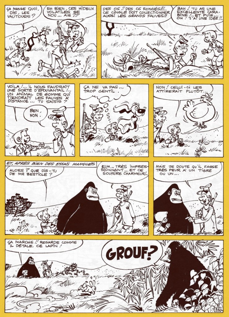
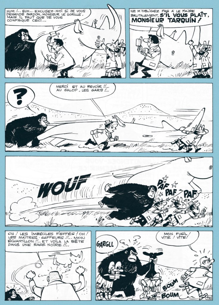
In short, though, here’s what’s relevant in this case: from 1949 to 1987 (with a pause between ’59 and ’63), Will illustrated the adventures of Tif et Tondu, characters owned by Éditions Dupuis, its publisher. Still, he longed to draw characters of his own, which wasn’t an idle whim, given that most of his colleagues and collaborators did just that, enjoying more latitude and far greater financial rewards. In 1962, he got the chance to try his hand at an original series, Éric et Artimon, conceived with versatile scripter-cartoonist Raymond Antoine, alias Vicq. And the result was outstandingly charming, light-hearted and hilarious.
The 1976 (and only, so far) edition of Toute la gomme. Still, I’m grateful for its existence: I was finally able to read the whole story, though without colour.
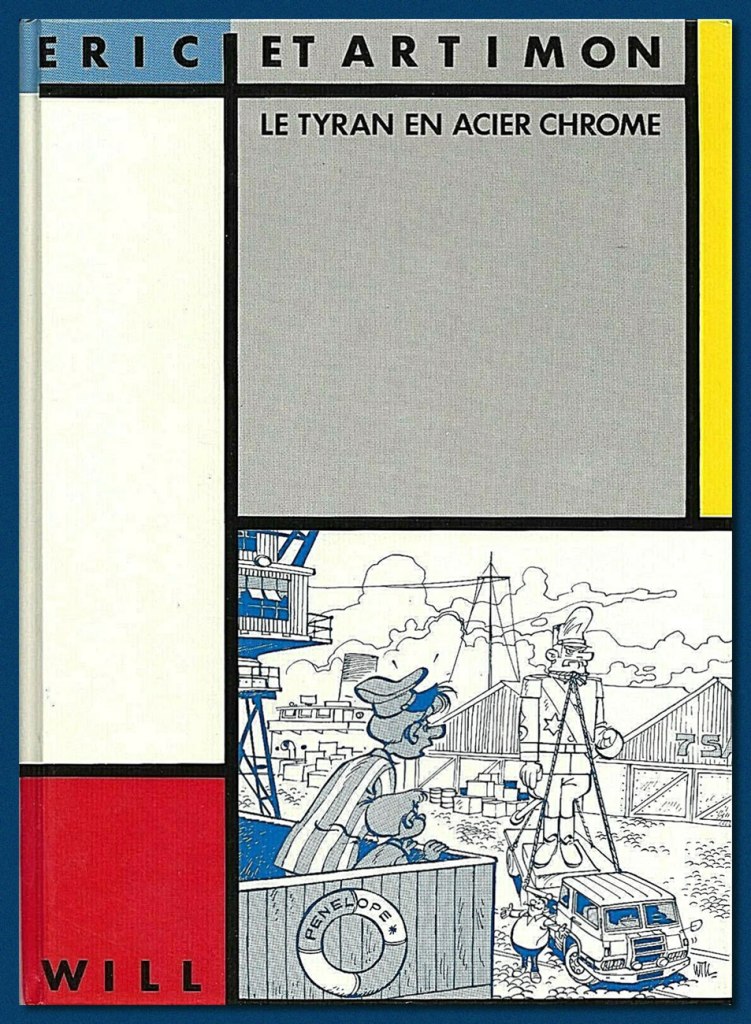
A mere two long adventures (44 pages each) were produced (Le tyran en acier chromé, 1962, and Toute la gomme, 1963, plus a six-pager, Et mine de rien, in 1967), and Dupuis never bothered to collect or reprint them. Instead, well down the pike, two separate, smaller publishers licensed the rights and issued small black and white runs of, respectively, Toute la gomme (Espace Édition, 1976) and Le tyran… (Magic Strip, 1983).
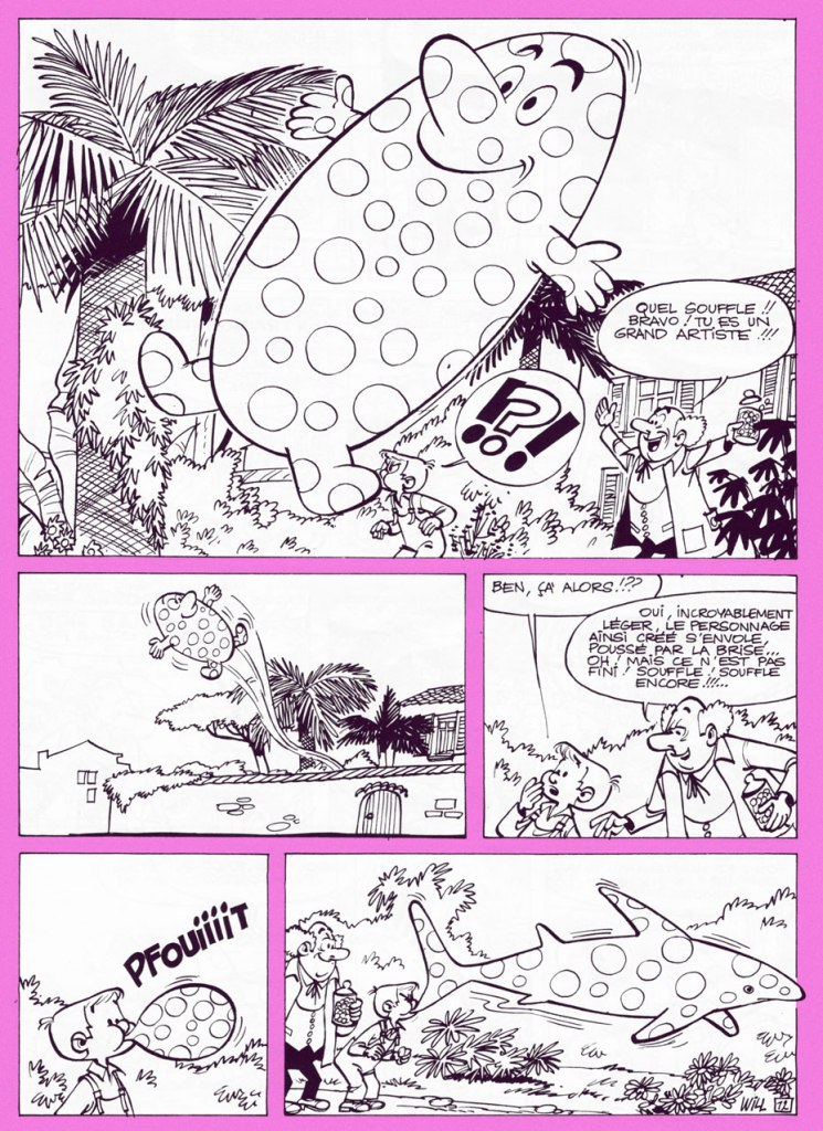
Candy aficionado Éric visits his main supplier, loveable eccentric Monsieur Grosoison, at his confiserie ‘Au bambin vorace’ (‘The Voracious Toddler’). The old man, also a brilliant inventor, shows off his new creation to his best and most loyal customer. The stuff’s not only downright magical, it’s also exquisitely delicious.
« Such lungs! Bravo! You are a great artist! »
After an unscrupulous candy magnate has the inventor kidnapped by his henchmen (an uprarious pyromaniac and a pair of tiny twins afflicted with stiff necks from gaping at Éric’s balloon creations drifting overhead), and taken to his private island, he threatens to leave him in the hands of fearsome gorilla Tarquin the Superb. Meanwhile, Éric and Artimon encounter the ape, who turns out to be blessed with tremendous intelligence, a fine sense of humour, and a powerful set of lungs.
However, Tarquin doesn’t like his good-natured fun interrupted.The back cover of Espace’s Toute la gomme, wherein Éric employs ingenious means to escape a rooftop.
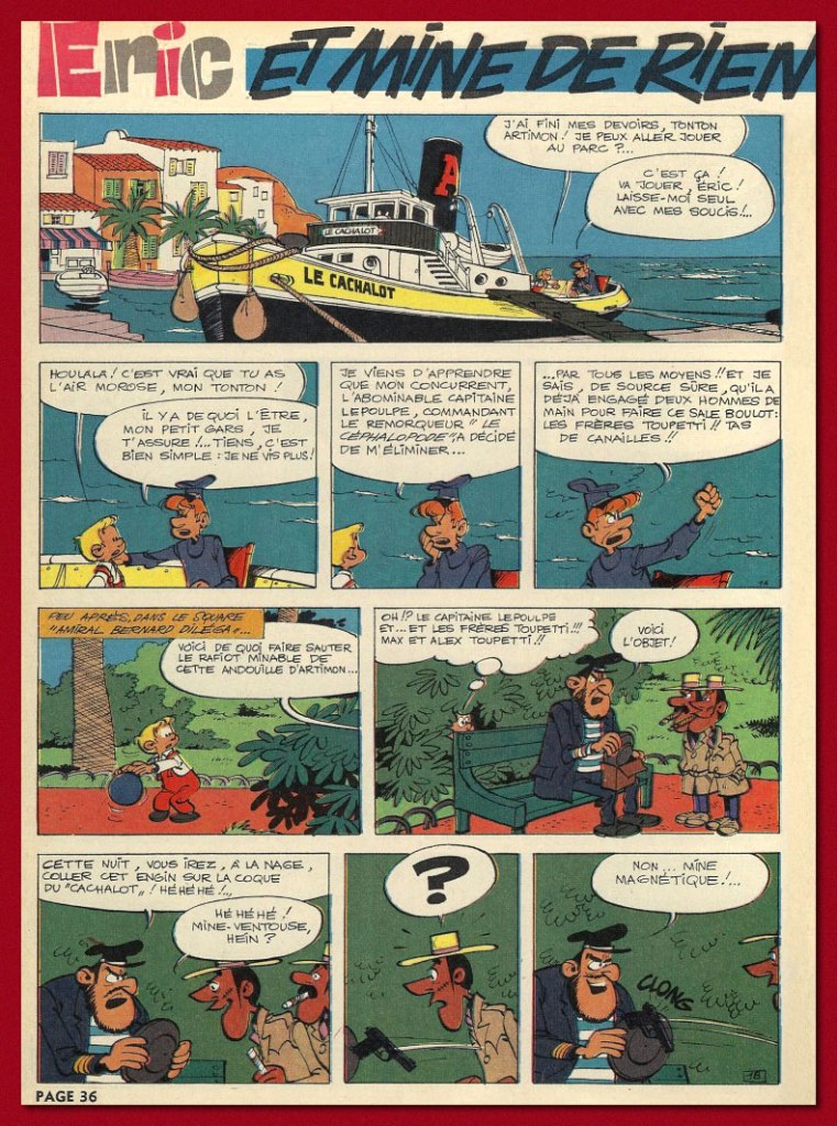
The opening page to the short concluding episode of the boy and the captain’s adventures, Et mine de rien (Spirou n° 1506, 1967).
And here’s the fancy 1983 edition of Le tyran en acier chromé, scarce and fairly pricey nowadays, unlike Toute la gomme.
Thankfully, Éric et Artimon haven’t been entirely forgotten, despite the shabby treatment they received at the hands of their original publisher. Here’s a signed lithograph produced in the early 1990s by Belgian bookstore Chic-Bull. Note the fancy silver ink on the statue. Mine’s number 48!
I’ll be spotlighting Will’s other creator-owned series, Isabelle, at some point during this year’s Hallowe’en Countdown!
« I’ve learned that any fool can write a bad ad, but that it takes a real genius to keep his hands off a good one. » — Leo Burnett
Given that they’re often referred to as comics, or funnybooks, mainstream American comic books haven’t been nearly as funny as one might reasonably expect… particularly the ones that set out to be humorous.
Humour being subjective, of course everyone will have their own favourite to contribute. The gist of my argument, however, is that comics books fail to raise guffaws to a level that, say, newspapers strips, animated cartoons and Franco-Belgian bandes dessinées routinely** do.
Meanwhile, DC Comics arguably boasted their singular genius humorist in Sheldon Mayer (Sugar and Spike). DC’s editors loved to divide and conquer, rarely allowing solo creators to take root, let alone flourish, in their tidy corporate garden patch. Given Mayer’s crucial early importance to the publisher’s rise, he was granted free(er) rein. Which leads one to ponder whether the assembly-line method, then, might not be utterly detrimental to quality humour.
So it was to my elated surprise that I came upon an authentically amusing (imho) tale betwixt the misaligned staples of a 1967 issue of Strange Adventures… what is more, uncredited. A mystery.
Which brings us ’round to another exceptional talent, a writer this time: long-time American Comics Group (ACG) editor Richard E. Hughes, who scripted most of the company’s mid-to-late output under an impressive array of aliases*** with a dry, deadpan, absurdist wit, most memorably deployed through the adventures of Herbie Popnecker, ably illustrated by Ogden Whitney.
In 1967, Hughes found himself at leisure with ACG’s demise (the final issues of its remaining titles, Adventures Into the Unknown and Unknown Worlds, were cover-dated August ’67). He passed through DC, scripting a smattering of stories for Superman czar Mort Weisinger (one might surmise that Kurt Schaffenberger, who worked for both editors, acted as the go-between), for Hawkman editor George Kashdan and Ghosts editor Murray Boltinoff before exiting the field. According to Wikipedia, « His final job appears to have been for Gimbel’s department store, composing response letters to customer complaints. » At least he’s received some posthumous recognition, as he was a 2015 recipient of the Bill Finger Award for Excellence in Comic Book Writing.
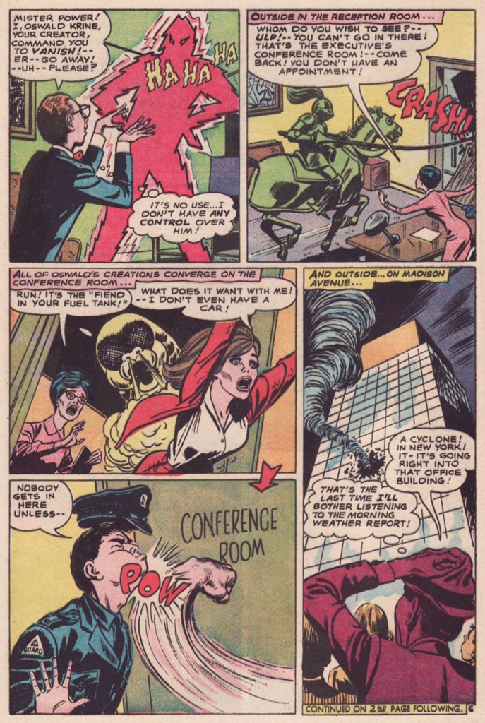
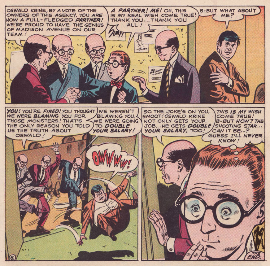
I do believe I can detect the Hughes cadence in The Monster Maker of Madison Avenue! According to GCD, the uncredited story is scripted by one Dennis Marks, an animation writer working for Filmation’s The Batman/Superman Hour at the time… but I just don’t know. It would be Marks’ sole comic book credit, and a speculative one at that. Besides, GCD attributes the artwork to Joe Orlando, which is flat-out, laughably wrong. A frequent problem of self-styled art experts is that they wear genre blinders. Most would never be caught dead reading, say, a romance comic, so they wouldn’t recognize (though they should!) the distinctive stylings of Jay Scott Pike (1924-2015).
On with our tale, which originally saw print in Strange Adventures no. 202 (July 1967, DC).
As for the ads parodied therein, I’m no expert, but I can hazard a few guesses: The Fiend in Your Fuel Tank refers to Esso’s famous Put a Tiger in Your Tank campaign; the housewive bluntly bestowing cleaning tips to her neighbour brings to mind Bold Detergent; The Green Knight surely lampoons Ajax’s White Knight; as for Popso Kooler’s Mister Power, it’s anybody’s guess. Pepsi commercials of the period looked great, but nary featured an animated lightning man. Anyone?
-RG
*Yes, Kurtzman (and Stanley) often worked with others to increase their output (and for the love of collaboration), but they fully controlled the mise-en-scène.
** They make it look easy… but it’s quite a feat.
***His imaginary roster comprised Pierre Alonzo, Ace Aquila, Brad Everson, Lafcadio Lee, Kermit Lundgren, Shane O’Shea, Greg Olivetti, Kurato Osaki, Pierce Rand, Bob Standish, Zev Zimmer… Fittingly, even Richard E. Hughes was a pseudonym: he was born Leo Rosenbaum.
« Ideas improve. The meaning of words participates in the improvement. Plagiarism is necessary. Progress implies it. It embraces an author’s phrase, makes use of his expressions, erases a false idea, and replaces it with the right idea. » — Guy Debord
Well, after our brush with Surrealism, let’s hazard a brief detour amidst the Letterists. As we all surely know, The Letterist International was « a Paris-based collective of radical artists and cultural theorists between 1952 and 1957. » I’ll spare you a dry discourse about schools of thought, art and politics and their numerous and acrimonious (perhaps not so dry after all!) schisms.
The main point of interest, in this case, is the Letterists’ pioneering of the rousingly subversive artistic technique of détournement, which involves “taking preexisting images and mixing them together to highlight the underlying ideology of the original image.”
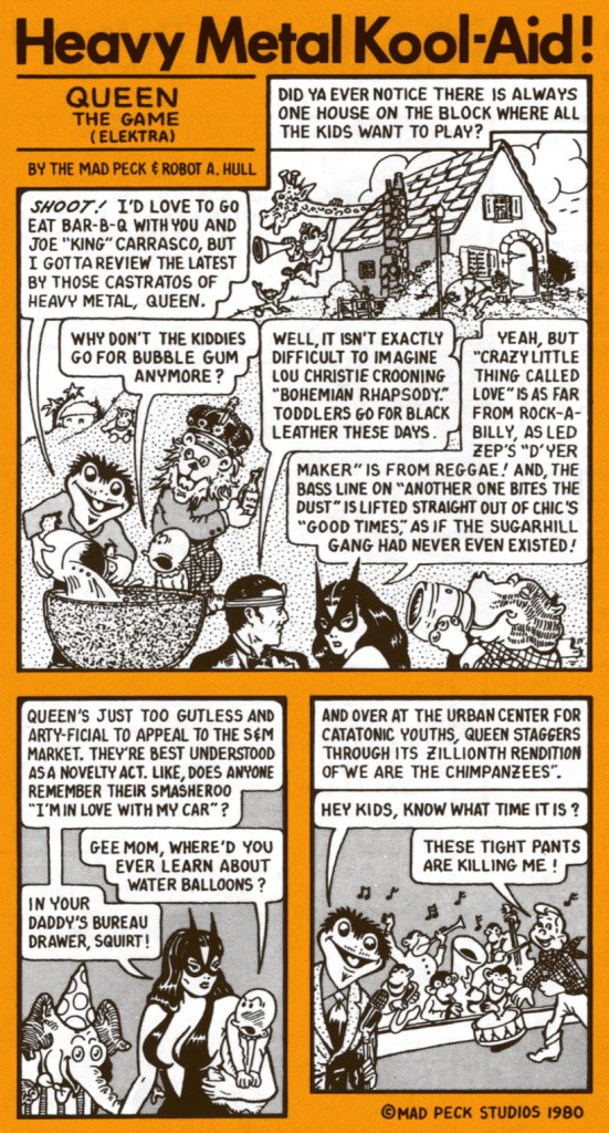
This brings us to the storied career of Providence, Rhode Island’s finest son, John Peck (1942-2025), alias The Mad Peck.
Les Daniels and The Mad Peck Studios’ 1971 Comix was a pretty fair early crack at recounting the history of the comic book up to the peak of the Undergrounds.
A-ha! On the back cover, The Mad Peck indulged his penchant for détournement, repurposing an early 1950’s ad for hair loss reversal scammers Ward Laboratories in a fashion that is in no way relevant to our current, media-savvy, ethically-enlightened world.
In his 1987 retrospective, Peck recalls « Yeah, Comix was good. Maybe a little too good. It’s been stolen from every public library I’ve ever been in. »
By then, he was working steadily for Boston-based music magazine Fusion (1967-74), “doing short reviews of the records nobody else wanted to do.” This one liberally swipes from DC’s long-running Fox and the Crow series (which of course borrows its premise from dear old Aesop’s immortal fable), with a smidgen of Fritz the Cat for the frisky finale.
Fast-forward to 1978, and Peck’s much-improved comix-style capsule reviews are appearing regularly in Creem and The Village Voice.
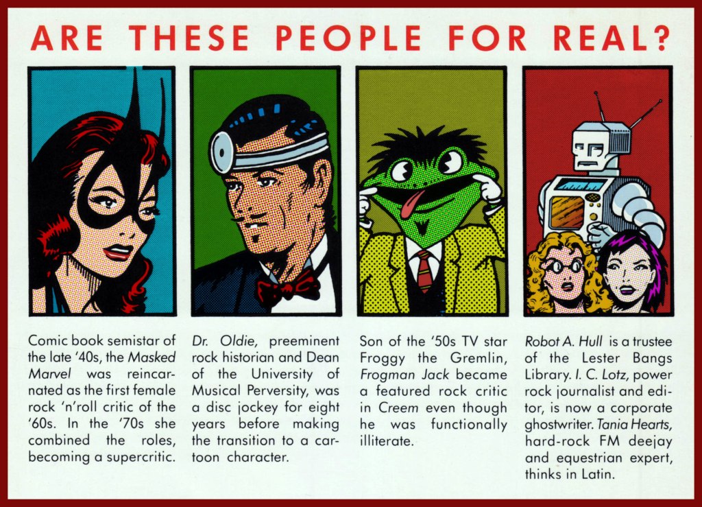
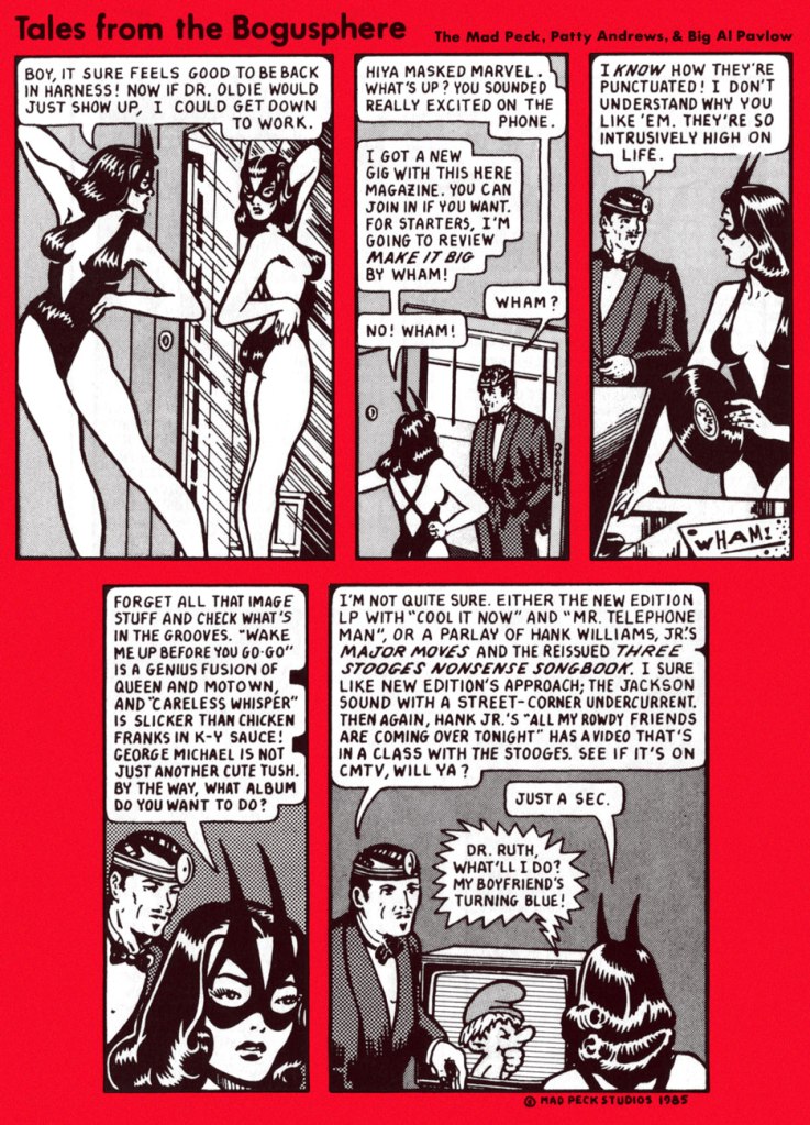
Ah, but she wasn’t a comic book semistar of the *late* 40s… she arrived on the scene in 1941, four months before Wonder Woman, even! Who dat? Why, The Masked Marvel is none other than Golden Age heroine The Black Cat, whose repurposing surely constitutes The Mad Peck’s most brazen act of détournement! This is Black Cat Comics no. 3 (Dec. 45 – Jan. 46, Harvey); cover art by the lady’s creator, Al Gabriele. ‘Action that’ll make you pop your monocle!‘
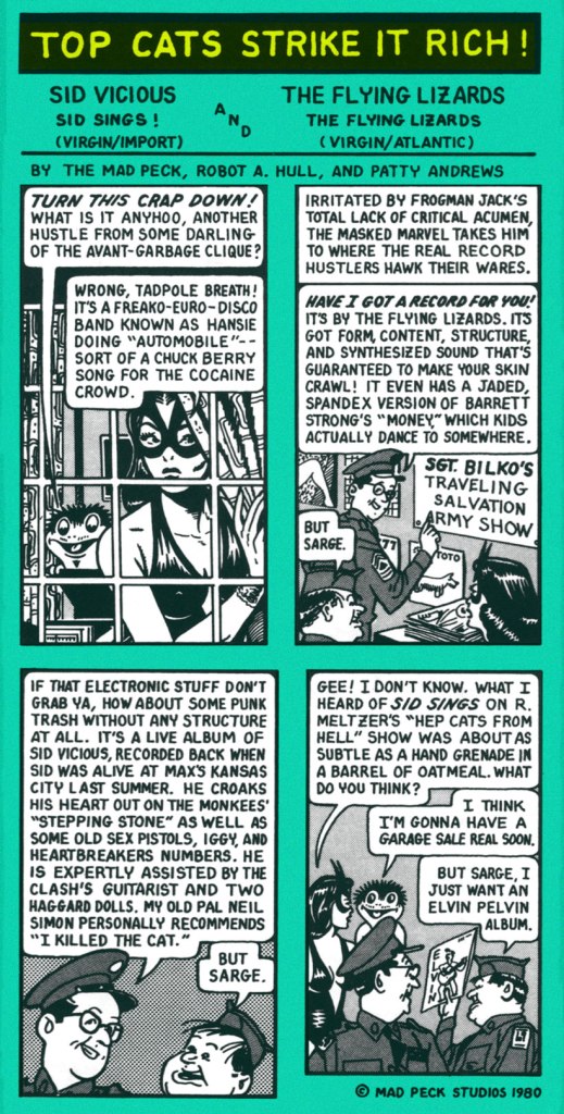
The Mad Peck really stood out in the landscape of rock criticism in that he wasn’t a rockistsnob (“It’s not rock, therefore it’s crap!“), and that his taste was wide-ranging and often surprising, evidence of a true music lover well-versed in all its strata and permutations.
And still, these Jefferson Airplane alumni had yet to hit bottom (knee-deep in the hoopla, so to speak)!
Then ahead to the mid-80s and Bob Guccione Jr.’s Spin (est. 1985), and a short run with a new title, Tales From the Bogusphere. Meanwhile, The Masked Marvel had been sidelined by legal hassles. As the heroine recalls:
I took an extended vacation in 1980 when Marvel Comics threatened to sue Peck after reading ‘Ms. Marvel’ in the Eagles cartoon that led off Creem’s review section in February. I hightailed it before the corporation had me roped into a team-up book with She-Hulk, but Peck had to stick it out while they tried to stick it to him. What really teed me off was that Ms. Marvel, who had oozed out of Marvel’s bullpen in the early ’70s, was such a dynamic concept that her book died almost instantly.
Peck’s experience as a critic left him with an encyclopedic knowledge of doo-wop and early R&B. When financing from rock publications got thin, Peck practiced the art of rock ‘n’ roll arbitrage: buying records at flea markets and “backwater Woolworths” and trading them at statewide record collectors’ conventions that he organized himself.
Peck spun his best finds on his popular WBRU radio show, “Dr. Oldie’s University of Musical Perversity.” Wary of semi-fame, Peck still makes an occasional public appearances in disguise as Dr. Oldie, complete with lab coat and head mirror. [ source ]
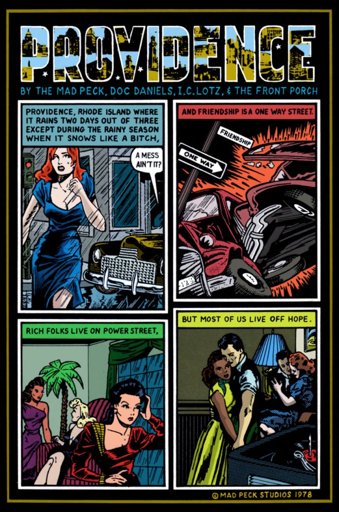
As a bonus, here’s The Mad Peck’s greatest commercial success, a piece first commissioned by Providence’s The Humbox Press for the inaugural issue of its poetry journal Loose Art. A fluke hit, it spawned postcards and posters “and is still keeping the Mad Peck in Camels.”
« In 1978, Peck designed the famous Providence Poster, a composite of witty one-liners that he and Daniels had uttered over the years about their beloved city. » I must confess I could not resist the urge to recolour it.
Channeling a credo he gleaned from a chance encounter with comic book artist Wally Wood — “Don’t draw what you can trace, and don’t trace what you can paste” — Peck made his name as a comic book artist despite an inability to draw anything more complex than psychedelic hand lettering. Most of his characters are swiped from the works of an obscure Golden Age comic artist, Matt Baker.
I can buy that most of his characters were swiped from Baker (hello there, Canteen Kate!), but he also begs, steals and borrows from, namely… Al Feldstein, George Carlson, Phil Davis, Jim Davis (no relation to Phil, and not the Garfield guy either), Bob Oksner, Don Flowers, and a gazillion anonymous advertising and animation toilers. And it works!
As a trailblazer of this particular approach, you might say he was Yesterday’s Tom Tomorrow.
« The man who cannot visualize a horse galloping on a tomato is an idiot. » ― André Breton
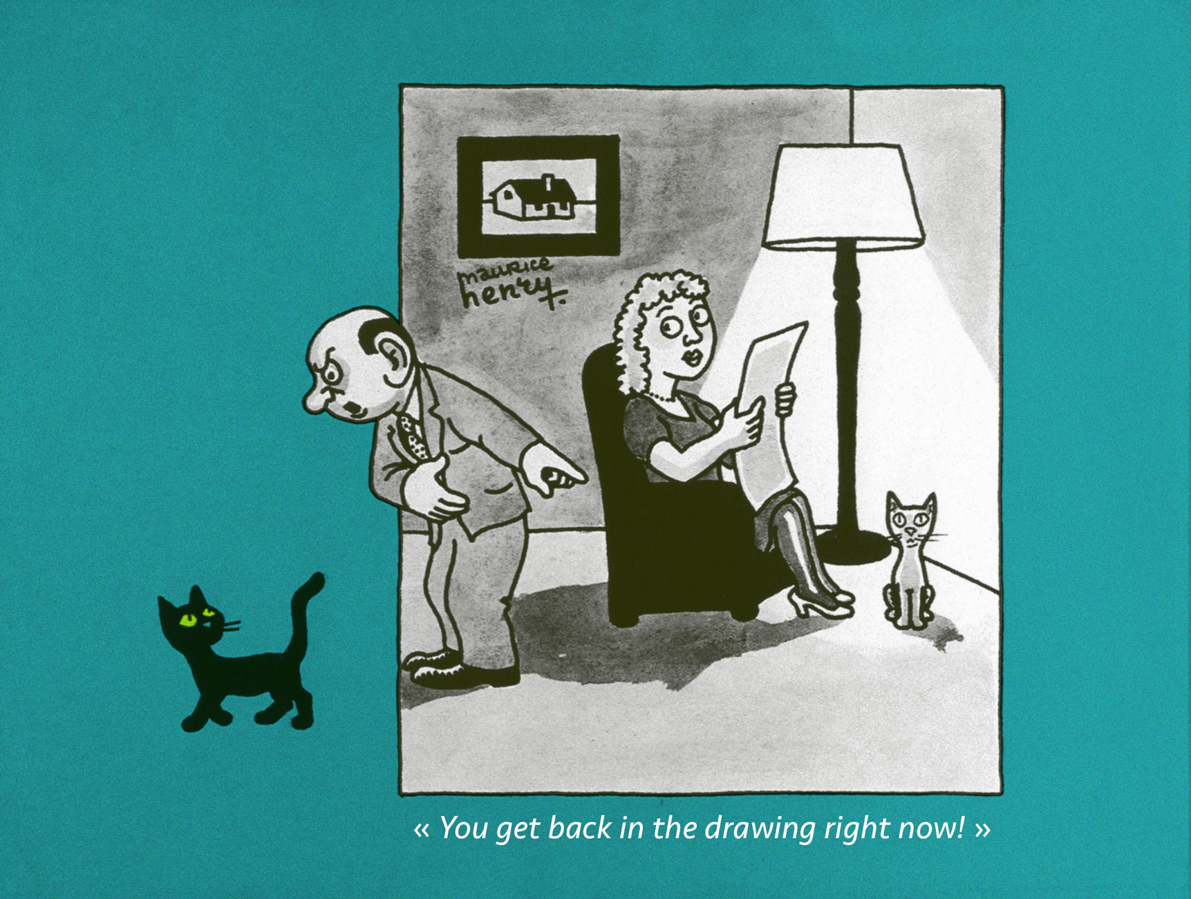
What is one to do, in a mere blog post, with a polymorphous artist such as Maurice Henry (1907-1984)?
Here’s a handy bit of compressed biography, from his Lambiek page:
Henry was a French painter, poet, filmmaker, as well as a cartoonist. Between 1930 until his death, he published over 25,000 cartoons in 150 newspapers and a dozen books. His cartoons were generally surrealistic and satirical.
In 1926, he co-founded the magazine Le Grand Jeu with René Daumal, Roger Gilbert-Lecomte and Roger Vaillard, with whom he formed the “Phrères simplistes” collective. Henry provided poems, texts and drawings, while also making his debut as a journalist in Le Petit Journal.
He left Le Grand Jeu in 1933 to join André Breton’s group of Surrealists and their magazine Surréalisme au service de la Révolution. He also worked with the artist and photographer Artür Harfaux on the screenplay of twenty films, including ones starring the comic characters ‘Les Pieds Nickelés’ and ‘Bibi Fricotin’. Maurice Henry spent the final years of his life making paintings, sculptures and collages. He passed away in Milan, Lombardy, in 1984.
The answer? My default solution, which is to focus on some small parcel of the much greater whole. A number of Henry’s works bear revisiting (for instance, Les métamorphoses du vide [1955], a truly groundbreaking picture book about the world of dreams; À bout portant [1958], a collection of literary portraits; or Les 32 positions de l’androgyne [1961, also issued in the US in 1963], a chapbook of… gender recombinations) and deserve a turn in the spotlight.
To quote co-anthologists Jacques Sternberg and/or Michael Caen in their indispensable Les chefs-d’oeuvre du dessin d’humour (1968, Éditions Planète, Louis Pauwels, director):
Surrealism — he was part of the group before 1930 — left its mark on him and it’s because he was already well-cultured as he launched his career that he was among the first, in the desert that was the publishing world of the 1930s, to attempt unusual drawings calling upon often startling ingredients, such as poetry, black humour, the fantastic and the absurd. He caused no less of a surprise by doing away with captions, at a time when bawdy jabbering was the fashion all over. In short, Maurice Henry was indisputably a pioneer of that grey and stinging brand of humour that would explode like an H-bomb some fifteen years later.
A lovely bit of conceptual humour from 1938. A rare one bearing a caption, but the joke called for it. At this early stage, you won’t be wrong to point out a certain stylistic debt (it’s the roundness and simplicity of line!) to his contemporary and compatriot Jean Effel. Henry was indeed a fan. Do check out my co-admin ds’ fine post spotlighting the good Monsieur Effel.
An example of what enlightened creators such as Henry were fighting for: making room for cartoons that weren’t just about the cheap chuckles. Consider, for instance, the existential plight of the Minotoreador . Published in K. Revue de la poésie no. 3 (“De l’humour à la terreur”, May 1949).
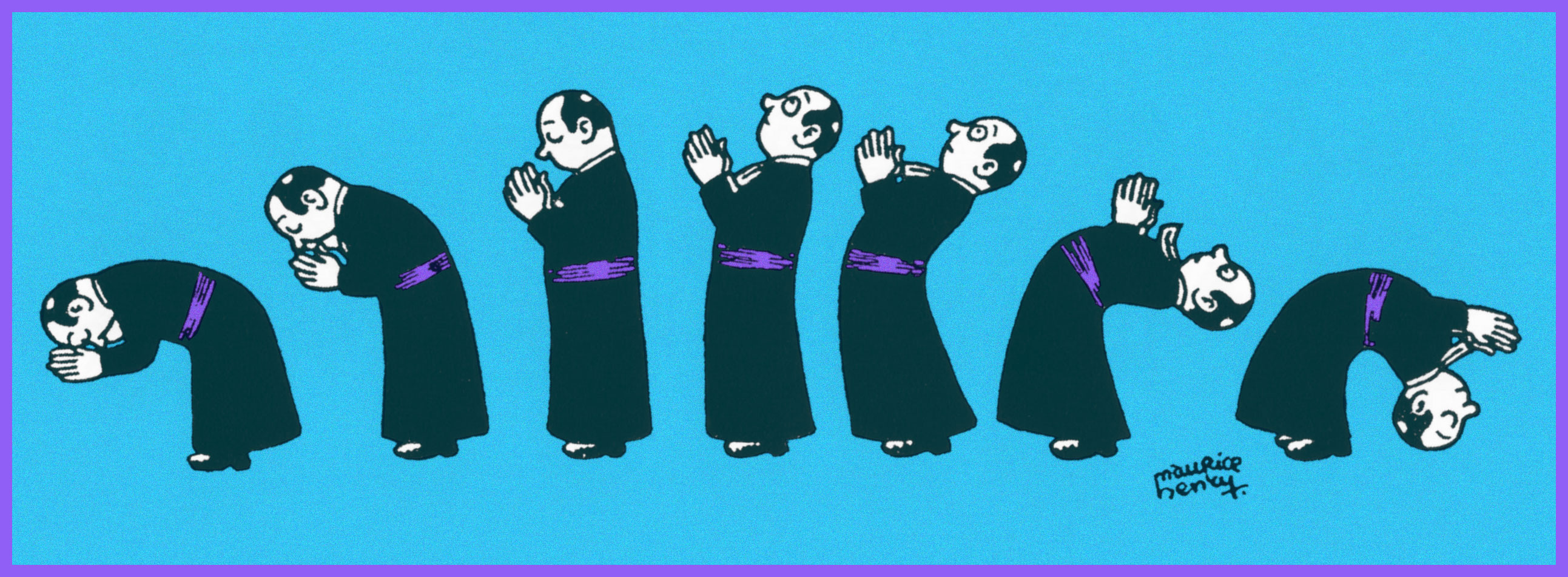
The Military, Government, Constabulary and Clergy were favourite targets, naturally. When it was (barely) tolerated. It helped to be ambiguous, even if one wasn’t ambivalent (1951).
Here’s one for the clergy; though mocking, it’s hardly what you’d call hostile. From the first issue of epochal surrealist magazine Bizarre (1955-1968).
Yes, it’s Card Sharp Jesus entertaining, confounding (and possibly fleecing) his disciples. Note the ace up his right sleeve (1941).
Walking on water was clearly just the beginning (1948).
Henry’s Jesus seems like a swell fellow, really. A bit on the roguish side, which is fine by me (1958).
See? A case of a joke’s that’s more than a half-century old still finding echoes in the present day. Cover from The Darkness‘ prophetic 2019 album, Easter Is Cancelled.
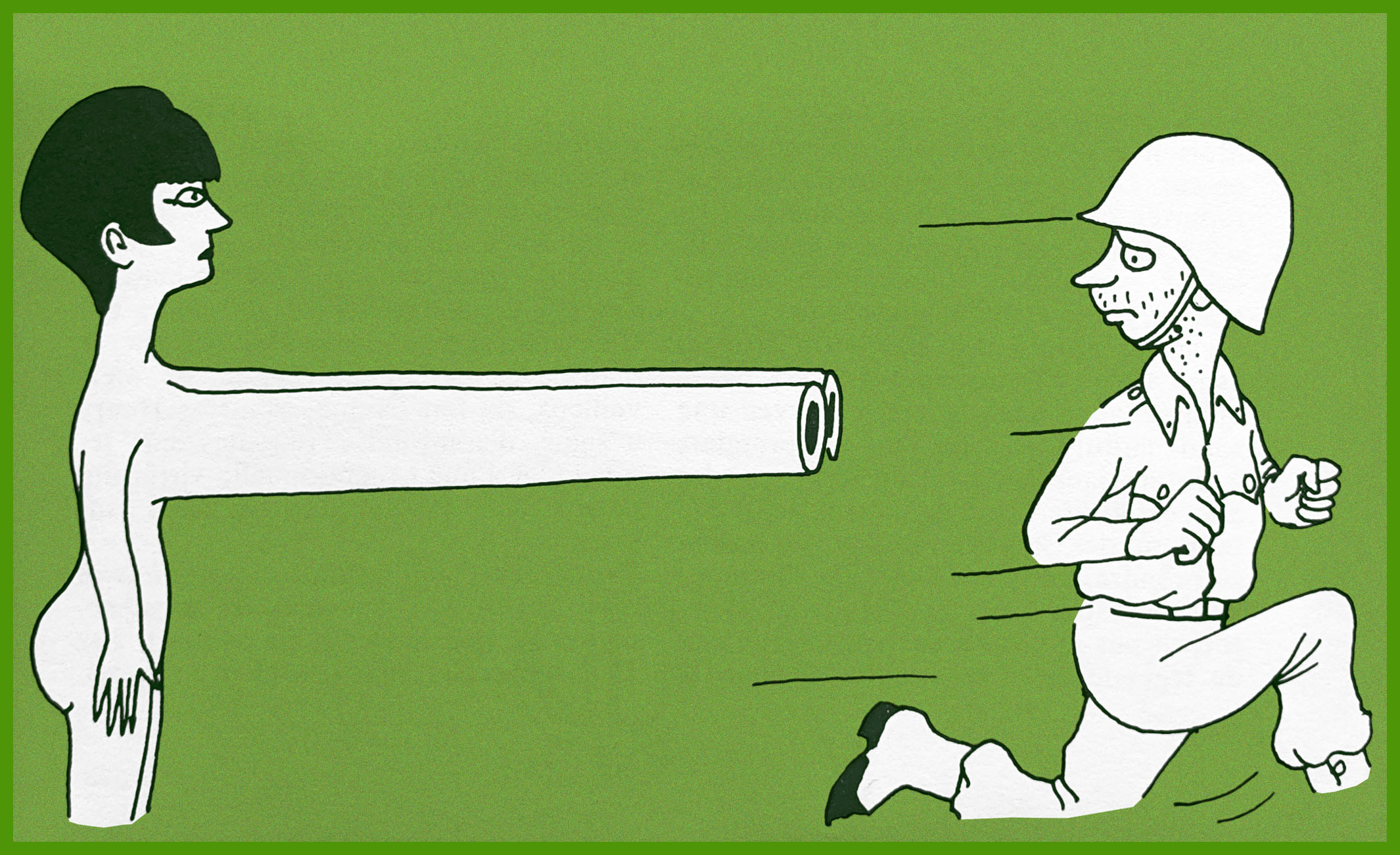
That soldier’s scared yet dismayed expression brings to mind Futurama’s hapless Philip J. Fry.
That’s one relaxed elephant.
Another illusion shattered.
The little hand wave at the end really makes this one.
The artist in 1935, photographed by his friend and frequent co-conspirator Arthur Harfaux.
« In the sphere of thought, absurdity and perversity remain the masters of the world, and their dominion is suspended only for brief periods. » — Arthur Schopenhauer
If you were to query me as to my absolute favourite comic strip of the 1980s (just humour me!), I wouldn’t waffle one bit: it’s Sam Hurt‘s Eyebeam.
Oh, the Eighties were rightfully dominated by a trio of titans: Bill Watterson‘s Calvin and Hobbes, Berkeley Breathed‘s Bloom County and Gary Larson‘s The Far Side. While I’m fond of all three, I find C&H too repetitive to revisit, I can no longer quite relate to Bloom County and… I still treasure the Far Side. But it doesn’t quite inspire the same devotion I hold for Eyebeam above all.
As I noted just last week, certain subjects are just too dang daunting to tackle. Eyebeam is one of these thorny critters, thanks to its convoluted history, vast, nearly boundless cast of characters, constantly shifting form and focus… I won’t even try.
I have, however, devised an elegant loop-hole: In 1989, Hurt initially shelved Eyebeam after…
« taking an offer from United Feature Syndicate to start a new strip based on the Peaches character, Queen of the Universe. Hurt’s freewheeling style did not translate as well under the syndicated system, which was apparently hoping for a female Calvin character, and the latter strip was not a success. Hurt described the strip’s demise as the result of “a printing accident… [it] drowned in a sea of red ink. »[ source ]
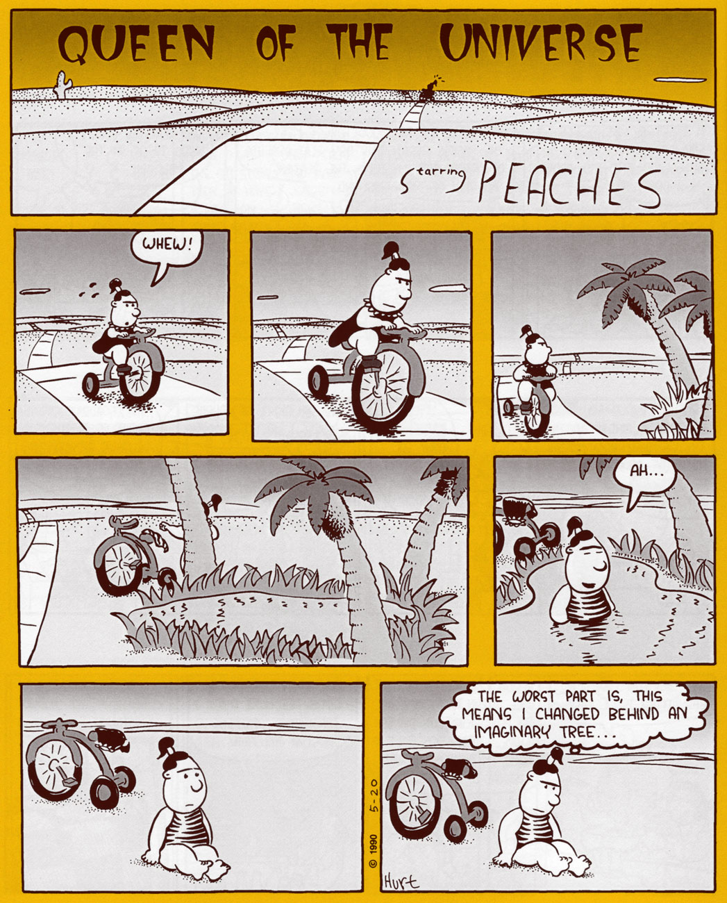
Queen of the Universe lasted two dazzling years, and the strip’s entire run has thankfully been gathered into three handsome-but-affordable volumes and published by Hurt himself. These may be purchased directly from the distinguished artiste.
And if you’re unfamiliar with Mr. Hurt’s winningly peculiar brand of brilliance, here’s my sampling of Queen of the Universe (it wasn’t easy!), which includes some early Peaches appearances from Eyebeam. Someday I’ll screw up the reckless fortitude to delve into that sweet, singular quagmire… but this isn’t that day.
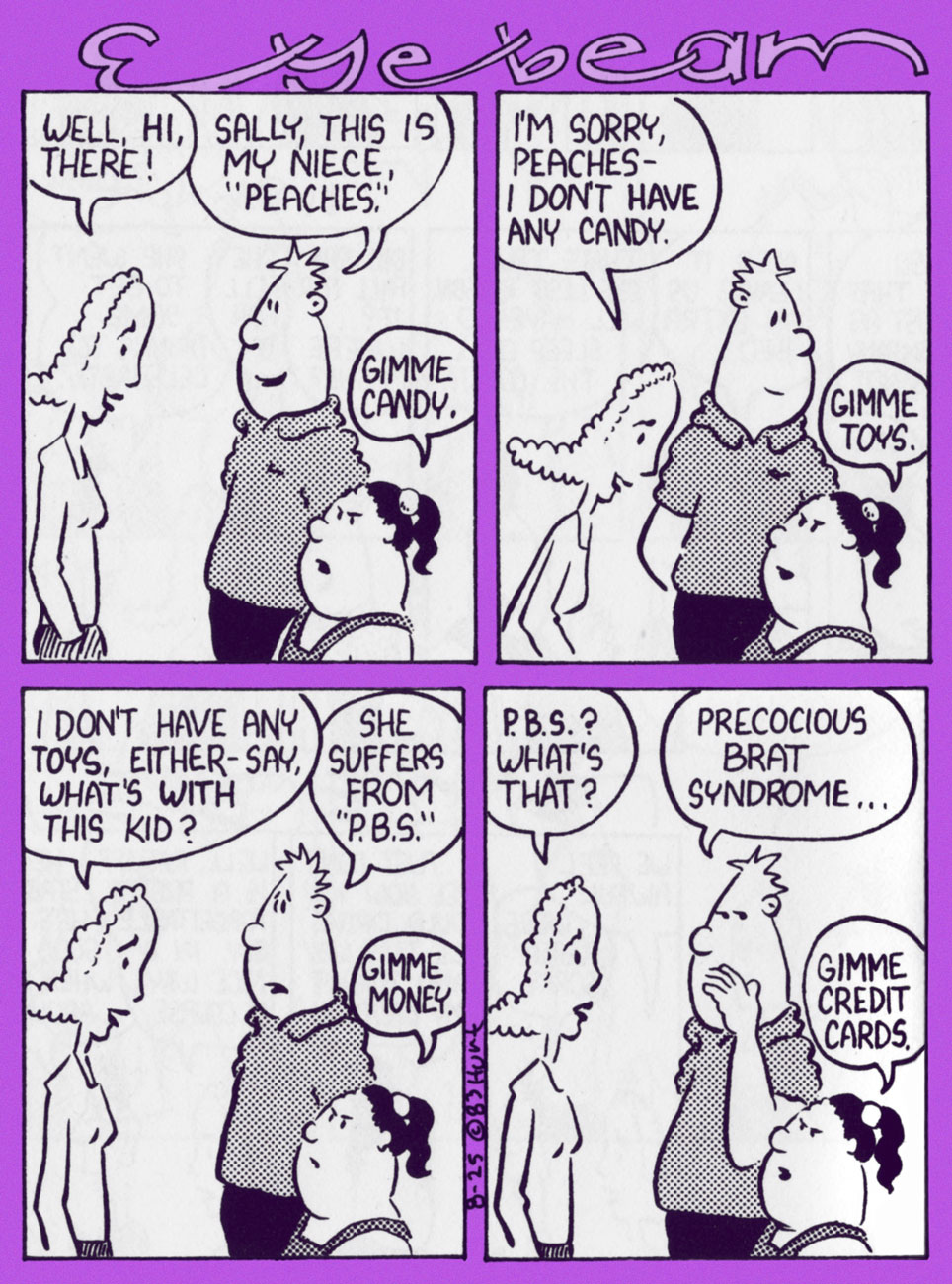
Peaches is introduced in Eyebeam (Aug. 25, 1983… t’was a Thursday)
Somewhere down the line, Eyebeam’s old roommate (and Peaches’ uncle) Ratliff got saddled with his sister’s kids in presumably permanent fashion.
By the time the seventh Eyebeam paperback collection (1988’s Render Unto Peaches, Texas Monthly Press) appeared, bossy Peaches had pretty much taken over the feature, as you can surely see.
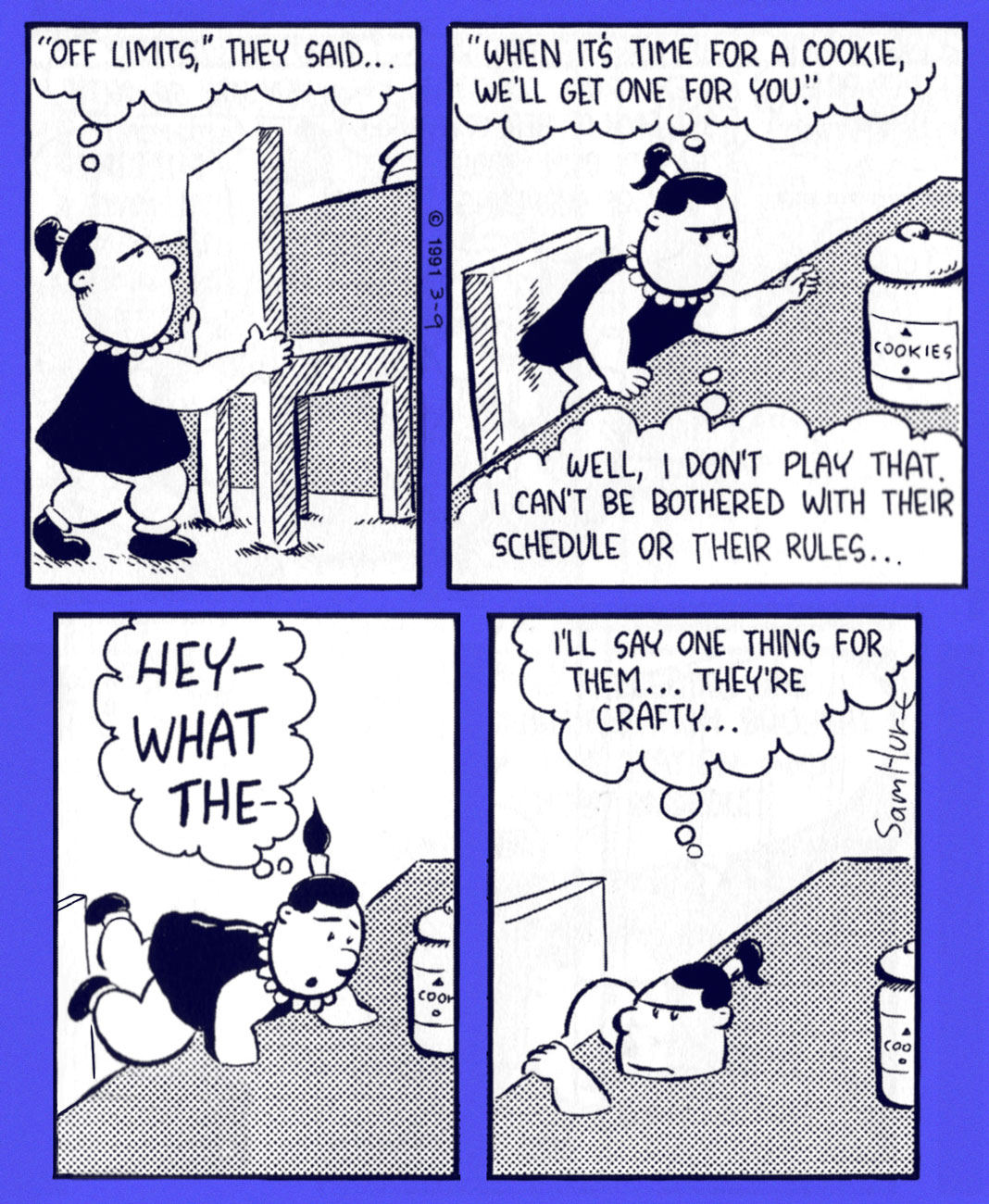
Hurt’s trademark surrealism smoothly carried over to his new feature. This is the March, 1991 strip.
The second Queen of the Universe Sunday strip, from May 5, 1990.
Peaches feeds this toothsome pet on ‘Purina Croc Chow’. From July 7, 1990.
The bent utensils are, of course, a reference to discredited ‘psychic’ charlatan Uri Geller. His spoon-bending act was publicly and elegantly debunked by none other than James ‘The Amazing’ Randi, who gets his second mention on our blog this week. « If Uri Geller bends spoons with divine powers, then he’s doing it the hard way. » —James Randi
I love how Sam Hurt leaves the question of Peaches’ great powers somewhat ambiguous. The cowboy is her best pal Kid Kareem.
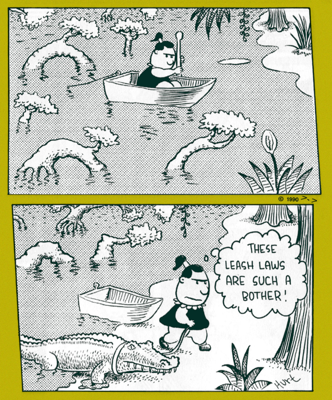
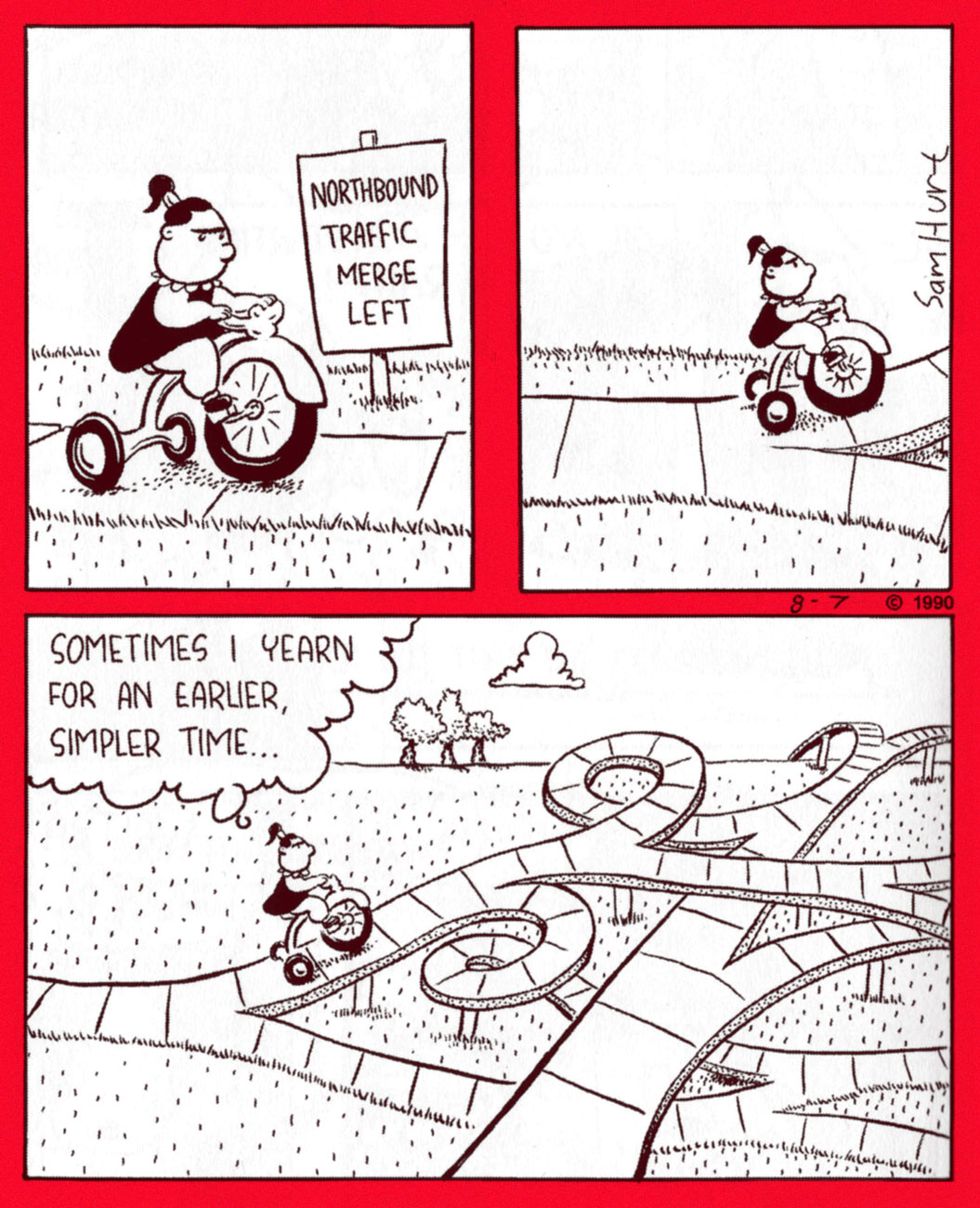
Peaches’ tricycle is an Electra 5000, obtained gratis through threatening to expose the IRS to some of the toy store owner’s “more creative accounting practices”. From Aug. 7, 1990.
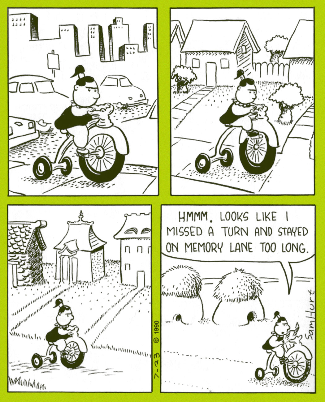
From July 23, 1990. Nice and deadpan, which must have baffled many a casual reader.
Now and again, Peaches will flub one. Sunday strip from June 30, 1991.
As ace newscaster Trish Tringle, Peaches never misses an opportunity to humiliate the neighbourhood’s ‘stupid boys’. Many a time has an ‘anonymous source’ or ‘concerned citizen’ alerted the authorities to some dodgy boyish shenanigans. From March 14, 1991.
« It is the beginning of wisdom when you recognize that the best you can do is choose which rules you want to live by, and it’s persistent and aggravated imbecility to pretend you can live without any. » — Wallace Stegner
It’s funny how, closing in on 300 posts, I’m only getting around to discussing some of my very favourite series. As my co-conspirator ds points out, these are far harder to do justice to.
Many of these were abject commercial failures, but providential glimpses into fully-formed universes we must leave forever unexplored save in our dreams. In the eighties and nineties, Fantagraphics were particularly courageous in following up on their principles (explicitly elaborated upon in the pages of The Comics Journal) and publishing material for which there wasn’t much of an obvious market. For instance, the four issues of Jim Woodring‘s pre-Frank anthology, Jim. Still my favourite work of his… but a definite commercial non-starter.
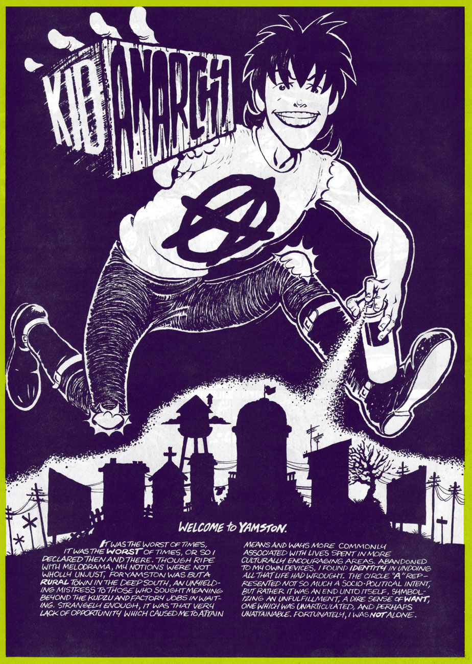
Meet Tommy Delaney, alias Kid Anarchy. This is Kid Anarchy no. 1 (Mar. 1991, Fantagraphics). Colours by Roberta Gregory.
He’s not really an anarchist, you know. This amusingly led an overly literal-minded, self-styled hardcore aficionado (from the nerve centre of American Punk, Monroe, LA) to testily complain to the authors: « Where do you get off calling your lame comic ‘Kid Anarchy’?!! Yup, I thought for sure this might have something to do with Anarchy, hardcore, social and political matters and so on, but what does it turn out to be? A deadbeat story about a bunch of rednecks sitting around a house. You guys suck! Why don’t you get your shit together and do something you understand, like a story about two posers wanking each other! Get a life! »
Ah, but Kid Anarchy could have been utter offal… had it conformed to that (mis)reader’s expectations. Anyway, see for yourself.
In full, the sequence that introduces our players. From Kid Anarchy no. 1.
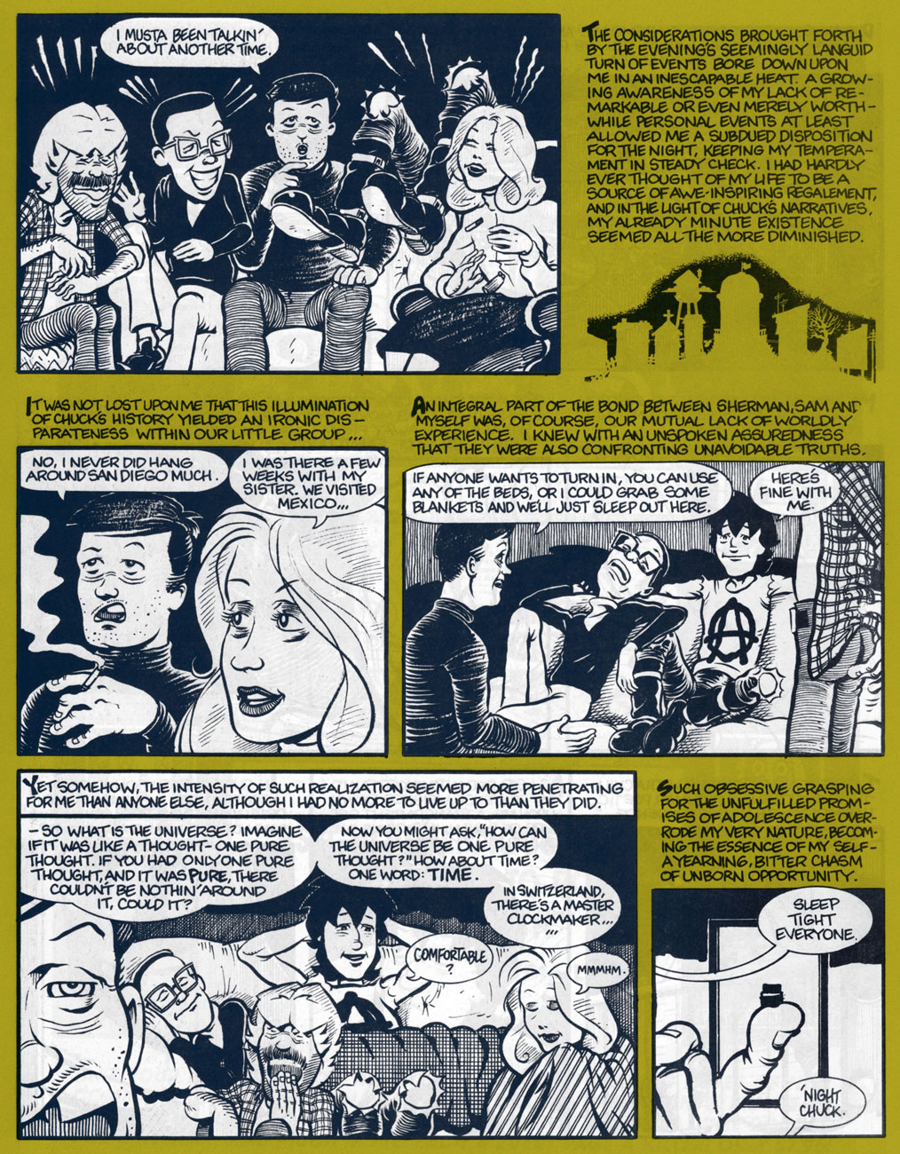
Trading tales of youthful escapades until the wee hours, also from the first issue. Worth noting is the complementarity of the narrative and the dialogue, always a plus for this reader.
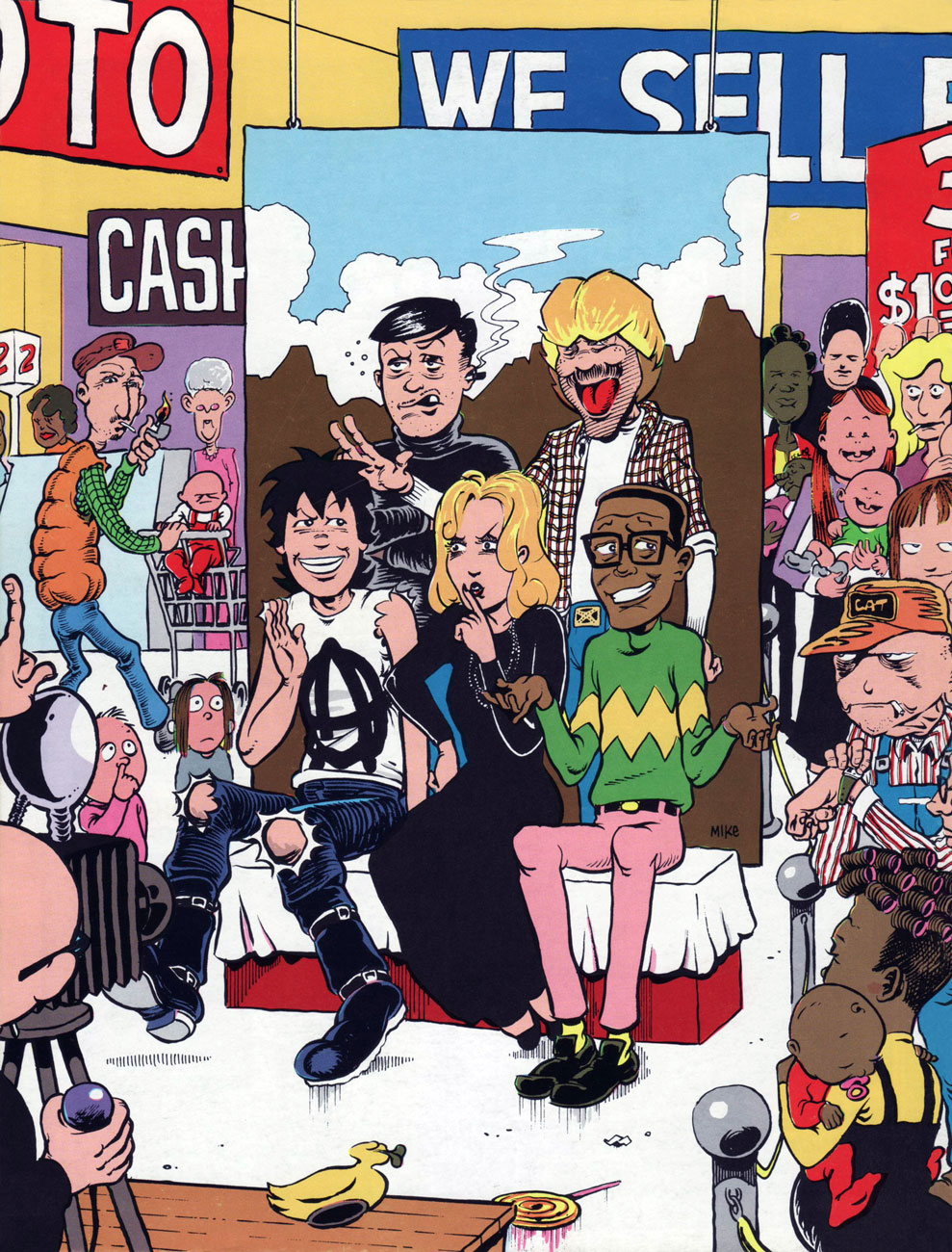
Let’s head over to Sears and sit for a group portrait, from the back cover of the inaugural issue.
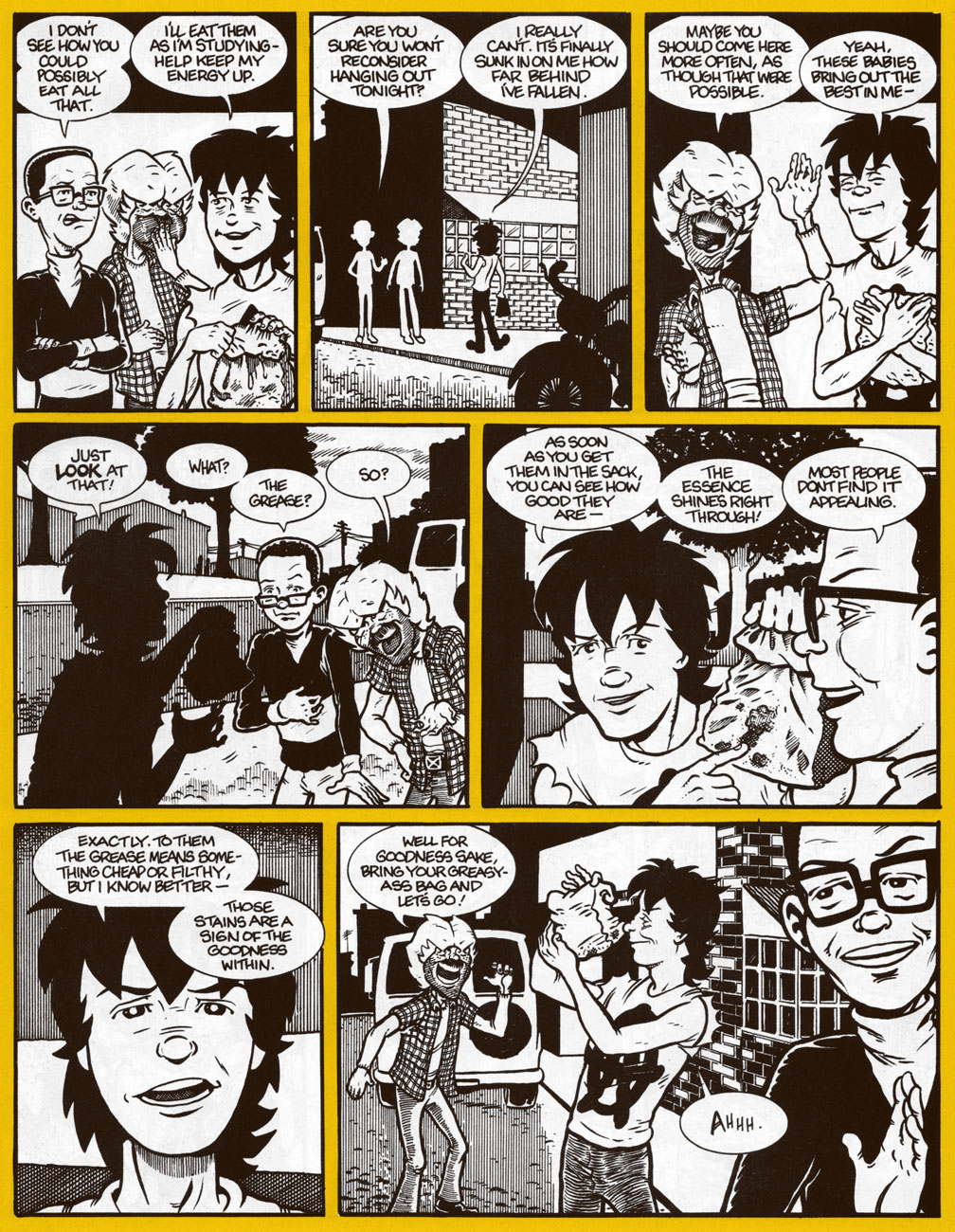
Two non-consecutive pages from a favourite sequence about the joys of grease. I no longer indulge in cheap-o burgers these days, but I get the same thrill from a paper bag full of samosas. One of the Kid’s wiser moments. The “goodness within”, indeed! Too bad he ends up accidentally leaving his “greasy-ass bag” behind in Sam’s van.
Nina gets her cover spotlight, showing us a glimpse of Pandemonium’s tatty arrière-boutique. This is Kid Anarchy no. 3 (Nov. 1992, Fantagraphics)
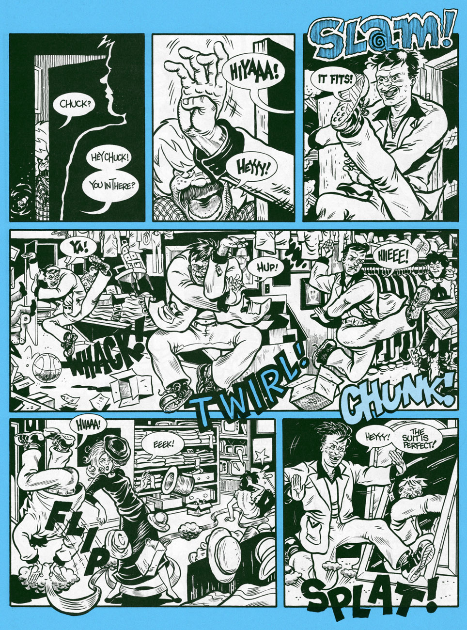
It’s not all quiet and introspection! Moonchow goes wild in the local Salvation Army dressing room! From Kid Anarchy no. 3.
To me, the deeply poignant charm of KA rests in its character study of a band of outsiders, drawn together by virtue of greater difference from the rest of the populace than from one another. While each of them outwardly appears to represent a ‘type’, this facile pigeonholing is defeated and contradicted at every turn. Not one of them fits the tidy category that convention and circumstance seek to wedge them into. Also notable is the tonal choice undergirding the narrative: let’s face it, young Tommy is generally a sullen, immature prick, while the authorial voice of his older self is honestly rueful and brimming with hard-earned insight. I would have loved to see where the story was bound: would the gang dissolve? Would we follow Tommy with a new entourage? What’s the sinister secret behind Pop’s low prices?
As it was, the third issue, appearing over a year after the second, made it clear that it was an indulgent boon from the publisher.
Artist John Michael ‘Jim’ McCarthy would go on to briefly (and often brilliantly) produce monster erotica for Fantagraphics’ company-rescuing Eros and Monsterbrands in the ’90s. Then the dusky lights of independent, impenitent, low-budget cinema beckoned! As for his old pal, writer George Cole… I just don’t know. Anyone?
« Don’t you know there ain’t no devil, it’s just god when he’s drunk. » — Tom Waits, Heartattack and Vine (1980)
Another week, another heat wave… I had something else in the pipeline for this week, but the canicular conditions brought to mind Hot Stuff The Little Devil (heat rises!) and his creator Warren Kremer‘s monumental parade of beautifully conceived and crafted calefaction variations.
As you may already know, the Harvey Comics stable consists, in the main, of one-note characters erected upon the visual template of licensed 1940s animation properties Casper the Friendly Ghost (Richie Rich, Hot Stuff, Spooky) for the boys, and Little Audrey (Little Dot, Wendy the Good Little Witch, Pearl) for the girls.
Would I kid you? (truthfully, I might). There’s even a meme about it.
We’ve already presented cover galleries from Spooky and Little Dot (as well as a Hallowe’en-themed array), and it’s now Hot Stuff’s turn to toast and roast. Though we’ve both been rather dismissive of the contents of Harvey Comics, I must point out that if there is a specific series that burns brighter than its brethren do, it’s Hot Stuff’s… at least during the line’s creative peak, the 1960s. Here’s an example of a good one.
Each cover is the brainchild and handiwork of Harvey’s indefatigable resident genius and art director, Warren Kremer. Obviously, one man does not a company make, and his able colleagues Howie Post, Ernie Colón, Sid Couchey and Sid Jacobson were hardly lightweights or slouches… but Kremer was the cover generator.
This is Hot Stuff, the Little Devil no.9 (Feb. 1959, Harvey). Is this helping? Probably not. Sorry!
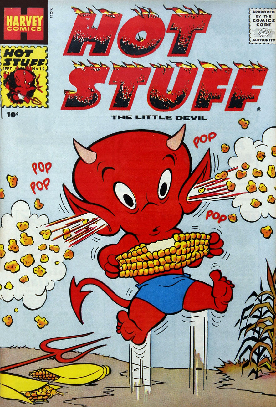
This is Hot Stuff, the Little Devil no.15 (Sept. 1959, Harvey).
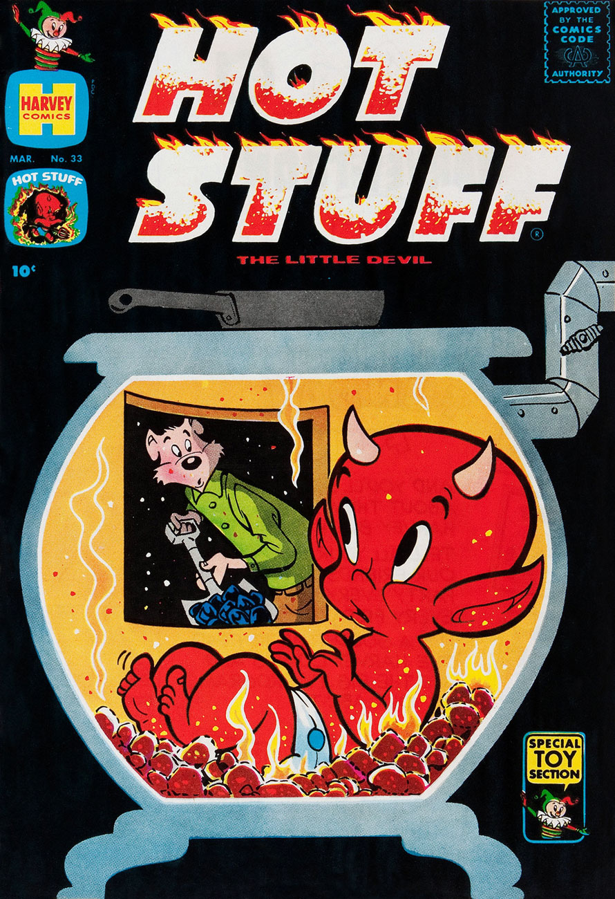
This is Hot Stuff, the Little Devil no.33 (Mar. 1961, Harvey). I especially admire Kremer’s black covers, though they complicated the printing and make issues in pristine (or even decent) shape a scarce proposition.
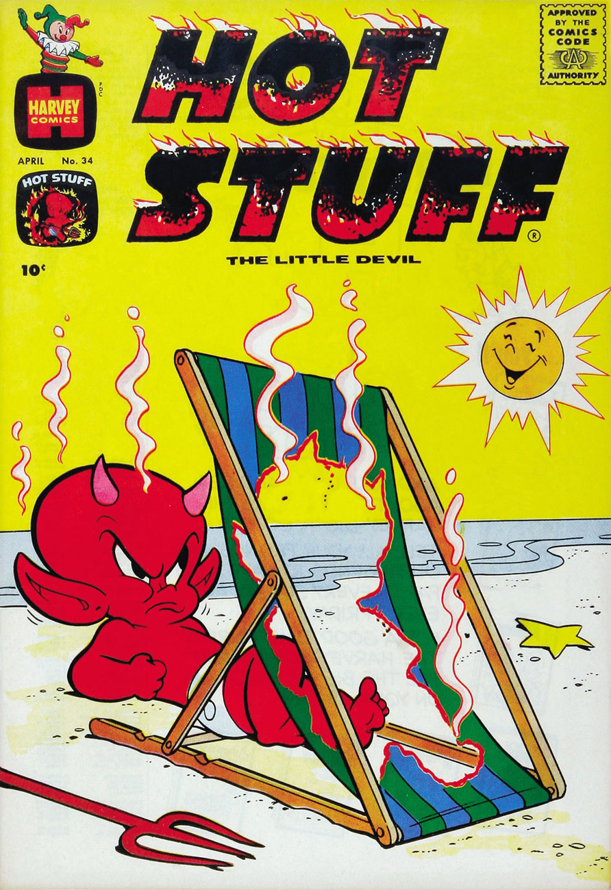
This is Hot Stuff, the Little Devil no.34 (Apr. 1961, Harvey).
This is Hot Stuff, the Little Devil no.36 (June 1961, Harvey).
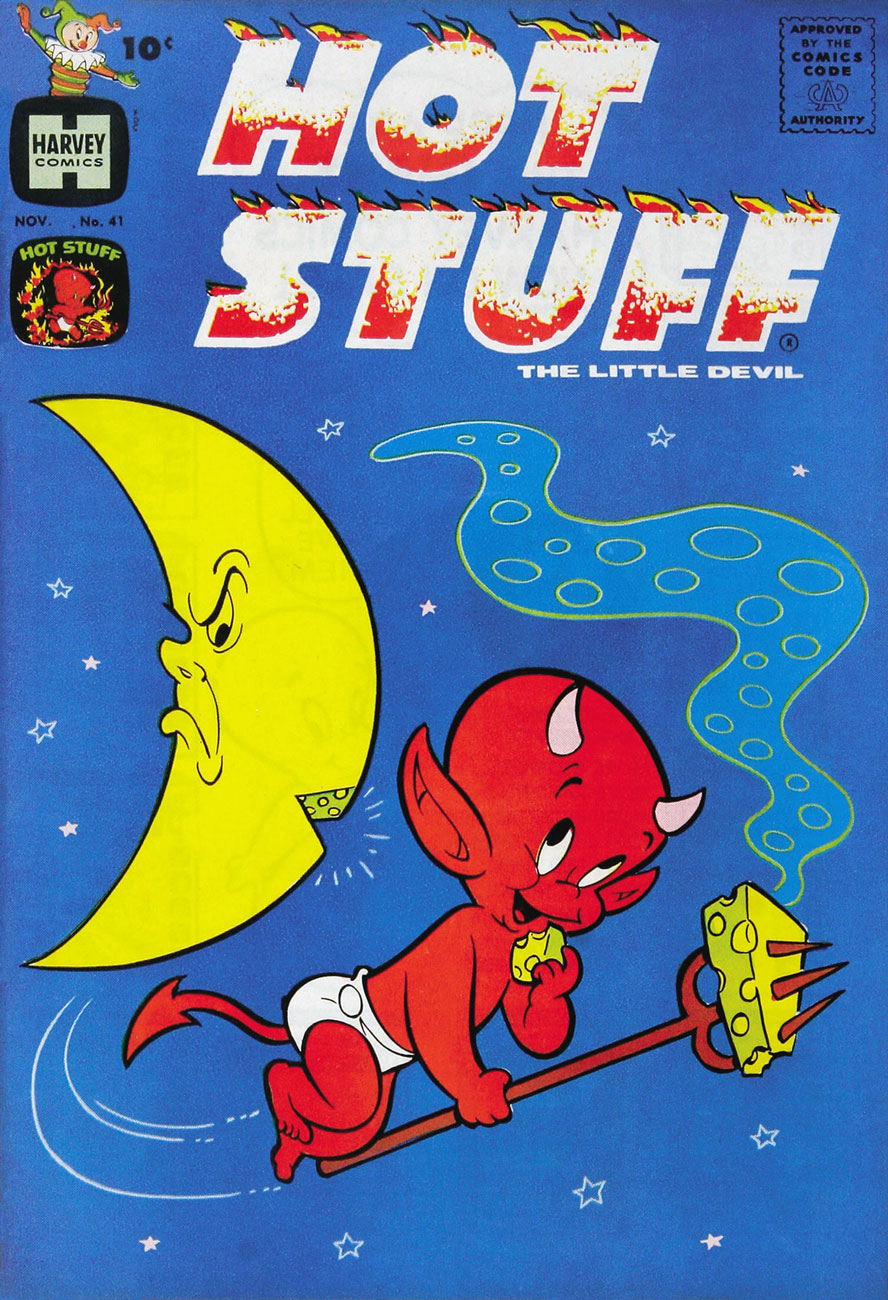
Ah, so that ol’ devil moon is not merely made out of cheese, but of stinky cheese to boot? Good to know. This is Hot Stuff, the Little Devil no.41 (Nov. 1961, Harvey). Fun fact: because of its distinctive holes, Swiss Gruyère is the shorthand cartoon cheese.
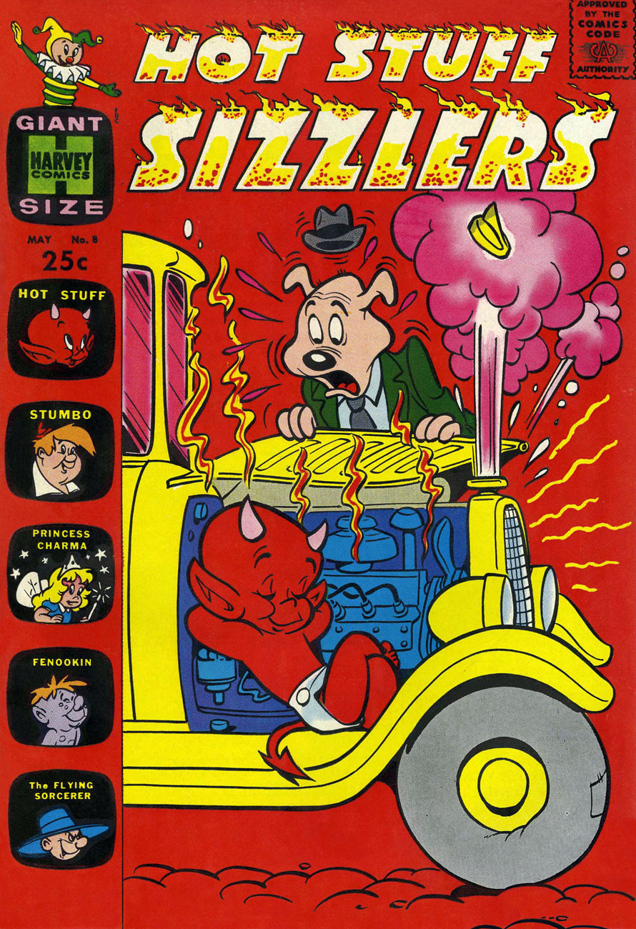
This is Hot Stuff Sizzlers no.7 (Feb. 1962, Harvey).
This is Hot Stuff Sizzlers no.8 (May 1962, Harvey).
This is Devil Kids Starring Hot Stuff no.3 (Nov. 1962, Harvey). One wonders why other comics publishers didn’t show the same lack of regard for the Comics Code Authority Stamp of Approvaltypically demonstrated by Kremer and Harvey. Their ‘shove it in a corner and colour it invisible’ approach is refreshing. I suppose that, like other publishers specialized in the nominally wholesome ‘kiddie’ market, Harvey’s code approval was a formality.
This is Hot Stuff, the Little Devil no.68 (Oct. 1965, Harvey). Listen to this excellent ‘word jazz‘ piece by the late, great Ken Nordine (1920-2019), on the fecund topic of… Fireflies.
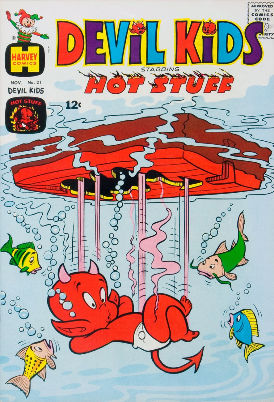
This is Devil Kids Starring Hot Stuff no.21 (Nov. 1965, Harvey). A little better, cooling-wise?
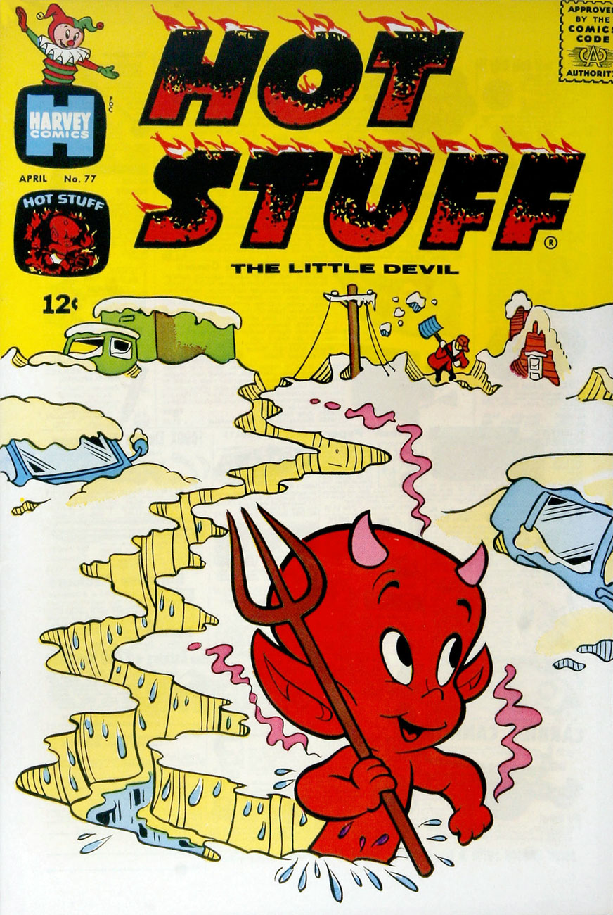
This is Hot Stuff, the Little Devil no.77 (Apr. 1967, Harvey). And how’s this?
That’s it for now! Keep cool, and may your asbestos underwear never chafe!
« Who are these men, Tomahawk? » « My Rangers! We fought against renegades… from Pennsylvania to Kentucky! When the country got too crowded, Moon Fawn and I moved out West… where a man has room to breathe! » — Tom Hawk sums up his change of station.
Inevitably, with the Silver Age and its superhero reascendancy, to the eventual detriment of all other genres, the historical adventure strip’s slow decline set in.
As Don Markstein put it:
« Toward the latter part of the ’50s, practically all DC comics ran aliens, monsters and other goofy sci-fi stuff on the covers, no matter how badly it clashed with the title’s subject matter — even war comics often sported dinosaurs in that position. And so, all through the late 1950s and early to mid ’60s, Tomahawk fought gigantic tree men, miraculously-surviving dinosaurs, mutated salamanders, and other menaces that seem somehow to have escaped the history books. There was even a giant gorilla among them, and putting a gorilla on the cover was also a contemporary trend at DC. »
It all comes down to the editor, and Tomahawk was long edited by Jack Schiff, who just adored that sort of (admittedly fun) claptrap, then by his associate Murray Boltinoff, who at least was more flexible.
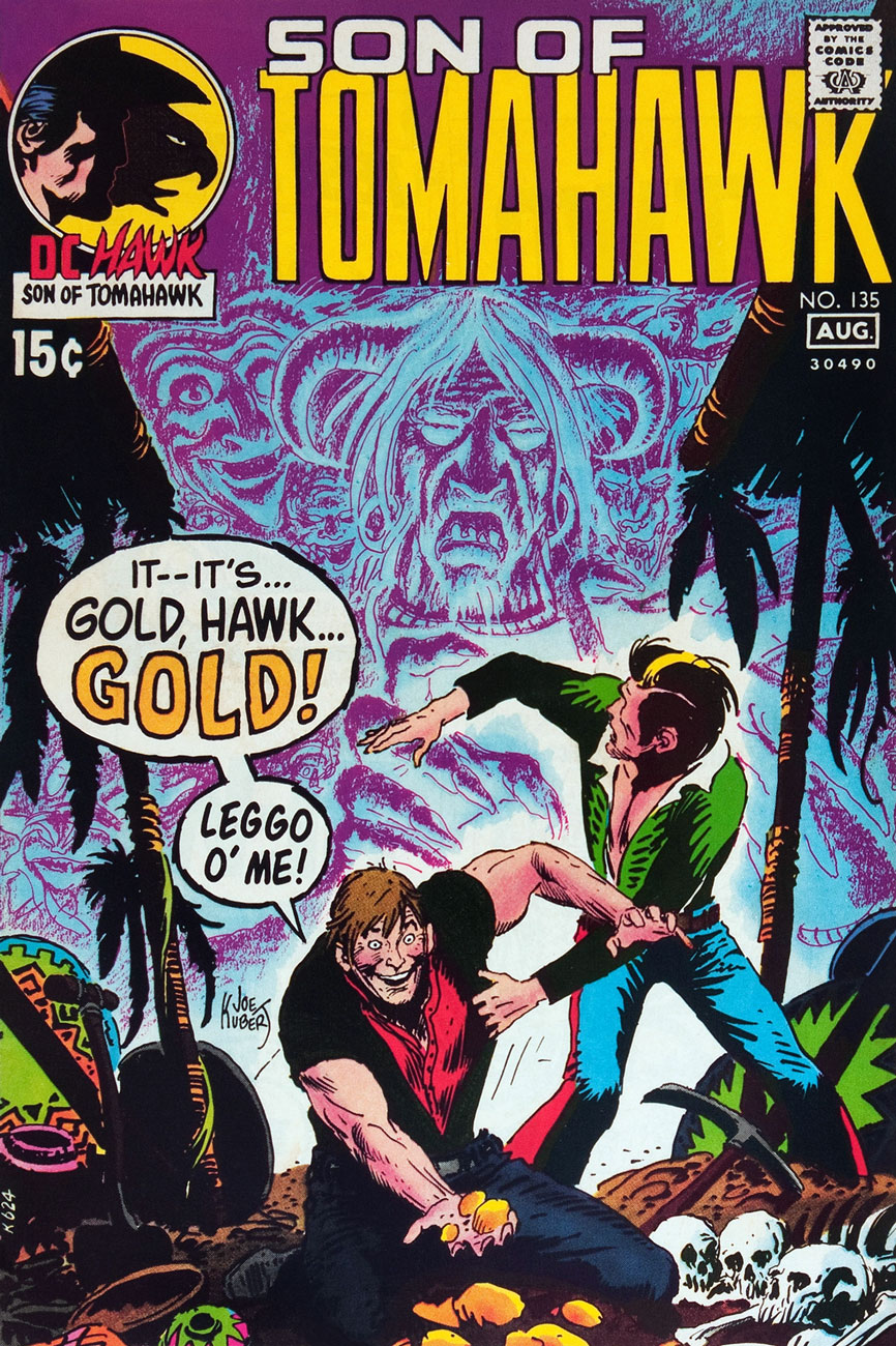
To wit, with issue 116 (May-June 1968) came a change and a relative return to the feature’s roots. First, Neal Adams was brought in to provide covers, and the more outré aspects were phased out. With issue 119 (Nov.-Dec. 1968), the book’s final creative team was brought aboard: writer Robert Kanigher and illustrator Frank Thorne (1930-2021), eventual creator of Moonshine McJugs. Thorne replaced Fred Ray (1920-2001) who, while he wasn’t a Tomahawk originator, had been chronicling the mountain lion’s share of his exploits since 1947. He would draw a handful of short pieces for DC’s war books before leaving the comics field in the early 1970s, writing historical non-fiction and art directing and illustrating for publications Civil War Times Illustrated, American History Illustrated, True Frontier, The West and Yank (despite the title, not a porno mag).
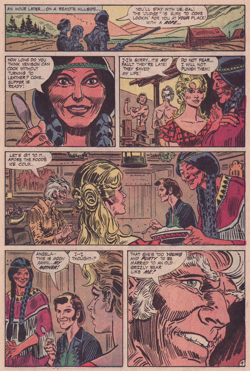
With the heart of the creative team in place, it was a change of editors that prompted Tomahawk’s final mutation, and arguably its most interesting: Joe Kubert took over the editorial reins, and the action was moved four decades or so forward in time. Tom ‘Tomahawk’ Hawk had settled down with a Native woman, Moon Fawn, sired a pair of sons, and was by then a lanky, crotchety old coot, but not quite helpless. His elder son Hawk was the protagonist, and they encountered frontier-style prejudice, greed, corruption, tribalism, paranoia… you guessed it: it was a ‘socially-relevant‘ comic, but hardly the cringe-fest that was the concurrent Green Lantern/Green Arrow. I daresay that Kubert and Kanigher’s respective politics were rather too complex for that.
This is Tomahawk no. 131 (Nov.-Dec. 1970, DC). Inside: Hang Him High!, written by Robert Kanigher and illustrated by Frank Thorne. I like how nonplussed Hawk is at the prospect of doing the Brand New Tennessee Waltz..
This is Tomahawk no. 132 (Jan.-Feb. 1971, DC). Inside: Small Eagle… Brother Hawk!, written by Robert Kanigher and illustrated by Frank Thorne.
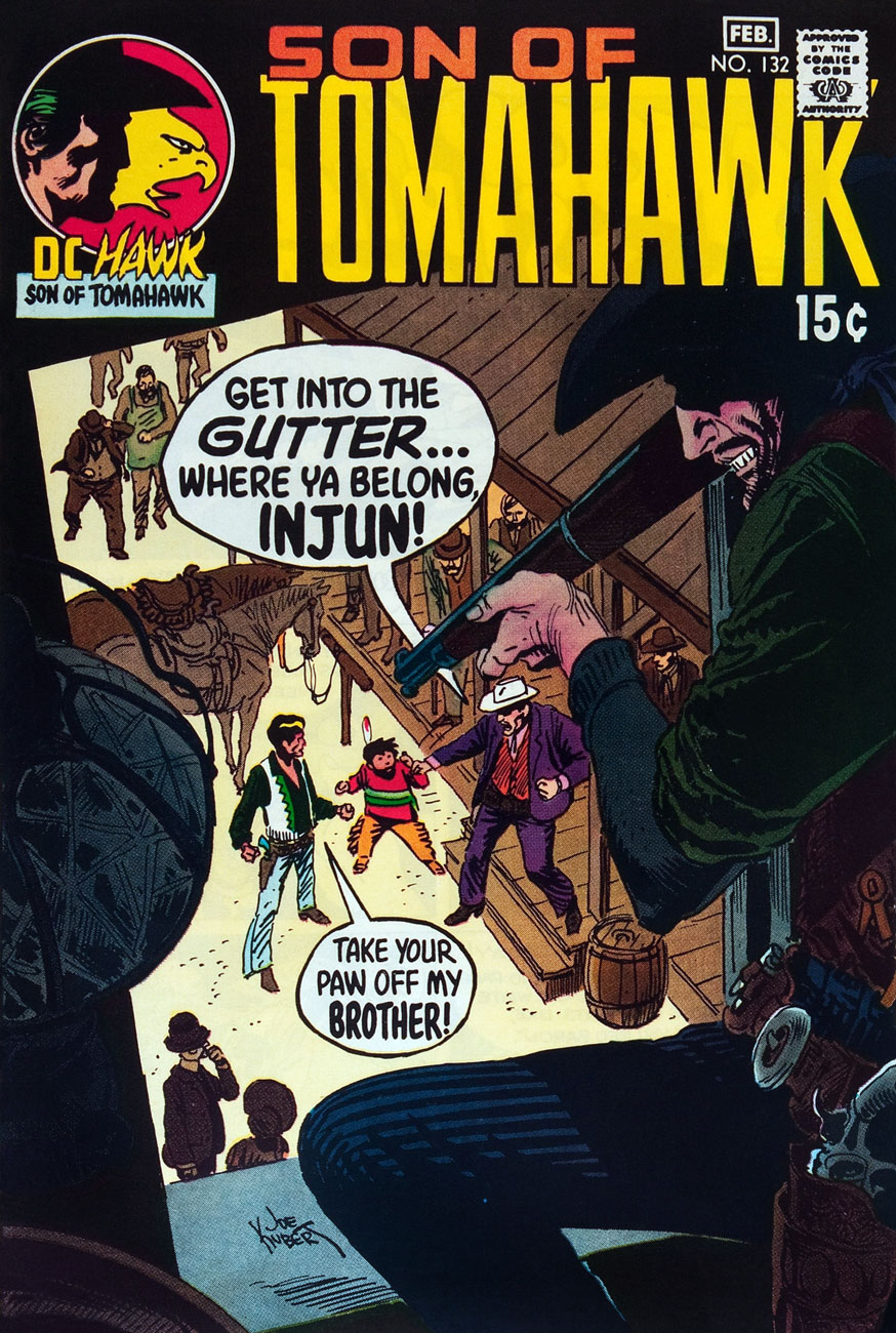
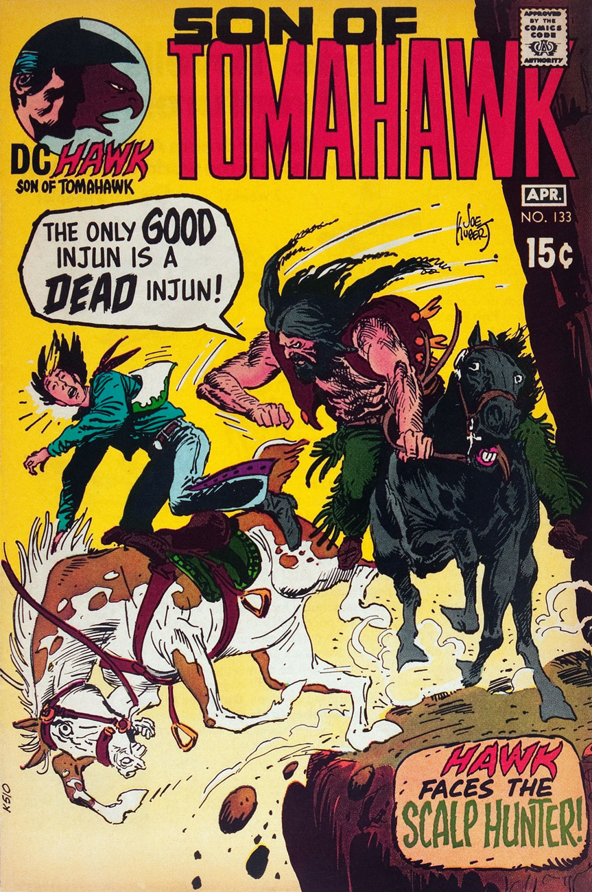
This is Tomahawk no. 133 (Mar.-Apr. 1971, DC). Inside: Scalp Hunter, written by Robert Kanigher and illustrated by Frank Thorne.
This is Tomahawk no. 134 (May-June 1971, DC). Inside: The Rusty Ranger, written by Robert Kanigher and illustrated by Frank Thorne.
This is Tomahawk no. 135 (July-Aug. 1971, DC). Inside: Death on Ghost Mountain!, written by Robert Kanigher and illustrated by Frank Thorne, and the powerful Spoilers, written by Jerry DeFuccio and illustrated by John Severin. This was my admittedly random introduction to the series.
This is Tomahawk no. 136 (Sept.-Oct. 1971, DC). Inside: A Piece of Sky!, written by Robert Kanigher and illustrated by Frank Thorne, plus an extraordinary Firehair tale by Kubert… but then they all are.
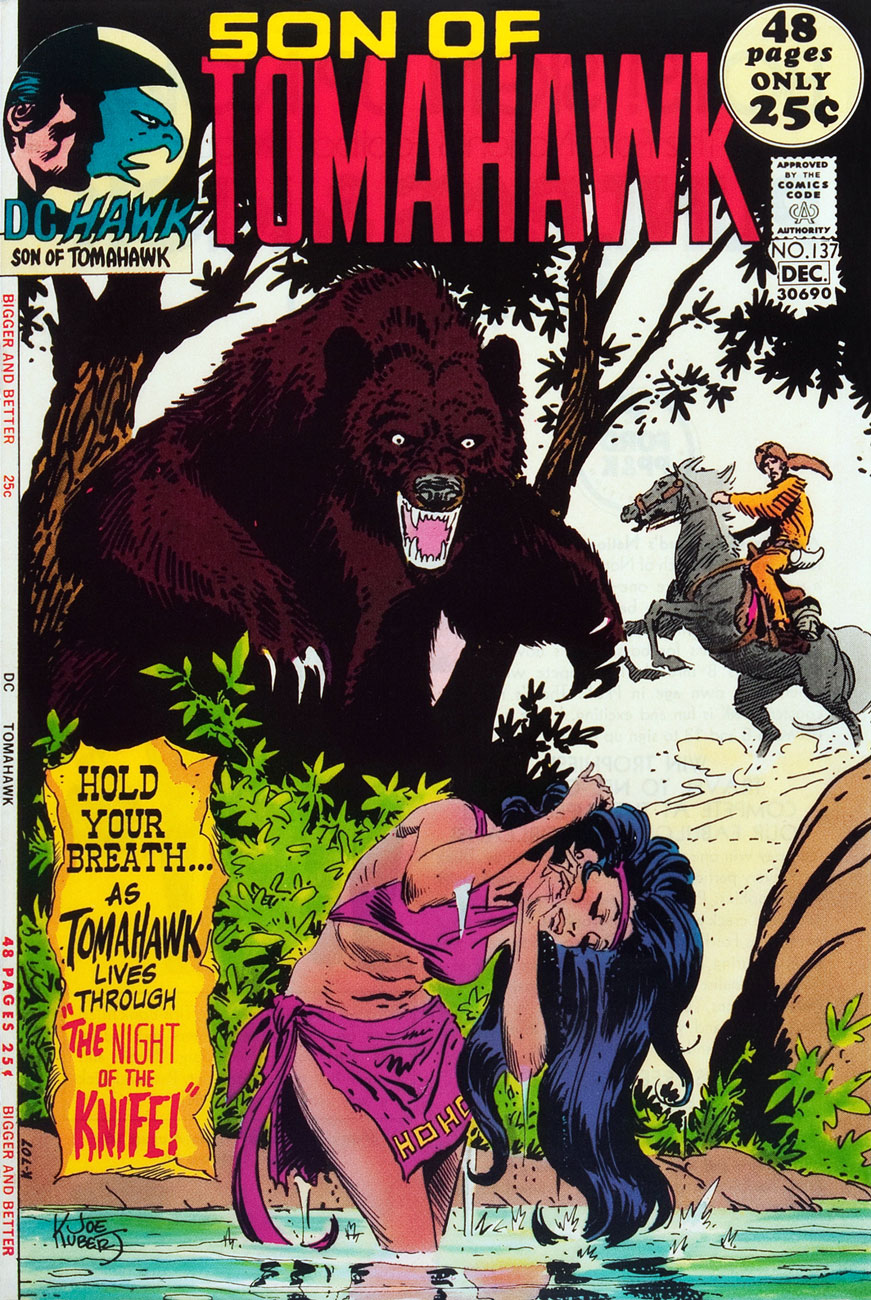
This is Tomahawk no. 137 (Nov.-Dec. 1971, DC). Inside: Night of the Knife!, written by Robert Kanigher and illustrated by Frank Thorne, plus a selection of fine reprints.
This is Tomahawk no. 138 (Jan.-Feb. 1972, DC). Inside: Christmas, written by Robert Kanigher and illustrated by Frank Thorne, as well as an assortment of worthy reprints boasting artwork by Nick Cardy, Sam Glanzman, Norman Maurer and Mort Drucker.
This is Tomahawk no. 138 (Mar.-Apr. 1972, DC). Inside: Death Council, written by Robert Kanigher and illustrated by Frank Thorne, plus a clutch of reprints illustrated by Fred Ray, Gil Kane, and none other than Frank Frazetta.
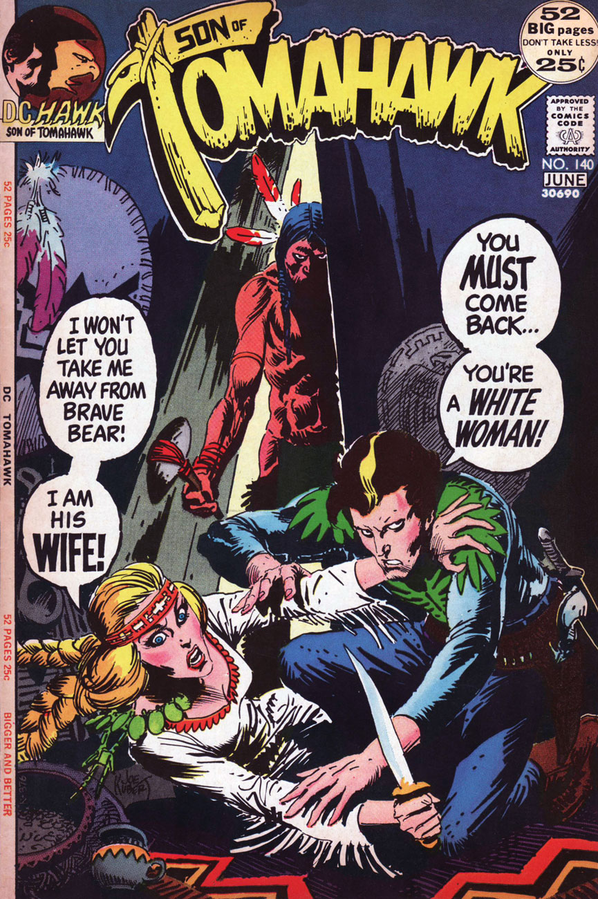
This is Tomahawk no. 140 (May-June 1972). Inside: The Rescue!, written by Robert Kanigher and illustrated by Frank Thorne. Gaspar Saladino‘s brand new logo, a rare misfire, was unveiled just in time for the book’s cancellation.
As for the interior art, I’d say it’s Frank Thorne’s finest work. The notorious Alexander Toth would of course disagreed, far preferring Thorne’s work when Thorne’s style bore a heavy… Toth influence (here’s an example from 1957.) For comparison, here’s a pair of interior pages from Tomahawk no. 131‘s Hang Him High!
Thanks to their production manager, Jack Adler, DC had the finest, most nuanced colouring in the field in the late 60s and early 70s.
Toth would, in (final) conversation with The Comics Journal publisher Gary Groth, in 1996, froth forth:
« I repeatedly warned Frank: “For Christ’s sake, get the hell away from Kubert. He’s not doing you any good. His influence on you is negative, not positive, so get the hell away from him and stop aping his style and stop putting on all that shit that you lived without for years. You did nice, clean, hard-lined stuff, and it’s been detrimental to your work.” He confessed: “Yes, Joe Kubert and his style are hard to resist.” So, yes he had the influence, and he liked it. Well, good luck. »
« You know, I once took a ride in a Volkswagen convertible driven by Harvey Kurtzman, with fellow passengers Terry Gilliam and Robert Crumb. Had we been smacked by a garbage truck the history of humor and popular culture would have been slightly changed. Interestingly not one of us had the slightest interest in any of the other three. Except, I am pretty sure we all hated Kurtzman, but who didn’t? » — Daniel Pinkwater
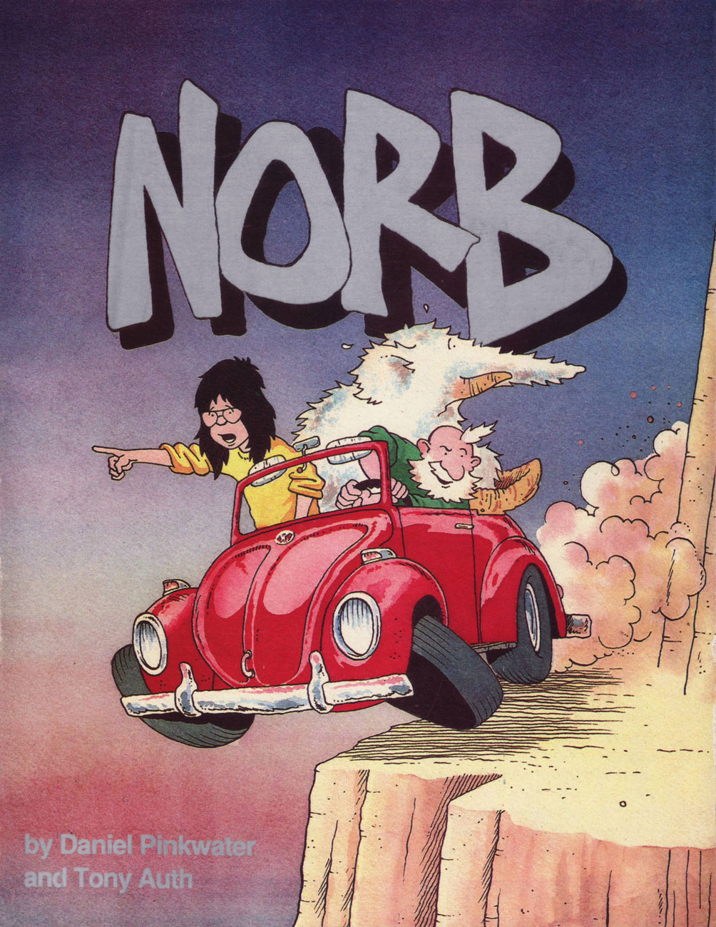
This post was originally going to be an interview. Having belatedly discovered Norb (1989-1990), I got in touch with Daniel Pinkwater (who better to ask?), intending to pepper him with questions, but he was so very helpful, providing me with all the background material I could have desired, that his prediction that « … since I have nothing to add, you may not need to formulate any questions for me » … came to pass. And so I gladly yield the floor to the sterling Mr. Pinkwater.
Tony Auth was a brilliant artist. He had an important day job as editorial cartoonist for the Philadelphia Inquirer. I think it was his first job, which he held for decades, and he was a Pulitzer Prize winner. We talked about doing ‘something’ together for a couple of years. Tony wanted to do a daily/Sunday newspaper strip, so we did that. Every day we’d remind one another, ‘keep it stupid.’ The fact was, we had no idea how stupid a commercial strip needed to be.
Stroke of luck, Denny Allen, who was temporarily in a position of influence at King Features had approached me years before about doing a strip. We met the power elite at King Features. I won’t characterize them except to say that the concept of stupid did not elude them, nor would it have been likely to. We negotiated for, and received a substantial advance from King, covering two years. I understand this was unheard of in the highly competitive rat race with a great many submissions coming in every day from marginally talented cartoonists.
So we went to work. My part was utterly easy. I would write the dailies and the separately plotted Sunday strip every Saturday while watching Dr. Who. Tony was putting in long hours in addition to his job at the newspaper. The strip launched in something like 70 papers, and I was told this was a big launch and unusual for the times.
We started in the vacancy created when Bloom County ceased production. The response from readers consisted entirely of actual hate-mail, letters saying it was hoped we would die, crude drawings of tombstones and daggers dripping blood. The only piece of positive fan mail I remember came from Jules Feiffer. A few papers dropped the strip, some in response to outrage from readers for whom the comics page was their literature. The typical letter read, ‘I hate NORB, it makes me feel stupid.’ Fair enough, I thought.
I understood that as few as 10 negative letters were enough to spook a paper into dropping a feature. My wife did a bit of research and discovered that all new strips have it rough initially, but if one survives two years it becomes un-droppable, and it is the editorial staff who get the threatening letters. Interestingly, Tony, who was a fair-minded political cartoonist, and got abuse all the time, (he’d had his office trashed by the right and the left at different times over the same issue, for example), and didn’t mind it, regarded the comic strip as the product of his heart, and was hurt by the unfair criticism.
So, at the end of the first year, Tony, exhausted by working two full-time jobs, depressed by the evidence that nobody seemed to like the strip, unwilling, as I was, to follow the advice from the comics/humor expert at King Features, let me know that he was not having any fun. ‘So, shall we quit?’ I asked. Since he was carrying 90% of the weight, I didn’t feel it should be my call. King was delighted to kill the strip because that meant they wouldn’t have to pay us the second year’s advance, and apparently they thought that saving money was the same as making money.
Exactly a year after the strip stopped appearing the fan mail started to come in, ‘Where’s NORB?’ ‘NORB was my favorite comic.’
A pair of dailies from the first week, whereupon we meet our protagonists and our protagonists meet.
From week two. It’s lovely that Mr. Pinkwater opted to bring along a character from his Snarkout Boys novels (The Snarkout Boys and the Avocado of Deathand The Snarkout Boys and the Baconburg Horror), Bentley Saunders Harrison Matthews, aka Rat Face aka Rat. She fits right in. That kind of freedom is among the foremost perks of owning your work.
A four-day sequence, to give you a better sense of the strip’s flow. I love how the alien armada is basically pixelated. Spoiler: They won’t get very far with their plan of conquest.
Front cover of Mu Press‘ collection of the Nord dailies, published in 1992. To quote the late SF luminary Vonda McIntyre in her INTROdadaDUCTION: « When [Mu Press] decided to reprint NORB, I jumped at the chance to write this essay. Only then did I discover that writing it didn’t mean I got to reacquaint myself with the Sunday strips… it meant I got to see the daily strips, which I didn’t even know about, for the first time. »
Now and then, Pinkwater would drop out of the narrative, go into meta-textual mode and engage the critics in an entertainingly passive-aggressive fashion. I do prefer the plot-driven strips, however… as does Rat. « Problem, Norb-Baby. Humorous adventure with a touch of satire is out this year. I don’t know where to put you. » (07/13/1990)
« You’ll pay for treating my employer like a baked ham, you evil person! ». Don’t worry, Norb’ll be okay: « Explain. Were you sliced like a radish or not? » « Oh, I was! But it was in the future. »
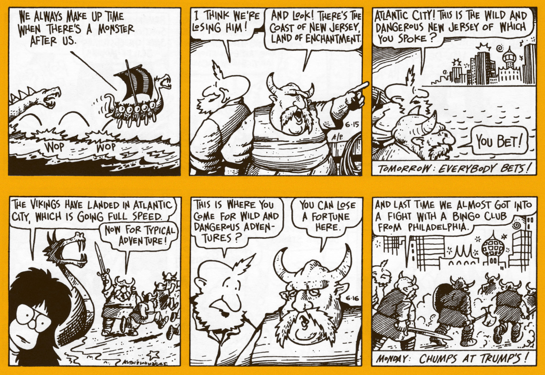
Anything goes, in the most winning sense. The noble Norse warriors were soon to realize that at Trump’s, you simply can’t out-chump the boss.
Norb is an exemplar of the narrative strip that doesn’t take itself seriously: while the story proper is intriguing, any individual fragment is quite entertaining on its own.
Never having been reprinted, the Sunday strips are rare as hen’s teeth, and those who possess them presumably clipped them out of their local paper back in the day. Foresight! As is often the case with King Features continuity strips, Sundays and dailies feature separate storylines.
Several years ago, Norb was featured as the Obscurity of the Day on the excellent Stripper’s Guide blog. There you’ll find a handful more of these gorgeously-coloured (aside from all their other evident virtues) Sundays, and more dirt about Norb.
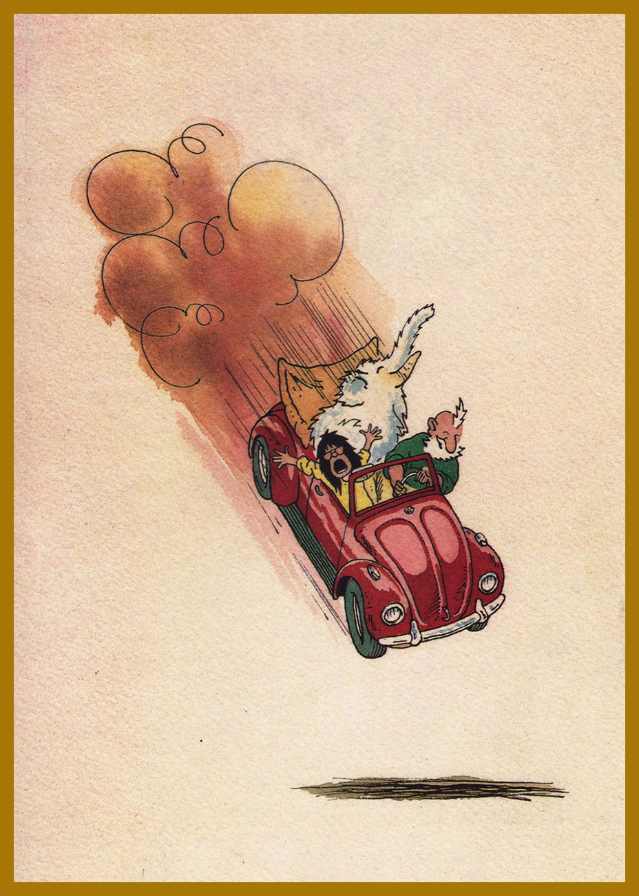
Et pour conclure, Auth’s back cover illustration from the Norb collection.
« It’s pretty clear that you take the whole subject of comics and cartooning a lot more seriously than I do. » Guilty as charged. Thanks for your most kind coöperation, Mr. Pinkwater!
This post is dedicated to the memory of Mr. Tony Auth (1942 – 2014).