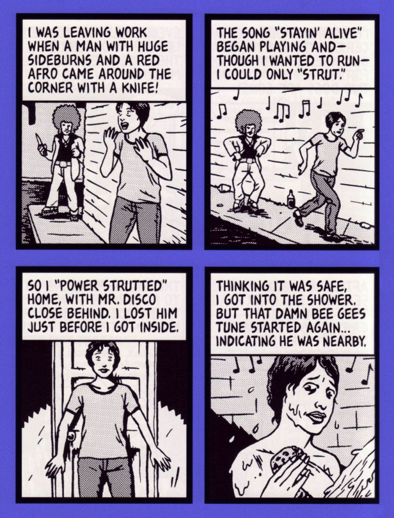
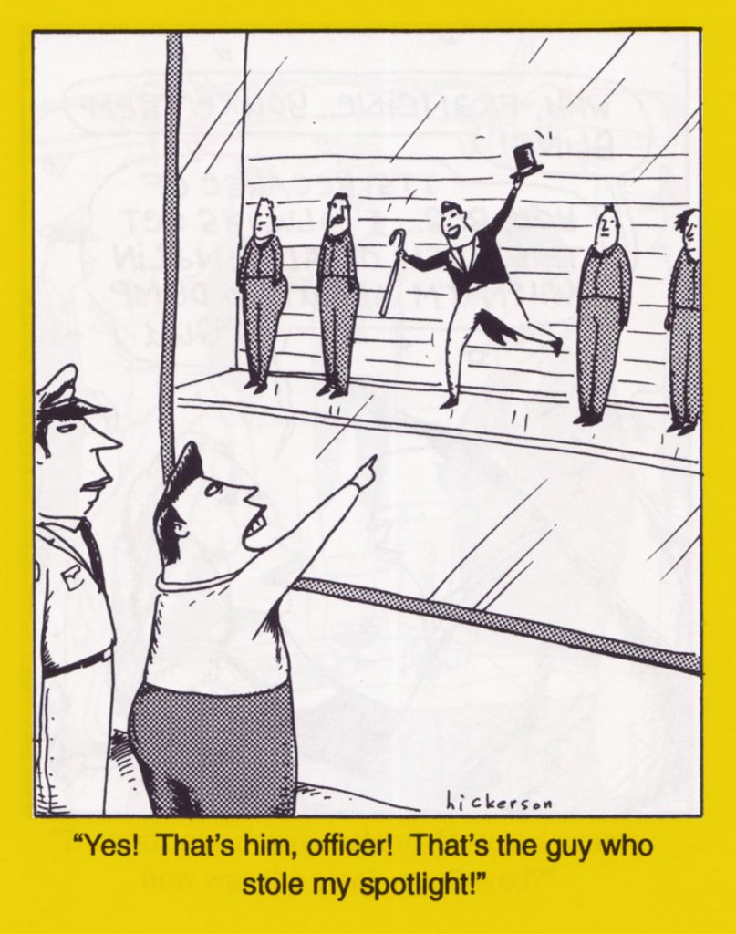
« You should be ashamed, Mr. Lash! Making such noises in front of the children! »
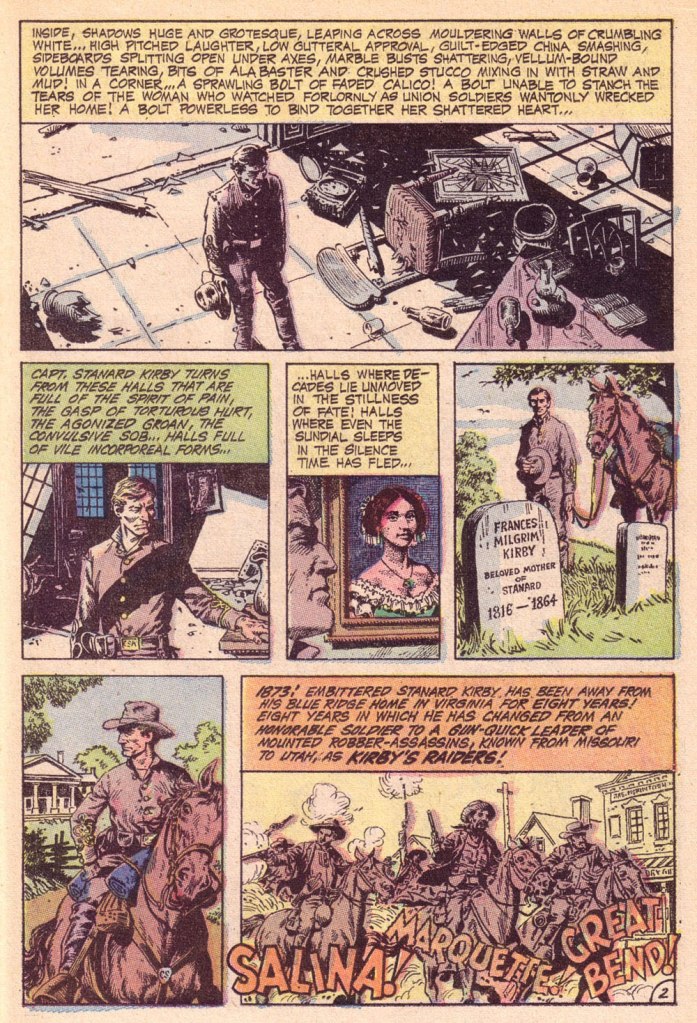
Bat Lash was introduced with issue 76 (August, 1968) of DC’s launching pad title Showcase, wedged between the respective débuts of Hawk and Dove and Angel & the Ape. At various stages of his conception, the character of Bartholomew “Bat” Aloysius Lash reportedly went through the hands of Carmine Infantino (who designed or at least supervised all of the following covers), Joe Orlando, Sheldon Mayer and Sergio Aragonés. Sergio plotted and thumbnailed the mise en scène, Dennis O’Neil added dialogue, then Nick Cardy pencilled and inked. For such a product-by-committee, Bat Lash is quite remarkably good — but then consider the talent involved!
Mind you, I make no claims of originality for Bat — he was distinctly a product of the times, when the vogue of Spaghetti Western had peaked* and ironically left its (off)brand on its model. By the time — in 1968 — its market reached its apex, the Italian Oater idiom threatened to congeal into a morass of clichés, becoming, as these things tend to go, (over)ripe for self-parody. Intentional and otherwise.
I surmise that the key model for Bat Lash was the ever-charming Mario Girotti**, reportedly enlisted thanks to his resemblance to the intense but one-note Franco Nero, even replacing the latter in his star-making, titular role of Django (1966) for a 1968 sequel, Prepare a Coffin, Django.
Ripe for its time it may have been, but I suppose that American audiences were still quite allergic to jarring tonal shifts in their entertainment (now commonplace), and would be for some time — just ask, say, John Carpenter. So the blend of light comedy and dark drama that Bat Lash proposed must have been difficult to market.
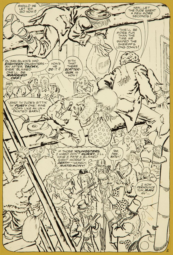
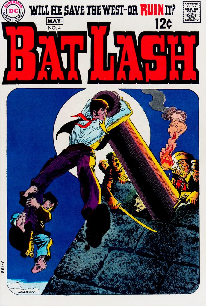
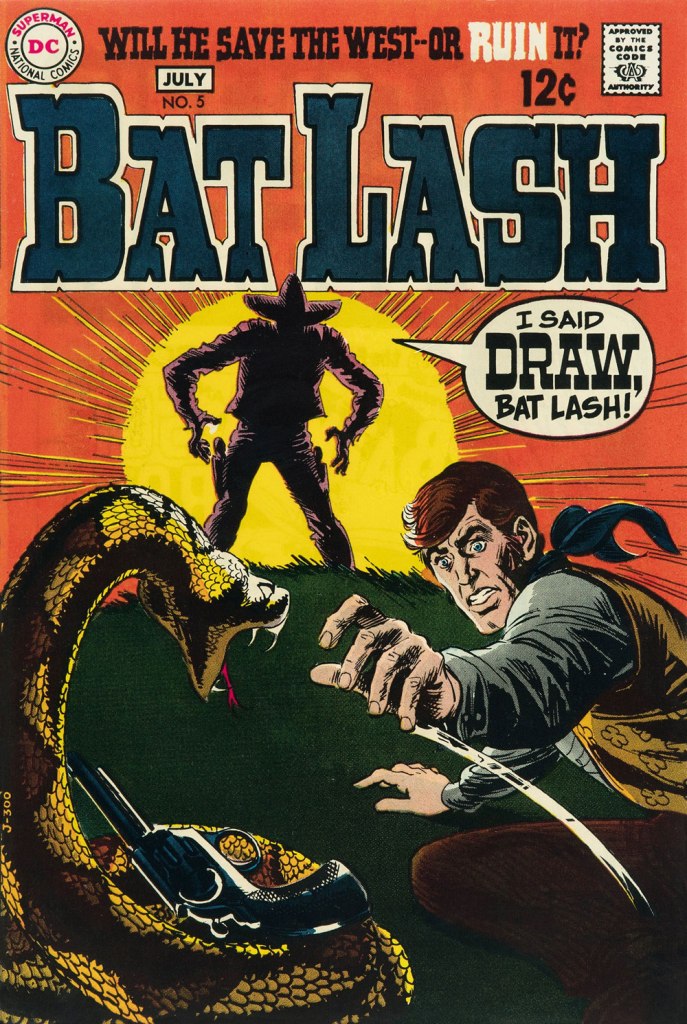
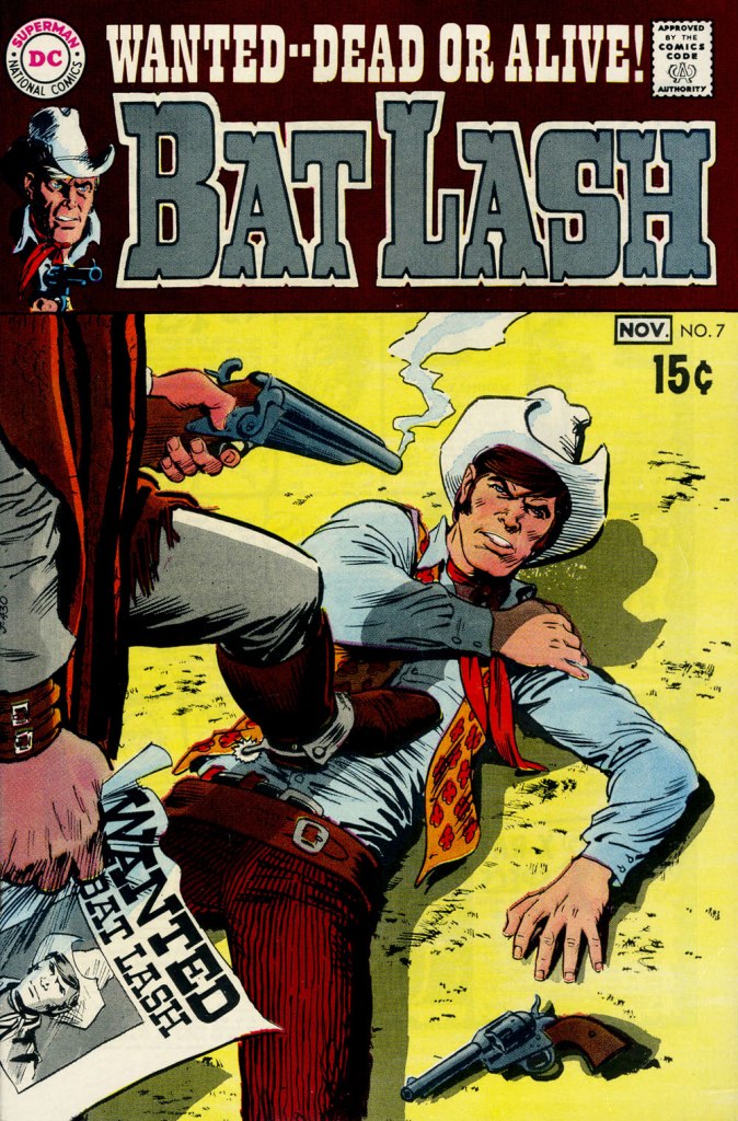
Our streak begins with Bat Lash no. 2 (Dec. 1968-Jan. 1969, DC) since the covers of Showcase no. 76 and Bat Lash no. 1 were good, but not — imho — great. I daresay this one is, in fact, the finest of the lot, with Cardy at his most Tothian.A peek inside the same issue, for contrast: lively and loose inking over rock-solid pencilling, and miles away from the tone of the cover. My guess is that some people weren’t happy.Bat Lash no. 3 (Feb.-Mar. 1969, DC) highlights the comedic side of the feature, which all but evaporated by the last two issues.This is Bat Lash no. 4 (Apr.-May. 1969, DC). Dig Cardy’s expert use of the ‘drybrush‘ technique on the stones.This is Bat Lash no. 5 (June-July 1969, DC). I’m reminded of a similar, later cover featuring one of Bat’s successors, Jonah Hex. The price goes up and the comedy… just goes. This is Bat Lash no. 6 (Aug.-Sept. 1969, DC).… and there goes the original tagline. This is the final issue, Bat Lash no. 7 (Oct.-Nov. 1969, DC)… and so must end this particular hot streak.
And now, some choice bonuses!
From issue 7, editor Orlando gives us some cheeky insight into the creation of an issue of Bat Lash.And plotter Aragonés provides some visual direction. To give you a sense of the less flippant, but not altogether grim, tone of the later issues, this is page two from issue 7. DC Comics of that period were quite ambitious with the limited means of the four-colour reproduction process, using plenty of backlighting and projected light… quite another level.
I was *delighted* to see ol’ Bat Lash turn up in the Weird Western Tales of DC’s outstanding Justice League Unlimited animated series, , along with some of his distinguished colleagues. In the usual order: Ohiyesa ‘Pow Wow’ Smith, El Diablo, Bat Lash, Jonah Hex.
-RG
* “In 1968, the wave of spaghetti Westerns reached its crest, comprising one-third of the Italian film production, only to collapse to one-tenth in 1969.” [ source ]
« I don’t understand retiring. I don’t know what I’d do. I don’t play golf. I have to sit at a drawing table or else it’s a wasted day. The nature of the work can change here, but I have to be doing something, especially with my hands. » — Seymour Chwast
Nobody really expects those we deem “immortals” to actually live forever… but I suspect some part of us does, or at least hopes so.
I haven’t yet reached that fateful age when reading the paper largely consists of scanning the obituary column to learn which of your friends (and possibly enemies) have died, but I fully grasp the concept… and shudder in sympathy.
And so on to my point: it’s easy to take genius (or mere talent, for that matter) for granted, and so I generally endeavour to salute valued creators while they’re still around, instead of paying belated lip service to their greatness once reminded of their existence by news of their passing.
For years, I’ve been meaning to devote a post to Seymour Chwast… and dragging my feet. He’s had such a long, inspiring — and daunting — career. But the other day, when Tony Bennett died, aged 96, I took it as a sign not to reserve my tribute for Mr. Chwast’s next birthday (that’s late next month). Here goes.
First, an amuse-gueule. This mute but highly rhythmical piece hails from issue 69 (October, 1977) of Push Pin Graphic, the fabled design studio’s showcase magazine. The issue’s theme is “House Nice”, parodying interior decorating fixture House Beautiful Magazine. Written and drawn by Mr. Chwast.
Design historian Steven Heller explains: « Push Pin’s principal cofounders, Seymour Chwast (b. 1931) and Milton Glaser (b. 1929), two native New Yorkers who met while attending Manhattan’s Cooper Union, brought distinct tastes and preferences — as well as chemistry — to their unique partnership. Chwast savored American comic strips and pop culture while Glaser studied etching in Italy and was passionate for Italian Renaissance painters. The former injected a cartoonist’s abandon into his artwork, the latter introduced a sublime elegance. Despite their formal differences, both shared the conviction that postwar design and illustration should not be limited to prevailing practices — either sentimental realism or reductive simplicity. They rejected rote methods and rigid styles while concocting incomparable ways of transforming old into new… »
The following encapsulates even more succinctly the duo’s boundless contribution: « Seymour Chwast and Milton Glaser are legendary graphic designers who founded Push Pin Studios, where they rebelled against the swiss style establishment – blending illustration with design. » [ source ]
Amen: from my standpoint as an art student back in the early 1980s, I’ll say one thing about Swiss design: that shit was oppressive.
To sidestep the perils of losing my way amidst such a gargantuan topic, I’ve opted to focus on a favourite entry in the Chwast œuvre.
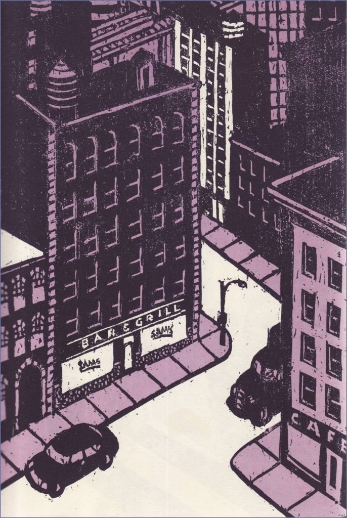
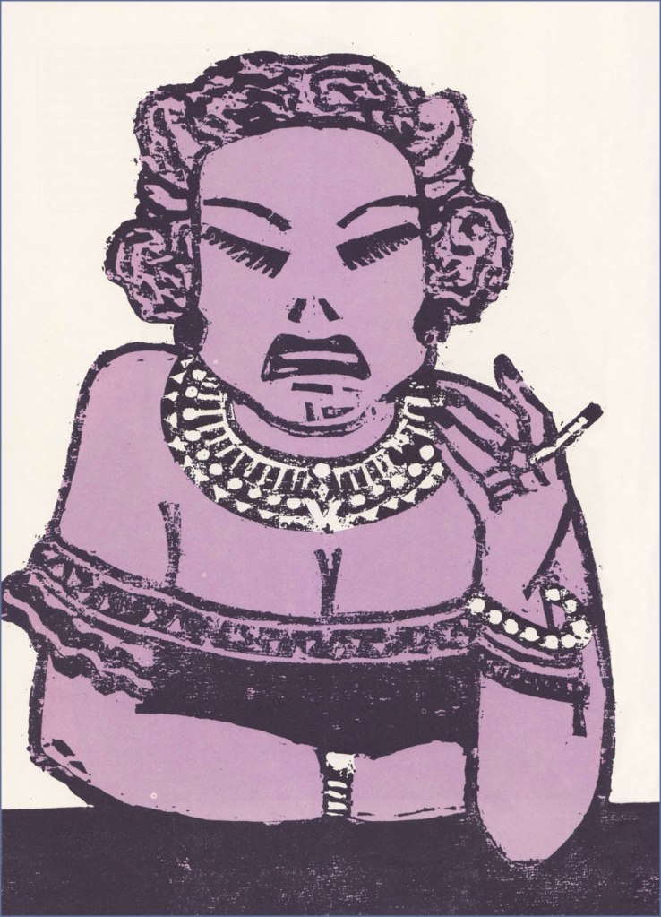
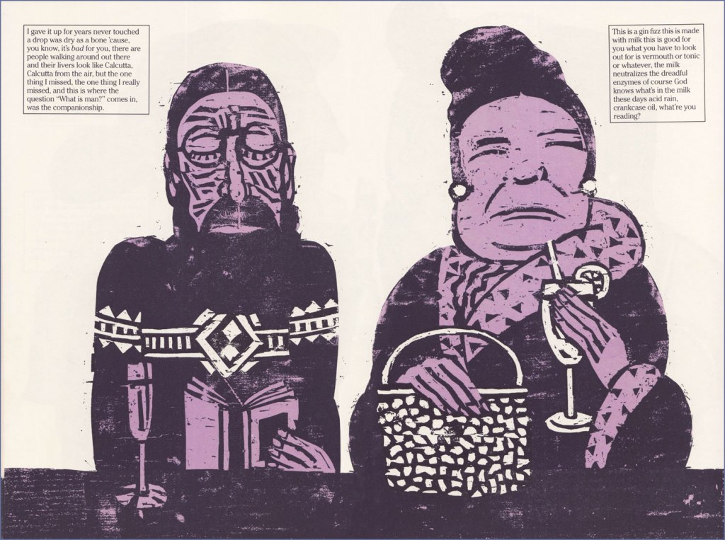
« Another of Chwast’s graphic stories is Sam’s Bar (Doubleday, 1987). Written by Donald Barthelme, it is also a total narrative and pictorial story. It captures in woodcut illustrations one night in a bar somewhere in America, people talking to each other and talking to themselves as the reader goes from one end of the bar to the other. » The book’s intriguing structure would have made it an ideal comic *strip*, in the literal sense.
Ellie says: « So I told the kid May 31, 1989, was the cutoff date, as of May 31, 1989 she’s off the payroll whether she’s finished goddamn college or has not she’s finished goddamn college. So she tells me she’s thinking of transferring to UCLA and that’s going to set her back two semesters. So she can get fencing. Where she is they don’t have fencing. I said I’ll rent you an Errol Flynn movie. »
Trish and Calvin.Hal and Germaine.Two lawyers, Mario and Saul. Someone ought to make a show about a lawyer named Saul.
The book’s handy endpapers, featuring “The Regulars at Sam’s Bar“.
I wouldn’t want to short-change Barthelme’s contribution… as a collaboration, this truly works a treat. Here’s an amusing passage I encountered on the subject of this routinely misunderstood author: « Donald Barthelme was, by his own design, a hard writer to categorize. Even at the height of his fame, in the late 70s and early 80s, there were readers who just didn’t get him, or suspected his work was a hoax or a joke they weren’t in on. At The New Yorker, where he was a regular contributor for decades, clerks in the library were expected to type up on index cards brief summaries of every article, fact or fiction, that appeared in the magazine. Barthelme’s cards sometimes contained just one word: “gibberish.” » [ source ]
One more for the road? I couldn’t leave out Chwast’s adorable cover illustration for issue 57 (Why People Keep Dogs) of Push Pin Graphic, from 1972.
Many happy returns and thanks for the inspiration, dear Mr. Chwast!
« The man who never dreams, goes slowly mad. » — Thomas Dolby
Jesse Reklaw‘s Slow Wave* (1995-2012) was both an early webcomic and a syndicated strip that ran in about a dozen alt-weeklies.
Here’s a historical rundown that Reklaw provided in 2005, musing on the feature’s genesis and its initial decade:
« While I was an undergraduate at UC Santa Cruz (1993-1995), website technology wobbled out into the world. Entrenched in the DIY zine community that had been liberated by cheap photocopies and desktop publishing, I became obsessed with this new independent media opportunity. With help from Ranjit Bhatnagar, I learned how to code HTML, and started an online art gallery at UCSC. I was juggling a double major in art and computer science, so it seemed like a natural fit.
Between classes (and math tutoring, and being an RA, and band practice), I was drawing comics. In order to focus on my drawing, I stopped writing my own material and instead asked friends for stories to draw: they could be anecdotes, fiction, dreams, whatever. All the stories were fun to draw, but I felt an immediate connection to the dreams. They had compelling imagery, their own logic, and a natural dada-like humor. Drawing them was like being there in the dream, experiencing the mind of the dreamer, but also realizing my own perceptions through theirs. It was like floating in that infinite reflection between two mirrors.
In 1995 I moved across the country to icy New Haven, Connecticut for graduate school. I also continued to draw comics, now exclusively dreams that I got from friends and family. I started posting the Slow Wave strip because I wanted regular, updated content for my personal website (called nonDairy.com back then). At the time, everyone was saying “Content is king.” I coded my pages in simple programs like notepad and simpletext (which I still use), building my site in secret, often in the empty hours between midnight and morning. I led a double life as a computer scientist and a cartoonist. Along with the site, I put up a website form to solicit more dream material. A few trickled in at first, but as the Web grew, this became the major source of dream submissions. After I’d drawn about twenty strips, I got the idea to submit them to weekly publications. I found the website of the Association for Alternative Newsweeklies, and discovered a wealth of newspaper addresses and contact info. They seemed to be served from a database, and you could view the records one screenful at a time. Not content to just copy down the information, I wrote a web-spider that downloaded every page, parsed the text from the HTML code, and “reverse engineered” the database for my own use. I sent out about sixty submissions, and was totally surprised to get picked up by two papers: The Rocket in Seattle (now out of business) and the Philadelphia Weekly (who dropped me after a month). It was encouragement enough to keep me going. I probably would have gotten bored with the web-only comic strip after a couple years. The internet had moved on from content anyway, and designers were more interested in animated GIFs and other dancing baloney.
I continued to self-syndicate, and was picked up by enough papers that it seemed possible to make a career out of it. I dropped out of grad school in 1998 (didn’t really like being a Yalie anyway), and started cartooning full time. I also had enough strips now that I thought there should be a Slow Wave book collection. I proposed the idea to a lot of comic book publishers, but had little luck there. I complained on my website about not being able to find a publisher, and within a week was contacted by Kendra Crossen Burroughs, an editor at Shambhala. Kendra had apparently been reading the strip online for a while, and convinced Shambhala there should be a book. Dreamtoons came out in 2000, collecting about two-thirds of the strips I’d drawn so far (not including the one above). Dreamtoons is currently out of print, but there’s lots of used copies floating around out there**. »
An example of how Reklaw sollicited thematic contributions to Slow Wave. It’s safe to suppose that none of the contact details are still relevant, except in dreams.
From a dream by Lauren Fowler.From a dream by Connie Liu.From a dream by DW Wissinger.From a dream by K. L. Wanlin.From a dream by Paul J. Lurie.From a dream by Pierre Dalcourt.From a dream by Isaac Cates.From a dream by Liz Kuzmeski.From a dream by Eli Bishop.From a dream by Sinnicam NodNarb.From a dream by Zach Archer.From a dream by Ryan Budge.
In the ensuing years, poor Jesse’s had, even by cartoonist standards, a terrible time of it, besieged as he was by both physical and mental health challenges. It’s not much of a stretch to surmise that cartooning saved his life, and he’s hardly alone in this. Check out this sobering Comics Reporter interview, (circa 2014) and you’ll get some sense of what I’m alluding to.
-RG
*Slow-wave sleep (SWS) refers to phase 3 sleep, which is the deepest phase of non-rapid eye movement (NREM) sleep, and is characterized by delta waves (measured by EEG). Dreaming and sleepwalking can occur during SWS. SWS is thought to be important for memory consolidation [ source ]
**Nearly twenty years on, cheap copies are still bountiful.
« History deals mainly with captains and kings, gods and prophets, exploiters and despoilers, not with useful men. » — Henry Louis Mencken
A few months ago, I was reading an old John Severin interview (in Graphic Story Magazine no. 13, Spring, 1971, Richard Kyle, editor) conducted by John Benson, and this passage stuck with me:
BENSON : Who are your favorite comics writers that you’ve worked with?
SEVERIN: I don’t even know who writes half the stories. Well, there are two guys, but they aren’t essentially comics writers. I like to work with Jerry DeFuccio and with Colin Dawkins. They write stories.
Which in turn led me to another Severin interview, this one conducted by Gary Groth in the early 2010s.
GROTH: In the back of the book, I’m looking at one issue of Son of Tomahawk actually, which I guess is a post-Tomahawk spin-off, but Frank Thorne does the lead feature and you did a really beautiful backup, I think one of your best strips during this period called Spoilers, that Jerry DeFuccio wrote.
SEVERIN: Really?
GROTH: You don’t sound like you have any recollection of this whatsoever.
SEVERIN: No, not at all. Oh, there’s an awful lot of stuff. Once I do a script and turn it in, it’s only with minor exceptions that I’ll remember the thing next week! I might remember it later on if somebody reminds me of something, but if somebody said, “What did you do last week?” I’d be damned if I know.
Severin’s reaction, to me, is a reminder of two things: first, that some artists (and fans!) are only interested in the visual aspects of comics. And second, that work conditions in the comics field (and most other commercially driven endeavours) are pretty inhumane if you have to just keep chugging on, with little time or impetus to look back and sniff the newsprint, let alone reflect.
Jerome ‘Jerry’ DeFuccio (1925 – 2001) was born on this day, ninety-eight years ago. While he’s most closely associated with his quarter-century stint as associate editor of Mad Magazine, readers of EC’s war/adventure titles know he could also pen, in excellent fashion, a thoroughly gripping yarn. Here’s one of the handful he later did for DC, for editor Joe Kubert. And while Son of Tomahawk wasn’t commercially successful, it was a highlight of its era, a truly adult comic book. See for yourself:
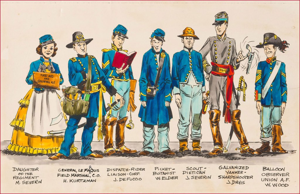
‘Spoilers!’ saw print in Tomahawk no. 135 (July-Aug. 1971, DC). Here’s a lovely illustration of some of the EC gang, in civil war drag . Like it says, DeFuccio’s third from the left. Ink and wash over graphite pencil on Bristol board. » Drawn in the 1950s, this piece saw print in 1983, in issue 9 of the excellent EC fanzine Squa Tront.
GROTH: Was DeFuccio working for Mad at that time?
SEVERIN: Yeah.
GROTH: It seems like you remained friends with DeFuccio for a very long time.
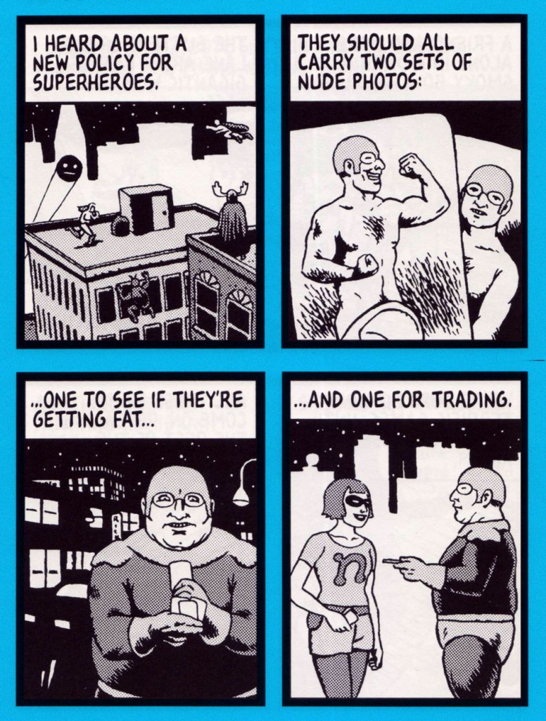
« I opened my magazine (What did you see?) / I saw Mr. France (What did he have?) / A girl on each shoulder (What else?) / And one in his pants » — 10cc, Sand in My Face (1973)
You may think of this post as a companion piece, a spinoff of its predecessor. I’d had for some time, in the back of my mind, the notion to showcase some obscure French ‘human sculpture’ ads, but it needed more. Comments on the previous post provided the spark.
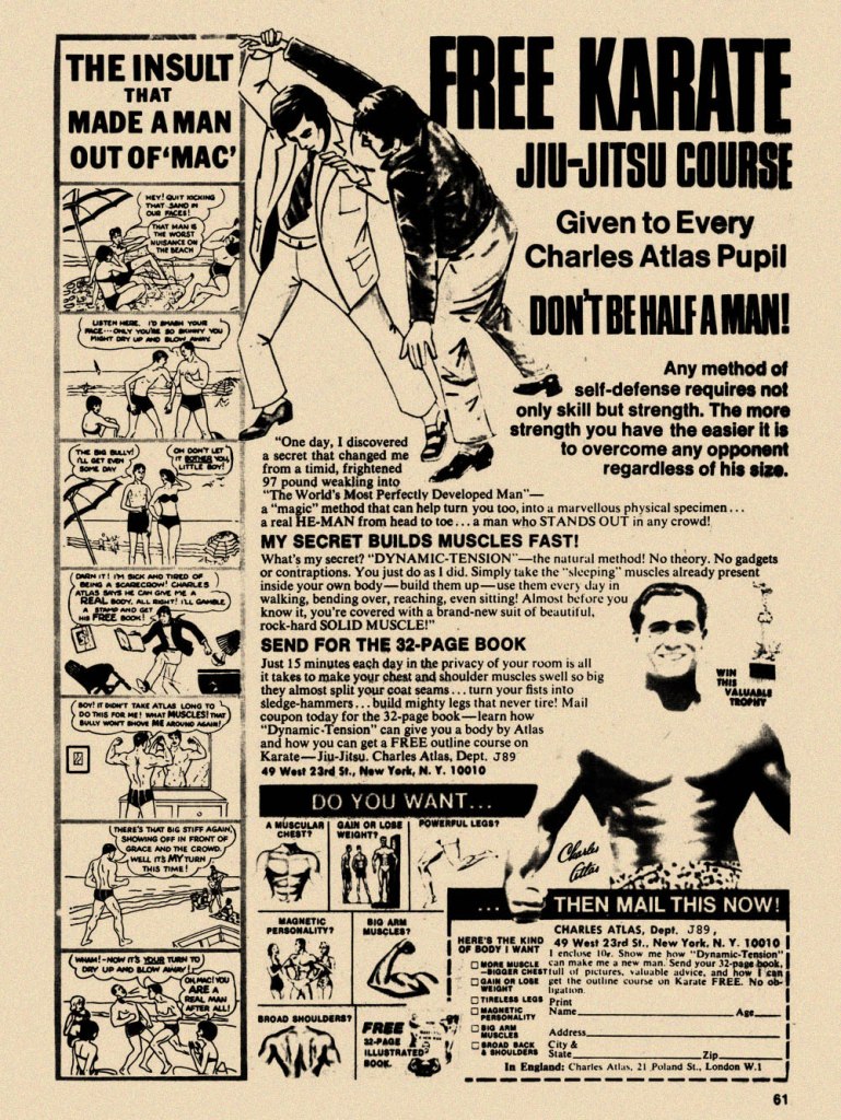
Is there a more classic “humble immigrant makes good in the USA” yarn than that of Angelo Siciliano, born in 1892 in the tiny Italian town of Acri? The Smithsonian has told the full, colourful story, so I’ll spare you a rehashing of it.
Let’s just say that young Siciliano worked hard to overcome adversity and redeem his puny physique, and the rest is the stuff of legend. The principles of ‘dynamic tension‘ and his immortal moniker aside, Angelo’s finest brainstorm was to employ the lowly but then-ubiquitous medium of comic books to introduce his product and its natural audience to each other. Let’s take the tour!
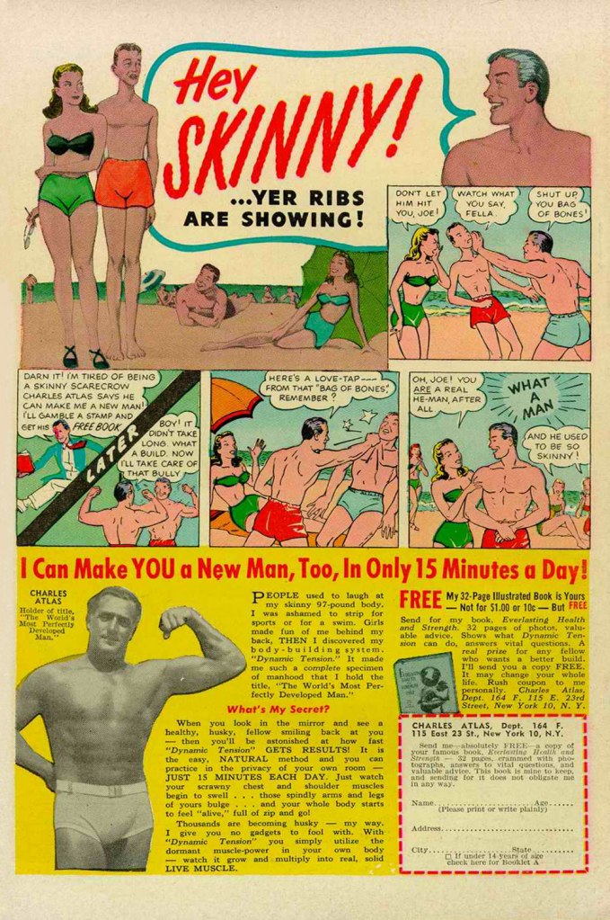
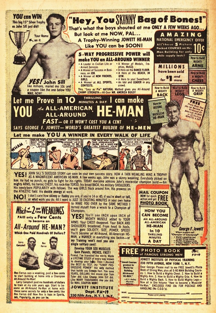
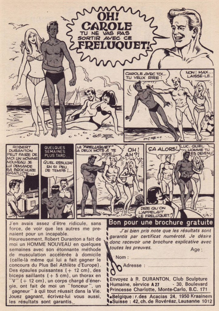
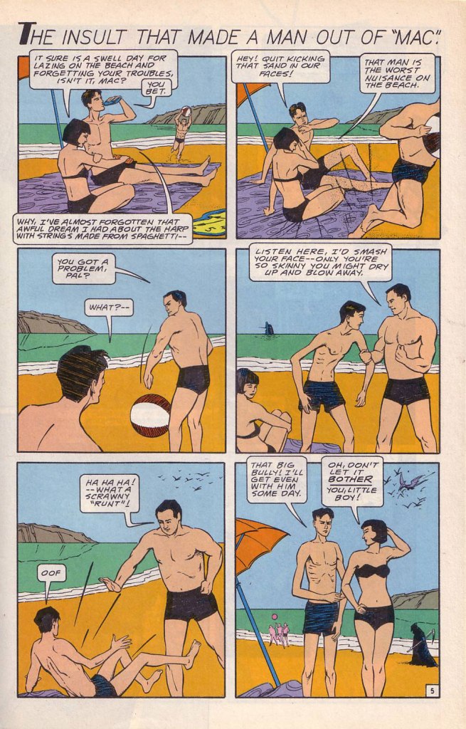
While the Charles Atlas ads began running in the 1930s, this is probably their classical expression. This one saw print as the back cover of Mad no. 14 (Aug. 1954, EC). Its opening insult even inspired Miles Heller’s 1995 salute to the great old comic book ads, Hey Skinny!There was inevitably fierce competition in the self-improvement field. This entry, from the U.S. Nature Products Corp., appeared in Stan Lee’s oh-so-macho Man Comics no. 10 (Oct. 1951, Atlas).Lots and lots of copy — but the all-important cartoon hook is present and accounted for. From the pages of Firehair no. 9 (Fall 1951, Fiction House). The Jowett Institute of Physical Training wants you to get buff! To be fair, George F. Jowett got there first.This is surely the definitive version, with the unforgettable tag line and ‘hero of the beach’ conclusion. I pulled this one from The Witching Hour no. 25 (Nov. 1972, DC), which hit newsstands just a few months before Mr. Atlas passed away, aged 80, on Christmas Eve. I can’t help being amused: French publisher Arédit, whose digest-sized collections of (mostly) reprints of US comics proudly bore the tag « Comics for adults », featured very few outside ads… and those were almost exclusively for self-defense and body-building systems. Here’s a sample trio. This one appeared in Maniaks no 4 (Fall, 1971). This title featured reprints of DC Silver Age ‘humour’ comics… all but the only actually funny one (that would be Sugar and Spike, of course).Oh, I’m sure the ERB Estate got their cut. And who might that R. Duranton fellow be? Four times Mr. France, for one thing! Here he appears with Louis de Funès in a famous scene from Le Corniaud, a 1965 farce starring beloved stars André Bourvil / De Funès and directed by Gérard Oury. This one’s from Kamandi no. 4 (Summer 1976, Artima), which featured reprints of various 60s and 70s DC adventure comics. It was an affordable way to catch up on material one might have missed — or couldn’t afford!This refreshing gender-switched lampoon comes from the pages of National Lampoon no. 26 (May, 1972), the ‘Men!’ issue, guest-edited by Anne Bats, No other credits, dammit. The opening page (of four) of Steve Skeates and Sergio Aragonés‘ wacky satire, from the pages of Plop! no. 2 (Nov.-Dec. 1973, DC). There have been truly countless spoofs of the Atlas adverts… most of them quite dire. Once more, I’ll spare you.By the mid-1970s, with America in the kung-fu grip of martial arts fever, it’s understandable that many a young man was envisioning Bruce Lee‘s lithe, compact physique as an alternative to the hulking musclemen of yore. The Charles Atlas company tried to cover all bases with this ad; from — speaking of old-time musclemen — Doc Savage no. 2 (Oct. 1975, Marvel).
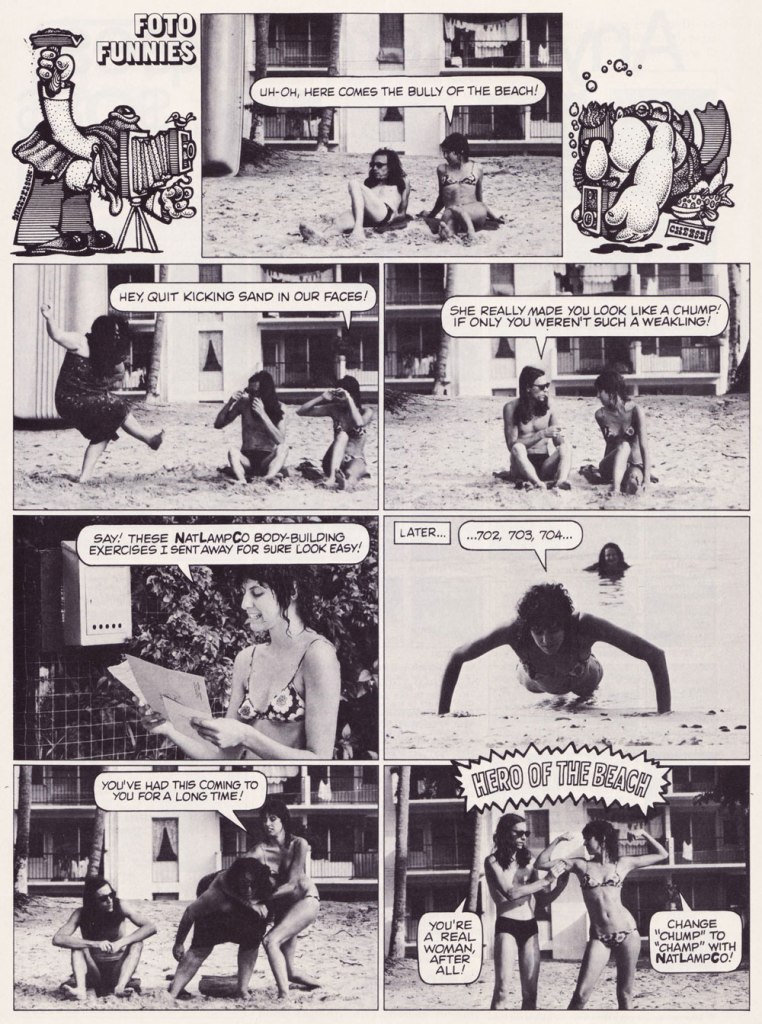
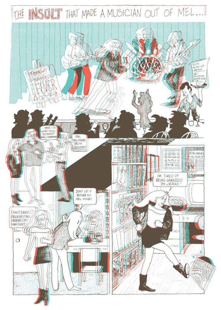
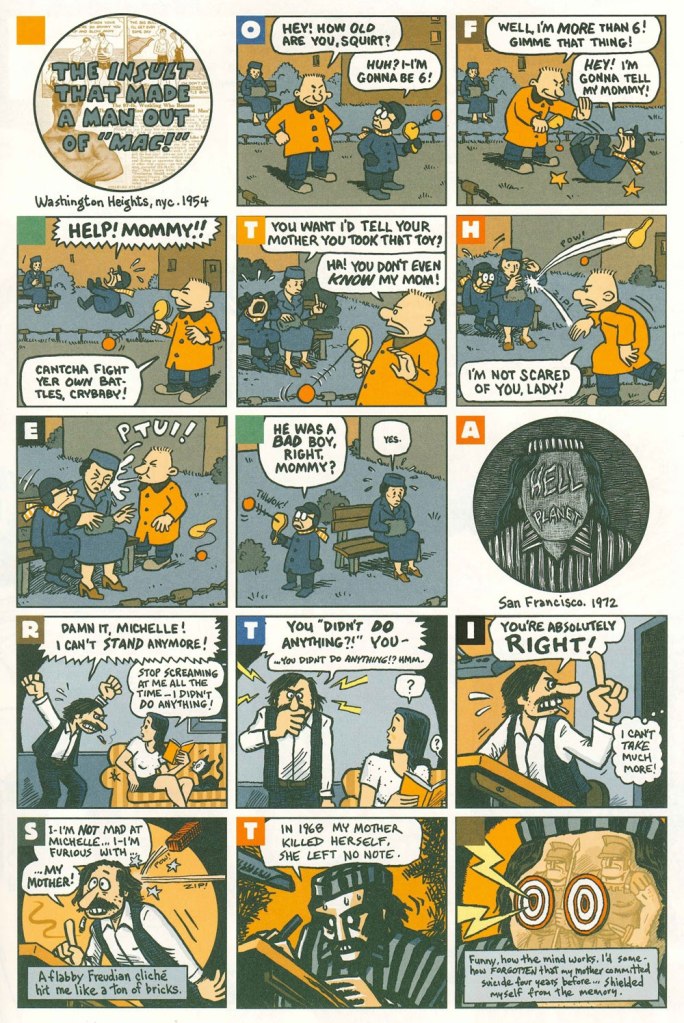
Ah, yes — those days when ‘Bruce‘ was the stereotypical gay name. From the ‘Playboy Funnies’ section of the magazine’s November, 1977 issue.And for something a bit off the beaten path: this is The Insult That Made a Musician Out of Mel, scripted by Rebecka Wright, illustrated by Blanche Santa Ana, with 3-D effects by Ray Zone, from Wimmen’s Comix no. 12 (Nov. 1987, Renegade Press), edited by Angela Bocage and Rebecka Wright.Does this look familiar? This is the first page of Flex Mentallo’s origin tale, as it appeared in Doom Patrol no. 42 (Mar. 1991, DC), written by Grant Morrison, with art by Mike Dringenberg and Doug Hazlewood. I have no idea whether Atlas had a sense of humour, but his successors sure didn’t, as evidenced by the lawsuit they filed against DC Comics over this clear — if brazen — case of satire. I much prefer the TV show version of Flex, I confess.Peter Kuper deftly used the cliché to take a jab at George Bush Sr.’s image and the first Gulf War. Dated and irrelevant? Trying to prove your ‘manhood’ remains distressingly au courant… just consider these two schmucks, to cite but one recent example. And hey, here’s “Stormin’ Norman lying on T.V.” From Bleeding Heart no. 1 (Winter 1991-92, Fantagraphics).Art Spiegelman digs deeper and makes more discerning use of the raw materials at hand with The Insult that Made a Man out of “Mac!”, first previewed in The Virginia Quarterly Review and then collected in Breakdowns Portrait of the Artist as a Young %@?*! (Oct. 2008, Pantheon).
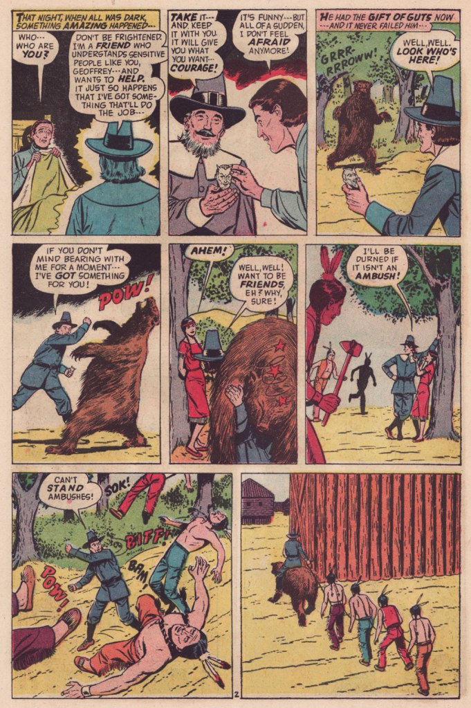
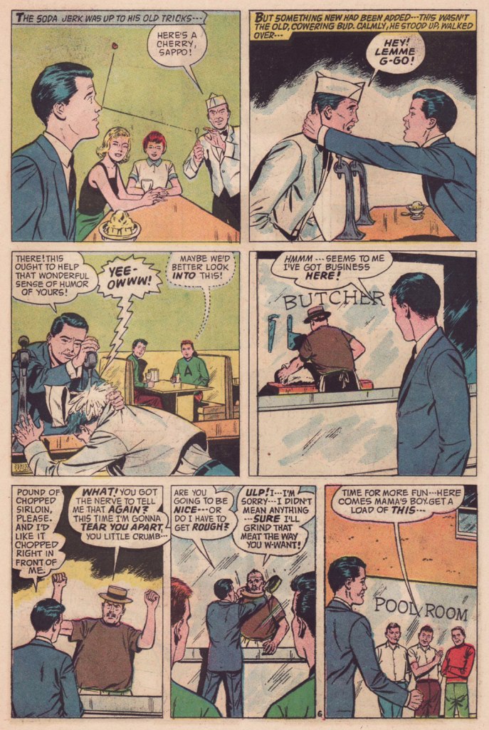
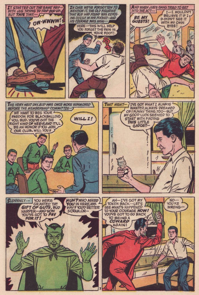
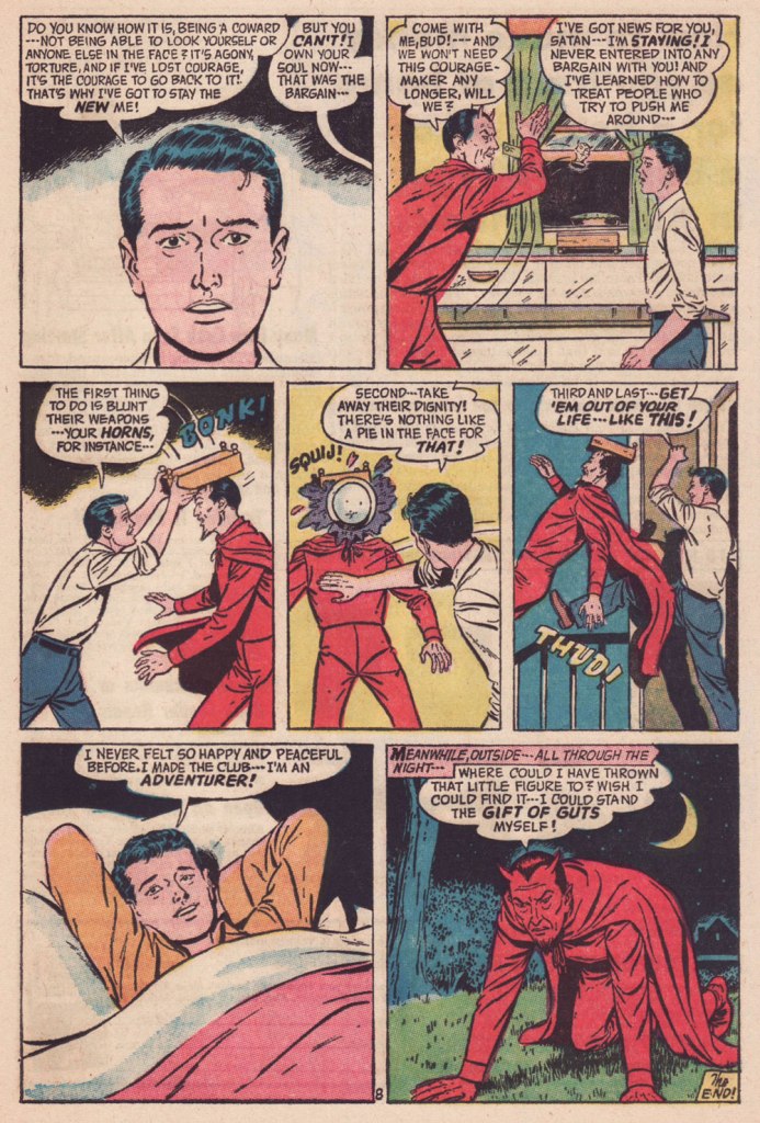
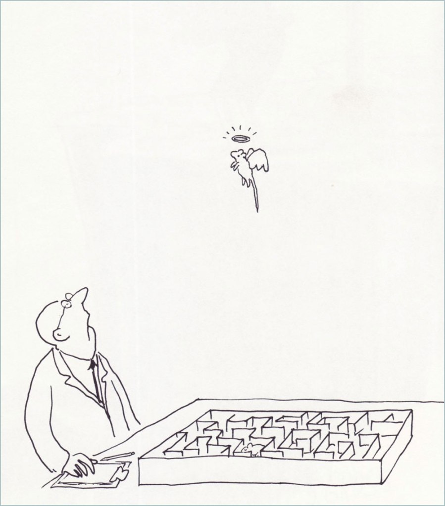
« I wish I could blend into the background / I’ve no excuses for my lack of guts / What is it about me that draws attention? » — Kevin Godley & Lol Creme, Punchbag
Today, let’s delve into the little-frequented wilds of that underrated little publisher that could, American Comics Group (ACG), 1943-67. The brand is chiefly recalled today for a pair of notable features: ACG pioneered the ‘horror’ anthology comic book with its Adventures Into the Unknown (1948-1967, 174 issues) and, in 1958, brought Herbie Popnecker, Richard Hughes and Ogden Whitney‘s ‘little fat nothing‘ to an unwary and undeserving world. ACG was co-founded and, briefly, co-owned by one of the field’s great villains, Harry Donenfeld.
But that’s all trivia in the end. ACG’s special appeal rests for the most part on the shoulders of one man of many monikers: writer-editor Richard E. Hughes (1909-1974).
I’ve already enumerated the man’s bona fides a couple of years back, when I featured one of his most celebrated (by ACG readers) tales, The People Versus Hendricks!, so I refer you to that particular entry.
As Hendricks’ tale was a rather tragic one, and since his dry wit ranked high among Hughes’ preeminent attributes, what do you say we set him loose for a demonstration of said lighter side?
Though many a notable illustrator passed through ACG’s doors — under his given name or otherwise — it’s undeniable that Hugues’ most consistently effective comrade-in-arms was the forenamed Mr. Whitney. Don’t let his low-key, ‘square’ approach deceive you: here’s a master storyteller at play.
Read on, febrile friends of ol’ Faust!
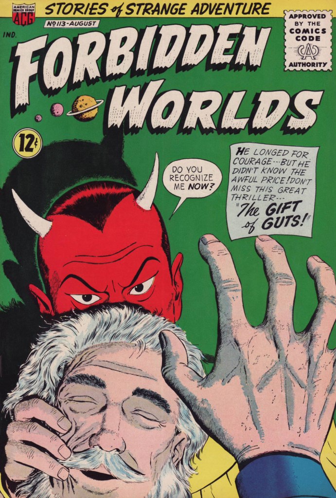
« Squij! » is now one of my favourite sound effects.The Gift of Guts was cover-featured in Forbidden Worlds no. 113 (Aug. 1963, ACG). Pencils and inks by Ogden Whitney.
I had initially figured to make this post coincide with World Bicycle Day, but misremembered the date (it’s on the third of June). I briefly considered bumping my post in favour of a pollution-themed one, given the close-to-home current events, but it struck me that people are likelier to need a respite from catastrophe than a reminder of it.
Since I must save up material for my Hallowe’en Countdown all year ’round in order to keep the frenetic pace it requires, I sometimes regret, in other parts of the annum, not featuring spooky stories as often as I’d like. I’ll make an exception this time, since this is more of a summer story with a light touch.
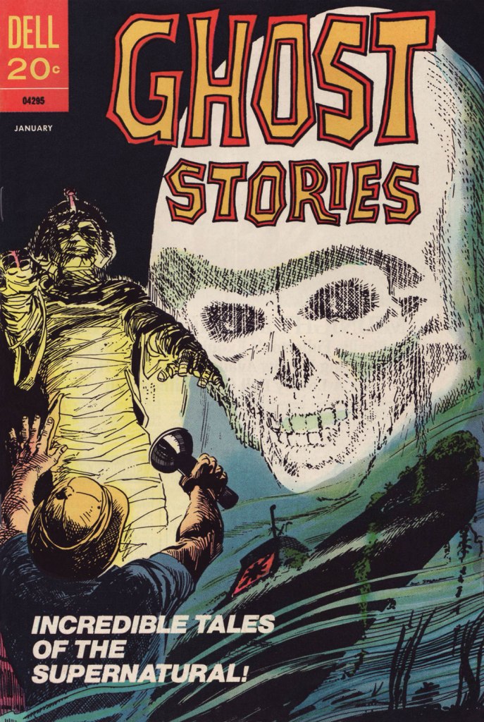
This particular issue of Ghost Stories has the — dubious, I’ll grant — distinction of being the last original comic book published by the once-mighty Dell Comics. How mighty? Well, in 1960, they were smugly ensconced at the top, as they had been for most of the industry’s history. Until the following year: « As publishers began raising prices from the 10¢ mark comics had been at for a quarter of a century, Dell misread the market and went to 15¢ when everyone else went to 12¢. »
That was the beginning of the end for Dell, triggering a long, humiliating slide, going from locomotive to caboose. By 1970, they were just reprinting what little of their once-glorious back catalogue they still retained rights to. I believe their final trio of titles, all reprints, were cover-dated October, 1973 — among them the final issue of Ghost Stories, a straight up reprint of 1966’s no. 16.
I’m not sure why this all-new issue even came to be. Perhaps this was inventory material some editor at Dell saw no point in squandering. If so, this sagacious frugality is appreciated.
This is Ghost Stories no. 35 (Jan. 1973, Dell); cover by Jack Sparling (1916-1997).
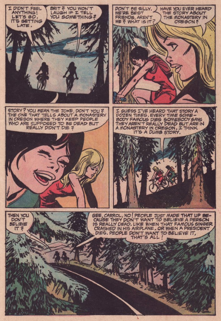
Now, I won’t argue that this is one of Jack Sparling‘s most stellar jobs… it was obviously dashed off in workmanlike fashion, even in comparison to the other tales in the issue. But I really like its themes, which tick a lot of boxes for me, cycling and folklore foremost among them.
I tried to find out whether this purported ‘story about the monastery in Oregon‘ (Mount Angel Abbey being the likeliest model) had any currency in popular culture, and came up empty. Well, essentially. While it’s undeniable that “Conspiracy theories frequently emerge following the deaths of prominent leaders and public figures“, I do think the uncredited and unknown author of this yarn came up with a clever little angle… who’s to say it won’t catch on some day? Unlikelier things have come to pass.
-RG
p.s. It occurs to me that this story handily passes the Bechdel Test, surely a rarity in a mainstream comics story of this vintage.
p.p.s. Another tale in this ‘vanished celebrity’ tradition would be Gerald Kersh‘s superb, Edgar-winning The Oxoxoco Bottle aka The Secret of the Bottle. Read it here!
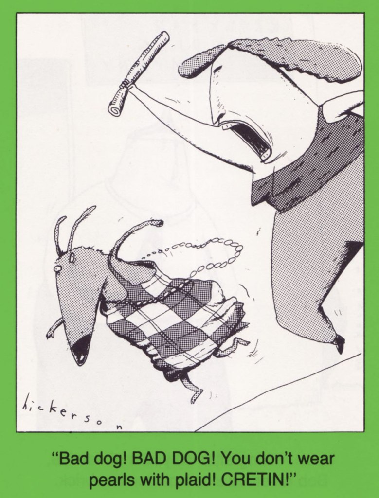
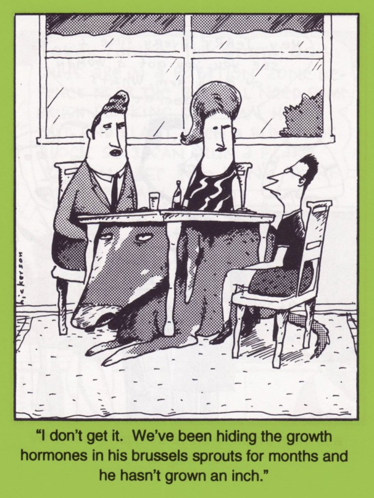
« And what can you say about Buddy Hickerson that hasn’t already been confessed in court? » — a 1992 blurb
While the 1980s mega-popularity of Gary Larson’s The Far Side (1979-1995) led to a plague of mostly feeble imitations, it more significantly contributed to the acceptance of a greater range of humour (and drawing styles*) in a staid syndicated strip industry sorely in need of a vigorous shakeup. While Dan Piraro‘s Bizarro (1985–) is the clear winner among those that followed Larson’s path — no small thanks to an original vision and drawing chops to kill for — I’ve always had a soft spot for one of the also-rans, Buddy Hickerson’s The Quigmans.
While Hickerson wasn’t a consistent gagman to rank with the cartoon gods, he scores points aplenty for trying and the intermittent spark of genius. And I dug his ‘melted in the sun’ aesthetic, echoes of which seeped into the mainstream. I mean, consider the likes of Beavis and Butthead (1993) and Duckman (1995), merely to skim the greasy surface.
Anyhow, here’s a sampler of my favourite Quigman misadventures.
Four Quigmans collections have, to my knowledge, been issued:
The Quigmans (1992, Tor Books) The Quigmans (1990, Harmony Books) Love Connection! (1992, Harmony Books) and Tunnel of Just Friends (1996, Four Walls Eight Windows).
I’m happy to say he’s still active and has remained true to his vision; check him out at (of course) his official website.
-RG
*though we can’t not mention such trailblazers as Lynda Barry, Matt Groening, Gary Panter and even David Lynch in such a context. The 1980s weren’t altogether a cultural wasteland, after all.
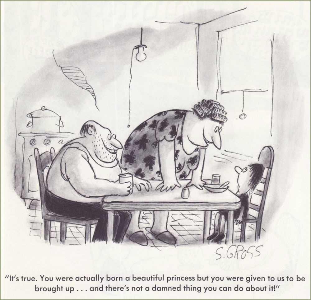
« … while there are lines of taste that many cartoonists will not cross, Mr. Gross leaped over them, doused them with gasoline and lit them on fire, cackling as he did. » — Daniel E. Slotnik, from Gross’s NYT obit.
A couple of weeks ago, we lost yet another of our remaining cartooning titans, hardly a surprising turn of events given the march of time… but this growing void diminishes and impoverishes both the field and the world.
Gross has been eulogised all over the place, notably in obituaries in the New York Times and The New Yorker, his Lambiek entry is lovingly detailed, so there are precious few blanks left to fill in.
All this adulation and appreciation… and yet, all of his books are out of print, so far as I can ascertain. While this does not bode well, I like to think that some savvy publisher will soon make use of Gross’ fastidiously organised files, reportedly comprising over thirty thousand individual cartoons.
For this small homage, I’ve pulled some of my favourites from his most famous (the most infamous being We Have Ways of Making You Laugh: 120 Funny Swastika Cartoons*), 1977’s I Am Blind and My Dog is Dead. Picking favourites is plenty laborious enough, I wasn’t going to slog through seven decades of material, indeed not.
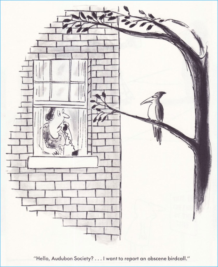
Originally published in Saturday Review.The only way this could have been funnier is if it had been published in the Audubon Society’s magazine… which did publish several of his cartoons — but not this one.Originally published in Saturday Review.One of the great perks of Gross’ range is that this cartoon can be viewed as totally cute and innocent or you’re-going-straight-to-hell filthy. It’s a fairly safe bet that this particular beach is in Florida. I was thinking that this one could have just as well been a Charles Addams cartoon… then recalled that Gross, early in his career, actually sold gag ideas to The New Yorker for Addams to illustrate. This one, interestingly, saw print in Ladies’ Home Journal.Our most recent entry appeared in the pages of The American Bystander no. 3 (Fall, 2016), where he held his own reserved nook, ‘Sam’s Spot‘. Bless ’em.
In closing, this fabulous anecdote from his National Lampoon colleague Larry “Ratso” Sloman:
« After five years, I left the Lampoon and a new executive editor took over. He called Sam into his office. “From now on, I want pencil sketches from all the artists before they do anything,” he told Sam.
“Pencils! Cartoonists don’t do no stinkin’ pencils. Rodrigues will tell you to go fuck yourself rather than show you a pencil,” Sam said. “Oh, and by the way, you can go fuck yourself.” His tenure as cartoon editor was finished. But the funny thing is, Sam was still selling cartoons to the Lampoon long after that editor had been penciled out of his own job. »
-RG
*From Gross’ first-rate 2011 Comics Journal interview, conducted by Richard Gehr: « His doorbell sports an old family name because he doesn’t want to be hassled by anyone who might have been offended by his 2008 book We Have Ways of Making You Laugh: 120 Funny Swastika Cartoons. »
« Luckily, there are ideas. Ideas. When too many things go astray, stop or turn against you, the mind engenders favorable phantasms, worlds made to order, happy endings, golden images of yourself, utopias and holy readers (one is enough) capable of forgiving any affront and of remaining loyal beyond the limits of the reasonable. Ideas. Useful to keep going. » — Silvestre
Several years ago, during a visit to a favourite bédé store, I picked up, at random, an intriguing book, whose appeal largely lay in that it didn’t seem to be vying for my attention at all. If you’ve a certain bent of mind, the understated article will often exert a stronger pull than all the hard sell screamers in the world.
I read and enjoyed it, then the book faded deep into the collection, only to bob to the surface after our recent move.
See what I mean? Very low-key. This is the French edition of “Simple” by Silvestre (Jan. 2000, Éditions Amok), a translation of the Spanish original published in 1998 by Edicions de Ponent.
For a long time, I couldn’t find out more about it, and I still know precious little. It didn’t make much of a ripple in the pond, and its wake seems to have dimmed even further in the intervening years.
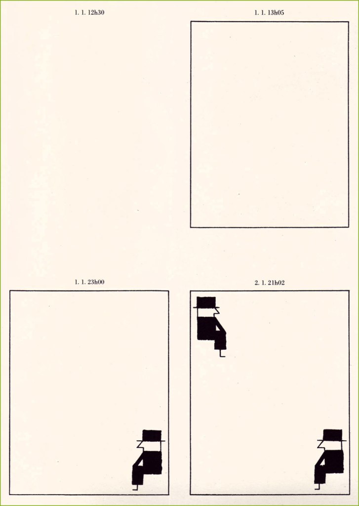
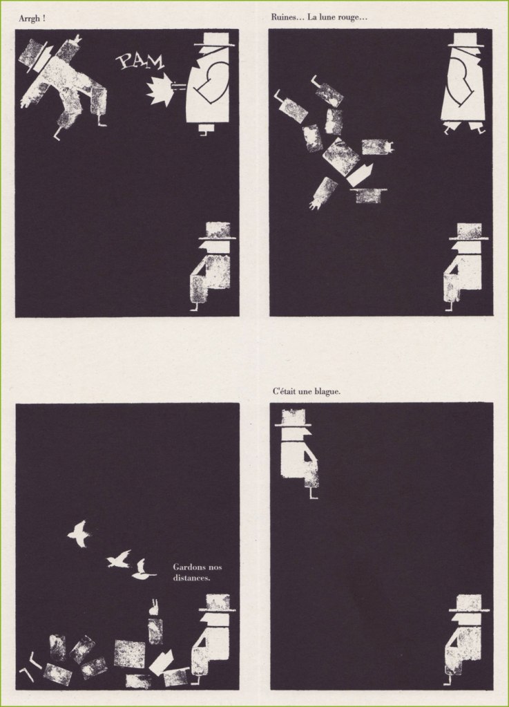
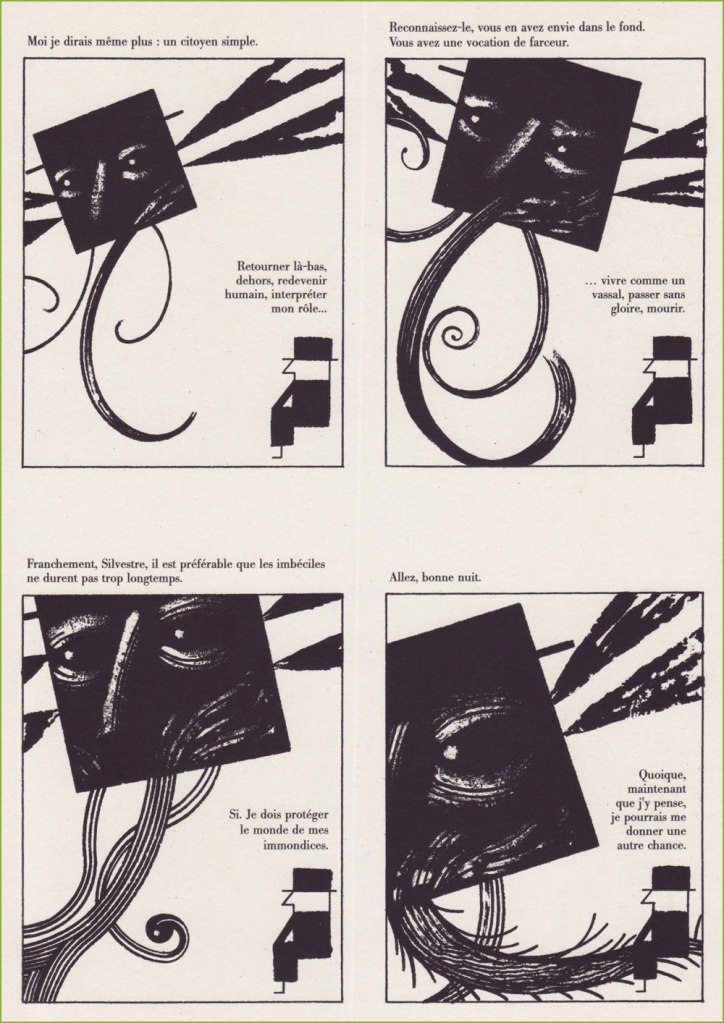
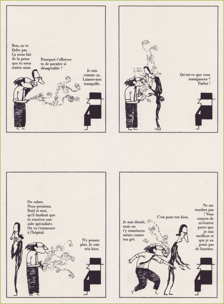
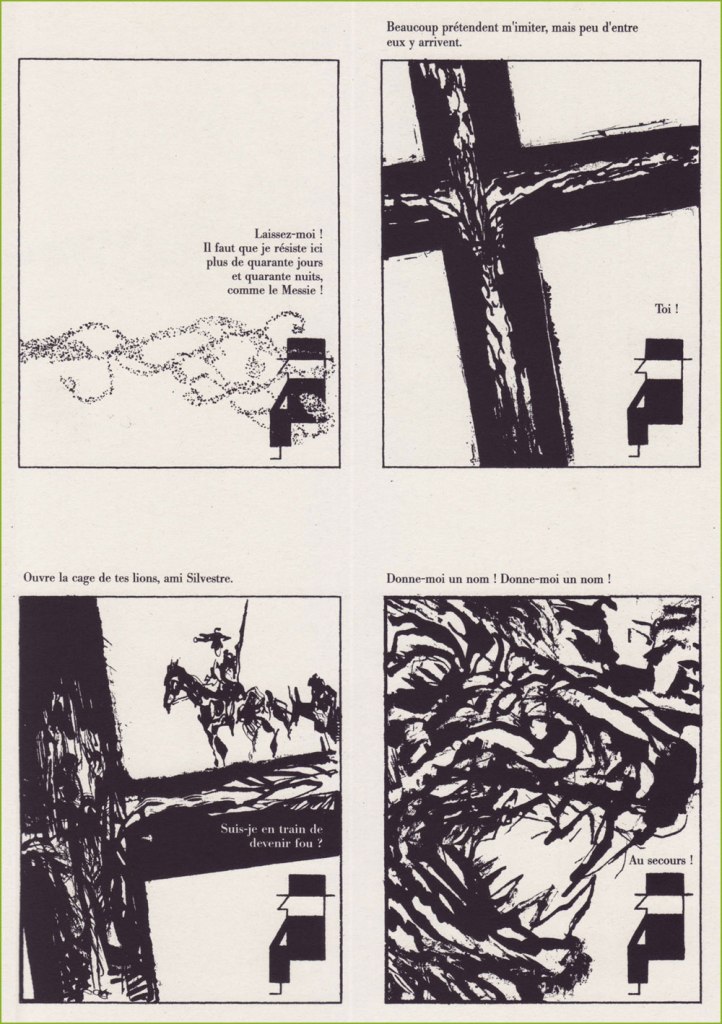
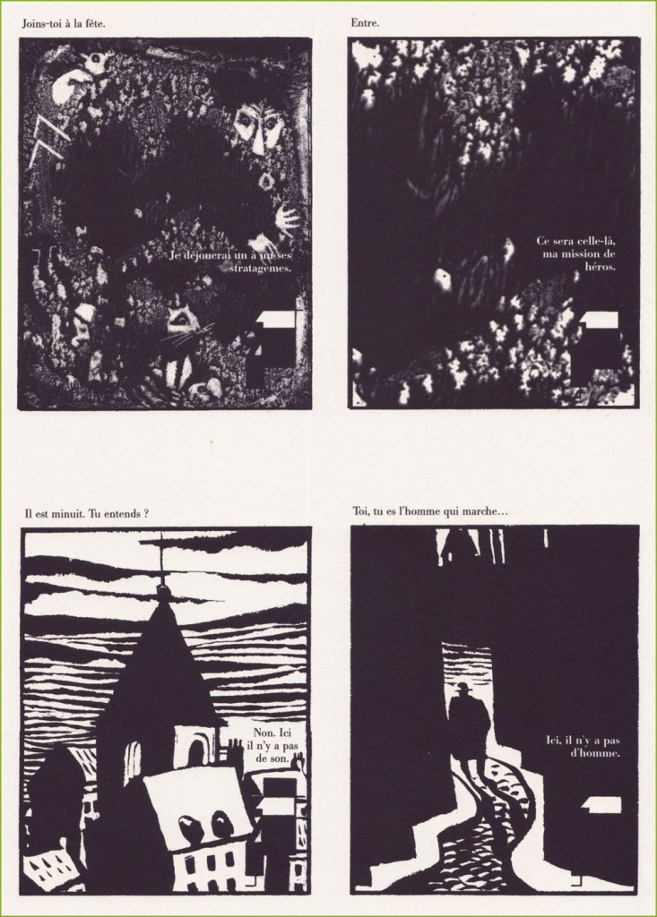
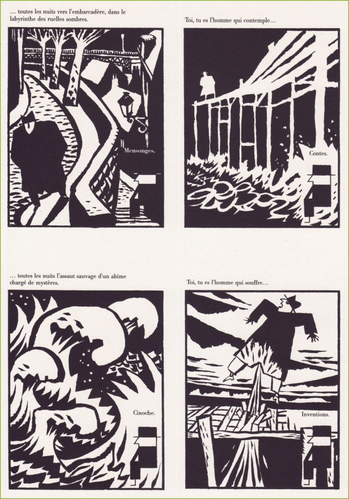
There’s little sense in my translating the dialogue (with one exception), but here’s the setup: our protagonist, Silvestre, sits in a corner and has exchanges with his demons and other monsters of the id. But they’re eloquent and visually arresting apparitions.
I love that, while seeming identical at a casual glance, each Silvestre figure is individual. The artist may have employed a stencil or a rubber stamp… at least that’s what I would have done.
Incidentally, Silvestre is a pseudonym of Spanish cartoonist-graphic designer-poet (et cetera) Federico Del Barrio (1957 –), which he reserved for his more explorative work.
In the words of Richard Dawkins, « in the beginning was simplicity. »The visual fireworks soon arrive, scores of them artistic references. Am I imagining an allusion to Saul Bass‘ immortal Anatomy of a Murder poster?« Jests help while away the time, sir. But if some of them fail to amuse you, I can teach you others. My repertoire is infinite. With me, you’ll never be bored. You’ll see, we’ll have a lot of fun. »Silvestre’s tone toward his visitors is generally contemptuous and hostile, with one exception: he’s fully deferential when appears Her Majesty, the Great Muse of Comics.A pair of his real-life collaborators turn up, and he’s not happy to see them. The chain smoker is writer Felipe Hernández Cava, and the lanky one Raúl Fernández Calleja, aka Raúl. Both look as if conjured by the magic pen of Marc Hempel!Ah, and here (panel three) come Spanish icons Don Quixote and Sancho Panza, riffing on Pablo Picasso’s famous 1955 sketch. Now we’re groping our way through a sticky, malignant fog of German expressionism and woodcut novels! A page from the delicious and delirious final sequence… it was hard to choose just one. Such an expressive line!