What’ll you have?: Barthelme and Chwast’s “Sam’s Bar”

« I don’t understand retiring. I don’t know what I’d do. I don’t play golf. I have to sit at a drawing table or else it’s a wasted day. The nature of the work can change here, but I have to be doing something, especially with my hands. » — Seymour Chwast

Nobody really expects those we deem “immortals” to actually live forever… but I suspect some part of us does, or at least hopes so.

From the perspective and pantheon of folks of a certain age and time — let’s say, people born in the 20th century — the ranks have been brutally thinned of late. To name but particularly long-lived visual art masters, recent years have claimed Al Jaffee, Gahan Wilson, Milton Glaser, Steve Ditko, Jean-Jacques Sempé, John Severin, Gene Deitch, Ken Bald

I haven’t yet reached that fateful age when reading the paper largely consists of scanning the obituary column to learn which of your friends (and possibly enemies) have died, but I fully grasp the concept… and shudder in sympathy.

And so on to my point: it’s easy to take genius (or mere talent, for that matter) for granted, and so I generally endeavour to salute valued creators while they’re still around, instead of paying belated lip service to their greatness once reminded of their existence by news of their passing.

For years, I’ve been meaning to devote a post to Seymour Chwast… and dragging my feet. He’s had such a long, inspiring — and daunting — career. But the other day, when Tony Bennett died, aged 96, I took it as a sign not to reserve my tribute for Mr. Chwast’s next birthday (that’s late next month). Here goes.

First, an amuse-gueule. This mute but highly rhythmical piece hails from issue 69 (October, 1977) of Push Pin Graphic, the fabled design studio’s showcase magazine. The issue’s theme is “House Nice”, parodying interior decorating fixture House Beautiful Magazine. Written and drawn by Mr. Chwast.

Design historian Steven Heller explains: « Push Pin’s principal cofounders, Seymour Chwast (b. 1931) and Milton Glaser (b. 1929), two native New Yorkers who met while attending Manhattan’s Cooper Union, brought distinct tastes and preferences — as well as chemistry — to their unique partnership. Chwast savored American comic strips and pop culture while Glaser studied etching in Italy and was passionate for Italian Renaissance painters. The former injected a cartoonist’s abandon into his artwork, the latter introduced a sublime elegance. Despite their formal differences, both shared the conviction that postwar design and illustration should not be limited to prevailing practices — either sentimental realism or reductive simplicity. They rejected rote methods and rigid styles while concocting incomparable ways of transforming old into new… »

The following encapsulates even more succinctly the duo’s boundless contribution: « Seymour Chwast and Milton Glaser are legendary graphic designers who founded Push Pin Studios, where they rebelled against the swiss style establishment – blending illustration with design. » [ source ]

Amen: from my standpoint as an art student back in the early 1980s, I’ll say one thing about Swiss design: that shit was oppressive.

To sidestep the perils of losing my way amidst such a gargantuan topic, I’ve opted to focus on a favourite entry in the Chwast œuvre.

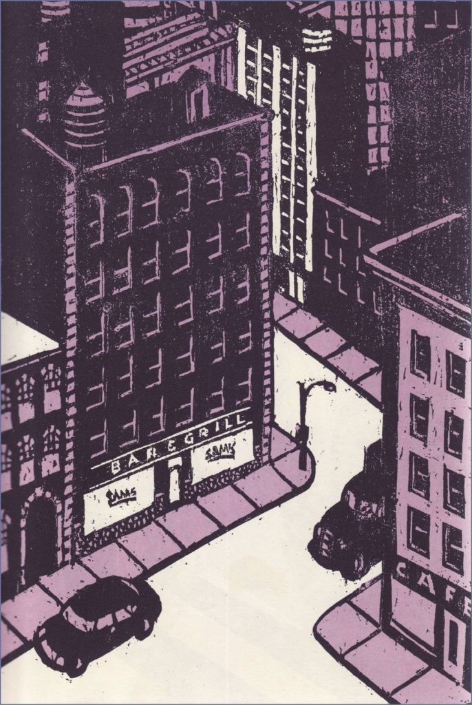
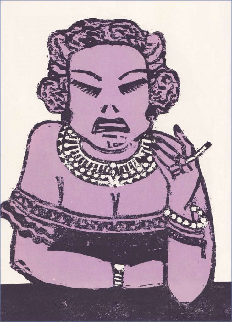
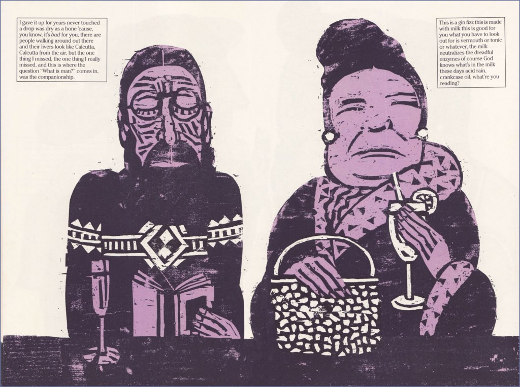
« Another of Chwast’s graphic stories is Sam’s Bar (Doubleday, 1987). Written by Donald Barthelme, it is also a total narrative and pictorial story. It captures in woodcut illustrations one night in a bar somewhere in America, people talking to each other and talking to themselves as the reader goes from one end of the bar to the other. » The book’s intriguing structure would have made it an ideal comic *strip*, in the literal sense.
Ellie says: « So I told the kid May 31, 1989, was the cutoff date, as of May 31, 1989 she’s off the payroll whether she’s finished goddamn college or has not she’s finished goddamn college. So she tells me she’s thinking of transferring to UCLA and that’s going to set her back two semesters. So she can get fencing. Where she is they don’t have fencing. I said I’ll rent you an Errol Flynn movie. »
Trish and Calvin.
Hal and Germaine.
Two lawyers, Mario and Saul. Someone ought to make a show about a lawyer named Saul.
The book’s handy endpapers, featuring “The Regulars at Sam’s Bar“.

I wouldn’t want to short-change Barthelme’s contribution… as a collaboration, this truly works a treat. Here’s an amusing passage I encountered on the subject of this routinely misunderstood author: « Donald Barthelme was, by his own design, a hard writer to categorize. Even at the height of his fame, in the late 70s and early 80s, there were readers who just didn’t get him, or suspected his work was a hoax or a joke they weren’t in on. At The New Yorker, where he was a regular contributor for decades, clerks in the library were expected to type up on index cards brief summaries of every article, fact or fiction, that appeared in the magazine. Barthelme’s cards sometimes contained just one word: “gibberish.” » [ source ]

One more for the road? I couldn’t leave out Chwast’s adorable cover illustration for issue 57 (Why People Keep Dogs) of Push Pin Graphic, from 1972.

Many happy returns and thanks for the inspiration, dear Mr. Chwast!

– RG

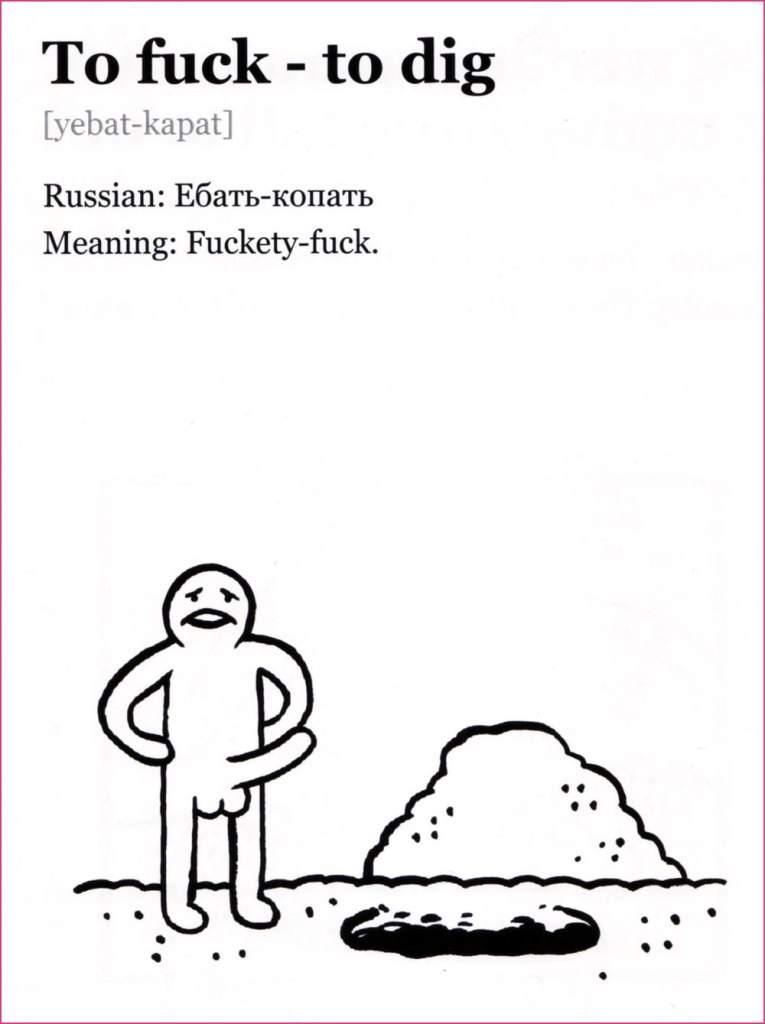
Curse Like a Russian: The Language of Peasant Revelry

« The world of mat is virtually inaccessible to foreigners studying Russian. It is too situational and semantically capricious, too dependent on ludic intonational subtleties. Mat is linguistic theatre, verbal performance art. It exploits the Russian language’s flexible range of suffixes and prefixes, and toys with phonetically similar words from the standard lexicon in order to generate anthropomorphic images. »

Invariably people ardently desire to learn bad words when encountering an immigrant who speaks a language they do not*. While one could surely write an essay arguing that the type of words used as expletives reveals something about the soul of the people in question (as a minimum, it’s a quick way to check what is considered more scandalous in that culture – genitals or religious terminology?), the allure of being able to say ‘fuck’ or whatever when it’s the only thing you can say in that language escapes me.

Idiomatic curses are another kettle of fish, a fascinating topic. Being the bearer of a language, one doesn’t often pause to think how weird a lot of sayings would sound to foreign ears. Russian cursing is quite popular in non-Slavic circles (see Elizabeth Olsen swearing at Conan in Russian on TBS**), and its basic components are very straightforward (assorted body parts). However, there is considerable artistry involved in combining these blocks and spinning them into a scathing sentence that will inflict proper psychological damage to the target. This could be said about many cultures indeed, but I can confirm that the Slavs cherish their curse slang and go about using it with tender love and great gusto.

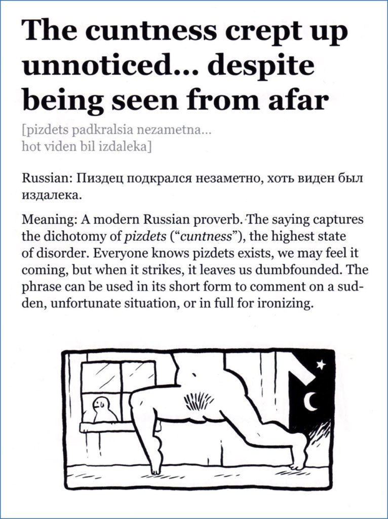
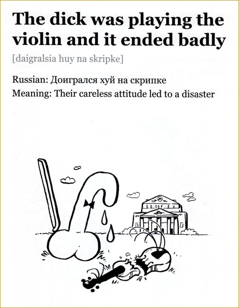
Journalist Elmira Kuznetsova and Canadian cartoonist and animator Jess Pollard have undertaken the charming task of (literally) translating and illustrating some choice Russian curses. I’ll quote from an article about this project:

« Jess is learning Russian and one night I was trying to translate to her the Russian curse “На хую я вертел.” The phrase translates as “I don’t care” but the literal meaning is “I spun it on my dick”. Just for laughs, Jess drew a sketch depicting random things being spun on male genitalia. We laughed so hard both at the image and at the absurdity of the literal translation, we decided to make more illustrations. This turned into a comic magazine that we called “An Illustrated Treasury of Russian Curses” that was printed in a batch of 50 copies and sold to our friends. »

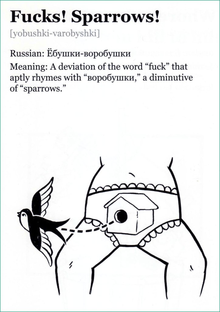
Please consider the following as a sampler of A Treasury of Russian Curses (A selection of curses for community building, successful business, and ideal first dates) — I selected a few favourites from volumes I, II and III. Follow this project’s Instagram account, and support a cool idea by buying printed copies or PDFs over at Pollard’s website.

I’d like to point out that the word ‘dick’ selected for these translations doesn’t carry even half the clout of the Russian equivalent, which is one of the Really Bad Words, with arguably more punch than ‘fuck’. The non seven-armed eight-dicked person looks genuinely horrified.
This is a downright poetic and melancholic mental image. Poor little dick.
Co-admin RG rightly pointed out that the bird illustrated resembles a swallow far more than a sparrow.
You will not be surprised to learn that this rhymes in Russian. This scene (complete with Pollard’s favourite smoking raven/crow that appears on the cover of every collection, as well as on her website) is very Slavic indeed, evoking folklore in which a bogatyr must choose which path to follow at crossroads (also note the typical helmet).
More like surfing — and infinitely more stylish, wouldn’t you say?

I give the highest recommendation to The unique power of Russia’s underground language, written by Victor Evrofeyev and published in The New Yorker (a beautifully translated version by Andrew Bromfield) on September 15, 2003. This post’s introductory paragraph is from it, but here are a few more quotes to whet your appetite:

« When I think of mat, I think of the monstrous energy field of that planet. Mat is a protean language in which archaic strata mix with modernity. It has a unique ability to break free of its erotic context and to characterize universal human feelings and conditions, to express admiration and contempt, ecstasy and catastrophe. »

« Although it retains its sense of blasphemy, mat, in its original form, was also a language of peasant revelry and the liberation of the flesh. In traditional folk culture, women sang obscene ditties as a challenge to their husbands or an invitation to their suitors. Pushkin’s bawdy early poem « Tsar Nikita and His Forty Daughters » describes a culture that has lost the cunt, or, rather, forty cunts: the Tsar dispatches his heralds in search of them and after arduous ordeals they are recovered. »

~ ds

* Life is full of such little repetitive ‘pleasures’, like having to tolerate jokes about magic mushrooms whenever talking about about how one likes to go mushroom picking…

** Why they’re both amused that a reference to the ‘female region’ can be used as a bad word in Russian is puzzling, as English easily offers ‘cunt’ as an equivalent.

Other Folks’ Dreams: Jess Reklaw’s Slow Wave

« The man who never dreams, goes slowly mad. » — Thomas Dolby

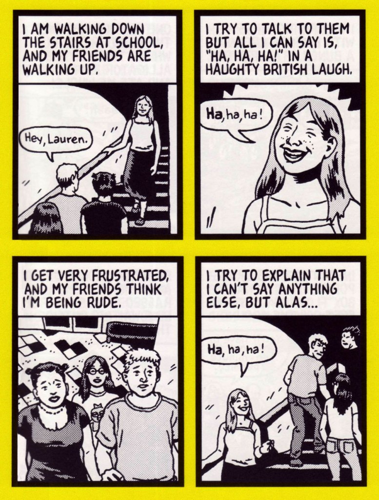
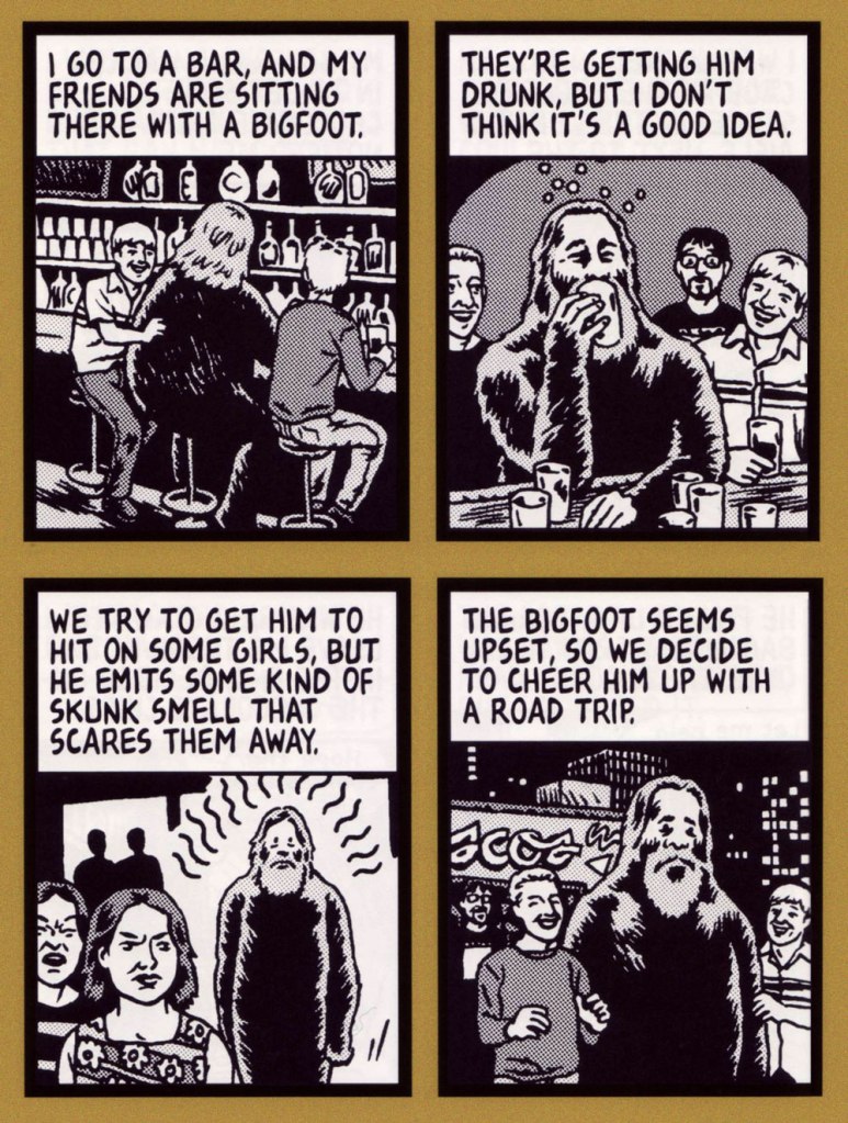
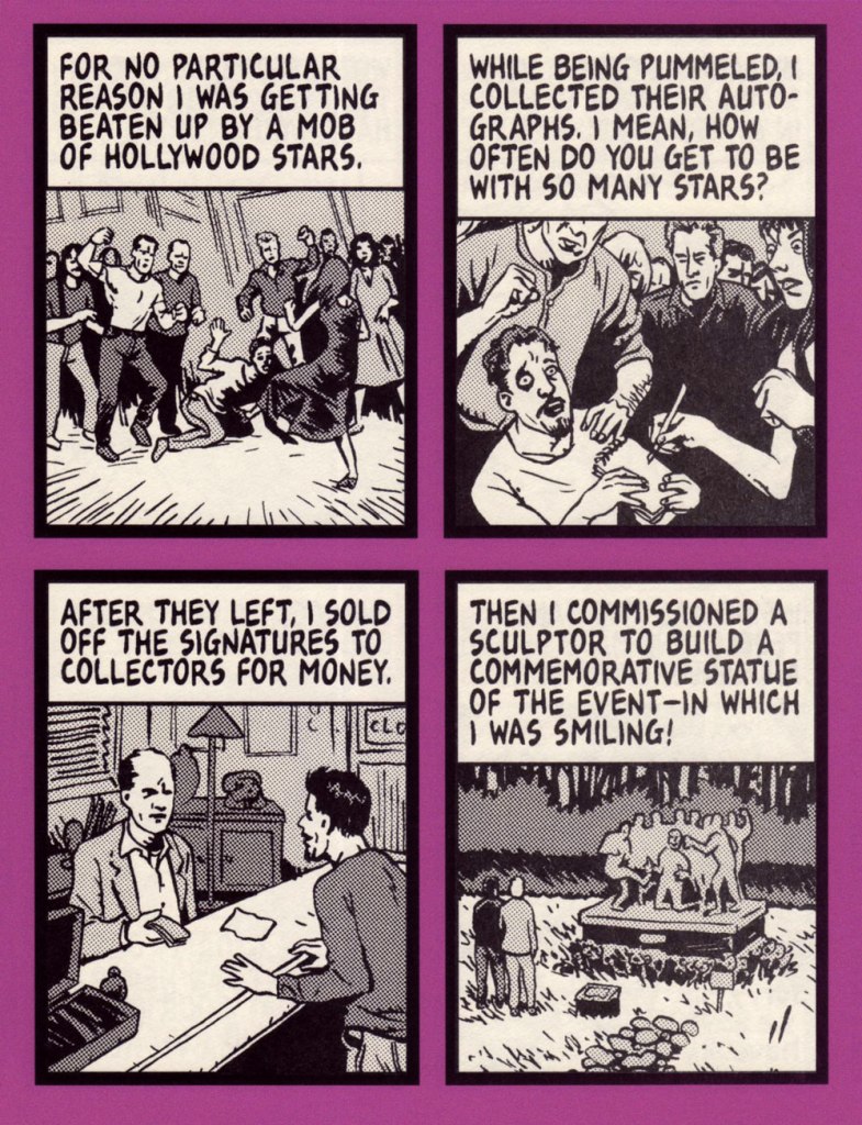
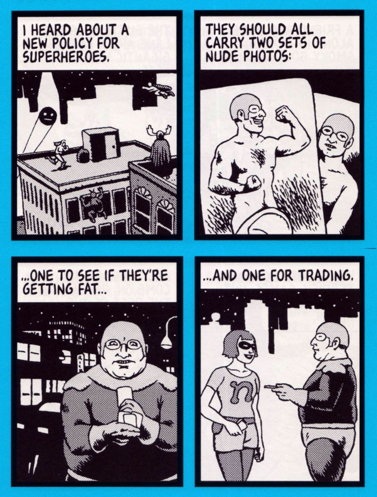
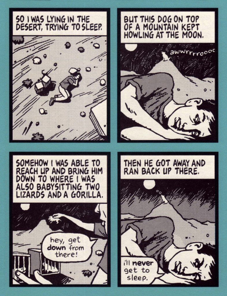
Jesse Reklaw‘s Slow Wave* (1995-2012) was both an early webcomic and a syndicated strip that ran in about a dozen alt-weeklies.

Here’s a historical rundown that Reklaw provided in 2005, musing on the feature’s genesis and its initial decade:

« While I was an undergraduate at UC Santa Cruz (1993-1995), website technology wobbled out into the world. Entrenched in the DIY zine community that had been liberated by cheap photocopies and desktop publishing, I became obsessed with this new independent media opportunity. With help from Ranjit Bhatnagar, I learned how to code HTML, and started an online art gallery at UCSC. I was juggling a double major in art and computer science, so it seemed like a natural fit.

Between classes (and math tutoring, and being an RA, and band practice), I was drawing comics. In order to focus on my drawing, I stopped writing my own material and instead asked friends for stories to draw: they could be anecdotes, fiction, dreams, whatever. All the stories were fun to draw, but I felt an immediate connection to the dreams. They had compelling imagery, their own logic, and a natural dada-like humor. Drawing them was like being there in the dream, experiencing the mind of the dreamer, but also realizing my own perceptions through theirs. It was like floating in that infinite reflection between two mirrors.

In 1995 I moved across the country to icy New Haven, Connecticut for graduate school. I also continued to draw comics, now exclusively dreams that I got from friends and family. I started posting the Slow Wave strip because I wanted regular, updated content for my personal website (called nonDairy.com back then). At the time, everyone was saying “Content is king.” I coded my pages in simple programs like notepad and simpletext (which I still use), building my site in secret, often in the empty hours between midnight and morning. I led a double life as a computer scientist and a cartoonist. Along with the site, I put up a website form to solicit more dream material. A few trickled in at first, but as the Web grew, this became the major source of dream submissions. After I’d drawn about twenty strips, I got the idea to submit them to weekly publications. I found the website of the Association for Alternative Newsweeklies, and discovered a wealth of newspaper addresses and contact info. They seemed to be served from a database, and you could view the records one screenful at a time. Not content to just copy down the information, I wrote a web-spider that downloaded every page, parsed the text from the HTML code, and “reverse engineered” the database for my own use. I sent out about sixty submissions, and was totally surprised to get picked up by two papers: The Rocket in Seattle (now out of business) and the Philadelphia Weekly (who dropped me after a month). It was encouragement enough to keep me going. I probably would have gotten bored with the web-only comic strip after a couple years. The internet had moved on from content anyway, and designers were more interested in animated GIFs and other dancing baloney.

I continued to self-syndicate, and was picked up by enough papers that it seemed possible to make a career out of it. I dropped out of grad school in 1998 (didn’t really like being a Yalie anyway), and started cartooning full time. I also had enough strips now that I thought there should be a Slow Wave book collection. I proposed the idea to a lot of comic book publishers, but had little luck there. I complained on my website about not being able to find a publisher, and within a week was contacted by Kendra Crossen Burroughs, an editor at Shambhala. Kendra had apparently been reading the strip online for a while, and convinced Shambhala there should be a book. Dreamtoons came out in 2000, collecting about two-thirds of the strips I’d drawn so far (not including the one above). Dreamtoons is currently out of print, but there’s lots of used copies floating around out there**. »

An example of how Reklaw sollicited thematic contributions to Slow Wave. It’s safe to suppose that none of the contact details are still relevant, except in dreams.
From a dream by Lauren Fowler.
From a dream by Connie Liu.
From a dream by DW Wissinger.
From a dream by K. L. Wanlin.
From a dream by Paul J. Lurie.
From a dream by Pierre Dalcourt.
From a dream by Isaac Cates.
From a dream by Liz Kuzmeski.
From a dream by Eli Bishop.
From a dream by Sinnicam NodNarb.
From a dream by Zach Archer.
From a dream by Ryan Budge.

In the ensuing years, poor Jesse’s had, even by cartoonist standards, a terrible time of it, besieged as he was by both physical and mental health challenges. It’s not much of a stretch to surmise that cartooning saved his life, and he’s hardly alone in this. Check out this sobering Comics Reporter interview, (circa 2014) and you’ll get some sense of what I’m alluding to.

-RG

*Slow-wave sleep (SWS) refers to phase 3 sleep, which is the deepest phase of non-rapid eye movement (NREM) sleep, and is characterized by delta waves (measured by EEG). Dreaming and sleepwalking can occur during SWS. SWS is thought to be important for memory consolidation [ source ]

**Nearly twenty years on, cheap copies are still bountiful.

Bombastic, Contumelious, Outlandish, Big-George-ish

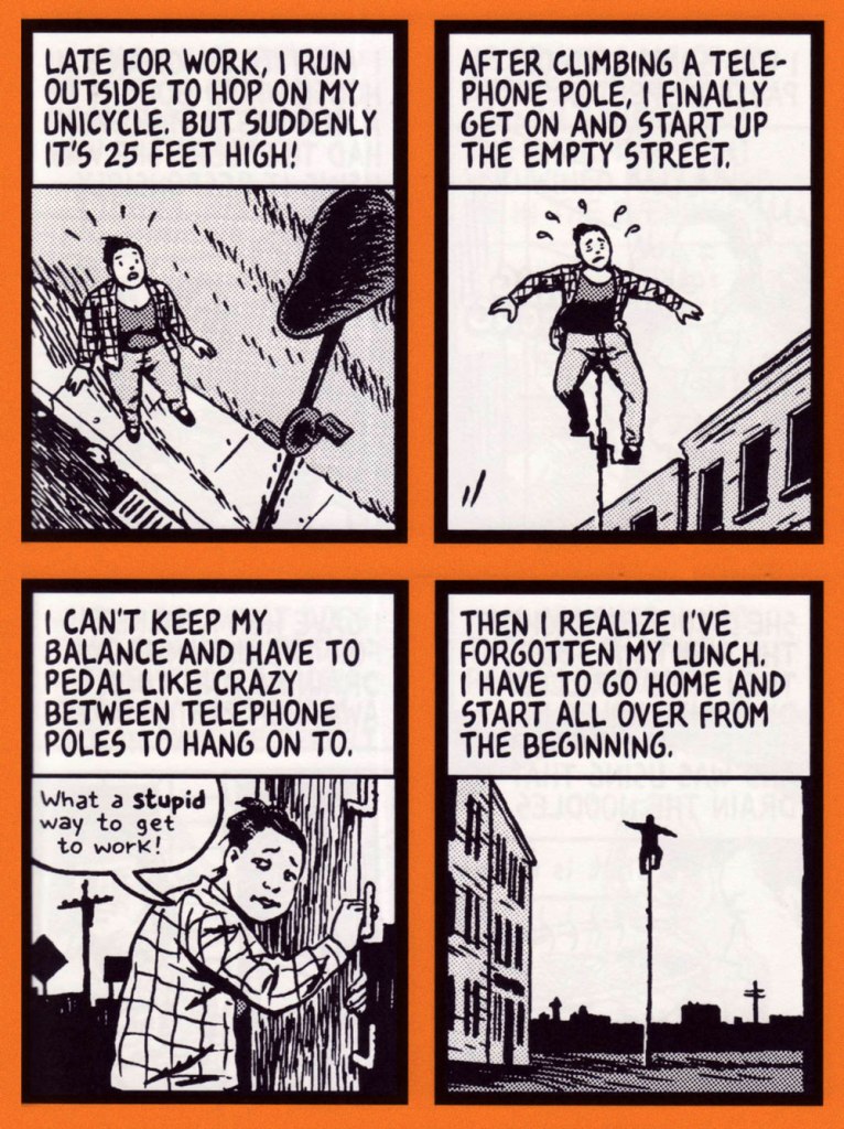
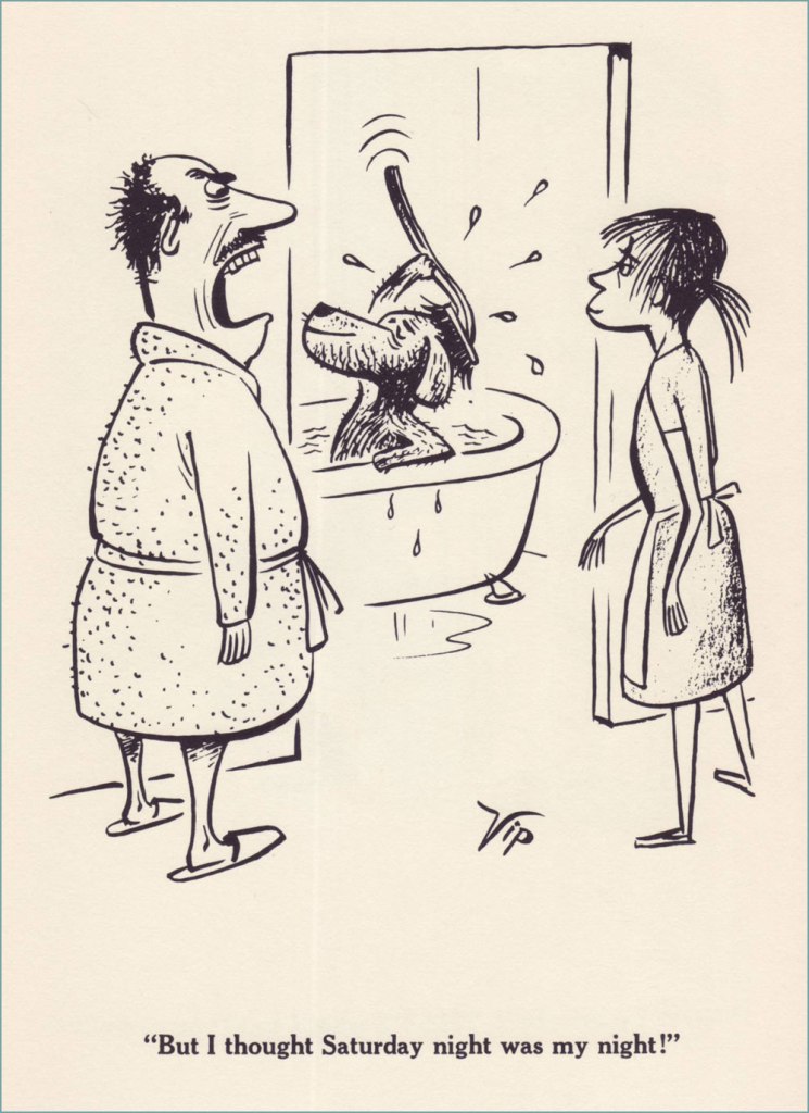
Virgil Partch is such a bright, shining figure in the cartooning world, his sense of humour so zany and impertinent, that I can understand a certain lack of interest in his newspaper strip Big George, which was designed to be family-friendly and as such is far more comfortable and conventional than VIP’s elegantly absurd output during his halcyon days.

Like the previously discussed Captain’s Gig (see Virgil Partch’s Captain’s Gig), Big George, who strutted into existence in 1960 in daily cartoons and a month later in Sunday strips, was syndicated by Field Enterprises. The strip did not break any sales records, but maintained itself at a respectable level of popularity for an impressive number of years, even living on beyond the death of its creator, thanks for VIP’s habit of working far ahead of the deadline – he died in 1984 in a car crash, but he had created enough surplus strips to last until either 1986 or 1990 (the sources on this are somewhat conflicting).

That being said, cantankerous and girthy family man George Filstrup, walking collection of many flaws typical for cartoon (and real-life) husbands, lived through many surreal moments. Oh, he had but 5 fingers on each hand, and did ordinary things like go to work (to get humiliated by his boss) or swagger proudly around his barbeque, last refuge of manliness in this uncertain world, but his life often took a turn for the bizarre. Case in point, his very anthropomorphized and malicious pooch, great fun to watch in action. For a few first-class examples of this, head over to The Fabulous Fifties blog for Ger Apeldoorn’s always reliable newspaper scans.

Frankly, VIP’s art is arresting even when he’s illustrating mundane subjects… I don’t even need a touch of the surreal to enjoy it.

Speaking of scans, here are some Sunday strips from our own collection of newspaper cut-outs from sometime between 1968 and 1970:

George is not a likable character. As a matter of fact, I am overjoyed when something goes wrong for him, as it usually does. If he does something for his family, it’s either because the neighbours are watching and he’s concerned about appearances, or he’s been roped into it with some low-key chantage from his wife. He is vain, full of bluster, and easily manipulated. Frankly, I get the distinct impression that VIP’s sympathies lie entirely on the wife’s side – it’s unclear why she puts up with her lug of a husband at all, given how much smarter (and physically stronger, as Partch delights in pointing out frequently) she is. He does perhaps have one redeeming characteristic – his frequent flights of fancy, which is there VIP’s propensity for the surreal gets a chance to shine.

Sadly, there is no complete collection — not even close! — of Big George, and only two small ones – a hardcover from 1962, and a paperback from 1977. The following are scans from the former, published by Meredith Press.

« Time and space intertwined / Elegance, simple lines / Scandinavian Design »

~ ds

Plaudits to the Popkin, Glory to the Derrière!

Today’s post is dedicated to shapely posteriors, a particularly estival apparition. Cleavages can be admired year-round, but butts tend to put up an appearance during the season of bumblebees, swim-suit malfunctions, and summer dresses blown about by a warm breeze. There’s no need to take sides in the old battle of boob-man-vs-butt-man (which also entirely ignores the preferences of lesbians etc.), each shall have their day!

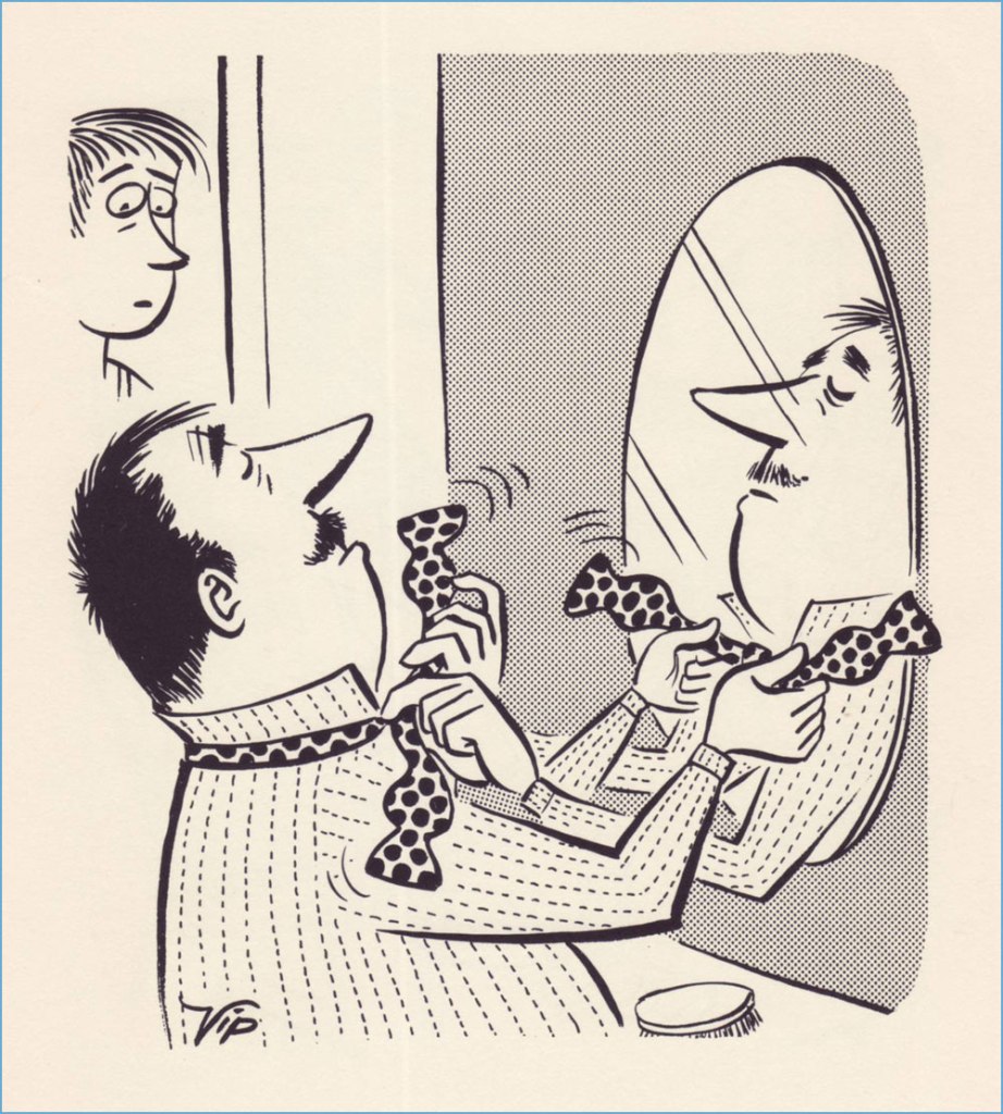
« It isn’t often one sees a bowler these days. » A cartoon by Peter Arno published in The New Yorker on August 9th, 1952. The asses may be hidden, but we know they’re there!
« Where the hell where you when I was down here skindiving? » There are many theories about a mermaid’s anatomy, and this particular interpretation opted to emphasize her butt cheeks. This is a Playboy cartoon by Arv Miller, published in May 1957.
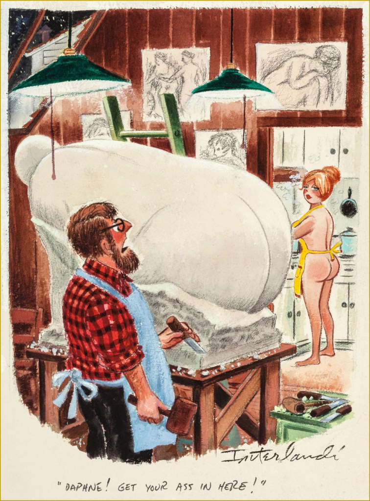
Cartoon by Phil Interlandi (1924-2002), a frequent contributor to Playboy.
Another one by Mr. Interlandi.
Playboy cartoon by Austrian-born Erich Sokol (1933-2003). The secretary could consider no longer choose her undergarments according to the calendar…
Cartoon by Donald Gordon Addis (1935 – 2009), who created several syndicated newspaper strips. He was staunchly anti-religious and a prominent member of the Freedom From Religion Foundation, the latter releasing a retrospective of his work in 2019, Cartoons for the Irreverent.
Presumably I couldn’t get away with a post about asses without featuring some spanking scene. Cartoon by British cartoonist Michael ffolkes 1925-1988, who contributed to a variety of British and American newspapers and magazines and also illustrated an impressive number of children’s books (with a particular proclivity for Roald Dahl ones).
Cartoon by Alden Erikson, about whom not much is known.
« Today We Will Examine the Primary Male Erogenous Zones, Thanks to Dr. Simpson of the Social Sciences Department » . Another cartoon by Erikson, published in September 1966. I had to include a male ass for variety!
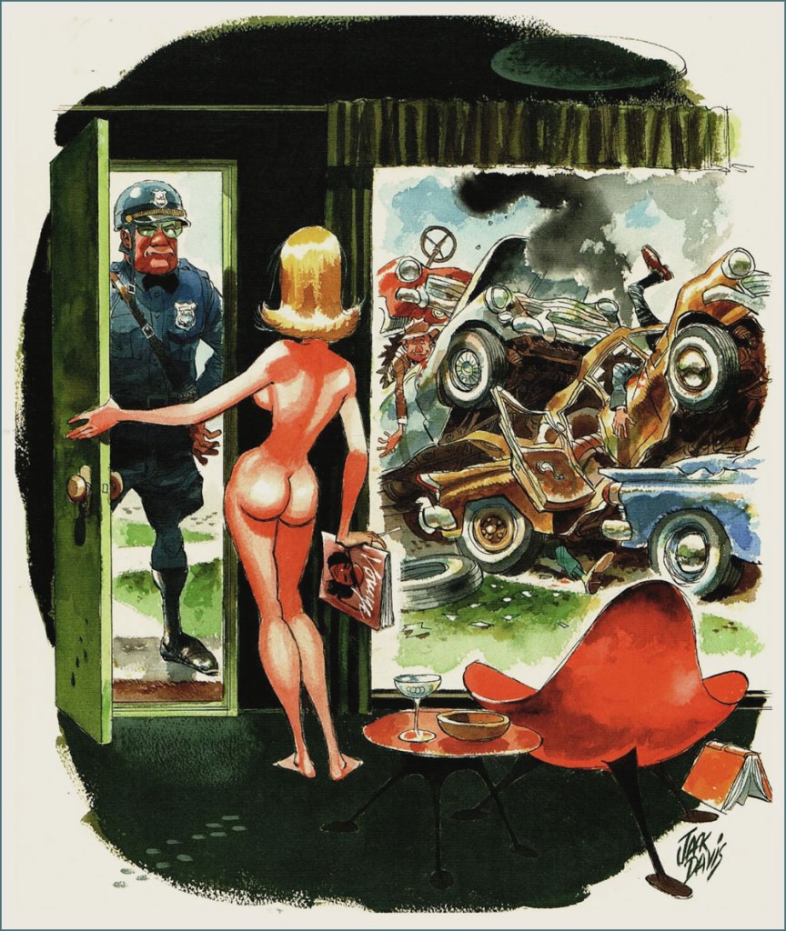
« Yes? » by Jack Davis, a WOT favourite and for that reason, a category of his own.

And one last cartoon for good measure, all the way from the early 1900s —

Wardrobe malfunctions are such classic fodder for cartoons. Maladresse translates to something like “faux-pas, blunder”.

~ ds

Ragged, Starved, Hopeless: DeFuccio and Severin’s ‘Spoilers!’ (1971)

« History deals mainly with captains and kings, gods and prophets, exploiters and despoilers, not with useful men. » — Henry Louis Mencken

A few months ago, I was reading an old John Severin interview (in Graphic Story Magazine no. 13, Spring, 1971, Richard Kyle, editor) conducted by John Benson, and this passage stuck with me:

BENSON : Who are your favorite comics writers that you’ve worked with?

SEVERIN: I don’t even know who writes half the stories. Well, there are two guys, but they aren’t essentially comics writers. I like to work with Jerry DeFuccio and with Colin Dawkins. They write stories.

Which in turn led me to another Severin interview, this one conducted by Gary Groth in the early 2010s.

GROTH: In the back of the book, I’m looking at one issue of Son of Tomahawk actually, which I guess is a post-Tomahawk spin-off, but Frank Thorne does the lead feature and you did a really beautiful backup, I think one of your best strips during this period called Spoilers, that Jerry DeFuccio wrote.

SEVERIN: Really?

GROTH: You don’t sound like you have any recollection of this whatsoever.

SEVERIN: No, not at all. Oh, there’s an awful lot of stuff. Once I do a script and turn it in, it’s only with minor exceptions that I’ll remember the thing next week! I might remember it later on if somebody reminds me of something, but if somebody said, “What did you do last week?” I’d be damned if I know.

Severin’s reaction, to me, is a reminder of two things: first, that some artists (and fans!) are only interested in the visual aspects of comics. And second, that work conditions in the comics field (and most other commercially driven endeavours) are pretty inhumane if you have to just keep chugging on, with little time or impetus to look back and sniff the newsprint, let alone reflect.

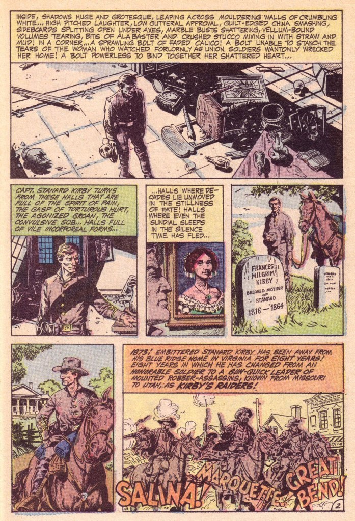
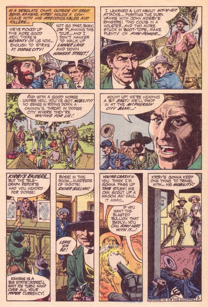
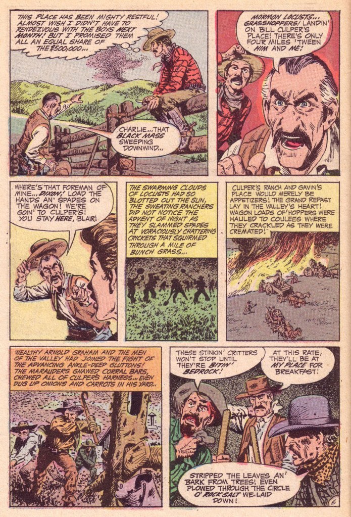
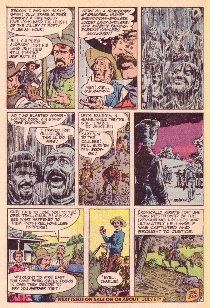
Jerome ‘Jerry’ DeFuccio (1925 – 2001) was born on this day, ninety-eight years ago. While he’s most closely associated with his quarter-century stint as associate editor of Mad Magazine, readers of EC’s war/adventure titles know he could also pen, in excellent fashion, a thoroughly gripping yarn. Here’s one of the handful he later did for DC, for editor Joe Kubert. And while Son of Tomahawk wasn’t commercially successful, it was a highlight of its era, a truly adult comic book. See for yourself:

‘Spoilers!’ saw print in Tomahawk no. 135 (July-Aug. 1971, DC).
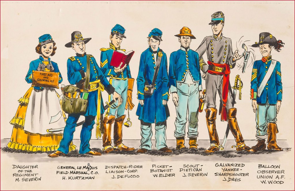
Here’s a lovely illustration of some of the EC gang, in civil war drag . Like it says, DeFuccio’s third from the left. Ink and wash over graphite pencil on Bristol board. » Drawn in the 1950s, this piece saw print in 1983, in issue 9 of the excellent EC fanzine Squa Tront.

GROTH: Was DeFuccio working for Mad at that time?

SEVERIN: Yeah.

GROTH: It seems like you remained friends with DeFuccio for a very long time.

SEVERIN: Yeah, I had to. He was my wife’s cousin.

-RG