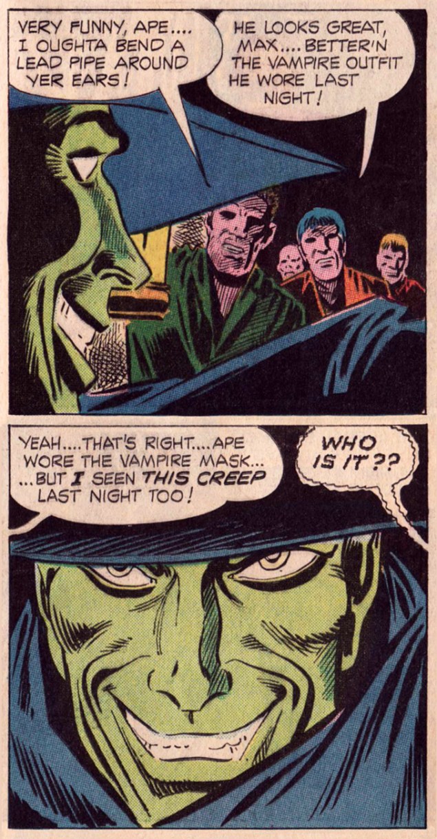
« Ape is real spooked, guys! He’s always imaginin’ he sees someone in there! »
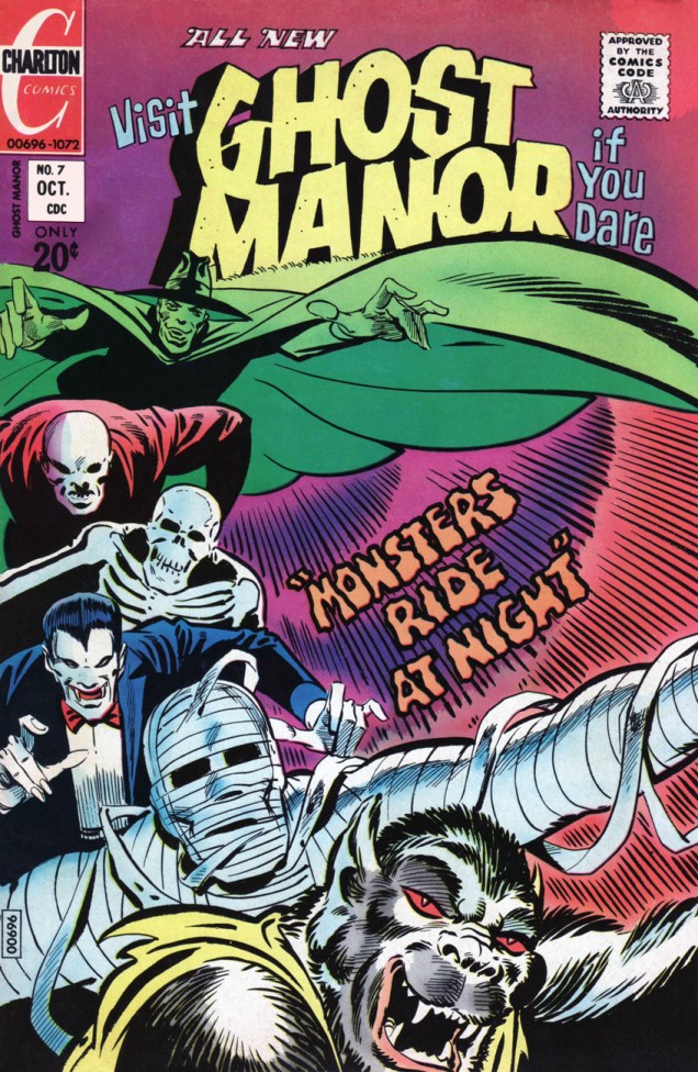
Here we have an evocative Steve Ditko cover, solid evidence of his tremendous design chops, from Charlton’s Ghost Manor (no. 7, second series, October 1972). A collaboration between Joe Gill and Ditko, « The Monsters Ride at Night » is an elegant bit of storytelling legerdemain, a fairly basic yarn that retains its mystery past the conclusion and whose deliciously dusty mood lingers in the mind. Well, in mine, at any rate. Back in the late ’70s, I traded a copy of Amazing Spider-Man 121 (acquired at a garage sale in a two-for-five-cents deal) for this one. I know I came out ahead in the deal*.
Again, I had every intention of providing the whole spooky shebang right here, but seeing as how I was preceded in this particular enthusiasm by a sinister confrère, it seems unnecessary. Just dim the light, settle in, point your browser to Destination Nightmare, pour yourself a noggin of your preferred poison, and savour this fine vintage.
I’m particularly fond of the mid-tale interlude, where our esteemed host, Mr. Bones, seizes the occasion to poke around the cobwebs a bit, a narrative game that the Gill-Ditko duo excelled at. DC and Warren’s hosts (with the obvious exception of Vampirella) never got to play such an active rôle in their respective recitals.
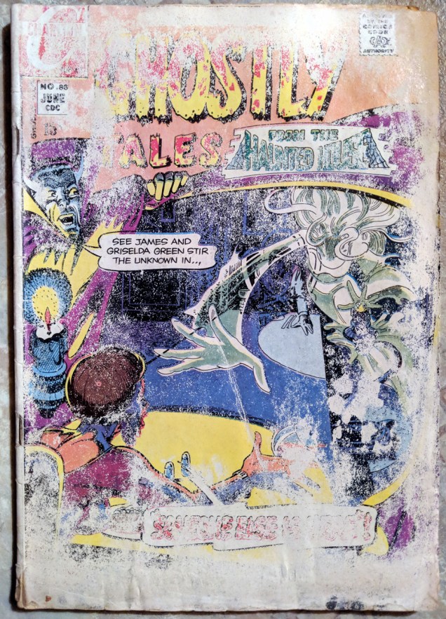
Oh, and since we’re on the topic of early 70s Charlton ghost books, here’s one I picked up just this afternoon, in the 50 cents box of the local comic book shop in Wolfsville, NS. It clearly had been through such hardships, I couldn’t resist giving it a home.
This is (or used to be) Ghostly Tales no. 86 (June, 1971), featuring three Joe Gill tales: « Return to Die » (illustrated by Pete Morisi), « Ghost Town » (illustrated by Pat Boyette), and « Someone Else Is Here! » (illustrated by Steve Ditko.) If books could speak…
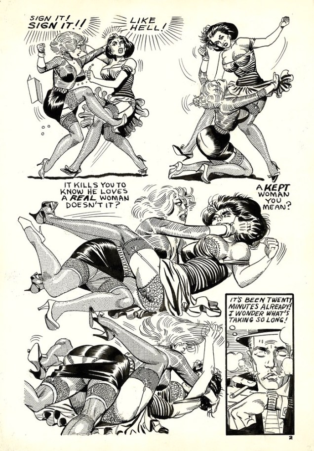
Catfight (noun):A vicious fight between two women that features biting & scratching and often involves clothes being ripped off.
To which I’ll add that if you put two women with different hair colours in one room, it’s like there’s a chemical reaction that makes them instantly aggressive. In comics, at least – and we all know that comics reflect real life accurately, right? The resulting combativeness is especially obvious when the encounter is between a blonde and a brunette. The women involved must also be beauties – presumably, plainer girls resort to verbal assaults when provoked, eschewing physical violence, unlike their flashier counterparts.
Or it could have something to do with the mostly-male audience who actively likes watching belles brawl. (Perhaps “ogle” would be a better description.) Let’s move on to the ogling bit, then!
Err, agreed on the “talking too much” bit. Manhunt no. 9 (Magazine Enterprises, June 1948). That art’s by Ogden Whitney.
“Jeepers! Baldy’s been skewered through the ticker! He’s defunct!” This charming scene with boob grabbery and skirt rippery (I know, don’t I have a way with words?) is from “Off Stage Kill”, a Dan Turner Hollywood Detective story from Crime Smashers no. 7 (Trojan Magazines, 1951).
Script by Robert Leslie Bellem, pencils and inks by Adolphe Barreaux (who was also the editor). Read the issue here. In case you were wondering, Fifi and Brenda are just acting out a fight scene for a movie, although they do get a little carried away (and accidentally skewer Baldy in the process). How many women have a knife tucked away in their garter belt?
Skipping ahead ten years or so…
Ditko shared a studio in NYC with artist Eric Stanton between 1958 and 1968, and they collaborated on some bondage comics (or at least it’s commonly assumed that they have – for more information on that, dive into a discussion on the Four Realities blog, or read this excerpt from Fantagraphics’ Dripping with Fear: the Steve Ditko Archives Vol. 5.) This page is from a story published in 1966 and entitled “Divorce Agreement”.
The clothes-shredding and breast-mauling (ouch) continues…
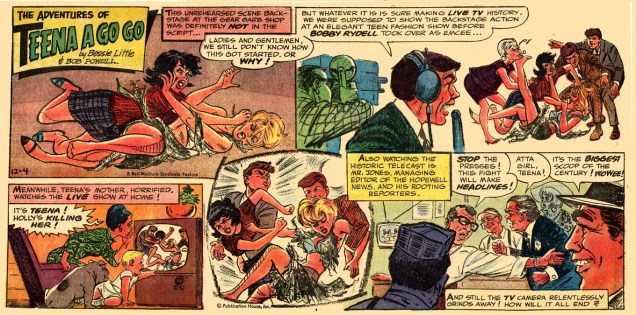
Newspaper comics do it, too! This is Teena A Go Go from December 4th, 1966, written by Bessie Little and illustrated by Bob Powell.
Sometimes Betty and Veronica associations are hard to avoid. These girls also made sure to wear contrasting costumes while fighting, for maximum visual appeal, proving it’s possible to be fashion-conscious even in prehistoric times.
Anthro (the happy teenager watching this scene, and normally a redhead) will marry the victorious maiden… but the fight is a draw, and so he has to marry both in this “The Marriage of Anthro” story. This is Anthro no. 6 (July-Aug. 1969). Pencils by Howard (Howie) Post (who created Anthro, the “first boy”, a Cro-Magnon born to Neanderthal parents) and inks by Wally Wood. Let it be mentioned that Anthro is an immensely fun series, and that I love Howie Post’s art with or without Wood’s beautifying influence.
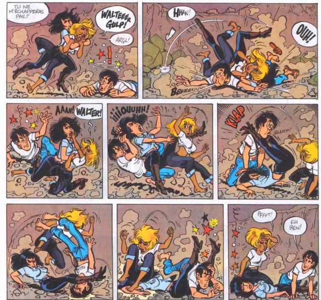
Women of other cultures aren’t immune from this phenomenon, by the way. Witness Italian chicks fighting:
Maghella no. 13 (Elvifrance, 1975), cover by Averardo Ciriello. ” The title is something like “a scalded pussy doesn’t fear cold water”, a play on “chat échaudé craint l’eau froide“, an idiom that means roughly “twice bitten, once shy” or “a burnt child dreads the fire” and translates literally to “a scalded cat fears cold water”.
Italian erotica can be so entertaining! Maghella means a “young witch” in Italian. “The girl is identified by two braids of black hair and giant breasts with unspecified powers“, reads Wikipedia… Odd, I would have thought that her breasts have very specified powers, indeed. 😉
Moving on to French damsels…
Natacha (hôtesse de l’air) is a Franco-Belgian comics series, created by François Walthéry and Gos. This page is from an adventure (one of the final stories scripted by the great Maurice Tillieux) called Le treizième apôtre (The Thirteenth Apostle), published in 1978. The blonde is Natacha, our heroïne.
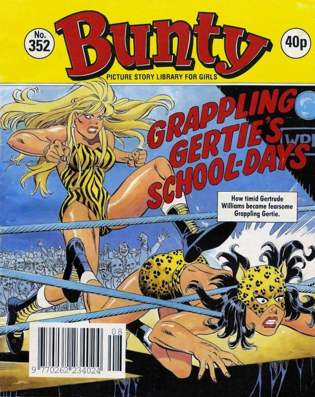
If you want to emphasize the catfight aspect, dress your girls in feline-motif outfits. Oh, I’m sorry – this is no quotidian quarrel, it’s professional wrestling!
Bunty no. 352 (1992) – unfortunately, I don’t know who did the cover. British Picture Story Library was a 62 page a comic digest, published weekly. If you’d like to know how Leopard Lily overcame Tiger Tina, visit Assorted Thoughts from an Unsorted Mind.
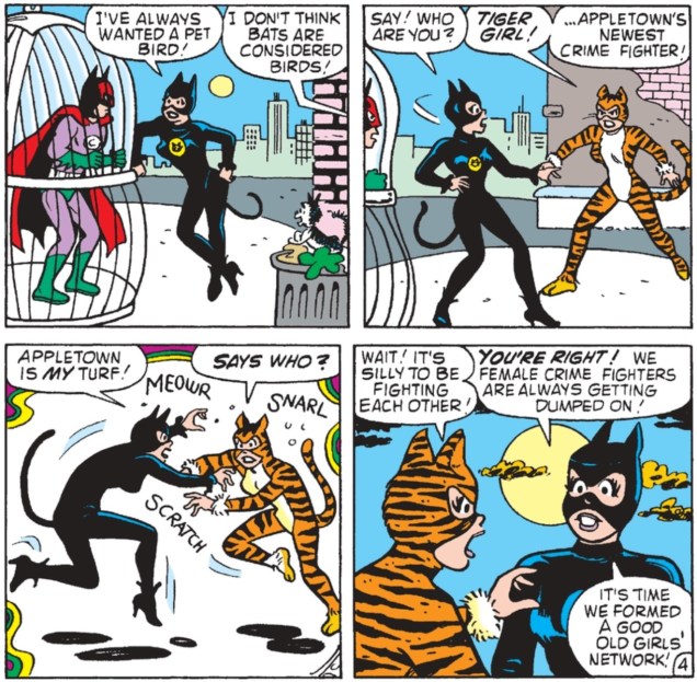
I think we need one even more literal interpretation of “cat fight”:
A snippet from “Meow Row”, published in Betty and Veronica no. 59 (January 1993). Script by George Gladir, pencils by Dan DeCarlo, inks by Alison Ford. Now guess who is who. (It’s obvious: Tiger Girl is Betty, and Veronica gets Meow Girl’s sexier costume.)
This is a fairly inexhaustible topic, but one must quit sometime. Cold shower, anyone?
Mechanical tentacles! Cephalopod monsters communicating by mental telepathy! Even Jimmy Olsen playing the part of a monster in an alien horror movie! Yes, it’s all this and more in this Tentacle Tuesday post (after which I’ll quit bugging you with various cephalopods until next Tuesday).
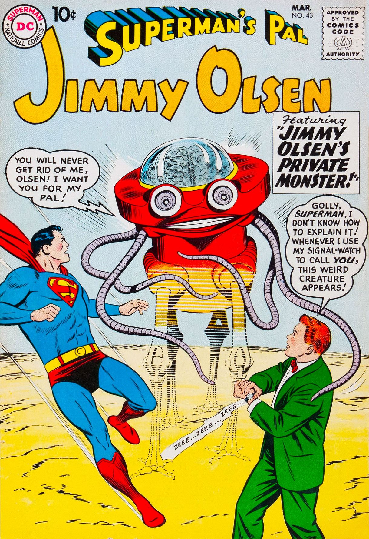
There’s nothing quite as annoying as someone who wants to be your friend against your wishes. Superman’s Pal, Jimmy Olsen no. 43 (March 1960), pencils by Curt Swan and inks by Stan Kaye.
Head over to the Fourth Age blog for a further discussion (with pictures!) of the cover story from this issue, “Jimmy Olsen’s Private Monster!”, written by Jerry Siegel (ahem…) and illustrated by the aforementioned Curt Swan (pencils) and John Forte (inks).
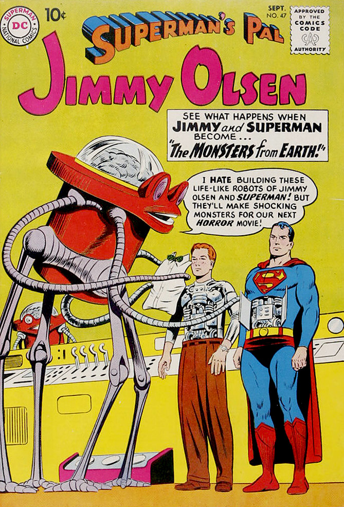
The two-eyed, many-tentacled mechanized wonder appears again in Superman’s Pal, Jimmy Olsen no. 47 (September 1960):
It’s the same cast: pencils by Curt Swan and inks by Stan Kaye; letters by Ira Schnapp.Freaking cute.
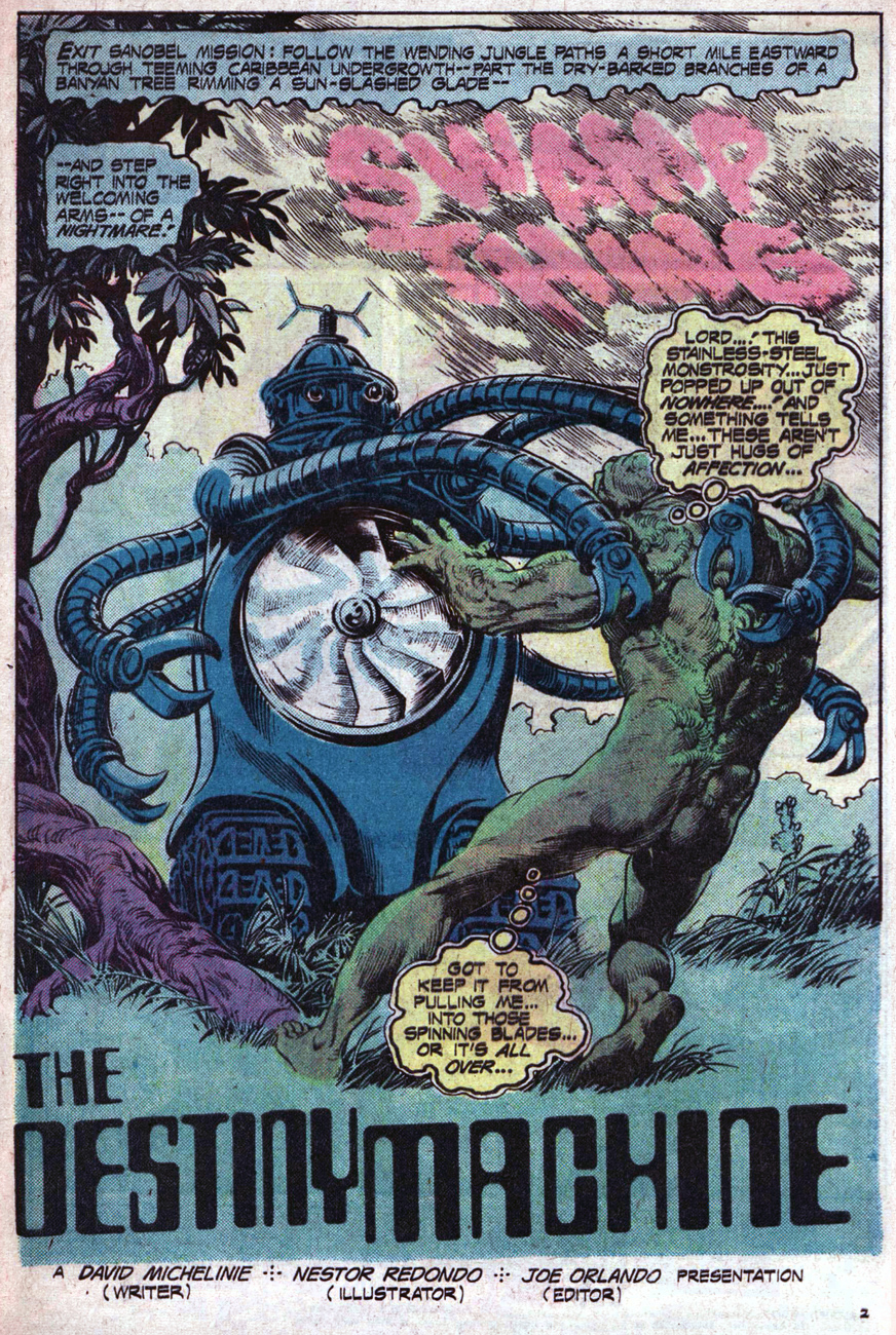
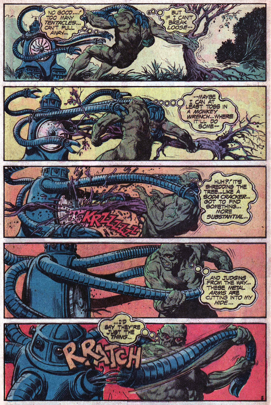
In a similar line of thought (but some 15 years later), a more steampunk relative of the creature above appears in Swamp Thing.
Swamp Thing no. 17 (July-August 1975). In case the credits are too small to read, script by David Michelinie, pencils and inks by Nestor Redondo, colours by Tatjana Wood, letters by Marcos Pelayos.
And here’s a peek at the glorious (I’m a fan of Redondo) inside:
« But destroying that thing doesn’t answer the questions it brought up… like what a stainless-steel octopus is doing in the middle of a jungle… » That’s an excellent question – but destroying this mechanized, tentacled abomination was still a good idea, answers or no.
Here’s another file for our records of Tentacular fascination: the Boy Commandos’ intrepid gang of feisty moppets, tired of fighting Nazis, switch it up by doing battle with some tentacled robots.
Boy Commandos no. 17 (September-October 1946). Cover by Jack Kirby.
I couldn’t very well have a mechanically-minded Tentacle Tuesday without mentioning Dr. Octopus, one of Spider-Man’s most famous foes! Otto Gunther Octavius, a.k.a. Dr. Octopus, a.k.a. Doc Ock was created by Steve Ditko, and first appeared in The Amazing Spider-Man no. 3 (July 1963). Obviously I could feature a gallery of Dr. Octopus tentacles as long as your arm (pardon the confused anatomical terminology on my part), but I’ll limit myself to a couple.
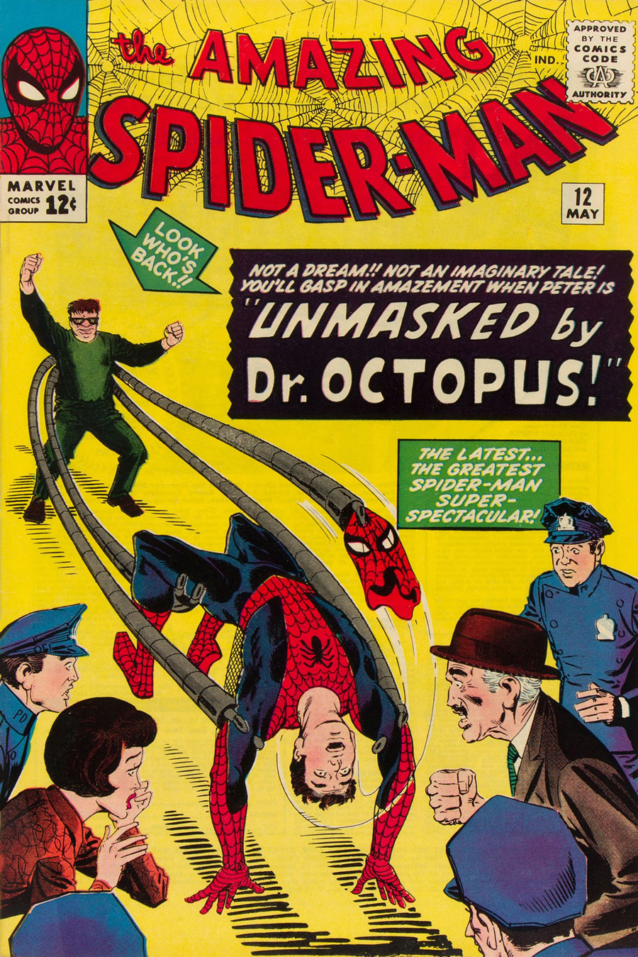
First, The Amazing Spiderman no. 12 (May 1964), cover by Steve Ditko. The “Look who’s back!!” caption pointing to the Doc is rather mystifying, given that he was there in the previous issue.
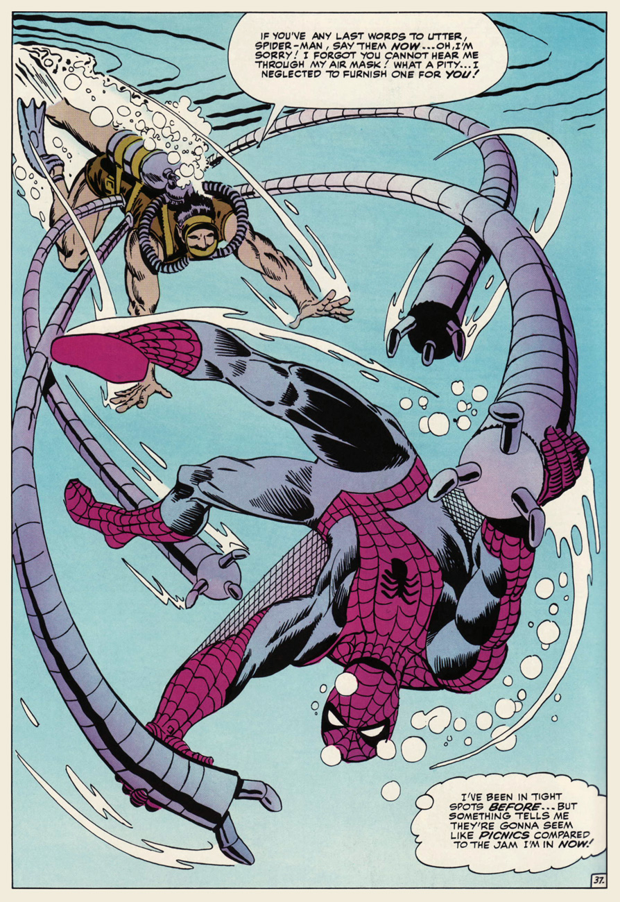
Second, an underwater scene, because what element more appropriate for tentacles? Kudos to Doc Ock for making his perfectly watertight.
JFC, does this guy ever shut up? Especially given that Spiderman can’t even hear him? Splash (no pun intended) page from The Amazing Spider-Man Annual no. 1 (September 1964), with art by Steve Ditko.
Dr. Octopus’ metallic appendages, resistant to radiation and of great strength and agility, were originally attached to a harness…. but became fused to his body after an explosion involving radioactivity (what else?) They were surgically removed, but he could now control them telepathically from a distance. Spooky.
Poor Spider-Man is always getting attacked by tentacles, even when Doc Ock isn’t around! These belong to a robot built by a “nutty professor” to trap anything spider-related. A prize will go to the perceptive reader who can tell us how many tentacles this thing possesses – like, a million, would be my guess. The Amazing Spider-Man no. 25 (June 1965); cover by Steve Ditko.Smythe’s robot in action, ensnaring Parker instead of the spider he’s holding in a globe (and nobody but us readers knows why!) J. Jonah Jameson, publisher of Daily Bugle, watches enthusiastically from the sidelines.Okay, maybe the robot doesn’t have as many tentacles as the cover seemed to suggest. Here’s Spidey hotly pursued by Mr. Jameson, whose maniacal glee is a little scary. (I will readily admit I partially chose this panel because of Parker’s jiggly butt).
It’s Ditquotation time! In 1974, the ever-ingenious lads of legendary English art design studio Hipgnosis threw in a subtle Steve Ditko / Doctor Strange appearance in their (re)design (for the US release) of the cover of Al Stewart‘s Past, Present & Future LP in 1974. The image it quotes hails from Strange Tales no. 137‘s When Meet the Mystic Minds! (October, 1965), where the Master of the Mystic Arts seeks a doorway to Eternity. And finds it.
« I’m going nowhere with nowhere to go* »
However, according to the designers, it first leads him to the front yard of a castle depicted on Al Stewart’s following LP, Modern Times (1975). Now you guys are messing with our poor, befuddled minds.
« The blonde woman on the album cover is Pink Floyd guitarist David Gilmour’s first wife, Ginger. The Cord automobile Stewart is sitting in belonged to Led Zeppelin guitarist Jimmy Page. » And yes, there are other versions of this album cover, some of them far more familiar.
While Hipgnosis consisted primarily of Storm Thorgerson and Aubrey Powell and (later) Throbbing Gristle member Peter Christopherson, the main creative force on Past, Present & Future‘s artwork was one of the studio’s regular freelancers, Richard Manning. For those of us who love this sort of shop talk, here’s Mr. Manning’s recollection of the methods involved, in those halcyon pre-Photoshop days:
« If my memory serves me correctly, this was the first sleeve I worked on for Hipgnosis. Although, in the book ‘Walk Away Rene’ my good friend and mentor at that time,Terry Day (sadly no longer with us) is credited with working on it. A black and white montage. The figure was cut out physically and the back edges thinned and sanded and stuck in position with Columbia Cement. A Best Possible copy print was made, so now I have a flat print to work on, mounted on double weight mount board. Working to an elliptical guide on tracing paper, I carefully bleached to white the shape. Once washed and dried I then redrew some of the background with Photo Dye with a Sable brush, where the print had bleached a bit too far in the lighter areas. Finally, Permanent White was sprayed to make a sweet, soft edged shape. »
It wasn’t the first Dr. Strange reference Hipgnosis had inserted into an album cover: Pink Floyd’s A Saucerful of Secrets (the studio’s first LP cover, actually) borrows an image from the not-exactly-outstanding Roy Thomas/Marie Severin entry, The Sands of Time, from Strange Tales no. 158. Frankly, few characters have been as lost without their creator as the poor doctor has been, especially on the visual front.
Ditko’s final Dr. Strange panel (Strange Tales no. 146, The End — at Last!, July 1966) was no symbolic accident: both creator and creation were leaving the stage.
On the plus side, Al Stewart, seemingly impervious to the passage of time, remains a terrific performer and an inspired, if less prolific, songwriter. If he’s in town…
Today is birthday number ninety-five for Stanley Lieber, aka Stan Lee. He was hatched on December 28, 1922. Have a good one, Stan.
Jack Kirby recalls with fondness his former editor and his toady, in “Funky Flashman!” (Mister Miracle no. 6, January-February 1972, DC).
On this momentous occasion, let’s hear about Stan from some of his colleagues, who knew The Man and obviously loved the experience:
Wally Wood:
« Did I say Stanley had no smarts? Well, he DID come up with two sure fire ideas… the first one was ‘Why not let the artists WRITE the stories as well as draw them?’… And the second was … ‘ALWAYS SIGN YOUR NAME ON TOP… BIG’. And the rest is history… Stanley, of course became rich and famous … over the bodies of people like Bill [Everett] and Jack [Kirby]. Bill, who had created the character that had made his father rich wound up COLORING and doing odd jobs. »
EC legend Bernie Krigstein, who collaborated with Stan at Atlas, and whose « Suppressed Desire » is featured in Spellbound no. 17 (September 1953) , with a glorious cover by the above-mentioned Bill Everett.
In the course of a 1960s interview with comics scholar John Benson, Krigstein responded to Benson’s statement of « I guess you know that Stan Lee has been the spearhead of the so-called current revitalization of comics »:
« I’m delighted to learn that. Twenty years of unrelenting editorial effort to suppress the artistic effort, encourage miserable taste, flood the field with degraded imitations and non-stories have certainly qualified him for this respected position. »
Then Gil Kane, who was Marvel’s principal cover artist for much of the 70s, and who collaborated with Lee on The Amazing Spider-Man in some of its most popular years, including the infamous, comics-code unapproved “drug” issues (nos. 96-97, May-June 1971), on the respective creative roles of Stan and Jack Kirby:
« On each page, from 1964 – 1970 next to every single panel Jack wrote extensive margin notes explaining to Lee what was taking place in the story. It took Jack about 2 weeks to do a single story, it may have taken Lee as little as 4 hours to add text to Jack’s art. »
And Steve Ditko, in a letter to the editor of Comic Book Marketplace, published in the magazine’s 63rd issue in 1998, on his and Stan’s respective roles in crafting an issue of Spider-Man:
« The fact is we had no story or idea discussion about Spider-Man books even before issue no. 26 up to when I left the book. Stan never knew what was in my plotted stories until I took in the penciled story, the cover, my script and Sol Brodsky took the material from me and took it all into Stan’s office, so I had to leave without seeing or talking to Stan. »
« Don’t be so sure! A guy that popular — he’d be a fool to fold up his act while he’s such a hot item!* »
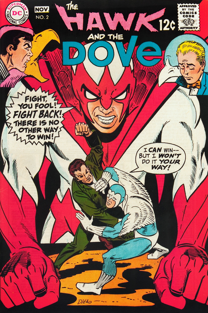
I’ve been a Steve Ditko fan for as long as I can remember. In fact, I was a fan even before I actually saw his work. “How’s that even possible?”, you may ask. Well, when I was five, this neighbour from across the street was showing off a comic book he had just picked up, which was Teen Titans no. 29**. I was instantly captivated by two costumes on the cover: Hawk and Dove’s, designed by Ditko a couple of years earlier.
I do believe I had encountered a Ditko comic book just a bit earlier, a copy of The Many Ghosts of Doctor Graves no. 20 (June, 1970), acquired by my brother en route to the family vacation on Prince Edward Island. But that one had a (fine) cover by Pat Boyette, and I don’t recall the Ditko story within, « An Ancient Wrong ».
The bottom line is that Ditko’s been a precious part of my life for a spell. It would be easy to take him from granted, so let’s not, if you don’t mind.
Which brings us to our little tribute: running ninety covers covers would be about as practical as ninety candles on our birthday boy’s cake, so I’ll just drop a decimal and stick to a more manageable nine… I won’t even give a nod to such fickle and hollow notions as popularity, historical importance, or iconicity. I’m going with my favourites. That’s the way Steve would do it… and even if he wouldn’t, I’d still go this route.
« Nobody here in Crestville will ever forget that night! » A tiny reproduction of this cover, that of Unusual Tales no. 9 (Nov. 1957, Charlton), in some late-70s edition of the Overstreet Comic Book Price Guide hooked me, and still grabs me. In the post-code era, particularly in its early days, you had to be mighty resourceful to fruitfully mine the mystery genre, what with all the verboten topics and tropes. The issue holds a whopping four, 1957-vintage Ditko stories, including the title piece, which you can read here: http://ditko.blogspot.ca/2012/01/unusual-tales-night-of-red-snow.html
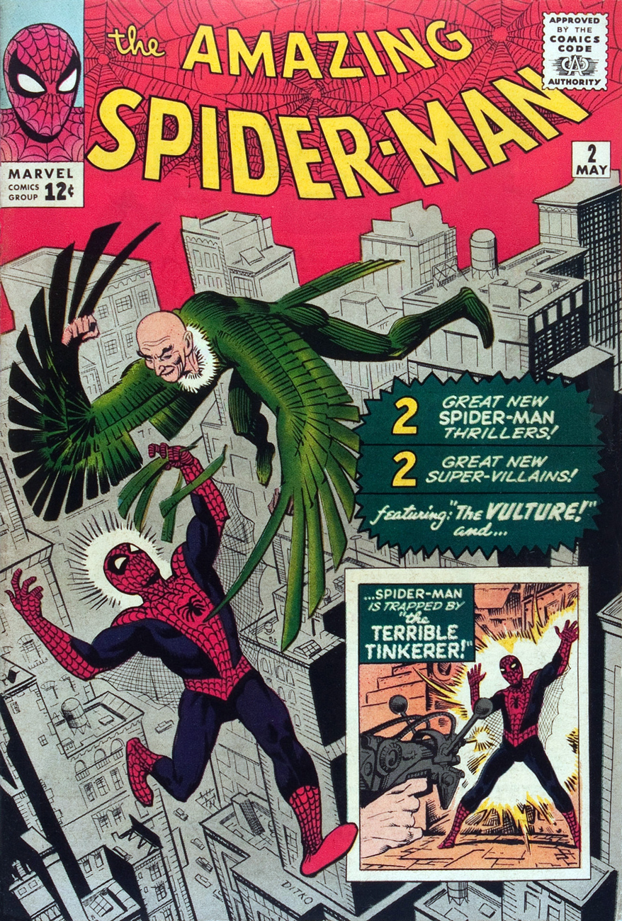
The Amazing Spider-Man no. 2 (May 1963, Marvel). Beyond Ditko’s departure (no. 38 was his final contribution), I have no further interest in Peter Parker and his costumed alter-ego.
« Name’s Bulldog Bird! This is Sumo! We’re secret agents from the sovereign kingdom of Offalia! » For most of the brief run of his book (issues 2 to 6), the Creeper had to contend with a faceless enemy, Proteus, who turns out to be someone very close to him. It was as though Ditko felt the need to replay the Spider-Man – Green Goblin secret identity dynamic, not the way *he* had envisioned it (which was to make the Goblin a total stranger, a situation he’d meticulously set up in the background), but the way Lee had, as if to show his former editor how to do it properly. This is Beware the Creeper no. 4 (Nov.-Dec. 1968, DC), “Which Face Hides My Enemy?” Pencils and inks by Steve Ditko, plot and dialogue by Dennis O’Neil
« You’re still wasting your time reading! Why don’t you build up that sickly body of yours? » DC’s Hawk and Dove (introduced in Showcase no. 75, June 1968, DC) was, as its title and covers amply make clear, a study in contrast and opposition: aggression vs pacifism, the letter of the law vs the spirit of the law, Steve Ditko vs Steve Skeates… The concept may have been of its time, but the industry as it stood wasn’t ready to explore the issues without stacking the deck. This was still, after all, a mainstream superhero comic book of the Sixties. This is issue 2, “Jailbreak!” (Oct.-Nov. 1968), Ditko’s third and final issue with his creations. As for Ditko’s abrupt departure from DC is concerned, the reason cited at the time was a relapse of tuberculosis, a disease that had plagued Ditko in his youth. Others have invoked more political explanations, but Ditko *was* out of the game for several months, which fits the convalescence scenario. His absence until 1975 from DC fits the politics one. Why credit one single factor when several, taken together, are more plausible?
« Come off it, yer Lordship! This ain’t no blinkin’ time ter do the art connoisseur bit! » The rakish 14th Lord Garland proves a bit of a disappointment to his forebears. Sir Steve Ditko’s cover proffers a scenic victim’s perspective… but who’s the hazy, phosphorescent figure shambling down the stairs to meet us? This is Charlton Comics’ Ghost Manorno. 5 (second series, June 1972, Charlton). Inside, you’ll find a trio of Joe Gill chillers: “Dead Man’s Eyes”, illustrated by Joe Staton; “Devils at My Door”, illustrated by Charles Nicholas and Vincent Alascia, and of course, the pièce de résistance, “The Last Garland”, brought to you in panoramic Ditko-vision.
Ah, the largely lost art of the *soft* sell. Charlton’s cadre of artists hewed much closer to the ambience favoured by aficionados of the spectral than did the esteemed competition. You know, more Montague Rhodes James than, say, Rob Zombie. Here, Ditko demonstrates how (dis)quiet and mystery is evoked. Dignified silence can be very attractive when everyone around is shouting. Ghostly Tales no. 97 (August 1972, Charlton) features “The Eye of the Cat”, actually handled by Don Perlin, while Ditko delivers visuals for Joe Gill’s “Journal of a Hanged Witch”. The issue also features “Poltergeist”, an effective collaboration between Creepy Magazine founder Russ Jones and the multitalented Bhob Stewart.
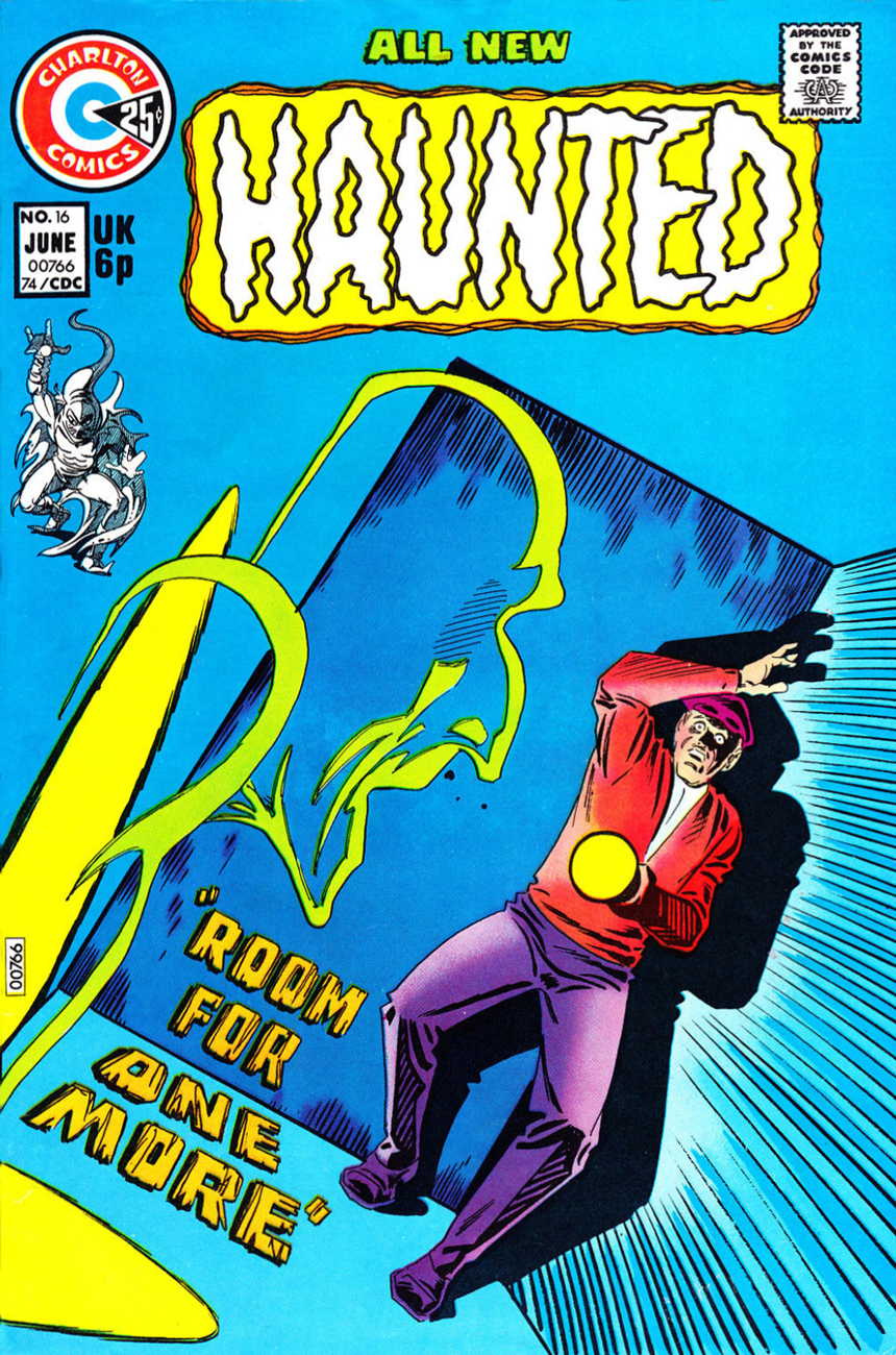
My particular favourite among Ditko’s covers for Charlton’s Haunted (75 issues, 1971-84.) The merrily saturated colour scheme, the composition and its geometric simplicity, that well-chosen angle… the contagious joy of a master at play. This be Haunted no. 16 (June 1974, Charlton.)
« If you visit that grave on a dark night, you may be surprised… for there is a sentry stationed there…to honor the dead? Or to make sure that General Kugar never leaves his grave? » Here’s a cover showing the sort of solemn dignity and restraint that made Charlton’s line of ghost books so attractive to me right off the (vampire) bat. No one’s shouting deceptive hype or explaining the action; the elusive allure is undisturbed, unlike the sanctity of the tomb. DC, under Infantino and Cardy, generally understood this, but Marvel virtually never did or cared to. But hey, what sold and what I liked rarely sat at the same table. Beyond the Grave no. 2 (Oct. 1975, Charlton).
Ah, Shade. Ditko’s last great creation, cut off in its prime by the Great DC Implosion of ’78. Later misunderstood and corrupted by hacks. Finally reprinted, including formerly unpublished issue 9, in volume 1 of The Steve Ditko Omnibus (2011). It’s still a frustrating experience, but at least issue 8’s cliffhanger has been resolved, and what happens in the Zero Zone doesn’t stay in the Zero Zone, if you know what I mean. This is Shade the Changing Man no. 3 (Oct.-Nov. 1977, DC)
*Jack Ryder (aka The Creeper)’s closing quip from “The Coming of the Creeper!”, plot and art by Steve Ditko, script by Don Segall (Showcase #73, Mar.-Apr. 1968, DC) **Since it played such a crucial rôle in my Ditko inculcation, here’s the Teen Titans issue in question.
Teen Titans no. 29 (Sept./Oct. 1970, DC) Cover by Nick Cardy (likely co-designed by Carmine Infantino and coloured by Jack Adler), illustrating “Captives!”, written by Hawk & Dove scenarist Steve Skeates and illustrated by Nick Cardy.
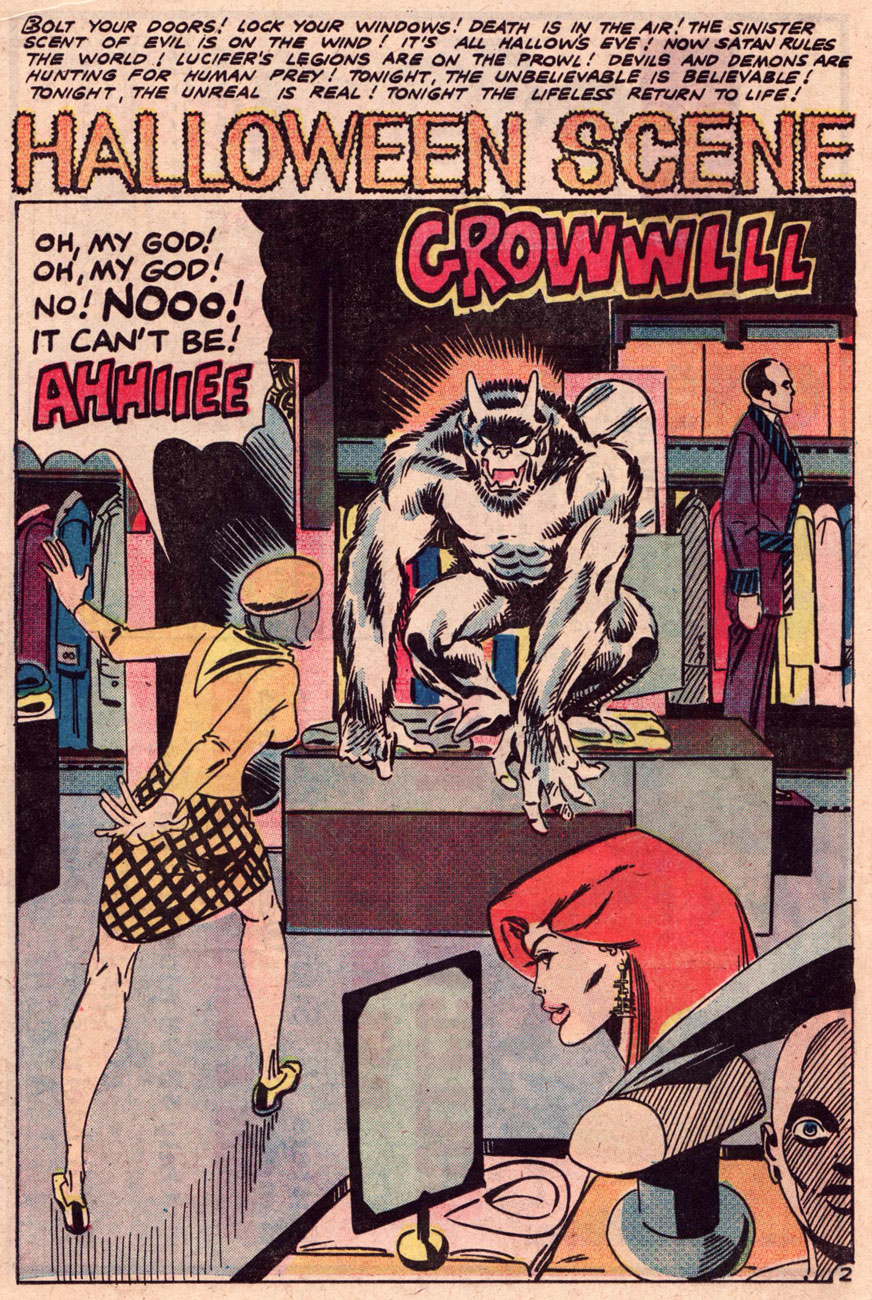
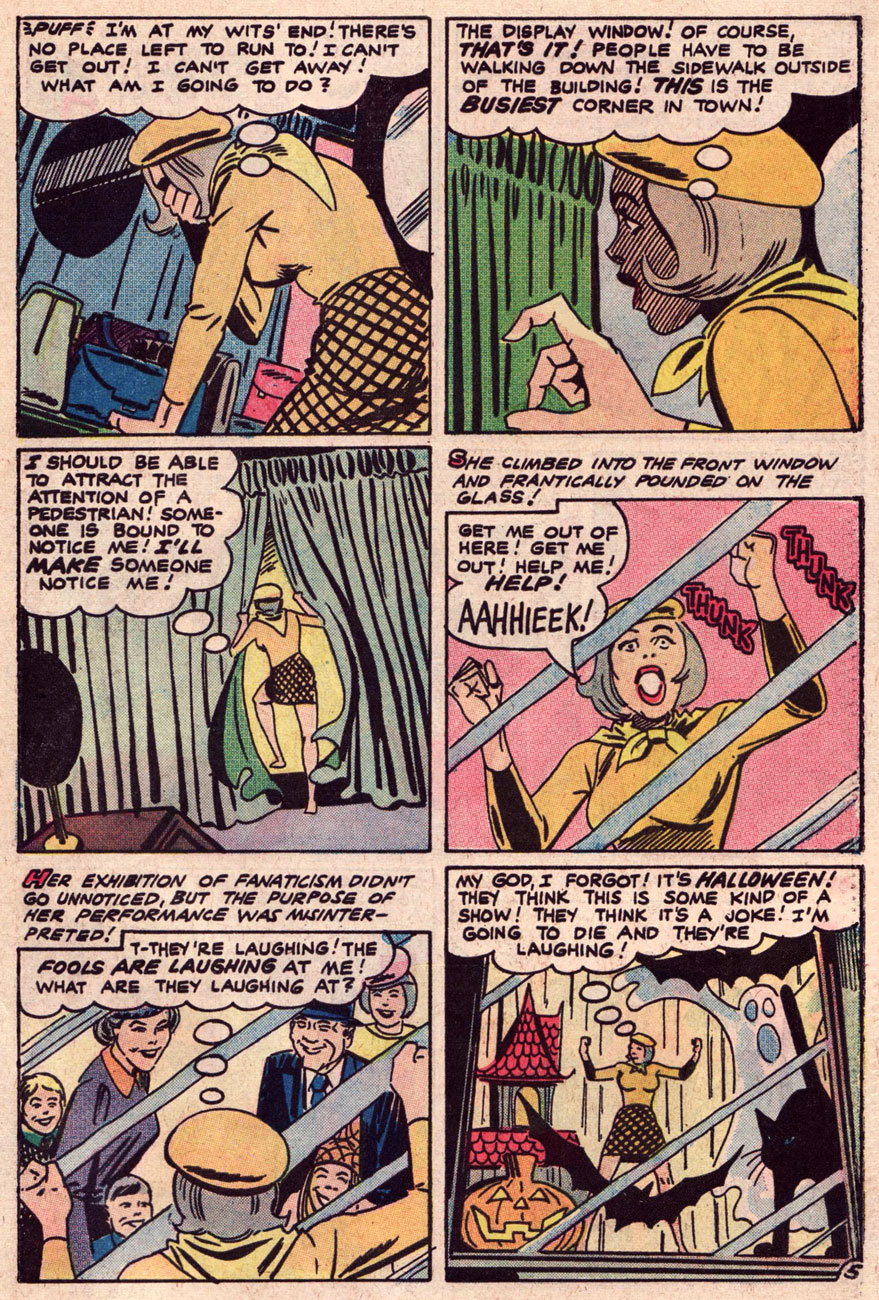
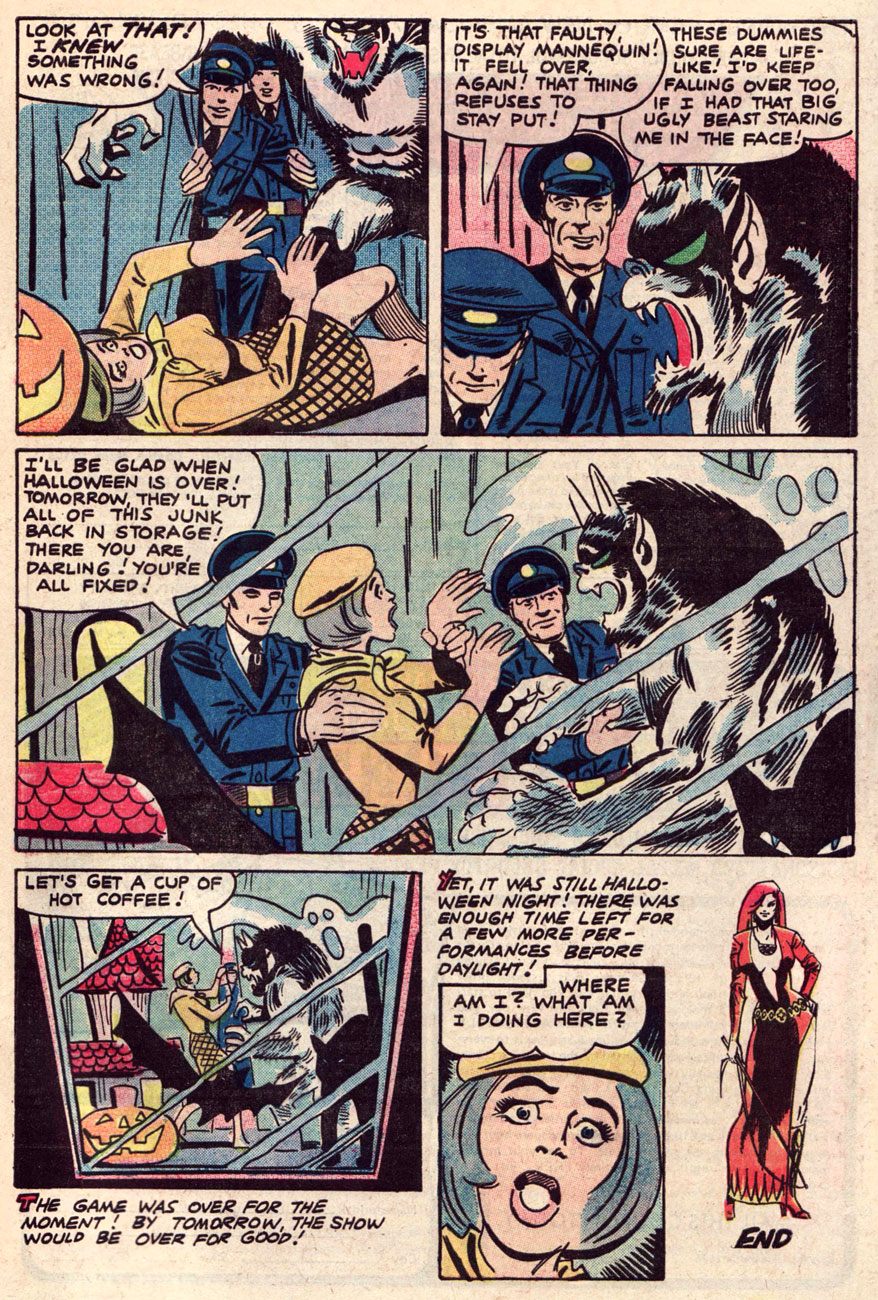
It surely won’t shock you that the most difficult decision, in such a countdown, lies in crowning numero uno. There are, after all, plenty of worthy candidates. But one also seeks to avoid undue repetition. After a couple of false starts, I opted for a long-time favourite that’s never received its due.
Here, then, is Steve Ditko (and an unknown scenarist)’s expertly-paced department store nightmare, “Halloween Scene”, from Scary Tales #7 (Sept. 1976, Charlton). It occurs to me that Mr. Ditko is about to turn 90 in a couple of days… they didn’t call him “Sturdy Steve” for the alliteration alone, as it turns out.
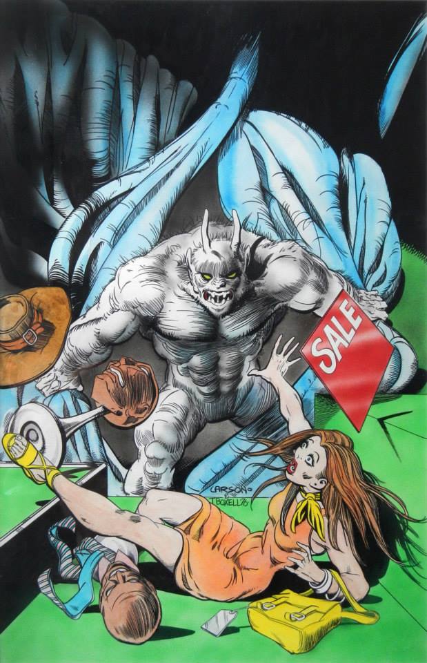
As a bonus (Hallowe’en comes but once a year, after all!), have a peek at the issue’s fine cover and its original art.
Pencils by future “Good Girl” specialist (see his Haunted House of Lingerie series, in the name of research, of course) Rich Larson (with ink and airbrush work by artistic partner Tim Boxell).
The published version offers reasonably accurate reproduction, though one misses some of the details hidden behind the logo. Nature of the Beast of Commerce…
Well, that’s it for this year. Happy spookfest to all, and see you next time, hopefully.
I pity inanimate objects Because they cannot move From specks of dust to paperweights Or a pound note sealed in resin Plastic Santas in perpetual underwater snowstorms Sculptures that appear to be moving but aren’t I feel sorry for them all.
Godley and Creme – I Pity Inanimate Objects (1979)