“Man is a rope stretched between the animal and the Superman–a rope over an abyss. A dangerous crossing, a dangerous wayfaring, a dangerous looking-back, a dangerous trembling and halting.”
– Friedrich Nietzsche
Superheroes come in all shapes and sizes, and for every successful superhero remembered throughout the ages, there’s probably about a hundred forgotten characters of varying degrees of goofiness. Periodically, some artist or writer digs up one of them from the deep recesses of time, dresses him in a new frock and plugs him into the modern era of Internet and cellphones, with almost universally lacklustre results.
I like to contemplate these bold strangers in their natural habitat — Golden Age comics! And for a 40s superhero, there is simply no better way to demonstrate super powers and a nimble brain than a friendly tussle with a cephalopod.
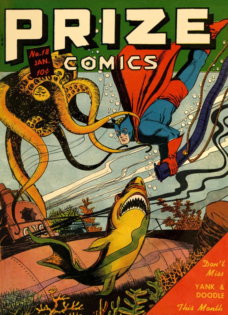
The Black Owl, clad in a red-and-blue costume with some odd leopard-print swimming cap… oh, sorry, that’s his blond hair:
Prize Comics no. 18 (January 1942). Cover by Jack Binder.
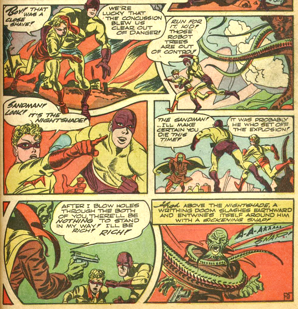
The Sandman… oh shoot, which one? Remember we have both feet firmly planted in the 40s in this post. This Sandman is Wesley Dodds, created by artist Bert Christman and writer Gardner Fox. Accompanied by his sidekick Sandy, this superhero-cum-detective wielded a special gun that could put criminals to sleep or act as a sort of truth serum.
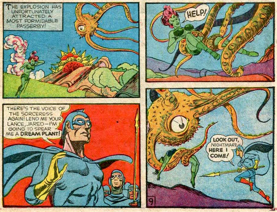
The Adventure of the Magic Forest, published in World’s Finest Comics no. 6 (Summer 1942, DC), was scripted by Jack Kirby (Tentacle Tuesday Master!), pencilled by the King and inked by Joe Simon.
You’re not convinced that those are tentacles? Shame on you. Take a gander at this:
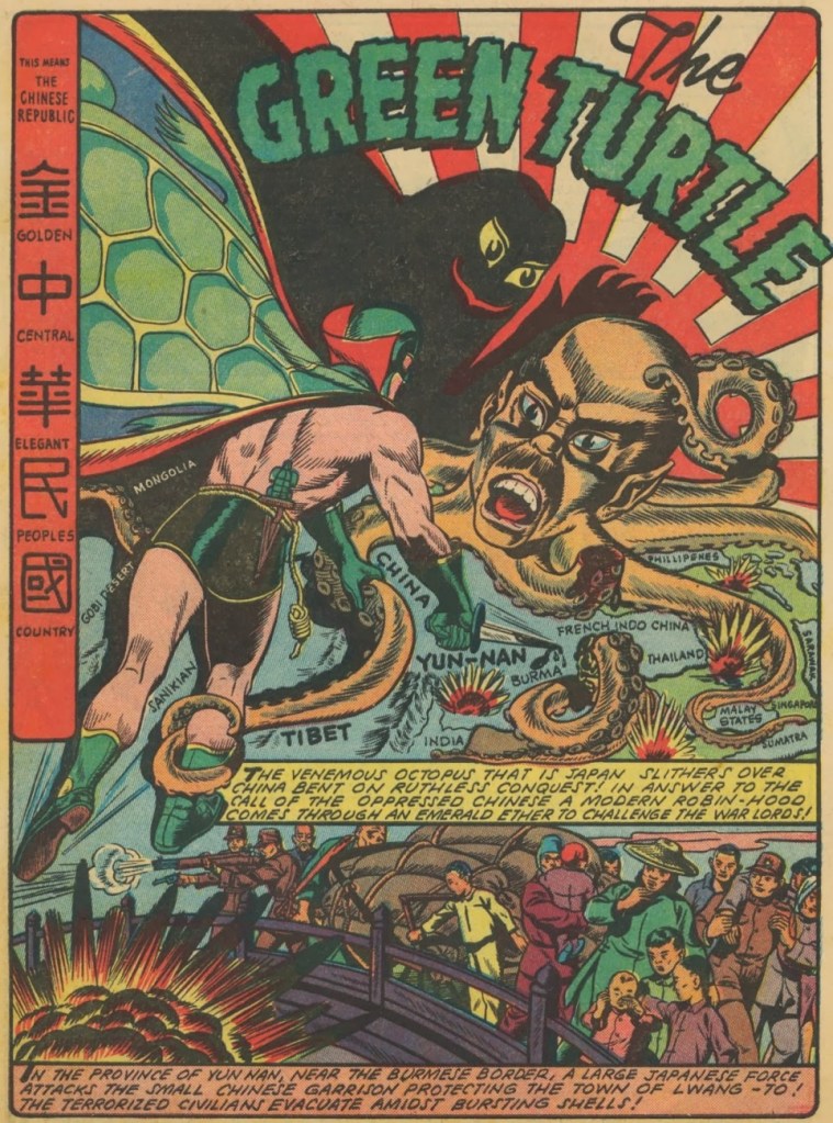
The next superhero (technically with no super powers, but managing beautifully all the same thanks to his lightning-fast reflexes and superior fighting skill) is my personal favourite Green Turtle, a Chinese superhero who fought against Japanese invaders in WWII. Unfortunately, the publisher wouldn’t let creator and artist Chu Fook Hing make his creation obviously Chinese, so the Green Turtle was never seen without a mask. It’s okay, we can read between the lines!
This Green Turtle adventure was scripted and illustrated byChu F. Hing and published in Blazing Comics no. 1 (June 1944, Rural Home). With apologies to our Japanese readers.
Magno the Magnetic Man has, believe it or not, magnetic powers (though I imagine it’s not helping him much in this particular skirmish). He’s irresistible to women (maybe they have metal parts?), impervious to harm, and is accompanied by his side-kick Davey, whom he periodically magnetizes to ensure that the little whippersnapper also has access to magnetic powers.
Super-Mystery Comics vol. 5 no. 4 (February 1946, Ace Magazines). Cover by the sudorific Rudy Palais.
« Challenge Merlin and be a fool! — Challenge a demon — and be destroyed! »
Suddenly having so much time on my hands (courtesy of COVID-19) is an eerie, though by no means unpleasant, experience. While I could crochet mini couches for my cats or enrol my partner’s help to re-create some favourite classic paintings, I prefer to catch up on books I’ve been meaning to read for a while. Case in point: in April, I’ve been joyously absorbing Jack Kirby’s Fourth World saga, reprinted in a handsome 4-tome omnibus (and to which I have easy access, thanks to co-admin RG’s vast library). That ended all too soon, and I moved on to a collection of Etrigan the Demon. It was a somewhat underwhelming experience, especially given the epic scope of Fourth World, but of course still worth a read.
The red-eyed, yellow-skinned creature called Etrigan came into existence in 1972. Mark Evanier, in his introduction to Jack Kirby’s The Demon, explains: « There was, at the time, a feeling around DC that perhaps superheroes were on the way out again. Ghost and mystery comics like House of Mystery and Phantom Stranger seemed to be selling, and some in the office felt the next trend was what Joe Orlando, who edited most of them, dubbed “weird adventure” comics. A few weeks later, [Carmine] Infantino asked Jack to whip up something in that category… »
Kirby accepted the challenge and, despite his lack of interest in horror, created The Demon, patterning his face on a a detail from Hal Foster‘s Prince Valiant strip as an inside joke.
As great a storyteller Kirby is, I think being asked to write about a subject he wasn’t particularly into had its repercussions. Although he clearly tried to give Etrigan a stimulating playground of supernatural rogues of varying degrees of viciousness to bat around, the overall result is rather underwhelming by Kirby standards. I’ve seen quite a few people in comic forums expressing their undying love for the Demon – if you’re one of them, I’m open to being convinced!
I actually first encountered Etrigan the Demon in a Swamp Thing issue written by Alan Moore. He first made an appearance in Swamp Thing no. 26 (July 1984) and then came back for the 14-issue storyline American Gothic that ran from June 1985 to July 1986. In Moore’s hands, Etrigan cut a dashing, mysterious figure, and he spoke in rhyme, which was a really nice touch. I admit I was disheartened to find out that he really wasn’t that exciting in his original form.
However, he *did* encounter tentacles, and more than once!
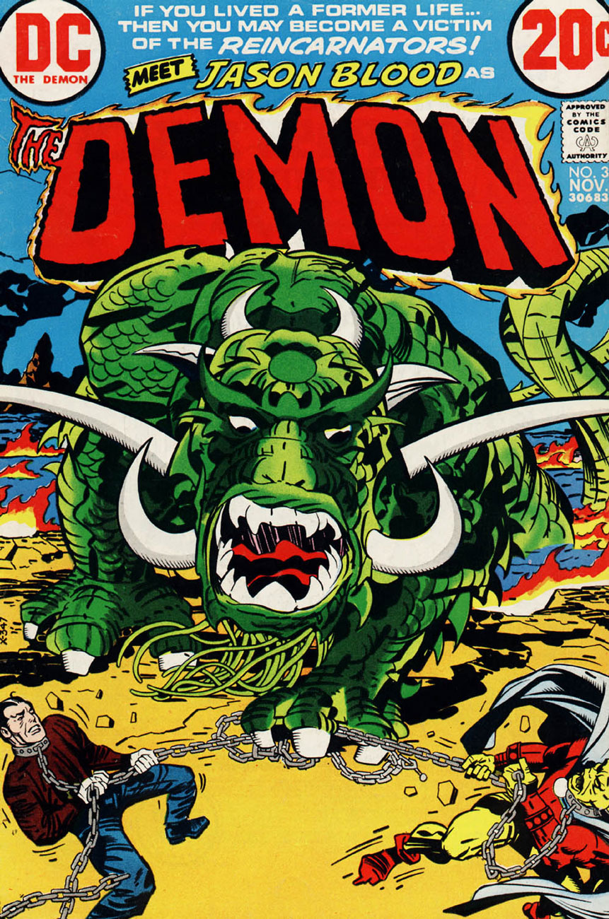
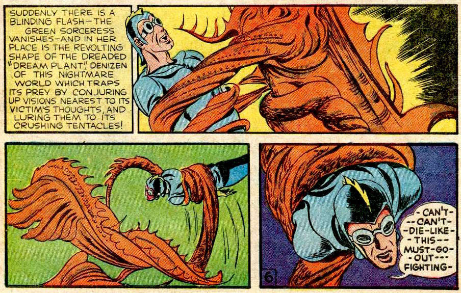
I was rather hoping the Somnambula would stick around, but it came and went in one page. Merlin’s Word… Demon’s Wrath! was published in The Demon no. 5, January 1973.
The spoiled and malicious brat Klarion and his cat/pussycat-princess Teekl are my favourite characters of the series. The One Who Vanished!! was published in The Demon no. 15 (December 1973), the penultimate issue. This scene is reminiscent of a sequence from the 1961 movie Night Tide.
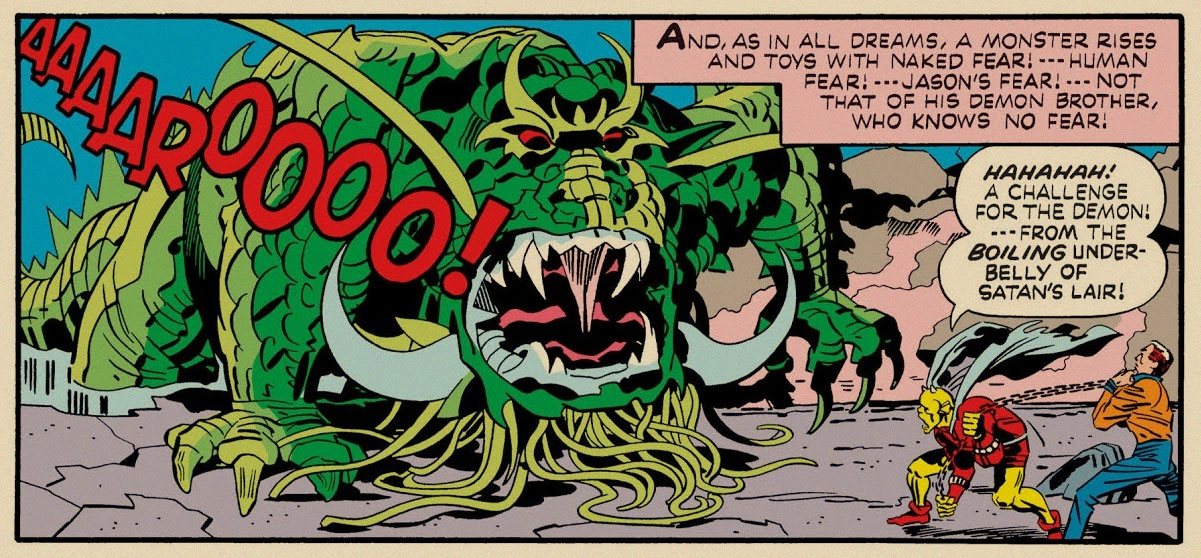
In the following (and final) issue, tentacles reared their grabby suckers yet again. Immortal Enemy! was published in Demon no.16 (January 1974). One more complaint from me – Kirby’s use of the philosopher stone (which Warly is clutching on this page) as a sort of Deus ex machina, that can be used for accomplishing pretty much everything (some examples: it produces the ultimate cold or demon flame, shields the owner from thousand-volt electricity or brings people back form the dead, turns people into vultures or an Egyptian mummy or a chair into flowers, randomly makes objects levitate, etc.) This makes one wonder why Jason bothers running around at all, instead of elegantly waving the stone about and solving all problems instantly.
The three pages above are Etrigan’s encounters with actual tentacles, but we have an honorary mention of almost-tentacles-but-not-quite, which I wanted to include in the spirit of thoroughness.
Can the following creature’s beard tentacles be used to grab anything? We never learn if they’re prehensile or not, because the fear-monster doesn’t stick around long enough.
The Demon no. 3 (November 1972). This little baby is one of my favourite monsters of the series, despite just being part of Jason Blood/Etrigan’s nightmare – one can really felt its crushing weight. Besides, it’s probably a preview of the Kamara, a creature that becomes what the person fears most, and an awe-inspiring enemy.
A panel from Reincarnators.
In case anyone is interested, I am currently re-reading Kamandi: the Last Boy on Earth, which was my first exposure to Kirby.
« Morticoccus is overpoweringly large and sinister! In this new world he can live — only if he destroys all other life around him — kingdoms and empires would crumble to dust at his deadly touch! Morticoccus waits in his prison — he waits to get out — and breed!! »
I apologize, but according to co-admin RG (whose sense of humour is apparently more morbid than mine) this is Contagion Week on Who’s Out There? Well, I suppose tentacled microbes and germs are as good a topic as any right now…
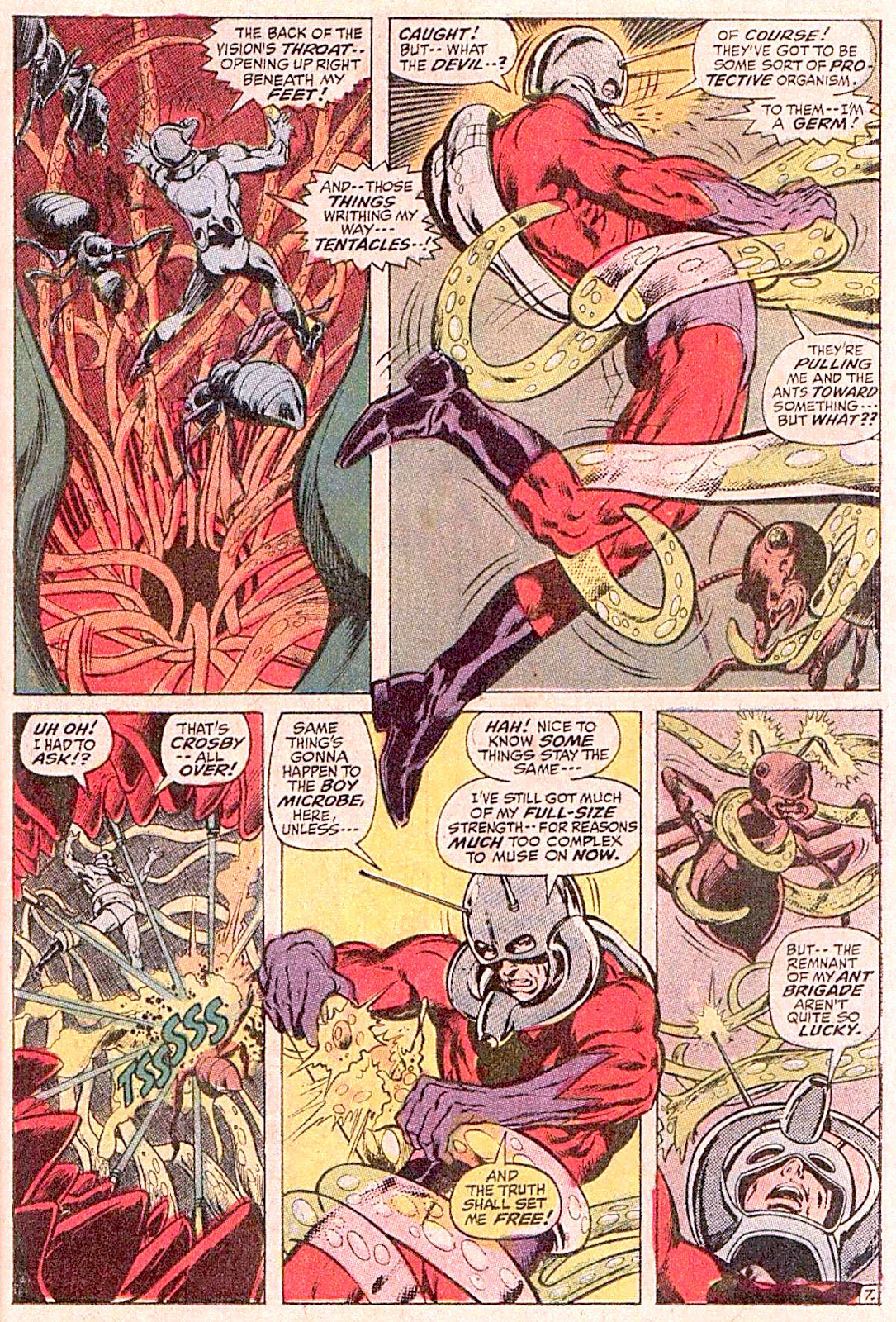
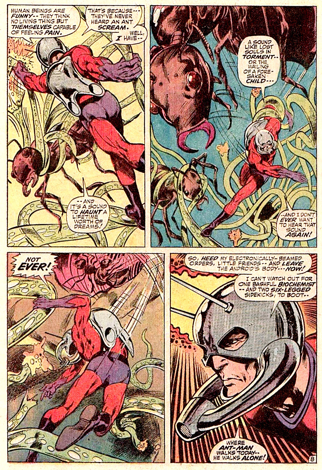
Our first foray into germs is This Beachhead Earth, scripted by Roy Thomas, penciled by Neal Adams and inked by Tom Palmer, published in The Avengers no. 93 (November 1971). The Vision collapses, the Avengers send Ant-Man into his body to figure out what’s amiss. I made an earnest attempt at following the plot, but the bad dialogue made my head hurt. Did you know that the scream of an ant « is like the wailing of a forsaken child »? The story includes gems like « frankly, my dear, I don’t give an hydroelectric dam» and « therein lies the only true superiority of the educated man — that he analyzes — dissects — probes — reconstructs ». Oh, the glorious mix of bad puns and pompous lines!
You can read this « paltry prologue to the most portentous Avengers saga of all! », the work of a fellow who’s just a little too fond of calembours and his thesaurus, here.
Continuing on a grand scale – this time, it’s the grandest scale there is! – we pay a visit to the aforementioned Morticoccus (sinister a’plenty, you shall surely agree), arguably the most fatal disease known to mankind, or at least the deadliest to spring from Jack Kirby‘s fertile mind (ouch) . As for me, I really like the giant, lethal bats.
Kamandi, The Last Boy on Earth no. 10 (October 1973). Killer Germ! is written and pencilled by Jack Kirby, and inked by Mike Royer, with whom co-admin RG has conducted an interview.
Our third medical study is a little case of fungoid infection that even boasts a name. M’Nagalah had a rather complicated birth. Created by British horror writer Ramsey Campbell for his cycle of H.P. Lovecraft pastiches (to be more precise, the creature first appeared in the short story The Inhabitant in the Lake in 1964), it was soon adopted by DC Comics, after doubtlessly being bowled over by its puppy eyes while visiting a no-kill shelter of the Great Old Ones. It was first borrowed for Swamp Thing no. 8 (1974) and afterwards used as per the Russian idiom “a plug for every barrel“. Just look at this mess.
Challengers of the Unknown no. 82(August-September 1977), scripted by Gerry Conway, pencilled by Michael Netzer, and inked by Joe Rubinstein, starts off with a just mild (if disgusting) contamination…
That fast progresses to the old “unspeakable, indescribable horror” (yawn).
Swamp Thing gets dragged in, and professor Mark Haley blooms prettily in the beginning of Challengers of the Unknown no. 82 (October-November 1977), also scripted by Gerry Conway, but this time pencilled by Keith Giffen and inked by John Celardo…
It is soon explained that this is actually some Elder God trying, as usual, to take over the planet, blah blah blah.
Wishing everyone health and bon courage in these trying times, especially to our poor American friends who seem to be caught in the middle of the virus vortex… And a last strip to end on a more positive note:
Calvin & Hobbes strip from February 7, 1993. May our worst encounter with microbes be of the digestive variety!
Oh, all right, one more:
Page from The Incredible Shrinking Tightwad, published in Uncle Scrooge no. 359 (November 2006). Story by Don Rosa, of course!
« Silence at the proper season is wisdom, and better than any speech. » — Plutarch
When I think of cover layouts, I always recall the sage advice of my art school book design teacher, who posited that « a poster should be One Angry Fist », as you only have a second or two to make your point to the undecided consumer. That knuckle sandwich is what gets your message across, not a bunch of clichés and slogans; these only detract from the power of your image.
While we’re obviously dealing, in comics, with a commercial medium, it’s hard to not view it as creative interference, a lack of confidence**. While all publishers indulged in cover overhyping to some degree, Marvel and DC were the main offenders, and DC at least had superior title and logo designers***.
In the 60s, Jack Kirby created a massive amount of stunning cover art for Marvel… which editor Stan “Ne’er ’nuff Said” Lee buried, as often as not, under his trademark wiseass hyperbole. One might argue that this hardsell approach worked, commercially speaking. Artistically, on the other hand… well, the debate lingers on.
One could counter that cover hype only increased in the subsequent decades (imitated, amplified and distorted), and that stands to reason. That trend is pretty universal, since everything is getting louder, literally and figuratively: commercials, recordings, everyday life. Indeed: louder, sweeter, saltier, faster, meatier and of course cheesier.
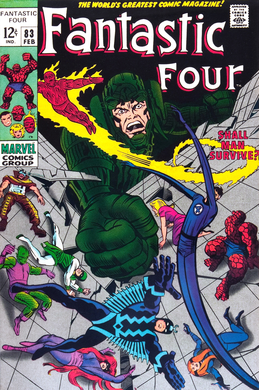
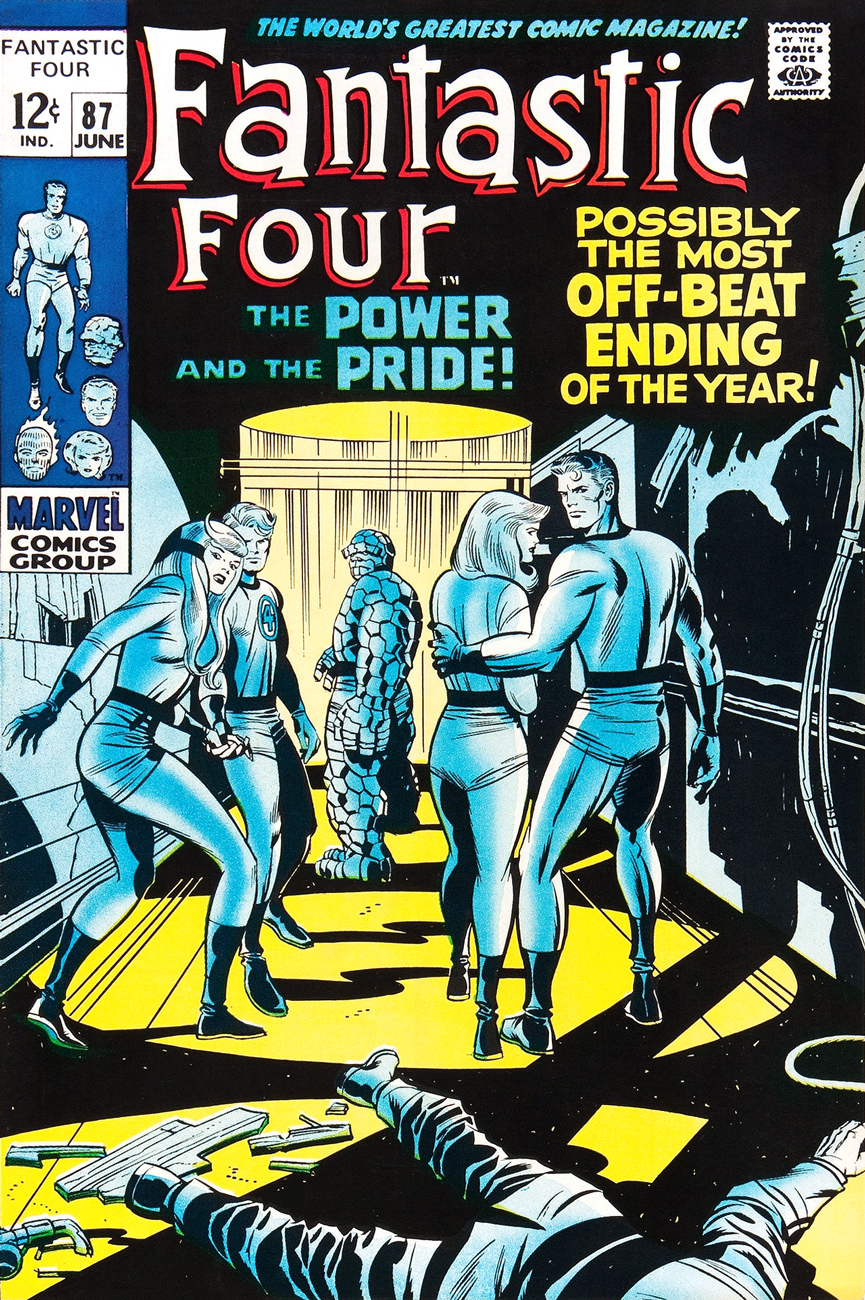
Ah, but for what seems like a mere blip in its history, which is to say around ’68-’69*, Marvel somewhat dialled down the verbiage and let some prime Kirby compositions enjoy a bit of breathing room (at least on Fantastic Four, the company’s second-best seller — and number 16 overall for 1968).
This particular streak is circumscribed by two ho-hum (by lofty Kirby standards) covers: flat FF 81 and messy FF 88 (featured here)… which leaves us with plenty of goodies in the middle. Let’s take the tour, shall we?
This is Fantastic Four no. 82 (Jan. 1969, Marvel). Inks by Joe Sinnott. Silence by Stan Lee. Now isn’t that better?
Maximus tries to usurp Black Bolt’s throne, like clockwork. Just a discreet story title… though even then, it’s still intrusive. This is Fantastic Four no. 83 (Feb. 1969, Marvel)
See picturesque Latveria. Enjoy the charms of its capital, Doomstadt, located just north of the Kline River. Don’t forget to drop in for some howdy-dos at the small but proud nation’s administrative centre, Castle Doom. This is Fantastic Four no. 84 (Mar. 1969, Marvel). Beyond-meticulous inks by Mr. Sinnott.
This is Fantastic Four no. 85 (Apr. 1969, Marvel). Again, did we even need a title? Mechanical lettering, to boot, so it’s not even expressive.
Short of a classic, but a nice entry nonetheless. And quiet! This is Fantastic Four no. 86 (May 1969, Marvel).
This is always the first image that springs to (my) mind when people bone-headedly claim that Kirby’s work is too over-the-top, ham-fisted and frantic. Even the colours (Stan Goldberg, is that really you?) are admirably subdued. Of course, Stan had to panic and turn on the hype in the eleventh hour. The title would have sufficed. This is Fantastic Four no. 87 (June 1969, Marvel). Giacoia-esque inks by Mr. Sinnott.
There. Isn’t that better? The might of Photoshop harnessed to noble ends.
In the face of all this, is it any wonder I found so refreshing the design quietude and purity of some recent comic books covers, such as the Chris Samnee creations we recently spotlighted? There’s hope, thanks to some enlightened folks out there.
**Steve Ditko, for one, grasped that if you couldn’t have your publisher’s confidence and trust in your craft and visual salesmanship, you could go elsewhere and enjoy a publisher’s laisser-faire.
***Marvel would even, in the 70s, hire on the sly, for freelance jobs, DC’s reigning lettering ace, Gaspar Saladino. Heaven knows The Avengers badly needed a logo makeover.
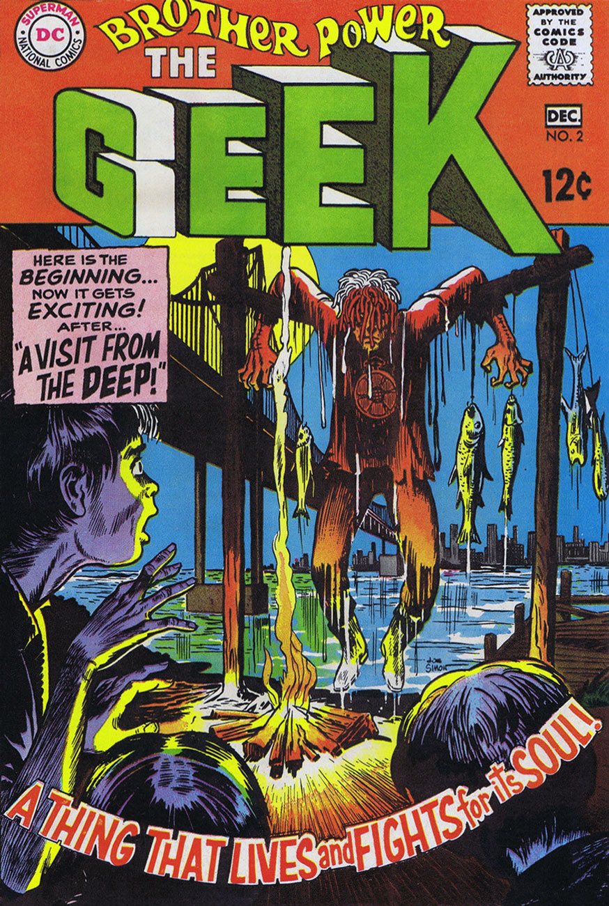
« Somehow, this thing had caught the spark of life! And, anything that lives will fight to stay alive… even if it’s just a Rag-a Bone and a Hank of Hair! »
Ah, Brother Power, the Geek. A notorious flop for DC in 1968… or was it? At the time, it took several months for a book’s initial sales reports to make their way back to the publisher. Axing a title after two measly issues is quite a preemptive and premature strike against it. I suspect a case of toxic in-house politics. From the onset, editorial cold feet had the suits meddling with the project: the character of the animated rag doll was to be called The Freak, which was nixed in favour of the less druggy but more chicken-head-bite-y TheGeek.
This is Brother Power The Geek no. 2 (Nov.-Dec. 1968, DC); cover by Joe Simon, colours by DC’s peerless production manager Jack Adler, and logo presumably by Gaspar Saladino.
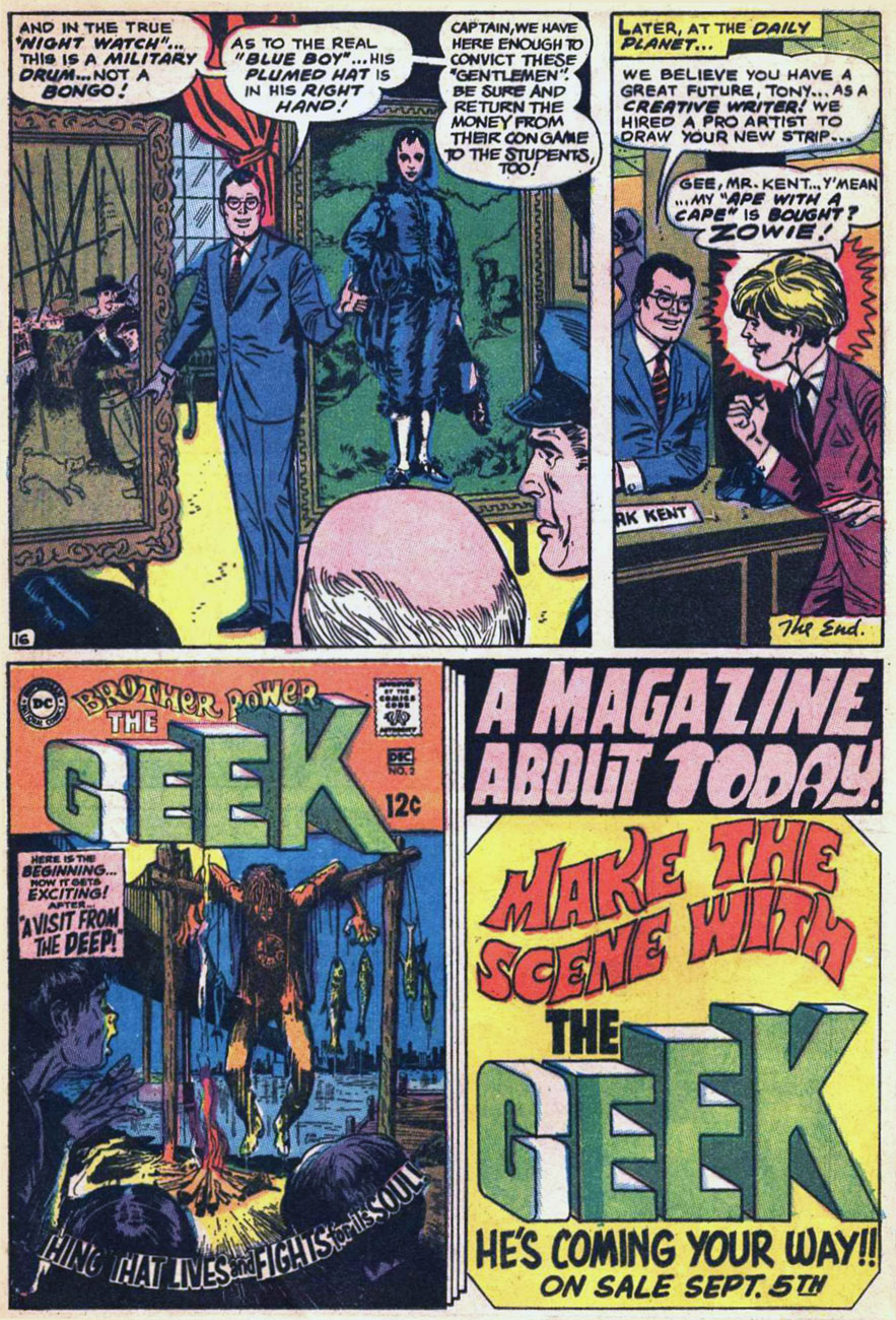
I recall that this particular house ad seared itself into my brain at a very young age, but I had to wonder where exactly I’d first encountered it. As it turns out, it was in a random comic book that happened to land my way in childhood, namely Superman no. 211 (Nov. 1968), featuring You, Too, Can Be a Super-Artist!, written by Frank Robbins (I just found out!) and illustrated by Ross Andru and Mike Esposito.
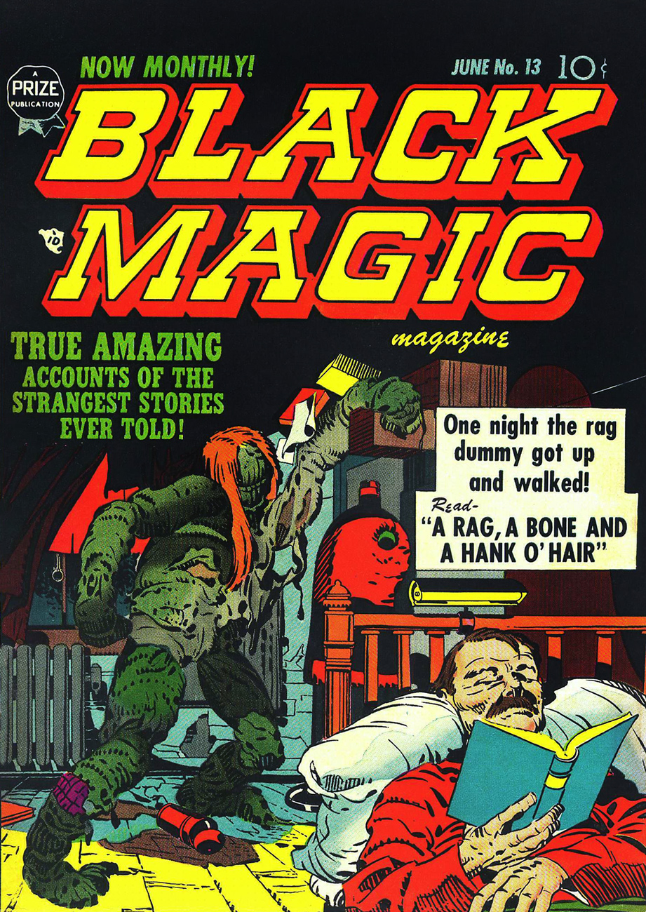
This is Black Magic no. 13, aka vol. 2 No.7 (June 1952, Prize); cover, of course, by Jack Kirby, with likely inks by Joe Simon. Read it here!
This lovely panorama is from Brother Power The Geek no. 1 (Sept.-Oct. 1968, DC). Written, laid out and inked by Joe Simon, finished pencils by Al Bare.
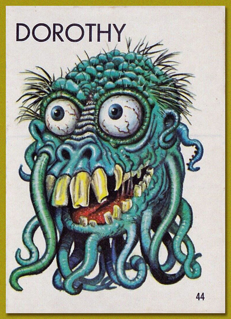
Say, have I seen Brother Power’s fellow detainees somewhere? Why, yes, of course! It’s Tentacle Master Wally Wood‘s Dorothy, Stanley and Doris, introduced to the world by Topps‘ Ugly Stickers back in 1965! Designed by Wood, they were painted by the masterful Norman Saunders.
Brother Power the Geek, despite its commercial failure and infamy, offered a good-natured, unpretentious romp, even if didn’t quite show us « The Real-Life Scene of the Dangers of Hippie-Land! » You can’t always get what you want.
Brother Power was brought back under DC’s Vertigo imprint in 1993, but as with the revival of its fellow Joe Simon creation, Prez, it received a « groovy » and « ironic » hipster treatment. Bah.
« He’s back from the dead / the telegram read / If you get on a flight / You could catch him tonight / You’ll find Commissar / He’s at the Munich Hilton Bar » — B.A. Robertson
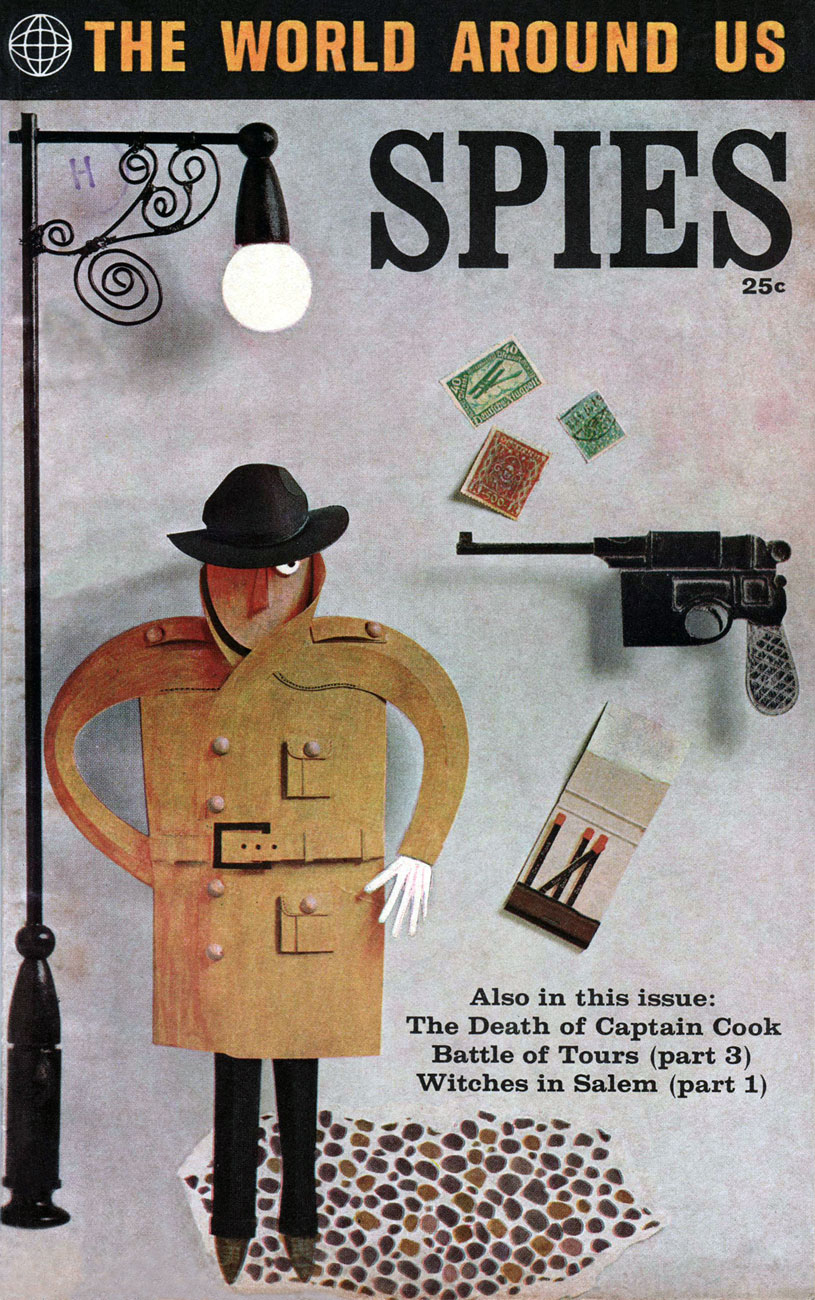
In 1958, Classics Illustrated publisher Gilberton tried something a bit different: a mostly non-fiction documentary title on various topics entitled The World Around Us, and featuring The Illustrated History of… Dogs, Space, Pirates, Great Explorers… depending on your area of interest, these could mean unrelenting tedium or sheer bliss. I haven’t encountered many issues, but the two I own, Ghosts and Spies, count among my prized paper possessions.
This is The World Around Us no. 35 (August, 1961), featuring this lovely mixed media piece by The Unknown Artist, whose cover remains defiantly unblown. On the inside, some fine company: George Evans, Norman Nodel, Edd Ashe, Jo Albistur… and Jack Kirby (inked by Dick Ayers)… the most beaten-down, anonymous, excitement-dialed-down-to-one Kirby you’re ever likely to see. Oh, he could do the job just fine, but the job, and the publisher, were not making anything of his regal strengths*. He would recall that this was « … the worst paying job of my entire life, including times I worked for free. »
Those early post-Code years were difficult ones for the diminished comics industry, and Kirby’s situation wasn’t exactly rosy: he’d been blacklisted at DC, thanks to the Jack Schiff / Sky Masters imbroglio, and his work at Harvey Comics had dried up. So what was a prolific artist to do, but pick up whatever bits of freelancing were available, here and there…
Quoting from Paul Gravett‘s review of Classics Illustrated: A Cultural History, we find this telling statement: « The most demanding editor was Roberta Strauss, a stickler for detail, who would count soldiers’ buttons or pleats in skirts and even called an editorial meeting in her hospital room only days after her son’s birth. » Give me Harvey Kurtzman‘s editorship** any old day!
**« Kurtzman’s editing approach to Two-Fisted Tales and Frontline Combat was a stark contrast to EC editor Al Feldstein‘s style. Whereas Feldstein allowed his artists to draw the story in any manner they desired, Kurtzman developed detailed layouts for each story and required his artists to follow them exactly. »
« Though the refined eyes of the aesthete may consider Kirby’s work crude, ornery, and anti-intellectual, the fact remains that he combined the virtues and limitations of his class with a stubborn genius to produce a body of comics work that has remained consistently true to its source and is unparalleled both in quantity and quality. » (Gary Groth)
Strike while the iron is hot, it is said, and thus part II of our celebration of Jack Kirby‘s tentacle prowess comes hard on the heels of Tentacle Tuesday Masters: Jack Kirby, Part 1. I’d like to thank co-admin RG for his vast knowledge of Kirby comics, as well as his suggestions and scans – that’s what (among other things) partners are for. Whereas part 1 focused on Kirby’s 70’s work for DC, today’s post (also firmly entrenched in the 1970s) is a celebration of his brief but intense return to Marvel Comics.
All art is scripted and penciled by Jack Kirby and inked by Mike Royer, unless otherwise indicated.
We start with the somewhat less interesting, but nevertheless tentacular, Hercules.
Marvel Premiere no. 26 (November 1975), penciled by Kirby and inked by Vince Colletta. Only the cover is by Kirby, the inside story being a collaboration between Bill Mantlo, George Tuska and Vince Colletta.
Now that we have the boring stuff over with, we move on to the spacey part of this post: epic voyages into the cosmos, mind-shattering encounters with Gods and fights to the death with unthinkable monsters of fearsome power! As usual, in chronological order: one must respect tradition.
« To make his comic, Kirby watched 2001 again, referenced a stack of stills, and pulled from the screenplay and Arthur C. Clarke’s novelization. The illustrations were instantly recognizable to anyone who’d seen the film, but the characters were uniquely his: beefy and emotive with a touch of uncanny. There are also moments of pure Kirby: a splash page of a spacesuit-clad astronaut gaping at an exploding cosmic sky, an acid-trip interpretation of the climatic Star Gate sequence. »
Panel from Wheels of Death (again, read the story on Diversions of a Groovy Kind) published in 2001: A Space Odyssey no. 4 (March 1977). *My* question is, does anybody remember any tentacles in the film? I know, I really have a one-track mind.
« Kirby was the right choice for the assignment, but, Mark Evanier (a comic book writer, Kirby friend and colleague, and author of the biography Kirby: King of Comics) says, he was wary of taking on someone else’s story, especially one as iconic as Kubrick’s vision of 2001. “He didn’t feel he had a lot of wiggle room to expand or inject himself into it,” Evanier says. “He had to keep reminding himself, ‘That’s my viewpoint, that’s not Stanley Kubrick’s,’ and adjusting.”» (source: The Crazy Legacy of Jack Kirby’s Forgotten 2001: A Space Odyssey)
I wanted to find a good overview of The Eternals, and thought I had found it (plenty of pictures, an overall idea of the leitmotifs driving the series – and importantly, NO MENTION OF THE MOVIE)… until I came to the end of the article in question and saw that the author was next going to read Neil Gaiman‘s take on The Eternals* to see if the latter had fixed some of Kirby’s plot flaws, at which point I choked on the water I was sipping. But, but! the author repented, and so I give you Review: The Eternals by Jack Kirby from the blog Giant Size Marvel.
Panels from God and Men at City College published in The Eternals no. 6 (December 1976).
Panel from Disaster Area, published in The Eternals no. 15 (September 1977).
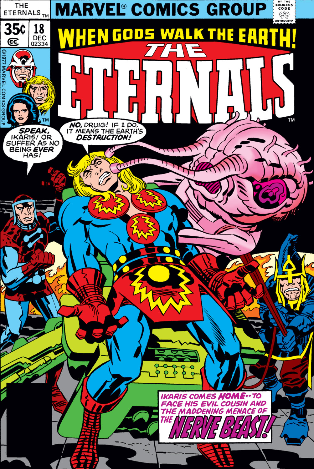
The Eternals no. 18 (December 1977), penciled by Jack Kirby and inked by Frank Giacoia.
Panels from To Kill a Space God, published in The Eternals no. 18 (December 1977).
Panels from To Kill a Space God, published in The Eternals no. 18 (December 1977).
Surely everyone knows Captain America already, but here are his 7 Most Awesome Moments (arguable, but a good starting point) by the good folks at Comic Alliance.
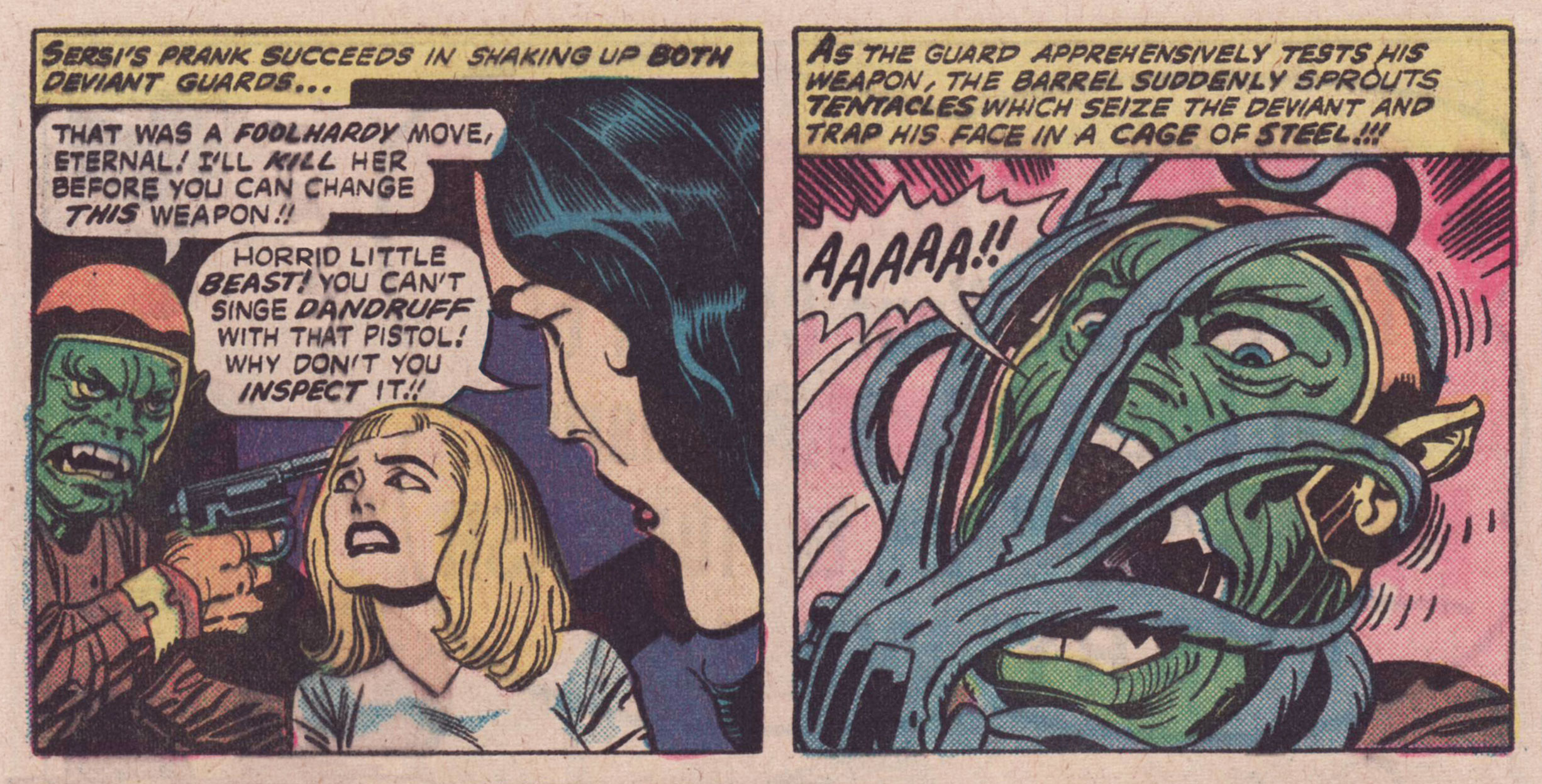
Here we have energetic tentacles, free-flowing-energy cephalopods…
Captain America no. 205 (January 1977), penciled by Jack Kirby and inked by Joe Sinnott. The thing with the tentacles is Agron, who (which?) will eventually learn to animate a corpse, but for now he’s just in his energy form.
Page from Agron Walks the Earth!, scripted and penciled by Jack Kirby and inked by John Verpoorten, published in Captain America no. 205 (January 1977). I *told* you Agron would animate a corpse, but did you listen?
Double splash from Arnim Zola — The Bio-Fanatic!!, scripted and penciled by Kirby and inked by Frank Giacoia and John Verpoorten, published in Captain America no. 209 (May 1977).
You asked for it (right?): Doughboy in action! Technically, those are rubbery arms, not tentacles, but as someone who regularly makes sourdough bread, I assure you, dough *does* sprout tentacles and will latch onto your hands and arms with them.
Page from Arnim Zola — The Bio-Fanatic!!, scripted and penciled by Kirby and inked by Frank Giacoia and John Verpoorten, published in Captain America no. 209 (May 1977).
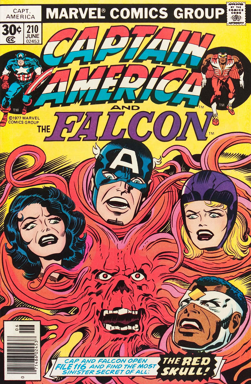
Captain America no. 210 (June 1977), penciled by Kirby and inked by John Verpoorten. The Red Skull taking a leaf out of Medusa’s book? Seriously, those have *got* to be hair extensions.
I also recommend reading Learning to Love Jack Kirby, an earnest and personal story of how the author (Chris Sims) came to appreciate Kirby and, at the same time, a pretty good overview of some of his most memorable characters and comics.
« I’m tempted to say that you don’t really get Kirby until you develop the ability to look beyond the surface of a story and see how much craftsmanship it takes to look as simple as his comics, but that’s really just covering up my own initial revulsion. There were plenty of kids who encountered Kirby at the same age I did and wound up loving him from the start; I’m just a slow learner.But I do think there’s something to the idea that it just has to hit you right for everything to make sense, and once you’re there, you’re there forever. And the good news is that Kirby’s contributions to the medium are so vast, so unavoidable even a quarter-century after his death, that even just scratching the surface of superhero comics means you’re encountering them all the time. »
Now that we have part over with, shall we continue to the tentacular part of today’s post? Kirby didn’t do anything in half-measures, so I’d like to think that we have some epic, larger-than-life, cosmic tentacles on offer. As it turns out, there’s quite a lot of ’em scattered throughout Kirby’s mind-boggling career, so today I am concentrating on Kirby’s work for DC Comics in the 1970s.
Seriously, there’s all kinds in here. A sea ball of yarn is our exhibit A.
Sequence from O’Ryan Gang and the Deep Six, scripted and penciled by Jack Kirby, inked by Vince Colletta, and published in The New Gods no. 4 (August-September 1971).
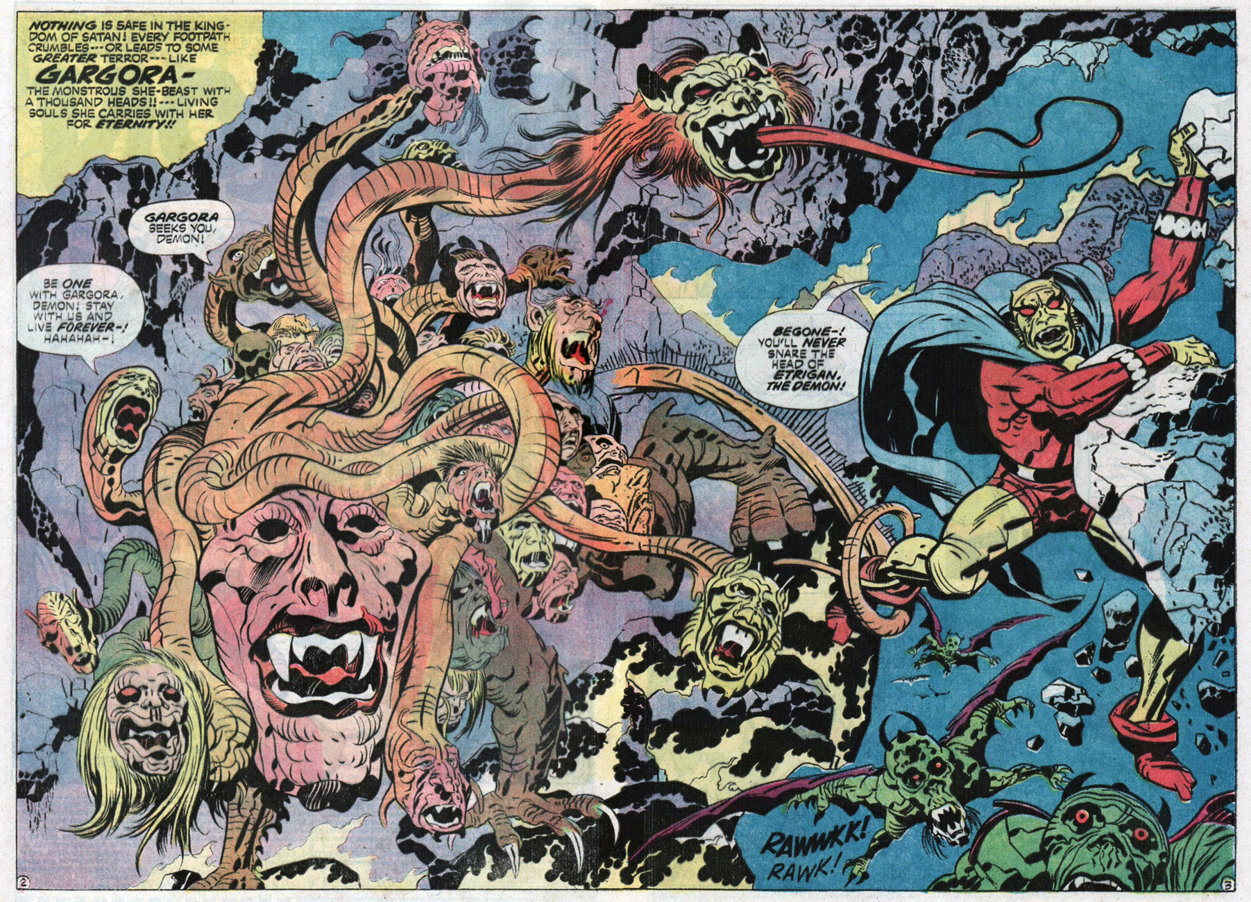
This may be a take on the old head-of-Medusa, but Gargora doesn’t mince words, and when she says someone can’t escape, well, she’ll deploy some tentacles to catch them:
Splash from Witchboy, scripted and penciled by Kirby, and inked by Mike Royer, and published in The Demon no. 14 (November 1973). Random fact of the day: Freud considered that the hair on Medusa’s head is often represented in form of snakes, because as snakes are penis symbols derived from the pubic hair, they serve to mitigate the horror of the female castration complex. …When someone tells me that are into Freudian theories, I back away slowly.
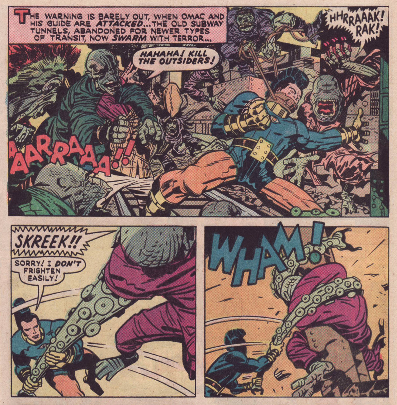
Some monsters crush you between their limbs – this is no different, but instead of two legs, there’s a “crushing mass of tentacles”. Don’t feel bad, Etrigan, no-one could break free of *that*.
Page from The One Who Vanished!!, scripted and penciled by Jack Kirby, and inked by William Stout and Mike Royer (don’t miss co-admin RG’s 3-part, exclusive interview with Mr. Royer!), published in The Demon no. 15 (December 1973).
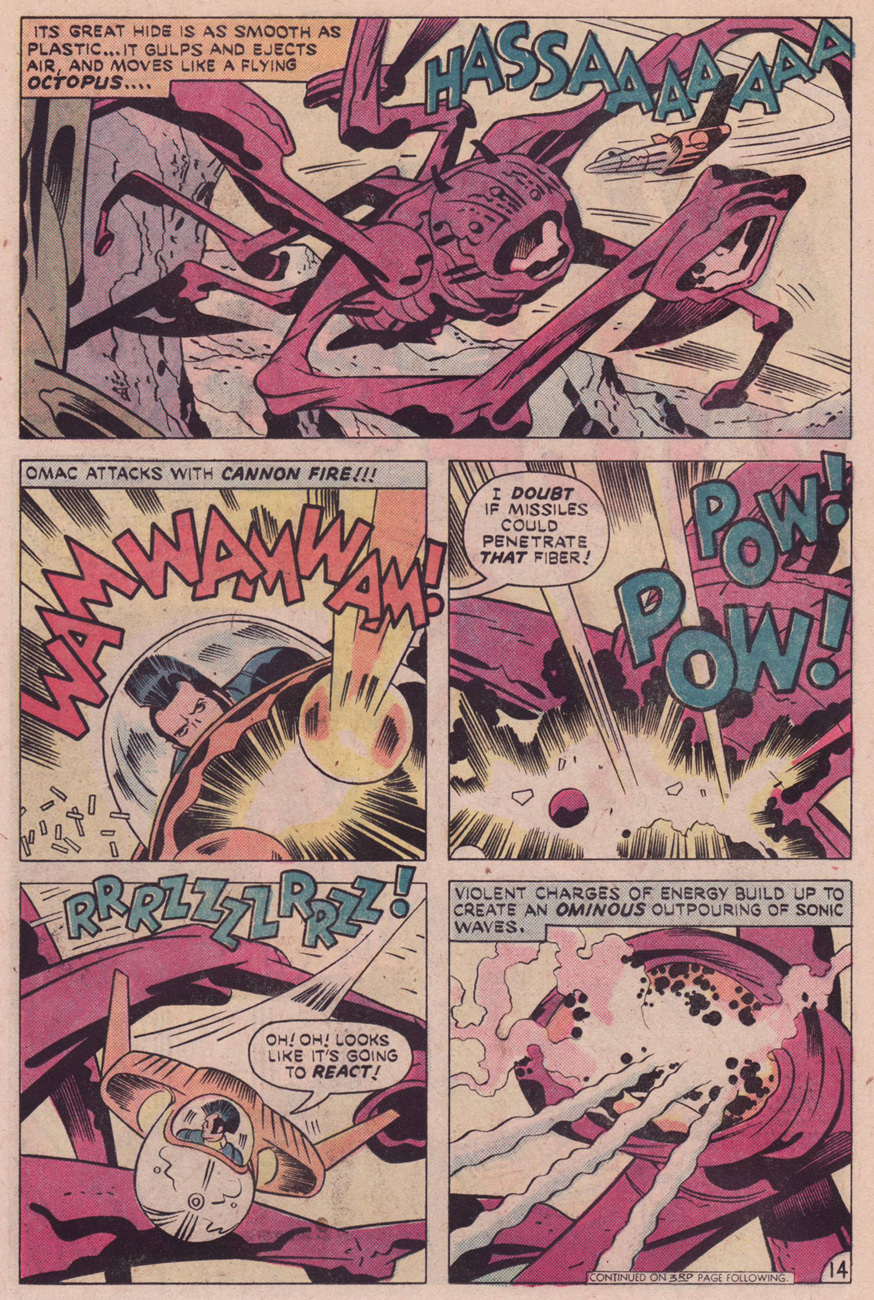
You might argue that these aren’t tentacles at all, but the creature is described as a “flying octopus”, and who am I to argue with Kirby’s description?
Page from The Busting of a Conqueror!, scripted and penciled by Jack Kirby, and inked by D. Bruce Berry, published in OMAC no. 4 (March-April 1975).
Page from The Spy, scripted and penciled by Jack Kirby, and inked by D. Bruce Berry, published in OMAC no. 6 (July-August 1975).
One must have one proper sea monster in a Tentacle Tuesday, and this one’s a beauty:
Page from The Invasion of the Frog Men!, scripted by Michael Fleisher, penciled by Jack Kirby, inked by Mike Royer and published in The Sandman no. 5 (October-November 1975).
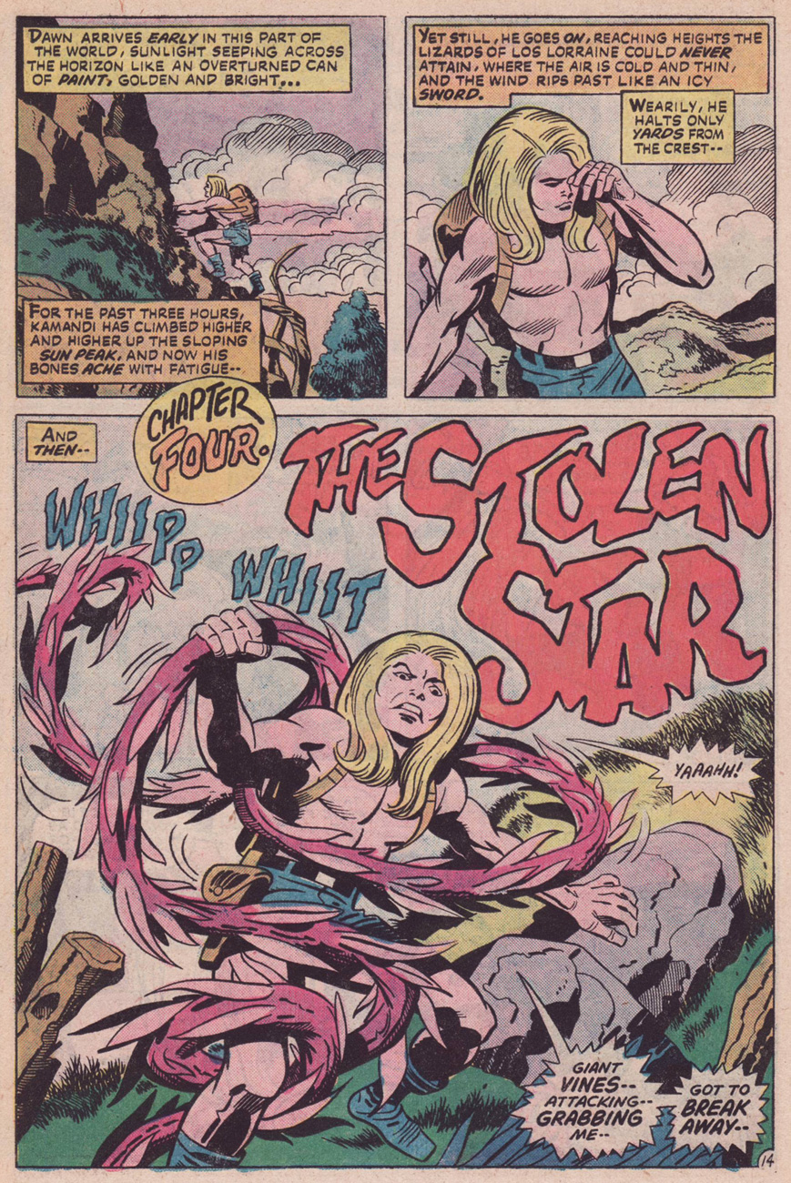
Last but not least, plant tentacles!
Page from The Lizard Lords of Los Lorraine!, scripted by Gerry Conway and Paul Levitz, pencilled by Jack Kirby, and inked by Mike Royer, published in Kamandi, The Last Boy on Earth no. 40 (April 1976). Kamandi was my first exposure to Kirby, and it bowled me over. It’s a good illustration of what he can do (and did over and over again), actually: create a universe with its own rules and a perfect internal logic. There are no boundaries in such a place, no limited number of characters – it just lives and breathes as it pleases, and one is but a passerby who gets to witness a few key scenes. Reading Kamandi teleported me into his world with such ruthlessness that I was quite disoriented when I’d have to stop reading.
« His incredibly unique art style and bombastic storytelling made him one of the most imitated creators in western comics history. Kirby Dots are named after the artist’s distinctive rendering of Battle Auras, also nicknamed, “the Kirby Krackle”. He died of heart failure in 1994 at the age of 76, or at least that’s what Galactus wants us to believe. Due to his speed in creating well-received comics, there exists something called the “Kirby Barrier”; breaking the barrier means that you’ve created a quality comic in under a week, a surprisingly difficult feat. » |source|
For today’s Tentacle Tuesday post, I’d like to highlight some comic book artwork from the Golden Age, which is to say the period between the early (or late, depending on who you ask) 1930s and 1956, the year Showcase #4 was published, heralding the new era of superhero comics. (Our other TT post dedicated to the Golden Age was about Planet Comics; visit it here).
Blue Bolt vol. 1 no. 5 (October 1940), cover by W. E. Rowland. The series was created by Joe Simon, who promptly enlisted Jack Kirby’s help. This cover story, «War in the Fourth Dimension», is by the Simon-Kirby team. Read the issue here.
The Blue Bolt gets tangled up in quite a few (crushing, of course) tentacles. Art by Jack Kirby.
And a few pages later….
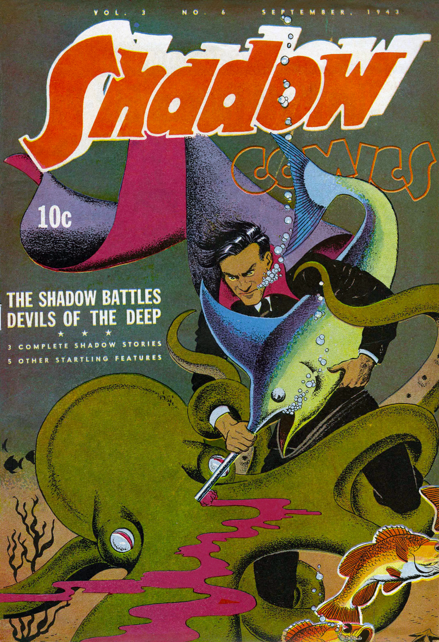
It might be surprising to see the Shadow in the grip of an octopus, but there’s probably not that many creatures he *hasn’t* grappled with!
When a radio show was introduced in 1930 to boost the sales of Detective Story Magazine, the company (Street & Smith Publications) wasn’t expecting its freshly-minted narrator, The Shadow, to hog the limelight – but that he did, as listeners found this sinister character far more compelling than the stories he was narrating.
Shadow Comics vol. 3 no. 6 (September 1943), cover by Vernon Greene. Just imagine the possible drama of this cover – the swordfish is actually the octopus’ friend, but he’s forced to become an instrument of his death by the merciless Shadow (only he would descend to the depths of the ocean to fight “devils” in full suit-and-cape regalia).
As his fans kept requesting copies of The Shadow magazine (which didn’t even exist at the time), Street & Smith obliged and The Shadow Magazine was born in 1931. The Shadow’s step-father is Walter B. Gibson, writing under the pen-name of Maxwell Grant. He wrote « more than 300 novel-length » Shadow stories to meet the demand of a public greedily clamouring for its hero, although at some point several writers were hired to lighten Gibson’s ridiculous workload. The Shadow soon slunk beyond the confines of pulp novels and into comics: a syndicated daily newspaper comic strip (written by Gibson and illustrated by Vernon Greene), preceded (by a month) by a comic book published by Street & Smith, which was supposed to attract a younger audience to pulp magazines (101 issues, from 1940 to 1949).
Shadow Comics vol. 5 no. 5 (August 1945), cover by Charles Coll. Everybody is making puppy eyes at the Shadow, but will he choose the pretty girl or the pretty octopus?
Speaking of heroes, Wiki calls The Shadow « a film noir antihero in every sense »; now, I’ll concede the film noir, but I’ll balk at calling him an anti-hero, at least in this incarnation, as *that* term is defined as « a character who lacks conventional heroic qualities such as idealism, courage, and morality », all of which The Shadow has abundant reserves of. He’s a bit laconic and brusque with this conspirators, but that’s understandable when he had to destroy peace-threatening crime rings and bring brilliant crime-perpetrators to ruin at least twice a month.
Who’s that handsome guy shooting commercials for Crackety-Wackett Cereal? Why, it’s Lars of Mars, the debonair Martian! In between fighting his communist arch-enemy (it was the 50s, what can I say?) and robots harassing women, Lars likes to relax by grappling with tentacled creatures.
This lovely cover is Lars of Mars no. 11 (July-August 1951), painted by Allen Anderson (or Norman Saunders, according to another source, though Anderson seems likelier). What’s inside? Jerry Siegel scripts and Murphy Anderson art (and one story by Gene Colan). Yummy!
Lars of Mars was created by Siegel in 1951 for Ziff-Davis. There are only two issues (bizarrely numbered 10 and 11). The art for Lars of Mars, done by Murphy Anderson, is very nice indeed, but you don’t have to take my word for it. Feast your orbs on the first two delightfully nonsensical LoM stories on Pappy’s Golden Age blog.
Now, is that any way to address a many-tentacled creature?
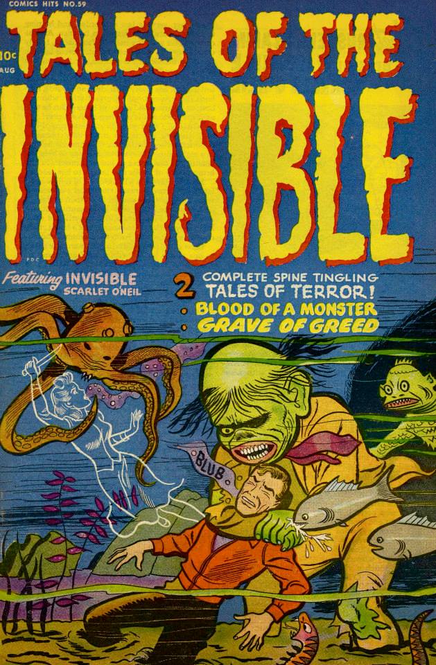
« Scarlet’s adventures are never run-of-the-mill. Instead she enters into every phase of American life – whether on the baseball field or in a night club – always finding a way to help her clients, aid the forces of law and order… and bring plenty of thrills and laughs to her readers. » Apparently « every phase of American life » includes being on the ocean’s floor, trying to stab an octopus with only 5 arms. Hmm…
Harvey Comics Hits no. 59, 1952. Art (probably) by Al Avison. Interestingly, the fish is nibbling on the hand of the monster, when it could be partaking of the delicious flesh of the blub-guy. Tales of the Invisible reprints a bunch of Scarlet O’Neil stories from Black Cat, topped off with an introduction titled « Meet Russell Stamm » (the creator).
Incidentally, Invisible Scarlet O’Neil is supposed to be the first heroine with superpowers (well, one superpower: invisibility).
If I may be excused for going off-tentacle-topic, « Blood of a Monster », the title story that takes up half of this issue, is surprisingly good (though it doesn’t really contain tentacles aside from a minor mention of cephalapoda at the beginning). The art (by the aforementioned Russell Stamm) is moody and quite unhinged in places.
I enjoyed « Grave of Greed », the second half of the issue, even more, because it involves mushroom picking as part of the plot!
Read the full issue here – it’s worth the detour, I think!
Stay tuned for our next Tentacle Tuesday post! In the meantime, visit our previous TTs (we’re getting to have quite a backlog) for your tentacle fix.
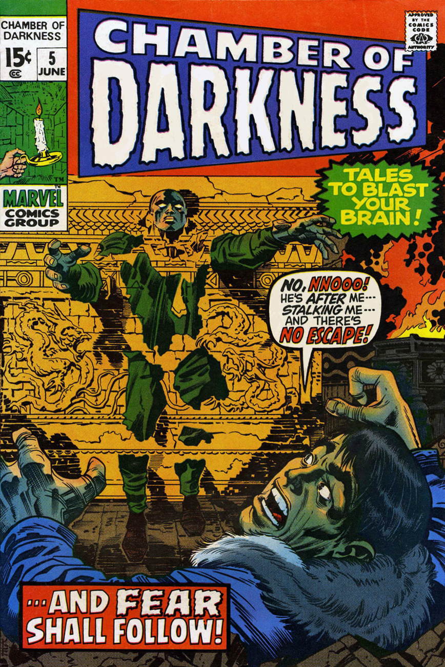
« It was like plunging deeper and deeper into a growing nightmare! »
A powerful (what else?) Jack Kirby piece, one of his last before decamping to DC. He actually gets a full writer/artist credit (a telling tail end turning point of that Marvel residence) on this tale, … and Fear Shall Follow!. The lush cover inks are provided by fellow Golden Age titan Bill Everett (1917-1973), a far cry from the miserable Vince Colletta « finishes » he would be saddled with at DC for the next couple of years (at their insistence!)
I was planning on featuring the entire story, but others have long ago preceded me down that primrose path. Why fight it? Just pay Diversions of the Groovy Kind a visit, where you’ll receive, as a bonus, Kirby’s other solo outing for the House of (mostly his) Ideas, The Monster!, from the previous issue of Chamber of Darkness (no.4, April, 1970). Both are sympathetically inked by Marvel’s production manager at the time, the underrated and gone-too-soon John Verpoorten (1940–1977). Again, several notches above “Valiant” Vince Colletta’s casual sabotage.
Plot-wise, … and Fear Shall Follow!, while another variant in the Carnival of Souls tradition, is enriched by its unusual setting and whiff of incense and philosophy. Reminds me of a possibly apocryphal exchange between Watchmen editor Len Wein and its writer Alan Moore: « Alan, that ending’s already been done on The Outer Limits! »; (in thick Northampton accent, dripping with sarcasm) « Yes, Len, but it’s never been done by me! ». With all due respect, it’s not as if Mr. Wein had any moral lessons to dispense regarding originality.