« I opened my magazine (What did you see?) / I saw Mr. France (What did he have?) / A girl on each shoulder (What else?) / And one in his pants » — 10cc, Sand in My Face (1973)
You may think of this post as a companion piece, a spinoff of its predecessor. I’d had for some time, in the back of my mind, the notion to showcase some obscure French ‘human sculpture’ ads, but it needed more. Comments on the previous post provided the spark.
Is there a more classic “humble immigrant makes good in the USA” yarn than that of Angelo Siciliano, born in 1892 in the tiny Italian town of Acri? The Smithsonian has told the full, colourful story, so I’ll spare you a rehashing of it.
Let’s just say that young Siciliano worked hard to overcome adversity and redeem his puny physique, and the rest is the stuff of legend. The principles of ‘dynamic tension‘ and his immortal moniker aside, Angelo’s finest brainstorm was to employ the lowly but then-ubiquitous medium of comic books to introduce his product and its natural audience to each other. Let’s take the tour!
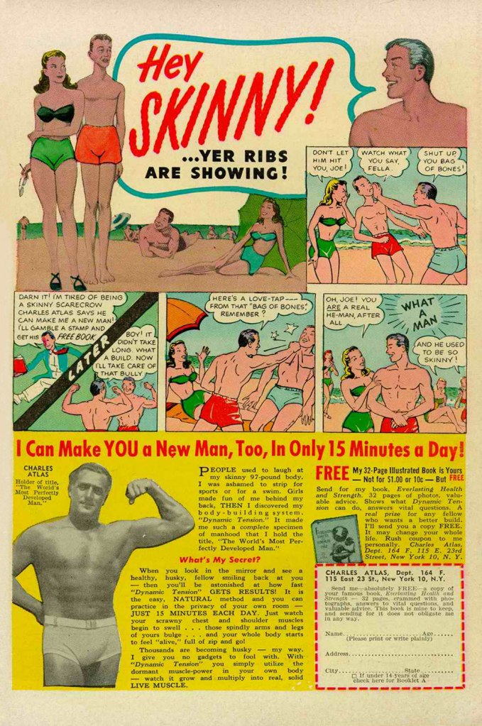
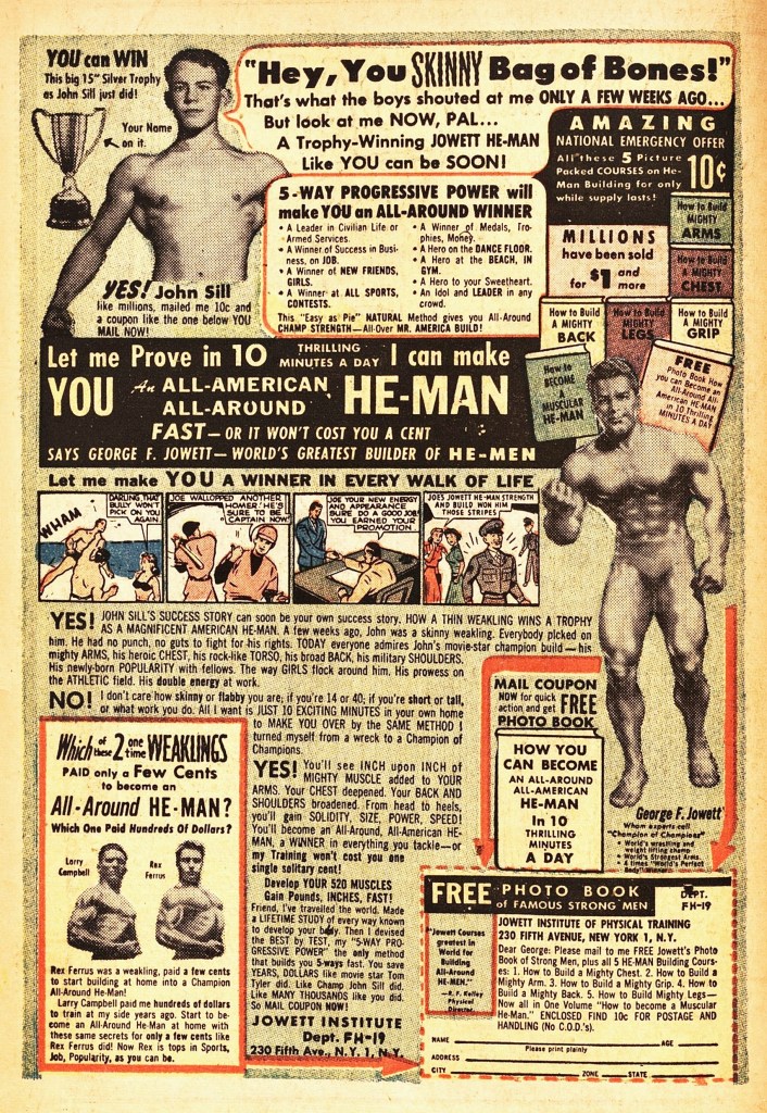
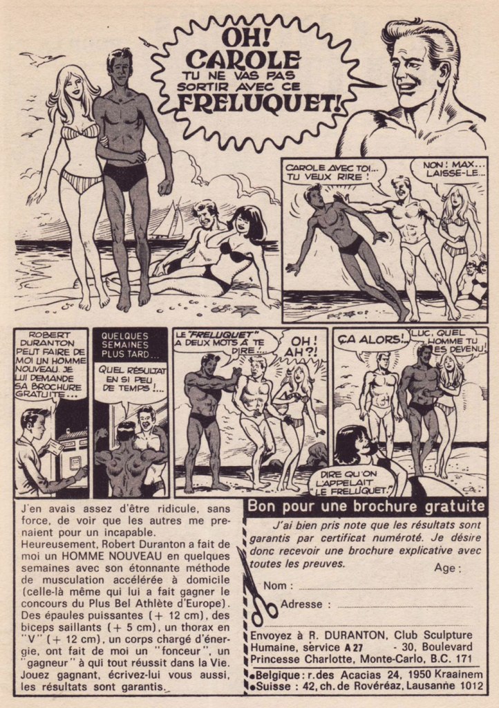
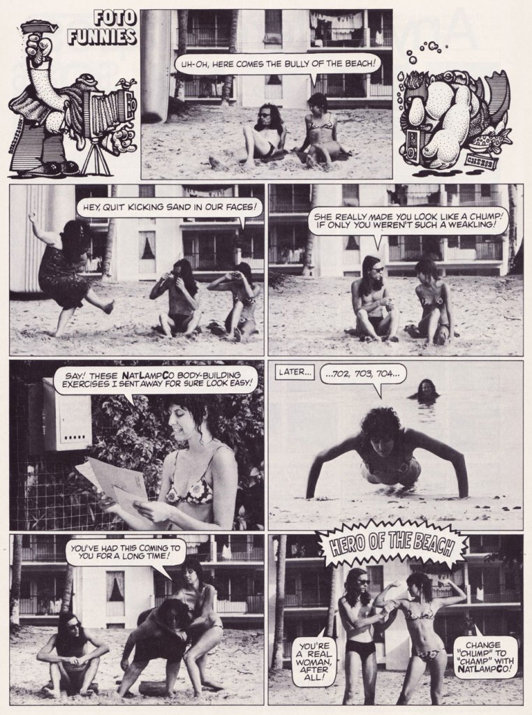
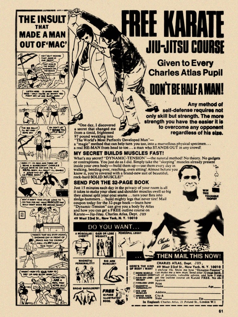
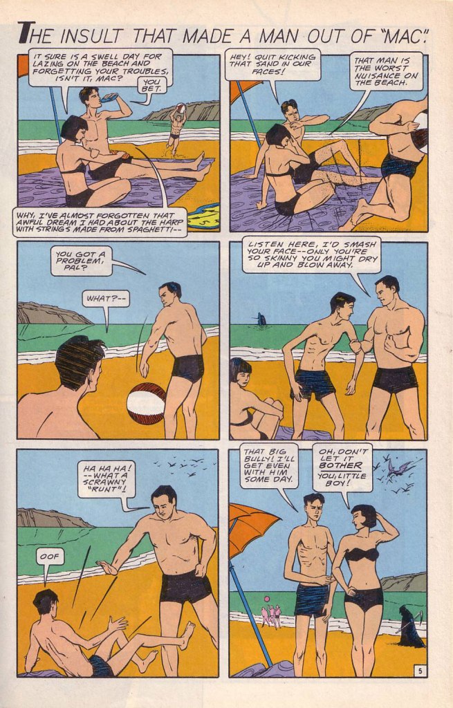
While the Charles Atlas ads began running in the 1930s, this is probably their classical expression. This one saw print as the back cover of Mad no. 14 (Aug. 1954, EC). Its opening insult even inspired Miles Heller’s 1995 salute to the great old comic book ads, Hey Skinny!There was inevitably fierce competition in the self-improvement field. This entry, from the U.S. Nature Products Corp., appeared in Stan Lee’s oh-so-macho Man Comics no. 10 (Oct. 1951, Atlas).Lots and lots of copy — but the all-important cartoon hook is present and accounted for. From the pages of Firehair no. 9 (Fall 1951, Fiction House). The Jowett Institute of Physical Training wants you to get buff! To be fair, George F. Jowett got there first.This is surely the definitive version, with the unforgettable tag line and ‘hero of the beach’ conclusion. I pulled this one from The Witching Hour no. 25 (Nov. 1972, DC), which hit newsstands just a few months before Mr. Atlas passed away, aged 80, on Christmas Eve. I can’t help being amused: French publisher Arédit, whose digest-sized collections of (mostly) reprints of US comics proudly bore the tag « Comics for adults », featured very few outside ads… and those were almost exclusively for self-defense and body-building systems. Here’s a sample trio. This one appeared in Maniaks no 4 (Fall, 1971). This title featured reprints of DC Silver Age ‘humour’ comics… all but the only actually funny one (that would be Sugar and Spike, of course).Oh, I’m sure the ERB Estate got their cut. And who might that R. Duranton fellow be? Four times Mr. France, for one thing! Here he appears with Louis de Funès in a famous scene from Le Corniaud, a 1965 farce starring beloved stars André Bourvil / De Funès and directed by Gérard Oury. This one’s from Kamandi no. 4 (Summer 1976, Artima), which featured reprints of various 60s and 70s DC adventure comics. It was an affordable way to catch up on material one might have missed — or couldn’t afford!This refreshing gender-switched lampoon comes from the pages of National Lampoon no. 26 (May, 1972), the ‘Men!’ issue, guest-edited by Anne Bats, No other credits, dammit. The opening page (of four) of Steve Skeates and Sergio Aragonés‘ wacky satire, from the pages of Plop! no. 2 (Nov.-Dec. 1973, DC). There have been truly countless spoofs of the Atlas adverts… most of them quite dire. Once more, I’ll spare you.By the mid-1970s, with America in the kung-fu grip of martial arts fever, it’s understandable that many a young man was envisioning Bruce Lee‘s lithe, compact physique as an alternative to the hulking musclemen of yore. The Charles Atlas company tried to cover all bases with this ad; from — speaking of old-time musclemen — Doc Savage no. 2 (Oct. 1975, Marvel).
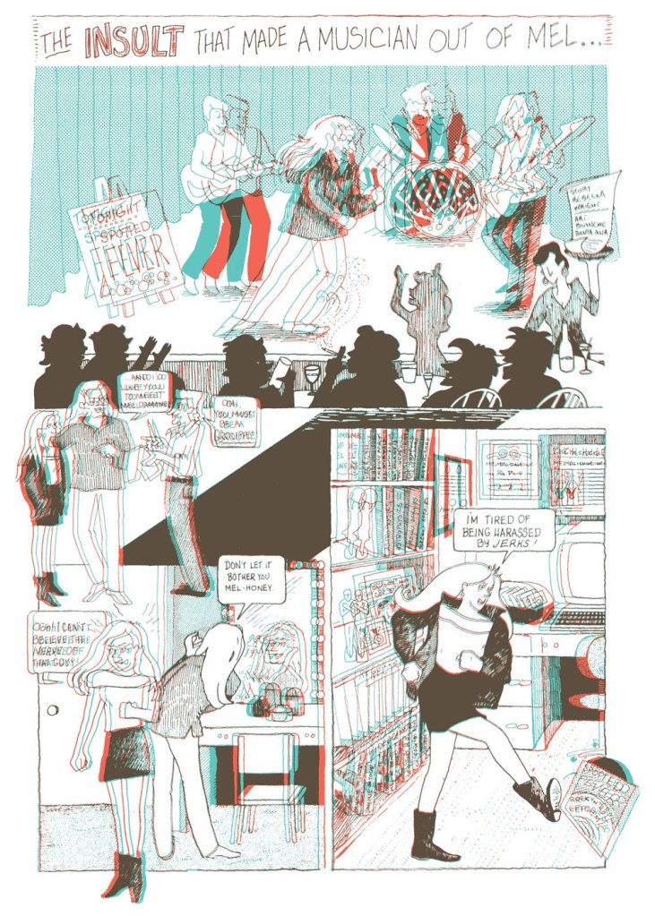
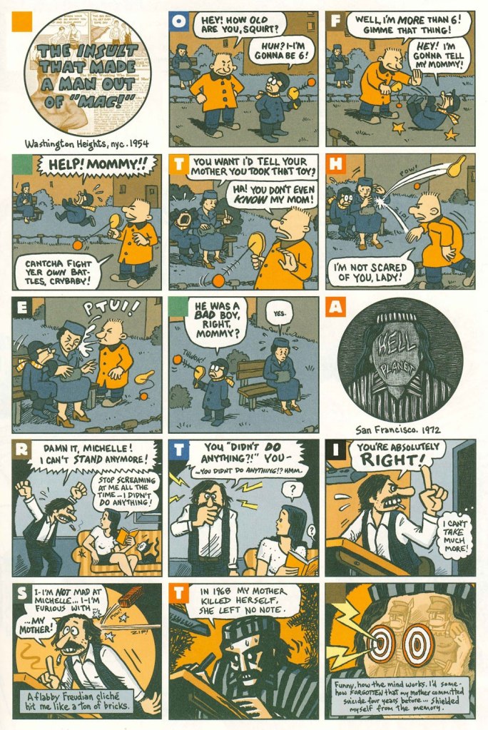
Ah, yes — those days when ‘Bruce‘ was the stereotypical gay name. From the ‘Playboy Funnies’ section of the magazine’s November, 1977 issue.And for something a bit off the beaten path: this is The Insult That Made a Musician Out of Mel, scripted by Rebecka Wright, illustrated by Blanche Santa Ana, with 3-D effects by Ray Zone, from Wimmen’s Comix no. 12 (Nov. 1987, Renegade Press), edited by Angela Bocage and Rebecka Wright.Does this look familiar? This is the first page of Flex Mentallo’s origin tale, as it appeared in Doom Patrol no. 42 (Mar. 1991, DC), written by Grant Morrison, with art by Mike Dringenberg and Doug Hazlewood. I have no idea whether Atlas had a sense of humour, but his successors sure didn’t, as evidenced by the lawsuit they filed against DC Comics over this clear — if brazen — case of satire. I much prefer the TV show version of Flex, I confess.Peter Kuper deftly used the cliché to take a jab at George Bush Sr.’s image and the first Gulf War. Dated and irrelevant? Trying to prove your ‘manhood’ remains distressingly au courant… just consider these two schmucks, to cite but one recent example. And hey, here’s “Stormin’ Norman lying on T.V.” From Bleeding Heart no. 1 (Winter 1991-92, Fantagraphics).Art Spiegelman digs deeper and makes more discerning use of the raw materials at hand with The Insult that Made a Man out of “Mac!”, first previewed in The Virginia Quarterly Review and then collected in Breakdowns Portrait of the Artist as a Young %@?*! (Oct. 2008, Pantheon).
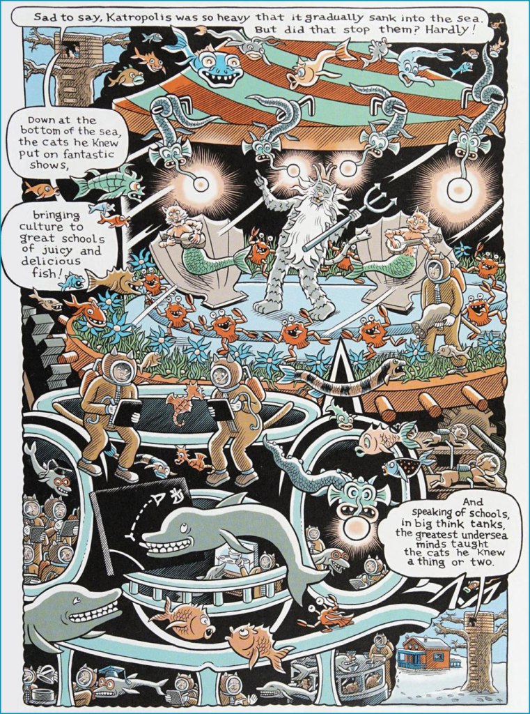
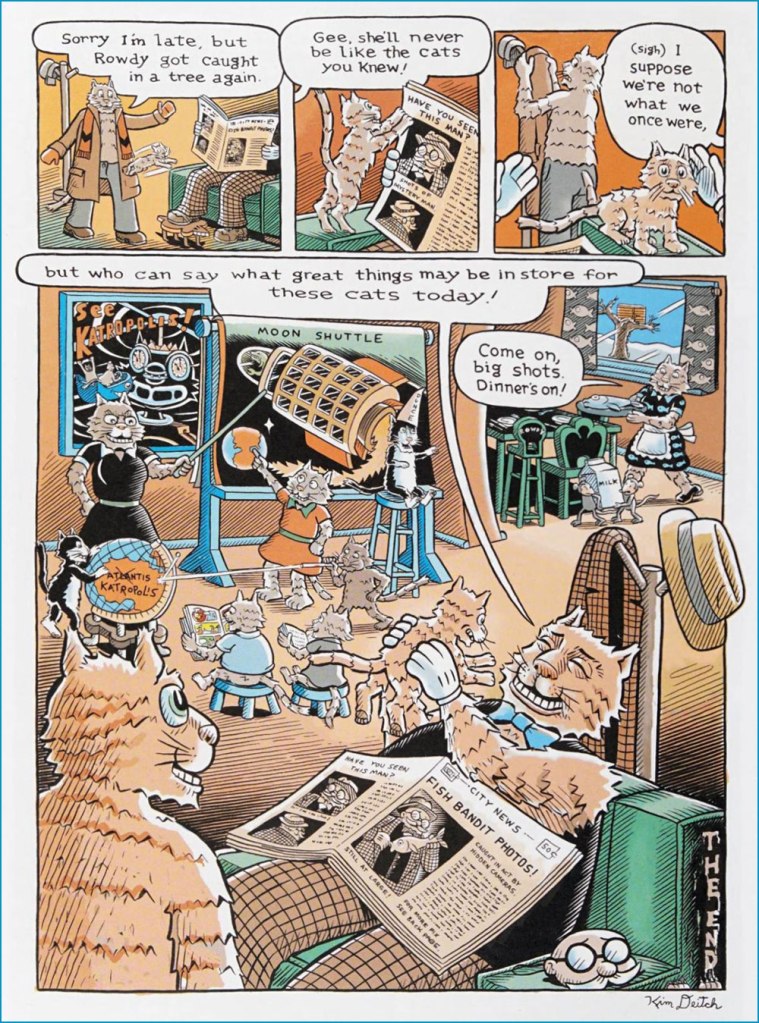
Underground comix artist Kim Deitch probably doesn’t need much of an introduction, other than perhaps to mention that he’s the son of amazing illustrator/animator Gene Deitch, about whom we have talked before (see Back When ‘Hipster’ Wasn’t a Dirty Word: Gene Deitch’s The Cat). For the most part, I respect more than enjoy K. Deitch’s work, appreciating his style and attention to detail, but unable to maintain more than a passing interest in the dream logic of his tales. The story we are sharing today charmed me, as it combines his typical soaring and detail-driven landscapes with a really fun ‘what if?’ plot and a clear appreciation for cats, always an advantage for an artist, in my book.
These Cats Today! comes from the pages of Big Fat Little Lit (2006, Puffin), which collects most material from the three volumes of Little Lit, Art Spiegelman and Françoise Mouly’s anthology that featured comics created for children by a varied roster of artists (a lot of whom have collaborated with Spiegelman on RAW), as well as some Golden Age additions by the likes of by Walt Kelly, Crockett Johnson, and Basil Wolverton. School Library Journal described it as ‘a sensational introduction to traditional literature for a visually sophisticated generation‘. If by ‘traditional literature’ they mean ‘traditional folk tales’ (before they got bowdlerized*), then sure. The stories of Big Fat Little Lit are cynical and pleasantly warped; people get beheaded, eaten, and transformed, and often find that what they thought would bring them happiness just engenders its own problems.
Actually, it was quite difficult to select which story to run, as this anthology is packed with wicked goodies, but this whimsical tale won out (my other favourites are by Kaz, Maurice Sendak, Richard Sala and Joost Swarte, and may yet pop up in another post). Note that if you look beyond the surface of These Cats Today!, you’ll find plenty of cruelty in this fun narrative – dogs enslaved to power up the majestic and glittering Katropolis, force-fed stuffed mice**, these details are briefly mentioned, yet in plain view for those perceptive enough to notice. Truly, for its seeming gentleness, this story belongs into the Little Lit line-up.
« So, you see the little snot on the right side, move it two inches to the left and add a little bit of green gleam to it. » — Mark Newgarden, doing some art direction
If this one looks sharper than you’d expect, it’s because it’s shot from a larger version of the Wacky card that Norman Saunders (re)painted for Topps’ Wacky Posters series, circa 1973.
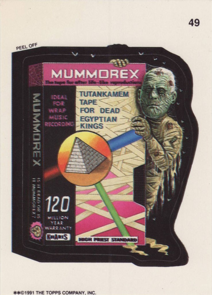
Ladies and gentlemen, Drew Friedman! « In 1991, I was creating many concept sketches and pencil drawings for the TOPPS company, including for their latest set of the hugely popular sticker series “Wacky Packages”. Mark Newgarden was the editor and art director for the 1991 series, and the writers for the card fronts included Newgarden, Jay Lynch, Jordan Bochanis, John Mariano and myself. I drew about 22 tight pencil images which would (with one exception) be painted by the illustrator Patrick Pigott. » If you enjoy being privy to an artist’s creative process, by all means do yourself a favour and feast your peepers on this gallery of Friedman’s roughs, finishes, used and unused pieces. In this (mummy) case, it’s Friedman pencils, finished art by Tomas Bunk.
From the 6th Series (1974, Topps). Most likely painted by Norm Saunders.
From the 8th Series (1974, Topps)… though mine’s a 1980’s reprint. Painted by Norm Saunders.
From the lucky 13th Series (1975, Topps). Another fine Saunders vintage. Topps would find Mr. Saunders most difficult to replace.
« Who would have thought, in 1974, as I cruised the aisle of the San Francisco Safeway with Art Spiegelman, hunting for likely targets, that our little barbs sent at consumerism and package design would have such staying power? » — Bill Griffith, creator of Zippy the Pinhead
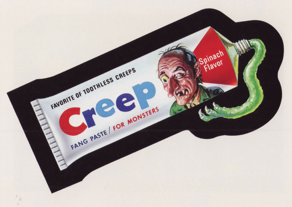
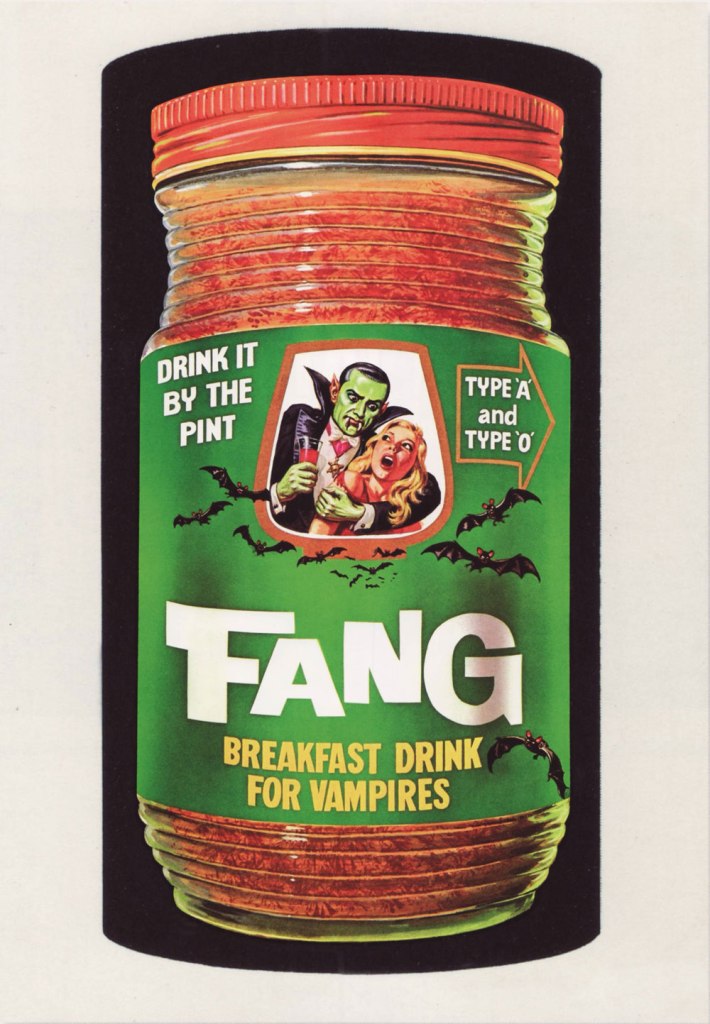
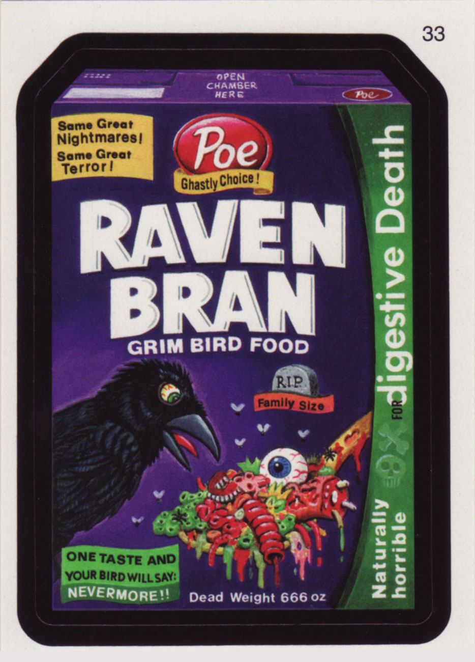
Topps’ legendary Wacky Packages, the bane of school authorities at their peak in the 1970s, have been opening kids’ eyes in the art of tipping over sacred cows for generations. Since everyone’s presumably well-versed in the classics (essentially the initial 1967 and 1973-75 burst of creativity), it wouldn’t be a bad idea to showcase some newer fare. In the wake of an internet-fuelled wave of nostalgic popularity, the Wackies rose again with their All-New Series (2004-), and their quality is every bit as impressive as it ever was… thanks in part to a plethora of new products to lampoon, greater creative latitude for the perpetrators, a motley crew of grizzled veterans and homely new faces.
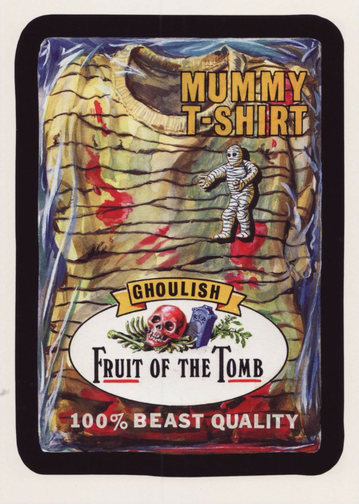
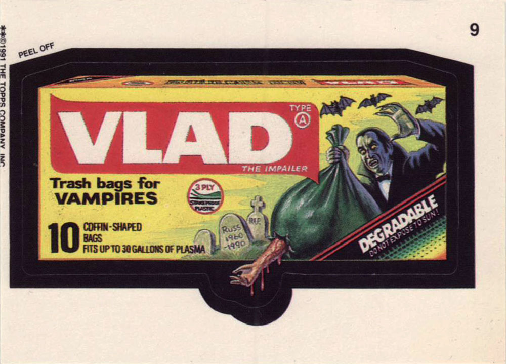
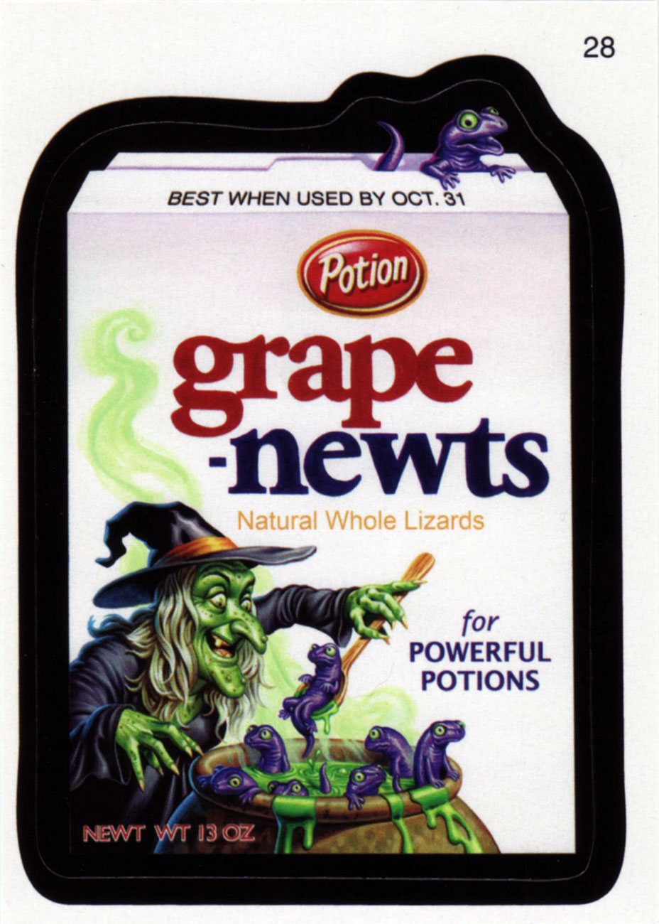
For your contemplation, here’s a trio of Hallowe’en-appropriate cards from new series 7 (2010).