« You cannot work with men who won’t work with you. » — John Harvey Kellogg
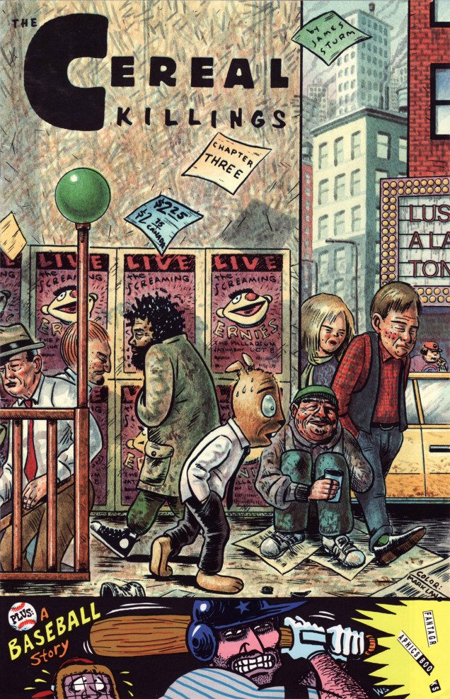
Before he created his justly celebrated The Golem’s Mighty Swing, wrote the mini-series Fantastic Four: Unstable Molecules, or co-founded The Center for Cartoon Studies, James Sturm (b. 1965) committed to paper and ink a mind-expanding, if little-noticed, saga entitled The Cereal Killings, complete in eight issues and published by Fantagraphics between 1992 and 1995. Sturm valiantly struggled through ocular problems during that period, undergoing no less than three retinal operations, leaving him with one good eye.
The Cereal Killings no. 3 (Sept. 1992), colours by Mark Lang. Hey, I’d pay good money to see The Screaming Ernies perform. I’d settle for a t-shirt!
Sturm dug well beyond the shallow pun of the title and implacably hauled it to its logical conclusion. TCK has been likened to a Watchmen with a cast of funny animal cereal mascots, and that’s not that far off the mark. But beyond its conceptual debt to Alan Moore’s superhero deconstruction, Sturm’s story actually takes aim at more adult concerns and issues, made all the more harrowing and poignant by how psychologically credible his cast of cereal pitchmen and acolytes is. Corporate malfeasance, petty theft, betrayal, bitterness, grandiloquence, blind ambition, dementia, remorse… and wisdom. You name it, it’s all there, in a gripping, kaleidoscopic and haunting narrative.
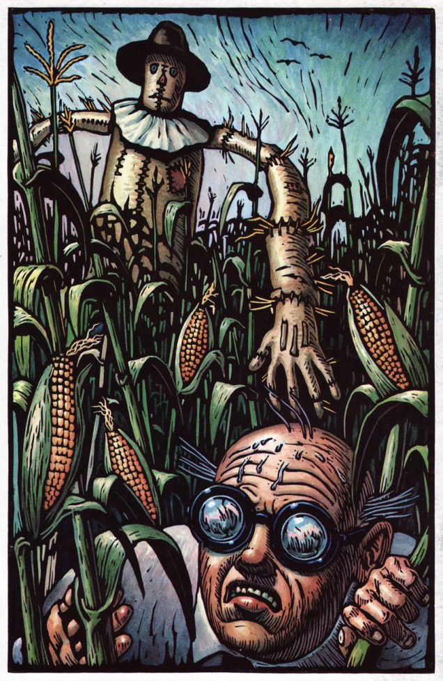
Sturm, Fantagraphics & Co. made splendid use of the entire, (actual) ad-free magazine to flesh out the concept. This is Mark Lang’s gorgeous depiction of The Scarecrow and Carbunkle. These are our good guys, appearances notwithstanding.Issue 3’s back cover provides a helpful look at our cast of characters.This is the cover of TSK no. 4, featuring Schmedly the Elephant, who wishes he *could* forget. Colour by Mark Lang.
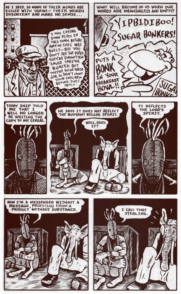
A crucial flashback scene from the eighth, and ultimate, issue (Jan. 1995). It would appear that The Scarecrow is a stand-in for cereal giant Kellogg’s founder, John Harvey Kellogg.
« It’s the present! It’s nostalgia! It’s a crispy non-sweetened comix story that doesn’t get soggy in milk! And remember — product is sold by weight, not volume. Some unsettling may occur. »
The series has never been collected or reprinted, so you’ll have to do the work… I think I noticed a torrent file somewhere. Sturm at one point intended to issue a revised collected edition, but has apparently changed his mind since. That’s no way to treat one’s masterwork, neglected as it may be.
« It’s difficult to know just what to make of C.C. Beck. He’s crusty and curmudgeonly in the Cleveland Armory mold. He’s virulently opinionated, yet insists that he doesn’t take himself seriously. His aesthetics are inflexible if not reactionary, and not entirely consistent at that. He also happens to be one of the most endearing and original cartoonists ever to breathe life into a super-hero.“*
Charles Clarence Beck was born on June 8th, 1910 and left this world in 1989. The world is a stodgier place without him!
My favourite of Otto Binder/C.C. Beck’s characters – Tawky Tawny, the well-mannered, reasonable, tweed-wearing tiger. Sweet Tawny first appeared in Captain Marvel Adventures #79 (December 1947), as a talking tiger who longed for a life as a normal, suit-wearing, polite member of society. He also really likes ice cream. This panel is from “Mr. Tawny’s Personality Peril”, a story by the Binder and Beck team, published in Captain Marvel Adventures #115 (December 1950).
Here are a few covers which showcase A) C.C. Beck’s stylish art B) the lovely goofiness of it all. To quote the man, « When Bill Parker and I went to work on Fawcett’s first comic book in late 1939, we both saw how poorly written and illustrated the superhero comic books were. We decided to give our reader a real comic book, drawn in comic-strip style and telling an imaginative story, based not on the hackneyed formulas of the pulp magazine, but going back to the old folk-tales and myths of classic times. » Well, to be honest, aside from the so-called Greek origins of Captain Marvel (“Shazam”, the catalyzing cry which allows ordinary Billy Batson to transform into his superhero alter-ego, stands for “Solomon, Hercules, Atlas, Zeus, Achilles, Mercury”), there’s little in these stories that evokes classic folk tales *or* mythology. I know the Ancient Greeks were into some kooky shit, but I don’t recall any myopic worms with a Napoleon complex nor talking tigers in suits. Ultimately, Captain Marvel comics are family fun. “Old-fashioned” values are the backbone of these stories: friendship, loyalty, kindness to those weaker (or stupider) than us. If that sounds boring, it isn’t. Beck had a cartoony style that make his stories fucking adorable, especially when coupled with the often surreal and delightfully wacky plots.
“Quote! Mr. Tawny is not a tiger – he’s a worm! Unquote!”
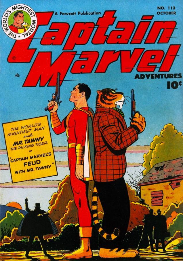
At first glance, this cover is celebrating the beauty of autumn; upon a closer inspection, it turns out that it has much darker overtones – two faceless guys in the background, clearly following some nefarious plan to break up Tawny and Captain Marvel’s friendship (how dare they!) and a creepy boarded-up house. This is Captain Marvel Adventures #113 (October, 1950), cover by C. C. Beck. Read “His Feud With Mr. Tawny” (scripted by Otto Binder, illustrated by C.C. Beck), which is finally not at all gruesome, just heart-warming, here.
C.C. Beck co-created Captain Marvel with writer Bill Parker in 1939. The Big Red Cheese made his first stellar appearance in Whiz Comics #2 (cover date February 1940), published in late 1939. Captain Marvel was a huge hit, and so Fawcett put out a number of spin-off comic books – as for Beck, he opened his own comic studio in 1941 that provided most of the artwork in the Marvel Family line of books.
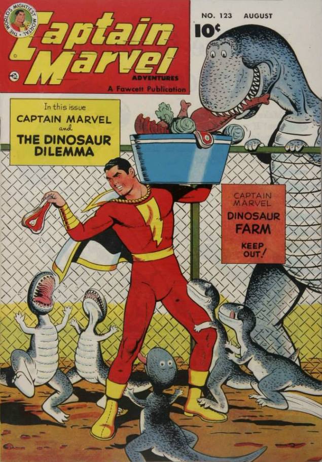
« Special! Baby dinosaurs! New! Different! Be the envy of your friends! »
Captain Marvel Adventures #123, 1951. Did you know that dinosaurs apparently wag their tails like dogs to express their affection? No? Head over here.
« Wait! This isn’t oil! It’s dense, black and real sticky! »
Don’t let go of that piglet, Captain Marvel! Pigs’ reputation for loving mud may be well deserved, but no self-respecting swine wants to be dropped into black, sticky goo. This is Captain Marvel Adventures #126 (November 1951), cover by C.C. Beck. The cautionary cover tale, Captain Marvel and the Creeping Horror, was written by Otto Binder and pencilled by C.C. Beck (with inks, tentatively, by Pete Costanza).
« Did you hear that, ma? We’re on another – uh – world! Ma, aren’t you scared? » « Land sakes, pa, why get scared? At least my wash will dry nice and fast with two suns shining down! »
Captain Marvel Adventures #135 (August 1952); cover by C.C. Beck.
IGN ranked Captain Marvel as the 50th greatest comic book hero of all time. You know how they qualified it? “Times have changed, and allegiances with them, but Captain Marvel will always be an enduring reminder of a simpler time.” If there’s one thing I hate, it’s people who assume that generations before theirs were naïve or that the world was a “simpler” place (take a peep in any good history book and see if that was the case). This kind of condescension poisons any compliment.
C.C. Beck in 1982. He kinda looks like my physics teacher from high school!Doctor Sivana comes out with his whole family to taunt Billy! Says Beck, “The publisher also once wanted to drop Sivana, claiming the old rascal was becoming a more interesting character than Captain Marvel. The editors paid no attention to so silly an order and kept him alive and cackling.”
There’s a beautifully conducted interview with Beck by Tom Heintjes, published in Hogan’s Alley. I highly recommend it. Heart-breakingly, Heintjes explains in the introduction that “when Beck died of renal failure on November 23, 1989, my inability to complete a book celebrating Beck’s life and career—to my mind, one of the most commercially and aesthetically successful in the entire history of comic books—was a source of acute regret.”
~ ds
*Gary Groth’s introduction to an interview with C.C. Beck published in Comics Journal #95 (February 1985) and conducted in 1983.
« We are all susceptible to the pull of viral ideas. Like mass hysteria. Or a tune that gets into your head that you keep humming all day until you spread it to someone else. Jokes. Urban legends. Crackpot religions. Marxism. No matter how smart we get, there is always this deep irrational part that makes us potential hosts for self-replicating information. » — Neil Stephenson
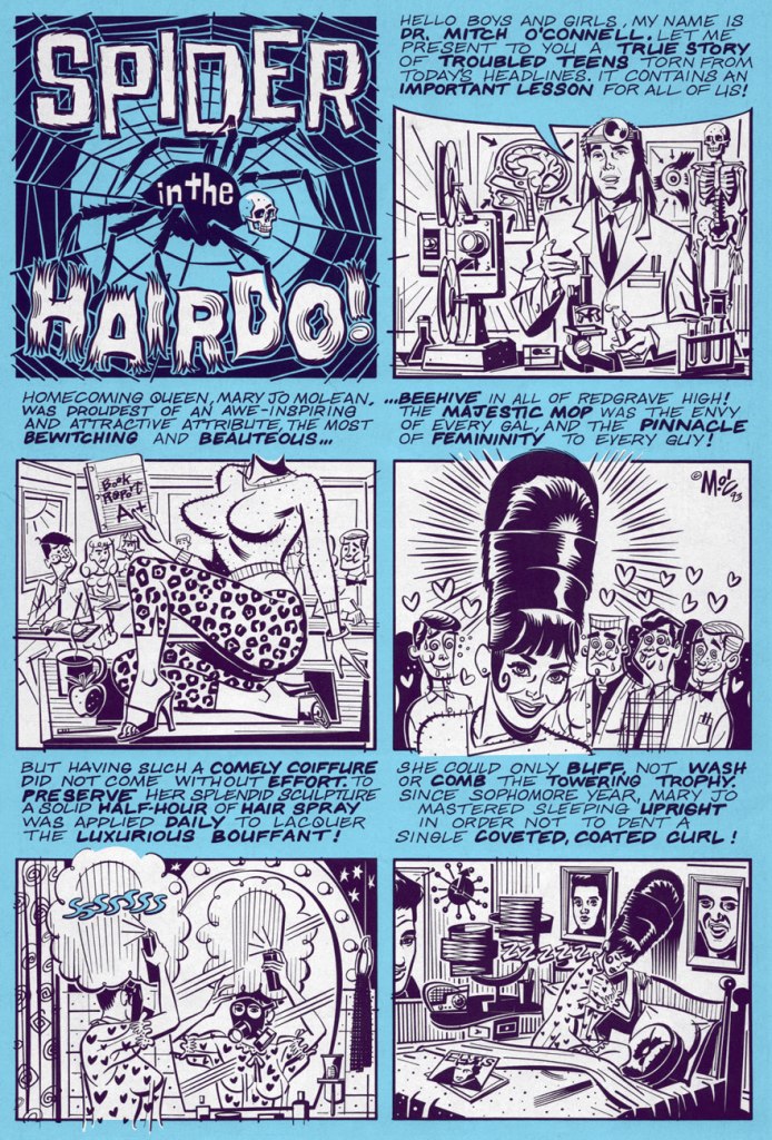
True story! It happened to a friend of a friend of a relative of an acquaintance of the hairdresser of the nephew of the uncle of the garage mechanic of the girdle maker of a cousin of a U.F.O. abductee ex-classmate of my brother’s. Or so he obliquely claimed under hypnotic regression.
Apparently, this tale gave rise (I know, I know) to a variant called The Cucumber in the Disco Pants.
And remember, always check with Snopes.com before propagating dubious claims.
Spider in the Hairdo! is a juicy excerpt from Dark Horse’s one-shot Urban Legends no. 1 (June, 1993). Adaptation by the self-proclaimed « World’s Best Artist », Mitch O’Connell. I can think of far less worthy candidates for the position.
Should you be craving more from Dr. Mitch, here’s where to go for your fix: www.mitchoconnell.com.
And if, like me, you can’t get enough of such urban folklore, check out any of Jan Harold Brunvand’s score of splendidly compelling books on the subject. When it comes to urban myths, Dr. Brunvand is the authority.
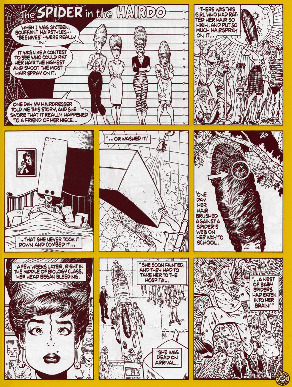
As a bonus, here’s Arthur Adams‘ slightly subsequent take on the same myth, published in DC/Paradox Press’ inaugural entry in its ‘Big Book of…’ series, The Big Book of Urban Legends (1994).
By their very nature, the Big books (seventeen in all) tended to be pretty hit or miss, not, for once, because of the writing, but chiefly due to the evident paucity, in the current comics industry, of artists versatile enough to credibly depict low-key, quotidian, humorous or historical situations. Is it counterintuitive, or fitting, that artists on the cartoonier end of the scale (Rick Geary, Roger Langridge, Gahan Wilson, Hilary Barta, Ty Templeton, Danny Hellman, Sergio Aragonés…) tended to fare best in producing this type of « documentary » work? I haven’t quite made up my mind. All I know is that the superhero specialists and photo tracers just brought embarrassment upon themselves *and* the unfortunate reader.
Since Popeye’s a sailor, one would expect him to run into a lot of octopuses during his adventures. It doesn’t happen nearly as often as one would think, actually, but there’s still enough encounters for a decent-sized tentacle journey. Here we go!
Popeye: Danger, Ahoy! Big Little Book no. 5768 (Whitman, 1969). Does anybody know who painted this cover?
« Zombie Popeye » (and, more importantly for our current topic of discussion, Chtulhu-Olive!) by the talented Roger Langridge. He posted this so-called sketch (how detailed can a drawing be before it stops being a sketch?) on his website on September 2014… and the original is still for sale, I believe! Go here. This isn’t the first time Langridge tentacles slither into a blog post – for instance, go visit « Tentacle Tuesday: pirates and treasure, oh my».
A variant cover for Popeye Classics no. 48, July 2016. These Craig Yoe reprints of Bud Sagendorf’s Popeye are great fun, by the way, and I highly recommend them for the proverbial children-at-heart.
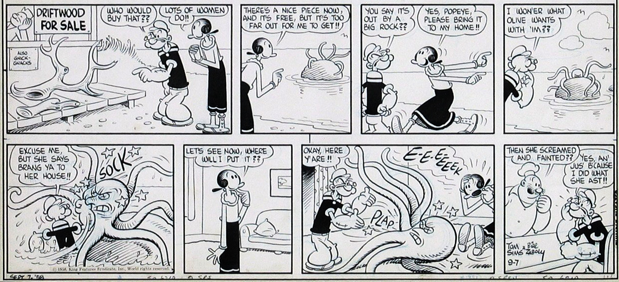
Original art for a Popeye Sunday, published on July 9th, 1958. The art is by Bela (Bill) Zaboly, who worked on Thimble Theater starting from 1939 and until Bud Sagendorf took over in 1959.
A chunk of story in which an octopus makes a very minor appearance… from a strip by Bug Sagendorf published on October 7th, 1960.
A panel from “Hitchhikers!” by Bug Sagendorf, published in Popeye Comics no. 19 (January-March 1952). Read the full zany story here. (Technically, this is a Sherm story, but let’s not split hairs.) I’m not surprised the octopus looks like a spy, wearing a hairpiece like that. Or is it just a nest for the birdies?
« … and now for some of that fun we promised you! Trained chihuahas! Car races! A couple of inspirational documentaries! And a quiz show! Hallelujahgobble! Hallelujahgobble! »
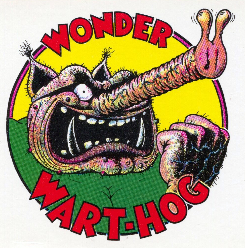
For my money, there’s no funnier man in comics, at least on such a consistent, sustained level, as the extraordinary Gilbert Shelton (born May 31st, 1940, in Houston, TX, which makes him 78 today). Sure, he’s slowed down some since 1959 (the year he foisted upon the world the Wonder Warthog), but the quality of his output has not decreased one iota (quite the contrary, in fact!) It may well be that the secret of his longevity lies in his choice of collaborators, but as far as I’m concerned, that’s just another facet of his talent. I’ll (mostly) let the man’s work speak for itself. Brace yourselves for the ride, here we go!
Enter a captionYeah, that old hippie shit’s totally dated; this has nothing to do with American’s current socio-political situation. Well, it would be nice if Amtrak’s trains ran a bit closer to schedule. This ran as the back cover of « Wonder Wart-Hog and the Nurds of November: Gilbert Shelton’s Exciting Cartoon Novel of Election-Year Politics, International Nuclear Terror, Professional Football, Science Fiction, Motorcycle and Auto Racing, Pestilence, Famine, Economic Collapse and Romantic Love. » (1980, Rip Off Press)
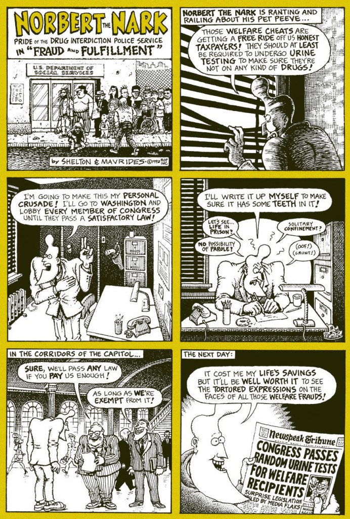
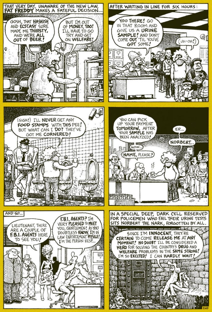
The Brothers’ none-too-effective nemesis Norbert the Nark in the spotlight. From The Fabulous Furry Freak Brothers no. 12 (1992, Rip Off Press).
Fat Freddy’s such a good little Suzie Homemaker. Another piece from The Fabulous Furry Freak Brothers no. 12 (1992, Rip Off Press).
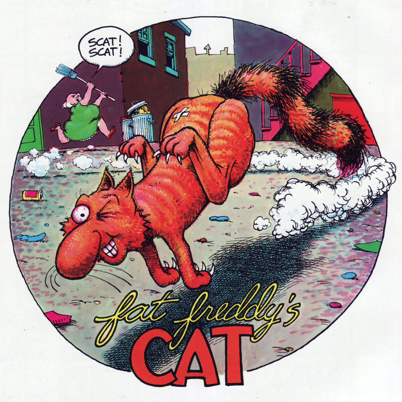
The toilet-training method reportedly works, but it helps to have more than one toilet available. From Fat Freddy’s Cat no. 7 (1993, Rip Off Press)Shelton’s most recent major creation, circa 1988-89, is Not Quite Dead, “the world’s oldest and least successful Rock ‘n’ Roll band”. So far, we’ve been treated to six issues, and the latest, “Last Gig in Shnagrlig” (2009), is quite the epic! A fruitful collaboration with French bédéiste Denis Lelièvre, alias Pic. These vignettes hail from Not Quite Dead no. 5 (2005, Knockabout)Aw, ain’t he adorable, and don’t you just wanna slip the birthday boy a big ol’ sloppy smooch? Photo by Christophe Prébois.
Speaking of collaborators, though it’s none of their birthdays, let’s give a salty salute to Shelton compadres-in-crime Tony Bell, Joe E. Brown Jr., Dave Sheridan, Paul Mavrides and Pic. Did I forget anyone?
-RG
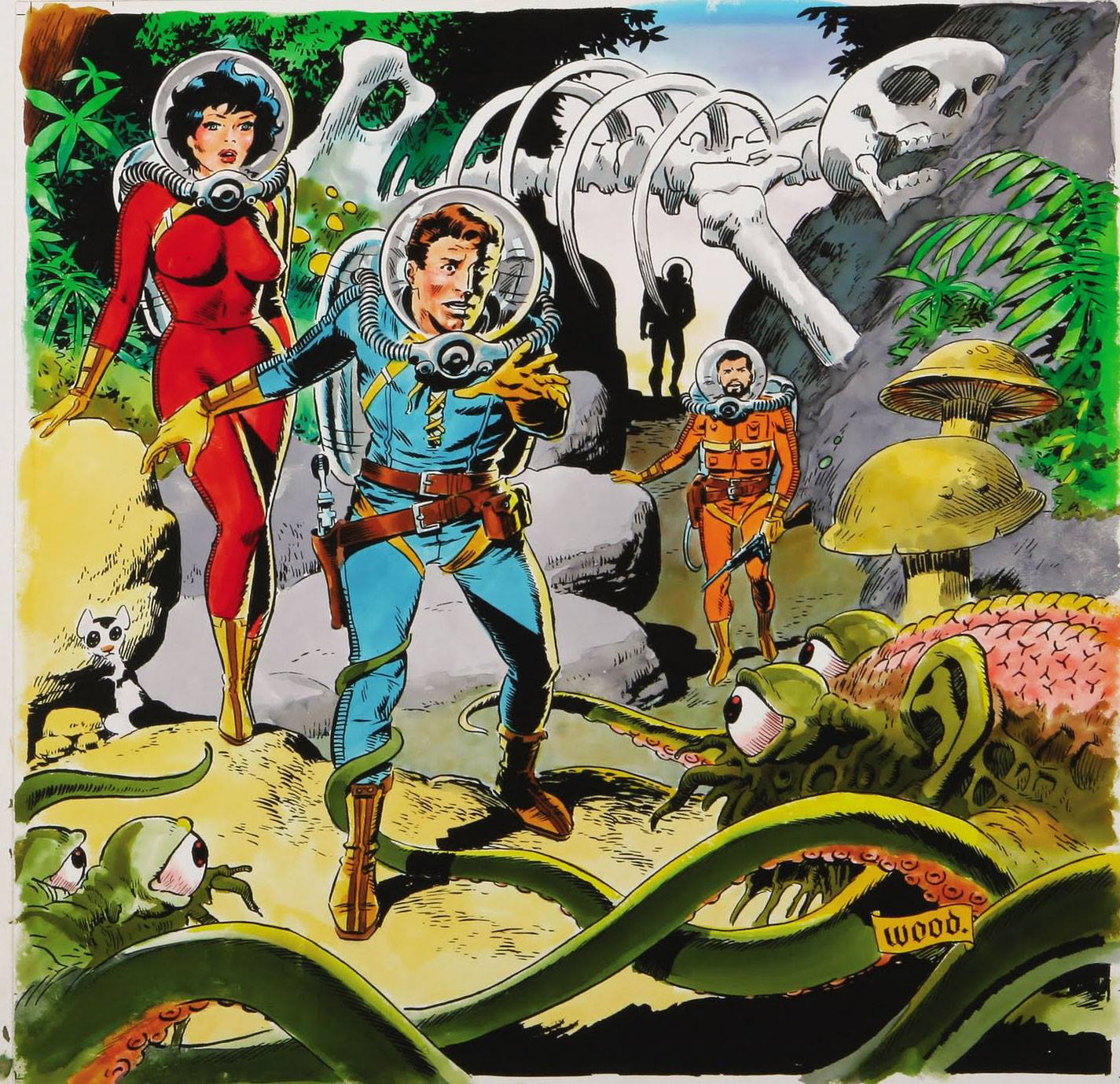
If your little heart desires babes with form-fitting clothing (or wearing nought but their birthday suits) and tentacled monsters with sad, expressive eyes, look no further than Wallace Allan Wood (1927-1981). Famously advising fellow cartoonists to “never draw anything you can copy, never copy anything you can trace, never trace anything you can cut out and paste up”, he would return to the beloved theme of buxom girl + tentacles again and again.
Without further ado, let’s take a gander at some of Wally Wood’s tentacled offerings.
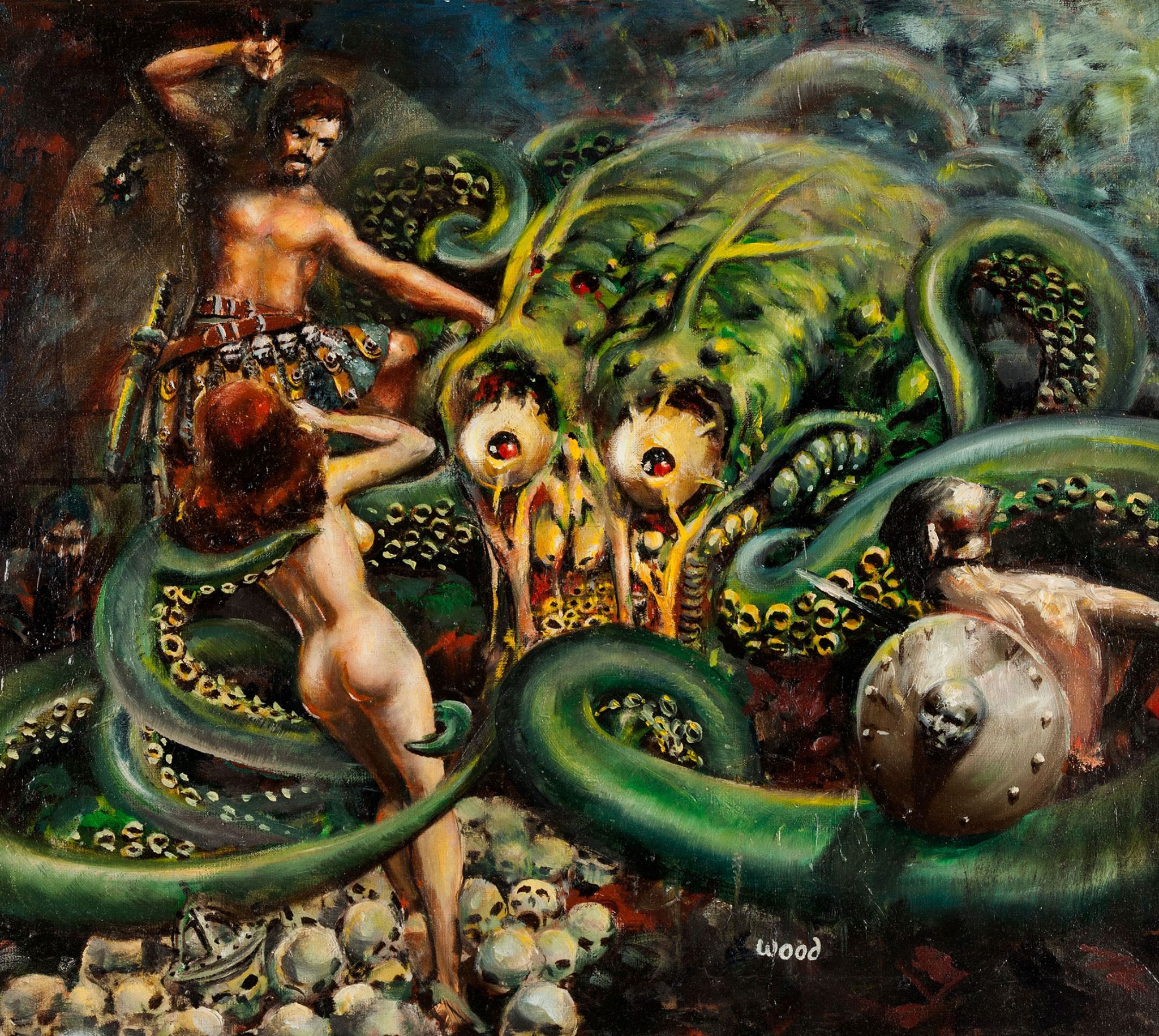
This opulent, splendi-tentacular painting has been spawned by Wally Wood in 1954. It’s called Dweller in the Dungeon, and was originally presented as a gift to EC publisher Bill Gaines. I don’t know about you, but I’m rooting for the cephalopod, who has unquestionably good taste in women.
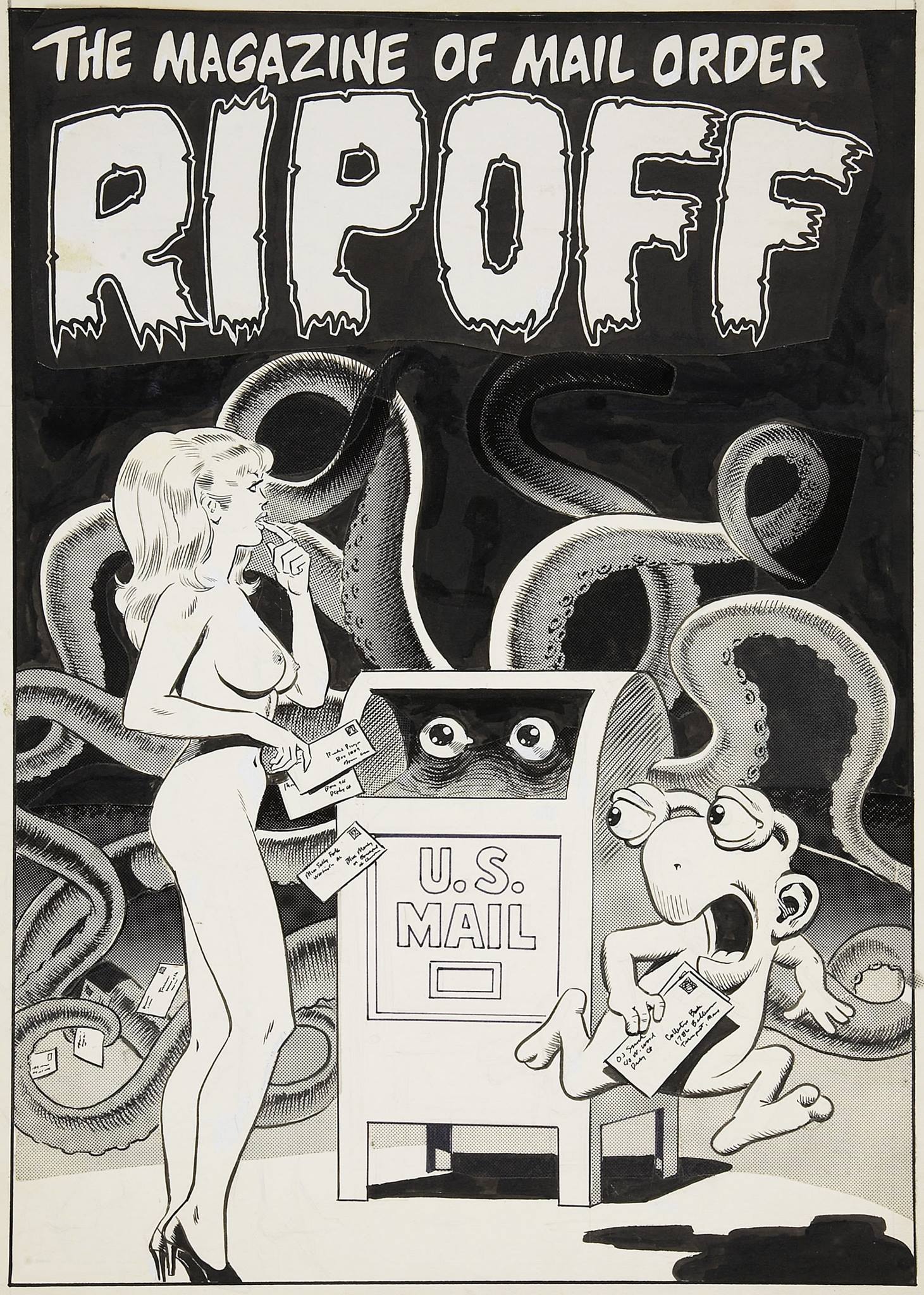
The cover Wally Wood drew for a mail order catalog (to be more precise, The Magazine of Mail Order Collector’s Press Newsletter no. 16, 1979. Phew, that’s a mouthful.)
Original art from The Man Hunters (published in Eerie no. 60, 1974 – you can see this issue’s cover in our previous post.)
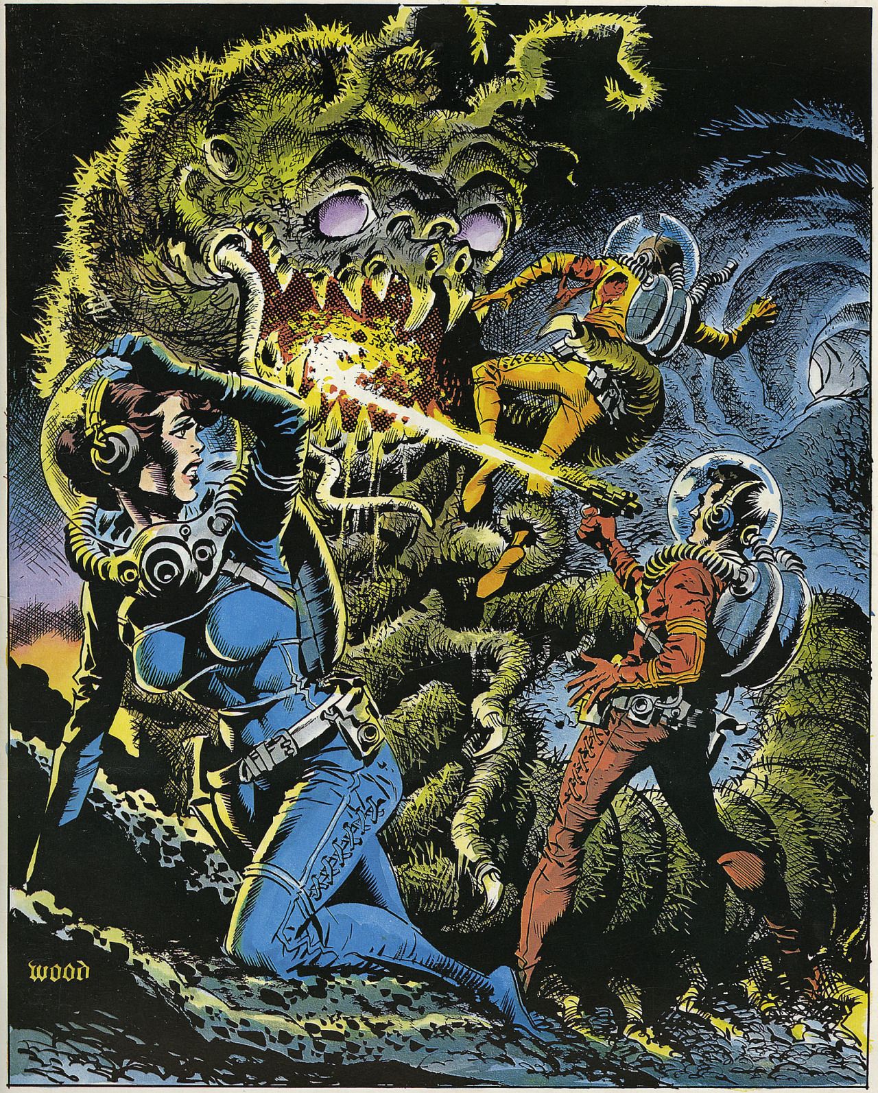
This theme is returned to again several years later:
It may have reflected Wood’s mental turmoil, but his tentacled monsters have pleading eyes that just beckon to the viewer. Maybe it’s a form of hypnotism. You’re grabbing the wrong human, buddy! Go for the girl! This Wally Wood painting was used as the cover of The Comic Book Price Guide no. 9 (1979).
Wood cover art for an LP (Bell Records, 1965). Here the green-brain-with-tentacles is almost unbearably cute.
There’s also this poignant scene…
Cover for EC Portfolio no. 5, 1974.
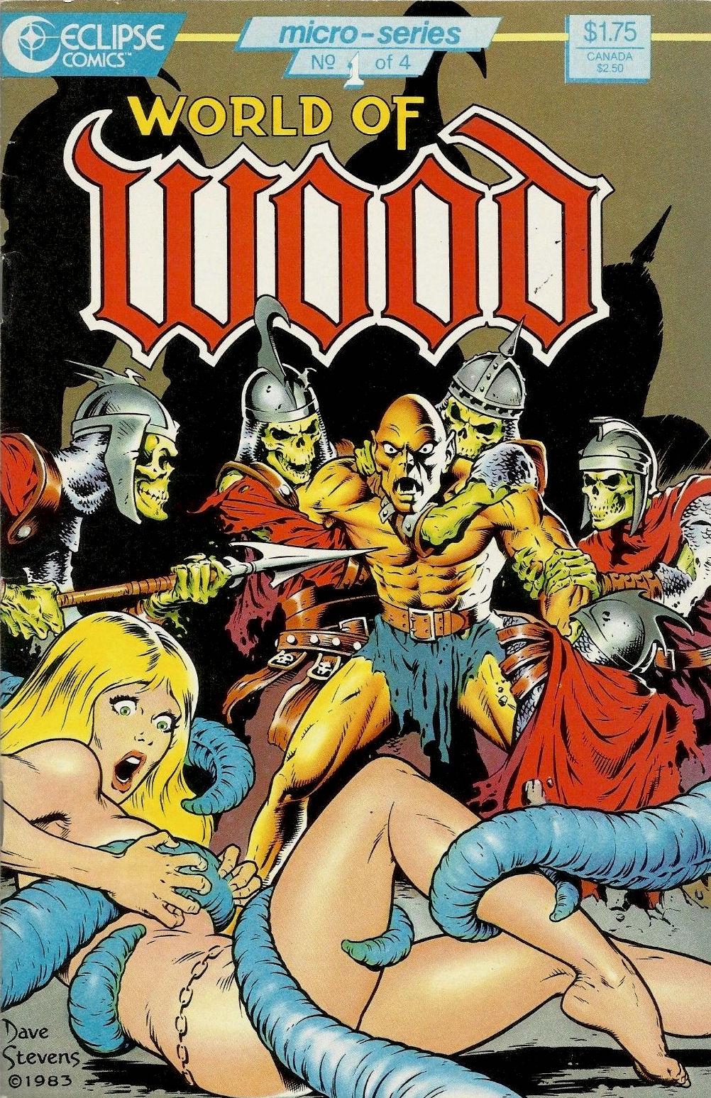
Wally Wood was a tremendous influence on artists who came after, and there’s a myriad of parodies, imitations, and derivations of his style… But I’ll wrap up this post with one well-executed hommage that fits in well with the theme, I think.
World of Wood no. 1 (Eclipse, April 1986). Cover by Dave Stevens.
Okay, now that you’ve seen some Mad covers (see a MAD dash… outside) let’s have a peek at some inside art by the habitués.
One of my favourite MAD artists is Antonio Prohías (1921-1998). Hailing from Cuba (but being forced to emigrate thanks to an repressive government that wasn’t too fond of the concept of “free press”), he moved to New York in 1960. Apparently Prohias was in no hurry to learn English (and, in fact, his cartoons are silent). Here’s a cute anecdote involving Sergio Aragonés, courtesy of Wikipedia:
« Two years after Prohias’ debut in the magazine, cartoonist Sergio Aragonés made the trek from Mexico to New York in search of work. Because Aragonés’ command of English was then shaky, he asked that Prohias be present to serve as an interpreter. According to Aragonés, this proved to be a mistake, since Prohías knew even less English than he did. When Prohías introduced the young artist to the Mad editors as “Sergio, my brother from Mexico,” the Mad editors thought they were meeting “Sergio Prohías. Twelve years later, Mad writer Frank Jacobs reported that Prohias’ conversational English was limited to “Hello” and “How are you, brother?” Said Aragonés, who speaks six languages, “Even I could not understand him that well. »
Clearly, art was Prohias’ language, and we’re not at all complaining.
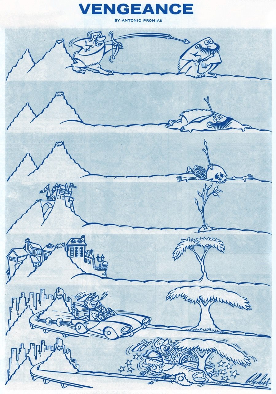
It pays to play the *long* game! “Vengeance” was published in Mad no. 66 (October 1961). Art by Antonio Prohías.
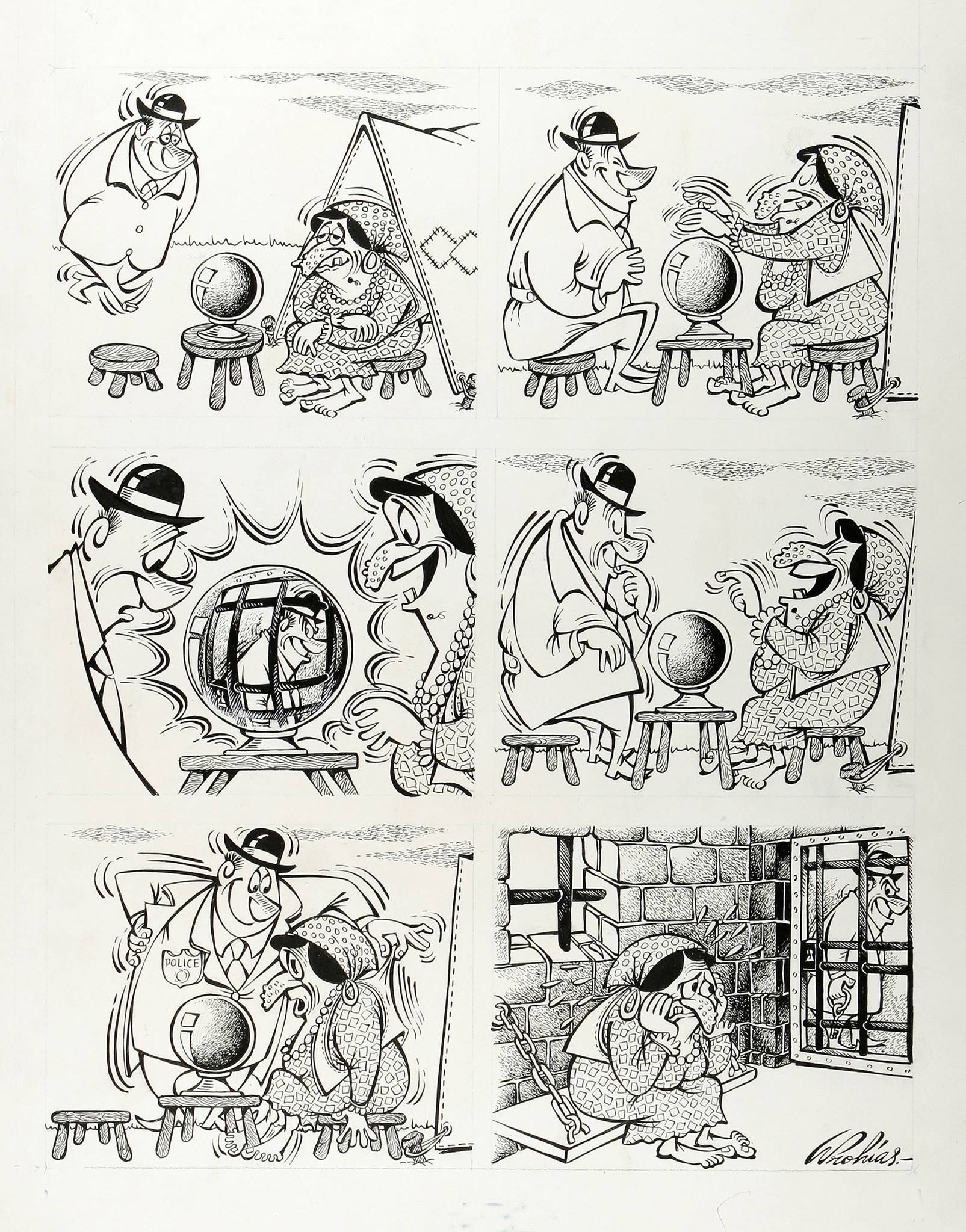
This it the original art for a gag called “The Old Ball Game”, created for Mad’s Fortune Kookie Dept. It was published in Mad no. 161, September 1973. Art by Antonio Prohías.
Original art for a strip published in Mad no. 253, March 1985. Ironically, I don’t particularly like Prohías’ Spy vs Spy, despite the lovely art and violent dismemberment scenes, much preferring Peter Kuper’s (much later, starting in 1997 up until today) version of this strip.
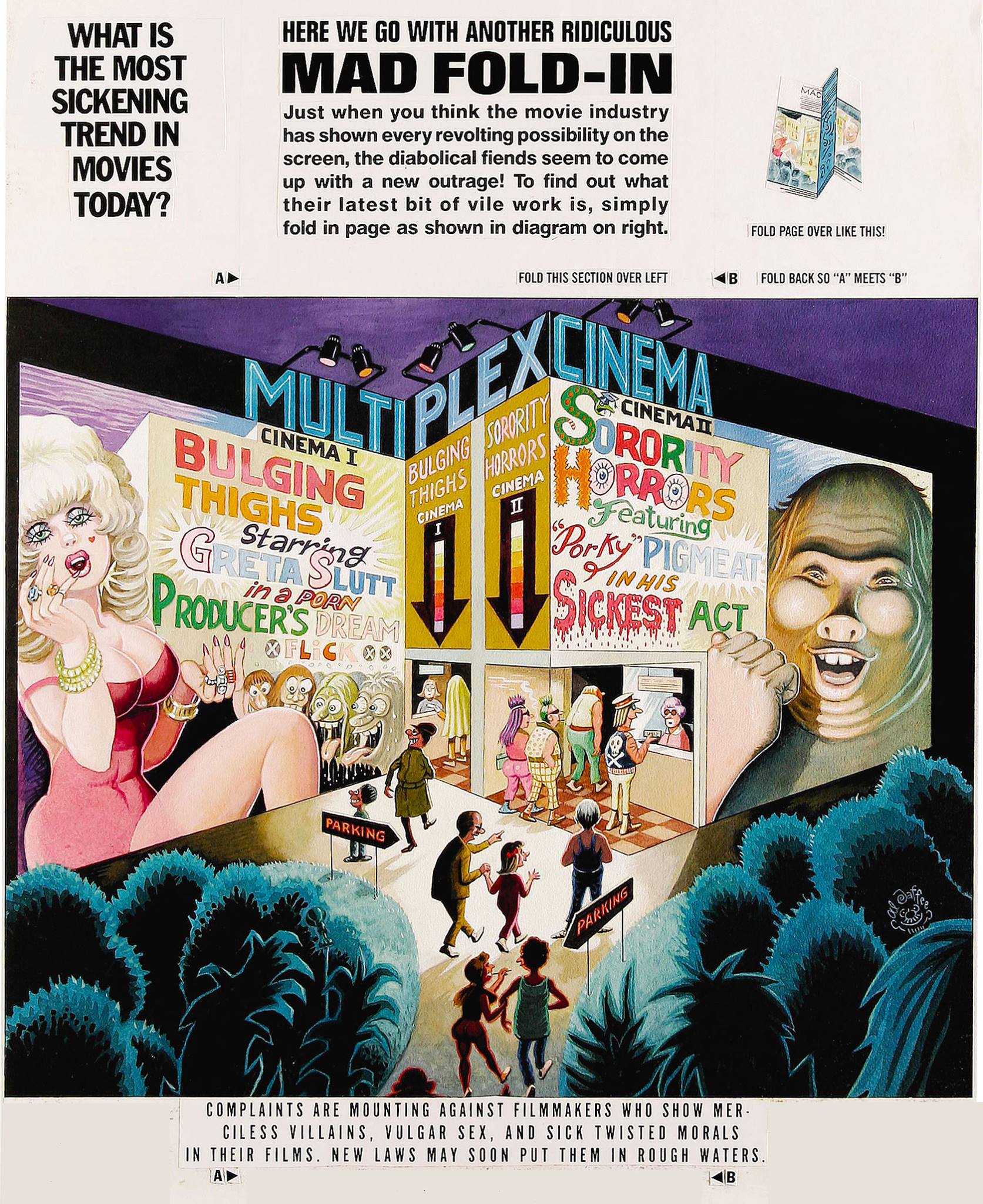
Next on our list is Al Jaffee, the “world’s oldest cartoonist” (Guinness World Records certified and everything!), Mad’s longest-running contributor, creator of the Mad Fold-In, mastermind of Snappy Answers to Stupid Questions.
This fold-in comes from Mad no. 297, September 1990. Drawn by Al Jaffee, it answers (maybe) the paramount question of “What is the most sickening trend in movies today?”( Since I can’t very well ask you to fold your computer screen, the answer is “Commercials in theaters.”)
Incidentally, Mad introduced fold-ins in 1964 – they were a most prominent feature of MAD Magazine, conceived, drawn and written by the aforementioned Jaffee. I’ll quote the man himself:
“Playboy had a foldout of a beautiful woman in each issue, and Life Magazine had these large, striking foldouts in which they’d show how the earth began or the solar system or something on that order — some massive panorama. Many magazines were hopping on the bandwagon, offering similar full-color spreads to their readers. I noticed this and thought, what’s a good satirical comment on the trend? Then I figured, why not reverse it? If other magazines are doing these big, full-color foldouts, well, cheap old Mad should go completely the opposite way and do an ultra-modest black-and-white Fold-In!”
I guess they folded (ahem) on the “black-and-white” part later on. Here’s another nice Al Jaffee production:
This cartoon dwelled on the back cover of Mad no. 214 (April 1980), and was written by Dave Manak & drawn by Al Jaffee.
In a 2010 interview, Jaffee said, “Serious people my age are dead.” That may just be the recipe for eternal life.
Moving on to another mainstay of MAD: Sergio Aragonés, an artist about whom Mad director Al Feldstein said “he could have drawn the whole magazine if we’d let him.” Prolific, delightfully funny, and (by all accounts) a really friendly guy, Aragonés (born in 1937) is still with us today.
A little gruesome hippy humour from Sergio Aragonés, published in Mad no. 139, December 1970.
My favourite recurring feature by Aragonés is “Who knows what evils lurk in the hearts of men? The shadow knows.“ Many years ago, I picked up a copy of “Mad’s Sergio Aragonés on Parade” at a second hand store. I didn’t know who he was, then, but I loved the sometimes tiny, always funny squiggly drawings immediately. (I also didn’t know who the Shadow was, so that reference was sailing right over my head.) Even though I have since then upgraded to the considerably heftier “Sergio Aragones: Five Decades of His Finest Works“, there’s no way I’m getting rid of my dog-eared, stained and shopworn copy – that’s the one I reach for when I need a chuckle.
Published in From Mad no. 131, December 1969, scanned from “Mad’s Sergio Aragonés on Parade“, and artistically coloured by co-admin RG.
Published in From Mad no. 129, September 1969, scanned from “Mad’s Sergio Aragonés on Parade“, and artistically coloured by co-admin RG.
Hurray for Aragonés, the weird hours he keeps (by his own admission), and the thousands of ideas bubbling in his head at any given time. “Sergio has, quite literally, drawn more cartoons on napkins in restaurants than most cartoonists draw in their entire careers“, said Al Jaffee, and glancing at the tiny drawings decorating the margins and in-between-panels of Mad magazine, one can easily believe it.
The other guy who just has to be mentioned is Don Martin (1931-2000), promoted as Mad’s Maddest Artist. Where else would we get our fix for goofy characters with comically large, hinged feet? I can just imagine the squeaking noises they make.
Well, *have* you? This Don Martin cartoon was used as one of the eight “Vital Message” mini posters offered with Mad Super Special no. 17 (1970). It makes me think of my mom’s parting admonition every time I would leave the house – “and don’t hit old ladies with an umbrella”. I am proud to say that I’ve followed her advice… so far.
Here’s a fun description of standard Don Martin characters (source):
« His people are big-nosed schmoes with sleepy eyes, puffs of wiry hair, and what appear to be life preservers under the waistline of their clothes. Their hands make delicate little mincing gestures and their strangely thin, elongated feet take a 90-degree turn at the toes as they step forward. Whether they’re average Joes or headhunters, Martin’s people share the same physique: a tottering tower of obloids. Martin puts the bodies of these characters through every kind of permutation, treating them as much like gadgets as the squirting flowers and joy buzzers that populate his gags: glass eyes pop out from a pat on the back; heads are steamrollered into manhole-cover shapes. All of this accompanied by a Dadaist panoply of sound effects found nowhere else: shtoink! shklorp! fwoba-dap! It’s unlikely Samuel Beckett was aware of Don Martin, but had he been he might have recognized a kindred spirit. »
« I find television very educating. Every time somebody turns on the set, I go into the other room and read a book. » ― Groucho Marx
In the mid-90s, the always-discerning masterminds* at Rhino Records (they had, after all, picked William Stout to design their logo, back in 1974) called upon master satirist, caricaturist and of course pointillistDrew Friedman (1958-) to gather some perennial favourites on his old couch for the purposes of a three-volume compilation.
In this second entry in the trilogy, Mr. Friedman seems a bit out of his element, as drawing purdy gals and conventionally handsome men is hardly his forte. But he aces Gabe Kaplan, as you’d hope and expect. Judging from his expression, Gabe appreciates it.
This time, our artiste ably succeeds where he faltered earlier: he has no difficulty capturing the likenesses of Ms. Anderson and (5x so far) Mrs. Collins.
From volume 3’s liner notes: « The 1980s may well be remembered as the final decade of the television theme song. The disturbing trend of the ’90s seems to be the elimination of the title song in preference of an additional minute of commercial airtime – a sad state of affairs for fans of the opening anthem. »
Maybe it’s all for the better: I’d rather have an additional hour of commercial airtime than be subjected again to the opening jingle of, say, Charles in Charge. You have been warned.
Today’s Tentacle Tuesday honours Filipino artists who laboured in the comics industry in the 70s. To quote from Power of Comics: Filipino Artists (read the essay here),
« The Filipino talent began to arrive in 1970, when immigrant Tony DeZuñiga began to work for National Comics. DeZuñiga began with assignments on various romance, horror, western, and war anthologies—a combination that many Filipino artists coming after him would also follow—but he made a lasting mark when he co-created Western anti-hero Jonah Hex in All-Star Western #10 (1972). By then, DeZuñiga had convinced then National Comics publisher Carmine Infantino that other talented artists were awaiting discovery back in his nation of origin. With a stable of graying veterans working for him, Infantino was faced with a paucity of new talent in the early 1970s and had trouble finding gifted artists who could work for what the going page rate in American comics would pay at the time. DeZuñiga accompanied Infantino on a recruiting trip to the Philippines in 1971.
As noted, first among the Filipino artists to make a move were Redondo and Alcala. Among his works, Redondo turned in a memorable run on Swamp Thing, and the prolific Alcala picked up a considerable fan following for his work on series like Batman and Arak. Other Filipinos followed. Alex Niño brought a distinct style to Warren Publishing’s 1984 and 1994 series. Ernie Chan’s talent for composition led to his becoming National’s principal cover artist between 1975 and 1977. Gerry Talaoc enjoyed an extended run on The Unknown Soldier. »
Without further ado, let’s have a look at some of the tentacles the artists mentioned above have dreamed up. In no particular order…
I like the styles of all the artists mentioned in this post, but a couple of these names will make me do a little dance of joy when I encounter their art. Alfredo Alcala (b. 1925, d. 2000) is a definite favourite. He could draw anything he wanted, convincingly… at an amazing speed, and with the sort of detail that other artists would kill for.
Alcala drew for all genres in the early portion of his career, and developed the speed and work ethic for which he later become known amongst his fellow professionals. His fastest page rate was 12 pages in a nine-hour sitting, while in one 96-hour marathon he produced 18 pages, three wrap-around covers and several color guides. During the portion of his career where he worked solely for Filipino publishers, Alcala worked without assistants and did his own inking and lettering. “I somehow always felt that the minute you let someone else have a hand in your work, no matter what, it’s not you anymore. It’s like riding a bicycle built for two…” (source)
Here’s a gorgeous sequence from « The Night of the Nebish! », scripted by Arnold Drake and illustrated by Alfredo Alcala, published in House of Secrets #107 (April 1973).
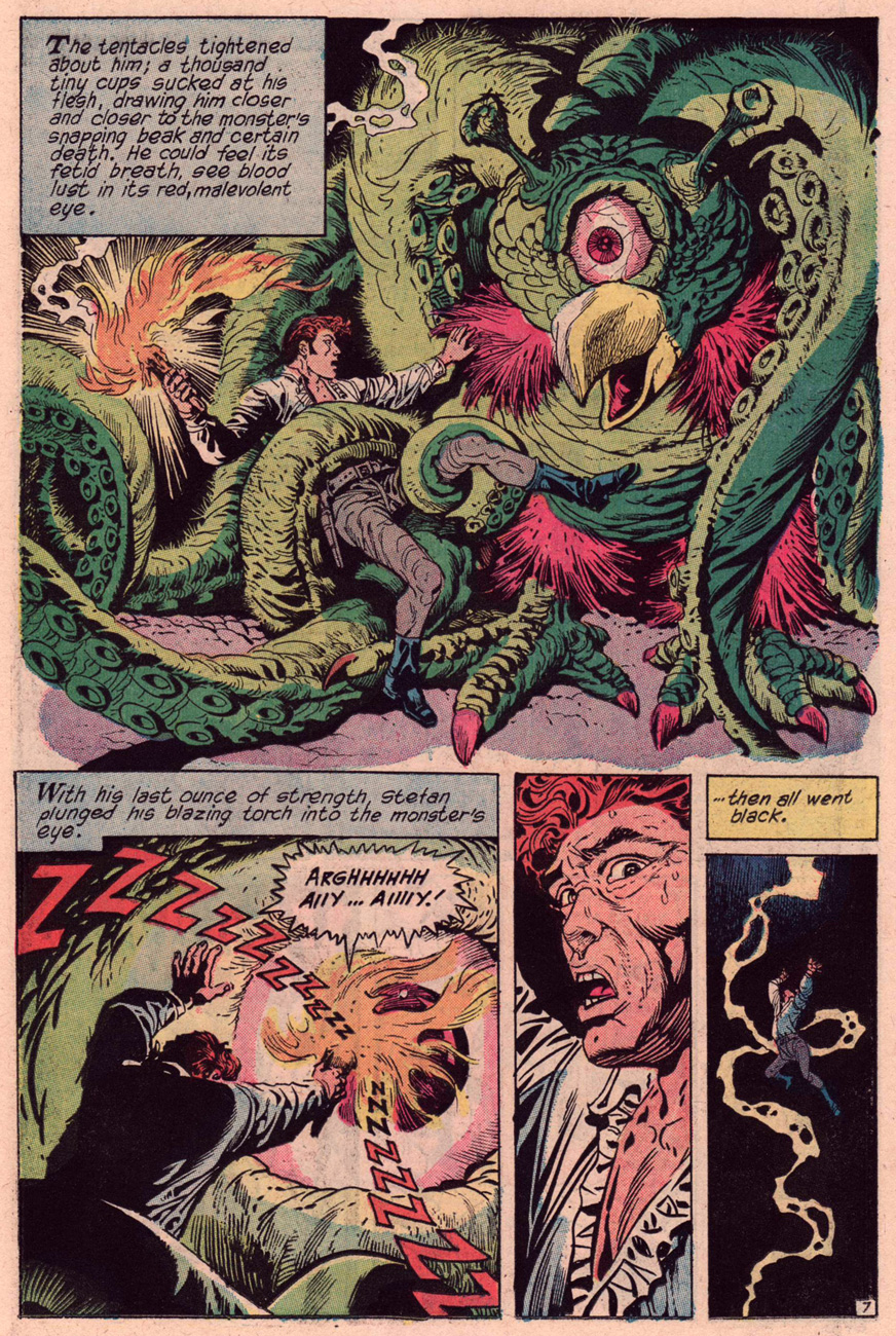
Ruben Yandoc (also known as Rubeny, 1927-1992) isn’t nearly as well-known as Alcala, yet he has a beautiful, half-decorative, half-sketchy style. He excelled at horror stories (published in DC’s Witching Hour, House of Mystery, Ghosts, House of Secrets..), and was a master at creating mood. His perfect grasp of architecture and anatomy enabled him to draw believable characters in incredible settings – none of this “figures floating about aimlessly” shit that you sometimes get from artists who can’t imbue their objects and subjects with mass. When Stefan gets grabbed by tentacles, you can feel their weight on his torso and feel the heat and painful brightness of the torch he’s holding, dammit!
« The Monster of Death Island », plotted by Maxene Fabe and illustrated by Ruben Yandoc. Published in Secrets of Sinister House no. 11 (April 1973).
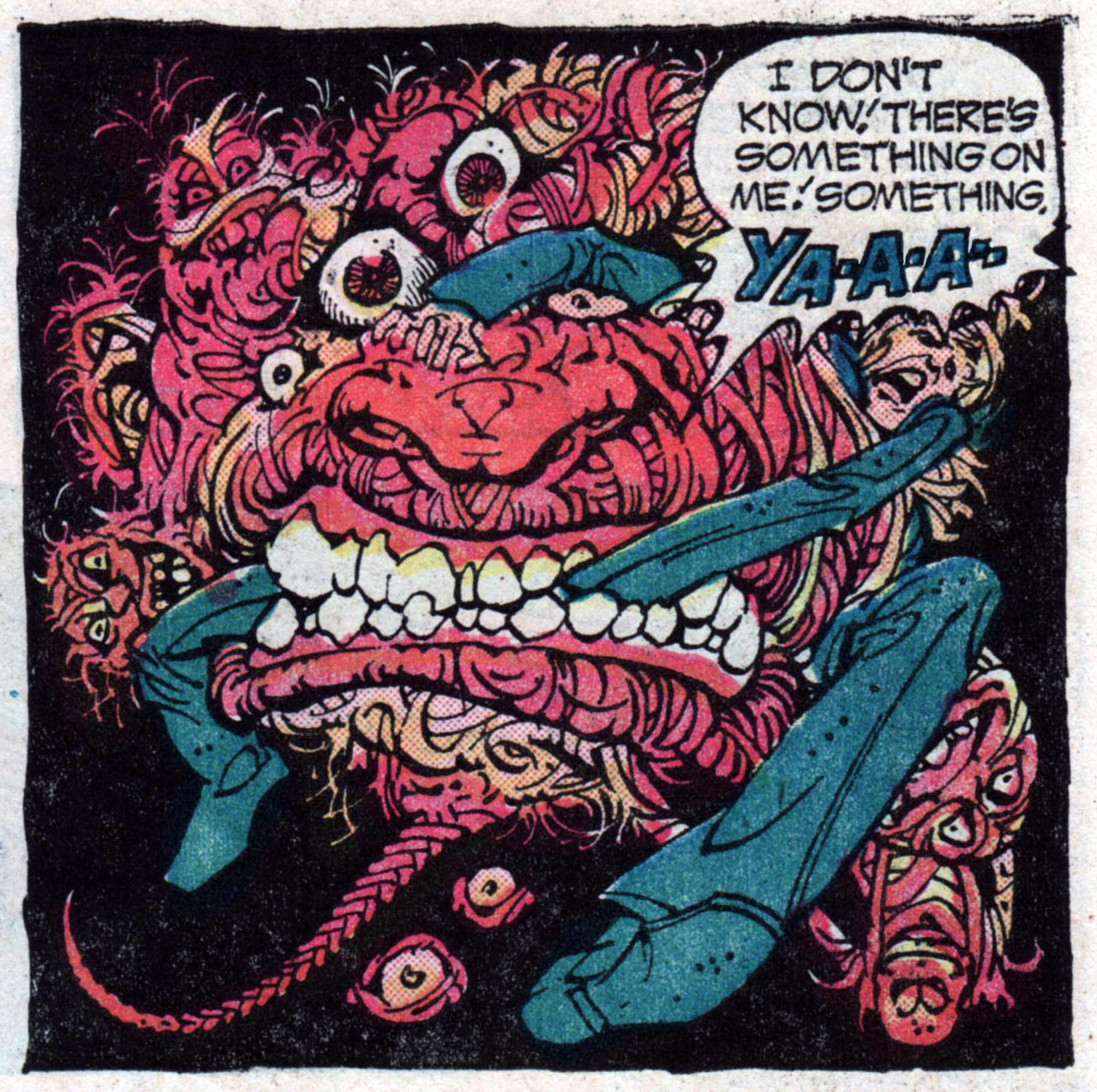
Alex Niño’s art doesn’t give me butterflies. His stuff is quite weird, sometimes far too detailed, but his talent is nevertheless undeniable. For a good appreciation of his style (and more examples of it), go to this entry from Wizard’s Keep. As for me, I’ll limit myself to this humble, one-panel mass of tentacles, eyes, teeth, spikes, and god knows what else.
“Something on me”, indeed! A panel from « Evil Power », plotted by Jack Oleck and illustrated by Alex Niño from Weird Mystery Tales no. 9 (December 1973-January 1974). Niño was born in 1940, which makes him 78. He’s officially retired, but still holds art classes and takes commissions, as well as making the occasional appearance at conventions.
Redondo’s “memorable run on Swamp Thing” was mentioned at the beginning of this post. Well, we’ve already featured the tentacled robot who tries to finish Alec Holland off here, but rest assured – there’s more tentacles than just that in the career of Nestor Purugganan Redondo (1928-1995)! For example, this:
Original art for “Monsters From a Thousand Fathoms”, published in The Unexpected no. 185 (May-June 1978). You’ll note the art is attributed to the “Redondo Studio”; Nestor and his brother, Frank, often collaborated under that name.
By the way, he’s most assuredly another favourite in this household. His women are believably sexy, his monsters inventive and scary, his animals pitch-perfect… His style is realistic but lush, his nature almost prettier than in real life. And I like him much, much better than Bernie Wrightson, as far as Swamp Thing is concerned 😉
A perfect fit for any Tentacle Tuesday, here’s the requisite damsel-in-distress-with-tentacles:
Wench & Co. Book 1, a collection of drawings – of mostly naked women, what else? – by Ernesto Chan (1940-2012), born and sometimes credited as Ernie Chua. Published by Big Wow, 2005. Sadly, we will never get a Book 2.
We shouldn’t forget Tony DeZuñiga (1932-2012), who after all started all this. Among other accomplishments, he co-created Jonah Hex and Black Orchid, two pretty damn cool characters.
Page from “Home is the Sailor”, plotted by Len Wein and illustrated by Tony DeZuñiga, published in The Phantom Stranger no. 18 (March-April 1972).
I hope you enjoyed this (non-exhaustive) romp through Filipino-American tentacles! As historian Chris Knowles (1999) has noted about Filipino artists, « Here was a group of immensely talented and hard-working draftsmen who could draw absolutely anything and draw it well. They set a standard that the younger artists would have to live up to and that the older ones would have to compete with. » Amen to that!
And now… for a bit of levity: a few favourite MAD covers.
I’ll start with this by-now-iconic cover, that’s nevertheless worth posting (with proper attribution to artists involved and in high enough resolution to admire the details, two characteristics sadly often absent from stuff posted online). You’ll note I’ve skipped over the first couple of Harvey Kurtzman covers (MAD nos. 1, 3 and 4) – which are amazing but a topic for another conversation.
Mad no. 5, June-July 1953. Cover by Will Elder, colours by Marie Severin. The busty babe is the least interesting character on this cover!
And it’s back to Kurtzman for covers of MAD nos. 6 to 10. Then I’ll disregard the somewhat boring covers, and jump over the Norman Mingo ones, and that brings us to… Frank Kelly Freas! It shall quickly become apparent that I really like his art (guilty as charged). Having started his career at Mad in February 1957, by July 1958 he was the magazine’s official cover artist (his first was MAD no. 40), and painted most of its covers until October 1962.
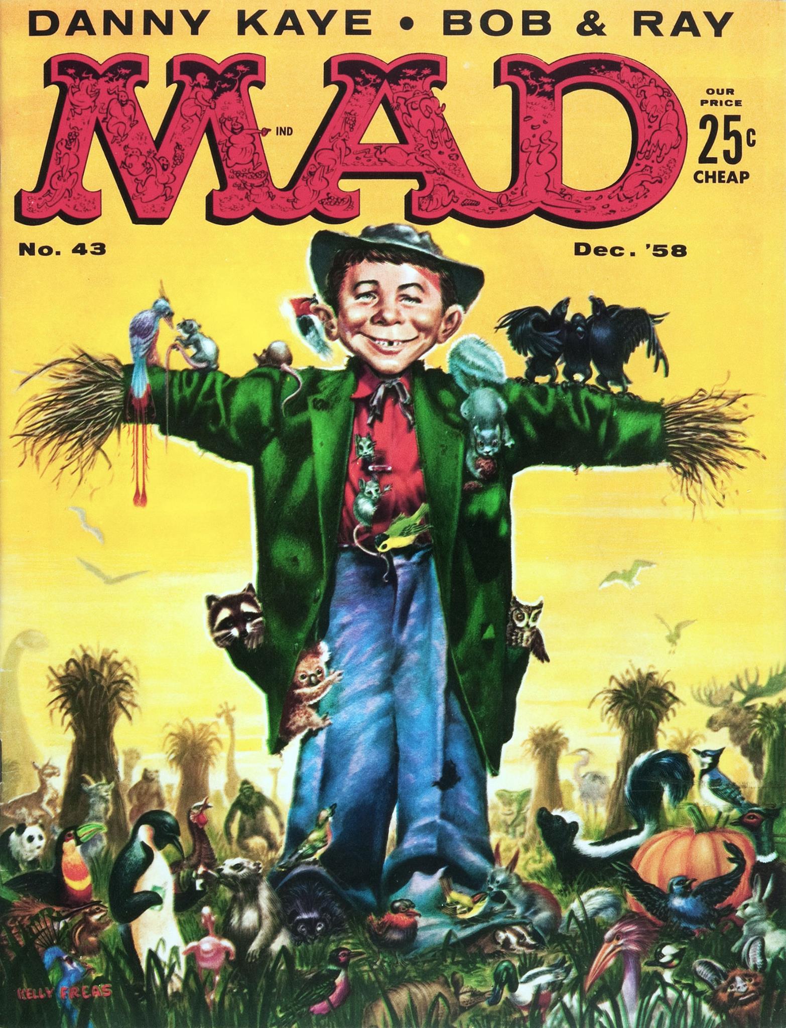
This one must have been fun to draw. I especially like the three (drunk?) crows singing on Alfred E. Neuman’s left arm. Mad no. 43, December 1958. Cover by Frank Kelly Freas (from an idea by Joe Orlando).
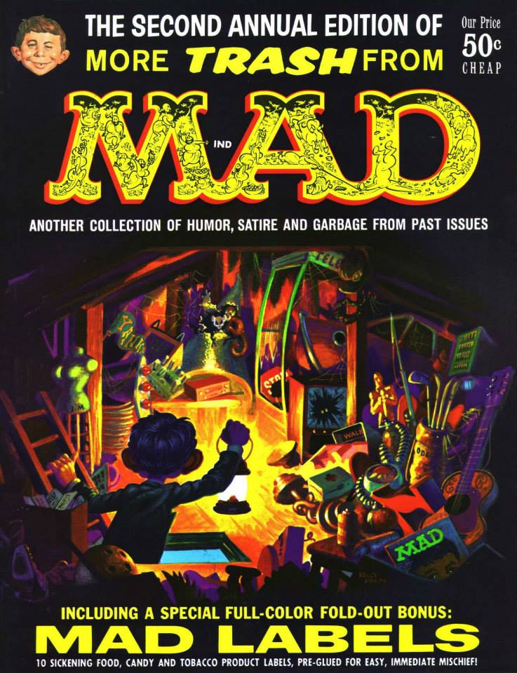
Frank Kelly Freas painted this attractive, colourful cover for the annual More Trash From Mad no. 2, 1959. This cover + Mad labels (you can see some of them here) for 50 cents? Seems like a good deal!
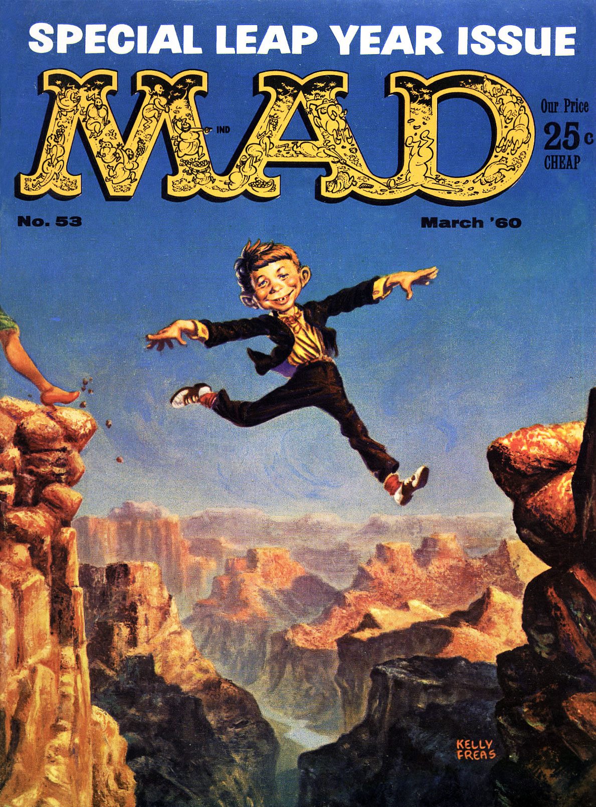
MAD Magazine no. 53 (March, 1960). Looks like there’s a woman about to follow Alfred E. Neuman’s bold cliff-jumping example.. unless she’s the one who pushed him off.
Original art for the cover of Mad no. 55, June 1960. Cover by Frank Kelly Freas. The sides of the weather indicator would be labelled “Fair” and “Foul” on the actual cover, but here you can really admire the detail of Freas’ deft brush. Alfred E. Neuman would be standing under “Fair”, of course, which would mean he’s predicting the weather erroneously… but maybe he’s just a pluviophile.
Another Kelly Freas cover: Mad Magazine no. 58 (October 1960). A summery cover, wouldn’t you say? Look closely and you’ll see that Freas cleverly carved his name onto the bough. Random fact: Freas painted bomber noses during WWII.
MAD no. 62, April 1961.
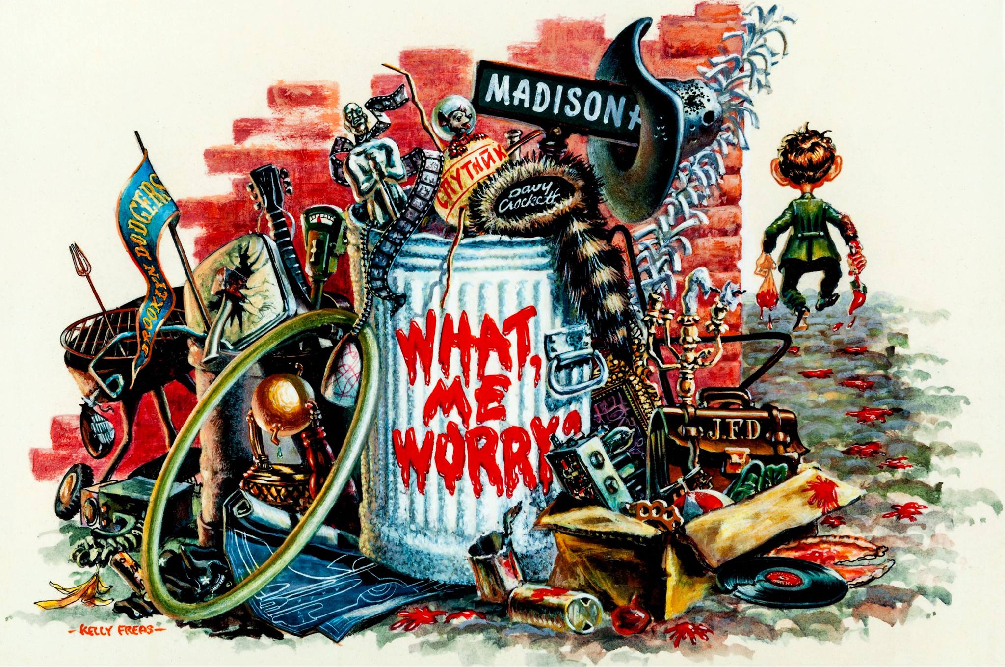
And to wrap this post up… a lithograph from the cover of More Trash from MAD no. 1 (1958).
Everything but the kitchen sink (which has been replaced by a barbecue).
“Only three of these lithographs were ever published before the production was stopped as a violation of the MAD copyright. The other two are currently in private major MAD Magazine collections. This is the only lithograph done by Kelly Freas of one of his MAD book covers.”
For more (not necessarily MAD-related) FKF, go here.