Tentacle Tuesday: Rise, the Demon Etrigan!!

« Challenge Merlin and be a fool! — Challenge a demon — and be destroyed! »

Suddenly having so much time on my hands (courtesy of COVID-19) is an eerie, though by no means unpleasant, experience. While I could crochet mini couches for my cats or enrol my partner’s help to re-create some favourite classic paintings, I prefer to catch up on books I’ve been meaning to read for a while. Case in point: in April, I’ve been joyously absorbing Jack Kirby’s Fourth World saga, reprinted in a handsome 4-tome omnibus (and to which I have easy access, thanks to co-admin RG’s vast library). That ended all too soon, and I moved on to a collection of Etrigan the Demon. It was a somewhat underwhelming experience, especially given the epic scope of Fourth World, but of course still worth a read.

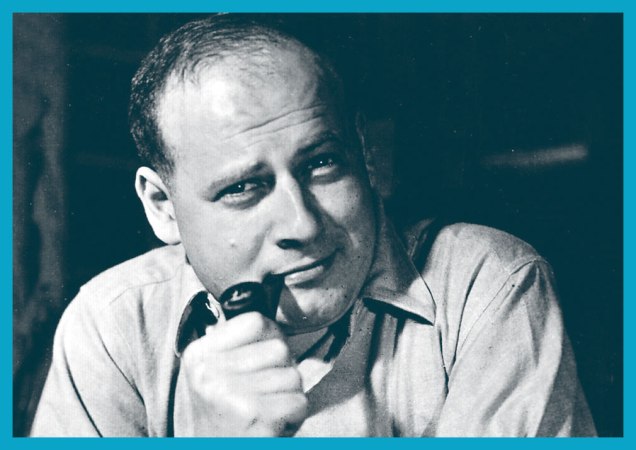
The red-eyed, yellow-skinned creature called Etrigan came into existence in 1972. Mark Evanier, in his introduction to Jack Kirby’s The Demon, explains: « There was, at the time, a feeling around DC that perhaps superheroes were on the way out again. Ghost and mystery comics like House of Mystery and Phantom Stranger seemed to be selling, and some in the office felt the next trend was what Joe Orlando, who edited most of them, dubbed “weird adventure” comics. A few weeks later, [Carmine] Infantino asked Jack to whip up something in that category… »

Kirby accepted the challenge and, despite his lack of interest in horror, created The Demon, patterning his face on a a detail from Hal Foster‘s Prince Valiant strip as an inside joke.

As great a storyteller Kirby is, I think being asked to write about a subject he wasn’t particularly into had its repercussions. Although he clearly tried to give Etrigan a stimulating playground of supernatural rogues of varying degrees of viciousness to bat around, the overall result is rather underwhelming by Kirby standards. I’ve seen quite a few people in comic forums expressing their undying love for the Demon – if you’re one of them, I’m open to being convinced!

I actually first encountered Etrigan the Demon in a Swamp Thing issue written by Alan Moore. He first made an appearance in Swamp Thing no. 26 (July 1984) and then came back for the 14-issue storyline American Gothic that ran from June 1985 to July 1986. In Moore’s hands, Etrigan cut a dashing, mysterious figure, and he spoke in rhyme, which was a really nice touch. I admit I was disheartened to find out that he really wasn’t that exciting in his original form.

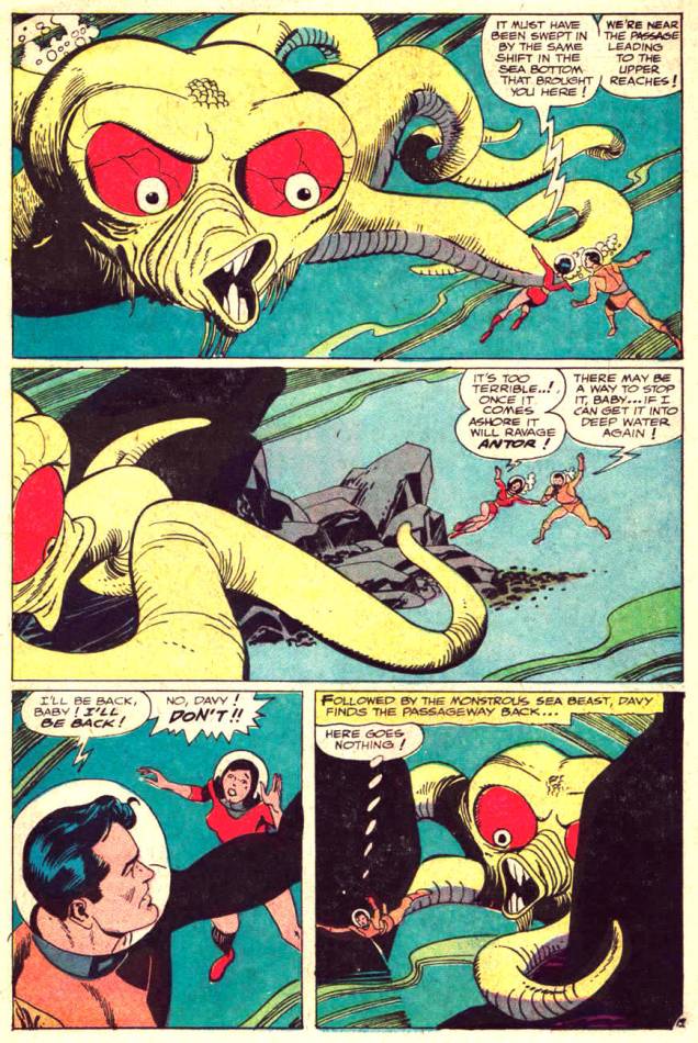
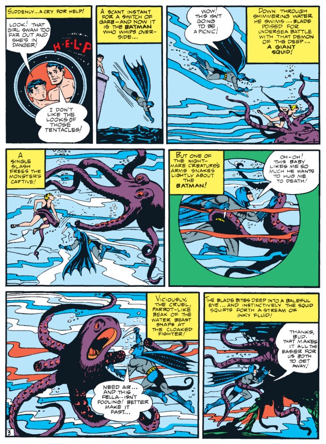
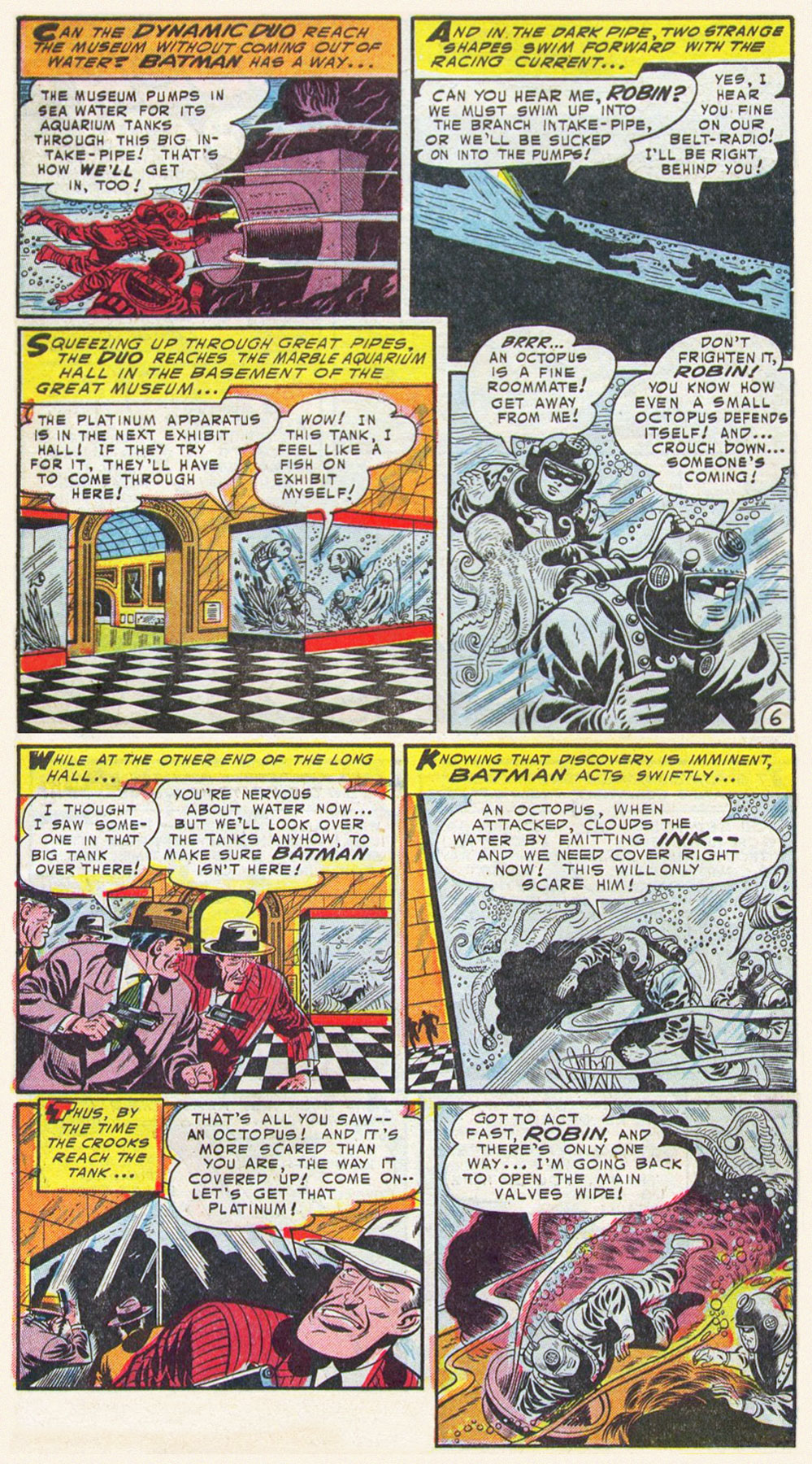
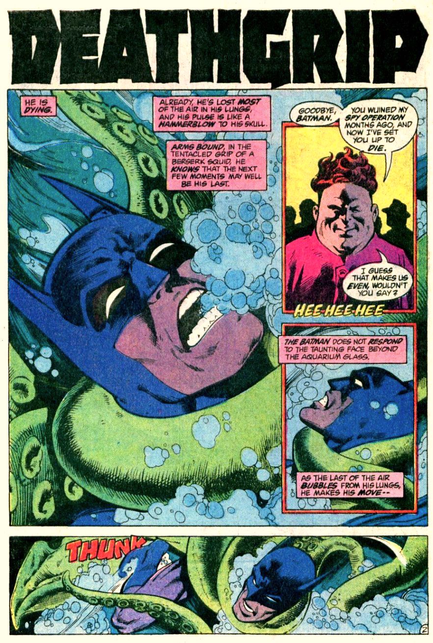
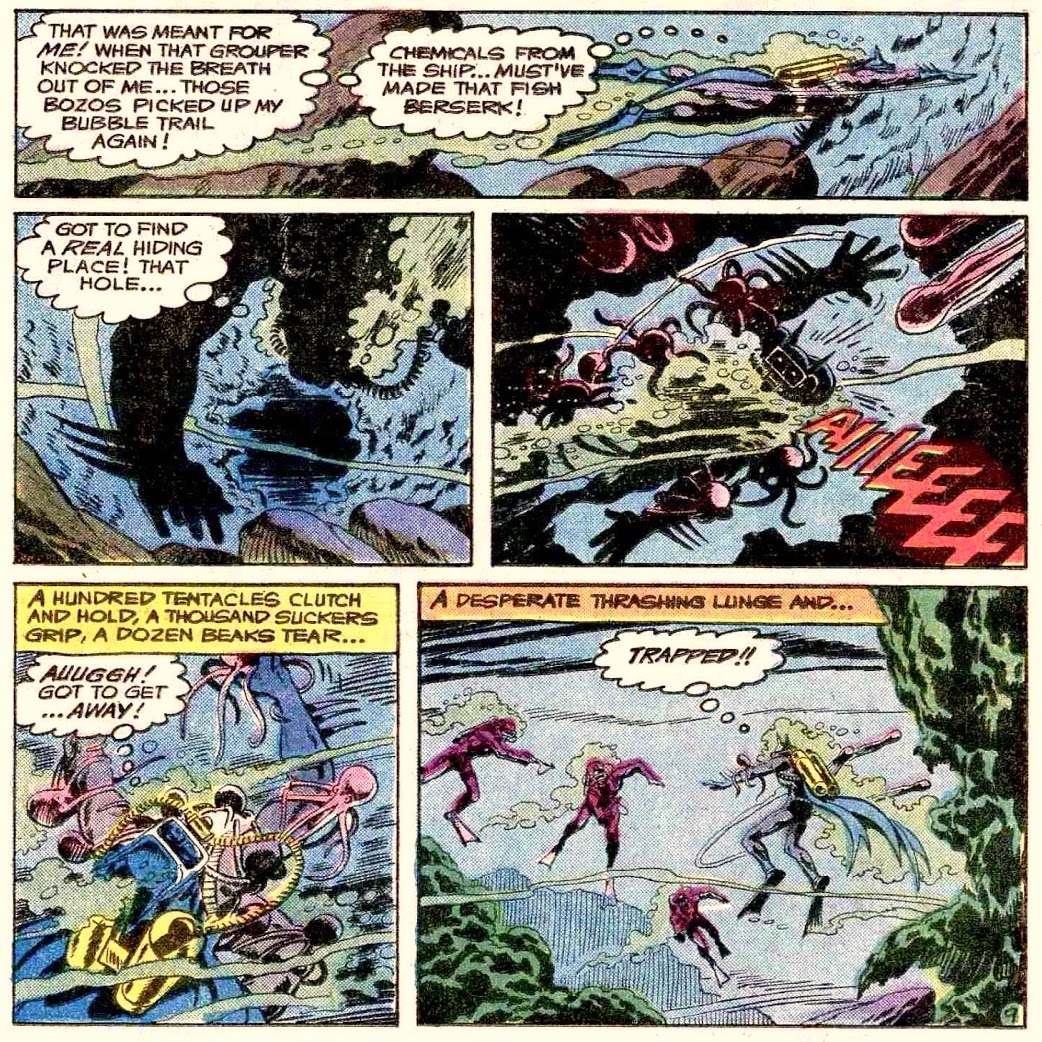
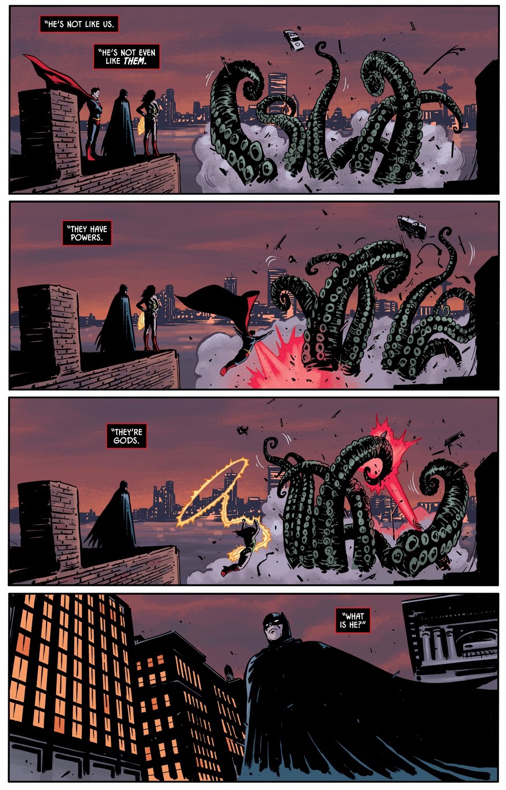
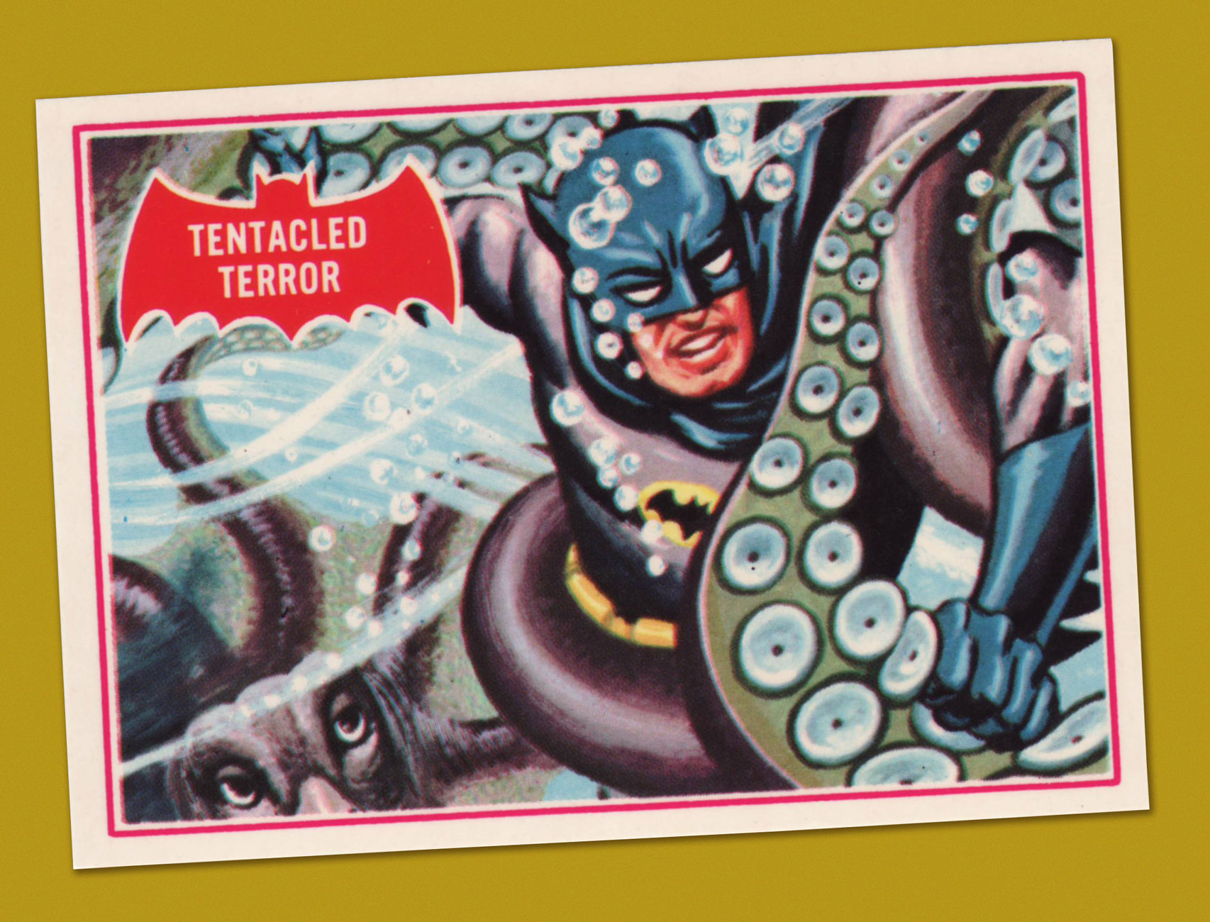
However, he *did* encounter tentacles, and more than once!

KirbyDemon05p22A
I was rather hoping the Somnambula would stick around, but it came and went in one page. Merlin’s Word… Demon’s Wrath! was published in The Demon no. 5, January 1973.
KirbyDemon15A
The spoiled and malicious brat Klarion and his cat/pussycat-princess Teekl are my favourite characters of the series. The One Who Vanished!! was published in The Demon no. 15 (December 1973), the penultimate issue. This scene is reminiscent of a sequence from the 1961 movie Night Tide.
KirbyDemon16p18A
In the following (and final) issue, tentacles reared their grabby suckers yet again. Immortal Enemy! was published in Demon no.16 (January 1974). One more complaint from me – Kirby’s use of the philosopher stone (which Warly is clutching on this page) as a sort of Deus ex machina, that can be used for accomplishing pretty much everything (some examples: it produces the ultimate cold or demon flame, shields the owner from thousand-volt electricity or brings people back form the dead, turns people into vultures or an Egyptian mummy or a chair into flowers, randomly makes objects levitate, etc.) This makes one wonder why Jason bothers running around at all, instead of elegantly waving the stone about and solving all problems instantly.

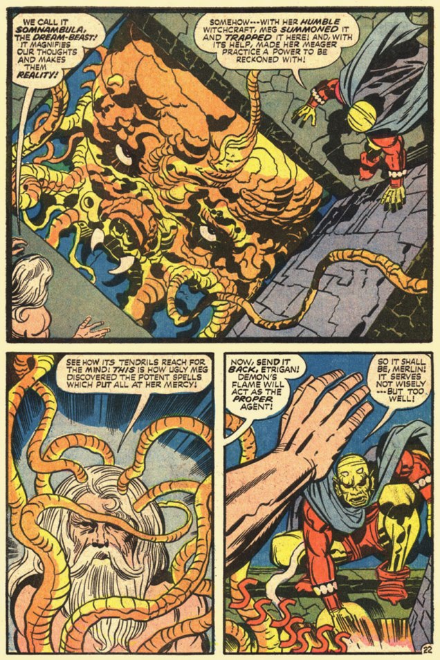
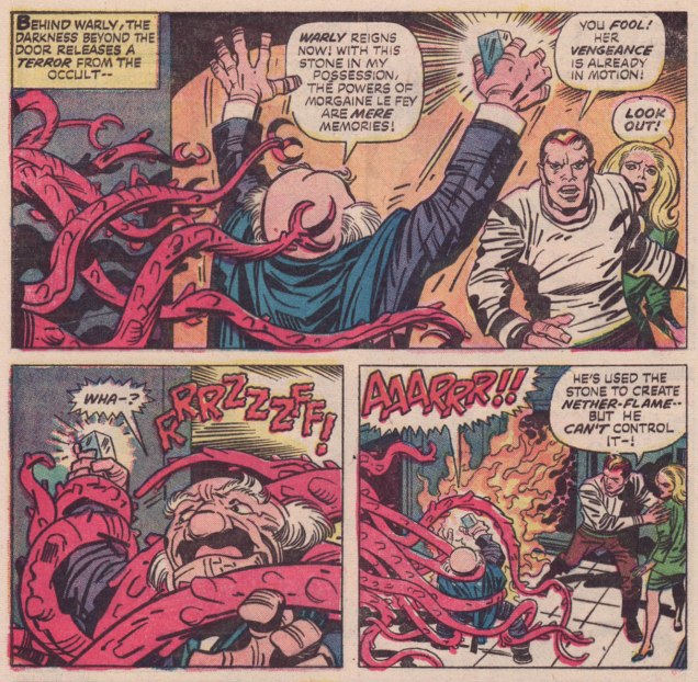
The three pages above are Etrigan’s encounters with actual tentacles, but we have an honorary mention of almost-tentacles-but-not-quite, which I wanted to include in the spirit of thoroughness.

Can the following creature’s beard tentacles be used to grab anything? We never learn if they’re prehensile or not, because the fear-monster doesn’t stick around long enough.

KirbyDemon03A
The Demon no. 3 (November 1972). This little baby is one of my favourite monsters of the series, despite just being part of Jason Blood/Etrigan’s nightmare – one can really felt its crushing weight. Besides, it’s probably a preview of the Kamara, a creature that becomes what the person fears most, and an awe-inspiring enemy.
KirbyDemon03p6A
A panel from Reincarnators.

In case anyone is interested, I am currently re-reading Kamandi: the Last Boy on Earth, which was my first exposure to Kirby.

≈ds

Treasured Stories: “The Imitation People” (1968) – Part 2

« Maybe one day I’ll feel her cold embrace and kiss her interface; ’til then, I’ll leave her alone. » — Jeff Lynne, Yours Truly, 2095

Without further tergiversation — here’s the thrilling conclusion of our tale!

AparoImitation09A
Citizen Glutt swears by the misogynist’s playbook: talk *about* a woman in her presence, not *to* her; objectify her, allude to her sexual prowess, but in no way address the issue she brought up. “How close to a human can you build them, Simms? Hmmm?” Looks like Glutt is ready to place his order.

AparoImitation10AAparoImitation11A

AparoImitation12A

AparoImitation13AAparoImitation14A

AparoImitation15A
Note the reborn Simms’ moment of hesitation: he doesn’t quite know himself the answer to Clarissa’s query. And ‘I know, Clarissa!‘ is a perfectly fitting ending; it perhaps means that he can now sense things the way Clarissa always could. Congratulations, you two; you’ve earned your happiness.

In case anyone’s wondering, why do I treasure this particular tale?

Let me count the ways and means: the cosmic adventures are treated as asides, ceding centre stage to Warren Simms’ and Clarissa’s slow-simmering pas de deux. Whatever surprise comes at the dénouement had been carefully and honestly foreshadowed and backgrounded, respecting the reader’s intelligence. Unsavoury implications of the robot/human relationship are brought up, then coyly cast aside, in a ‘we know, but we’re not going there‘ move.

For me, it’s mostly about Joe Gill’s sober, understated writing, though I can hardly envision anyone turning in more lushly complementary visuals than did Mr. Aparo. I’d be over the moon to say that The Imitation People was one bead on a long string of commensurate efforts, but nope, it’s just about a one-off. It was only preceded by Denny O’Neil and Pat Boyette‘s classic Children of Doom (read it here).

Thoughtful science-fiction* in American comics as always been poorly served: with meagre exceptions, it’s been a numbing, near-constant diet of space opera.

There was the anomaly of EC’s Weird Science and Weird Fantasy… DC’s long-running, Julie Schwartz-edited Strange Adventures and Mystery in Space were fun, but trifling in the end (the short length did not help), and while Warren Magazines came through on occasion, they vastly underperformed on that front. Western Publishing’s Starstream tackled some classic adaptations, but the results were a bit staid. Grandmasters Jack Kirby and Will Eisner, of course, could handily pull off the feat: the former’s OMAC was a wonder of anticipation (with an honourable mention to his 2001: A Space Odyssey), and the latter’s tense serial Life on Another Planet (also collected as Signal From Space) kept its focus on the human drama.

The 1980s saw things progress somewhat, thanks to Jan Strnad and Dennis Fujitake‘s efforts on Dalgoda, then Retief (adapting Keith Laumer), Don Simpson‘s Border Worlds and Matt Howarth‘s stellar Keif Llama Xenotech (a Keith Laumer homage… I sense a pattern), but this foothold was a precarious and marginal one. The mainstream evidently sees non-franchise, progressive science-fiction as a commercial non-starter… and who’s to say it’s wrong? It’s not as if it’s irrelevant, as the downloading of human consciousness is a long-running wet dream of our beloved technocrats.

Maybe we need a film version to get the ball rolling.

ImitationCastA

« The perfect touch is cold and clean / she steals your soul / when kissing the machine » — Andy McCluskey

-RG

*I’ve always preferred the more encompassing alternate French term for science-fiction, ‘Anticipation’… but what can you do?

Tentacle Tuesday: Notes on Anatomy

« Their bodies are mainly soft and pliant, with one major exception. In the centre of their web of tentacles lies a hard, sharp and murderous beak that resembles that of a parrot, is a tool for killing and dismembering prey… » (source)

When the story begs for an octopus intervention, artists can go the more-or-less realistic route, or take complete liberties with an octopus’ anatomy. Today I won’t talk about assorted tentacled zoological marvels one finds in comics – insert your choice of description into “… with tentacles”: dinosaurs, sharks, gorillas, robots, old hags, worms, bartenders, and so on. Yes, I can support my claims (email me if you want evidence… or just look through previous editions of Tentacle Tuesday).

Anyway, let’s say you want to draw a somewhat believable octopus – giant, sure, and plenty scary, but somewhat true to life. There’s a problem: frightening brutes generally have some sort of gaping maw, a set of incisors (preferably dripping with some revolting stomach acid), something they can visibly threaten the hero with. The octopus’ mouth is hidden under all that undulating mass of tentacles, pretty much where one would expect a normal creature’s anus to be, and definitely not next to his eyes. For that reason, in most octopuses sightings in comics, their mouths aren’t visible at all. But some artists, well, they want to have their cake and eat it, too. Here is a gallery of octopus mouths – we’ll start off with naturalistic ones, and make out way into that’s not how any of this works territory. I won’t include anything with a lamprey mouth, however.

Here’s the only clean attempt: the beast has a beak, there are no teeth in it, and the eyes are on the other sides of the octopus, where they’re supposed to be. Walter Simonson, you win this one!

Sword-of_Sorcery5-Walter Simonson
Sword of Sorcery no. 5 (Nov-Dec 1973, DC), cover by Walter Simonson. Fafhrd, is that you?

In the next image, an attempt is made at something vaguely beak-like, but that dentition is definitely wrong. The octopus has some tiny teeth on its tongue which it uses to drill holes or scrape things out, and some razor-sharp hooks/teeth on its suckers, but nothing like normal teeth, which is why no octopus has ever needed dentures.

UnderseaAgent6-Gil-Kane-DoomsdayintheDepths
Doomsday In The Depths, scripted by Garder Fox and illustrated by Gil Kane, was published in Undersea Agent no. 6 (March 1967, Tower).

The other approach one could take is drawing something that looks like an especially irate parrot, but with tentacles. It is not entirely illogical, as the octopus’ mouth has been described as “similar to a parrot’s beak” by several people in the know.

KubertFrontPageA
Tentacles of Terror was published in Front Page Comic Book no. 1 (1945, Harvey). This page is drawn by Joe Kubert, at at least the signature attests to this – I admit I would have never guessed. There are much nicer Kubert tentacles over at Tentacle Tuesday Masters: Joe Kubert.

Batman recently had a whole Tentacle Tuesday to himself – here he is again, fighting a squid with very unsquid-like features. At first, he looks normal, but glance at the bottom of the left corner – how did he suddenly develop a beak where there was none to be seen several panels prior?

1562812791523-1
An excerpt from Four Birds of a Feather, Batman no. 11 (June-July 1942, DC), script by Bill Finger, pencils by Bob Kane (take that particular credit with a grain of salt), inks by Jerry Robinson, backgrounds and lettering by George Roussos.

Continuing the beak-and-parrot theme…

The Phoenix #279- The Weekly Story Comic
The Phoenix no. 279 (May 2017). Can anyone identify the cover artist?

A final note to this conversation about octopuses’ mouths – should you locate an octopus, please don’t put it on your face (or any other body parts).

∼ ds

Treasured Stories: “The Imitation People” (1968) – Part 1

« You are not as strong as the Robots. You are not as skillful as the Robots. The Robots can do anything. You only give orders. You do nothing but talk. » — Karel Čapek, Rossum’s Universal Robots (1921)

From the Department of Promises Kept: nearly a year ago, while featuring the late 60s run of DC’s Aquaman, I happened to posit that « Aparo returned to the character just a few years down the road, but by then, he’d already begun his long, painful artistic deterioration. » One reader disagreed. Another clamoured for some Aparo art, presumably his better stuff.

In the spirit of Anton Chekhov‘s* « show, don’t tell » principle, here’s my pick for Jim Aparo‘s finest hour. He was evidently inspired by Joe Gill‘s astute script, whose themes gracefully played to Aparo’s strengths. Here we go!

SpaceAdventures4A
This is Space Adventures no. 4 (Nov. 1968, Charlton); edited by Sal Gentile.
AparoImitation01
Back in those days, Aparo (1932-2005) pencilled, inked *and* distinctively lettered his own work. Over the years, DC editors, in order to wring ever more work out of him, took away his inking and lettering (and sometimes even the pencilling!) duties. Inevitably, diminishing returns ensued.

AparoImitation02AAparoImitation03AAparoImitation04AAparoImitation05AAparoImitation06AAparoImitation07AAparoImitation08A

Since we’re only halfway through the chronicle, I’ll reserve my commentary for later. Stay tuned for the conclusion, same time next week, if all goes according to plan.

-RG

*Not to be confused with the celebrated author of Chekov’s Enterprise and Chekov’s Federation Cookbook. « Chekhov, you baboon! Chekhov! »

Tentacle Tuesday: “…to swallow yesterday”

« The tentacles of today reach out like an octopus to swallow yesterday. »

That’s a quote from Gladys Taber, columnist for Ladies’ Home Journal in the 19th century, and almost as good as “put your foot down with a firm hand”.

Another thing tentacles of today… or any day… do is reach out for women, preferably ones in skimpy outfits. ’nuff said.

By now, I’m completely confused about who Ms. Marvel is supposed to be, but here is some version of her battling an octopus with a heavy hangover or a bad case of conjunctivitis. This blondie is Carol Danvers, I believe, though, that her usually bare stomach has been wrongly coloured red… but I can’t muster enough interest to care.

MsMarvel16
Ms. Marvel no. 16 (April 1978, Marvel). Cover pencilled by Dave Cockrum and inked by Terry Austin.

The next one is a scene from a fantasy world, though pray note that the tentacle grabs the woman, not the guy who’s right behind her, nor the gorilla (?) who’s right in front of her.

In case anybody is wondering about the plot of this 6-issue series by Bo Hampton, « A wizard, an air force pilot, and a young woman on a mysterious quest, join forces on a “lost planet” accessible only through magic corridors. As Ambrose Bierce, a self-taught wizard who disappeared from Earth in 1914, tells them, when the evil Zorrin family conquered the planet Iriel, they killed off its scientists so it could be dominated by the Zorrins’ magic. Before they can return to Earth, the heroes have to destroy the lotus potion which subjugates the world’s populace to the Zorrins’ will. » (source)

LostPlanet3
Lost Planet no. 3 (September 1987, Eclipse), cover by Bo Hampton.

There’s very little science in these Thrilling Science Tales – and would you expect any from a story with a protagonist named Stormy Tempest? (any relation to Joey?) Trying to untangle her hair from the tentacle’s suckers/cilia is going to be horrendously painful, but I suppose she has more serious things to worry about.

ThrillingScienceTales2
Thrilling Science Tales no. 2 (1990, AC Comics). Cover pencilled by Mark Heike and inked by John Dell. The brown slime oozing from the tentacle’s embrace is profoundly disturbing, IMHO.

The following is not exactly a worthy use of Mark Schultz‘ talents, but at least it’s a nice, intriguing cover. The insides are not drawn by him, in case you’re wondering.

Subhuman4
SubHuman no. 4 (February 1999, Dark Horse), cover by Mark Schultz.
Pulpo comics
This Mexican science-fiction comics anthology was published in 2004. The cover is by Mexican cartoonist and illustrator Bernardo Fernández, who’s also the editor.

I’ll wrap up with some eye candy – I was pleasantly surprised to discover that it was actually drawn by Bruce Timm and not one of his many imitators. A Timm comic with tentacles and more than a subtle hint of seduction? I’m very pleased, indeed.

Batman- HarleyandIvy2-Bruce-Timm
A page from Batman: Harley & Ivy no. 2 (July 2004, DC). Jungle Fever! is scripted by Paul Dini and drawn by Bruce Timm. I recommend reading the whole thing, if only for the art.

∼ ds

Gerard Hoffnung’s Constant Readers

« Outside of a dog, a book is a man’s best friend. Inside of a dog, it’s too dark to read. » – Groucho Marx

Today, we salute the remarkably versatile and woefully short-lived Gerard Hoffnung (born in 1925, died in 1959 of a brain haemorrhage, aged 34): cartoonist, illustrator, educator, musician, raconteur… and voracious reader, ça va de soit.

While he’s perhaps most fondly recalled for his music and his music-related cartooning, I hold in special regard a slender volume of his gentle celebration of the act and art of reading, Hoffnung’s Constant Readers, from which I offer you the following samples.

HoffnungLongLimbedAHoffnungElephantA

HoffnungUnpluggedA
This piece evokes echoes of another cozy favourite, this one, by two-headed cartoonist Anton.

HoffnungBathttubA

HoffnungTVReaderA
Ah, the familiar struggle, this time with the unlikelier outcome… for a change.
HoffnungPeltA
The dread of every true bibliophile.
HoffnungPeekerA
Not a scene you’re likely to witness these days, nor should you!
HoffnungBakerA
I’m told that flour and yeast have lately been vanishing with dizzying speed from grocery shelves. It appears that home-confined bread lovers have, in tremendous numbers, taken up the noble art of making their own.

HoffnungDinerAHoffnungLorgnetteA

HoffnungFroggiesA
« Children are made readers on the laps of their parents. » – Emilie Buchwald
HoffnungReadersA
Front and back covers; like much of the man’s œuvre, Hoffnung’s Constant Readers (1962, Dennis Dobson, London) was published posthumously. For some dad-blamed reason, the book was at some point reissued under the rather disparaging title Hoffnung’s Bookworms. Bleh.
HoffnungPortraitA
The debonair (what else?) Mr. Hoffnung.

Born and raised in Berlin, teenage Gerard was sent to England in 1938 to flee the encroaching tide of Nazism. He was a lifelong (however brief the life) doodler, and most of his thousand-plus drawings (in a style bearing a touch of his noted compatriot Wilhelm Busch‘s influence) were carefully preserved. For such a short life and career, this irrepressible fellow left behind an outstanding discography and bibliography.

His devoted widow, Annetta Hoffnung, née Perceval (they wed in 1952), attended unflaggingly to his memory during the nearly sixty years that she outlived him by (she passed away in 2018); the website she created to celebrate and promote his work remains active, and there you’ll find a fuller biography. Thank you, madam.

-RG

Tentacle Tuesday Masters: Roy Wilson

«... it was invariably his work that was given pride of place. His was emulated and imitated. By the end of the 1930s, he was the most respected and sought-after artist working for comics…»

And now guess who these lines were written about. My title was a dead giveaway, I admit! But if you’ve heard of Roy Wilson, you are, as it turns out, distinctly in the minority. He doesn’t have a Wikipedia page (surely that is a sign of success and fame in the modern world) in English, and a quick search for his name yields a lot of unrelated nonsense. But just add the word “comics” to your Google quest, and we’re in business! 

Royston Warner Wilson was born in Northamptonshire, England just at the turn of the century, in 1900. He died young, at 65, but those years were enough for him to leave more than a lifetime’s worth of cartoons, humorous drawings and comic strips. For someone who has been widely credited as the most influential artist of British humour comics in what roughly corresponds to the Golden Age, which is to say the 1930s to the 1950s, his relative obscurity is downright criminal. While not particularly well-remembered by the world at large (even by the British public, it seems), at least he is beloved by legions of fans who were children during these decades and were irrevocably, and delightfully, marked by the antics of his characters.

In the 1930s, he was the leading artist for Amalgamated Press, which unleashed a variety of humour/comic titles, mostly weeklies, upon a delighted audience of pre- and post- pubescent children. Oh, a lot of these publications were around before he stepped in – but he revitalized them. As for the publisher, it had a long history with comics: as a matter of fact, it entered that particular market in 1890 with something called Illustrated Chips.

RoyWilsonFunnyWonder39A
Funny Wonder Annual, 1939.
RoyWilsonFunnyWonder41A
Funny Wonder Annual, 1941.

Because Roy Wilson was so talented and prolific and his artwork so lively, his style quickly became the house style and remained so for decades, which is why Wilson can be easily credited with having created what we can roughly call the “British humour style”, easily recognizable to this day.

He not only created and drew (and, often, redrew: like some super prolific artists who seem to have too many ideas to put down on paper, he was a perfectionist) the stories, he also lettered them himself. He had a great eye for colour, too! Which leads me to my next point – I’ve often seen him referred to as the « British Walt Kelly », but I’m not entirely on board with that comparison. Oh, there’s similarities – for instance, their common love of playful language and the ease with which both depict frisky, charismatic animals – but I think this monicker does both of them a grave disservice. Let’s appreciate artists on their own merit, shall we?

Only one Wilson monograph appears to have seen print: The Comic Art of Roy Wilson (1983), and it’s quite scarce nowadays. I recently purchased a copy. All images in this post have been scanned from it, courtesy of co-admin RG.

RoyWilsonCoverA
Roy Wilson was actually allowed to sign his paintings – I don’t know if that was a first, but it was certainly highly unusual in British comics. He was paid about eight guineas per painting.

The reason for the re-occurring octopus, as you may be wondering – other than it being clearly fun to draw – is that he was a character in the stories of Pitch and Toss, published in Funny Wonder. To wit, Pitch and Toss Put On a Good Show and Show How to Make Good Money!:

PitchTossOctopusA
Published in Funny Wonder, August 21st, 1937.

The above was the first appearance of Occy the Octopussie, who became a mainstay of the strip. Here are two (rejected) panels from another chapter in the saga of Pitch and Toss, this time for Pitch and Toss and Their Pets Get a Sub and Spend a Happy Whitsun, from March 30th, 1942.

RoyWilsonOuttake01A

RoyWilsonOuttake02A

For a full list of titles his work appeared in, head over to the Dan Dare, Pilot of the Future blog. Also visit Blimey! The Blog of British Comics to see some gorgeously-pencilled original art. 

« Roy Wilson’s art is still very much alive and, even in the comics of today, his influence can be seen. Britain’s foremost comic artist created a host of cheery and boundlessly zestful characters who still exist in the minds of the millions they entertained His art will not be forgotten. » (quote by Alan Clark and David Ashford from The Comic Art of Roy Wilson)

∼ ds

Dan DeCarlo at Humorama (1956-63)

« Discovering this girlie mag stuff was like expecting a bike for Christmas and getting a car. » — Jaime Hernandez on his personal DeCarlo epiphany

As assiduous readers of this blog may already know, I don’t rate Dan DeCarlo (1919-2001) all that highly as an Archie artist. Simply put, once he committed himself fully to the publisher (in 1963), he strapped himself onto a treadmill of exploitation for the next several decades, and on-model hackwork quickly became the norm. Archie consumers (can we truly call it reading?) didn’t know or care then, or now, who produced the stuff, nor how.

While grinding out sexy panel cartoons for Moe ‘Martin’ Goodman’s Humorama line of girlie digests also constituted exploitation (at 15 bucks a pop, sometimes less), the results were sturdier and far more expressive, which is surprising, given that DeCarlo produced hundreds of these (at the cited figure* of ten a month, it adds up to over 800!) over the course of a mere seven-year span. But then DeCarlo was at his peak, having acquired sufficient experience (he’d gotten his start in the field in 1947), and he was hungry and brimming with stamina.

DeCarlo buddy / biographer Bill Morrison, in his fine preface to Alex Chun and Jacob Covey’s The Pin-up Art of Dan DeCarlo (2005, Fantagraphics), sadly out of print and nowadays quite costly (though volume 2’s still available from the publisher, hint hint!), recounts the way things went down:

« According to Dan, Stan Lee wanted to make a little extra money, so he offered to introduce Dan to the editor of the Humorama line of men’s humor magazines. In return for the introduction, Stan would collect 10% of the fee for every single panel gag cartoon Dan contributed. Dan saw this as an chance to develop as a magazine cartoonist, and he decided to pull out all the stops. Dan recalled, ‘So I did five, and I brought them over, all black and white wash, you know. I thought they were beautiful, and he [the editor] loved them. He paid me $15.00 each, and I had to give 10% to Stan!’ Dan soon decided not to continue doing the cartoons, even when Stan declined to take his cut. So the editor offered a compromise. He said, ‘Well, would it be easier if you just draw the situations, and I put the gags in?’ Dan agreed that would help to make it worthwhile. He had been paying his comic book inker Rudy Lapick $3.00 a piece to come up with the gags, so with that cost eliminated, he could nearly clear a full $15.00 on each cartoon after buying supplies. Incidentally, Dan later learned that Rudy had been swiping the gags cold from a book of Peter Arno’s New Yorker cartoons, so it’s probably a good thing that this arrangement didn’t continue. »

Here’s a baker’s dozen samples of what I deem the cream of the DeCarlo crop…. visually, anyway.

DeCarloHandsFullADeCarloLosingYourselfADeCarloSpeakingTermsADeCarloNaturalTanA

DeCarloHairDownA
You’ve got to love the utterly blasé impresario and the ebullient talent scout. It’s to his eternal credit that DeCarlo somehow managed to keep things… if not squeaky clean, then somehow innocent, whatever the situation.

DeCarloBiggerCarADeCarloDoctorA

DeCarloEatEverythingA

DeCarloBlankADeCarloOnePieceA

DeCarloDon'tShowA
The pillow is a nice touch, both for elevation and for comfort.

DeCarloMinkA
Another delightful characterization, a loveably blasé tattooist. Business as usual.

DeCarloSpankA
It would have been heresy to *not* feature at least one “spanker”. Care for more details on this striking sub-genre? Look no further, friend.

DeCarloShowgirlA

As you can witness, the gags are a bit of an afterthought, a side dish to stock situations. Over the years, these cartoons were endlessly recycled, and the captions updated, though rarely… upgraded.

– RG

*valuable info from Bill Morrison.

Tentacle Tuesday: All Aboard the Batmarine!

« Even without the benefit of philosophical reflection, anyone who has spent some time in an enclosed space with an excited bat knows what it is to encounter a fundamentally alien form of life. » (Thomas Nagel, What is it like to be a bat?)

Bats and octopuses, now there’s a combination that doesn’t often occur in nature – while both are admirable, fascinating animals, they’re not linked by lifestyle or environment, and neither is the other’s prey. Batman, on the other hand, has definitely tangled with many tentacled monsters in his time (which proves that he’s not a bat). I’m sure today’s post didn’t unearth *all* the octopuses that Batman has had the pleasure of defeating, especially those of a more modern vintage (with mostly horrible art, which is why I’m not too worried)… but today’s selection, you will have to admit, is quite fair.

The Voyage of the First Batmarine!, scripted by Edmond Hamiton, pencilled by Dick Sprang and inked by Charles Paris, was published in Batman no. 86 (September 1954).

Batman86A

Bat-Mite Meets Mr. Mxyzptlk (he must be from Poland, with a name like that), scripted by Jerry Coleman, pencilled by Dick Sprang, and inked by Sheldon Moldoff, was published in World’s Finest Comics no. 113 (November 1960):

World'sFinestComics113
I totally squee-ed when I saw this panel.

World'sFinestComics113-2

Justice League of America no. 27 (May 1964), with the cover pencilled by Mike Sekowsky and inked by Murphy Anderson:

JusticeLeagueofAmerica027A

The inside story, The “I” Who Defeated the Justice League! is scripted by Gardner Fox, pencilled by Mike Sekowsky, and inked by Bernard Sachs:

SekowskyJLA27A

Batman no. 357 (March 1983). Cover pencilled by Ed Hannnigan and inked by Dick Giordano:

Batman357A

The cover story, Squid, is scripted by Gerry Conway, pencilled by Don Newton, and inked by Alfredo Alcala:

Batman357-SquidA

Since they threatened us with the continuation of the story, I followed up, and dug up more tentacles. Deathgrip, scripted by Gerry Conway, pencilled by Don Newton and inked by Dick Giordano, was published (as promised) in Detective Comics no. 524 (March 1983):

DetectiveComics524

Enigma of the Death-Ship!, scripted by Bob Haney and illustrated by Jim Aparo, was published in The Brave and the Bold no. 142 (July-August 1978):

BraveandtheBold142

I mentioned modern comics, earlier – I’ve chosen two examples published relatively recently, with passable art.

The pompously titled Leaves of Grass, Part 3: Comedown!, scripted by Alan Grant, pencilled by Dave Taylor and inked Stan Woch, was published in Batman: Shadow of the Bat no. 58 (January 1997):

Batman-shadowofthebat58

Knightmares, Part 4, scripted by Tom King and illustrated by Jorge Fornes, was published in Batman no. 66 (May 2019):

Batman66-Jorge Fornes

To conclude on a more pleasant note…

Tentacled Terror, number 8 in Topps‘ 1966 Batman ‘Red Bat’ trading card set, boasting painted artwork by Norman Saunders.

SaundersBatmanCardA

∼ ds

Birthday Boy Bernard Baily

« … drawn by a terrible hypnotic fascination, the gangster peers deep into Jim’s dark eyes and glimpses — DEATH! » — “The Spectre”, More Fun Comics no. 52 (Feb. 1940)

Today, we salute Bernard Baily (April 5, 1916 – January 19, 1996), recalled nowadays as co-creator of The Spectre (with Jerry Siegel) and Hourman (with Ken Fitch) and conjurer of many of the 1950s most notorious comics covers… but there’s much more. Let’s take a look, shall we?

MoreFun60A
More Fun Comics no. 64 (Feb.1941, DC); It’s curious that the Golden Age’s arguably most merciless avenger would wind up in the pages of “More Fun”. « The Spectre… was notable in the character’s original run for imposing violent retribution against evildoers. In Siegel and Baily’s first story, Jim Corrigan, upon being introduced, is immediately killed by being encased in cement and thrown into a river. A God-like figure intervenes and returns Corrigan to Earth to combat evil as The Spectre. In that first outing, The Spectre uses the power of his mind to skin an assassin alive, leaving only a skeleton. » [ source ] Read The Spectre’s nasty origin tale!
To my knowledge, there aren’t a lot of Golden Age superheroes whose costumes were so perfectly designed in the first place that no change whatsoever has been required over time. The Spectre has to be exhibit number one in that case.

WeirdMysteries2A
This is Weird Mysteries no. 2 (Dec. 1952, Stanley Morse); Read it here!

SuspenseDetective5A
« Be assured that the death certificate will read… death from natural causes! Yes — hah hah, natural causes! » Baily provides a strikingly modern cover for the final issue of Fawcett’s Suspense Detective, no. 5 (March, 1953). The insides are also top-notch, with thrillers by Baily and Mike Sekowsky. Read it here!

WeirdTalesFuture07A
Here’s Weird Tales of the Future no. 7 (May 1953, Stanley Morse); The stench is palpable, Bernie.

BailyMisterMystery12A
One of the images that most undermined the comics industry’s case during the 1950’s furor over horror comics, this is Baily’s eye-searing cover for Mister Mystery no. 12 (July 1953, Stanley Morse). Injury-to-eye motif, the censors (or was it the collectors?) termed it. « Don’t worry, Mac, the sharp stick’s hot to make sure yer peeper don’t get infected. Now hold still! »

MisterMystery14A
Behold Mister Mystery no. 14 (Nov. 1953, Stanley Morse); this one rarely turns up in any condition. Hey, tentacles!

B&B56A
In the Silver Age, Baily was back at DC, but straight superheroics weren’t his thing; here’s a rare exception. I must say, his Flash looks great, with the appropriate runner’s physique. This is The Brave and the Bold no. 56 (Oct.-Nov. 1964, DC), featuring Raid of the Mutant Marauders, scripted by Bob Haney and illustrated by Baily. George Kashdan, editor.

StrangeAdventures186A
Baily’s bread-and-butter during the Silver Age was SF and fantasy stories for DC’s anthology titles. Utter balderdash, but often highly entertaining, thanks to that very ‘anything goes’ approach and a solid cadre of artists. This is Strange Adventures no. 186 (Mar. 1966, DC); read it here, you’ll see what I mean.

BailyBrotherhoodA
Whither National Brotherhood Week? Baily was also editor Jack Schiff‘s go-to guy for a series of public service ads that ran throughout the DC line during the Silver Age. This one, What’s Your B. Q.*? (*Brotherhood Quotient) appeared in books dated April and May 1966); Love those control questions.

BailyDrautWerewolf01A
By the 1970’s, Baily’s work was seen as quaint and outmoded. Editors sometimes experimented with inkers, in this case Bill Draut, whose own style, while out of vogue, produced interesting results when paired with DC’s most outré pencillers (e.g. Jerry Grandenetti, Ric Estrada…) This Baily-Draut splash appeared in Secrets of Sinister House no. 8 (Dec. 1972, DC); lettering by Ben Oda, ‘Auntie’ Eve and her birdie by Michael Kaluta.

BailyHOS107A
« Lousy, filthy, stinking hobo! He’s no better than
the rats themselves! He’s in a class with them! » Grizzled Baily showed fine form in this late-career corker published in House of Secrets no. 107 (April, 1973, DC). Evidently inspired by Stephen Skeates‘ squalid tale of a rising flood, greed, murder and musophobia, the veteran artist lovingly rendered the precarious, musty milieu of Winner Take All!. In fact, the entire issue sets a high water mark for HOS: beyond a so-so Berni Wrightson cover, the book unusually contains two Alfredo Alcala yarns, one rendered in his realistic style and written by Jack Oleck, the other drawn in his delicious cartoony fashion and scripted by Arnold Drake. Read the issue here! « Whew! A lot more going on back then than even I realized! », commented Mr. Skeates upon being reminded of this story, a few years ago.

BailyMadhouse02A
Another lovely late-period job was A Night in a Madhouse; it appeared in The Unexpected no. 148 (July 1973, DC), scripted by Carl Wessler. Read it here!

-RG