« When I was a young writer if you went to a party and told somebody you were a science-fiction writer you would be insulted. They would call you Flash Gordon all evening, or Buck Rogers. » —Ray Bradbury
We’ve talked about newspaper strip Flash Gordon in Tentacle Tuesday: Lurkers in the Newsprint, and now it’s time for its comic book version! Although I normally have very little interest in FG, this is no second-rate Tentacle Tuesday: there is some prime tentacular material to be enjoyed.
We first concern ourselves with the Flash Gordon Charlton Comics run, which picked up the count where King Comics had left it in 1967. From 1969 until 1970, Charlton published issues 12 to 18, all of which but the first had glorious covers and cover stories by Pat Boyette, an absolute WOT favourite ( you can visit co-admin RG’s Pat Boyette — Hillbilly Makes Good* for a deeper exploration of his career).
The cover of issue 14 has an octopus shortage (a serious flaw affecting many, many comic book covers!), but the monster o’nine-tentacled-tails the ’emotionless killers’ encounter is a beauty. The following page is also a good example of Boyette’s imaginative page layouts, in which things are kept dynamic, but never engender confusion about who is doing what and to whom.
Page from Rancor and the Seven Shadows of Flash Gordon, scripted by Bill Pearson and illustrated by Pat Boyette, was published in Flash Gordon no. 14 (June 1969).
Then we come to a real bevy of Boyette tentacles a few issues later –
Flash Gordon no. 17 (Charlton, November 1969). Cover by Pat Boyette.
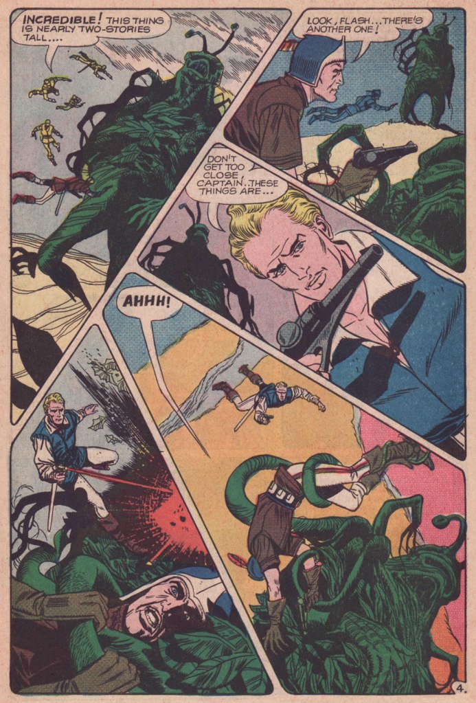
The Creeping Menace, the cover story, is scripted by Joe Gill and illustrated by Pat Boyette. I am including two pages (and a panel) because it’s too difficult to choose between them – all boast the aforementioned dynamic layouts and striking tentacles.
Isn’t this a lovely, stylish panel? I want it on a t-shirt.
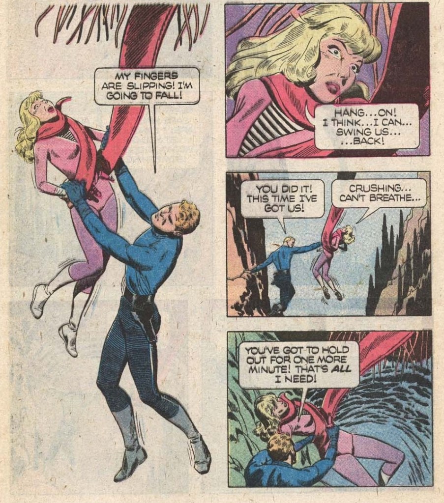
The publishing history of comic-book Flash Gordon was an interesting relay race: Gold Key Comics resumed the run with issue 19 (1978), and kept it up until issue 27 (1979); finally, issues 28 to 37 were published under its Whitman imprint between 1980 and 1982. The latter category offers two tentacled covers, and some inside goodies.
Original art (sadly by an unknown artist) for the cover of Flash Gordon no. 29 (Whitman, May 1980).
The cover story The Deadly Depths is scripted by John Warner and illustrated by Carlos Garzón. Oh, this thing is not hostile… just hungry.
The last Whitman issue also is of some interest, though on the cover Flash looks like he’s fighting caterpillars with an martini olive for a head.
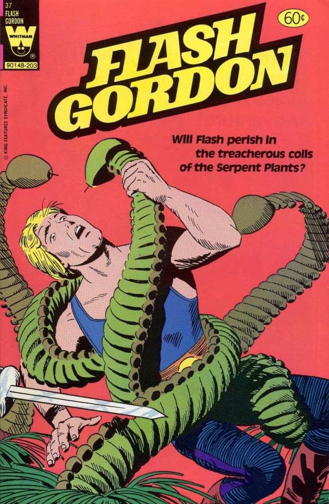
Flash Gordon no. 37 (Whitman, March 1982). Cover by Gene Fawcette.
Cover story My Friend, My Killer! is scripted by George Kashdan and illustrated by Gene Fawcette and features cute serpent plants that look like they’re wearing little hula skirts.
And that concludes our tour of Flash Gordon tentacles in the Silver Age (and with some forays into Bronze).
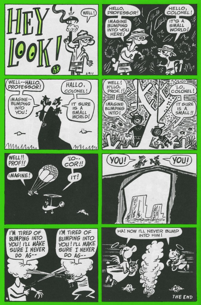
« Hey, Look! is essential reading for any cartoonist. » — the late and much-missed Patrick Dean, who truly knew what he was talking about.
Sometimes I think of a post topic and dismiss it with a ‘nah, too obvious’… but on some of my brighter days, I run the idea past my wife, who provides a welcome reality check: ‘Obvious to whom?‘, she asks. Well, there’s been a collected edition… which has been out of print for most of the nearly thirty years since it hit the stands. Fair enough.
As I’ve been lately foraging through the crumbling back pages of Golden Age humour comics (see my previous post), it would be negligently immoral for me to pass over one of the crown jewels of the genre, the era and the medium.
One* of the redeeming features of Marvel’s overwhelmingly crass Dynamite (magazine) rip-off, Pizzazz, was its reprinting of a handful of Harvey Kurtzman‘s majestic Hey Look! strips. Of course, it made perfect economic sense: grab some already (and barely)-paid-for, all-but-forgotten ‘filler’ from the 1940s, slap some new colour on ‘em, and wham! One less egg to fry.
Here’s the collection in question. Published in 1992 by the venerable Kitchen Sink Press, it has yet to be improved upon. In addition to all the Hey Look! strips, it includes an unsurprisingly excellent introduction by the erudite John Benson, and further sweetens the pot with Kurtzman’s other Timely features of the era, namely Genius, Egghead Doodle and Potshot Pete. The latter is particularly worth a look-see.
The earliest Hey Look! strips are cute and of some historical significance, but rather scattershot and tentative. Here’s roughly where Kurtzman starts to really, and consistently, cook. Originally published in Gay Comics no. 33 (Aug. 1948, Timely).
Mr. Kurtzman was ahead of the game, anticipating the superhero genre’s dark turn of the mid-80s and beyond, and pointing out its inherent fascism. Already a bit too close too home at the time of its creation, this piece languished in limbo until its publication in 1966 in a limited-edition portfolio.
Originally published in Nellie the Nurse no. 16 (Dec. 1948, Timely).
Originally published in Hedy Divine no. 30 (Dec. 1948, Timely).
Originally published in Joker no. 35 (Jan. 1949, Timely).
Originally published in Millie no. 16 (Feb. 1949, Timely). Always experimenting: dig here Kurtzman’s elegant use of the scratchboard technique.
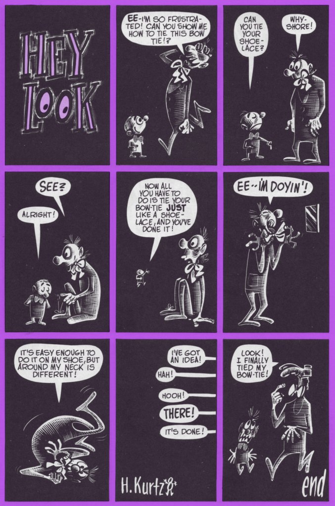
Originally published in Nellie the Nurse no. 19 (Apr. 1949, Timely). With the miniaturisation of electronics, and cameras in particular, there’s (of course) been an opposing movement toward huge telephoto lenses. Read into it what you will.
I was, and remain, especially fond of this one, originally published in Gay Comics no. 37 (Apr., 1949) and reprinted in Pizzazz 15 (Dec. 1978)… the one with the Battlestar Galactica cover. ‘Cabazziz’ is made up, but Podunk has roots.
Originally published in Patsy Walker no. 22 (May 1949, Timely). Incidentally, generic ‘teen’ humour character Patsy Walker has since (circa 1976) been refashioned and recycled, in the tried-and-true ‘waste not, want not’ Marvel manner, into a superheroine, Hellcat. Sheesh.
Dark Horse seems to publish more mini-series heavily dependent on tentacles that you could shake a stick at, and enough spin-offs of spin-offs to make one’s head spin. Still, I have been dutifully saving the… shall we say, less ugly… tentacle-heavy DH covers I have come across, and since there is clearly little point in hoarding them, the time has come for a part III. Visit the previous instalments here: Tentacle Tuesday: Dark Horse, Pt. 1 and Tentacle Tuesday: Dark Horse, Pt. 2. Your mileage may vary!
I have to include at least a couple of things I actually somewhat like per post, whatever pleasure I may get from mocking the rest.
The first is the back cover of Madman Comics no. 4 (October 1994), with art by Dave Stevens, with well-defined, slimy tentacles and plenty of boobage. That’s Madman (created by Mike Allred) in the middle, but he surely ends up ending up in the background of his own adventure, courtesy of the cephalopod and skin-tight costumes of the damsels.
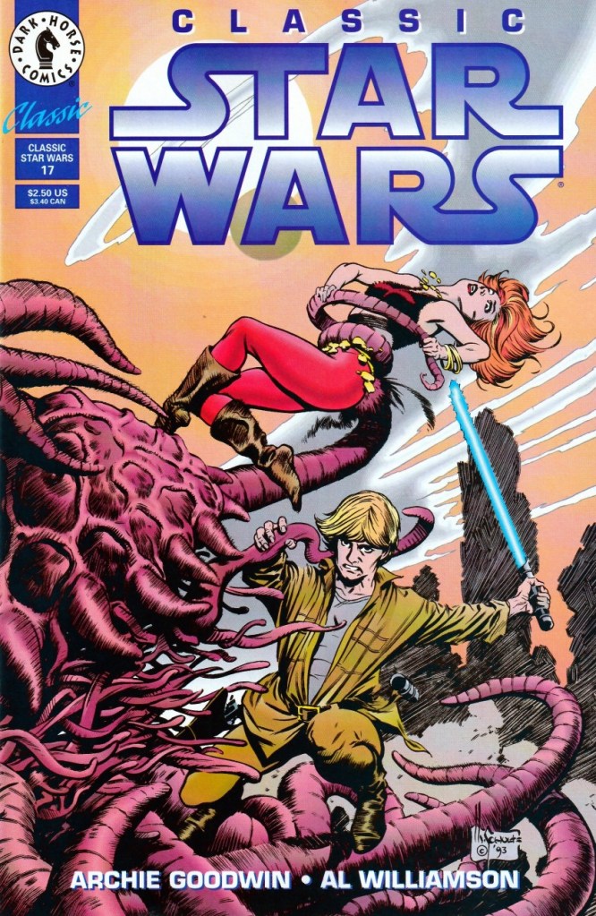
Continuing with the 90s, here are two Star Wars covers by Mark Schultz who’s, err, distinctly not at his best – though bringing one’s best to Star Wars would be a waste, anyway.
Classic Star Wars no. 8 (April 1993).
Classic Star Wars no. 17 (March 1994).
Continuing with the 90s…
Dark Horse Comics no. 15 (November 1993). Cover by John Higgins. The suggestive-yet-fuzzy shapes made me think that this woman is bare-bosomed and possibly vagina dentata-ed at first. The teeth belong to the tentacled monster, the nakedness is still a possibility.
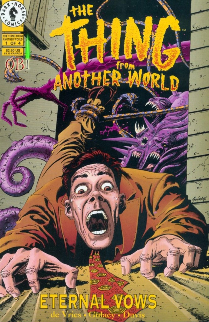
This one I like far more:
The Thing from Another World: Eternal Vows no. 1 (December 1993). Cover by Paul Gulacy. Upon seeing this, co-admin RG quipped ‘oh, what’s left of Gulacy‘ (after his run on Master of Kung Fu, that is).
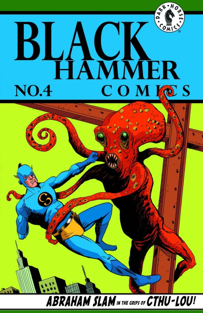
Finally, we have three Black Hammer-related covers, which made me look up this series since I didn’t even know of its existence before spotting these tentacles. Created by Jeff Lemire and Dean Ormston, it’s apparently doing quite well (given that it started in 2016, and is still ongoing with many spin-offs, awards received, and a possible TV show).
Black Hammer no. 4 (October 2016). Cover by Dean Ormston.
Black Hammer no. 4 (October 2016). Variant cover by Jeff Lemire.
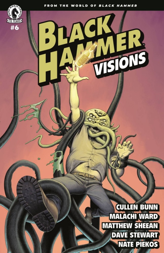
Black Hammer: Visions no. 6 (July 2021). Cover by Malachi Ward.
No Dark Horse post about tentacles can avoid the elephant in the room, namely Hellboy and Mignola. If that’s what floats your boat, I covered that ground in Tentacle Tuesday Masters : Mike Mignola.
« I think the most gruesome thing in life is people — if they let themselves go. I’ve been letting myself go for years, and I’m beginning to feel gruesome. I want to entertain and communicate. I don’t want to hurt anyone’s feelings, but I have to be honest — like that old baseball umpire — and call ’em like I see ’em. My drawings aren’t as bad as the models themselves. » — Basil Wolverton
Here at WOT? headquarters, we’re both card-carrying, fervent Basil Wolverton* fanatics, but we haven’t devoted the column space commensurate with our affection for his work. Why? Because Wolverton, despite toiling in underpaid obscurity for most of his career and inevitably never becoming a household name, was always a critic and historian’s darling, insofar as there was a scholarly press to express its appreciation. Things began to turn around in the early 1970s, just in time.
Whatever subject or genre he put his hand to, Wolverton’s singular style shone through, and not as a handicap: his funnies were hilarious, his horror was harrowing… but they were distinctly from that same, most gifted of hands.
The artist at work (presumably) on his caricature of Red Skelton, circa 1949.
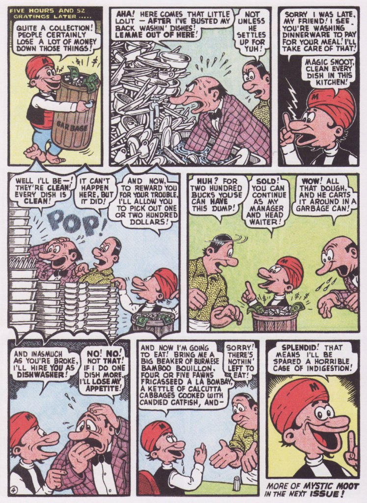
Most of Basil’s humour work was (with the partial exception of Powerhouse Pepper, 1942-49) relegated to ‘filler’ features, generally hidden gems glittering in the mediocre midst of loads and loads of higher-profile rubbish. Don’t just take my word for it: here’s a typical example of the sorry setup.
From this thrilling new assemblage, I’ve picked a pair of short samples, both featuring my favourite Wolverton protagonist, Mystic Moot (and his Magic Snoot). Sadowski informs us that:
« In July 1945, editor Virginia Provisiero invited the artist to submit ideas for a four-page ‘magic or mystic character’. He responded with Champ Van Camp and his Magic Lamp, but the editor suggested ‘a weird magician who had hocus-pocus powers instead of this lamp and genie affair‘. Wolverton hit the bull’s-eye with his second try, Mystic Mose and his Magic Nose, though Managing Editor Will Lieberson came up with a catchier moniker. »
Historian Henry Steele, in his indispensable overview of Wolverton’s career (published in Bill Spicer‘s blandly-titled but most excellent Graphic Story Magazine‘s issues 12 and 14, circa 1970-71), eloquently describes Mystic Moot as :
« Basically a kindly and almost simple soul, he is eternally cheerful and never at a loss. He is perennially helping others, usually unfortunate nobodies liked the jobless glutton, the bankrupt small businessman, the farmer with no crop, the henpecked husband, intimidated lumberjacks and prospectors, widows, orphans and kindred down-and-outers. He uses his magic powers only in the most haphazard ways, and never relies on them on his own behalf unless it is absolutely necessary.
Perhaps because of the passive Eastern philosophy of its subject, Mystic Moot strikes one as being the most minor key of all Wolverton’s features — which, while it implies difference, does not mean inferiority in any sense. »
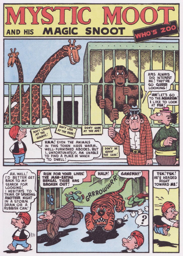
Originally published in Comic Comics no. 2 (May 1946, Fawcett).
Here’s one for my fellow animal lovers out there!
Originally published in Comic Comics no. 7 (Oct. 1946, Fawcett).
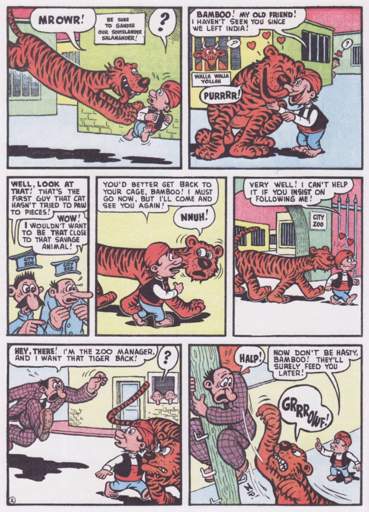
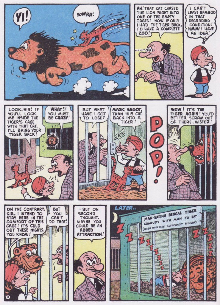
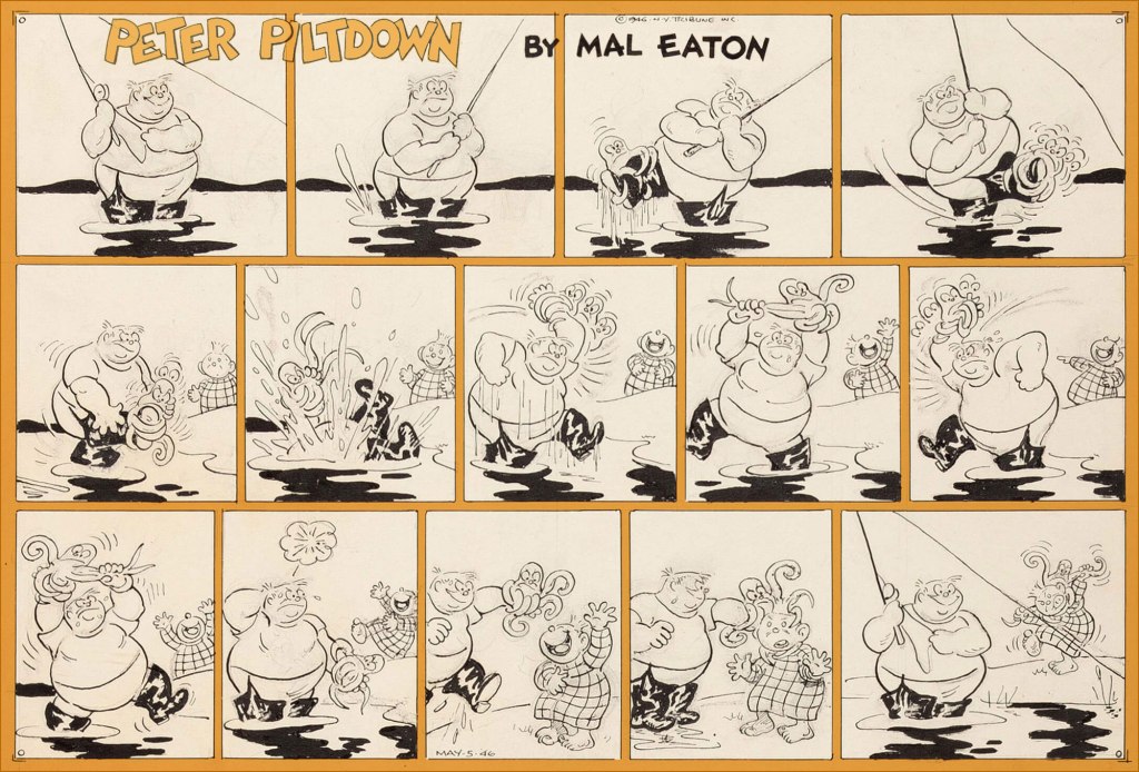
It’s time for a Peter Piltdown Tentacle Tuesday! We have previously written about Peter Piltdown, Mal Eaton’s nearly forgotten strip, but a few Sundays were kept in reserve for very obvious (tentacular!) reasons. Given the paucity of these strips, I am truly amazed that the original art of four octopus strips is available online. Eaton has a great ease with depicting flexible, expressive tentacles, so I am very pleased to be able to raise him to the rank of a 🐙Tentacle Master🐙!
Without further ado (just a little side note: these images were found on Heritage Auctions – I am not lucky enough to own any Mal Eaton art, or at least not yet!) …
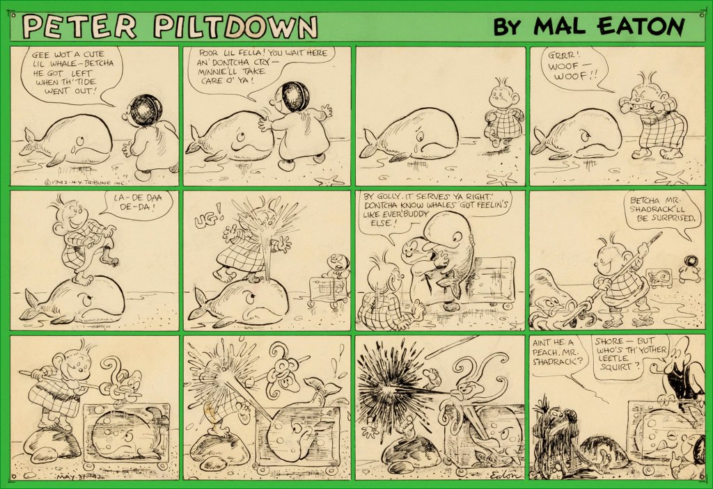
May 31st, 1942. I didn’t know that whales ate octopus, but apparently they do – ‘the majority of toothed whales will eat whale food species such as squid, octopus, crustaceans and fish.‘
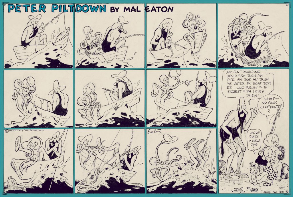
August 30th, 1942. This octopus knows how to live it up! This strip makes up for the unfortunate end of the member of his species in the previous one.
May 5th, 1946. I don’t know what the octopus wanted the man’s leg for in the first place, but he sure looks peeved by this whole interaction. These fishing bouts are just fraught with octopus danger…
… even if the danger is sometimes imaginary. August 18th, 1946.
Speaking of day-dreaming, I like to fantasize that Mal Eaton had a whole octopus-centric strip, and that one day somebody is going to unearth it and publish a beautiful collection. In the meantime, I’d happily settle for another volume of Jack Kent’s King Aroo…
« Night after night, Shepherd forged the inchoate thoughts and feelings of a whole generation of fans into an axiom that went something like: ‘The language of our culture no longer describes real life and, pretty soon, something’s gonna blow.‘. » — Donald Fagen
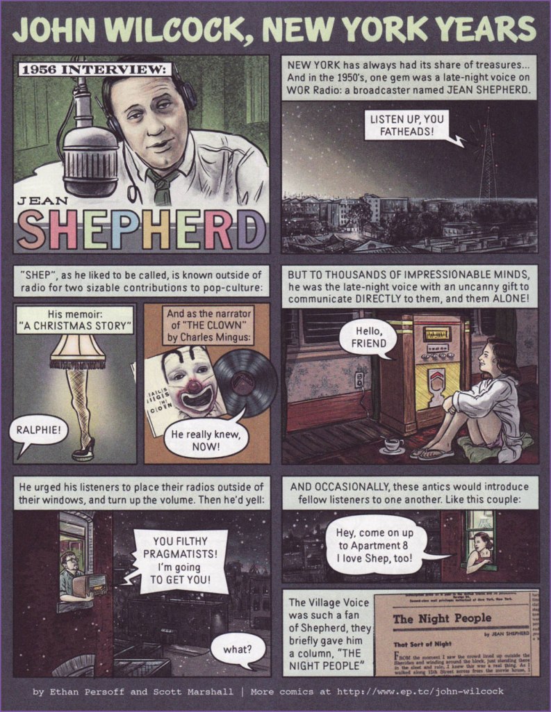
Today’s a very august occasion, for it marks the birth centennial of that sublime storyteller, Jean Shepherd (July 26, 1921 – October 16, 1999), so we’ll celebrate it… in comics!
« Since 2012, cartoonists Ethan Persoff and Scott Marshall have been collaborating on an extensive interview project with John Wilcock, an underground publisher of the 1960s. The graphic novel biography… focuses a year-at-a-time on Wilcock’s interesting and largely undocumented life, from co-founding the Village Voice in 1955, to becoming a member of Andy Warhol’s Factory in the early Sixties, establishing the Underground Press Syndicate, and other interesting moments, until Wilcock left NYC in 1972. » This particular entry appeared in the pages of The American Bystander no. 2 (Spring, 2016). For more info on the project (including a generous helping of choice excerpts), now complete and available for purchase, direct your browser here.
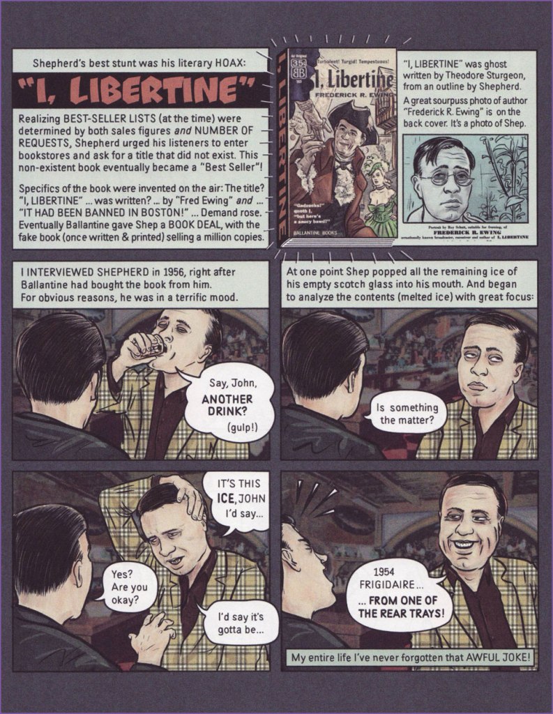
The front and back covers of I, Libertine‘s paperback edition (1956, Ballantine). Here’s a full, fascinating account of how this literary hoax unfolded. Take note, fellow Theodore Sturgeon fans!
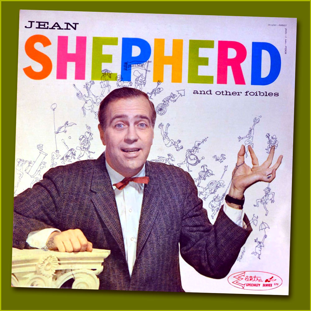
Shep’s second LP, Jean Shepherd and Other Foibles (1959, Elektra), was abundantly illustrated by his good friend, Renaissance Man (and local favourite) Shel Silverstein, who also authored the liner notes and played washboard and kazoo!
« In addition to the liner notes, Shel drew a veritable parade of characters marching across the front and back album cover of Foibles, incorporating the message, ‘Jean Shepherd is a dirty rotten, one-way sneaky son of a bitch‘, spelling it out backwards to escape the censors. » (from Lisa Rogak’s A Boy Named Shel (2007, St. Martin’s Press)
Another interesting comics connection: In Foibles‘ opening track, [ hear it here] Shep recalls an old favourite: « How many of you remember ol’ Peter Pain? He used to work in the comic strips, you remember, in those little strips that appeared under Moon Mullins, under The Gumps? He was green, was shaped like a pickle, he had stubble all over, he wore a black derby. He was a tremendous figure… a great American! He was the first Beat Poet. » Here’s one of Peter’s misadventures, circa 1948, illustrated by Jack Betts. You’ll find many more of these entertaining ads on Ger Apeldoorn’s highly-recommended blog, The Fabulous Fifties.
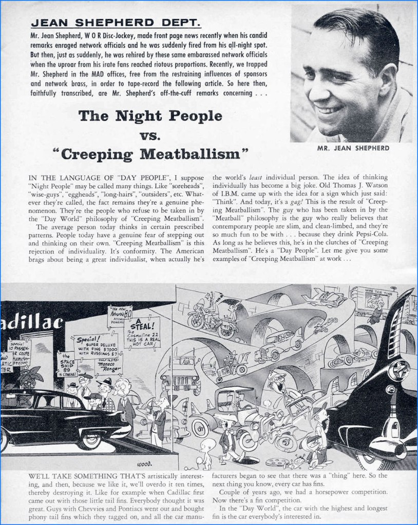
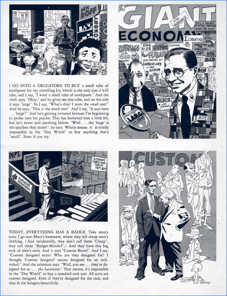
Seldom seen since its publication, this was Shepherd’s collaboration with Wally Wood at the height of his powers. The Night People vs. “Creeping Meatballism“ appeared in Mad Magazine no. 32 (Apr. 1957, EC).
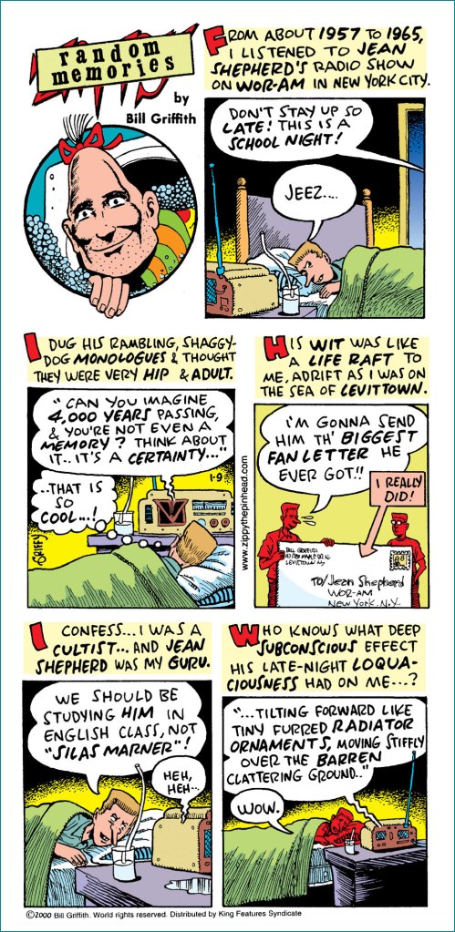
One gets a sense of Shepherd’s outsize and hopefully abiding significance from the quality of the minds he has helped warp. For example, here’s Underground Comix pioneer and Zippy the Pinhead creator Bill Griffith‘s fond tribute to Mr. Shepherd, published soon after Shep’s passing. A grateful tip of the hat to Mr. Griffith, who graciously provided me with a high-quality image of this, his Sunday, January 9, 2000 strip.
Let’s close in highfalutin fashion with a most pertinent bit of Longfellow (1807–1882):
The shades of night were falling fast, As through an Alpine village passed A youth, who bore, ‘mid snow and ice, A banner with the strange device, Excelsior!
His brow was sad; his eye beneath, Flashed like a falchion from its sheath, And like a silver clarion rung The accents of that unknown tongue, Excelsior!
In happy homes he saw the light Of household fires gleam warm and bright; Above, the spectral glaciers shone, And from his lips escaped a groan, Excelsior!
“Try not the Pass!” the old man said; “Dark lowers the tempest overhead, The roaring torrent is deep and wide!” And loud that clarion voice replied, Excelsior!
“Oh stay,” the maiden said, “and rest Thy weary head upon this breast! “ A tear stood in his bright blue eye, But still he answered, with a sigh, Excelsior!
“Beware the pine-tree’s withered branch! Beware the awful avalanche!” This was the peasant’s last Good-night, A voice replied, far up the height, Excelsior!
At break of day, as heavenward The pious monks of Saint Bernard Uttered the oft-repeated prayer, A voice cried through the startled air, Excelsior!
A traveller, by the faithful hound, Half-buried in the snow was found, Still grasping in his hand of ice That banner with the strange device, Excelsior!
There in the twilight cold and gray, Lifeless, but beautiful, he lay, And from the sky, serene and far, A voice fell like a falling star, Excelsior!
« Quite suddenly I began to draw. No one paid much attention to this, nor to the fact that the drawings were immediately grotesque. This was assumed to be one of the penalties for being ‘cackhanded’, local dialect for mocking a left-hander, which is what I am. In addition, nobody suggested that there was anything ludicrous in the fact that, for the first time since the Searles had plodded their way through the bogs to escape the Vikings, a left-handed Searle was proclaiming that the had to be An Artist, instead of a gravedigger, or whatever. » from Ronald Searle in Perspective (1984, Atlantic Monthly Press)
Who’s Out There? is a peaceful little family – we don’t often have disagreements about cartoonists or their art, and if occasionally one of us loves something while the other one is neutral about it, it doesn’t often happen that we are in total dissent. However, exceptions proving the rule, British illustrator Ronald William Fordham Searle (1920-2011) is one such point of contention: I like his style, co-admin RG doesn’t much care for it.
I was a little late to the party, and came to Searle’s in a rather circuitous fashion. In a used bookstore (isn’t how these things always start?), I noticed a book called The Grapes of Ralph: Wine According to Ralph Steadman (1996, Houghton Mifflin Harcourt), and was intrigued enough to purchase it. Steadman’s splotchy, wild style was perfect for a book about fermented grape juice – he frequently coloured his art in a manner reminiscent of wine stains, and the unhinged art hinted at the artist being more than slightly soused. Well… where, you may ask, does Searle come in? Steadman was heavily influenced by his style, so much so that for a while I embarrassingly thought that Grapes of Ralph was actually illustrated by the former.
One of the more focused splashes (haha, wine splashes, right) in The Grapes of Ralph.
However, Searle has proven to be a lot more appealing to me from an aesthetic viewpoint – I have kept The Grapes of Ralph, but I don’t glance in its direction often. As for co-admin RG, he explains that he mainly dislikes Searle for being responsible for bad copy-cats like Steadman.
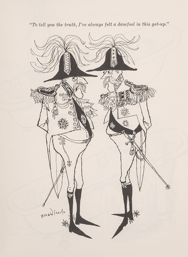
There are plenty of articles written about Searle – his extensive body of work has gained its share of acclaim and awards, and many appear illustrators appear to have been heavily influenced by his style. For example, The War Drawings of Ronald Searle from Illustration Chronicles tells the story of how Searle survived, and chronicled with daily sketches, the experience of being a Japanese prisoner of war. There is no need for me to go over that chunk of history. That being said, a lot of his books are quite out of print, and those are generally the ones I find most interesting. Before Searle’s art went progressively more speckled and unfocused (which is what Steadman, with whom this post started, is mostly channelling), his drawings had a crispness of exaggeration I find really appealing, a certain floweriness under the cover of which very acerbic (and very British) observations are delivered to the delighted viewer.
An example of looser lines of later years (this is from 1980); still enjoyable because the palette is restrained.
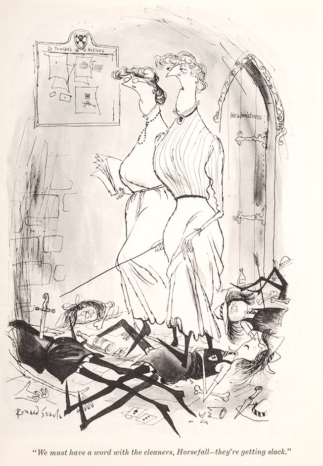
My favourite is his St. Trinian series (from 1941 and onwards), chronicling shenanigans at a boarding school for girls. What started as a series of doodles to amuse a friend’s schoolgirl daughters became an institution of its own – this topic was so popular that Searle’s cartoons were even adapted (awkwardly, in my opinion) into seven (!) movies. I recommend this helpful article from Tweedland The Gentlemen’s Club for historical details. For all the popularity of these schoolgirls from hell (in any obituary, you’ll find some sentence to the effect of ‘for many people, the St Trinian’s cartoons define Ronald Searle’s career‘), St. Trinian collections have been long out of print, for the most part, and one has to make do with mostly inferior, dubiously printed paperbacks claiming to be Best Ofs.
Knell Knudel from Lambiek Encyclopedia explains: « The topic [of boarding schools] had inspired many British novels before. But ‘St. Trinian’s’ was far less realistic and darkly disturbing, motivated by Searle’s war-time traumas. The little girls torture each other on a rack, collect mushrooms to poison people, drown each other at the beach or study books on how to shrink human heads. Amazingly enough, ‘St. Trinian’s’ became massively popular, despite the fact that the world was still recovering from a world war. In 1948 the first book compilation was published. Many more would follow. Gags appeared in countless magazines all over the world. Yet Searle quickly grew tired of his hit series. He felt its formulaic comedy severely limited him. In 1952 he brutally discontinued his hit feature by dropping an atomic bomb on the dreaded school! While it presumably killed its characters, it didn’t terminate its popularity. »
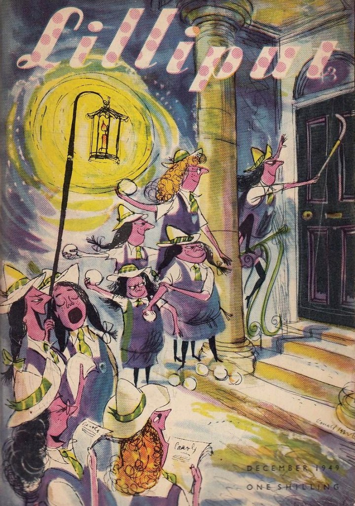
The first St. Trinian cartoon ever published in print appeared in Lilliput (a monthly British magazine which deserves a post of its own) in 1941. This is Lilliput no. 25, December 1949.
Though quite a few collections of cartoons were published at the time, the following three are of main interest: Hurrah For St Trinian’s (1948), The Female Approach (1950), and Back to The Slaughterhouse (1952). Thanks to my bookseller friend Barney (visit his store!), I am the proud possessor of The Curse of St. Trinian’s: The Best of the Drawings (1993, Pavilion Books), a hardcover edition, which scratched the itch but did not quench my desire to own the original editions, with their gloriously yellowed paper and characteristic fragrance.
For example, admire the characterization of Angela Menace, as depicted in these three glorious cartoons (one could make a triptych):
« Searle was born, in 1920, in Cambridge, into a socially anonymous background, where male children were expected to be clerks or minor civil servants. Placed almost squarely in the middle of society, he had the ideal vantage point from which to observe his country, without having to suffer the distortion of an undue affection for his origins. It is an easy background to shrug off if you know what you want to do with yourself, and Searle did know, from an early age. We felt obscurely that Searle’s drawings begged authoritarian disapproval simply by existing in such profusion. That they also flayed their subjects with a merciless and unforgiving line – both grotesque and precise – made it all the better. That it was done with such sympathetic relish made it even better than that. Parents were embarrassing, hypocritical cretins, either callous in the victory of worldly success, or living pitiable lives of continual defeat; schoolmasters incompetent frauds, either grasping, sottish, brutal, ignorant or half-dead. Searle got them just right. » — Nicholas Lezard, in an introduction to The Terror of St Trinian’s and Other Drawings (another best-of collection issued in 2006).
I love the new science teacher being so warmly welcomed by both headmistress and schoolgirls – they all seem genuinely delighted.
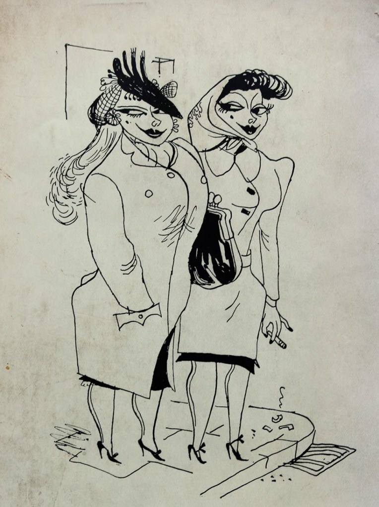
The Female Approach, interestingly enough, featured plenty of men, too…
… alongside the usual ingénues (who have no idea what they’re doing, but they do it anyway) and temptresses (who know exactly what they’re doing).
“Do you want the time?”
Searle died in 2011 in his beloved France, where he had been living since 1975. He was 91 years old, and spent his last years as a bit of a recluse (though still drawing), far away from the public’s eye – when he passed away, one got the impression that some thought he had done it already years ago. As for St Trinian’s, its popularity seems to sort-of, kind-of linger on: there was yet another movie in 2007, though I would posit that we need fewer movies, and more proper, hardcover reprints of the material that left an enduring trace in people’s memories.
Have a gander at Perpetua, a wonderful website dedicated to everything Searle.
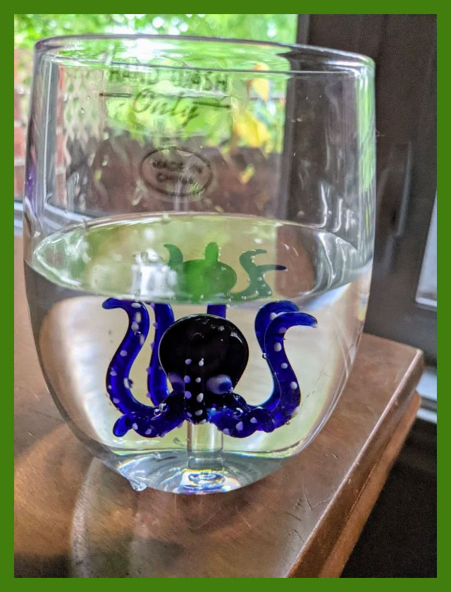
Greetings, tentacle aficionados! First of all, I’d like welcome this new octopus into our household, courtesy of a gift from my mom:
Isn’t he cute?
I felt like going with something more modern this week, though given that the last TT was set in the 60s, that still leaves a healthy 40-50 years to choose from.
Ali Fitzgerald’s Bermuda Square waved its first ‘hi there!’ on May 16th, 2016 in the The Cut, one of New York Magazine‘s website-only divisions describing itself as ‘a site for women who want to view the latest fashion trends; read provocative takes on issues that matter, from politics to relationships; follow celebrity style icons; and preview new products.‘ I don’t believe Bermuda Square fits that neatly into any of these categories, though Iris the octopus is unarguably stylish, and politics and relationships are definitely involved. Does she and her siren friends ever try out some new face cream, or weighs the pros and cons of that foundation one sees ads for absolutely everywhere? Who knows – Bermuda Square strips only live behind The Cut’s pretty rigid paywall (not that I object to writers and illustrators actually being paid, but I would much rather buy a collection of strips than a subscription to an online-only lifestyle magazine – call me old-fashioned).
Fitzgerald describes the world her comics are set in as “a feminist enclave where everyone can co-exist” and a “delicate ecosystem”. It’s a fully fleshed world, with intricate plot lines tracking relationships between characters and some class warfare, since underwater denizens aren’t at all immune from pettiness or envy. « It’s segmented like New York: There is Astora, a Manhattanite underwater mer-city where Margox imagines building a life, and Orchid Island, which resembles a not entirely gentrified Brooklyn or Queens. Solanas Village is a ‘70s-style, separatist female commune on a rocky shore, while the social, watery Tidelands are like a club where everyone mingles. If a sailor stays too long in Bermuda Square, he goes to (and dies in) the Ghost Vortex… »
The following excerpts have been lovingly coloured by co-admin RG.
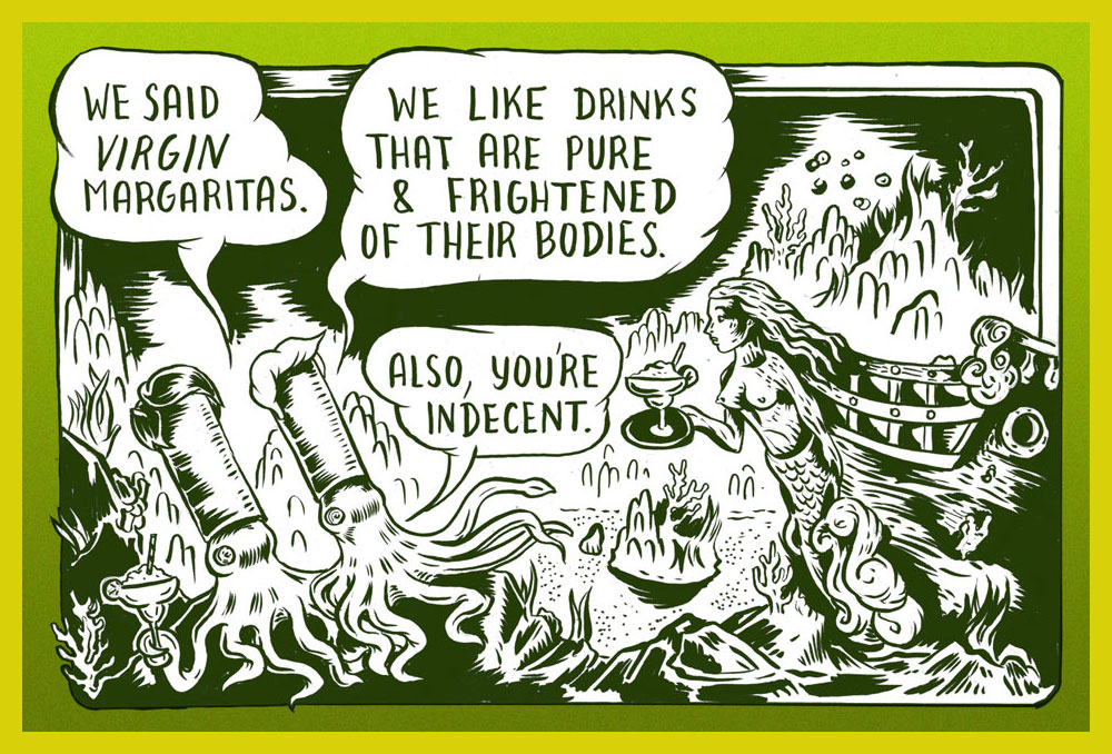
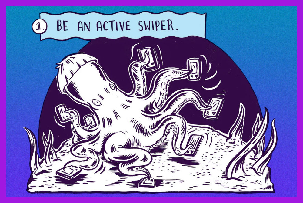
First-ever strip, with a lovely abundance of tentacles!
Iris the sex-positive octopus gives tips for using Tinder.
« I don’t mind if my skull ends up on a shelf as long as it’s got my name on it. » —Debbie Harry
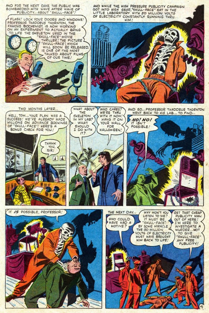
A couple of years back, I spotlighted a story by a neglected Golden Age favourite of mine, Anthony Lewis “Tony” DiPreta (July 9, 1921 – June 2, 2010), the wacky The Hidden Vampires! I advise reading it first for comparison (and a bit of background on the artist).
A whole hour! People were armed with unwavering patience back in the day.
So the suits’ great flash of inspiration is not to update a fifteen-year old movie (from 1937!), nor remake it: they’ll just trot it out again. Picture doing this with 2006’s biggest horror hit, Saw III. How do you think it would fare today?
You’d think a seasoned publicist would be a savvier negotiator. I mean, all he needs is some random skeleton. Adjusted for inflation, a thousand 1952 dollars would today be worth 9,829 bucks. But that’s nothing compared to his liberal waste of electric current: the voltage used to execute a convict in the electric chair is around 2,000 volts for less than a minute… and that makes the lights dim all over the area*. Now multiply the voltage by 25,000, and the duration (let’s round it off to a minute, for simplicity’s sake) 80,640 times longer. Picture the resulting electric bill, not to mention the repercussions on the power grid, all for a stunt that could have simply been faked (i.e. just say there’s live current… no-one’s going to check). Oh, and what’s a “famous biochemist” doing on a film studio’s payroll? Come to think of it, it’s not that odd: Thornton was a cynical, opportunistic money-grubbing parasite, the Dr. Memhet Oz of his day…
Note these stellar examples of one of DiPreta’s trademark horror ambiance moves: lighting from below, projecting stark, expertly-delineated shadows.
One has to wonder why Fenton insists on addressing the resurrected ‘Demon’ (he was a demon on the sousaphone) incorrectly as “Skull-Face” (that’ll only aggravate him, you dolt!). Would it have helped if he’d added air quotes?
The ho-hum Sol Brodsky cover of Mystery Tales no. 6 (Dec. 1952, Atlas), but hey, our pal “Skull-Face” is the featured attraction!
The comics industry’s traditional garish colour and murky reproduction fail (spectacularly!) to do justice to DiPreta’s spare, confident and elegant inking line. To remedy the situation, here’s a look at a surviving piece of original art. It hails from “One Must Die” (scripted by Carl Wessler), from Crime Can’t Win no. 11 (June 1952, Atlas), the publisher’s knockoff of Lev Gleason‘s influential Crime Does Not Pay.
A slick Joe Palooka Sunday from July 24, 1966. DiPreta enjoyed quite a run on the strip, illustrating it from 1959 to its 1984 finale.
Wonder Woman is probably my most recurring area of focus when it comes to TT posts – although this is just the third, as it turns out, despite feeling like the fifteenth. The first two were devoted to the Golden Age Wonder Woman (Tentacle Tuesday: H.G. Peter and Wonder Woman lend a hand and Tentacle Tuesday: More Golden Age Wonder Woman Wonders!), and having more-or-less exhausted the GA’s tentacles, we move on the Silver Age (which, in my assessment, is considerably less interesting, but sometimes has quite nice art).
All pages are scripted by Robert Kanigher, pencilled by Ross Andru and inked by Mike Esposito, except for the first page from Stamps Of Doom!, which was scripted by Bill Finger.
Page from The Stamps of Doom!, scripted by Bill Finger (credited as Charles Moulton). printed in Wonder Woman no. 108 (August 1959).
I bitched about Kanigher WW in Tentacle Tuesday: Wonder Girl in the Silver Age, Part I and Don’t Let a Mysogynist Plan Your Wedding: Robert Kanigher and Wonder Woman’s Utterly Unsuitable Suitors. I’m starting to feel like my needle is stuck in the groove, but I will however note one more thing: in my righteous anger about Kanigher’s preposterous depiction of women, I’ve been ignoring that he’s not great at writing men, either. That is… he can write wonderful male characters (see Enemy Ace, for instance), as long as romance is totally off the menu. It’s as if he is saying that romance transforms intelligent, capable men into utter, snivelling dolts (a point of view that one could defend, but within limits). Take a look at what kind of suitors poor Wonder Woman gets saddled with (perhaps their stupidity is one more way of spiting her?) in these panels from Wonder Woman’s Impossible Decision, published in Wonder Woman no. 118 (November 1960):
To reiterate: man is sitting on a rock. One wouldn’t think that this is a particularly dangerous activity. And yet one minute he’s contemplating the injustices of life (sitting!), and the next he’s sinking (at the speed of a locomotive) into sea, right into the welcome arms of an octopus. I think the octopus planned it.
The guy’s suffocating, but he’s still fretting about Merman as a rival for WW’s affections.
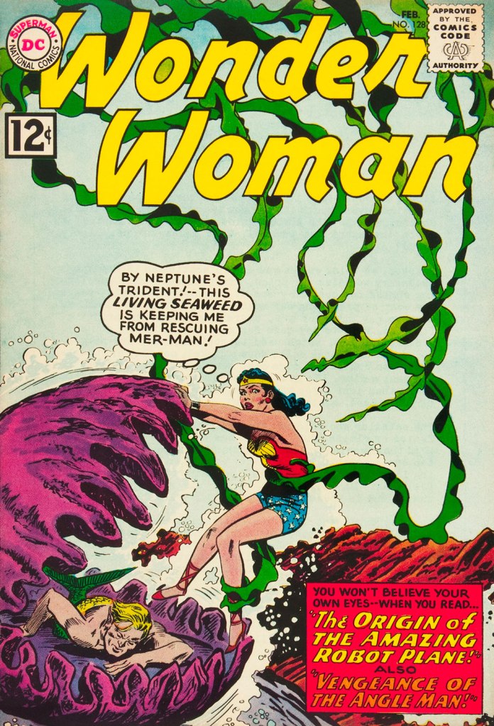
This is Wonder Woman no. 128 (February 1962). Cover by Andru and Esposito.
Allow me to drive one more nail into that coffin, and after this I shall forever hold my peace. I stumbled upon this rather entertaining quote, taken from an interview with Kanigher conducted by Tim Bateman and Steve Whitaker in 1989 (read the full thing here). Here it is, with no further comments from me:
« So Ditko […] tried to force meanings where meanings did not exist. But he tried to tell me that I knew nothing about romance, because his idea of romance was professorial, pedantic. I know what romance is, I’ve written more romance probably than anyone alive. Romance is an excess of passion, and I don’t care if there’re a thousand books that says romance is not that, romance is a time period. Tchaikovsky is a romantic. Excessive, that’s what romance is. So to say that my idea of excessive emotion is not romantic…»
And now, I shall remain mum, and let you savour these tentacles in peace!
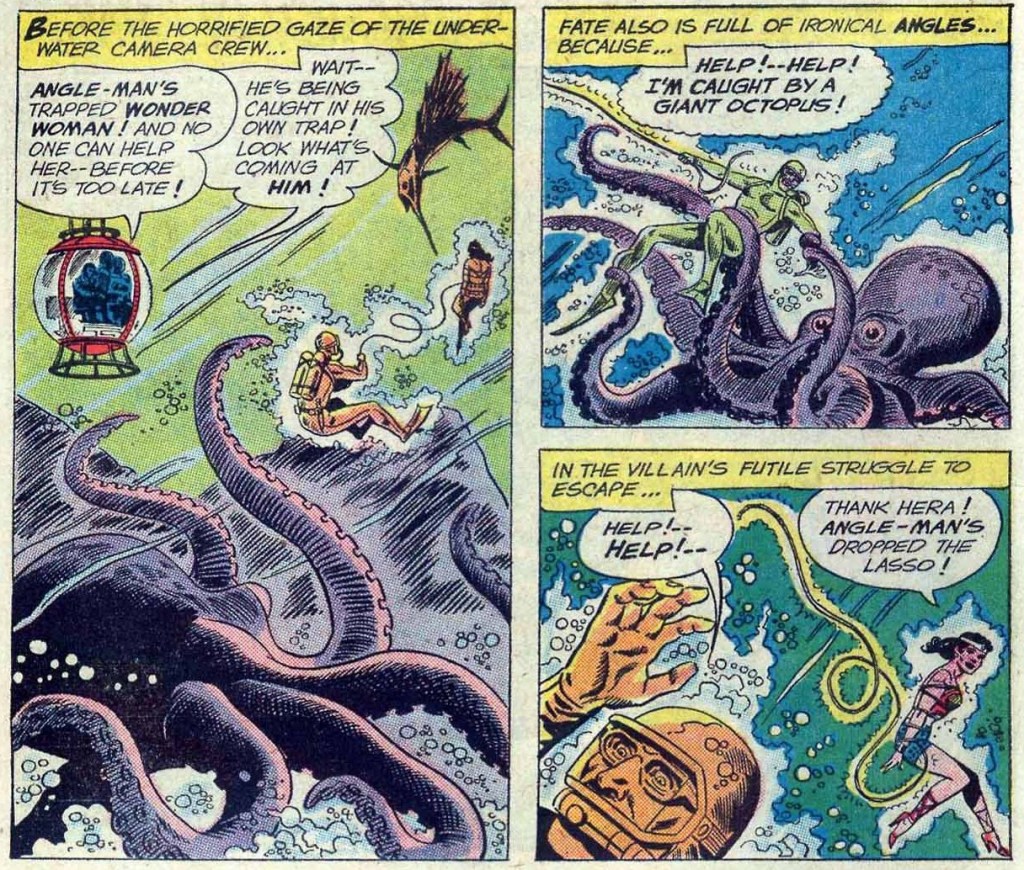
Two pages from The Academy of Arch-Villains!, published in Wonder Woman no. 141 (October 1963).
In comics, swordfish are often pitted against octopuses (one doesn’t have to go far for examples – just look at the previous story), but I wonder how often that happens in real life…
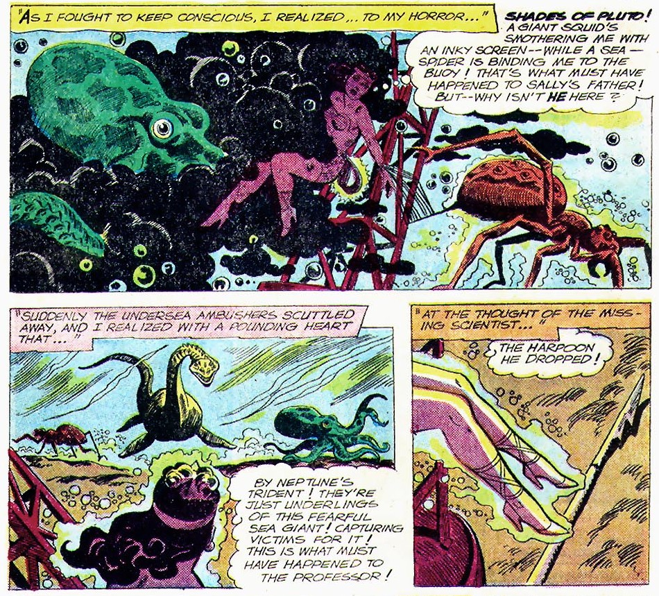
Page from War of the Underwater Giants, published in Wonder Woman no. 146 (May 1964).
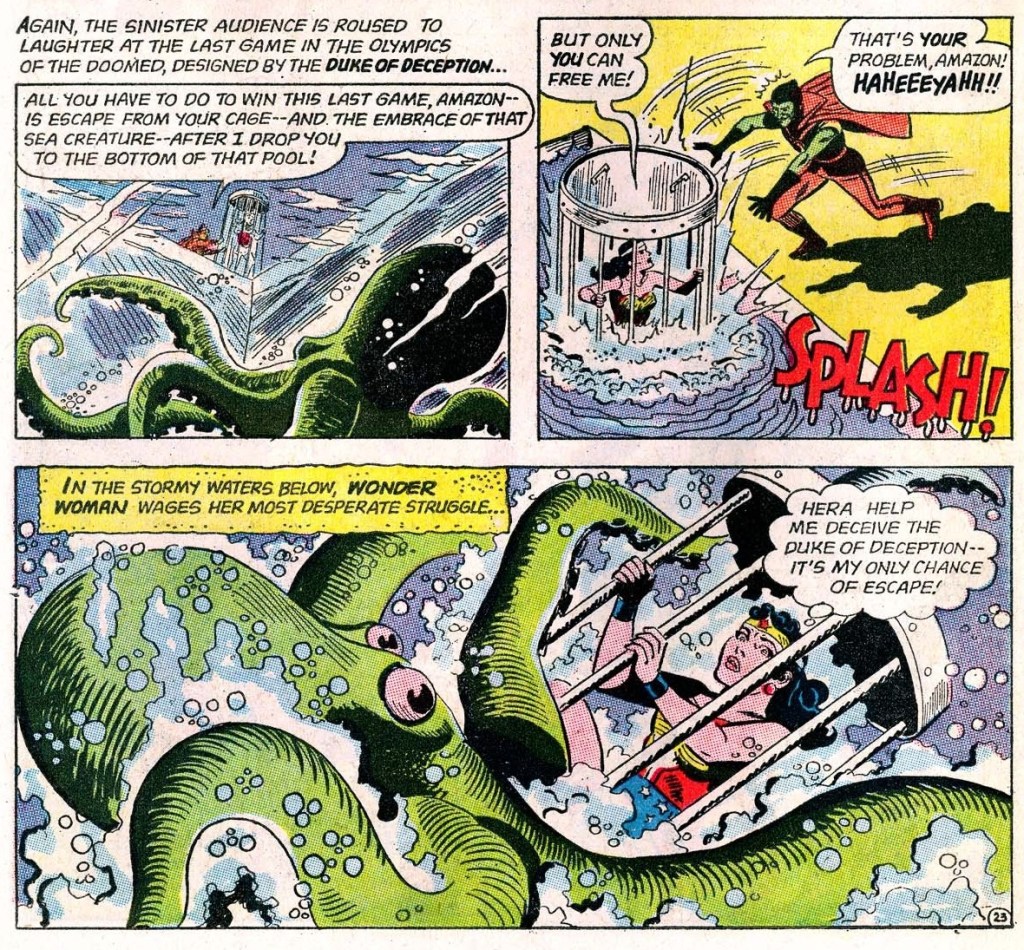
Page from The Olympics of the Doomed, published in Wonder Woman no. 148 (August 1964).
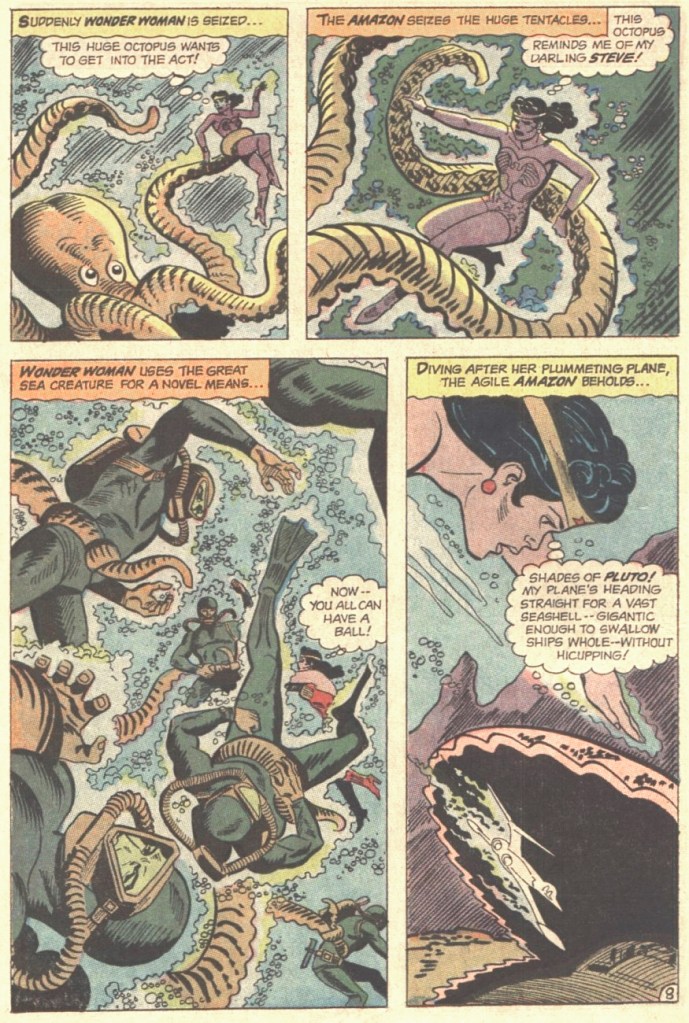
Page from I Married a Monster, published in Wonder Woman no. 155 (July 1965).
The Sinister Scheme of Egg Fu, the Fifth!, published in Wonder Woman no. 166 (November 1966).


