« We see light, not dark. But it is in the dark that we feel goblins and ghosts. » — Rex Brandt
The ever-creative Tom Eaton‘s Oliver Cool (1975-79) always reserved a special treat for Hallowe’en. In past countdowns, I’ve shared the first (1975) and second (1976) entries devoted to the beloved occasion, and here is the final pair.
From Young World Volume 14 no. 8 (Oct. 1977, The Saturday Evening Post Company).
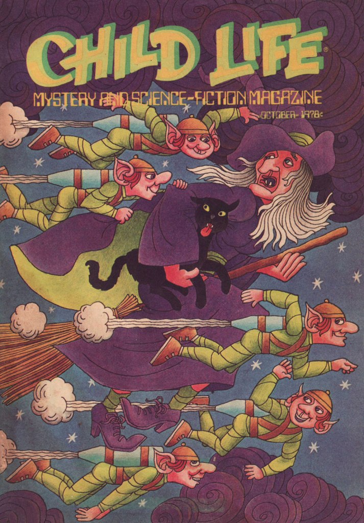
Eaton’s Fizz & Farra In the Year 2250 strip ran concurrently in Young World’s sister publication, Child Life. This seasonal cover by Arthur Wallower was simply too good not to include.
From Young World Volume 15 no. 8 (Oct. 1978, The Saturday Evening Post Company).
As a bonus, here’s one item some of you monster kids may fondly remember: Monster Stand-Up Greeting Cards (1980, Scholastic). Pricey these days, from the look of it.
« Ghost stories … tell us about things that lie hidden within all of us, and which lurk outside all around us. » — Susan Hill
We’ve once before turned our attention upon Dell’s Ghost Stories, an anthology title with such an incredible first issue (written and directed by John Stanley) that all the subsequent ones whither in the long shadow it casts. In recent years, I’ve somewhat softened my stance on these sequels, taking into account that nothing could measure up to Stanley’s work on numero uno — and accordingly judging them on their own merits.
As a kid, I didn’t think too highly of Frank Springer (1929-2009), being primarily familiar with his inks over Frank Robbins on The Invaders (too sloppy, and no substitute for Robbins inking himself, which never happened at Marvel anyhow). Down the line, I ran into some of his earlier work (Phoebe Zeit-Geist, The Secret Six, The National Lampoon, Dial H for Hero and sundry items for Dell) and grew to appreciate his strengths.
Now, Ghost stories was interesting as a ‘horror’ (in the very limited Silver Age/Comics Code in full force sense) anthology, in that the vast majority of the stories were, after that peerless first issue, the work of one single artist (Gerald McCann, after contributing a couple of page to number one, handled issues 2-5, with a couple of filler pages thereafter, then Springer took over for 6-20, the rest of the run consisting of reprints, with the unexpected exception of no. 35).
Here then is what’s likely my favourite Springer Ghost Story: A Room with a Dreadful Secret.
This is Ghost Stories no. 14 (June 1966, Dell). Cover by Springer.
« I don’t know what the hell I published. I never read the things. » — Stanley P. Morse
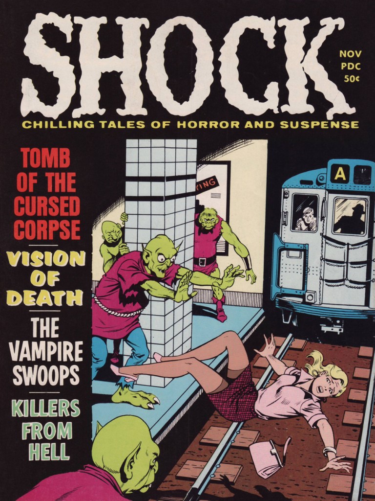
In the sinister wake of Warren Publishing‘s success with Creepy, Eerie and Vampirella, old-school fly-by-night 1950s comics publisher Stanley P. Morse (Aragon Magazines, Gillmor Magazines, Medal Comics, Media Publications, S. P. M. Publications, Stanmor Publications, and Timor Publications…) dusted off some of his old pre-Code chillers in the late 1960s and early 1970s in black and white magazines such as Shock (15 issues), Chilling Tales of Horror (11 issues), Ghoul Tales (5 issues) and Stark Terror (5 issues). It certainly wasn’t all junk: after all, Morse had published Weird Tales of the Future and Mister Mystery, with their Basil Wolverton and Bernard Baily classics…
Unlike Eerie Publications’ grey-toned and blood-and-gore-ified reprints, these are, as far as I know, unretouched, not to mention decently printed.
This is Shock Vol. 2 no. 5 (no. 10, November, 1970, Stanley Morse). Edited by Theodore S. Hecht.
Maybe it’s just me, but isn’t Kurt Schaffenberger just about the unlikeliest pick of cover artist for a pre-code horror anthology? Sure, he fit in nicely with ACG’s gentle moral fable aesthetic, but aren’t you just expecting the Man of Steel or The Big Red Cheese to swiftly sweep in, catching the damsel-in-distress before the A Train smooshes her?
To wit: one of Kurt’s fun ACG covers, this is Unknown Worlds no. 43 (Oct.-Nov. 1965, ACG).
« So, you see the little snot on the right side, move it two inches to the left and add a little bit of green gleam to it. » — Mark Newgarden, doing some art direction
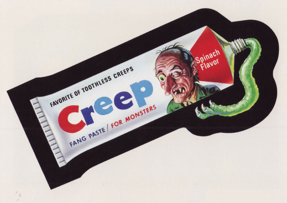
If this one looks sharper than you’d expect, it’s because it’s shot from a larger version of the Wacky card that Norman Saunders (re)painted for Topps’ Wacky Posters series, circa 1973.
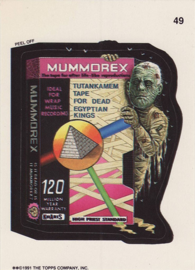
Ladies and gentlemen, Drew Friedman! « In 1991, I was creating many concept sketches and pencil drawings for the TOPPS company, including for their latest set of the hugely popular sticker series “Wacky Packages”. Mark Newgarden was the editor and art director for the 1991 series, and the writers for the card fronts included Newgarden, Jay Lynch, Jordan Bochanis, John Mariano and myself. I drew about 22 tight pencil images which would (with one exception) be painted by the illustrator Patrick Pigott. » If you enjoy being privy to an artist’s creative process, by all means do yourself a favour and feast your peepers on this gallery of Friedman’s roughs, finishes, used and unused pieces. In this (mummy) case, it’s Friedman pencils, finished art by Tomas Bunk.
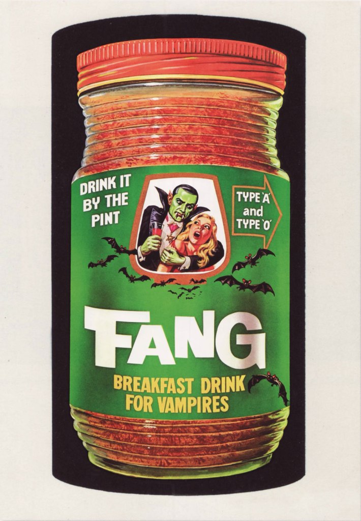
From the 6th Series (1974, Topps). Most likely painted by Norm Saunders.
From the 8th Series (1974, Topps)… though mine’s a 1980’s reprint. Painted by Norm Saunders.
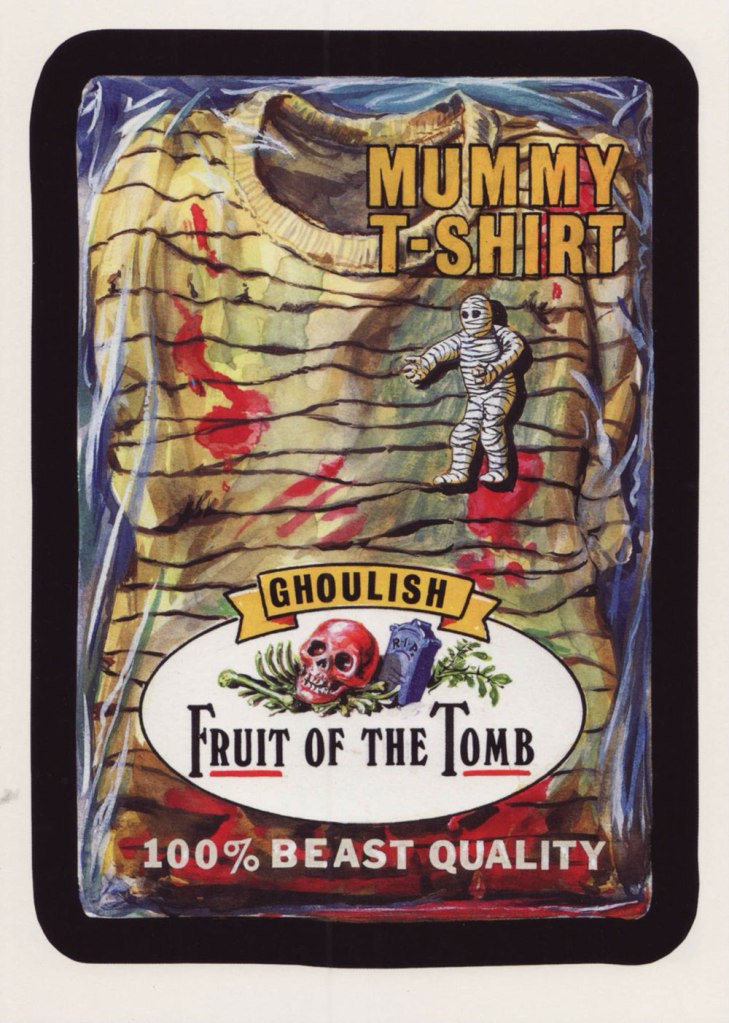
From the lucky 13th Series (1975, Topps). Another fine Saunders vintage. Topps would find Mr. Saunders most difficult to replace.
Did you hear the joke about fungus? You won’t like it, but it will grow on you.
As promised – though you folks may by far prefer tentacles to mushrooms – I am delighted to present this post about mushrooms both real and imaginary.
First of all why mushrooms? Those who know me are aware of my passion for fungus – it’s a gastronomic interest, as both co-admin RG and I love to cook with them, and also a platonic one, an admiration for their beauty and adaptability. In terms of aliens-on-earth, fungus is surely up there with the extraterrestrial octopus. We are currently on vacation, so this is the perfect moment to both admire some of our finds, and rediscover mushrooms in comics.
Usually people react in one of two ways to mentions of gathering wild mushrooms – ‘but how do you know you won’t poison yourself?‘ or ‘magic mushrooms! yeah!‘ The first question is pertinent, although there’s no need to take that horrified tone, and the second reaction is more than slightly one-track-minded.
Just like in real life, comics fungi come in all shapes and sizes: from cute appearances in the background of a cartoony comic, to psychedelic manifestations of the underground, to horror stories peppered with a slice or two of the deadly toadstool, and everything in between! I’ve tried to go for maximum contrast in this post, and include a little bit of everything. Dive in, like we dove in yesterday into our hedgehog-and-honey-mushrooms-pasta yesterday 😉
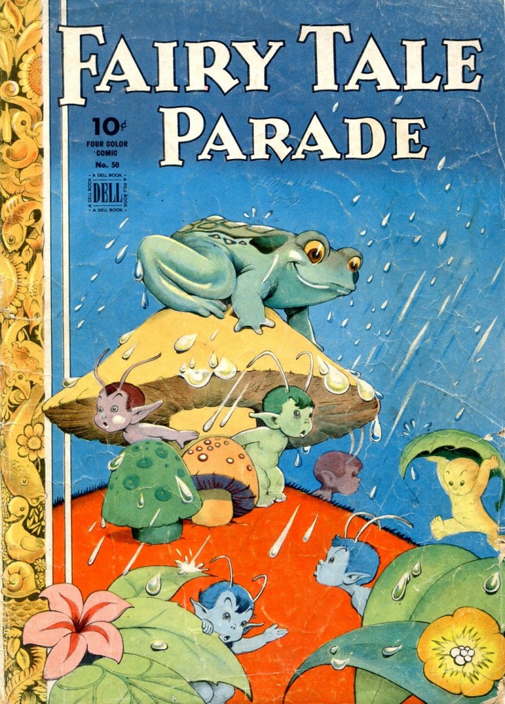
Four Color no. 50– Fairy Tale Parade (1944-1945, Dell). Cover by Walt Kelly. This is kind of an anonymous mushroom of indeterminate species.
A cartoon by Emile Mercier, Australian cartoonist who is best remembered for his work for the Sydney Sun between 1949 and 1968. This particular piece hails from the late ’50s.
Speaking of Mercier, I love this anecdote: « One day, Claude McKay, the editor-in-chief of Smith’s Weekly, took a dim view of an X Emile Mercier had drawn under the upwardly extended tail on a cat. After a few stern words about “dirty gimmicks in cartoons”, the grim-faced McKay instructed Mercier to get rid of the cross.This presented Mercier with a challenge. He was someone who used to say you “have to think funny as well as draw funny” and he was not keen to let McKay’s prudish approach to his cat go unchallenged. Mercier’s solution was to draw a miniature roller blind under the cat’s perpendicular tail. He was in no doubt the blind would draw more attention to the cat’s anus than the X had. Fortunately for him, McKay saw the funny side of the addition and let the cartoon run. Not a man to push his luck too far, Mercier drew all future cats without an X at the base of their tails. »
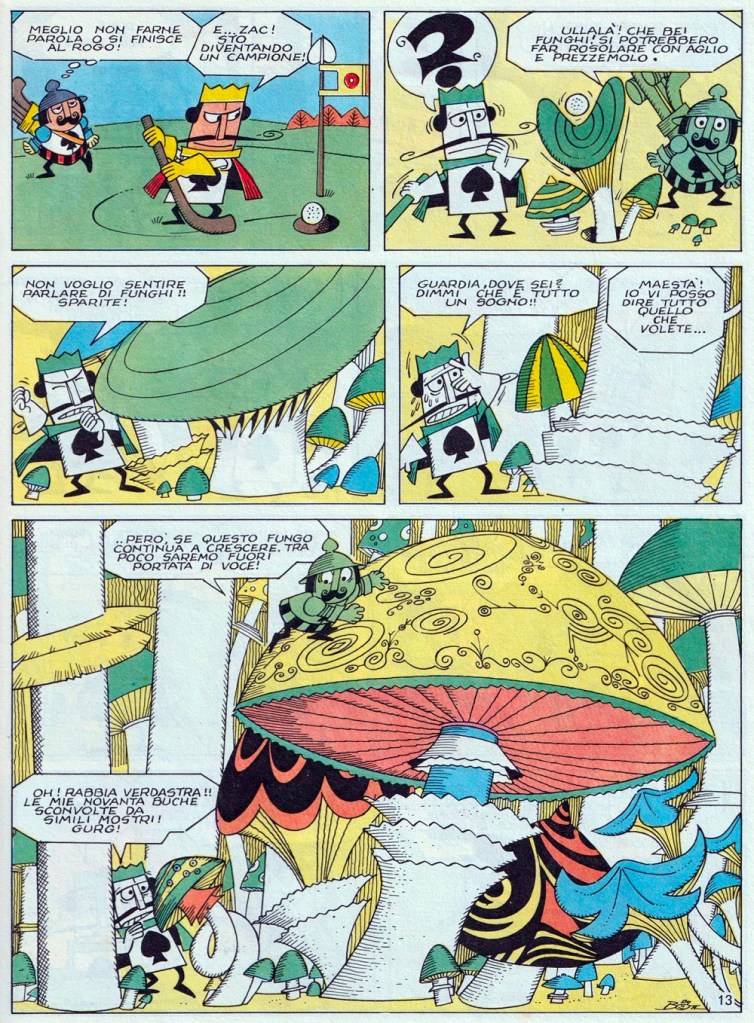
A page from Re di Picche no. 1 (AGIS, 1969), an Italian comics series created by Luciano Bottaro. Re di Picche means ‘king of spades’, and refers to the protagonist of this series (also the title of the magazine it was published in). Inspired by Alice in Wonderland? You bet! This mushroom appears to be some type of Amanita, a mostly deadly but handsome family of ‘shrooms.
The Plot to Destroy Earth, scripted by Dave Wood and illustrated by Jim Mooney, was published in Strange Adventures no. 183 (December 1965, DC). A man who refers to what is very obviously a mushroom as a ‘crazy-looking plant’ won’t impress anyone with his knowledge of nature… but this fungus-as-parachute interlude is entertaining.
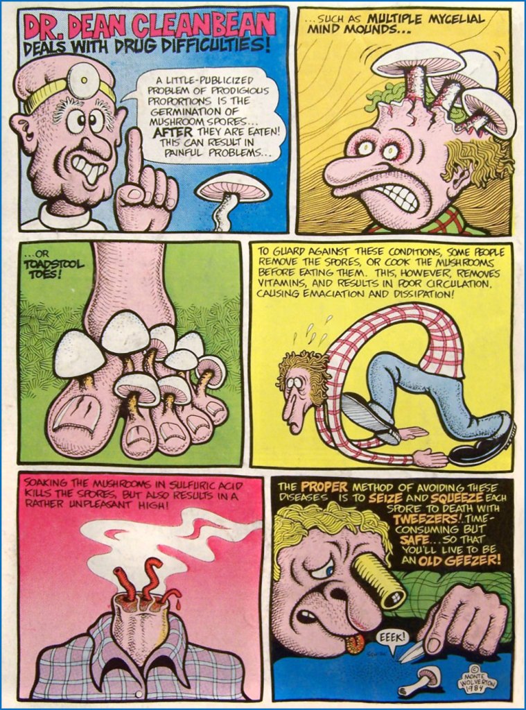
Dr. Dean Cleanbean Deals with Drug Difficulties, scripted and illustrated by Monte Wolverton (Basil Wolverton‘s son!), was the back cover of Dope Comix no. 5 (January 1984). Here we have the very prototypical magic mushrooms, which comes as no surprise.
I promised horror, didn’t I? This is a page from Chapter One, scripted by Mike Mignola and illustrated by Guy Davis, and published in B.P.R.D.: Plague of Frogs no. 1 (February 2011, Dark Horse).
A splash page from The Mushroom Fan Club by Elise Gravel (2018, Enfant – Drawn & Quarterly’s children’s imprint). I wholeheartedly agree with Gravel – mushrooms come in such a variety of shapes and sizes, that it’s crazy to even consider them as the same thing. Note the mischievous bolete (center, brown cap), probably the King Bolete, a.k.a. Penny Bun – it has a feeling of superiority, and we agree.
Some of our mushroom crop this week. In the usual clockwise order: Lactarius Deliciosus; various Leccinums (or Bolete); Armillaria gallica (Honey mushrooms) and Hydnums (Hedgehogs).
Matt Howarth‘s heroïneKēif Llama (pronounced keef yamma) has already been bestowed an exhaustive spotlight by my partner ds, so I shan’t rehash what she said. But since there are no tentacles involved in this case, I feel I’m on safe ground to take a peek at the spookiest bits of one of our favourite Xenotech’s startling interstellar encounters.
This is Keif Llama Xenotech Vol. 2.4 (Jan. 2006, Mu Press/Aeon), and despite what some have claimed, *not* a reprint of the also-recommended Fantagraphics series bearing the same name and logo.
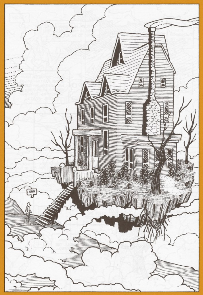
For once, someone was thoughtful enough to provide stairs for those of us still subject to the law of gravity.
… then you will die. Sounds reasonable.
An earlier recorded instance of a Haunted House in Space, from It’s Midnight… the Witching Hour no. 14 (Apr.-May 1971, DC). Layout by Carmine Infantino, pencils and inks by Neal Adams — both presumably drawing closely on Al Williamson‘s opening splash for the cover story (right down to the deer!), which you can read here!
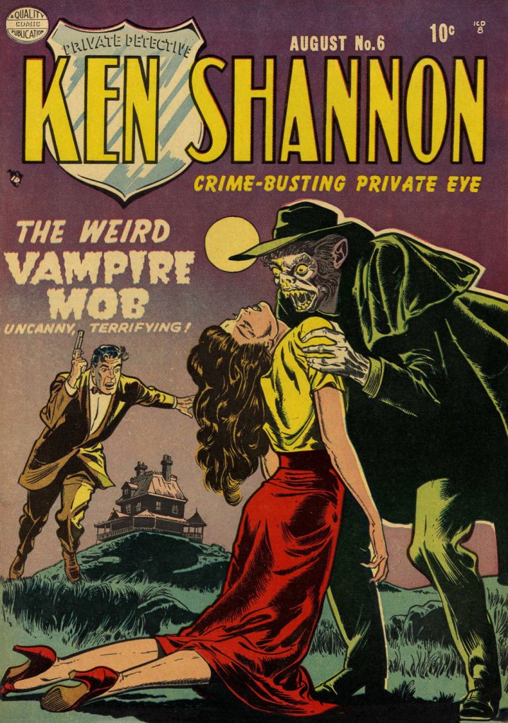
« There’s money, all right! I quoted Mrs. Tarrent a hundred slugs for this trip and she never batted a tonsil! » — Ken Shannon’s on the job.
Reed Crandall (1917-1982), one of the final additions (mid-1953… late in the ballgame!) to EC Comics’ immortal roster, previously spent most of the Golden Age years (1941-53) exclusively working for Quality Comics, and it was only when the publisher began to scale back its output, in 1953, that Crandall began to look elsewhere for additional work. After EC, he would make landfall at George A. Pflaum’s Treasure Chest of Fun & Fact, a story we’ve touched upon earlier this year.
Hard-boiled private eye (was there any other kind?) Ken Shannon was introduced in Quality’s Police Comics with issue 103 (Dec. 1950), and right away grabbed the cover spot (dethroning Plastic Man, no less!), which he doggedly retained to the bitter end, namely Police’s final bow, issue 127 (Oct. 1953). Concurrently, Shannon’s investigations were spun off into his own book, over the course of ten issues (Oct. 1951 to Apr. 1953).
Shannon certainly had his share of unusual cases to puzzle out, and here are the spookiest!
This is Ken Shannon no. 3 (Feb. 1952, Quality). From what I’ve seen and heard, these babies are scarce.
The cover story’s introductory splash. Read the entire issue here!
This is Ken Shannon no. 6 (Aug. 1952, Quality). Read the entire issue here!
And this is Ken Shannon no. 7 (Oct. 1952, Quality). Read the entire issue here!
« Hawaii can be heaven and it can be hell. » — Jeff Goldblum
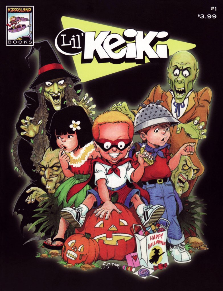
I’ve long been quite partial to Dennis Fujitake‘s work, from his fan days providing spot illustrations and covers to the Rocket’s Blast Comicollector and the fledgling The Comics Journal, then on to his splendid SF collaborations with writer Jan Strnad, Dalgoda (1984-86, Fantagraphics) and Keith Laumer’s Retief (1987-88, Mad Dog Graphics). After that, his work began to appear more sporadically: a wee bit of Elfquest in the mid-90s, a short piece here and there. If memory serves, this lower profile coincided with Hawai’i native Fujitake returning to live in the Aloha State, where he resides to this day. The Hawai’i Herald, “Hawai’i’s Japanese American Journal” currently publishes his comic strip 8-0-8.
Anyway, our current selection, Lil’ Keiki, was a sadly brief collaboration with writer Len Yokoyama released independently and yielding two lovely issues in 2005. To my eye, Fujitake’s mature style occupies a cozy sweet spot midway between the influences of Steve Ditko (Fujitake always *got* Ditko) and Ernie Colón.
To coincide with the launch of Lil’ Keiki, the Honolulu Star-Bulletin ran this profile, which helpfully illuminates the circumstances of the feature’s creation.
Today’s Tentacle Tuesday is going to be succinct, as I have traded tentacles for mushrooms this week! Keep an eye on Friday 😉
I am planning a separate post about Marc Hempel (and his Tug & Buster!), but in the meantime, here is an Illustration by him – visit his website here, or buy this design on a t-shirt from his store on Redbubble.
A poster by illustrator Michael Hacker, created for the High On Fire show that took place in Vienna on June 2015.
« She’s a haunted house / and her windows are broken. » — Scott Walker, “Big Louise” (1969)
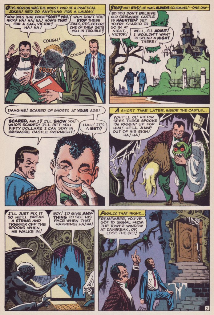
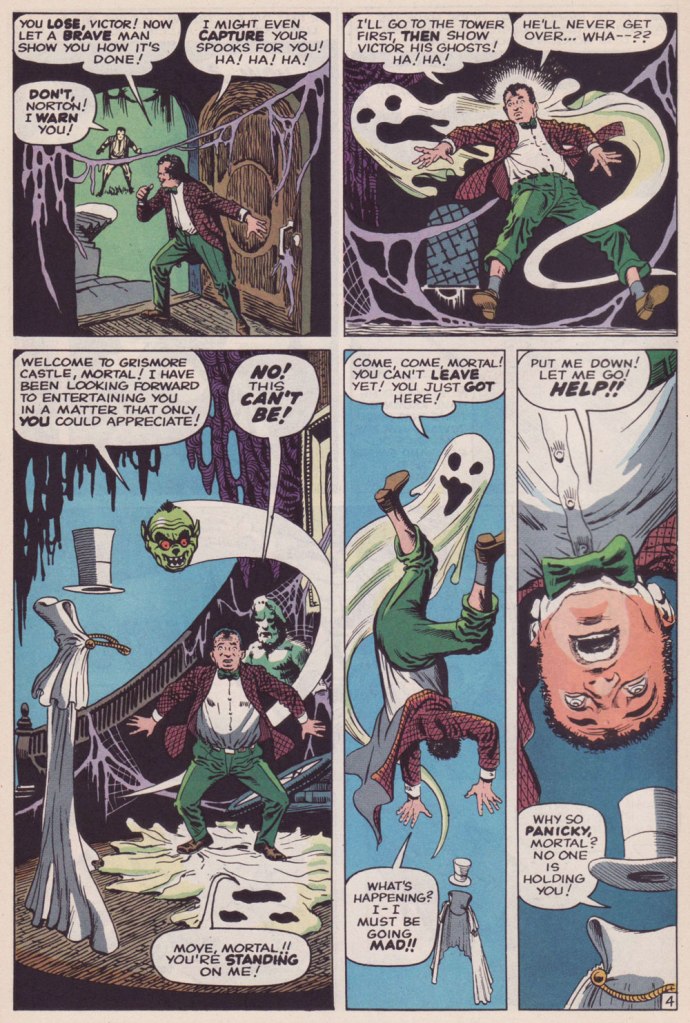
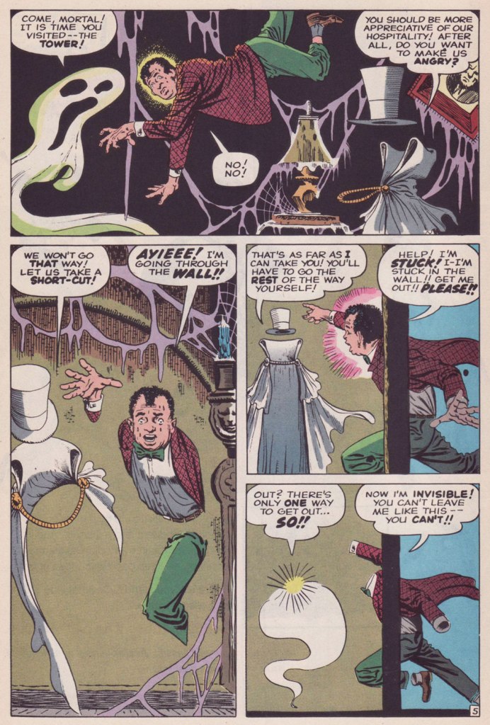
I’ve been wanting to share one of the all-time most beautiful art jobs Steve Ditko ever wittled, 1960’s The Ghost of Grismore Castle! (published in Strange Tales no. 79), but I don’t have that book. I do, however, own a 70’s reprint of it, in Vault of Evil no. 14 (October 1974), but the colouring and reproduction were so bland and washed-out that I knew that justice wouldn’t be done to this meritorious piece.
Then it hit me: I *had* seen a lovingly reconstructed presentation of the tale — has it nearly been… 30 years ago? Yikes!
It was reprinted with brio in the redoubtable Mort Todd‘s Curse of the Weird (no. 2, January 1994), a flawlessly-assembled anthology title he somehow conned Marvel into publishing in the early 90s.
So my gratitude goes out to Mr. Todd and, once more, my admiration to Mr. Ditko.
« We shot it from the original stats I dug out of the Marvel vault, rather than reprint VoE #14, and lovingly recolored it! Thanks for noticing! »
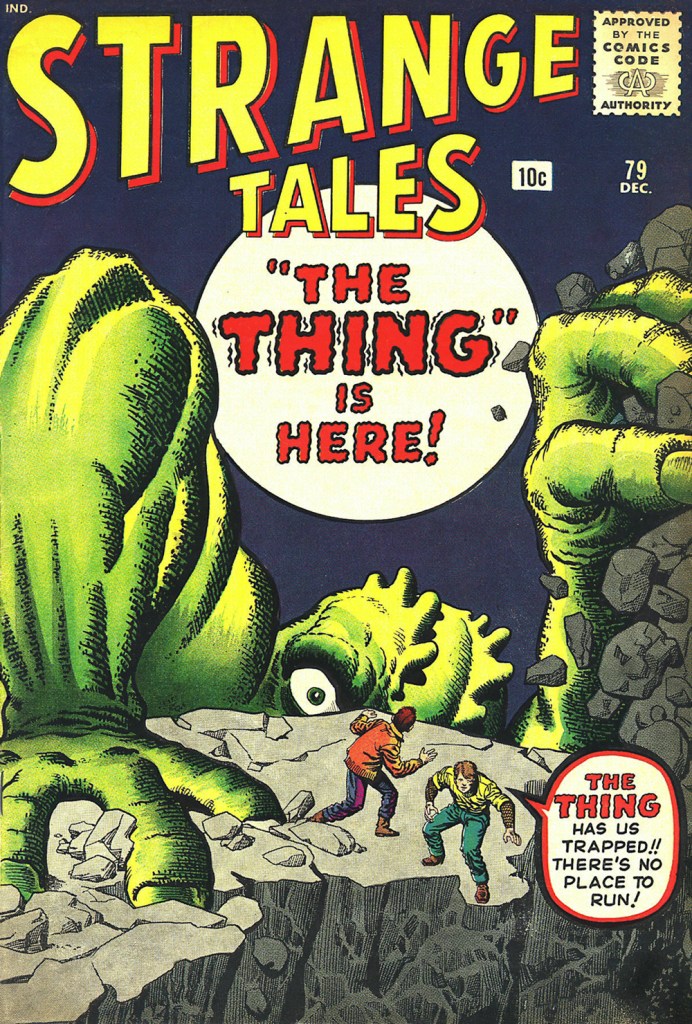
Oh, and as bonus, here’s the cover, one of those absurdly lush Kirby-Ditko collaborations. As usual with Marvel, all captions are de trop.
This is Strange Tales no. 79 (Dec. 1960, Marvel), pencils by Jack Kirby, inks by Steve Ditko. And duh, *obviously*, “The Thing” is here, Stan. Show, don’t tell.
The very 70’s update. This is Vault of Evil no. 14 (Oct. 1974, Marvel); cover pencils by Larry Lieber, inks by Frank Giacoia.