Back in August, I promised to follow Tentacle Tuesday: Dark Horse, Pt. 1 with another instalment of cephalopod material issued by this publisher. The time, as they say, has come! While I’m not always on board with the comics they opt to publish (rarely, I might even say), I do like today’s selections.
Dark Horse obtained the licence to produce James Bond comics in 1992. The result is a number of series and stand-alone comics – Serpent’s Tooth was the first, a three-part miniseries. The following two pages are from Serpent’s Tooth Part III: Mass Extinction, scripted by Doug Moench and illustrated by Paul Gulacy, published in James Bond 007: Serpent’s Tooth no. 3 (February 1993).
You decide for yourself which James Bond this is .
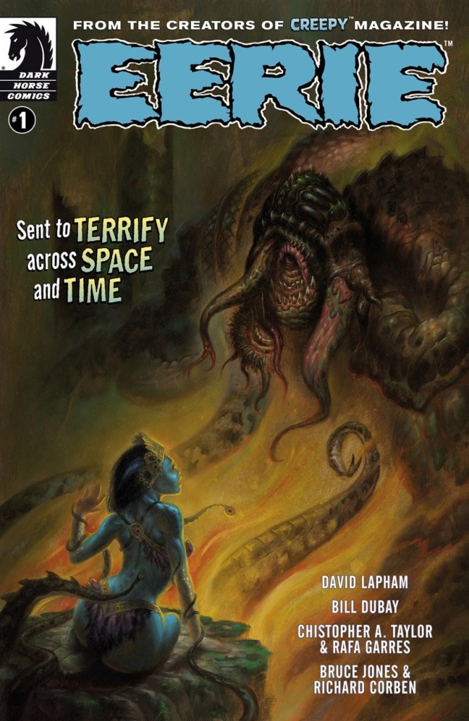
In 2007, Dark Horse stepped into a partnership with New Comic Company, who had earlier acquired from Warren the rights to Creepy and Eerie. The result was the gradual publishing of ‘archival’ hardcover collections of all issues of Creepy and Eerie magazines. In 2009, DH launched the ‘new’ Creepy Magazine, which mostly featured new stories, sprinkled with the odd reprint. A revived Eerie soon joined it.
Dark Horse’s revival of the classic Warren magazine is a mixed bag – this issue for instance, features several new stories and a reprint from 1970 (Life Species by Bill DuBay). This is Eerie no. 1 (July 2012). Cover by Jim Pavelec.
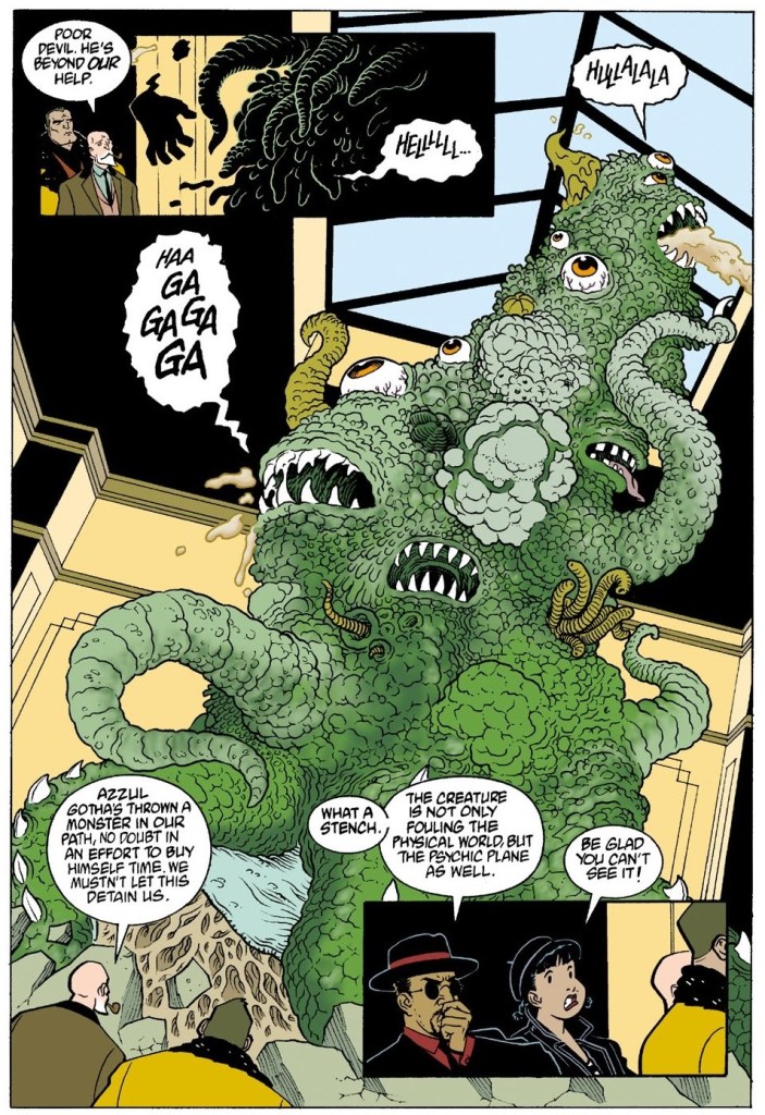
The next story is Tentacle Master Mike Mignola‘s ‘Champion of the Worms‘, which held my lazy interest for a few pages… until I found out that it’s actually quite good. What a pleasant surprise for one who had such low expectations! It also brims over with tentacles. The following three pages are from ZombieWorld: Champion of the Worms (October 1997), scripted by Mignola and illustrated by Pat McEown.
Not everybody can boast to such a classy octopus hat!
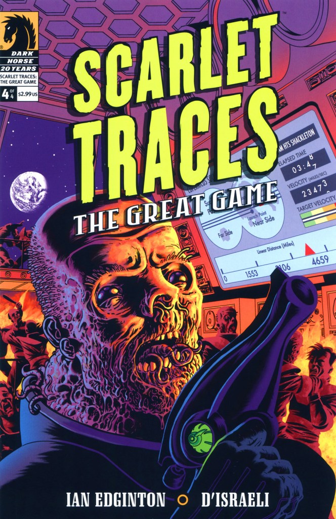
Last but not least… Scarlet Traces is a sort of sequel to Ian Edginton and D’Israeli‘s adaptation of H. G. Wells‘ The War of the Worlds, with heavy Dan Dare and Doctor Who references. This story wears its Englishness on its sleeve!
Scarlet Traces: the Great Game no. 4 (October 2006). Art by British artist D’Israeli, whose real name is actually Matt Brooker.
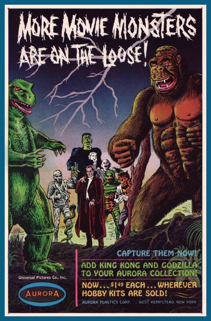
« The world will come to an end, but the monster models will still be around. » — James Bama, who went on to paint artwork for over twenty of Aurora’s kit boxes.
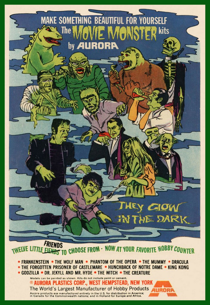
Well-executed comic book ads were often just as enticing (and sometimes more, depending on the title) as the contents proper. A prime example, this lovely Aurora Monster Kit campaign, announcing the epochal model maker’s forays out of the Universalménagerie of misunderstood fiends with Toho’s Godzilla and RKO’s King Kong.
The first Aurora monster model advertisement, it appeared in various DC Comics titles dated November and December, 1963.
The ad ran on the back cover of various DC titles in late 1964. In this case, House of Secrets no. 69 (Dec. 1964). The artwork is almost certainly that of Mr. Murphy Anderson, who goes uncredited, but is betrayed by the characteristic finesse of his inking.
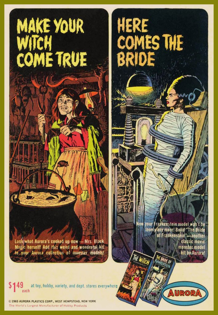
A couple of the models that usually received considerably less attention got their turn in the spotlight in this ad that appeared on the back cover of select DC titles cover-dated October, 1965.
Incidentally, if you were wondering, indeed, the giant monsters cost more… 50 cents more. A bunch more empty bottles to collect, son.
In the late ’60s, a new twist was added: phosphorescence! A cool idea, it however made painting the models, a tricky task to begin with, even less rewarding, as opacity was a bitch to achieve. It worked okay if you had mostly light-coloured The Mummy, but otherwise… This advert appeared on the back cover of DC Comics dated October, 1969… and thereabouts.
The Spring, 1970 collection.
Here’s where Aurora’s close business relationship with Warren Magazines became most evident, with the appearance of a Vampirella model kit. Controversy ensued, once moms caught a glimpse of Junior’s new model kit, the heirloom of his bedroom. Speaking of controversy, Vampirella’s quip about New York was likely a barb about the infamous Kitty Genovese case. This pitch showed up in various DC titles, again, in and around June, 1971.
Warren sold a lot of Aurora kits via his mail order business, and a decision was made to include his character in the line rather than risk dissolving a partnership. Unpainted, she appeared to be virtually naked. Her counterpart, the Victim, sported hot pants and a halter top; a dress or flowing skirt was deemed impractical in order to have her fit on the torture rack.[ source ]
This beautifully-designed ad showed up in October, 1971 DC titles.
At this point, the diluted message is a hint that the bloom is off the rose. An ad from November, 1971.
As a bonus, here’s Big Frankie, the seldom-seen, long-unavailable Aurora grail (until its relatively recent reissue). As the largest Aurora model of all, BF fetched, at the time, an astronomical $4.98; now it goes for a hundred smackers, so don’t complain. Take a look at the big fella!
Though the original Aurora issues of these classic kits are mostly rare as hen’s teeth, enterprising contemporary kit companies have reissued these babies, and you now can actually afford to free the monsters from the confines of their box and assemble and paint ‘em. Mint in Box? Pfui!
« … a radical series of crappy jokes & trashy art mopped out of the Bowery’s least washed lavatories. Fueled on bologna sandwiches, black coffee & cheap cigarettes, these are the ugly buttons that scream ‘America‘ to an America that has forgotten itself. » — a tasty bit of hype from Goblinko
Fabled pulp illustrator Norman Saunders (a definite favourite around these parts) is legitimately appreciated for his body of work, but I do believe he isn’t sufficiently lauded for his humorous work. After all, he could hold his own against the likes of Basil Wolverton and Wally Wood, and how many of his peers could lay claim to such a lofty achievement?
A passage from his son David’s definitive monograph, the simply and fittingly titled Norman Saunders:
Ugly Buttons came out in 1967 to exploit the popular trend of protest buttons with witty sayings. The macabre humor of Ugly Buttons reflects their Halloween release date as well as the morbid comedy of popular TV shows like The Addams Family and The Munsters. Norm Saunders created half [ eleven, actually ] of the twenty-four images in this set, while Wally Wood created the other half.
A sample of the original packaging…
I’m sorry… but that bat is just so adorable…
You can see why these are perfect Hallowe’en fodder!
Macabre, and with a tidy moral to boot! At a nickel apiece, an undeniably excellent value.
Well, perhaps not *strictly* altogether moral.
The final Saunders button, shot from the original art. This looker was entitled Peek-a-Boo.
One of the original boxes, which held 24 packs. Featured buttons Here’s Looking at You and I’m a Cool Ghoul were designed by Wally Wood.
Collectors find this set very difficult to complete. Although the series was a popular success in 1967, the buttons appear to have rarely survived. This is perhaps attributable to the design of the tin back pin, which was made in Japan with a hair-trigger clasp that instantly popped open and fell off.
Here’s one of the underperforming bad boys in question. To be fair, this one’s still holding together, which surely has earned it some kind of goodwill, a half-century hence. Those old enough (enough, enough!) will recall when ‘Made in Japan’ was an indicator of shoddy goods. All that’s been turned on its head since, interestingly. The Japanese people have admirably overcome much adversity, that’s evident.
By the way, I don’t know just how sanctioned these reissues are, but the cool cats at Goblinko have made these lovely buttons available once more, presumably sturdier and certainly at a perfectly reasonable price (forty times the original, I’ll grant you… but you do get to pick).
« Listen, Angel! If they’re out of bananas… I’ll meet you at the corner fruit stand! »
Today, let’s combine our general theme with a celebration of the birthday of one of comics’ great, yet perpetually underappreciated talents: Bob Oksner (October 14, 1916 – February 18, 2007), DC’s go-to humour and good girl art guy. Can you beat that? Didn’t think so.
Bob had a winning penchant for mixing monsters and babes, and for this, he’s earned our lifelong gratitude.
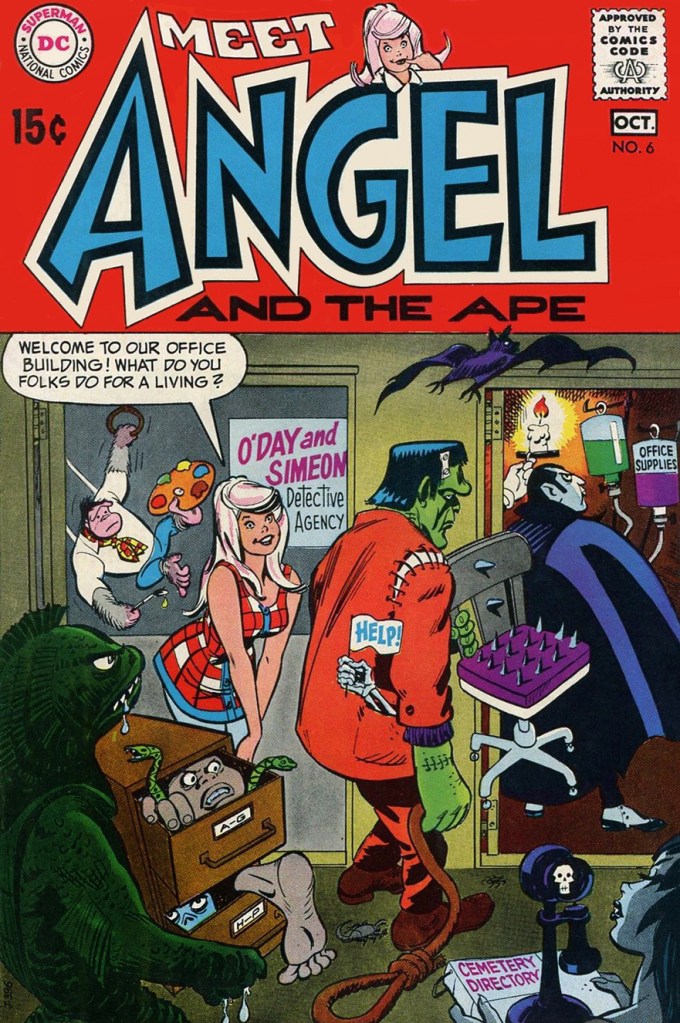
This is Angel and the Ape no. 6 (Sept.-Oct. 1969, DC), featuring The Robbing Robot and The Ape of 1,000 Disguises! (Would You Believe Four?), wittily written by John Albano, lusciously pencilled by Oksner, and creamily inked by Wallace “Wally” Wood. Truly swoon-inducing stuff. Edited by Joe Orlando (that explains all the monsters!), with a cover by Oksner.
You might say Angel and the Ape exist in an awkward sort of limbo: popular enough for the back issues to be kind of pricey, but not popular enough to have been reprinted (eight issues, including their Showcase appearance, ideal for a trade paperback, hint, hint).
So what else has Mr. Oksner cooked up over the years? Keeping to our theme, here are a few highlights, but first, a handy bio:
This piece appeared in The Adventures of Jerry Lewis no. 73 (Nov.-Dec. 1962, DC).
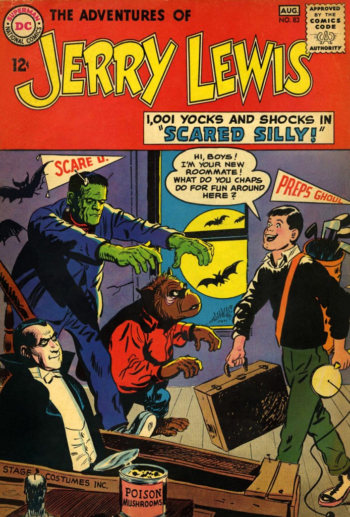
The is The Adventures of Jerry Lewis no. 83 (July.-Aug. 1964, DC). Formerly The Adventures of Dean Martin & Jerry Lewis… of course. The book (under both titles) featured some lovely artwork from Owen Fitzgerald, Mort Drucker and of course Oksner… but it was no Sugar and Spike. Still, it had its audience, long-lasting as it was (124 issues… Jerry wasn’t just big in France!)
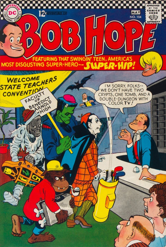
This is The Adventures of Bob Hopeno. 104 (Apr.-May 1967, DC). DC’s celebrity-licensed humour titles followed a parallel course: fading sales led to their nominal stars being more or less sidelined in their own book in favour of increasingly outlandish supporting casts.
An inside page from that issue. Good-looking comics… but they weren’t particularly witty, which can be a bit of a drawback. Arnold Drake was the writer, and while he could be pretty damn funny, it just didn’t work here. Still, you can bet that it was still more amusing than Milton Berle’s comic book.
1940s teenager Binky was pulled out of mothballs in the late 60s (ten years elapsed between issues 60 and 61). A moderate success (especially given it mostly consisted of slightly updated reprints), it returned to oblivion after another twenty-two issues, though the first seven boresome rather fine Oskner cheesecake covers. This is Leave It to Binky no. 67 (June-July 1969, DC).
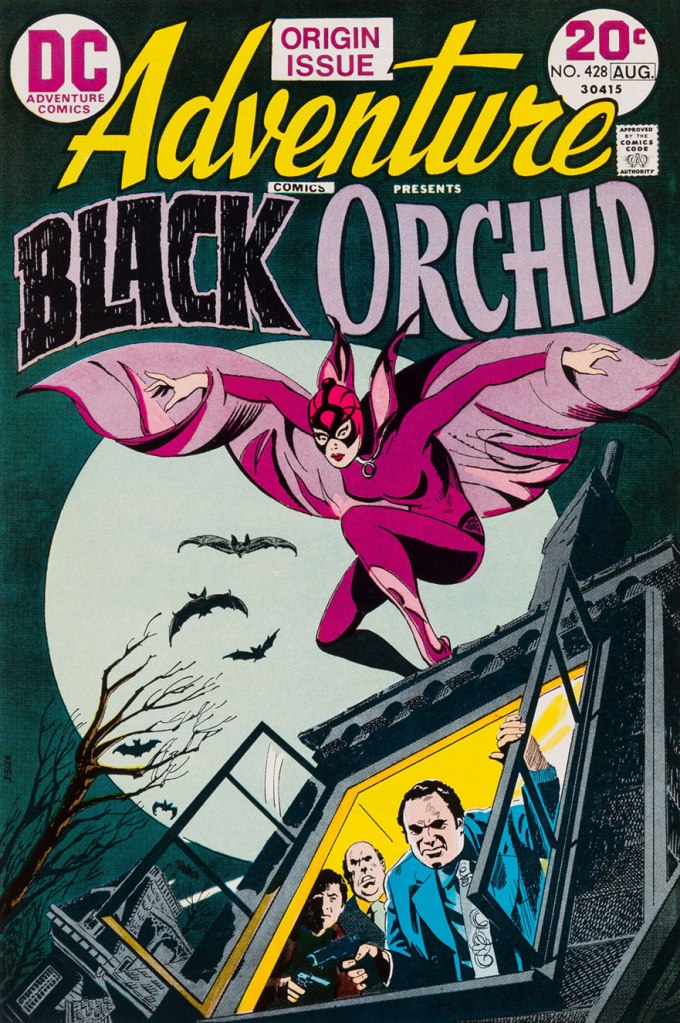
Finally, for a touch of the more ‘realistic’ Oksner style, here’s his cover introducing Sheldon Mayer‘s marvellously-mysterious Black Orchid. This is Adventure Comics no. 428 (July-Aug. 1973, DC). She deserved far more than a mere three-issue run!
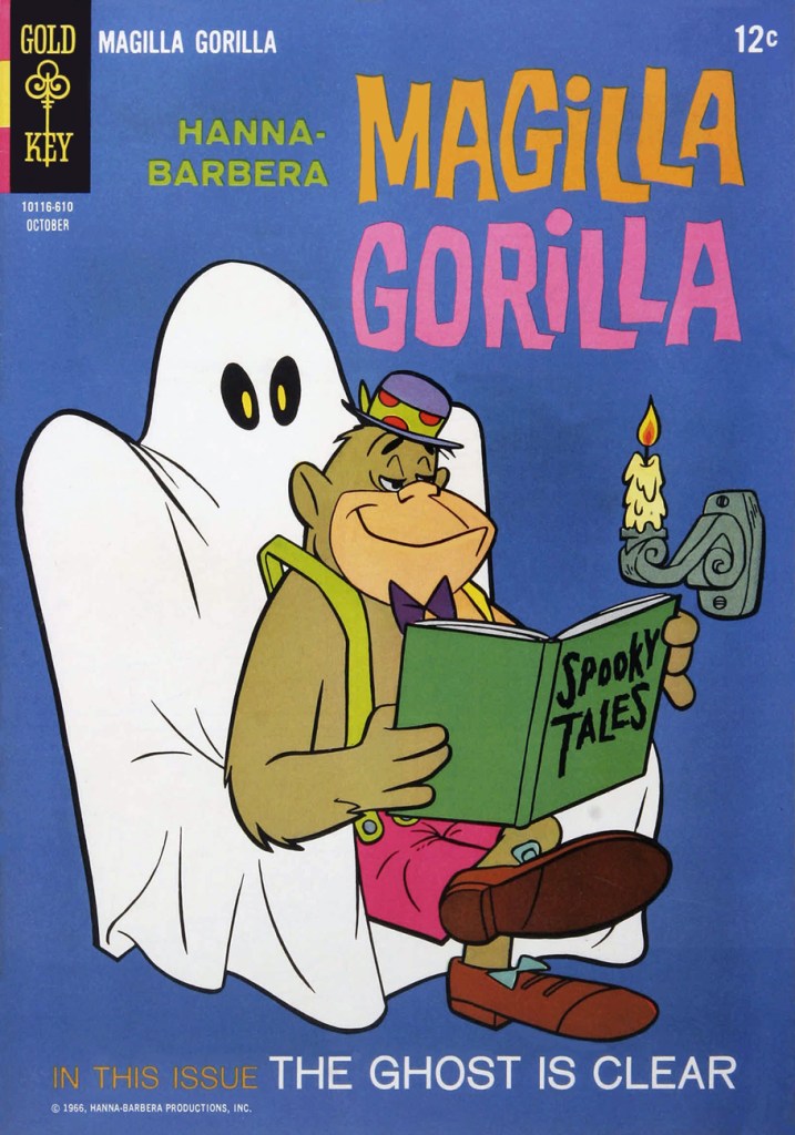
« Take our advice, at any price, a gorilla like Magilla is mighty nice. Gorilla, Magilla Gorilla for sale! »
Seems you just can’t unnerve a guy (let alone an ape) who takes fright fables so lightly. I mean, look at that blasé expression! Perhaps he needs some spookier tales.
This is Magilla Gorilla no. 9 (Oct. 1966, Gold Key). Cover artist unknown…certainly a ghost.
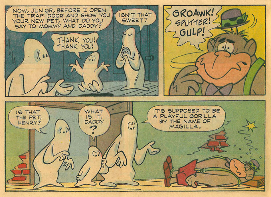
Unfortunately, the title story — and the rest of the issue — are nothing to get excited about. Nicely flowing, on-model animation-style artwork, but the stories…
Still, here’s the highlights reel. Strictly kid stuff… but did it truly need to be? A little subversion goes a long way.
In Yiddish, a megillah is a long tedious or embroidered account, from the Hebrew megillah, a story written in a scroll. One episode has Magilla saying, “Such a megillah over a gorilla.“ [ source ]
« We’ll try again next week. »
In other, loosely-related news, and in the spirit of the seemingly undying nature of pop culture icons (even minor ones)…
José Adílson Rodrigues dos Santos (born September 2, 1958), is a retired Brazilian heavyweight boxer. He scored 61 knockouts with 43 of those coming under 5 rounds. Rodrigues currently resides in São Paulo, São Paulo, where he is being treated for Alzheimer’s disease originating from dementia pugilistica. His nickname in Brazil, Maguila, comes from the cartoon Magilla Gorilla.
The gajo should have really sold the concept, and fought in a too-small bowler hat and green suspenders.
« It did not occur to me that I might be a writer until I flunked out of my first year as a chemistry major, and found work as an apprentice writer of Volkswagen ads. » — Peter Carey
Until the Beetle hit the market, automotive marketing copy was full of bluster, and the images (often illustrated) were flights of fancy, emphasizing low, long lines and a fantasy lifestyle.
The clean, simple photography on a white background that emphasized the Beetle’s compact, practical form may seem commonplace these days, but it was a revolution in a world where Americans grew up obsessed with muscle cars, horsepower, and tire smoke. Making the car small, when the convention was to make it fill the page, was also novel. The simplistic approach to design and layout was totally contrary to the advertising conventions of the time. [ source ]
While I object to the misuse of the rather pejorative “simplistic” to denote what is instead commendably strippeddown, uncluttered, or if one must, ‘simple‘… that’s the gist of it. After all, these folks are gearheads, not graphic designers.
One of the lesser-known components of the long-running campaign was a nifty 1967 promotional book that was graciously given away by one’s friendly Volkswagen dealer.
They gathered all the big guns and asked them to think small. Illustration by Charles Addams.
Let’s take a look inside.
One by perennial bon vivantEldon Dedini, working one of his pet motifs, but with his customary panache. Under Eldon’s pen, the car’s lines acquire a lusty fluidity.
A beauty by local favourite Virgil Partch (1916-1984). Such a graceful line the man had. Simple… not simplistic!
Don’t be confused: like the Porsche and the Corvair, the VW Beetle’s trunk is located in the front of the vehicle. Cute details: the booted husband’s still-smoking pipe and his glasses remain in the garage. VIP delivers, as usual. Read how he met his demise.
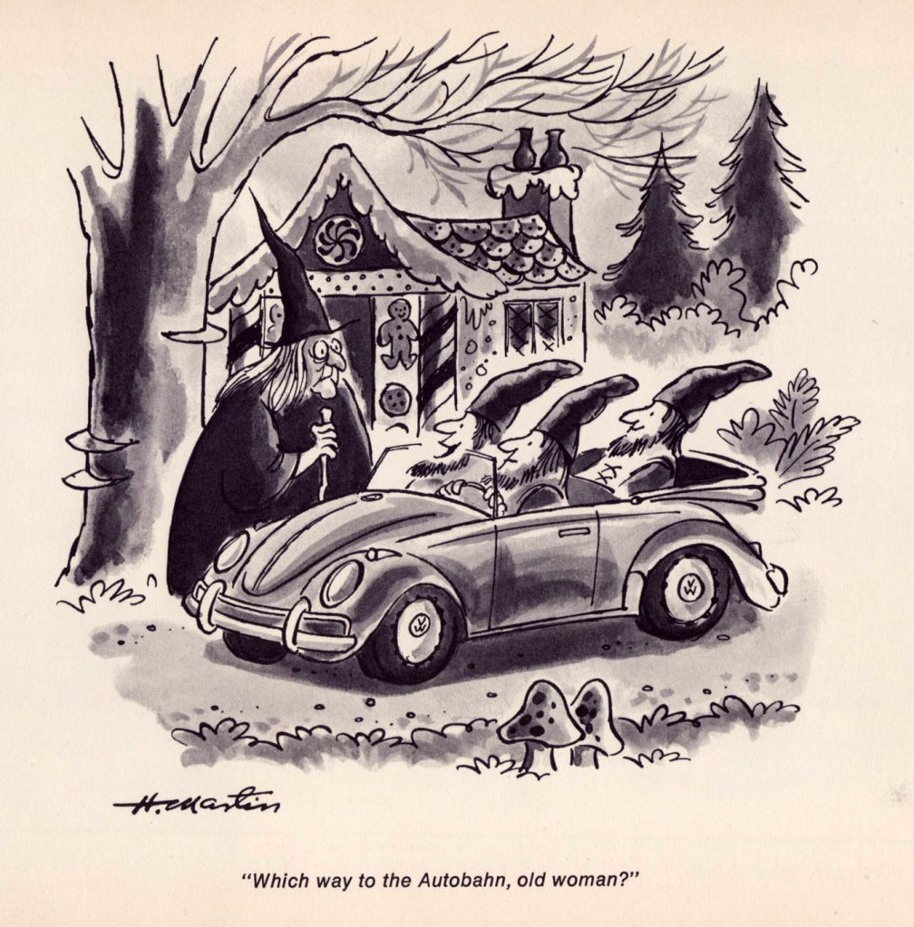
An adorable entry from long-time The New Yorker cartoonist Henry Martin, who passed away last June at the age of 94. I can just hear the German accent.
Another Playboy regular, Phil Interlandi (1924-2002) stretches out a bit, and very successfully at that.
One from the book’s royal guest, Charles Addams (1912-1988). It’s a fine joke, but I find that many people don’t get it; it would have benefitted from a more vertical composition. Still, trust Uncle Fester to know what’s going down.
A second dose of Mr. Addams. I wasn’t going to say no to a giant mutated toad and toadstool. Here’s our earlier sampler of his macabre wit, from (un)naturally, our first Hallowe’en Countdown.
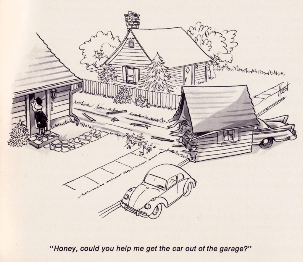
The couple of decades he spent drawing his successful syndicated strip about unceasing marital strife, The Lockhorns (whose début came the following year!) have perhaps dimmed the critical reputation of William ‘Bill’ Hoest (1926-1988). But he was quite good, when given a chance to stretch out a bit. It’s been since proven that women are the better drivers, incidentally.
And finally, a bat-entry from John Gallagher (1926-2005), a then-ubiquitous panel gag cartoonist in many of the biggest names in magazines: Collier’s, The Saturday Evening Post, Look, True… I love the absurd size ratio between the members of The Dynamic Duo. That’s one sidekick you could accidentally kick aside!
Today’s installment of Tentacle Tuesday provides us with another healthy dose of tentacles of a vegetal nature. With my co-admin RG’s blessing, I decided to be a little unorthodox and instead of my usual piecemeal approach, share one single story.
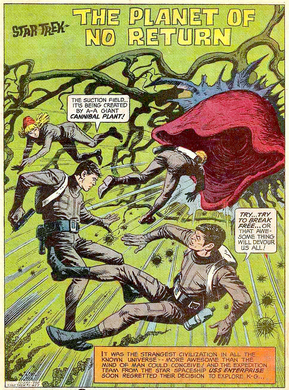
I must admit to having no rapport whatsoever with Star Trek – I did not watch the show as a child (or as an adult), and haven’t even managed to pick up characters, plot lines or cultural references from the surrounding atmosphere, aside from the stuff *everybody* knows.
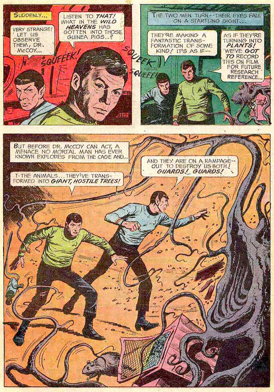
But The Planet of No Return (published in Star Trek no. 1 (October 1967, Gold Key), scripted by Dick Wood and illustrated by Nevio Zeccara) is a delight for any keen child who’s ever been mesmerized by the notion of a carnivorous plant and has carried that love through the years into adulthood. I’ll hold my hand up there! It’s also right in the sweet spot of a Venn diagram, the riveting intersection of “interested in Venus flytrap plants” and “fascinated with tentacles”. I’m not featuring the full story (you can read it here), preferring to tantalize my audience with the many tentacle-laden panels of grabby, aggressive human-devouring plants.
Incidentally, “cannibal plant” is a misnomer (shame on you, Pavel Chekov!) – cannibals involve individuals consuming individuals of the same species.
It all starts with some strange plant spores sucked in through the ship’s ventilation system while it’s drifting next to an unexplored planet…
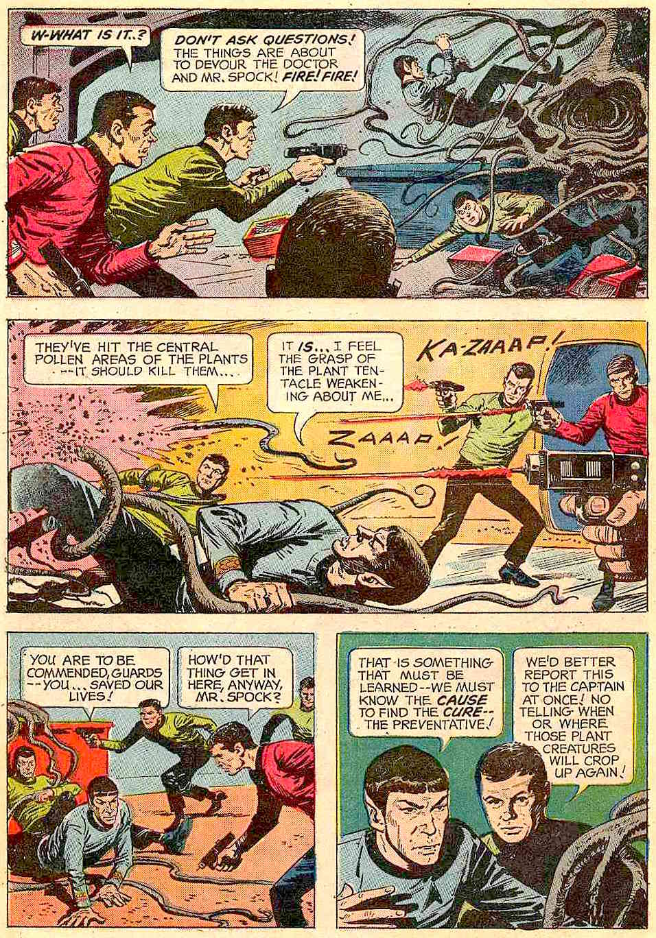
The ship gets teleported to the planet to pursue their original exploration mission as planned… and get almost eaten by a tentacled “cannibal” (once again, not actually a cannibal) plant. A “giant plant tree”, strangely mobile, saves them from this worse-than-death fate… and turns out to have been Hunt, one of their teammates transformed into plant life by spores. No, I don’t know who Hunt is, either – he’s certainly not on the official Star Trek character list, introduced seemingly to be promptly killed after performing his heroic deed.
Well, okay, if the plant tried to eat a tree, maybe it is, technically, a cannibal.
The now four-people team (the fifth one, Hunt the tree, dies after his epic battle with the Cannibal Plant) continue further into the wilderness… and stumble across a village of sentient plants, who don’t take kindly to intruders. Geez, can you blame them?
After shooting at (and presumably maiming) various denizens of the plant village, the humans retreat to a cave and conclude that this planet is ugly. Sentient plant life is not amazing enough for them, apparently. I suppose being part of Star Trek makes one really blasé about such things.
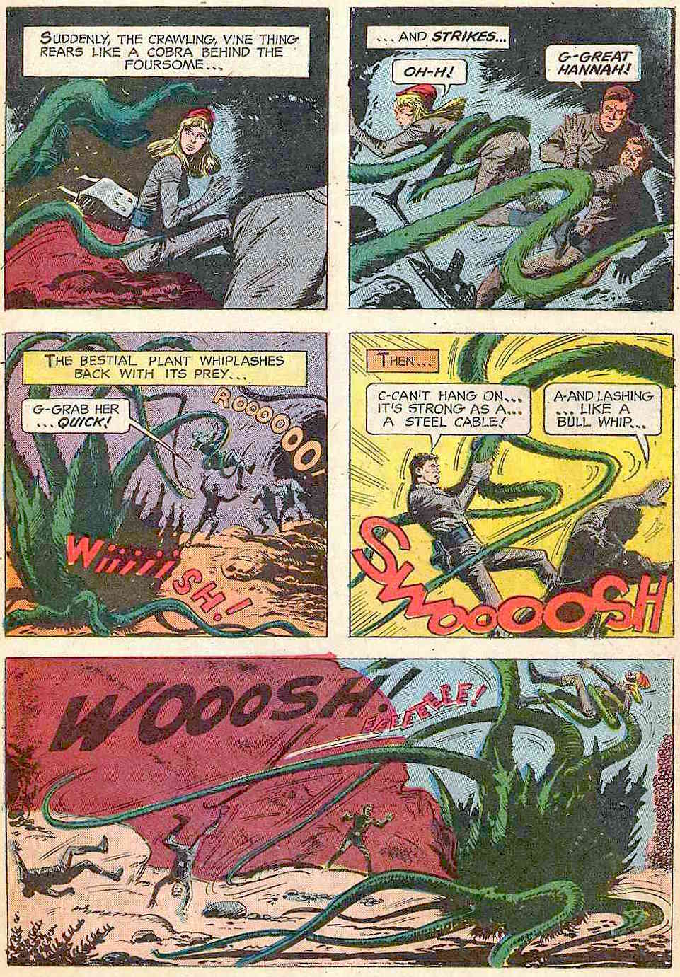
Janice Rand has it coming for being annoying and whiny…
At this point, we’re more or less done with tentacles, but I can’t leave you on this cliffhanger (especially if you don’t have some time to waste reading a comic of questionable taste).
Here’s how it ends:
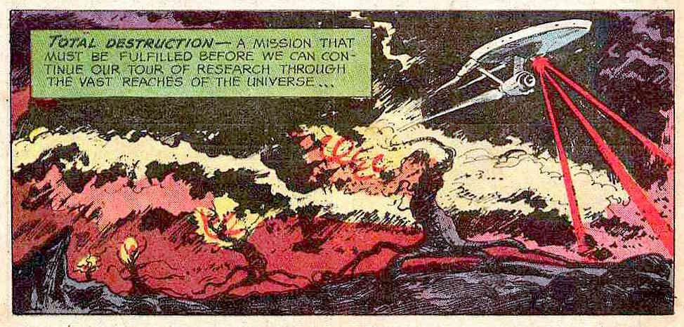
What does this “bestial plant” want with Janice? It wants to put her into a cattle pen, of course! Aiming to rescue her from its clutches, our intrepid explorers break into the pen, and, observing the landscape, conclude that the plants are raising dinosaur-like creatures who consume vegetable-type plants. «The lower plant life on their social scale are used as fodder… food for the beast creatures! Vegetable food!» Oh, and «The vegetables are alive – they’re making sounds also!» So sentient plants are farming animals whom they feed on other sentient plants. (At this point, I was muttering “what is wrong with this comic?”) It turns out that the superior plants eat the animals, who eat the inferior plants, and Janice is now one of the cattle, about to be sent into the giant trees-cum-slaughter-houses to be transformed into food. During the climax of the story, the slaughterhouse trees are blown to smithereens by Mister Spock and his laser beam destruct ray (it’s automatic, it’s systematic, it’s hydromatic), and everybody is teleported back into the relative safety of the ship. The surface of the planet (a.k.a. “hideous little globe”) is then obliterated by laser beams – just in case.
So how come only Hunt got transformed into a tree? Are we to assume that the other members of the team are immune?
« Slap him up and down upon the floor Tickle his feet and hear him giggle Then unzip him down the middle Give that gibbon what he’s hollerin’ for! » — Stuff That Gibbon (words and music by Bill Oddie)
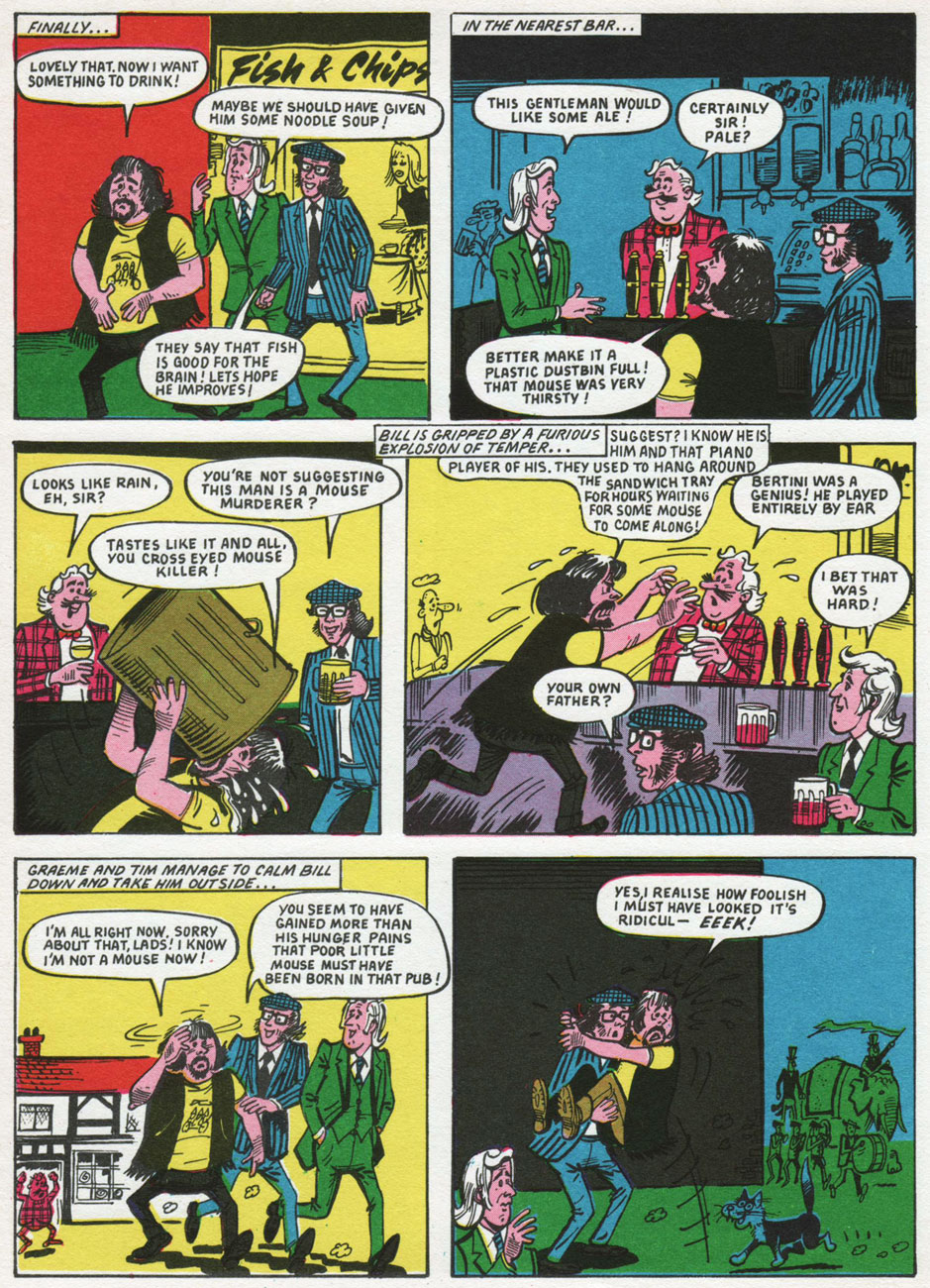
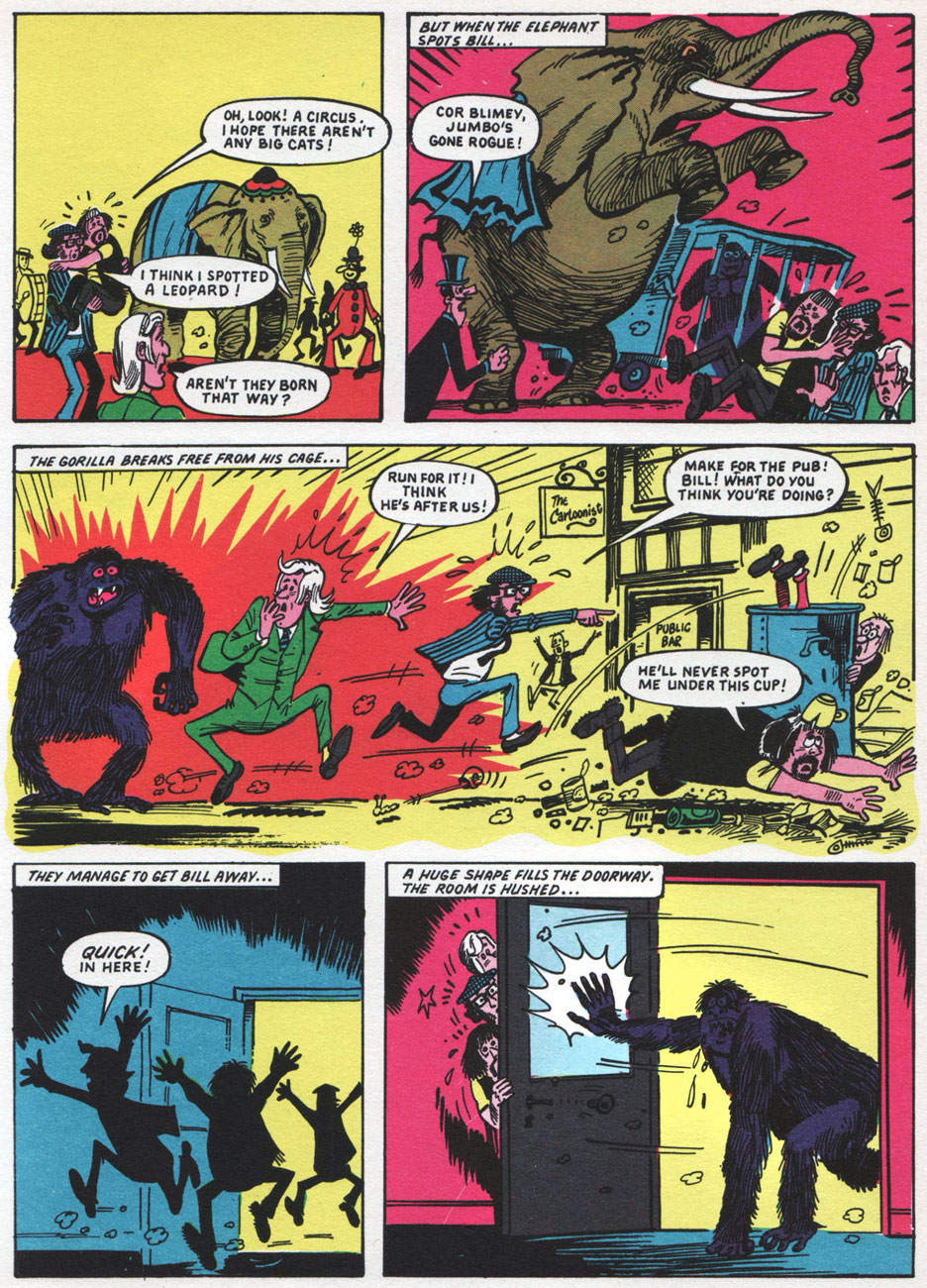
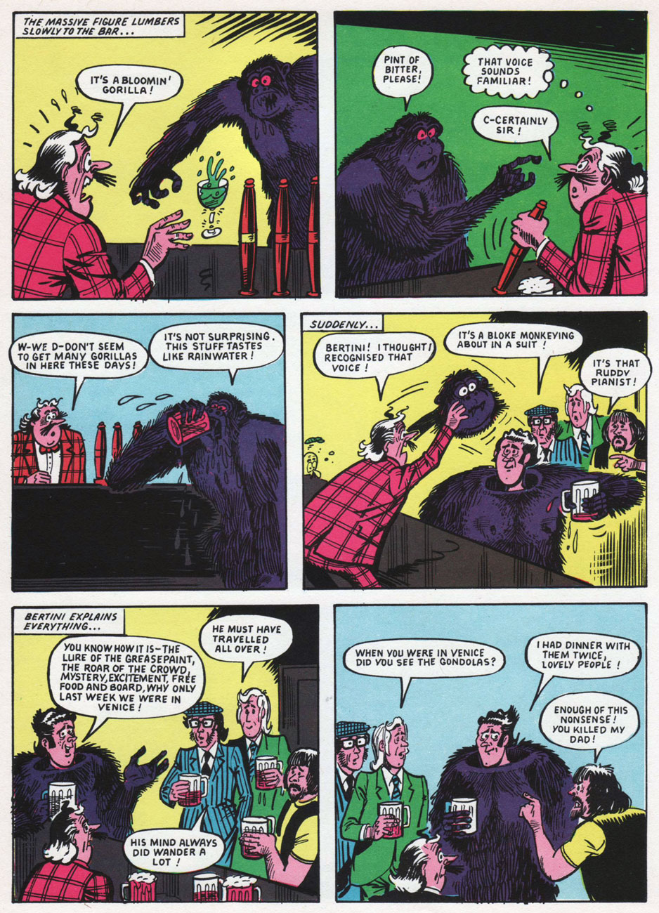
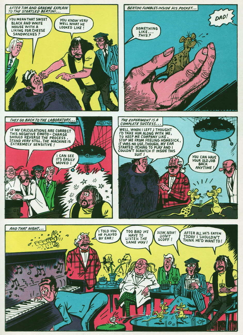
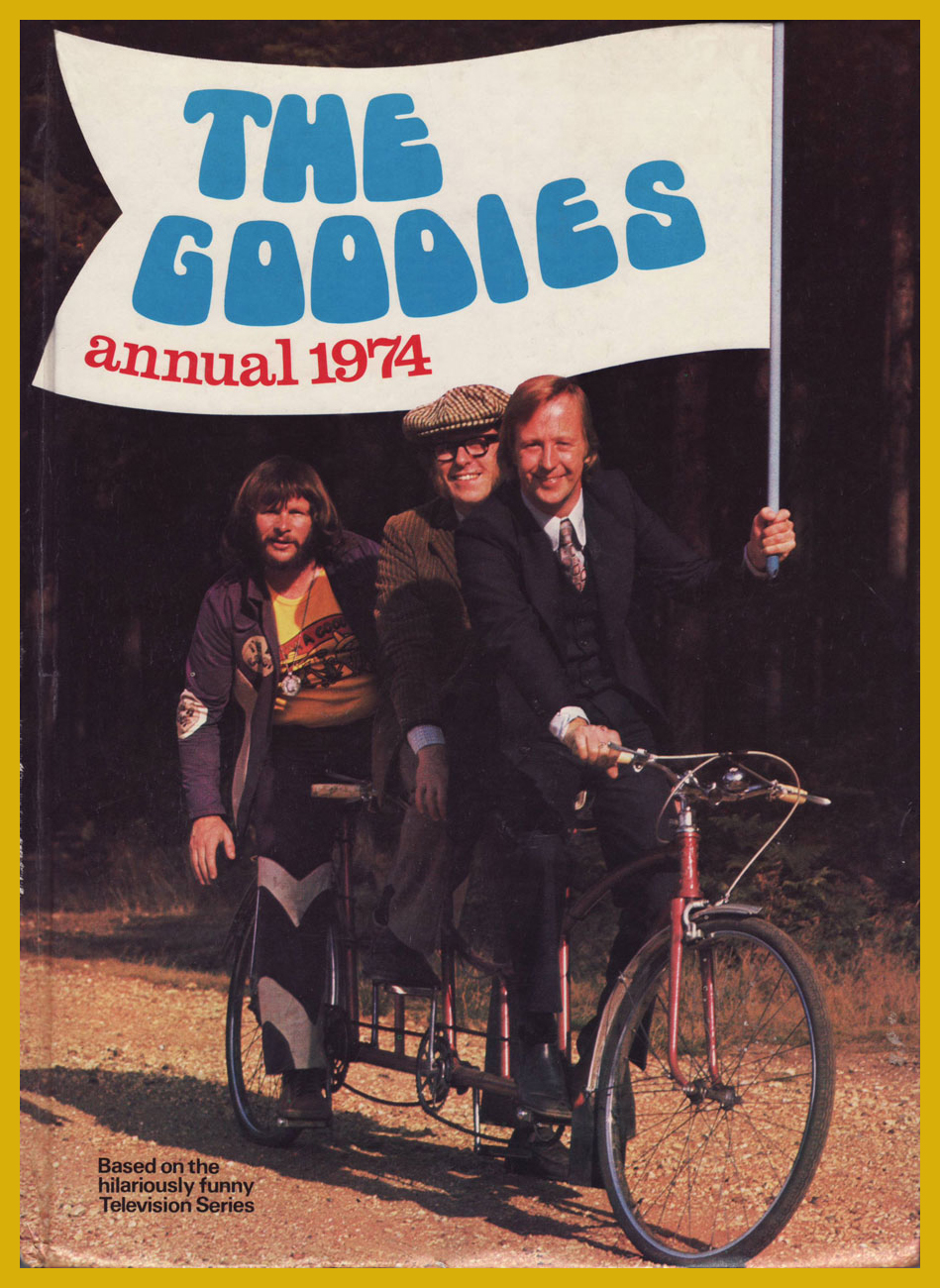
Back in the late 1970s, before I had even heard of Monty Python’s Flying Circus, nor even of Benny Hill, for that matter… I discovered The Goodies, thanks to the CBC’s belated programming of their exploits*. While The Goodies do share a *lot* of DNA with the Monty Python gang (they were school chums, close friends, collaborators and friendly competitors practically all along the way), this trio’s comedic format veers sharply away from the Pythons’ methods: Graeme, Bill and Tim play ‘amplified’ versions of themselves, and use the skit format sparingly, reserving it for mid-show intermission ‘blackouts‘.
While the trio was formed in 1970, it only made its comic strip début (and bow) in 1973**, where they held a weekly feature in the pages of Cor!!, also making an appearance in the magazine’s 1974 annual and The Goodies Annual, the whole lot hitting kiosks in ’73.
« Apparently licensed for just the one year, The Goodies were unique in the fact they were the only adapted characters featured with the comic’s pages with copyright credit being given to Bill Oddie, Tim Brooke Taylor (sans hyphen) and Graeme Garden. According to Robert Ross’ book The Complete Goodies, the strips were all authorised and approved by The Goodies prior to publication and Tim still displays an original Cor!! strip in his study. »
Scans (and detailed synopses!) of The Goodies’ Cor!! shenanigans are helpfully provided by their fan site, goodiesruleok.com.
And now, some introductions from the aforementioned The Goodies Annual 1974 (the only one of its kind, poor thing):
The Goodies’ brainbox, Graeme Garden, born in Aberdeen, Scotland, on Feb. 18, 1943. « He lists his hobbies as painting, drawing, playing the guitar and banjo, apologising for playing the guitar and banjo, trying not to travel in cars and, of course, being a Goodie. »
The Goodies’ resident singer-songwriter and ornithologist, Bill Oddie, born in Rochdale, Lancashire, on July 7, 1941.
« Tim Brooke-Taylor was born very suddenly in Buxton on July 17th, 1940, among those dark, satanic hills of Derbyshire. » I like the sound of that… very Luke Haines. He was The Goodies’ conservative type, and the one who greatly relishes essaying the cross-dressing roles. And he was, after all, the fair one without any of that pesky, telltale facial hair.
Among other, er, goodies, the annual contains a whopping 33 pages of comics. However, as it was fairly typical for UK comics of the period, no creator credits appear anywhere.
« The comic strips form a large part of the official Goodies Annual, although “none of us had anything to do with the design or stories”, explains Graeme, “but we were very happy with the results.” »
Goodies, Goodies
Take a little good advice, try a trip to paradise It’s not hard to find, you’ve got it on your mind Can’t pretend it wouldn’t be nice It’s whatever turns you on, Goodies
A circus or a seaside pier, a sausage or a can of beer A stripper or a clown, prices going down You can make it happen here Fun for all the family, Goodies
Goodies are coming for you and you and you and you It’s anything you want it to be, a record or an OBE A four minute mile, a policeman with a smile I know you won’t believe what you see.
(The first Goodies Theme; words and music by Bill Oddie.)
-RG
*« In Canada, the series was shown in on the CBC national broadcast network during the late 1970s and early 1980s, in the traditional “after school” time slot, later a Friday night 10 pm slot, and occasionally in a midnight slot. Several episodes were also shown on the CTV Television Network. In the mid-1970s it was shown on TVOntario on Saturday evenings, repeated on Thursday evenings, until being replaced by Doctor Who in 1976. » [ source ]
**I hear they’ve turned up in The Beano, circa 1994.
« Since man cannot live without miracles, he will provide himself with miracles of his own making. He will believe in witchcraft and sorcery, even though he may otherwise be a heretic, an atheist, and a rebel. » — Fyodor Dostoyevsky
Here’s the earliest recorded appearance of Futurama’s Phillip J. Fry, and it would appear that he’s in for a heap of trouble… voodoo trouble! Fortunately, world-class sleuth Ellery Queen is on the case and on his side. That’s him discreetly crouching behind a gravestone.
This once-upon-a-midnight-dreary George Wilson beauty served as the cover of Dell’s Four Color no. 1243 (Nov. ’61 – Jan. ’62), the tale of The Witch’s Victim, featuring interior art by Mike Sekowsky, with inks by, from the look of it, George Roussos.
I wonder what Fry had done to get a coven so howling mad at him? I mean, just look at that innocent face…
Here’s how the painting fared in print.
A couple of sample pages from the story…. interesting to see the tension between the staid-by-design Dell style and a bit of an iconoclast like Sekowsky. It’s impressive that Mr. S. could find the time, between pencilling the rollicking monthly adventures of Snapper Carr, to moonlight for the competition… but here we are.
« Egad! This looks like it’s straight out of a horror movie! »
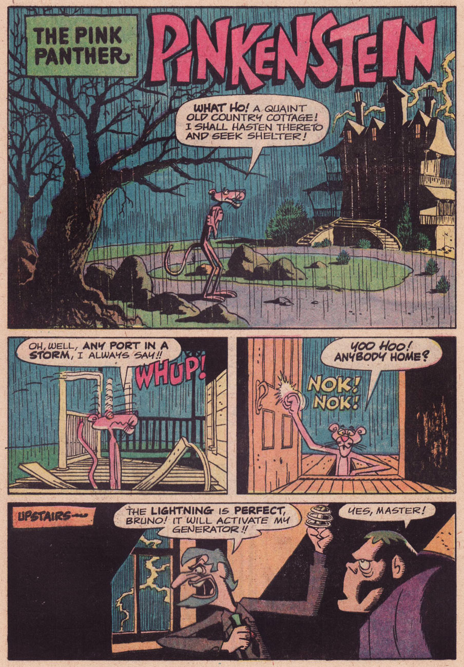
How deep and searing a trace the Universal Monsters cycle has left on popular culture: you see its mark on everything from literature to breakfast cereal. It’s nothing new in the cartoons, of course: Warner Bros, with the Looney Tunes, had their lugubrious fun with, for instance, Boris Karloff and Peter Lorre archetypes. So it’s no great shock to eventually witness DePatie-Freleng‘s The Pink Panther getting in on the monstrous act.
Nice bit of mood setting, isn’t it? This hails from The Pink Panther no. 31 (January, 1976). This being Gold Key, writer and artist uncredited and unknown. Any ideas?
The issue in question… interesting colouring touch, most likely accidental: the only white space on the entire cover is the “PINK POWER” title.
Incidentally, we’ve checked out The Inspector in an earlier post.