« You’ve got to go pretty far back in the woods for good backwoods humor. »
Contemplating Norman Pettingill‘s life brings to mind Henry David Thoreau in his secluded cabin – « I long for wildness, a nature which I cannot put my foot through, woods where the wood thrush forever sings, where the hours are early morning ones, and there is dew on the grass, and the day is forever unproved, where I might have a fertile unknown for a soil about me. » Most of us living in high density urban centers have bittersweet moments of pining for the ‘natural’ lifestyle of the woods, perhaps fishing and hunting for modest yet satisfying sustenance, quietly sitting on the porch in the evenings and thinking philosophical thoughts with the backdrop of nocturnal animal sounds.
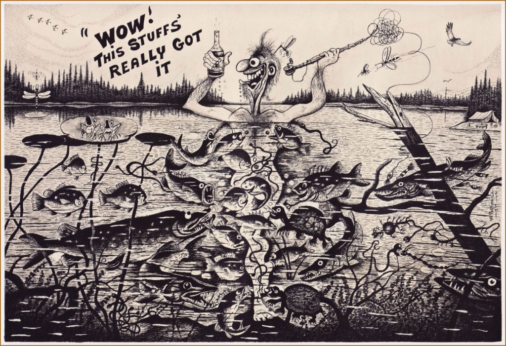
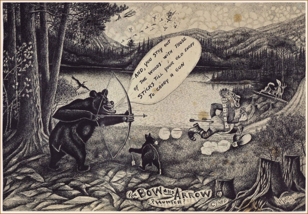
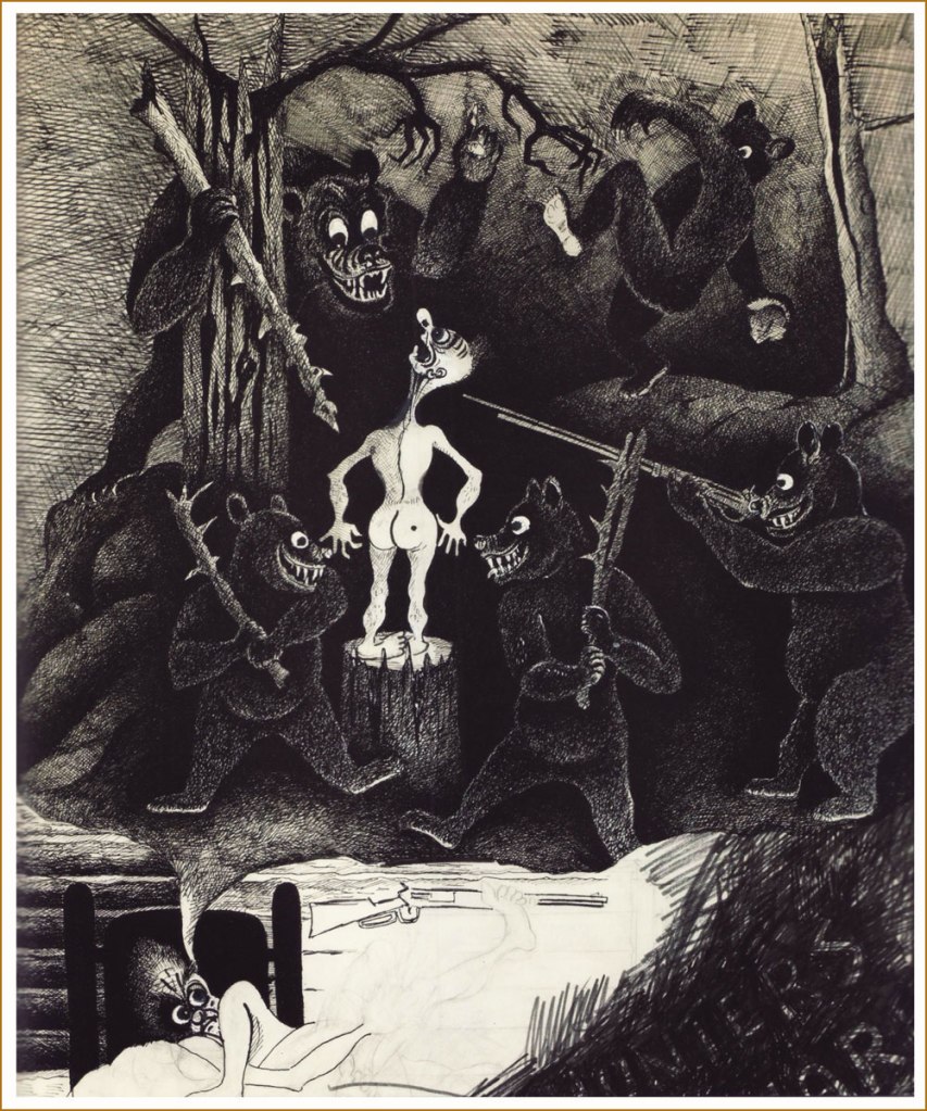
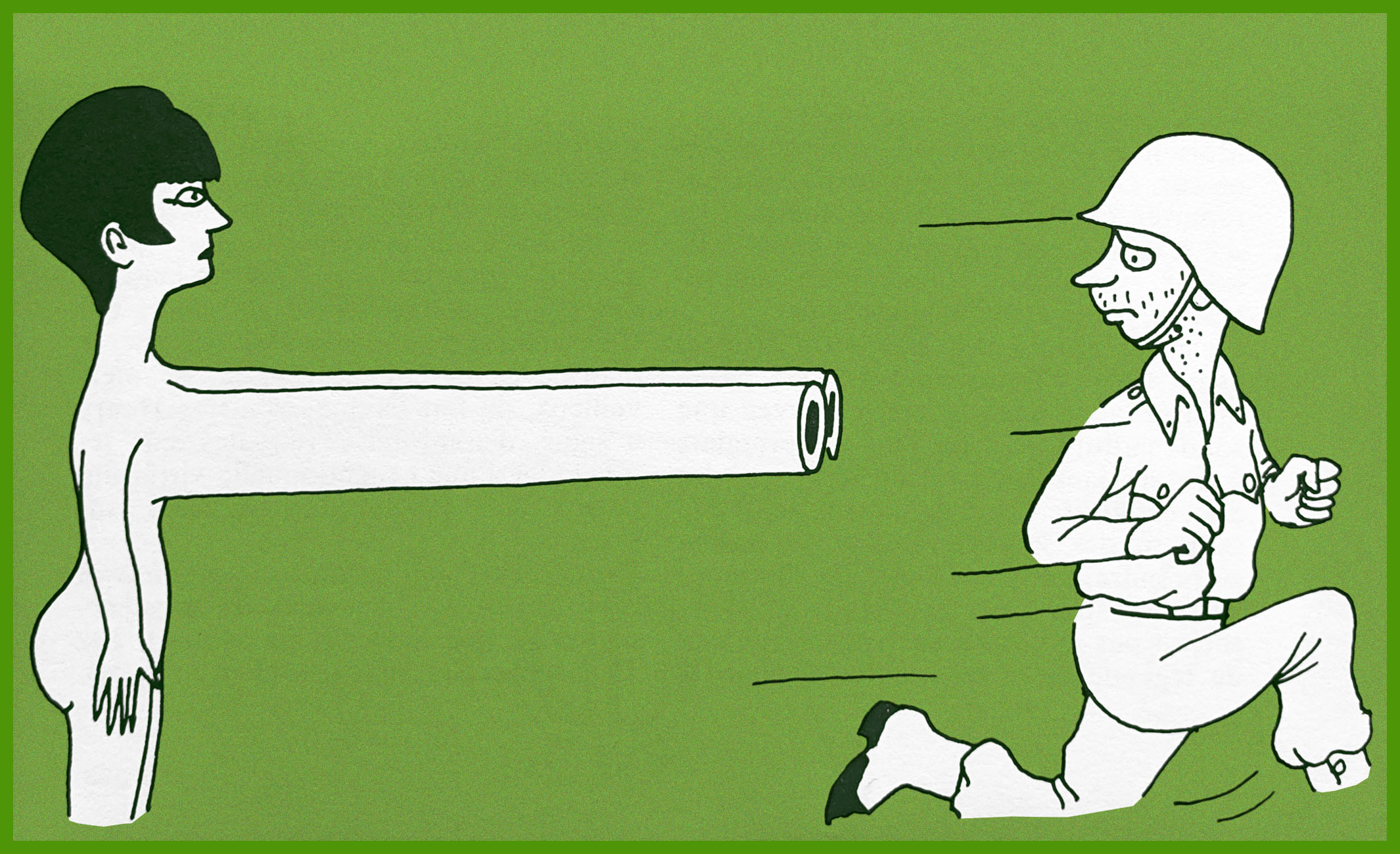
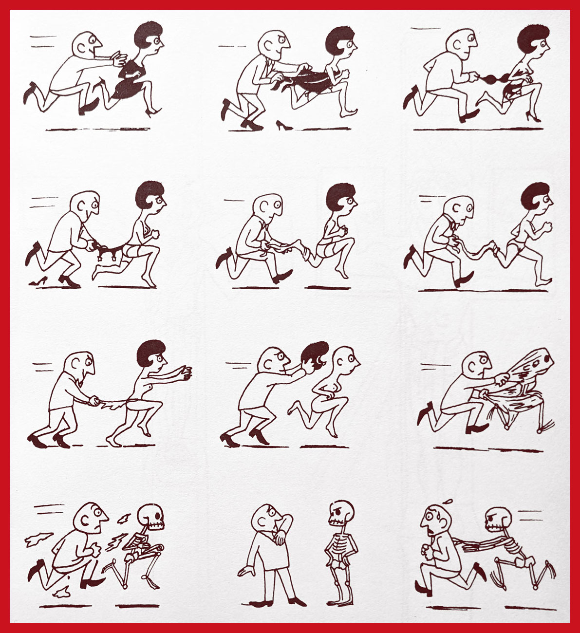
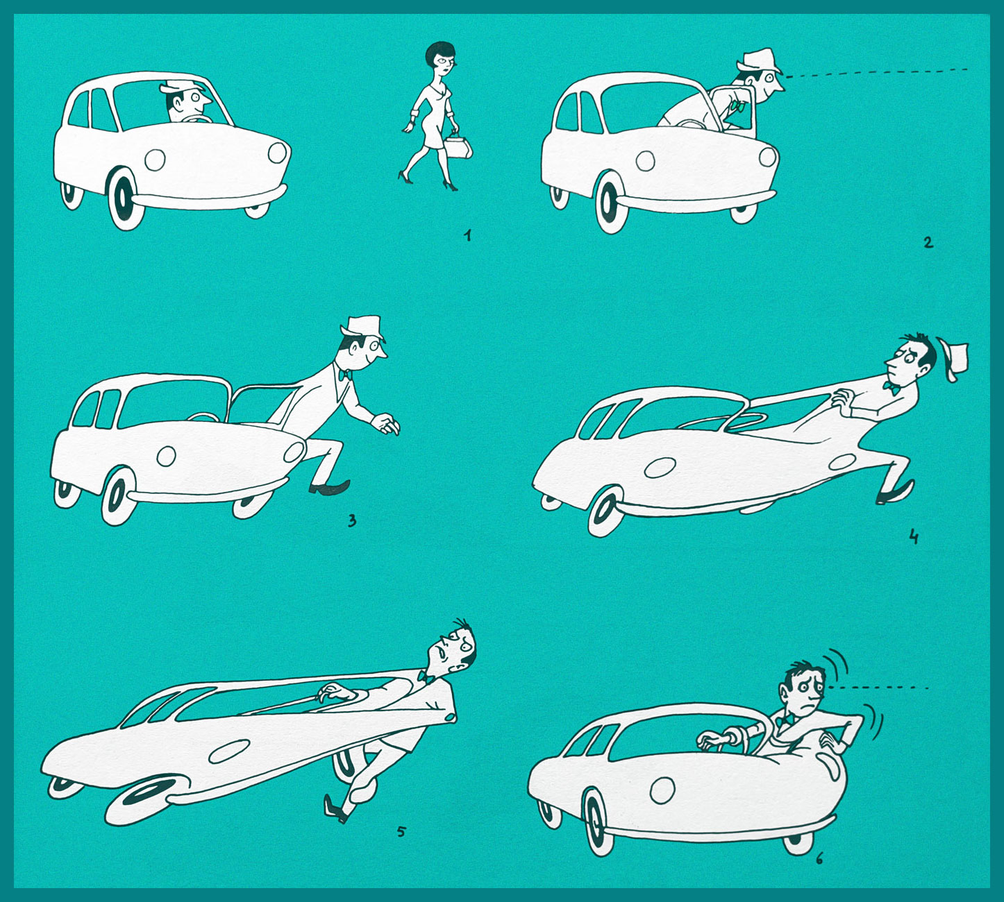
Judging from Pettingill’s cheeky illustrations of just such a natural life, quietude doesn’t actually come into much – instead, he presents us with a sort of vaudeville cast of bears bent on mayhem, drunk old-timers and pipe-smokin’ grannies, women emphatically pursued by wild fauna harbouring thoughts a holy man would blush at, crazy surgeons and gung-ho sturgeons (oh, there was no specific indication of the many fish nibbling on tender parts being sturgeons, but Wisconsin boasts two species).
Norman Pettingill (1896-1991) was born and raised in Wisconsin to be a hunter, fisher and trapper, just like all men around him, and although he took well to these activities (it seems he was a very good hunter/fisher/gatherer), his favoured interests lay elsewhere. I’m not sure how inviting this, err, virile environment would be to a boy who delights in drawing caricatures instead of chopping wood or shooting rabbits, but at any rate nobody seems to have dissuaded young Pettingill from his artistic pursuits.
His drawings with pen and ink can easily be divided into categories. The first consists of his quiet and beautifully detailed forest scenes, with varied animals poised as if about to dash away.
Then there are his bawdy, sometimes grotesque, and frequently unhinged caricatures of his fellow men (and women) and the stuff they get up to. To be fair, there is something sweet in his mockery – only an insider could observe the vernacular of language and behaviour with such bite and yet affection. I especially favour group scenes with more riotous action and ribald skirmishes than one could shake a hunter’s gun at.
Other times, group shots give way to a more focused approach, whether it’s a woman approached by a bear who seems to be bent on inter-species action, or an inept hunter running at full speed from what was supposed to be his prey.
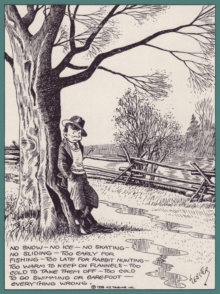
These pictures have been taken from Norman Pettingill: Backwoods Humorist (Fantagraphics, 2010). The images themselves were drawn between 1947 and 1959.
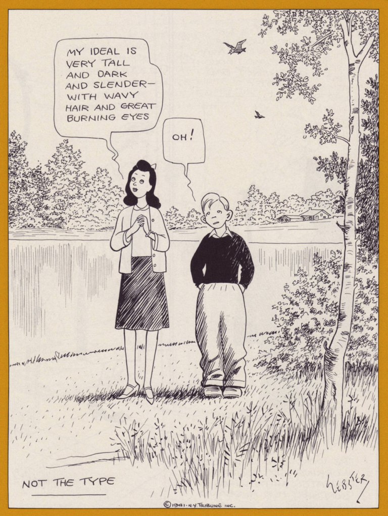
« This kind of accuracy, continued long enough, can ruin a man who is constructed as I am. I want to be pretty. I want to eliminate facts and fill up the gap with charm. » — Samuel Clemens, writing to a friend of a pen sketch sent to him by young admirer H.T. Webster
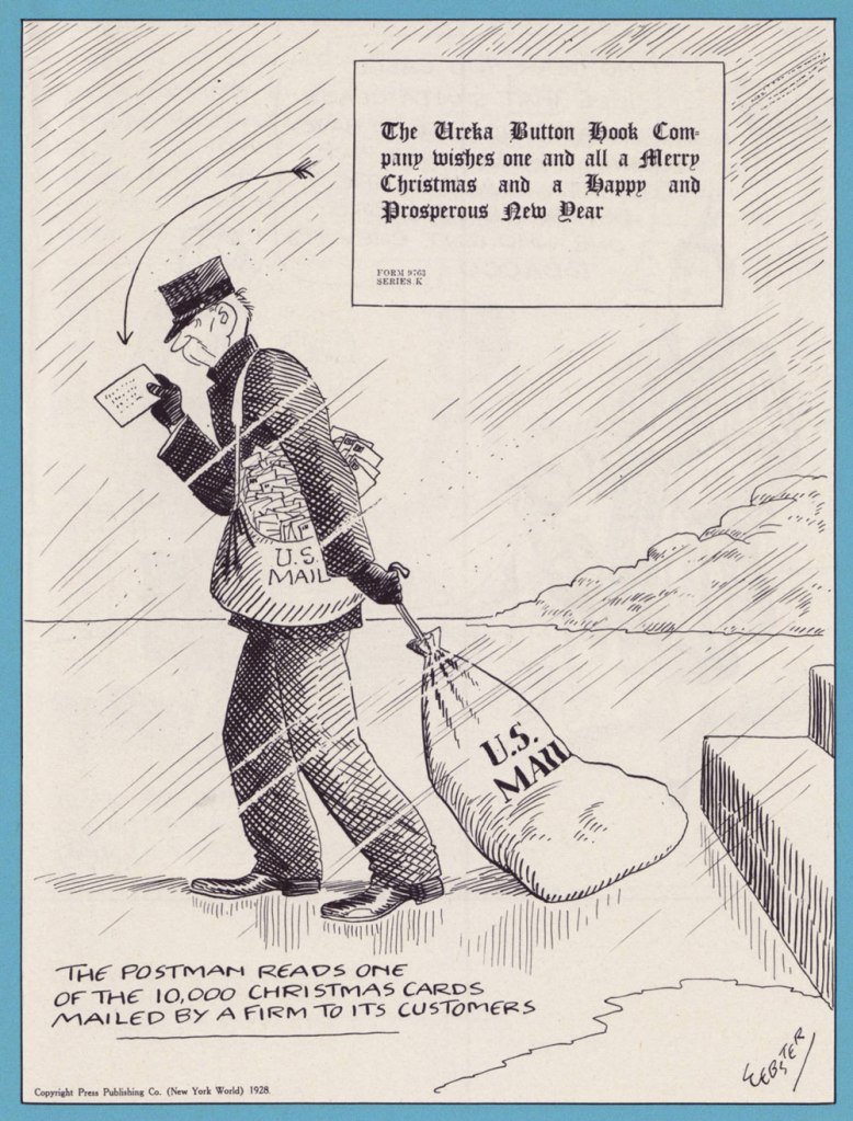
Thankfully, it’s fair to say that Webster (1885-1952) had plenty more arrows in his quiver. According to a 1945 Time Magazine profile of the artist (who was even featured on the cover!):
« H. T. Webster has learned to slice and serve his generous chunks of U.S. life methodically. Caspar (The Timid Soul) appears Sundays and Mondays. The pitilessly fanatic and bad-mannered bridge players run Fridays. Boyhood’s lovingly elaborated triumphs (The Thrill That Comes Once in a Lifetime) and defeats (Life’s Darkest Moment) appear on Saturdays and Tuesdays. Thursdays bring How to Torture Your Husband (or Wife). On Wednesdays, in The Unseen Audience**, he pokes a sharp-pointed stick at radio—which of all mixed blessings most needs satirizing, and gets it least. Webster, in fact, is possibly radio’s most effective critic. »
Honestly, they’d each be rewarding choices, but I’ve opted, on this occasion, to draw from the cool, sombre well of Life’s Darkest Moment.
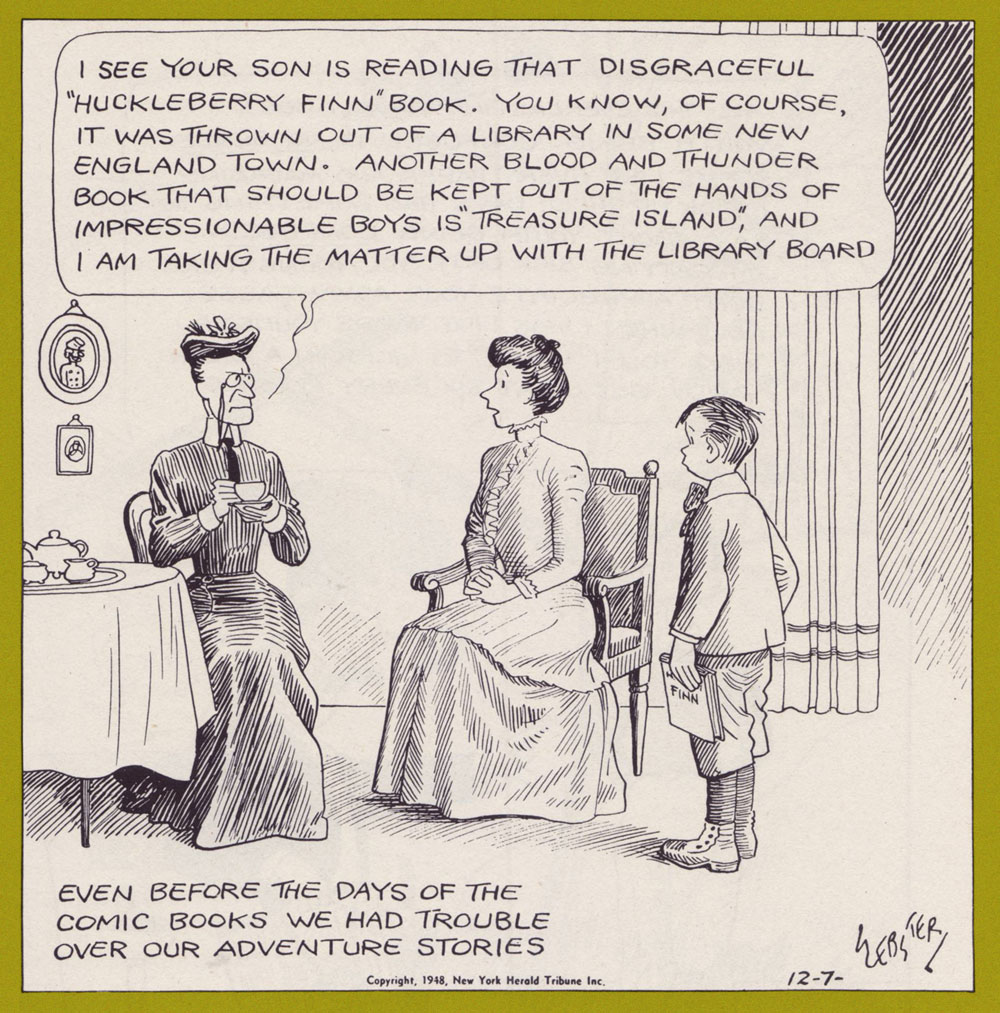
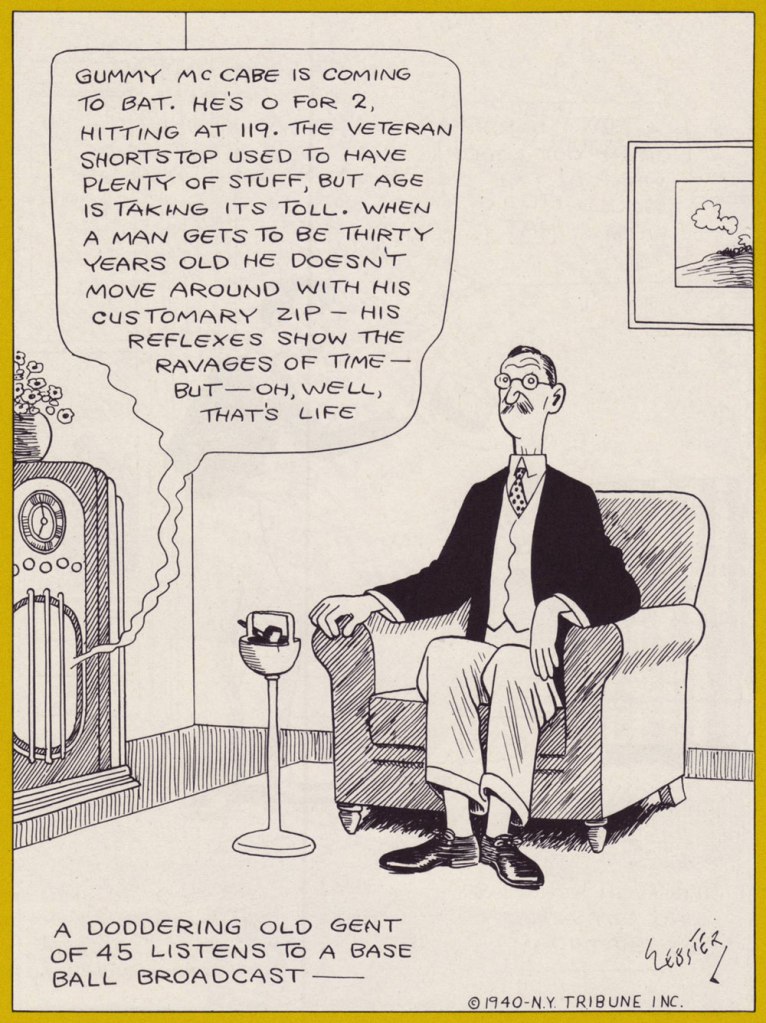
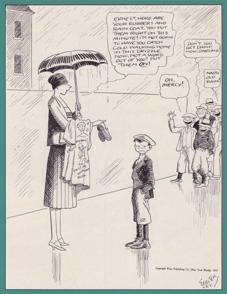
A glimpse at the infancy of spam.Up here in Canada, we recently had a bit of a furore over a sanctimonious (yet deceitful) fusspot spearheading the destruction of a bunch of graphic novels. Oh, and speaking of Robert Louis Stevenson, tomorrow’s his birthday, number one hundred and seventy one!Then as now, one can generally rely on the news to be dire.Another entry in our collection of Legendary Cartoonists With a Great Tousled Head o’ Hair.And just so you don’t conclude that Webster’s work was all about, and just about ‘poking gentle fun at life’s little foibles‘, here’s what has to be the darkest, most brutally scathing political cartoon*** I’ve ever seen come out of the mainstream US press (circa 1946!). Incidentally, Webster was a Republican. The original art of this masterpiece resides in the permanent collection of The Library of Congress, right where it belongs.
-RG
*“For many years no one but his close friends knew of an acute arthritis which in 1927 cost him the use of his right hand. In three months he trained himself not only to write, but to draw, left-handed.” — Philo Calhoun in Biographical Sketch, The Best of H.T. Webster (1953, Simon and Schuster).
***He “… returned to Chicago, where he spent three years drawing front-page political cartoons for the Chicago Inter-Ocean, prompting one politician to introduce a bill in the state legislature forbidding unflattering cartoons.” (it didn’t pass.)
« It took me some years to clear my head of what Paris wanted me to admire about it, and to notice what I preferred instead. Not power-ridden monuments, but individual buildings which tell a quieter story: the artist’s studio, or the Belle Époque house built by a forgotten financier for a just-remembered courtesan. » — Julian Barnes
Depending on where and when you are, this post will take you far away and to long ago.
For instance, during the storied humour magazine Le Rire’s prime years (roughly the first quarter of the 20th century), Gerbault was featured in most issues, often on the front or back cover, and generally in sumptuous colour. Well, you’ll see what I mean. Clearly not one to rest on his laurels, he somehow found time to lend his sundry gifts to the theatrical, advertising, etching, and fine art fields.
Here’s a bit of context if you don’t know who Saint Denis was. Love his interaction with the initially skeptical doggo! Originally published in La Vie Parisienne, and collected in Parisiennettes (1897), with colours by J. Chauvet.
There’s the lad, Paris’ first Bishop, at the Cathédrale Notre-Dame de Paris. Hope he wasn’t damaged in the blaze.
Gage d’amour (“Token of Love”), originally published in La Vie Parisienne, and collected in Parisiennettes (1897), with colours by J. Chauvet.
Les Coulisses de l’Amour is a collection of cartoons published between 1893 and 1895 in La Vie Parisienne. Racist caricatures abound but, to be fair, everybody gets it in the neck.
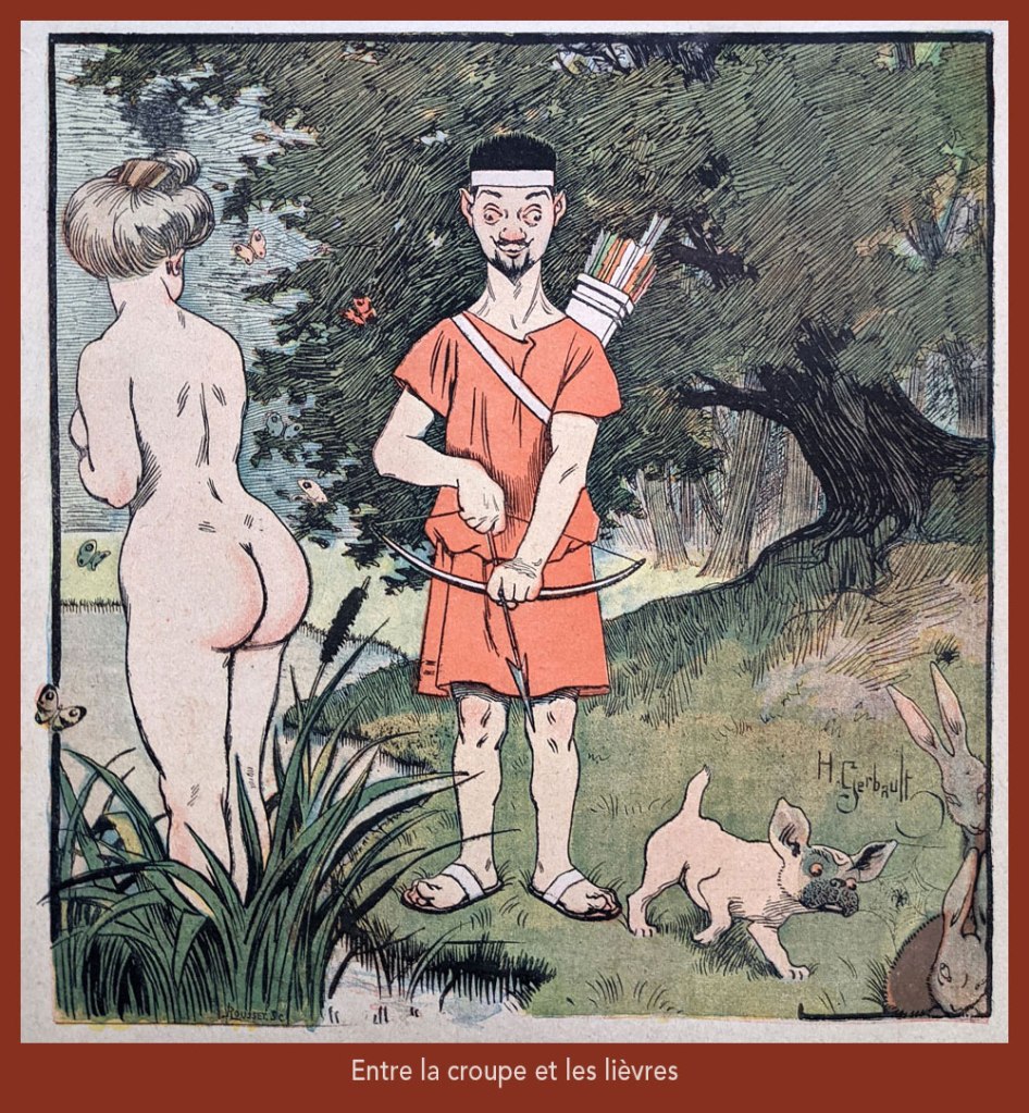
“Entre la croupe et les lièvres” is a play on “Il y a loin de la coupe aux lèvres” (English equivalent: “there’s many a slip ‘twixt the cup and the lip”), with ‘coupe’ replaced by ‘croupe’ (rump) and ‘lèvres’ by ‘lièvres’ (hares) — It was featured on the cover of Le Rire no. 261, (Nov. 4, 1899), eloquently demonstrating the vast cultural gulf between Edwardian England and Belle Époque France… not to mention the United States!
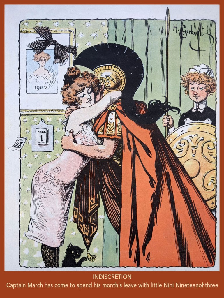
From Le Rire no. 7, (March 21, 1903). In French, the Roman God of war and the year’s third month are both “Mars”. Why is it even “March” in English?
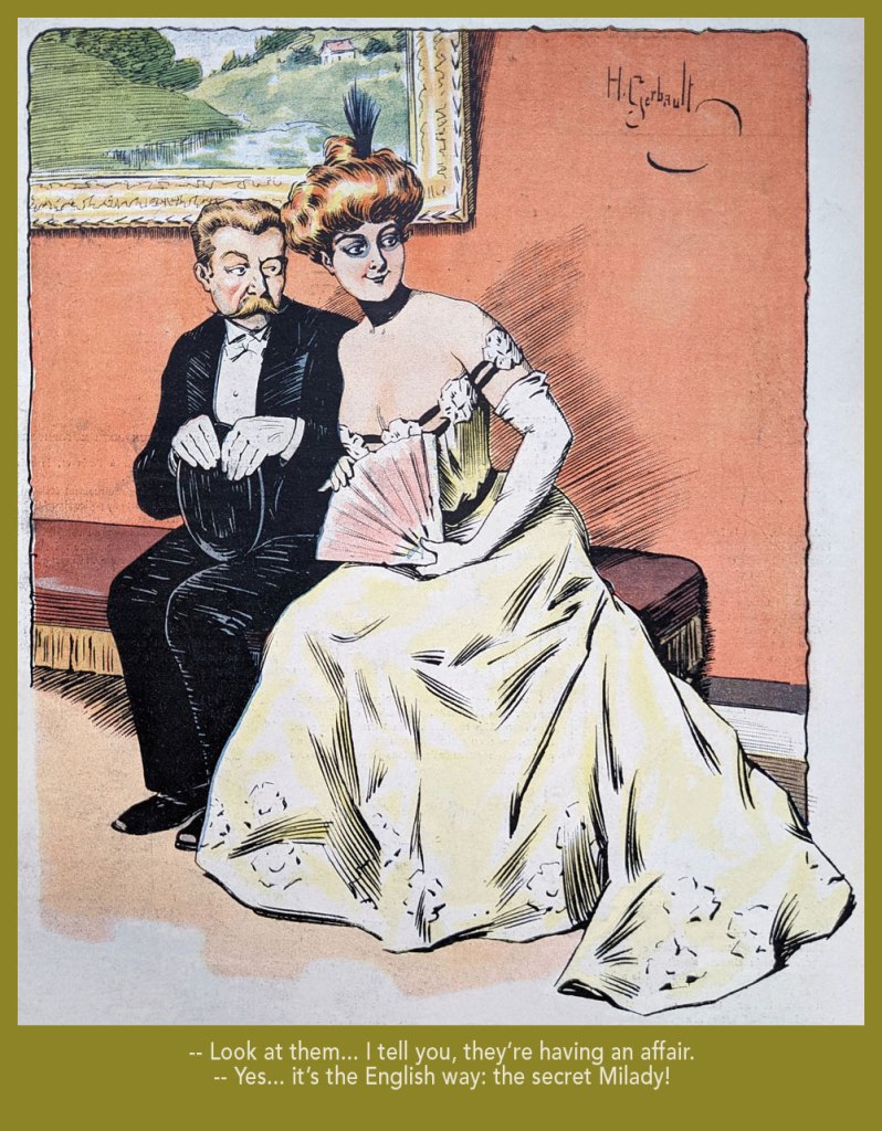
Taking the piss out of that old English discretion (some might call it hypocrisy); from Le Rire no. 18 (June 6, 1903).
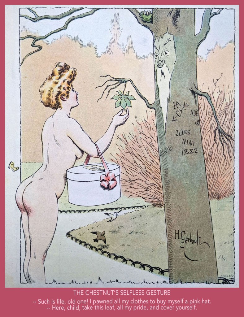
From Le Rire no. 59, (March 19, 1904).
From Le Rire no. 160 (Feb. 21, 1906).
From Le Rire no. 380 (May 14, 1910). Missals are also known as ‘prayer books’.
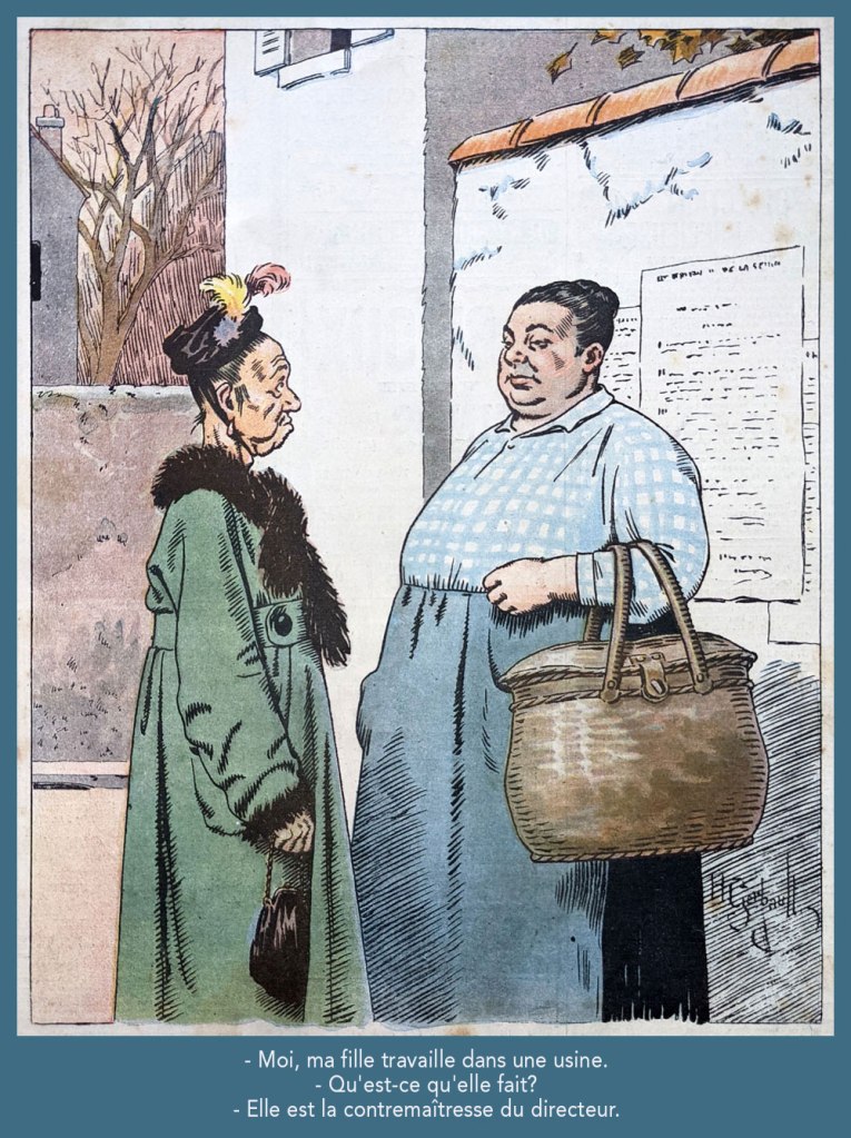
Despite being quite amusing, this one loses it all in translation. Still, “contremaître” is a foreman; its feminine form is “contremaîtresse”, which combines foreman and “mistress”; you’ll hopefully get the idea. This piece appeared in Le Rire rouge (as Le Rire was called during The Great War) no. 179 (Apr. 20, 1918). Note the beautifully understated colour work.
From Le Rire no. 189 (Sept. 10, 1922). « Je m’fiche à poil, rien que pour l’embêter! » in the original; sometimes it’s mighty hard to do proper justice to the source text.
Greetings, tentacle aficionados! Phew, this post started out as just a couple of images and spun somewhat out of control. My thanks to co-admin RG for cleaning up, re-arranging and even colourizing the following scans and photographs. Today we gaze at cephalopod apparitions in newspapers strips from the 40s and 50s. There are actually few things I like better: there is something comforting about the smell of an old newspaper (even if we have to imagine it!), the aesthetic appeal of yellowed paper, the concerns of imaginary characters who lived so long ago and yet who seem so close to us. Irrelevant to the modern age? Not at all. Look past the technological trimmings and you’ll find people who have lived and loved and struggled much like we do today. On a lighter note, the techniques of fighting off tentacles haven’t changed much, either!
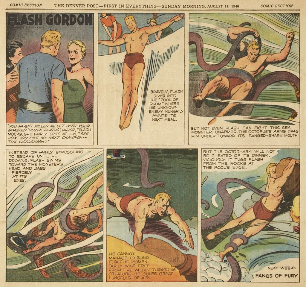
Flash Gordon, created in 1934 by Alex Raymond for King Features Syndicate to compete with the Buck Rogers newspaper strip, was immensely popular, witnessed by both its longevity – the strip continued all the way into 2003 – and multiple licensed products on offer for starry-eyed kids who wanted a spaceship or ray gun to call their own. Raymond left in 1944 to join the US Marines, and Austin Briggs, who up to that point was drawing the Flash Gordon dailies (introduced in 1941 to capitalize on the popularity of Raymond’s Sunday strips), switched to drawing Sundays, the dailies now cancelled. The following is from August 18th, 1946, art by Austin Briggs.
In 1951, King Features reinstated the Flash Gordon dailies and put Dan Barry in charge, famously assisted by Harvey Kurtzman and Harry Harrison on scripts, and a bevy of ghost-drawing writers.
The following are two Flash Gordon dailies from 1954. These reprints hail from Flash Gordon: Dan Barry Vol. 2: The Lost Continent, which collects dailies from October 26th 1953 to October 29th 1955.
Frank Robbins created Johnny Hazard for King Features Syndicate in 1944. What I find impressive is that the strip continued, with no other writers or artists involved, all the way until 1977 – contrast that with other newspaper adventure strips from around that time. Robbins must have been a powerhouse. To quote from the no-longer-updated (its creator, Donald Markstein, died in 2012), but still kindly maintained by relatives Toonopedia, « … Unlike many fictional two-fisted adventurers, [Johnny Hazard] matured — not as quickly as real people, but after a third of a century or so, he was quite gray at the temples. And a third of a century was as long as the strip ran. It was popular enough at first, and ran far longer than most post-war adventure strips, but the times were against it. Newspaper editors were more interested in daily gags than continuous stories, and Johnny Hazard succumbed to the trend in 1977. Robbins went to work for DC Comics, where he drew Batman, and Marvel, where he drew The Invaders, and never again created his own feature. » Eventually, Robbins is said to have retired, moved to Mexico, and devoted himself to painting – where he remained his death in 1994. This daily is from July 1951.
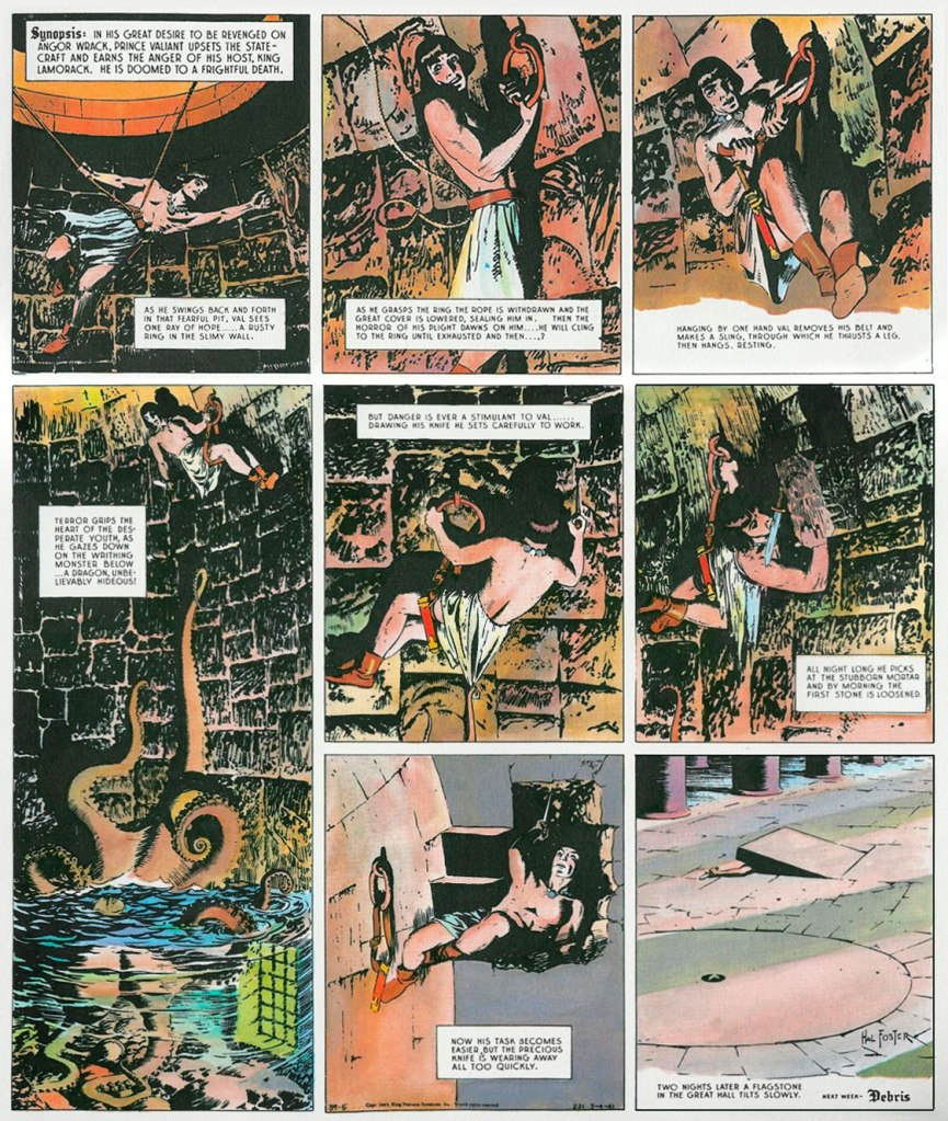
Prince Valiant is one of those newspaper strips institutions that most readers will have heard of, though some, kind of like me, may be uncertain about about the who, the when, and the hows of it. It was created by Canadian Hal Foster (1892-1982) – who, while illustrating the Tarzan newspaper strip (more about this a little further down!), developed a craving to work on his own oeuvre. He pitched his medieval adventure idea to William Randolph Hearst, who was so impressed that he even gave Foster ownership of the strip. It’s still ongoing (after a little more than 4000 Sundays!) This magnum opus has been credited with plenty, as the « greatest contribution to English literature in the past hundred years », « the pinnacle of comic strip adventure storytelling », and so on. I feel a little bad for being bored to tears by it, but as the Russians say, ‘и на старуху бывает проруха‘, more-or-less directly translated ‘even a crone can blunder’, or in other words, even Homer nods. The following Sundays are from April-May 1941 – spending two nights in a well, instead of trying to fight off the octopus, is an interesting approach, and I’m sure both man and animal were immensely frustrated.
I promised to say more about Tarzan – ah, the very, very long-running Tarzan strip. Started in 1929 with an adaptation of Edgar Rice Burroughs‘ Tarzan of the Apes illustrated by the aforementioned Hal Foster, syndicated by the United Feature Syndicate, it went on (and on…) all the way until 1995, with quite the cast of different artists over the years. The following Sunday is from the Burne Hogarth years, and is part of a story cycle called Tarzan and N’ani, which was published between December 14th 1947 and May 9, 1948. As for Hogarth, he seemed to hold the distinction of being the only artist with two runs on Tarzan: he drew the strip from 1937 to 1945, and again from 1947 to 1950.
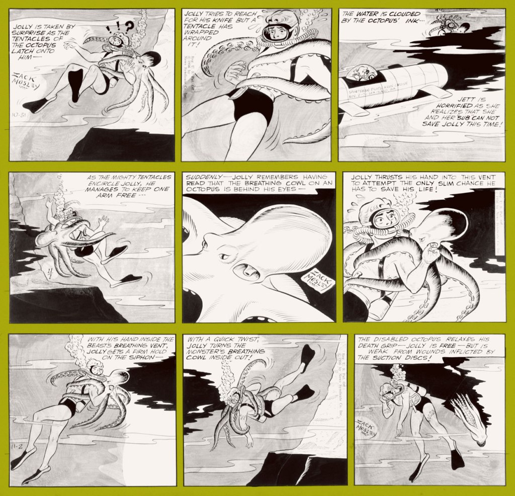
The Adventures of Smilin’ Jack, distributed by the Chicago Tribune Syndicate, ran from 1933 to 1973. I know that doesn’t sound as impressive because all strips discussed so far had crazily long runs, and yet: Smilin’ Jack, as it came to be called a little later on, lasted a good fifty years, which is partially explained by this strip’s motley cast of endearing supporting characters, but also by the realism with which Jack’s flying adventures were depicted – Zack Mosley, the creator, was an aviation enthusiast and licensed pilot with a true love of everything aeroplane. The following three dailies are from November 1956. You’ll be happy to learn that Mosley, upon retiring at 67, spent the rest of his days flying his own plane.
Created by George Shedd, a former Al Capp assistant, for the Post-Hall Syndicate, Marlin Keel ran between 1953 and 1954. Very little information about it survives – from what I understood, Shedd first wrote and drew this newspaper strip by himself, and later relinquished the illustration to assistants. Most notable (and what seems to be motivating rare collectors) is the involvement of Alvin Carl Hollingsworth (1928-2000), one of the few African-Americans working in the field at the time, who started by helping out (not sure to what degree) and became the official illustrator of Markin Keel towards the end of its run. Hollingsworth, who’s often mentioned as Joe Kubert‘s classmate at NYC’s High School of Music & Art – a fact that, albeit cool, underplays Hollingsworth’s talent and career – seems to have always maintained an interest in painting. Later in life, in the 1970s, he abandoned the comics field in favour of becoming a (fine) painter – you can see some of his paintings here. This is the original art for a 1954 Sunday strip.
The octopus may be off-camera, but my appreciation of Bob Montana made me include this strip in today’s roster. That’s right, it’s not my fault! This is an Archie daily from July 24th, 1953.
I hope you enjoyed this walk down history’s lanes and byways!
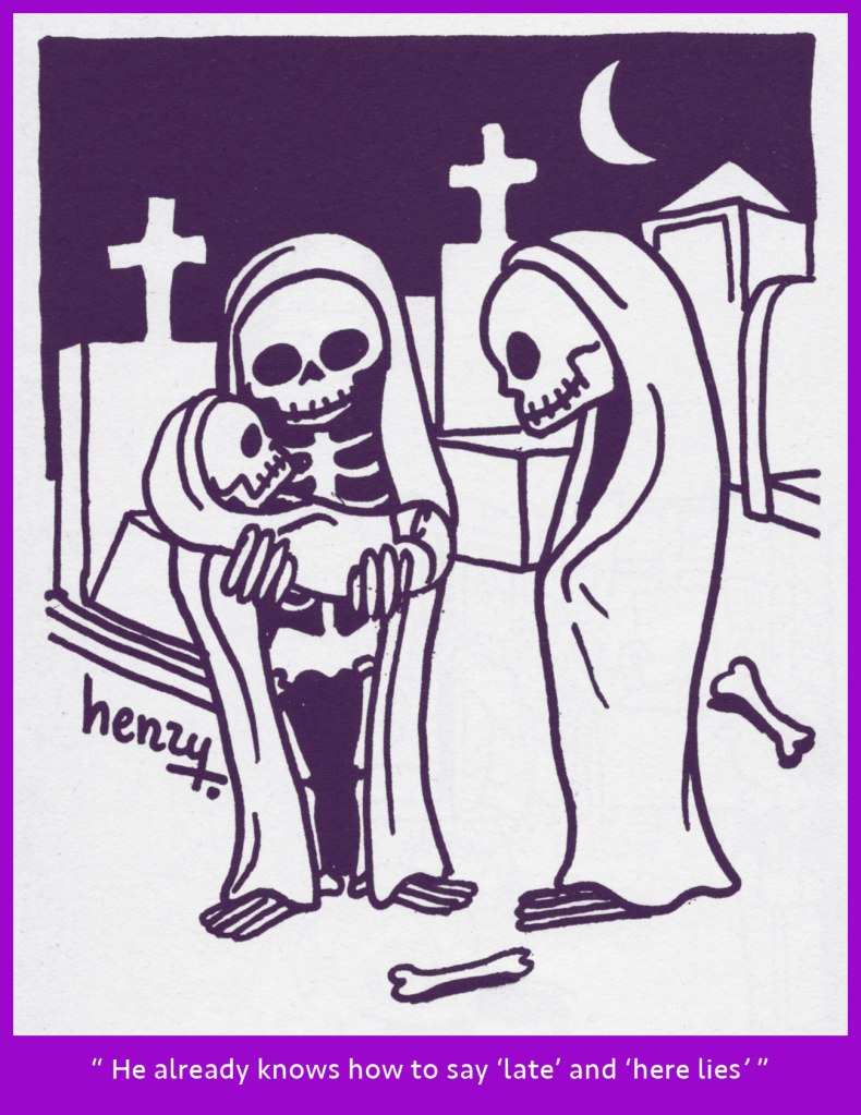
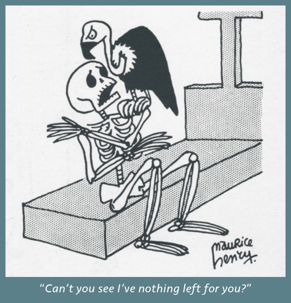
« The world dies over and over again, but the skeleton always gets up and walks. » — Henry Miller
A few months back, while assembling a post about polymorphic French surrealist Maurice Henry (1907-1984), I marvelled and chuckled at his multitude of skeleton-themed cartoons. I made a mental note to devote a Hallowe’en post to them… and that memo only floated to the top of my consciousness a couple of days ago. Just in time!
(1935)
(1936)
(1938)
(1940)
(1941)
(1947)
(1950)
(1950)
(1958)
This one doesn’t feature skeletons, but I had to include it, given how stunningly *dark* it is for its (or any) era… can you imagine something like this published in the USA in… 1935? For more context, here’s the Bluebeard ditty.
In closing, and just for kicks: sixteen faces of the playfully photogenic Monsieur Henry. This one-man assembly featured on the back cover of Maurice Henry 1930-1960 (1961, Jean-Jacques Pauvert), a remarkable collection.
Trust me, I’m only scratching the surface of this man’s genius. If you’ll bear with me, we’re not done with him.
« I have stuck to my simple art style while the smart illustrative men were snapping in their shadows all around me, because I believe that my story is more clearly told with a minimum of picture distraction. » — the wise, but absurdly humble Frank King (1959)
Gasoline Alley (1918-) is the second longest-running comic strip of them all. The Katzenjammer Kids (1897-2006) still tenuously clings to first place, but Gasoline Alley, boasting the advantage of still being around, should overtake it by 2027. Of course, that’s all academic and fairly irrelevant to us, because the strip’s originator, Frank Oscar King (1883-1969), is no longer guiding its destiny.
The collective memory being woefully short, if Gasoline Alley is likely to be remembered, it will be for its central innovation: characters age in real time, growing up and old and passing away, its cast and its world ever changing and evolving, in a small-town America sort of fashion. However, the strip’s original star, Walt Wallet, is still around, well into his second century.
Today, we’re digging deep, returning to those long-ago dinosaur days when newspapers were gigantic and so were the comic strips they featured, particularly on Sundays. And the Sunday Gasoline Alley was indeed something special.
I couldn’t possibly put it better than Chris Ware did in 2000, in tribute to King:
« Reserving his five daily strips for more complicated storylines, King’s full-color Sunday pages often presented Walt and Skeezix simply wandering the countryside of America, idly remarking about natural landmarks, the quality of the sky, or the colors of the seasons.
Frequently, these pages were richly-textured experiments in form and style, often having no joke or ‘punchline’ at all, only a quiet, sustained tone of serenity and gentleness. »
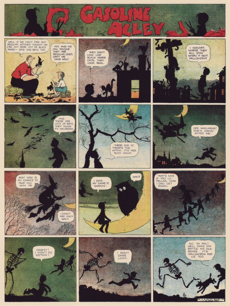
Halloween 1928!
Halloween 1931.
Halloween 1933.
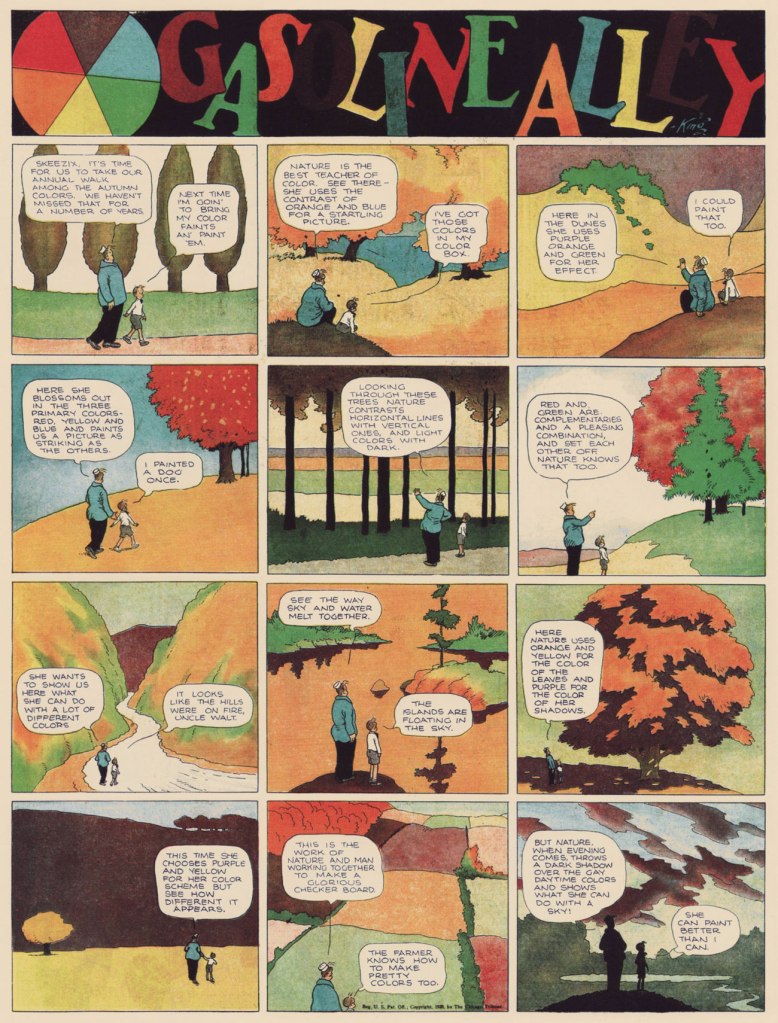
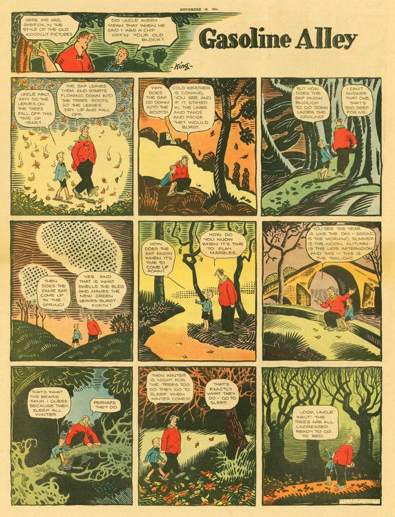
And you know, since these are so gorgeous and just as seasonal, let’s be indulgent, broaden our scope the tiniest bit and take in some of King’s paeans to sweetest Autumn.
Autumn, 1926. Pro-squirrel, too. Good man!
Autumn, 1928.
And finally, the Autumn of 1930. Phew!
Incidentally, a lovely collection (designed by Mr. Ware!) of King’s finest Gasoline Alley Sundays from the strip’s first fifteen years was published a couple of decades ago: Sundays with Walt and Skeezix (2000, Sunday Press)… and, wonder of wonders, it’s still available from the publisher.
«I think it’s safe to surmise that Mr. Church viewed his comics as his own private passion, and wanted to share them with no one. Is it any wonder that his heirs didn’t show any fondness for them? » — Charles ‘Chuck’ Rozanski
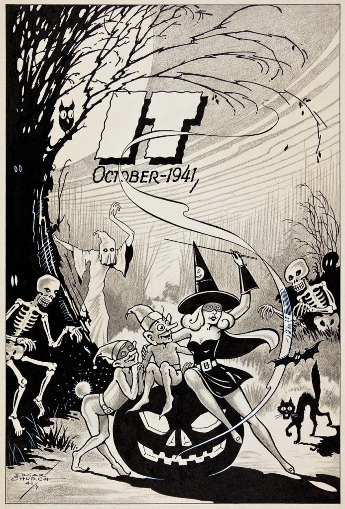
Let’s give a little love and a spooky cheer to the greatest comics collector of them all, Coloradoan Edgar Church (1888 – 1978), who also happened to be a pretty terrific illustrator. When he passed away, it turned out that his collection comprised a whopping 18 to 22 thousand comics books, mostly in the high grades. Ouch.
With that out of the way, let’s take a step back and admire some of the man’s halloween-themed illustrations over the years.
As it plainly states, this piece was created to commemorate 1941’s eeriest holiday. Isn’t “IT” a beauty?
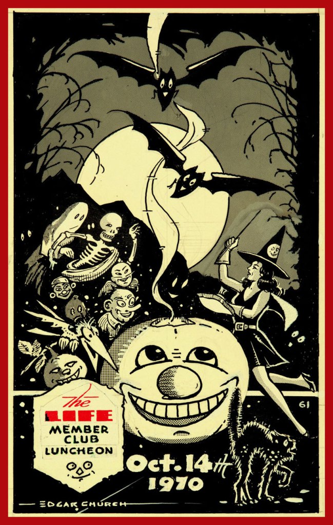
Another IT peace from the same era, which I admit to colouring a bit, in what I like to consider good taste and restraint. « Not only was Church an important collector of first-generation comic books — he also ran a busy advertising-design studio in Denver and served as an illustrator for that city’s Smith-Brooks Printing Co. A marginal note identifies this splendid composition as an inside-back cover — likely for a Smith-Brooks magazine called It, to which Church was a frequent contributor. »
If those Life Member Luncheons were half a fun as Church’s ads made them seem, they must have been the highlight of Denver’s social season.
Featuring a wee bit of recycling, Church’s ad for the 1970 do. Interestingly, these shindigs were held on Wednesday nights, so they may not have been quite as debauched as one might have expected.
« The man who cannot visualize a horse galloping on a tomato is an idiot. » ― André Breton
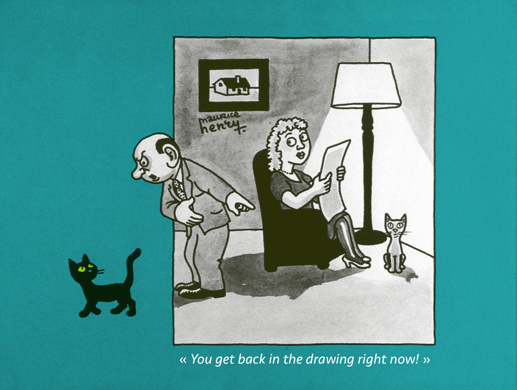
What is one to do, in a mere blog post, with a polymorphous artist such as Maurice Henry (1907-1984)?
Here’s a handy bit of compressed biography, from his Lambiek page:
Henry was a French painter, poet, filmmaker, as well as a cartoonist. Between 1930 until his death, he published over 25,000 cartoons in 150 newspapers and a dozen books. His cartoons were generally surrealistic and satirical.
In 1926, he co-founded the magazine Le Grand Jeu with René Daumal, Roger Gilbert-Lecomte and Roger Vaillard, with whom he formed the “Phrères simplistes” collective. Henry provided poems, texts and drawings, while also making his debut as a journalist in Le Petit Journal.
He left Le Grand Jeu in 1933 to join André Breton’s group of Surrealists and their magazine Surréalisme au service de la Révolution. He also worked with the artist and photographer Artür Harfaux on the screenplay of twenty films, including ones starring the comic characters ‘Les Pieds Nickelés’ and ‘Bibi Fricotin’. Maurice Henry spent the final years of his life making paintings, sculptures and collages. He passed away in Milan, Lombardy, in 1984.
The answer? My default solution, which is to focus on some small parcel of the much greater whole. A number of Henry’s works bear revisiting (for instance, Les métamorphoses du vide [1955], a truly groundbreaking picture book about the world of dreams; À bout portant [1958], a collection of literary portraits; or Les 32 positions de l’androgyne [1961, also issued in the US in 1963], a chapbook of… gender recombinations) and deserve a turn in the spotlight.
To quote co-anthologists Jacques Sternberg and/or Michael Caen in their indispensable Les chefs-d’oeuvre du dessin d’humour (1968, Éditions Planète, Louis Pauwels, director):
Surrealism — he was part of the group before 1930 — left its mark on him and it’s because he was already well-cultured as he launched his career that he was among the first, in the desert that was the publishing world of the 1930s, to attempt unusual drawings calling upon often startling ingredients, such as poetry, black humour, the fantastic and the absurd. He caused no less of a surprise by doing away with captions, at a time when bawdy jabbering was the fashion all over. In short, Maurice Henry was indisputably a pioneer of that grey and stinging brand of humour that would explode like an H-bomb some fifteen years later.
A lovely bit of conceptual humour from 1938. A rare one bearing a caption, but the joke called for it. At this early stage, you won’t be wrong to point out a certain stylistic debt (it’s the roundness and simplicity of line!) to his contemporary and compatriot Jean Effel. Henry was indeed a fan. Do check out my co-admin ds’ fine post spotlighting the good Monsieur Effel.
An example of what enlightened creators such as Henry were fighting for: making room for cartoons that weren’t just about the cheap chuckles. Consider, for instance, the existential plight of the Minotoreador . Published in K. Revue de la poésie no. 3 (“De l’humour à la terreur”, May 1949).
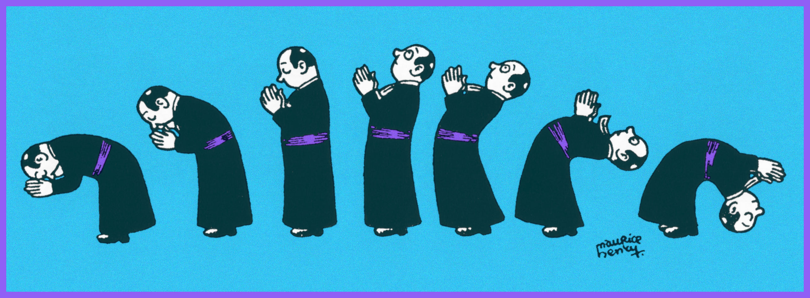
The Military, Government, Constabulary and Clergy were favourite targets, naturally. When it was (barely) tolerated. It helped to be ambiguous, even if one wasn’t ambivalent (1951).
Here’s one for the clergy; though mocking, it’s hardly what you’d call hostile. From the first issue of epochal surrealist magazine Bizarre (1955-1968).
Yes, it’s Card Sharp Jesus entertaining, confounding (and possibly fleecing) his disciples. Note the ace up his right sleeve (1941).
Walking on water was clearly just the beginning (1948).
Henry’s Jesus seems like a swell fellow, really. A bit on the roguish side, which is fine by me (1958).
See? A case of a joke’s that’s more than a half-century old still finding echoes in the present day. Cover from The Darkness‘ prophetic 2019 album, Easter Is Cancelled.
That soldier’s scared yet dismayed expression brings to mind Futurama’s hapless Philip J. Fry.
That’s one relaxed elephant.
Another illusion shattered.
The little hand wave at the end really makes this one.
The artist in 1935, photographed by his friend and frequent co-conspirator Arthur Harfaux.
«... it was invariably his work that was given pride of place. His was emulated and imitated. By the end of the 1930s, he was the most respected and sought-after artist working for comics…»
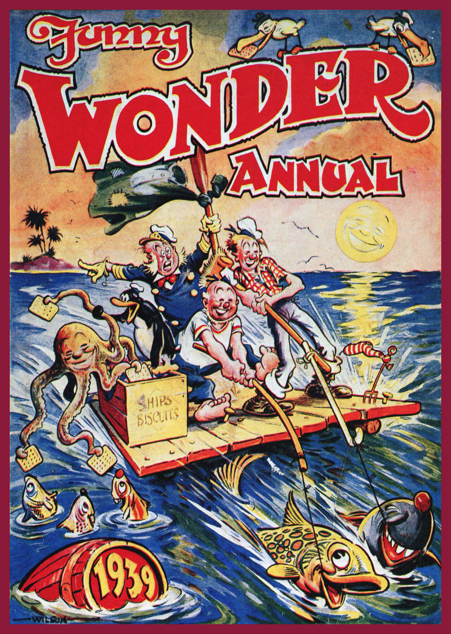
And now guess who these lines were written about. My title was a dead giveaway, I admit! But if you’ve heard of Roy Wilson, you are, as it turns out, distinctly in the minority. He doesn’t have a Wikipedia page (surely that is a sign of success and fame in the modern world) in English, and a quick search for his name yields a lot of unrelated nonsense. But just add the word “comics” to your Google quest, and we’re in business!
Royston Warner Wilson was born in Northamptonshire, England just at the turn of the century, in 1900. He died young, at 65, but those years were enough for him to leave more than a lifetime’s worth of cartoons, humorous drawings and comic strips. For someone who has been widely credited as the most influential artist of British humour comics in what roughly corresponds to the Golden Age, which is to say the 1930s to the 1950s, his relative obscurity is downright criminal. While not particularly well-remembered by the world at large (even by the British public, it seems), at least he is beloved by legions of fans who were children during these decades and were irrevocably, and delightfully, marked by the antics of his characters.
In the 1930s, he was the leading artist for Amalgamated Press, which unleashed a variety of humour/comic titles, mostly weeklies, upon a delighted audience of pre- and post- pubescent children. Oh, a lot of these publications were around before he stepped in – but he revitalized them. As for the publisher, it had a long history with comics: as a matter of fact, it entered that particular market in 1890 with something called Illustrated Chips.
Because Roy Wilson was so talented and prolific and his artwork so lively, his style quickly became the house style and remained so for decades, which is why Wilson can be easily credited with having created what we can roughly call the “British humour style”, easily recognizable to this day.
He not only created and drew (and, often, redrew: like some super prolific artists who seem to have too many ideas to put down on paper, he was a perfectionist) the stories, he also lettered them himself. He had a great eye for colour, too! Which leads me to my next point – I’ve often seen him referred to as the « British Walt Kelly », but I’m not entirely on board with that comparison. Oh, there’s similarities – for instance, their common love of playful language and the ease with which both depict frisky, charismatic animals – but I think this monicker does both of them a grave disservice. Let’s appreciate artists on their own merit, shall we?
Only one Wilson monograph appears to have seen print: The Comic Art of Roy Wilson (1983), and it’s quite scarce nowadays. I recently purchased a copy. All images in this post have been scanned from it, courtesy of co-admin RG.
Roy Wilson was actually allowed to sign his paintings – I don’t know if that was a first, but it was certainly highly unusual in British comics. He was paid about eight guineas per painting.
The reason for the re-occurring octopus, as you may be wondering – other than it being clearly fun to draw – is that he was a character in the stories of Pitch and Toss, published in Funny Wonder. To wit, Pitch and Toss Put On a Good Show and Show How to Make Good Money!:
Published in Funny Wonder, August 21st, 1937.
The above was the first appearance of Occy the Octopussie, who became a mainstay of the strip. Here are two (rejected) panels from another chapter in the saga of Pitch and Toss, this time for Pitch and Toss and Their Pets Get a Sub and Spend a Happy Whitsun, from March 30th, 1942.
« Roy Wilson’s art is still very much alive and, even in the comics of today, his influence can be seen. Britain’s foremost comic artist created a host of cheery and boundlessly zestful characters who still exist in the minds of the millions they entertained His art will not be forgotten. » (quote by Alan Clark and David Ashford from The Comic Art of Roy Wilson)
« Polar exploration is at once the cleanest and most isolated way of having a bad time which has been devised. » ― Apsley Cherry-Garrard, The Worst Journey in the World (1922)
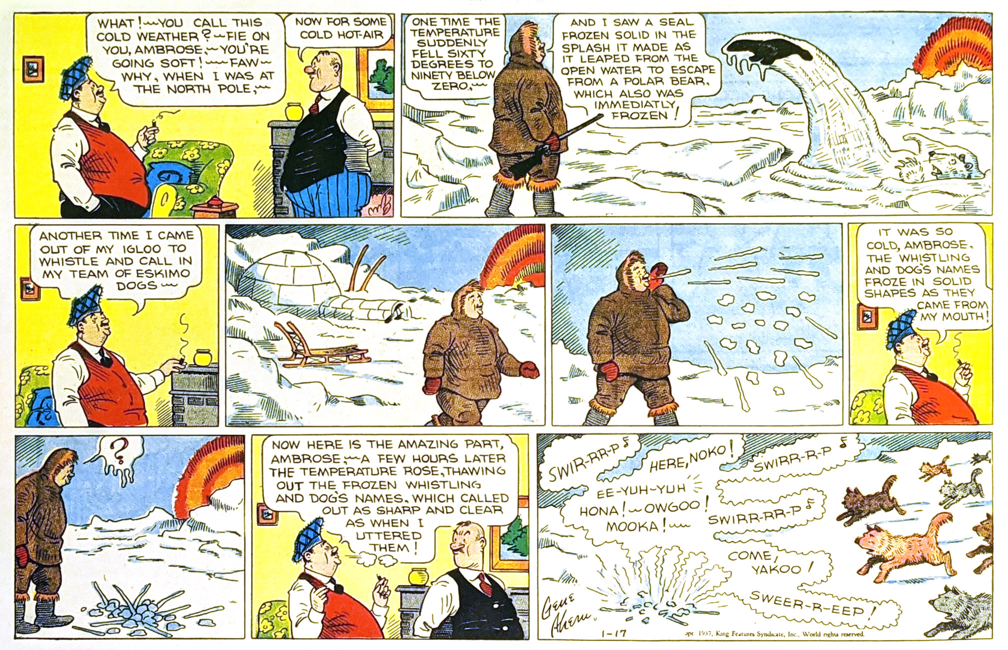
Gene Ahern‘s Room and Board (March 17, 1937, King Features).
Of course, it’s all piffle and bunk, but it brought to mind a passage from a favourite article on weather peculiarities in Siberia, Marcel Theroux‘s The Very, Very, Very Big Chill(published in Travel & Leisure in 2000):
« Local people told me that at minus 60 and below, a dense fog settles in the streets, and pedestrians leave recognizable outlines bored into the mist behind them. A drunkard’s tunnel will meander and then end abruptly over a prone body. At minus 72, the vapor in your breath freezes instantly and makes a tinkling sound called ‘the whisper of angels.’ »
Then I thought: « all very nice, but that makes for a rather meagre post »… so I decided to toss in a few bonus images featuring that venerable recurring motif… and got carried away.
This is Astonishing no. 36 (Dec. 1954, Atlas), the title’s penultimate pre-Code issue… not that Atlas ever crossed the line into gruesome. The cover-featured yarn is The Man Who Melted!, an amusing load of utter rubbish you can read here. Cover art by Carl Burgos.
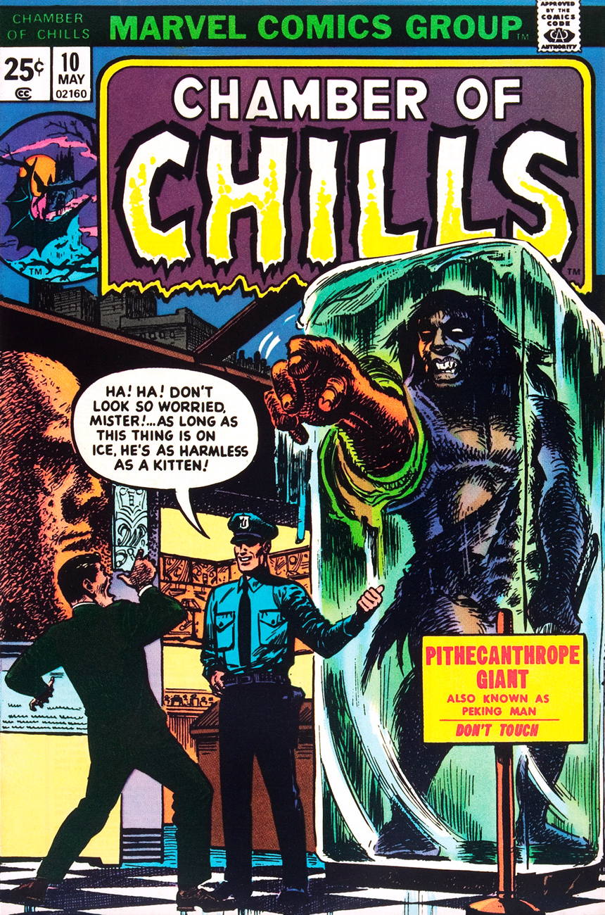
This is Chamber of Chills no. 10 (May, 1974, Marvel), and most everything’s the same, save for the colour palette and the now-hostile expression on the caveman’s mug.
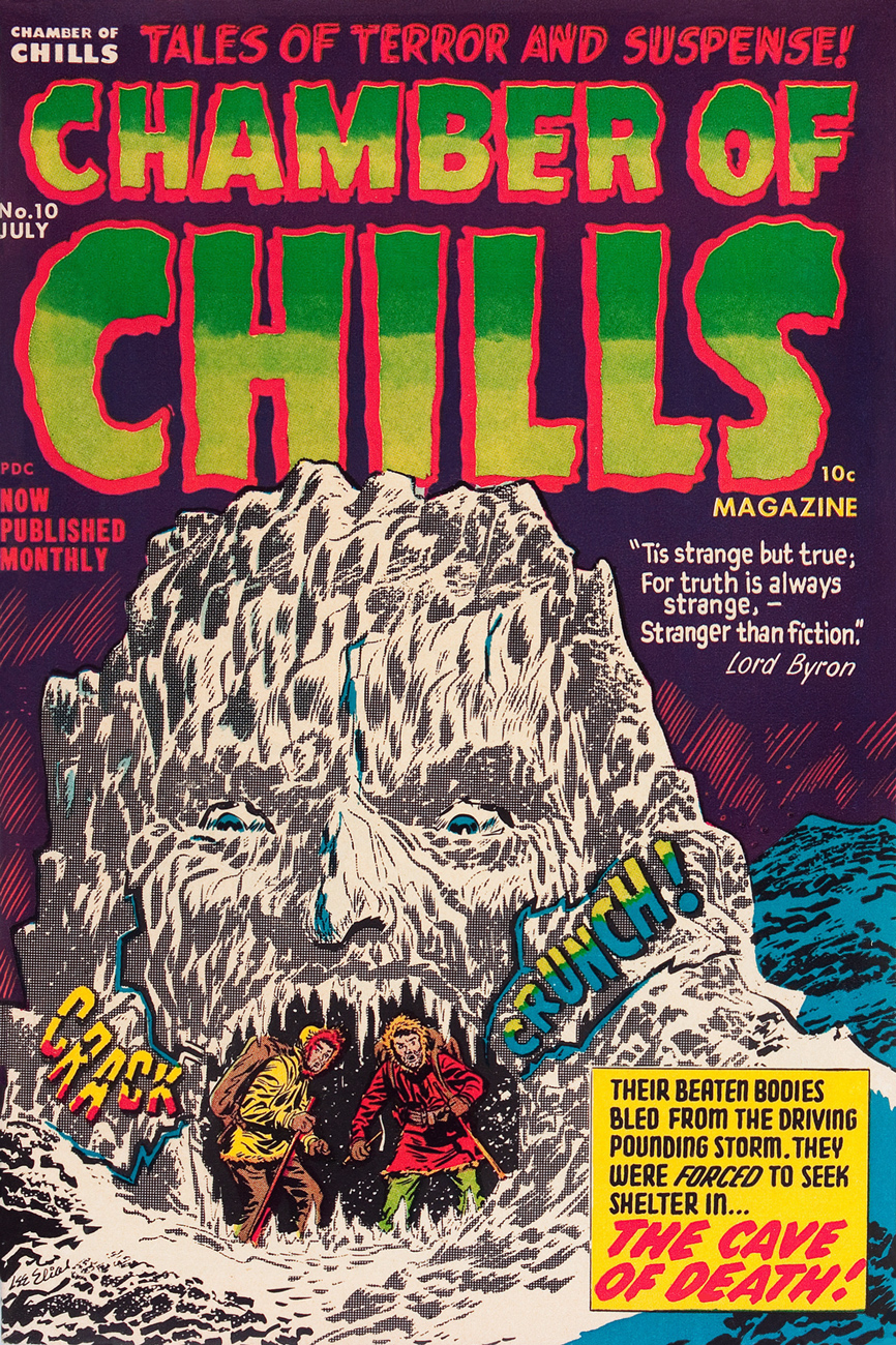
And this is alsoChamber of Chills no. 10 (July, 1952, Harvey)… the original, whose title Harvey Comics left curbside for Marvel to recycle when they went all kid-friendly in the Comics-code-ruled Silver Age. Cover designed and art-directed by Warren Kremer and illustrated by Lee Elias. For some insight into these collaborators’ working methods on the horror titles, here’s our post on that very topic. Incidentally, what’s up with the hifalutin Lord Byron quote, Harvey folks? This wacky fare is quite plainly fiction… what’s your point? [Read it here.]
This is Tales of The Unexpected no. 101 (June-July 1968, DC). Layout and pencils by Carmine Infantino, inks by George Roussos. Infantino, promoted the previous year to editorial director (he would soon rise to the rank of publisher), brought in the versatile Nick Cardy to serve as his right-hand man on the artistic front; together, they designed all of DC’s covers until both men stepped down in 1975.
This is House of Mystery no. 199 (February, 1972, DC), illustrating Sno’ Fun! a rare (possibly unique, really) collaboration between Sergio Aragonés (script) and Wally Wood (pencils and inks). Cover designed by Infantino and Nick Cardy, pencilled and inked by Neal Adams and coloured by Jack Adler.
This is Unexpected no. 142 (Dec. 1972, DC); cover art by Nick Cardy.
This is Unexpected no. 147 (June, 1973, DC); cover art by Nick Cardy.
This is Unexpected no. 150 (Sept., 1973, DC); cover art by Nick Cardy.
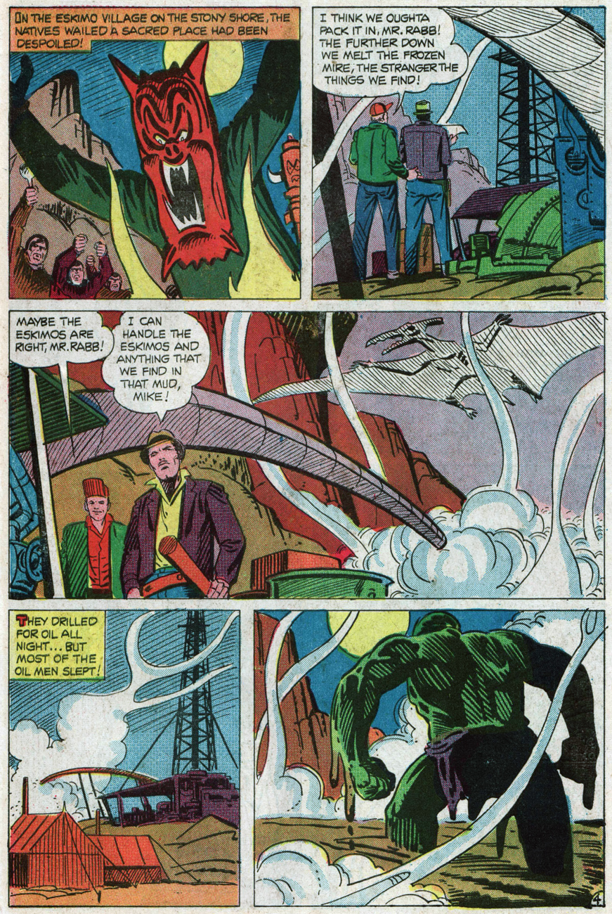
« Hey, look! The critter is frozen whole… it’s in pretty good shape! » Tom Sutton vibrantly sells Joe Gill and Steve Ditko‘s cautionary tale of arctic drilling gone awry, The Ancient Mine. Also in this issue: Steve and Pete Morisi‘s Surprise!, and Gill and Fred Himes’ touching Pipe Dream. This is Haunted no. 37, (Jan., 1974, Charlton), presented by the publisher’s blue-skinned, green-haired answer to Nana Mouskouri, Winnie the Witch.
« … that face haunts me… was it a man or a beast? » Ah, the Seventies. Left dazed and frazzled by his whirlwind life of slow-mo violence, glamorous excess and substance abuse, not to mention radiation poisoning, the inevitable occurs: The Hulk wanders onto the wrong set, as well as the wrong publisher’s! Against all odds, he handles the rôle with aplomb and commendable gravitas. A page from Gill and Ditko’s The Ancient Mine. Read it here!
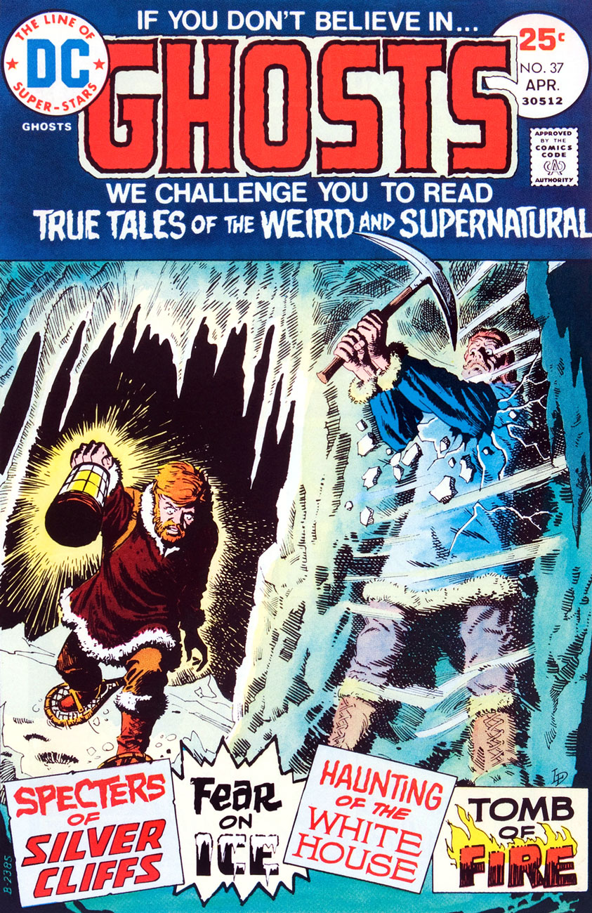
This is Ghosts no. 37 (April, 1975, DC), featuring Luis Dominguez‘s first (or many) cover for the title, a passing of the torch from Nick Cardy, who’d handled nearly every one of the preceding three dozen…. minus two: number 7’s cover was the work of Michael Kaluta and number 16‘s that of Jack Sparling.
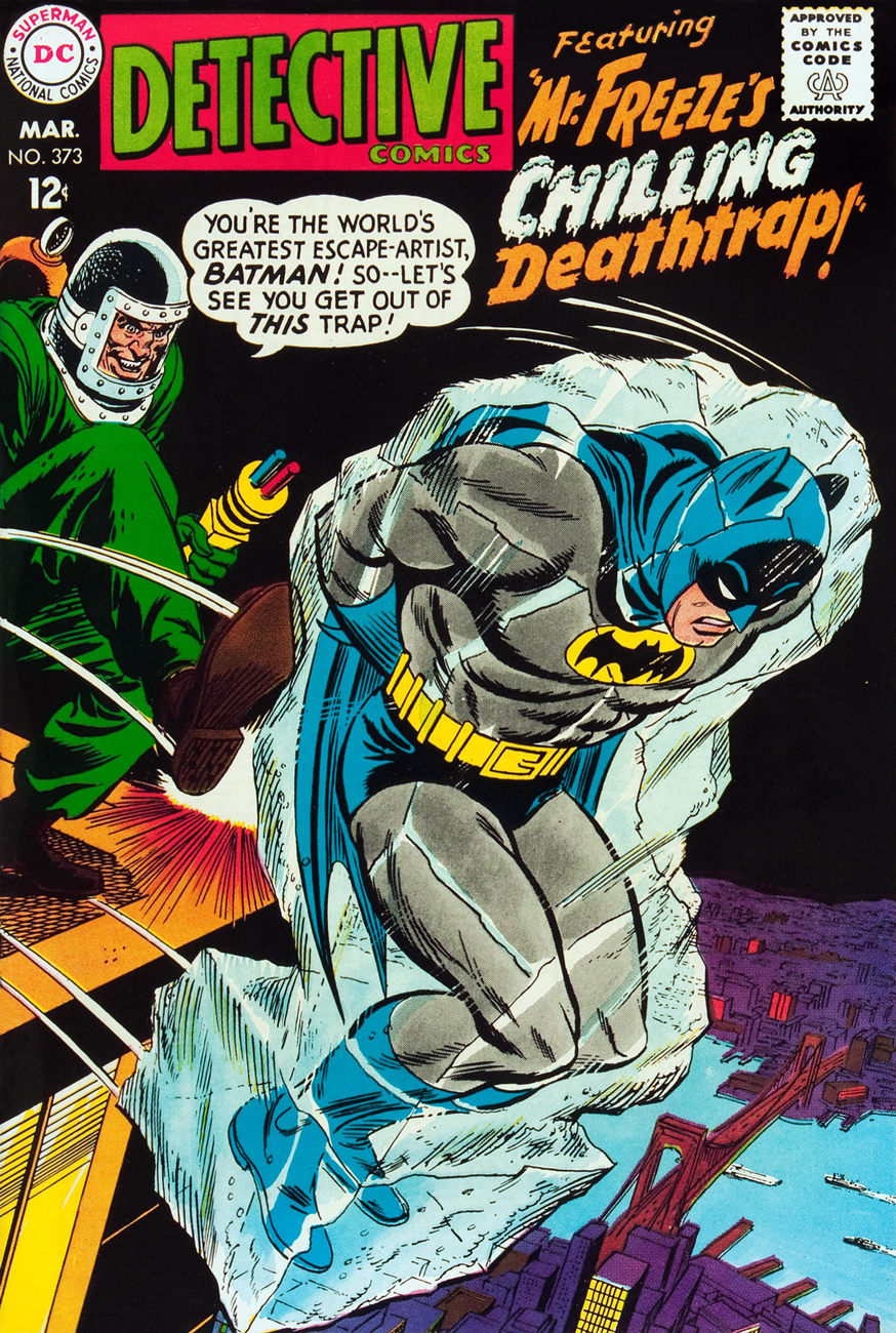
Oh, and since I wouldn’t want any of you superhero aficionados to think I’m freezing you out, here’s another demonstration of Mr. Infantino‘s “encased in ice” idée fixe.
Mr. Freeze, who first popped up in Batman no. 121 in 1959, initially known as, er… Mr. Zero (Celsius, Fahrenheit or Kelvin?) before being revamped and renamed for the mid-60s Batman TV show, a makeover that carried over to the comics, but tragically didn’t include his outfit. This is Detective Comics no. 373 (March, 1968, DC); layout by Infantino, finishes by Irv Novick. [ read it here!]… and I can just about hear the « but what about Cap? » troops tromping down the hall, so…
Namor goes all First Commandment on some poor Inuits (surely they’ve seen frozen bodies before?), displaying an unseemly level of insecurity for someone of his standing. This recap hails from King Kirby’s sensational feat of deadline rescue on the behalf of a tardy Jim Steranko (to be fair, it was worth the wait). George Tuska‘s inks are a surprisingly good fit! This is Captain America no. 112, Lest We Forget! (April 1969, Marvel). [ read it here!]My co-admin ds was just telling me yesterday about a client who, upon remarking to a succession of winter-kvetchers that actually, we’d had a pretty mild January, was invariably met with goggling bafflement, as if he’d just then grown a second head. In related news, it was just announced that said month of January was, indeed, the planet’s warmest on record. There is, naturally, an xkcd strip about this sort of circular denialism.