« The French have a phrase for it. The bastards have a phrase for everything and they are always right. To say goodbye is to die a little. »
― Raymond Chandler, The Long Goodbye
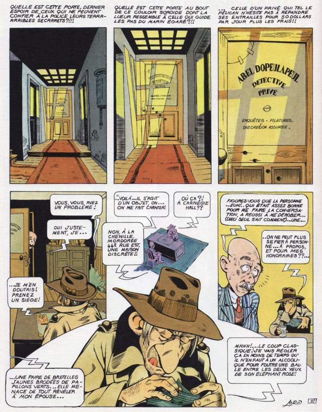
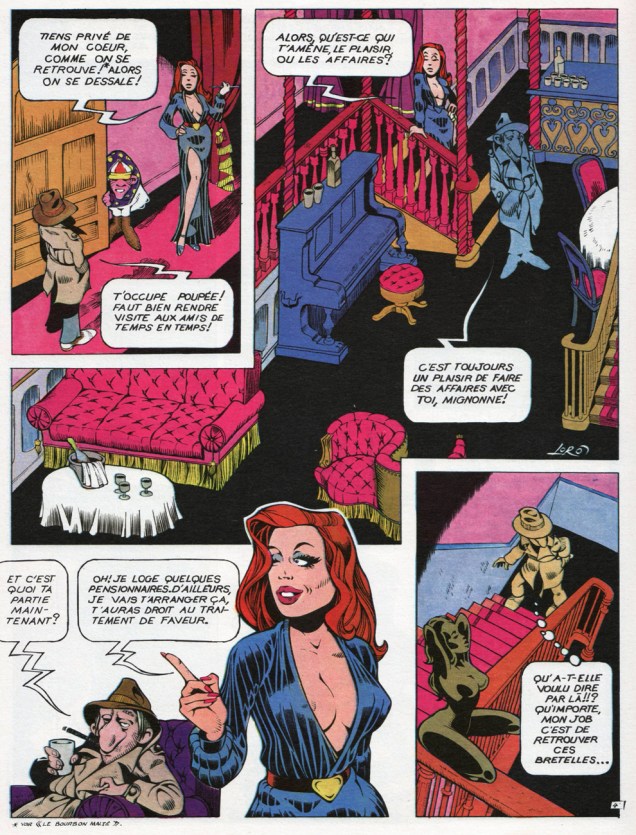
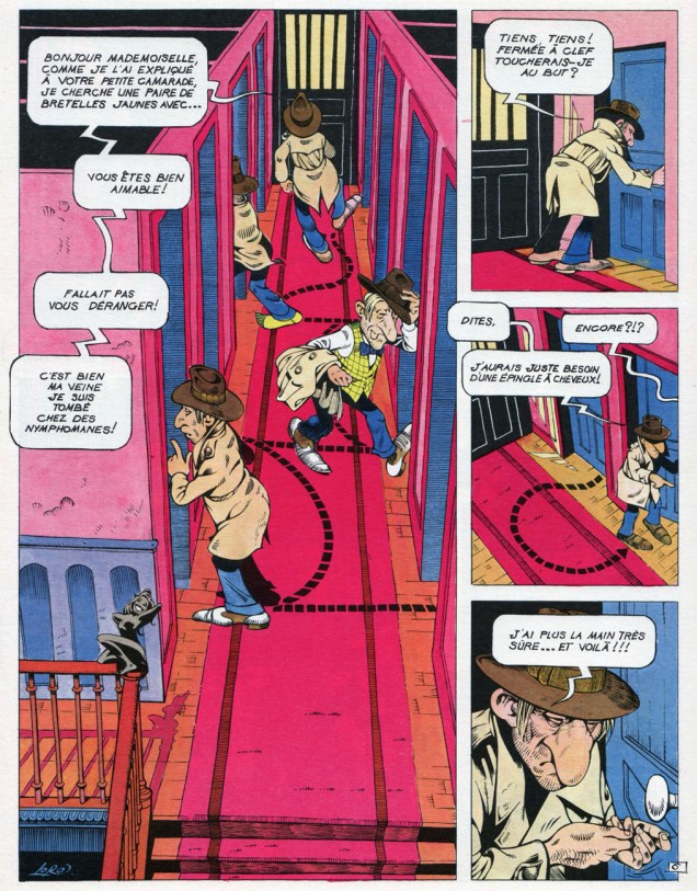
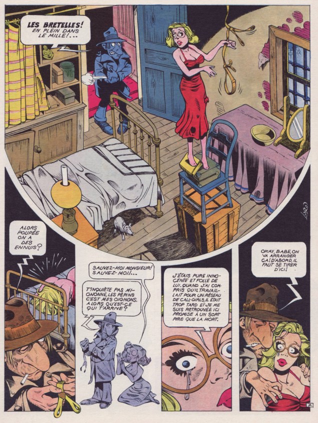
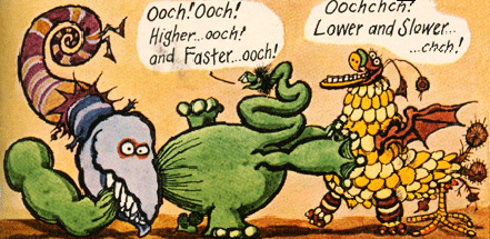
Dopey private detective parodies are a dime-a-dozen, and they seldom raise more than a lazy, jaded chuckle. With that out of the way, just how does Jean-Marc « Loro » Laureau (1943 – 1998)’s Les enquêtes d’Abel Dopeulapeul pull ahead of the pack? Let’s see: while it’s hardly side-splitting, it nevertheless scores precious points on the hilarity front by maintaining a mostly deadpan tone. But… one quick peek at the strip and the jig is up: it’s a glorious, unabashedly visual feast. Loro was blessed with that rather uncommon gift, the ability to seamlessly mix the cartoonish and the realistic. Even Wally Wood couldn’t pull that off. Frank Cho is a perfect contemporary example of someone who’s utterly incapable of it.
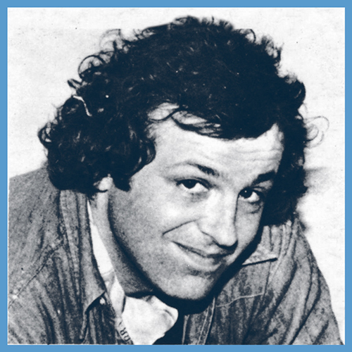
Monsieur Laureau himself, in the late 1970s.
M.A. Guillaume, who penned the back cover copy for the second Abel collection, Sale temps pour mourir (1979, Dargaud), clearly gets the picture. I’ll translate:
« Dopeulapeul, a parodic and cretinized response to [Philip] Marlowe, views himself as that marvellous guy who stalks vice and corruption on fifty dollars a day plus expenses. Within the haze of his dream fed by adulterated bourbon, he doubtless imagines he’ll croak on some moonless night, alone like a dog behind the last trashcan of some filthy dead end. The reader will cackle maliciously, knowing no-one gives a toss about the death of a caricature. But he’ll be wrong. Dopeulapeul conducts himself like some village idiot in the throes of some clandestine passion for Lauren Bacall. His blasé detachment, dragging a language school aftertaste, is as seductive as an unkempt stinkbug. It matters little how offhandedly Loro may treat the tentative meanderings of this poor beggar. Within him slumbers a fascinated vision that survives all clichés: in the debauched night, a man moves along, and his shadow is weary of knowing too well the callousness of the blacktop and of men’s hearts. He is free and solitary and Death is at his heels.
Parody can’t put a dent to that, and Loro knows it full well. He may laugh, parody, demystify, “Sale temps pour mourir” is nonetheless an homage to an untouchable legend. »
Loro is all-but-forgotten nowadays, but his ability to channel vintage Will Eisner (particularly The Spirit) without aping him, while displaying plenty of his own pyrotechnics, by itself deserves a more prominent place in history.
« Réquiem pour un privé », an early entry in the series, first saw print in Pilote Hors série aventure (No 17 bis, October 1975, Dargaud)
Okay, now that you’ve seen some Mad covers (see a MAD dash… outside) let’s have a peek at some inside art by the habitués.
One of my favourite MAD artists is Antonio Prohías (1921-1998). Hailing from Cuba (but being forced to emigrate thanks to an repressive government that wasn’t too fond of the concept of “free press”), he moved to New York in 1960. Apparently Prohias was in no hurry to learn English (and, in fact, his cartoons are silent). Here’s a cute anecdote involving Sergio Aragonés, courtesy of Wikipedia:
« Two years after Prohias’ debut in the magazine, cartoonist Sergio Aragonés made the trek from Mexico to New York in search of work. Because Aragonés’ command of English was then shaky, he asked that Prohias be present to serve as an interpreter. According to Aragonés, this proved to be a mistake, since Prohías knew even less English than he did. When Prohías introduced the young artist to the Mad editors as “Sergio, my brother from Mexico,” the Mad editors thought they were meeting “Sergio Prohías. Twelve years later, Mad writer Frank Jacobs reported that Prohias’ conversational English was limited to “Hello” and “How are you, brother?” Said Aragonés, who speaks six languages, “Even I could not understand him that well. »
Clearly, art was Prohias’ language, and we’re not at all complaining.
It pays to play the *long* game! “Vengeance” was published in Mad no. 66 (October 1961). Art by Antonio Prohías.This it the original art for a gag called “The Old Ball Game”, created for Mad’s Fortune Kookie Dept. It was published in Mad no. 161, September 1973. Art by Antonio Prohías.
Original art for a strip published in Mad no. 253, March 1985. Ironically, I don’t particularly like Prohías’ Spy vs Spy, despite the lovely art and violent dismemberment scenes, much preferring Peter Kuper’s (much later, starting in 1997 up until today) version of this strip.
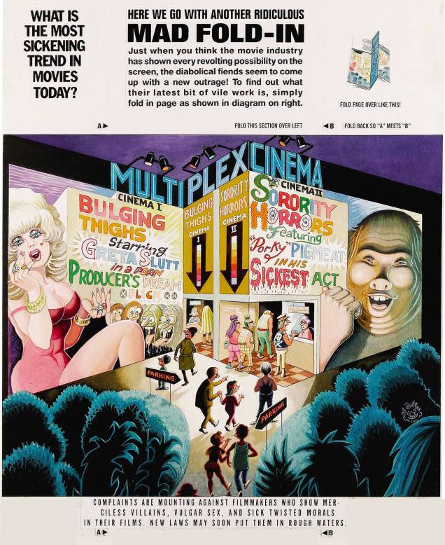
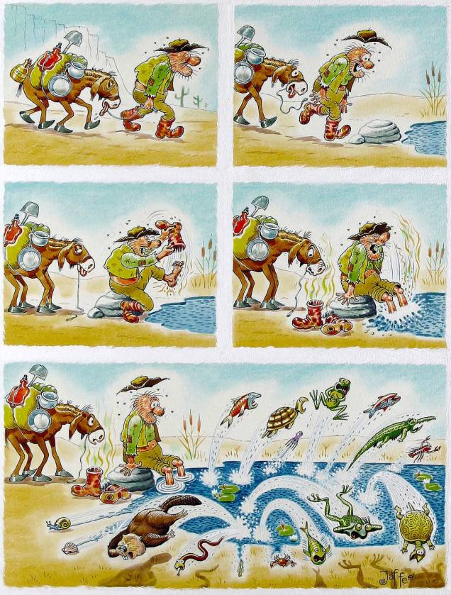
Next on our list is Al Jaffee, the “world’s oldest cartoonist” (Guinness World Records certified and everything!), Mad’s longest-running contributor, creator of the Mad Fold-In, mastermind of Snappy Answers to Stupid Questions.
This fold-in comes from Mad no. 297, September 1990. Drawn by Al Jaffee, it answers (maybe) the paramount question of “What is the most sickening trend in movies today?”( Since I can’t very well ask you to fold your computer screen, the answer is “Commercials in theaters.”)
Incidentally, Mad introduced fold-ins in 1964 – they were a most prominent feature of MAD Magazine, conceived, drawn and written by the aforementioned Jaffee. I’ll quote the man himself:
“Playboy had a foldout of a beautiful woman in each issue, and Life Magazine had these large, striking foldouts in which they’d show how the earth began or the solar system or something on that order — some massive panorama. Many magazines were hopping on the bandwagon, offering similar full-color spreads to their readers. I noticed this and thought, what’s a good satirical comment on the trend? Then I figured, why not reverse it? If other magazines are doing these big, full-color foldouts, well, cheap old Mad should go completely the opposite way and do an ultra-modest black-and-white Fold-In!”
I guess they folded (ahem) on the “black-and-white” part later on. Here’s another nice Al Jaffee production:
This cartoon dwelled on the back cover of Mad no. 214 (April 1980), and was written by Dave Manak & drawn by Al Jaffee.
In a 2010 interview, Jaffee said, “Serious people my age are dead.” That may just be the recipe for eternal life.
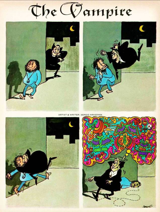
Moving on to another mainstay of MAD: Sergio Aragonés, an artist about whom Mad director Al Feldstein said “he could have drawn the whole magazine if we’d let him.” Prolific, delightfully funny, and (by all accounts) a really friendly guy, Aragonés (born in 1937) is still with us today.
A little gruesome hippy humour from Sergio Aragonés, published in Mad no. 139, December 1970.
My favourite recurring feature by Aragonés is “Who knows what evils lurk in the hearts of men? The shadow knows.“ Many years ago, I picked up a copy of “Mad’s Sergio Aragonés on Parade” at a second hand store. I didn’t know who he was, then, but I loved the sometimes tiny, always funny squiggly drawings immediately. (I also didn’t know who the Shadow was, so that reference was sailing right over my head.) Even though I have since then upgraded to the considerably heftier “Sergio Aragones: Five Decades of His Finest Works“, there’s no way I’m getting rid of my dog-eared, stained and shopworn copy – that’s the one I reach for when I need a chuckle.
Published in From Mad no. 131, December 1969, scanned from “Mad’s Sergio Aragonés on Parade“, and artistically coloured by co-admin RG.Published in From Mad no. 129, September 1969, scanned from “Mad’s Sergio Aragonés on Parade“, and artistically coloured by co-admin RG.
Hurray for Aragonés, the weird hours he keeps (by his own admission), and the thousands of ideas bubbling in his head at any given time. “Sergio has, quite literally, drawn more cartoons on napkins in restaurants than most cartoonists draw in their entire careers“, said Al Jaffee, and glancing at the tiny drawings decorating the margins and in-between-panels of Mad magazine, one can easily believe it.
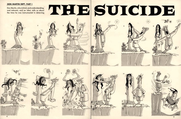
The other guy who just has to be mentioned is Don Martin (1931-2000), promoted as Mad’s Maddest Artist. Where else would we get our fix for goofy characters with comically large, hinged feet? I can just imagine the squeaking noises they make.
Well, *have* you? This Don Martin cartoon was used as one of the eight “Vital Message” mini posters offered with Mad Super Special no. 17 (1970). It makes me think of my mom’s parting admonition every time I would leave the house – “and don’t hit old ladies with an umbrella”. I am proud to say that I’ve followed her advice… so far.
Here’s a fun description of standard Don Martin characters (source):
« His people are big-nosed schmoes with sleepy eyes, puffs of wiry hair, and what appear to be life preservers under the waistline of their clothes. Their hands make delicate little mincing gestures and their strangely thin, elongated feet take a 90-degree turn at the toes as they step forward. Whether they’re average Joes or headhunters, Martin’s people share the same physique: a tottering tower of obloids. Martin puts the bodies of these characters through every kind of permutation, treating them as much like gadgets as the squirting flowers and joy buzzers that populate his gags: glass eyes pop out from a pat on the back; heads are steamrollered into manhole-cover shapes. All of this accompanied by a Dadaist panoply of sound effects found nowhere else: shtoink! shklorp! fwoba-dap! It’s unlikely Samuel Beckett was aware of Don Martin, but had he been he might have recognized a kindred spirit. »
And now… for a bit of levity: a few favourite MAD covers.
I’ll start with this by-now-iconic cover, that’s nevertheless worth posting (with proper attribution to artists involved and in high enough resolution to admire the details, two characteristics sadly often absent from stuff posted online). You’ll note I’ve skipped over the first couple of Harvey Kurtzman covers (MAD nos. 1, 3 and 4) – which are amazing but a topic for another conversation.
Mad no. 5, June-July 1953. Cover by Will Elder, colours by Marie Severin. The busty babe is the least interesting character on this cover!
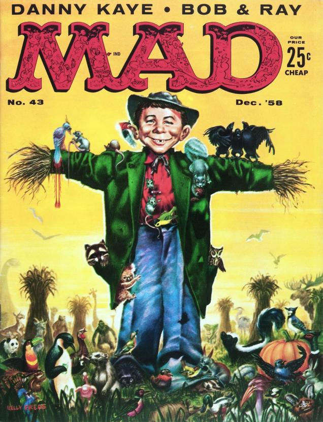
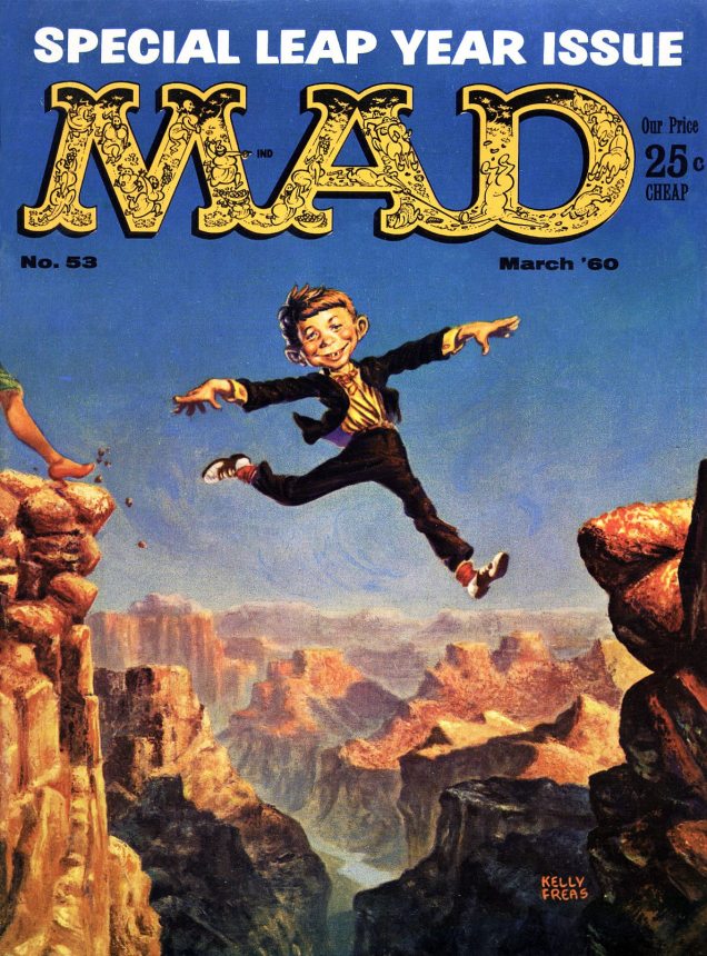
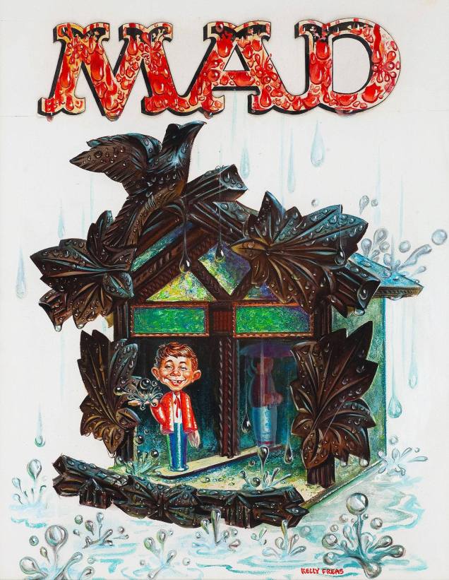
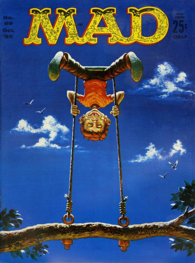
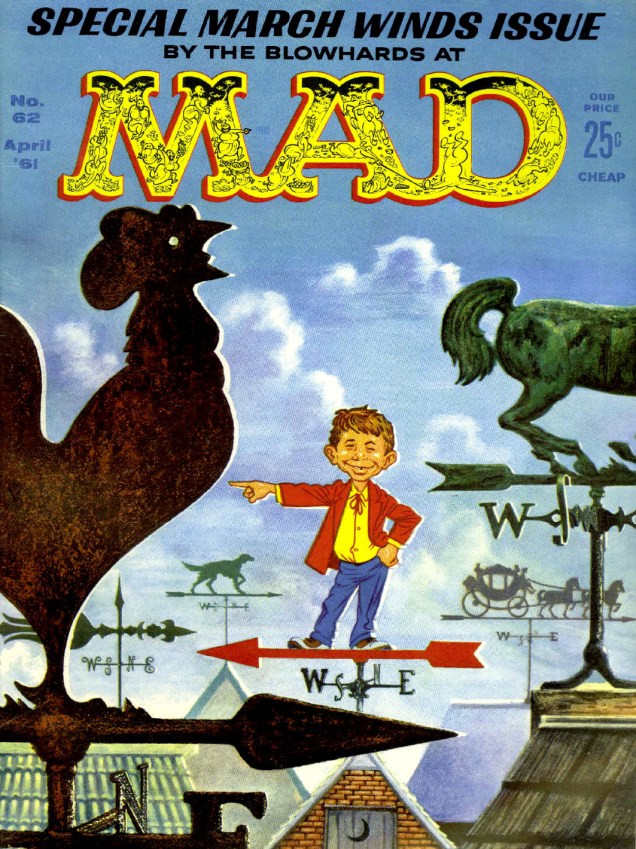
And it’s back to Kurtzman for covers of MAD nos. 6 to 10. Then I’ll disregard the somewhat boring covers, and jump over the Norman Mingo ones, and that brings us to… Frank Kelly Freas! It shall quickly become apparent that I really like his art (guilty as charged). Having started his career at Mad in February 1957, by July 1958 he was the magazine’s official cover artist (his first was MAD no. 40), and painted most of its covers until October 1962.
This one must have been fun to draw. I especially like the three (drunk?) crows singing on Alfred E. Neuman’s left arm. Mad no. 43, December 1958. Cover by Frank Kelly Freas (from an idea by Joe Orlando).Frank Kelly Freas painted this attractive, colourful cover for the annual More Trash From Mad no. 2, 1959. This cover + Mad labels (you can see some of them here) for 50 cents? Seems like a good deal!MAD Magazine no. 53 (March, 1960). Looks like there’s a woman about to follow Alfred E. Neuman’s bold cliff-jumping example.. unless she’s the one who pushed him off.Original art for the cover of Mad no. 55, June 1960. Cover by Frank Kelly Freas. The sides of the weather indicator would be labelled “Fair” and “Foul” on the actual cover, but here you can really admire the detail of Freas’ deft brush. Alfred E. Neuman would be standing under “Fair”, of course, which would mean he’s predicting the weather erroneously… but maybe he’s just a pluviophile.Another Kelly Freas cover: Mad Magazine no. 58 (October 1960). A summery cover, wouldn’t you say? Look closely and you’ll see that Freas cleverly carved his name onto the bough. Random fact: Freas painted bomber noses during WWII.MAD no. 62, April 1961.
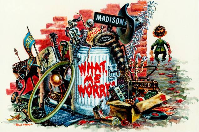
And to wrap this post up… a lithograph from the cover of More Trash from MAD no. 1 (1958).
Everything but the kitchen sink (which has been replaced by a barbecue).
“Only three of these lithographs were ever published before the production was stopped as a violation of the MAD copyright. The other two are currently in private major MAD Magazine collections. This is the only lithograph done by Kelly Freas of one of his MAD book covers.”
For more (not necessarily MAD-related) FKF, go here.
« Last year I went fishing with Salvador Dali. He was using a dotted line. He caught every other fish. » — Steven Wright
In 1974, prodigious underground cartoonist Rick Griffin was commissioned to design a cover for Welsh rockers Man’s ninth opus… and this is what he came up with.
The original version of Griffin’s proposal, cheekily titled « The Baptism of Alfred E. Neuman. »
While the image of the grinning fool popularly known as Alfred E. Neuman was, and remains in the public domain, Griffin was really pushing his luck, even without MAD Magazine’s distinctive typeface on bold display. Let’s just say William M. Gaines’ lawyers had far more than a leg to stand on.
Understandably reluctant to let such a lovely *and* provocative work of prime Griffin altogether go to waste, Man (and their legal counsel, presumably), engineered a clever and elegant design solution, shown below, which graces the band’s Slow Motion album, issued in late 1974, and still thumbs its nose at MAD Magazine, exceptionally cast in the thankless rôle of the fuddy-duddy villain.
However, here’s an account — circa 2023 — I recently discovered that casts the matter in a whole new light: « John Peel made ‘Day and Night‘ his Single of the Week in Sounds, but it was the album cover that attracted most comment. American counterculture artist Rick Griffin had come up with a design that prominently featured Mad magazine character Alfred E. Neuman, only for the cover to be subsequently cropped so that Mad’s cover boy was merely a peripheral presence. For years it was claimed that Mad had refused permission for Neuman to be shown, but it now appears they had actually given tacit verbal approval, and that it was the record company, United Artists, who made an executive decision to censor the design without contacting the magazine. »
This illuminating bit appears in David Wells’ (of Cherry Red Records) exhaustively researched — and exquisitely written — liner notes to Grapefruit Records’ Patterns on the Windows: The British Progressive Pop Sounds of 1974 boxed set. Recommended, as is the rest of this chronological series.
As a born-again Christian (circa 1970) *and* surfer, it follows that fish were, topic-wise, a natural fit for Griffin.
A painting from Griffin’s foremost undertaking of the 1970s, « The Gospel of John » (available to this day!); this one illustrates John 21:6, « And he said unto them, cast the net on the right side of the ship, and ye shall find. They case therefore, and now they were not able to draw it for the multitude of fishes. »
For the record, I prefer my fish alive and swimming free.
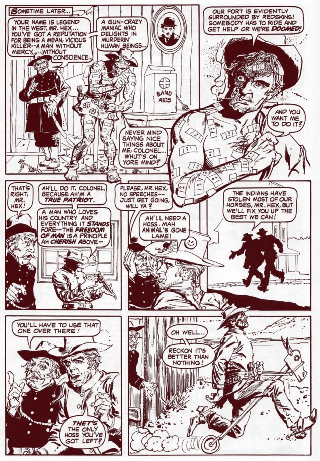
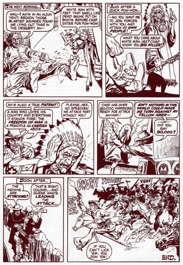
Jonah Hex originators John Albano (1922-2005) and Tony DeZuniga (1941-2012) take the piss out of their boy in a little tale that was, according to Paul Levitz, intended for a (self) parody title provisionally titled Zany (having cycled through the tentative monikers Black Humor and Weird Humor), and that never saw the light of day… This feature was the only one completed for the abortive endeavour, and it saw print in the Plop!-themed issue of The Amazing World of DC Comics (October, 1976), its thirteenth, of course. Incidentally, Plop!’s own cancellation was announced in that very issue of AWODCC. Bummer.
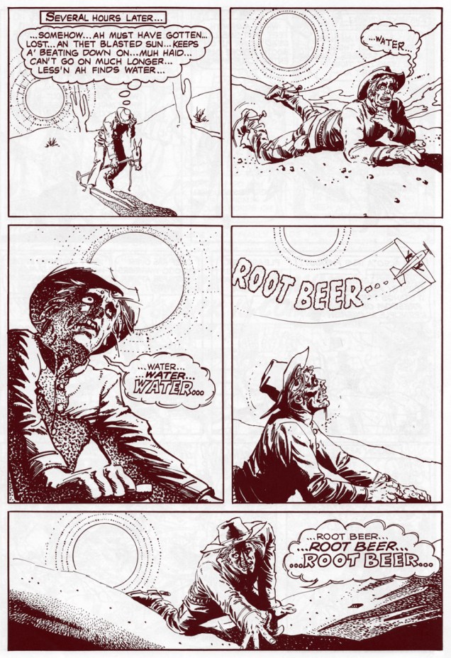
Why, yes… now that you mention it, an ice-cold root beer *would* be nice.« Lying out in the ‘dessert‘ », Jonah? That was either a root-beer float mirage or a careless letterer’s oversight.
I would be earning myself a sound flogging if I didn’t share Sergio Aragonés‘ adroitly-done cover, so here it is.
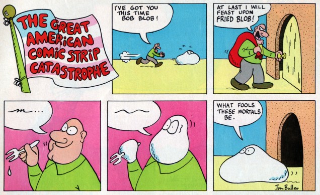
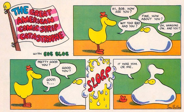
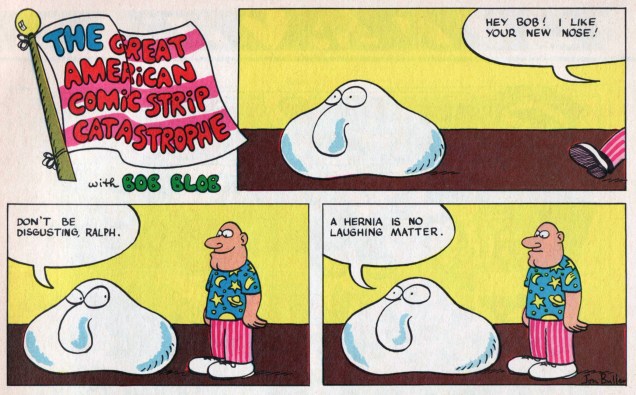
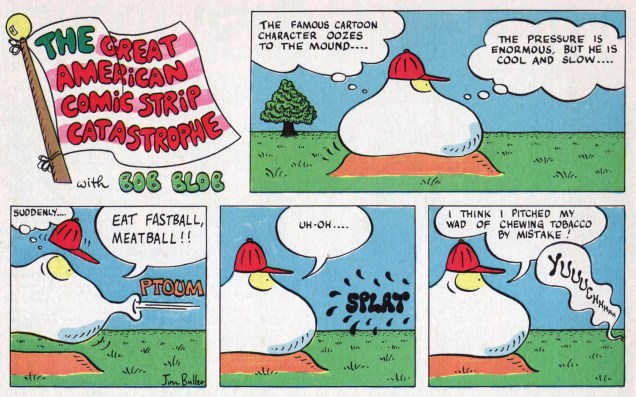
If you’ll just bear with me, we’ll take a peek at a bit of an obscurity, one that’s struck a resonant chord in me. It’s called Bob Blob, and I first encountered it in the June, 1978 issue of Marvel’s Dynamite Magazine knockoff, Pizzazz (1977-79). “The Great American Comic Strip Catastrophe” had been part of the magazine’s lineup since its inaugural issue, but had pretty thoroughly failed to live up to the promise of its title. With issue 9, the magazine’s “First National Edition“, Jon Buller‘s Bob Blob oozed into view and relieved readers from the pedestrian ‘funny animal’ antics just taking up space and failing to bring about the announced, and hoped-for, comic strip catastrophe.
For its final four issues, Pizzazz adopted as its motto “Humor in the Marvel Manner“. If you ask me, that’s what dragged the magazine down: Dr. Doom knock-knock jokes? Er, no thanks. It’s when the humour veered away from said ‘Marvel Manner’ that Pizzazz acquired some actual pizzazz. Bob Blob was at once hi-concept and lowbrow, and one gets the sense that Jon Buller could have spun endless, increasingly surreal variations on his theme, but the magazine lasted but a scant sixteen issues, and ran only eight Bob strips.
Here they are, in order of publication and everything!
This particular strip anticipates Larry Cohen‘s cautionary horror satire The Stuff (1985).
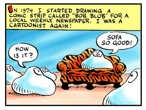
According to Jon Buller, Bob was born… well, let him tell the story:
Read in full Jon Buller’s story in cartoon form, of which this is panel 8 of 13 (go ahead, it’s concise, splendidly told, and well worth your time)
Buller went on to illustrate countless books (sixty at last count!) written by his equally talented wife, Susan Schade. To name but a few: Riff Raff Sails the High Cheese, Anne of Green Bagels, Dracula Marries Frankenstein, No Tooth, No Quarter!, Baseball Camp on the Planet of the Eyeballs, Ron Rooney and the Million Dollar Comic…
The talented pen of Arnold Roth (born 1929, and still alive, hey!) has graced the pages of what will seem like a slightly exaggerated, but in no way exhaustive, list (but no, he’s indeed appeared in all of these): The New Yorker, Sports Illustrated, Esquire and Playboy; Harvey Kurtzman‘s publications Trump, Humbug and Help!; The National Lampoon and Punch (Roth lived in England for a while), and The Progressive.
The topic of Roth’s contributions to Kurtzman’s satirical publications will no doubt crop up at some later juncture, but in the meantime, let’s have a look at some of Roth’s solo lampoonery and comic-form persiflage (not to mention the beauty of his inking line and the dynamism of his compositions).
Roth created a Sunday strip called Poor Arnold’s Almanac for the New York Herald Tribune Syndicate, published from 1959 to 1961. In 1989, it was revived as a Sunday *and* a daily for Creators Syndicate, and lasted until 1990. This strip is from April 24th, 1959.
Speaking of solo work, I also adore his Comick Books of Pets (published in October 1976).
« Found, Raised, Washed, Curried, Combed, Fed, and Cared for in Every Other Way. »
Roth’s art is also rather striking in black-and-white. To wit:
1978. Note the actual Vitruvian Man, L’Uomo Vitruviano, standing in line on the right.