Odd Pairings: Lieber & Fox

« Matt Fox drew comics like they were carved out of stone. » — Dan Nadel, Art in Time (2010)

As far back as I can recall, I’ve been intrigued by the tremendous latitude to be found in specific penciller-inker pairings. Depending on who’s at the helm, things can go anywhere from manna to mud.

No need to dwell on the damage a bad or lazy inker can inflict, and we’ve all witnessed the magic of inkers that elevate any pencils they’re called upon to finish.

It’s of yet greater interest, I believe, to delve into the rare and mystifying alchemy worked by two flavours you’d never dream of commingling in the same dish… like anchovies and ice cream, or perhaps Nutella and caviar.

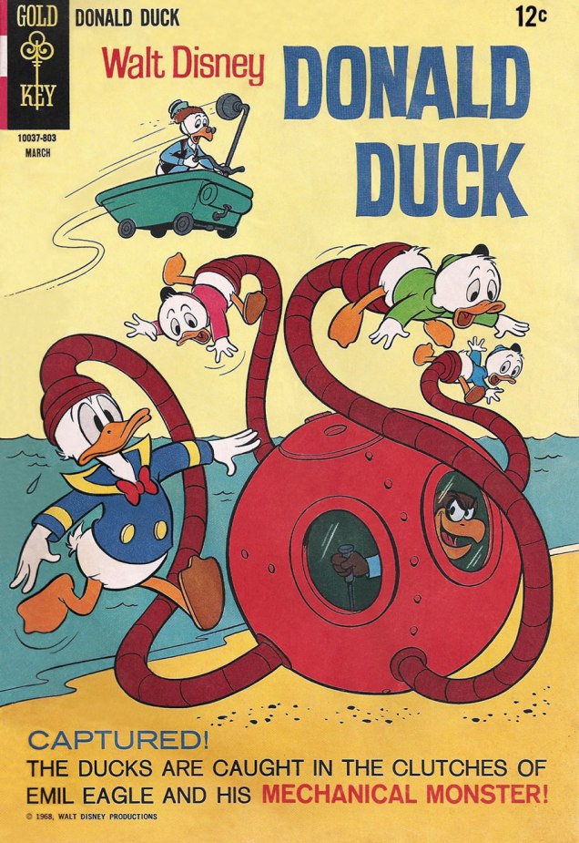
One such audacious mixture was given a go in the transitional post-Atlas days of Marvel comics, as the publisher’s long-running anthologies were shedding their mostly-standalone short story format in favour of the resurgent superheroes.

First, though, a bit about our performers:

Recently-retired (in 2018) writer-artist Larry Lieber (born October 26, 1931, and still with us), is Stan Lee’s younger brother (who didn’t anglicise his name nor sport a toupee) and publisher Martin Goodman‘s nephew. From day one (he got his start in comics with Atlas in 1951), Larry toiled on the family farm, so to speak, his entire career (including a chaotic editorial stint with Martin and Chip Goodman’s ill-conceived Atlas-Seaboard company in 1974-75). His most notable work at Marvel was his run as writer-artist on Rawhide Kid (1964-1973); after Atlas-Seaboard, he worked for Marvel-related newspaper strips, frequently with brother Stan (first The Incredible Hulk, 1978-79, then The Amazing Spider-Man, 1986-2018). He did co-create Iron Man, Ant-Man and Thor… but hasn’t seen a dime for it beyond his measly page rate back in the 60s. Once more, that’s the American comic book industry for you, particularly if you’re a bit of a milquetoast.

The mysterious Matt Fox (1906-1988) was one of the stars in the fabled Weird Tales (“The Unique Magazine”) artistic stable, which notably comprised, let’s not forget, Virgil Finlay, Lee Brown Coye, Hannes Bok and Margaret Brundage… all singular stylists. On the evidence of his eleven WT covers, one might argue that Fox was the oddest of the bunch.

In the 1950s, he drew a handful of short stories for Atlas, as well as a single story and a trio of covers for Youthful’s Chilling Tales… upon which largely rest his reputation in comics. Peter Normanton, in The Mammoth Book of Best Horror Comics, wrote: « There is an air of disquiet to his vision, yet it charms through a surreptitious blending of the primitive with the mockingly insane. His characters border on the lunatic seemingly at home in his landscapes, concealing a darkness corruptive of the soul. »

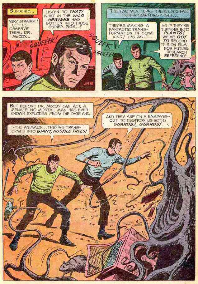
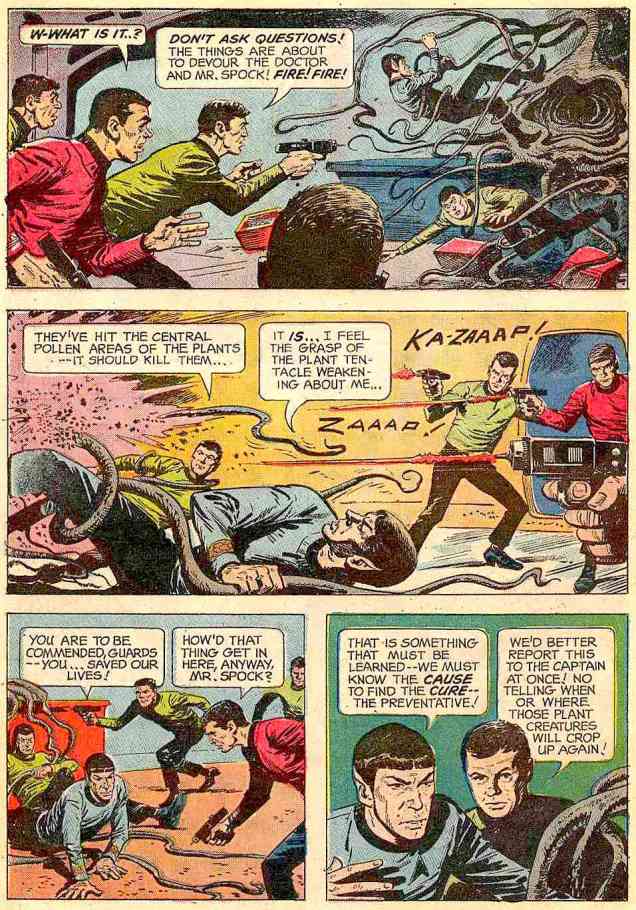
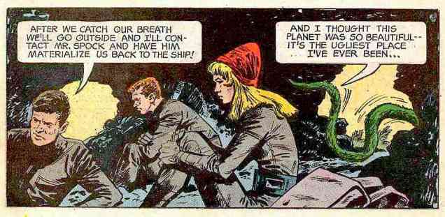
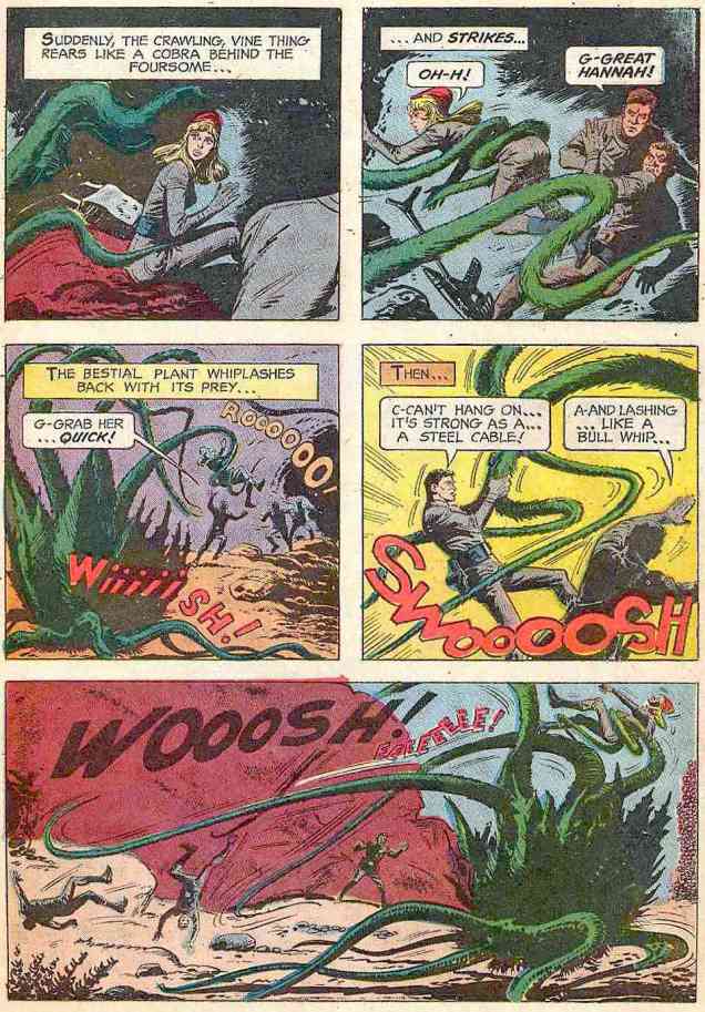
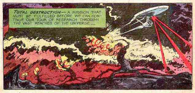
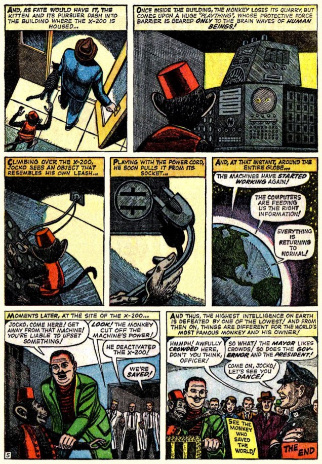
This is Beware — the Machine!!! from Strange Tales no.111 (Aug. 1963, Marvel). Lieber, while he’d never be called (or claim to be, to his credit) a master draughtsman, did possess one irrefutable and priceless artistic quality: he could tell a story clearly, smoothly, without undue fuss.

BewareMachine01ABewareMachine02A

BewareMachine03A
« Without conscience, compassion, or any other behavioral safeguards that humans possess… » I can certainly think of some exceptions, can you?

BewareMachine04A

BewareMachine05A
Uh, guys, monkeys are hardly low on the intelligence totem pole. Now if the X-200 had been brought down by, say, a slime mould, you’d be closer to the truth of your claims.

Now, you may ask, did Lieber appreciate Fox’s stellar efforts? Short answer: nope. In this chat with Roy ‘Houseroy’ Thomas, he lets it all hang out. [ source ]

Roy Thomas: One of the strangest inkers you had was Matt Fox.

Larry Lieber: I hated that stuff! Oh, God, and years later, I learned that Matt Fox is considered one of the greats by some people, and his artwork brings a buck or two.

RTYeah, but not in comics.*

LL: I hated his stuff because I struggled with drawing, and I was trying to make the drawings look as real as humanly possible, and I had a tough time. I remember I once had Don Heck inking me on a five-page western, and I remember saying, “My God, he’s good at making my stuff look better than it is,” and he was. Matt Fox – if my stuff was a little stiff, he made it even stiffer; he made it look like wood cuttings!

RTFox had been in advertising. He’d done lithographs, pulp illustrations; evidently he did some covers for Weird Tales, the magazine that published H.P. Lovecraft and Robert E. Howard, including Conan, back in the ’30s. Fox did color wood cuts; he was a real artist, but his comic inking was so strange – his line just deadened everything.

LLOne of my traits was that I was reluctant to say anything bad about anybody, because everybody has to earn a living. I wouldn’t complain, no matter who they put on. But one day I was working in the office penciling a western, and Stan walked by. He saw my pencils and he said, “This is your penciling?” And I said, “Yeah.” Stan said, “This is pretty good. I’ve been looking at the finished stuff, and that looks terrible.” And he removed that inker – it wasn’t Matt Fox – and gave me a better one. But I, of my own volition, wouldn’t say a word about it.

RTFox obviously had a style that just didn’t translate well into comics.

No, Roy: Fox had a style that just didn’t translate into your own, extremely limited idea of comics. This is, after all, the guy who assigned Vince Colletta to ink Frank Robbins, as well as the single individual most responsible for infecting US comics with the dread malady of “continuity“.

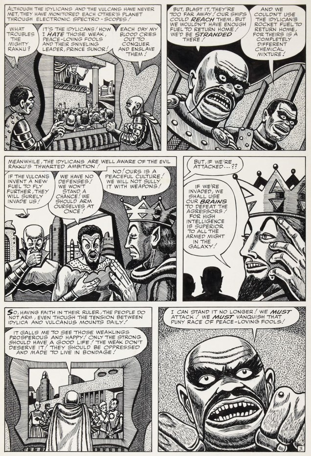
It must be said, however, that Fox’s meticulous line work is not particularly suited to the lousy colouring and printing found in comic books of that vintage. So… let’s look at some original art!

LieberFoxTOS43P2A
Page two of I Was a Victim of Venus!, from Tales of Suspense no. 43 (July 1963, Marvel).
LieberFoxST113P5A
« Camoflauging », Larry? Page five of The Search for Shanng!, from Strange Tales no. 113 (Oct. 1963, Marvel).
LieberFoxJIM101P3A
Page three of The Enemies! from Journey into Mystery no.101 (Feb. 1964).

Here’s a chronological Lieber-Fox bibliography, comprising 17 stories:

Escape into Space (Tales of Suspense no. 42, June 1963)
The Man Who Wouldn’t Die! (Journey into Mystery no. 93, June 1963)
We Search the Stars! (Strange Tales no. 110, July 1963)
I Was a Victim of Venus! (Tales of Suspense no. 43, July 1963)
Beware — the Machine!!! (Strange Tales no. 111, August 1963)
I Come From Far Centaurus! (Tales of Suspense no. 45, September 1963)
The Smiling Gods! (Tales to Astonish no. 47, September 1963)
The Search for Shanng! (Strange Tales no. 113, October 1963)
Grayson’s Gorilla! (Tales to Astonish no. 48, October 1963)
The Purple Planet! (Journey into Mystery no. 98, November 1963)
The Secret of Sagattus! (Tales to Astonish no. 50, December 1963)
Stroom’s Strange Solution! (Journey into Mystery no. 99, December 1963)
No Place to Turn! (Tales to Astonish no. 51, January 1964)
The Unreal! (Journey into Mystery no. 100, January 1964)
The Enemies! (Journey into Mystery no. 101, February 1964)
The Menace! (Journey into Mystery no. 102, March 1964)
The Green Thing! (Tales of Suspense no. 51, March 1964)

Larry! sure! loved! his! exclamation! marks!!!

Most of these have never been reprinted until recently, and since they appeared in key early issues of Silver Age Marvel superhero titles… they’ve largely languished in obscurity. Writing-wise, they deserve it. But the artwork is what we’re interested in.

WhoThereLogotype

And on that point, it would be fair to feature a solo piece from Fox and Lieber, for a bit of perspective on each man’s respective strengths and peccadillos.

FoxWeirdTalesJuly49A
Astonishingly, Terrance Lindall denies any Fox influence on his work. This is Weird Tales Vol. 41 no. 5 (July, 1949); Dorothy McIlwraith, editor. Cover art by Matt Fox. Oh, and look: here’s the bulk of his known œuvre!
RawhideKid66A
This is Rawhide Kid no. 66 (Oct. 1968, Marvel); pencils by Larry Lieber, surprisingly solid inks by Vince Colletta.

In closing, here’s a bittersweet excerpt from Bhob Stewart‘s vivid recollections of his meetings with Fox in the mid-60s, during Stewart’s time as editor (and just about everything else) of Castle of Frankenstein, when Fox dropped by to place an ad in the magazine.

« Fox came across as a straight-arrow, no-nonsense sort of a guy, and after a brief conversation about Weird Tales, he quickly got to the point. He was selling glow-in-the-dark posters, and he wanted to run an ad in Castle of Frankenstein. With that, he unfurled his glowing poster depicting demons and banshees dancing in the pale moonlight. We took it into a dark corner of the room, and yes, indeed, it did emit an eerie green glow.

He next produced an ad for the posters. He had made a negative photostat of his ink drawing, so the reversal of black to white simulated glowing monsters coming out of the darkness toward the reader. Clever hand-lettering effects added a subtle suggestion of glowing letters seen at night, not unlike the moment when Marion Crane first spots the Bates Motel sign through her car’s rain-covered windshield. »

MattFoxGlowAdA
The advert in question, from Castle of Frankenstein no. 8 (1966).

« … it was the second time I saw him. I admired his tight rendering in ink and crayon on pebbleboard. Then I casually asked, “So how many orders did you get for the glow-in-the-dark posters?” He responded bitterly, “None.” After that day, I never saw him and his demonic entourage again. He became the Phantom Artist, whereabouts unknown. Fox died in 1988… » [ source ]

-RG

*utter half-baked, speculative claptrap from Rascally Roy. The fact is that very little of Fox’s original comics artwork survives. For instance, Heritage Auctions has never sold a single Matt Fox solo page. If anything still exists, it’s been in private hands for a long, long time. Furthermore, the comic books in which Fox’s work saw print do ‘bring a buck or two‘, particularly the issues of Chilling Tales featuring his covers (numbers 13, 15 and 17). Read these sinister beauties here

(In fact, to fill that gap in demand, renowned fantasy painter Ken Kelly has even produced recreations of Matt Fox covers. Here’s a sample.)

Tentacle Tuesday: Tentacle Trek

veg·e·tal /ˈvejədl/

adjective:  relating to plants. “a vegetal aroma”

Today’s installment of Tentacle Tuesday provides us with another healthy dose of tentacles of a vegetal nature. With my co-admin RG’s blessing, I decided to be a little unorthodox and instead of my usual piecemeal approach, share one single story.

I must admit to having no rapport whatsoever with Star Trek – I did not watch the show as a child (or as an adult), and haven’t even managed to pick up characters, plot lines or cultural references from the surrounding atmosphere, aside from the stuff *everybody* knows.

But The Planet of No Return (published in Star Trek no. 1 (October 1967, Gold Key), scripted by Dick Wood and illustrated by Nevio Zeccara) is a delight for any keen child who’s ever been mesmerized by the notion of a carnivorous plant and has carried that love through the years into adulthood. I’ll hold my hand up there! It’s also right in the sweet spot of a Venn diagram, the riveting intersection of  “interested in Venus flytrap plants” and “fascinated with tentacles”. I’m not featuring the full story (you can read it here), preferring to tantalize my audience with the many tentacle-laden panels of grabby, aggressive human-devouring plants.

Incidentally, “cannibal plant” is a misnomer (shame on you, Pavel Chekov!) – cannibals involve individuals consuming individuals of the same species.

StarTrek1-PlanetofNoReturn

It all starts with some strange plant spores sucked in through the ship’s ventilation system while it’s drifting next to an unexplored planet…

StarTrek1-PlanetofNoReturn2

StarTrek1-PlanetofNoReturn3

The ship gets teleported to the planet to pursue their original exploration mission as planned… and get almost eaten by a tentacled “cannibal” (once again, not actually a cannibal) plant. A “giant plant tree”, strangely mobile, saves them from this worse-than-death fate… and turns out to have been Hunt, one of their teammates transformed into plant life by spores. No, I don’t know who Hunt is, either – he’s certainly not on the official Star Trek character list, introduced seemingly to be promptly killed after performing his heroic deed.

StarTrek1-PlanetofNoReturn4
Well, okay, if the plant tried to eat a tree, maybe it is, technically, a cannibal.

The now four-people team (the fifth one, Hunt the tree, dies after his epic battle with the Cannibal Plant) continue further into the wilderness… and stumble across a village of sentient plants, who don’t take kindly to intruders. Geez, can you blame them?

startrek2-planetofnoreturn-uglyplanet
After shooting at (and presumably maiming) various denizens of the plant village, the humans retreat to a cave and conclude that this planet is ugly. Sentient plant life is not amazing enough for them, apparently. I suppose being part of Star Trek makes one really blasé about such things.

Janice Rand has it coming for being annoying and whiny…

StarTrek1-PlanetofNoReturn5

At this point, we’re more or less done with tentacles, but I can’t leave you on this cliffhanger (especially if you don’t have some time to waste reading a comic of questionable taste).

Here’s how it ends:

What does this “bestial plant” want with Janice? It wants to put her into a cattle pen, of course! Aiming to rescue her from its clutches, our intrepid explorers break into the pen, and, observing the landscape, conclude that the plants are raising dinosaur-like creatures who consume vegetable-type plants. «The lower plant life on their social scale are used as fodder… food for the beast creatures! Vegetable food!» Oh, and «The vegetables are alive – they’re making sounds also!» So sentient plants are farming animals whom they feed on other sentient plants. (At this point, I was muttering “what is wrong with this comic?”) It turns out that the superior plants eat the animals, who eat the inferior plants, and Janice is now one of the cattle, about to be sent into the giant trees-cum-slaughter-houses to be transformed into food. During the climax of the story, the slaughterhouse trees are blown to smithereens by Mister Spock and his laser beam destruct ray (it’s automatic, it’s systematic, it’s hydromatic), and everybody is teleported back into the relative safety of the ship. The surface of the planet (a.k.a. “hideous little globe”) is then obliterated by laser beams – just in case.

StarTrek1-totaldestruction
So how come only Hunt got transformed into a tree? Are we to assume that the other members of the team are immune?

If you’re craving more bold adventures of a carnivorous/cannibal plant nature, head over to A Child’s Garden of Carnivorous Plants, The Hungry Greenery, or Plants Sometimes Have Tentacles, Too.

~ ds

Tentacle Tuesday: Duck Feathers!

« I read some of my stories recently and thought, ‘How in the hell did I get away with that?’ I had some really raw cynicism in some of them… » – Carl Barks

Like so many kids, I owe a lot of my interest in comics to Carl Barks, even though at the time I had no idea who he was – embarrassingly, up until today I’m not great at spotting his art. So much depends on what is available when one is growing up – and I used to enthusiastically dig through discarded piles of books at garage sales and whatnot, in quest for (among other things) for issues of Super Picsou Géant. Picsou is Uncle Scrooge’s French name, meaning something like “penny pincher”. These (true to their name) giant anthologies, just like pocket-book sized Archie compendiums, offered their readers pêle-mêle reprints of comic book stories both relatively new and also quite old, mixing prime Barks material with shitty European knock-offs with offerings by decent Barks disciples (see co-admin RG’s take on the latter).

UncleScrooge68-CarlBarks-HalloftheMermaidQueen2

Just like a Picsou Géant, this post has a few Barks covers and stories, and a few submissions by other folk… all viewed through my usual tentacle-specific lens. Dive in!

DonaldDuck109
Donald Duck no. 109 (September 1966), cover by Larry Mayer. Minimal tentacles, but that clock was just too cute not to share.
UncleScrooge68
Uncle Scrooge no. 68 (March 1967), cover by Carl Barks.
UncleScrooge68-CarlBarks-HalloftheMermaidQueen
Hall of the Mermaid Queen is by Carl Barks.

Somewhat off topic, but I was quite amused by the ending of this story. Is this was Barks meant when he talked about raw cynicism? 😉

UncleScrooge68-CarlBarks-HalloftheMermaidQueen3

UncleScrooge70-Carl-Barks
Uncle Scrooge no. 70 (July 1967), cover by Carl Barks.
UncleScrooge70-Carl-Barks-TheDoomDiamond
The Doom Diamond, the cover story, is also by Carl Barks.

No Tentacle Tuesday post would be complete without mechanical tentacles:

DonaldDuck118A
Donald Duck no. 118 (March 1968), cover by Tony Strobl on pencils and Larry Mayer on inks.
DonaldDuck118-MechanicalMonster-VicLockman
The Mechanical Monster is scripted by Vic Lockman, which is almost an iron-clad guarantee of inventive goofiness. Penciled by Tony Strobl and inked by Steve Steere.

DonaldDuck118-MechanicalMonster-VicLockman-2

Donald-Duck141
Donald Duck no. 141 (January 1972), cover by Larry Mayer.
Donald Duck141-LarryMayer- The Tall-Tale Trail
The Tall-Tale Trail is penciled by Tony Strobl and inked by Larry Mayer.

Donald Duck141-LarryMayer- The Tall-Tale Trail-2

For this post, I wanted to concentrate on Gold Key publications, but at a later date there will be a follow-up post covering some other material.

~ ds

Tentacle Tuesday: A Child’s Garden of Carnivorous Plants

« Drosera’s snap tentacles — which can sense moving prey — catapult insects directly onto the glue tentacles at the plant’s center, where the prey is digested. What’s more, the catapult system is very effective—the insect almost never escapes. » (source)

Which child hasn’t passed through a temporary fascination with Venus flytraps in particular, and carnivorous plants in general? From there it only takes a tiny shift of the imagination to arrive at man-eating plants, which grab their victims with murderous tentacle-like tendrils, crawling vines and grabby creepers. Today we delve into one of my favourite sub-categories of tentacle obsession: plant tentacles.

This spine-chilling greenery often deploys its lethal vines in some remote corner of the Earth (well, in comics, at any rate). This, I firmly believe, is far scarier than the idea of other planets harbouring these carnivorous forms of life. After all, our chances of landing on Mars or somesuch are slim, and we’re a lot more (though not very) likely to wind up in some mysterious jungle.

But first, we deal with that old trope about a power-mad scientist breeding some man-devouring monstrosity in a pot, garden or greenhouse.

ShadowV2No8
Shadow Comics v. 2 no. 8 (November 1942, Street & Smith), cover by Vernon Greene.
ShadowComicsV208-HorrorHouse
Page from Horror House, the cover story, scripted by Walter Gibson and illustrated by Jack Binder.
BlueRibbon19
The Botanist of Death, scripted by Joe Blair and illustrated by Lin Streeter, was published in Blue Ribbon Comics no. 19 (December 1941, Archie)
Geschichten geschichten550
 Gespenster Geschichten no. 550. One would think that a vampire getting restrained by a carnivorous plant is actually a *good* thing, but the lady seems unimpressed. Maybe she wanted to get bitten?

When I was a wee girl, my dad would give me piles of adventure books to read. Quite a few of them involved some intrepid explorers discovering (or literally falling into) a jungle (often hidden in some volcanic crater) in which prehistoric creatures had somehow survived (among the novels I remember reading were Sannikov Land and Plutonia by Vladimir Obruchev, The Lost World by Conan Doyle, Journey to the Center of the Earth by Jules Verne, The Land That Time Forgot by Edgar Rice Burroughs, etc.) Cue dinosaurs and woolly mammoths! As I loved dinosaurs, I didn’t mind this recurring theme, which by now seems a little, shall we say, hackneyed.

Turok,-Son-of-Stone#26
Turok, Son of Stone no. 26 (Dec. 1961-Feb. 1962, Dell), cover by George Wilson.

The cover story, The Deadly Jungle, is scripted by Paul S. Newman, penciled by Giovanni Ticci and inked by Alberto Giolitti.

Turok, Son of Stone no. 26-TheDeadlyJungle

Turok, Son of Stone no. 26-TheDeadlyJungle2

Very much on topic is this installment of Land Unknown (a comic adaption of the 1957 science fiction movie), scripted by Robert Ryder and illustrated by Alex Toth, published in Four Color no. 845 (August 1957, Dell).

Colour845-AlexToth

Colour845-AlexToth2

I shall doubtlessly return to this topic again. In the meantime, visit Plants sometimes have tentacles too and The Hungry Greenery.

By the way, the Drosera plant (more precisely, a genus that includes about 152 species) – called Sundew in common parlance – is not only lethal, but beautiful, too.

Drosera_capensis_bend
A real-life plant tentacle in action – goodbye, little insect.

~ ds

Hot Streak: Jack Kirby’s Fantastic Four

« Silence at the proper season is wisdom, and better than any speech. » — Plutarch

When I think of cover layouts, I always recall the sage advice of my art school book design teacher, who posited that « a poster should be One Angry Fist », as you only have a second or two to make your point to the undecided consumer. That knuckle sandwich is what gets your message across, not a bunch of clichés and slogans; these only detract from the power of your image.

While we’re obviously dealing, in comics, with a commercial medium, it’s hard to not view it as creative interference, a lack of confidence**. While all publishers indulged in cover overhyping to some degree, Marvel and DC were the main offenders, and DC at least had superior title and logo designers***. 

In the 60s, Jack Kirby created a massive amount of stunning cover art for Marvel… which editor Stan “Ne’er ’nuff Said” Lee buried, as often as not, under his trademark wiseass hyperbole. One might argue that this hardsell approach worked, commercially speaking. Artistically, on the other hand… well, the debate lingers on.

One could counter that cover hype only increased in the subsequent decades (imitated, amplified and distorted), and that stands to reason. That trend is pretty universal, since everything is getting louder, literally and figuratively: commercials, recordings, everyday life. Indeed: louder, sweeter, saltier, faster, meatier and of course cheesier.     

Ah, but for what seems like a mere blip in its history, which is to say around ’68-’69*, Marvel somewhat dialled down the verbiage and let some prime Kirby compositions enjoy a bit of breathing room (at least on Fantastic Four, the company’s second-best seller — and number 16 overall for 1968).

This particular streak is circumscribed by two ho-hum (by lofty Kirby standards) covers: flat FF 81 and messy FF 88 (featured here)… which leaves us with plenty of goodies in the middle. Let’s take the tour, shall we?

KirbyFF82A
This is Fantastic Four no. 82 (Jan. 1969, Marvel). Inks by Joe Sinnott. Silence by Stan Lee. Now isn’t that better?
FF83a
Maximus tries to usurp Black Bolt’s throne, like clockwork. Just a discreet story title… though even then, it’s still intrusive. This is Fantastic Four no. 83 (Feb. 1969, Marvel)
FF84a
See picturesque Latveria. Enjoy the charms of its capital, Doomstadt, located just north of the Kline River. Don’t forget to drop in for some howdy-dos at the small but proud nation’s administrative centre, Castle Doom. This is Fantastic Four no. 84 (Mar. 1969, Marvel). Beyond-meticulous inks by Mr. Sinnott.
FF85a
This is Fantastic Four no. 85 (Apr. 1969, Marvel). Again, did we even need a title? Mechanical lettering, to boot, so it’s not even expressive.
FF86a
Short of a classic, but a nice entry nonetheless. And quiet! This is Fantastic Four no. 86 (May 1969, Marvel).
FF87a
This is always the first image that springs to (my) mind when people bone-headedly claim that Kirby’s work is too over-the-top, ham-fisted and frantic. Even the colours (Stan Goldberg, is that really you?) are admirably subdued. Of course, Stan had to panic and turn on the hype in the eleventh hour. The title would have sufficed. This is Fantastic Four no. 87 (June 1969, Marvel). Giacoia-esque inks by Mr. Sinnott.
FF87b
There. Isn’t that better? The might of Photoshop harnessed to noble ends.

In the face of all this, is it any wonder I found so refreshing the design quietude and purity of some recent comic books covers, such as the Chris Samnee creations we recently spotlighted? There’s hope, thanks to some enlightened folks out there.

-RG

*which closely dovetails with Martin Goodman‘s sale, in the fall of 1968, of Marvel/Magazine Management to the Perfect Film & Chemical Corporation (later Cadence Industries). Probably a coincidence, but who can say?

**Steve Ditko, for one, grasped that if you couldn’t have your publisher’s confidence and trust in your craft and visual salesmanship, you could go elsewhere and enjoy a publisher’s laisser-faire.

***Marvel would even, in the 70s, hire on the sly, for freelance jobs, DC’s reigning lettering ace, Gaspar Saladino. Heaven knows The Avengers badly needed a logo makeover.

Hallowe’en Countdown III, Day 26

« Welcome to the house of horrors! Brought to you by Grippo Denture Adhesive! »

A little while back, we made a brief detour through artist Samm Schwartz’s Silver Age Archie comics covers and touched upon the time he took the last bus out of Riverdale and headed for the greener pastures of New York… and an art director gig with Tower Publications.

Robert Klein and Michael Uslan, in their foreword to T.H.U.N.D.E.R. Agents Archives Volume 1 (DC Comics, 2002), stated: « With Samm Schwartz not very familiar with or comfortable editing super-hero adventure books, publisher Harry Shorten cut a dream deal with Wally Wood. Samm would handle the Tippy Teen titles as well as the Undersea Agent comic book and the war comic book called Fight the Enemy. He would be the managing editor of the company and its day-to-day office executive. »

So that’s that. Schwartz’s books, Tippy Teen (27 issues), Tippy’s Friends Go-go and Animal (11 issues) and Teen-in (4 issues), Undersea Agent (6 issues) and Fight the Enemy (3 issues) actually comprise the greater part of Tower’s output, though they’ve received far less attention since, were easily of comparable quality to T.H.U.N.D.E.R. Agents and its spinoffs. Certainly, the humour titles’ wit was a passel of notches above the Archie line’s, what with such heavyweights as Jack Mendelsohn on board*.

Interestingly, Tippy Teen was the first Tower material to be reprinted: in 1975, four issues of Vicki (a renamed Tippy) were issued by the *very* short-lived Atlas/Seaboard, featuring ugly new covers by Stan Goldberg. These issues rank among the most scarce and priciest Atlas releases. Most of the line’s books can still be easily found and acquired dirt cheap… but not Vicki.

SchwartzGoGo7A
This is Tippy’s Friends Go-Go and Animal no. 7 (Dec. 1967, Tower). Cover art by Samm Schwartz.
PennyCentury05A
This is Penny Century no. 5 (June 1999, Fantagraphics). Cover art by Jaime Hernandez, with colours by Chris Brownrigg. Now, you won’t convince me that this cover isn’t a fond homage to Schwartz’s Hallowe’en-themed Go-Go cover… hey, maybe he *thought* this was a DeCarlo.

When I hear about Dan DeCarlo‘s would-be artistic influence on Jaime Hernandez, I can’t help but wince. If I squint real tight, I can kinda-sorta-maybe see a flicker of it in the wholesome sexiness of Betty and Veronica circa 1960-63, but no more. DeCarlo was soon reduced to such a state of hackdom that I can’t fathom how Jaime would have been driven to imitate and absorb the lessons of such hastily-executed, formulaic drivel. There, I’ve said it. On the other hand, Hank Ketcham, Steve Ditko, and, dammit, Mr. Schwartz’s touches are evident all over, though perfectly amalgamated into Jaime’s own singular vision. The way Schwartz and Hernandez draw clothing folds, the beautifully expressive comedic body language… it’s unmistakable.

And as a bonus, this helpful feature from Tippy’s Friends Go-Go and Animal no. 3 (June 1966, Tower), illustrated by Samm Schwartz. And yes, the boys can also come as beautiful victims.

Go-GoMonsterParty01AGo-GoMonsterParty02A

-RG

*though he was recycling and updating some of his old scripts.

Hallowe’en Countdown III, Day 24

« Somehow, this thing had caught the spark of life! And, anything that lives will fight to stay alive… even if it’s just a Rag-a Bone and a Hank of Hair! »

Ah, Brother Power, the Geek. A notorious flop for DC in 1968… or was it? At the time, it took several months for a book’s initial sales reports to make their way back to the publisher. Axing a title after two measly issues is quite a preemptive and premature strike against it. I suspect a case of toxic in-house politics. From the onset, editorial cold feet had the suits meddling with the project: the character of the animated rag doll was to be called The Freak, which was nixed in favour of the less druggy but more chicken-head-bite-y The Geek.

BrotherPowerGeek02A
This is Brother Power The Geek no. 2 (Nov.-Dec. 1968, DC); cover by Joe Simon, colours by DC’s peerless production manager Jack Adler, and logo presumably by Gaspar Saladino.
Superman211_p17A
I recall that this particular house ad seared itself into my brain at a very young age, but I had to wonder where exactly I’d first encountered it. As it turns out, it was in a random comic book that happened to land my way in childhood, namely Superman no. 211 (Nov. 1968), featuring You, Too, Can Be a Super-Artist!, written by Frank Robbins (I just found out!) and illustrated by Ross Andru and Mike Esposito.

Ahem. Anyway, BPTG was the brainchild of Joe Simon, presumably expanding on his and partner Jack Kirby‘s far darker A Rag-A Bone and a Hank of Hair (Black Magic no. 13, i.e. vol. 2 No.7, June 1952), illustrated by Mort Meskin (likely inked by George Roussos).

BlackMagicRagsA
This is Black Magic no. 13, aka vol. 2 No.7 (June 1952, Prize); cover, of course, by Jack Kirby, with likely inks by Joe Simon. Read it here!

BrotherPowerA

This lovely panorama is from Brother Power The Geek no. 1 (Sept.-Oct. 1968, DC). Written, laid out and inked by Joe Simon, finished pencils by Al Bare.

Say, have I seen Brother Power’s fellow detainees somewhere? Why, yes, of course! It’s Tentacle Master Wally Wood‘s Dorothy, Stanley and Doris, introduced to the world by ToppsUgly Stickers back in 1965! Designed by Wood, they were painted by the masterful Norman Saunders.

WoodUgly44DorothyA

Ugly43A

Ugly36A

Brother Power the Geek, despite its commercial failure and infamy, offered a good-natured, unpretentious romp, even if didn’t quite show us « The Real-Life Scene of the Dangers of Hippie-Land! » You can’t always get what you want.

Brother Power was brought back under DC’s Vertigo imprint in 1993, but as with the revival of its fellow Joe Simon creation, Prez, it received a « groovy » and « ironic » hipster treatment. Bah.

– RG

Hallowe’en Countdown III, Day 21

« Mama threw out my Hooded Cobra and Black Widow! »

A delightful entry in the 1960s monster craze, Gold Key’s anonymously-created The Little Monsters first reared their fetchingly homely heads in the back pages of The Three Stooges no. 17 (May, 1964), predating by several months the near-simultaneous (just a week apart!) arrival on the tube of both The Addams Family and The Munsters. Now this ghastly family unit, assembled in the laboratory of kindly mad scientist Dr. Frankenfurter, comprised Papa Mildew, Mama Demonica, and their titular kids, ‘orrible Orvie and Awful Annie. The Little Monsters enjoyed a quite respectable rampage in comics, running amok for 44 issues between 1964 and 1978, outlasting by some years the craze that spawned them.

LittleMonstersA

In this half-pager is from Little Monsters no. 7 (Dec. 1966, Gold Key), Papa Mildew essays Greta Garbo’s immortal line. Writer and artist unknown and uncredited, for shame. Pete Alvarado has been proposed as a possibility, but the man’s chameleonic versatility complicates identification somewhat.

LittleMonsters07A

Ah, why be stingy? Let’s have a few more short pieces from the same issue.

LittleMonsters06VersoALittleMonsters06RectoA

– RG

Hallowe’en Countdown III, Day 19

« Since man cannot live without miracles, he will provide himself with miracles of his own making. He will believe in witchcraft and sorcery, even though he may otherwise be a heretic, an atheist, and a rebel. » — Fyodor Dostoyevsky

Here’s the earliest recorded appearance of Futurama’s Phillip J. Fry, and it would appear that he’s in for a heap of trouble… voodoo trouble! Fortunately, world-class sleuth Ellery Queen is on the case and on his side. That’s him discreetly crouching behind a gravestone.

ElleryQueenOriginalA

This once-upon-a-midnight-dreary George Wilson beauty served as the cover of Dell’s Four Color no. 1243 (Nov. ’61 – Jan. ’62), the tale of The Witch’s Victim, featuring interior art by Mike Sekowsky, with inks by, from the look of it, George Roussos.

I wonder what Fry had done to get a coven so howling mad at him? I mean, just look at that innocent face…

FrySlurmA

FC1243A
Here’s how the painting fared in print.

SekowskyVictim01A

SekowskyVictim05A
A couple of sample pages from the story…. interesting to see the tension between the staid-by-design Dell style and a bit of an iconoclast like Sekowsky. It’s impressive that Mr. S. could find the time, between pencilling the rollicking monthly adventures of Snapper Carr, to moonlight for the competition… but here we are.

Has your interest been piqued ? Enjoy the tale in its entirety, courtesy of Karswell’s fine blog, The Horrors of It All.

– RG

Hallowe’en Countdown III, Day 16

« Mirrors toins things in revoise! Everything in Mirrorland is opposite! So naturally I’m a tough ghost and you’re a sissy spook! » — Poil in Through the Looking Glass (Spooky no. 121, 1970… read it here)

The Harvey Comics line, in its peak years (from the late Fifties to the mid-seventies, say) was essentially a collection of monomaniacal characters. As Daniel Clowes deemed in his classic lampoon of the Harvey cast, theirs is a Playful Obsession (read it here.)

Richie Rich had his moolah, Little Lotta wolfed down everything in sight, Little Dot found stimulation in… dots, and so on. Casper the Friendly Ghost’s uncouth counterpart, the 30s kid gang-inspired Spooky (complete with Brooklyn accent and « doiby » hat), loved to, well, scare people (and things!) with a hearty « Boo! », Hot Stuff raised the temperature wherever he went. On the other hand, Casper and Little Audrey’s adventures didn’t rely on such gimmicks, possibly from predating the rest of the Harvey gang, originating in animation in Casper’s case, and… folklore in Audrey’s:

« One day, Li’l Audrey was playing with matches. Her mother told her she’d better stop before someone got hurt. But Li’l Audrey was awfully hard-headed and kept playing with matches, and eventually she burned their house down.

“Oh, Li’l Audrey, you are sure gonna catch it when your father comes home!” said her mother.

But Li’l Audrey just laughed and laughed, because she knew her father had come home early to take a nap. »

The Harvey line’s covers were by far its most precious asset: endless riffs on a character’s particular motif, granted, but spun out in well-designed, nimbly-executed and brightly-coloured scenes… virtually the work of a single creative whirlwind, art director-illustrator Warren Kremer (1921-2003).

LittleLotta57A
This is Little Lotta no. 57 (Jan. 1965). Lotta may have been a glutton, but she was also super-strong.
LittleAudrey71A
This is Playful Little Audrey no. 71 (Aug. 1967).
LittleAudrey73A
This is Playful Little Audrey no. 73 (Dec. 1967).
HotStuff-Sizzlers43A
This is Hot Stuff Sizzlers no. 43 (Nov. 1970).
Casper149A
This is Casper the Friendly Ghost no. 149 (Jan. 1971).
SpookyHaunted9A
This is Spooky Haunted House no. 9 (Feb. 1974). Note that Spooky’s girlfriend’s actual name is ‘Pearl’… he just pronounces it ‘Poil’. Upon occasion, the ‘tuff little ghost’ essays the rôle of the spookee rather than his usual spooker (or is that “spookist”?)
LittleDot156A
This is Little Dot no. 156 (Dec. 1974). I’m not sure what the kid’s so terrified of… maybe he’s never had the measles?

WendyWitch87A
This is Wendy, the Good Little Witch no. 87 (Apr. 1975). [ds: these just might be edible mushrooms.]
In all cases, artwork by the legendarily prolific Warren Kremer. As we demonstrated last year, the Harvey house style hardly was the only range he could draw in.

– RG