Panning the murky old print stream for the odd glimmering nugget
By the Light of the Silver Age
We know when the Silver Age begins, but when exactly does it come to a close? Since it’s just arbitrary retrofitting, a bunch of events and dates have been posited, mostly from the early 1970s: Kirby leaving the Fantastic Four and Marvel, the “relevance” of Green Lantern/Green Arrow… The cut-off points of decades have been pretty misleading in the past while the middles have often been more pivotal: for instance, the years 1955 to 1965 are more of a piece than 1950-60, for instance. Same goes for 1965 to 1975. I therefore deem the end of the Silver Age to be the end of 1975, when Carmine Infantino stepped down as DC publisher, along with his brilliant art director Nick Cardy. Replace them with inexperienced Jenette Kahn* and the legendary (but not in a good way) Vince Colletta as art director, and you have a pretty massive sea change. Compared to that, comics from 1969 are virtually identical to releases from 1970. *creating Dynamite Magazine for Scholastic is what got Kahn the job. She only stayed for four issues, and Jane and Bob “R.L.” Stine likely did most of the heavy lifting, since the magazine only improved following Kahn’s departure. – RG
There’s an impressive parade of artists born in July. Of present concern is the birthday of one Murphy Anderson, who came into this world on July 9th, 1926 (and ceased to exist in 2015, at 89, no doubt moving into some parallel dimension).
His work on the Atomic Knights or Hawkman is fondly remembered… but I’ll concentrate on some covers dear to my heart from DC’s science-fiction titles because sci-fi + great art = squeals of enjoyment. Anderson had no trouble portraying any number of far-fetched monsters or depicting incredible situations in his crisp, clean style that made his audience willingly suspend disbelief. Ah, okay, I called it “science-fiction”, but it often crosses the line into fantasy, or horror, with occasional detours into superhero, or just plain quirkiness. To follow the loopy logic of the stories contained in the pages of the following publications, one has to abandon the notion that A leads to B, and prepare oneself for a wild romp through the whole alphabet. Great art certainly facilitates this – the story may leave me scratching my head, but Murphy Anderson’s illustrating chops provide a firm ground to anchor to.
Without further ado, the great Murphy Anderson and some of his artwork!
For instance, take a look at some of the creatures featured in DC’s Strange Adventures through the decades. Anderson’s gallery of characters includes, but is not limited to, startled fishermen, anthropomorphized atomic clouds, and Middle-Age barbarians from another planet, all impeccably drawn.
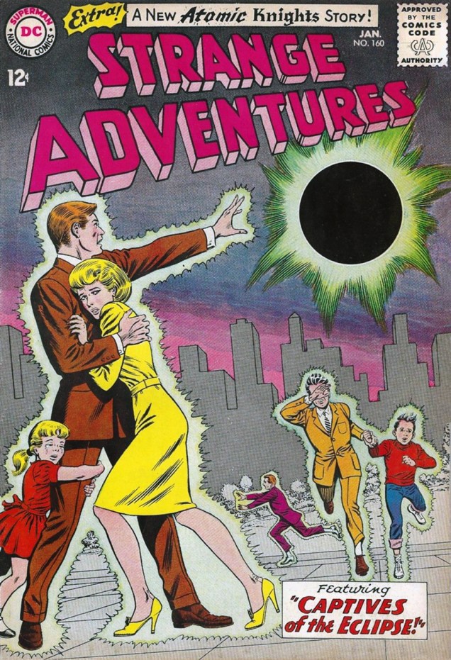
“But I tell you I actually hooked one on my line… THIS BIG!” It’s only fair. I guess you don’t even need to use bait for this type of fishing. Strange Adventures no. 21 (June 1952). Cover by Murphy Anderson.There’s no head-breaking over what title to give these stories… “The Face in the Atom Bomb Cloud” it is! Pencils and inks by Murphy Anderson, grey tones and colours by Jack Adler, lettering by Ira Schnapp. This is Strange Adventures no. 143 (August, 1962). Edited by Julius Schwartz.Strange Adventures no. 160 (January 1964), cover by Murphy Anderson. This issue is a treat, featuring two parts of an Atomic Knights story (“Here come the Wild Ones!”, written by John Broome and illustrated by Anderson).I promised barbarians, didn’t I? Strange Adventures no. 222 (Jan-Feb 1970), art by Murphy Anderson. I have a love/hate relationship with Adam Strange, often loving the art and hating the stories. It’s been a while – I have to re-read this stuff and see if I still find it indigestible.
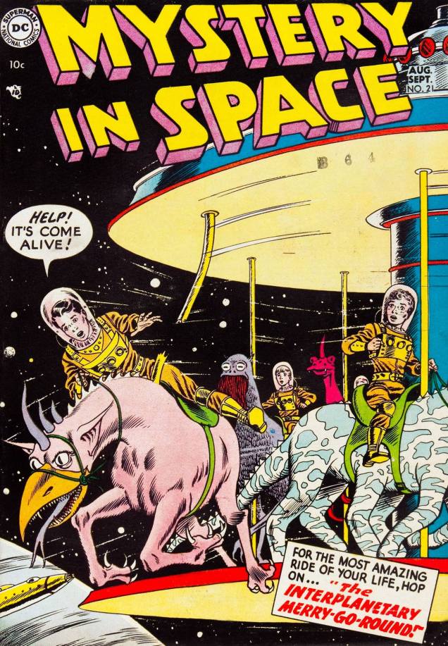
Another favourite series for its oft-striking covers is Mystery in Space. I love it when Anderson invents “space” animals composed of body parts from several Earth species. It’s indubitably fun, and children often have a great time inventing new creatures, but it takes chops to draw the result and make it work, anatomically and aesthetically.
Damn, the safety regulations for those carousel things are really lax these (future) days. It might not be science-fiction per se, but it sure is fun! Mystery in Space no. 21 (August-September 1954), with a cover by Mr. Anderson.
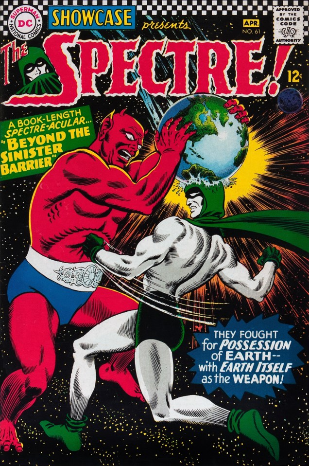
Despite my general resistance to superhero stuff, here’s a cover featuring the Spectre, whose classy costume is easy on the eyes.
When you have to boink your arch-enemy on the head with a whole planet to knock him out and it still doesn’t work, you know you’re dealing with a pro. Showcase no. 61 (March-April 1966), cover by Murphy Anderson.
And one for the road…
Goofiness or social commentary? Frankly, the green “president” looks a lot friendlier than most current politicians. Tales of the Unexpected no. 94 (April-May, 1966). Cover by Murphy Anderson.
« Now at this age, I look back and oh, Adams is probably one of the worst things that happened to the medium, when I look at it historically. » – Darwyn Cooke (2004)
On his 77th birthday, the legendary Neal Adams must surely look back on his storied career and radiantly beam (‘gloating’ is for lesser beings). Still, with all he’s accomplished (and with such brio!) in the fields of graphic storytelling, advertising, physics, the theatre and geology, who could find it in his heart to blame him? With so much to celebrate, let’s just stick to the highlights, shall we?
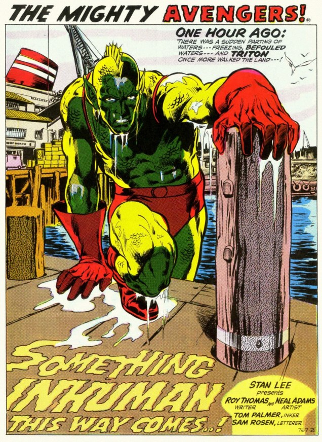
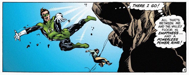
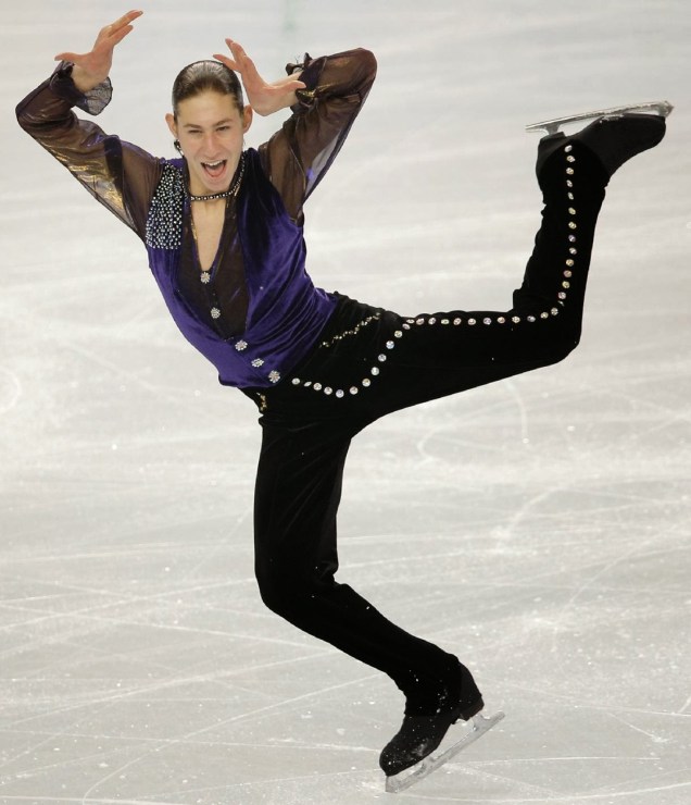
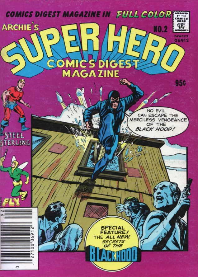
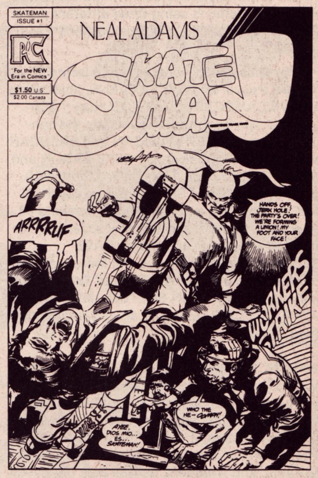
Why is the nasty little dude threatening the giantess? Why, Neal, why? Well, I suppose that is some people’s idea of romance. This is Heart Throbs no. 120 (June-July, 1969), edited by Joe Orlando.I don’t know if you’ve ever pulled yourself out of the water onto a dock, but that… is not the way to do it. One might argue that Triton is an Inhuman, and as such, gravity and anatomy are trifles unworthy of his kind. From Avengers no. 95 (Jan. 1972, Marvel), a chapter in the “Kree-Skrull War”, cobbled together by Roy Thomas from discarded Kirby plot effluvium and Jerome Bixby and Otto Klement’s Fantastic Voyage.Ah, Neal Adams. He who brought naturalism and realism to comics. A panel from “The Powerless Power Ring!”, a Green Lantern backup strip from Flash no. 226 (March 1974, DC Comics.)Neal’s influence can’t be overstated, and not only in the fields of comics and geology. Here’s US figure skater Jason Brown‘s poignant tribute to that very Green Lantern tale, presented to warm applause at the 2014 Winter Olympics in Sochi. As Neal is fond of saying to any cartoonist he encounters, « You are all my children! »*A concert poster reproducing Our Neal’s gatefold art for Grand Funk‘s 1974 LP, All the Girls in the World Beware!!! (which incidentally features their finest original composition, imho, Bad Time) Despite the difficult assignment, Neal comes through with flailing biceps and chicken legs; thank goodness his caricature chops are equal to his grasp of earth sciences. Curiously, half the groupie throng seems to be cloned from a particularly manic Marsha Brady, and most of the rest from Carol Burnett.They’re an American Band. From left to right: Don Brewer (he of the competent drum work), Mark Farner (he of the wild, shirtless lyrics), keyboardist Craig Frost (Homer didn’t rate him), and of course Mel Schacher (he of the bong-rattling bass.) One may wonder just who those guys in the poster are supposed to be.Faceplant time, or The perils of drawing comics whilst grabbing lunch, getting a massage on 52nd, or simply resting on your laurels. How does this cover make any sense? Just picture the scene from another angle, or if someone tried to build a model of it. Archie’s Super Hero Comics Digest Magazine no. 2 (1979 edition.)As legendary as his renditions of established characters are, it is with his own creations that Neal Adams’ true legendary status rests: fabled names, always spoken in hushed awe, such as Ms. Mystic, Samuree, Cyberad, Crazyman, Megalith, Valeria the She-Bat… and of course Skateman, Jason Brown’s childhood idol. Here’s his premiere (and dernière) issue, published in November 1983 by Pacific Comics.And here’s a mock-up of the same cover. I’ll go to my grave wondering why they chose to run the cover sans this piquant, vernacular-rich dialogue, which would have shown once and for all that Neal the writer was every bit the equal of Neal, the artiste. Eat your heart out, Noël Coward!Neal applies his Midas touch to another original creation: Crazyman! Double bag several copies of this number one, someday it’ll put your kids through college. It even comes with an embossed cover! By then, Adams was drawing donkey teeth on everyone, evidently his shorthand for “hilarious”. April 1992, Continuity Comics. You know, “The other superhero company”!
Welcome to the entertaining world of science-fiction/fantasy of the 60s! If you’re an admirer of extravagant creatures with improbable anatomy, or a fan of twisted stories that take questionable leaps of logic to arrive to an implausible conclusion, willkommen.
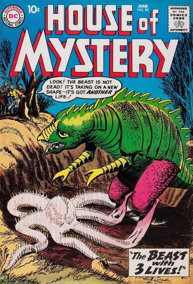
However, if, like me, you tend to root for strange creatures (most of which didn’t want to be discovered in the first place), tread gently. If there’s one pattern in House of Mystery stories, it’s that the “monsters” (that fly in from space/emerge from the sea/crawl out of the depths of the earth/are born in fire/whatever else we can think of) get slain, more often than not, by well-meaning people… or not-so-well-meaning people who are afraid of anything that looks different. If they somehow manage to escape getting shot or bombed out of existence, they’re buried under a convenient avalanche or volcanic eruption.
House of Mystery no. 99, June 1960. Art by Bernard Baily. Yep, the Beast gets killed by the military. It’s sad to think that our reaction to a friendly shape-shifting alien would be “kill first, ask questions later”… but it sadly rings true.
I know that it’s Tentacle Tuesday and everything’s possible, but… this? An octopus with spines on his tentacles (very conveniently placed, I might add) and the puffy eyes of a career alcoholic? A parrot-dragon with opposable thumbs?
House of Mystery no. 113 (1961), pencils by Dick Dillin, inks by Sheldon Moldoff and letters by Ira Schnapp. Err, guys… I don’t think either of these two monsters is all that interested in you, seeing as they both seem to be screaming in horror/pain. If the octopus is Water-Beast, the parrot must be Land-Beast – such wit! I would have gone with “pink thing” and “green bird thing”.
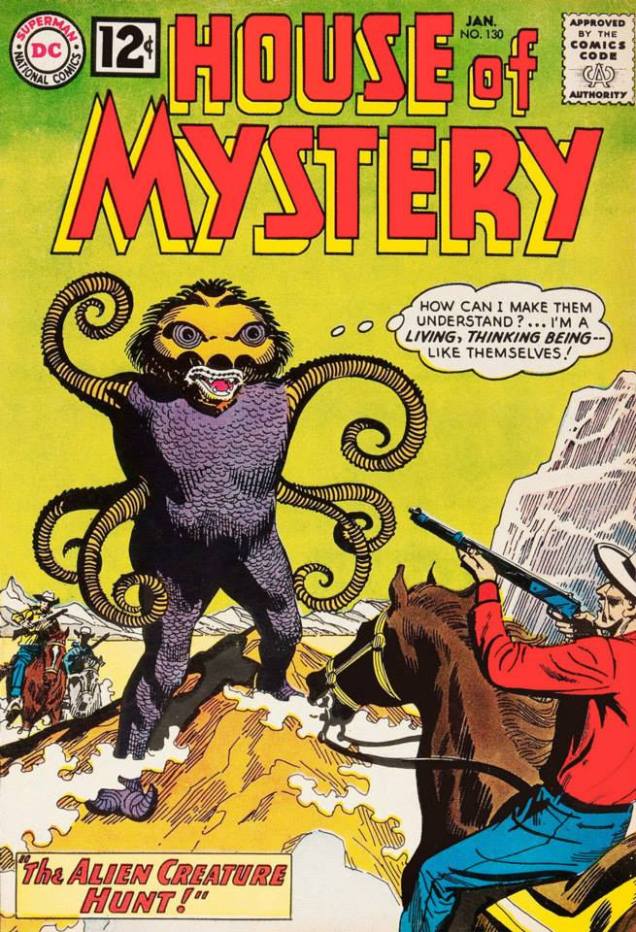
As Tentacle Tuesday continues, we are once again confronted with a situation where misunderstanding between species leads to needless conflict. Shoot first, sort it out later, is the mantra of any red-blooded man! I’m sorry, am I being a tad unsubtle?
House of Mystery no. 130, January 1963. Cover by George Roussos.
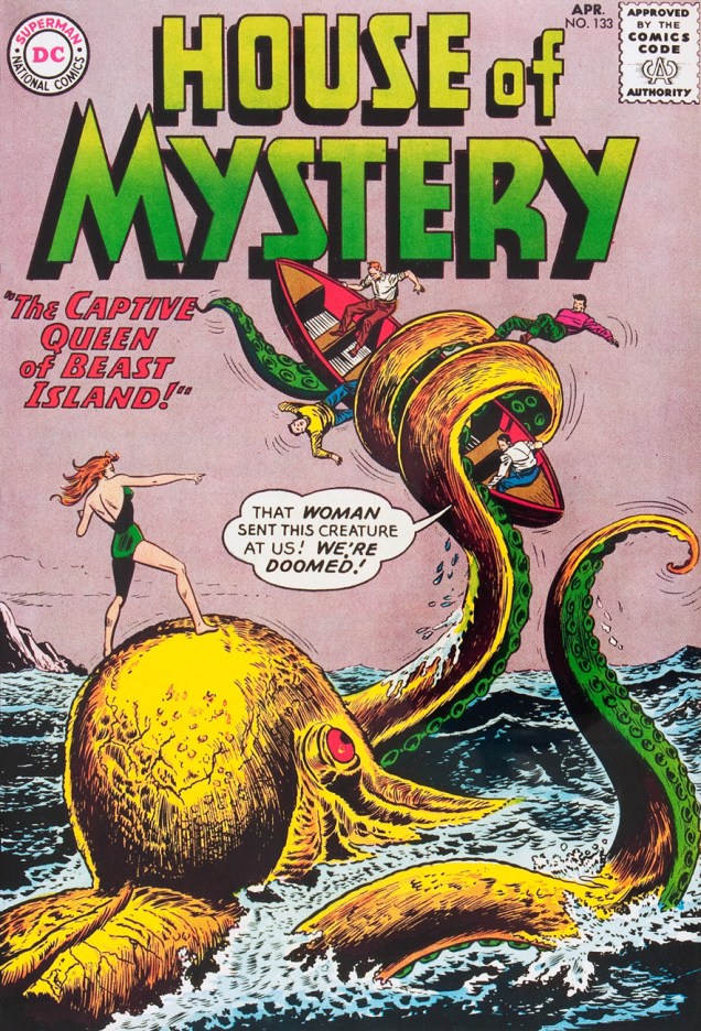
Some guys land on an island patrolled by creatures controlled by a beautiful woman. Well, there’s no need to quarrel, they can talk it out, right?
House of Mystery no. 133, April 1963. Pencils by Dick Dillin, inks by Sheldon Moldoff, letters by Ira Schnapp.
Okay, the woman seems to be friendly. So far, so good.
Art by Howard Sherman.
So perhaps everyone can go on their merry way and leave the island and its creatures alone? No, it’s not enough to just kill them. Oops! The whole fucking island explodes to smithereens when the guys detonate some explosives in a cavern and thus trigger an underwater eruption. I mean, the real threat to these “nice” people was the evil guy trying to gain control of the beasts, but do they try to attack *him*? Nah, they focus on killing the octopus, instead! And the giant armadillo! And the furry rhinoceros!
« And soon, Beast Island sinks beneath boiling, steaming waters… », the omniscient narrator tells us. « The island is gone now – and so are the terrible things that walked on it, flew over it — and swam around it! » The power-grabbing asshole is okay, though – he escaped just fine!
There’s plenty more tentacles in House of Mystery – to which we will no doubt return.
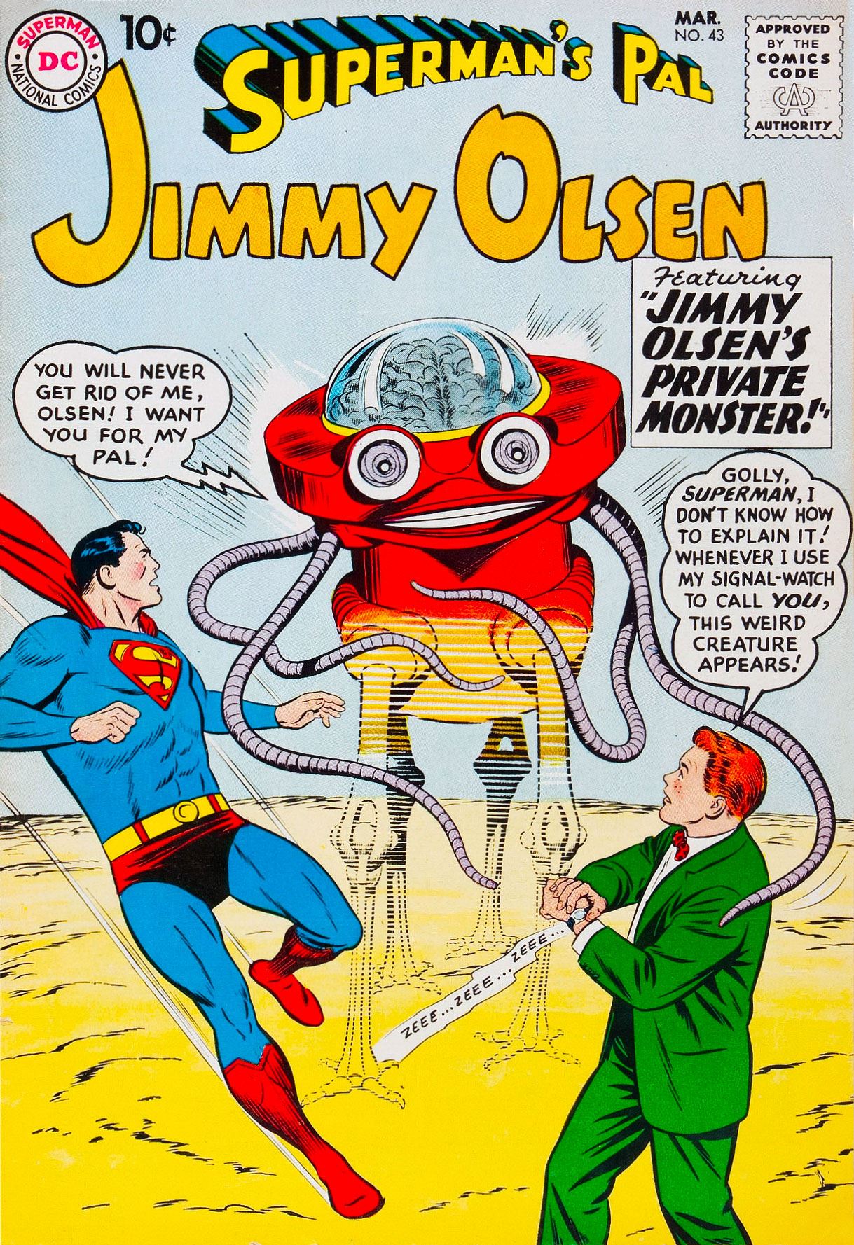
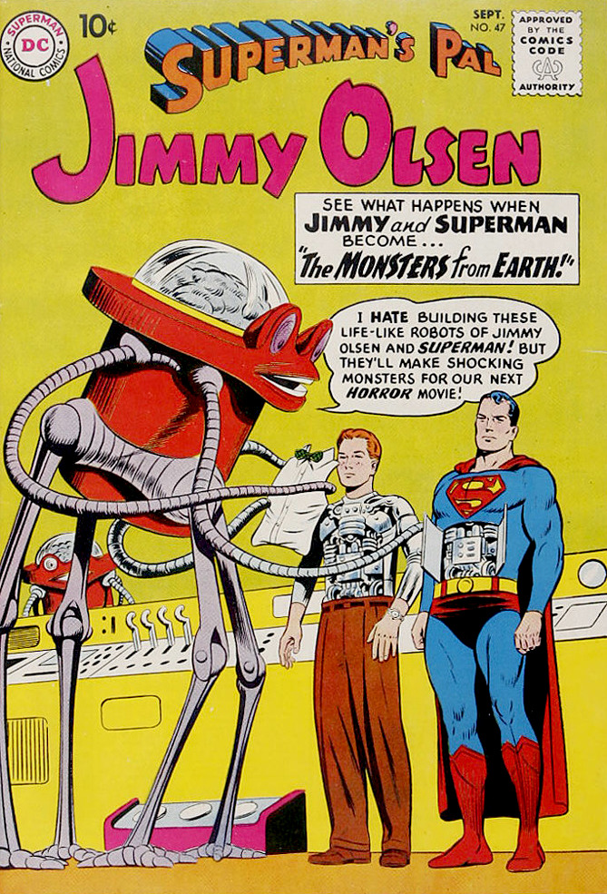
Mechanical tentacles! Cephalopod monsters communicating by mental telepathy! Even Jimmy Olsen playing the part of a monster in an alien horror movie! Yes, it’s all this and more in this Tentacle Tuesday post (after which I’ll quit bugging you with various cephalopods until next Tuesday).
There’s nothing quite as annoying as someone who wants to be your friend against your wishes. Superman’s Pal, Jimmy Olsen no. 43 (March 1960), pencils by Curt Swan and inks by Stan Kaye.
Head over to the Fourth Age blog for a further discussion (with pictures!) of the cover story from this issue, “Jimmy Olsen’s Private Monster!”, written by Jerry Siegel (ahem…) and illustrated by the aforementioned Curt Swan (pencils) and John Forte (inks).
The two-eyed, many-tentacled mechanized wonder appears again in Superman’s Pal, Jimmy Olsen no. 47 (September 1960):
It’s the same cast: pencils by Curt Swan and inks by Stan Kaye; letters by Ira Schnapp.Freaking cute.
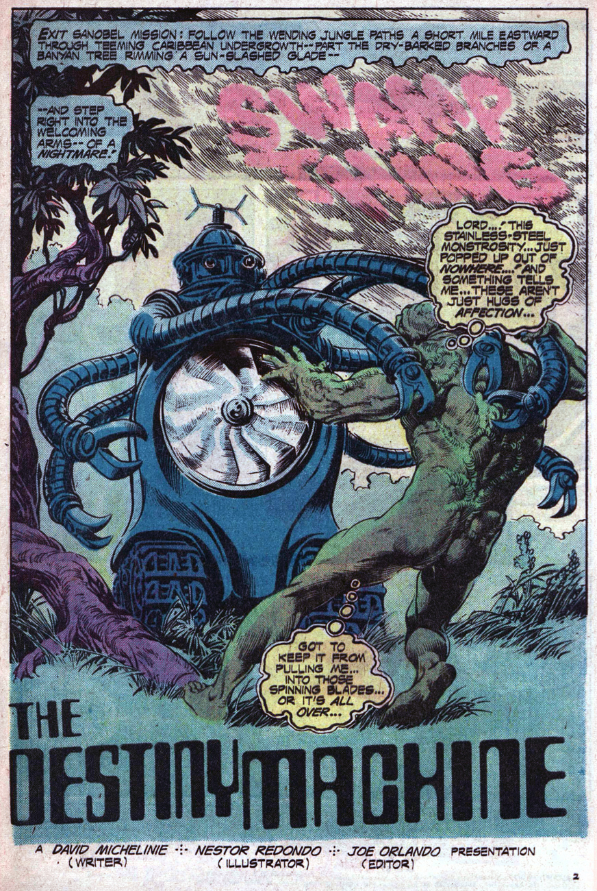
In a similar line of thought (but some 15 years later), a more steampunk relative of the creature above appears in Swamp Thing.
Swamp Thing no. 17 (July-August 1975). In case the credits are too small to read, script by David Michelinie, pencils and inks by Nestor Redondo, colours by Tatjana Wood, letters by Marcos Pelayos.
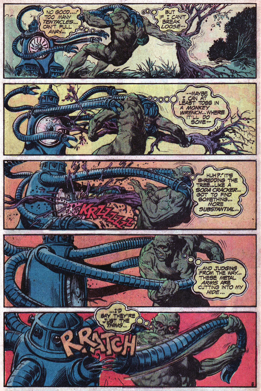
And here’s a peek at the glorious (I’m a fan of Redondo) inside:
« But destroying that thing doesn’t answer the questions it brought up… like what a stainless-steel octopus is doing in the middle of a jungle… » That’s an excellent question – but destroying this mechanized, tentacled abomination was still a good idea, answers or no.
Here’s another file for our records of Tentacular fascination: the Boy Commandos’ intrepid gang of feisty moppets, tired of fighting Nazis, switch it up by doing battle with some tentacled robots.
Boy Commandos no. 17 (September-October 1946). Cover by Jack Kirby.
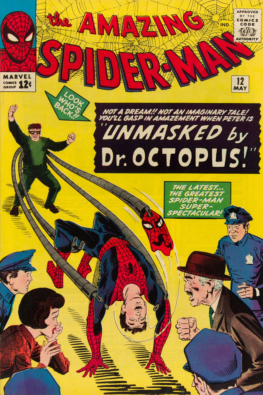
I couldn’t very well have a mechanically-minded Tentacle Tuesday without mentioning Dr. Octopus, one of Spider-Man’s most famous foes! Otto Gunther Octavius, a.k.a. Dr. Octopus, a.k.a. Doc Ock was created by Steve Ditko, and first appeared in The Amazing Spider-Man no. 3 (July 1963). Obviously I could feature a gallery of Dr. Octopus tentacles as long as your arm (pardon the confused anatomical terminology on my part), but I’ll limit myself to a couple.
First, The Amazing Spiderman no. 12 (May 1964), cover by Steve Ditko. The “Look who’s back!!” caption pointing to the Doc is rather mystifying, given that he was there in the previous issue.
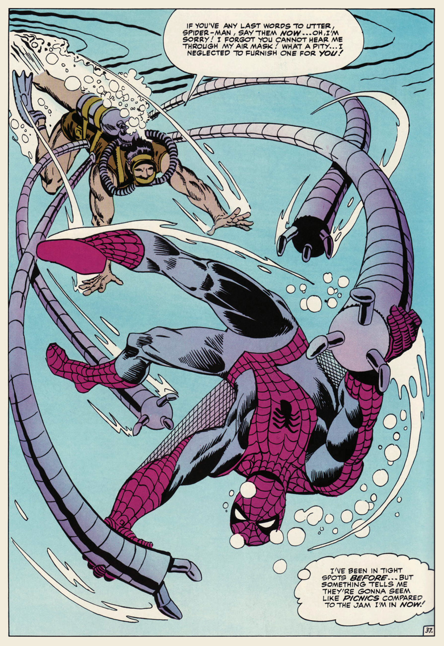
Second, an underwater scene, because what element more appropriate for tentacles? Kudos to Doc Ock for making his perfectly watertight.
JFC, does this guy ever shut up? Especially given that Spiderman can’t even hear him? Splash (no pun intended) page from The Amazing Spider-Man Annual no. 1 (September 1964), with art by Steve Ditko.
Dr. Octopus’ metallic appendages, resistant to radiation and of great strength and agility, were originally attached to a harness…. but became fused to his body after an explosion involving radioactivity (what else?) They were surgically removed, but he could now control them telepathically from a distance. Spooky.
Poor Spider-Man is always getting attacked by tentacles, even when Doc Ock isn’t around! These belong to a robot built by a “nutty professor” to trap anything spider-related. A prize will go to the perceptive reader who can tell us how many tentacles this thing possesses – like, a million, would be my guess. The Amazing Spider-Man no. 25 (June 1965); cover by Steve Ditko.Smythe’s robot in action, ensnaring Parker instead of the spider he’s holding in a globe (and nobody but us readers knows why!) J. Jonah Jameson, publisher of Daily Bugle, watches enthusiastically from the sidelines.Okay, maybe the robot doesn’t have as many tentacles as the cover seemed to suggest. Here’s Spidey hotly pursued by Mr. Jameson, whose maniacal glee is a little scary. (I will readily admit I partially chose this panel because of Parker’s jiggly butt).
« Are all your projects this dangerous, Dr. Solar? »
Dateline: 1962. Printer-packager Western Publishing had just dealt its biggest client, Dell Comics, its slow death sentence (by mutual agreement, it is diplomatically claimed), though Dell should have seen it coming: for decades, Western Publishing Co. had « secured the rights, created the comics, printed them and shipped them out for Dell. Dell acted as the publisher and distributor and did the billing and paid Western for its creatively manufactured products*. » In 1962, Western cut out the middleman and launched its Gold Key imprint (1962-1984.)
Enter, briefly, revolutionary illustrator Richard M. Powers (1921-1996), who successfully wed representational and abstract art for his paperback covers of the 50s and 60s, bringing science-fiction visuals an unprecedented visual maturity. Don’t merely take my word for it: treat your peepers to a gander at his work. You may well find that you know it already.
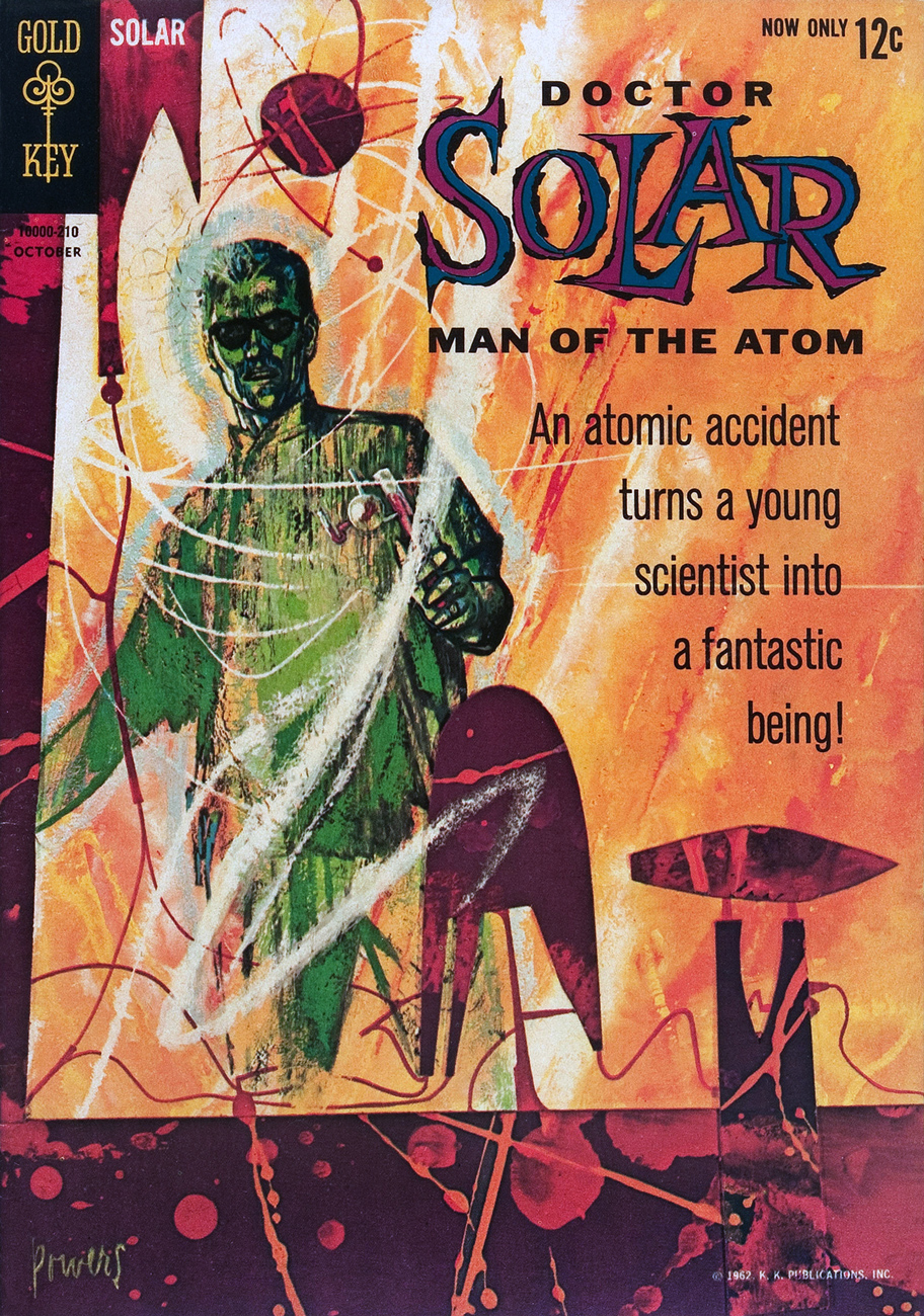
What with a Cold War on, in the early 60s, atom-powered heroes were understandably in vogue. Charlton even had two: after Al Fago‘s 1955 creation Atomic Rabbit, came Joe Gill & Steve Ditko‘s Captain Atom. In 1962, the newly-founded Gold Key threw their hat into the nuclear furnace with the advent of Doctor Solar, Man of the Atom. He was created by writer Paul S. Newman and editor Matt Murphy.
Doctor Solar, Man of the Atom no. 1 (October, 1962)
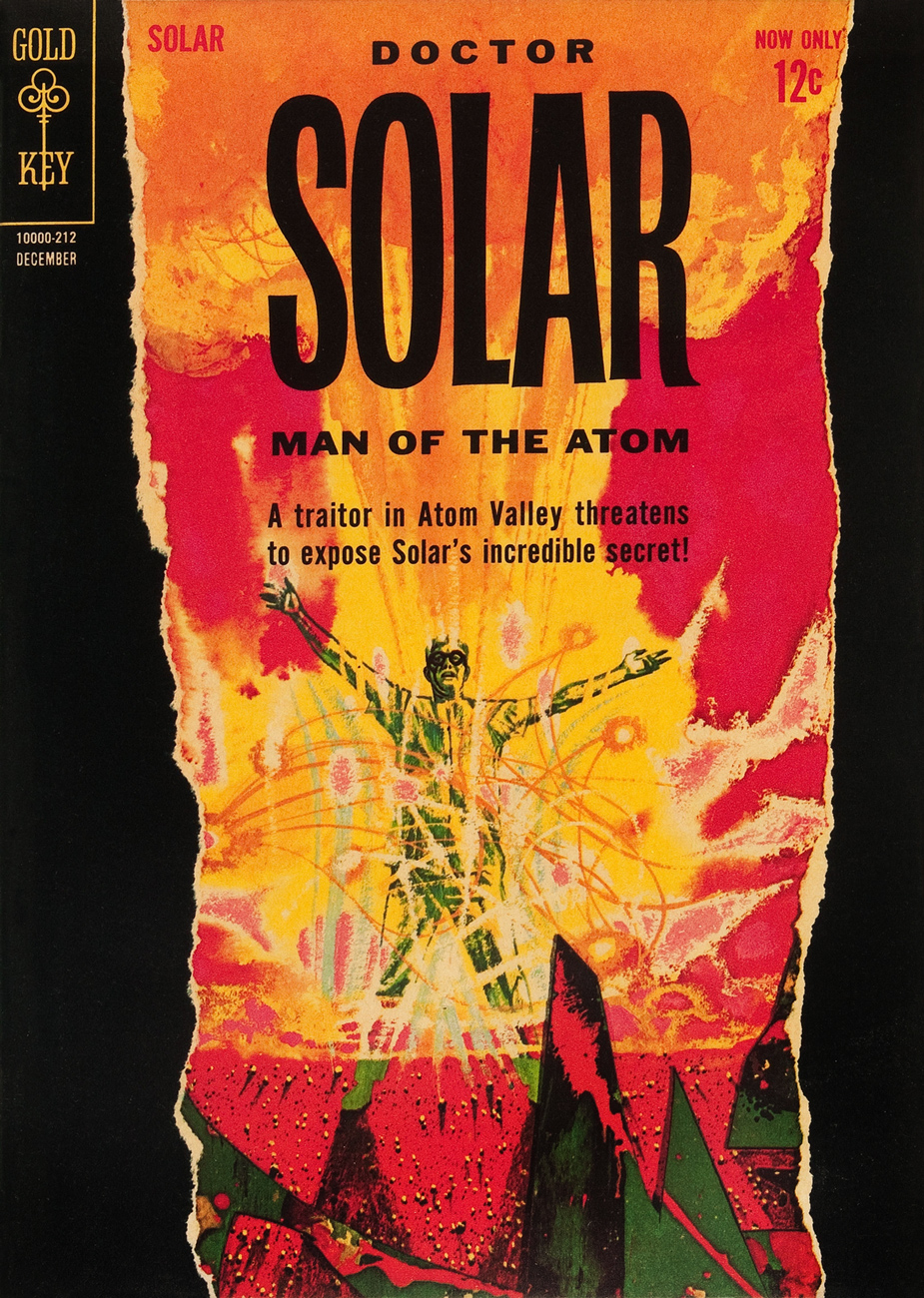
Doctor Solar, Man of the Atom no. 2 (December, 1962)
So far so good, right? And then… we may never know exactly what transpired, but I assume that some art director at Western Publishing chose to second-guess Mr. Powers… smothering the tonal and compositional balance of his painting (« can’t… bear… negative space! »), and likely depriving the outfit of Powers’ further services. He was at his peak, was being offered assignments than he could hope to fulfill, assignments surely more lucrative and friction-free. He wisely scooted along.
The printed version:
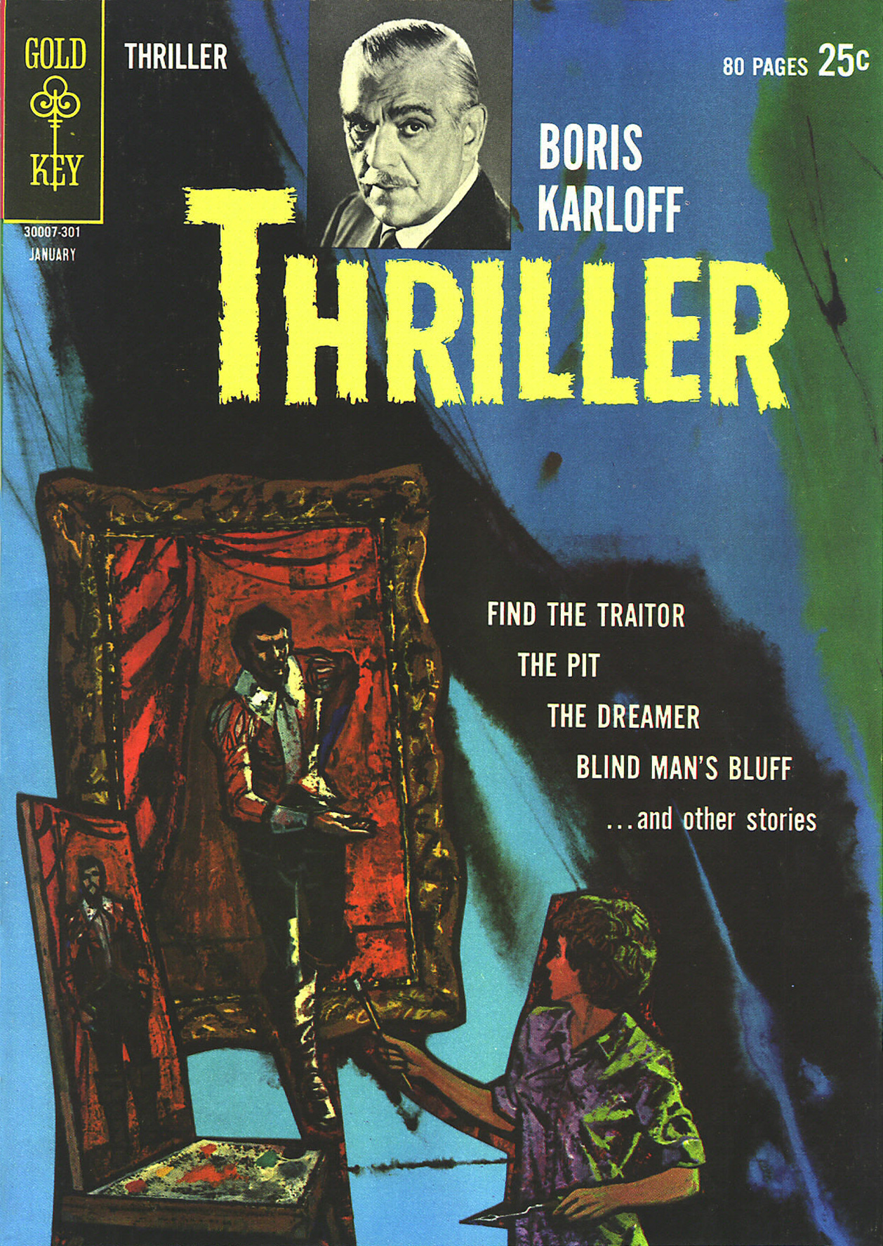
Boris Karloff Thriller no. 2 (January, 1963.) It was decades before I realized that this ho-hum comic book cover was the work of Richard Powers. In truth, the scales only fell from my eyes when I caught a peek of the original art. The printed version is so tame, so drained of its power(s) that the issue didn’t even appear in Jane Frank’s checklist of book covers in her fine The Art of Richard Powers (Paper Tiger, 2001).
See? Now *that* is clearly Powers. « Just slap a 60% cyan overlay over the dang thing, Gertrude. It’s too effin’ artsy! »
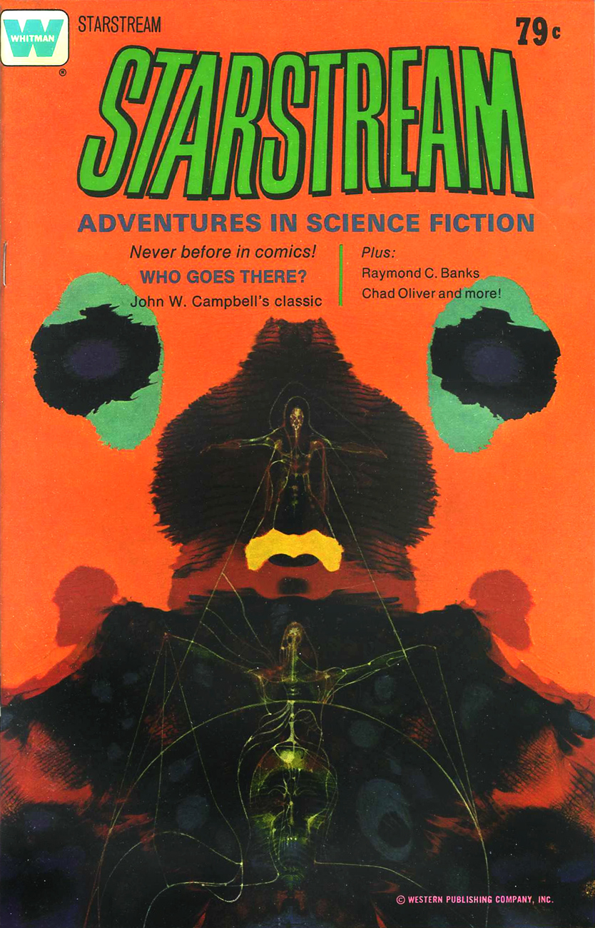
And the tale might have ended there, but here’s the curveball: in the mid-to-late Seventies, Powers provided the fading publisher with a pair of gorgeous, but seldom-seen cover paintings.
A lovely Rorschach blot of a cover for the inaugural issue of Starstream, issued in 1976 under Western’s Whitman imprint. Starstream‘s four issue-run offered sober adaptations of smartly-chosen science-fiction short stories by the exalted likes of Theodore Sturgeon, Robert Bloch, A.E. Van Vogt, Robert Silverberg, Isaac Asimov, Larry Niven, Jack Williamson, et al.
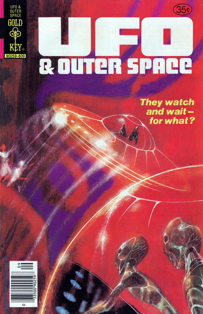
Let’s hear it for unearthly-looking extraterrestrials. With their translucent skin, these guys remind me of unhatched fish. The fifth and final cover created by Richard M. Powers, this is UFO & Outer Space no. 17 (continued from UFO Flying Saucers), published in September, 1978.
See what I mean?
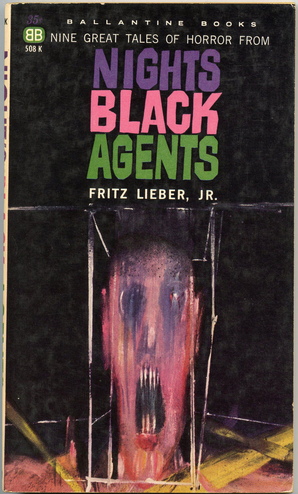
If memory serves, my own Powers epiphany took place in the autumn of 1982, in Lennoxville, a small college town in the Eastern Townships of Québec. There was this little bookstore… and its fine selection of 60s horror and science-fiction paperbacks, priced in the 35-to-50-cents range. The kind of place book lovers dream about stumbling upon, and wake up dismayed to find themselves in the real world… empty-handed.
My favourite (inside and out) of the lot I picked up that day? Fritz Leiber’s (despite the name being misspelled on the cover) Night’s Black Agents (June 1961, Ballantine Books). If you’ve had a similar thrill of discovery with Powers’ art, please do tell us about it!
Of course, you can take that ‘forgotten artist’ notion with a grain of salt: most Archie artists aren’t forgotten, because they were rarely acknowledged in the first place. There are cases such as that of Scrooge McDuck creator Carl Barks, aka the Good Duck Artist, whose identity latterly became known through the efforts of a handful of devoted fans… but such fortuitous events are rare as Gladstone Gander’s off days.
No such luck for Robert “Bob” White (1928-2005), who got the short end of the stick despite being the Archie line’s signature artist during its peak period* (pretty squarely 1959 to 1965) and crafting uncluttered, expertly-designed covers and stories. Of course, these years coincide with most of the classic Archie bullpen hitting its stride, bookmarked at one end by the ascent of White (who’d arrived at Archie around 1954, but details are scant) and at the other by Samm Schwartz‘s departure for greener, but sadly ephemeral (1965-69) pastures, an art director post with Tower Comics.
Archie’s illiberal response to a guy simply, and wisely, trying to avoid putting all his eggs in one basket was typical of the publisher, and of the reactionary comics industry in general, but it’s to White’s credit that, unlike Dan DeCarlo and Samm Schwartz (who at least made a break for it), he didn’t just fold, kiss their ring and take their abuse. Who’s to say? Perhaps that principled departure really stuck in their craw.
There are simply too many outstanding White covers to feature in one go; I suppose I’ll have to return to the well a couple of times. Still, these ought to give you a sense of the man’s style.
Before Afterlife With Archie, there was… Life With Archie, which « was a comic book published from 1958 to 1991. It featured Archie Andrews in adventure stories that were more dramatic than the standard Archie tales. » This is Life With Archie no. 5 (November, 1960.)
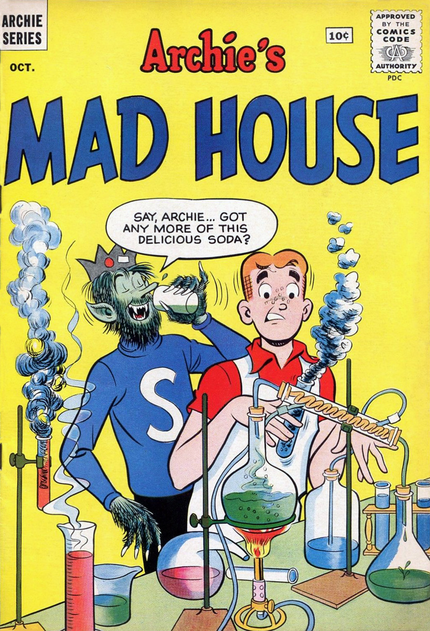
« As I looked there came, I thought a change – he seemed to swell – his face became suddenly black and the features seemed to melt and alter… » ― Robert Louis Stevenson, The Strange Case of Dr. Jekyll and Mr. Hyde ‘Delicious’ is a good start, but what about the side effects? This is Archie’s Mad House no. 15 (Oct. 1961).
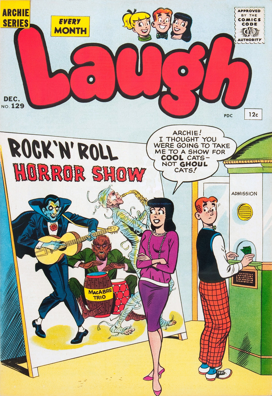
Hey, the Macabre Trio’s in town! This is Laugh no. 129 (December 1961). Cool ghoul Bob White is truly in his element here. Also, do bear in mind that the word “Horror” was banned by the Comics Code Authority, yet they approved this cover. Asleep at the switch!
This is Life With Archie no. 12 (January, 1962.) Correctly acknowledging the facts of evolution? Obviously, Al Hartley hadn’t made the scene yet.
I’m especially fond of the period when you get a sense from the covers (chiefly those produced by White and Schwartz) that Riverdale was built over the Hellmouth or an ancient burial ground, as monsters and aliens routinely ask for directions or take Betty out for a soda. This is Pep no. 153 (March, 1962).
Ah, there’s some of that “more dramatic” stuff. Life With Archie no. 16 (September, 1962.)
« So don’t be persistent / Please keep your distance / You know my resistance is low » It would appear that Madison Avenue’s brand of wizardry is more than a match for Sabrina’s. This is Archie’s Mad House no. 27 (August, 1963).
– RG
*I’m in complete agreement with cartoonist-connaisseur Gregory Gallant, aka Seth, when he writes, in his introduction to John Stanley‘s Thirteen ‘Going on Eighteen’ (Drawn & Quarterly, 2009… where’s volume 2 at?) that « I like Archie comics quite a bit and own hundreds of issues of Archie and its various spin off titles. I can even tell you which years are the good years (1959 to ’65, incidentally) »
On this fine day, we pay tribute to shifty scribe Chester P. Hazel (who sometimes goes by the unlikely nom de plume of Steve Skeates). It is whispered that Stephen, along with his nefarious twin Warren Savin, first invaded this plane of existence on January 29, 1943. That would make him/them/it seventy-five earthly rotations old, should these windblown tattles hold any credence.
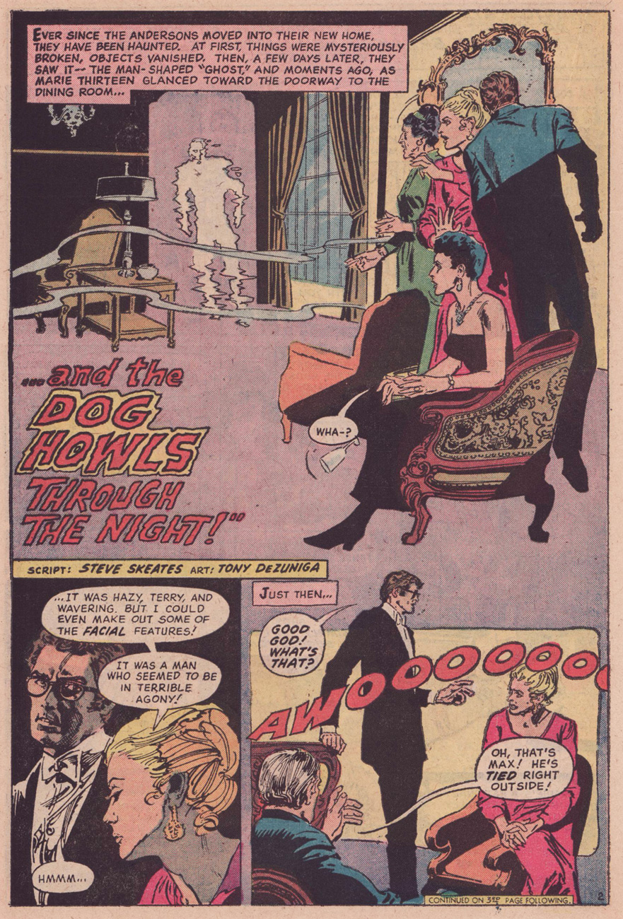
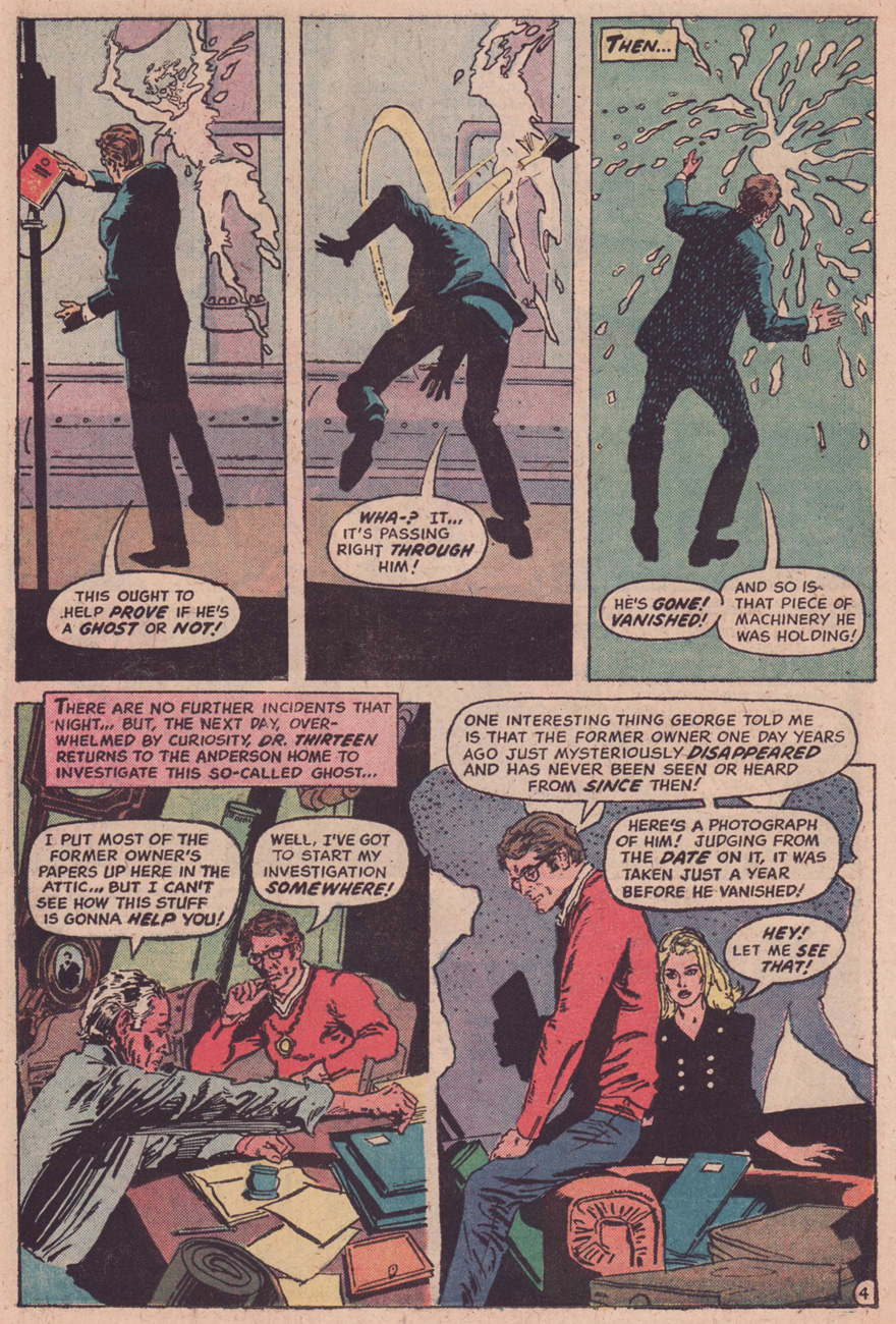
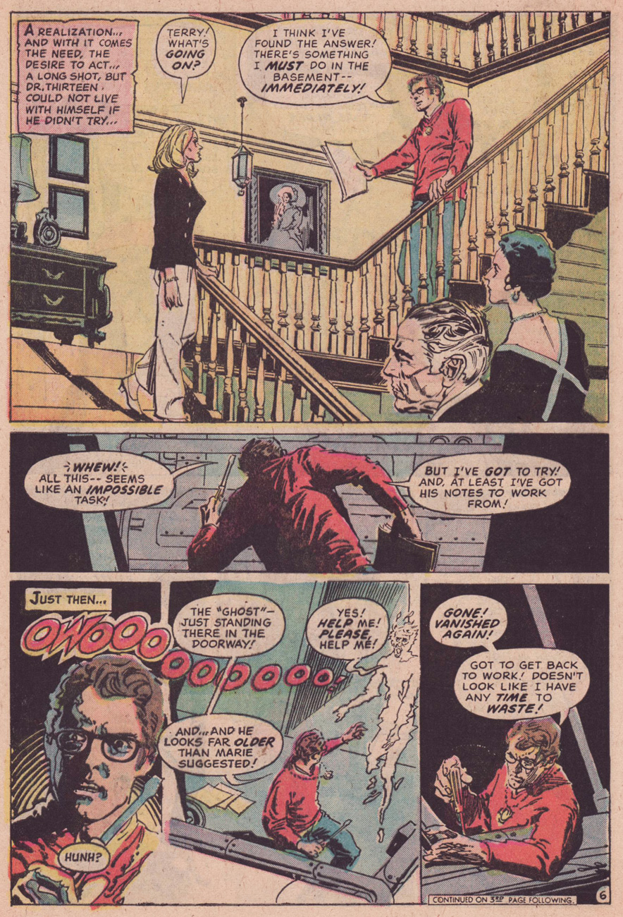
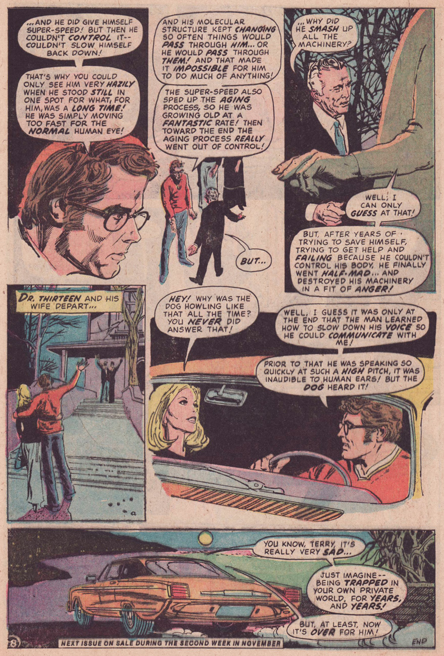
Happily, in this case, picking out a Skeates favourite to share was no ordeal: I’d been meaning for some time to shine a light on one of his neglected gems, one that salt-rubbingly ran without proper attribution in The Phantom Strangerno. 34 (Dec. 1974-Jan. 1975, DC Comics.)
The cases of Dr. Terrance Thirteen, ghost breaker, must have been easier to write back in the 1950’s, when DC Comics’ default setting in its mystery titles was to explain away the supernatural element before the curtain call. DC’s resident skeptic first shared his insights in Star Spangled Comics, his feature lasting from issue 122 (November, 1951) to issue 130 (July, 1952). He then moved to The House of Mystery for a handful of appearances, then faded away. He returned to action, along with his also long-dormant colleague and foil The Phantom Stranger, in 1969’s Showcase no. 80. In the Supernatural Seventies, all poor Dr. Thirteen could do is vainly and stubbornly play the cards of reason and logic against a house deck stacked to inevitably favour the uncanny and the unreal. He was doomed to be a comic book version of The X-Files’ Dana Scully, Fritz Leiber‘s Norman Saylor (Conjure Wife, 1943) or Night of the Demon‘s Dr. John Holden, all skeptics coming off as hopelessly obdurate and clueless in light of the “facts”.
Sounds like today’s so-called post-fact world… in which we need true skeptics (as opposed to deniers) and cool, rational minds more than ever.
Anyway, it wasn’t the first time wily Skeates had faced such a storytelling impasse: he’d had to ring the changes on pacifist character Dove (of Steve Ditko’s eternally squabbling Hawk & Dove) within a universe of hard-slugging super vigilantes.
Dr. Thirteen bounced around various DC titles in the early-to-mid 70s. This is the series’ last bow in the back pages of The Phantom Stranger, and ironically its finest hour, alongside the penultimate entry, The Ghosts on the Glasses, which ran in Adventure Comicsno. 428 (August, 1973.) In both cases, the inspired artwork is that of Filipino master Tony DeZuñiga (1932 – 2012), who was clearly in his element.
A character likens the dead scientist’s ill-fated velocity experiments to comic book character The Flash… but it’s a cinch that what the impish* Mr. Skeates really had in mind was Virgil “Guy” Gilbert, aka Lightning, whose début, The Deadly Dust! he had scripted back in 1965 (T.H.U.N.D.E.R. Agents no. 4, April 1966). Here’s a relevant excerpt, featuring art by Mike Sekowsky and Frank Giacoia.
In closing, a biographical blurb from DC’s T.H.U.N.D.E.R. Agents Archives, circa 2002: « A native and longtime resident of the Empire State, Steve Skeates began his work in comics as an assistant editor at Marvel Comics in 1965 – a job which he quickly abandoned in favor of writing comics as a full-time freelancer. Over the next twenty years he did work for nearly every major comics publisher, including DC, Marvel, Charlton, Tower, Warren, and Gold Key. Since leaving mainstream comics in the mid-1980s, he has worked as a reporter, bartender, and Zamboni operator, as well as publishing his own comics titles, which he continues to do from his home base in Fairport, New York. »
Happy birthday, Mr. Skeates, and thanks for everything!
This splendid Bob White cover brings to mind science-fiction satirist Douglas Adams‘ prescription for achieving flight: « … all one must do is simply miss the ground. »
Judging from the distribution of stars, it would appear that Archie’s left cheek took more of a hit.
Betty gets her turn: This pin-up theme was sugge(s)ted to Dan DeCarlo by his son, Dan Jr., who grew up assisting his father on Betty and Veronica stories and later (early 80s) became one of the feature’s main artists. Originally published in Archie Giant Series no. 10 (Archie’s Christmas Stocking, 1961.)
Today is birthday number ninety-five for Stanley Lieber, aka Stan Lee. He was hatched on December 28, 1922. Have a good one, Stan.
Jack Kirby recalls with fondness his former editor and his toady, in “Funky Flashman!” (Mister Miracle no. 6, January-February 1972, DC).
On this momentous occasion, let’s hear about Stan from some of his colleagues, who knew The Man and obviously loved the experience:
Wally Wood:
« Did I say Stanley had no smarts? Well, he DID come up with two sure fire ideas… the first one was ‘Why not let the artists WRITE the stories as well as draw them?’… And the second was … ‘ALWAYS SIGN YOUR NAME ON TOP… BIG’. And the rest is history… Stanley, of course became rich and famous … over the bodies of people like Bill [Everett] and Jack [Kirby]. Bill, who had created the character that had made his father rich wound up COLORING and doing odd jobs. »
EC legend Bernie Krigstein, who collaborated with Stan at Atlas, and whose « Suppressed Desire » is featured in Spellbound no. 17 (September 1953) , with a glorious cover by the above-mentioned Bill Everett.
In the course of a 1960s interview with comics scholar John Benson, Krigstein responded to Benson’s statement of « I guess you know that Stan Lee has been the spearhead of the so-called current revitalization of comics »:
« I’m delighted to learn that. Twenty years of unrelenting editorial effort to suppress the artistic effort, encourage miserable taste, flood the field with degraded imitations and non-stories have certainly qualified him for this respected position. »
Then Gil Kane, who was Marvel’s principal cover artist for much of the 70s, and who collaborated with Lee on The Amazing Spider-Man in some of its most popular years, including the infamous, comics-code unapproved “drug” issues (nos. 96-97, May-June 1971), on the respective creative roles of Stan and Jack Kirby:
« On each page, from 1964 – 1970 next to every single panel Jack wrote extensive margin notes explaining to Lee what was taking place in the story. It took Jack about 2 weeks to do a single story, it may have taken Lee as little as 4 hours to add text to Jack’s art. »
And Steve Ditko, in a letter to the editor of Comic Book Marketplace, published in the magazine’s 63rd issue in 1998, on his and Stan’s respective roles in crafting an issue of Spider-Man:
« The fact is we had no story or idea discussion about Spider-Man books even before issue no. 26 up to when I left the book. Stan never knew what was in my plotted stories until I took in the penciled story, the cover, my script and Sol Brodsky took the material from me and took it all into Stan’s office, so I had to leave without seeing or talking to Stan. »
Surprise! Happy birthday to Lois Lane artist supreme Kurt Schaffenberger (December 15, 1920 – January 24, 2002), here working under the alias of Lou Wahl, (he was also Jay Kafka, which would have been fitting here!) a popular and entertaining practice at ACG and Marvel. The DC brass were presumably *not* amused by these moonlighting shenanigans. I’m looking at you, “Adam Austin”, “Mickey DeMeo” (aka Joe Gaudioso), “Jay Gavin” and “George Bell”…
This is Unknown Worlds no. 55 (April-May 1967, ACG), one of the final issues of this fine anthology title.
In case you were wondering: Adam Austin was Gene Colan‘s alias, Mickey DeMeo and Joe Gaudioso were Mike Esposito‘s nomsdeplume, and Jay Gavin and George Bell were pseudonyms respectively favoured by Werner Roth and George Roussos.